Summary
- MS weakest stock in the universe
- Don't chase PSA
- AXP continues to nose-dive
- VTR accelerating into lagging quadrant
- BK ready to break higher
- AFL offering opportunities
In my previous blog, we looked at sector rotation in the US based on the traded (State Street) ETFs. The headline of that article was "Negative sector rotation expected for XLE and XLB" clear enough I thought. However inside the article, the financials sector, XLF, was mentioned as potentially bottoming out against the lower boundary of a trading range of relative strength against SPY.
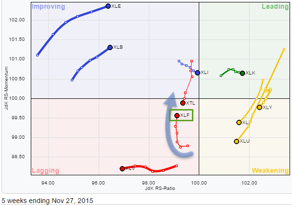 The Relative Rotation Graph on a sector level (in the small graph) shows XLF inside the lagging quadrant but moving higher, almost vertically, on the JdK RS-momentum axis or a few weeks already. This is an interesting move in itself as it tells us that; yes XLF is in a relative downtrend against SPY, but it is not a very strong downtrend as XLF manages to hold at JdK RS-Ratio levels just below 100. And also this relative downtrend is already losing downside power as RS-Momentum is moving higher quite rapidly.
Enough reason to inspect the XLF chart itself in combination with relative strength. This analysis can be found in last week's blog article mentioned above. Not much has changed since then so my starting point for this article will be that Financials are, potentially, putting in a new relative low against the broader market.
As if and when this scenario will actually start to unfold it will be interesting to know which stocks inside the financials universe could benefit most from a renewed period of outperformance or which stocks are unlikely to participate.
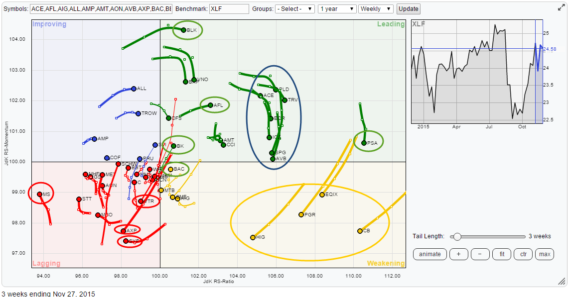
To find that out I will be working on the Relative Rotation Graph that holds the top-50 constituents (based on market cap) of XLF which is the chart printed on top of this article.
Initial observations
A first quick glance over this RRG leads to the following initial observations which I'd like to investigate a little further.
First of all there is MS far away on the left-hand side of the plot moving higher on the RS-Momentum scale but at the same time, slightly, lower on RS-Ratio. On the opposite side, we find PSA which is, based on RS-Ratio, the strongest stock in this sector but it's losing relative momentum over the past few weeks.
Inside the lagging quadrant AXP, VTR and SYF are heading further into negative territory.
On the top of the graph we see BLK crossing over into the leading quadrant from improving but momentum is levelling off, this makes me want to check the price chart in combination with relative strength to find out what's going on. A bit lower on the RS-Momentum scale but also inside the leading quadrant AFL and BK are catching my eye as their trails show a nice positive angle moving higher on both axes at the same time. Even lower on the RS-Momentum scale and still inside the weakening quadrant my eye caught the trail of BAC when I was sliding back and forth through time. This stock seems to be rotating back towards the leading quadrant, after having travelled through weakening for a few weeks, without crossing over into the lagging quadrant. This usually points to a strong relative trend that went through a temporary correction.
Finally, there are two big clusters of stocks that are all following the same rotational pattern for the time being. The first is the group inside the leading quadrant captured in the blue oval and the second group is inside the weakening quadrant and captured inside the orange oval. All these stocks are well above the 100-level on the RS-Ratio scale which means that they are all in relative uptrends against XLF. They are also all losing relative momentum as they are declining on the RS-Momentum scale. Both groups are far away from the 100 mark and all have the possibility to turn back up again before crossing over into the lagging quadrant. Just keep an eye for now but these are not going to give us any trading opportunities any time soon.
Morgan Stanley - MS
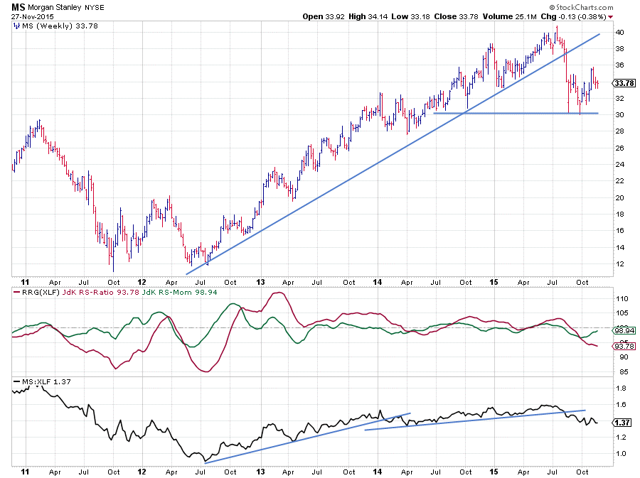
Morgan Stanley is the stock furthest to the left on the Relative Rotation Graph showing a JdK RS-Ratio reading around 94. Despite the rising JdK RS-Momentum MS is still losing relative strength against the sector (XLF).
The (raw) RS-Lines broke below a rising support line, again, a few weeks ago dragging RS-Ratio below 100 while RS-Momentum had already started to decline. With the RS-line pausing in its decline, relative momentum picked up a bit but has not yet been able to reach back to the 100-mark.
On the price chart, MS broke out of its rising trend in August and rapidly declined to the $ 30 area where, subsequently, two lows were formed and a new lower high has been put into place at $36. All in all this looks like a weak picture from both a relative and a price point of view and definitely not strong enough to cause a rotation all the way back to the leading quadrant anytime soon. After this relative recovery, more underperformance seems likely.
Public Storage Inc. - PSA
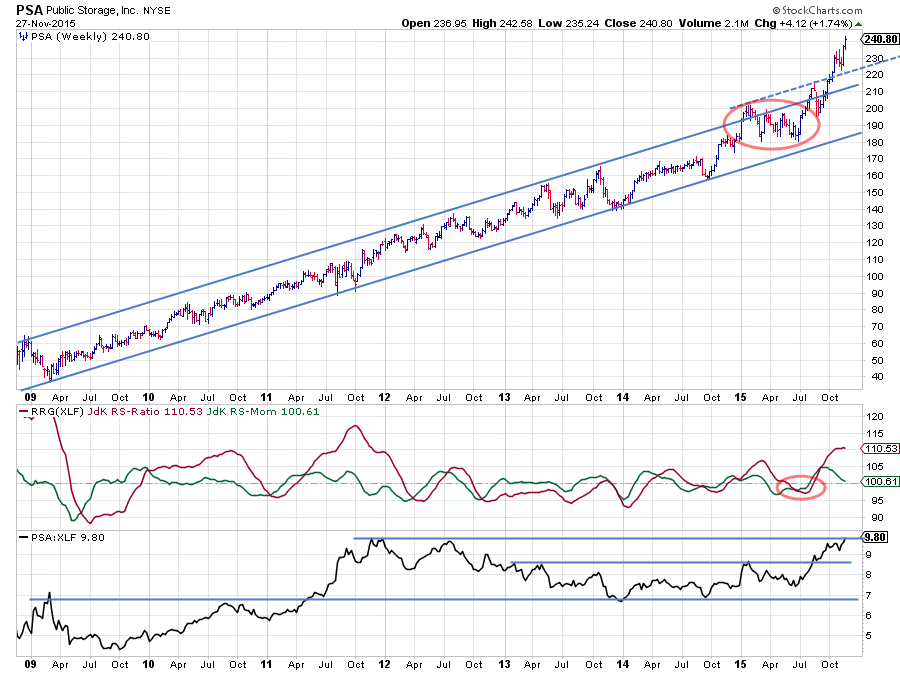
PSA is showing a really strong chart. I personally had never seen PSA before but wow what a nice picture.
Out of the 209 low, a very regular uptrend unfolded characterized by higher highs followed by higher lows and this rhythm is still intact as of today. As a matter of fact with the stock price breaking upwardly out of its already rising channel, this trend even started to accelerate. This is a good thing and a bad thing at the same time. The good thing is that it strongly confirms the underlying buying power for PSA which can still push the price higher. The bad thing is that it is, at these levels, probably not very wise to chase the stock higher, there is now simply too much risk creeping into the price.
From a relative point of view, PSA has not always been an outperformer inside the XLF universe. Clearly very strong in 2010-2011 but then weak during the 2012-2013 period followed by a flat 2014 until November when relative strength started to pick up pushing both RRG-Lines above 100. A very nasty curve ball was thrown by PSA during the first six months of 2015 when a descending triangle started to take shape on the price chart accompanied by a drop in RS. I can imagine that, reading this chart at that time, I would have judged the descending triangle as being weak, anticipating a break below its horizontal support level especially as the RRG-Lines both dropped below 100, suggesting that a new relative downtrend had started.
However, neither of those materialized. PSA never broke below its horizontal support level near $ 180 and relative strength quickly reversed back up to show a very strong relative performance since its June low. At the moment, RS is pushing against its all-time-high. Given the recent loss of relative momentum I am not sure if we will see a break higher very soon, it looks like the (relative) trend might need some breathing space. Which would actually align pretty well with the situation on the price chart. Hence, at the moment it will probably be better to leave PSA where it is and track the rotation lower, very likely into and through the weakening quadrant. As soon as the stock starts to turn back up again on the RS-Momentum scale followed by a pick up of RS-Ratio new opportunities will most likely become available.
Inside the lagging quadrant AXP, VTR and SYF are heading further into negative territory.
These stocks are already inside the lagging quadrant and heading further into this negative area. SYF is a stock with only limited history, just over a year, which makes it a bit difficult to judge for longer-term trends. AXP has been covered pretty intensively a few weeks ago here when I wrote on the relative rotation of stocks inside the DOW Industrials universe. Please refer to that post as the situation and thus my view on AXP has not changed.
Ventas Inc. - VTR
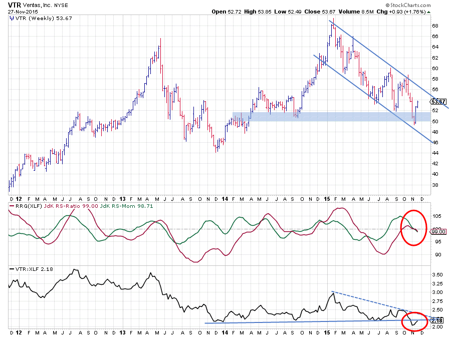
The relative strength of VTR started 2015 strongly coming out of the September 2014 low on the RS-Line. However, after this strong start this relative up move turned down again dragging RS-Ratio below 100 in April. This downturn was caught by horizontal support on the RS-chart. A few weeks ago the negative forces in play became too strong and support in RS had to give way causing a break below this horizontal support level.
Combining this relative action with the picture on the price chart provides enough reason to be very very careful with Ventas and expect further downside in the weeks to come. On the price chart, VTR is now in a clear downtrend and recovering out of a new low that was set just below $ 50. This recovery could continue slightly higher towards the top of the falling trend channel, but there are no signs for a turnaround yet.
With relative strength already turning back down, positioning VTR well inside the lagging quadrant on the Relative Rotation Graph, and price likely to put in a new high soon more underperformance versus XLF seems to be around the corner.
A bit lower on the RS-Momentum scale but also inside the leading quadrant AFL and BK are catching my eye as their trails show a nice positive angle moving higher on both axes at the same time. Even lower on the RS-Momentum scale and still inside the weakening quadrant my eye caught the trail of BAC when I was sliding back and forth through time. This stock seems to be rotating back towards the leading quadrant, after having travelled through weakening for a few weeks, without crossing over into the lagging quadrant. This usually points to a strong relative trend that went through a temporary correction.
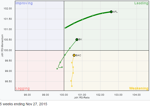 Inside the leading quadrant of the Relative Rotation Graph for XLF constituents some good opportunities seem to be available at the moment.
AFL is leading the way and already in a solid uptrend against XLF. BK has, just, crossed, back into the leading quadrant while BAC is rapidly moving its way higher and expected to cross back into the top right-hand leading quadrant soon.
Bank of New York Mellon Corp. - BK
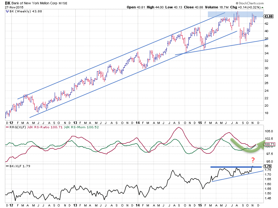
The BK chart shows a nice uptrend over the past few years. During this period, its relative strength against the sector switched back and forth. If we zoom in on the last part of the chart, say the beginning of 2015, we see that relative strength started a move higher just after the start of the new year causing RS-Ratio to cross above the 100 level. From April onwards an ascending triangle started to shape up on the RS-graph and it looks as if a break of the horizontal resistance level is imminent.
Although BK broke below its rising trend line during the August market turmoil the stock recovered rapidly and is now also pushing a horizontal resistance level on the price chart. With the RRG-lines now bottoming out against the 100-level and both the price- and the relative charts close to breaking above their horizontal resistance levels, this stocks looks set for a new period of outperformance.
Aflac Inc. - AFL
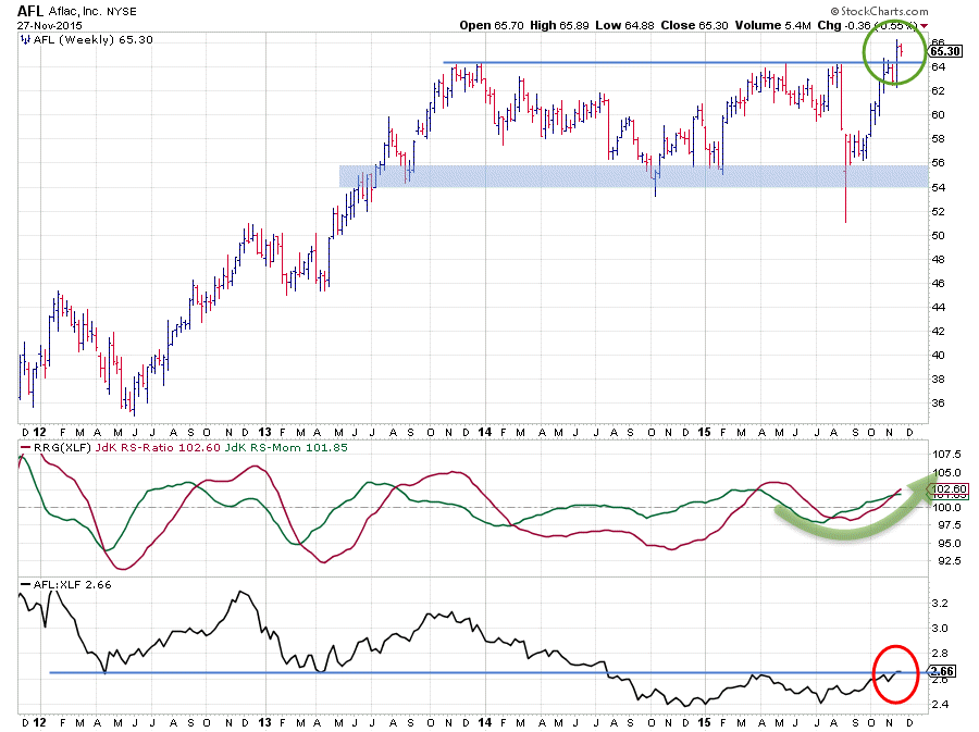
Of the three stocks on the zoomed in RRG AFL is the one with the highest RS-Ratio reading meaning that it is well underway to establish a relative uptrend versus XLF. The RRG-Lines are both clearly above 100 for some time now. The fact that the raw RS-Line is now pushing against a horizontal barrier which has played a role on a number of occasions since 2012 could put some pressure on relative development in the near term.
The good thing about the AFL chart, especially when compared with BK and BAC is that AFL has just broken above an important horizontal resistance level near $ 64 on the price chart This break is a break out of a two-year trading range. Usually, such breaks are followed by a fairly strong follow-up rally shrugging off the selling pressure which had kept the stock price inside that range. If this expectation is correct and works out, such a rally should start anytime soon now and it will also very likely cause the relative strength to be pulled higher.
Based on the height of the range a price target for AFL can be pegged $ 8 - 10 higher putting it into the $ 72.50 - 75.00 range making AFL an attractive play at the moment with the downside protected at the level of the breakout.
Julius de Kempenaer | RRG Research
RRG, Relative Rotation Graphs, JdK RS-Ratio and JdK RS-Momentum are registered TradeMarks by RRG Research


