Summary
- Commodities keep tanking
- Bond related asset classes weakening
- Equities leading on weekly- but weakening on daily time-frame
- US equities continue to lead international equity markets
- Chinese market coming back into play
Quick scan
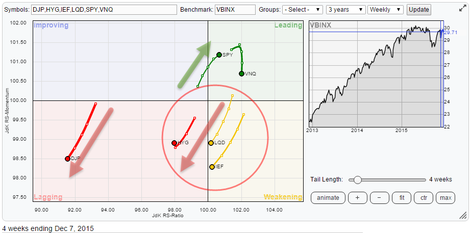
A quick look at the Relative Rotation Graph holding a number of asset class ETFs, comparing them to VBINX (Vanguard Balanced Index Fund) learns that a pretty distinct rotational pattern is underway at the moment, albeit still very close to the benchmark and therefore not very mature yet.
Commodities (DJP) is still the odd one out, pretty much leading its own rotational life on the far left (negative) side of the graph. The rotation over the past 5-6 weeks has once again caused DJP to turn back down and head lower on both axes pushing the asset class deeper and deeper into the lagging quadrant.
Closer to the center (benchmark) a clear rotation in favor of equities over fixed income related asset classes is visible. Inside the red circle, we find all three bond related asset classes; government (IEF), Investment grade corporate (LQD) and High Yield (HYG). all three are rapidly losing relative momentum and slowly pushing lower on the JdK RS-Ratio axis.
In the top-right, leading, quadrant we find Equities (SPY) and Real Estate (VNQ) with equities clearly showing the most promising trail at the moment.
A different time-frame
The observations above are from the weekly RRG above, the time frame I usually use for my analysis. And as said in the quick-scan section, the rotational pattern inside this universe of asset classes is pretty distinct BUT at the moment the rotation is still very close to the benchmark and the relative trends in play are by no means very mature yet. Knowing what I wrote about the stocks/bonds ratio in the previous article on asset classes I want to take a closer look, also on a daily time-frame to see what is going on.
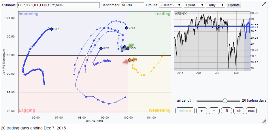
The RRG below holds the same set of ETFs as the one on top of the article but is now rendered on a daily time-frame.
As you can see on this time-frame the picture is almost flipped upside down, especially with regard to the rotation of equities versus the fixed income asset classes.
Commodities are still way out to the left but at very low JdK RS-Ratio levels, in combination with the position of DJP on the weekly RRG this is judged as another recovery within the longer-term relative downtrend and DJP is expected to turn back down again, on the daily RRG as well, before rotating into the leading quadrant. . Real Estate (VNQ) is starting to lose relative momentum, just like on the weekly chart which makes it doubtful whether the asset class can keep up the rotation inside the leading quadrant.
Equities (SPY) and bonds (IEF, LQD, and HYG) are throwing some curve-balls at us. Until a few days ago it looked as if the daily rotation for equities was going to continue on the right-hand side of the RRG (> 100) while bonds would rotate on the left-hand side of the graph (< 100). This would then confirm the rotation that is seen on the weekly RRG. Unfortunately, over the past few days equities started to move left (lower on the RS-Ratio scale) while bonds started to move right.
Equities - SPY (DAILY CHART)
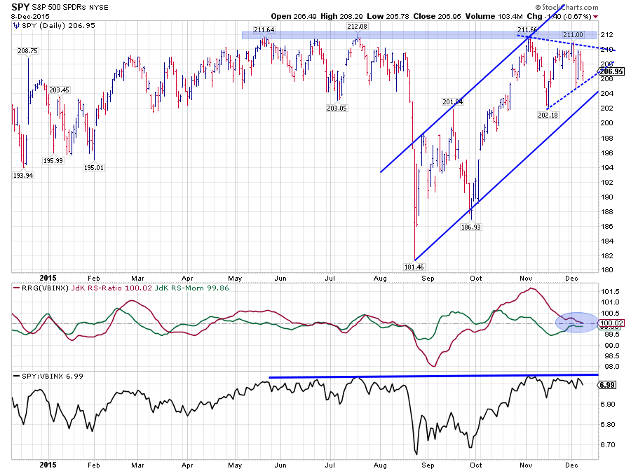
The price of SPY is still working its way higher inside the up-sloping channel but has trouble pushing higher since the peak in November was set near 212. At the moment, a triangle formation seems to be in the making. As you all know a break out of this triangle will be of great influence on the subsequent move of SPY. However, as the triangle is forming inside a rising channel there are new support and resistance levels waiting just after a break on either side of the pattern.
In case of a breakdown, very shortly after that break the rising support line that marks the lower boundary of the rising channel will come into play as support. The same happens when SPY breaks the triangle on the upside. In that case, almost immediately the resistance zone around 212 will start to cap further price movement.
This uncertainty is also seen in the graph holding the RRG-Lines (JdK RS-Ratio and JdK RS-Momentum). During the formation of the triangle and the accompanying wide swings in price (=uncertainty) both the RRG-Lines moved very close to the 100-level which means that there is no clear relative trend versus VBINX.
Unfortunately, this means that it is difficult to call any meaningful move at the moment. There is simply too much uncertainty from both a price and a relative perspective. An appropriate asset allocation decision would be to remain close to the benchmark weight for equities in the benchmark, in the case of VBINX that means around 60%.
Looking at the SPY chart, also from a longer term perspective, it seems as if the market is really pushing against that horizontal barrier around 212. If that can be taken out to the upside SPY will move to new all-time highs after having been under pressure for a while. Usually, such a situation is followed by a strong rally as all the selling pressure got eliminated and investors get afraid to miss out on the next leg up for equities.
On the other hand, when SPY breaks the triangle formation to the downside and subsequently also breaks the rising support line there will still be a decent amount of support levels of various gradations available to catch any decline. For sure it will bring the market down but only when the area around 180 gets violated, the longer term price structure for SPY will really get damaged. Nevertheless, that is still a ~10% decline.
Government Bonds - IEF (DAILY CHART)
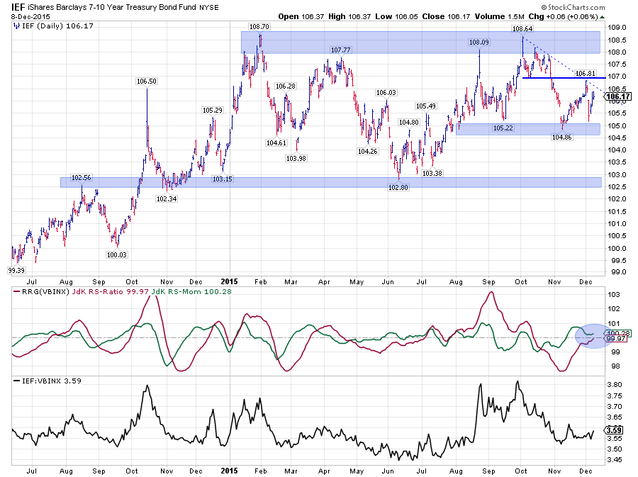
Development of IEF over the past year is contained within the boundaries of a very wide channel with the area between 102.5 - 103 showing up as support below the current market and a broad area between 108 - 109 as resistance above current prices. And to make things, even more, indecisive, since the formation of the last peak(s) in October the range seems to be narrowing further at the moment with the area around 105 showing up as support and 107 as resistance.
This means that, here also, in case of a break in either direction, new levels of support and resistance will show up quite rapidly. Hence, it is difficult to call for some sustainable move in either direction.
The relative picture is not helping us either. The RRG-Lines have moved close to the 100-level, suggesting relative movement in line with the benchmark, just like equities.
Equities / Bond ratio (DAILY CHART)
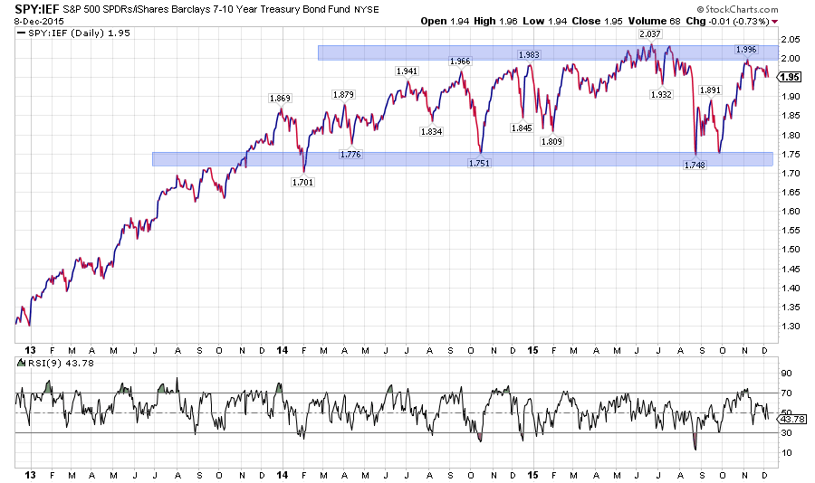
With a fairly indecisive picture for both equities and bonds, maybe the ratio between the two can shine some light in this darkness. The chart above shows the Equity/Bond ratio on a daily basis in combination with the RSI (Wilder's) on a daily basis. I am using a nine-period look back for the RSI because it is a bit more sensitive than the standard 9-period look-back and touches overbought and oversold areas a bit sooner and more often.
As the ratio is moving in a trading range and is not showing a clear trend up or down at the moment the RSI can give us some clues about moves within the boundaries of the range. With the RSI peaking just above 70 while the ratio touches the upper boundary suggests that another leg down within the boundaries of the trading range may be imminent.
This would mean that in coming weeks equities are likely to underperform bonds and bring the equity/bond ratio back to the lower boundary of the range.
Please not that this is a shorter-term assessment and that the longer-term picture shows no real preference for either asset class at the moment.
International perspective on equities
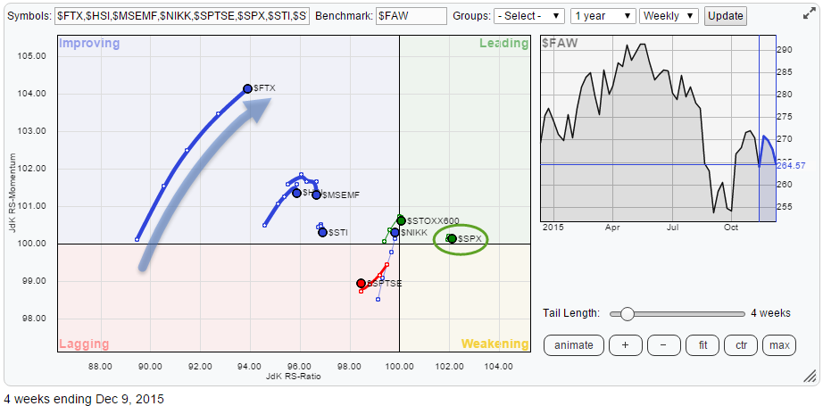
From an international perspective the S&P 500, i.e. US Equities, remains the place to be for equity investments.
The Relative Rotation Graph below holds a number of international equity indices and compares them to the FTSE all World index ($FAW). As you can see the S&P is furthest to the right and leading the universe. But what's more important, it is doing so with a very short trail. Compare the trail on the S&P 500, it is a 4-week trail, just like it is on all other indices on the plot, but almost invisible because it is so short, to the trail on the Chinese $FTX index (FTSE China A50 Net index).
The trail being so short indicates that the relative trend is very stable and neither gaining nor losing relative momentum.
China - $FTX
Despite the fact that on the RRG the $FTX index is still the weakest measured by JdK RS-Ratio its trail is calling for attention. First of all, because it stands out on the graph by length and secondly because $FTX is gaining on both axes quite rapidly.
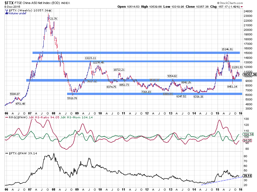
Reading from the longer-term chart above we can learn that the Chinese market, after having topped out around 15.000, found support in the 9.000 area, with one brief dip to 8.500. This area showed up as support or resistance level a few times in the past and seems to have gained a bit more respect with the recent low formed there.
Does this mean that we have seen the lows? Not sure, too early to tell. But it is very clear that the odds are now much better for long positions than they were a few months back.
From a relative point of view, despite the current impressive move through the improving quadrant, $FTX is still lowest on the RS-Ratio scale and there is still a very serious possibility for a rotation back down to lagging without reaching the leading quadrant.
On the price chart, we have only seen one real test of the aforementioned support level. The picture is improving on the daily chart as well, but a real base has not been "hammered out" yet IMHO.... So here also the risk for another setback is seriously present.
I would prefer to get some more confirmation on both the relative and the price charts but what we are looking for are definitely buying opportunities, preferably during a renewed test of the support area.
Julius de Kempenaer | RRG research
RRG, Relative Rotation Graphs, JdK RS-Ratio and JdK RS-Momentum are registered TradeMarks by RRG research.

