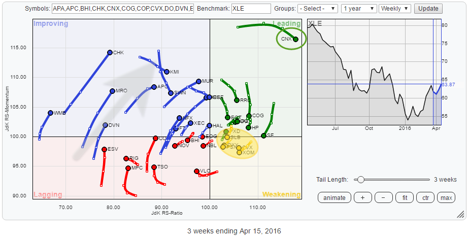
The energy sector has been a very poor performing sector for a very long time. However, on the Relative Rotation Graph for US sectors (ETFs), XLE is now way up inside the improving quadrant and heading right towards leading. This makes it a good sector to dissect on an individual equity level to see if there are any good buying candidates available in case this sector rotation continues in its current direction.
To do this, I will work my way through the Relative Rotation Graph holding the constituents of XLE.
Summary
- Improving quadrant dominates RRG of XLE holdings
- Only a handful names inside the weakening quadrant but they make up 40% of the XLE market cap.
- Completion of double bottom in APA will add to the positive outlook from a relative perspective
- Downside risk for MPC heavily outweighs upside potential
- Upward break in CVX:XLE seems imminent
- Bottom phishing in CHK?
- Odds shifting for MUR:XLE
Quick scan
A first glance at this Relative Rotation Graph, reveals that the weakening quadrant holds only a handful of stocks. And they are all concentrated in a small area close to both the JdK RS-Ratio and JdK RS-Momentum axes while the improving quadrant seems to be pretty dominant at the moment with most of the stocks in that area heading in a North Eastern direction.
The opposite, weakening, side is clearly less populated, but it reveals something interesting when we zoom in on that area.
The RRG below shows a zoomed in RRG of only the stocks in the weakening quadrant, and they are labeled with their respective percentages of market cap within the Energy sector! These five stocks, all inside the weakening quadrant, make up more than 40% of the total market cap of the sector.
As we are looking at a closed universe here, the relative positions, based on their market cap, should be evenly spread. This concentration of market cap inside the weakening quadrant, therefore, causes more stocks to end up in the improving quadrant in order to equalize the weight over there.
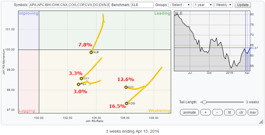 The other observation taken from the RRG, better seen on the full RRG above, is that all these stocks inside the weakening quadrant are showing relatively short tails. This means that there is not much power (momentum) behind their current moves, suggesting that a turn back up towards leading is very well possible.
CVX already seems to be starting such a rotation.
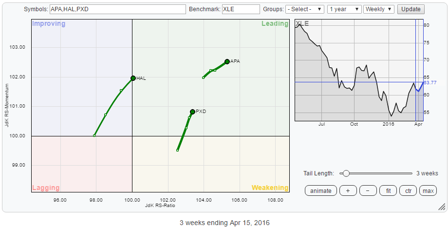
Inside the leading quadrant CNX, of course, catches the eye as it is far away from the other securities on the plot, that relative trend is well underway. Zooming in on the leading quadrant, as shown in the RRG below, reveals three stocks with interesting rotational patterns.
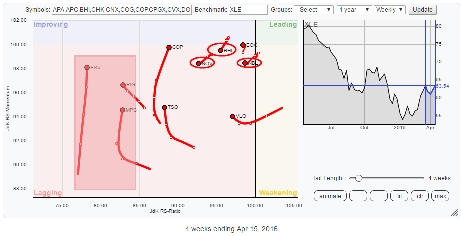
 Zooming in on the stocks inside the lagging quadrant shows some mixed rotational patterns. There are a few names like ESV, RIG and MPC that are very low on the JdK RS-Ratio scale (<85) which means that, even despite their recent run-up on the JdK RS-Momentum axis they are still in strong relative downtrends.
Just inside the lagging quadrant but closer to the benchmark we find a number of stocks, NOV, BHI and NBL, that are starting to move lower on both axis suggesting that they have started new relative downtrends against XLE and more underperformance seems to lie ahead for them.
Inside the Leading quadrant
Apache Corp. - APA
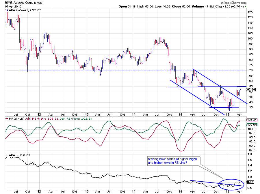 APA tested the important support, now resistance, level near $ 70 a number of times between 2011-2014. After the breakdown, late 2014 and the re-test of $ 70 as resistance in 2015, the stock lost about half of its value ending near $ 35 where a new support level seems to have formed now.
Out of this low, a rally is now underway for the second time and testing resistance near $ 55. A break beyond this level would mean the completion of a double bottom pattern aiming for a further rally that could target towards the $ 70 level again which will now start to act as resistance.
In the relative strength chart, a long downtrend is visible. On the back of the improvement in the price chart, the raw RS-Line is now breaking a short-term trendline and seems to be starting a new series of higher highs and higher lows.
The RS-Ratio line picked up a change for the better already back in 2015 when it crossed above 100 for the first time since late 2014.
From a relative point of view, things are looking good for APA already. A completion of the double bottom formation on the price chart will be a confirmation from a price perspective.
Inside the lagging quadrant
Marathon Petroleum Corp. - MPC
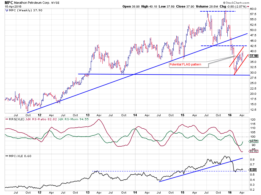 The first thing I see on the MPC chart is a potential flag pattern under development. And when such a pattern occurs after the completion of a huge double top formation, as it is doing on the chart above, that does not mean a lot of good.
The uptrend in MPC ended in the beginning of this year when the rising support line gave way. Shortly after that break the double top formation was completed, resulting in an almost $ 15 drop towards support just below $ 30. This fulfilled the minimum price target based on the double top.
However, what seems to be developing now is a flag pattern. As this is a so-called continuation pattern, a break to the downside will signal a further deterioration in price which will very likely push MPC below its recently formed low.
Combine this weak outlook from the price chart with a relative strength line that broke rising support and an RS-Ratio that is moving below 100 since the beginning of the year and we have to conclude that the downside risk for MPC heavily outweighs the upside potential. The upward rotation on the RRG chart is therefore expected to rotate back down again before being able to crossover to the right side of the plot.
Inside the weakening quadrant
The population of the weakening quadrant for the energy sector is currently characterized by some heavyweights, within this universe, that are camping in that area. With XOM and CVX being the most important at 16.5% and 12.6%.
Chevron Corp. - CVX
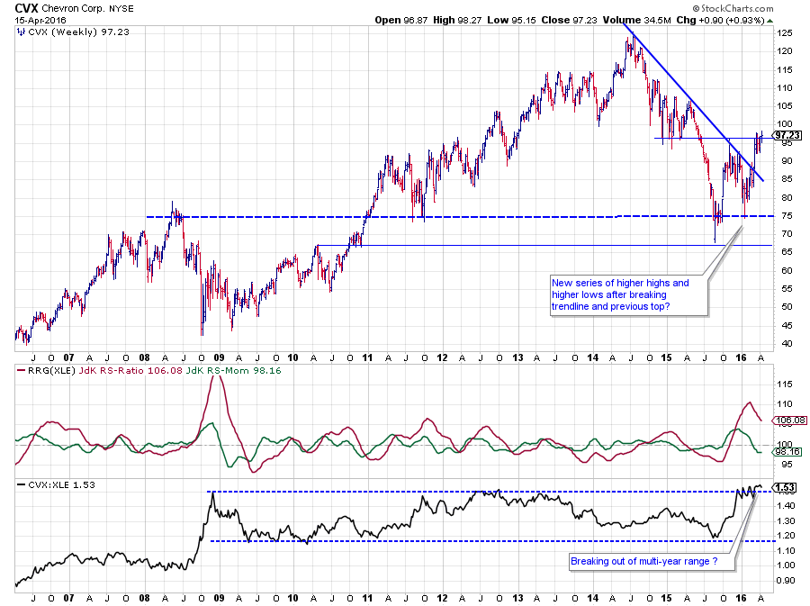 After setting a peak near $ 125 in 2014, CVX almost halved in price in roughly 12 months time, coming to a rest just above $ 65 in August 2015. Out of that low a rally emerged that brought the stock back to a former support level, now resistance, around $ 95. At that level, the stock price also met resistance again coming from the falling trendline. A renewed decline managed to get support around $ 75, which was a first positive as supply apparently was not strong enough to push CVX below its previous low again.
After this first higher low the falling trendline was broken and subsequently CVX is now challenging the horizontal resistance level around $ 95. A break will clear the way towards, at least, $ 105 but probably (much) higher.
The relative picture shows a raw relative strength line that has been contained within the boundaries of a broad range since 2009. The last few weeks the CVX:XLE ratio is trying hard to break higher. It is not decisive yet but things are looking good so far. The JdK RS-Ratio line picked up on a new relative uptrend since late 2015 already and has now pushed to its highest level since 2010. As RS-Ratio, also, measures trend strength, this suggests that an upward break in the RS-Line is imminent.
Inside the improving quadrant
As described in the introduction, the improving quadrant in this sector rotation RRG is currently the dominant quadrant, balancing out the heavyweight stocks that are found in the weakening quadrant.
There are plenty of stocks to choose from in that area at the moment but the position and the tails of CHK and MUR look interesting to me. Both stocks are high on the RS-Momentum axis and both are showing an almost straight tail pointing North-East. The only difference being that MUR is much closer to crossing over into the leading quadrant while CHK still has some distance to cover on the RS-Ratio axis. This makes CHK the riskier of the two but, arguably, also the one with the highest potential.
Chesapeake Energy Corp. - CHK
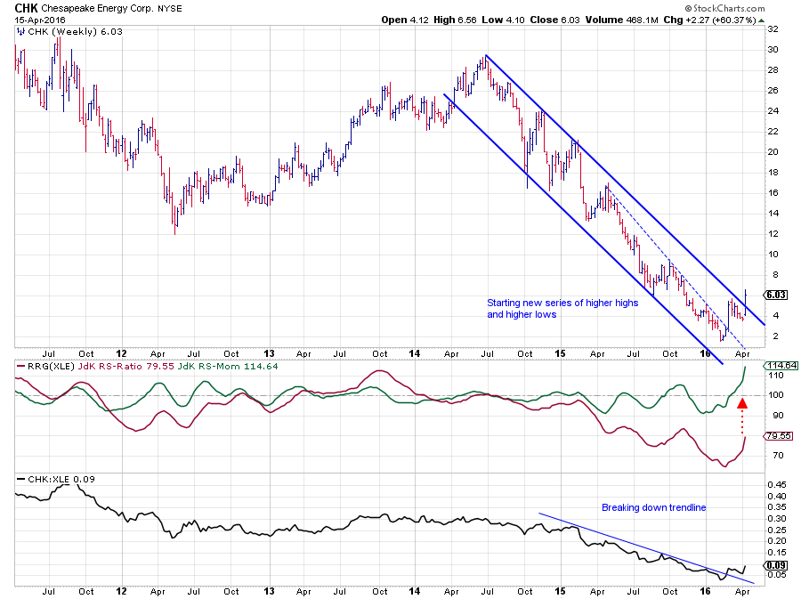 After a drop of over 90% from its peak near $ 30 (mid-2014), it is not a surprise that this stock has disappeared off of a lot of people's radar screens. No matter what sort of relative strength measure you look at, this stock will always be at the low end of the range. And this is one of the good examples where the added value of the visualization via Relative Rotation Graphs becomes clear as CHK clearly stands out on the chart, almost begging for our attention.
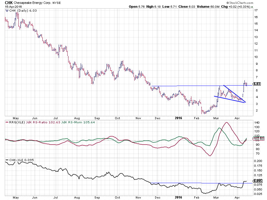
After setting a low near $ 2 in the beginning of this year CHK rallied sharply, breaking the dashed falling resistance line. After the high following, the initial rally a wedge-shaped continuation pattern developed which was left last week, pushing CHK through the falling resistance line and above its previous peak, clearing the path for an even further rise.
The power of this move is clearly visible in the strong move of the JdK RS-Momentum line. The risk for CHK is clearly in the very low reading of the RS-Ratio line which is still way below 100. It is still possible that the rotation will fade and turn back to the lagging quadrant but the combination of a break above the trendline in the RS-Line, the strong relative momentum and the completion of a bottom and break out of the falling trend on the price chart are all positive signs.
So for a bottom-phishing exercise, CHK could be a good candidate when used with some good money management rules around any position.
The reading of the daily version of this chart only confirms this view.
Murphy oil Corp Holding Co. - MUR
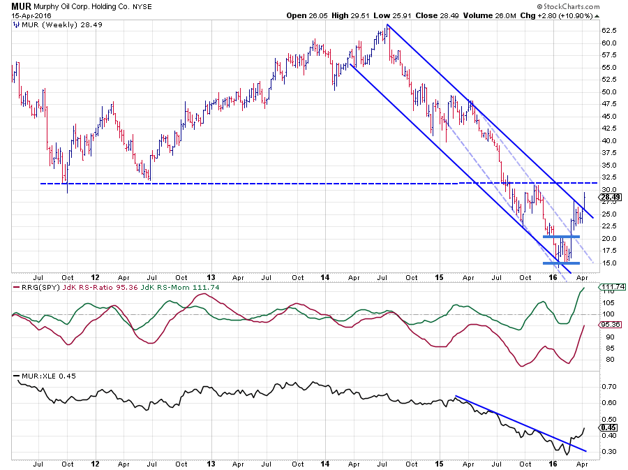 Albeit not as spectacular as CHK, MUR also lost a whopping 75% of its value coming off the mid-2014 peak near $ 62.50. In the first months of 2016, a double bottom between $ 15 - $ 20 marked the end of this falling trend. After completing this trend-ending formation MUR rallied towards a high near $ 27.50 where it met resistance coming off the falling resistance line. A few weeks of consolidation were needed before MUR could leave the falling channel last week.
The dashed horizontal resistance level near $ 32 is now the most important to watch. A break beyond this barrier will certainly pave the way for a further rise.
From a relative perspective, the raw RS-Line has already broken a short-term falling resistance line and RS-Ratio is rapidly moving towards the 100-level pulled higher by a strong RS-Momentum line.
Anticipating a continuation of the current rotation, it certainly looks like the odds are shifting in favor for MUR vs XLE and other stocks in this universe.
Julius de Kempenaer | RRG Research
RRG, Relative Rotation Graphs, JdK RS-Ratio and JdK RS-Momentum are registered TradeMarks by RRG Research
Follow RRG Research on social media:
LinkedIn Facebook Twitter

