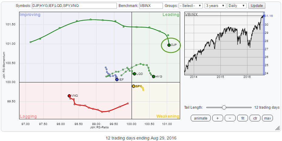
On the Relative Rotation Graph below, the rotation of various asset classes is shown against the Vanguard Balanced Index Fund (VBINX).
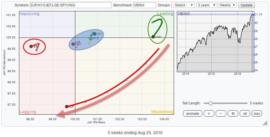 The single one tail that immediately stands out is the one of DJP (Commodities). Then there are IEF (Government bonds) on the far left inside the lagging quadrant and VNQ to the far right, on the verge of crossing from leading into weakening.
Inside the blue shaded area are LQD (Corporate Bonds), HYG (High Yield Bonds), and SPY (Equities). All three on a very short tail and no clear rotational path with SPY and HYG still on the positive side of the RRG and LQD just about to cross over into the lagging quadrant.
Putting SPY/$SPX on a Relative Rotation Graph with other (international) equity markets against the FTSE All-World Index provides a different picture!
Summary
- As long as $ 22 holds up in DJP, commodities are likely to continue higher gradually
- A drop back to support in VNQ might be a good buying opportunity
- Government bonds weakest asset class at the moment
- $SPX losing relative strength against international markets
ChartCon 2016
Have you signed up for ChartCon 2016 already? If you like Relative Rotation Graphs and all the other assets on StockCharts.com, please click the registration link below this article. It will be a great event with tons of information that will only be available to registered attendees.
In my presentation, I will dive a little deeper into the most frequently asked questions about Relative Rotation Graphs and how I use them to get a handle on the markets.
Asset Classes
Commodities - DJP
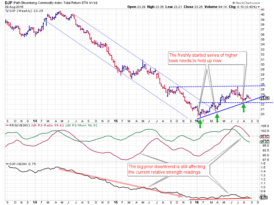 Commodities started improving during the first few months of this year after a very long period of deterioration. Even the more or less flat movement in the relative strength line at the start of 2016 already caused the RRG Lines to improve rapidly and move back up towards the 100 level.
Breaking out of the falling trend channel and starting a new series of higher highs and higher lows then triggered an acceleration of the RS-Line as well, pushing the RRG-Lines above 100 and DJP into the leading quadrant. The initial rally then stalled near $ 26 which is a resistance level coming off the Q4 peaks of 2015 and still a level to watch on the next move higher.
It looks as if the drop from $ 26 to $ 22 in July was the first serious correction after the turnaround. Therefore the recently formed low near $ 22 is now a very important low to watch as it is the second higher low and the third point validating the rising support line that emerges out of the January low.
As long as $ 22 holds up, the turnaround situation for commodities is still intact and this asset class can be expected to gradually work its way higher.
The impact of this price move on the relative strength charts is that the raw RS-Line dropped back to almost its lowest levels but just seems to hold there. The red rising support line has a very shallow up-sloping angle. The speed of the move is reflected by the rapid drop of the JdK RS-Momentum line from above 102.5 to below 97.0, in a matter of weeks, dragging the JdK RS-Ratio line below 100 as well now. On the Relative Rotation Graph, the speed of the move can be identified by the long tail that shows up.
The power of this rotation will almost certainly cause DJP to rotate further into the lagging quadrant. It will be the behavior of DJP on the price chart, in combination with VBINX, that dictates, if this will be a short-lived rotation and Commodities can return to the leading quadrant soon or whether they will resume their longer term downtrend.
As the rotation on the daily RRG already shows DJP back inside the leading quadrant, I am biased towards the first scenario.
Real Estate - VNQ
 REITs (VNQ) have been one of the star performers (together with commodities) over the past few months and have rotated on the right-hand (positive) side of the Relative Rotation Graph since mid-October 2016 as you can see on the animated RRG below.
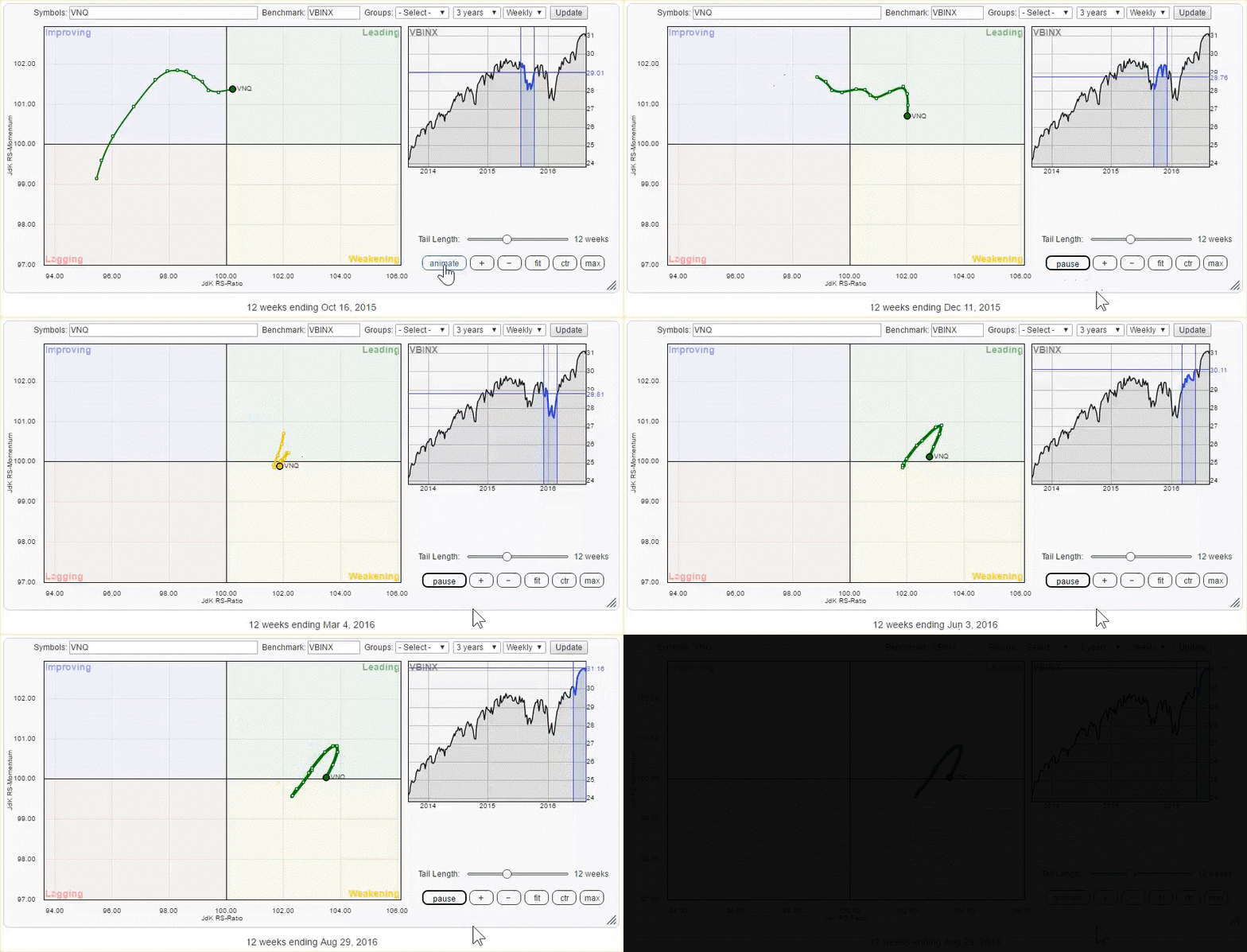 The rotational pattern in the animation suggests that each leading-weakening-leading rotation over the past months has continued to push VNQ higher on the JdK RS-Ratio, meaning a continuously improving relative trend against VBINX.
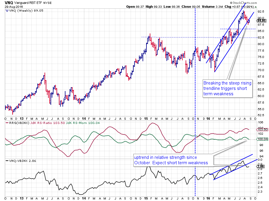
This improvement on the relative charts is backed/caused by the strong picture seen on the price chart. After breaking to new all-time highs in April/May VNQ's price has held up very well above the previous highs which initially provided resistance but are now offering support.
The important support zone to watch now is the area between $ 82.50 and $ 85.00. As long as VNQ remains above these levels, or even better, puts in a new low there, the uptrend for VNQ in price remains fully intact and can be expected to move higher.
The short-term picture is showing some weakness as the price has, or is on the verge of, breaking its steeply rising channel which can put some pressure on VNQ in coming weeks. A similar situation is happening in the chart of the raw RS-Line where, also, a short-term trendline has given way.
Based on the strong rotation of VNQ on the RRG and the strong longer-term outlook for the price chart, I expect the current rotation of VNQ to move through weakening and then bend upwards again to move back into the leading quadrant.
Any drop back into the support zone might offer good risk/reward buying opportunities.
Government Bonds - IEF
 The charts for Treasuries tell quite a different story at the moment.
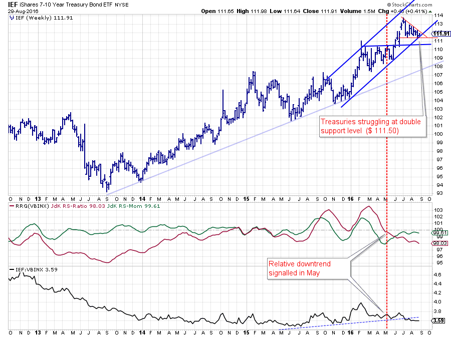
From a relative perspective IEF started a relative downtrend against VBINX in May and although not extremely strong, that trend is still intact and gradually getting a weaker reading on the JdK RS-ratio which is still moving lower.
The weakness in relative strength got confirmed by the break below the slightly up-sloping support in July which is not going to help to turn things around for the better.
On the price chart, things still look okay at first sight, but there are a few things that make me cautious. First, the most recent rally did not manage to reach the upper boundary of the rising channel which is a sign of a market losing thrust. Secondly, the pattern that seems to be evolving after setting its recent peak starts to look like a descending triangle which is a pattern with negative implications. The lower highs covered by the falling trendline suggest selling power is coming in. At the moment there is still, a bit of, support found around $ 111.50. Tha fact that this horizontal support level is now coinciding with the rising support line out of the late 2015 lows makes it a double support level.
All of this price action is better seen on the daily version of the chart.
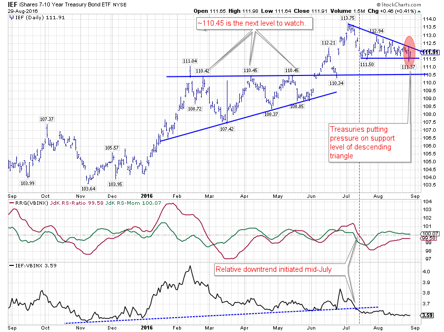 The descending triangle is clearly defined and the swing inside the red shaded area was a first attempt/threat to break lower. As if and when the break of that aforementioned double support level happens, the next (horizontal) support level to watch will be around $ 110.45.
Especially from a relative point of view there are no reasons to assume any improvement at short notice for IEF.
With Bonds clearly the weaker asset class and a benchmark that holds 60% equities and 40% bonds, that automatically puts equities (in this case SPY)at the opposite side of the benchmark (center of the chart) and just inside the leading quadrant. When we put US equities (SPY/$SPX) against other equity markets they do not look all that good.
International equity market rotation
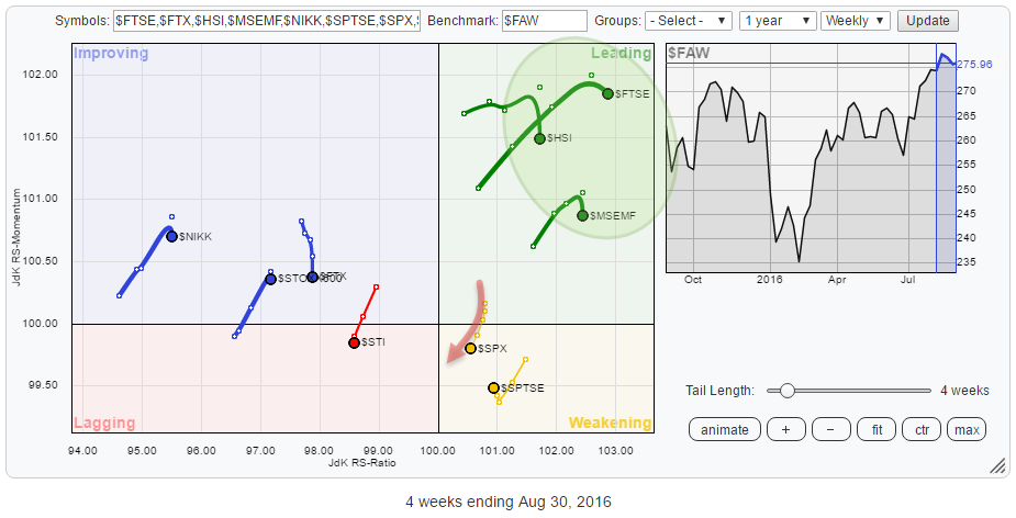 The Relative Rotation Graph puts $SPX in perspective against the FTSE All-World Index and some international equity market indices. Over the past six to seven weeks the US started to lose its leading position in terms of relative strength and has been taken over by Emerging Markets and Hong Kong stocks and, surprisingly, by UK stocks as well.
These three markets are now all comfortably inside the leading quadrant while the US ($SPX) is rotating through the weakening quadrant and heading towards lagging. As the US makes up a big part of the All-world Index $SPX is unlikely to move far away from the center of the chart but the heading of the tail on $SPX is sending a clear signal at the moment.
US Equities - $SPX
The price chart of $SPX in combination with the relative strength charts against $FAW is printed below.
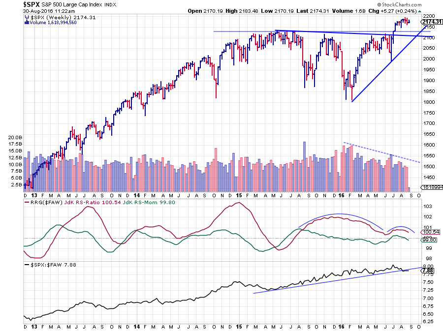 The gradually declining JdK RS-Ratio line since Q4-2016, coming from levels above 102, signals the slow decline of the relative position of US stocks in the world. The relative trend is still positive as RS-Ratio continues to move above 100 but the power is declining.
This also shows in the chart of the (raw) relative strength line which is only gradually sloping up, more sideways, since the beginning of the year. As the drawing of trendlines, especially angled ones, is a very subjective hobby, I used the thinnest line type and tried to connect as many of the recent lows as possible, but I find it a difficult call to say that this trendline has been broken. Any other thickness of this trendline would cover the most recent movement. Having said that, relative strength is not moving higher either...
The thing that continues to worry me on the price chart as pointed out in previous blogs as well is the complete lack of volume combined with no powerful follow through after the break above resistance.
Julius de Kempenaer | RRG Research
RRG, Relative Rotation Graphs, JdK RS-Ratio and JdK RS-Momentum are registered TradeMarks by RRG Research
Follow RRG Research on social media:


