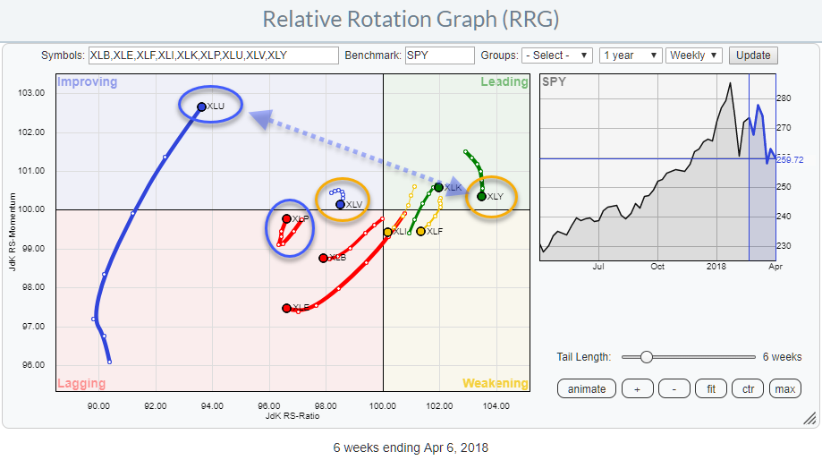
 The Relative Rotation Graph for US sectors is showing us a few interesting rotational patterns for the week ending 4/6.
Studying the RRG above, there are two sector pairs which rotations I want to investigate a bit further.
The first one is Consumer Discretionary vs Utilities because they are both at the extremes of the RRG and started turning around. The second combination of sectors to have a better look at is Consumer Staples against Health Care. Both are at the left side of the plot but moving at opposite headings.
Summary
- Utilities expected to lead over Discretionary in next few weeks
- Staples and Health Care rotating in opposite directions suggesting preference for staples
Utilities vs Discretionary
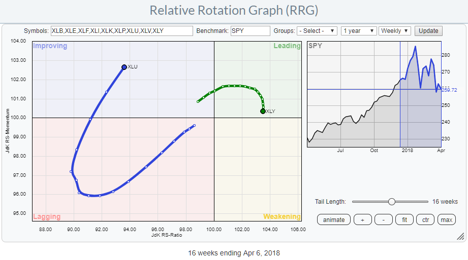 The RRG above shows the rotations for XLU and XLY.
XLY is, still, the highest ranked sector based on JdK RS-Ratio while Utilities is, still, the weakest sector.
However, Utilities is gaining, strongly, in terms of JdK RS-Momentum while Discretionary rolled over, still inside the leading quadrant, and started heading for weakening.
What stands out is the difference in tail length which means that the power behind the rotation for XLU is, much, stronger than for XLY.
The caveat that we have to make is the fact that XLU is still at very low RS-Ratio levels which means that the Utilities sector would need to maintain its current momentum in order to be able to reach the leading quadrant which can be a challenge.
So, for the time being, we are looking for a short-term counter-trend move.
Given the opposite RRG-heading of both sectors, it is expected that XLU will gain over XLY in coming weeks. We’ll have to wait and see if this can turn into a long-term turnaround of their relative trends.
Consumer Discretionary
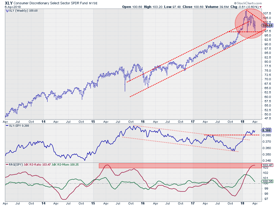 The price chart of XLY shows a topping behavior since the start of this year. 2018 started with a powerful upward break out of the rising channel but failed to really push higher after setting a high at $ 109 and subsequently a lower high at $ 107 while falling back into the old channel.
Very often this leads to a test of the lower boundary of the channel and XLY seems to be in the process of doing exactly that at the moment.
The area around $ 97.50 is of growing importance and a break below this support will very likely trigger a new acceleration lower.
The long-term relative strength looks good as the RS-Line broke out of its falling channel at the beginning of the year and recently took out a previous relative high which is another positive sign. This upward turn was also picked up by the RRG-Lines pushing the sector into the leading quadrant.
At the moment the RS-ratio line is reaching historically high levels and started rolling over. The green RS-Momentum line is close to crossing below 100.
For the time being XLY seems to have enough room to maneuver and should be able to handle a temporary setback.
Utilities
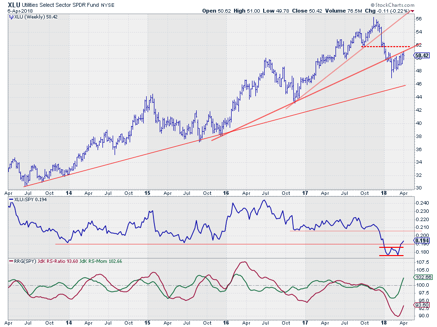 The price chart of XLU shows two subsequent breaks of rising trend lines which will make upward movements in coming weeks difficult.
Watch how the recent sequence of weekly price-bars continues to bounce off that old support line. The current recovery out of the recent low could very well take the shape of a flag or wedge-like formation which means that a downward break triggers a new leg down.
First support can be seen at the level of the long-term rising support line but a target calculated off a possible flag/wedge would come in around $ 40.
The relative picture for XLU is looking much better than its price picture, at least for the short term.
The RS-Line seems to have completed a short-term double bottom and broke back above the former horizontal support level.
The long-term relative outlook is a bit more difficult as there is still a lot of overhead resistance and the main trend, lower highs and lower lows in RS, is still in play.
For the near-term XLU can gain some more relative strength but will probably need another rotation from improving through lagging before the long-term relative trend can be turned around.
Staples vs Health Care
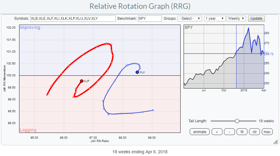 The Consumer Staples and Health Care sectors are both positioned at the left side of the Relative Rotation Graph which means that both are in relative downtrends against SPY.
However, their opposite RRG-Headings makes it interesting to study the charts of both these sectors to look for potential opportunities.
XLP is positioned inside the lagging quadrant but curled upward over the past few weeks and started heading for the improving quadrant while XLV did the exact opposite. It rolled over inside the improving quadrant and is now close to crossing back into the lagging quadrant.
This is a typical example of a relative trade as both sectors are weak vis-a-vis SPY but their rotational pattern suggests, at least near-term, improvement of Staples over Health Care.
Health Care
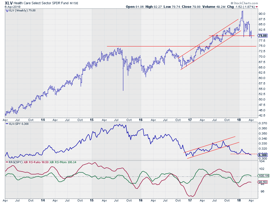
In a way, the XLV chart looks a bit like the XLY chart we saw earlier. An upward break out of the rising channel without a meaningful follow through and then a drop back into the old rising channel. What we see here is that XLV now already broke below the lower boundary of that former rising channel and two lower highs are clearly visible while the most recent low is being tested at the moment.
For the time being there are a number of support levels visible between $ 75 and $ 79, when they give way more downside price action is expected.
The relative picture does not look very well. First of all, there is the downward break of the rising channel in the first half of 2017 and after a pause and some sideways movement since the beginning of 2018, the RS-Line broke below its recent low last week.
This is now resulting in a downward turn for the RS-Momentum line which is about to cross back below 100 again after short stint above it.
This will very likely result in more downside relative strength causing a new peak for the RS-Ratio line while below 100. Not one of the strongest rotational patterns.
Consumer Staples
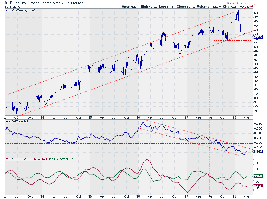 XLP has just left a very nicely rising channel which put an end to a multi-year uptrend in price. From a relative perspective, however, XLP has been and still is, in a downtrend since the beginning of 2016. As expected for a so-called defensive sector in a soaring equity market.
The lowest low for the RS-Ratio line was set at the start of 2017. Since then we have seen a few rotations, primarily at the left-hand side of the chart with a very short stint through leading in May-June 2017.
Since the start of 2018 XLP rotated from lagging into improving and back to lagging. Very recently RS-Momentum curled up again bringing the sector close to another rotation back into improving.
We have to acknowledge that all movements are close to the benchmark (100-line) which makes them prone for changes but for the next few weeks it looks like a bit more relative strength against SPY and also against XLV is possible.
Wrapping up
All in all, it looks as if more defensive sectors like utilities and staples can, continue to, outperform SPY in coming weeks. Whether these rotations will be able to turn the longer-term relative trends around remains to be seen so we will have to keep a close eye on them going forward.
The opposite RRG-headings following the recent rotations for Utilities vs Discretionary and Staples vs Health Care offers the potential for pair-trades in those combinations.
Let me know what you think of this usage of RRG in the comments? If you want to receive a notification when a new article in the RRG blog is published? Simply "Subscribe" and leave your E-mail address.
Julius de Kempenaer | RRG Research
RRG, Relative Rotation Graphs, JdK RS-Ratio, and JdK RS-Momentum are registered TradeMarks ®; of RRG Research
Follow RRG Research on social media:
If you want to discuss RRG with me on SCAN, please use my handle Julius_RRG so that I will get a notification.


