Never a dull moment when it comes to the markets. Just when you thought you had it all figured out, Mr. Market throws us another curve-ball that we all have to deal with.
The last few days have been pretty hectic, given a 200-point drop in the S&P 500. That is nothing short of serious. Although there are a lot of people who have been awaiting for or calling a top or a correction, the problem is that a lot of these people have been doing that for two years now. I believe they call this group perma-bears.
For reference purposes, the S&P 500 is still up 13% for the year and almost 6% since the end of 2017, which is not super bearish. When things get a little hectic I always find it refreshing to step back and take a look at the longer term picture.
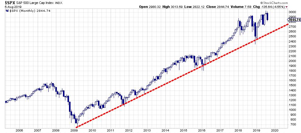
The image above shows a monthly candle chart for the S&P 500, showing the trend line that I am watching for long-term perspective. This trend line emerges out of the 2009 low and connects the major lows that have formed since then. As you can see, I am using the areas where the low end of the bodies line up, which are not necessarily the lows of the wicks. I believe there is more "meat" where these clusters can be found.
As the chart above is a monthly chart, the last candle is "live" and will only close at the end of August. This means that it is dangerous to use that last candle to call breaks, etc.
What this long-term chart tells me is that the rhythm of major highs and lows is still signaling an uptrend, with higher highs and higher lows. For this month, the level of "my" support line is at 2550, which means that we still have some 300 index points for the market to breathe.
Are we happy with that? Unless you're a (perma-)bear, probably not. Is it painful? Yes, for most. Is it the end of the world? No... not yet at least. Should we be alert? Always.
More Detail on the Weekly Chart
On the weekly chart, the picture is shown in a bit more detail. Again, the last bar is "live" and should not be used to call breaks, etc. until Friday's close is in.
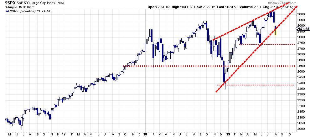
At the moment, the market is testing the rising support line from the late December 2018 low. Until now, this line has only two touch-points, which makes it a debatable trend line. However, when we close above roughly 2870-75 this Friday and stay above that level the week after, we will have formed a third touch point, which will all of a sudden make it a real trend line.
In case of a break at the end of the week, I am watching 2750 as intermediate support, as well as that aforementioned monthly trend line that comes in at 2550.
Don't catch falling knives, but when they start to bounce there may be some good steals available.
Asset Rotation
Another big-picture view is coming from the Relative Rotation Graph below, which shows the rotation for asset classes.
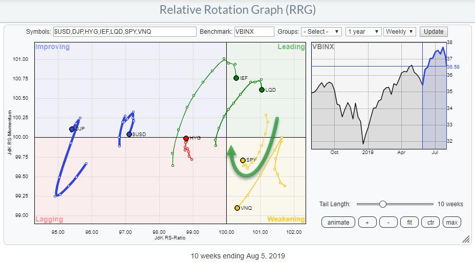
What strikes me here is that, despite the drop in the markets, the tail for SPY (equities) on the weekly time frame is still in the process of curling back up to the leading quadrant while traveling through weakening. Usually, that is a positive sign, as that security is in the process of starting a second (or third, etc.) leg of the (relative) uptrend that is already underway.
The daily version of this RRG, obviously, shows weakness for equities and strength for the fixed-income related asset classes.
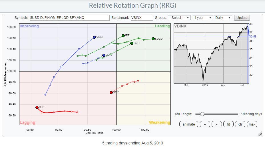
On this daily RRG, SPY has just crossed over into the lagging quadrant. The big question now is whether this weakness on the daily RRG will drag the weekly back down or (vice versa) the strong weekly will enable the daily tail for SPY to travel quickly through lagging and improving back into leading.
Given the fact that the rhythm of higher highs/lows is still intact on the monthly chart, not to mention the (still-)strong rotation on the weekly RRG, I believe that we are going through a corrective move at the moment.
As mentioned above, my line in the sand is drawn on that monthly chart, but I am very curious to learn - what is your (trend) line?
-- Julius
Let me know what you think of this usage of RRG in the comments below. If you would like to receive a notification when a new RRG Charts blog article is published, simply subscribe with your email address using the form below.
Julius de Kempenaer Senior Technical Analyst, StockCharts.com Creator, Relative Rotation Graphs Founder, RRG Research
Want to stay up to date with the latest market insights from Julius?
– Follow @RRGResearch on Twitter – Like RRG Research on Facebook – Follow RRG Research on LinkedIn – Subscribe to the RRG Charts blog on StockCharts
Feedback, comments or questions are welcome at Juliusdk@stockcharts.com. I cannot promise to respond to each and every message, but I will certainly read them and, where reasonably possible, use the feedback and comments or answer questions.
To discuss RRG with me on S.C.A.N., tag me using the handle Julius_RRG.
RRG, Relative Rotation Graphs, JdK RS-Ratio, and JdK RS-Momentum are registered trademarks of RRG Research.
Julius de Kempenaer
Senior Technical Analyst, StockCharts.com
Creator, Relative Rotation Graphs
Founder, RRG Research
Host of: Sector Spotlight
Please find my handles for social media channels under the Bio below.
Feedback, comments or questions are welcome at Juliusdk@stockcharts.com. I cannot promise to respond to each and every message, but I will certainly read them and, where reasonably possible, use the feedback and comments or answer questions.
To discuss RRG with me on S.C.A.N., tag me using the handle Julius_RRG.
RRG, Relative Rotation Graphs, JdK RS-Ratio, and JdK RS-Momentum are registered trademarks of RRG Research.