
Last week, on Tuesday 1st October I hosted the first episode of "Sector Spotlight".
Preparing for something new and then going into the first time hosting a live show was an exciting experience. The problem, at least for me, is that you do not really know how things will go because you have no experience flying solo.
Add to that that I am the type of guy that is always afraid of running out of material before running out of time and you can understand that I had way too much stuff prepared to cramp into 30 minutes.... There's always room for improvement.
One of the things that I really wanted to use and bring into the show is the interactive component and although we did it and it worked I think there is plenty room for improvement so stick with me and I'm sure we're going to make this work in a proper way going forward.
During the show I promised to answer the most important questions that came in during the show, and which I was not able to answer live, in a blog article. So here it is.
Adjusted vs Unadjusted charts?
The first question, I actually did answer during the show but as it is a very important question I will address it here again.
The default setting for charts on Stockcharts.com is "adjusted". What this means is that the data series will be adjusted for corporate events like spits, distributions and every time that a dividend is paid. In short, when such an event occurs the history for that stocks will be corrected to prevent a sudden "move" on the chart that is not caused by normal market action but because of an event like a dividend payment.
You can read more about the Stockcharts.com approach to (un)adjusted data in this support article.
This means that when you compare an adjusted chart with an unadjusted chart the historical prices on the adjusted chart come out lower than on the unadjusted version, especially when you are looking at long term charts on high dividend paying stocks or sectors.
We can have long debates on whether one is better than the other but what I can say is that for the calculation of indicators like moving averages adjusted series are preferred. Imagine using a moving average cross over system to generate buy- and sell-signals. Yesterday the stock is trading above that moving average and today it pays a dividend. The price on the exchange will then drop by the amount of the dividend and might close below your moving average and trigger a sell signal while in reality nothing happened.
When the dividends are small it may not have a big impact but when dividends are high, for example like in the real estate sector, the impact on the stock price can be quite significant as you can see on the chart of VNQ below.
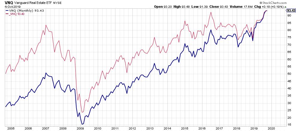
the blue line is the adjusted series while the red line is the unadjusted series. Marking trends, breakouts, and price patterns on both series will get you completely different outcomes.
For these techniques I prefer unadjusted charts because things like support and resistance are coming from people's minds and they remember certain price levels where a market (stock, index, bond, future, etc...) has peaked or bottomed in the past. They will not adjust these levels for dividends that have been paid since.
To make life easier you (and I) can use the adjusted data-series most of the time as the impact of dividend payments in most sectors of the market is almost negligible but when you are working on stocks and sectors that pay high dividends, like real estate, you have to be aware of this effect and use the chart that is most appropriate for you what you want to do.
I did not find RS-Ratio and RS-Momentum in the indicator list?
The JdK RS-Ratio and the JdK RS-Momentum lines together are referred to as the RRG-Lines. On Stockcharts.com you will find them under RRG Relative Strength.
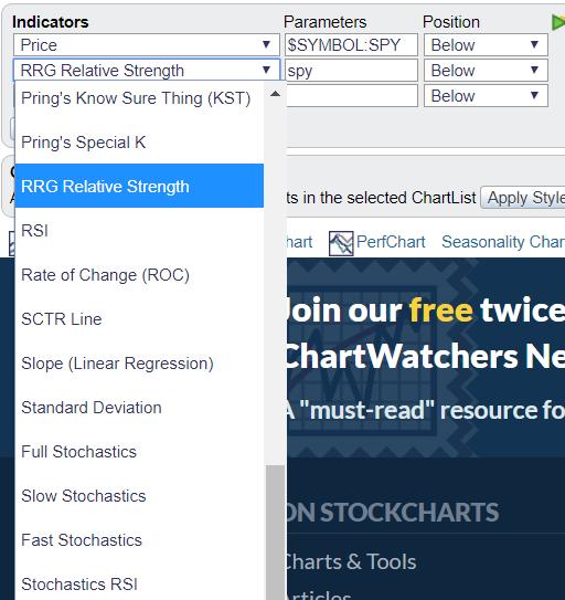
Under the parameters you can select the ticker symbol that you would like to act as the benchmark for the study.
Pls explain how to use the %change 'tail' length located on the far right column of the RRG chart?
This question relates to two related things. First the length of the tail that is controlled by the slider underneath the chart of the benchmark and second the %change that is listed in the most right column of the table printed underneath the RRG chart.
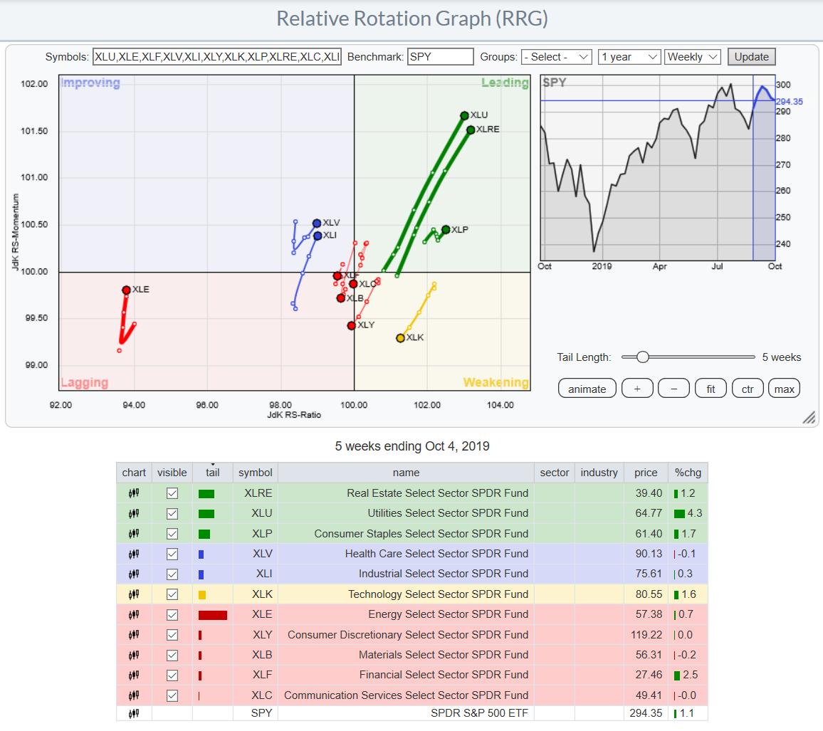
The "tail length" simply sets the length (number of periods) of the tail. It is NOT a parameter of some sort it is purely cosmetic. Changing that value will not change the position of the observations on the RRG. This setting can be used to find a balance between the number of securities on the chart and the length of the tail. Generally. If you have a lot of symbols on the RRG you may want to use a shorter tail length to keep things readable. If you only have a few items on the chart you can use longer tail lengths because you have more screen real estate that you can use before things start to become messy, or a "spaghetti chart".
The % change column calculates the %change over the period of the tail-length. So in the chart above it shows the 5 week % change. This number will change when you set the tail length to a different number. This can help you to see how the actual performance of a security has been over that period in comparison with the benchmark and the other securities and if that performance is in line with the position of the security on the RRG.
I think this covers the most important, if not all, questions from last week's Sector Spotlight. Please keep them coming during the show in the live chat-box or via mail or social media.
And of course make sure to tune in again this coming Tuesday at 10.30AM ET.
-Julius
Let me know what you think of this usage of RRG in the comments below. If you would like to receive a notification when a new RRG Charts blog article is published, simply subscribe with your email address using the form below.
Julius de Kempenaer Senior Technical Analyst, StockCharts.com Creator, Relative Rotation Graphs Founder, RRG Research
Want to stay up to date with the latest market insights from Julius?
– Follow @RRGResearch on Twitter – Like RRG Research on Facebook – Follow RRG Research on LinkedIn – Subscribe to the RRG Charts blog on StockCharts
Feedback, comments or questions are welcome at Juliusdk@stockcharts.com. I cannot promise to respond to each and every message, but I will certainly read them and, where reasonably possible, use the feedback and comments or answer questions.
To discuss RRG with me on S.C.A.N., tag me using the handle Julius_RRG.
RRG, Relative Rotation Graphs, JdK RS-Ratio, and JdK RS-Momentum are registered trademarks of RRG Research.
Julius de Kempenaer
Senior Technical Analyst, StockCharts.com
Creator, Relative Rotation Graphs
Founder, RRG Research
Host of: Sector Spotlight
Please find my handles for social media channels under the Bio below.
Feedback, comments or questions are welcome at Juliusdk@stockcharts.com. I cannot promise to respond to each and every message, but I will certainly read them and, where reasonably possible, use the feedback and comments or answer questions.
To discuss RRG with me on S.C.A.N., tag me using the handle Julius_RRG.
RRG, Relative Rotation Graphs, JdK RS-Ratio, and JdK RS-Momentum are registered trademarks of RRG Research.


