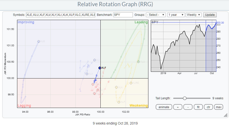
 Weekly RRG of US sectors highlighting XLF
The Relative Rotation Graph for US sectors remains characterized by steep moves on the vertical (JdK RS-Momentum) axis. This is the Rate of Change metric for the underlying relative trends. Sharp moves in an almost vertical direction, up or down, indicate a sudden change of the underlying trend.
Looking at the current rotations on this weekly RRG, it's clear we have seen a few of those recently.
Combining Weekly and Daily Rotations
As with all research and analysis tools that we have available, it is always a good idea to not only look at the interaction between the various sectors but also to take the interaction between different timeframes into account.
The RRG chart on StockCharts offers us two time-frames, daily and weekly. Ever since I started using RRGs in my own research as a sell-side analyst, I have held as a rule of thumb that trends detected on a weekly RRG will likely remain intact for a minimum of three months, often much longer. Applying that same proportion to the daily version leads to roughly a three-week or longer trend when using that timeframe.
Just as a side note, RRGs can be used on ANY timeframe, even intraday ones (like hourly, ten-minute, etc.). The behavior, the appearance, etc. will all be similar to what you see on daily or weekly RRGs.
On the RRG above, I have highlighted the Financial sector as it is inside the improving quadrant, very close to the benchmark (center of the chart) and began accelerating after spending a few weeks in the same area. In particular, the acceleration at the strong RRG-heading makes it a sector to investigate a bit further.
To do that, I want to see how XLF is rotating on the daily RRG.
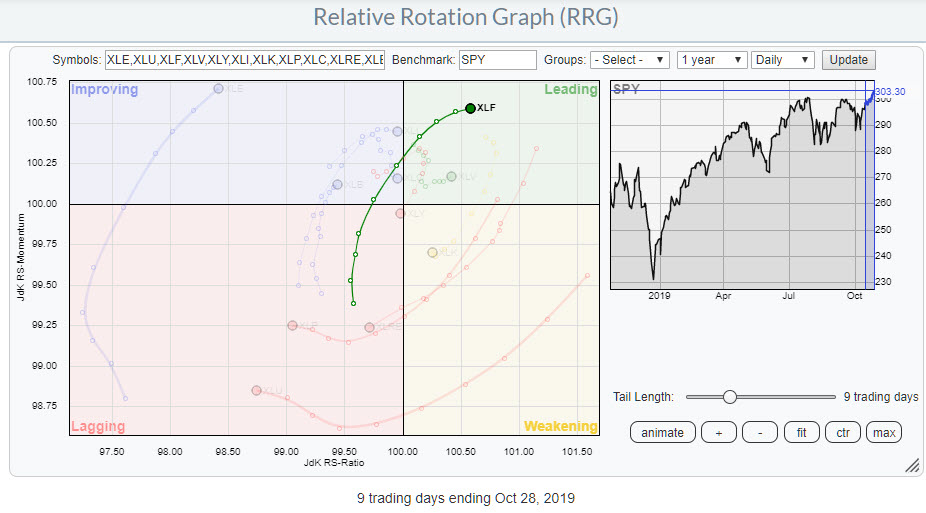 Daily RRG of US sectors highlighting XLF rotation
Over the last nine trading days, XLF has moved out of the lagging quadrant and rotated into the leading quadrant, with only two days inside improving.
What we have here is a sector that is inside the improving quadrant on the weekly RRG and heading towards leading, while the daily tail has already entered that leading quadrant and is one of the stronger sectors in that timeframe.
The only caveat is that yesterday's price action has led to the tail on the daily RRG flattening a bit. This does not have to be a massive problem, as the sector is still traveling higher on the JdK RS-Ratio scale. Assuming a normal, clockwise rotation, I expect the daily rotation to pull the weekly tail into the leading quadrant soon and lead to a further outperformance for the Financial sector in coming weeks.
The Catalyst
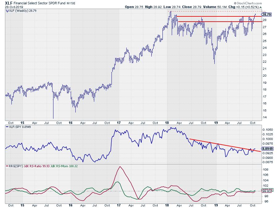 XLF weekly chart with relative strength and RRG-Lines
The price chart for XLF, in combination with Relative Strength and the RRG-Lines, seems supportive of this assumption.
First and foremost, XLF is breaking above an important overhead resistance level. Be careful, though, as it is still early in the week and things could change. For the time being, however, this is a positive sign. But if this break holds up and price follows through as expected, this will very likely be the catalyst for a further outperformance against the S&P 500.
Financial Sector
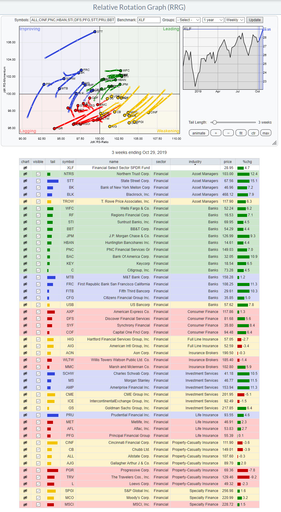 RRG of Financial sector members vs. XLF
The RRG above shows the rotation of the members of the Financial sector against XLF as the benchmark. I have attached the table to the image to show you a way to break down this sector in smaller parts and use that for analysis purposes.
By default, the table on RRG is sorted based on the "Tail" column or therefore by quadrant. However, you can sort on any column, which gives us other ways to slice and dice this universe and look at it from different angles.
Because the Financial sector has been doing so well recently, I wanted to check if there is a particular group that is driving this move at the moment. In order to do that, I sorted the table on the "Industry" column, which groups the table per industry. What you see then is very informative, IMHO.
The "Banks" industry is predominantly green, i.e. inside the leading quadrant. There are a few that are inside improving, while only one is inside weakening. Without looking at any individual charts, I can already say that this group is now the driving force behind the strength of the sector. Any holdings in the Financial sector are better shifted to banks, rather than, for example, insurance-related industries, which are all found inside the lagging or weakening quadrants.
Picking Banks
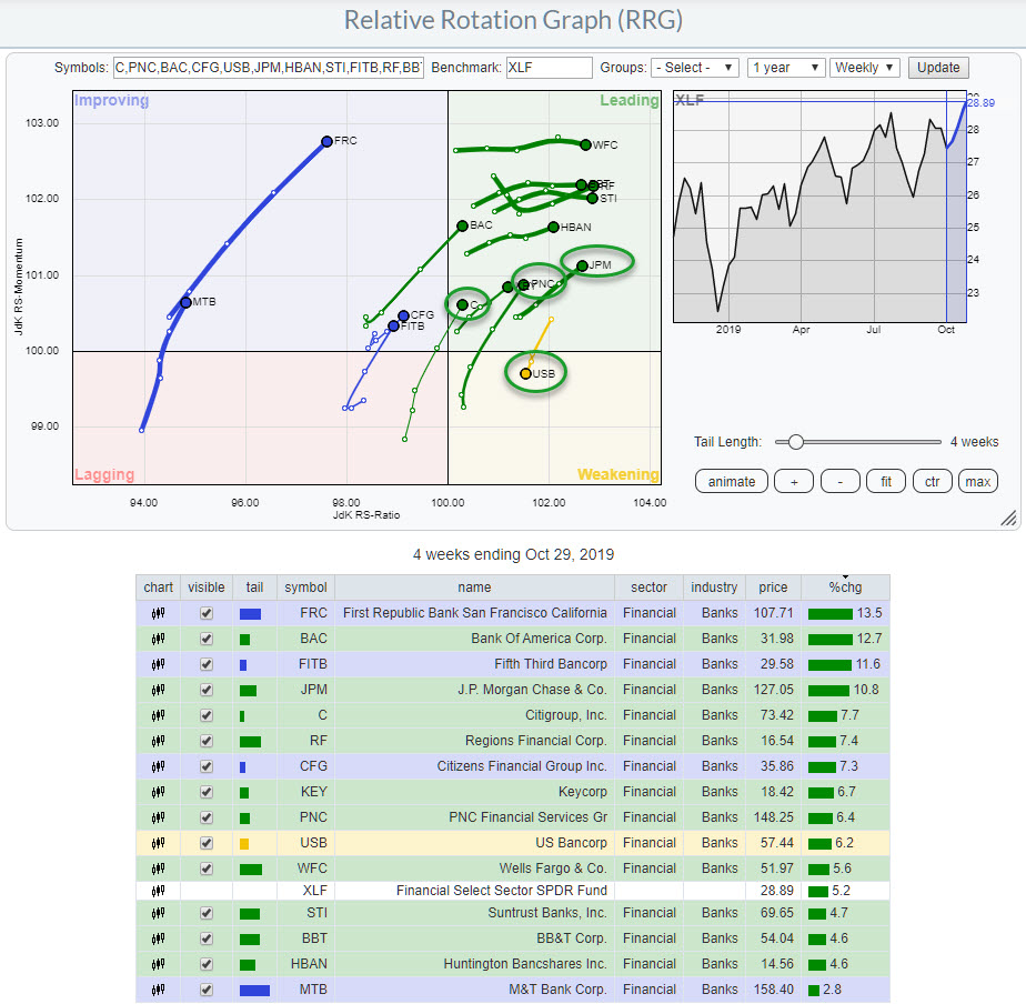 RRG of Banking stocks vs. XLF
The RRG above has the banking stocks isolated from the other stocks in the financial sector, showing the general tendency for this industry to move at a strong RRG-heading, meaning in a "northeast" direction.
I have discussed this sub-set of financial stocks in today's Sector Spotlight show, which you can review here. Two stocks that I want to highlight in this article are JPM and USB.
JPM
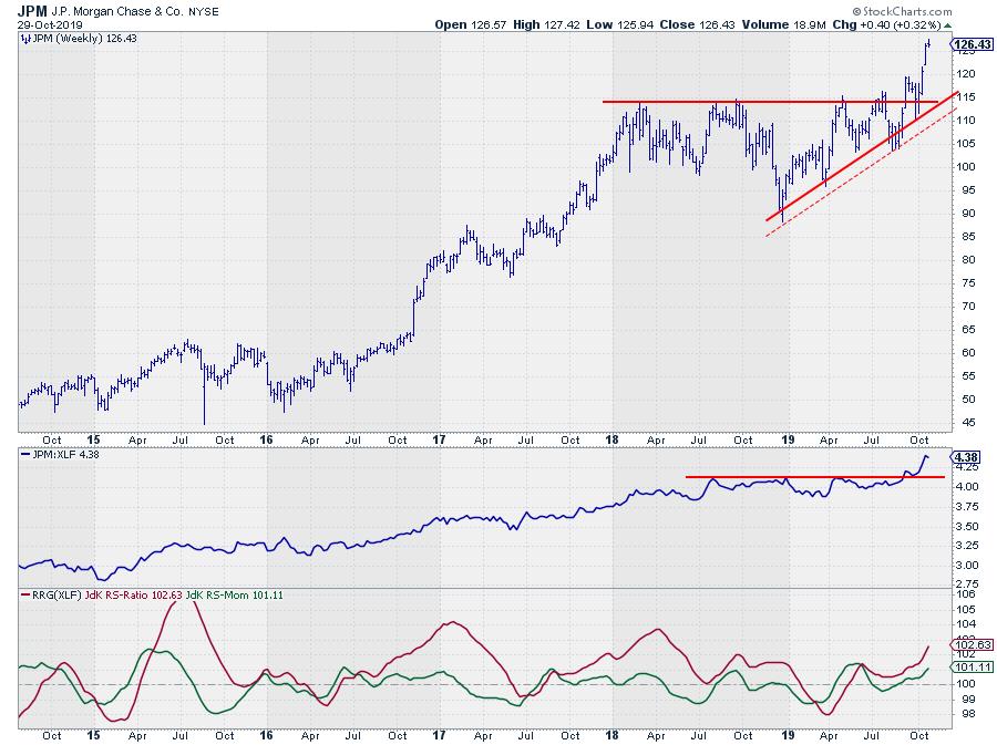 JPM weekly chart with Relative Strength and RRG-Lines
On the weekly RRG, JPM is well inside the leading quadrant and is moving at an RRG-Heading around 40 degrees, meaning that it is gaining on both axes. It's not gonna get much better than that.
With JPM being the heavyweight bank in the Financial sector, this is the stock that is driving banks and, therefore, the financial sector higher at the moment. From a risk management perspective, it is probably best not to chase this one higher but wait for pull-backs.
USB
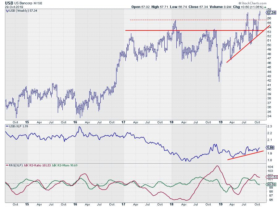 USB weekly chart with Relative Strength and RRG-Lines
USB is the only stock on that RRG with banking stocks that is not traveling at a positive RRG-Heading and it is the only one inside the weakening quadrant.
Is that a negative? Not necessarily. If you switch to the daily RRG of those banking stocks, you will find USB rotating into the leading quadrant at a strong heading at the moment. As it is still well above the 100-level on the RS-Ratio scale, this means that there is a good possibility that USB will start to curl up before hitting the lagging quadrant and picking up the relative trend again.
With price now breaking above a broad overhead resistance zone, all seems in place for a further rally both in price and in relative.
-Julius
Want to stay up to date with the latest market insights from Julius?
– Follow @RRGResearch on Twitter – Like RRG Research on Facebook – Follow RRG Research on LinkedIn – Subscribe to the RRG Charts blog on StockCharts
Feedback, comments or questions are welcome at Juliusdk@stockcharts.com. I cannot promise to respond to each and every message, but I will certainly read them and, where reasonably possible, use the feedback and comments or answer questions.
To discuss RRG with me on S.C.A.N., tag me using the handle Julius_RRG.
RRG, Relative Rotation Graphs, JdK RS-Ratio, and JdK RS-Momentum are registered trademarks of RRG Research.
Julius de Kempenaer
Senior Technical Analyst, StockCharts.com
Creator, Relative Rotation Graphs
Founder, RRG Research
Host of: Sector Spotlight
Please find my handles for social media channels under the Bio below.
Feedback, comments or questions are welcome at Juliusdk@stockcharts.com. I cannot promise to respond to each and every message, but I will certainly read them and, where reasonably possible, use the feedback and comments or answer questions.
To discuss RRG with me on S.C.A.N., tag me using the handle Julius_RRG.
RRG, Relative Rotation Graphs, JdK RS-Ratio, and JdK RS-Momentum are registered trademarks of RRG Research.


