
|
This step-by-step tutorial will show show how to change from relative performance to absolute performance using PerfCharts. In addition, users will learn how to show or hide a security from the PerfChart. This example starts with the default settings for the Sector SPDR PerfChart.
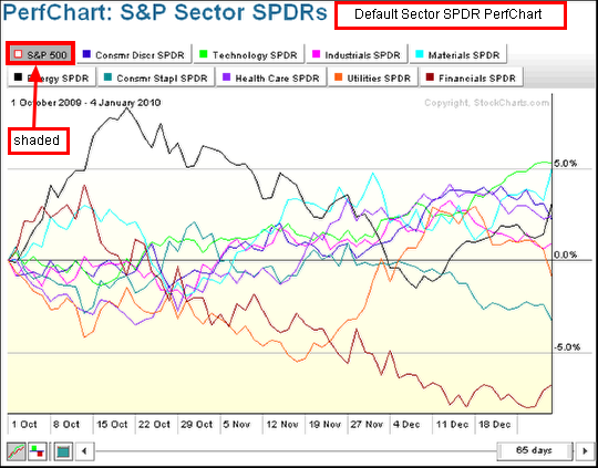
A link for the S&P Sector PerfChart can be found on the FREE CHARTS page. Alternatively, one can create a Perfchart with the following symbols: $SPX,XLY,XLK,XLI, XLB,XLE,XLP,XLV,XLU,XLF. The default Sector PerfChart shows "relative" performance for the nine sector SPDRs. This means performance is measured relative to the S&P 500 ($SPX). Relative performance measure the over or under performance relative to the benchmark. If XLY is up 10% and $SPX is up 5%, relative performance for XLY would be +5% (10% - 5% = 5%). If XLF is down 1% and the $SPX is up 5%, then relative performance for XLF would be -6% (-1% - 5% = -6%). On the PerfChart above, notice that the S&P 500 tab is shaded. This means it is the benchmark for measuring relative performance.

The next PerfChart shows the eight Sector SPDRs and the S&P 500 relative to the Technology SPDR. Click the Technology SPDR tab to select it as the benchmark (shaded). These relative performance lines moved lower from early October until late December, indicating that all eight sectors and the S&P 500 underperformed the Technology Sector.

All tabs must be white to show absolute performance. Click on the shaded tab to show absolute performance for the nine sector SPDRs. Because the Technology SPDR tab was shaded in the last example, it must be clicked to turn it white and show absolute performance. Notice that absolute performance is largely positive from October to December.

The small squares next to each security's name show weather the security appears on the chart or not. A filled square means the security's performance is shown on the PerfChart. A hollow square indicates that that performance is not shown. Any security can be shown or hidden.