I've discussed price action (duh!), the relative performance of aggressive sectors and defensive sectors vs. the benchmark S&P 500 and the relationship between consumer discretionary (cyclical) stocks and its consumer staples counterparts in prior articles and how they impact the future behavior of stock prices. This brings me to a fourth area of the stock market to keep a close eye on......
4. EVALUATE THE HEALTH OF FINANCIALS, PARTICULARLY BANKS
Who cares what the banks are doing if I'm trading high tech stocks, biotechs and consumer discretionary stocks that are seeing rapid rises in earnings growth? I do, that's who. I spent a couple decades in public accounting and was responsible for the audits of our banking clients. I can tell you from experience that overall, this is a VERY conservative bunch. Despite what you read about risk taking and trading at large commercial banks, the overwhelming majority of bankers have little patience when it comes to loan losses, specifically, and losing money in general. When the first hint of trouble looms on the economic horizon and customers begin having difficulty making their expected loan repayments, regulators review the practices of banks including an analysis of bank procedures with respect to loan losses. Banks don't begin taking hits to their P&L when a loan goes belly up. They take the hit as the probability of repayment diminishes. That can be a LONG time before a property is actually foreclosed upon or other assets of a company are seized. They must provide RESERVES for loan losses well ahead of the actual loss itself. Therefore, increases to their loan loss reserve generally occurs BEFORE the actual losses begin piling up on Main Street. As bank profits begin to drop, bank management tends to turn very conservative, opting for lower yielding assets like U.S. and Federal Home Loan Bank securites that provide much more safety - but much lower profits. The stock market always looks ahead and therefore begins to price in this weakness before you see it show up in quarterly earnings reports. When banks become tighter and tighter with credit, it begins to show in the earnings of other sectors (like those mentioned above) and industry groups as their access to credit slowly dries up. Access to credit is very important to spur economic growth. I think you can probably see where this is going.
Visually, let's take a look at how we can use this information to our advantage with all the tools that we have to offer at StockCharts.com. I'll provide you a chart that compares bank performance to the benchmark S&P 500. Let's simply take a long-term look at this relationship:
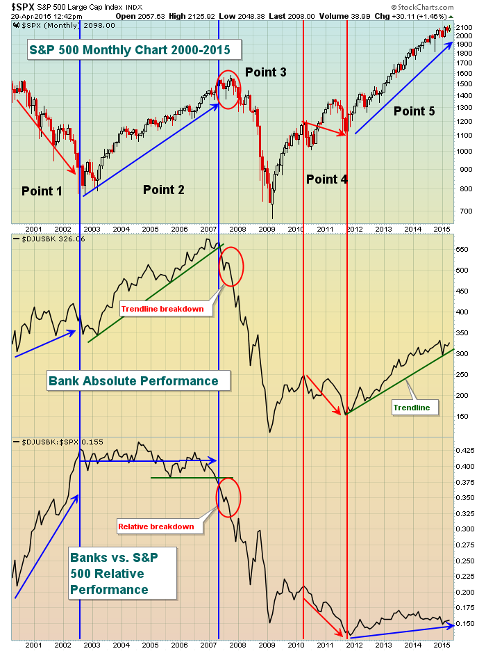
I've broken the above chart into segments and identified several talking "points". Here they are:
Point 1 - My first question would be how can the S&P 500 continue to sell off when banks are performing strongly on both an absolute and relative basis? Well, first consider that every technical signal will not prove to be correct. This one was false. In hindsight, we know that the selling during the 2000-2002 bear market was mostly triggered by technology companies that were EXTREMELY overvalued by nearly every historical measure. Companies that had never posted a profit in their history had market caps that dwarfed companies on the Dow Jones. It didn't seem to matter then, but we know better now. You may not remember this, but the NASDAQ climbed 39.92%, 22.71%, 21.64%, 39.63% and 85.59% per year from 1995 through 1999, respectively. That led to a frenzied parabolic rise and tech bubble that was popped during the 2000-2002 bear market. The selling simply didn't affect banks in an overly bearish way and they continued to perform well. But the rest of the last 15 years I think we can gain knowledge from.
Point 2 - Throughout this 2002-2007 bull market, banks went along for the ride. There was a nice uptrend in play on the absolute chart while the relative chart (vs. the S&P 500) was simply flat. Flat isn't a bad thing as it's telling us that banks kept pace with the benchmark index. That's all I really ever look for from this group. They aren't the high octane performers like technology and consumer discretionary. Their products aren't flashy. We just want the group to be healthy technically so the odds are greater that they'll make the credit available that's necessary to keep the economy humming along and to drive the S&P 500 higher.
Point 3 - Okay, we've already seen warning signs develop in 2007 in my previous articles. Let's add another one here with respect to bank performance. During 2007, the S&P 500 continued pushing higher, but banks were left behind. Notice the red circles? They clearly show the S&P 500 moving to fresh highs (all-time highs actually) while trendline support broke on the banks absolute chart. Worse yet, the relative performance of banks fell through the floor and failed to hold relative support. That was a rather obvious warning sign and we know what happened to our financial system after that.
Point 4 - Since the current bull market began, we've had one pronounced bearish period of performance in banks, a span of roughly 18 months in 2010 and 2011. We shoudn't be at all surprised that the S&P 500 fell during this 18 month period as well.
Point 5 - In late 2011, banks broke out into another very long uptrend and that has supported the current bull market for sure. Over the past 18 months or so, the relative strength in banks has deteriorated somewhat although I wouldn't say that we're free falling on a relative basis. Furthermore, the absolute performance of banks has been strong and the uptrend remains perfectly in place. A breakdown in this uptrend, combined with further deterioration in the relative performance, would represent a warning sign to be aware of. For now, however, I believe the performance of banks continues to support the six year bull market.
In my next article, I'll discuss the impact that transportation and utility stocks (and their relative performance to one another) have on the S&P 500 and what signs to look for in that relationship. Remember - to receive my articles directly to your e-mail, simply subscribe to my blog. To the right of this article and under "Subscribe to this Blog", click on "Email updates", enter your e-mail address and click SUBSCRIBE. VOILA! Thanks for your support and, as always, leave me a comment about today's article if you'd like.
Happy trading!
Tom
