Today marks two months for me here at StockCharts.com and I just want to thank everyone for your kind words and especially for all of the technical feedback. Your comments are very important to me so please keep them coming. Writing and teaching about the stock market is what I love most and there's no better platform than here at StockCharts with so many talented technicians on board. Clearly, I'm blessed to be part of this community. Thank you.
Note that the topics covered so far in this series are rarely discussed in the media. To be honest, I don't think they care about educating the investing public. It's all about the ratings and the money. That's fine with me because it provides all of us here at SC an opportunity to do just that - educate.
Now let's turn our attention to the next area of the stock market to watch closely.....
5. WHICH GROUP DO TRADERS COVET - TRANSPORTATION OR UTILITY STOCKS?
Before we delve into the charts to see what they're telling us, let's think about this from a common sense perspective. We know the stock market looks ahead and tries to price in future economic growth and rising (hopefully) corporate earnings before they occur, right? Why would transportation stocks rise? Think airlines, think railroads. These groups will perform best if our economy is humming along and expected to continue humming along. Railroads ship goods. If the stock market believes our domestic economy is heading into the tank, what impact might that have on railroads? Well, I can't think of why anyone would want to own them. Airlines would likely perform poorly for many of the same reasons. Also, travel is one of the line items that get cut in company budgets when revenues start to drop. So doesn't it just make good common sense that transportation stocks would likely begin to fall JUST BEFORE a major economic downturn?
What about utilities? Are we going to cut our power in a meaningful way if the economy starts to slow? I'm still going to heat my house. To me, this transportation/utility relationship is similar to the relationship between consumer stocks. One can be cut back much easier than the other out of necessity. Also, keep in mind that utilities tend to be more income-oriented rather than growth-oriented. Their dividend yields can be quite appealing to those seeking income in the stock market. If utilities begin to fall, their yields rise making them even more attractive. Utilities represent safety and stable income to many while transportation is more closely tied to economic growth. Therefore, studying the relationship between these two can give us a sense as to what traders believe is coming our way in terms of economic conditions.
So once again, let's see visually how this relationship can help us. Below I'm providing a monthly chart of the S&P 500 over the past 15 years with absolute performance of both transportation and utility stocks just below. Finally, at the bottom of the chart, you'll see the relative performance of transports vs. utilities. It is a BULLISH sign to see this relative ratio RISING while a falling ratio would suggest traders are becoming much more conservative, a BEARISH development for equities as a whole. Check it out:
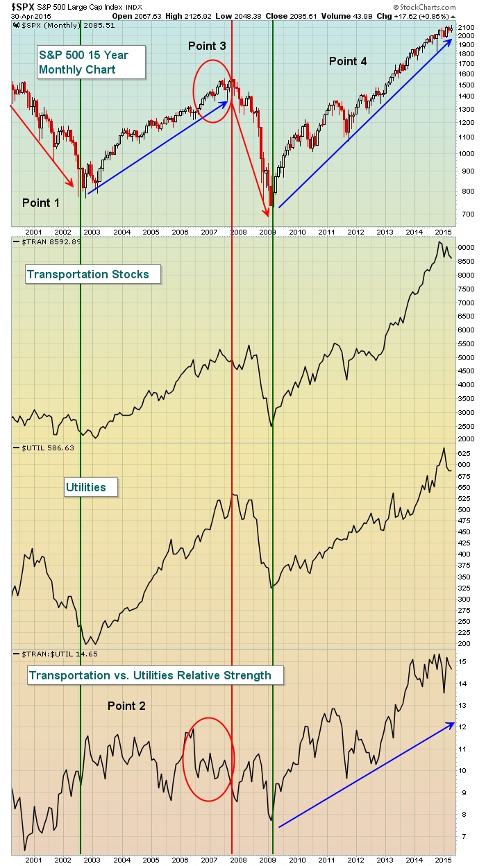
This chart isn't perfect and we can certainly pick apart a couple false signals, but keep in mind that this is just one piece of the puzzle to a VERY large puzzle. We're looking for the "preponderance of evidence" to convict, remember? Now let's take a look at what this chart is suggesting, point by point.
Point 1 - During the 2000 to 2002 bear market, the relative strength of transportation stocks was a false bullish signal. But as we know, that downturn was primarily due to a technology bubble. If you recall, banks didn't perform poorly on a relative basis during this bear market either.
Point 2 - While we're not seeing a lot of relative strength, it is important to note that technically there was an uptrend in play on both groups of stocks throughout this bull market. In other words, while the relative performance was mostly flat, there were no technical breakdowns in terms of price action. The relative performance only provides us potential warning signs. In order to actually begin a bear market, we need to see price breakdowns to confirm. Those didn't appear until 2008.
Point 3 - Check out those red circles. I've already pointed out in previous articles all the warning signs that began to mount in 2006 and 2007. This is simply another one to add to the pile. As the S&P 500 made its final push to all-time high territory in October 2007, money had begun to shift on a relative basis towards utilities. Traders were becoming more defensive based on this analysis alone. You might point back to the relative weakness in 2005 and wonder why that didn't signal the top. There are two things to keep in mind. First, we didn't have all the other warning signs in play to suggest a bear market was at hand. Second, look at the absolute performance of transportation stocks after this 2005 period of relative weakness. Do you see any price breakdowns to confirm this potential warning sign? Nope. So even if you turned a bit more cautious, there was never confirmation to change strategies and become a bear.
Point 4 - Despite a few blips, most notably the one in 2011, the relative strength of transportation stocks has been trending higher, supporting this ongoing bull market. The rise in transportation stocks the past two years has been nearly parabolic so I wouldn't be shocked to see a temporary rotation out of this group. But there's nothing here to suggest the bull market is doomed.
Because of the Federal Reserve's mandate to keep interest rates low for an extended period of time, the high yielding utility group has had much wider appeal to those investors/traders seeking income over capital appreciation. Still, even that hasn't skewed the relative strength of transportation stocks. This unprecedented dovish behavior by the Fed has had a significant impact on the relationship between treasury and equity prices, however. This area of relative performance (treasuries vs. equities) has always provided solid warning signs in the past but the Fed's cheap money policies (ie, quantitative easing) has thrown a monkey wrench into this "beneath the surface" signal. I'll focus on this relationship in my next article in this series. Stay tuned.
Later today, I'll be hosting my weekly Friday webinar, "Trading Places LIVE" and I'm having a special guest on the show - my great friend and former partner at Invested Central, John Hopkins. Join me and John today as we discuss earnings season and talk about several companies worth watching in the days and weeks ahead. You can register for this event by CLICKING HERE. Hope to see you there!
Happy trading!
Tom


