During my webinar yesterday, I indicated that I'd take a look at the Russell 2000 ($RUT) and its lagging performance, but then I was sidetracked by other charts and questions. So I'll take an opportunity here in my blog to provide you those Russell 2000 comments. By the way, I received wonderful feedback from the new Wednesday show and the extended 2 hour format. Thank you! Always keep in mind that if the webinar is too long for you midday, pick out the segments of the show that you like and simply attend that part. As always, you can listen to the recorded transcript at your leisure. The Wednesday, May 13, 2015 webinar is recorded HERE. I'll be striving to improve the show in the future so your comments and suggestions are always welcome.
One relative chart that I always keep my eye on is the Russell 2000 vs. the S&P 500. At StockCharts.com, you can display this on your chart by typing "$RUT:$SPX". For relative charts, I normally change my Chart Type from "candlesticks" to "solid line". Take a look at the recent deterioration in the relative performance of small cap stocks:
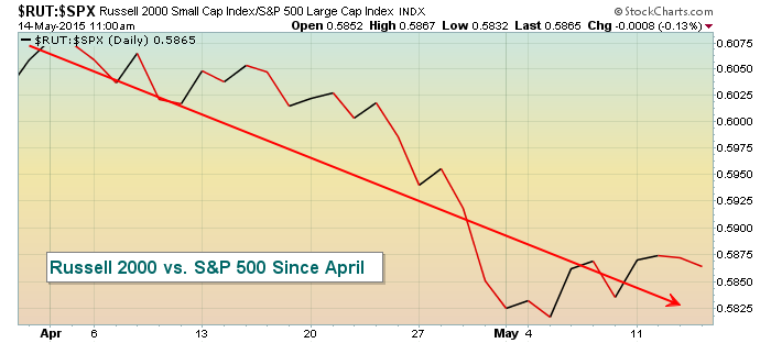
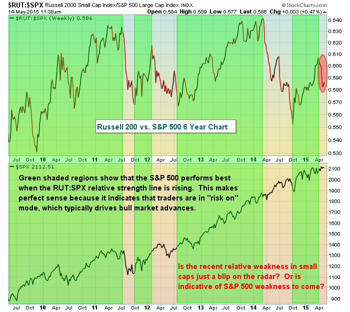
This could simply be a short-term rotation away from small caps before the next leg higher so don't be too quick to make inappropriate conclusions. Most of the intermarket relationships that I watch suggest this bull market has not ended. Therefore, I'd err on the side of remaining long. That being said, this chart is still worth watching. If we stretch this relative chart out to a weekly chart spanning the entire bull market, it's a bit easier to see what this relative weakness could mean to future S&P 500 performance. Check it out:
Both of the above charts are showing the relative performance of small caps. But we have absolute performance issues as well, as can be seen by the daily chart. First, let's look at the 1 hour intraday chart. Take a look:
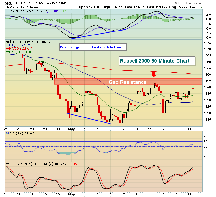
Clearly, the hourly intraday chart suggests the area from 1242-1247 could prove difficult. If the Russell 200 can break above that level, and begin to outperform once again on a relative basis, the action would turn much more bullish. This area of resistance isn't just evident on the intraday chart, however. Look at the resistance on the daily chart:
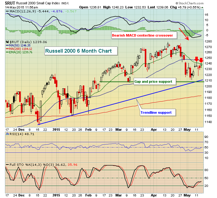
The daily chart also offers up problematic areas of resistance. Given the bearish MACD centerline crossover, those 20 day EMA resistance tests are important and so far they're failing. I'll feel much better about the stock market in the near-term if we can get the Russell 2000 to clear the resistance discussed here in this article and the relative performance begin to turn up again.
Happy trading!
Tom