Welcome to August. Don't look now, but September is right around the corner. Given the recent short-term price support breakdowns and explosion in the Volatility Index ($VIX), we have to be very careful as we make our way through the next month as historically the market has shown tendencies to be extremely volatile during the months of July, August and September. One way to look at this is to simply use the Seasonality Tool at StockCharts.com and plot the performance of the VIX. Check this out:
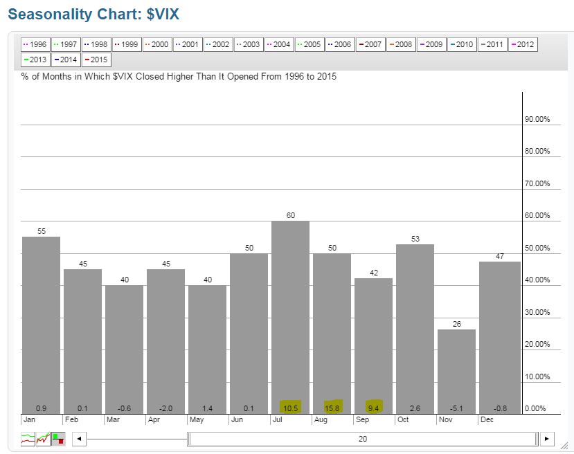
The chart above tells us that the VIX doesn't always move higher in July, August and September and the reason is quite simple. Typically, volatility rises when the S&P 500 declines and stock prices don't decline every year during the summer months. BUT, when the market does decline it tends to be much weaker during these summer months. The numbers across the top of the bars provide us with the percentage of times that the VIX has risen during that month. For instance, in July the VIX has risen 60% of the time over the past 20 years. Check out the yellow highlighted numbers, however. Those numbers at the bottom represent the AVERAGE gain during each calendar month over the past 20 years. August has the highest average increase (15.8%), followed by July (10.5%), then September (9.4%).
Have you looked at the VIX so far this month? Take a look:
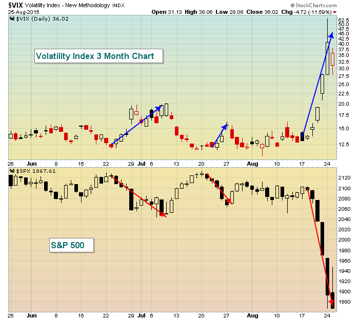
The VIX represents expected volatility priced based on near-term S&P options. In other words, as the market anticipates increased levels of volatility, option premiums rise and options become much more expensive. Traders pay the higher premiums (risk) in an effort to gain higher profits (reward) as prices swing wildly. From the chart above, you can see that the movement in the VIX and S&P 500 moves opposite one another. Let's take a look back at October 2014 to see further illustration:
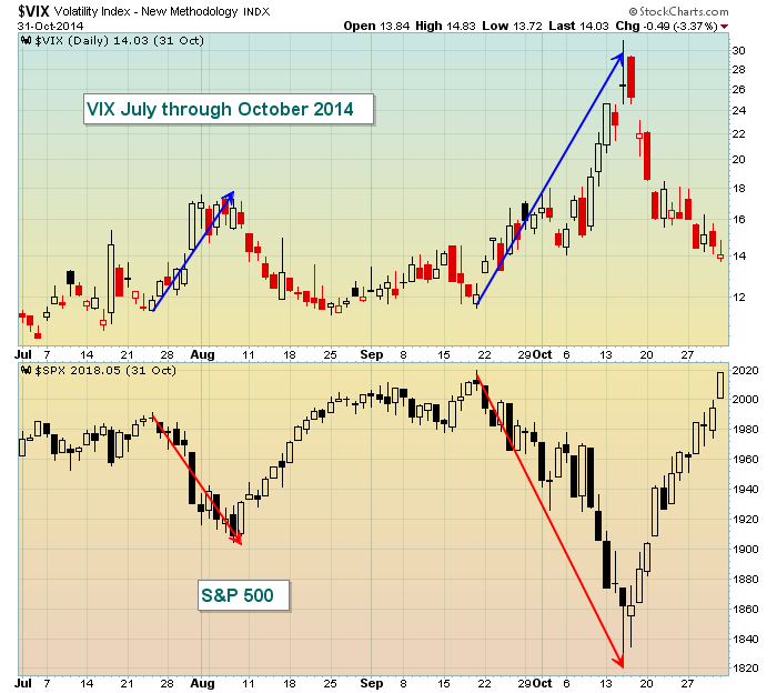
Once again, it looks like a mirror image. Volatility soars when stock prices decline. Note that I do not include any of my typical overlays or indicators on the VIX chart. You have to keep in mind that the volatility index is simply a snapshot of expected volatility at a given point in time based on how options are priced. The stock market goes higher more often than it goes lower. So the VIX generally drifts lower much of the time with spikes during periods of selling on the S&P 500. Late 1999 was an exception as the move higher in stock prices was a violent one, resulting in a spike in the VIX. But that is not typical.
The VIX is a sentiment indicator can also provide a warning sign. Because the VIX generally falls with higher stock prices, we can view a higher S&P 500 level that's accompanied by rising lows on the VIX as a potential red flag, especially if the market is flashing other warning signs to corroborate. Prior to the September/October selloff of 2014, the VIX flashed a potential warning sign. Check it out:
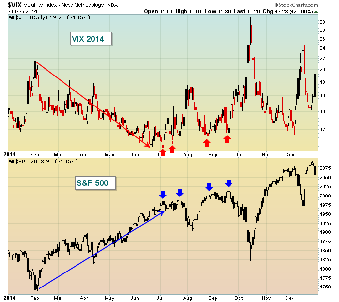
Notice the VIX rising (red arrows) with each higher S&P 500 reading (blue arrows). That's unusual and makes little technical sense. While it certainly didn't guarantee the type of selling that we saw, it should at least raise eyebrows.
So given the huge selloff in equities and major spike in the VIX, where does this leave us? Well, the short-term trading environment is much, much different. Risk is elevated whether you short or trade long because of the major price swings intraday as well as the crazy opening gaps. Many traders love this extreme volatility. I generally sit it out. The risk is too much. I'd like to see the market settle down. I'm watching to see how the market responds when key moving averages are tested. Now that the daily MACD has fallen below centerline support and price support was lost with expanding volume, we must respect the declining moving averages as major resistance until the stock market proves to us otherwise.
I've annotated the NASDAQ chart to highlight a few key levels to watch in the days and weeks ahead:
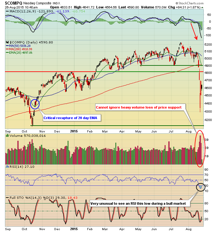
Any time I see price support lost on heavy volume, I cringe. There are definite signs that we could see additional selling ahead. How prices react on bounces will help determine the likelihood of further price erosion. Take a look back at the October 2014 selloff. Prices quickly recovered back above the declining 20 day EMA, which is very important technically. Most downtrends fail at 20 period resistance unless we see positive divergences emerge prior to the 20 period test. Prior resistance on the NASDAQ was close to 4800 and the declining 20 day EMA is now just below 4900. So I'd view potential upside at this point to 4800-4900 while recognizing that October low near 4150 as MAJOR intermediate-term price support. That's a wide trading range, but with volatility exploding into the 30s, 40s and 50s, literally anything in this range is possible.
I'll be reviewing all the major index charts, along with several sector and industry group charts as well during my Trading Places LIVE webinar at noon EST today. CLICK HERE to register. I hope to see you there!
Happy trading!
Tom


