That's a really good question and one that I'm researching. My view has been (and remains) that the stock market is in a multi-decade secular bull market, one that will carry us into the 2030s. There will be cyclical bear markets along the way, similar to what we saw in Q4 2018 with the trade war. I'm not expecting anything like the pandemic-induced, 35%-in-a-month variety like we saw in March, but the market won't be straight up. It rarely is. There's enough uncertainty in the air right now to squash that notion. Look no further than the Volatility Index ($VIX), which remains at an elevated 27.63 at Friday's close.
I recently hosted EarningsBeats.com's Q4 Market Outlook webinar and one area that remains a mystery to me is whether a Q4 rally will be led by the same groups leading since March or will we see those hard-hit industries come to life as we contemplate a surge in business for those companies post-COVID. That's a very difficult question to answer, because I'm not a public health expert. I have absolutely no idea what we'll be dealing with this fall/winter. Will COVID-19 cases surge again? Will the virus mutate? If so, will we have to consider another shutdown? That's being discussed in other parts of the world. Throw in the presidential election in November and the current high-profile COVID case in the White House. How do we invest with any sense of confidence given all of these uncertainties?
How? Follow the charts, that's how.
I may not be a public health expert, but Wall Street knows plenty of those. Always remember that everything, and I mean everything, is baked into price. When the worst of the virus-related restrictions are behind us, we'll see it in the charts. Just follow that COVID-19 index. You know, the one that shows relative strength accelerating vs. the S&P 500. There's just one problem with doing that. There isn't such an index.
Until now.
I've created a User-Defined Index, which is an equal-weighted portfolio of the hardest-hit industry groups during the pandemic. Once created, this index can be charted using a SharpChart just like any other index. It can also be plotted on a price-relative basis, comparing these beaten-down areas to the benchmark S&P 500.
At EarningsBeats.com, we use the User-Defined Index feature at StockCharts for a number of reasons, but predominantly for tracking our four portfolios - Model, Aggressive, Income, and Strong AD (accumulation/distribution). As an example, here's our Model Portfolio's SharpChart, which displays our performance since the Model's inception on November 19, 2018:
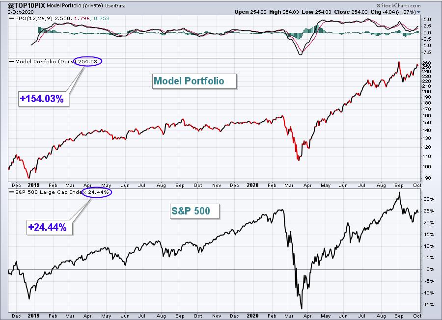
It's a visual that tracks our utter dominance of the S&P 500 since inception. But once you create a User-Defined Index, StockCharts recognizes the symbol assigned, in this case "@Top10Pix", just as it would any ticker symbol. So I can take this one step further and create a price-relative chart that will simply show the Model Portfolio's performance, relative to the S&P 500. This is important for us, because our goal is to outperform that benchmark over time. Here's the chart to illustrate this point:
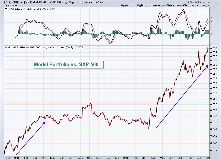
Note the crazy outperformance that began on our Model Portfolio in March. It wasn't coincidence. On March 13th, I wrote that we remained in a secular bull market and I'm sure most everyone thought I was nuts. But I saw that a certain group of stocks were being accumulated during the pandemic. It was apparent that Wall Street had already developed their list of favorites for the duration of the pandemic and we simply followed the smart money. The accumulation/distribution line has been the most important technical indicator of 2020. It was so important, in fact, that we launched our Strong AD Portfolio at the time of our next portfolio "draft" on May 19th, 2020. Check out the strong performance of our "@StrongAD" portfolio vs. the S&P 500:
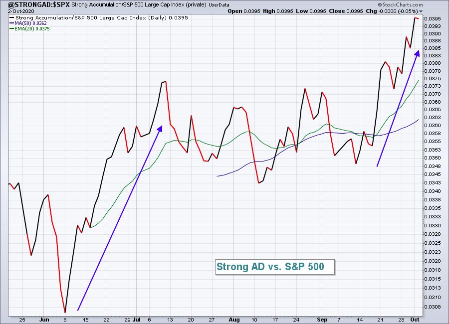
As of Friday's close, the Strong AD Portfolio is up 32.35% since May 19th. The S&P 500, by contrast, is up 14.56%.
The User-Defined Index feature allows us to track our work, our portfolios. That brings me back to the original discussion here. How will we know when these pandemic stocks begin to shine? When we see it on the chart, that's how. But before we can see it on the chart, we have to create a User-Defined Index to track the data.
At 11:00am ET today, I'm hosting a "Creating a User-Defined Index" webinar and I'll be demonstrating how we created our Model Portfolio and Strong AD indexes. If you're interested in the stocks that we've included in both of these portfolios, you'll receive that as part of this completely-free webinar. I'll also discuss the new pandemic-related portfolio that I'm creating, designed to provide us the clues necessary that a major move higher is unfolding in those hardest-hit areas.
If you'd like to join me for this webinar, here's the room link:
https://us02web.zoom.us/j/83192450948
The room will open at 10:30am ET. If you miss the live event, make sure you sign up for our EB Digest newsletter as we'll send out a recording to everyone in our EB.com community. The newsletter is free, there's no credit card required, and you can unsubscribe at any time. CLICK HERE for the sign up form. We will automatically sign up everyone that attends today's live event, so there'll be no need to sign up if you join me for the webinar.
Happy trading!
Tom


