It very well could be. In my Daily Market Report (DMR) to EarningsBeats.com members on Thursday, I discussed this very possibility. I do not believe we're at any MAJOR top, but our major indices have had a significant "pre-earnings" run higher since late March and could be poised for a period of rest. Here are the five biggest warning signs I'm seeing right now.
Overbought Conditions
Overbought can remain overbought for lengthy periods, so this by itself would not make me particularly nervous. But it's definitely worth noting that the S&P 500's weekly RSI closed this week above 71. Here's the current 5-year weekly chart of the $SPX:
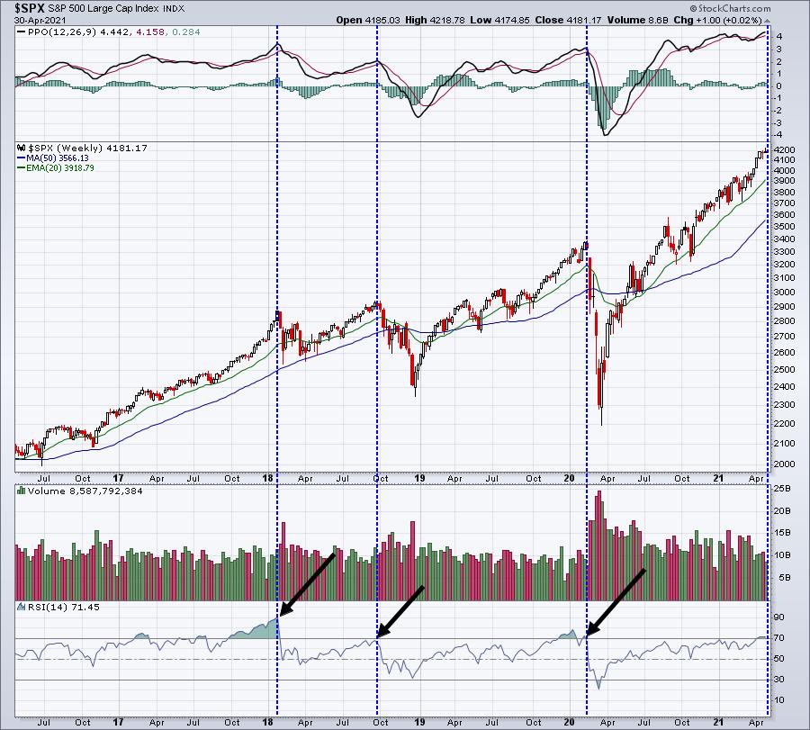
You can see that we've been overbought like this (or more) several times over the past 5 years. All of our significant tops occurred with weekly RSI readings at or above 70 (blue-dotted vertical lines). But, we've reached RSI 70 plenty of times in the past with little or no selling as a result. So while we're clearly overbought and "could" see a top, there's definitely no guarantee.
NASDAQ Failure at Resistance
After the bell on Wednesday, Apple (AAPL) and Facebook (FB) both reported blowout quarterly results, which led to a very strong NASDAQ open on Thursday. Sellers, however, haven't let up since that open. Here are two charts of the NASDAQ, the first a daily chart showing the price resistance and then an intraday chart showing the selling since Thursday's open:
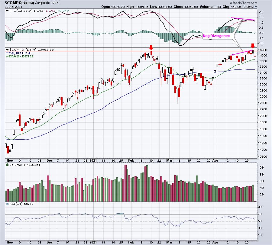
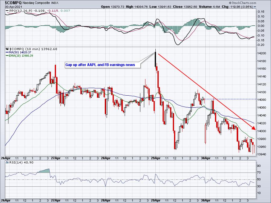
Eventually, a move back through 14,204.51 (Thursday's open) will be very bullish, but have we topped short-term? I'd say yes until proven wrong, which would include that breakout.
Rising Volatility
I wrote about the significance of rising stock prices accompanied by rising volatility ($VIX) back on September 3rd, just as the stock market topped. We're not quite where we were then, but we're getting close. The S&P 500 and VIX usually move opposite one another, but when that changes, we need to be aware of it. Check this out:
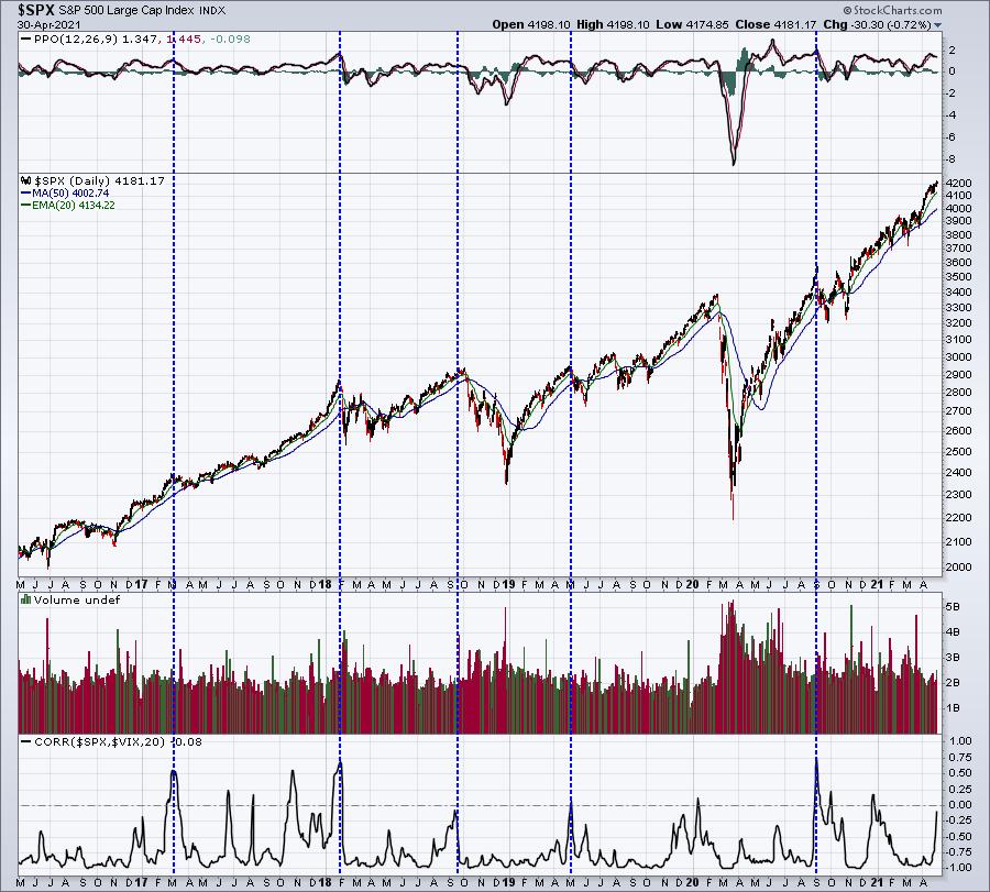
The blue-dotted vertical lines illustrate significant tops that coincided with the SPX-VIX correlation readings in positive territory. This tells us that the market is getting nervous, while prices are rising - an odd combination. But it's also very important to realize that this correlation rising to zero or above it does not result in a top every time. 2017 was a year-long example. We had multiple correlation readings above zero with no significant tops. So again, this is not a guarantee, but it is a warning.
Historical Performance
I wrote an article not that long ago that discussed the performance of the S&P 500 during the first half of calendar quarters vs. the second half. Since 1950, the S&P 500's annualized returns for the 2nd calendar quarter (April 1 - June 30), broken down by halves, are as follows:
- April 1 - May 15: +14.48%
- May 16 - June 30: +1.70%
We're two weeks away from turning the page to the second half of this calendar quarter. It's fairly obvious to me that our major indices tend to move higher throughout earnings season, but tend to struggle once the majority of earnings have been released.
Earnings Reactions
At EarningsBeats.com, we're monitoring the market's reaction to thousands of earnings reports this quarter. Here's a recap, highlighting earnings reactions by sectors thus far this quarter:
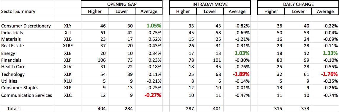
To provide an example of how to read this, let's consider consumer discretionary. 76 companies in this sector have reported earnings. The first three columns relate to the opening bell and the gap higher or lower. 46 of these 76 companies have seen their stock price gap higher, while 30 have gapped lower. The average gap has been higher by 1.05%. The next three columns relate to intraday action (opening price to closing price). Here, consumer discretionary companies haven't fared so well. Only 33 of 76 companies have move higher from the opening gap to the closing bell. 43 have moved lower. The average intraday move is -0.82%. The final three columns simply relate to the daily change - the closing price the day before the earnings are released to the closing price the day after the earnings are released.
If you've sensed that many technology companies are struggling after releasing their earnings reports, you'd be correct. The average technology stock has lost 1.89% during the trading day after earnings were released. This compares to an average opening gain of +0.11%. Once that opening bell rings, however, technology stocks have been met by swarms of sellers. That's a concern.
If you'd like to obtain a copy of my Excel spreadsheet with all the individual companies and various sorts that I ran, it's very easy. Subscribe to my EB Digest newsletter (it's FREE, no credit card required) and I'll be providing a link in Monday's newsletter that will take you to a page where you can download this data. It's my way of saying THANK YOU for your readership and support over the years. CLICK HERE and enter your name and email address in the area provided. We'll get you set up so that you'll receive that link on Monday!
I've also recorded a video explaining more about the spreadsheet and my analysis of it. You'll receive this video as well on Monday.
Happy trading!
Tom


