I follow the money. Not the hype. Not the talk. Just show me the money! I remember growing up and learning to play basketball. Defensively, my first coach told me to "follow their hips". They can fake you with their eyes, they can fake you with their legs, they can fake you with their shoulders.....but they can't fake you with their hips! Their hips don't lie! On a side note, I never knew Shakira was such a basketball fan.
I digress.
Anyhow, my original point is that you can't cover up the money. The money doesn't lie. One of my biggest overall mistakes in investing/trading throughout my career was trying to prove that Wall Street was wrong - that I knew more than everyone on Wall Street. That was probably my most expensive tuition. Wall Street, collectively, is a pretty smart bunch. Watching what they're doing with their money is extremely important and StockCharts.com provides us all the platform necessary to do just that.
In a nutshell, charts write us a movie script. The leading actor is relative strength. When areas of the market are performing better than other areas, they show relative strength. Do you want to know whether banks ($DJUSBK) are performing better than software ($DJUSSW)? It's so simple to see using price-relative charts at StockCharts. Check this out:
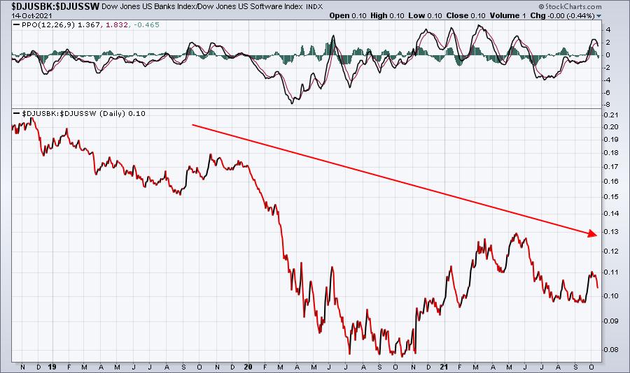
Banks haven't performed very well vs. software the past 3 years. I don't need a PhD to figure that out. The money is telling me. Banks show poor relative strength vs. software. But interest rates play a role in this (intermarket relationships are Oscar-worthy as supporting actors), so let's add a chart for the 10-year treasury yield ($TNX) and check out the correlation between this relative ratio and the direction of treasury yields:
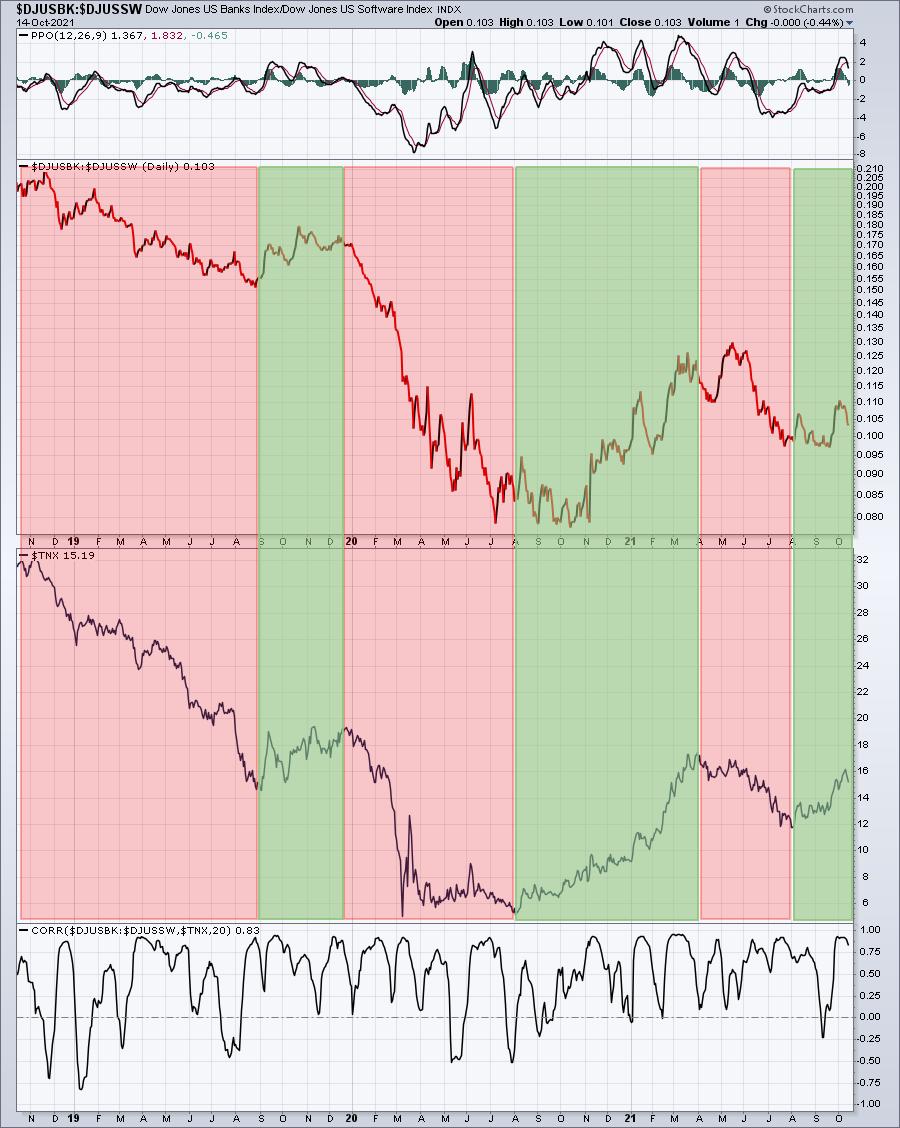
These two charts look very similar, which means they are positively correlated. In other words, when treasury yields rise, money rotates away from software and towards banks - at least on a relative basis. The opposite is true when yields fall. We know this from what the money does. The green-shaded areas perfectly illustrate that banks perform much better than software when the TNX is rising. The red-shaded areas represent periods of bank underperformance vs. software when yields are falling. We don't need anyone from CNBC telling us whether to buy software or bank stocks. Follow the direction of treasury yields and we'll know.
Today's lesson: Hips don't lie, but lips do.
ChartFest 2021
Last week, we announced ChartFest 2021, which is tomorrow, Saturday, October 16th, at 11:00am ET. Speakers include me, David Keller, Chief Market Strategist at StockCharts.com and host of StockCharts TV's "The Final Bar", and Grayson Roze, Vice President of Operations at StockCharts.com. We will be discussing our routines and how we use the StockCharts.com platform to make better and more informed investing/trading decisions. If you like charts, you'll LOVE ChartFest 2021! Best of all, it's FREE. Need more incentive to attend? How about free ChartLists from each of us to help you navigate the market? And you don't need to attend LIVE. We'll be recording the event and a copy of the recording will be sent to all those registered. To register, CLICK HERE and enter your name and email address.
See you Saturday!
Happy trading!
Tom