| |
|
|
|
|
| |
 |
ChartWatchers
the StockCharts.com Newsletter
|
|
|
|
|
|
|
|
Hello Fellow ChartWatchers!
2014 has already been full of surprises both in the markets and here at StockCharts.com. From a market perspective it has been yet another great year to be a technician assuming that you trusted the charts and not the talking heads and experts. "The market is too high!" "It's overdue for a pullback!" "It is prudent to be on the sidelines in this environment." Did you listen? Or did you watch your charts instead? Check out what this chart has been saying so far in 2014:
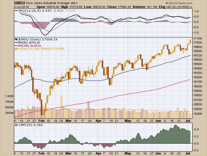
First off, except for a brief period at the start of February, the Dow was above its 200-day moving average so technicians should have had a bullish bias to begin with. Then, regardless of the technical indicator you followed, you should have been in the market much more than out. Do you like momentum? The PPO (a percentage-based version of the MACD) has been above zero since mid-February and above its signal line for much of that time. Do you like watching money flows? The Chaiken Money Flow has been positive most of the time also - certainly since late April.
There's only one worrisome signal on the chart above. Can you spot it?
Yep, declining volume since February is a warning signal but, by itself, it is not a reason to move to the sidelines especially if you are practicing sensible risk management techniques.
Now, my point is not "Buy! Buy! Buy!" - but instead I'm saying "Pay attention to the charts and ignore the pundits. The market is bullish until it isn't and the charts will tell you that long before the talking heads do." Headlines like this "Stocks soar, and most Americans just don't care" amaze me. Who doesn't care about making 2.97% in 6 months (11.03% since the February low)? And that's just from the Dow. The S&P 500 is up over 7.4% since the start of the year (14% since the February low)! Who doesn't love that? It is madness.
So the first half of 2014 has been the perfect time for pure technicians - i.e. those of us who truly just follow the charts. And, regardless of what the market does for the rest of the year, if you pay attention to the charts, you will always come out ahead.
Speaking of the rest of the year, what does StockCharts have in store for you between now and December 31st? A ton of great new things actually - here are some teasers for things to come:
- High quality historical data from Pinnacle Data - Pinnacle Data has been synonamous with accurate historical data for over 30 years. Knowledgeable technicians like Greg Morris and Carl Swenlin swear by these guys. And now that legendary data is coming to StockCharts! Over the course of the next month, we will be updating many of our ticker symbols - especially our breadth indicators - with Pinnacle Data that goes back much further than what we currently offer. The is a big deal for all of our users but especially our PRO members who want to conduct research using data as far back as the 1950s and even earlier. As an example of what you can look forward to, the Nasdaq 100 index ($NDX) now has data back to October 1985 (it used to end in January of 1992).
- Relative Rotation Graphs - These things are amazing (and also somewhat hard to explain). We are still working on finishing them but I can give you a "sneak peek" at what they might look like when we are done:
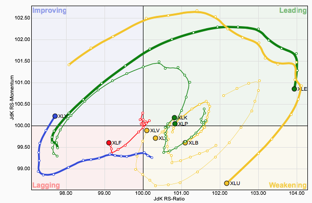
They will be interactive also - similar to our PerfCharts. Just don't ask me for an explanation yet! But don't worry, we will have a full explanation and examples available by the time this new tool is launched later this year.
- International Data - Anyone here interested in charting stocks from non-North American exchanges? We are too! And because of that we are working hard on upgrading our datafeed so that it can handle more data - specifically more international data from places like India and England. We still have a ways to go with that work, but we hope to have it ready before the end of the year as well.
- New, Comprehensive Site Documentation - The Support area of our website is undergoing a complete re-write at the moment. When it is finished, we expect it will be much more helpful than our current documentation. Stay tuned for an announcement soon - this is a top priority with us right now.
- At Least Two New Bloggers - One of them will be helping everyone understand those RRG charts you see above and the other one will help us understand India's markets.
- Did I Mention ChartCon 2014? - It will be without a doubt our best conference ever with presentations from 14 industry experts (including 2 special guests just added to the agenda!). If you miss ChartCon, you will regret it. Given where the market is right now, don't you want to hear what the top technicians in the country think about the rest of 2014? Don't you want to learn first hand about all of the new tools we've added to StockCharts this year? ChartCon 2014 is the best way I know of to accomplish those goals. There are still a couple of slots left - click here to reserve your spot now.
- ...and the proverbial "much, much, more!" - Why should we stop now? I'm sure that we will soon add stuff even I didn't know about!
Thanks again for an amazing 1st half of the year and here's to an even better second half!
- Chip
SITE NEWS
RECENT ADDITIONS TO STOCKCHARTS.COM
- NEW VERSION OF s.c.a.n. LAUNCHED - We have updated our online community forum with new software. Called "s.c.a.n." (for the StockCharts Answer Network), the forum is a great place to get your questions answered by knowledgable StockCharts users. Click here to see the new version.
- NEW VERSON OF OUR HISTORICAL CHART GALLERY - We've reworked our Historical Chart Gallery to make it much more interesting and useful. Ever wondered if the 4-year Presidential cycles is real? Click here to find out.
- DOWN TO THE WIRE FOR CHARTCON 2014! - Join us in Seattle on August 8th and 9th for presentations specifically focused on technical analysis, stock charting and using StockCharts.com. Murphy, Pring, Elder, Arms, Hill, Schnell, Heim, Roze and Anderson all on the same stage. Just one month away! Click here for more details.
The Market Message
John Murphy is on hiatus this time. Please visit The Market Message for more articles by John Murphy.
Relative weakness in the consumer discretionary sector was a concern a month ago, but not anymore. The first PerfChart shows the Consumer Discretionary SPDR (XLY), the Technology SPDR (XLK), the Energy SPDR (XLE) and the HealthCare SPDR (XLV) leading since June 3rd. XLY really came to life this past week with a new 52-week high and a gain that was greater than that of the S&P 500.
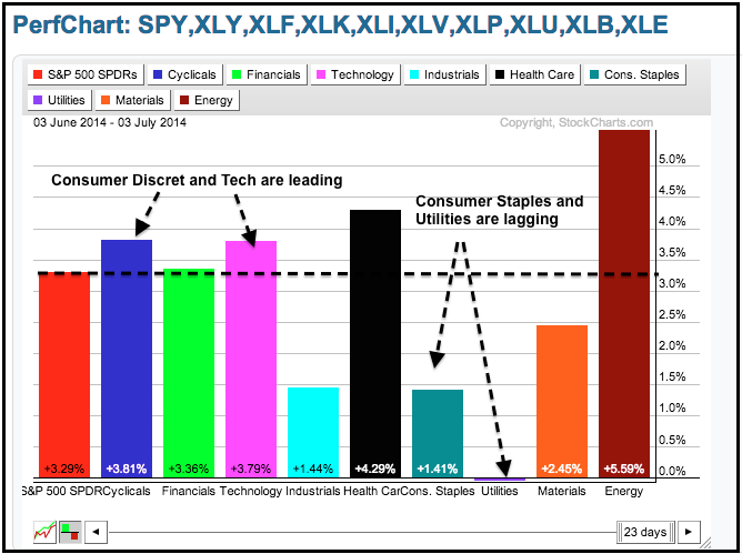
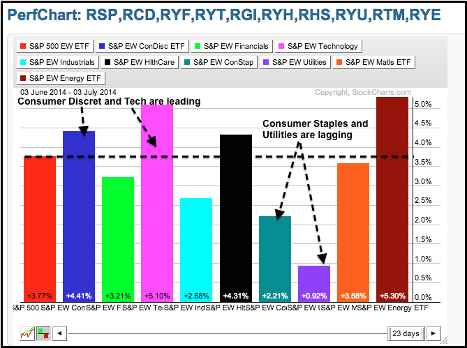
It is quite positive to see these two sectors leading the stock market. The consumer discretionary sector is the most economically sensitive sector and relative strength here is a positive sign for the economy. The technology sector is also an important barometer because it has the stocks with the highest betas (volatility). This means the tech sector represents the appetite for risk and a healthy appetite for risk bodes well for stocks. In contrast to these offensive sectors, notice that the Consumer Staples SPDR (XLP) and Utilities SPDR (XLU) were the weakest sectors. As defensive sector, this indicates that money is moving from defense to offense. The second PerfChart shows the equal-weight sectors with similar characteristics.
Good trading and good weekend!
Arthur Hill CMT
This week was an important week on a lot of the commodity charts. Most of them surged up to major long term resistance lines with a few of them breaking through.
But it is the Euro Currency Charts that look critical right here. If major support should fail on the Euro ($XEU) , that would indicate a rise in the US Dollar ($USD). A major push in the $USD usually has downward pressure on commodity prices.
Lets look Monthly, Weekly and Daily to see the full picture.We can see on the Monthly, the Euro recently peaked out at a key long term support resistance area. After pushing up against the down sloping green resistance line it has pulled back and is testing the 2 year up sloping blue line.
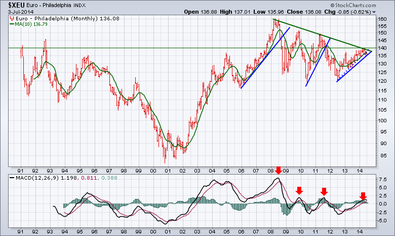
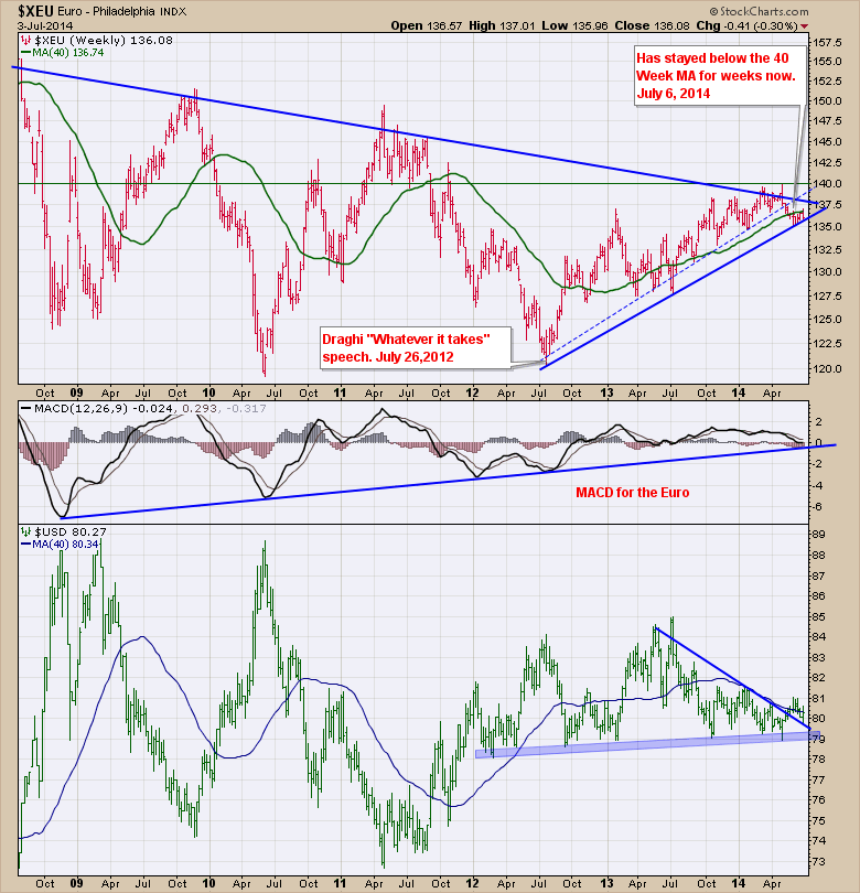
Chart 2 is the Euro Weekly. A few important things to note, the green line is the 40 Week Moving Average (40 WMA). We have been trapped below it for 6 weeks now. I have drawn a dotted line which has a lot more tests of support. It appears to be clearly broken at this point. The push down in 2013 was the only major pullback in the US equity markets. The low on the $SPX was made June 24, 2013. The top resistance line is just overhead. We can see the up slope on the MACD is near the support line. On the US Dollar ($USD) chart, we can see the downtrend has been broken, and we have back tested this line for support. It appears to have held at a critical point. We also have massive horizontal support at the blue shaded area near 79.
Finally here is the daily on chart 3 for the zoomed in view. We can see the Euro clearly broke the major support area which I have marked with a dotted line. Now we seem stuck under the 200 DMA and based on the price action of this week, the backtest of the 200 DMA looks to have failed. We are approaching a major test of the last trend line for support. Just below is the red zone. Usually a good place to go short is on a failed backtest of the 200 DMA.
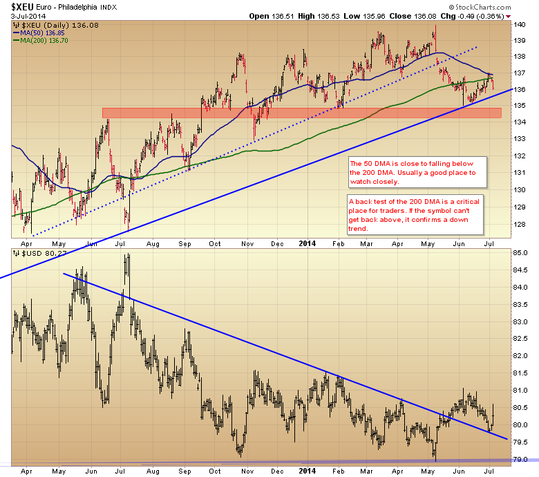
On the US Dollar chart, we can see the back test and bounce that we saw on Thursday. The blue trend line fits nicely on the Feb , Mar, April tops and when extended back it is at the island top gaps. While it doesn't fit nicely on May 2013 tops, it is a good fit of the data we currently have since then.
Should the $USD start a major rally here, all my commodity bullishness may have to wait. The weeks ahead will be important reversal or confirmation weeks as these levels are still close and could revert back into the previous trend. Based on the monthly charts at the top, when these currencies lose trend line support the move is pretty aggressive and significant for major trends.
Good trading,
Greg Schnell, CMT.
DecisionPoint.com
Carl Swenlin & Erin Heim are on hiatus this time. Please visit DecisionPoint.com for more articles by Carl Swenlin & Erin Heim.
ASSESSING THE FIRST HALF OF 2014
by Tom Bowley | InvestEd Central
It's been quite confusing for several reasons, a few of which are discussed below.
Historically, the S&P 500 nearly always struggles during the balance of a calendar year in which January performance is weak. In January 2014, the S&P 500 fell 3.56%, ranking it in the bottom quartile of all Januarys since 1950. That rarely bodes well for equity performance over the next 11 months, yet the S&P 500 has risen in every calendar month since January and is up roughly 200 points and more than 11% since the end of January. History has misled us - at least through June 30th.
Technically, the bulls have been fighting an uphill battle all year - and winning. There have been multiple negative divergences on the S&P 500 chart. Twice in 2014 already, it appeared the bulls lost their momentum, but after brief periods of selling, that momentum returned. Currently, there's another negative divergence as we head into earnings season. Will it matter? Check it out and you be the judge:
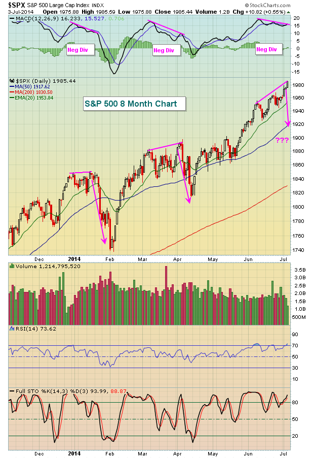
That's a short-term issue that can be easily corrected by a period of unwinding. There's is a bigger picture concern, however. Much of this 2014 rally has been led by defensive areas of the market - utilities, consumer staples, healthcare, REITs. We have begun to see leadership from aggressive areas of the market again and that's important. Traders need to be willing to take risks in order to sustain advances - at least that's what history tells us. Check out the relative strength of defensive areas of the market throughout this 2014 rally - especially when equities broke out in March/April:
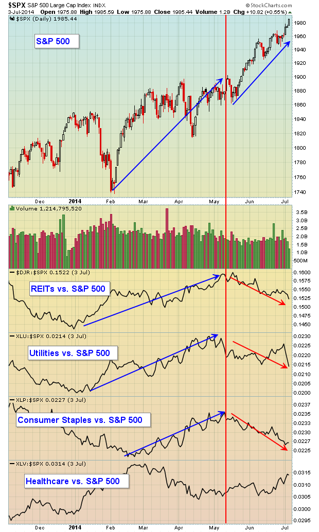
The past couple months do look better and that's good news for the bulls. The recent push higher has seen the relative strength of defensive stocks deteriorate, which is exactly what we want to see. It will be important to see money continue to rotate away from safety.
Later this week, I'll be hosting my annual Mid-year Market Outlook webinar where I'll be discussing the second half prospects for each of the sectors and many industry groups. While many market pundits follow the "Go away in May" theory, my research tells me it's more like "Go away in mid-July". I'll discuss that historical tendency in detail in this webinar as well. For more information on how you can participate, CLICK HERE.
Happy trading!
Tom Bowley
Chief Market Strategist
Invested Central
 Have you ever met a famous investor at a cocktail party or event, taken his or her advice on a stock and lost money? You are not alone. It may have been a sensational timely trade and the famous one made a 30% gain in four weeks while you held it an entire year and lost money. Therein lies the crux of the problem. Same equity but two different trading timeframes. The... Read More
|
|
|
Recent StockCharts Articles You Might Have Missed
|
- Art's Charts - Small-Cap AD Line Hits New High as Advance Broadens July 5, 2014
- Market Message - STOCKS MOVE INTO OFFENSIVE MODE -- CONSUMER DISCRETIONARY AND TECH JOIN THE LEADERSHIP CIRCLE July 5, 2014
- Market Message Videos - Small-caps and Microcaps, XLY and XLK, SPY and SPX, Inflation Indicators, TLT and IEF, Economic Table July 5, 2014
- MailBag - Charting the Correlation between Two Asset Classes (video) July 5, 2014
- Don't Ignore This Chart! - A Rough Week for Utilities July 3, 2014
- DecisionPoint - Q1 2014 Earnings: Market Merely Overvalued July 3, 2014
- Top Advisors Corner - Tim Ord: The Ord Oracle - July 2, 2014 July 2, 2014
- The Canadian Technician - Will The Loonie Be Rejected A Beaver Short Of A Buck? June 30, 2014
|
|
|
Are you new to StockCharts.com?
|
|
Here are some activities that will help you learn more about our website:
Do you know someone else that would appreciate this newsletter? Please feel free to forward this to other people interested in stock charting. Thanks!
|
|
|
|
|
|
|
|
|
|
|
|
|
| |
|


 Have you ever met a famous investor at a cocktail party or event, taken his or her advice on a stock and lost money? You are not alone. It may have been a sensational timely trade and the famous one made a 30% gain in four weeks while you held it an entire year and lost money. Therein lies the crux of the problem. Same equity but two different trading timeframes. The...