|
|
||||
 |
||||
Expert Technical Commentary Delivered Straight To Your Inbox |
||||
| December 3, 2016 | ||||
Hello Fellow ChartWatchers!After our Cyber Monday sale this past week, hopefully your wallet is just as stuffed as your post-Thanksgiving belly. Many of you caught those special prices on Monday, but in case you missed it, I've got good news for you! The season of savings is just beginning, and you still have time to catch some of our best deals of the year. For a limited time only this month, we're offering some serious savings off our regular subscription pricing. We're throwing in 2 FREE months of service when you sign up for a 12-month subscription, or 1 free month when you sign up for a 6-month subscription. And remember, just like our Cyber Monday sale, these special holiday prices apply to both new accounts and renewals of existing subscriptions, so sign up now and save big or renew your membership to catch our holiday pricing while it lasts! If you're not yet a StockCharts Member, now is the best time of year to join! To sign up for a brand new StockCharts account, click this link and select the service level that fits you best. If you are already a member, you can still catch our special pricing on the Your Account page. Click this link, then look for the yellow "Extend" button in the subscription plans table. From all of us here at StockCharts, we want to wish you the happiest of holidays and a prosperous New Year! - Grayson psst! Having trouble viewing this email? |
||||
|
Rotation Continues Into Value Stocks, Financials and Energy Still Look Cheap |
||||
|
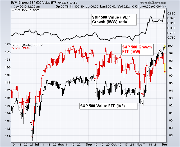
Two days after the election (November 10), I wrote a message entitled: "Rotation Out of Growth Stocks into Value Stocks Causes Profit-taking in Technology". We're seeing a replay of that rotation again this week as technology stocks are underperforming the market while financials, energy, and industrials surge. Chart 1 compares the move to new highs in the S&P 500 Value ETF (black bars) to the weaker action in the S&P 500 Growth ETF (red bars) since the start of November. That rotation can be seen more graphically by the surge in the IVE/IVW ratio over the last month (top of chart). The reason behind the rotation is understandable. Technology accounts for 35% of the growth ETF (IVW). Meanwhile, the three largest value groups are financials (25%), energy (12%), and industrials (11%). A lot of money has moved into those last three groups which were perceived as relatively undervalued. Money used to make those purchases has been coming out of more expensive technology stocks. And that rotation into cheaper parts of the market may have a lot further to run.
|
||||
|
||||
|
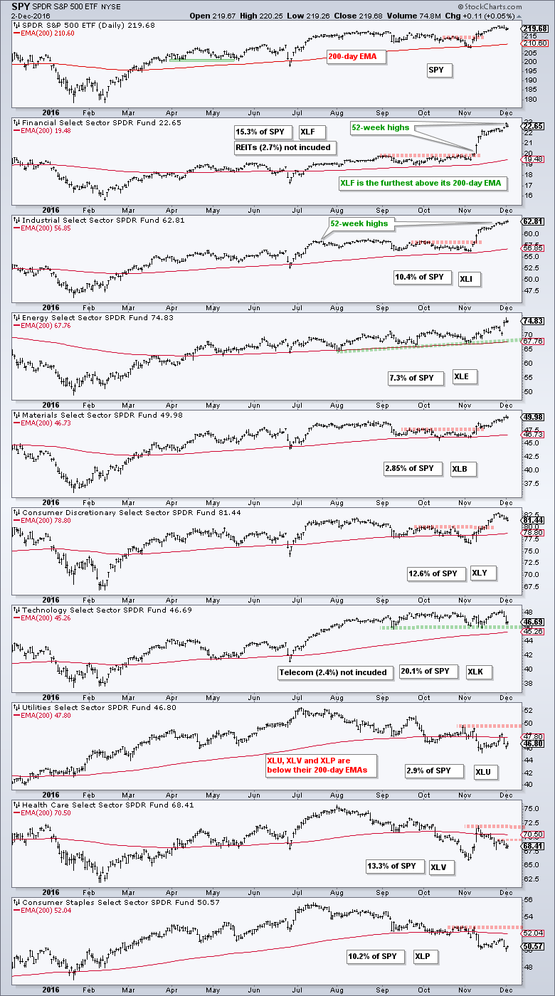
The whole is only as strong as the sum of its parts. Applying this logic to the stock market, the S&P 500 represents the whole and the nine sector SPDRs represent the sum of the parts. Let's see just how strong the parts of the S&P 500 are. The chart below shows SPY and the nine sector SPDRs. The sector charts are sorted by the percentage above the 200-day EMA with the highest at the top (XLF) and the lowest at the bottom (XLP). First, note that SPY is above its rising 200-day EMA and in a clear uptrend. Second, note that six of the nine sector SPDRs are above their 200-day EMAs and the 200-day EMAs are rising for all six. The chart also shows the weightings for each sector and the six bullish sectors account for around 68% of the S&P 500. This is enough to keep the market in an uptrend overall. Of these six, the Technology SPDR (XLK) is the closest to its 200-day EMA and the one to watch. Three of the nine sector SPDRs are below their 200-day EMAs, but not by much. These three represent around 26% of the S&P 500 and they are weighing on the market. Note that REITs 2.7% and Telecom 2.4% were excluded from these calculations. REITs were part of the finance sector and most telecom stocks are part of the technology sector. **************************************** Plan your Trade and Trade your Plan |
||||
|
||||
|
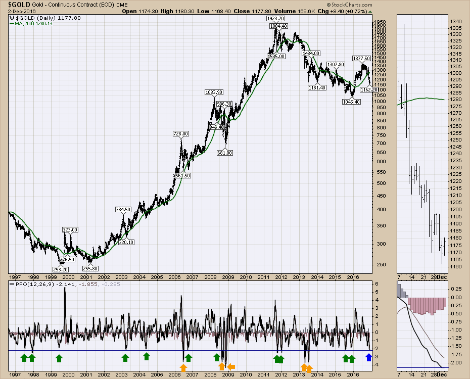
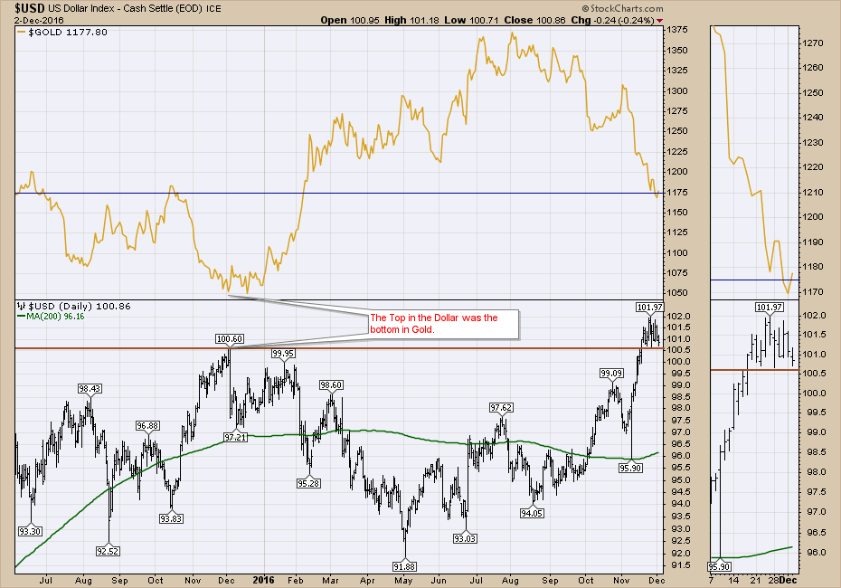
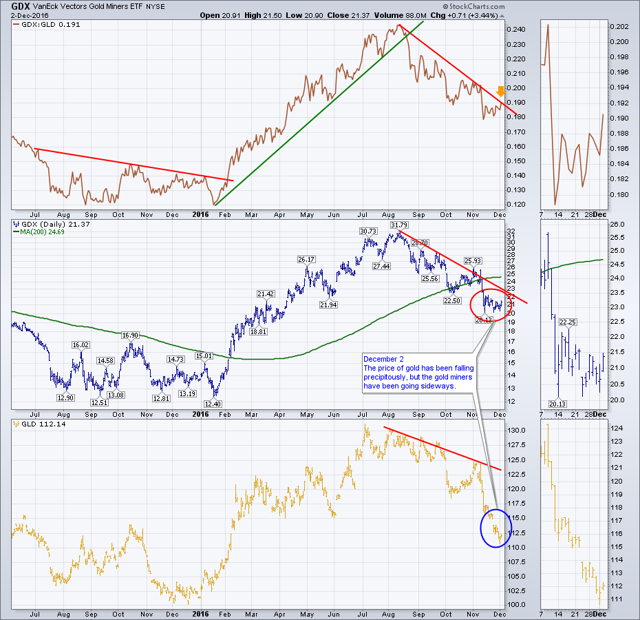
Gold has dropped into the very unloved category. There is a great quote that interests me when we get technical setups like this. " I believe the very best money is made at market turns. Everyone says you get killed trying to pick tops and bottoms and you make all your money by playing the trend in the middle. Well for twelve years I have been missing the meat in the middle but I have made a lot of money at tops and bottoms" - Paul Tudor Jones Martin Pring has created some great indicators for helping to find oversold levels. I like to use long term charts and look to see how an oscillator has behaved over time. I find the Percentage Price Oscillator (PPO) works better than the MACD for long time frames. Interestingly enough, Gold made a major low one year ago on December 1, 2015. Gold has had 17 PPO signals in 20 years where the price drop has pulled back significantly to the level we are currently at, as shown on the Percentage Price Oscillator (PPO) below the $GOLD plot. 5 of the 17 signals got more severe. That includes two during the Great Financial Crisis which I think we could all say seemed to be an exception. So in a 20 year period, we have seen the gold market reverse after this percentage price drop (blue line) 80% of the time (12) and 3 others got even worse. At least it suggests we might want to look at it. On the next chart, we can see the $USD was soaring in November 2015 and started to moderate near the end of the month. Recently, the $USD broke out to new highs but has not made any progress since and closed near the lows for the last three weeks. I also plotted $GOLD on this chart and we are at a level of horizontal support. So both charts are at interesting levels. The $USD has a tiny head and shoulders top over the last 3 weeks. It is trying to hold above the previous high. If this does not hold, it is probably bullish for Gold.
We'll watch how the market rolls forward early next week for more clues but this looks like a nice setup with a close stop. Manage your trade size appropriately. I did a couple of webinars this week. In the first one, I discussed two major pipeline approvals in Canada, the OPEC oil decision, the move in Natural Gas and other ways to play the changes in the oil and gas sector. The Canadian Technician Live 2016-11-29. On the Commodities Countdown 2016-12-01, I spent a lot of time discussing the current index levels and the price action. The feedback from the webinar appreciated the considerable amount of time throughout the webinar discussing the potential gold trade. The Commodities Countdown Webinar 2016-12-01. You can also follow me for 1-liners on Twitter @Schnellinvestor. Good trading, |
||||
|
||||
 |
||||
|
ChartLists Are The Key To Disciplined And Successful Trading |
||||
|
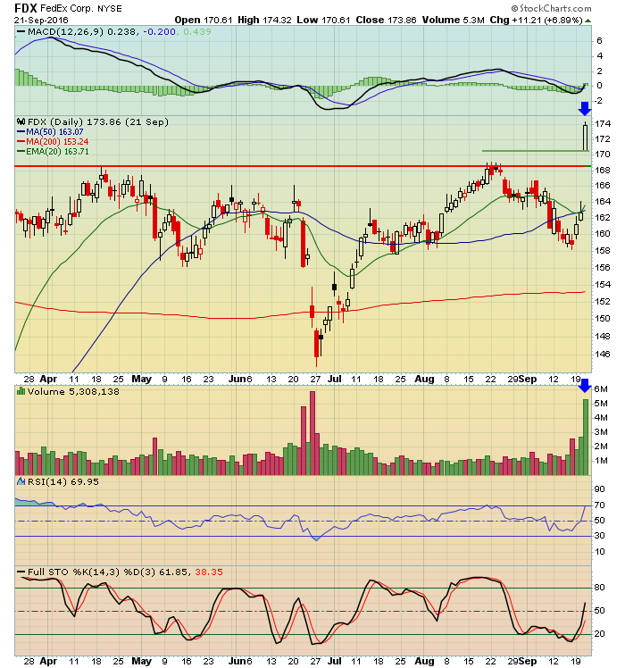
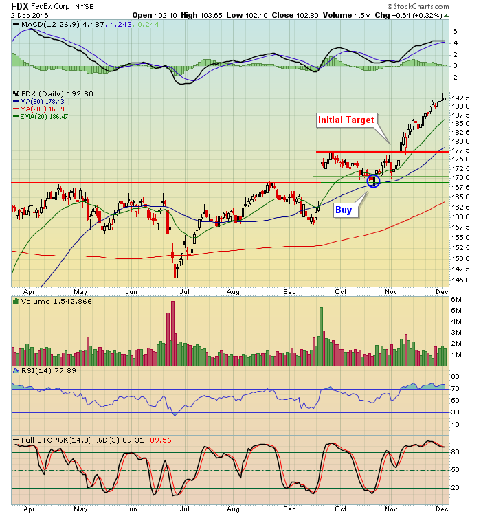
I spend a great deal of time scouring the market and looking for interesting trade setups. It's quite often that I see a stock that I really like, but it's not at a price level where I'm ready to pull the trigger. If I move onto the next chart, chances are that prior chart will be gone until.....I see it days or weeks later and it's made a big move that I was anticipating. Then it just becomes a wasted opportunity. So how can StockCharts.com make a difference? ChartLists, that's how. I couldn't trade any longer if I didn't have my ChartLists. It's so easy to quickly annotate and save a chart to a ChartList and it takes out all the memorization you have to go through to try to remember to keep an eye on a given stock, ETF or index. Or to have to return to scattered notes all over your desk. Planning, organizing and executing smart trades become a whole lot easier with very simple tools available right here at StockCharts.com. Let me give you an example of a trade that I was able to uncover recently by using the ChartLists and Scanning tools. On September 21st, FedEx (FDX) had an excellent and very bullish reaction to its latest earnings report, but it wasn't a solid reward to risk trade until one month later on October 21st. Waiting a month to pull the trigger requires a ton of patience and discipline. I included FDX on a strong earnings ChartList and it turned up on two separate scans on October 21st that suggested FDX was a great reward to risk trading candidate. First, let's go back in time and I'll show you what my annotated FDX chart looked like on September 21st:
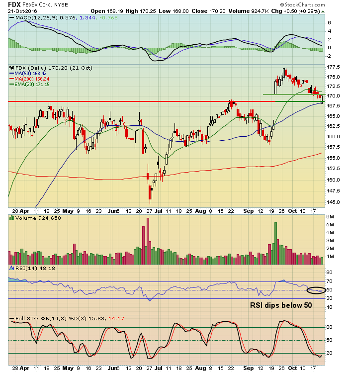
One month later, FDX began to surface on scans that I run every day. One scan was a 50 day SMA test that I run against that specific ChartList. On October 21st, FDX hit its 50 day SMA, its RSI had fallen back into the 40s and its chart looked like this:
The rest is history....
On Tuesday night, December 6th at 7:30pm EST, I will be joining John Hopkins, President of EarningsBeats.com for a joint webinar. I'll be demonstrating how to setup ChartLists and how to run scans against a specific ChartList, in addition to the technical merits of trading stocks that report better-than-expected earnings and a quick overall market view. I'd love to have you join me for this educational event. You can REGISTER HERE. Happy trading! Tom |
||||
|
||||
 |
||||
|
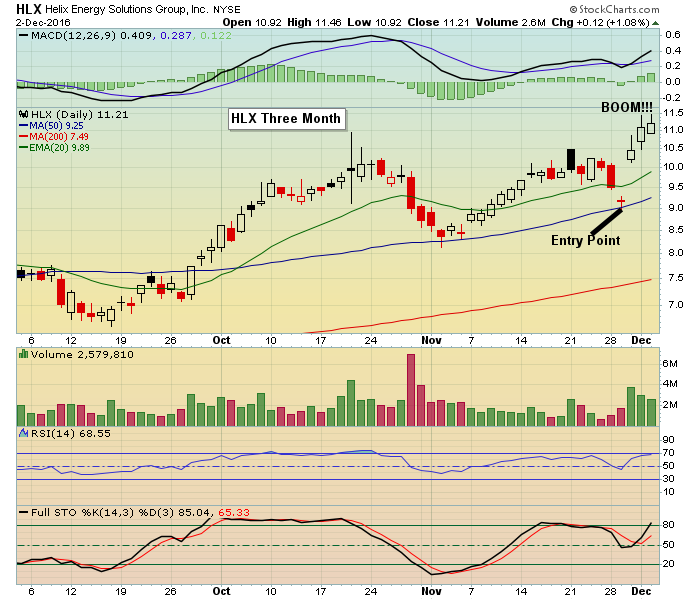
Every once in a while the gods of trading look out for us and reward our perseverance, a little bone for all of those trades that don't turn out so well. When one of these opportunities takes place you should be prepared to take advantage of these rare gifts by pocketing profits when you can. As an example, we issued a trade alert to our members this past week on HLX. We issued the alert because the stock had reported strong earnings and had pulled back to a key technical level and looked ripe for a bounce. And as you can see in the chart below the bounce was sharp.
The alert was sent out to members last Tuesday at an entry price of $9 with a price target of $10.20 and a stop loss of a close below $8.37. As you can see the target price was easily exceeded by the following day with the stock continuing to climb higher right into week's end, actually rising by 27% in two days. That 27% climb in two days would be a spectacular rise even if it had taken a full year. But we all know that profits can disappear just as quickly as they appear and that's why it makes sense to have a strategy in place when these situations arise. For example, in this case once the initial price target of $10.20 was hit, I issued a profit alert to members since our objective was met. That alone represented a 13% rise in one day; not too shabby. But sometimes if a stock has sudden momentum it's tempting to try and ride it higher. That comes with a risk of those profits evaporating quickly. So one idea would be to place a trailing stop that would continue to raise as the stock moved higher. This way you would be guaranteed to lock in a solid profit if the stock took a sudden turn. I'm often asked what's an appropriate period of time to hold a stock when making a trade and my answer is always the same; I don't have a specific time frame. It doesn't matter to me if it takes one minute, one day, one month or one year to hit a price target as long as it continues to look solid on a chart. But once that price target is hit, it is important to lock those profits in or have plan B ready to go. All of the trading candidates that are issued to members of EarningsBeats come from our exclusive "Candidate Tracker" which consists of companies that beat earnings expectations and have strong charts. In fact, I am going to conduct a webinar this Tuesday, December 6 at 7:30 pm eastern where I will discuss the concept of trading stocks that beat earnings expectations and have strong charts, including some examples of recent trades. And I will be joined by StockCharts.com's Senior Technical Analyst Tom Bowley, who will be discussing scanning for stocks that beat earnings expectations as well as an overview of the market. VERY timely as we near year end. If you want to join Tom and me for this Free event just click here to register. The session will also be recorded as well for those who are unable to attend the live event. Locking in profits on a successful trade is still one of the hardest things to do when trading. But when you are lucky enough to hit a home run over a short period of time don't think twice; take the money and run! At your service, John Hopkins EarningsBeats |
||||
|
||||
|
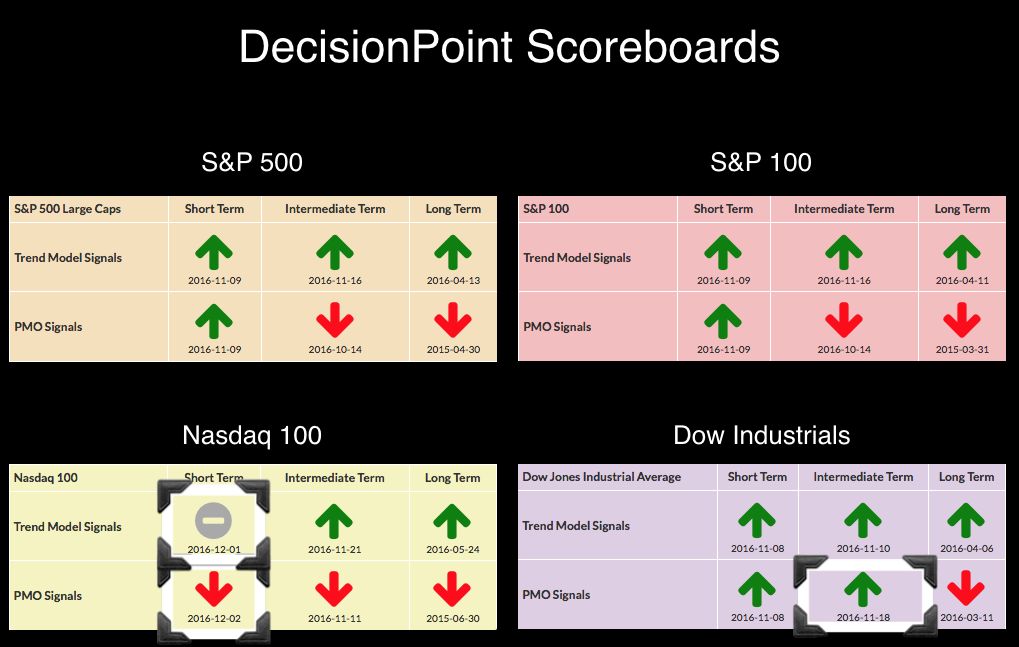
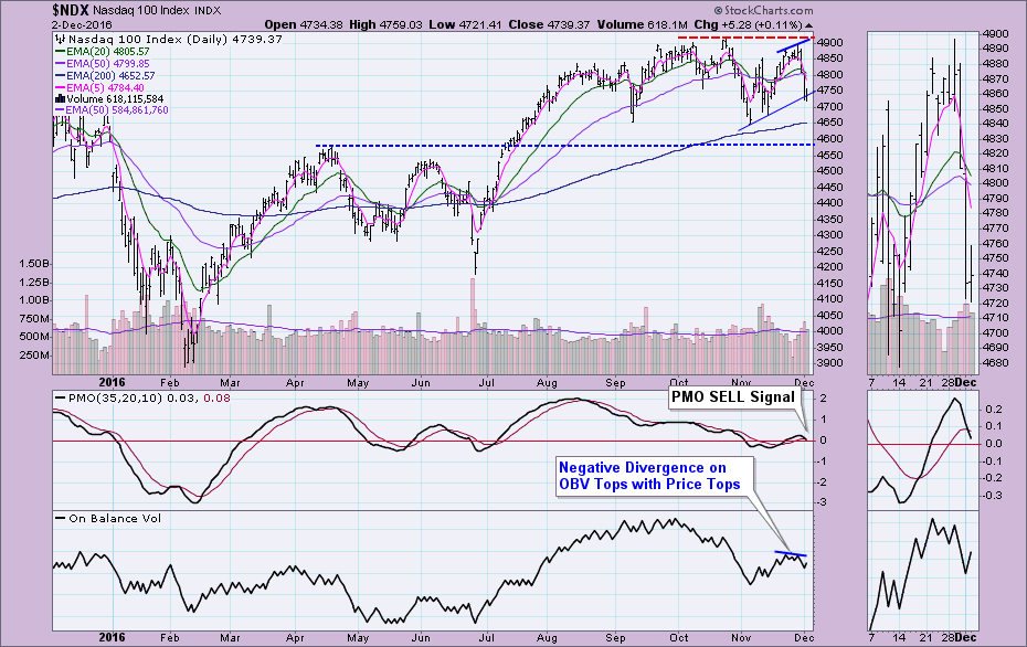
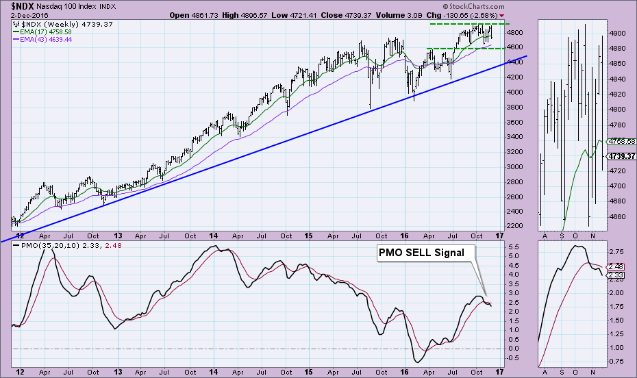
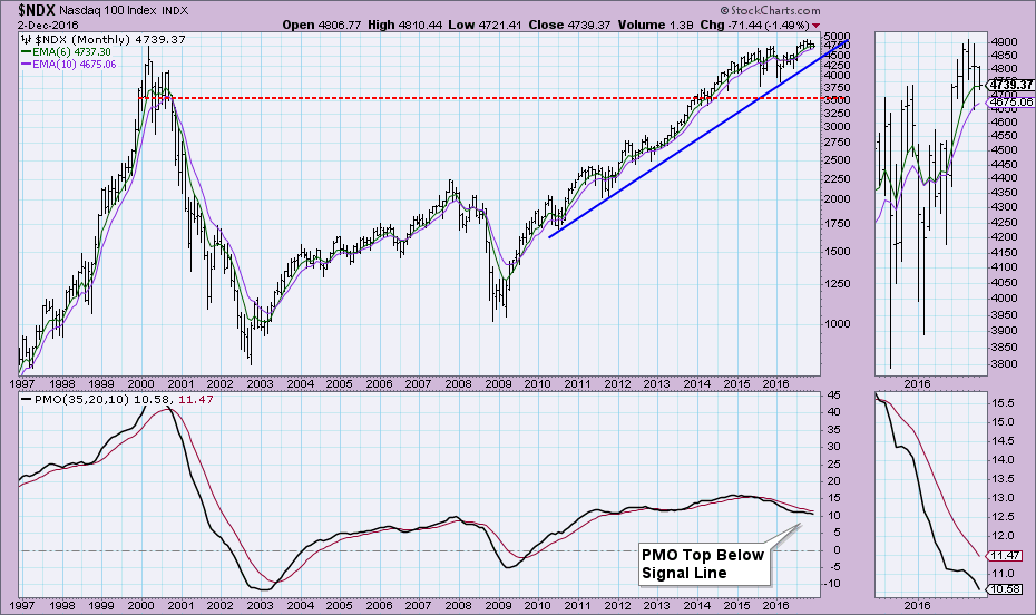
The daily chart for the NDX shows a somewhat weak rally in comparison to what you'll find on the chart of the Dow. Price was unable to significantly test the October high. The PMO SELL signal is visible. The Short-Term Trend Model Neutral signal was triggered when the 5-EMA crossed below the 20-EMA while the 20-EMA was above the 50-EMA (hence the Neutral signal and not a SELL). It's coming very close to an Intermediate-Term Trend Model Neutral signal which would generate when the 20-EMA crosses below the 50-EMA (Neutral because the 50-EMA is above the 200-EMA). This decline was signaled to us with the negative divergence between OBV tops and price tops on Wednesday's drop. The intermediate-term picture shows last month's weekly PMO SELL signal and the numerous unsuccessful tests of resistance around 4900. Good news is support is at 4600. The monthly PMO turned down below its signal line and is headed lower which is very bearish. The rising bottoms trendline has managed to provide strong support. If that holds, it confirms the NDX support level of 4600 in the weekly chart above. Conclusion: It is troubling to see the NDX so weak. A strong bull market should have support from all of the large-cap indexes (and most of the small ones too). Come check out the DecisionPoint Report with Erin Heim on Wednesdays and Fridays at 7:00p EST, a fast-paced 30-minute review of the current markets mid-week and week-end. The archives and registration links are on the Homepage under “Webinars”. Technical Analysis is a windsock, not a crystal ball. Happy Charting! |
||||
|
||||
|
||||
|
||||
|
||||
|
||||
|
||||
|
||||
|
|
||||
| © StockCharts.com, Inc. | ||||
| This email was sent to [email] |
||||
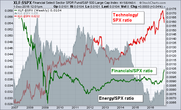
 A lot of questions are being asked about whether or not recent rotations into cheaper parts of the market can continue. The next chart suggests that they can. The red line on top is a relative strength ratio of the Technology SPDR (XLK) divided by the S&P 500. It's clear that technology has been a market leader for the last ten years. The Financials (XLF)/SPX ratio (green line), however, shows that sector to have been a terrible performer since 2007. It's only just starting to rise. The gray area shows the energy sector (XLE/SPX ratio) to have been a very weak performer as well. Chart 2 suggests that both of those previously ignored groups have a long way to go to restore them to their normal market relationship. [Transportation stocks, which are helping drive the industrial sector higher, could be added to the list of undervalued stocks starting to play catch up, as well as industrial metal stocks like copper and steel that have been pulling material stocks higher]. The economy appears to be evolving from a deflationary, low interest world into a more inflationary period with rising rates and stronger economic growth. Monetary stimulus is giving way to fiscal stimulus which should lead to more infrastructure spending. That suggests that post-election rotations may have a lot further to go. All the more reason to be in those market sectors that will benefit the most from that new economic climate. Technology may not be one of them.




 The daily chart of the Nasdaq 100 doesn't really resemble any of the other large-cap indexes or even most small-cap indexes. Technology sectors have performed terribly. The Election "euphoria" enjoyed by the Dow Industrials and most other indexes really didn't do much for tech. Consequently, the NDX has triggered a Short-Term