Gold has dropped into the very unloved category. There is a great quote that interests me when we get technical setups like this.
" I believe the very best money is made at market turns. Everyone says you get killed trying to pick tops and bottoms and you make all your money by playing the trend in the middle. Well for twelve years I have been missing the meat in the middle but I have made a lot of money at tops and bottoms" - Paul Tudor Jones
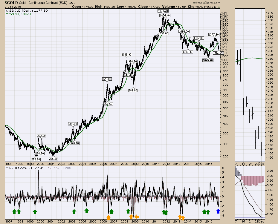
Martin Pring has created some great indicators for helping to find oversold levels. I like to use long term charts and look to see how an oscillator has behaved over time. I find the Percentage Price Oscillator (PPO) works better than the MACD for long time frames.
Interestingly enough, Gold made a major low one year ago on December 1, 2015. Gold has had 17 PPO signals in 20 years where the price drop has pulled back significantly to the level we are currently at, as shown on the Percentage Price Oscillator (PPO) below the $GOLD plot. 5 of the 17 signals got more severe. That includes two during the Great Financial Crisis which I think we could all say seemed to be an exception. So in a 20 year period, we have seen the gold market reverse after this percentage price drop (blue line) 80% of the time (12) and 3 others got even worse. At least it suggests we might want to look at it.
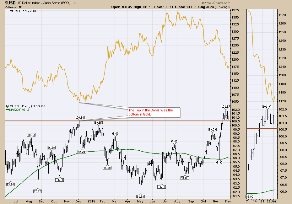
On the next chart, we can see the $USD was soaring in November 2015 and started to moderate near the end of the month. Recently, the $USD broke out to new highs but has not made any progress since and closed near the lows for the last three weeks. I also plotted $GOLD on this chart and we are at a level of horizontal support. So both charts are at interesting levels. The $USD has a tiny head and shoulders top over the last 3 weeks. It is trying to hold above the previous high. If this does not hold, it is probably bullish for Gold.
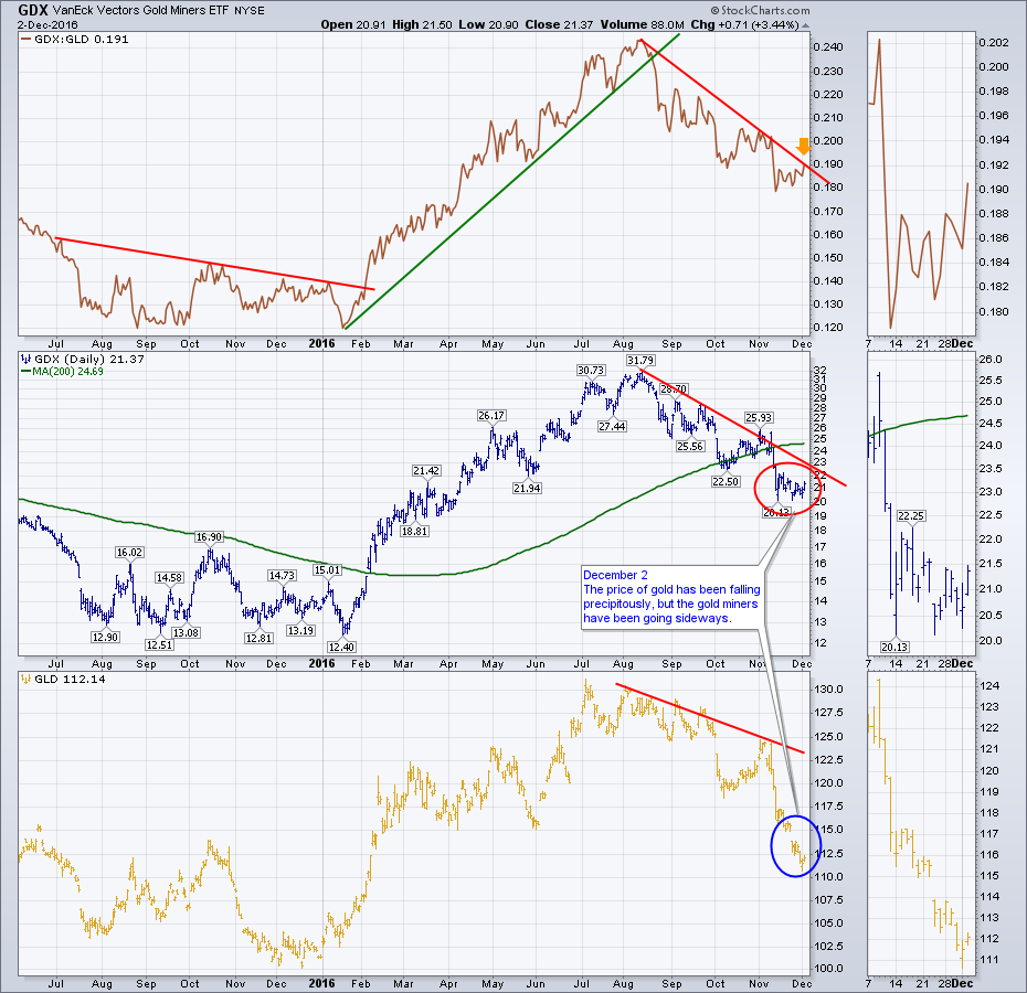
 Trading Gold itself on the (GLD) ETF is one method. However, the real action is in trading the gold miners. They move exponentially more than the move in gold. While Gold was up about 30% from the low to the high in 2016, lots of miners had 200% moves. Looking at GDX in the centre panel, it is trying to spur a move here. While Gold (GLD) has continued lower, GDX has consolidated for the last few weeks. This is easier to see in the zoom box on the right.
 Lastly, when the Gold miners (GDX) start to outperform Gold (GLD), it is usually a good time to invest in GLD or GDX. This is shown in the top panel by plotting the ratio GDX:GLD. Looking in the zoom box, we can see the ratio made a 3-week high today to close the week. There are three things suggesting this might be a good time to ride some gold stocks higher.
- the oversold conditions on the PPO from the first chart
- the $USD stalling / closing near three week lows after breaking out
- the 3-week high on the GDX:GLD ratio
We'll watch how the market rolls forward early next week for more clues but this looks like a nice setup with a close stop. Manage your trade size appropriately.
I did a couple of webinars this week. In the first one, I discussed two major pipeline approvals in Canada, the OPEC oil decision, the move in Natural Gas and other ways to play the changes in the oil and gas sector. The Canadian Technician Live 2016-11-29. On the Commodities Countdown 2016-12-01, I spent a lot of time discussing the current index levels and the price action. The feedback from the webinar appreciated the considerable amount of time throughout the webinar discussing the potential gold trade. The Commodities Countdown Webinar 2016-12-01.
You can also follow me for 1-liners on Twitter @Schnellinvestor.
Good trading,
Greg Schnell, CMT, MFTA


