| THIS WEEK'S ARTICLES |
| Market Roundup |
| More Short-Term US Market Indicators Turn Bullish |
| by Martin Pring |
Editor's Note: This article was originally published in Martin Pring's Market Roundup on Tuesday, June 18th at 2:30pm ET.
Several reliable short-term oscillators have just turned bullish. Chart 5, for instance, features my Dow Diffusion Indicator. This one is similar to the Global Oscillator, but uses DJIA components instead. The green arrows show when it reverses to the upside from a position below the oversold line. The indicator recently turned up again, but not from such a subdued level. As long as it can continue to power its way higher, it represents a positive backdrop.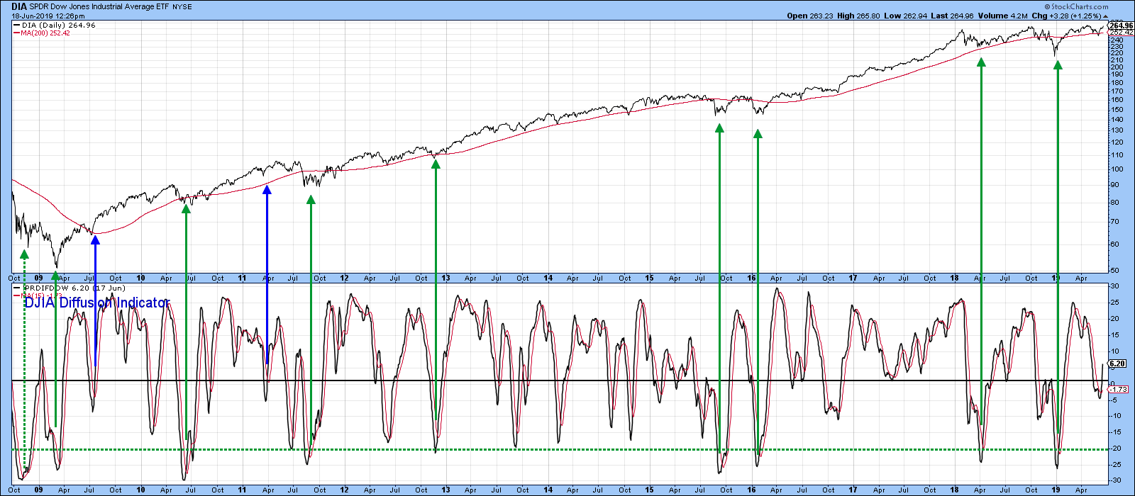 Chart 5 Chart 5
Chart 6 calculates a couple of moving averages for the VIX and plots them inversely. That allows swings in this indicator move in the same direction as the S&P Composite. The green arrows flag periods when the 10-day MA reverses to the upside from a position below or at the blue horizontal line. It essentially tells us that the period of rising volatility and falling prices has ended. That indicator went bullish a few sessions ago.
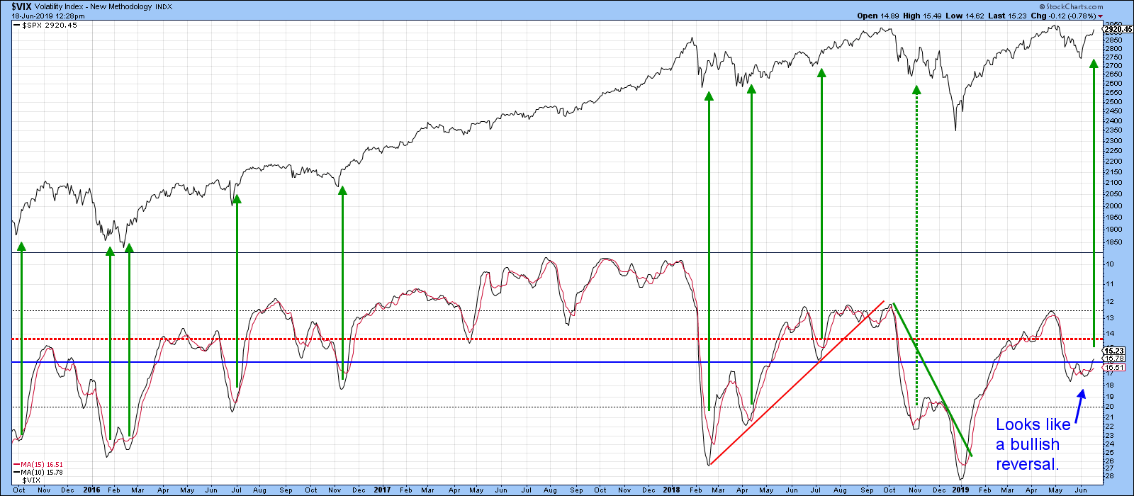 Chart 6 Chart 6
It’s always good to see new highs in an index being confirmed accompanied by an expanding new high list. Chart 7 shows that the current technical position is going one better than that, with the list expanding prior to the NYSE Composite registering a post-May high.
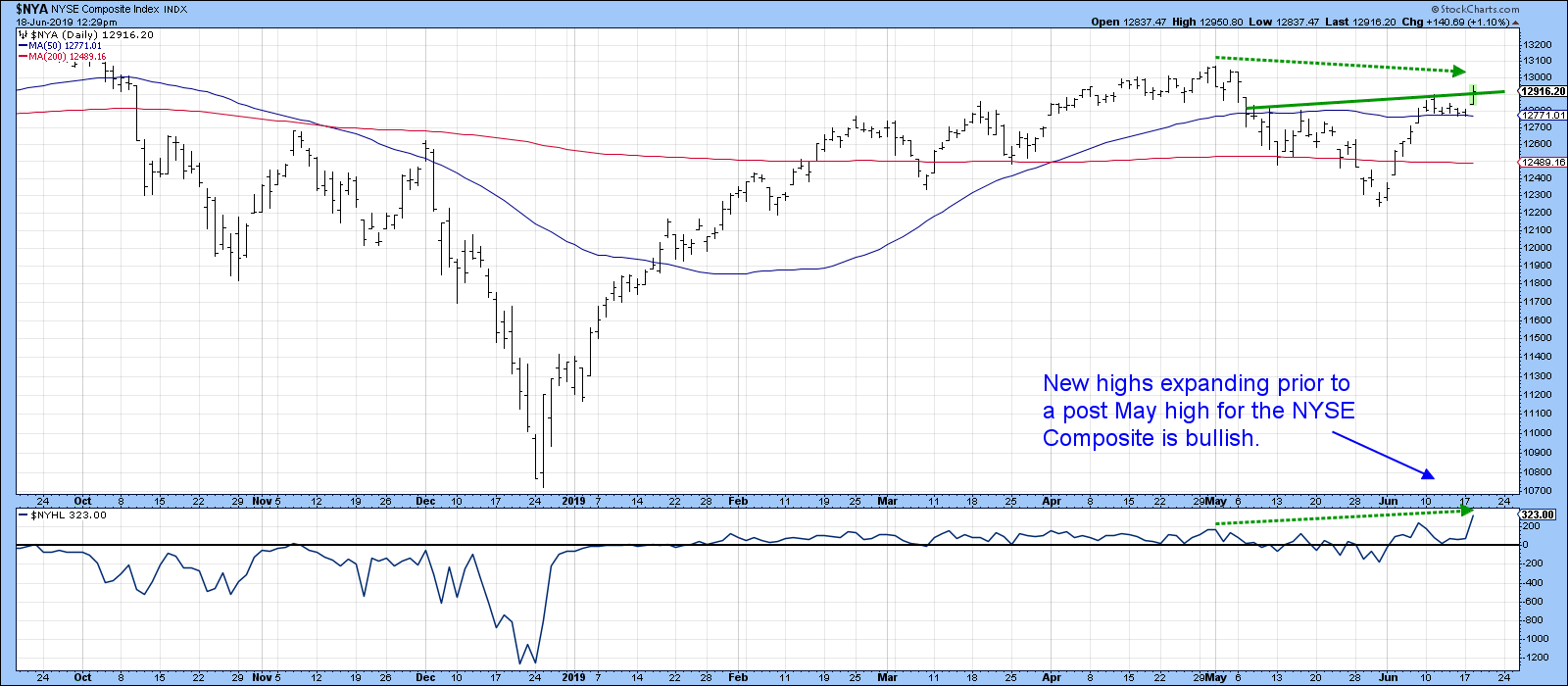 Chart 7 Chart 7
Good luck and good charting,
Martin J. Pring
The views expressed in this article are those of the author and do not necessarily reflect the position or opinion of Pring Turner Capital Group of Walnut Creek or its affiliates.
|
| READ ONLINE → |
|
|
|
 |
| The Mindful Investor |
| Dialing Down the Dollar |
| by David Keller |
Has the slow and grinding uptrend in the US Dollar finally reached its exhaustion point? A quick review of the charts suggests this may be the case.
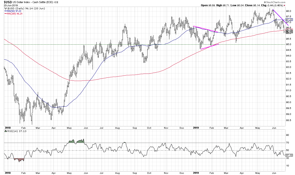 The $USD chart has certainly been a frustrating one for Dollar bulls, as the trend, while steadily positive, has not provided the upside follow-through you’d expect. Every time the Dollar index has approached the key 97.50 level, the greenback quickly reversed to find support around 94.50-95.00. The $USD chart has certainly been a frustrating one for Dollar bulls, as the trend, while steadily positive, has not provided the upside follow-through you’d expect. Every time the Dollar index has approached the key 97.50 level, the greenback quickly reversed to find support around 94.50-95.00.
That all changed in late April, when the $USD finally reached 98 as it trended above two upward-sloping moving averages. All is well, right? Not so fast.
The US Dollar tested 98 three times in April and May, but was never able to go meaningfully higher. After that came a breakdown of the 50-day moving average, which often serves as support during brief price pullbacks.
This week, the Dollar established a lower high for the first time since April, before then breaking below its most recent swing low. That means that the Dollar is now in a Dow Theory downtrend of lower highs and lower lows.
Thursday and Friday also saw the Dollar index reach below the 200-day moving average. If this breakdown is confirmed next week, that would be the first time since April 2018 that the Dollar has remained below this key long-term barometer.
The Dollar Bullish ETF (UUP) is another way to track the rotation from bullish trend to bearish phase.
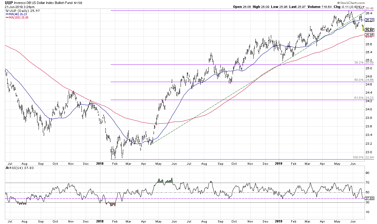 Here we see a significant trend line break that occurred in early June, where the price broke down through a trend line formed from the key lows in 2018 and 2019. The bounce last week pushed the price back up to that trend line before the Dollar resumed its downside push. Here we see a significant trend line break that occurred in early June, where the price broke down through a trend line formed from the key lows in 2018 and 2019. The bounce last week pushed the price back up to that trend line before the Dollar resumed its downside push.
The RSI is important to watch here. Have you noticed how the last couple significant pullbacks in price have seen the RSI move down to around 40? A break of this RSI 40 level would suggest a rotation from a bullish phase to a bearish phase, with downside momentum increasing from previous selloffs.
So what’s next?
Well, the Dollar index has already broken the 200-day moving average, although the UUP has not yet done so. I’d look for the UUP to break down through this key trend mechanism to confirm further downside for the Dollar.
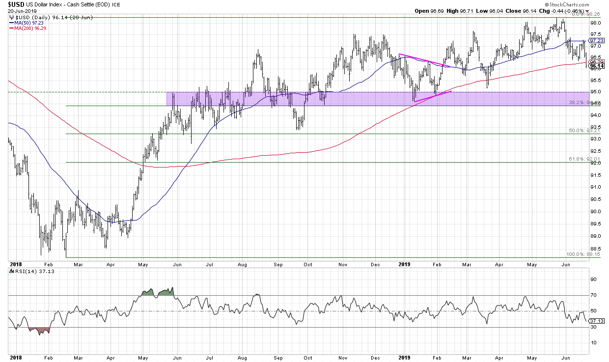 If this does occur, look to the 94.50-95.00 range on the US Dollar chart. That area has served as support a number of times so far this year and was an area of price congestion in 2018 as well. This would line up well with the first Fibonacci retracement level using the 2018-2019 Dollar rally. If this does occur, look to the 94.50-95.00 range on the US Dollar chart. That area has served as support a number of times so far this year and was an area of price congestion in 2018 as well. This would line up well with the first Fibonacci retracement level using the 2018-2019 Dollar rally.
RR#6,
Dave
David Keller, CMT
President, Sierra Alpha Research LLC
Disclaimer: This blog is for educational purposes only and should not be construed as financial advice. The ideas and strategies should never be used without first assessing your own personal and financial situation or without consulting a financial professional.
The author does not have a position in mentioned securities at the time of publication. Any opinions expressed herein are solely those of the author and do not in any way represent the views or opinions of any other person or entity.
|
| READ ONLINE → |
|
|
|
| Trading Places |
| The Bullish Case For Gold Isn't All That Strong |
| by Tom Bowley |
The price of gold ($GOLD) closed on Friday at $1400.10 per ounce. The weekly gain of 4.14% was the best such weekly advance since April 2016 and the close above $1400 was the first such close since September 3, 2013. Since testing 2019 lows on May 21st, GOLD has rallied more than 10% in just one month. What's not to like?
Well, for starters, there's the following 8-year relative downtrend vs. the benchmark S&P 500:
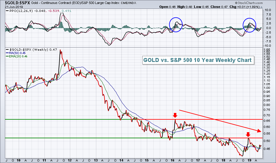 What drives that type of relative underperformance in GOLD? A rising U.S. Dollar Index ($USD). The USD has had some short-term issues of late, closing on Friday at its lowest level in nearly three months. For one of the few times in the past several years, I've been short-term bullish on GOLD because I believed we'd see short-term deterioration in the USD based on this chart: What drives that type of relative underperformance in GOLD? A rising U.S. Dollar Index ($USD). The USD has had some short-term issues of late, closing on Friday at its lowest level in nearly three months. For one of the few times in the past several years, I've been short-term bullish on GOLD because I believed we'd see short-term deterioration in the USD based on this chart:
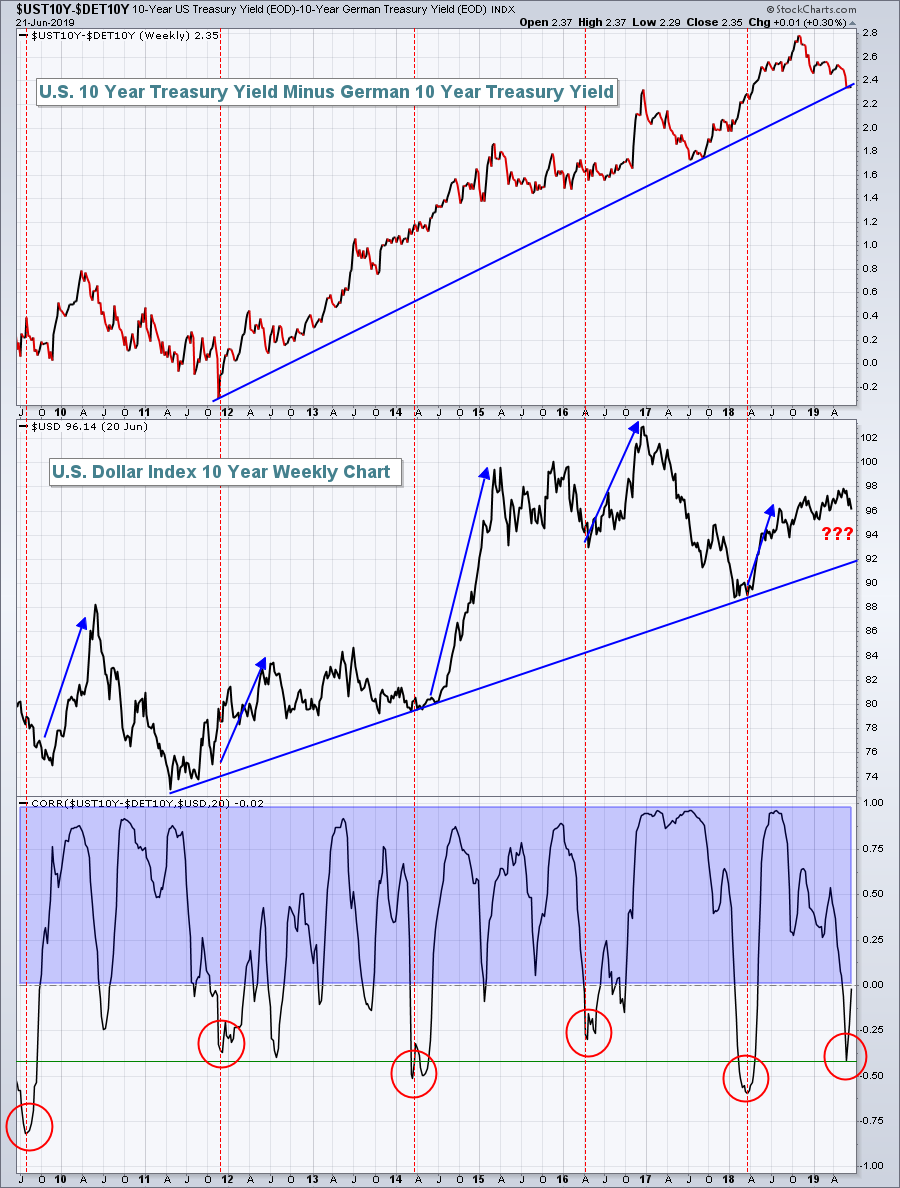 The USD had stubbornly been holding up despite a big drop in U.S. treasury yields vs. German treasury yields. If you look back to 2017, the relative drop in U.S. treasury yields resulted in a big drop in the USD. The red circles at the bottom of the chart show rare "inverse correlations" that have generally been resolved with a subsequent rise in the USD. At best, we have a mixed picture here. The USD had stubbornly been holding up despite a big drop in U.S. treasury yields vs. German treasury yields. If you look back to 2017, the relative drop in U.S. treasury yields resulted in a big drop in the USD. The red circles at the bottom of the chart show rare "inverse correlations" that have generally been resolved with a subsequent rise in the USD. At best, we have a mixed picture here.
If the USD rises from here, GOLD will most likely be in trouble based on this chart:
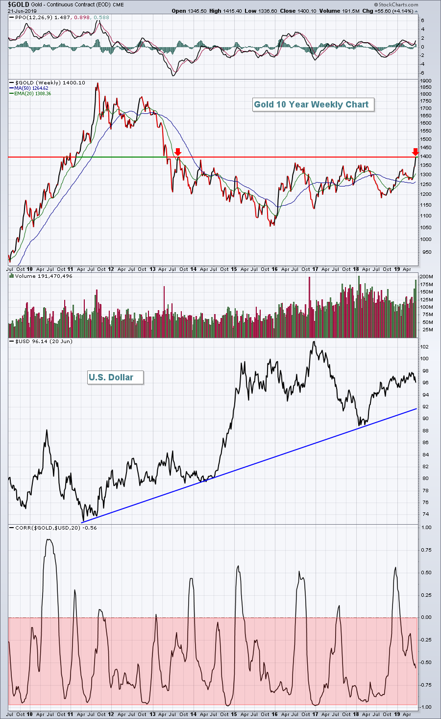 The red-shaded area highlights the inverse correlation between the direction of GOLD vs. the direction of the USD. Until the USD breaks that 8-year uptrend line, I am likely to have little interest in GOLD from a long-term perspective. The red-shaded area highlights the inverse correlation between the direction of GOLD vs. the direction of the USD. Until the USD breaks that 8-year uptrend line, I am likely to have little interest in GOLD from a long-term perspective.
If we do see short-term continuing deterioration in the USD, then GOLD is likely to sustain its move above $1400, which would represent a 6-year price breakout. But guess what? The S&P 500 just broke out to an all-time high! Despite all the headline news that GOLD is receiving right now, the S&P 500 has outperformed GOLD thus far in June. That's right, the S&P 500 has gained more in June than GOLD - which is exactly my point.
Successful investing comes down to relative performance. If you can beat the benchmark S&P 500 index, I consider that successful investing. GOLD hasn't been able to consistently do that for 8 years! Will it finally begin to outperform consistently? I want to see it first. Show me the money!
Here's the bottom line: GOLD is competing with too many other asset classes. Treasuries and U.S. equities have been hot. Foreign equities are gaining strength and remain in long-term uptrends, unlike GOLD. Central bankers around the globe remain dovish with no inflation in sight. This isn't the best environment for GOLD, at least not in my view. Could it be a short-term trade? Yes. Would I put money in GOLD at current levels and expect it to outperform the S&P 500? Not a chance.
Relative strength holds the key. I'm sticking with proven outperforming sectors, industries and stocks - not GOLD. I recently joined EarningsBeats.com for a relative strength webinar; the recording is still available if you're interested. CLICK HERE for more information.
Happy trading!
Tom
|
| READ ONLINE → |
|
|
|
|
|
| The MEM Edge |
| Small Caps and Biotechs Have Both Turned Positive - Here Are 3 Candidates for Your Consideration |
| by Mary Ellen McGonagle |
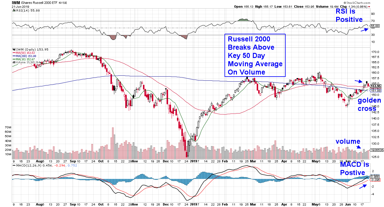
June is shaping up to be quite a month, with the S&P 500 on track to outpace January as the best-performing period. Of special note is this week’s move into Biotechnology and Small Cap stocks, which both have struggled since stalling out in February. With money flows into these laggards, a downtrend reversal is shaping up.
This is very good news, not only for these stocks but for the markets in general. Given the lowered liquidity in Small Caps and the lack of earnings in Biotechs, both of these areas are viewed as risky. A move back into these riskier stocks historically points to investor confidence, which helps further bolster the prospects for the broader markets.
DAILY CHART OF RUSSELL 2000 SMALL CAP ETF
 DAILY CHART OF NASDAQ BIOTECHNOLOGY ETF DAILY CHART OF NASDAQ BIOTECHNOLOGY ETF
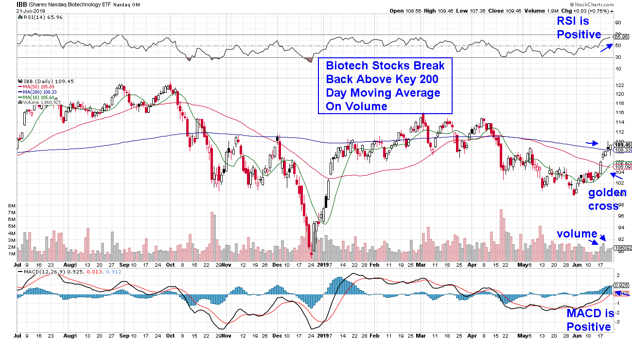 Today, I’ll be highlighting 2 Small Cap Biotech stocks that are technically attractive. However, before proceeding, it’s important to note that, given the inherent volatility in smaller biotechs, there may be higher risk associated with these names. For those more conservative, I’ll also be reviewing a diversified ETF that provides participation in the move into Biotechs without as much potential angst. Today, I’ll be highlighting 2 Small Cap Biotech stocks that are technically attractive. However, before proceeding, it’s important to note that, given the inherent volatility in smaller biotechs, there may be higher risk associated with these names. For those more conservative, I’ll also be reviewing a diversified ETF that provides participation in the move into Biotechs without as much potential angst.
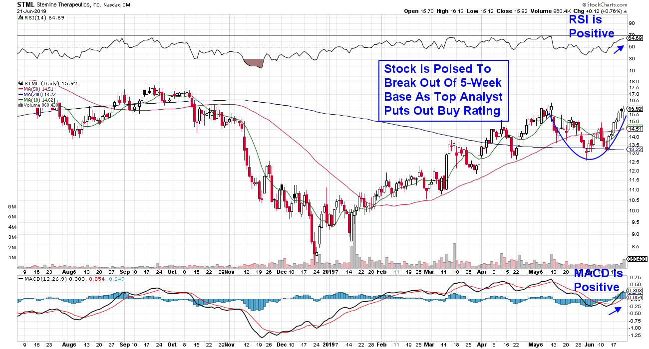
The first company is Stemline Therapeutics Inc. (STML), which focuses on the development of oncology therapeutics. The company received FDA approval for a rare blood disease treatment in late December, which helped them post revenues that were ahead of estimates for Q1. This week, STML presented in front of the European Congress of Rheumatology with an eye toward an approval overseas, which would boost sales further.
As you can see in the chart below, the stock is very close to breaking out of a 5-week base, which would be very bullish. However, given the stock's recent strong advance, I would suggest being a buyer on any pullback.
DAILY CHART OF STEMLINE THERAPEUTICS (STML)
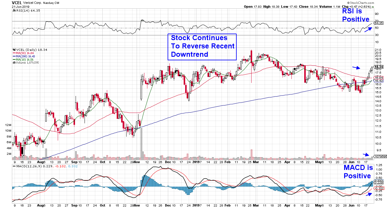
Next up is Vericel Corporation (VCEL), which develops therapies for sports medicine and severe burn victims. The stock has been under accumulation recently as the company continues to expand their licensing agreements with burn treatment products, which are expected to boost revenues. In fact, a report out this week shows a 32% increase in the number of hedge funds who own Vericel this quarter vs. last quarter. This pick-up in institutional participation, coupled with continued positive growth prospects, should benefit this stock.
DAILY CHART OF VERICEL CORP. (VCEL)
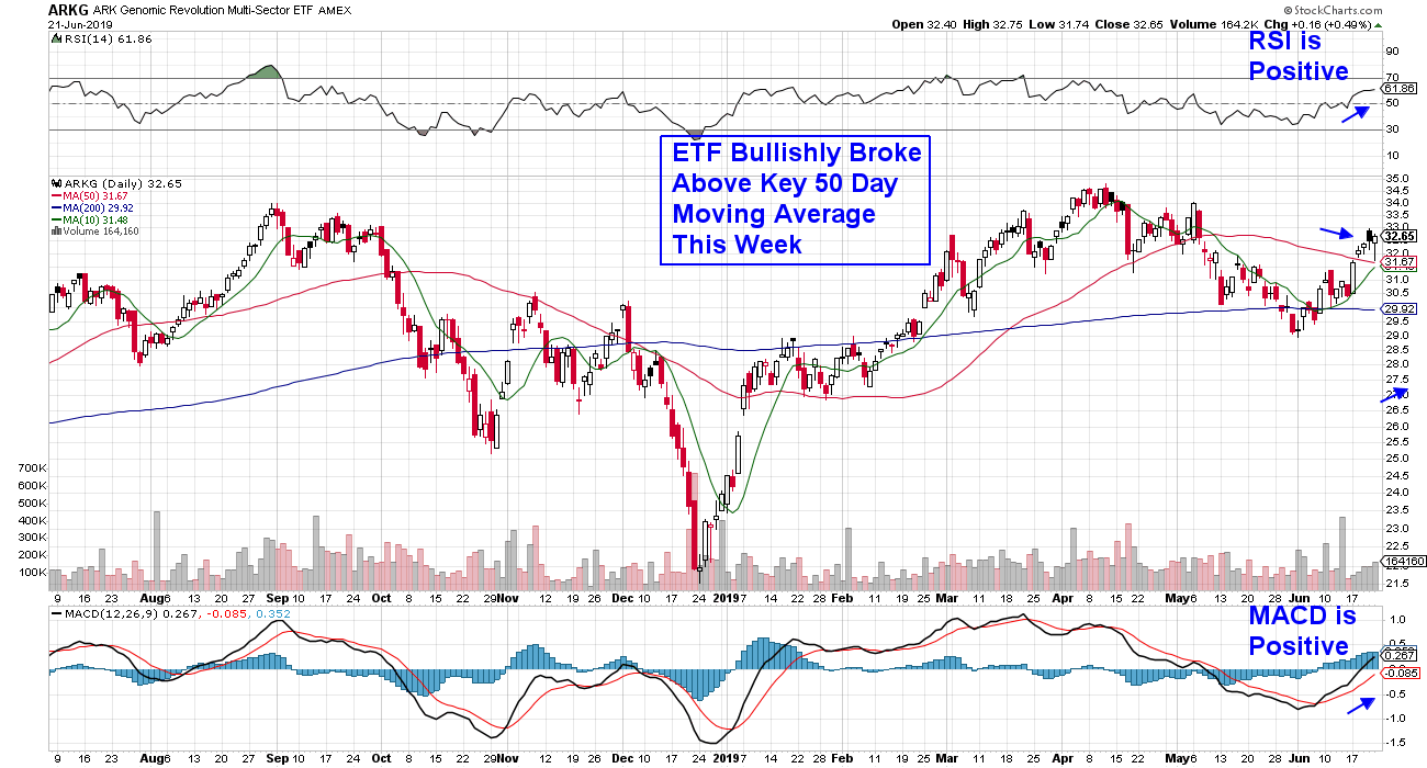
 Lastly, we have Ark (ARKG), an ETF comprised of high-quality Biotechnology stocks across many disciplines, including gene therapy, targeted therapeutics and oncology, among others. As you can see, ARKG has had a bullish break back above its 50-day moving average and, if you were to view a weekly chart, you’d see that it’s emerging from an oversold position. Lastly, we have Ark (ARKG), an ETF comprised of high-quality Biotechnology stocks across many disciplines, including gene therapy, targeted therapeutics and oncology, among others. As you can see, ARKG has had a bullish break back above its 50-day moving average and, if you were to view a weekly chart, you’d see that it’s emerging from an oversold position.
DAILY CHART OF ARK GENOMIC REVOLUTION ETF (ARKG)
 For those interested in finding out more about this and other innovative ETFs that Ark Invest ETFs manages, tune in to my weekly The MEM Edge show on StockCharts TV, as their client portfolio manager Renato Leggi will be my guest on Monday July 8th at 10:30 am. For those interested in finding out more about this and other innovative ETFs that Ark Invest ETFs manages, tune in to my weekly The MEM Edge show on StockCharts TV, as their client portfolio manager Renato Leggi will be my guest on Monday July 8th at 10:30 am.
Warmly,
Mary Ellen McGonagle
MEM Investment Research
|
| READ ONLINE → |
|
|
|
| RRG Charts |
| Will China Be Able To Complete Its Current Rotation Inside Positive Territory And Start A New Period Of Outperformance?? |
| by Julius de Kempenaer |
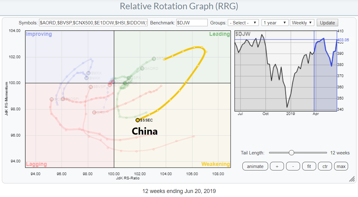
 On the above Relative Rotation Graph, which shows the rotation for international stock indexes against the Dow Jones World index, we really ought to pay attention to the long tail inside the weakening quadrant for the Chinese market. On the above Relative Rotation Graph, which shows the rotation for international stock indexes against the Dow Jones World index, we really ought to pay attention to the long tail inside the weakening quadrant for the Chinese market.
This rotation follows a strong performance of the Chinese market during the first four months of the year, which was followed by a 50% correction. At the moment, $SSEC is putting a first higher low into place, which could offer good entry opportunities.
China
Regarding China, the big question will be if that market can curl back up towards and into the leading quadrant and subsequently complete a rotation at the right-hand side of the RRG.
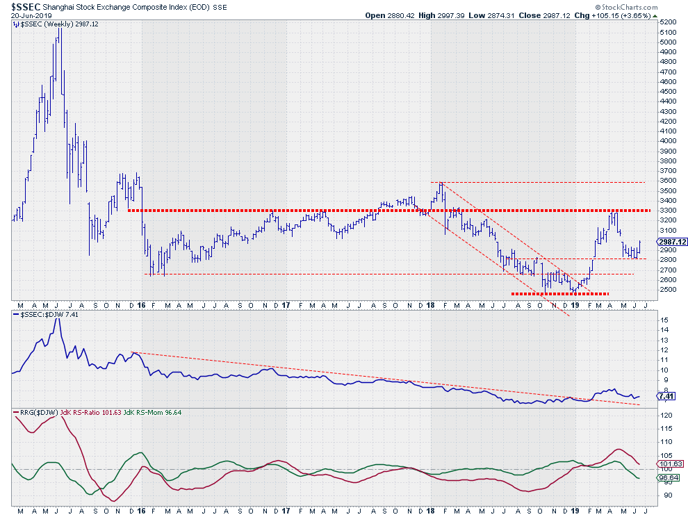
The weekly chart below of the Shanghai Stock Exchange Composite Index ($SSEC) gives us a few good clues.
Weekly
 The downtrend that characterized 2018 bottomed out towards the end of that year and going into 2019. By January and February, $SSEC managed to break the falling resistance line and complete a double bottom formation, breaking above the November high around 2700. The rally that followed out of that bottom took prices back to 3300, where they hit a horizontal level that had acted as support and resistance on a few occasions since 2016. The downtrend that characterized 2018 bottomed out towards the end of that year and going into 2019. By January and February, $SSEC managed to break the falling resistance line and complete a double bottom formation, breaking above the November high around 2700. The rally that followed out of that bottom took prices back to 3300, where they hit a horizontal level that had acted as support and resistance on a few occasions since 2016.
Another sign of strength occurred when the decline from that test of resistance resulted in a new higher low at 2800.
This week, the Chinese market is working its way higher out of that newly formed low, which is more visible on the daily chart.
Daily
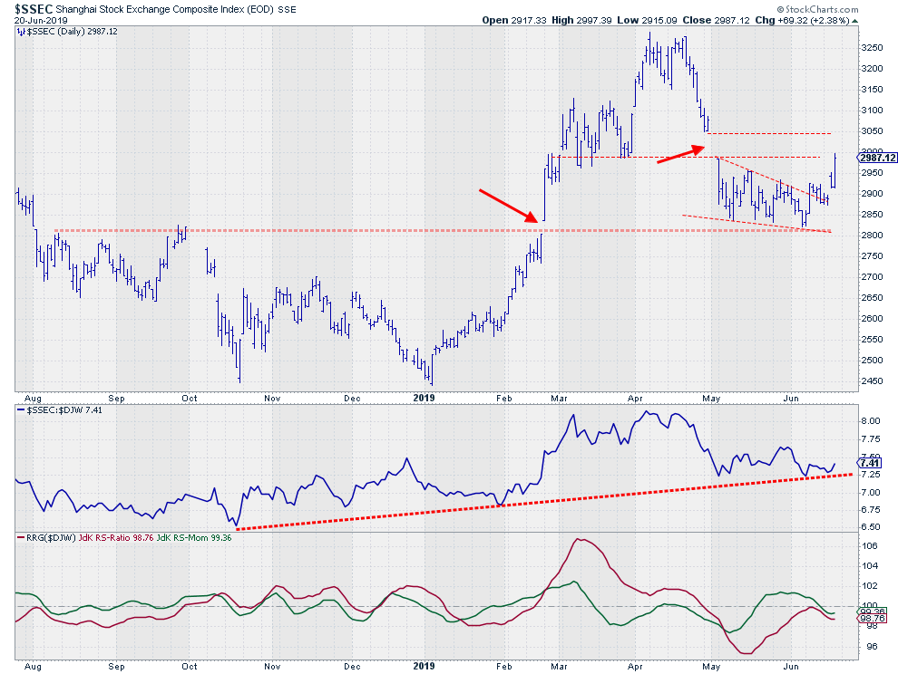
 The detail on this daily chart also shows that the forming of support near 2800 took place at a level that played a role a few times before in 2018, including a small gap in February of this year. At the moment, $SSEC is entering the gap resistance area between 3000-3050. Clearing that barrier will be another sign of strength and is necessary for the $SSEC to extend current strength in a more meaningful rally. The detail on this daily chart also shows that the forming of support near 2800 took place at a level that played a role a few times before in 2018, including a small gap in February of this year. At the moment, $SSEC is entering the gap resistance area between 3000-3050. Clearing that barrier will be another sign of strength and is necessary for the $SSEC to extend current strength in a more meaningful rally.
In terms of relative strength, the market is holding up well above support. On the weekly chart, $SSEC is holding up above the former falling resistance line. On the daily chart, the rising support line, starting at the October 2018 low, is getting stronger and stronger.
The RRG-Lines on the weekly chart need to start turning upward soon in order to keep $SSEC at the right-hand side of the RRG and, consequently, push this market back into the leading quadrant.
On the daily RRG, China is inside the lagging quadrant following the recent flat-to-weakening relative strength, but has just turned back up into a positive RRG-Heading. When relative strength can hold up above current support, the daily tail should be able to continue towards the improving and leading quadrants in the near future. The speed at which such a turn occurs will influence the ability for $SSEC to complete the turn on the weekly chart without going through lagging.
All in all, the current outlook for the Chinese market, compared to other international stock markets, is still strong, but the improvement that is now visible should continue in coming weeks in order to keep this outlook alive.
This setback following a long-term turnaround seems to be offering a relatively low-risk entry point to participate in a potential new rally for Chinese stocks, at least on a relative basis.
My regular blog is the RRG Charts blog. If you would like to receive a notification when a new article is published, simply Subscribe using your email address.
Julius de Kempenaer
Senior Technical Analyst, StockCharts.com
Creator, Relative Rotation Graphs
Founder, RRG Research
Want to stay up to date with the latest market insights from Julius?
– Follow @RRGResearch on Twitter
– Like RRG Research on Facebook
– Follow RRG Research on LinkedIn
– Subscribe to the RRG Charts blog on StockCharts
Feedback, comments or questions are welcome at Juliusdk@stockcharts.com. I cannot promise to respond to each and every message, but I will certainly read them and, where reasonably possible, use the feedback and comments or answer questions.
To discuss RRG with me on S.C.A.N., tag me using the handle Julius_RRG.
RRG, Relative Rotation Graphs, JdK RS-Ratio, and JdK RS-Momentum are registered trademarks of RRG Research.
|
| READ ONLINE → |
|
|
|
| MORE ARTICLES → |
|
 Chart 5
 Chart 6
 Chart 7

 The $USD chart has certainly been a frustrating one for Dollar bulls, as the trend, while steadily positive, has not provided the upside follow-through you’d expect. Every time the Dollar index has approached the key 97.50 level, the greenback quickly reversed to find support around 94.50-95.00.
 Here we see a significant trend line break that occurred in early June, where the price broke down through a trend line formed from the key lows in 2018 and 2019. The bounce last week pushed the price back up to that trend line before the Dollar resumed its downside push.
 If this does occur, look to the 94.50-95.00 range on the US Dollar chart. That area has served as support a number of times so far this year and was an area of price congestion in 2018 as well. This would line up well with the first Fibonacci retracement level using the 2018-2019 Dollar rally.


 DAILY CHART OF NASDAQ BIOTECHNOLOGY ETF
 Today, I’ll be highlighting 2 Small Cap Biotech stocks that are technically attractive. However, before proceeding, it’s important to note that, given the inherent volatility in smaller biotechs, there may be higher risk associated with these names. For those more conservative, I’ll also be reviewing a diversified ETF that provides participation in the move into Biotechs without as much potential angst.
 Lastly, we have Ark (ARKG), an ETF comprised of high-quality Biotechnology stocks across many disciplines, including gene therapy, targeted therapeutics and oncology, among others. As you can see, ARKG has had a bullish break back above its 50-day moving average and, if you were to view a weekly chart, you’d see that it’s emerging from an oversold position.
 For those interested in finding out more about this and other innovative ETFs that Ark Invest ETFs manages, tune in to my weekly The MEM Edge show on StockCharts TV, as their client portfolio manager Renato Leggi will be my guest on Monday July 8th at 10:30 am.