| THIS WEEK'S ARTICLES |
| The Market Message |
| The MSCI All-World Stock Index is Testing its Early 2018 High |
| by John Murphy |
Editor's Note: This article was originally published in John Murphy's Market Message on Friday, July 26th at 11:16am ET.
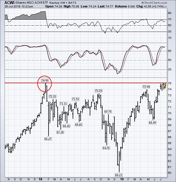
Global stock indexes are once again testing overhead resistance barriers. The weekly bars in Chart 1 show the MSCI All Country World Index iShares (ACWI) in the process of testing its previous high set at the start of 2018 (see red circle). Any test of a prominent previous peak always bears close watching. Weekly momentum indicators also suggest a potential overbought condition.
The 9-week RSI line (top box) is nearing overbought territory at 70. While the 14-week slow stochastics oscillator (middle box) is already well into overbought territory over 80. That doesn't mean that the ACWI won't clear its 2018 peak. It just means that global stocks have another chart barrier to overcome. More than half of the ACWI (56%) is comprised of U.S stocks (which have already hit new highs). Foreign stocks (which are lagging way behind the U.S.) are holding it back.
Chart 1
|
| READ ONLINE → |
|
|
|
| Art's Charts |
| Relative Strength Based on Price Action |
| by Arthur Hill |
Price action is not everything, it’s the only thing. This is what Vince Lombardi might have said were he a trader or investor. Indicators are great for scans and sorting through hundreds of stocks, but nothing takes the place of price action. Moreover, our profits and losses are based on price values, not indicator values.
At the risk of stating the obvious, bullish price action occurs when a stock records higher highs and higher lows. Bearish price action is when price a stock records lower lows and lower highs. Chartists can compare a stock's highs and lows against those of a market benchmark to find stocks showing relative "chart" strength. When SPY is forming a lower low, chartists should look for stocks that are NOT forming lower lows. These stocks are holding up better than the market and often lead when the market turns back up. Let's look at an example.

The next chart shows a peak-trough example using SPY and Workday (WDAY). First, we should all have an idea of recent peaks and troughs in SPY or the S&P 500, even without looking at the chart. At the time, we all knew that SPY moved well below its October-November low in December. WDAY, on the other hand, formed a higher lower in November and even broke out to a 52-week high in December. The stock held up better on the way down and hit a new high well before SPY. Talk about a leader!

Workday also held up better than SPY in May-June. Notice that SPY moved below its April lows with the May decline, but WDAY held above the April lows. In addition, WDAY hit a new high on June 10th, ten days before SPY hit a new high. As far as the price chart is concerned, WDAY held up better during broad market weakness and performed better when the market rebound.
- Index and Sector Breadth Tables Bullish
- New Signal from Mid-Cap %Above 200-day EMA
- Breadth and Price Charts for XLI, XLV and XLF
- Leading ETFs Making New Highs in July
- Reversal Alert Zones (RAZ’s) in IBB and XBI
Click here to Watch
|
| READ ONLINE → |
|
|
|
| The Canadian Technician |
| Paradise By The Dashboard Lights |
| by Greg Schnell |
This week has been an interesting one for the transports. Transports traditionally include Railways, Trucking and Airlines, but, for the purposes of this article, we'll add the Autos in.
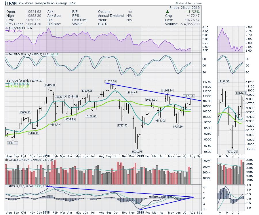
First, let's take a look at the transports index. Transports have underperformed against the $SPX, as shown in the top shaded panel. When this purple area chart trends up, the transports would be outperforming. The full stochastic still has a positive slope, so that is bullish. Looking at price, we still have a series of lower highs in place. The last two weeks saw some explosive volume, including options expiration Friday and lots of earnings releases. I do like that the PPO has just turned up around the zero level, as you can see in the zoom box. The next goal will be to break the two-year downtrend in momentum on the PPO. Just a broad look at the transports suggests a sideways chart for the last two years.
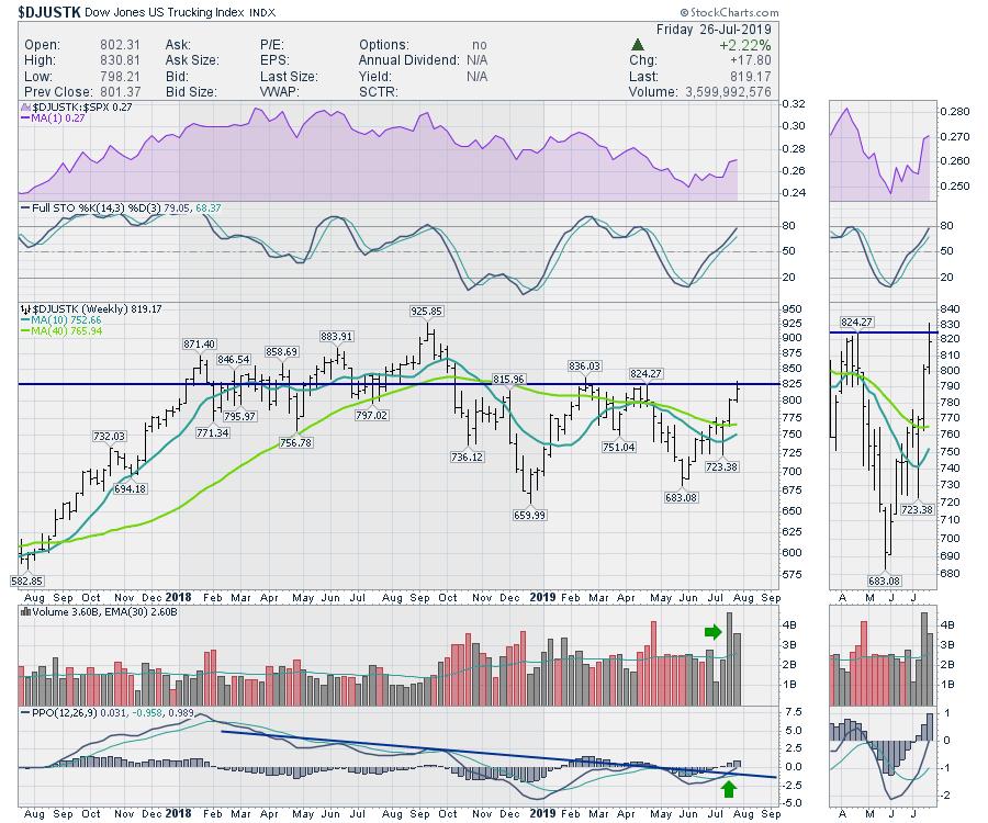
The Trucking chart has been surging since the earnings from the big carriers. They mentioned a slowdown in volumes, but the chart has been running on 18 wheels for June and July. I do like the fact that the PPO has a clear momentum trend line that has been broken; that looks very bullish to me.
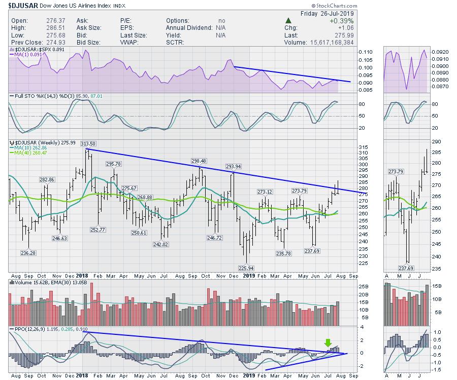
The airline index has had two big selling bars the last two weeks. This chart has some weakness in relative strength, shown in purple. While the price bars of the last two weeks broke the trend line, they also retreated and closed on the lows, which looks weaker. That adds a little caution. Once again, the downtrend on the PPO, which measures momentum, has been broken. I find that very bullish.
Next is the railroads. I have used a different timeline for the railway chart. The reason is that this chart also broke down in 2015 in a timely fashion, telling us about an impending top in the market. I'm bringing it to your attention this week because of the break in relative strength after a two-year uptrend. The purple area charts show the railroads close to the four-year uptrend in relative strength as well. One interesting reason to pay close attention to the railways is that railroads are the only charts in the transport index I can find which reflect some sort of a signal towards the broader market. So, when the railroads break their relative strength uptrend, it is worthy of remembering. Also, notice how cleanly they trend in relative strength.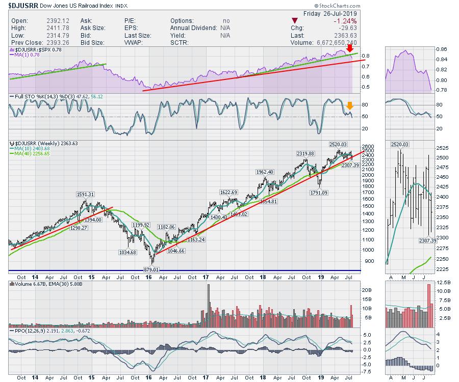
Here is the autos chart. With the weakness in Tesla and Ford this week, the chart is hurting following a nice run up. With the PPO trapped below zero and no momentum higher, this looks like an industry group to avoid. That was a vicious outside bar to wrap up the week.
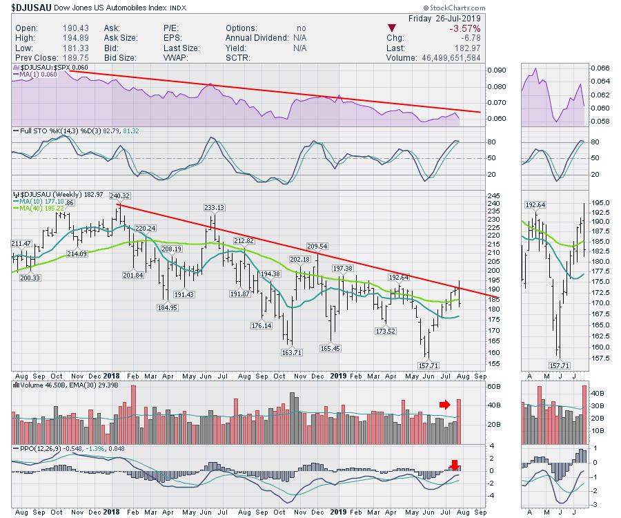
In summary, the truckers chart looks better than the earnings information. Watch closely to see if it can break horizontal resistance. The airlines selling bars suggest caution. The break in the clean trend of railway outperformance to the SPX is a big red flag for me, one I'll be watching closely. Lastly, the autos look like an avoid.
Thus, while the top two charts have been a sideways mess, it's the potential for trend change on the railways that concerns me the most. Just like a late night drive in the country with the glow of the dashboard lights... be careful when crossing railway tracks.
|
| READ ONLINE → |
|
|
|
| ChartWatchers |
| Emerging Leadership From Two Key Groups - On Your Mark, Get Set, TRADE!!! |
| by John Hopkins |
With a new earnings season comes new leadership, and I'm already beginning to see a shifting of industry winds. Sure, some of the prior leaders continue to show leadership - software ($DJUSSW), financial administration ($DJUSFA), renewable energy ($DWCREE), and restaurants & bars ($DJUSRU) - but, as the current bull market extends its record run, there are other emerging leaders that we need to be aware of and take advantage of. I'll give you my two favorites below; in both cases, recent earnings back me up.
1. Defense ($DJUSDN)
Over the past three months, the DJUSDN has been among the top 10% of industry groups. It hasn't gotten there by accident, either; huge earnings reports from the likes of Northrop Grumman (NOC), Lockheed Martin (LMT) and Raytheon (RTN) are confirming the DJUSDN's relative strength since May. The change in trend took place then and can easily be seen on the following relative strength chart:

Just wait for the best of this group to report its earnings. That company, which will be reporting its earnings in the next two weeks, will be featured as part of our FREE EB Digest newsletter on Monday. I think it'll be an absolute blowout! If you're interested in receiving earnings and relative strength-related charts throughout the week to help you in your trading and investing (and more specifically this defense stock on Monday), then CLICK HERE to sign up. It's FREE!!!
2. Internet ($DJUSNS)
The DJUSNS had been a leading group through April 2019, but the May selling really hit this group hard. I started to sour on it, quite honestly, but, if you notice, the relative momentum (PPO) barely moved beneath the zero line. It has now started to turn higher again, with tremendous relative strength since the recent stock market low the first day of June:

Furthermore, the DJUSNS broke out on an absolute basis. Why? Well, the latest quarterly results from Alphabet (GOOGL), Twitter (TWTR) and Snap, Inc. (SNAP) were superb. Better-than-expected revenues and earnings, combined with solid technical price action and relative strength, is a recipe for outperformance in your portfolio.
These are two groups that I'll be trading - you should too.
At your service,
John Hopkins, President EarningsBeats.com
"Better Timing. Better Trades."
|
| READ ONLINE → |
|
|
|
| The Traders Journal |
| 140 New Reasons to Join the ChartPack Investing Ecosystem - ChartPack Update #24 (Q2, 2019) |
| by Gatis Roze |
 Once again, a big shout-out to our Tensile Trading ChartPack User community. This has become a sensational crowd-sourced collection of the best-of-the-best charts and ChartList organization. We’re all profiting handsomely from improving this collaborative investing tool. Don’t be bashful. We invite you to be a “commentariat” as well. Send us your suggestions! Once again, a big shout-out to our Tensile Trading ChartPack User community. This has become a sensational crowd-sourced collection of the best-of-the-best charts and ChartList organization. We’re all profiting handsomely from improving this collaborative investing tool. Don’t be bashful. We invite you to be a “commentariat” as well. Send us your suggestions!
It’s been said that to become a consistently profitable investor requires “extravagant preparation” over years. I maintain that it can be a lot easier than it sounds and over a much shorter time period. Yes, the art and craft of successful investing means you must learn to make good choices and not chase your impulses. But it is equally essential to have a dependable organized roadmap (i.e.ChartPack) and, of course, the discipline to allocate the appropriate mindshare on a regular basis. With that, we invite one and all to join our powerful investing ecosystem.
Here are brief descriptions of just some of this quarter’s enhancements and betterments, as well as the many fresh actionable insights from our X-ray analysis of all the Fidelity Select Sector Funds.
#10.4 — Bullish & Bearish Dashboard
Since we first made our personal ChartLists available to StockCharts subscribers in 2013 and through 23 subsequent upgrades, the ChartList that’s been commented upon the most is this one. In simplistic terms, it’s a market timing dashboard based on history. It’s been winnowed down strategically into a collection of the fifteen most powerful long term indicators. Investors vote with their portfolios either being bullish or bearish or someplace along that spectrum. These fifteen charts let you decided based on your own investing timeframe. We encourage all the investors in our ChartPack community to review these charts regularly.
As we write this update, there are no bearish charts. There are four charts that we might suggest you review:
- Chart #4.15 — The Fed Funds Rate is going flat.
- Chart #4.4 — Industrial Production had a pullback but has ticked up again.
- Chart #4.5 — The S&P 500 Earnings is still trending up, albeit momentum is decreasing.
- Chart #4.7 — The Average True Range is increasing and presently trending up.
A reminder: read the extensive notes that are beneath each chart and available in four different views.

#400-1 —Sectors / Percentage New Highs Less New Lows
If investors leaned exclusively on the ChartPack simply for Sector SPDR analysis and insights, it would pay for itself in a week. Sensational stocks in great industries won’t necessarily make you money if they occur in an out-of-favor sector. On the other hand, being invested in the sector that’s outperforming — even if the industry group and stock is lukewarm — can still put money in your pocket. It’s all about probabilities.
Our point is that first and foremost you have to nail your sector dissection. This is the entire foundation of our Tensile Trading high probability investment methodology. In an uptrending market, pick those stocks that are doing three things: (a) in a sector that’s outperforming the market (VTI — the Vanguard Total Index); (b) in an industry that is outperforming its sector; and (c) is the best-of-breed stock in its industry. In other words, you want a stock that is outperforming its brothers and sisters within its industry. A present example of this might be Inphi Corporation (IPHI).

But remember, it all starts with sector analysis.
This new ChartList is populated with twelve charts. They clearly show the underlying strength of all eleven sectors and the S&P 500 by plotting the percentage new highs minus percentage new lows. We’ve plotted them as Histograms and installed horizontal reference lines at +10 and -10 to make comparisons more visually powerful. We feel that the blue 5-day simple moving average line also makes comparisons easier. We look closely at these charts once a week and rank them by percentage change in the summary view. We also like to take note of whether the sector is outperforming the S&P 500 or underperforming.

#420 —Fidelity Sector Funds
By now, most readers grasp the significance of sectors as the bedrock of successful investing. In other words, you can pick the wrong equity, but if it’s in the right sector, you can still make money. Reinforcing this principle, we’ve added three Sector funds to the Fidelity Sector nest. Therefore, you’ll see that ChartList 420 — the master — now has three new sector funds bringing the total to 43. The new Sector Funds are:
- Global Commodity Fund
- Real Estate International Fund
- Real Estate Income Fund
Correspondingly, all three have their own ChartLists as well that contain their top holdings. Note that the Real Estate International Fund’s holdings are mostly private equity deals with only a few being publicly traded, such as Prologis, Inc. and Mitsubishi Estate Co.
#640 —Institutional Dividend Darlings
This ChartList has three parts. It’s populated with (1) four of the top dividend growth and appreciation mutual funds; (2) four of the largest and most liquid dividend focused ETFs; and (3) fourteen of the individual stocks that are most widely held by both groups — the mutual funds and the ETFs (as of April 19, 2019). The stock charts show both the dividend payments on the timeline, as well as their respective yields. This ChartList has it all — whether you are looking for solid dividend stocks, passive dividend ETFs or actively-managed dividend appreciation mutual funds.
Fidelity Select Sector Funds
The paramount focus of our tracking the Fidelity Sector Funds buys and sells each quarter is to monitor their accumulation and distribution of specific equities. While that continues to be our focus and where many profitable trades originate, don’t overlook other powerful insights. For example:
- Percentage return this past month exceeded 12% for Gold (FSAGX) and Semi-Conductors (FSELX) and it exceeds five percent for Health (FSHCX), Tech (FSPTX), Computers (FDCPX), and IT Services (FBSOX).
- For the top five funds over a slightly longer timeframe, the percentage return over the past three months is 6-8% for Leisure (FDLSX), Health (FSHCX), IT Services (FBSOX), Medical (FSMEX) and Insurance (FSPCX).
- An interesting factoid is that three very popular equities are held by up to eight different Sector Funds. Alphabet A (GOOGL) held by eight funds; Visa (V) held by six Funds; and MasterCard (MA) held by five Funds.
- The three largest dollar commitments collectively amongst all the Sector Funds are three different equities: Unitedhealth Group (UNH), AT&T (T); and United Parcel Service (UPS).
Already have the ChartPack? Here's how to upgrade:
- Log in to your account, then visit the "Manage ChartPacks" page (accessible from the bottom of the Members Dashboard or from the "Your Account" page).
- In the table that appears, find the entry for the "Tensile Trading ChartPack" (if you don't see the Tensile Trading ChartPack listed, that means that you haven't purchased it. Click Here to do so now).
- Click the "Re-Install" button next to the Tensile Trading ChartPack to start the update process
The download should take about 15 seconds, after which you can explore the new ChartLists and other updates!
New to the ChartPack? Here's how to install it:
If you'd like to add the Tensile Trading ChartPack to your StockCharts account, Click Here.
Trade well; trade with discipline!
- Gatis Roze, MBA, CMT
- Grayson Roze, Business Manager, StockCharts.com
StockMarketMastery.com
Co-Authors, Tensile Trading (Wiley, 2016)
Co-Presenters, How To Master Your Asset Allocation Profile
|
| READ ONLINE → |
|
|
|
| DecisionPoint |
| DP Bulletin! Negative Divergences on Major Indexes Flag an IT Decline |
| by Erin Swenlin |
On today's DecisionPoint show, we looked at some of the intermediate-term analysis charts and found some disturbing negative divergences. Below are the charts you need to see.
Starting off with the NYSE Composite, price has been flat, which explains the flat reading for percent above 200-EMA. However, there are sharp differences in the short-to-intermediate-term timeframe. Under the surface, we can see that more and more stocks are losing support at their 20- and 50-EMAs.

The negative divergences are quite clear in those same timeframes on the SPX. Notice how price continues to make new all-time price highs(!), all while fewer stocks are holding support at their 20/50-EMAs.

I was somewhat surprised that the technology-heavy Nasdaq was showing the same negative divergences. This is a sector of the market that has been enjoying quite a rally and has been relatively stronger than most of the other sectors. In spite of all that, here it is. Support continues to be lost at the 20/50-EMAs while price continues to set new all-time highs.

Conclusion: Imagine looking at a stock's price chart and seeing price fall below its 20-EMA -- that means it can't hold support at the 50-EMA, suggesting further decline. Once you see that, it's time to bail. It's been great at the all-time highs, but these indexes need to see full participation if we are to expect this rally to continue on.
Watch the latest episode of DecisionPoint with Carl & Erin Swenlin LIVE on Fridays 4:30p EST or on the StockCharts TV YouTube channel here!
Technical Analysis is a windsock, not a crystal ball.
Happy Charting! - Erin
erinh@stockcharts.com
Helpful DecisionPoint Links:
Erin's PMO Scan
DecisionPoint Chart Gallery
Trend Models
Price Momentum Oscillator (PMO)
On Balance Volume
Swenlin Trading Oscillators (STO-B and STO-V)
ITBM and ITVM
SCTR Ranking
**Don't miss DecisionPoint Commentary! Add your email below to be notified of new updates"**
|
| READ ONLINE → |
|
|
|
|
|
| MORE ARTICLES → |
|


 Once again, a big shout-out to our


