| THIS WEEK'S ARTICLES |
| Market Roundup |
| Most Sectors Still Experiencing Rising Peaks and Troughs |
| by Martin Pring |
Editor's Note: This article was originally published in Martin Pring's Market Roundup on Wednesday, August 27th at 4:15pm ET.
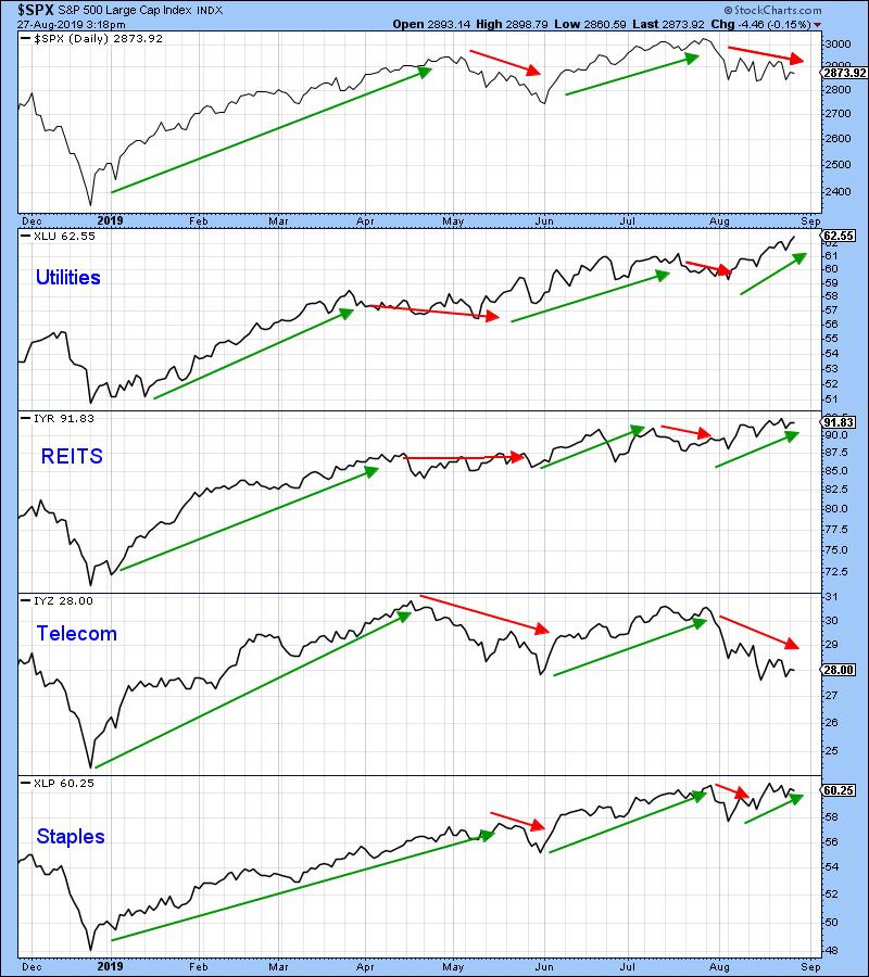
One simple and very much overlooked technique for trend identification is to observe whether the price of a security is experiencing a series of rising peaks and troughs. When that progression reverses to one of a series of declining peaks and troughs, it represents one piece of valuable technical evidence that the tide has turned. The top panel of Chart 4 tells us that the S&P has experienced a series of rising peaks and troughs since last December. That action clearly indicates positive technical characteristics. It’s also a useful idea to see whether such action is being supported by a majority of the sectors and key industry groups.
Charts 4, 5 and 6 take a closer look at current action and show that the S&P is being supported by virtually every sector and key industry groups. Chart 4 reflects defensive sectors and groups, which have generally outperformed since December. This strong relative action by defensive areas is typical of an equity market emerging from a bear trend. Utilities, REITS and staples have all followed the upward zig-zagging characteristics displayed by the S&P. In addition, they have all achieved new bull market highs. Telecom is the standout, having begun a series of declining peaks and troughs. It clearly does not support the idea of a generalized market rally.

Chart 4
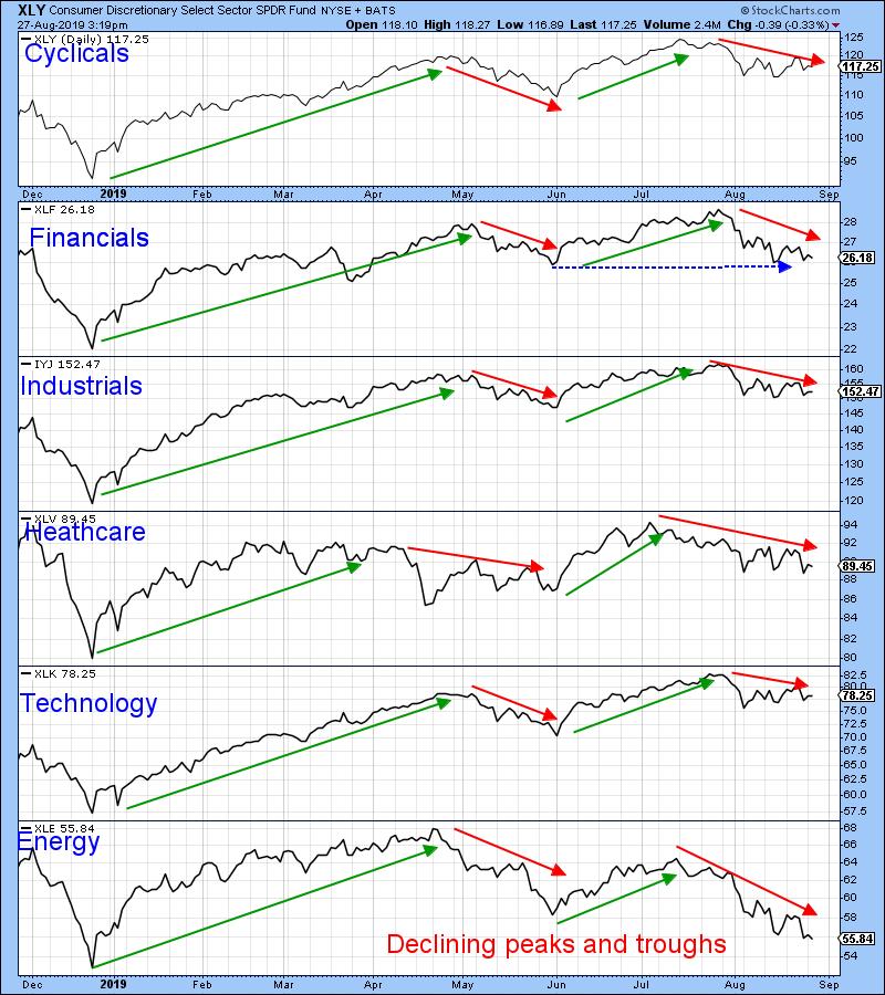
The sectors in Chart 5, for the most part, also reflect the higher peak-trough progression scenario. One area to watch is the financial sector, which is having difficulty remaining above its May low. This has been flagged by the horizontal blue arrow. It’s still bullish based on this technique, but is facing an important test in the period directly ahead. However, cyclicals, industrials, health care and technology are in firmly bullish territory. Note that I am using the iShares industrial sector ETF, as the SPDR (XLI) combines industrials with transports in its portfolio. I prefer to split them, as transports tend to be a leading sector and industrials a lagging one. Placing apples and oranges in the same bag does not make much sense to me.

Chart 5
Returning to Chart 5, we see that one sector (energy) has started to trace out a series of declining peaks and troughs. If the markets do slip through those red trend lines in Charts 1 and 2, this weakness suggests that energy could well lead the way.
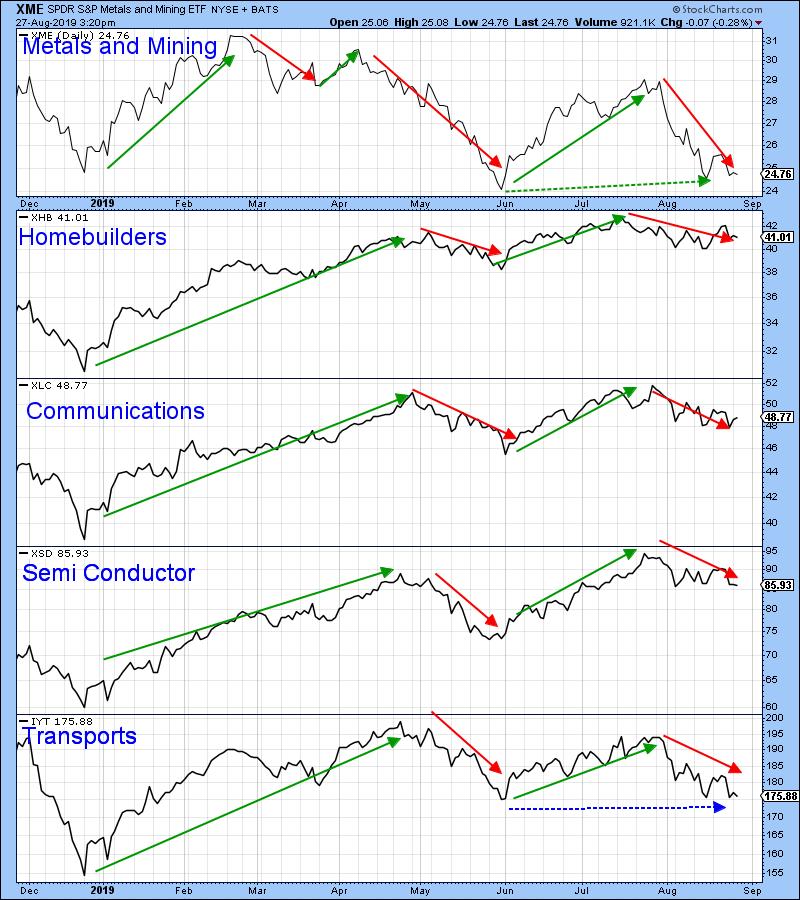
Metals and Mining (XME), as Chart 6 shows, has experienced a declining peak, but the rising troughs are still intact. The remaining groups in the chart, are continuing to experience a positive peak trough progression, though transports may be close to a break of their May low. Until the price does register a post May low, it is wiser to assume that the overall trend of rising peaks and troughs is intact. That May low is critical, though, since the IYT already experienced a lower peak in late July. A post-May low would therefore signal declining peaks and troughs.

Chart 6
Good luck and good charting,
Martin J. Pring
The views expressed in this article are those of the author and do not necessarily reflect the position or opinion of Pring Turner Capital Group of Walnut Creek or its affiliates.
|
| READ ONLINE → |
|
|
|
| SPECIAL EVENT ANNOUNCEMENT |
| Calling all Toronto-area investors and traders! Our very own Greg Schnell will be speaking at the upcoming Toronto MoneyShow, September 20th - 21st. Free to register and attend, come down to hear Greg share his latest market analysis, see the charts he's watching most closely and meet the man himself in person. Plus, hear other great presentations from a long list of incredible speakers. Click the banner below to learn more and register. |
 |
| LEARN MORE → |
|
| The Mindful Investor |
| Should Market Breadth Be Cap-Weighted or Equal-Weighted? |
| by David Keller |
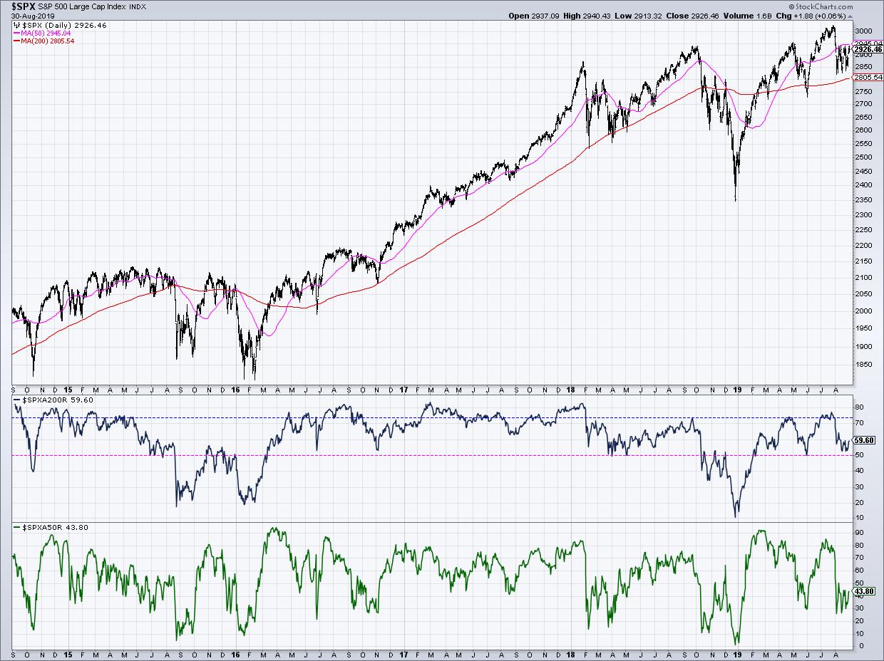
I recently tweeted about the percent of stocks above their 200-day moving averages, pointing out that there is a key line in the sand for this important breadth indicator. This resulted in a fantastic question about looking at market breadth in cap-weighted terms vs. equal-weighted terms. In this article, we’ll unpack why market breadth makes the most sense on equal-weighted terms and review where this indicator stands today.
The chart I sent around showed the S&P 500 index as well as the percent of SPX names above their 200-day moving averages, along with the percent of stocks above their 50-day moving averages.

I find the former to be an excellent measure of market participation in the intermediate-term. To put it another way: when the market makes a significant move over a couple of weeks, how many stocks are participating in the move?
The most recent selloff pushed this indicator from about 75% down to just above 50%. I often put a horizontal line at the 50% level just as a reminder that this is a key differentiator.
If the market pulls back but we remain above the 50% level, this suggests most stocks are remaining in an intermediate-term uptrend and the market overall is still in positive form. If this indicator breaks down through the key 50% point, then it often is a warning of further downside for the S&P 500.
So why do we look at market breadth on equal-weighted terms? And should we consider other forms?
As an example, we could look at breadth in cap-weighted terms, so, instead of measuring the number of stocks above their long-term moving averages, we could instead measure a percent of market cap above their moving averages. If you think about it, though, that would mean that a stock like AAPL or MSFT breaking the 200-day moving average would cause a large shift in this indicator, while some of the smaller SPX names would barely be a rounding error.
For me, it goes back to the very reason you look at breadth in the first place. The S&P 500 index (and most widely followed equity indexes, for that matter) are cap-weighted. As a result, they are very skewed to the largest companies and to the sectors that have the biggest weight in the index.
The point of market breadth is to look below the hood a bit and see how all the other stocks are participating relative to the trends of the largest names. So, when the SPX does one thing while the breadth indicator does something else, this tells you of a divergence between the larger and smaller companies in the index.
Every market breadth indicator I followed is based on an equal-weighted calculation for this very reason!
If you’re interested in learning more about market breadth, check out this primer on charting market breadth, as well as this list of commonly-used breadth indicators.
RR#6,
Dave
David Keller, CMT
President, Sierra Alpha Research LLC
Disclaimer: This blog is for educational purposes only and should not be construed as financial advice. The ideas and strategies should never be used without first assessing your own personal and financial situation, or without consulting a financial professional.
The author does not have a position in mentioned securities at the time of publication. Any opinions expressed herein are solely those of the author and do not in any way represent the views or opinions of any other person or entity.
|
| READ ONLINE → |
|
|
|
| Trading Places |
| The 3 Biggest Risks As We Enter September; The Trade War Isn't One |
| by Tom Bowley |
Listen, the media loves to overhype the trade war. Seriously, is there anyone that isn't aware of the trade war, the tweets, the rhetoric, etc. at this point? Hasn't everyone already priced in an economic disaster because of it? Oh wait! That's right, our economy is still growing and the jobs market is still expanding. I'm tired of all the trade war talk. It's baked in! There are at least three bigger issues in my view as we enter the month of September, so let's go over them one at a time, from the smallest risk to the biggest risk:
September
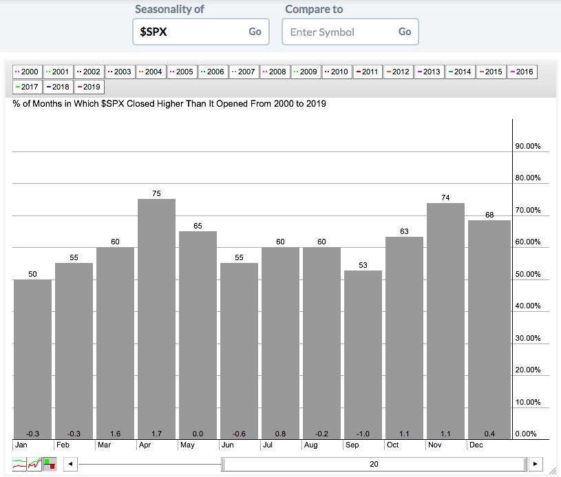
That's right. One issue is simply that it's September. The S&P 500 has produced annualized returns of -5.51% during the month of September since 1950. On the surface, that's a significant problem, as we're about to embark on the only calendar month of the year that has fallen more often than it's risen over the past 7 decades. A simple look at the seasonality tool confirms a fairly bleak outlook:

We do have to keep one thing in mind: this is just the last 20 years, which includes two nasty bear markets from 2000-2002 and 2007-2009 that fell during that last secular bear market.
But I'm a historian, so of course I had to dig a little deeper. Here's what I've found. Septembers during secular bear markets (1969-1981 and 2000-2012) have produced annualized returns of -13.82%. Meanwhile, Septembers during secular bull markets have produced annualized returns of -0.35%. I certainly wouldn't do cartwheels after looking at that last number, but flat is a much different picture than big losses. No matter how we slice it, though, September is not a great month and presents a hurdle for those like me in the bullish camp.
Volatility
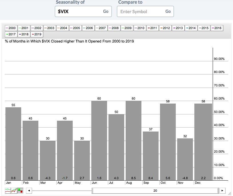
An increasing Volatility Index ($VIX) is associated with falling equity prices. Here's another seasonal chart to look at, this time pertaining to the VIX:

As you can see, the biggest gains in the VIX typically occur during July, August and September. Despite the "go away in May" mantra, I've pointed out countless times that mid-July-to-late-September is the period when you really want to go away - and the above seasonal chart "bears" this out. But of course, once again, I had to do a little more research regarding the VIX over the past 20 years.
August and September normally have that bearish 1-2 punch; over the last 20 years, when the VIX is elevated heading into September, the odds of a bigger decline increases. In 2019, we're entering September with a VIX of 18.98, which is below the average of 19.86 on August 31st this century. 11 of the last 20 years have seen a VIX below that 19.86 average heading into September. Only 1 of those 11 years produced a September return worse than -1.55% (2000, when the S&P 500 fell 5.35%). To the contrary, if the VIX is above 20 heading into September, we've seen September returns of -11.00% (2002), -9.21% (2008), -8.17% (2001) and -7.18% (2011).
Currently, 2019's VIX level of 18.98 seems to suggest that we won't see the steep declines associated with some of those secular bear market years.
The Federal Reserve
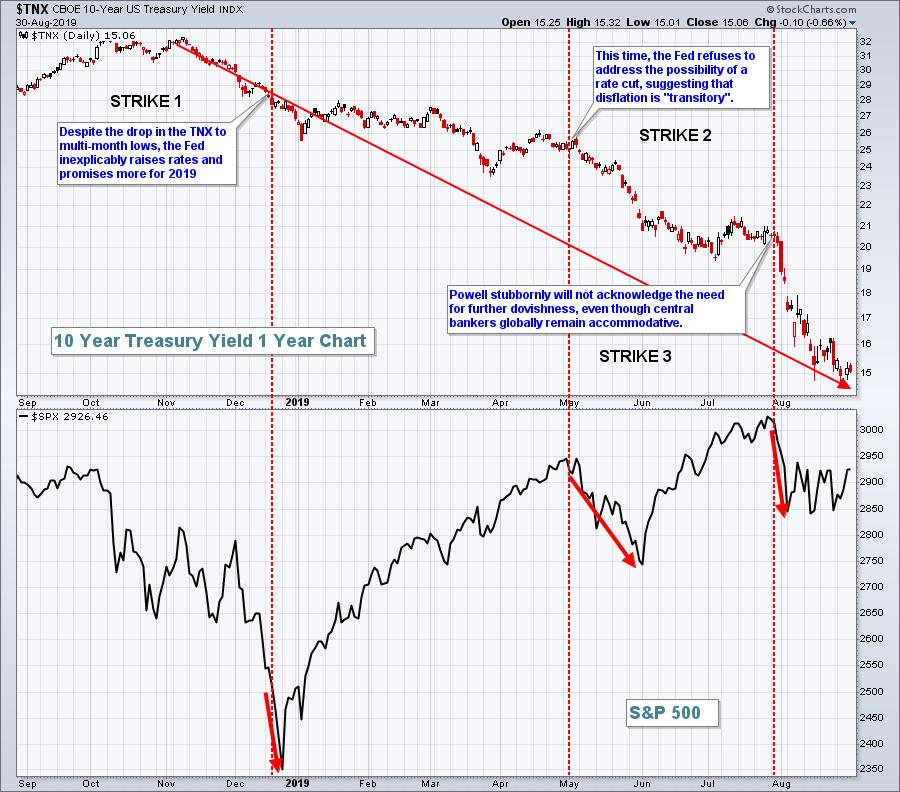
Honestly, in my mind, this is the stick of dynamite. We have already seen the market aftermath of Hurricane (Fed Chief) Powell on three occasions in the past 9 months. I don't know if we can take another direct hit. While most media folks are pitting Fed Chief Powell against President Trump, I believe it's more Fed Chief Powell vs. the BOND MARKET. The bond market sends us signals all the time. It's a very smart market, much smarter than the stock market in my view. The signals here have been very clear since Q4 2018. In case you haven't noticed, let me show you what the bond market has been saying:

While yields have tumbled from 3.25% to 1.50%, the Fed has moved from a rate-hiking campaign to finally agreeing to lower the fed funds rate a quarter basis point. But the bond market wants a lot more - and the Fed needs to lower rates further.
I've been asked "Why should the Fed lower rates if our economy is strong?" That's a fair question. If inflation was at or above the Fed's target level, then I'd say the Fed should stand pat. But here's the problem. Central bankers are dovish everywhere around the globe. Standing pat here strengthens the dollar, which, in turn, weakens commodity prices. The Fed's mandate is to maximize employment and to stabilize prices. Because the threat of disinflation remains high with a strong currency, the Fed has the opportunity and the ability to lower rates - and the bond market is SCREAMING for it!
I blame the Fed for the inverted yield curve. Lowering shorter-term rates would immediately correct that inversion or potential inversion.
For the first time in a very long time, I can say that the Fed has become an enemy of the stock market. I have little doubt that we're in a secular bull market and that U.S. equity prices are ultimately going higher. But I cannot say, with certainty, that we won't see a rapid decline at some point in September. Based on history, it could be right after the next Fed meeting on September 17-18.
I still see many positive signs and believe the next couple years could see an explosion to the upside in the S&P 500. If I'm right (or even if I'm wrong), it's critical to stick with leaders - leading sectors, leading industries and leading stocks. Combining those relative strength leaders with excellent fundamentals, namely beating Wall Street estimates as to both quarterly revenues and EPS, is the focus of our EB Digest newsletter, which is published 3x a week. It's a FREE newsletter and I'd love for you to join our growing community of knowledgable investors and traders. CLICK HERE to sign up.
As always, I appreciate your support!
Happy trading!
Tom
|
| READ ONLINE → |
|
|
|
|
|
| The MEM Edge |
| The August Stealth Bull That Has Some Investors Cheering |
| by Mary Ellen McGonagle |
For most investors, it’s been a tough month as headline induced volatility brought the Indexes to their worse August returns since 2015.
While a sense of doom and gloom has dominated the popular financial news, select investors that have looked beyond the headlines have seen dramatic gains for the month.
In fact, over a thousand non-defensive stocks that are priced above $10 saw gains over the past 4 weeks while the S&P 500 was down 1.8%.
And of those, 250 were up over 10%. I’m not telling you this so you can lament not being in any of these stocks but rather, I’d like to share some of the common traits among these winners.
And the good news about uncovering these traits is that the techniques that are working remarkably well in this choppy market are the same ones that have been helping sharp investors get above average returns for decades.
Below is an example of just a few of the bigger winners over the past month...
· Roku Inc. (ROKU) up 46% for the month of August
· Carvana Co (CVNA) up 28% on big volume
· Pagseguro Digital (PAGS) rallied 15% while hitting new highs
Each of these stocks recently posted strong earnings reports that were above estimates!
From my many years of working with top portfolio managers while working at William O’Neil & Co., my work at MEM Investment Research now includes the proven fact that strong earnings are the primary driver of any stock's big advance. This is especially true when they report above their estimates.
Currently, second quarter earnings season is essentially over and 76% of companies in the S&P 500 reported above estimates. This means the news is out and with the right tools, you can cherry pick stocks poised to outperform the markets.
And even better news, you can expect even higher returns once the markets return to a strong bull market phase.
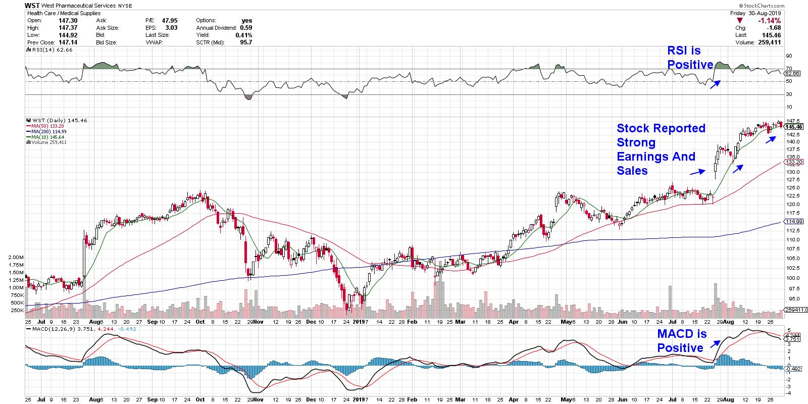
Below I’ve highlighted some of the other characteristics in winning stocks that rally after reporting earnings. This example is West Pharma (WST) and it’s one of the names from the top performing MEM Edge Report.
DAILY CHART OF WEST PHARMACEUTICAL (WST)

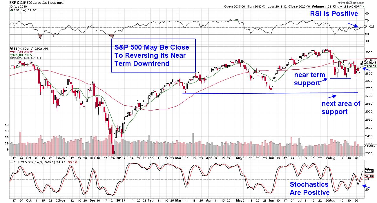
In addition to monitoring individual stocks, you’ll want to pay close attention to the markets before investing in these outperformers or any type of stock. Below is a daily chart of the S&P 500 and using technical indicators, I’ve highlighted key signals to pay attention to. As you'll see, 2 separate indicators are flashing positively at the same time.
DAILY CHART OF S&P 500 INDEX

The first and most critical event that needs to take place is for the S&P 500 Index to trade above its key 50 day moving average.
Other signals include the Relative Strength Indicator (RSI) which is in positive territory. For those who are not familiar with this indicator, you can access the links below for more information.
The third indication is shown below the price chart and it is showing the stochastics in a positive position as well. (again, the link below will provide a definition of this indicator).
So now we have 3 powerful technical indicators providing guidance and flashing mixed signals. Entering the markets that are not in a confirmed uptrend can be risky however those stocks that have been outpacing the broader markets over the last month are setting up to be the leaders once the market pressures are lifted. This is another common trait of big winners.
Regards,
MaryEllen Mcgonagle
meminvestmentresearch.com
P.S. If you’d like to learn the specifics of how to uncover and then successfully trade big, winning stocks, I’d like to let you know that on Thursday, September 5th I’ll be offering my highly regarded trading course “Mastering The Art Of Spotting Winning Stocks” at 30% off (for 4 days only).
I’m only making 20 spots available, and once they’re gone, the course will be closing. You can get on the wait list below and by doing this, you’ll receive my next article tomorrow that will outline more characteristics of stocks that outpace the markets as well as more details about the course.
GET ON THE WAIT LIST HERE TO GET MORE INFORMATION
**Relative Strength Indicator (RSI) Information
**Stochastics Information
|
| READ ONLINE → |
|
|
|
| RRG Charts |
| Growth vs. Value Rotation is Sending a Very Clear Message on RRG |
| by Julius de Kempenaer |

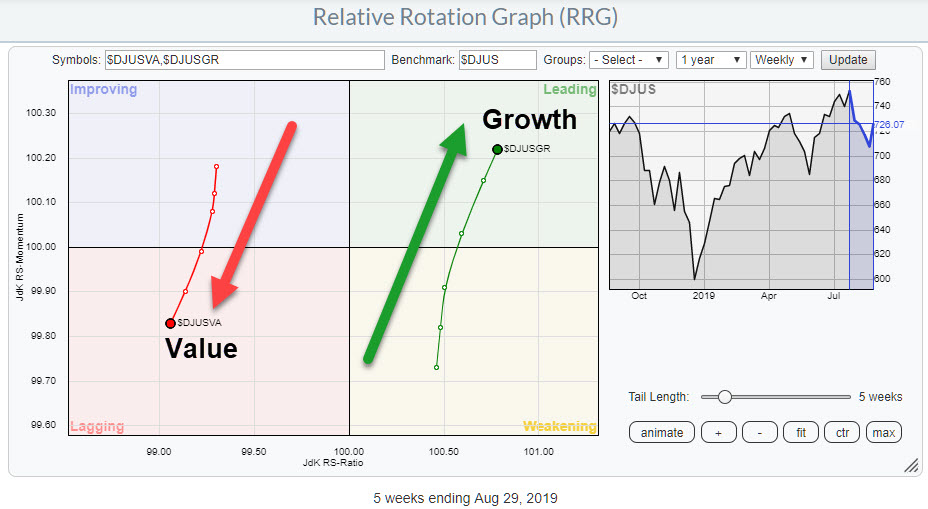
One of the Relative Rotation Graphs that I like to keep an eye on in order to get a handle on the general market condition (for stocks) is the chart above, which shows the rotation of Value versus Growth stocks using the Dow Jones US Index as the benchmark. The general take on this relationship is that Growth stocks do well when the market as a whole is doing well, while Value stocks are seen as a safe haven that will do well (or at least better than the general market) in times when stocks are coming down.
The rotation on the RRG very clearly shows the strength for Growth stocks over Value. The strong JdK RS-Momentum for Growth as it travels higher on the JdK RS-Ratio axes is causing a positive RRG-Heading on this group.
At the opposite side of the RRG, Value stocks are showing the reversed rotation. Weak RS-Momentum, in combination with dropping values on the RS-Ratio scale, make a rotation from improving back to lagging at a negative RRG-Heading.
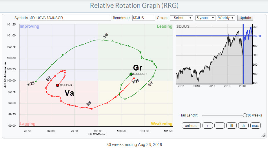
Lengthening the tails for both indexes on this RRG shows the longer-term relationship for this rotation of Growth vs. Value.

I have marked the dates when the tails cross over to different quadrants. On 25 Jan, both tails simultaneously cross over. Value moves from leading into weakening (this is the red tail in the chart above) while Growth moves from lagging into improving around 4 weeks after the December 2018 low was put into place.
Both tails then move through these quadrants in the next five to six weeks before then crossing over. Growth crosses from improving into leading in the week of 8 March; Value moves into lagging one week later.
As you know, there is no specific trigger point or signal point on RRG charts, but, in the period from 25 Jan to 8 March, evidence for improvement of Growth over Value continued to mount. Combining this type of information with observations on the price chart of the S&P 500 or (in this case) the DJ US Index can help you in assessing overall market conditions.
After the initial improvement and crossings into leading and lagging quadrants respectively, the tails rotated through leading and lagging and eventually moved into/curled up to weakening/improving around 7 June.
At that time, Growth was still much higher and above 100 on the RS-Ratio scale, meaning it was therefore ahead of Value. The rotations through weakening and improving were short-lived, however, and recently the tails turned around again. One to two weeks ago, Growth crossed back into leading while Value re-entered the lagging quadrant.
This sort of rotation is typical for the start of a new leg in an existing trend, in this case the outperformance of Growth over Value.
Personally, this observation makes me feel a bit more comfortable looking at the graphs for major market indexes (S&P, DOW, etc) wearing my buyer's glasses. It just gives you a little more confidence judging bullish indications from their price charts.
Therefore (imho) using RRG charts not only on primary series like stocks and (sector) indexes directly can add value to your process. The Growth vs. Value rotation as described in the example above, as well as Size indexes (small-, mid-, large-cap) or RRGs showing rotation of various forms of breadth data etc., can all help you get that little extra information that you cannot find on a price chart.

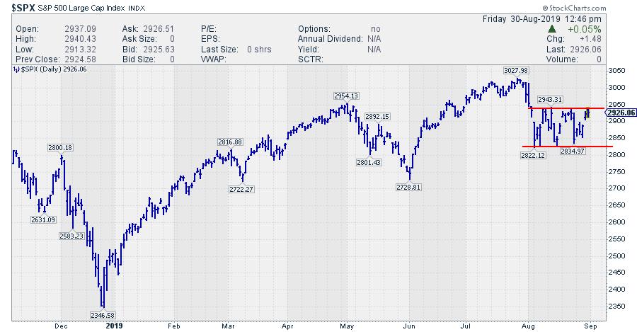
Taking the information on Growth vs. Value to the S&P 500 chart ($DJUS looks pretty much the same), my judgement is that a break from the current range is more likely to occur to the upside rather than the downside.
My regular blog is the RRG Charts blog. If you would like to receive a notification when a new article is published there, simply "Subscribe" with your email address.
Julius de Kempenaer
Senior Technical Analyst, StockCharts.com
Creator, Relative Rotation Graphs
Founder, RRG Research
Want to stay up to date with the latest market insights from Julius?
– Follow @RRGResearch on Twitter
– Like RRG Research on Facebook
– Follow RRG Research on LinkedIn
– Subscribe to the RRG Charts blog on StockCharts
Feedback, comments or questions are welcome at Juliusdk@stockcharts.com. I cannot promise to respond to each and every message, but I will certainly read them and, where reasonably possible, use the feedback and comments or answer questions.
To discuss RRG with me on S.C.A.N., tag me using the handle Julius_RRG.
RRG, Relative Rotation Graphs, JdK RS-Ratio, and JdK RS-Momentum are registered trademarks of RRG Research.
|
| READ ONLINE → |
|
|
|
| MORE ARTICLES → |
|
