| THIS WEEK'S ARTICLES |
| The Market Message |
| The Dollar Has Fallen This Week Against the Euro and Pound |
| by John Murphy |
Editor's Note: This article was originally published in John Murphy's Market Message on Friday, October 18th at 4:23pm ET.
Chart 1 shows the Invesco US Dollar Index Fund (UUP) falling this week to the lowest level in two months. Most of that drop has come against the Euro and British Pound. Chart 2 shows the British Pound rising to the highest level in five months. Chart 3 shows the Euro rising to the highest level in two months. Although the dollar fell against other currencies, the two European units account for nearly 70% of the direction of the UUP, and were two of the week's strongest currencies. Their recent gains are tied to renewed hope for a Brexit settlement between the UK and EU which was approved in Brussels this week. The real test, however, will come this weekend when the British Parliament votes on the issue. That Saturday vote should determine if this month's gains in the two currencies continues or falters. The same is true of their stock ETFs.
Chart 1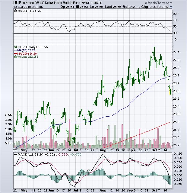
Chart 2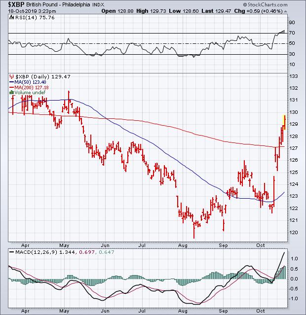
Chart 3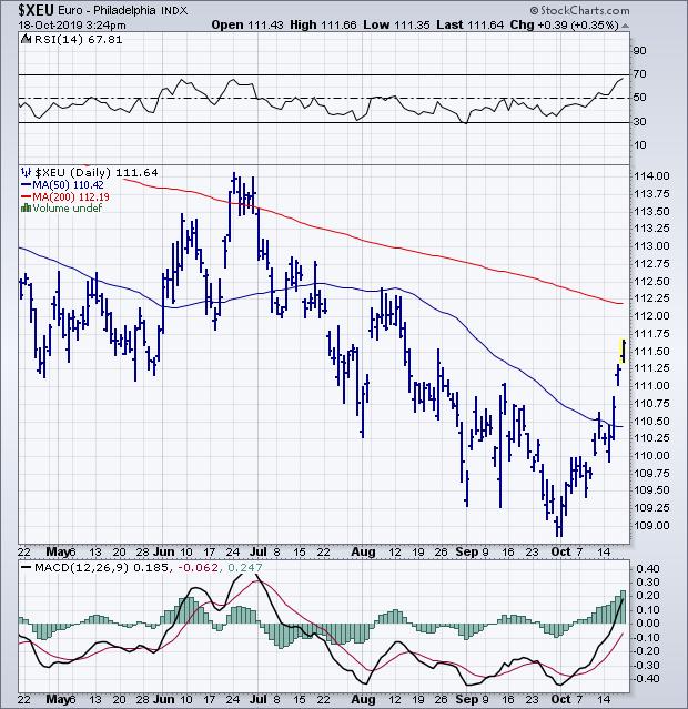
|
| READ ONLINE → |
|
|
|
| Art's Charts |
| Few New Highs, but Even Fewer New Lows |
| by Arthur Hill |
 The lack of new highs may seem like a concern, but one cannot talk about new highs without also looking at new lows because there are two sides to the story. The S&P 500 is within 2% of an all time high and there were just 28 new highs on Friday. There were over 100 new highs in early June, but new highs have not exceeded 50 since early September. There is an upside leadership issue within the S&P 500, but this alone is not enough reason to turn bearish. The lack of new highs may seem like a concern, but one cannot talk about new highs without also looking at new lows because there are two sides to the story. The S&P 500 is within 2% of an all time high and there were just 28 new highs on Friday. There were over 100 new highs in early June, but new highs have not exceeded 50 since early September. There is an upside leadership issue within the S&P 500, but this alone is not enough reason to turn bearish.
Despite fewer new highs, new highs are still outpacing new lows, of which there were only 2 on Friday. This is what really matters because it means there are still more stocks in strong uptrends (hitting new highs) than strong downtrends (hitting new lows). Now let's measure it with an indicator.
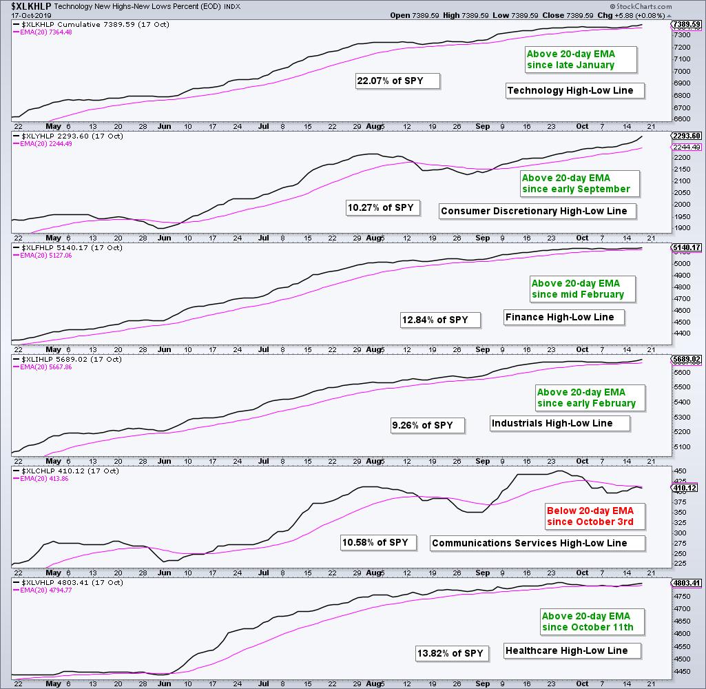
Two weeks ago I featured a timing technique using the High-Low Line for the S&P 500. Basically, the index has a bullish bias as long as there are more new highs than new lows. We can measure this on-going differential using the High-Low Lines, which rises when new highs outpace new lows. A rising High-Low Line is net bullish for the index, regardless of the total number of new highs.
Today I want to expand on this concept with the High-Low Lines for the six largest sectors in the S&P 500. These indicators can be used to find the leading sectors and measure the overall health of the S&P 500.
The charts below show these High-Low Lines with their 20-day EMAs and the sector weight. Technology is by far the largest sector and accounts for 22% of SPY. Currently five of the six High-Low Lines are above their 20-day EMAs and rising. The Technology High-Low Line has been rising the longest as it crossed its 20-day EMA back in late January. The Finance and Industrials High-Low Lines have also been strong for an extended period as they crossed their 20-day EMAs in February.

One cannot be bearish on SPY when the High-Low Lines for Technology, Industrials and Finance are rising and leading.
Elsewhere, the Consumer Discretionary High-Low Line turned up in early September, while the Healthcare High-Low Line turned up last week. The Communication Services High-Low Line is the most erratic of the six because it has the fewest component stocks. It is also the only one below its 20-day EMA.
Putting it all together, the five sectors with rising High-Low Lines account for 68% of SPY and this is more than enough to support and uptrend in the ETF. Of note, the Consumer Discretionary High-Low Line turned up quite sharply this week as new highs expanded in the sector. This is also a positive sign for the broader market.
Chartists looking to time these sectors and SPY can watch the High-Low Lines for signals. These signals are not very frequent and they can sometimes catch big trends, such as the uptrend in XLK since late January. At the very least, the direction of these lines tells us which side of the market we want to trade. Right now, this is the bullish side for SPY and five of the six sectors.
Special Announcement
From here on out I am the Chief Technical Strategist at TrendInvestorPro.com, a website offering market timing and trend-momentum strategies. As with Art's Charts, the analysis is objective, systematic and educational. I will continue to contribute at StockCharts on a limited basis, but the bulk of my content will be on TrendInvestorPro.
Access to the website is free this week. Next week I will open up for subscriptions so stay tuned! Analysis is geared towards the weekend trader or investor with a publishing schedule as follows:
- Thursdays - ETF Ranking and Grouping: Systematic ranking and grouping of 60 core ETFs for trend-rotation strategies. This report includes chart analysis and a PDF ChartBook featuring all 60 ETF charts with annotations and comments.
- Fridays - The State of the Stock Market: Broad market analysis and timing with index and sector breadth models.
- Saturdays - Stock Setups: A weekend report highlighting stocks with uptrends and bullish setups (when the broad market environment is bullish). Should the market environment turn bearish, I would then highlight stocks with bearish setups.
I will also be offering periodic strategy pieces and educational content.
Click here to checkout TrendInvestorPro.com
Let the new journey begin!

|
| READ ONLINE → |
|
|
|
|
|
| The Canadian Technician |
| More Stalls Than A California Freeway |
| by Greg Schnell |
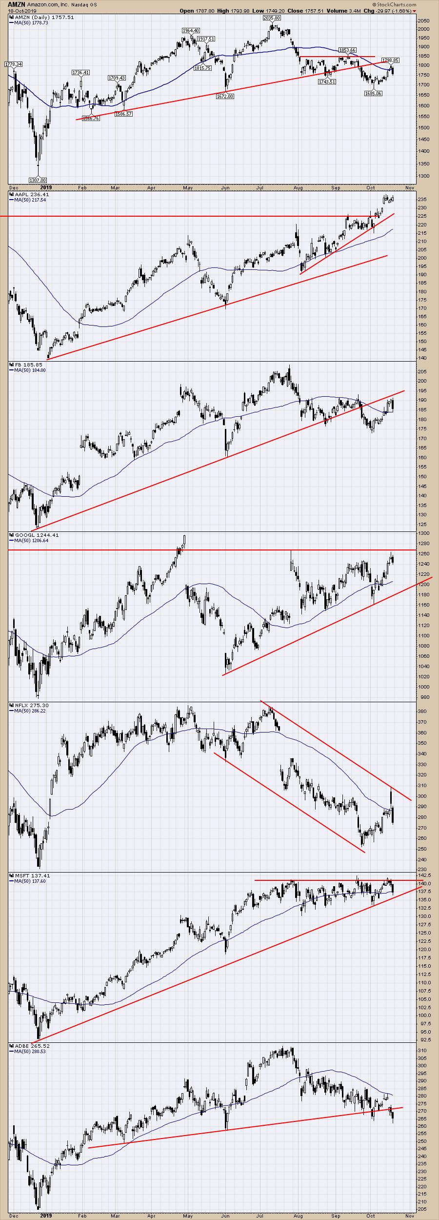
After another week of hope, Mr. $SPX under-delivers. There are some great-looking charts that are failing again today as the $SPX continues to get stuck around this 3000 level. Below are the FAANG stocks and a few more.
Key Points:
- AMZN- Stalling under the 50-day moving average after back testing the up trend line.
- AAPL - Stalled out all week, flat to Friday's close.
- FB - Stalling at last months high, trying to bounce off the 50-day moving average but below the trend line.
- GOOGL - Stalling at resistance
- NFLX - Stalled and reversed at the channel line. Falling below the 50-day moving average.
- MSFT - Stalling at resistance, falling below the 50-day moving average today.
- ADBE - Stalled at the 50-day moving average, falling below the topping pattern neck line.

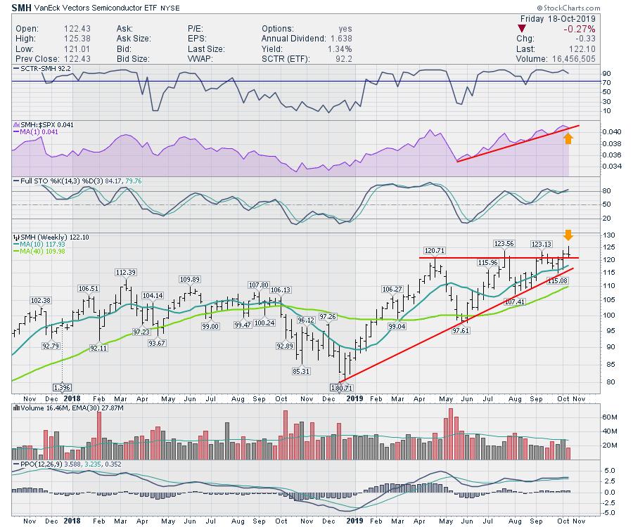
Semiconductors stalled and reversed again. Ugggh. Looking more like a tombstone candle than a bullish bar on this weekly chart.

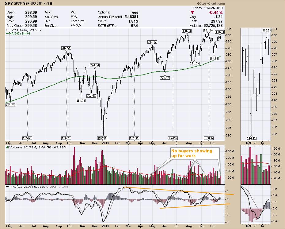
Lastly, the SPY shows a lack of buyers showing up for work. The real problem is the declining momentum on many index charts, where we continue to make lower highs and lower lows. Another stall at resistance isn't going to help the bullish case; we needed to see some strong momentum this week and it failed to appear. Not great for the bulls. Caution is warranted.

I do have my new website up and running. I hope to get the confirmation emails for members working as they are the holdup. If you have not put your name on the contact list at gregschnell.com, you might want to as I'll be setting a founding member price that won't go up in the future - but you have to be in before the cutoff to take advantage of it. It will be unavailable after that!
|
| READ ONLINE → |
|
|
|
| DecisionPoint |
| EARNINGS: 2019 Q2 Finalized; S&P 500 Still Overvalued |
| by Carl Swenlin |
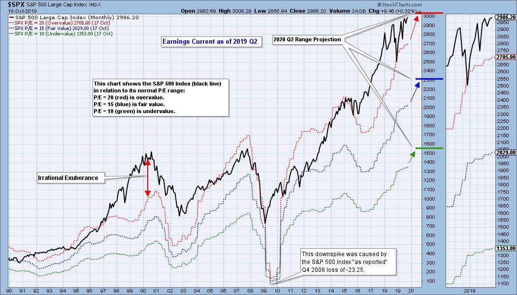
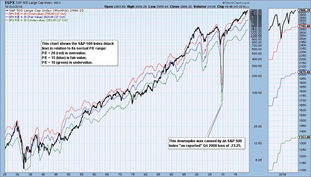
The S&P 500 earnings for 2019 Q2 were finalized a few weeks ago. The following chart shows us the normal value range of the S&P 500 Index, indicating where the S&P 500 would have to be in order to have an overvalued P/E of 20 (red line), a fairly valued P/E of 15 (blue line) or an undervalued P/E of 10 (green line). There are three hash marks on the right side of the chart, which show where the range markers are projected be at the end of 2020 Q2. Since 2016, price has been well above the traditional value range, with the exception of the late 2018 price decline (which lowered the P/E to 19). Based upon the future earnings hash marks on the right, the S&P 500 is within the normal range, but is still overvalued.

Historically, price has usually stayed below the top of the value range (red line); however, since about 1998, it has not been uncommon for price to exceed normal overvalue levels. The market hasn't been undervalued since 1984.

I use GAAP earnings (Generally Accepted Accounting Principals) as the reference for this article. Operating Earnings is the favorite of most of Wall Street, as it omits essential elements of real accounting to make the numbers look better. For me, a former accountant, using operating earnings is a form of cognitive dissonance.
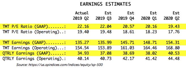
The table below shows how earnings are expected to improve going forward, but the drop in P/E shown is only possible if price doesn't rise significantly. In the best case shown (2020 Q2), the market will be slightly lower than the top of the normal value range, but this depends upon price being about the same level as it is now. Not likely.

The following table shows where the colored bands will be based upon forward earnings.

CONCLUSION: Historically, overvalued conditions leave the market vulnerable for a large correction or bear market, but P/E ratios are not a precise timing tool, just a way to see if fundamentals are favorable or not. These earnings charts are intended to provide a historical context for current earnings and to demonstrate that overvaluation is not your friend.
Technical Analysis is a windsock, not a crystal ball.
Helpful DecisionPoint Links:
DecisionPoint Chart Gallery
Trend Models
Price Momentum Oscillator (PMO)
On Balance Volume
Swenlin Trading Oscillators (STO-B and STO-V)
ITBM and ITVM
SCTR Ranking
|
| READ ONLINE → |
|
|
|
| ChartWatchers |
| Earnings Season Presents TONS of Profit Opportunities |
| by John Hopkins |
On Friday morning, Tom Bowley, Chief Market Strategist of EarningsBeats.com, and Mary Ellen McGonagle, president of MEM Investment Research, conducted a webinar that included identifying stocks reporting earnings next week that could make significant moves. It was fascinating listening to these two seasoned pros as they displayed charts on 14 specific companies and explained their reasons for why they thought these stocks were ripe for a move higher or lower. It got me thinking about how exciting things are about to get and the tremendous opportunities that lie ahead as Q3 earnings season moves into high gear.
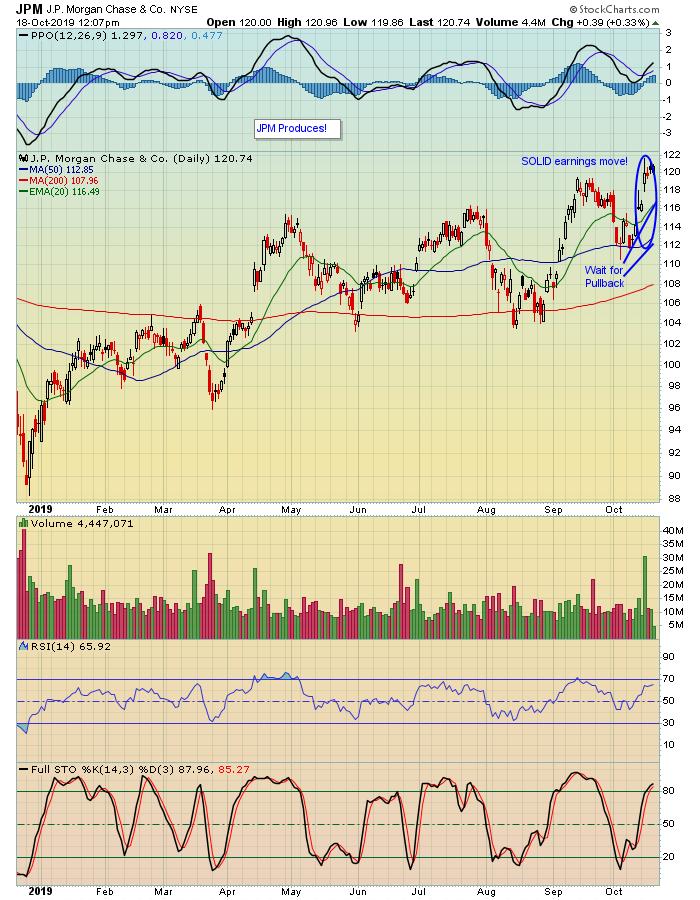
We've already seen a number of companies report their earnings with mixed results. But the only ones we care about are the ones that beat earnings expectations - both top and bottom line - and have promising charts. A great example is JP Morgan, which reported its numbers last week.

Though JPM didn't "blast off" on its earnings, it managed to move up 8% in just a few days - not too shabby for a bank - and helped to set the tone for both the financial sector as well as the overall market which, at one point last week, saw the S&P get within striking range of its all time high. Importantly, the stock is now on our radar screen as we wait for some of the initial enthusiasm to settle down, with expectations that at some point it will pull back to a level that presents a solid reward-to-risk opportunity.
The REALLY great news is there are going to be a TON of companies reporting earnings over the next few weeks and we're going to be identifying a bunch that could be set to propel higher. Several companies that already reported - like JPM - are going to end up on our Strong Earnings ChartList while we wait for them to set up as high R/R trades. In fact, we will be conducting one of our four annual earnings season events - the Q3 Earnings Webinar - this Monday, October 21, at 4:30pm ET, where Tom Bowley will be providing attendees with a list of stocks that have already reported as well as a list of stocks about to report that fall into the category of "Very Worth Watching!" This particular webinar will be for EarningsBeats.com members only, but we want as many traders as possible to join us on Monday, so check out the EarningsBeats.com website for additional information so you can sign up!
Trading brings with it a whole set of challenges. Why not increase your odds of profiting by focusing on those companies that "walk the walk" by beating top and bottom line expectations?
At your service,
John Hopkins
EarningsBeats.com
Better Timing. Better Trades.
|
| READ ONLINE → |
|
|
|
|
|
| The Traders Journal |
| Why Pick Stocks Over ETFs or Mutual Funds? My Personal Five Most Compelling Reasons |
| by Gatis Roze |

Yes, this is personal. I’ll share my own portfolio experiences from the past 25 years. Feel free to embrace those elements that strike you as most appropriate to your investing style.
First, a few ground-floor definitions before I get specific on the five reasons that motivate me to buy individual stocks. When I refer to “funds”, I mean either ETFs or mutual funds. When I say “stocks”, I mean Large Cap USA Blue Chips.
Secondly, it’s important that you understand the manner in which I’ve built my entire portfolio. My ten individual stocks occupy never more than ten percent of my total portfolio. These equities are what I refer to as my “Super Explore” allocation. Clearly, my objective here is to seek growth. This is also the ONLY asset class (Large Cap USA Blue Chips) where I trade individual stocks. My other 19 asset classes are all in ETFs and No-Load mutual funds — about 50% in each category.
From an asset allocation perspective, 10-20% of my portfolio is in what John Bogle described as “Explore”. Here, I’m still oriented towards growth, but less aggressive in its pursuit (for example, I own the T. Rowe Price Communications Fund PRMTX). The balance of my asset allocation and the majority of my portfolio is invested in “Core” holdings. The objective here is asset protection. To this end, I own indexes such as VTI and mutual funds such as the T. Rowe Price Capital Appreciation Fund PRWCX.
The last caveat should be self-evident, nevertheless — I’ll point it out. My trading methodologies and sell disciplines are unique to the ticker I’m trading. Stock trading is very different than mutual fund investing. Our book, Tensile Trading, goes into great detail on these specific methodologies.
Lastly, without getting overly melodramatic, let me get on my soapbox about this topic. Your investing methodologies must be unique to you. They are very personal and must be written down. The metaphor I’ll use is the equivalent of investing in proper protective clothing for beekeepers. Wearing appropriate beekeeping armor will protect you, shield you and make you comfortable and confident when working with the beehive and bees. Your investment methodology should be much the same. If you visit the hives in a random hat, plain gloves and jeans — thinking that’s good enough — you’ll get badly stung. No doubt about it.
Similarly, a quick methodology doesn’t work either. Without a carefully formulated methodology, you’ll be hesitant and fearful — leading to financial losses. But onward, as promised, here are my 5 personal motivations for buying individual stocks.
#1 – Customized Ownership
As a former entrepreneur, I like to own something. Not a basket of equities, but a company I admire and want to follow. A company where the corporate culture is appropriate to my sensibilities, the management is respected and an attractive growth potential exists. All the better if it’s a hometown-headquartered entity such as Amazon or Microsoft. Afterall, the cocktail party crowd doesn’t want to discuss mutual funds. — instead, they want to know what stocks I’m buying. One admonition here. Don’t fall in love with your ticker. Emotional ownership can negatively challenge your sell disciplines. Never fall in love — with an individual stock, that is!
#2 – Returns
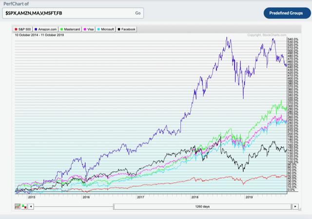
Below is a PerfChart of five of my positions versus the S&P 500 Index over the past five years. It speaks for itself. In addition, I believe we individual investors have a significant advantage here over fund managers. We are in canoes, able to maneuver in and out quickly. Funds are battleships with a huge turning radius.
- S&P 500 ($SPX): +56%
- Amazon: +456%
- Mastercard: +304%
- Visa: +257%
- Microsoft: +254%
- Facebook: +152%

#3 – More Predictability
Some of you may gasp here. Remember, I’m talking about Blue Chips and not Biotechs or Baidu. I maintain a laser focus on earnings for my stocks. I only hold ten positions. I have liquidity as an individual investor. I have my sell disciplines in place. I’ve calculated my risk-reward equation for my specific stocks. This growth-focused asset class has been very very good to me over the past 25 years.
#4 – High-leveraged Analysis
My technical analysis toolkit has worked really well for individual stocks because, for example, the on-balance volume data is pure. Funds have far more “noise”. Over the years, I’ve found that my sell disciplines, tools and routines are far more accurate with stocks than funds.
#5 – Tax Consequences
I have more control with stocks. Funds pay out distributions with short term and long term capital gains, as well as charging me fees — all of which I have very little control over. And I take taxes seriously.
So there you have it...
Your reasons might be different than mine, but I suspect there is a place for stocks in your portfolio. Don’t forget this: your highest leverage activity is asset allocation, not stock selection — as hard as that is to believe for many of you. Your first priority is to keep analyzing your total portfolio ecosystem and your allocations to each of your asset classes.
Trade well; trade with discipline!
- Gatis Roze, MBA, CMT
StockMarketMastery.com
|
| READ ONLINE → |
|
|
|
| MORE ARTICLES → |
|


 The lack of new highs may seem like a concern, but one cannot talk about new highs without also looking at new lows because there are two sides to the story. The S&P 500 is within 2% of an all time high and there were just 28 new highs on Friday. There were over 100 new highs in early June, but new highs have not exceeded 50 since early September. There is an upside leadership issue within the S&P 500, but this alone is not enough reason to turn bearish.