| THIS WEEK'S ARTICLES |
| Market Roundup |
| Commodities are in a Bear Market |
| by Martin Pring |
Editor's Note: This article was originally published in Martin Pring's Market Roundup on Friday, November 1st at 1:36pm ET.
At Pring Turner Capital, the registered investment advisory firm where I serve as investment strategist, our investment approach involves the proactive rotation of client’s assets around the business cycle. That’s because every cycle goes through a chronological sequence of events, just like the calendar year transitions through four seasons. In the business cycle, we call them stages, as turning points in financial markets represent part of this sequential approach. Since there are three markets (bonds, stocks and commodities), each of which has a top and a bottom, an individual cycle experiences six stages (three times two). Just as farmers generally do not plant seeds in winter, we take measures to reduce risk and reduce our equity exposure during bear markets, lowering the overall beta level at the same time. On the other hand, the start of an equity bull market is the time to take on added risk. Our indicators identified a bull market in bonds and stocks earlier in the year; stocks have now tentatively broken to the upside. Using the sequential approach, the next event in the business cycle calendar, so far as financial market turning points are concerned, is a bottom in commodities. That will obviously be important for commodities, but even more-so for resource-based equities such as energy, mines and materials. Arguably most importantly, it will represent a signal that the economy is emerging from its 18-or-so-month slowdown, since commodity prices are very sensitive to global economic conditions. Sector leadership changes are taking place and portfolio performance will depend on identifying the emerging leaders and laggards.
Right now, the major commodity indexes are trading below their 12-month MAs and experiencing a bearish long-term KST. As long as those conditions remain in force, count me as a bear. That said, there are some potentially bullish signs that lead me to believe commodity prices may be in the process of bottoming.
First, Chart 1 shows that the Coppock Curve for the CRB Composite has started to turn up. The solid green arrows show valid signals, while the three dashed ones show failed ones. What I conclude from this is that the Coppock reversal is an encouraging factor, but we really need to see some confirmation from the CRB itself in the form of some trend reversal evidence. In effect, we need something to tip the balance in a bullish way.
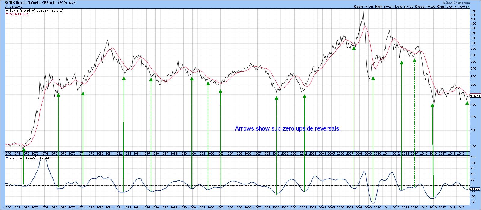
Chart 1
The obvious point would be a break above the dashed green 2014-19 downtrend line for the CRB Composite in Chart 2, which has started to happen in an anemic way. The connection between the CRB and the Canadian dollar is also featured in the chart. It also looks as if the currency has broken out. If that does prove to be the case, the implied strength in the dollar will result in a KST buy signal. The arrows show that previous such signals were followed by a very significant commodity rally.
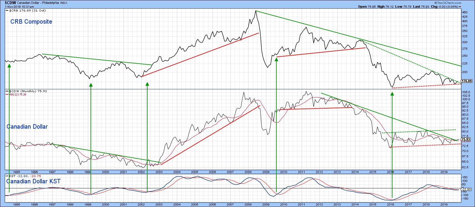
Chart 2
Good luck and good charting,
Martin J. Pring
The views expressed in this article are those of the author and do not necessarily reflect the position or opinion of Pring Turner Capital Group of Walnut Creek or its affiliates.
|
| READ ONLINE → |
|
|
|
| SPECIAL EVENT ANNOUNCEMENT |
| Don't miss your chance to hear David Keller, Chief Market Strategist at StockCharts.com! David will be a featured presenter at the upcoming Las Vegas TradersEXPO, November 7th - 9th. The event is free to register and attend, and you'll have the chance to hear David speak alongside a long list of other industry legends and market experts. Click the banner below to learn more. |
 |
| LEARN MORE → |
|
| Art's Charts |
| How to Distinguish between Selective and Indiscriminate Advances |
| by Arthur Hill |
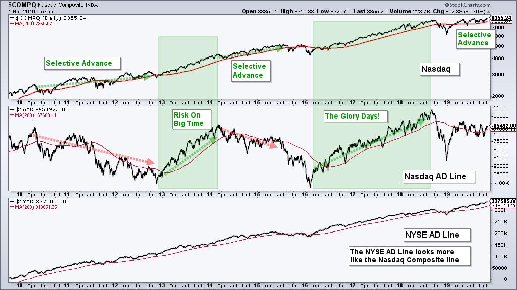
 The Nasdaq AD Line is not keeping pace with the Nasdaq Composite, but this is not bearish for the Nasdaq or the market as a whole. Note that the Nasdaq hit a new high in July and again on November 1st, even though the Nasdaq AD Line has been falling since April. How can this be, what does it tell us and why is it not bearish? Let's address this questions. The Nasdaq AD Line is not keeping pace with the Nasdaq Composite, but this is not bearish for the Nasdaq or the market as a whole. Note that the Nasdaq hit a new high in July and again on November 1st, even though the Nasdaq AD Line has been falling since April. How can this be, what does it tell us and why is it not bearish? Let's address this questions.
First and foremost, note that the Nasdaq has some 3200 listed stocks ($NATOT) and the listing requirements are not as stringent as they are on the NYSE ($NYTOT). This means there are quite a few "questionable" listings on the Nasdaq and this is reflected in the AD Line. All stocks are equal in the eyes of the AD Line because an advance counts as +1 and a decline counts at -1, regardless of market cap or listing quality. This means an advance in AAPL counts the same as an advance in Ruhnn Holdings (RUHN), which is a Chinese listing with a market cap of $454 million. You may want to watch "The China Hustle" before you consider investing in RUHN.
The chart below shows the Nasdaq, the Nasdaq AD Line and the NYSE AD Line. The Nasdaq AD Line is currently near its 2010 peak and has pretty much moved sideways for 10 years. In contrast, the Nasdaq is up over 200% the last ten years and the NYSE AD Line shows a consistent rise. The Nasdaq Composite is a market cap weighted index where the biggest stocks drive the index. Thus, the index can, and often does, rise on days when declines outpace advances.

The Nasdaq AD Line is not useless though. Because of the relatively easy listing requirements, the AD Line provides a good litmus tests for the risk appetite in the stock market. There are basically two types of advances in the Nasdaq Composite: selective advances and indiscriminate advances.
The market is more selective when the Nasdaq AD Line declines and the Nasdaq rises, which occurred from 2010 to 2012, April 2014 to March 2016 and over the last six months. The market is more indiscriminate (risk on big time) when the AD Line and the Nasdaq are rising together, which occurred in 2013 and from March 2016 to August 2018. These were the glory days! Almost everything went up and everyone looked like a genius.
We are currently in a selective advance because the Advance-Decline Line is not keeping pace. This is not bearish because for the market as a whole and or for the Nasdaq Composite because the Nasdaq price chart sports a bullish continuation pattern and the AD Volume Line is keeping pace. See this extended analysis in a free article on TrendInvestorPro.com.
Videos are back!
Subscribers to TrendInvestorPro have access to an ETF ChartBook featuring 60 Core ETF charts with annotations and comments. There is also an accompanying video on Saturdays covering these 60 ETFs, which includes QQQ, IPAY, GLD, GDX and TLT. Subscribe today for immediate access.
|
| READ ONLINE → |
|
|
|
|
| The Canadian Technician |
| Investment Services Looks Ready To Run |
| by Greg Schnell |
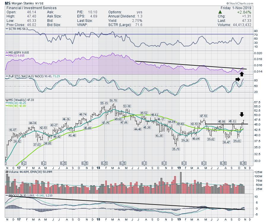
Investment Services are tucked within the Financial Sector and, on Friday, Morgan Stanley (MS) was the first past the post to make higher highs. The chart looks good. Probably one of the changes I like the most on it is the purple-shaded area where Morgan Stanley has broken the downtrend. On the PPO, notice how the trend lower in momentum is also breaking for the first time in years. I like that that they are both starting to break together.

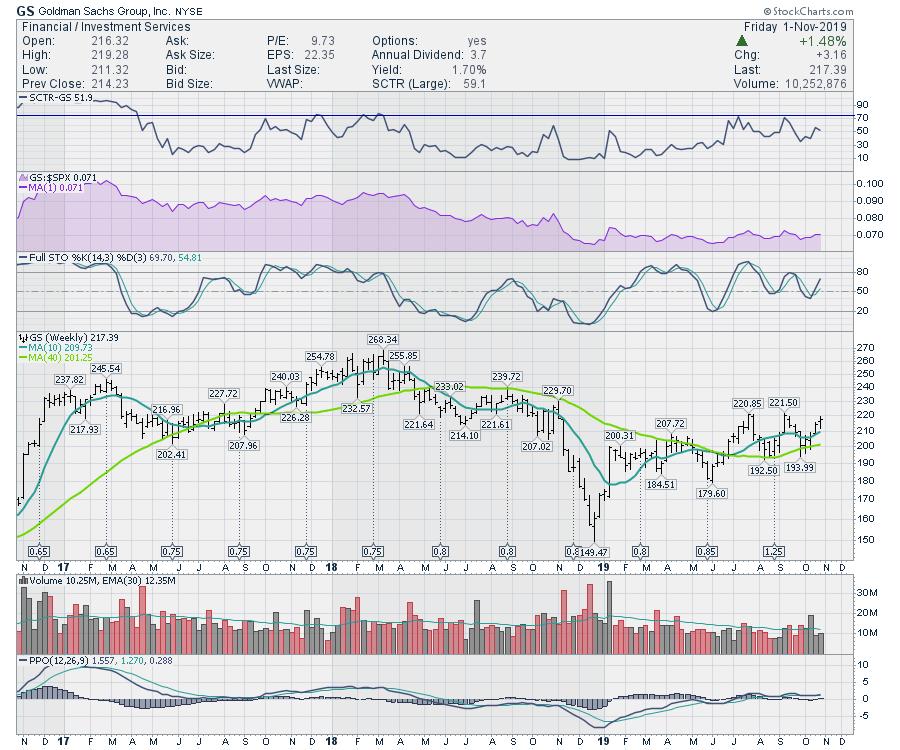
Another big player in the space is Goldman Sachs (GS). If Goldman can break above $222, that will be a new 52-week high. While the chart is not showing the same uplift in momentum, that is what I would be watching for on Goldman - or stay with the leader, MS.

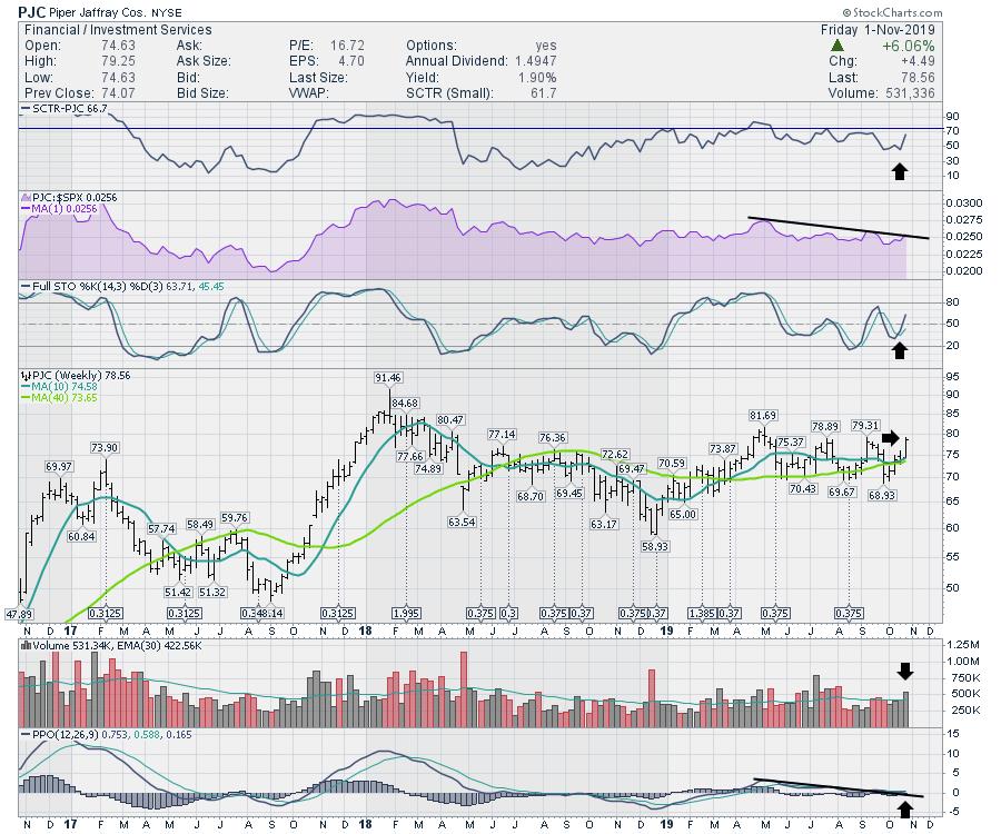
I like Piper Jaffray (PJC) as a company. The chart is a little behind Morgan Stanley, but very similar to Goldman Sachs. It wouldn't take much to get going as volume showed up this week, so someone is interested in buying the stock here. It needs to push through $82, but another week like this week and that's a done deal.

I like the space and these charts look set up to run into the fourth quarter here.
I did launch my new website this week; if you are interested in subscribing, you can find the options on the Private Investor tab at gregschnell.com.
Thanks for following my work!
|
| READ ONLINE → |
|
|
|
|
|
|
| THE TRADERS JOURNAL |
| Your Shortcut to Stock Market Mastery: ChartPack Update #25 (Q3 / 2019) |
| by Gatis Roze, Grayson Roze |
Investing is like a plumbing game. For this reason, the organization and organization of your ChartLists, along with your routines, matter big time! Figuring out where the funds are flowing and adjusting your piping system accordingly is the key objective. In this case, its money flow which is being piped and must be monitored accordingly. The ChartPack facilitates the visualization of the proper piping and acts like the treasure map locating where the pirates are stashing their golden bounty. It’s seldom static for any long period of time. Therefore, the manta is “embrace the changes”. The ChartPack is designed to do precisely this.
Here are some of the updates and changes to the ChartPack over the past quarter. Our thanks once again to the user community for your suggestions and betterments.
#10.4 – Bullish & Bearish Dashboard
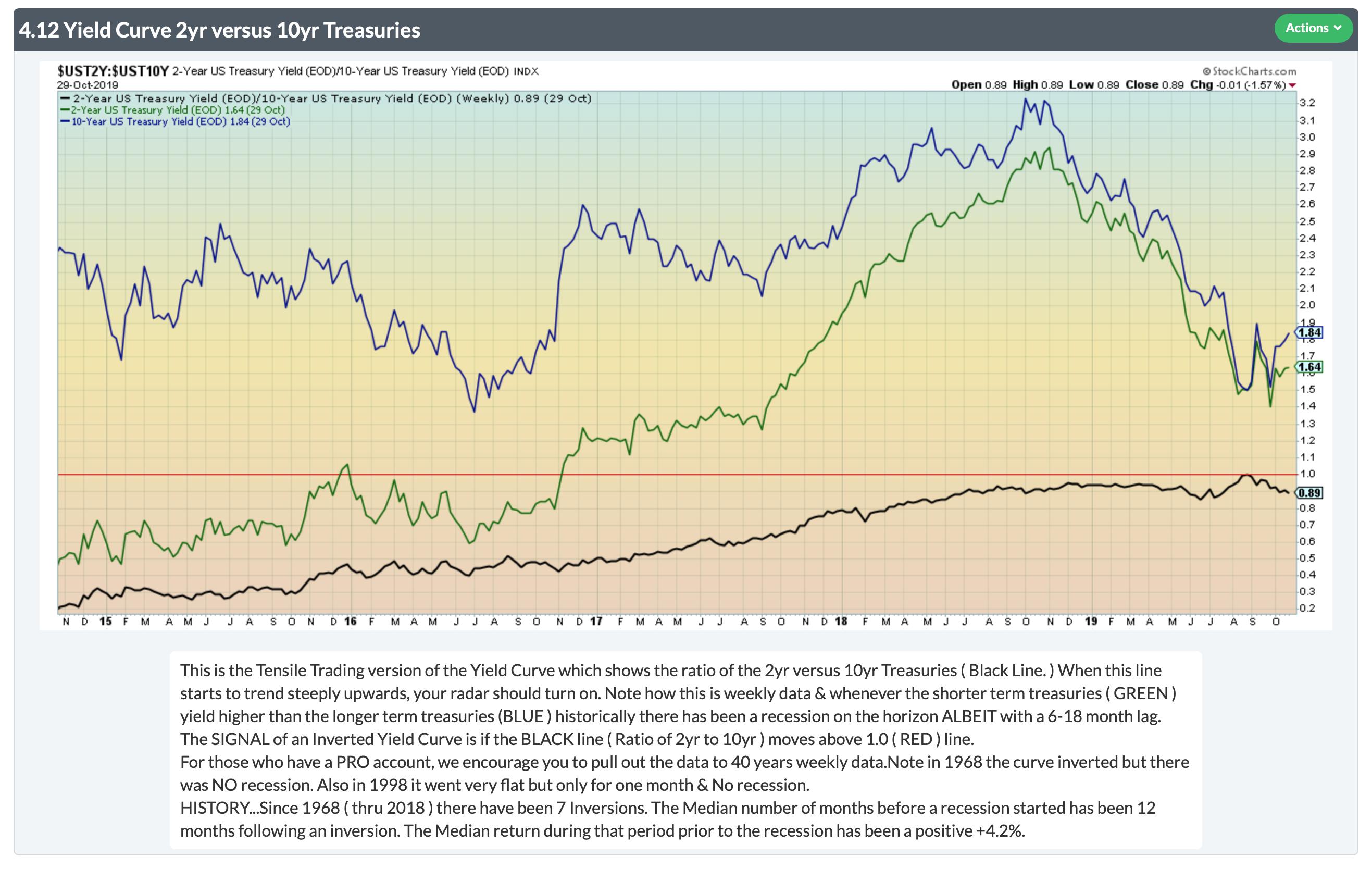
We regularly write about this ChartList since it provides a mountain of insights. The essential message is always the same: don’t miss the comments portion below all the charts. For example, on Chart 4.12 Yield Curve, we added historical notes about lead-times and returns from the time the curve inverts to the beginning of a recession. Don’t overlook that commentary.

#217 – Gold & Currencies
Review the chart of gold versus all the major global currencies. It suggests that bankers are losing faith in their own currencies and bidding up gold as a store of value. Again, don’t overlook the comments section below the charts.
#401 to #413 – Sector ChartLists
Grayson and I have a great deal of enthusiastic company in the user community for the contribution that “Sector Analysis” makes to one’s investing success. An intimate ongoing familiarity of what’s going on in these 11 sectors yields huge dividends in all your market endeavors. That being the case, we’ve added six tickers to their respective sector-specific ChartLists to help facilitate your analysis.
- Consumer Staples — added FSTA
- Industrials — added ITA since it is such an immense group
- Real Estate — added IYR as well as ITB and XHB. These latter two are home builders and construction. Some rating services like to position them under the consumer discretionary sector. We feel they’re more appropriate in the Real Estate Sector. But having said that, you should decide for yourself. It’s not difficult to reassign them in your personal ChartLists.
- Technology — added FDN
Remember, the S&P 500 is divided into 11 investable sectors. Yes, they all provide diversification, transparency and all-day tradability. But beware of the composition of each sector. For example, the Technology Sector (XLK) has its top two positions accounting for 37% of the portfolio. Significantly different from the Industrials Sector (XLI) which has its top two holdings accounting for less than 14% of the portfolio. The point being that if you hold XLK, then monitoring Microsoft and Apple is more impactful than if you hold XLI and monitor Boeing and Honeywell.
#420-12 to 420-90 — Fidelity Sector Funds
Let’s start with the big picture observations about how these 43 Sector Funds are collectively allocated this quarter.
- Large Caps – 66%
- Mid Caps – 25%
- Small Caps – 9%
Note: recent Morningstar research proves that managers add alpha (out-performance) most consistently in both the mid-caps and small caps arenas.
–––––
Fidelity’s sector funds are split pretty evenly amongst Value, Core and Growth — i.e. 35%, 36% and 29%
–––––
Between US and Foreign, it’s very US-oriented — 88% to 10% foreign and the balance in cash.
–––––
On a performance basis, 21 individual funds outperformed the S&P 500 (SPY) this quarter, led by these big five (through 10/25/19).
- Computers: +9.13%
- Construction: +9.02%
- Wireless: +8.94%
- Semiconductors: +8.02%
- Pharmaceuticals: +6.27%
–––––
The four Sectors over-allocated by Fidelity relative the S&P 500 allocations are:
Basic Materials
Real Estate
Communication Services
Utilities
–––––
The stocks owned by the most number of Sector Fund managers were:
- Alphabet (GOOGL) – held by 9 funds
- Visa (V) – held by 6 funds
- MasterCard (MA) – held by 5 funds
- A tie between Apple (AAPL), AT&T (T), and Verizon (VZ) – held by 4 funds each
–––––
Each quarter, Grayson and I expend the most energy on the Fidelity Sector Funds analysis portion of the ChartPack because, frankly, this is there we personally get the “biggest bang for our buck” as investors. Here are six key reasons why Grayson and I invest our time in dissecting the 43 Fidelity Select Sector Funds each and every quarter.
(1)
The next big stock winners have historically appeared first in these focused sector funds. This has been our experience over the past decade.
(2)
The “weight” of Fidelity’s commitment to a particular stock can be identified. The bigger the position, increasing over a number of sector funds gives us confidence and is worthy of our attention.
(3)
Likewise, our radar goes up when we witness a decreasing commitment in certain stocks versus the previous quarter.
(4)
With all 43 Sector Funds in one ChartList, it’s easy to rank performance and identify strengths and weaknesses each day, week or month depending on your personal routines. Sector analysis always matters. It’s money in the bank.
(5)
Here’s an example. If Construction and Housing (FSHOX) is outperforming the market, as investors we can dig into the funds individual holdings and consider the stocks Fidelity deems to be the best-of-the-best, such as Home Depot (HD), DR Horton (DHI) or PulteGroup (PHM).
(6)
As a learning tool, it’s been very very informative to analyze the stock charts of equities that Fidelity is either accumulating or distributing. Combine this with Bruce Fraser’s blog, “Wyckoff Power Charting”, and you have the equivalent of X-ray market vision! You can see the buying and selling campaigns and witness the execution used by big money managers like Fidelity.
–––––
The bottom line is that your time is well spent on understanding the shifting market landscape each quarter, and these sector funds and ChartPack are your vehicle.
Here are a few additional highlights from this quarter's Fidelity sweep:
- The Air Transportation Portfolio (#420-12) was particularly active this quarter with 4 of its top 10 holdings changed. Among a few other changes, the management team here swapped one major airline for another and took a substantial position in TransDigm (TDG), an aerospace company that has been trending beautifully and outperforming the market by a healthy margin.
- Another highly-active fund was the Construction and Housing Portfolio (#420-28). This is one to take a closer look at when you re-install (or purchase) the ChartPack updates for this quarter.
- A certain Seattle-based coffee chain was picked up by the Consumer Discretionary Portfolio (#420-30), which has coincided with a nice run in the stock. After a strong uptrend, SBUX is now pulling back to its 200-day Moving Average. This is a great example of how the Fidelity sweep can yield profitable results, uncovering strong stocks with equally strong institutional support that are making important technical moves. If you're playing a bit of the longer-term game, take a look at SBUX here as it resets on the 200-day.
- Lastly, the Telecommunications Portfolio (#420-84) and Wireless Portfolio (#420-90) both added big positions in major video game creator. On the chart, the stock pulled back after making new highs last year, but it appears that some support has been found and an uptrend may be forming here. Take a look at these two ChartLists and dig into the new buy.
|
| READ ONLINE → |
|
|
|
|
|
| DecisionPoint |
| Swenlin Trading Oscillators Still Not Confirming All-Time Highs |
| by Erin Swenlin |
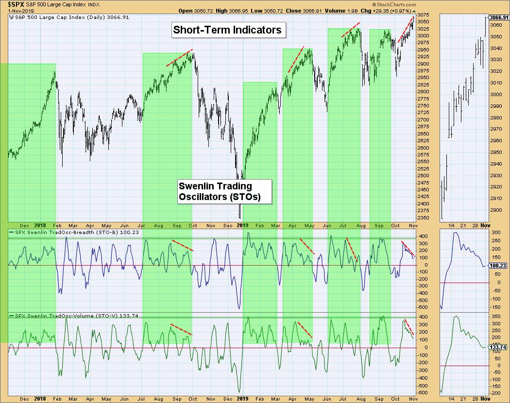
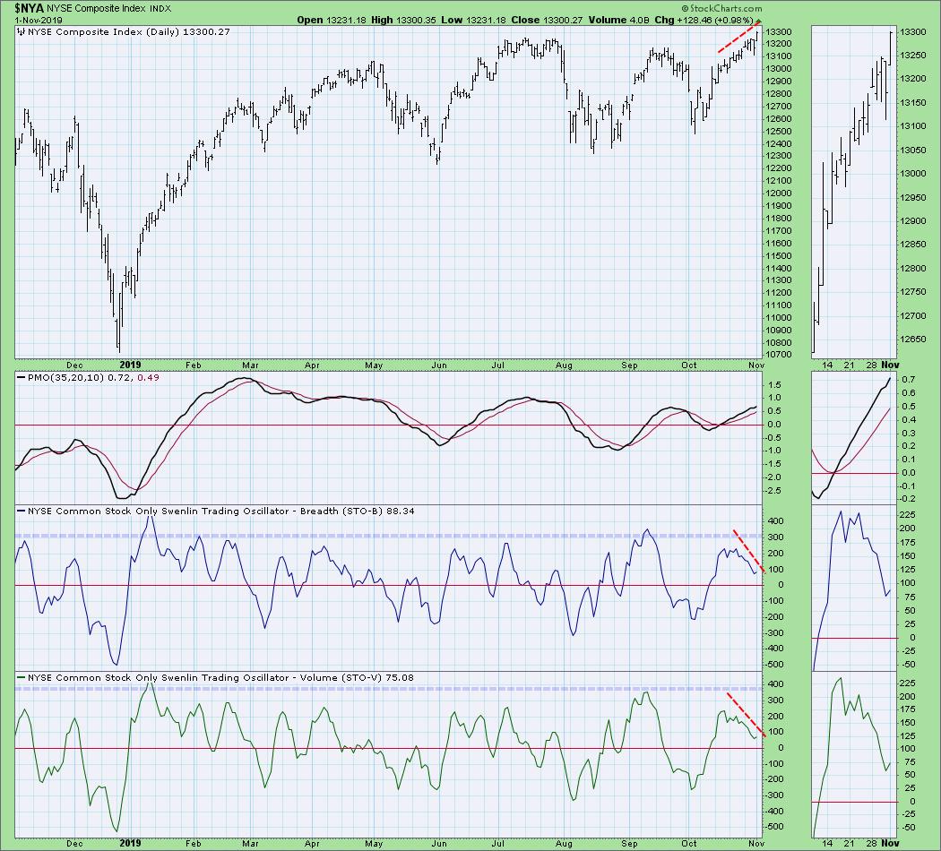
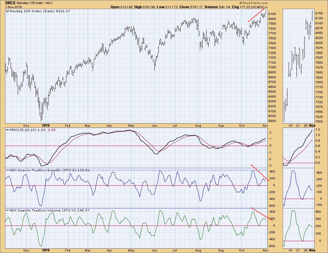
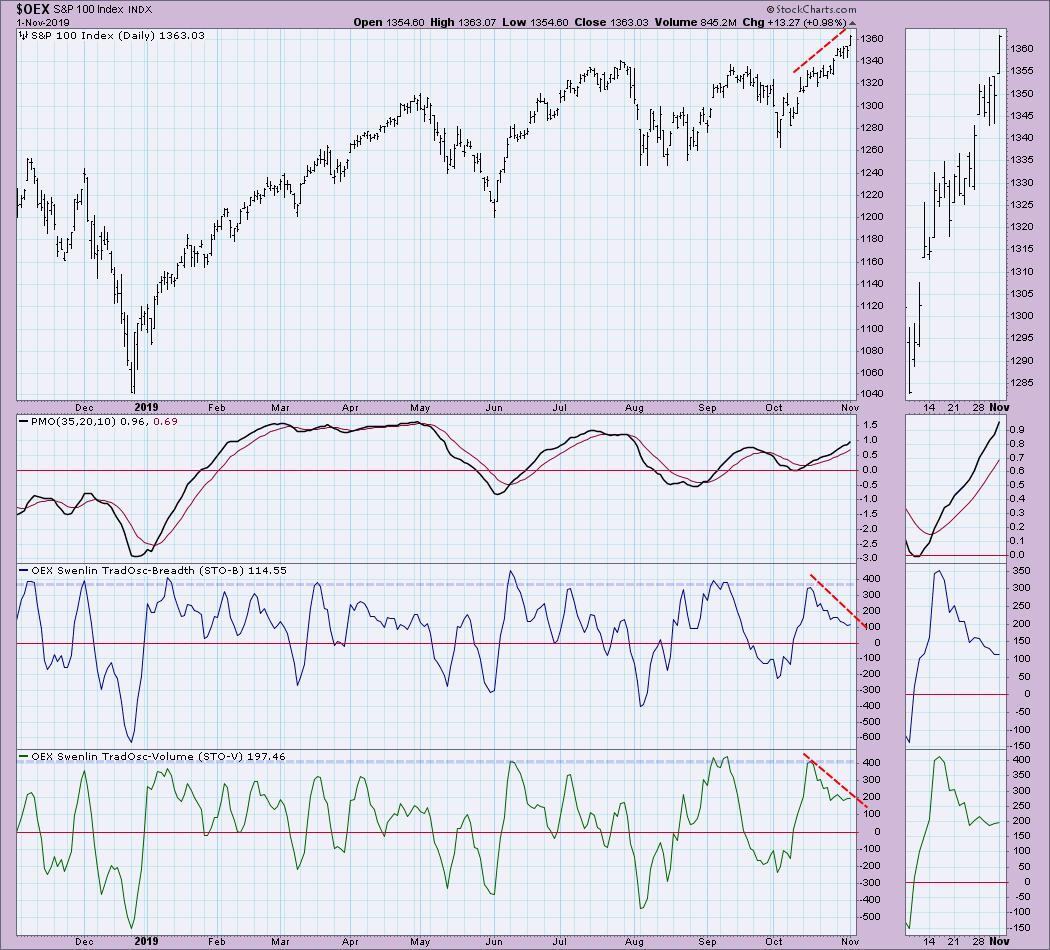
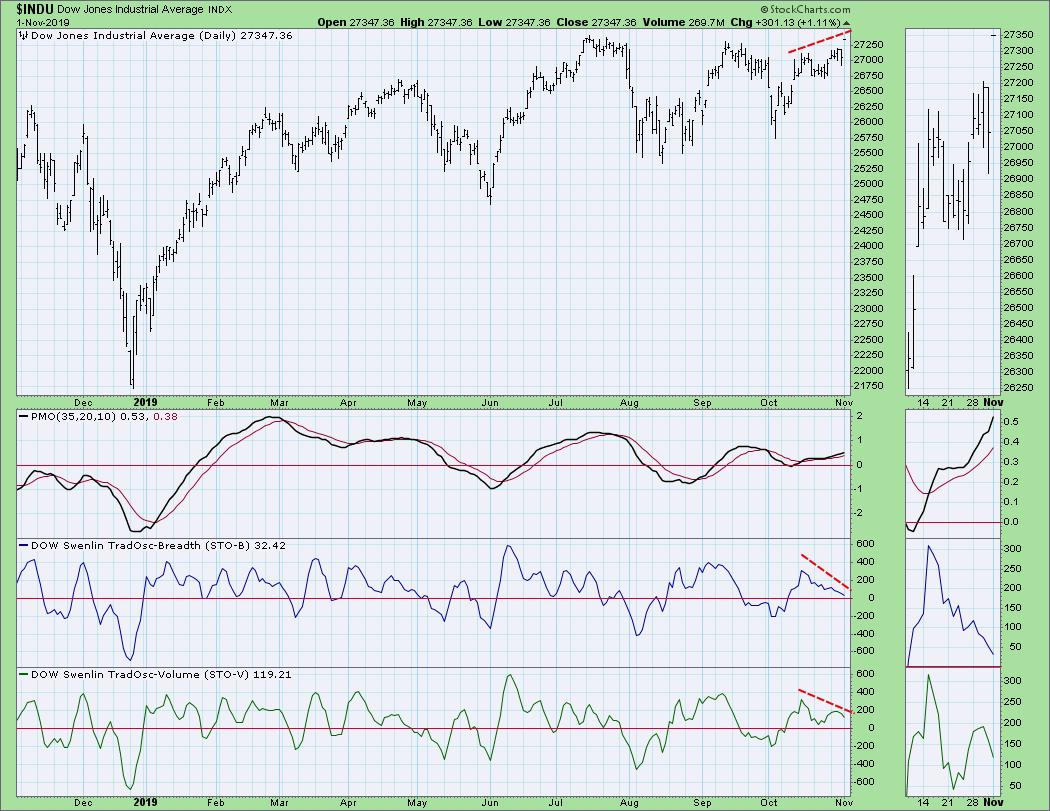
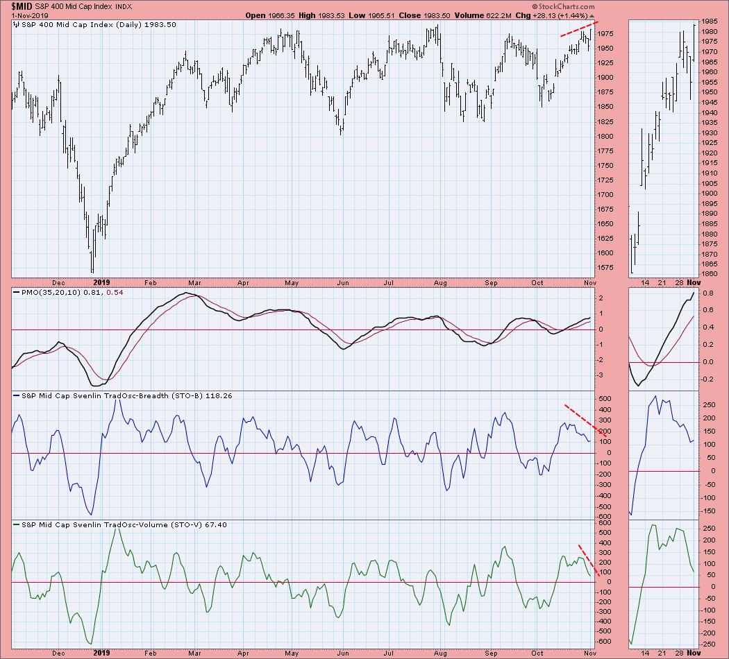
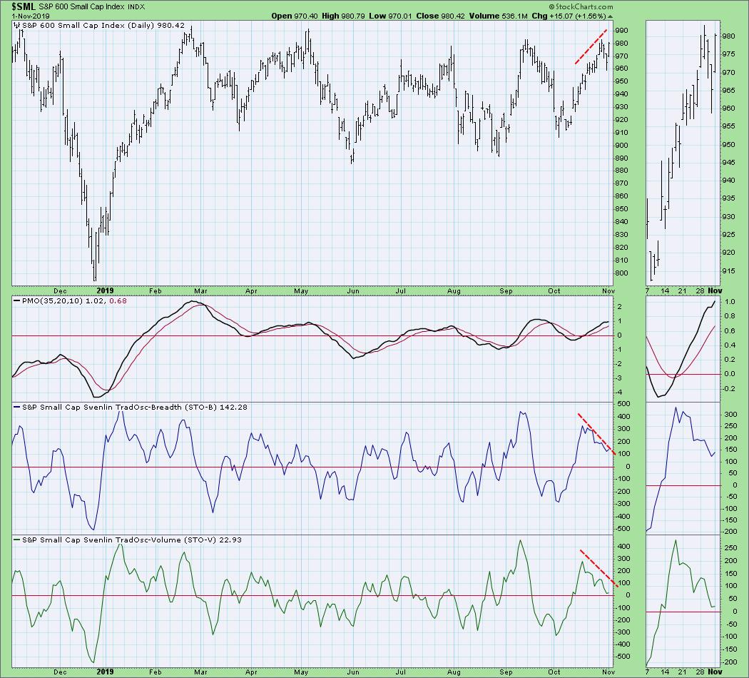
Today saw fresh all-time highs hit on most of the broad market indexes. The weekly Price Momentum Oscillators (PMOs) just generated new Intermediate-Term BUY signals on all four DecisionPoint Scoreboard indexes (SPX, NDX, Dow and OEX). These signals are triggered when the weekly PMO crosses above its signal line on close of business of the last trading day of the week. Yet, despite all of the bullish price activity, the Swenlin Trading Oscillators are in decline - a steep decline, at that.
Typically, when we see these types of negative divergences on these indicators, it happens before a short- (or even intermediate-) term price decline. The negative divergence right now is quite severe; it is very concerning to see the steep declining trends on the STOs paired with steep price rises on new all-time highs.

These conditions are not unique to the SPX. Notice that we are seeing the same phenomena on the other major indexes, including the NYSE, S&P 400 and S&P 600.


Conclusion: I want to believe this rally will continue; certainly the new weekly PMO BUY signals suggest it should. However, when I look at these negative divergences, I have to remain cautious. I'm not adding any new positions just yet and, as you can read in the DecisionPoint Daily Diamonds Reports, I am still 60% cash in my portfolio.
Watch the latest episode of DecisionPoint with Carl & Erin Swenlin LIVE on Fridays 4:30p EST or on the StockCharts TV YouTube channel here!
Technical Analysis is a windsock, not a crystal ball.
Happy Charting! - Erin
erinh@stockcharts.com
Helpful DecisionPoint Links:
DecisionPoint Shared ChartList
Trend Models
Price Momentum Oscillator (PMO)
On Balance Volume
Swenlin Trading Oscillators (STO-B and STO-V)
ITBM and ITVM
SCTR Ranking
**Don't miss DecisionPoint Commentary! Add your email below to be notified of new updates"**
|
| READ ONLINE → |
|
|
|
| ChartWatchers |
| Do Not Ignore the Most Important Signal Heading Into an Earnings Report |
| by John Hopkins |
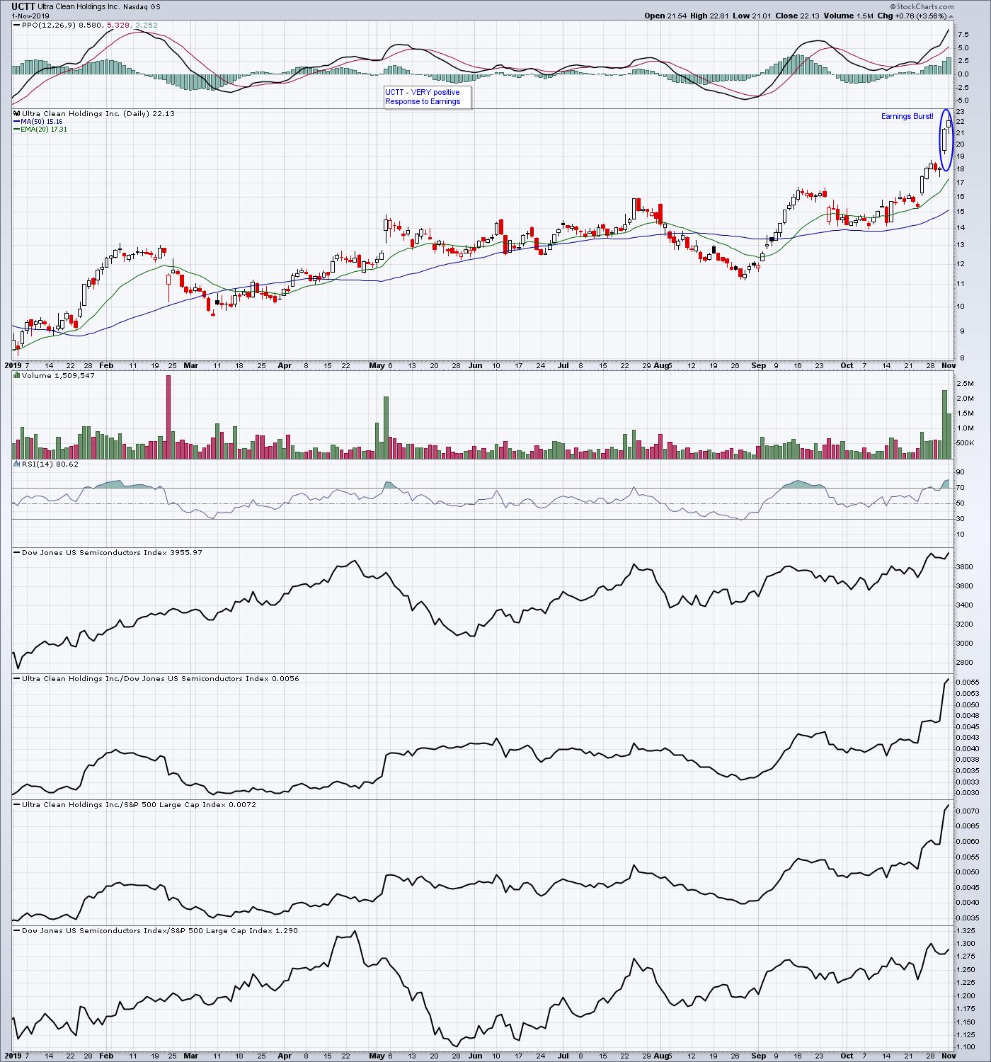
We are now deep into earnings season and, as we can see by the record highs in the NASDAQ and S&P, traders are mostly liking what they are hearing and seeing from companies who are reporting their numbers. We've seen some phenomenal moves in stocks - both to the upside and downside - which have turned into big gains and big losses, particularly for those individuals who chose to hold positions into earnings reports. For example, look at the chart below on Ultra Clean Holdings (UCTT), one of 15 companies our Chief Market Strategist Tom Bowley unveiled to EarningsBeats.com members last week. He felt it could attract a lot of buying interest once it released its earnings last Wednesday, based on its relative strength.

As you can see, within two days of its earnings release, the stock was up by as much as 26%; not too shabby!
Of course, it's impossible for anyone to predict every stock that might go higher or lower when they release their earnings, but it certainly helps to increase the odds of success if you can zero in on those charts showing the companies with the greatest relative strength. In fact, of the 15 companies Tom revealed to our members last week, 10 of the stocks did move higher, with the first 5 released gaining an average of 7% and the next 10 released gaining an average of 3.5% (including the 5 stocks that ultimately moved lower).
I want to point out that holding any stock into its earnings report is a risky proposition; you can never be certain how the market will react to the numbers. For example, even though UCTT gained 26% in 2 days, another stock, MDC, missed expectations - the "worst performer" - that showed promising relative strength into its report. The stock lost 11% the day after its earnings were released, though that was trimmed to roughly 5.5% at its high one day later. Still, if you were holding just that one stock, it might feel painful.
Since Tom got such a positive response to sharing promising stocks to our members, he's decided to conduct a FREE webinar this Monday, November 4 at 4:30pm ET, where he will release a new batch of stocks on companies set to report their earnings throughout the week. This event will be open to both our full service members as well as those who subscribe to our free EarningsBeats Digest newsletter, which is published 3 times a week on Mondays, Wednesdays and Fridays and focuses specifically on earnings-related topics. So, if you are NOT currently an EarningsBeats.com subscriber but want to attend this FREE, timely, educational and potentially profitable webinar, just click on this link to save a seat and we'll send out a webinar link to you prior to the start of the event. It's going to to be an outstanding event and we'd love to have you join us!
Traders are constantly looking for ways to get an edge to profit. Zeroing in on those companies set to report earnings with charts that look solid on a relative basis is something worth examining.
At your service,
John Hopkins
EarningsBeats.com
Better Timing. Better Trades.
|
| READ ONLINE → |
|
|
|
|
|
| MORE ARTICLES → |
|


 The Nasdaq AD Line is not keeping pace with the Nasdaq Composite, but this is not bearish for the Nasdaq or the market as a whole. Note that the Nasdaq hit a new high in July and again on November 1st, even though the Nasdaq AD Line has been falling since April. How can this be, what does it tell us and why is it not bearish? Let's address this questions.