| THIS WEEK'S ARTICLES |
| The Traders Journal |
| A Top-Down Approach To Find Market-Beating Stocks |
| by Grayson Roze |
 Back at it this week on StockCharts TV! I had the pleasure of once again hosting "Your Daily Five" this afternoon and I gotta say – I am a HUGE fan of this format. In just about 10 minutes, we bring you a concise, action-packed daily rundown of the five most important charts that you need to be watching. Weekdays at 1:00pm ET, each day features a new host, which means five top charts and key insights from a different seasoned technician every single day of the week. Back at it this week on StockCharts TV! I had the pleasure of once again hosting "Your Daily Five" this afternoon and I gotta say – I am a HUGE fan of this format. In just about 10 minutes, we bring you a concise, action-packed daily rundown of the five most important charts that you need to be watching. Weekdays at 1:00pm ET, each day features a new host, which means five top charts and key insights from a different seasoned technician every single day of the week.
First up, I took a multi-timeframe look at the classic Intermarket Analysis chart with stocks (SPY), bonds (TLT), gold (GLD), commodities (DBC), oil (USO) and the US dollar (UUP) all on one chart. I narrow down from the long-term 10-year weekly view to the intermediate-term 2-year daily view, then zoom in all the way to a 3-month daily chart.
With some broad market analysis out of the way, I then walked through my top-down analysis approach using the Sector Summary page on StockCharts. This feature-rich resource is one of my favorite ways to find market-leading stocks, but many users don't realize the full power of the tool. By drilling down from the 11 sectors to the industry groups and then the individual stocks within, you can quickly pinpoint the strongest stocks in the strongest industry groups in the strongest sectors of the market. That sort of top-down approach yields amazing relative strength, and it's a great resource not only for your analysis, but also your discovery process.
So, to see the process in action, be sure to watch today's edition of "Your Daily Five" below:
Money In, Eyes Open.
- Grayson Roze
VP of Operations, StockCharts.com
Author, Trading for Dummies (Wiley, 2017)
Author, Tensile Trading: The 10 Essential Stages of Stock Market Mastery (Wiley, 2016)
StockMarketMastery.com
|
| READ ONLINE → |
|
|
|
| The Market Message |
| Techs Retreat as Other Groups Gain |
| by John Murphy |
Big tech has been the main story in the market since the start of the pandemic with most of the rest of the market largely left behind. Over the past couple of weeks, however, we've started to see some money moving into weaker parts of the stock market that have been lagging behind. So it's encouraging to see some of the those groups continuing to gain ground as some profit-taking emerges in an overbought technology sector. Some of those moves can be seen in today's sector alignment. Chart 1 shows technology and communications as Friday's weakest sectors, while money flowed into utilities, financials, industrials, and real estate. In addition to those four leading sectors, small caps and transports are gaining more ground on Friday. A bounce in bond yields may be giving a boost to bank shares. Chart 2 shows the whole week's performance.
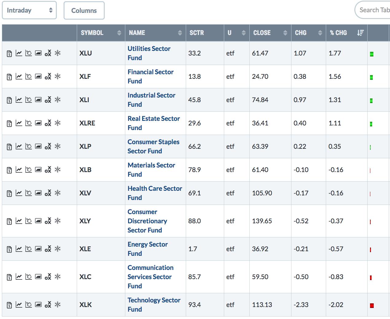 Chart 1 Chart 1
Chart 2 ranks the eleven market sectors for the entire week. And it shows industrials in the top spot. The XLI cleared its 200-day moving average this past week and is starting to attract more attention and money. Its top gainers were in delivery services like UPS and FedEx along with heavy construction, airlines, and aerospace. Technology came in third. Defensive staples, utilities, and real estate were among the weakest sectors. Some of the money moving into cheaper parts of the market may be coming from technology. But some of it may be new money coming from the sidelines. The S&P 500 is within one percent of its February high which may provide an important test for the overall stock market (see Chart 5). In related markets, a bounce in an oversold dollar is causing profit-taking in overbought precious metals.
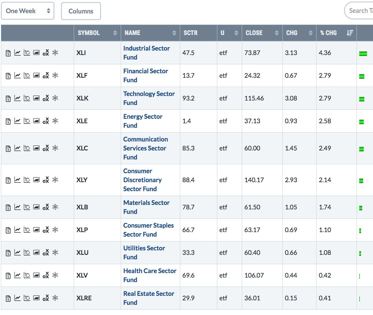 Chart 2 Chart 2
United Parcel (UPS) and FedEx (FDX) are the day's two top percentage gainers in the Industrial SPDR (and the Dow Transports). Last weekend's message showed UPS surging to a new record. FedEx has a long way to go to reach that milestone. The daily bars in Chart 3, however, show the delivery stock hitting a new 52-week high today. The weekly bars in Chart 4 put that upturn in better perspective and suggest that its new uptrend may be just beginning. The upper chart shows UPS scoring another record high today. Chart 5 shows the S&P 500 nearing an important test of its February high.
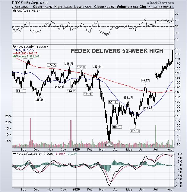 Chart 3 Chart 3
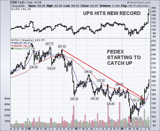 Chart 4 Chart 4
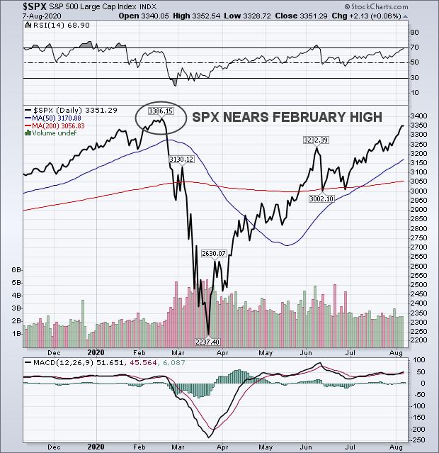 Chart 5 Chart 5
Editor's Note: This is an article that was originally published in John Murphy's Market Message on Friday, August 7th at 3:34pm ET.
|
| READ ONLINE → |
|
|
|
| Art's Charts |
| Four Stocks Poised to Drive Healthcare Higher |
| by Arthur Hill |
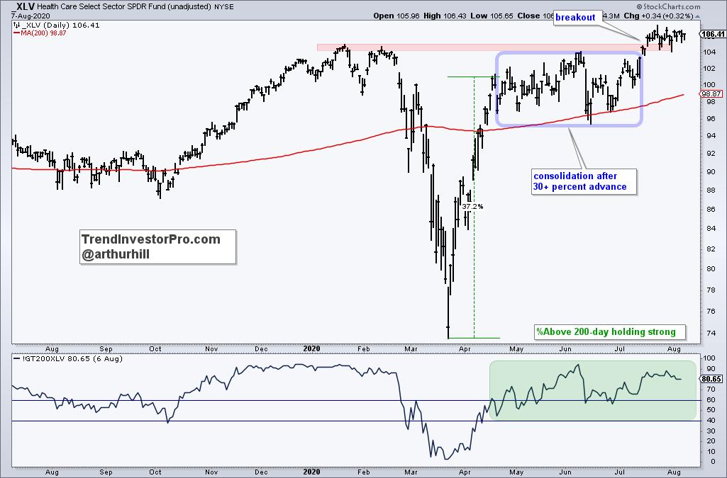
 The Healthcare SPDR (XLV) is one of the strongest sectors in 2020. Even though it does not sport the biggest gain, XLV recorded a new high in July and some 80% of its components are above their 200-day EMAs. The new high points to a long-term uptrend and upside leadership, while the percentage of stocks above the 200-day EMA points to broad strength within the sector. Sector SPDRs, however, are only as strong as the sum of their parts (component stocks). The top four stocks in XLV account for 27.7% of the ETF and these four look poised for further gains. The Healthcare SPDR (XLV) is one of the strongest sectors in 2020. Even though it does not sport the biggest gain, XLV recorded a new high in July and some 80% of its components are above their 200-day EMAs. The new high points to a long-term uptrend and upside leadership, while the percentage of stocks above the 200-day EMA points to broad strength within the sector. Sector SPDRs, however, are only as strong as the sum of their parts (component stocks). The top four stocks in XLV account for 27.7% of the ETF and these four look poised for further gains.
The first chart shows XLV surging over 30% and then consolidating from mid April to mid July. A consolidation after a sharp advance is typically a bullish continuation pattern and XLV broke out with a surge to new highs in mid July. This breakout signals a continuation of the existing uptrend and further gains are expected. Also note that price is above the rising 200-day and %Above 200-day EMA (!GT200XLV) has been bullish since above crossing 60% in mid April.
Now lets check out the big four. The next chart shows Johnson & Johnson (JNJ) with a breakout in July and UnitedHealth (UNH) with a breakout this week. Actually, UNH is the stronger of the two because it recorded a new high this week. Nevertheless, JNJ held its rising 200-day in June, broke out of a falling channel correction and remains above its 200-day.
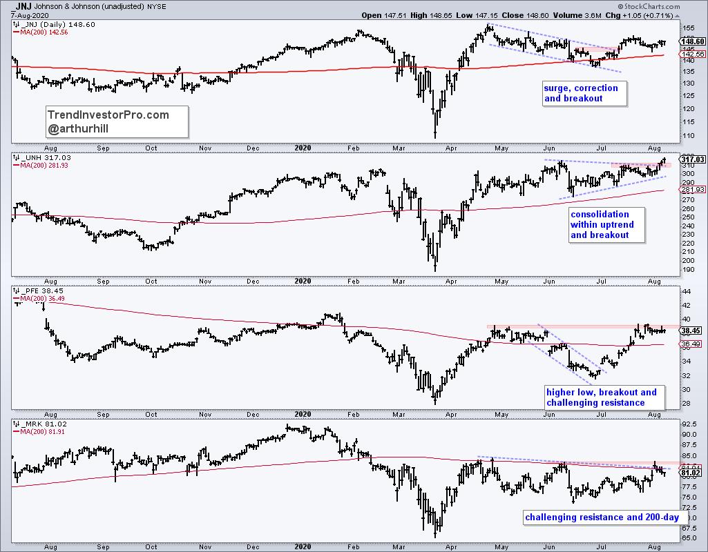
Pfizer (PFE) and Merck (MRK) are not quite as strong as the first two, but both are challenging resistance zones. PFE formed a higher low in late June, broke out of a falling channel and raced to the resistance zone. A breakout here would forge a higher high to go along with the higher low. MRK surged to its 200-day in April and then worked its way lower the last few months. There is resistance in the low 80s from the 200-day and June-July highs. A breakout here would reverse the downtrend.
Sign up bonus! StockCharts members who sign up for TrendInvestorPro.com receive the Essential Breadth Indicator ChartList. This list contains over 100 charts organized by index and sector with their respective breadth indicators. New subscribers also receive the Core and Master ETF ChartList, which contains over 200 ETFs organized in a top-down manner. Each week we rank, group, chart and analyze the core list of 60 ETFs. There is also a broad market timing report on Friday's with quantified breadth models and a weekend video putting it all together.
Click here to take your analysis to the next level!
--------------------------------
|
| READ ONLINE → |
|
|
|
| The Canadian Technician |
| Ballistic Investing Heroes |
| by Greg Schnell |
It seems remarkable that, every week, the market moves higher regardless of public health deterioration, rising death rates, politics, increasing global conflict, falling earnings and rising bankruptcies. But, more importantly, the only thing telling us which side of the investing landscape to be on is the price action. There is very little helping us with words of encouragement on the news flow.
Mega-cap names have soared for 4 months, as if they had a product they did not have before. Apple (AAPL) is still selling what it was selling, Microsoft (MSFT) is still selling what it was selling, Facebook (FB) is still selling what it was selling. Google (GOOG) is still selling what it was selling. Really, Amazon (AMZN) is the only one where business flow has had a remarkable upside turn. Banks are muted by interest rates, but they are also the only and primary conduit for Fed and Government programs. Why haven't they soared? Bitcoin ($BTCUSD) currency is breaking out, while the dollar falls. Gold and Silver soar, as some sort of marginal ballast to exploding government debt globally. Retailers are in a paradox between bankruptcies and soaring revenues for online offerings. Railways and trucking continue to move higher as the media reports areas of the country slowing. The payment systems area has exploded higher, with SQ and PYPL as examples, but Mastercard (MA) and Visa (V) can't get through prior highs.
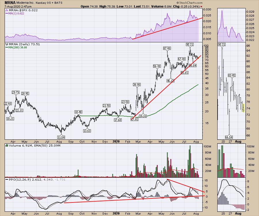
It's a challenging investment landscape, where the only clues we have are prices paid. Strength has led to strength. The companies that broke out early have continued to push higher. Some ballistic surges in TSLA, NKLA, NIO have only amped up speculation. The Biotech industry is like a ride on Space Mountain, a roller coaster in the dark where every curve illuminates some new vaccine idea, while what was showing up is overshadowed by the new view.
In the meantime, my Twitter feed shows advisor after advisor suggesting to stay the course, it's a long-term plan. My LinkedIn is all about how people who got out to protect their capital were foolish and sticking with a plan was the right thing to do. At this point, it is hard to argue as staying invested was the right thing to do.
The unstated central thesis for portfolio managers worldwide is you just had to believe that every municipal, state and federal government worldwide would take on immeasurable risk and throw money they didn't have at the problem at the fastest rate of unplanned debt expansion ever. The central banks would buy junk bonds, corporate debt and bizarre "assets," and go on the fastest surge in spending ever. Countries like Japan would add two trillion in debt while unable to service the largest debt ratio in the developed world. In the words of Mario Draghi, whatever it takes. Now, we are waiting for the next round of stimulus checks so the global economies don't stall again. Truly, even more remarkable.
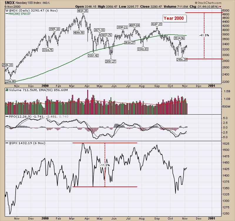
As the $SPX is coming back to test the old February highs, is this the deja vu of the year 2000? Being aware of the chart shapes can help ballast our optimism. After all, we wiped out the global economy and brought it back to some shadow of its former self, but is the world worth so much more now that markets continue to higher highs?
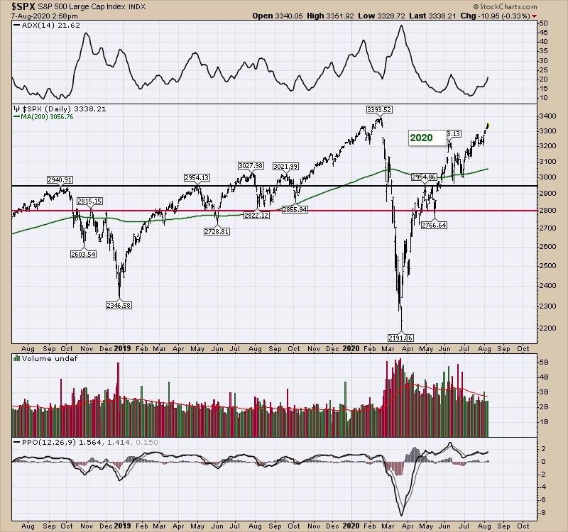
Here's how 2000 looked on the $NDX. The lesson to be learned on the chart that is valuable is that the market rallied significantly off the lows and took about 6 months to lose the euphoria in the rallies. The absolute levels are valid, but may be higher or lower than the previous highs before the primary correction. In 2000, the market topped in March and again in September. The $SPX (lower panel) went back to test prior highs, but did not get through. There is no reason to suggest this would be the same, but let's at least be aware of historical reactions as the market keeps trying to move higher.
Here is how that played out after the initial 6 months of rebuilding confidence. We see the same trend of complacency creeping in with fresh lows in options market pessimism (not shown).
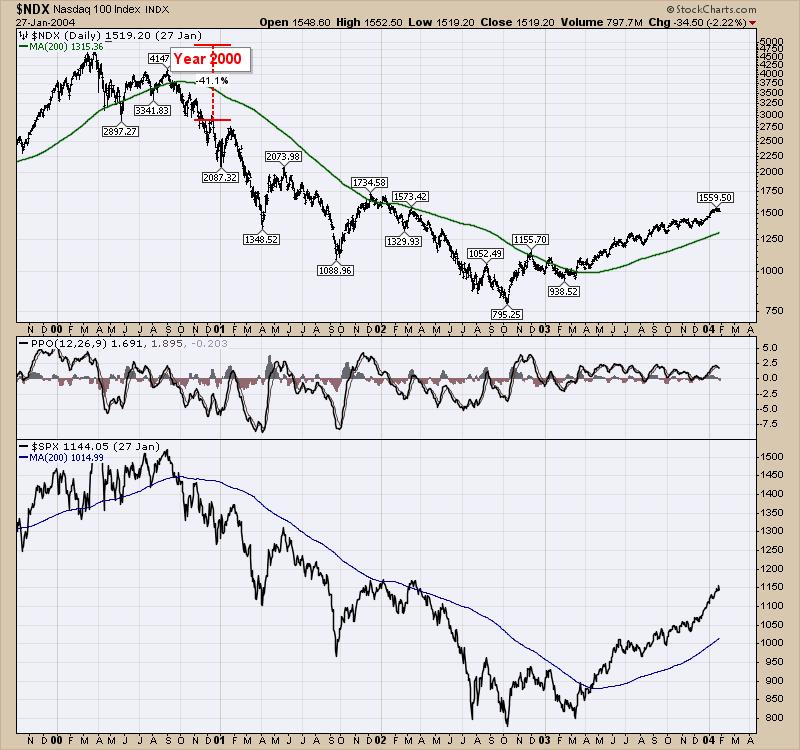
We don't know if we can just keep having companies growing at 12.8% per year, trading at 37 times earnings (MSFT) as the new normal, or if it will end up with a global slowdown when all the facts come out and we melt down into a big slowdown.
I have a series of charts that keeps me invested now, but will also push me to the exits should they start to fail. They currently say to keep on holding. My comfort level that this was the world's greatest recovery is way lower than the current level of the Nasdaq. It won't matter if I am right or wrong; it will only matter if I don't follow the technical clues the market is sharing.
All that is to say, the news flow would scare us out of the market every day, but make us feel like we missed the moves by not being invested. At this point, I would suggest the market has been the kindest market ever to let us reevaluate the selloff by returning to prior highs. With the $SPX only a day away from prior highs, it's a good time to check the Kool-Aid we are drinking to make sure reality is nearby if required.
|
| READ ONLINE → |
|
|
|
|
|
| The Traders Journal |
| The Dance Of The Outperformers: Peter Lynch Preaches You Best Start With Yourself |
| by Gatis Roze |
 Novice investors seldom like to hear that before asset growth (trading) must come asset protection. Boring! Similarly, they are reticent in embracing the reality that before they begin analyzing equities, they must first analyze themselves. Really? Legendary stock-picker Peter Lynch specifically warned investors of these "Investor Self" priorities. He insisted that to succeed as an investor, this short checklist was the gateway for all with serious aspirations of success. Novice investors seldom like to hear that before asset growth (trading) must come asset protection. Boring! Similarly, they are reticent in embracing the reality that before they begin analyzing equities, they must first analyze themselves. Really? Legendary stock-picker Peter Lynch specifically warned investors of these "Investor Self" priorities. He insisted that to succeed as an investor, this short checklist was the gateway for all with serious aspirations of success.
Patience.
The old cliche — "I worked a long time to become an overnight success" — is often appropriate in the investment arena. Patience is a prerequisite for profits. Jeff Bezos wrote in his annual shareholder letter that most people think if they work hard and practice every day, they should master a handstand in two weeks. In reality, it takes six months of daily practice. Takes practice and patience.
Self Reliance.
There can be only one hand that pulls the trigger. Be prepared to accept both the responsibility and the consequences of your investing endeavors.
Common Sense.
One needs to understand that a tomato is a fruit, but don't put one in a fruit salad. What seems obvious is sometimes not. Buy more of an investment that's working. That is common sense. Without it you have many expensive lessons ahead of you.
Tolerance For Pain.
Successful investors understand that tolerance for pain is not the absence of pain. Instead it's the capacity to execute a plan of action in spite of the pain.
Open-Mindedness.
The markets are never static. The divine discontent of economic markets breeds new companies and technologies each and every day. Yesterday's "WOW" is today's ordinary. If that doesn't excite you, look elsewhere for fulfillment.
Detachment.
Emotions impact your perceptions. Be in touch with your emotions. In lieu of moving to a desert island, I focus on what my charts are telling me. Movie makers have perfected the art of illusions. News media has fine-tuned disinformation. It's a plague if you let it impact you. Talking heads are selling advertising, not profitable investing methodologies. My charts don't lie to me. My charts provide the impartial detachment to which I aspire.
Persistence.
Investing — like entrepreneurship — appeals to some and not to others. When you are brutally honest with yourself, you need to answer that question with respect to yourself. If you do catch the stock market bug and you persist, it can be a wonderful world, producing a lifetime of fulfilling achievements and financial rewards. Nice people, too!
Humility.
Before you invest in the markets, leave your ego at the door. If not, the market will humble you because the market is ALWAYS right.
Flexibility.
This quote by Charles Darwin captures it: "It's not the strongest of the species that survives, not the most intelligent that survives. It is the one that is most adaptable to change." Don't be rigid.
Willingness To Do Independent Research.
Personally, I've always enjoyed researching papers in college, new car specifications or finding the best plumbing contractor. But that's just me. These days, the challenge is finding truth amongst all the dark web information masquerading as knowledge and facts.
Willingness To Admit Mistakes.
To phrase it in a positive light, let your winners run and sell everything else. In my experience, selling is the hardest part of investing. Just because you choose to ignore your mistakes, they will not ignore you. Smart investors learn from their mistakes, but the smartest learn from other people's mistakes. Bill Gates said, "It's fine to celebrate success, but it's more important to heed the lessons of failure."
Ability To Ignore General Panic.
The only people who get hurt on a roller coaster are the ones who jump off. Studying historical price charts can illustrate what panic smells like. Human tendencies haven't changed. Charts are pictures of behavior in past panics.
Discipline Yourself To Resist Your Human Nature.
Investing is fertile ground for emotional attachments, personal behavioral biases, familiarity bias and a great deal of other emotional baggage that must be first studied and understood before being controlled. Precisely why the most important chapter in our book, Tensile Trading, is titled "The Investor Self". Easy to say. Hard to do, but a very high leverage worthwhile endeavor. Your bottom line will thank you.
Trade well; trade with discipline!
- Gatis Roze, MBA, CMT
StockMarketMastery.com
|
| READ ONLINE → |
|
|
|
| DecisionPoint |
| Two Industrial Sector Stocks that are Prepared to Perform! |
| by Erin Swenlin |
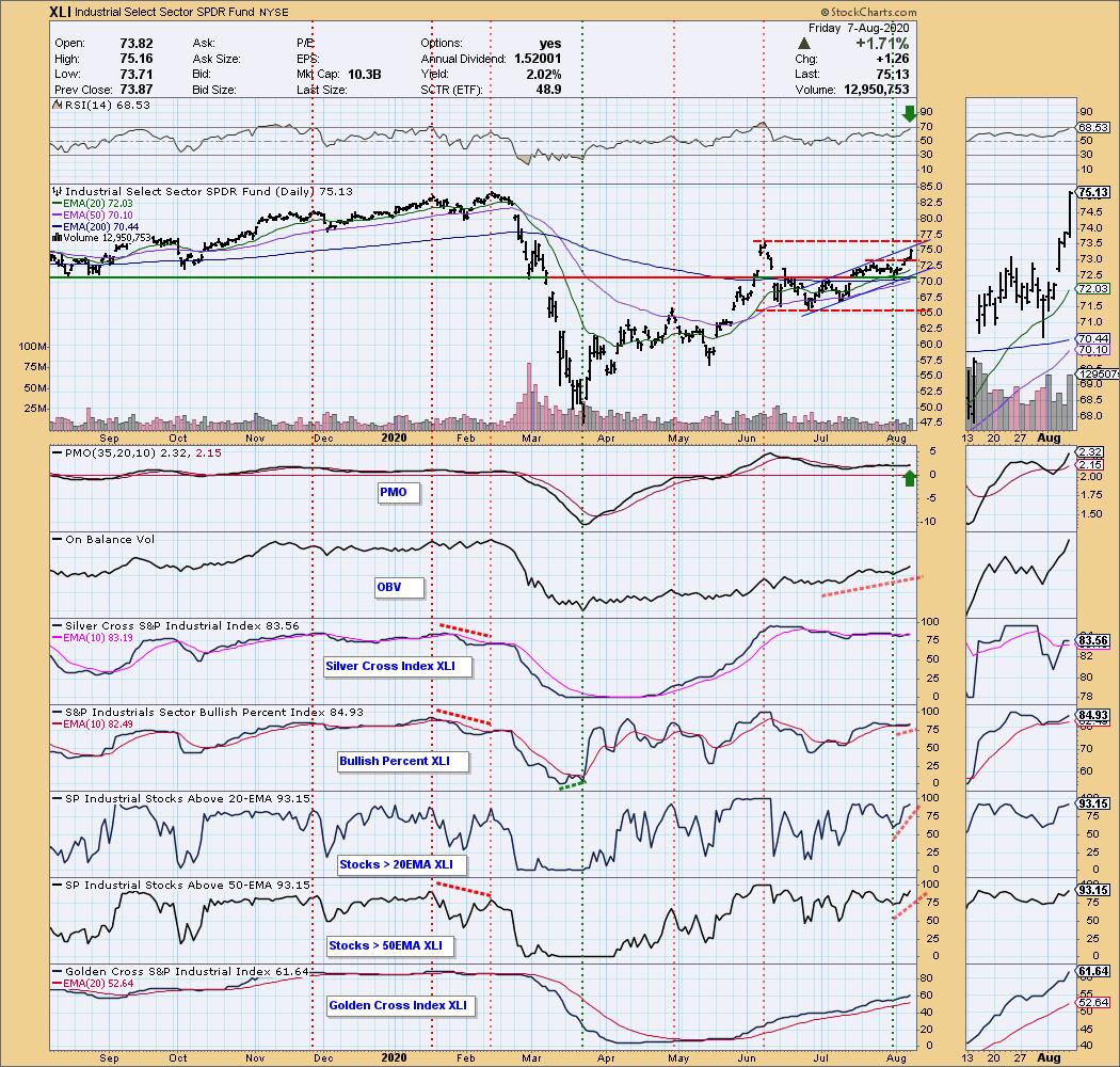
On Wednesday afternoon, as I was preparing to record the DecisionPoint show, I did a scan of the sectors in preparation and the Industrial Sector SPDR (XLI) caught my eye after a nice gap up. I scanned my Tuesday DecisionPoint Diamonds and, sure enough, I had presented an Industrial stock to my Diamond readers! Today, I found another "diamond in the rough" Industrial you need to review at the bottom of the article.
Let's start with the chart of XLI. I continue to like this sector and the two stocks below it. You can see in the thumbnail what intrigued me before the DecisionPoint show on Wednesday... price closed above the previous short-term top and the Price Momentum Oscillator (PMO) triggered a crossover BUY signal. It has only continued higher since then and I believe it will follow-through with more upside movement in spite of overhead resistance at the June top.

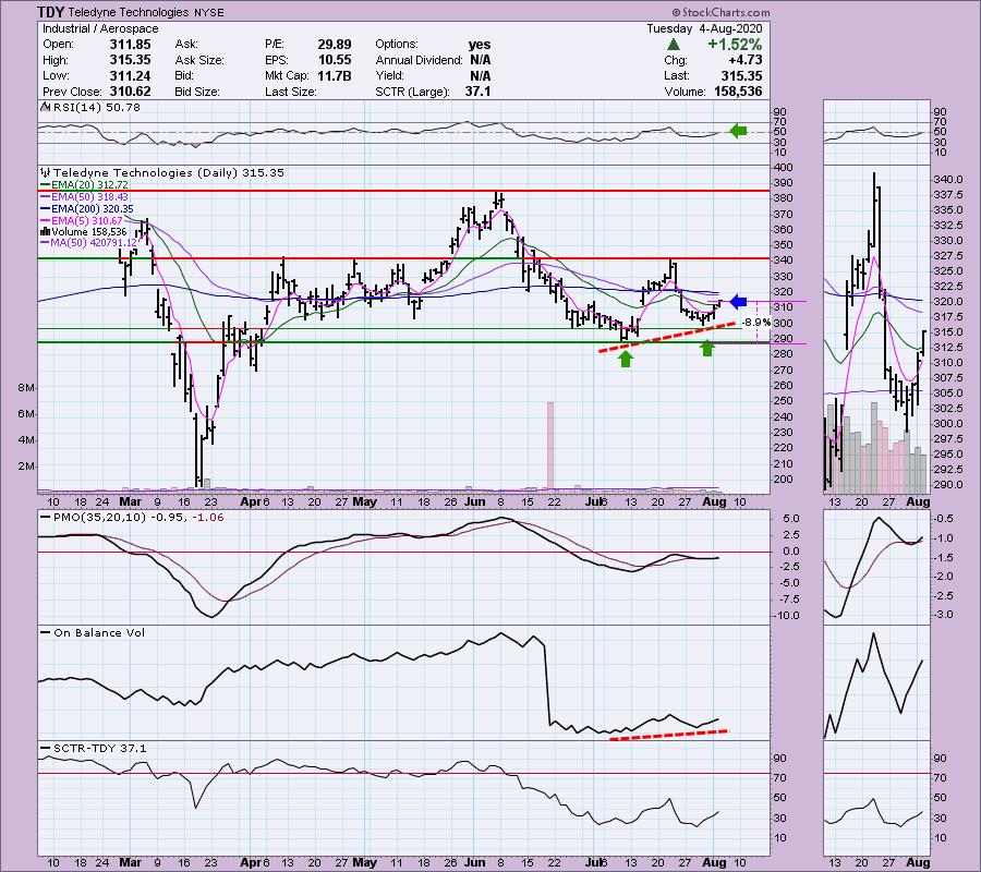
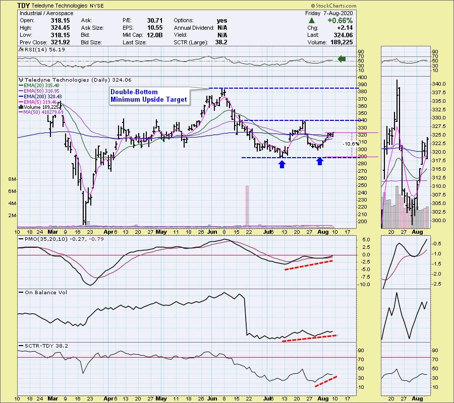
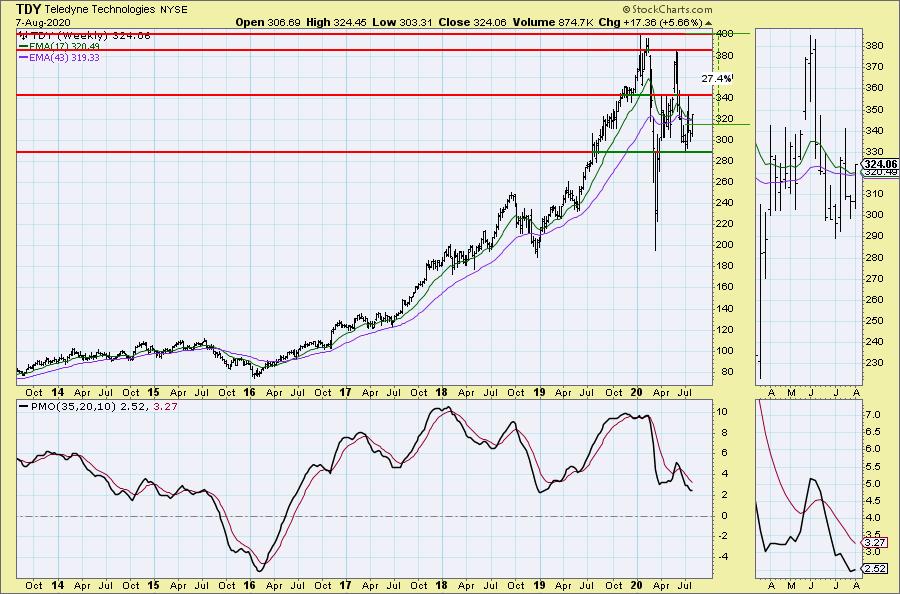
My "Diamond of the Week" pick for the DecisionPoint show is below with TUESDAY's Diamonds Report commentary in italics; beneath that is the up to date chart in yellow. I still like this set-up:
"Teledyne Technologies (TDY) - Earnings: 10/21/2020 (BMO)
Teledyne Technologies, Inc. engages in the provision of electronic and communication products for wireless and satellite systems. It operates through the following business segments: Instrumentation; Digital Imaging; Aerospace & Defense Electronics; and Engineered Systems. The Instrumentation segment includes monitoring and control instruments for marine, environmental and industrial applications. The Digital Imaging segment offers sensors, cameras and infrared systems. The Aerospace & Defense Electronics segment provides electronic components, data acquisition, subsystems and communications equipment. The Engineered Systems segment develops and produces electrochemical energy systems and small turbine engines.
We could be seeing a double-bottom forming on TDY. Price closed above the 20-EMA and the RSI just moved into positive territory. The OBV is confirming the move and the PMO just triggered a BUY signal. The SCTR is beginning to improve.
TUESDAY'S CHART:

FRIDAY'S CHART:

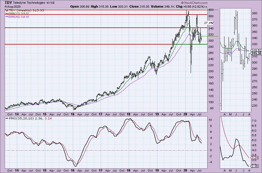
The weekly PMO is trying to decelerate in oversold territory and upside potential is great.
TUESDAY'S CHART:

FRIDAY'S CHART:


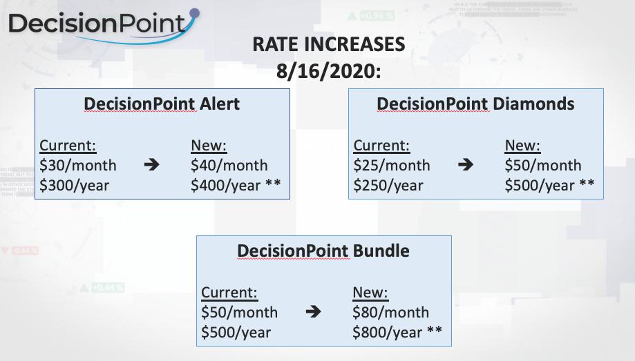
** PRICES ARE GOING WAY UP! **
Subscribe now to lock in our low prices with a one-week trial (coupon code: dptrialcw)! You can thoroughly check us out as we have all of our DP Alert and DP Diamonds reports archived back to January!

DecisionPoint Diamonds are becoming even more indispensable! Not only do you get 60 "Diamonds in the Rough" stocks/ETFs per month with complete analysis that includes stops/targets... but there will now be a Friday Diamonds Recap that will look at the performance of each week's Diamonds and their prospects moving forward. Over the weekend, we clean the slate and start over again.
Included for my Diamonds subscribers-only will be a new one-hour trading room, "The DecisionPoint Diamond Mine" on Fridays! It will be an opportunity for us to talk live, review current and past Diamonds for possible entries/exits/stops/targets and take your questions and symbol requests in this intimate trading room.
DecisionPoint Alert subscribers will continue to enjoy clear, concise analysis of the overall market, including Dollar, Gold, Gold Miners, Oil and Bonds from both Erin and Carl Swenlin. You are prepared each market day knowing the implications of market behaviors for that day, week or month!
All subscribers have access to our exclusive ChartLists that are annotated and curated by Carl Swenlin. Know what he thinks is important on all of the sectors, indexes, indicators and more!

Today's ChartWatchers "Diamond of the Week":
FYI, in the July 24th ChartWatchers Newsletter, Natural Gas (UNG) was the "Diamond of the Week".
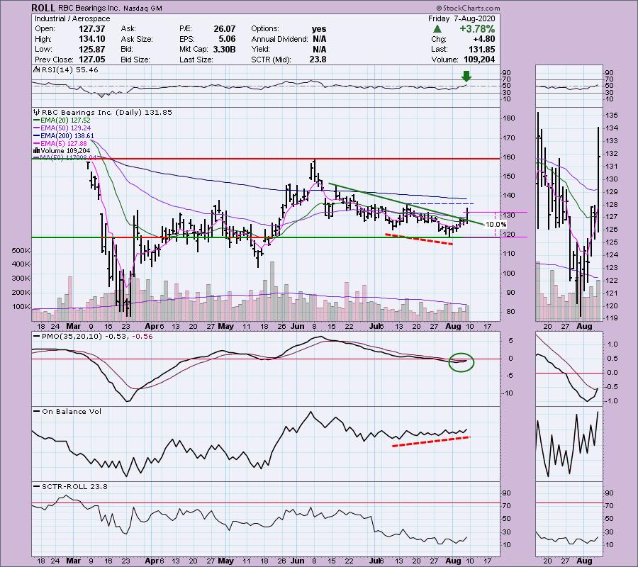
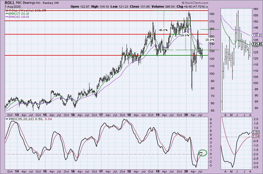
RBC Bearings Inc (ROLL) - Earnings: 10/29/2020 (AMC)
RBC Bearings, Inc. engages in the design, manufacture and marketing of engineered precision bearings and products. It operates through the following segments: Plain Bearings, Roller Bearings, Ball Bearings and Engineered Products. The Plain Bearings segment produces self-lubricating, metal-to-metal designs and other sub-classes, including rod end bearings, spherical plain bearings and journal bearings. The Roller Bearings segment manufactures anti-friction products that utilize cylindrical rolling elements. The Ball Bearings segment offers high precision aerospace, airframe control & thin section and industrial ball bearings. The Engineered Products segment consists of engineered hydraulics and valves, fasteners, precision mechanical components and machine tool collets used in aircraft and submarine applications, as well as aerospace and defense aftermarket services.
I like this chart even better than TDY. RBC just broke out of a declining trend alongside a new PMO BUY signal. The RSI has just moved positive above net neutral (50). I feel a little deja vu from Tuesday looking at the TDY chart. The indicators are so similar. However, I see something that TDY doesn't have---a positive divergence with On-Balance Volume (OBV). I show that it would take a 10% stop to get you to important support.

The weekly PMO has just turned up above the signal line and above the zero line, which I find especially bullish. I've marked several areas for upside targets.

Conclusion: I already had an affinity for the Industrial Sector on Wednesday afternoon and I still like it. It seems that money is beginning to rotate into this sector, as John Murphy described in his article today. It was the highest gainer among the SPDR Sectors this week. The two Industrial stocks above do seem to have some great upside potential based on the technicals. Be sure and sign up on our free email list to learn more about the new DecisionPoint Trading Room coming in late August! I can't wait to begin interacting live again with all of you! And don't forget, we are raising our rates, so lock in a good deal now with a 1-week trial (coupon code: dptrialcw).
Happy Charting! - Erin
Technical Analysis is a windsock, not a crystal ball.
Helpful DecisionPoint Links:
DecisionPoint Alert Chart List (subscribers only)
DecisionPoint Golden Cross/Silver Cross Index Chart List (subscribers only)
DecisionPoint Sector Chart List (subscribers only)
DecisionPoint Chart Gallery
Trend Models
Price Momentum Oscillator (PMO)
On Balance Volume
Swenlin Trading Oscillators (STO-B and STO-V)
ITBM and ITVM
SCTR Ranking
|
| READ ONLINE → |
|
|
|
| ChartWatchers |
| Powerhouse Stocks with Smashing Results |
| by John Hopkins |
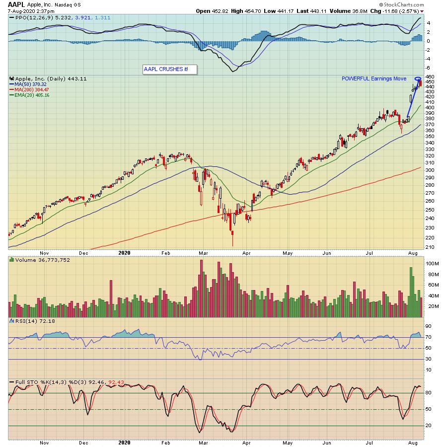
A number of tech giants have crushed earnings expectations, something that becomes quite apparent when you look at their charts. For example, take a look at Apple (AAPL), which recently reported its numbers:

Your eyes are not deceiving you. Since the company reported its earnings on July 30, the stock rose almost 20% at its peak - in a week! That's quite a move for a large cap stock like AAPL.
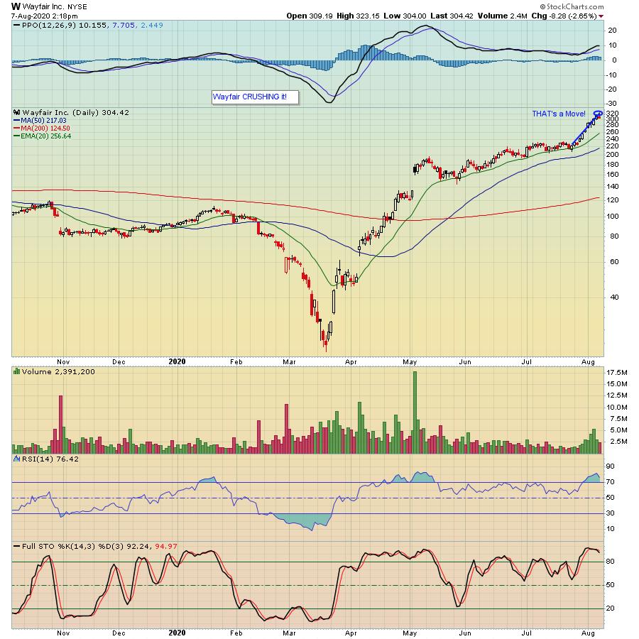
Then there's Wayfair (W). How has that stock done the past week? Up a mere 35% at its high.

What do those two stocks have in common? They both reside in our Model Portfolio, which was established in November 2018 by EarningsBeats.com Chief Market Strategist Tom Bowley and, since its inception, is higher by 117.88% compared to the S&P of 24.55% over the same period of time. In fact, since AAPL and the latest batch of 10 stocks that beat both top and bottom line expectations, identified and hand-selected by Tom, were added to the Model portfolio this past May 19, the stock is higher by 46% and Wayfair has doubled! Not too shabby.
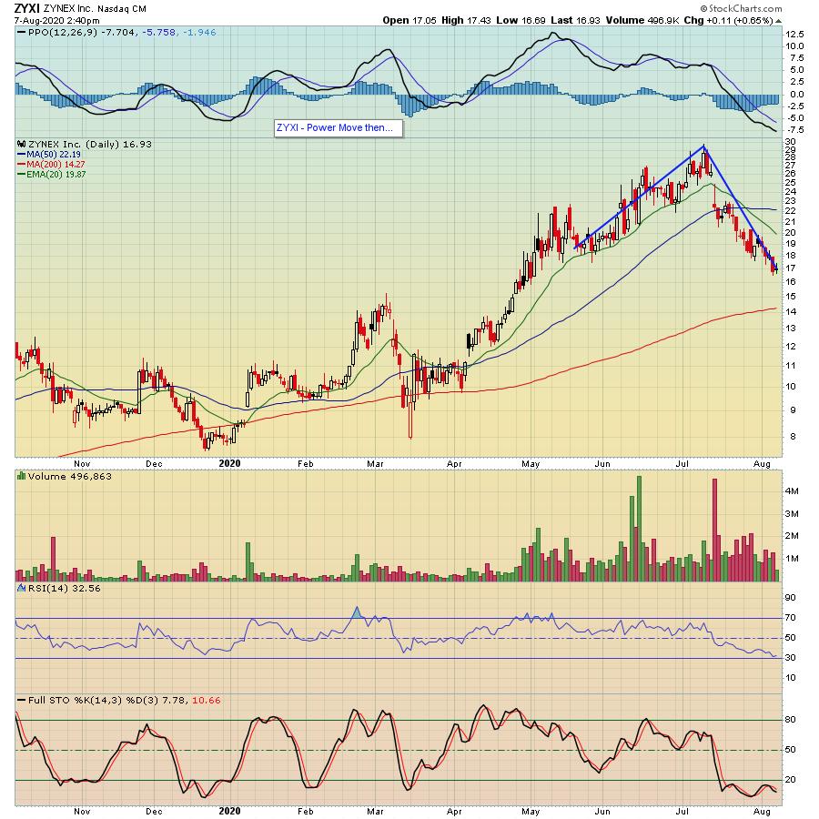
However, not every stock in the Model portfolio selected by Tom has fared as well. For example, take a look at the chart below on ZYNEX (ZYXI). The stock took off after it was added to the Model Portfolio - higher by 52% at its peak - only to give it all up plus some, moving lower by 14% as of Friday.

Still, as a group, the 10 stocks that make up the Model Portfolio that were added on May 19 are higher by almost 30% compared to the S&P of 14.65%. And it goes to show you that even when you have a company like ZYXI that loses steam after a great move higher, stocks like AAPL and W can easily offset the losses, especially when 8 out of the 10 stocks in the portfolio are higher since the May 19 start date.
All of this is very exciting to us especially since Tom will soon unveil his newest batch of "Top 10 Stock Picks" in 4 portfolios - 40 stocks in all. And we're going to have a "Sneak Preview" webinar this upcoming Monday, August 10 that is open to the EarningsBeats.com community. If you would like to join us and learn more, just click here.
At your service,
John Hopkins
EarningsBeats.com
|
| READ ONLINE → |
|
|
|
|
|
| MORE ARTICLES → |
|
 Back at it this week on StockCharts TV! I had the pleasure of once again hosting "Your Daily Five" this afternoon and I gotta say – I am a HUGE fan of this format. In just about 10 minutes, we bring you a concise, action-packed daily rundown of the five most important charts that you need to be watching. Weekdays at 1:00pm ET, each day features a new host, which means five top charts and key insights from a different seasoned technician every single day of the week.


 The Healthcare SPDR (XLV) is one of the strongest sectors in 2020. Even though it does not sport the biggest gain, XLV recorded a new high in July and some 80% of its components are above their 200-day EMAs. The new high points to a long-term uptrend and upside leadership, while the percentage of stocks above the 200-day EMA points to broad strength within the sector. Sector SPDRs, however, are only as strong as the sum of their parts (component stocks). The top four stocks in XLV account for 27.7% of the ETF and these four look poised for further gains.


 Novice investors seldom like to hear that before asset growth (trading) must come asset protection. Boring! Similarly, they are reticent in embracing the reality that before they begin analyzing equities, they must first analyze themselves. Really? Legendary stock-picker Peter Lynch specifically warned investors of these "Investor Self" priorities. He insisted that to succeed as an investor, this short checklist was the gateway for all with serious aspirations of success.