| THIS WEEK'S ARTICLES |
| The Traders Journal |
| Our Top Trade Targets Are On The Table For You To See: Don't Miss The Latest Edition Of "The Pitch" |
| by Grayson Roze |
 Without a doubt, one of my favorite shows on StockCharts TV right now is "The Pitch", a monthly series where we assemble three different technical analysts and ask each of them to bring their five best individual ideas to the table. Without a doubt, one of my favorite shows on StockCharts TV right now is "The Pitch", a monthly series where we assemble three different technical analysts and ask each of them to bring their five best individual ideas to the table.
With each guest pitching a narrow list of top targets, it's a wonderful chance to hear some seasoned strategists walk through their analysis process and dig into the technical setups that they're seeing on the charts.
On this month's edition of "The Pitch" (which aired yesterday on StockCharts TV), I had the great pleasure of joining Dave Landry, Tom Bowley and David Keller for a lively hour-long discussion. We each revealed the themes we're tracking, names we're following, and chart setups we're watching most closely in the current market.
As I mentioned during the show itself, I just love this format. I can't say it enough. It's such a fantastic opportunity to hear not only a variety of perspectives on the markets overall, but also to see some truly skilled traders and investors come together to share new ideas and promising setups, each derived from different styles, timeframes, processes and routines. In this episode, for example, we had Dave Landry sharing some new IPO setups, we had Tom Bowley digging into his classic earnings-driven approach, and we had my picks based on some 1-year charts looking at a few new-high breakouts and trend continuation ideas.
In the end, this all combines to create a show that's not only fabulously fun to watch, but also insightful, informative and potentially profitable for you as the viewer. What could be better than that?!
So, grab yourself a seat and settle in for this month's edition of "The Pitch" on StockCharts TV:
Chart on, my friends.
- Grayson Roze
VP of Operations, StockCharts.com
Author, Trading For Dummies (Wiley, 2017)
Author, Tensile Trading: The 10 Essential Stages of Stock Market Mastery (Wiley, 2016)
Co-Founder, StockMarketMastery.com
Twitter: @GraysonRoze
|
| READ ONLINE → |
|
|
|
|
|
| Market Roundup |
| Time for a Little Firmness in Bond Yields? |
| by Martin Pring |
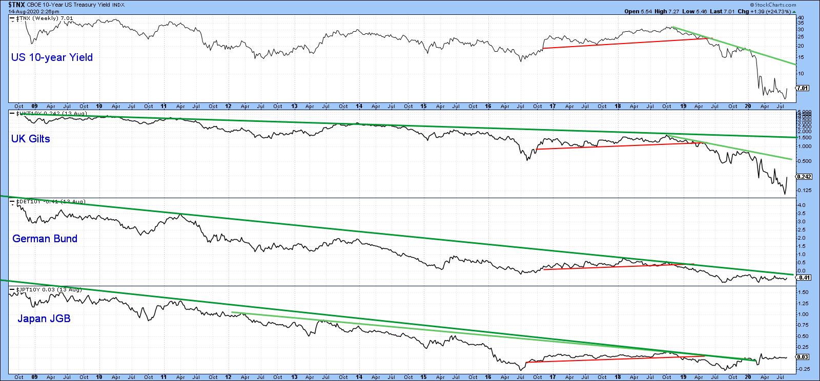
Chart 1 shows that the basic trend for bond yields around the world is still negative, as all series are in a clear-cut downtrend. The only exception is Japan, where the secular down trendline was violated earlier in the year. So far, though, the yield has only managed a sideways move. All trends eventually turn. In that respect, there are some tentative signs that US yields may be in the process of firming up as a prelude to a more sustainable turn down the road.
 Chart 1 Chart 1
One of the characteristics of a multi-year turning point on both uptrends and downtrends is the observation that momentum often climaxes at a record pro-trend level, thereby indicating total exhaustion. In that respect, Chart 2 shows the secular bear market for the 10-year yield that began in September 1981. Note that the KST is still declining, thereby underscoring the fact that the basic downtrend is still intact. However, it has reached a record low, which suggests that the 1981-2020 secular bear market may be blowing itself out. Certainly logic and 5,000 years of interest rate history argues that, notwithstanding negative rates in Europe and Japan, zero ought to provide some pretty good support.
 Chart 2 Chart 2
Chart 3 compares the 20-year yield to its 52-week ROC. The arrows show when momentum has moved beyond the overbought/oversold zones and re-crossed them on its way back to the equilibrium point. There are a couple of things to note. Firstly, this indicator was recently at a record low. Secondly, it is trying to bottom, but has yet to cross above the green horizontal oversold line at around -20%. The green arrows tell us that, when it does, we should expect a yield rally. That implied advance may not be enough to clear the secular green down trendline. However, based on its consistent record in both directions over the last 25 years, it is likely the yield would firm up quite a bit.
 Chart 3 Chart 3
Chart 4 argues that any yield rally would have some fundamental backing. In this instance, we are comparing the 30-year maturity to a long-term KST for the copper price. Copper, being widely used in many industries, is a convenient proxy for industrial commodities and, therefore, the economy. The green arrows tell us that when the KST for Doctor Copper turns up, so (usually) does the yield. The dashed arrows remind us that this is not a perfect indicator, as some rallies have either been non-existent or relatively contained. Since the KST has just started to head higher, long-dated interest rates ares likely to follow suit.
 Chart 4 Chart 4
Long-term momentum indicators are certainly showing signs of exhaustion, but we can see the same sort of extreme readings from some shorter-term ones. In this instance, multi-decade or multi-year records do not reflect exhaustion but are a sign of strength, epitomizing a young and vibrant bull market. A recent example comes from the 12-day ROC for the 10-year yield in Chart 5. In late March, it swung from an exhausted record low to a powerful record high.
 Chart 5 Chart 5
Just consider Chart 6, which compares the DJIA in the 1929-1937 period to its 12-day ROC. It's true that the Index sold off for a few months following its record +45% reading. Nevertheless, that extreme overbought reading did signal the end of the 1929-32 drop and the start of the 1932-38 bull market. The point of these extraordinary momentum highs, then, is to signal that a change in trend has taken place. It is not to say that the market in question is expected to immediately take off on the upside. Think of it this way: the March equinox that fell on March 19 this year told us that spring had arrived. While it signaled that temperatures would rise over the next three months, it did not mean that the very next day would be any warmer.
 Chart 6 Chart 6
Short-Term Trends
Chart 7 shows that the iShares 20+ Year Treasury Bond ETF (TLT) has started to violate its March/August up trendline and (blue) 50-day MA. There are three reasons for expecting its eventual violation. First, the price experienced a false upside breakout. Second, that whipsaw has been confirmed by a decisive break under the dashed line. Finally, the daily KST has gone bearish. Remember, it is fairly common for a false breakout to be followed by an above-average move.
 Chart 7 Chart 7
Chart 8 features the 5-year yield, where we can see that a rupture of the March/August down trendline has taken place. The construction of this line could leave me open to criticism because it has been drawn through the June whipsaw. However, a trendline should be constructed to best reflect the underlying trend. This one has been touched or approached on numerous occasions, thereby suggesting it better reflects the underlying downtrend. Right now, the yield is challenging its 50-day MA, but the rising KST argues the likelihood of an eventual more decisive penetration.
 Chart 8 Chart 8
The short-term technical position is bearish for bond prices (bullish for yields), even though many long-term indicators have reached extremes and are hinting at a possible secular uptrend (in yields). However, the reversal process typically takes some time, so major signals are unlikely to be seen for a while. The central bank has promised to keep short-term rates in the basement for the next year. However, it's important to remember that their action tends to be a lagging indicator. That means that, should the recovery take off sooner than is currently believed by the consensus, rates could unexpectedly firm up later in the year as part of an overall base building process.
Editor's Note: This is an updated version of an article that was originally published in Martin Pring's Market Roundup on Tuesday, August 11th at 4:49pm ET.
Good luck and good charting
Martin J. Pring
The views expressed in this article are those of the author and do not necessarily reflect the position or opinion of Pring Turner Capital Group of Walnut Creek or its affiliates.
|
| READ ONLINE → |
|
|
|
| The Mindful Investor |
| What Would Change My Mind on This Market |
| by David Keller |
The last five months of market history are a blur for me. Back in mid-March, the S&P 500 was in free fall with no end in sight. Here we are in mid-August, and the S&P is retesting all-time highs. Trend-following is about defining the trend, recognizing shifts in the trend and anticipating potential trend changes. So now that the S&P 500 is in a raging uptrend with no apparent end in sight, what would I need to see to turn bearish?
I think many investors focus too much of their time on entry points and getting the market call correct, and not enough time managing risk and clearly defining an exit strategy before it's needed. To put another way, when the market actually stops going higher and begins to drop, that is not the time to begin developing an exit strategy!
As we were recording the latest episode of my closing bell show The Final Bar, I started to think about a bull market top checklist. What would I need to see to acknowledge that an uptrend has exhausted?
Here's a rough draft of what I'll be looking for in the coming weeks and beyond. Until I see these signs of weakness, the trend will, by definition, remain positive.
1. Failure at resistance with bearish divergences
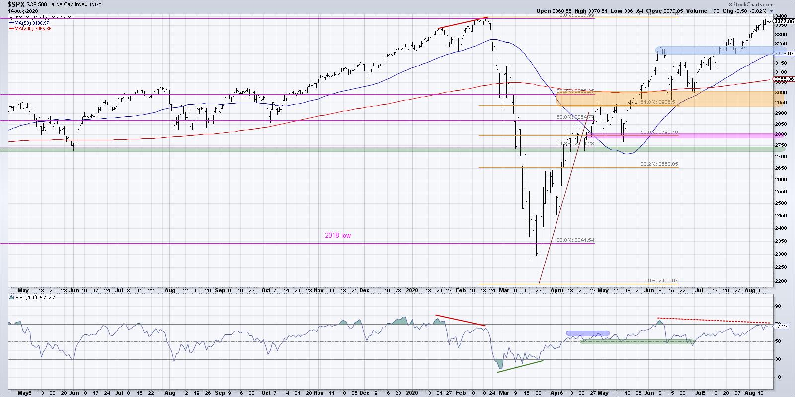
While many individual stocks have already made new 52-week highs (about 10% of the S&P 500 members on a good day in recent weeks), the S&P 500 chart remains below its February peak.

In mid-to-late July, the S&P, as well as many technology stocks, appeared to be displaying a bearish divergence with higher prices and lower RSI. While that divergence was not confirmed on charts like $AAPL, the S&P 500 chart may still be working on a bearish divergence.
It's worth noting that the S&P retesting all-time highs and accompanied by lower momentum certainly speaks to a weakening of upside pressure. We may be seeing the beginning of indication #1 of uptrend exhaustion.
2. Breakdown of support
Once the price starts to pull back, you'd want to see the price fail to hold a key support level. For the S&P 500, I'm looking at 3200-3250, which lines up with the June high as well as the July swing low. A breakdown of this key level would establish a lower low and lead me to think of further downside potential.
3. Validation of a downtrend
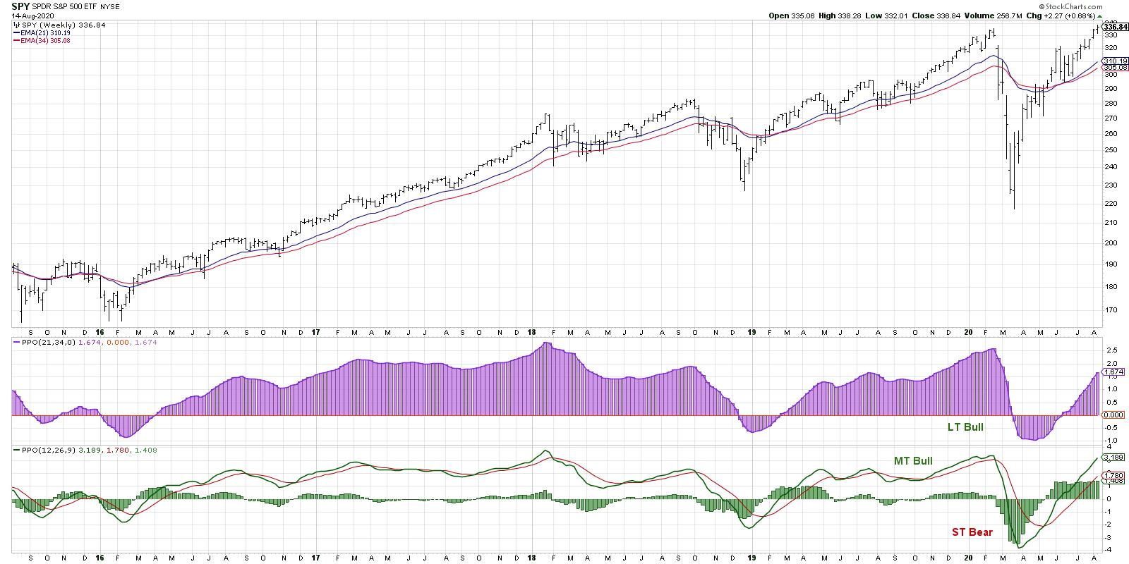
Once the price has broken down, at some point the trend-following indicators like MACD or PPO will confirm the downtrend by registering a sell signal. I tend to follow the weekly PPO on the S&P 500 as part of my Market Trend Model.

The weekly PPO turned bullish in early May and remains positive through this week. It's worth noting that this could be considered the final warning signal, as the price would have to drop significantly to register a sell signal from this indicator on the weekly charts.
Those first three steps would tend to happen in order: first a failure at resistance, then a subsequent break of support and, finally, a PPO sell signal confirming the new downtrend. These next two steps could happen at any point during the first three and would all serve to confirm the rotation in trend.
4. Deterioration in breadth
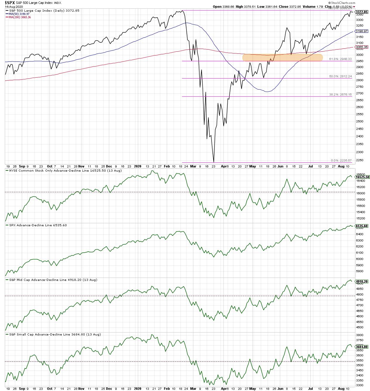
One key validation of the current bull market is the appreciation in breadth indicators. One chart I refer to often for this read is the cumulative advance-decline lines for NYSE common stocks, large-caps, mid-caps, and small-caps.

The fact that all four of these have successfully eclipsed the peak from the June market high tells me that most stocks are participating in this bull market phase. If and when these A-D line stop going higher, especially if the S&P 500 chart continues higher, that would suggest internal weakness.
It's worth noting here that usually you'll see a rotation lower in the mid-cap and small-cap breadth before large caps. This is due to investors rotating to more defensive blue-chip names instead of smaller, more speculative stocks. Jan-Feb 2020 provides a perfect example of this phenomenon.
5. Improvement in defensive sectors
Finally, I'd look for a rotation away from traditional offensive sectors like Consumer Discretionary and into more conservative sectors like Utilities and Real Estate. I think this one may be difficult this time around, only because some of the top performing names (MSFT, AMZN, AAPL come to mind) have done well as offense as well as defense.
We've seen how market pullbacks have driven investors to pile into the mega-cap tech/consumer trade, meaning many of the stocks that led the way higher to current levels may also outperform during a bear phase as well. However, the low-yield environment, combined with fear and anxiety for market downside, would likely drive investors to search for the safety and income potential of higher-yielding defensive sectors like Real Estate.
If you look back through market history, you will see several common factors surrounding market tops. Here, I'm listing five characteristics/signals/indications that would tell me an uptrend is exhausting and to prepare for downside potential.
I hope that the most important takeaway from this article is not me presenting perfect checklist of market top signals, but rather an encouragement for you to spend time now (while the market seems to continue higher unabated) to think about alternative scenarios and how you would change your positioning to adapt for a new reality.
RR#6,
Dave
David Keller, CMT
Chief Market Strategist
StockCharts.com
Disclaimer: This blog is for educational purposes only and should not be construed as financial advice. The ideas and strategies should never be used without first assessing your own personal and financial situation, or without consulting a financial professional.
The author does not have a position in mentioned securities at the time of publication. Any opinions expressed herein are solely those of the author and do not in any way represent the views or opinions of any other person or entity.
|
| READ ONLINE → |
|
|
|
|
|
| Trading Places |
| Here are 3 of the Fastest-Gaining Momentum Stocks |
| by Tom Bowley |
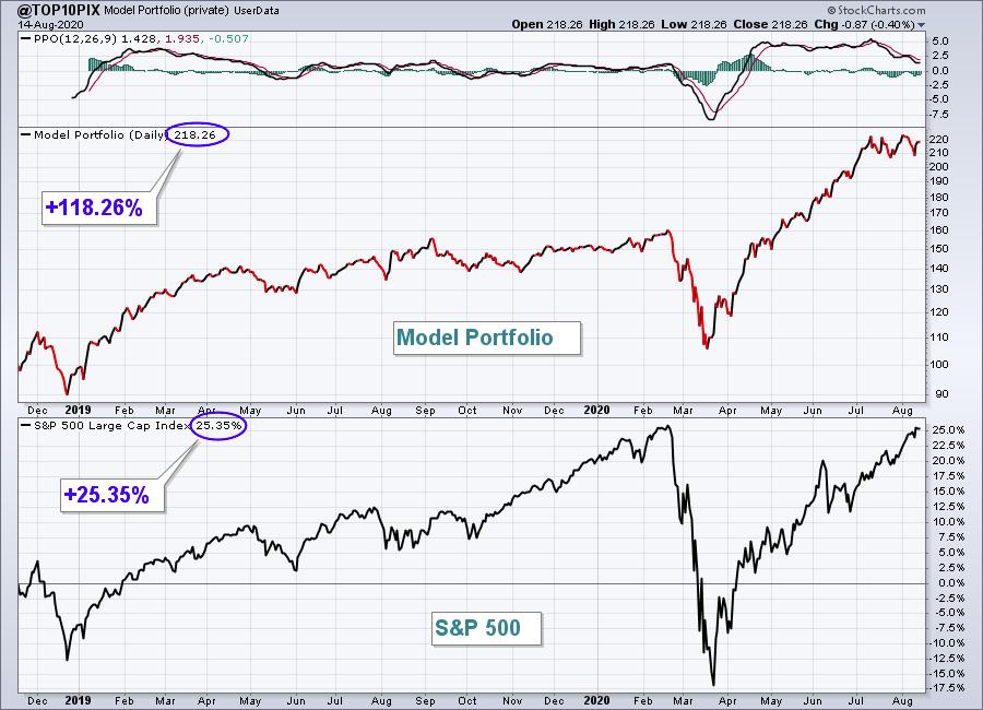
Over the past five months, since that March low, we've enjoyed many stocks' relentless pursuit to the upside. I know it's hard, however, to keep chasing those stocks as their prices move into what seems the stratosphere. So I set out to find stocks that are just beginning to show excellent relative strength in strong industry groups. Remember, it's always important to find leading stocks in leading industry groups if you want to beat the benchmark S&P 500. The proof is in the performance of our Model portfolio, which is +118.26% since its inception on November 19, 2018. By comparison, the S&P 500 is +25.35% over the same period.

When I "draft" the 10 equal-weighted stocks that I include in our Model portfolio, I generally do so with the primary focus being relative strength. Every stock in our Model Portfolio MUST also be on our Strong Earnings ChartList (SECL). I review thousands of earnings reports each quarter and companies that beat Wall Street consensus estimates as to both revenues and earnings are added to our SECL if:
- they're liquid (trade at least 200,000 shares per day on average)
- they look solid technically, trending higher and showing relative strength
I still really like the AAPLs, AMZNs, and TSLAs of the stock world, but every quarter I see emerging leadership and I want to focus on 3 of these stocks - one or more of which might find their way into our newest Model portfolio, which will be released on Wednesday, August 19th, beginning at 5:30pm ET. Check these three out:
Delivery Services - United Parcel Services (UPS)
I don't believe there's a hotter industry right now than the Dow Jones U.S. Delivery Services Index ($DJUSAF). And I'm quite honestly not sure which one is better, United Parcel Services (UPS) or FedEx Corp (FDX). Over the past couple years, though, UPS has been in an uptrend vs. FDX, which was the differentiating factor here for me. The massive volume and gap higher with its latest quarterly report suggests massive institutional accumulation:

Internet - Pinterest (PINS)
The Dow Jones U.S. Internet Index ($DJUSNS) has remained a leading industry group since late-2018. It's a group that I want to continue to look at for leadership. PINS has begun providing that leadership and I expect it to continue. Over 100 million shares changed hands in late-July after PINS delivered blowout revenue and earnings numbers. Now look at the strength:

Specialty Retail - Autonation (AN)
Like both UPS and PINS, the largest volume of the year accompanied AN after it posted blowout quarterly results in July. The Dow Jones U.S. Specialty Retailers Index ($DJUSRS) has been soaring in 2020 and AN is the latest to take on a leadership role. AN has now broken its recent relative downtrend and has jumped to a six-month relative high vs. a strong specialty retail group:

These are the types of stocks I look for. Creating and organizing ChartLists is the first step to planning and executing great trades. I actually ran a scan against our Strong Earnings ChartList that only considered stocks that had made significant jumps in SCTR scores, so it ignored AAPL, AMZN, TSLA and others like those, as they've been leaders for a long time. UPS, PINS, and AN are just beginning to show leadership qualities and higher SCTR scores.
Speaking of momentum, EarningsBeats.com is enjoying tremendous momentum and growth as well. If you'd like to see what we do, we have two upcoming events that I think you'd really enjoy:
"The Research Engine at EarningsBeats.com" (free event)
- Date: Saturday, August 15, 2020
- Time: 2:00pm ET
- Cost: FREE
Details: I'm planning to walk everyone through our service at EarningsBeats.com. I'll be discussing our 4 portfolios, 7 key ChartLists, various scanning strategies (we provide the scan syntax to use at StockCharts.com), and our member-only webinars/events. We will be sending out room instructions tomorrow to our entire EarningsBeats.com community. If you're interested, you can join us for this event in one of two ways.
(1) Subscribe to our free EB Digest newsletter (published 3x per week - Mondays, Wednesdays and Fridays). You can sign up with name and email address HERE (no credit card required and you can unsubscribe at any time). We will send out room instructions to our entire EB Digest subscribership on Saturday before the event.
(2) Go to our website at www.earningsbeats.com at the time of the event and we'll have instructions on our home page on how to join, along with a link to the webinar room.
"Top 10 Stocks - The Draft" (members-only event)
- Date: Wednesday, August 19, 2020
- Time: 5:30pm ET
- Cost: Must be at least a no-cost trial member
- Details: CLICK HERE
I hope to see you at these events!
Happy trading!
Tom
|
| READ ONLINE → |
|
|
|
| RRG Charts |
| Not All Tech Stocks Look Good... But the Most Important Ones Still Do! |
| by Julius de Kempenaer |

The technology sector sparks a lot of interest, and for good reason - it has turned into a safe(r) haven when things get rough in the markets, but it's also everybody's baby when the market goes up. "What could possibly go wrong?", one would think. The answer, IMHO, is nothing - and also a lot!

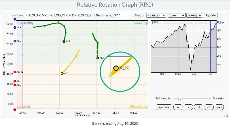
On the weekly Relative Rotation Graph for US sectors, XLK is still the highest ranking sector measured on the JdK RS-Ratio scale. This makes it the sector with the strongest relative trend in the universe. The tail on XLK was showing a downward rotation into the weakening quadrant for a few weeks. But, as we know, such a rotation at high RS-Ratio values is usually a temporary pause within the longer-term rising trend.
Reading from that weekly RRG for US sectors (see inset), that seems to be the case... again. Inside the magnified circle you see the tail of XLK moving further into the weakening quadrant at a weak RRG-Heading but hooking back up again. This move was fed by the strong rotation for the Technology sector at the start of this week (article).
So, all in all, Technology continues to throw curve balls.
A Look Behind the Scenes
That's enough reason to take a look behind the curtain and investigate what is going on among the components of this sector.
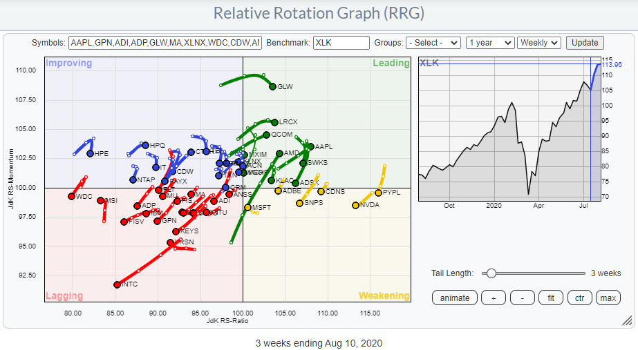
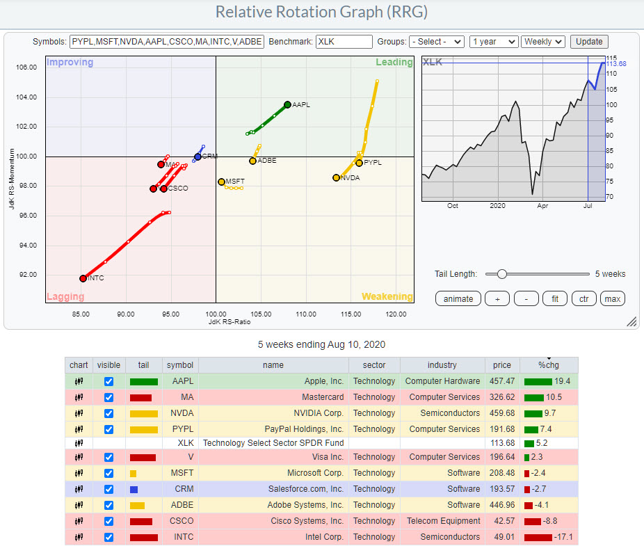
The RRG at the top of this article shows the weekly RRG for all XLK components. To understand how relative rotation and relative strength works, it's important to know how a sector is put together and especially if there are any "heavyweights" in there. We discussed the dominance of AMZN inside the Consumer Discretionary sector a few times recently, but Technology also has a few heavy weight names.
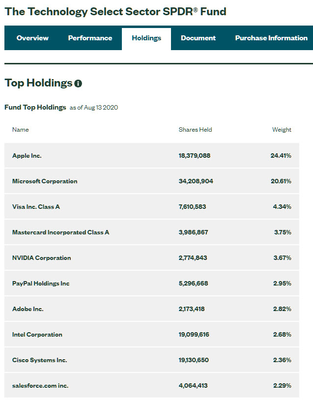
 You can find the composition for all these sector ETFs on the SPDRS.com website. Click on the image on the left to visit the page for XLK on the SPDRS website, where you can find all information for this ETF, including the composition. You can find the composition for all these sector ETFs on the SPDRS.com website. Click on the image on the left to visit the page for XLK on the SPDRS website, where you can find all information for this ETF, including the composition.
This sector has just over 70 members (stocks) but, as you can see in the table, AAPL and MSFT together are already 45% of the index and the top-10 holdings account makes up almost 70%!!! That basically means that whatever happens to these two or ten names will be driving the direction of the sector.
The RRG at the top of the article holds the top 50 names of XLK. There is a hard cut-off at 50 symbols on a Relative Rotation Graph. Otherwise, the plot would become too crowded.
On the aforementioned RRG, you can see that the majority of the stocks are located at the left-hand side of the graph, either in the lagging or the improving quadrant. And you can also see that there are more tails traveling at an RRG-Heading between 180-270 than between 0-90.
If you would like to see the rotations of its members as some sort of a breadth measure for the sector, I'd say it is negatively skewed. But price is still moving higher, and so is relative strength vs SPY.
There is only one possible explanation for that: the big names are doing really well. In order to investigate this further, I have set up an RRG that only shows the top-10 members vs. XLK.

Here, we see that the majority of this group is located at the right-hand (positive) side of the graph while only four tails are moving into the lagging quadrant. The AAPL tail is solidly progressing further into the leading quadrant, whereas MSFT has started to curl up inside the weakening quadrant already.
So the big guns are still holding up their relative strength. The only real dissonant here is INTC, which is rapidly moving away from the group deeper into the lagging quadrant. However the weight for INTC is only one-tenth of the weight for AAPL and MSFT, so the INTC move is not nearly strong enough to drag XLK down vs. the market and the small loss for MSFT in this period is not meaningful enough to be harmful.
The essential takeaway here is that, with top-heavy sectors like XLK, it is important to keep an eye on the rotation for individual members and pay attention when the dominant stocks, in this case MSFT and AAPL, are starting to move, as that will drive the move for the sector as well.
As long as the heavyweights continue to do well, all will be good. Once they start to turn, a lot can go wrong.
#StaySafe, --Julius
My regular blog is the RRG Charts blog. If you would like to receive a notification when a new article is published there, simply "Subscribe" with your email address.
|
| READ ONLINE → |
|
|
|
| The MEM Edge |
| Is It a Pullback or Something More? The Recent Selloff in Top Growth Stocks Reminds Us to Stay Sharp |
| by Mary Ellen McGonagle |
The recent rotation our of high-growth stocks and into economically sensitive cyclicals has created some unique opportunities to purchase select growth names at a discount. Before considering this strategy, however, it's important to make sure that several characteristics are in place.
To begin, you'll want to reduce uncertainty by making sure the company has already reported 2nd quarter earnings and that these earnings were better than expected. This, coupled with positive guidance from management going into year-end and beyond, will also help put you in front of ideal candidates.
These growth prospects are going to be the primary driver of the stock going higher.
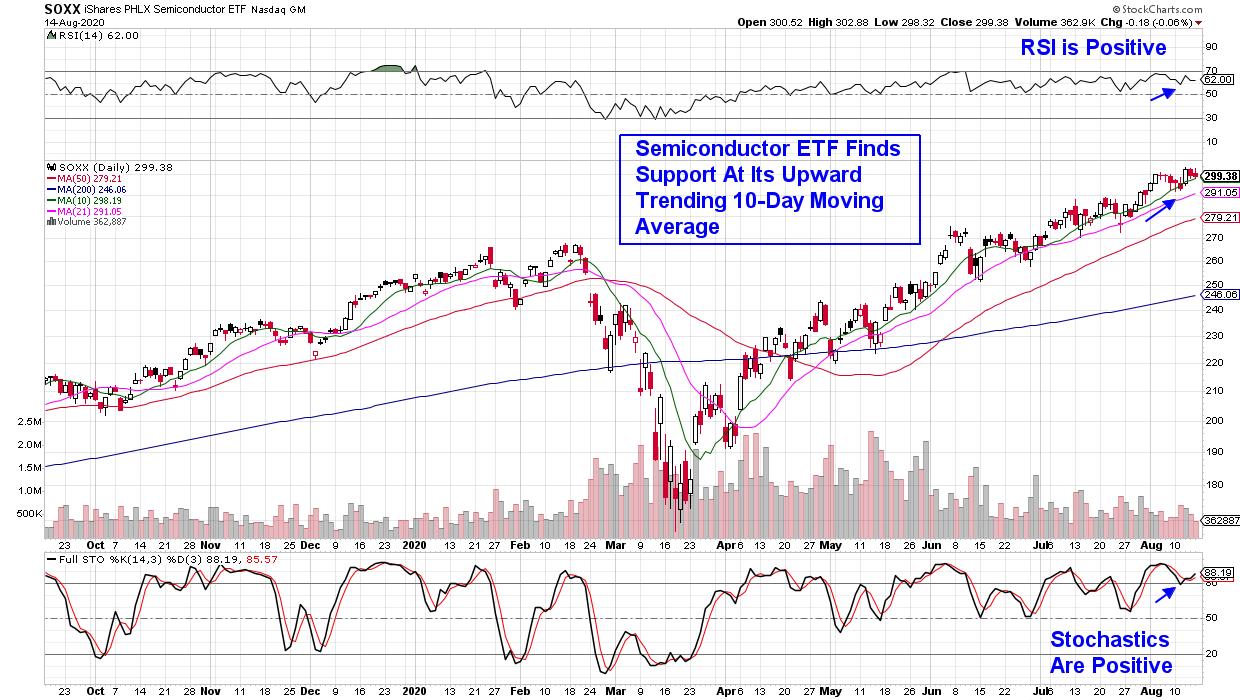
Next up, you'll want the stock to be a part of a strong industry group or sector. In other words, the company provides products or services that are being met with high demand not only currently, but going forward as well. Below is a chart of the Semiconductor Industry, which is in a very confirmed uptrend as demand for chip stocks has been particularly strong.
DAILY CHART OF SEMICONDUCTOR ETF (SOXX):

Lastly, and of particular importance, you'll want to make sure that the stock is finding support at its key simple averages, which are in an uptrend. This last item can carry the most weight as it will point toward the near-term prospects for your stock.
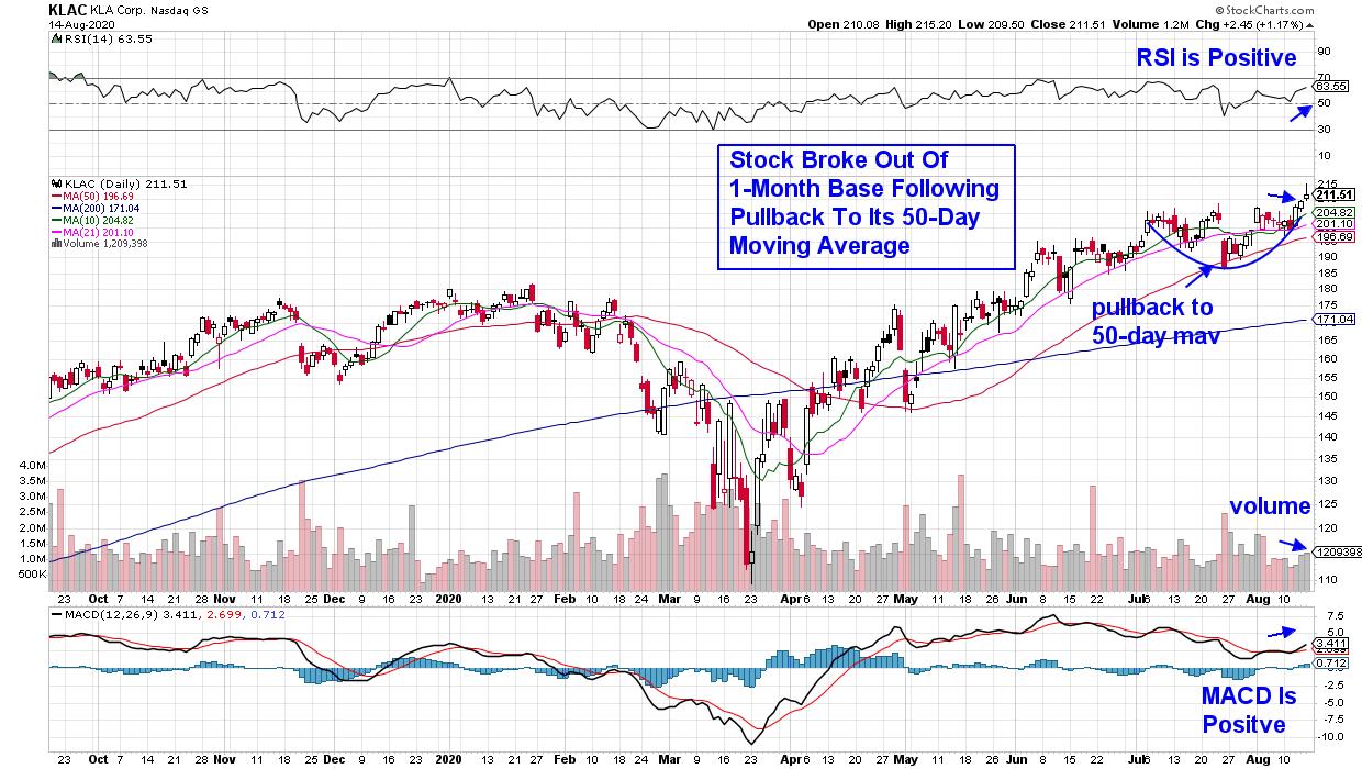
Below is a daily chart of KLA Corporation (KLAC), which is a Semiconductor Equipment supplier that reported earnings and sales late Monday that beat Wall Street's targets for its fiscal fourth quarter. Management also guided higher for their current quarter.
DAILY CHART OF KLA CORP. (KLAC):

KLAC pulled back to its upward-trending 50-day moving average late last month before bullishly breaking back above its shorter term 10-day moving average (green). The company's bullish earnings and sales report helped push the stock out of a 1-month base on volume, with the RSI and MACD in positive territory.
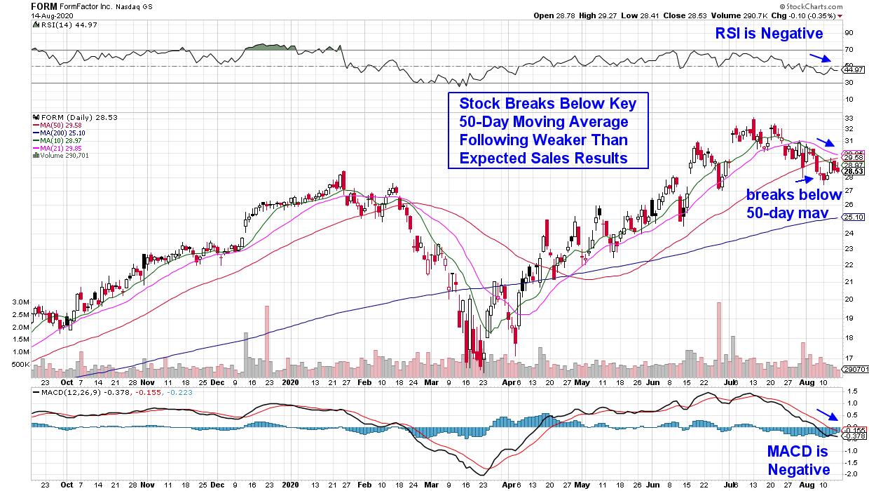
Below is an example of a stock that's also from the strong Semiconductor industry and, as you'll see, this stock did not find support at its key 50-day moving average. This indicates that the recent downtrend in the stock may well be more than a pullback as the stock appears headed lower.
DAILY CHART OF FORMFACTOR INC. (FORM):

In addition to breaking below key support, the RSI and MACD for the stock are also in negative territory. The fact that the company reported weaker-than-expected sales is another signal that you're not looking at a leading stock in within a leading industry.
Semiconductor stocks entered into the bear market with strong growth prospects that have only gotten stronger during this historic pandemic. These chips are needed in many vital industries, including digital cloud computing centers that allow remote workers to remain connected, as well as the expansion of 5G networks that allow this data to move faster.
I've identified several top Semiconductor chip providers in my bi-weekly MEM Edge Report and, if you'd like access to these top stocks poised to trade higher, take a 4-week trial for a nominal fee. This top-performing report will also point you toward leading cyclical stocks that are currently moving into favor. Click Here to make sure you receive this Sunday's report!
Warmly,
Mary Ellen McGonagle. MEM Investment Research
|
| READ ONLINE → |
|
|
|
| MORE ARTICLES → |
|
 Without a doubt, one of my favorite shows on StockCharts TV right now is "The Pitch", a monthly series where we assemble three different technical analysts and ask each of them to bring their five best individual ideas to the table.


