Chart 1 shows that the basic trend for bond yields around the world is still negative, as all series are in a clear-cut downtrend. The only exception is Japan, where the secular down trendline was violated earlier in the year. So far, though, the yield has only managed a sideways move. All trends eventually turn. In that respect, there are some tentative signs that US yields may be in the process of firming up as a prelude to a more sustainable turn down the road.
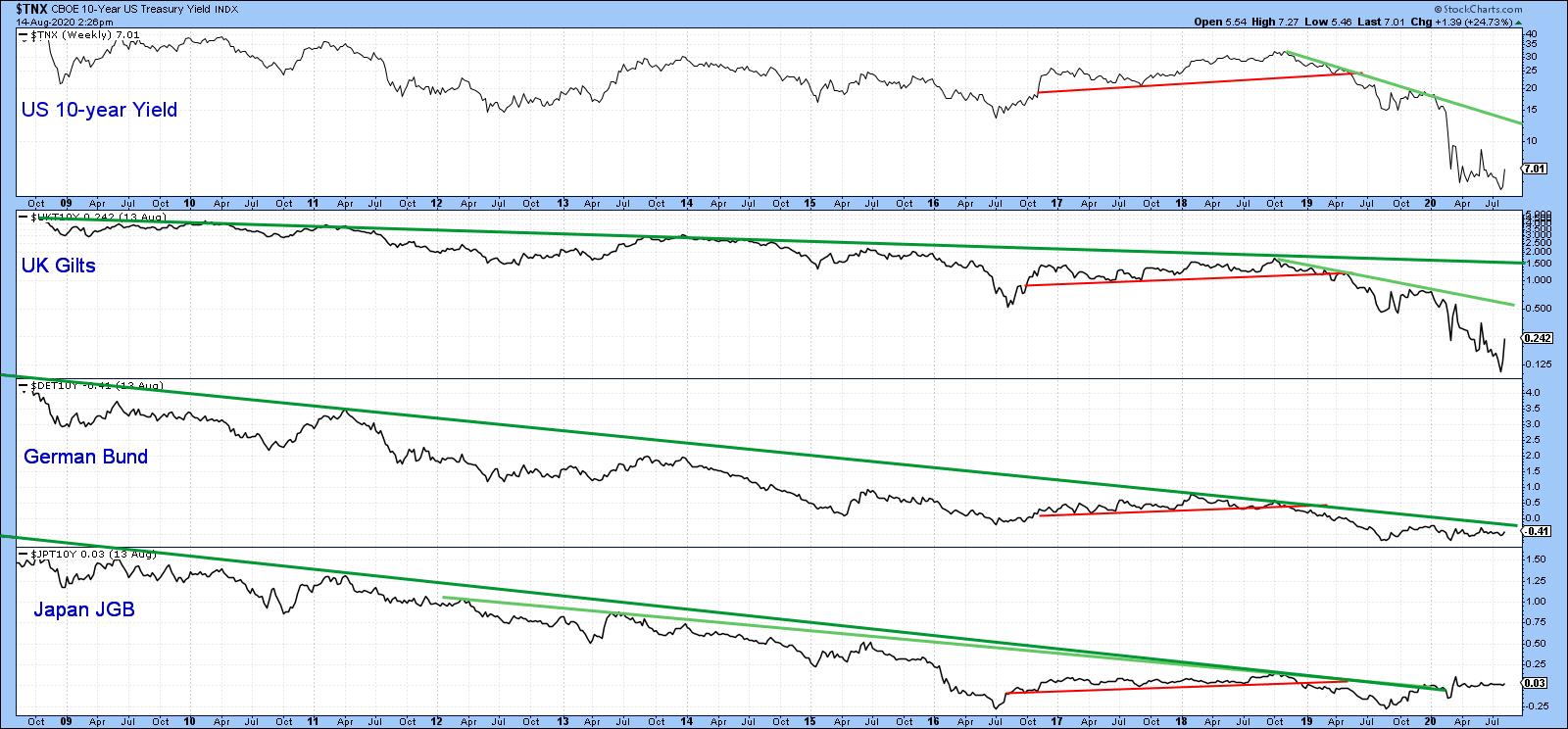 Chart 1
One of the characteristics of a multi-year turning point on both uptrends and downtrends is the observation that momentum often climaxes at a record pro-trend level, thereby indicating total exhaustion. In that respect, Chart 2 shows the secular bear market for the 10-year yield that began in September 1981. Note that the KST is still declining, thereby underscoring the fact that the basic downtrend is still intact. However, it has reached a record low, which suggests that the 1981-2020 secular bear market may be blowing itself out. Certainly logic and 5,000 years of interest rate history argues that, notwithstanding negative rates in Europe and Japan, zero ought to provide some pretty good support.
 Chart 2
Chart 3 compares the 20-year yield to its 52-week ROC. The arrows show when momentum has moved beyond the overbought/oversold zones and re-crossed them on its way back to the equilibrium point. There are a couple of things to note. Firstly, this indicator was recently at a record low. Secondly, it is trying to bottom, but has yet to cross above the green horizontal oversold line at around -20%. The green arrows tell us that, when it does, we should expect a yield rally. That implied advance may not be enough to clear the secular green down trendline. However, based on its consistent record in both directions over the last 25 years, it is likely the yield would firm up quite a bit.
 Chart 3
Chart 4 argues that any yield rally would have some fundamental backing. In this instance, we are comparing the 30-year maturity to a long-term KST for the copper price. Copper, being widely used in many industries, is a convenient proxy for industrial commodities and, therefore, the economy. The green arrows tell us that when the KST for Doctor Copper turns up, so (usually) does the yield. The dashed arrows remind us that this is not a perfect indicator, as some rallies have either been non-existent or relatively contained. Since the KST has just started to head higher, long-dated interest rates ares likely to follow suit.
 Chart 4
Long-term momentum indicators are certainly showing signs of exhaustion, but we can see the same sort of extreme readings from some shorter-term ones. In this instance, multi-decade or multi-year records do not reflect exhaustion but are a sign of strength, epitomizing a young and vibrant bull market. A recent example comes from the 12-day ROC for the 10-year yield in Chart 5. In late March, it swung from an exhausted record low to a powerful record high.
 Chart 5
Just consider Chart 6, which compares the DJIA in the 1929-1937 period to its 12-day ROC. It's true that the Index sold off for a few months following its record +45% reading. Nevertheless, that extreme overbought reading did signal the end of the 1929-32 drop and the start of the 1932-38 bull market. The point of these extraordinary momentum highs, then, is to signal that a change in trend has taken place. It is not to say that the market in question is expected to immediately take off on the upside. Think of it this way: the March equinox that fell on March 19 this year told us that spring had arrived. While it signaled that temperatures would rise over the next three months, it did not mean that the very next day would be any warmer.
 Chart 6
Short-Term Trends
Chart 7 shows that the iShares 20+ Year Treasury Bond ETF (TLT) has started to violate its March/August up trendline and (blue) 50-day MA. There are three reasons for expecting its eventual violation. First, the price experienced a false upside breakout. Second, that whipsaw has been confirmed by a decisive break under the dashed line. Finally, the daily KST has gone bearish. Remember, it is fairly common for a false breakout to be followed by an above-average move.
 Chart 7
Chart 8 features the 5-year yield, where we can see that a rupture of the March/August down trendline has taken place. The construction of this line could leave me open to criticism because it has been drawn through the June whipsaw. However, a trendline should be constructed to best reflect the underlying trend. This one has been touched or approached on numerous occasions, thereby suggesting it better reflects the underlying downtrend. Right now, the yield is challenging its 50-day MA, but the rising KST argues the likelihood of an eventual more decisive penetration.
 Chart 8
The short-term technical position is bearish for bond prices (bullish for yields), even though many long-term indicators have reached extremes and are hinting at a possible secular uptrend (in yields). However, the reversal process typically takes some time, so major signals are unlikely to be seen for a while. The central bank has promised to keep short-term rates in the basement for the next year. However, it's important to remember that their action tends to be a lagging indicator. That means that, should the recovery take off sooner than is currently believed by the consensus, rates could unexpectedly firm up later in the year as part of an overall base building process.
Editor's Note: This is an updated version of an article that was originally published in Martin Pring's Market Roundup on Tuesday, August 11th at 4:49pm ET.
Good luck and good charting
Martin J. Pring
The views expressed in this article are those of the author and do not necessarily reflect the position or opinion of Pring Turner Capital Group of Walnut Creek or its affiliates.