| THIS WEEK'S ARTICLES |
| The Market Message |
| Another Look at Bollinger Bands |
| by John Murphy |
Last Friday's message applied Bollinger bands to the S&P 500 and cautioned that the market looked a bit stretched over the short-run. Prices have since backed off slightly from the upper band, but remain well above the dashed 20-day average (green arrow) which means that the uptrend is still intact. The upper band is plotted two standard deviations above the 20-day average. During uptrends, prices will fluctuate between the two upper lines. Pullbacks from the upper band sometimes lead to a retest of the 20-day line which happened in late July. More serious pullbacks often drop all the way to the lower band which happened during June. It's also worth noting that the lower band coincides closely with the blue 50-day average (blue circle) which should provide additional support during any market pullback. So far, the pullback from the February peak is relatively minor and doesn't imply that the market uptrend is in danger. Bollinger bands, however, offer some perspective on the market's short-term trend and show where potential support levels lie if a pullback were to occur.
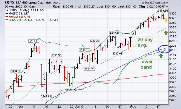 Chart 2 Chart 2
Last Friday's message explained that Bollinger band width measures the difference between the two outer Bollinger bands. And helps measure the level of market volatility. As a rule, lower volatility (narrower band width) supports higher prices, while rising volatility (wider band width) is a warning of lower stock prices. The blue line in Chart 3 shows Bollinger band width still at a relatively lower level which is supportive to stock prices. Any spike in that line, however, would signal the need for more caution.
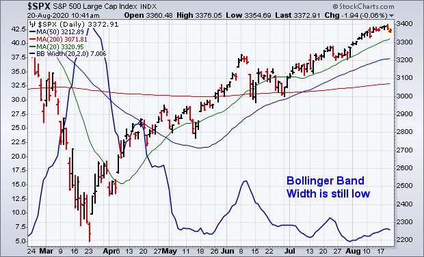 Chart 3 Chart 3
Editor's Note: This is an article that was originally published in John Murphy's Market Message on Thursday, August 20th at 10:46am ET.
|
| READ ONLINE → |
|
|
|
| Art's Charts |
| New 52-week Highs Underwhelm, But Outpace New Lows |
| by Arthur Hill |

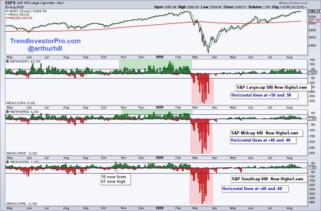
The total number of new highs in the S&P 500, S&P MidCap 400 and S&P SmallCap 600 continues to underwhelm. Even so, new highs are still outpacing new lows and this is enough to keep the uptrend since late March going.
The first chart shows new highs and lows for the three indexes with horizontal lines at the 10% level (e.g. 50 and -50 for the S&P 500). New highs in the S&P 500 exceeded 50 in mid July, but remain well below the levels seen in December, January and February (green zone). New highs for the S&P MidCap 400 have yet to exceed 40 and new highs for the S&P SmallCap 600 have yet to exceed 60. Again, mid-caps and small-caps are lagging overall.
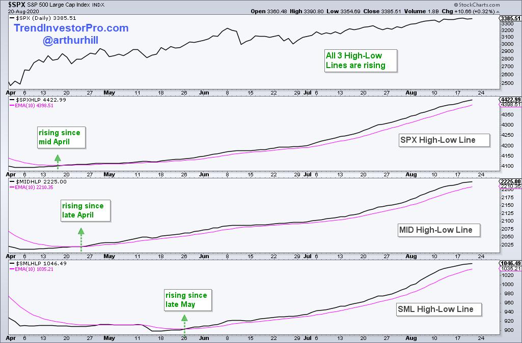
We can track cumulative net new highs with the High-Low Lines based on High-Low Percent, which is new highs less new lows divided by total issues. The High-Low Lines rise as long as new highs outpace new lows, regardless of the total number of new highs. The chart below shows the S&P 500 High-Low Line rising since mid April, the S&P MidCap 400 High-Low Line rising since late April and the S&P SmallCap 600 High-Low Line turning up in late May. All three are rising and this is bullish until two of the three turn down (break their 10-day EMAs).
Looking for more breadth indicators? Subscribe to TrendInvestorPro.com and get the Essential Breadth Indicator ChartList. This list contains over 100 charts with dozens of breadth indicators. It is organized by index, sector and breadth group. This makes it easy to analyze the breadth indicators and separate the leaders from the laggards.
Click here to take your analysis to the next level!
--------------------------------------------------
|
| READ ONLINE → |
|
|
|
| The Canadian Technician |
| 5 Charts to Think About |
| by Greg Schnell |
It has been a ride off the lows. The juggernauts continue to rise into the valuation stratosphere. Because of the large balance sheets in Tech, they have become the defense and the offense for this market. Today, I have 5 charts to think about that denote a change as we come through Options Expiration Friday. One macro thing I like to look for at meaningful inflection points in the market is cross-asset trend changes. An example would be a currency trend change, a bond market change, or a change in commodities and in equities. Sometimes you get just one or two, but, at big inflection points, you usually see more cross-asset changes.
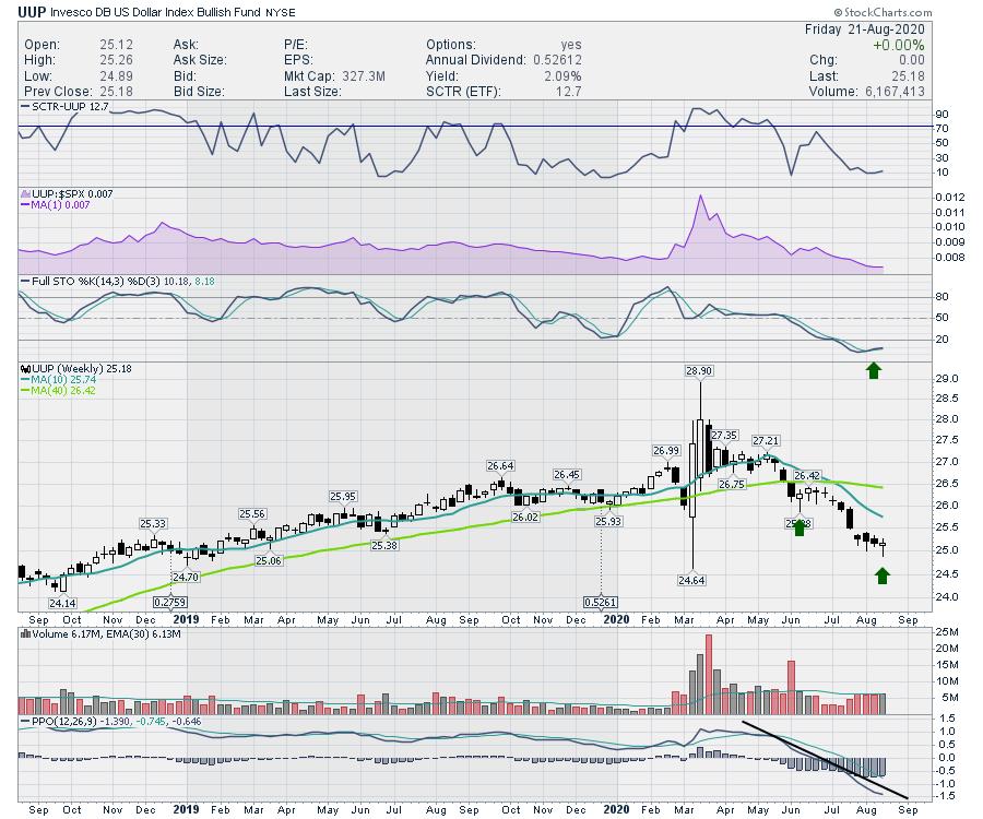
First of all, the almighty US Dollar is printing a hammer candle this week, a few weeks after the bonds did the same. A hammer candle is defined here. Typically used on a daily chart, the principle is the same on a weekly. Notice that the prior hammer candle did not mark a reversal. One of the differences on this hammer is that the full stochastic is turning up and has crossed above the signal line in tandem with the hammer. It is still too early to call it a trend change, but the downtrend has been in place with the entire rally. A change in the dollar would be a reason to suspect a change in the overall trend. It starts with a trend change in price action, and a hammer candle is a good example of an initiation move.
As the dollar is "oversold," a bounce here up to some moving averages, like the 10-week in blue or the 40-week in green, would be within a normal reversion.
All of a sudden, commodities are selling faster than french fries at McDonald's. A lithium name I was watching went from $12 to $9.50 in three days. Ouch! Another example might be the Gold miners testing their uptrend line on the GDX. Will Gold break down here or bounce and continue the uptrend? I'll be watching for changes in the commodities trend as well.
The second chart that is important is the $SPX. We are trying to break through prior highs. I like to watch the price action closely when we test prior highs. The market stalled at that level before, so now we want to watch and see if it has the strength to continue to new highs. What's not to like? It keeps pushing up.
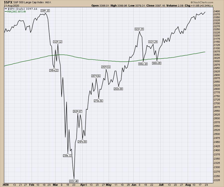
Well actually, the advance/decline lines in various parts of the market are starting to break their uptrends. That could stall the $SPX. The advance/decline line is explained here.
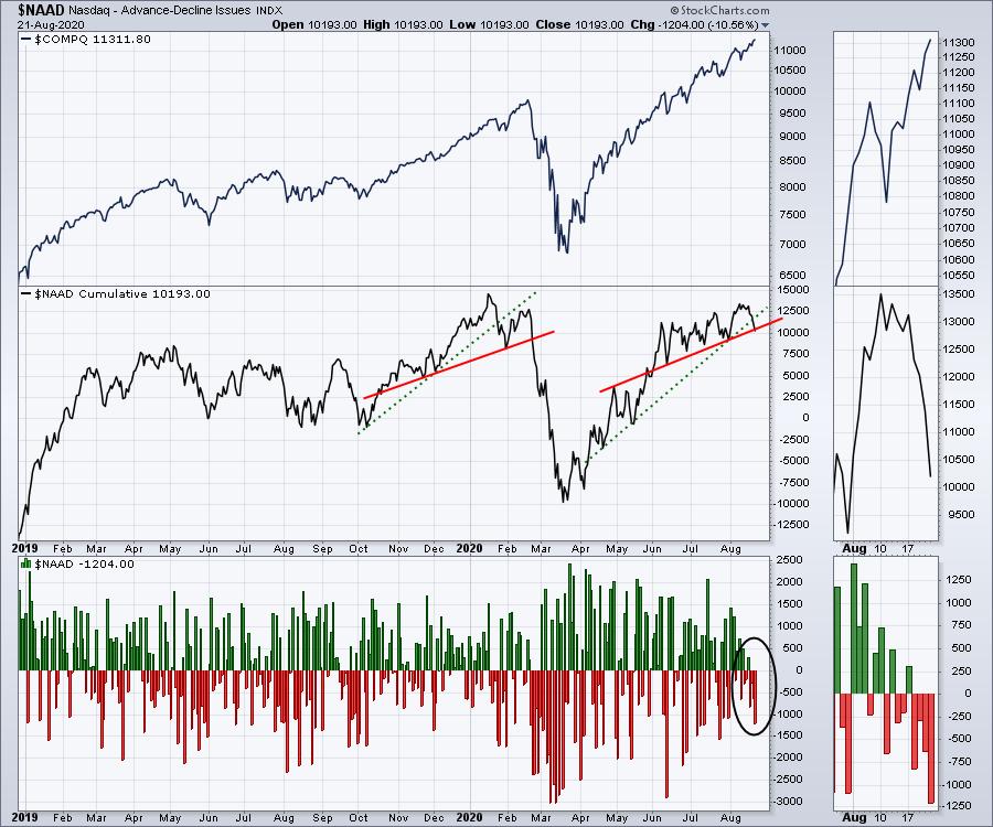
Below is the Advance/Decline line for the Nasdaq Composite (all the stocks on the Nasdaq exchange) in the second panel. As it is cracking this uptrend line, we are also on Options Expiration, which can be a meaningful day to expect (or at least watch for) trend changes. This is happening as the $SPX is trying to break out. What this means is that fewer Nasdaq stocks are helping the move up. While the Nasdaq looks unstoppable, trend line breaks in the advance decline line can be some of the early clues.
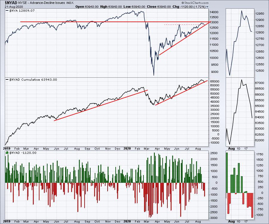
So the obvious question is what is happening on the other major US exchange, the New York Stock Exchange Composite? In the top panel, we see the NYSE Composite ($NYA). The stock exchange is at a resistance level that has stopped this $NYA index for most of 2019. After briefly breaking above the June highs, the market is now testing the uptrend line from the April lows. The problem, as we can see on the zoom panel, is that the number of stocks advancing compared to declining is plummeting, as shown on panel three. In panel two, we see the cumulative trend line breaking there as well. It is the break on the cumulative line that concerns me more.
One other chart I like to use that is different from most technicians is the Toronto Stock Exchange advance/decline line. It represents a much smaller market in Canada, but smaller markets usually fracture or break before the US market. The Canadian markets advance/decline line is one that I would expect to break before or with the US market.
We can see that the Toronto Stock Exchange ($TSX - top panel) is stalled at the same level as most of 2019. We saw the same trend on the $NYA above. The advance/decline line in the centre panel is breaking as well, which adds a subtle confirmation of the break on the US market.
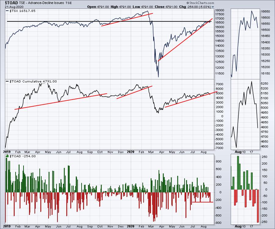
The breaks on all the advance decline lines have to reverse quickly to the upside next week, especially on the back of an options expiration this week. This all comes on the back of an article I wrote in my last ChartWatchers article about why it is important to watch price action closely around prior highs. That article is here - Ballistic Investing Heroes.
The $SPX is testing the prior high in price. The Canadian and NYSE Composite are stalling at the highs that were in place for much of the previous year. The Nasdaq is in an orbit of its own, as if nothing else matters. Maybe this is just a check back to the 50-day moving average on the $SPX before we go higher, but based on the underlying damage to the global economy, it's also a technical check for market euphoria.
Breakdowns in the advance/decline lines will need to follow through to the downside next week to confirm the first clues of a change in trend, but I won't be fully invested if they continue to break down. I have multiple other forms of breadth I follow and share with my subscribers that will be covered in depth in my newsletter this weekend. If you are interested, you can check out the member newsletter offering at GregSchnell.com.
|
| READ ONLINE → |
|
|
|
| The Traders Journal |
| After You've Poured Over The Charts And They've Yielded All Their Truths, Try These Tools |
| by Gatis Roze |
 Yes, I'm a chartist. Yes, I'm a chartist.
Yes, I can glean profitable insights using my technical tools.
No, charts are not the only tool in my analysis bag.
If that were the case, it would be akin to buying a Ferrari while living in a studio rental. That would be totally out of balance. See, life – just like investing – is all about equilibrium. It's about balancing risk and reward. Yes, everyone wants to maximize the reward position but unfortunately, the evil twin of risk always tags along. The key to profitable long term investing is to embrace a clear appreciation of how much risk you are comfortable with.
Consider the following:
- We each have a different "comfort zone". Understand your risk tolerance so you can sleep well. If you aren't sleeping well, you've taken on too much risk.
- Know your investing timeframe. Your goals must be tied to your stated investment horizon. If not, you'll be constantly jerked around by the markets to do the wrong thing at the wrong time.
- Risk tolerance is dynamic. Special situations during your life will impact your willingness and/or ability to invest in certain asset classes. Life changes. Marriage, children, college, health issues — all these and more can shift your risk tolerance. Just expect it! It's okay.
Without the buzz-word bingo that is so prevalent in our investing arena, I'm going to share with you five tools to help you better gauge the risk in any investment you're considering. All too often, slick investment schemers and marketeers will amplify the rewards portion and gloss over the risks. Risk, however, is present in every investment. Accept it and deal with it. Just do not ignore it – never ever.
Three decades of trading have taught me the following three rules about risk and investing:
- Investing requires a "second brain". In our book, Tensile Trading, the chapter titled "The Investor Self" describes the surgery necessary to get one.
- Risk can't be vaporized but with certain tools, investors can minimize the risks and increase the probabilities of achieving positive outcomes.
- Risk is best understood and explored before peeling the dollars from your wallet. It's very very personal. I suggest you formulate bullish and bearish scenarios to help you balance and tolerate the inevitable risks before you have to stare them in the eye.
Okay, now back to the five tools I promised you. I'm about to pedestrianize material I learned from Professor William Sharpe at the Stanford Business School. As a Nobel Laureate and the creator of the Capital Asset Pricing model, he'd probably be mortified to know that I'm giving you such simplistic definitions. For those of you who are academic investors, feel free to explore each of the items on the internet and drown in the details!
So, here's how I use the Fab Five:
Alpha
Bigger the better. Positive is good. Negative bad. Great to compare two funds you're considering. The one with the higher alpha (historically) has produced better performance for the amount of risk it undertook.
Beta
An equity with a beta coefficient of one (1) moves in nearly perfect unison with the market. Growth stocks often have a beta of 1.5— meaning they're 50% more volatile than the market. If that's too tough on your stomach, go for lower beta stocks (less volatile). I use Beta when formulating my asset allocation. Some funds have low betas and don't care what the market is doing. Great for diversification.
R-Squared
Sounds complex, but it's simple. If you are considering a mutual fund with an R-Sq of 98, you'll likely do better buying an ETF index and save fees. A high R-Sq identifies those supposedly active managers who are actually closet indexers. On the other hand, a manager with an R-SQ of say 75 is not just tracking an index or benchmark. For example, T. Rowe Price Global Tech Fund (PRGTX) has an R-Sq of 72. It's not an index fund. It's earning those management fees. It's alpha is greater than 13. It's an out-performer. Beta is 1.18 — as expected — a bit more volatile than the market. These, my friends, are the attributes of an overachiever!
Sharpe Ratio
Named after Dr. William Sharpe's students. Yes, it uses standard deviations and excess return to determine reward per unit of risk. Don't worry about that. The bigger the number, the better. Lesson over.
Standard Deviation
I use Bollinger Bands. They are based on standard deviations. StockCharts.com has three variations under indicators you can try, and detailed descriptions you can dig into via Chart School. My cut-to-the-chase bottom line is this. Bollinger Bands measure volatility. It's been my experience that lower volatility supports rising prices, while rising volatility suggests lower prices statistically. Got it? Straightforward!
In conclusion, remember you can't control the markets, but you can monitor and understand the risks you are willing to take. Best do this before a crisis hits!
Trade well; trade with discipline!
- Gatis Roze, MBA, CMT
StockMarketMastery.com
|
| READ ONLINE → |
|
|
|
|
|
| DecisionPoint |
| Equal-Weight S&P 500 (RSP) Weaves Bearish Tale + Free DP Trading Room Monday with Carl! |
| by Erin Swenlin |
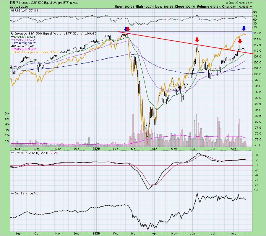
Yesterday I had the pleasure of doing a podcast with FinancialSense.com's James Puplava (I'll send the link out to the DecisionPoint free email list when I have it - sign up on the DecisionPoint.com homepage). We talked at length about the "top ten" large-cap stocks that run the show in the SPX. James did a study taking out those big-cap stocks and found the chart was very different as to what is actually going on in the SPX. I decided to take a look at RSP, the equal-weight S&P 500 ETF. Wow! According to RSP, the market is in a declining trend with a bearish bias. If investors get spooked and start letting go of the large-cap positions quickly, the market could fall swiftly, as there is no foundation of strong stocks to pick up the slack.

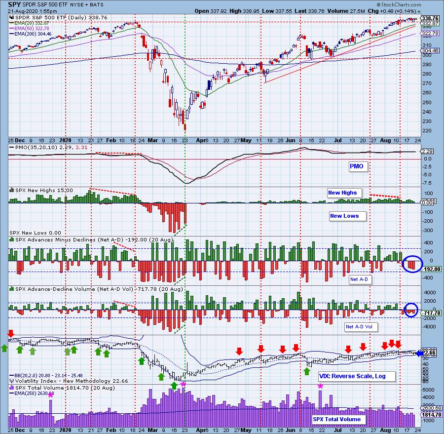
More to this point, notice the lack of participation on Net A-D and Net A-D Volume, which were negative on the last few rally days. The VIX is now below its moving average on the inverted scale, which suggests internal weakness ahead.

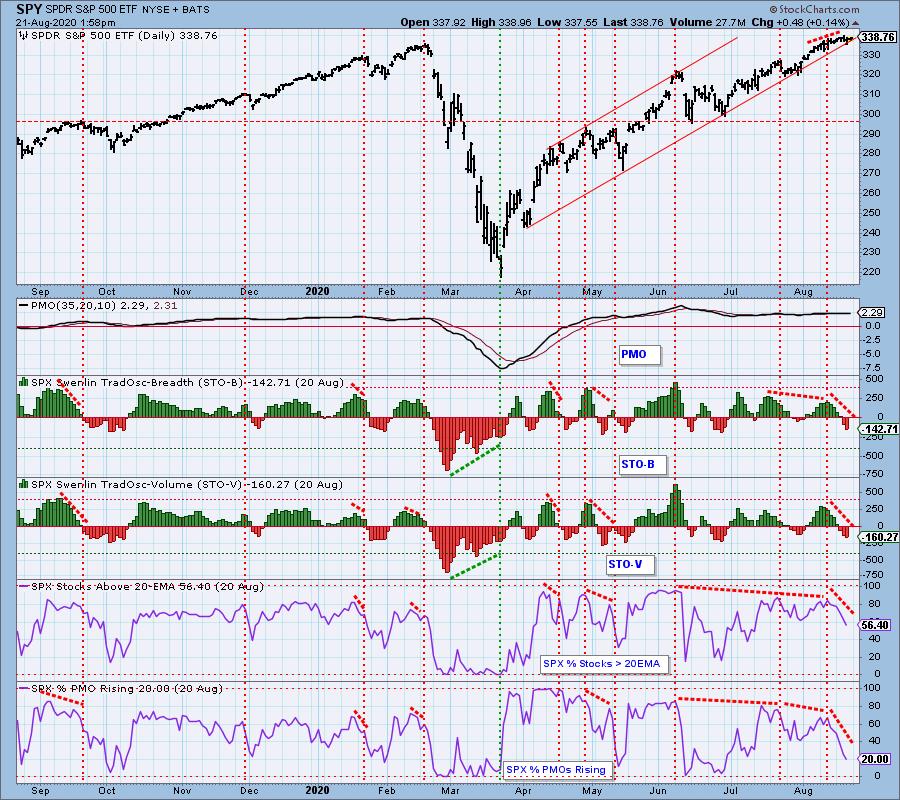
And how about those negative divergences in %Stocks indicators, which show a decline in participation despite the rallies higher? The Swenlin Trading Oscillators (STOs) have continued lower.

We have are just beginning a weekly free DecisionPoint Trading Room on Mondays at noon ET! Carl has agreed to join us for the first one on August 24th at noon ET! He's never done anything like this before, so it will be pretty special to get his intraday take on the markets and what to expect in the week ahead.
Here is the link to register for this Monday's free DecisionPoint Trading Room! Sign up on our DecisionPoint.com homepage free email list to receive the weekly links!
I just finished up my DP "Diamond Mine" trading room this morning for Diamonds subscribers only. This intimate trading room was fantastic and is certainly worth the price of admission by subscribing to our Diamonds Reports. We examined the Diamonds presented this week and symbols to watch in the coming week.

DecisionPoint Diamonds are becoming even more indispensable! Not only do you get 60 "Diamonds in the Rough" stocks/ETFs per month, with complete analysis including stops/targets... but there will now be a Friday Diamonds Recap that will look at the performance of each week's Diamonds and their prospects moving forward. Over the weekend, we clean the slate and start over again.
Included for my Diamonds subscribers only will be a new one-hour trading room, "The DecisionPoint Diamond Mine" on Fridays! It will provide an opportunity for us to talk live, review current and past Diamonds for possible entries/exits/stops/targets and take your questions and symbol requests in this intimate trading room.
DecisionPoint Alert subscribers will continue to enjoy clear, concise analysis of the overall market, including Dollar, Gold, Gold Miners, Oil and Bonds from both Erin and Carl Swenlin. You will be prepared each market day knowing the implications of market behaviors for that day, week or month!
All subscribers have access to our exclusive ChartLists that are annotated and curated by Carl Swenlin. Know what he thinks is important for all of the sectors, indexes, indicators and more!
Today's ChartWatchers "Diamond of the Week":
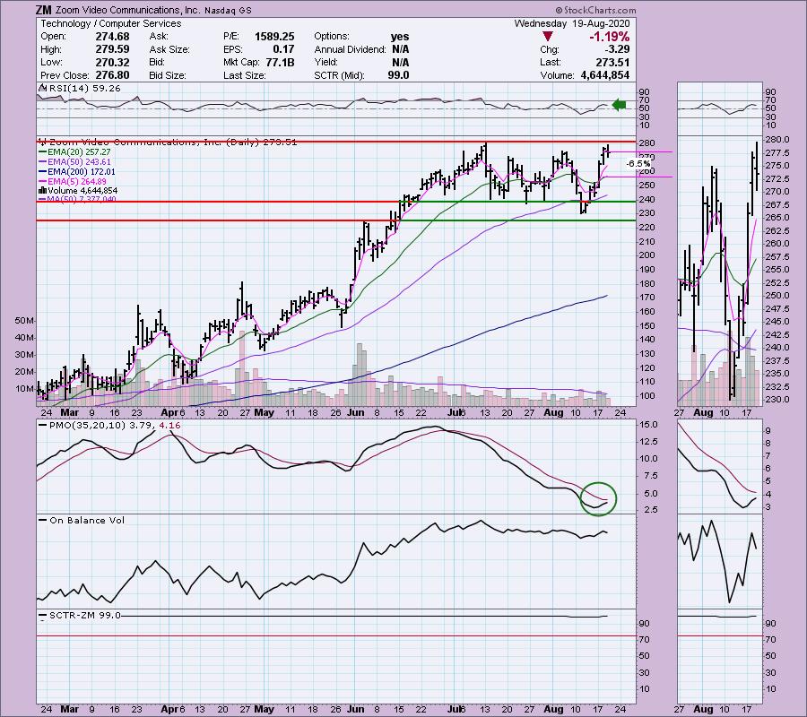
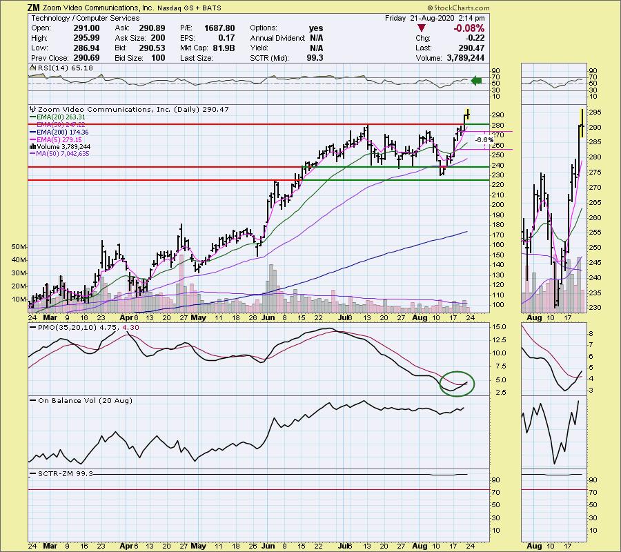
This "Diamond in the Rough" selection from the August 19th DecisionPoint Diamonds Report. I have included the chart from Wednesday with my original comments, after which I follow up with the current chart.
Zoom Video Comm Inc (ZM) - Earnings: 8/31/2020 (AMC)
Zoom Video Communications, Inc. engages in the provision of video-first communications platform. It connects people through frictionless video, voice, chat and content sharing, and enable face-to-face video experiences for thousands of people in a single meeting across disparate devices and locations. It focuses on customer and employee happiness, a video-first cloud architecture, recognized market leadership, viral demand, an efficient go-to-market strategy and robust customer support.
Yesterday I presented Citrix (CTXS), the purveyor of "GoToMeeting", and today I have one of its competitors, Zoom Communications. This chart looks very similar to the one I opened with of $DJUSSW. We have a possible flag formation that is ready to execute. The PMO has turned up and it looks like ZM may break out of this trading range. I would set my stop around the 20-EMA as I don't think I'd want to ride it down to support at $225. There is a slight negative divergence between OBV tops and price tops right now, which is another reason I really would want to wait on it if it starts to drop below the 20-EMA. They do report earnings soon, so keep that in mind.

FRIDAY's Chart is below:

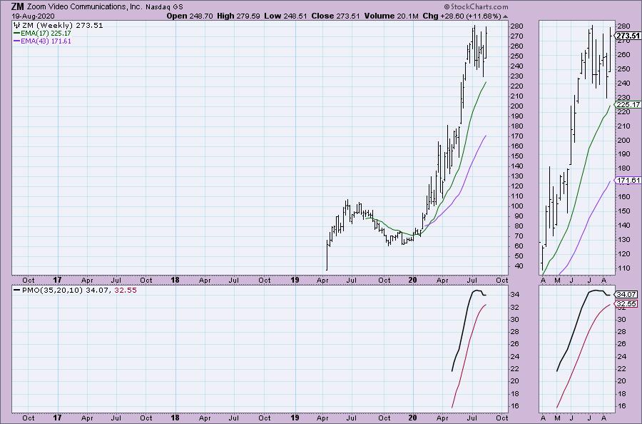
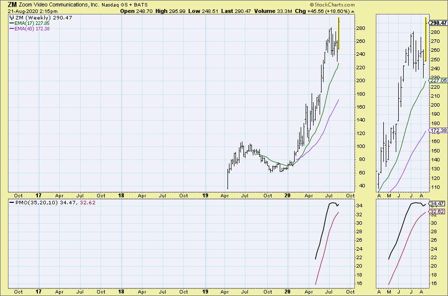
We don't see much more on the weekly chart, as Zoom is very young and doesn't have a lot of data. I do think the flag is very clear in the thumbnail.

FRIDAY's Chart:

Conclusion: RSP and the SPX indicators are weaving a tale of a likely decline. RSP is still in a long-term declining trend and the negative divergences persist on the indicators.
Be sure and sign up on our free email list to join the new DecisionPoint Trading Room! Carl will be joining us for our first DP Trading Room on Monday, so you don't want to miss it! Here's the registration link. Don't forget, you can give our reports a try with a 1-week trial by subscribing to the "Bundle" package and using coupon code: dptrialcw.
Happy Charting! - Erin
Technical Analysis is a windsock, not a crystal ball.
Helpful DecisionPoint Links:
DecisionPoint Alert Chart List (subscribers only)
DecisionPoint Golden Cross/Silver Cross Index Chart List (subscribers only)
DecisionPoint Sector Chart List (subscribers only)
DecisionPoint Chart Gallery
Trend Models
Price Momentum Oscillator (PMO)
On Balance Volume
Swenlin Trading Oscillators (STO-B and STO-V)
ITBM and ITVM
SCTR Ranking
|
| READ ONLINE → |
|
|
|
| ChartWatchers |
| Powerful Scanning Strategies for Our Strong Earnings ChartList |
| by John Hopkins |
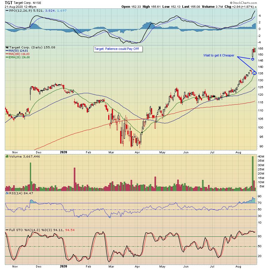
It's been a very exciting time for the bulls, with the NASDAQ and S&P hitting all-time highs this week. In fact, for those who have been skeptical and sat out the move off of the March 21 bottom, this has been painful to watch, with the NASDAQ rising over 70% in just 5 months. That ranks right up there with one of the most amazing turnarounds of all time. The good news for those who have been left behind, as well as those who are looking for fresh opportunities, is that you will be able to profit on those companies that recently reported stellar earnings and pull back to key support levels. As an example, take a look at the chart of Target (TGT) a company that smashed all earnings expectations when they reported their numbers last week.

Would it have been awesome to be a shareholder into the earnings report? You bet! After all, the stock rose a nifty 13% after earnings were released and has gained as much as 28% in just three weeks. But for those not fortunate enough to have owned the stock, there's a good chance you will get another chance to buy it cheaper. For example, I'm willing to bet that at some point the stock will minimally pull back to the bottom of the gap near $146 on August 19. And, should the stock fall below that level, perhaps another entry level near the 20-day moving average currently near $136.
There will be many other stocks that pull back to key support levels, and the ones I will be watching will be those that easily beat earnings expectations, especially those that raised guidance as well. Why? Because these are the most sought after stocks; traders like winners. How can you find these types of candidates? At EarningsBeats.com, we scan for stocks that beat earnings expectations - both the top and bottom line - and have promising charts. Those that meet our standards are then added to our Strong Earnings ChartList (SECL). In fact, our SECL currently has 483 stocks - the most we've ever had - that could become high reward-to-risk trading candidates. And, even better, those who have a StockCharts.com Extra level membership or higher can download our SECL, which allows them to scan for the best trading candidates. POWERFUL! In fact, our Chief Market Strategist Tom Bowley will be conducting a webinar this Monday, August 24 at 4:30 pm Eastern where he will be demonstrating the power of the SECL and how it can be used with StockCharts.com scanning tools for superior results. This will be open free of charge to the EarningsBeats and StockCharts communities and you can use this link to join us. The room will open at 4:00 pm Eastern. If you are currently NOT receiving our free EarningsBeats Digest that comes out every M, W and F, just click here to sign up and we will send you a reminder of the event on Monday. You don't want to miss this one!
At your service,
John Hopkins
EarningsBeats.com
|
| READ ONLINE → |
|
|
|
| MORE ARTICLES → |
|
 Chart 2
 Chart 3


 Yes, I'm a chartist.

