| Hello Fellow ChartWatchers |
The wait is almost over folks! We're less than 48 hours away from our biggest, baddest sale of the year, arriving THIS MONDAY, November 30th.
As any of our longtime members will tell you, Cyber Monday is a particularly important day here at StockCharts. Whether you're renewing an existing account OR joining as a premium member for the first time, Cyber Monday is hands down, without question the BEST day of the year to sign up. It's our biggest sale, our lowest pricing and our most generous offer. Period.
So, here's the rundown. For one day only, you're getting up to 4 FREE months of StockCharts service when you sign up for a new account or renew your existing membership. That means you can save nearly $160 off our regular subscription prices. It's madness, I know, but the cyber sprit got to us and we just can't help ourselves.
So this Monday, November 30th, visit StockCharts.com/special to sign up for our "4 free months" offer and take advantage of our best pricing of the year.
(plus you'll see plenty of banners up on the site and we'll shoot you a quick reminder email on Monday morning, just to make things a little easier to find)
We also dove into the details a bit further on this week's "StockCharts In Focus", so check out yesterday's edition by clicking the video below:

By the way, in addition to covering our Cyber Monday sale on this week's show, I took a quick look at three additions our team just launched in StockChartsACP:
- A "Verbose" option that brings more detail to the legends on your charts
- A new "Rainbow" shading option for the SCTR indicator
- A right side position option for the Volume By Price indicator
You know, it's been a wildly busy year here at StockCharts, but it sure has been a special one, too. So many major additions to the site with new tools like ACP and Symbol Summary, plus the evergrowing collection of exclusive shows and other content on StockCharts TV.
Our team absolutely loves what we do, but without you choosing StockCharts, we wouldn't have the opportunity to create these tools and build these features and deliver this content. So since this is the week of thankfulness, I'd like to send a very heartfelt "Thank You" to each and every one of you in our StockCharts community. And cheers to much, much more in 2021 and beyond! |
| Chart on, my friends. |
|
|
|
| THIS WEEK'S ARTICLES |
| The Market Message |
| Foreign Stock ETFs are Hitting New Records |
| by John Murphy |
The decline in the U.S. dollar continues. Chart 1 shows the Invesco US Dollar Index (UUP) dropping to the lowest level in two years. Previous messages have described some of the intermarket side-effects of a weaker greenback. One of them is that it's usually good for foreign markets. That also increases demand for foreign currencies. And right on cue measures of foreign stocks are hitting new records.
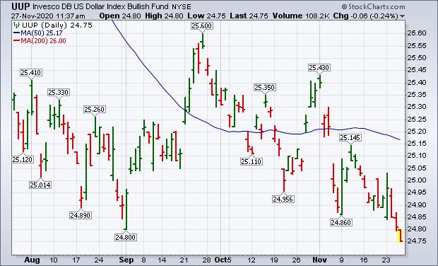 Chart 1 Chart 1
The daily bars in Chart 2 show the MSCI All Country World Index ex US (ACWX) moving above its January high to a new record. A big part of that recent gain has come over the last month as the dollar started its latest downleg. Foreign stocks are also starting to play catch-up to the U.S. That can be seen by the ACWX/$SPX relative strength ratio in the upper box. The foreign stock/U.S. ratio hit bottom at the start of September; and has since risen to the highest level in four months. And it's not far from a new eight-month high. That's a sign that investors may be rotating some funds from the relative safety of the U.S. and into foreign markets that had been lagging behind. Positive vaccine news may be the driving force behind that foreign rotation as investors become more optimistic on the global economy. Emerging markets have been the biggest beneficiary of the falling dollar. But foreign developed markets are also gaining ground.
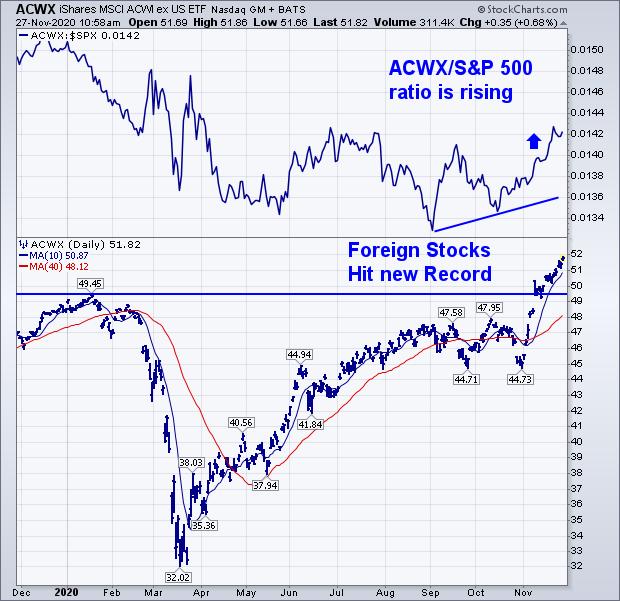 Chart 2 Chart 2
Chart 3 shows the MSCI EAFE iShares (EFA) moving above its January high to a new record. [EAFE includes developed stocks in Europe, Australasia and the Far East.] That puts them in sync with the Emerging Markets iShares (EEM) which are also in record territory. A lot has been written recently about the positive rotation in the U.S. into more cyclical parts of the stock market that stand to benefit from a stronger economy next year. The recent rotation into foreign stocks may be sending the same positive message. The fact that foreign stock ETFs are quoted in weaker dollars also gives them an added advantage. More optimism on the global economy and stocks may also be reducing the appeal for the safe haven qualities of the U.S dollar.
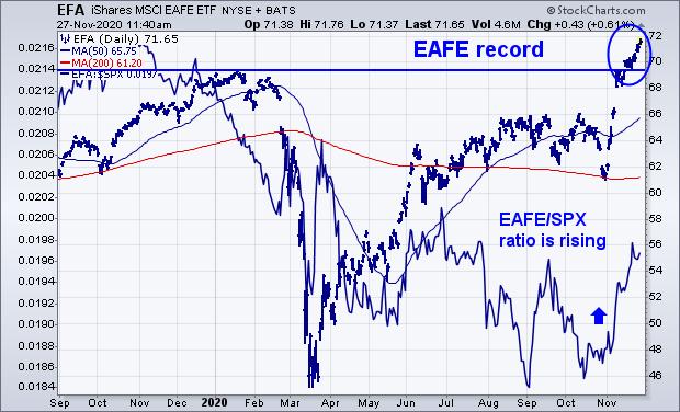 Chart 3 Chart 3
Editor's Note: This is an article that was originally published in John Murphy's Market Message on Friday, November 27th at 2:09pm ET.
|
| READ ONLINE → |
|
|
|
|
|
| Art's Charts |
| Bullish Setups in Two Boring Tech ETFs |
| by Arthur Hill |
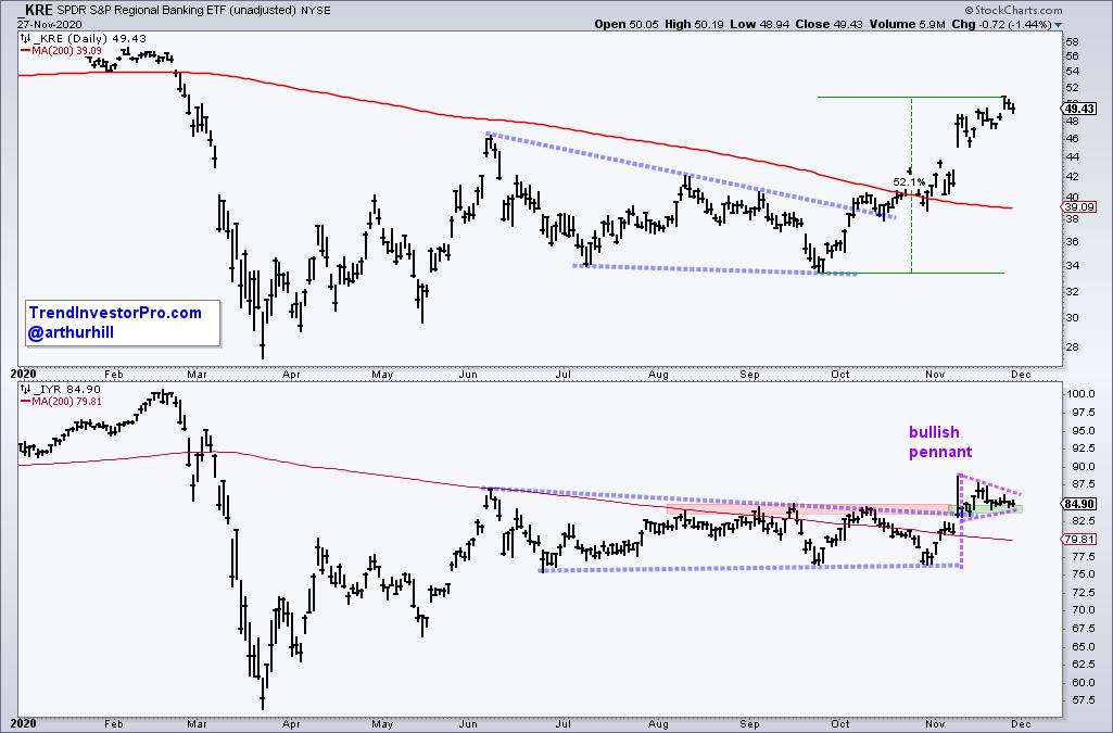
 Boring and lagging ETFs turned into exciting leaders in November as we saw breakouts in the Regional Bank ETF (KRE) and REIT ETF (IYR). The breakouts are bullish and IYR has a short-term bullish continuation pattern working, but we should not forget about the prior leaders and ETFs with real growth prospects. Today we will cover KRE, IYR and a classic bullish continuation pattern in two tech ETFs. Boring and lagging ETFs turned into exciting leaders in November as we saw breakouts in the Regional Bank ETF (KRE) and REIT ETF (IYR). The breakouts are bullish and IYR has a short-term bullish continuation pattern working, but we should not forget about the prior leaders and ETFs with real growth prospects. Today we will cover KRE, IYR and a classic bullish continuation pattern in two tech ETFs.
The first chart shows The Regional Bank ETF peaking just below its falling 200-day in June, forming a long falling wedge and breaking out with a 50+ percent advance the last nine weeks. It is an impressive advance that is clearly bullish, but as MC Hammer would say: Can't Touch This!

The bottom window shows the REIT ETF with a playable setup. The ETF broke out of a long triangle in mid November and the breakout zone turned into support. IYR consolidated the last two weeks and a pennant is taking shape. These are short-term bullish continuation patterns and a breakout at 87 would signal a continuation higher.
Even though banks, energy and other groups captured the market's attention in November, I would not dismiss the prior leaders. Sorry, but I do not see secular growth happening for old school banks, REITs and fossil fuels. Furthermore, we should be interested in an ETF or stock when trading has turned boring and volatility is low, not when excitement and volatility are high.
Note that Cyber Monday is this Monday, November 30th, and StockCharts is offering their biggest deal of the year: Get Four Months Free! Click here for details.
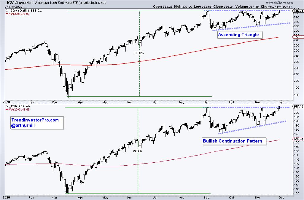
The next charts show the Software ETF and Internet ETF hitting 52-week highs in early September and then moving into the boring camp as both traded sideways. Even though they are not leading on the three month timeframe, they are leading on the nine to twelve month timeframes. In fact, note that KRE and IYR are still down year-to-date, and FDN hit a new high this week.

After a massive advance from late March to early September, IGV and FDN were entitled to a rest. The consolidation over the last three months provided the pause that refreshes and allowed the ETFs to digest their big gains. Moreover, both formed a classic bullish continuation pattern: Ascending Triangle. Breakouts would confirm these patterns and signal a continuation of their existing uptrends.
Looking for more trend analysis and bullish setups for ETF? TrendInvestorPro offers a comprehensive pattern and setup report with annotated charts as well as a ranking report that tracks trend and mean-reversion signals for over 100 ETFs. Click here to take your analysis to the next level!
-------------------------------------------
|
| READ ONLINE → |
|
|
|
|
|
| The Canadian Technician |
| This World is on Fire |
| by Greg Schnell |
The charts continue to roast the bears. It's been an aggressive run; they are hanging on, but it seems they are getting knocked off every perch. The Nasdaq even joined the party on Wednesday, finishing up on a down day for the Dow and $SPX.

But the question on everybody's mind is - will it last?
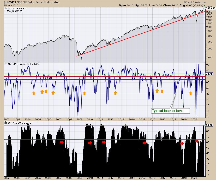
Below are a couple of charts that I like to use to help me with where we are. The top panel of the chart is the log chart of the $SPX.
The second panel is the Bullish Percent Index for the $SPX. As long as the indicator is above the red lines, it is very bullish. Above one of the red lines is strong, but needs to be watched. If it goes below the red lines, that typically means the market is heading into or currently in a correction. One of the things to like about the indicator is that when it keeps pushing above the top line, that shows that lots of stocks are on a buy signal. Since the COVID low, this has been thrusting to very high levels, suggesting lots of involvement in the bull market. Notice the bear markets typically can't get up to these strong levels if we look back in 2003 or 2008. Throughout all of 2018, not many stocks were participating when the trade tariff dispute was underway.
The lower panel is actually one of the best ones to visually demonstrate the strength of the bull market clearly. Notice how the bull markets of 2003, 2009, 2011, 2013 and 2020 all hit this level. Even in 2007, it reached up there, but the stock market never topped until 6 months after this high level.

Without a doubt, both indicators are demonstrating the traits of a big bull market. I would suggest that, unless we get a hiccup in the vaccines, the market is looking past the near-term slowdowns.
Good trading,
Greg Schnell, CMT, MFTA.
|
| READ ONLINE → |
|
|
|
|
|
| DecisionPoint |
| Assessing Market Bias |
| by Carl Swenlin |
We have all heard that "a rising tide raises all boats," and at DecisionPoint.com we have come to think of the direction of the market tide as being a bias that can benefit or work against our trading positions. As regular market participants, we may have a general sense that the market has a bullish or bearish bias; however, it would be useful to have objective ways to assess that bias. This is something we evaluate on a daily basis in the DecisionPoint Alert, and here are some of the tools we use.
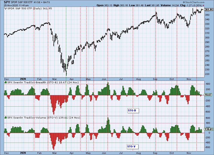
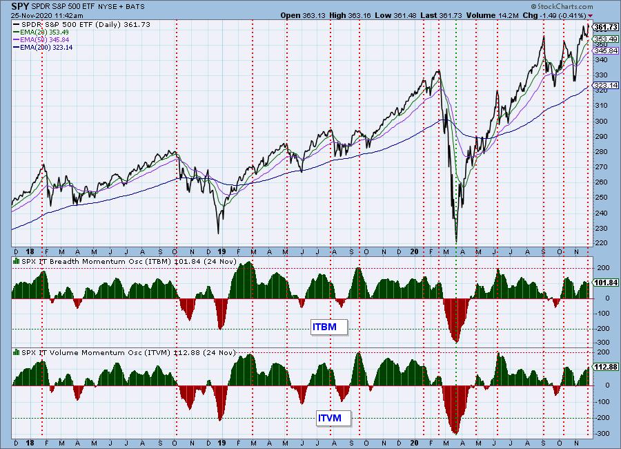
For the short term, we use the Swenlin Trading Oscillators for breadth (STO-B) and volume (STO-V). The normal range for both indicators is +400 to -400, and, on the one-year chart, we first assess how they are situated within that range. During the bear market earlier this year, a bearish bias was clear, as the STOs quickly plunged well below that normal range and stayed below zero until shortly after the March low. After that low, a bullish bias quickly became evident as the indicator ranges shifted to mostly above the zero line, and the time spent above the zero line far exceeded that spent below the zero line.
Beginning in September, the STO ranges began to shift to a more neutral stance as the moves below zero became deeper. Nevertheless, the time spent below zero was still less than that spent above, so the bias was still bullish.


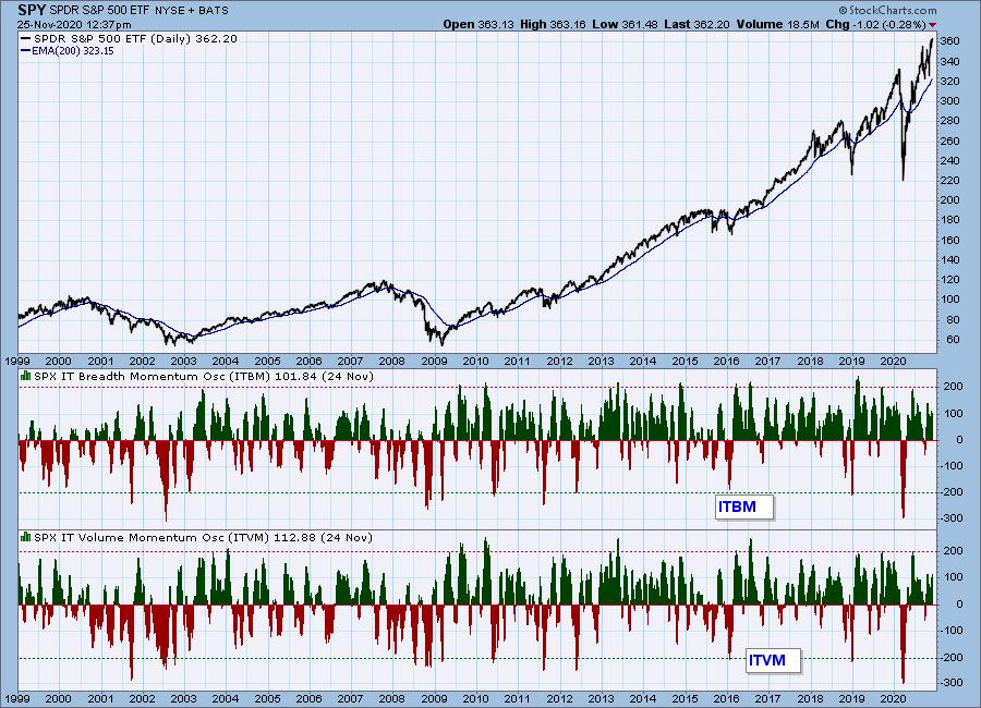
For longer-term assessment of market bias, we use the Intermediate-Term Breadth and Volume Momentum Oscillators (ITBM and ITVM). Using the same methodology as on the short-term chart, we can see that bias has been persistently bullish for the last three years, with the two bear markets, of course, offering splashes of bearishness. The question arises: is this the normal posture for these indicators?


Click here to register in advance for the recurring free DecisionPoint Trading Room! Recordings are available!
Looking at a 22-year chart, we can see that the indicators have favored a bullish bias since the 2009 bear market low. However, from 1999 to 2007, a neutral to bearish bias was more the norm.

CONCLUSION: Assessing market bias can help us make trading decisions that are compatible with the changing tide of the market. Our DecisionPoint indicators can provide objective evidence for making these decisions.
Technical Analysis is a windsock, not a crystal ball.
Helpful DecisionPoint Links:
DecisionPoint Alert Chart List
DecisionPoint Golden Cross/Silver Cross Index Chart List
DecisionPoint Sector Chart List
DecisionPoint Chart Gallery
Trend Models
Price Momentum Oscillator (PMO)
On Balance Volume
Swenlin Trading Oscillators (STO-B and STO-V)
ITBM and ITVM
SCTR Ranking
|
| READ ONLINE → |
|
|
|
| ChartWatchers |
| Current Rotation Leading to Massive Short Squeeze Trades |
| by John Hopkins |
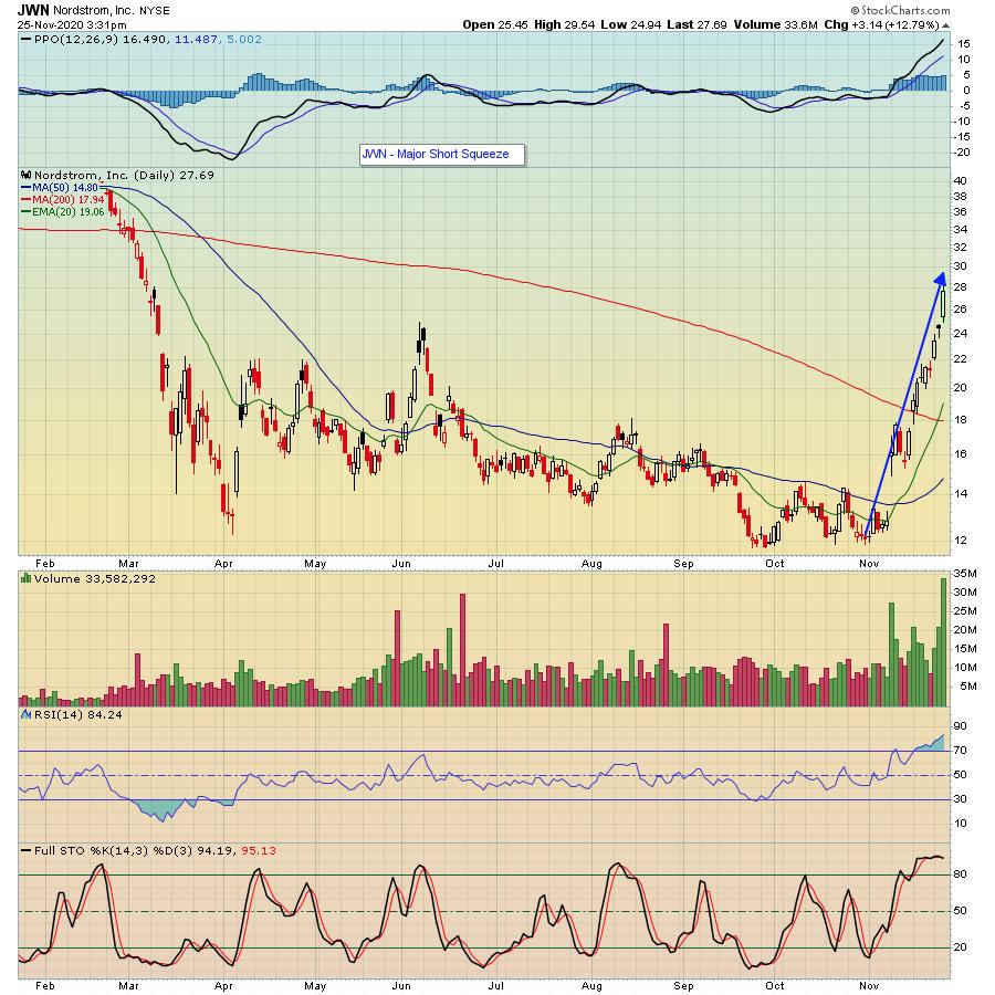
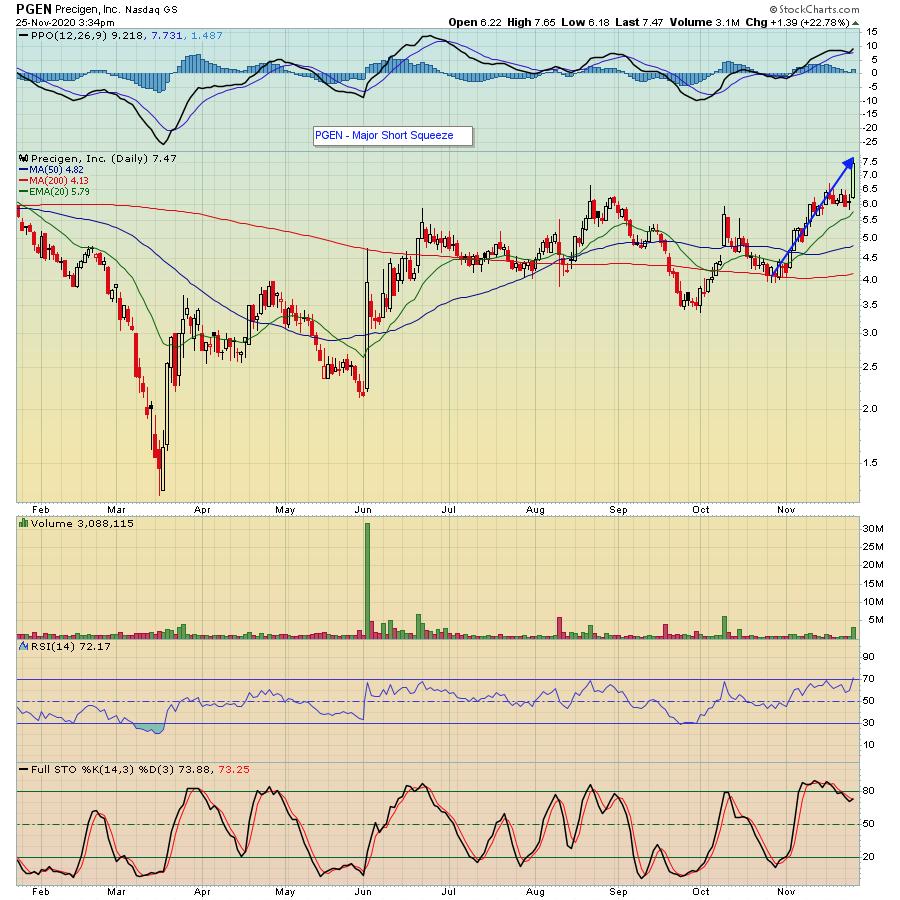
The market rotation of late has resulted in some explosive moves in some "forgotten stocks." This has been particularly true of those stocks that have a high percentage of shares short.
As an example, take a look at the two charts below. Both of these stocks are on our "Short Squeeze ChartList", which includes stocks that have a short percentage of float of above 20%.


In the case of JWN, the stock has exploded to the upside; it was up over 135% from its low on November 6 to its high this past Wednesday.
In the case of PGEN, the stock just broke out this past Wednesday after testing its 200-day moving average in late October, rising over 90% at its high on Wednesday in just a few weeks.
Why the huge moves? Because when the recent rotation kicked in, the shorts were in a box. They had to get out of the way as these stocks came roaring back.
We've seen a number of stocks on our Short Squeeze ChartList make substantial moves to the upside recently; it makes perfect sense. For a long time, many of the stocks lagged the overall market. But with the rotation away from higher growth stocks to some of the laggards, it was off to the races.
Our Chief Market Strategist Tom Bowley has identified other stocks on the list that could be primed for strong moves to the upside. If you would like to see one of those stocks Tom has his eyes on, just click on this link and sign up for our FREE EarningsBeats Digest, which will be sent to you Monday morning before the market opens.
At your service,
John Hopkins
EarningsBeats.com
|
| READ ONLINE → |
|
|
|
| MORE ARTICLES → |
|
 Chart 1
 Chart 2
 Chart 3


 Boring and lagging ETFs turned into exciting leaders in November as we saw breakouts in the Regional Bank ETF (KRE) and REIT ETF (IYR). The breakouts are bullish and IYR has a short-term bullish continuation pattern working, but we should not forget about the prior leaders and ETFs with real growth prospects. Today we will cover KRE, IYR and a classic bullish continuation pattern in two tech ETFs.