| THIS WEEK'S ARTICLES |
| John Murphy's Market Message |
| 10-YEAR YIELD JUMPS TO 14-MONTH HIGH |
| by John Murphy |
10-YEAR YIELD SPIKES HIGER... Bond yields continue to spike higher. Chart 1 shows the 10-Year Treasury yield jumping 9 basis points to 1.73% which is the highest level in fourteen months. That's helping lift financial shares, but weighing heavily on technology stocks. As a result, the Nasdaq market is under heavy selling pressure.
 Chart 1 Chart 1
QQQ LOSES 50-DAY LINE...Chart 2 shows the Invesco QQQ Trust losing -2.7% today and weighing on the rest of the market. The chart also shows the QQQ trading back below its 50-day moving average. Chart 3 shows the Technology SPDR (XLK) in a similar situation. Financial shares which benefit from higher yields are the day's strongest sector. Energy and technology are the day's two weakest sectors. A big drop in the price of crude is weighing on energy shares. The Dow and S&P 500 are losing ground heading into the last hour of trading.
 Chart 2 Chart 2
 Chart 3 Chart 3
|
| READ ONLINE → |
|
|
|
| ChartWatchers |
| IBB: Still a Correction within a Bigger Uptrend |
| by Arthur Hill |
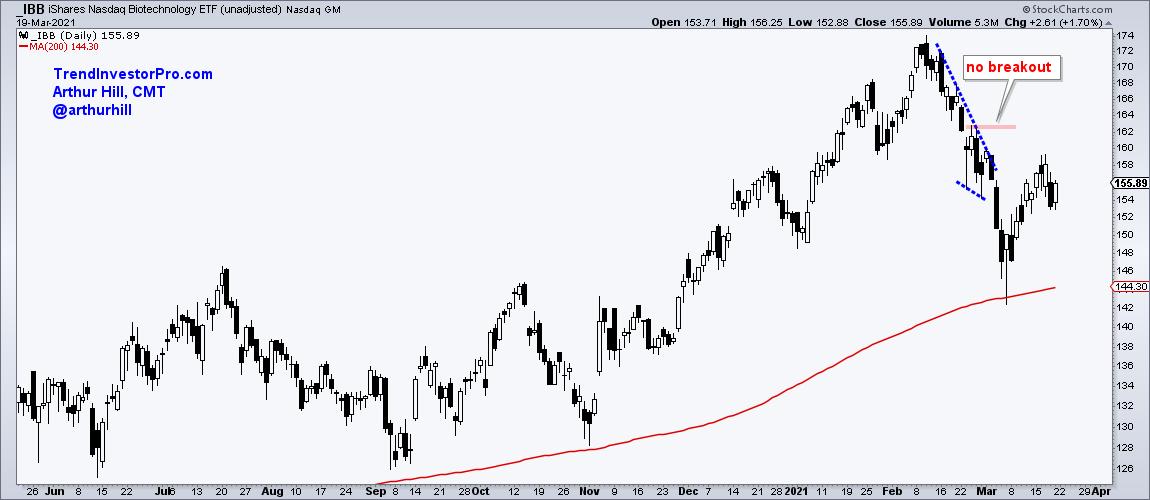
I wrote about the Biotech ETF (IBB) on February 28th as it pulled back from a new high. The pullback was viewed as a correction within the bigger uptrend, but the correction extended further than expected. At the time, I drew a falling wedge on the chart and marked resistance with the red line at 163. IBB did not break out and did not reverse the short decline. Instead, the ETF fell all the way to the 146 area. What now?

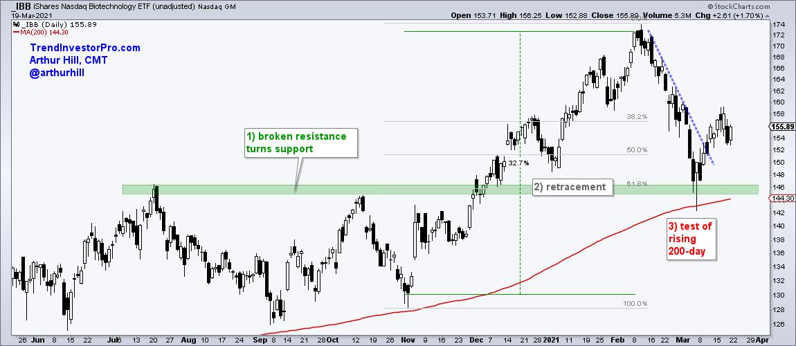
Despite further weakness, I still view the February-March decline as a correction within a bigger uptrend. It was just a bigger correction within the box of chocolates. First and foremost, the bigger trend is up because IBB recorded a new high in February and price is above the rising 200-day SMA.
Even though the recent decline was big in percentage terms, it still looks like a "normal" correction for three reasons. First, the decline retraced 61.8% of the prior advance. This is part of a two steps forward and one step backward sequence of an uptrend. Second, IBB returned to prior resistance and this area turned into support. Broken resistance turning into support is a classic tenet of technical analysis. Third, IBB returned to the rising 200-day SMA.

These three technical items made for a confluence of support in the 144-146 area and IBB surged off this zone the last two weeks. There may be some backing and filling as the market finds its footing, but I think the path of least resistance is up for IBB.
This week at TrendInvestorPro we analyzed some Asian ETFs using Heiken-Ashi candlesticks and identified some possible reversal zones. Friday's commentary looked at the secular downtrend in oil, while Thursday's report showed what to watch for the flag breakouts in several ETFs. Click here to subscribe and get immediate access.
---------------------------------------------------
|
| READ ONLINE → |
|
|
|
|
|
| The Canadian Technician |
| Real Set Ups in Real Estate |
| by Greg Schnell |
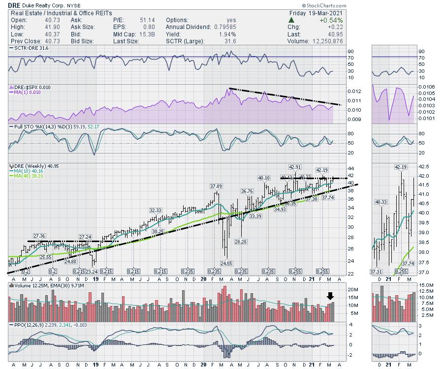
Why so many real estate set ups are occurring right now is hard to know, but the setups are nice. All these stocks were in strong uptrends before COVID hit. Can they resume the big picture?
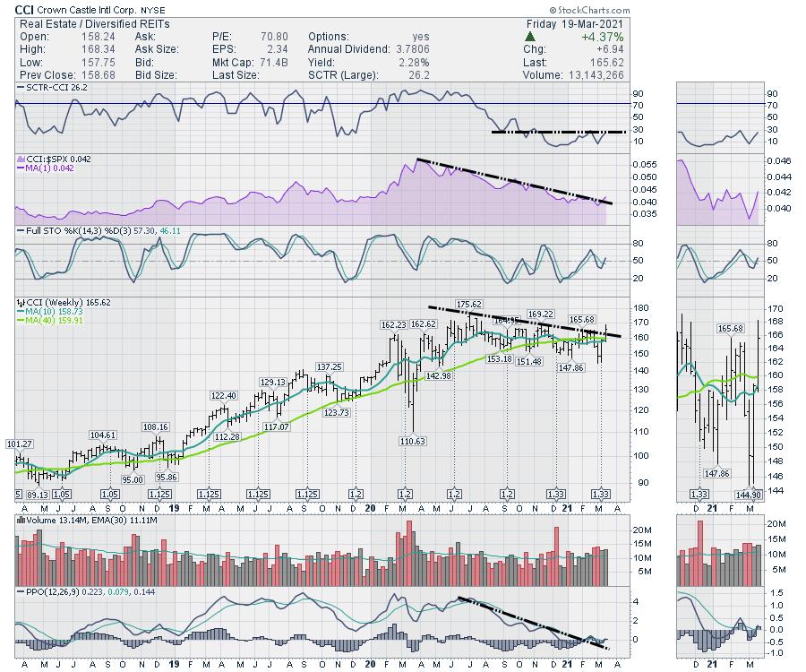
The first one is Crown Castle (CCI). Crown's yield is only 2.2%, which I thought might be the first reason people are looking around. That doesn't seem that motivating. When I look historically, the stock was strong through 2019, but paused for most of 2020. Perhaps the investors like the opportunity to get back on this name with a clean uptrend as the economy reopens. The stock is breaking the downtrend to resume the move up. The SCTR has been under 30, but it was a much stronger stock before COVID. Maybe it can turn the corner?

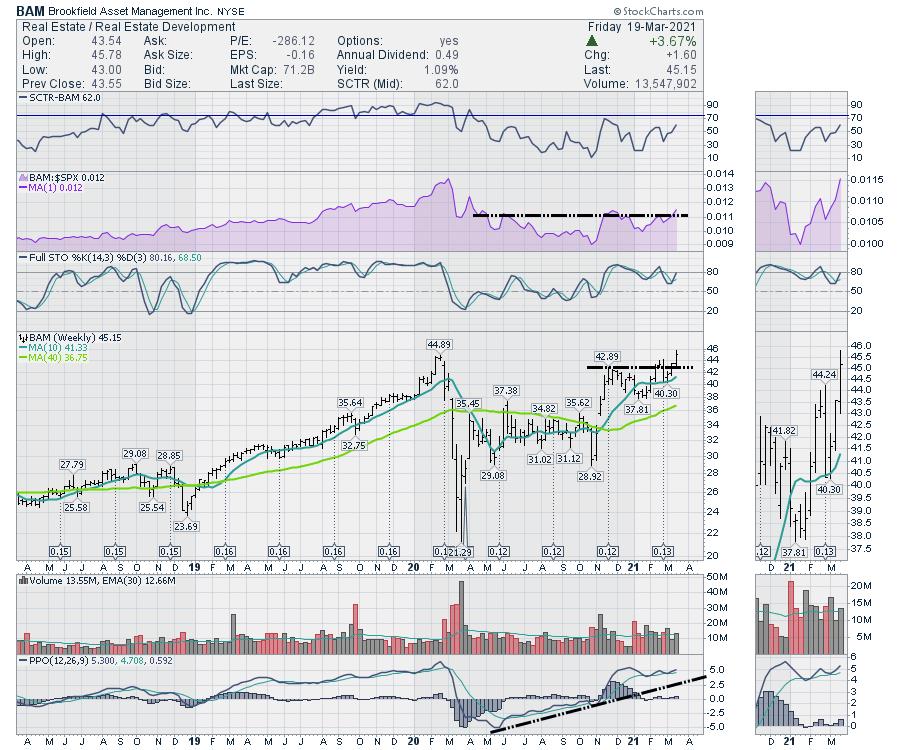
Brookfield (BAM), a big property developer, is also setting up. The stock is very close to new highs on relative strength (purple area chart), which is usually a good scan looking for stocks to start to run. The stock closed on a new 52-week high this week.

The next one is Duke Realty (DRE). The stock had a nice strong SCTR before COVID, but it has waned for the last 6 months. The relative strength is still declining, which is not positive. It would be nice if it could resume the uptrend that was in play before COVID. On the price chart, it has a nice strong 3-year trend, with the COVID dip as an exception.

With so many charts giving up hard reversals, quickly draining paper profits, perhaps strong stocks before the 2020 collapse can return to business as usual as the vaccinations continue.
If you would like to save 40% on GregSchnell.com, follow this link to see what's available. GregSchnell.com/Explore
|
| READ ONLINE → |
|
|
|
|
|
| ChartWatchers |
| Intermediate-Term Price Momentum Oscillator (PMO) SELL Signal on SPY |
| by Erin Swenlin |
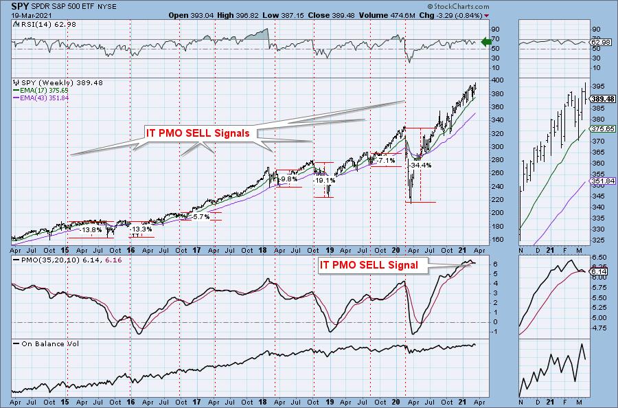
Today, the weekly PMO crossed below its signal line, which hasn't occurred since the early 2020 bull market top. The chart isn't all bad given the positive RSI and rising OBV. However, this signal should be heeded; they don't happen often and they usually lead to sustained declines.
Admittedly, in a strong bull market, these signals haven't hurt the market gravely. Given the strong bullish bias in the market currently and the positive RSI, this may not lead to another bear market, but a pullback or possible correction are likely.
At issue is the health of our other indicators. Readers of the DPA know the many problems on the DecisionPoint indicators, from overbought to negative divergences; the indicators tell us to beware this new IT PMO SELL signal. However, this isn't the only warning sign we got this week....

DPA: Clear and Concise Daily Market Commentary

DP Diamonds: Easy-to-Understand Stock Analysis
Try us out for a week! Subscribe to the Bundle and use coupon code: DPTRIAL. You'll find all of our reports going back to October 2019. Review our commentary and "diamond in the rough" picks that go back to before the 2020 bear market and enjoy the quality commentary from Carl and Erin Swenlin.
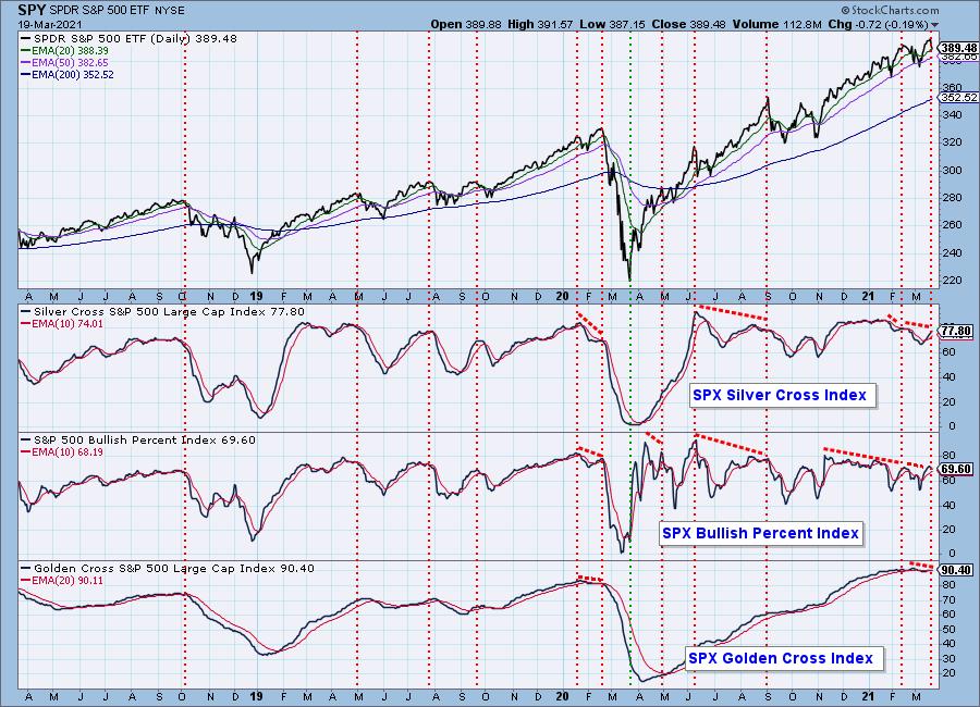
The weekly PMO SELL signal is an intermediate-term warning; however, we had a long-term warning this week on our Golden Cross Index. The Golden Cross Index (GCI) shows the percentage of SPX stocks on LT Trend Model BUY signals (50-EMA > 200-EMA). This week, the GCI set a lower top, which set up a negative divergence. Like the weekly PMO SELL signal, this GCI negative divergence hasn't been seen since the beginning of the bear market.

Free DecisionPoint Trading Room Every Monday!

Click here to register in advance for the recurring free DecisionPoint Trading Room! Recordings are available!
CONCLUSION: Carl pointed out two significant short-term negative divergences last week in his article, "Keeping it Simple". Now we have intermediate- and long-term warning signals in the form of a weekly PMO SELL signal and a negative divergence on the Golden Cross Index. Be prepared for more downside ahead.
Happy Charting! - Erin Swenlin
Technical Analysis is a windsock, not a crystal ball.
Helpful DecisionPoint Links:
DecisionPoint Alert Chart List
DecisionPoint Golden Cross/Silver Cross Index Chart List
DecisionPoint Sector Chart List
DecisionPoint Chart Gallery
Trend Models
Price Momentum Oscillator (PMO)
On Balance Volume
Swenlin Trading Oscillators (STO-B and STO-V)
ITBM and ITVM
SCTR Ranking
DecisionPoint is not a registered investment advisor. Investment and trading decisions are solely your responsibility. DecisionPoint newsletters, blogs or website materials should NOT be interpreted as a recommendation or solicitation to buy or sell any security or to take any specific action.
|
| READ ONLINE → |
|
|
|
| ChartWatchers |
| This Company Smashed Earnings Expectations |
| by John Hopkins |
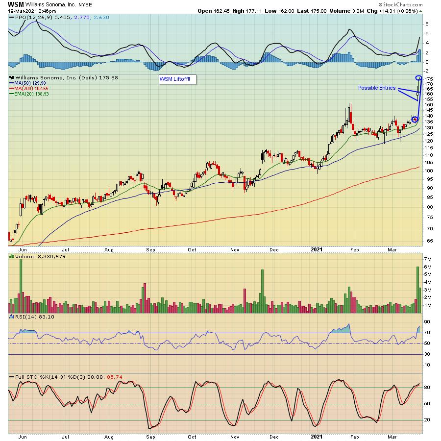
Williams Sonoma, Inc (WSM) reported their earnings this past week and proved that, even in a choppy market environment, strong earnings can be rewarded. In fact, look at the chart below, which shows the stock spiking a nifty 30% in just two days as traders cheered their performance.

WSM had the hat trick, with strong bottom and top line results plus a perky future forecast, all adding up to stock nirvana and putting the company on the radar screen of serious traders.
That nice 30% pop to the upside would have been even sweeter if you owned the stock into the earnings report. But the next best thing will be to be patient and watch for a pullback to a level that could present a nice reward to risk opportunity. For example, the low on the stock on Friday was $162, so that's one level to watch for. Even better would be a pullback to just above $153, with a tight stop just in case the stock moves below that level.
WSM's nice showing could be a sign of what could be coming when Q1 earnings start coming out in the beginning of April, in spite of all of the worry about how rising rates might put a damper on results. However, we can't ignore the fact that there has been a shift in sentiment towards value stocks, with traders shying away from Tech stocks. But will that last? Time will tell, but in the meantime, our Chief Market Strategist, Tom Bowley, will be conducting a webinar this Tuesday, March 23 entitled "Changing of the Guard", where he will be discussing how the recent shift might impact the earnings picture in Q2. This is a FREE event open to all EarningsBeats.com community members and if you are interested in attending, just click here to sign up for Tom's free EarningsBeats Digest. You will receive additional information and a room link prior to the 4:30 pm Eastern start.
At your service,
John Hopkins
EarningsBeats.com
|
| READ ONLINE → |
|
|
|
| Mish's Market Minute |
| My Special Inflationary Indicator |
| by Mish Schneider |

On Wednesday, the Federal Reserve stated that interest rates will continue to stay close to zero, along with a new estimate for the unemployment rate down to 4.5% instead of 5% for the year. Additionally, the GDP estimate was revised to +6.5% from +4.2% for 2021.
Many people were watching to see if the Chairman of the Federal reserve Jerome Powell would signal any efforts to deal with rising inflation. In the announcement, the inflation estimate was also increased from 1.8% to 2.4% for 2021. Considering the average of inflation rate taken from 1913 to 2020 is about 3.10%, these estimates are not very wild.
It looks as though the Federal Reserve is worried more about lowering the unemployment rate and further supporting the economic recovery going forward. However, it should be noted that the Fed does not look at the Food or Energy sectors when calculating inflation, as they both tend to have higher volatility. This is where our special inflation indicator comes in, as we believe both the food and energy sector add a needed layer to the bigger inflation picture.
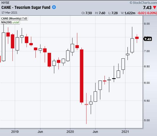
Specifically, we look at sugar, which is found in most processed foods. From a long-term perspective, its demand can help gauge if inflation is beginning to run hot or not. It is also used in the production of ethanol, as sugar is needed to ferment. Ethanol is an additive to gasoline, so not only does this show the use in food/alcohol, but it also ties into travel and the movement of goods.
Looking at the monthly chart of Teucrium Sugar Fund ETF (CANE) we can see that since the crash from last year, CANE has made a comeback to pre-pandemic times. If inflation does begin to heat up under the Fed's radar, CANE should see increased demand and continue to move up as the prices of goods begin to increase. So far, CANE has not made any huge moves, but has been able to build a steady uptrend we can watch to continue.
The last thing to keep in mind is that the underlying pressure for the Federal Reserve to deal with rising interest rates will stem from inflation. Therefore, if things get out of hand by the Fed's metrics, at some point they will have to step in. This is news the market does not like, which is why it pays to understand if inflation is beginning to run hot.
- S&P 500 (SPY): Reached new highs. 394 support
- Russell 2000 (IWM): Bounced off 226.33 10-DMA
- Dow (DIA): New Highs. 320 new support.
- Nasdaq (QQQ): Watching for a second close over the 50-DMA at 320.92
- KRE (Regional Banks): 68.41 support area.
- SMH (Semiconductors): Second close over the 50-DMA of 237.55 brings this back into a bullish phase
- IYT (Transportation): 244.88 support from 10-DMA held
- IBB (Biotechnology): Main resistance 160.60 the 50-DMA
- XRT (Retail): 88.49 next support area the 10-DMA
Mish Schneider
MarketGauge.com
Director of Trading Research and Education
Forrest Crist-Ruiz
MarketGauge.com
Assistant Director of Trading Research and Education
|
| READ ONLINE → |
|
|
|
| DecisionPoint |
| Keeping It Simple |
| by Carl Swenlin |
There are a lot of people worrying about a major market top, and there are just as many (mostly in the fundamental camp) confident that we're on the verge of another major up leg. We can see the logic of both positions, so how can we sort it out? While we need to be aware of the fundamentals affecting the market, we are technical analysts and we need to keep our focus in that area, believing that will give us a solid foundation for our decision-making.
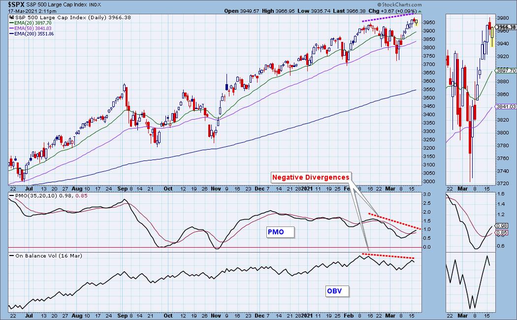
At a very basic level the technicals are negative. Two of our favorite indicators, the Price Momentum Oscillator (PMO) and On-Balance Volume (OBV) have formed negative divergences versus price. A negative divergence is when price makes a top above a top and the indicators make a top below a top. The PMO is the result of a rate-of-change calculation, so it is not so easy to immediately visualize what it means, but it is basically telling us that price is losing internal strength.

OBV is a lot simpler. It is cumulative volume, calculated by adding or subtracting daily volume based upon whether price closes up or down. It is easy to understand that, while price made new highs, volume was not confirming the price move.
CONCLUSION: The negative divergences are "non-confirmations" of the new price highs, and they are telling us that the technicals do not justify the recent price advance. We are seeing similar problems on other indicators, so it is a warning that some kind of corrective action is likely, at least in the short term. It doesn't tell us if the next move will be a major up or down move, but we have a clue in which direction the next move is likely go.

Click here to register in advance for the recurring free DecisionPoint Trading Room! Recordings are available!
Technical Analysis is a windsock, not a crystal ball.
Helpful DecisionPoint Links:
DecisionPoint Alert Chart List
DecisionPoint Golden Cross/Silver Cross Index Chart List
DecisionPoint Sector Chart List
DecisionPoint Chart Gallery
Trend Models
Price Momentum Oscillator (PMO)
On Balance Volume
Swenlin Trading Oscillators (STO-B and STO-V)
ITBM and ITVM
SCTR Ranking
DecisionPoint is not a registered investment advisor. Investment and trading decisions are solely your responsibility. DecisionPoint newsletters, blogs or website materials should NOT be interpreted as a recommendation or solicitation to buy or sell any security or to take any specific action.
|
| READ ONLINE → |
|
|
|
| MORE ARTICLES → |
|
 Chart 1
 Chart 2
 Chart 3

