| THIS WEEK'S ARTICLES |
| ChartWatchers |
| Several Key Indexes Testing Important Support |
| by Martin Pring |
It's never a good idea to try and predict contra-trend moves in a strong equity bull market, because the benefit of the doubt always goes with the prevailing trend. If false moves develop, they have a strong tendency to develop on the downside. That said, several key indexes and indicators have fallen back to levels that have got my attention. These indicators need to hold; otherwise, further downside testing will likely take place.
Chart 1 features the NYSE A/D Line and the common stock A/D Line. Both are trading well above their 200-day MAs, which tells us that the main trend is positive. However, the A/D Line itself has just bounced from a 5-month up trendline, which could prove to be the opening shot in signaling a correction in the event that it is violated. The Common Stock line has not yet broken its trendline, but is obviously at a critical point. None of this says that a new bear market is underway. However, if we do get further weakness in the Common Stock A/D Line, it will definitely add to the weight of the evidence favoring an extension to this week's setback.
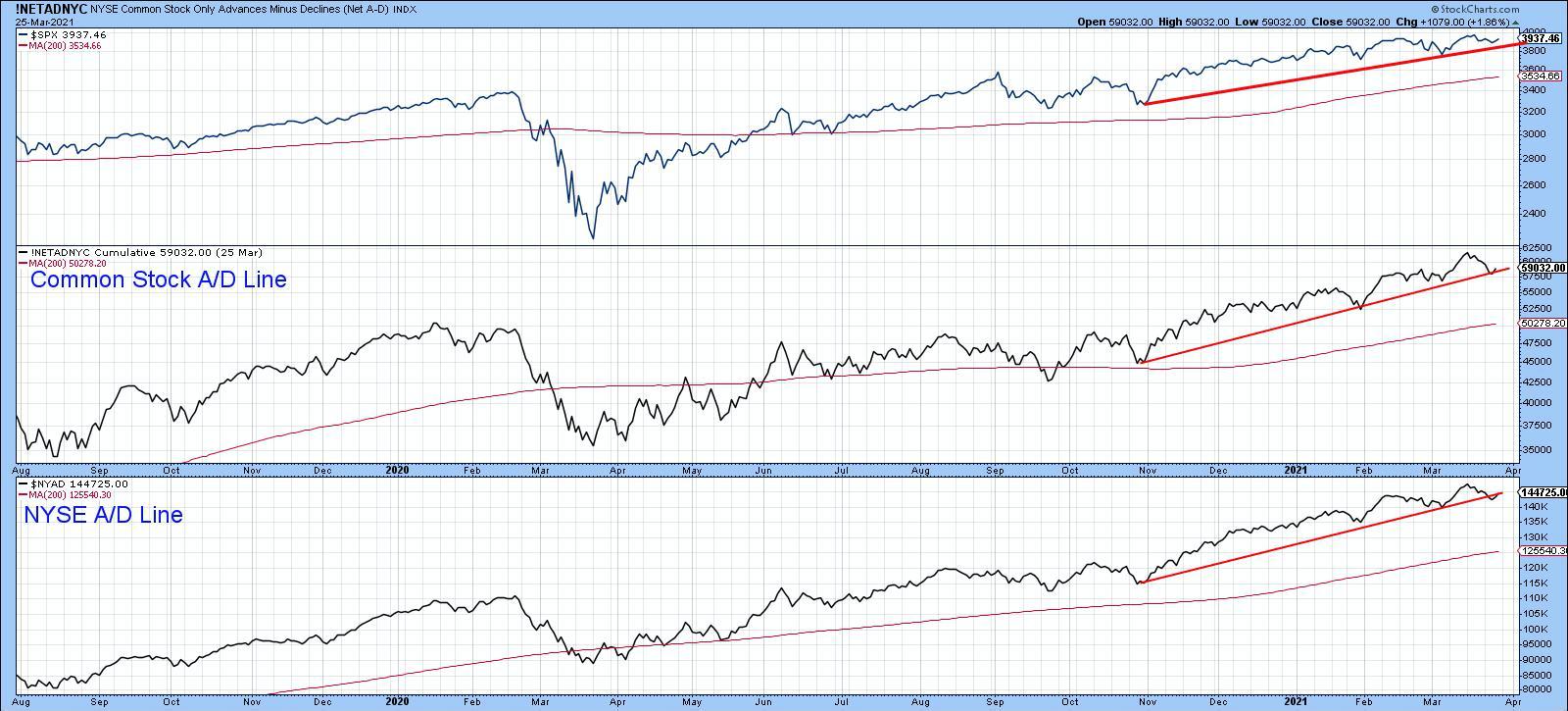 Chart 1 Chart 1
Chart 2 features the MSCI World Stock ETF (ACWI) together with my Global A/D Line, constructed from a universe of country ETFs. The ACWI itself may be in the process of tracing out a head-and-shoulders top, which would occur with a decisive daily close that can hold below $90.75. That's not happened yet, so we should not jump the gun. However, if it does, the A/D Line would likely crack its November/March up trendline, thereby signaling further global weakness.
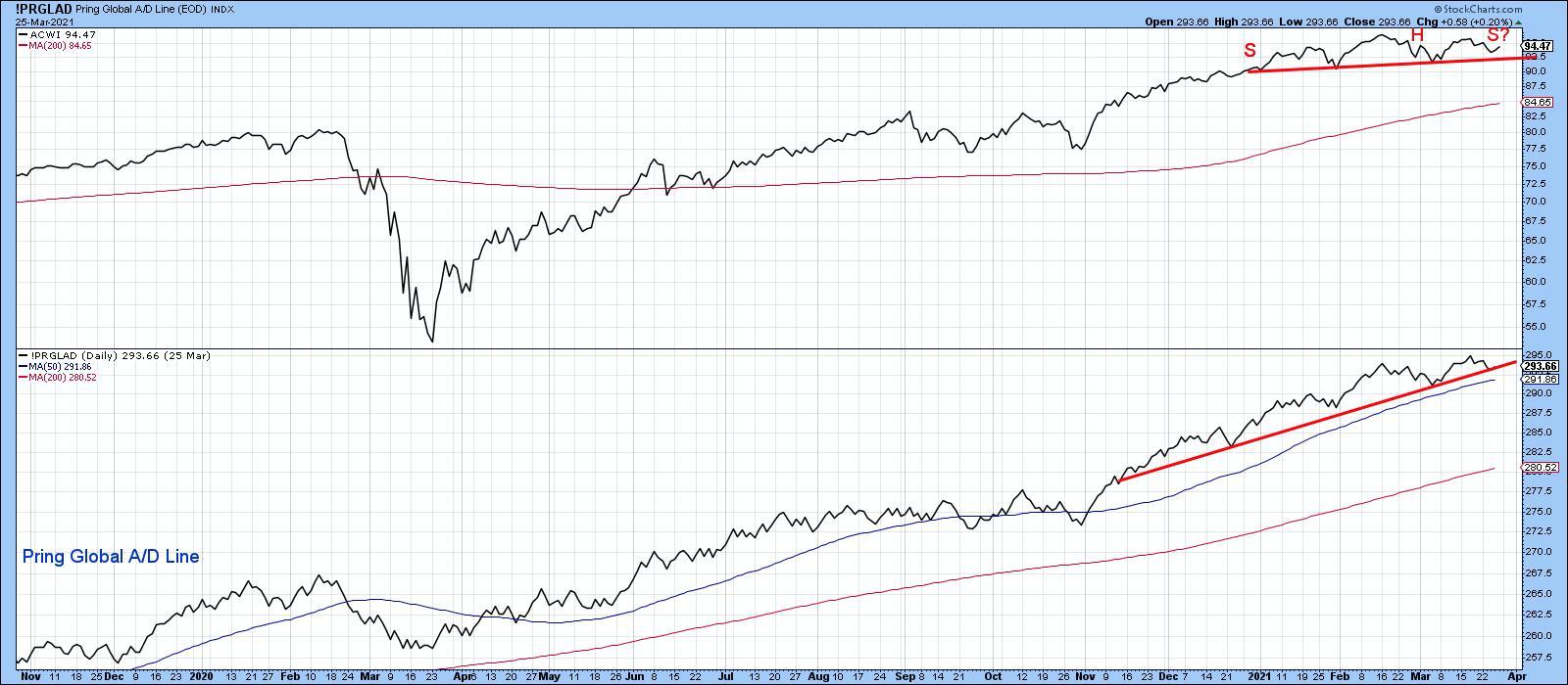 Chart 2 Chart 2
NYSE Composite at Key Support
Chart 3 compares the NYSE Composite to the 10-day MA of the number of NYSE issues trading above their 50-day MAs. The first thing to notice is that the NYSE is struggling to remain above its March 2020-21 up trendline. The good news is that it's a fairly steep line and those kind of violations are normally followed by a consolidation rather than a reversal move. In other words, if it is decisively violated, we are likely to see a sharp but quick shakeout prior to a renewal of the bull market. Note the extended green trendline that joins the 2018 and 2020 highs. If a correction does take place, it's likely to provide strong support.
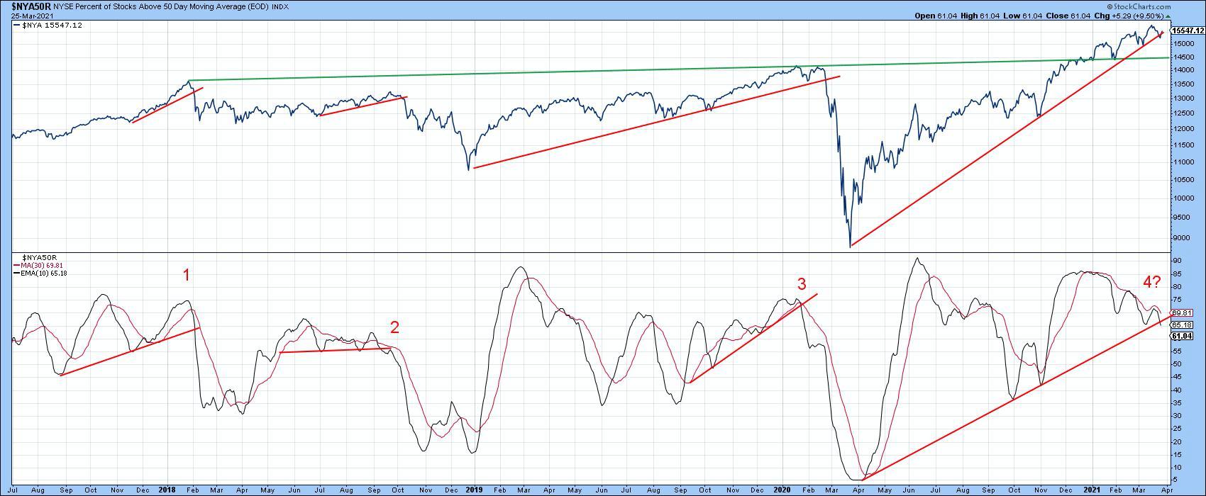 Chart 3 Chart 3
The second thing to note is the fact that the oscillator in the lower window has been diverging negatively with the index since the beginning of the year and is also right at an up trendline. The numbers on the chart represent three previous instances where a trendline for both the price and oscillator were more or less simultaneously violated. The three examples were all followed by a correction of some kind.
Chart 4 compares the NYA to a 10- and 20-day MA of the NYSE Common Stock McClellan Volume Oscillator. The good news is that it is rapidly approaching an oversold reading. However, at the most recent high in the Index, the indicator was barely above its equilibrium level, which, when confirmed, is a sign of weakness. Two previous examples in late 2018 and January 2020 have been flagged by the dashed arrows. The confirmation came from two solid up trendline violations. The NYA is currently resting on a third line, but has not yet decisively violated it.
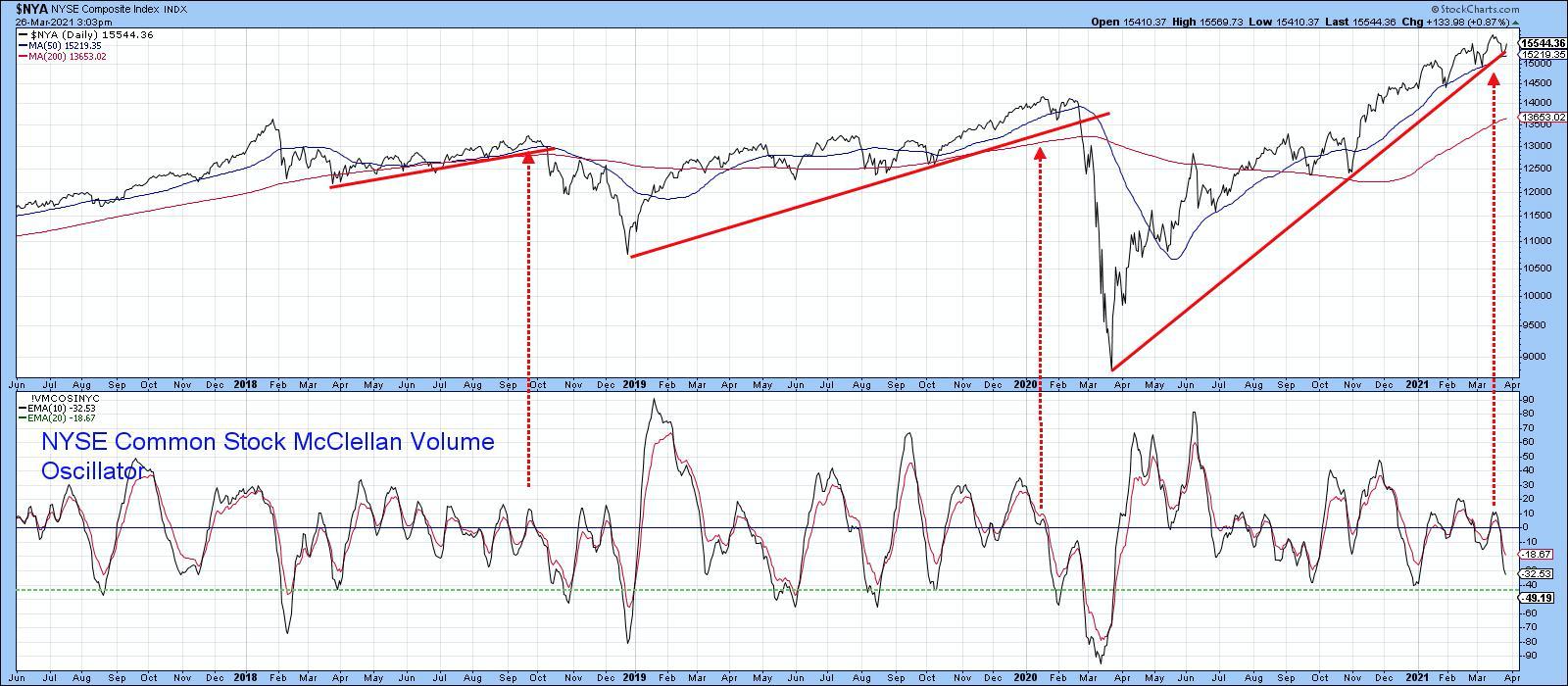 Chart 4 Chart 4
NASDAQ Leading the Way?
Chart 5 shows that the NASDAQ violated its 2020-21 up trendline some time ago and also experienced a break in a similar up trendline for its Bullish Percentage Index. The latter is now resting on the shallower dashed up trendline, further pointing up the critical nature of the short-term technical picture.
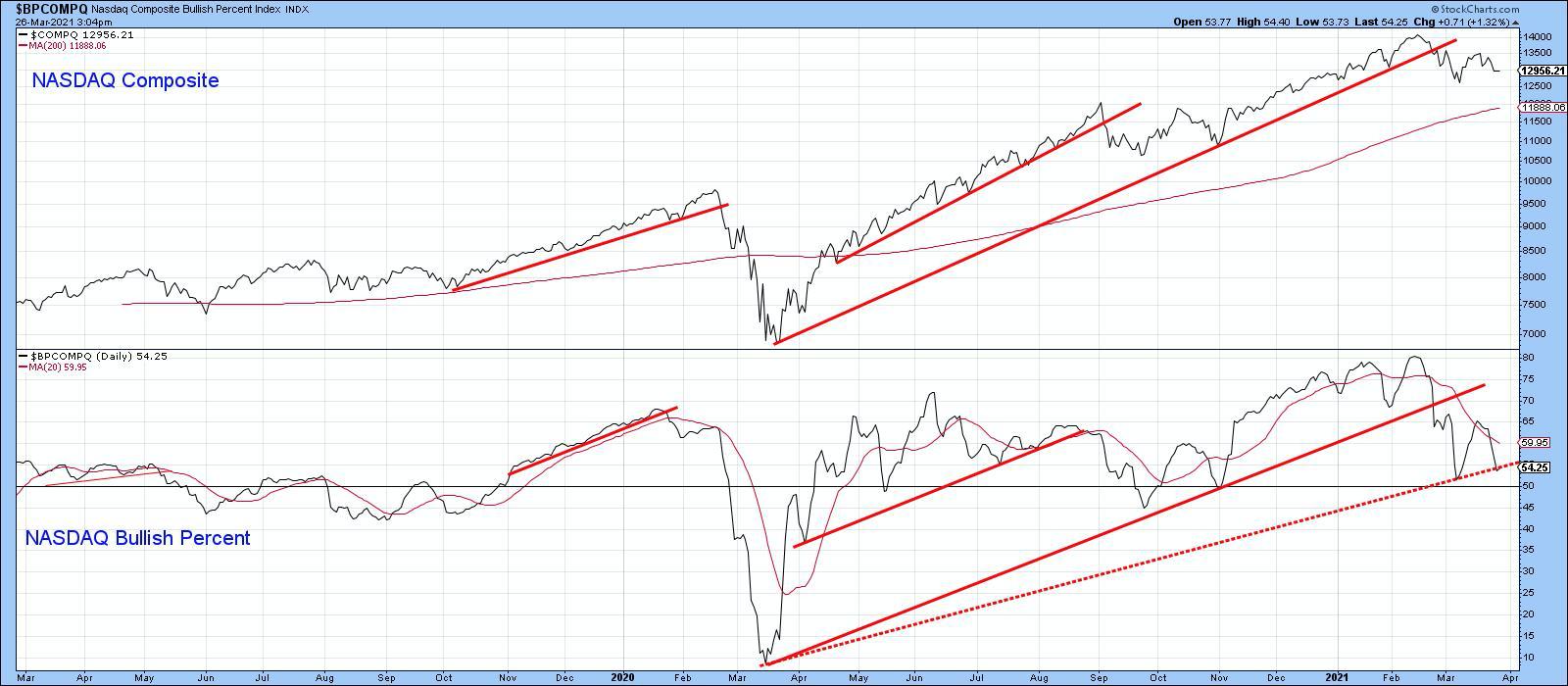 Chart 5 Chart 5
Clearly, none of these indicators have yet broken to the downside. However, these setups are so numerous that, if the breakdowns do materialize, a lot of traders could be temporarily caught on the wrong side of the market.
This is an updated version of an article previously published on Thursday, March 25th at 11:45am ET in the member-exclusive blog Martin Pring's Market Roundup.
Good luck and good charting,
Martin J. Pring
The views expressed in this article are those of the author and do not necessarily reflect the position or opinion of Pring Turner Capital Group of Walnut Creek or its affiliates.
|
| READ ONLINE → |
|
|
|
| John Murphy's Market Message |
| ALUMINUM AND STEEL STOCKS BOOST MATERIALS |
| by John Murphy |
MATERIALS NEAR RECORD... In a generally positive market day, materials are one of the days strongest sectors. Chart 1 shows the Materials Sector SPDR (XLB) gapping higher and nearing a new record. It's being led higher by aluminum and steel stocks which are also having a strong day. Chart 2 shows the Dow Jones Aluminum Index gaining 6% on the day. Steel stocks look even stronger. Chart 3 shows the Dow Jones Steel Index surging to a new record. Homebuilding stocks are also having a breakout day of their own.
 Chart 1 Chart 1
 Chart 2 Chart 2
 Chart 3 Chart 3
HOMEBUILDING RECORD... My St. Patricks's Day message showed homebuilders hitting a new record. They're doing it again today. Chart 4 shows the U.S. Home Construction iShares (ITB) rising into record territory today. Chart 5 shows PulteGroup (PHM) hitting a new record as well. Chart 6 shows DR Horton (DHI) doing the same. Homebuilders are the strongest part of the Consumer Discretionary SPDR (XLY).
 Chart 4 Chart 4
 Chart 5 Chart 5
 Chart 6 Chart 6
CHIP LEADERS... My Wednesday message showed the Semiconductor ETF (SMH) trading below its 50-day moving average. A number of individual chip stocks, however, are trading above that resistance line. One of them is hitting a new record. Chart 7 show Applied Materials (AMAT) in record territory today and well above its 50-day line. Chart 8 shows Lam Research (LRCX) bouncing off its 50-day line today. Chart 9 shows KLA Corp (KLAC) rising above its 50-day line in today's trading. Those three stock are boosting the entire chip group.
 Chart 7 Chart 7
 Chart 8 Chart 8
 Chart 9 Chart 9
|
| READ ONLINE → |
|
|
|
|
|
| ChartWatchers |
| Improving Relative Strength for Homebuilders |
| by David Keller |
Relative strength is one of the most important parts of my technical toolkit. Basically, the idea is to lean into stocks that are working and lean away from stocks that are not working. If that sounds easy, simple and straightforward, that's because it is!
This week, I noticed one group in particular that was demonstrating strong price and relative strength profiles. In this article, we'll break down the homebuilder stocks along with two popular ETFs to gain exposure to the space.
The chart of Lennar Corp (LEN) below shows strong relative performance from the March 2020 market low to the end of September.
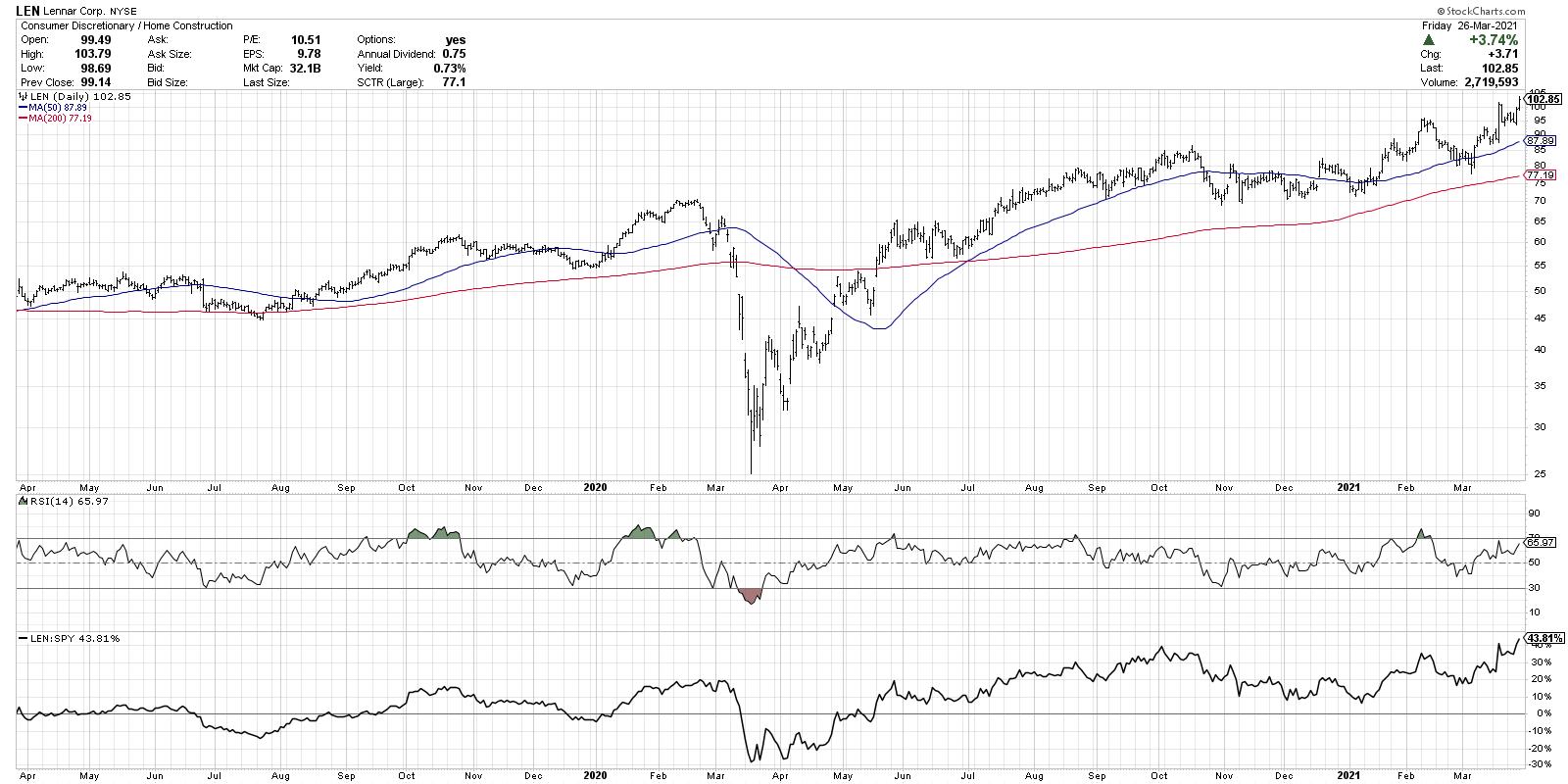
Notice how the relative strength turned down in the 4th quarter of last year, as LEN remained in a sideways consolidation phase while the S&P 500 pushed to higher highs in November and December. Once the new year began, Lennar resumed its uptrend and has handily outperformed the S&P 500 benchmark for the last three months.
While LEN certainly seems to have an attractive technical setup here, many investors choose to gain exposure to this group using ETFs. There are two popular ETFs that have large exposure to homebuilders: the iShares US Home Construction ETF (ITB) and the S&P SPDR Homebuilders ETF (XHB).
It's worth noting that while both of these ETFs have almost doubled the return of the S&P 500 index for the last 12 months, there are subtle differences between the two. The ITB is comprised of about 60% homebuilding stocks, and the other 40% is made of home improvement stocks like Williams Sonoma (WSM), Sherwin Williams (SHW) and Home Depot (HD).
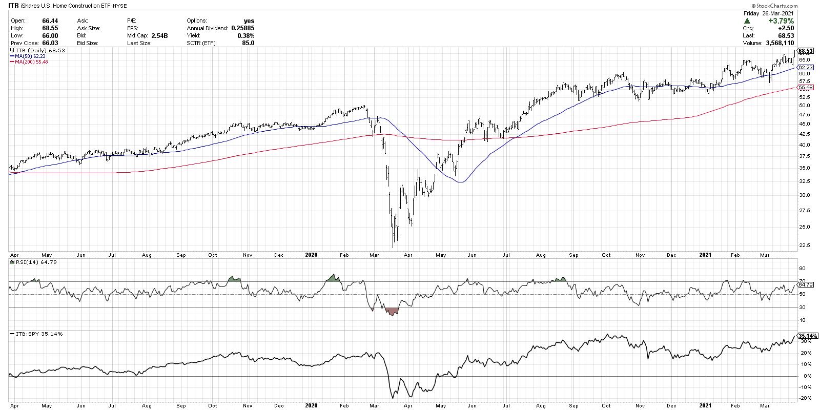
The XHB, on the other hand, is only 30% homebuilders, while the remaining 70% are other home improvement names. So in the case of XHB, the largest weight in the ETF is in WSM, which isn't a homebuilder!
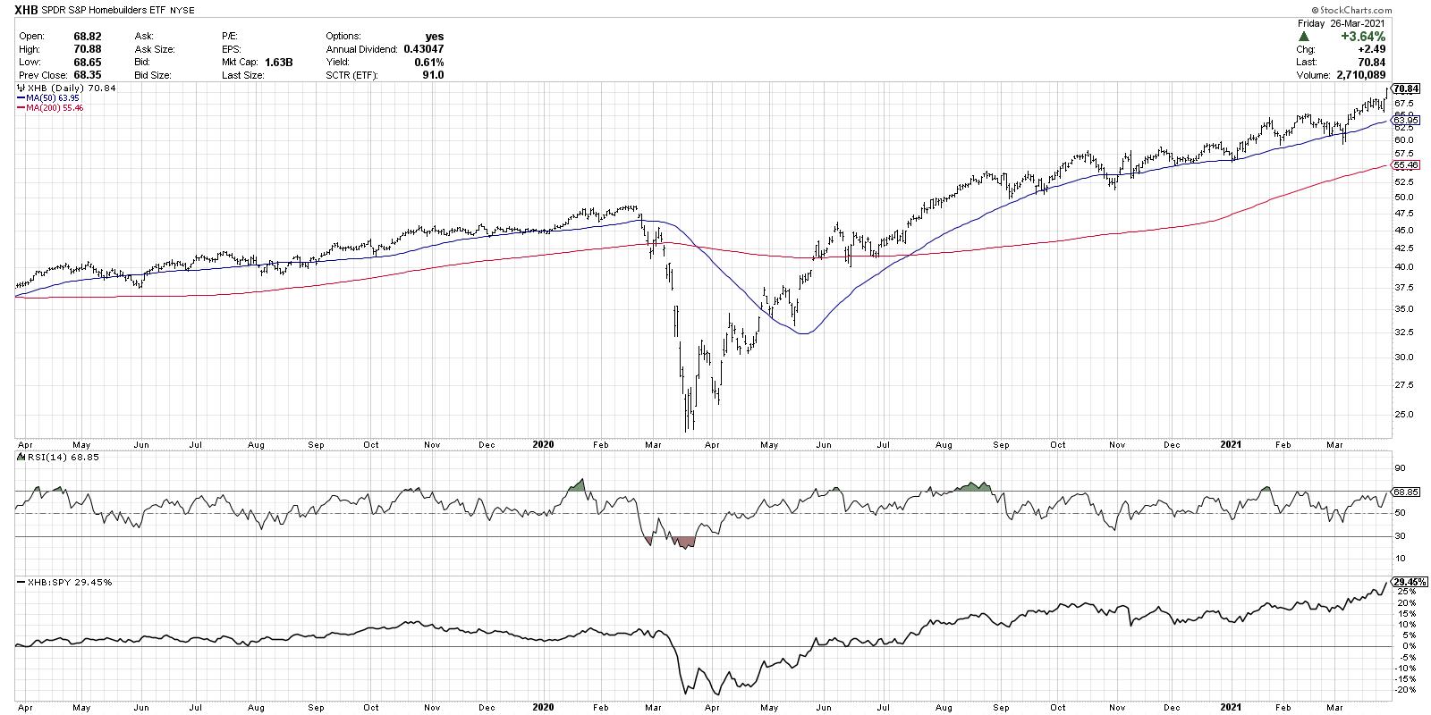
The good news for these ETFs is that, regardless of their weightings in homebuilders versus other related groups, the price and relative strength profiles speak for themselves. They are in established uptrends of higher highs and higher lows. The relative strength has made new 52-week highs this week, as the stocks have pushed higher while stocks in other sectors have been pulling back or consolidating.
Want this article in video format? Just click the image above!
Technical analyst John Roque used to relate stock portfolios to baseball teams. If you were managing a baseball team and you were trying to defeat the New York Yankees (who wouldn't?), would you put your "pretty good" players on the field? Or would you put your top performers out there to provide your team with the best opportunity to win?
Why would you do any different with your portfolio?
RR#6,
Dave
P.S. Ready to upgrade your investment process? Check out my free course on behavioral investing!
David Keller, CMT
Chief Market Strategist
StockCharts.com
Disclaimer: This blog is for educational purposes only and should not be construed as financial advice. The ideas and strategies should never be used without first assessing your own personal and financial situation, or without consulting a financial professional.
The author does not have a position in mentioned securities at the time of publication. Any opinions expressed herein are solely those of the author, and do not in any way represent the views or opinions of any other person or entity.
|
| READ ONLINE → |
|
|
|
|
|
| ChartWatchers |
| One Of The Market's Biggest Mysteries..... Solved |
| by Tom Bowley |
I'm sure that most of you have heard that old Wall Street adage "buy on rumor, sell on news." Well, it's never truer than with earnings. Wall Street meets with management teams prior to the end of the fiscal quarter and gathers a lot of information. It's one big advantage that Wall Street firms have over you and me. They have the ability to find out exactly how quarters are looking, then return to their offices and begin buying (or selling). The actual earnings news isn't released for another 3-4 weeks or longer. It's also the big reason why companies tend to move much higher into a solid earnings report. By the time the earnings are announced, it's simply too late for those trying to chase those moves.
Before I give you a couple specific company examples, let me provide you the actual returns of the S&P 500 for each calendar quarter, broken down by first half of the quarter and then the second half of the quarter. Here are the annualized returns on the S&P 500 since 1950:
Quarter 1 (January 1 - March 31):
January 1 - February 15: +12.38%
February 16 - March 31: +4.87%
Quarter 2 (April 1 - June 30):
April 1 - May 15: +14.48%
May 16 - June 30: +1.70%
Quarter 3 (July 1 - September 30):
July 1 - August 15: +8.43%
August 16 - September 30: -2.83%
Quarter 4 (October 1 - December 31):
October 1 - November 15: +14.24%
November 16 - December 31: +18.68%
In every calendar quarter, except the fourth quarter, the first half of the quarter is BY FAR the better half. It's not even close. It's all the "buying on rumor" that drives U.S. equities higher. The numbers above relate to the entire S&P 500, but many companies are known for beating earnings and they tend to see huge moves heading into earnings, so let's check out one of the most popular pandemic growth stories.
Shopify, Inc. (SHOP)
From the low in the month prior to earnings to the close the day before earnings, SHOP has averaged gaining 45.74% the past 5 quarters. The average holding period has been 37 days, or roughly 5 weeks. 45% in 5 weeks on average - that's not too shabby. Here's the chart:
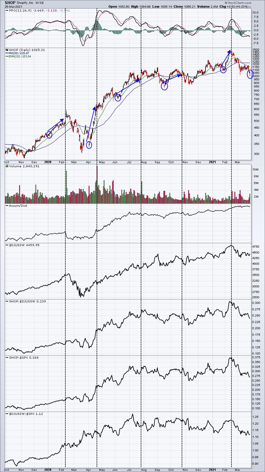
I see similar patterns nearly every quarter. Shortly after earnings, SHOP takes a hit on big volume. It's probably those that chased after big earnings having to panic sell after huge post-earnings selloffs (sell on news). I know many are arguing that growth companies are wildly overpriced, that we're in a bubble. I just don't see it. In the case of SHOP, it's trading at the same level it traded at last summer, despite huge increases in earnings. Granted, SHOP more than tripled during the first 3-4 months after the pandemic began. It makes sense to see a period of consolidation, which we've seen with SHOP. We're going to find out over the next 4-5 weeks whether Wall Street returns to buy shares leading up to its next earnings report. SHOP has averaged moving up 45% from the lows of the month prior to earnings up to the close just before earnings are released.
I'm planning to release another stock on Monday that tops SHOP in terms of average pre-earnings advances (+51%) and it does it in even fewer days (29, or roughly 4 weeks). Simply CLICK HERE to sign up for our FREE EB Digest newsletter and see if you can correctly name the company. It's been struggling just like SHOP for the past 6-8 weeks, but may be primed for another HUGE pre-earnings advance.
Happy trading!
Tom
|
| READ ONLINE → |
|
|
|
| The Traders Journal |
| Balance: How It Puts Money In Your Pocket, And How You Can Achieve It |
| by Gatis Roze |
 I just revisited the past 30 years of my trading journals. The objective of my little research study was to investigate whether there was a discernible correlation between my actual annual investment performances and if they were impacted by what I'll label as my "personal annual equilibrium score". That's the score I assign myself with an A through D grade each year. Let's not get into 2020 being the outlier year it was. I just revisited the past 30 years of my trading journals. The objective of my little research study was to investigate whether there was a discernible correlation between my actual annual investment performances and if they were impacted by what I'll label as my "personal annual equilibrium score". That's the score I assign myself with an A through D grade each year. Let's not get into 2020 being the outlier year it was.
The unequivocal answer was "yes, indeed!" It also produced reason #327 as to another benefit of keeping a trading journal. In my estimation, 30 years is a statistically significant sample size for this type of query. In my next book, I will summarize reasons #1 through #327 as to why every serious investor would benefit from keeping a personal trading journal. But that's for another day.
The interrelation was clear. In those particular years, I scored: the highest "Balance Grade", my investment performance was stronger as well. The inverse was also true. My life and my investing were measurably better when my personal equilibrium was on an even more solid footing.
I did consider the reverse as well whereby life's balance was driven by the degree of my success in the markets. My journal notes, however, negated that theory. My life's balance seemed to be the driver of my market success. Balance was part of the investment equation as well. Here's why. I've written about this before but my trading journal makes the case that it was my asset allocation skills (balanced investing) and less my stock-picking skills that produced the superior results.
My journals support the proposition that to achieve outperformance in your portfolio, you need to ensure that both balance in your personal life and balance in your investing life work together simultaneously — whether that investing balance is asset allocation, diversification or whatever label you care to use. My point being that plunging into the "hot" stocks of the day is not a consistent profitable long-term strategy.
You might think of this similar to the ancient Chinese philosophy of Yin and Yang which represents the concept of dualism. How contrary spheres in life might actually be interconnected and complementary. This, I believe, is the case here between one's personal equilibrium and one's investing stability.
So here are some key observations made from my Trading Journal review research.
- The greater the tension in one's life balance, the higher the likelihood that tension will be transferred to one's investment efforts and results.
- A preoccupation with the past and the future produces fear and anxiety in both spheres — personal and investing. Your focus needs to be on the "now".
- When you venture beyond the edge — where you jeopardize your stability — success will become out of reach. Allowing yourself to become consumed by either financial or personal goals will hurt both.
- Losing control of your time and routines will lead to losing your evenness in life and investing.
- If you neglect your exercise, health eating or proper sleep, you'll deplete your ability to maintain your balance.
- Your portal to personal performance is to commit to maintaining both your life balance and investing balance.
That said, I'd like to encourage you to pursue improving your personal balance in both spheres — your everyday life and your investing life. Promise yourself to explore those tools and apps that are available as you undertake your own action plan. Here are just a few examples of tools that could be helpful for you.
- TIMENEYE — it's a basic personal time tracking app that monitors how you spend your time. It syncs with Google Calendar as well.
- Workout apps such as TRIBESPORTS can help you regularize your workouts. This arenas has many options you can explore. I will admit that I do like my Apple watch for this purpose.
- Based on the Pomodoro technique, FOCUS BOOSTER is an app that helps you set "focus time" that can be a powerful productivity aid.
- WAY OF LIFE is an app that can help you purge your bad habits and develop helpful ones. It displays charts, trend lines and scoreboards for those who relate to visual analysis.
- COJI FAMILY ORGANIZER is an app that helps you manage family schedules, appointments and activities. It also syncs with Google Calendar.
- STRESS TRACKER is an app that helps you minimize or eliminate stress. It does this by capturing stress levels with "insight tools" to identify your biggest stress triggers and teaching you to avoid them.
So there you have it! My Trading Journal taught me this fundamental principle — a balanced life is a more profitable life. As the old saying goes, the best time to plant a tree was 20 years ago, but the second best time is today.
Trade well; trade with discipline!
- Gatis Roze, MBA, CMT
StockMarketMastery.com
|
| READ ONLINE → |
|
|
|
| ChartWatchers |
| Tech Is a Drag |
| by Julius de Kempenaer |


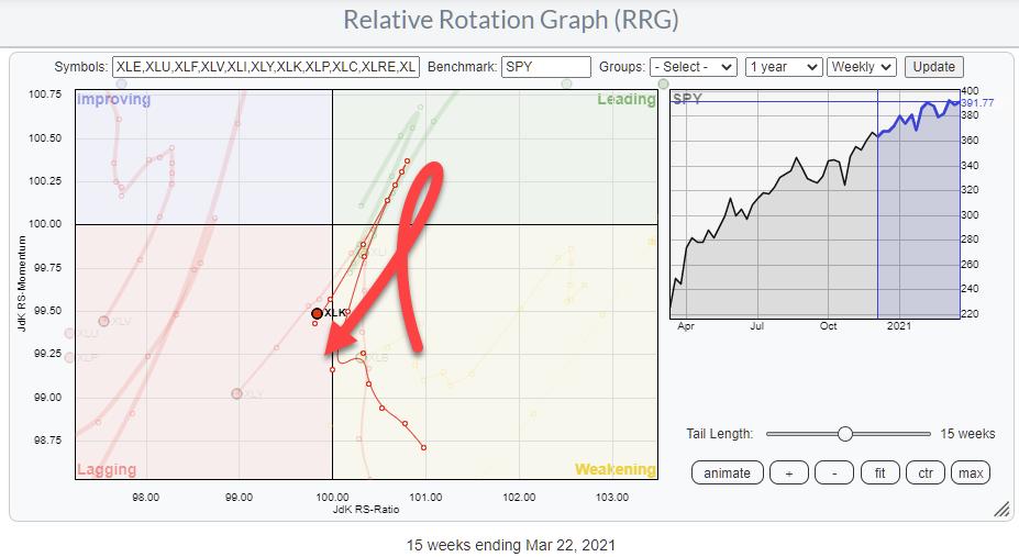
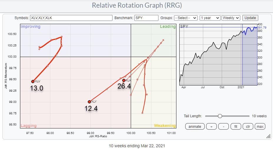
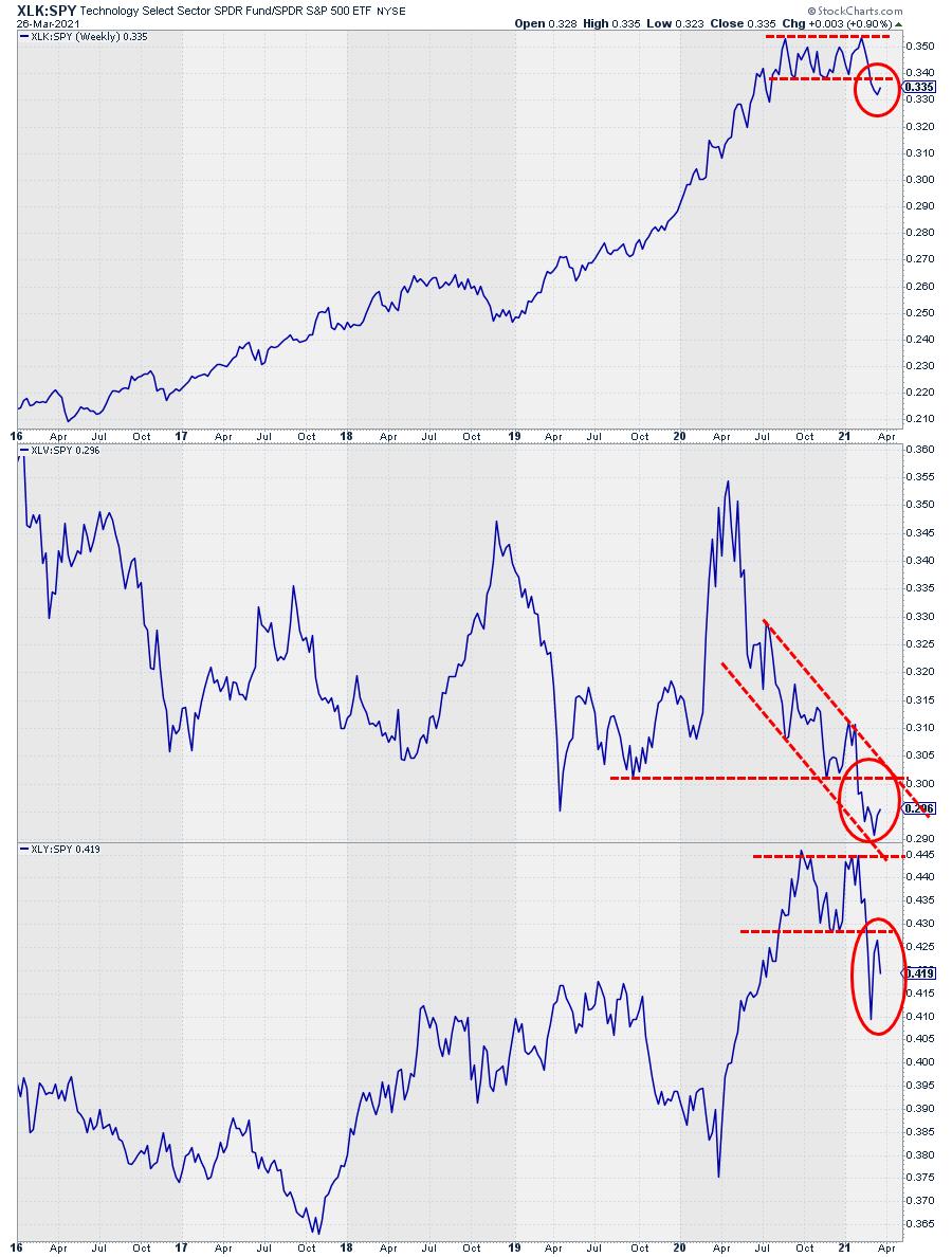
There is no doubt about it; Tech(nology) is an important sector. As a matter of fact, it is a crucial sector. At 26% weight inside the S&P 500 index, technology is twice as big as the next biggest sector -- Health Care at 13% -- and number three, Consumer Discretionary, which has a weight of 12.4%. Or in other words, Tech alone is as big as Health Care and Discretionary combined.
So if Tech becomes a drag, that's serious, and it could have, or better will very likely have, an impact on the market in general.
Let's talk about the weight in sectors. We'll zoom in on these three top sectors in the S&P 500:

All three, with a combined weight > 50%, are negatively affecting the S&P 500.
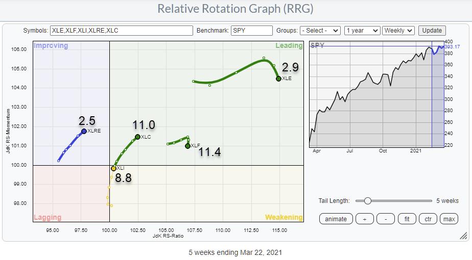
The next RRG shows the tails for XLRE, XLC, XLI, XLF and XLE, which are all (more or less) pulling the market (SPY) in a positive direction.

The combined weight for these sectors is just below 37%, including Energy and Financials, which have already started to roll over (i.e., losing relative strength). If we leave out XLF and XLE, only just over 20% positive pull remains. With such an imbalance, it will be tough for SPY to continue its rise at the pace we have seen recently.
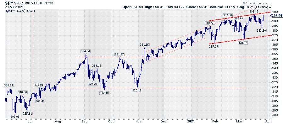
Just to be clear, the long-term trend for SPY is still up. But the current rotation and, in particular, the rotation of these top-three heavyweight sectors seems to be putting the brakes on the acceleration for now. Whether it will become a more serious decline or just a small or sideways correction remains to be seen. IMHO, it's too early to tell, but I will keep a closer eye on the rotation of these top-three sectors.
When tech is a "drag," it's very hard for the market to move seriously higher. We need a lot of power in other sectors to offset a weak technology sector's negative effects. When the top-three sectors are negatively affecting the market, I think it should be seen, at the minimum, as a warning signal.

It fits, at least in my mind ;) , the current change in the angle of the rise for the S&P 500. From November until late January, the rally traced out a regular rhythm of higher highs and higher lows. That series got interrupted by the drop at the end of the month. From there onwards, the swings got wider, which equals uncertainty, and the angle of the trend seems to have flattened.
I will be the first to admit that trend-lines with only two touch-points (the two bright red dashed lines) are as good as useless. So I won't label them as support or resistance, at least not yet. But I do think that the slope's decreasing angle signals that sellers seem to be getting a bit more aggressive than they had been since September-November last year.
What Do We Need to Get (Tech) Back on Track?

The chart above shows the relative strength lines of the top-three sectors vs. SPY. Pretty clear (further) weakening is visible in all three, I think. Technology dropped out of a sideways pattern after a steep rise. Health Care dropped to new lows, continuing the relative downtrend in play for almost a year. Discretionary completed a text-book double top, including a pull-back to the breakout level.
What do we need to get this train back on track? I would like to see at least two, but preferably all three, of these sectors get into a relative uptrend again, creating a positive pull.
My regular blog is the RRG Charts blog. If you would like to receive a notification when a new article is published there, simply "Subscribe" with your email address.
|
| READ ONLINE → |
|
|
|
| ChartWatchers |
| Follow This Path to Easily Uncover Top Stocks! |
| by Mary Ellen McGonagle |
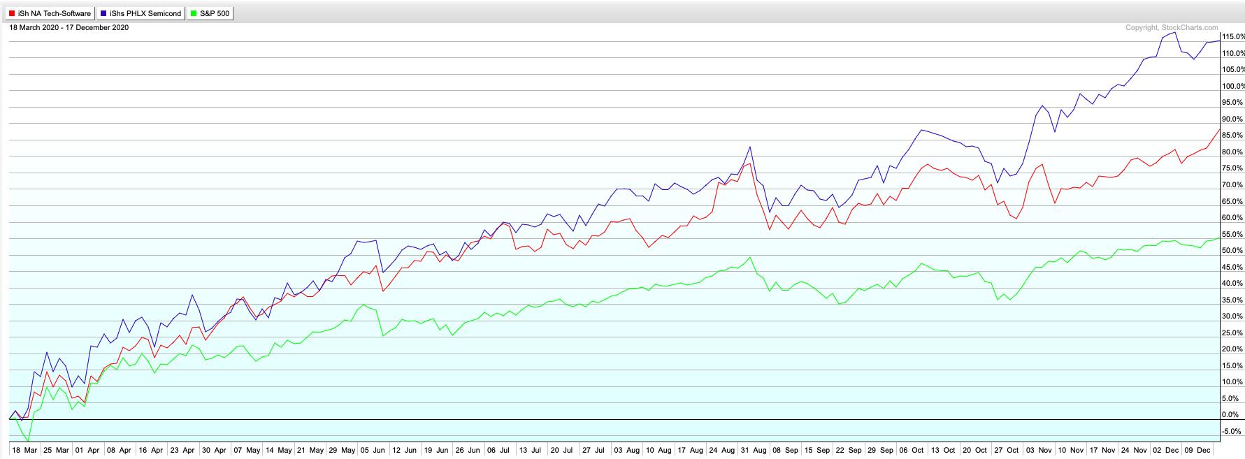
Have you ever noticed that top-performing stocks travel in groups? Just look at last year's biggest winners out of the bear market, where Technology stocks far outpaced the markets.
Within Technology, many out-performers were Cloud Computing stocks. Software companies that helped corporations store large amounts of accessible data saw high demand, as did high-tech Semiconductor chips which analyze this data.
S&P 500 (green) vs Software (red) and Semiconductor (blue) Stocks March - December 2020

My MEM Edge Report alerted subscribers to select Software and Semiconductor stocks that went on to gain up to 212% from March into November of last year. A major part of our selection was due to keying in on these strong groups.
Simply put, uncovering which Industry groups are outperforming is critical to getting in front of winning stocks. This is because the majority of leading stocks are in leading industries.
According to William O'Neil – whose company I worked with for many years – 37% of a stock's price movement is directly tied to the performance of the industry group they're a part of, with another 12% due to the strength of the overall sector they're in. That means that roughly half of a stocks move is attributable to what area of the market they're in.
With that in mind, I'd like to share a simple strategy that can help to uncover which industry groups are exhibiting strength. That is, pay attention to the price performance among a basket of ETFs. It could be the 11 underlying sectors within the S&P 500, coupled with more refined, themed ETFs. (You can create a list in StockCharts.com and be sent this list on a daily and/or weekly basis, ranked by the performance numbers for each ETF.)
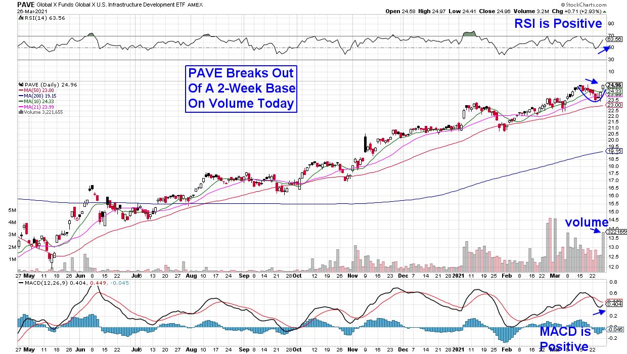
Below is a chart of the U.S. Infrastructure Development ETF (PAVE) which has been consistently hitting my screens since the beginning of the year while really coming into focus due to its outperformance as Technology peaked in February.
DAILY CHART OF US INFRASTRUCTURE DEVELOPMENT ETF (PAVE)

PAVE is a market cap-weighted index of US-listed companies that derive the majority of their revenue from (or have a stated business purpose related to) infrastructure development. Not only are these stocks in strong recovery or cyclical areas of the market, but many stand to benefit from Biden's proposed $3 trillion new spending plan that was announced last week, as a good portion will go to infrastructure projects.
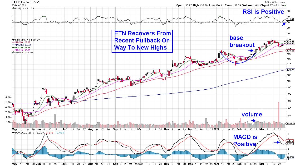
A review of the top ten holdings in this ETF reveals a candy store of possible candidates. Today, we'll review a stock that was added to the MEM Edge Suggested Holdings List in late February following its base breakout on volume.
DAILY CHART OF EATON CORP Plc (ETN)

Eaton (ETN) provides electrical power and control equipment and is considered to be at the center of a paradigm shift in the U.S. electric grid. The stock pulled back from an overbought position earlier this month and its break back above its shorter term moving averages puts it in a position to trade higher.
I'd love to share my other top picks in Cyclical areas of the market such as Financials, Energy and Industrials. Just use this link here for a 4-week trial of my bi-weekly report. In addition to precise entry and exit points for selected stocks, you'll receive market and sector insights not found elsewhere.
You can also watch the latest episode of my weekly StockCharts TV series The MEM Edge at this link.
Warm Regards,
Mary Ellen McGonagle, MEM Investment Research
|
| READ ONLINE → |
|
|
|
| Top Advisors Corner |
| Wall Street Sentiment - One Year From the Low: Cause for Concern |
| by Mark Young |
In our last submission, we wondered aloud, "Is it time to panic?" and, despite the ugly decline, our answer was a resounding "I don't think so." We allowed that the market might well have some more weakness to work off the over-bought condition, but my read was that there were far too many shorts and far too much stubborn bearishness. Additionally, I noted that the options premiums were more consistent with a ST low than an intermediate-term top. I felt that rather than planning for a bear market, we saw reason to be looking for a buyable low, which we thought remarkable. A few weeks later, the market made a good low and then began an 800-point rally.
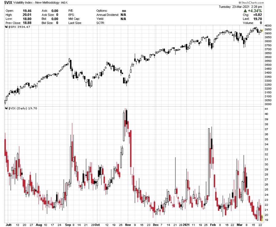
When we last commented on the VIX, it had shot up dramatically at the start of a correction, which I took to be a generally constructive sign. Today, the VIX is lower than it has been in over a year, even as the market has deteriorated. This causes me at least a bit of concern.

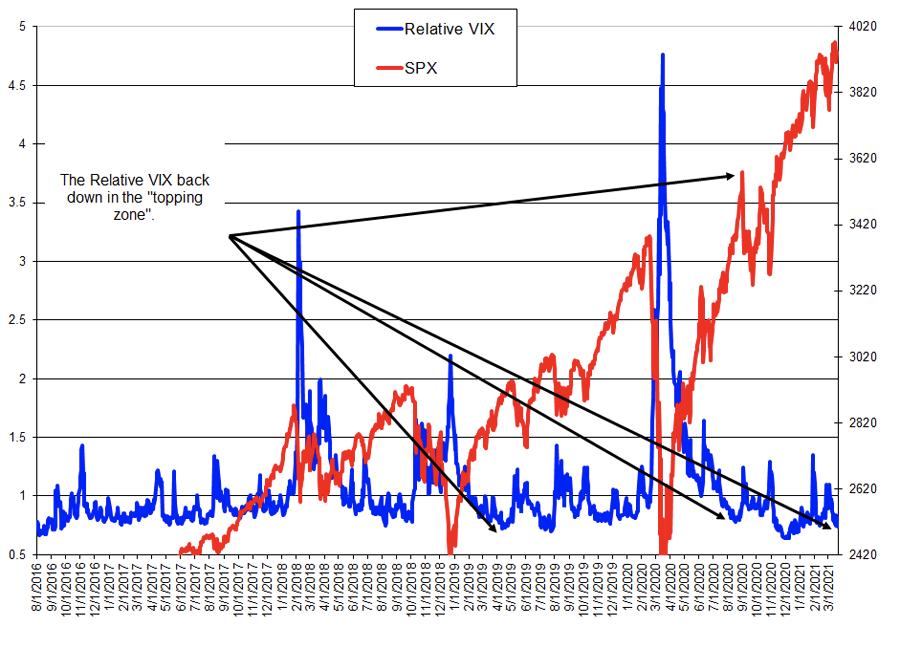
Similarly, the relative value of the VIX has fallen to levels that have been loosely associated with IT tops (though this is only a condition, not a surgical top-picking tool). This tool is very good at picking bottoms, but less useful for picking tops precisely.

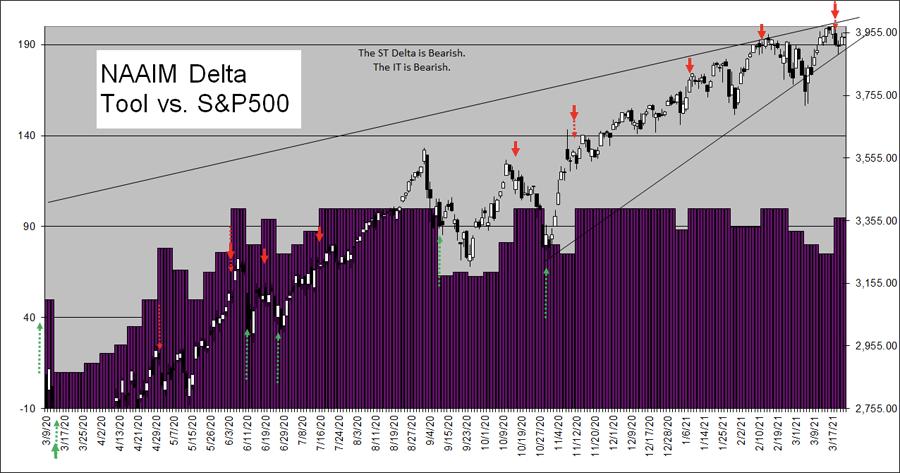
The NAAIM median exposure had pulled back, but last week, it shot up into IT Sell territory. However, as the chart shows, this is only a warning level. The NAAIM players are smart and very aware of the trend, and they are likely to be bullish for a long time before a major top. That said, I generally don't like big bullish shifts in NAAIM median exposure, especially above the 90 level.

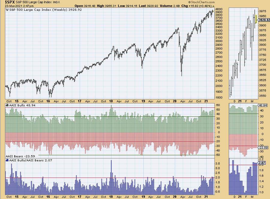
Note that NAAIM is not to be viewed as a surgical tool for top-picking either, since they do know what they're doing. On the other hand, AAII (individual investors) have been showing more Bulls than Bears for a while now, and for the past two weeks, they've been up in Sell territory, despite some dicey market action. These traders seem to be unfazed, as though they've been trained to ignore weakness.

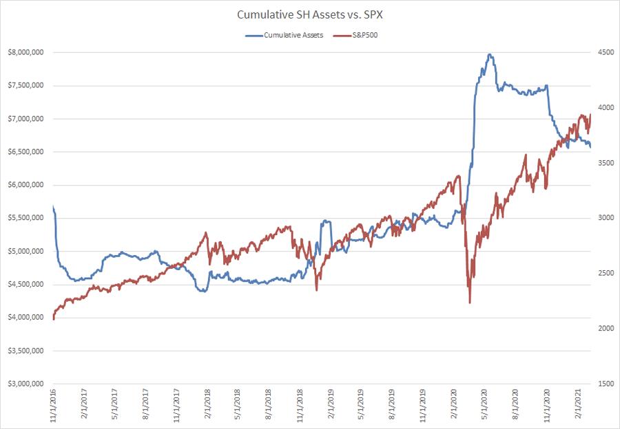
In addition to the excessive and stubborn bullishness among individual investors, there has been significant short-covering in the SH. They have covered something like 86% of their record levels of shorting in the SH (the Short S&P ETF). For the longest time, this crew was stubbornly short (representing support for the market), but finally, in recent weeks, these Bears seem to have largely capitulated.

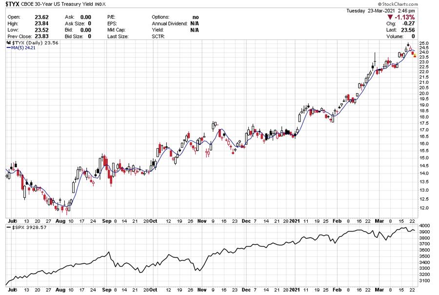
Now, sentiment alone isn't enough to stop a rally -- there needs to be something that the market doesn't like to trigger meaningful selling. One thing that might start bothering the market is the fact that the Long Bond is in a confirmed Bear Market. The TYX (Long yield) appears to have gone parabolic. Whatever Fed policy may be, the Bond Market Vigilantes may make enough of a ruckus to rattle the equity markets.

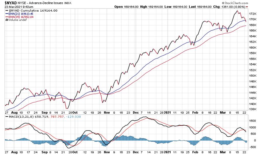
Breadth, too is suggesting that "somebody" is lightening up. When Breadth is sloppy on a good bounce in the market, it suggests that one or more big players are getting ready to take a little bit of money off the table.

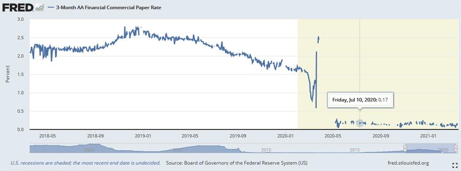
On the flip side, however, there seems to be no lack of availability of money. Not only that, but no concern about the banks' balance sheets, despite the adverse move in the long bond. 3-month AA rated Financial Commercial Paper is yielding just 12 basis points. If rising rates were about to throw markets into long-term chaos, it's very likely that concerns would leak into the Commercial Paper market first. That's not happening.

So, despite some legitimate concerns about this market and the need for a healthy correction, we see plenty of reason to be constructive on weakness here. I'm inclined to lighten up on riskier holdings and underperforming issues, and maybe write some calls vs. longs and take off leverage, but, should meaningful weakness develop, I'd be inclined to look for excuses to get back in, should the bottom-spotters trigger. I doubt the long side will be as easy as it was for the last year, but with liquidity where it is, buying dips for a trade seems likely to be a winning strategy.
Have a prosperous week!
Mark Steward Young
Wall St. Sentiment
http://www.wallstreetsentiment.com/trial.htm
|
| READ ONLINE → |
|
|
|
| MORE ARTICLES → |
|
 Chart 1
 Chart 2
 Chart 3
 Chart 4
 Chart 5


 I just revisited the past 30 years of my trading journals. The objective of my little research study was to investigate whether there was a discernible correlation between my actual annual investment performances and if they were impacted by what I'll label as my "personal annual equilibrium score". That's the score I assign myself with an A through D grade each year. Let's not get into 2020 being the outlier year it was.
