| THIS WEEK'S ARTICLES |
| John Murphy's Market Message |
| AMAZON TESTS OLD HIGH ON STRONG EARNINGS |
| by John Murphy |
AMAZON RALLIES ON STRONG EARNINGS... Amazon was the last of the big five tech stocks that reported earnings this week. And it reported strong quarterly profits as did the other big tech stocks. Of those four, Facebook and Alphabet gained ground while Apple and Microsoft pulled back on the strong earnings. As suggested in my last message, how stocks react to strong earnings can tell us something about the stock's technical condition. So far, the stock's reaction has been positive. But it's undergoing an important test. Chart 1 shows Amazon.com climbing today to the highest level in seven months and in the process of testing its early September peak. Its relative strength ratio in the upper box is turning up as well after several months of relatively weak performance.
 Chart 1 Chart 1
NASDAQ TESTS FEBRUARY HIGH...The Nasdaq market is also testing overhead resistance. Chart 2 shows the Nasdaq Composite Index up against its February peak. It's the only major stock index that has yet to clear that chart barrier. The Nasdaq is heavily influenced by the technology sector which has been one of the market's weakest sectors over the last week. Any pullback from current levels could lead to a period of sideways consolidation.
 Chart 2 Chart 2
S&P 500 SHOWS SLIGHT NEGATIVE DIVERGENCE...Chart 3 shows the S&P 500 pulling back today after hitting a new record yesterday. While it's trend is still clearly higher, is too may be vulnerable to some consolidation. Chart 3 shows its 14-day RSI line starting to weaken from overbought territory over 70 and forming two declining peaks (see arrow). That type of negative divergence often leads to a short-term pullback or a period of sideways trading.
 Chart 3 Chart 3
SELL IN MAY?... According to the Stock Trader's Almanac, April marks the end of the best six months of the calendar year beginning in November and the start of a seasonal period of weaker performance over the next six months. That's the genesis of the "sell in May" slogan which often leads to some profit-taking during that month. While that's only a seasonal tendency, it may be worth keeping in mind with a stock market that looks stretched on the upside.
|
| READ ONLINE → |
|
|
|
| The Mindful Investor |
| Eli Lilly: Perfect Example of Price Distribution |
| by David Keller |
I look at hundreds of charts every single day. Every once in a while, I come upon a chart that I feel should be in future textbooks on technical analysis. One chart that seems to provide a perfect example of best practices in price analysis and investor behavior.
This week's review of stocks on the new 13-week high and low lists yielded one such chart: Eli Lilly & Co. (LLY).
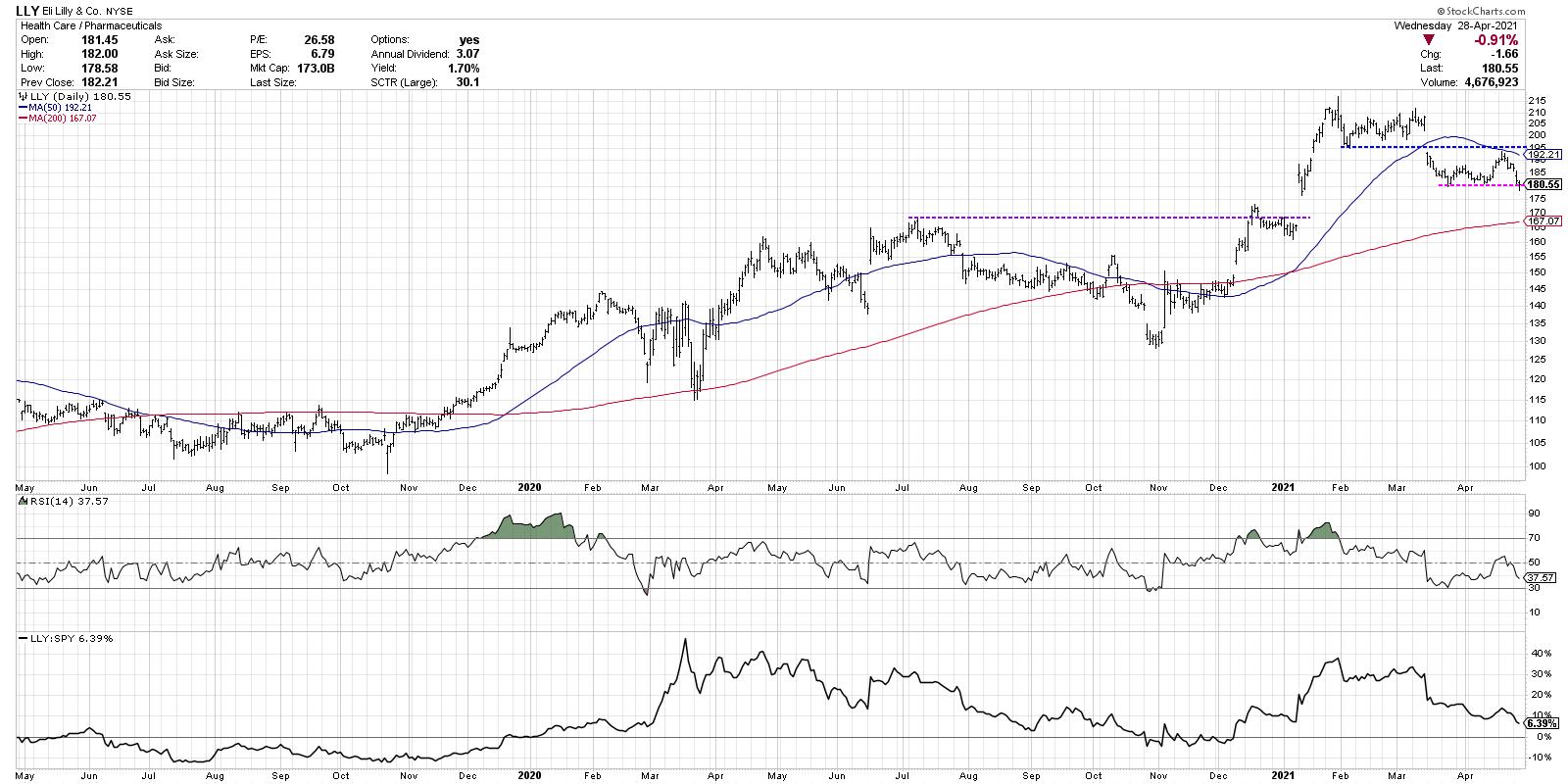
Rewind to January 2021 and you have quite a bullish configuration. The stock gapped higher above price resistance, finally eclipsing the July 2020 high. The stock made a series of new highs as the relative performance (bottom panel) continued to trend higher. This was a solid chart.
Something changed in February, when the price stopped making new highs and settled into a range between 195 and 215. We called this a consolidation phase, which I often refer to as a "digestion period." Imagine that you had a big meal and you need to just relax and spend some time digesting what you just ate. That's LLY in February.
Then, in March, the stock gapped down below price support, moved below its 50-day moving average for the first time in four months and saw its relative strength turn lower. This begins what I would consider the distribution phase, which is where LLY remains to this day. Afterwards, in April, the stock traded back up to price resistance and failed. The stock also tested a declining 50-day moving average from below and pulled back quickly from that level.
Perhaps the most telling indication of distribution is using the RSI (first panel below price). On the most recent upswing in mid-April, the RSI never reached above the key 60 level. In bearish phases, the RSI tends to top out around 60, so the price failing at resistance with the RSI remaining in a bearish range completes this picture of distribution.
This week, the stock is threatening to break its most recent price support yet again, and the relative strength line is making a new three-month low. Could LLY rally from here? Of course. Could it retest the highs and even make a new high next month? Sure.
Tom Dorsey used to relate trends to football. Can you score a touchdown with your defense on the field? Of course. But you're much more likely to do so with your offense holding the ball. Right now, the defense is on the field for LLY as the stock continues to show signs of distribution. Until this chart starts to show some signs of accumulation, the path of least resistance is most likely down.
For deeper dives into market awareness, investor psychology and routines, check out my YouTube channel!
RR#6,
Dave
P.S. Ready to upgrade your investment process? Check out my free course on behavioral investing!
David Keller, CMT
Chief Market Strategist
StockCharts.com
David Keller, CMT is Chief Market Strategist at StockCharts.com, where he helps investors minimize behavioral biases through technical analysis. He is also President and Chief Strategist at Sierra Alpha Research LLC, a boutique investment research firm focused on managing risk through market awareness. He is a Past President of the Chartered Market Technician (CMT) Association and currently serves on the CMT Curriculum and Test Committee. David was formerly a Managing Director of Research at Fidelity Investments in Boston as well as a technical analysis specialist for Bloomberg in New York. You can follow his thinking at MarketMisbehavior.com, where he explores the relationship between behavioral psychology and the financial markets.
Disclaimer: This blog is for educational purposes only and should not be construed as financial advice. The ideas and strategies should never be used without first assessing your own personal and financial situation, or without consulting a financial professional.
The author does not have a position in mentioned securities at the time of publication. Any opinions expressed herein are solely those of the author, and do not in any way represent the views or opinions of any other person or entity.
|
| READ ONLINE → |
|
|
|
| ChartWatchers |
| Semis Lose Their Shine |
| by Arthur Hill |
The long-term trend for the Semiconductor ETF (SMH) remains up, but the ETF is coming under some selling pressure and underperforming the broader market. While this is not enough reason to turn long-term bearish, it does increase the odds of corrective period in the coming weeks.
First, let's compare performance between SPY and SMH from mid February to April. SPY was 6% above its mid February high with Thursday's close, which was a fresh 52-week high. SMH, in contrast, barely exceeded its February high. Even though SMH was not keeping pace, it did manage a new high on April 5th so I let it go.
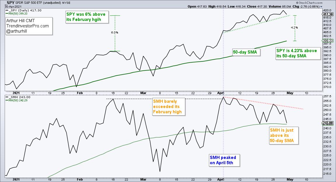
The vertical blue line on the chart above shows when SMH peaked on April 5th. SPY moved higher the last few weeks and is over 4% above its rising 50-day SMA. SMH, in contrast, moved lower the last few weeks and is barely above its 50-day SMA. This shows both absolute and relative weakness.
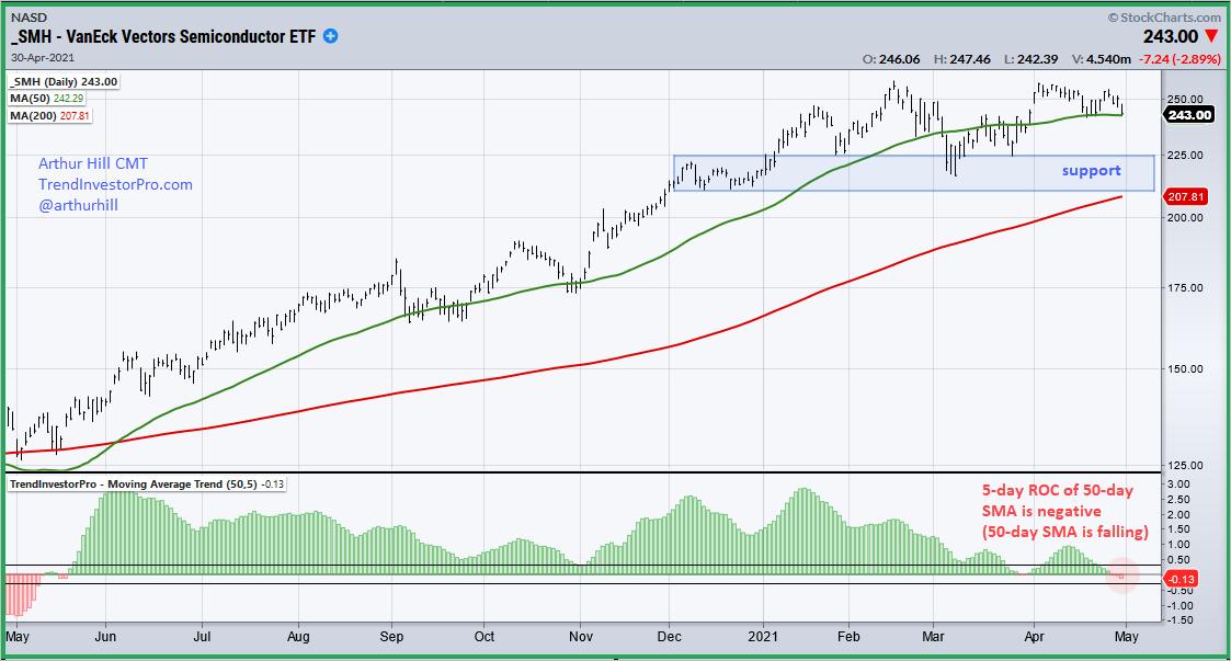
Also note that the 50-day SMA for SMH turned lower the last five days. The next chart shows the 5-day Rate-of-Change for the 50-day SMA in the indicator window. This indicator is part of the TIP Indicator Edge Plugin for StockCharts ACP. The indicator was positive when the 50-day SMA rose from May 19th, 2020 until March 26th, 2021. It went briefly negative in late March and more negative here in late April. A falling 50-day SMA further increases the odds for a correction and I would mark support in the 210-225 area.
TrendInvestorPro focuses on finding uptrends and trading in the direction of these uptrends. Each week we track trend signals and rank performance for 120 ETFs in our core list. We then highlight bullish setups within these uptrends. Click here to get immediate access to our ETF Reports, Market Timing Report and Weekend Video.
---------------------------------------------------
|
| READ ONLINE → |
|
|
|
|
|
| The Traders Journal |
| Your Dashboard To Profits In 2021: Stock Market Mastery ChartPack - Update #31 (Q1 / 2021) |
| by Gatis Roze, Grayson Roze |
 Welcome to a virtual SWAT team of elite charts and essential organized routines. This Stock Market Mastery ChartPack is now 15 years in existence. Eight years ago we made it available to the public but prior to that, I used it in my college investment courses. The point being, that after all these years of quarterly updates, it has actually been built by a user community that numbers in the thousands. Welcome to a virtual SWAT team of elite charts and essential organized routines. This Stock Market Mastery ChartPack is now 15 years in existence. Eight years ago we made it available to the public but prior to that, I used it in my college investment courses. The point being, that after all these years of quarterly updates, it has actually been built by a user community that numbers in the thousands.
Here's why this ecosystem of ChartLists should become your personal dashboard to navigating the stock markets. It focuses your routines on the key indicators and helps you ignore the frivolous distractions. Better analysis and higher probability trades in less time.
#105: Master ETFs Watch List
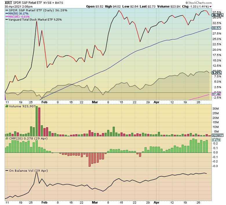
It's been six years since a prominent research firm began rating ETFs. In a universe of thousands, they assigned their top rating to only 42 ETFs. This ChartList highlights those top rated equities, and it includes another 150 Core ETFs based on their trading volume.
With this ChartList, it's easy to see where the money is flowing. Sorted by year-to-date (YTD) performance, 20 ETFs have more than doubled the S&P 500's results. It's obvious where the large institutions are moving money, and it's just as obvious where they are not. As always, we've pruned the lowest volume ETFs. If they aren't trading at least 50,000 to 100,000 shares a day, investors should look elsewhere as a rule.
#300: Market Breadth
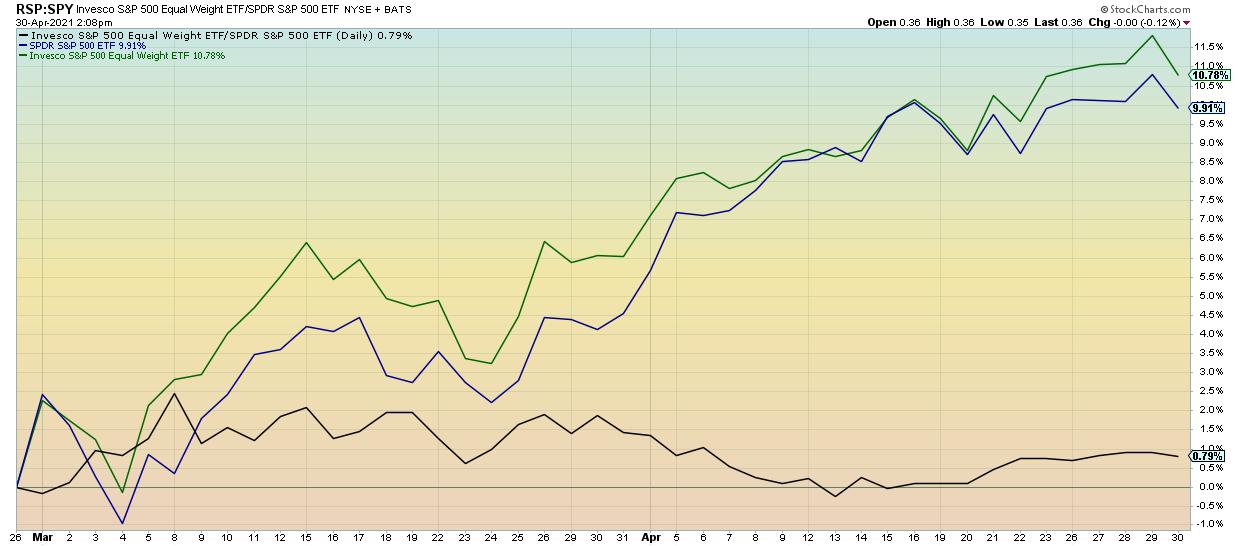
Don't overlook these 11 charts and the insightful commentary beneath each chart which has been contributed by our ChartPack community of users in many cases. Breadth is so much more than simply new highs and new lows. The unique visual presentations highlight confirmations and divergences, include momentum indicators and reveal the different behaviors of NYSE stocks versus NASDAQ stocks.
Presently of interest, note how RSP (equal-weighted S&P 500) is outperforming the top heavy cap-weighted SPY. Be sure to read the notes below the charts. Historically, wider participation has been a good omen for the markets, and this chart clearly shows this.
#450: US Dow Industries
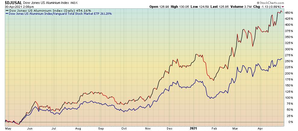
In the USA, commerce is divided into 152 industry groupings by Dow Jones. There is an important reality to embrace about the stock market — much as in nature. The Law of Groupings applies. In other words, you are the company you keep so chose your company carefully.
Year-to-date, the Vanguard Total Market ETF (VTI) has achieved over 12% appreciation. In the same period, six of these industry groups (such as furnishings and tires) have tripled those returns with aluminum being nearly five-times that benchmark. Similarly, on the flip side of the equation, six industry groups have barely achieved half the performance of VTI. Back to my original comment. This ChartList points out which group you want to party with and which parties you should avoid. Powerful stuff.
#640: Dividend Darlings
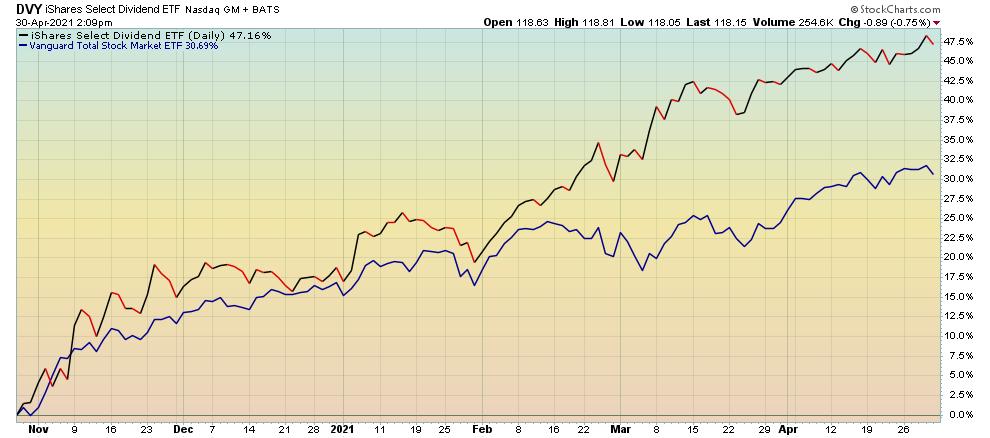
Understandably, there has been a great deal of interest in the equities in this ChartList.
As the name implies, the focus here is on dividends. On a year-to-date basis, many stocks, ETFs and mutual funds in this ChartList have all outperformed the Vanguard Total Market ETF (VTI). Here you'll see the nine dividend-oriented ETFs which have outperformed, as well as 12 stocks that not only outperformed but paid dividends, too. For example, year-to-date, DVY — a dividend-oriented ETF — is up 23% versus VTI at only 12%. Stocks such as Home Depot, Chevron, Archer Daniels and Microsoft have all outperformed VTI and paid handsome dividends.
This quarter, we added five top performing ETFs, such as PEY and RDVY. If dividends are of interest to you, dig into this ChartList. There are stocks such as Proctor & Gamble (PG) and 3M which have raised their dividends for over 60 consecutive years. The quintessential examples of blue chip stocks. There are also high tech stocks, such as Cisco which yields 2.8% and Qualcomm which yields 2.0%.
All these dividend oriented groups are represented here:
- Dividend Growth
- Dividend Income
- Dividend Growth & Income
#416: Stock Pickers
This ChartList is the home of six mutual funds with managers who have outperformed the market (VTI) over the past three years, five years and ten years. That's consistency! We run an X-Ray of their holdings each quarter and update the ChartList notes section with our findings. Some fresh insights for you:
- Only one fund owns Zoom (ZM)
- In early 2020, DexCom (DXCM) was once very popular amongst these managers but its dollar percentage has been cut in half
- 93% of the holdings are North American equities
- Square (SQ) is now one of the top 8 holdings in dollars amongst these six stock pickers
- These managers have over-allocated to the Communication Services Sector by 100% compared to the S&P 500.
There are always new names that show up. Stellar stock pickers generally don't lose their touch overnight. For this reason, this ChartList is worth a regular visit. As always, read the ChartList notes below each one.
#420-12 to 420-90: Fidelity Sector Funds
Of course, we did our quarterly sweep of the Fidelity Select Portfolios, tracking changes to the top 10 holdings of each fund to see what these highly-capitalized and highly research-driven funds are up to. Following what the "smart money" is buying (or selling!) can yield powerful results when you're able to ride some of the big accumulation campaigns by fund giants like these. When a stock you own has institutional support at the highest level, it can be a very strong tailwind for your position. So, here are a few things we noticed:
- The Biotechnology portfolio (GR-420-18) was particularly active, and picked up a big new position in one of the primary COVID-19 vaccine providers. Biotech has been a volatile sector in recent months, so we looked closely at how the managers in this fund have been shifting their exposures within their top holdings.
- Another highly active fund this past quarter was the Industrials portfolio (GR-420-54). Five of the fund's top 10 holdings changed, which is quite a substantial shift and one that we don't see too often. Among others, two significant additions of note were General Electric (GE) and Boeing (BA).
- By far the most active portfolio this past quarter was the Natural Resources fund (GR-420-70). The top 5 largest holdings by the team are all new, as well as two others in the top 10 list. Spend a little bit of time with this ChartList to see all that's changed, both what's new for the fund's top 10 and what's fallen out.
- We also looked closely at the Wireless portfolio (GR-420-90), which took a substantial position in Facebook (FB), plus big positions in a 223 billion dollar Telecom stock and, curiously, a big position in one of the major ride sharing companies.
BONUS – The ChartPack Is Now ACP Ready!
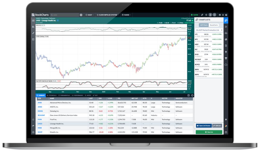 As you've surely heard, StockCharts has recently launched a new interactive, full-screen Advanced Charting Platform - StockChartsACP. This powerful all-in-one charting and analysis package brings you true dynamic charting with the ability to scroll back and forth through time, drag indicators and overlays up, down and around your charts, manipulate the y-axis with your cursor and much more. In short, the future of Technical Analysis and the next generation of StockCharts technology. As you've surely heard, StockCharts has recently launched a new interactive, full-screen Advanced Charting Platform - StockChartsACP. This powerful all-in-one charting and analysis package brings you true dynamic charting with the ability to scroll back and forth through time, drag indicators and overlays up, down and around your charts, manipulate the y-axis with your cursor and much more. In short, the future of Technical Analysis and the next generation of StockCharts technology.
Now, one important feature of the new platform is the ability to view ACP versions of your existing saved SharpCharts. You can open the ChartLists sidebar (on the right) and click the "SharpCharts" tab to see your current ChartLists. You can then click on each symbol in the list to see an ACP chart that will very closely match the saved SharpChart. It's a great way to explore the new world of ACP, or quickly get set up with some of your favorite indicators and other chart settings.
What this means for all you ChartPack users is that you can easily explore the ChartPack in ACP, right out of the box. When you install the latest version of our ChartPack, all of the ChartLists and associated SharpCharts will be installed into your StockCharts account. You'll then be able to head over to ACP and browse through dynamic versions of all the charts included in the ChartPack.
Already have the ChartPack? Here's how to upgrade:
- Log in to your account, then visit the "Manage ChartPacks" page (accessible from the bottom of the Members Dashboard or from the "Your Account" page).
- In the table that appears, find the entry for the "Tensile Trading ChartPack" (if you don't see the Tensile Trading ChartPack listed, that means that you haven't purchased it. Click Here to do so now).
- Click the "Re-Install" button next to the Tensile Trading ChartPack to start the update process
The download should take about 10 seconds, after which you can explore the new ChartLists and other updates!
New to the ChartPack? Here's how to install it:
If you'd like to add the Tensile Trading ChartPack to your StockCharts account, Click Here.
Trade well; trade with discipline!
- Gatis Roze, MBA, CMT
- Grayson Roze, VP of Operations, StockCharts.com
StockMarketMastery.com
Co-Authors, Tensile Trading: The 10 Essential Stages of Stock Market Mastery (Wiley, 2016)
Co-Presenters, How To Master Your Asset Allocation Profile
|
| READ ONLINE → |
|
|
|
| SPECIAL EVENT ANNOUNCEMENT |
| Don't miss your chance to hear our own David Keller at the upcoming MoneyShow Virtual Event, streaming LIVE May 11th - 13th. Click the banner below to learn more and register for the event. |
 |
| LEARN MORE → |
|
| ChartWatchers |
| Big Cap Tech is Remarkable |
| by Greg Schnell |
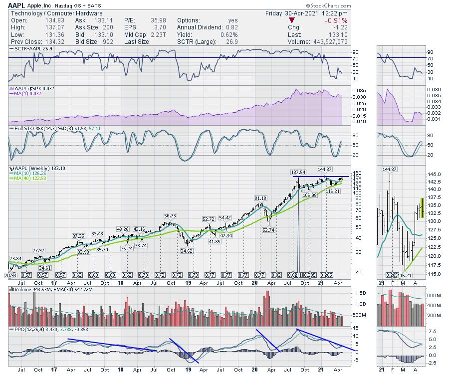
The market heavyweights announced earnings this week. Quite frankly, the numbers were stunning. Apple (AAPL)'s beat of $12 billion in revenue was larger than the annual revenue for 2/3 of the S&P 500 companies. The buyback was a remarkable $90 billion. Imagine how much money is going into the Apple Car development!!!
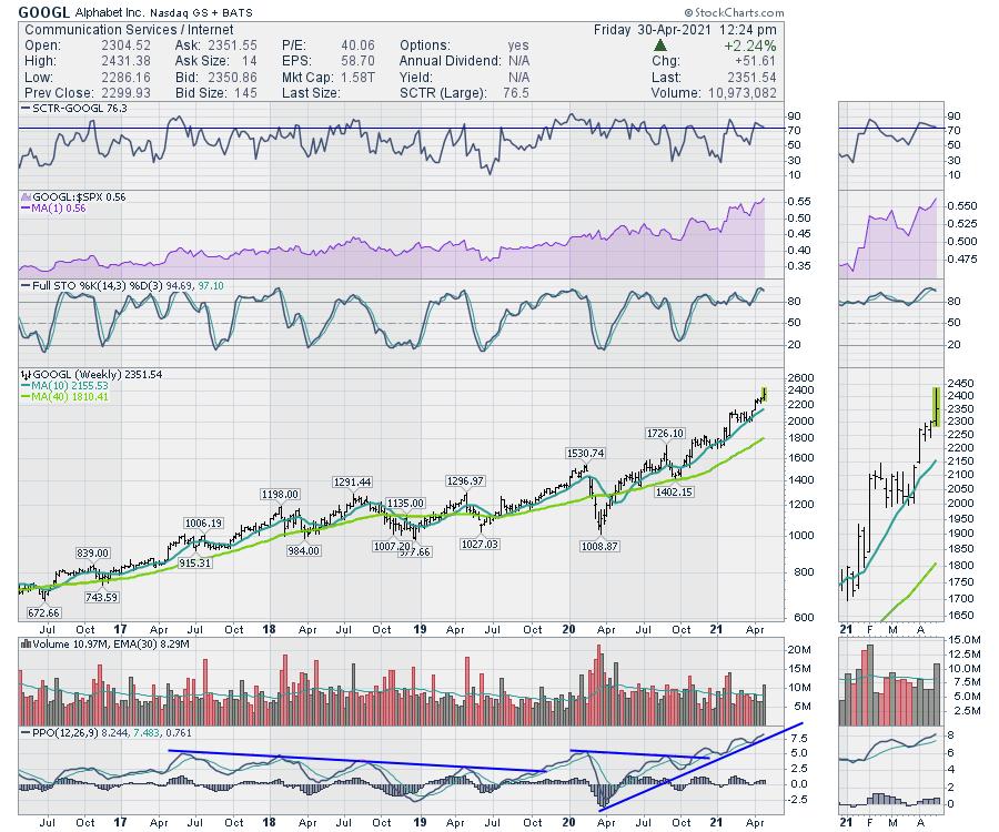
These stocks are really hitting it out of the park. It would seem, between Apple iOS and Google Android phone operating system manufacturers (and their few competitors), the software allowing apps has almost become a government organization. The company's app is only on the phone if they agree to pay the phone software companies a significant percentage of your revenue. This is not how a pickup truck works in the real world, where once the company buys the truck, it does not continue to pay Ford for any revenue generation because of the truck. It sounds like a mobile platform government tax on citizens.
While the development in the beginning was modest, what has played out now is a situation similar to Standard Oil, where they controlled so much of the revenue stream that they were untouchable. Another example is when Bell owned so much of the telco network.
In the meantime, allowing two companies to stream pizzo revenues on every cellular app that generates payments makes the income stream remarkable. And so the charts are remarkable of the two titans. The law of large numbers doesn't seem to apply when the income stream is generated worldwide. While the AAPL stock has a weak SCTR ranking, it's only a matter of time to get on the next plane out of town.

The chart of Alphabet (GOOGL) has been soaring for a while already, but I'd put Apple on that same plane ticket. With Waymo potentially going public in a spinout, the lack of options for customers of online ad spending, the street map data and all of the other business units, these giants are dwarfing governments in their control of entire ecosystems.

The bottom line for me is these names are going higher. The business moats were unaffected by a global pandemic. When the world regains its footing, it is hard to imagine these companies become less relevant.
A change in momentum on Apple, where the PPO starts to break above the down trend line, is probably the takeoff point for Apple. If we don't like it after a beat of $12 billion, I'm not sure how much more they can do.
I'll be on Erin Swenlin's DecisionPoint Trading Room Monday at Noon ET / 9 AM PT. Follow this link on Monday to join us! (Password = invest.)
|
| READ ONLINE → |
|
|
|
| RRG Charts |
| Seasonality Shows Weakness Ahead For Financials |
| by Julius de Kempenaer |

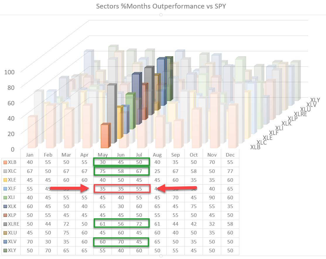
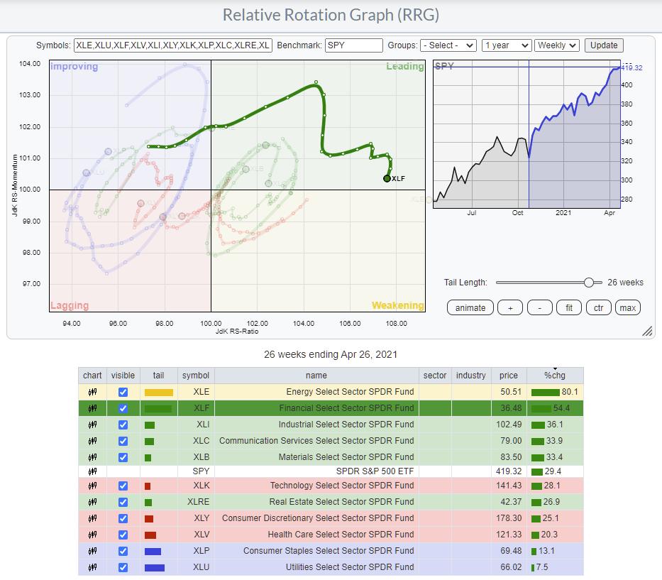
Looking at the 3D visualization for US sectors going into May, one sector stands out negatively. That sector is Financials, the fourth largest sector at ~11% of market cap.
For May and June, the historical record is that the Financial sector outperforms the S&P 500 only 35% of the time. This means that, 65% of the time, this sector has UNDERperformed SPY.

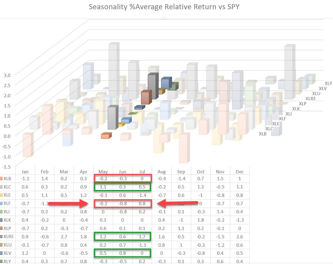
The second graph and table above show the average over-/under-performance per sector vs. SPY. As you can see, the Financials sector (XLF), on average, underperformed SPY by 20 Bps in May and even by 80 Bps in June.
This aligns with the expectation of underperformance in May and June.

The Relative Rotation Graph above highlights the rotation for XLF over the last two quarters. In the table, you can see that XLF was the second strongest performer over that period, beating SPY by more than 20%, but a few weeks since, the tail on XLF has started to roll over and move downwards, heading towards the weakening quadrant. This loss of relative momentum aligns with the weak expectation for the sector going into May, with a follow-through into June.

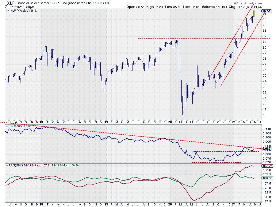
On the price chart, the uptrend for XLF is fully intact and continues to move higher within the boundaries of the rising channel. The "problem" is with the relative strength vs. SPY. The long downtrend is still intact, albeit that the RS-Line is currently testing the descending resistance line. The recent fading of momentum brings the green JdK RS-Momentum line close to crossing below 100, and it is starting to drag RS-ratio lower as well.
The combination of relative strength stalling against resistance and the expected seasonal weakness make Financials a sector to watch out for in the coming weeks/months. The upside potential is looking very pale.
--Julius
|
| READ ONLINE → |
|
|
|
| ChartWatchers |
| Strong Earnings = Fresh Opportunities to Make Money |
| by John Hopkins |
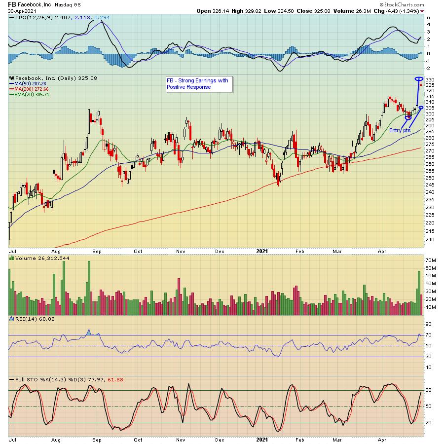
Last week was chock-full of blockbuster earnings reports, including AAPL, AMZN, FB, GOOGL and MSFT. Together, those five companies have a combined market cap of over $8 trillion. That's a lot of earnings fire power! Overall, the five companies in total had superb earnings including top line, bottom line and future prospects.
Of the five tech giants, Facebook had the most favorable response, as it rose almost 8% at its peak the day after it reported. And, as you can see below, it held up quite well even with the market softening some into the weekend.

Unless you owned FB into its earnings report, you would have missed out on the nice bump higher. And you have to decide if you want to chase a stock like FB after it has already made a substantial move higher. But now that we have seen some fantastic results, you can start thinking about taking on a position when stocks like FB pull back to levels that become attractive. For example, in the case of FB, if you are willing to be patient, there's a good chance you will be able to buy the stock cheaper. For example, if you look at the chart above, one place to consider taking a partial position would be on any pullback to the 20-day moving average, currently near $305. Below that is another position near $296. You could keep a tight stop in case the stock continued to go lower, but, the point is, FB is likely to be on the radar screen of a lot of traders, so any pullback could be a nice buying opportunity.
There are still a ton of companies set to report their earnings over the next few weeks. But how has the market reacted to earnings so far? Great question! And we have the answer as our Chief Market Strategist Tom Bowley has created a very detailed spreadsheet showing exactly that -- reactions to earnings on specific stocks that have already reported their numbers. If you would like to get a copy of the spreadsheet (and accompanying video explaining how it works) just click on this link and sign up for our FREE EarningsBeats Digest newsletter that comes out every M, W and F. It is full of great earnings and market-related information.
With every earnings season comes great opportunities. Just make sure you are keying in on those companies with the strongest results, then wait for them to pull back to levels that could result in high reward-to-risk trades.
At your service,
John Hopkins
EarningsBeats.com
|
| READ ONLINE → |
|
|
|
| ChartWatchers |
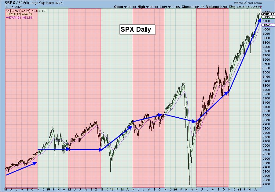
| Sell in May and Go Away? - Greg Schnell in Monday's Free Trading Room! |
| by Erin Swenlin |
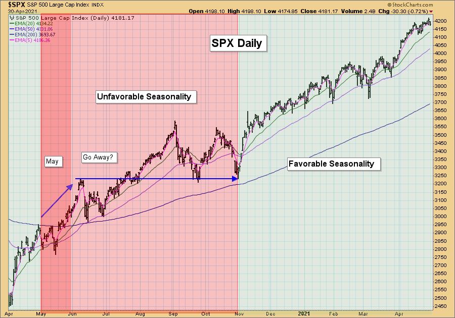
We've all heard the saying, "Sell in May and Go Away." This describes a phenomena that implies that investors, in preparation for summer, will sell in May and then take a break from the market over the summer. If only it were that easy!
2020 was certainly an atypical stock market year, given COVID and the fact that there wasn't anywhere to "go away" to. However, I still think the concept is interesting. Last May, investors did not sell; in fact, they bought hand over fist. We did see some decline and difficulty in June.
DecisionPoint tracks six-month seasonality, and we are now entering a period of unfavorable seasonality. Typically, between May 1st and November 1st, the market experiences doldrums and finishes either lower or unchanged. That clearly occurred in 2020. The market finished the period of unfavorable seasonality slightly higher than where it was at the beginning of May. It then finished the period of favorable seasonality much higher.
Keep reading...

SAVE 50% off your first month with coupon code: SAVE50

I love to create charts, so I decided to look at the various periods of favorable and unfavorable seasonality over the past three years. It's clearly not a "lock," but I suppose there is some truth to it.

CONCLUSION: We are entering a period of unfavorable seasonality next month. While a market pullback about now would be amazingly accurate, seasonality doesn't guarantee a certain outcome.
Greg Schnell, CMT, MFTA
I'm please to announce that Greg Schnell will be "in the house" on Monday at Noon ET! I can't wait to hear what Greg has to say about the market, but also his take on commodities and an intro to his trading style. Click here to register now!


Click here to register in advance for the recurring free DecisionPoint Trading Room! Recordings are available!
Happy Charting! - Erin Swenlin
Technical Analysis is a windsock, not a crystal ball.
Helpful DecisionPoint Links:
DecisionPoint Alert Chart List
DecisionPoint Golden Cross/Silver Cross Index Chart List
DecisionPoint Sector Chart List
DecisionPoint Chart Gallery
Trend Models
Price Momentum Oscillator (PMO)
On Balance Volume
Swenlin Trading Oscillators (STO-B and STO-V)
ITBM and ITVM
SCTR Ranking
DecisionPoint is not a registered investment advisor. Investment and trading decisions are solely your responsibility. DecisionPoint newsletters, blogs or website materials should NOT be interpreted as a recommendation or solicitation to buy or sell any security or to take any specific action.
|
| READ ONLINE → |
|
|
|
| MORE ARTICLES → |
|
 Chart 1
 Chart 2
 Chart 3


 Welcome to a virtual SWAT team of elite charts and essential organized routines. This Stock Market Mastery ChartPack is now 15 years in existence. Eight years ago we made it available to the public but prior to that, I used it in my college investment courses. The point being, that after all these years of quarterly updates, it has actually been built by a user community that numbers in the thousands.


 As you've surely heard, StockCharts has recently launched a new interactive, full-screen Advanced Charting Platform -
