| THIS WEEK'S ARTICLES |
| John Murphy's Market Message |
| MONTHLY AND WEEKLY SECTOR RANKINGS HELP FIND LEADERS AND LAGGARDS |
| by John Murphy |
MONTHLY RANKINGS... Major stocks indexes are ending the week with little change. The Dow and S&P 500 show a modest loss while the Nasdaq is showing a minor gain. To get a better sense of what's moving the market, a look at sector rankings can offer clues as to where money has been flowing. Chart 1 plots the eleven S&P 500 market sectors over the last month. Eight sectors have gained ground while three are in the red. The four strongest sectors are economically-sensitive stocks that include energy, financials, materials, and industrials. That's also part of the stronger performance of more value-oriented cyclical sectors that do better in a stronger economy. At the same time, the two weakest sectors are consumer discretionary and technology. Relative weakness in technology is also part of the rotation out of growth stocks that has taken place over the past few months. That rotation into value helped the market withstand the selling of technology shares, and relative underperformance of the Nasdaq market.
 Chart 1 Chart 1
WEEKLY RANKINGS... Chart 2 shows the sector rankings for the last week. It shows five sectors gaining ground and six in the red. It's also interesting to see a number of defensive sectors in a leadership role which include real estate, health care, utilities, and staples. At the same time, several of the more economically-sectors lost ground during the week. Technology moved to third place for the week which reflects some short-term buying of that sector. Let's take a closer look at the value/growth ratio to see if this week's rankings changed any trends.
 Chart 2 Chart 2
VALUE STILL IN THE LEAD... Chart 3 plots a relative strength ratio of the Russell 1000 Value iShares (IWD) divided by the Russell 1000 Growth iShares (IWF) over the last six months. That ratio turned up last September and is still in an uptrend. The chart shows its May peak pulling back from its March peak and which signaled a short-term retracement. This week's pullback also reflects the relative weakness by cyclical sectors and a rebound in technology shown in Chart 2. So far at least, that's not enough to signal a top in the ratio. The value/growth ratio would have to drop a lot further to shift the balance in favor of technology-dominated growth shares.
 Chart 3 Chart 3
|
| READ ONLINE → |
|
|
|
| Art's Charts |
| The 50-day and the early Gap Tell the Tale for QQQ |
| by Arthur Hill |
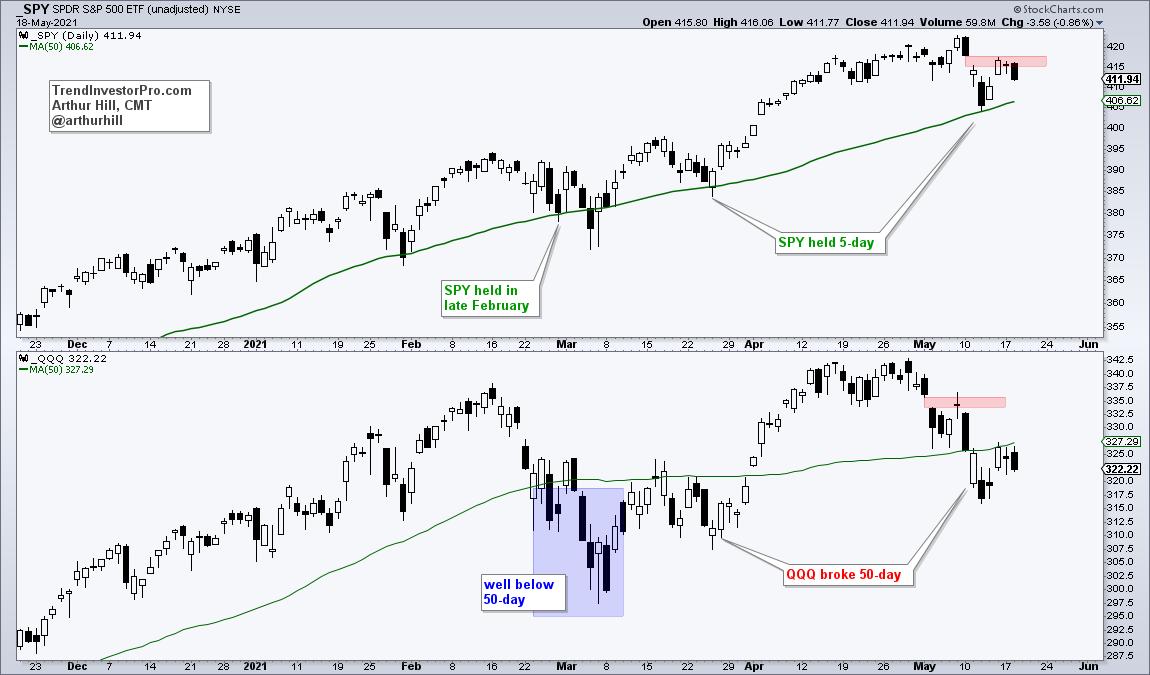
Chartists can compare performance by using the 50-day SMA as a benchmark level. Names that exceed their 50-day SMAs show more strength than those that do not exceed their 50-day SMAs. By this yardstick, QQQ is underperforming SPY and weighing on the broader market. Oh, and mind the gap as well.
QQQ was keeping pace with SPY until late February, which is when SPY held its 50-day and QQQ broke its 50-day. SPY also dipped below its 50-day in March, but the break was short and QQQ moved well below its 50-day (blue shading). SPY resumed its advance in March by holding above its 50-day as QQQ remained below.
Flash forward to May and we can see SPY holding its 50-day last week and QQQ breaking below. QQQ rebounded with the market on Thursday-Friday, but was not able to recapture the 50-day and continues to show relative weakness (and absolute weakness).

The gaps also show QQQ lagging. QQQ gapped down on May 4th and the gap held as QQQ turned back in the gap zone (red shading). SPY gapped down a week later on May 11th and this gap zone turned into resistance this week. Overall, I view both gaps as breakaway gaps that are short-term bearish. To turn things around, SPY needs to fill its gap and QQQ needs to reclaim the 50-day.
In addition to these gaps, I am also watching relative weakness in small-cap breadth and a 90% down day in SPY. These were covered in Wednesday's commentary at TrendInvestorPro. Subscribers also get access to strategy videos: trading falling wedges and trading the swing within a pattern. Click here to get immediate access.
---------------------------------------------
|
| READ ONLINE → |
|
|
|
| ChartWatchers |
| Wall Street Doesn't Want You to See These S&P 500 Performance Numbers |
| by Tom Bowley |
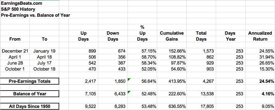
The stock market has a history of running higher in anticipation of earnings season. On the S&P 500, for instance, here are the annualized returns for the following periods since 1950:

This is 71 years of daily data, which is certainly statistically relevant. I don't believe there's any question about what drives the stock market. Those two annualized returns in the far-right hand column couldn't be much more different. During pre-earnings runs, the S&P 500 has an annualized return of 24.54%. During ALL other times of the year, that annualized return falls to 4.16%. What do you think that does to options returns - if you're an options trader? On the long side, you've got a much, much stronger chance to make money during the periods identified above.
Not all companies report earnings early in earnings season, however. Those companies could very likely see their earnings runs later in the quarter, heading into their respective earnings reports. What companies report earnings in early June that could see their own earnings runs ahead of the report? Well, here are two that could be getting kickstarted right now....
Zoom Video Communications, Inc. (ZM)
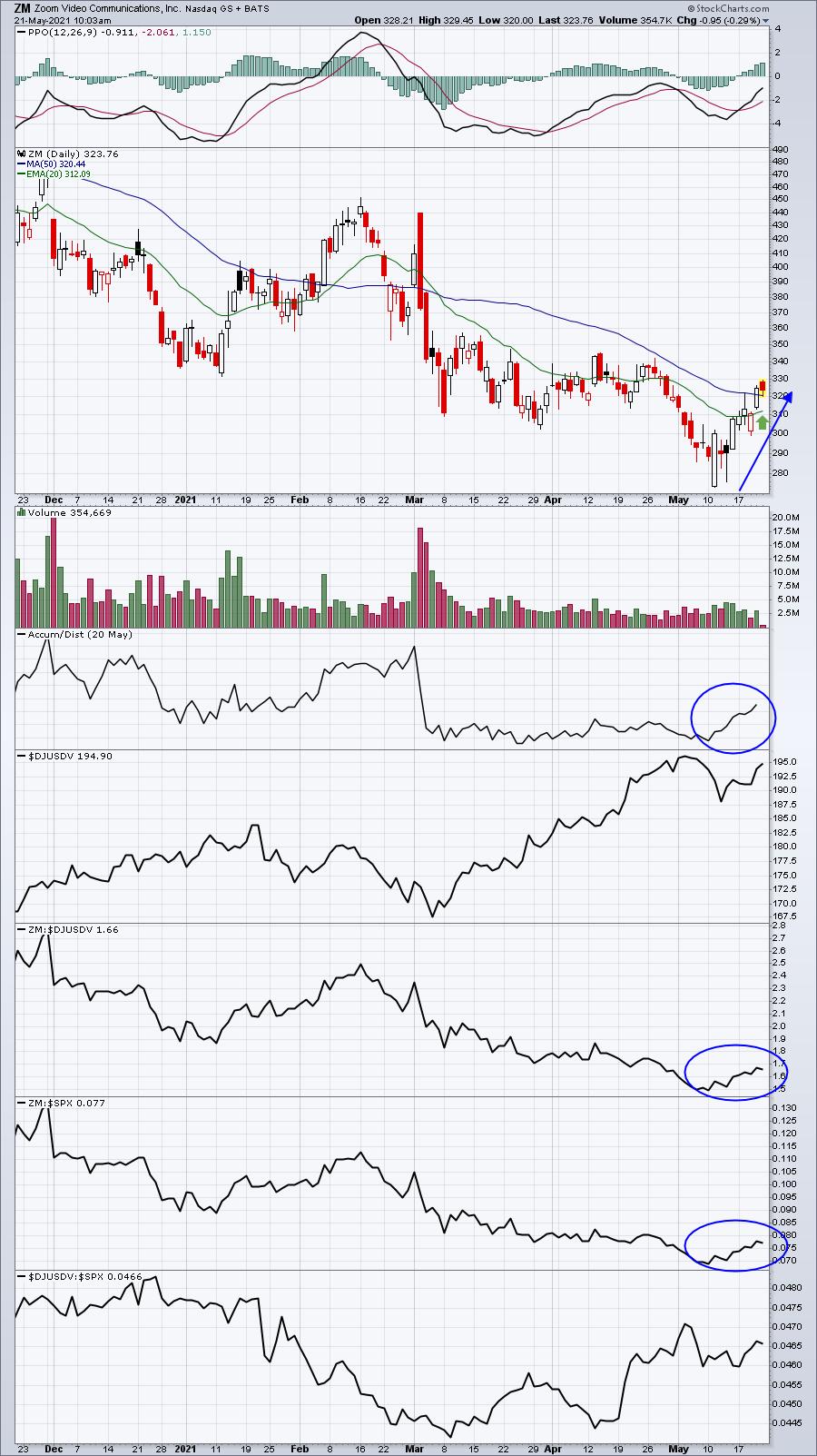
ZM reports its upcoming earnings on June 1, so if it's going to make a run, now is the time. The chart is setting up nicely too, after ZM's recent break above its now-rising 20-day EMA:

I'd watch that rising 20-day EMA and use it as a closing stop. If ZM is in the process of making a pre-earnings run, it's doubtful that it would pull back that far.
(Disclosure: I own shares of ZM)
Elastic NV (ESTC)
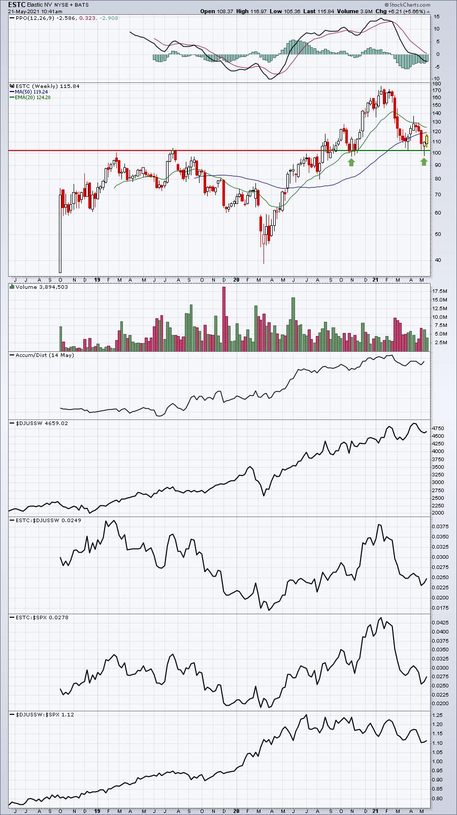
I'll be honest; the daily chart looks bad and the recent buying has taken ESTC up to pierce its 20-day EMA, normally an area of resistance, but it's hesitating at its 50-day SMA. Like ZM, keep a close eye on its now-rising 20 day EMA. If it fails to hold it, then be careful. Otherwise, a bounce off of it and a breakout above that 50-day SMA would be much more bullish and could open up ESTC for a much bigger advance. One thing I do like here is the bounce off key support on its weekly chart:

Growth stocks like ZM and ESTC have not been in favor and both have been beaten up, but, with upcoming earnings in early June (ESTC reports June 2), a further rise should not be ruled out.
Stay informed about the stock market's historical information and enjoy much educational material by subscribing to our FREE EB Digest newsletter. There is no credit card required and you'll receive 3 articles per week - Mondays, Wednesdays, and Fridays - before the stock market opens. Many of the articles provide tradable stock ideas as well. To subscribe, simply enter your name and address HERE!
Happy trading!
Tom
|
| READ ONLINE → |
|
|
|
|
|
| ChartWatchers |
| Is Equal-Weight Really Equal Weight When it Comes to Sectors? |
| by Julius de Kempenaer |

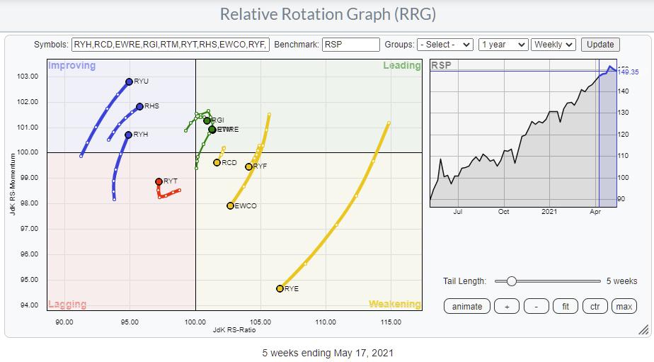
The Relative Rotation Graph shows the rotation of the Invesco family of equal-weight ETFs. These sector ETFs are often used to eliminate the dominating weight of some individual stocks in specific sectors. Think AAPL and MSFT in Technology, AMZN and (to a lesser extent) TSLA in Consumer Discretionary and FB and GOOG(L) in Communication Services.
But what does "Equal-Weight" actually mean? At first sight, you'd think that's easy; it means that all components in the index are weighted equally. And that is true for every individual (sector-)index. This information can be found on the website of the manager of these ETFs, in this case Invesco.
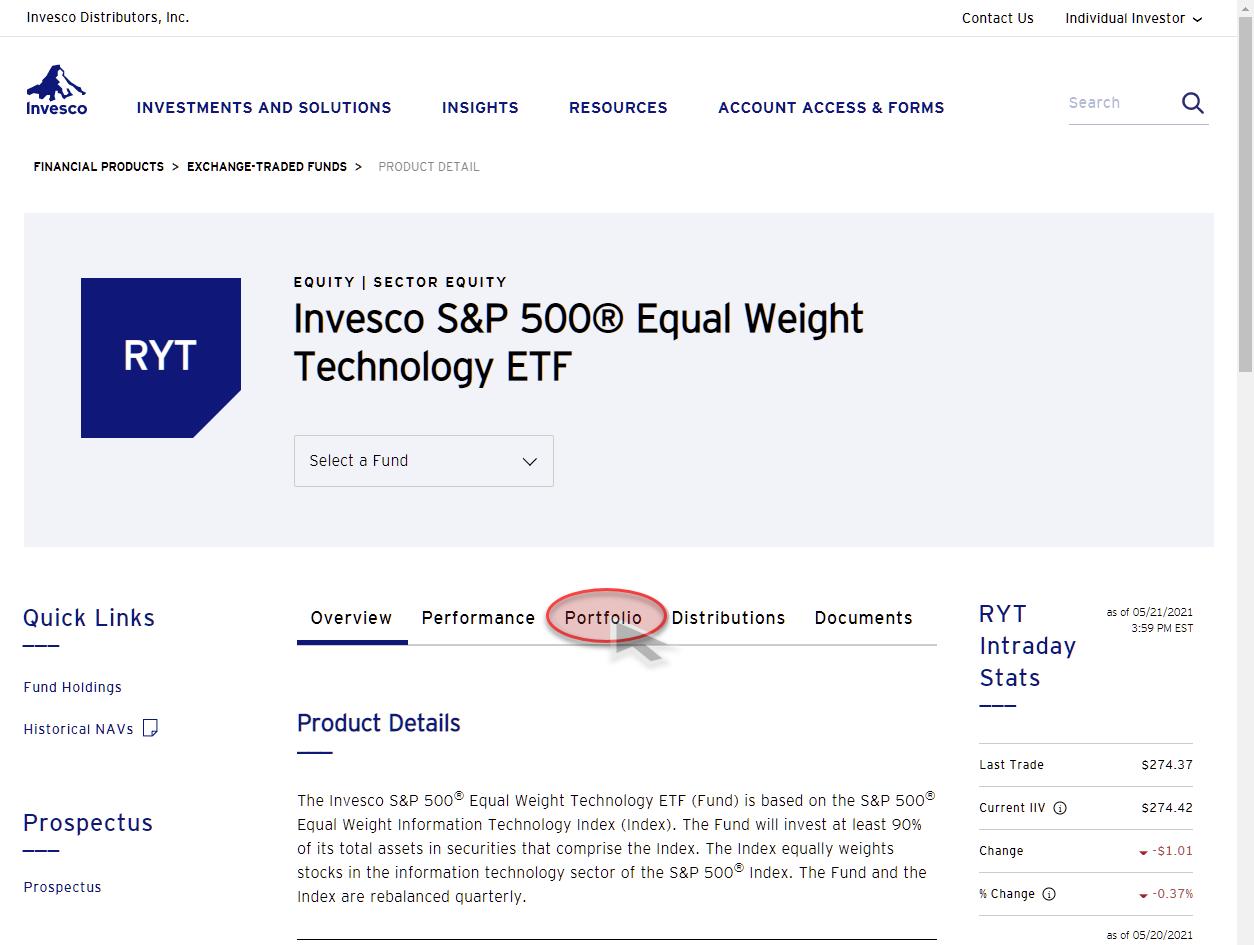
If you want to see the composition of the Technology index (ticker symbol RYT) in this family of ETFs, you can simply search for RYT on their website. That will lead you to the product page for that instrument.

When you click on the Portfolio tab on that page, it will take you to the composition of that ETF.

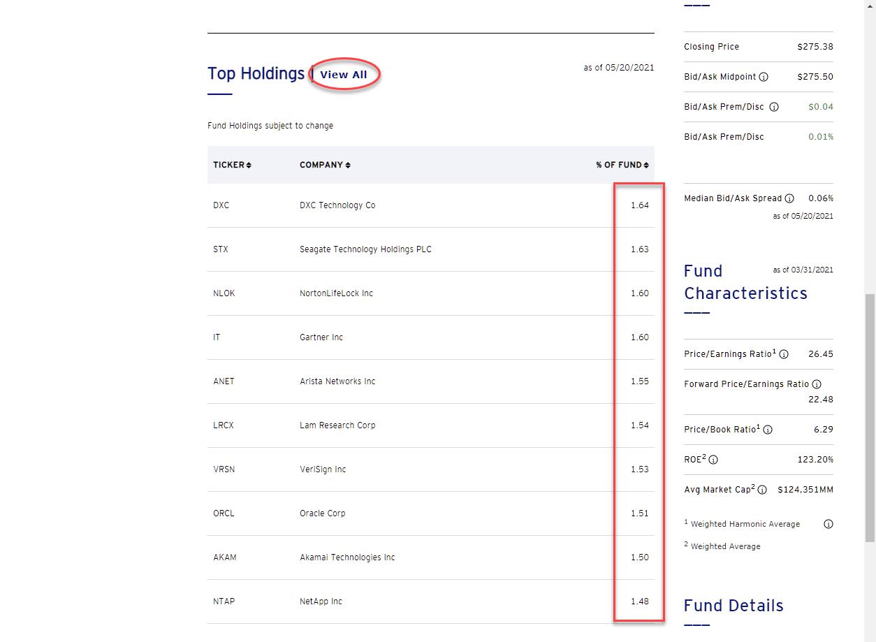
Scrolling down on that page brings you to the Top Holdings of the portfolio, and you can even go a little further and show all holdings, which you can even download in an Excel file, if you'd like.
The Technology sector holds 74 stocks. So, in an equal-weight portfolio, each stock will count for:
100% : 74 = 1.35%
When you look at the current weights, you will see that they are around 1.35%. That is because composing the equal-weight portfolio at 1.35% per symbol is only done at the rebalancing data, which is quarterly. After rebalancing, the weights will shift up or down depending on the movement of the stock price.
This goes for every sector ETF in this family. Each stock is equally weighted within the sector. So a smaller sector, in terms of the number of stocks in the sector, will have a higher weighting per stock. The utility sector, symbol RYU, for example, holds only 28 stocks. Therefore the weight per individual stock in that sector will be:
100% : 28 = 3.57%
So far, so good. Within the sectors, no individual stock will dominate because of its market cap.
What About the Benchmark?
The benchmark for the RRG showing the equal-weight sector ETFs is RSP, which is the equal weight S&P index. Again, the information about the portfolio composition can be found on the product page for RSP. And, not surprisingly, you will find that the weight per individual stock in that index comes in at:
100% : 506 = 0.197%
Because you all know that the S&P 500 holds 506 stocks (at the moment) and not 500, right? ;)
That also makes sense.
But hold on; what does that mean at the sector level?
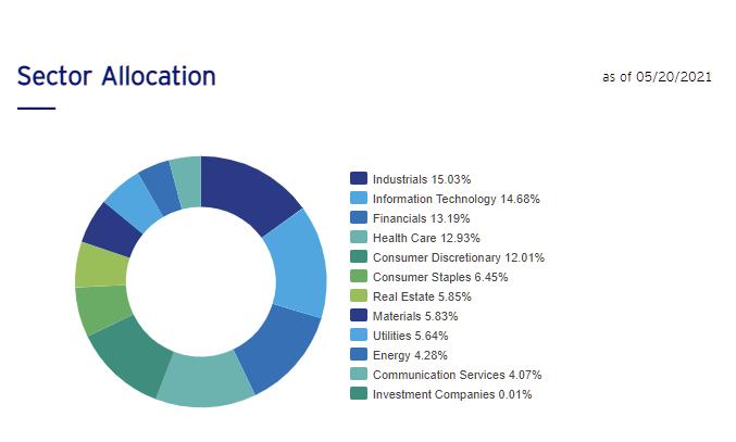
Well, it means that all pigs are equal, but some pigs are more equal than others. As a result, the sectors that hold a high number of stocks, like Technology and Industrials, will have a higher weighting at the sector level than sectors that hold a low number of stocks, like Energy and Communication Services.
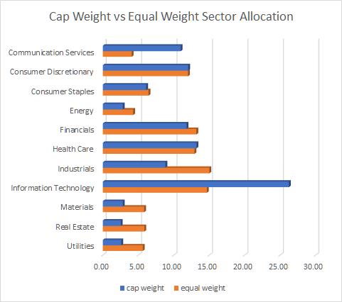
Here is the sector allocation of the Equal-Weight S&P index, RSP.

Wow!! All of a sudden, Equal weight is not so equal-weight anymore..
For sectors to be "Equal Weight" in an index, I would expect each sector to be at...
100 : 11 = 9.09%
Here is the comparison of sector weights in the cap-weighted S&P and the equal-weight S&P:

Some of my initial observations are that the impact of Information Technology is reduced significantly, as expected, but the sector remains above the "expected" average of 9.09%. The weight for Communication Services is also significantly reduced, but this sector goes from 11%, which is just above the EW average, to 4%, which is half of the average. For some of the smaller sectors like Materials, Real-Estate, and Utilities, the impact almost doubles.
Very interesting is the fact that the consumer discretionary sector, which, as you know, is heavily impacted by AMZN, is at exactly the same weight in both the cap-weight and equal-weight S&P. It's one of these subtleties that is easily overlooked, but can have a significant impact on your investment decisions and thus performance.
Let me know, did you know this? Did you realize it?
#StaySafe, and have a great weekend! --Julius
My regular blog is the RRG Charts blog. If you would like to receive a notification when a new article is published there, simply "Subscribe" with your email address.
|
| READ ONLINE → |
|
|
|
| The Canadian Technician |
| Commodities Pause - Can Tech Take the Baton? |
| by Greg Schnell |
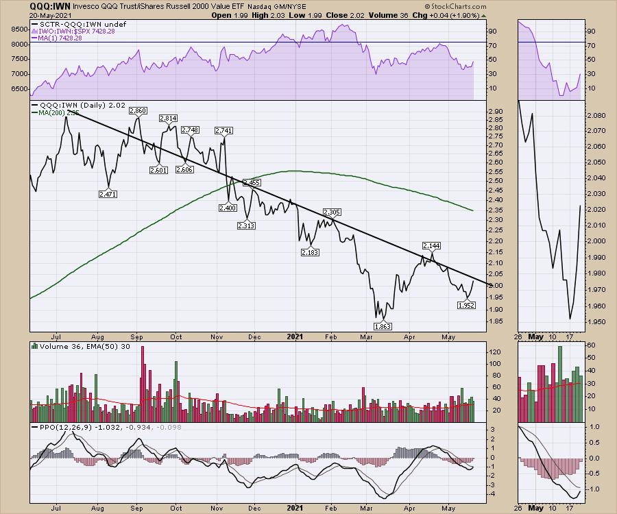
One of the most interesting parts of the rally from March has been the rapid turn between industry groups. Since November, when the vaccines started launching, tech slid sideways to lower while the reopening trade soared.
This week is marked by a very interesting chart. From the September spike, when the large cap techs ran up (roughly September 3rd), we have had a series of lower lows and lower highs in the ratio of tech to the Russell 2000 value index. The reason this matters is that this chart visualizes exactly what happened, starting with the vaccine rollout in early November. The reopening trade took off with Banks, Oil and Gas, Industrials, Basic Materials and groups like transports surging higher, while tech meandered sideways. For tech investors used to being at the front of the class, it was a very uncomfortable 2nd place.

However, when we look at the chart in the bottom right, there are so many signals I would look for to see a trend reversal. The PPO finally moved above zero. The downtrend on the PPO is broken and, after rolling above zero, the PPO is gently pulling back to reset near zero before it starts its next leg higher from a higher low. This is exactly the setup I would look for on any chart to give me a strong entry.
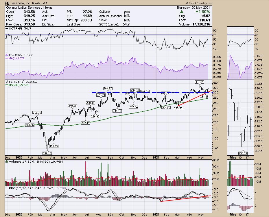
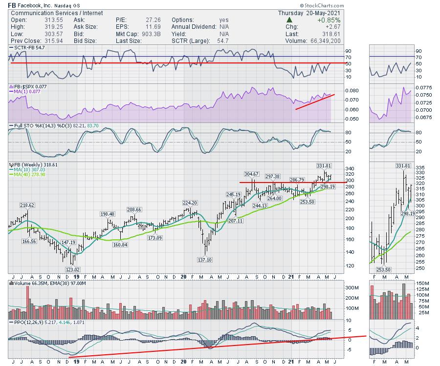
When we go look through the large cap names like Apple (AAPL) and Facebook (FB), they are setting up with enticing entries. The real question is, can the charts follow through and break out? If they do, it is probably enough to change the above chart and break the downtrend.
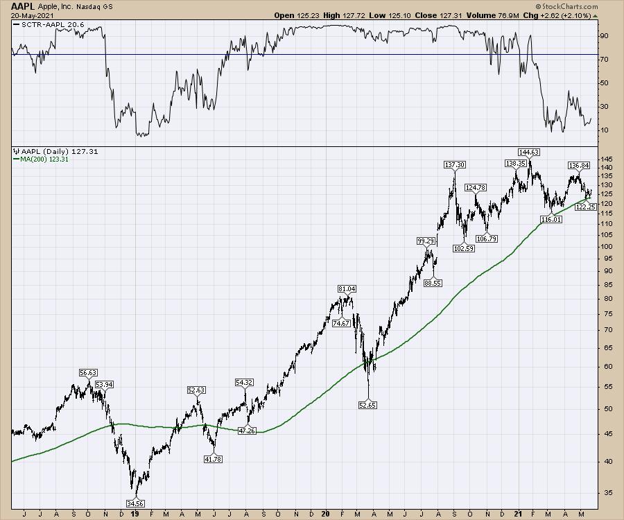
Here is AAPL.
Apple doesn't underperform for very long. It's hard to underperform when you get a huge chunk of revenue from every cellphone sold worldwide long after the sale of the device. What amounts to a mobile tax on the global user base of a billion phones goes into Apple's hip pocket. How weak can a stock get with a $90 billion dollar buyback program anchoring your downside risk?
So this first chart just shows Apple historically bouncing around the 200-DMA. If you were operating the buyback, this is a pretty good place to add value to shareholders. Secondly, the SCTR rarely spends much time at the lower levels. When it does, it is a nice time to be buying, not selling, Apple.

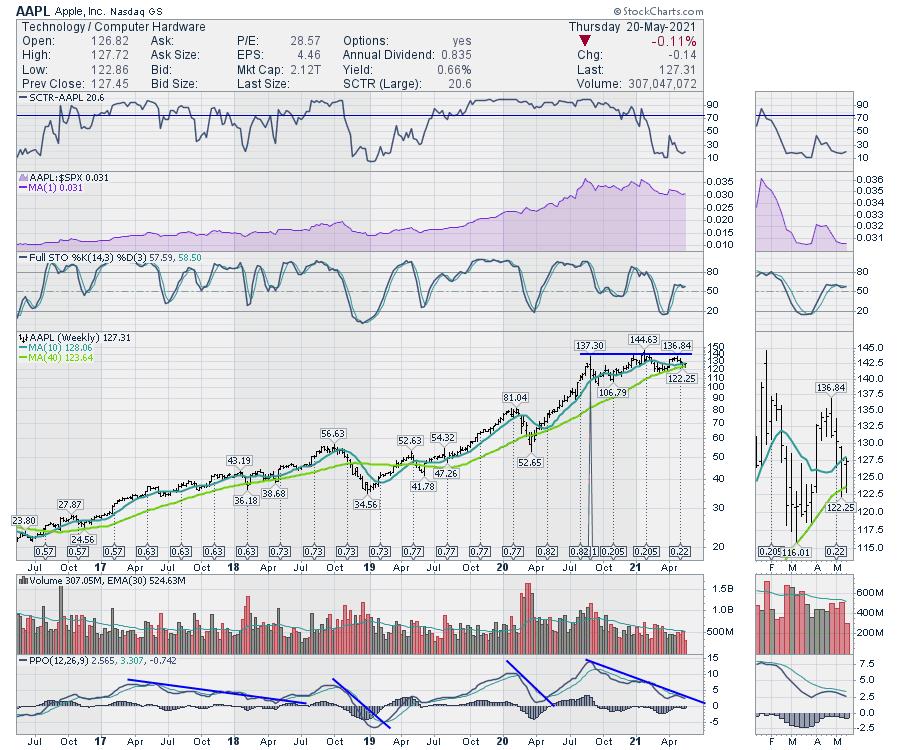
I have a few other indicators I like to look at on a weekly chart. I mentioned on an article a few weeks ago that when Apple breaks the downward momentum on the PPO, it's an excellent place to get long the stock. With the above chart as an anchor as a reason to be looking to buy Apple here, I just want to see the downward trend in momentum break. When the downward trend breaks on the PPO, I want to be looking to get long. You can look at Apple historically over 20 years and the weekly PPO spends very little time near zero. Maybe it takes Apple a few weeks to start kicking up again as it heads into the July earnings, but they only blew away revenue estimates by $12 billion last quarter. That wasn't the total revenue, that was the *beat* on the average analyst estimate. Seriously...

Facebook is not as compelling a backdrop to me, but the chart is in launch ignition sequence and that's all that is important. After breaking above a nine-month consolidation, Facebook just completed a backtest of the breakout. The SCTR looks to move into the top half, rather than the lower half, of the range. The daily PPO is gently backtesting the zero line. Is this about to explode higher?

Here's the Facebook weekly chart. I don't think it's possible to find a more attractive risk/reward setup on a $300 stock. If all of tech rolls over and the stock rolls down, at least we had a great setup to start with. If tech unwinds here, then at least we have some reasons to take money off the table based on the first chart. But if tech accelerates higher, this is the setup for us to get long.

While a lot of my strength indicators are falling hard, it is hard to believe the market is only going to have a 4% correction. If this is it, and we are about to launch higher, the tech charts are all set up to do that. If they can't break out over the next few weeks, that will probably tell us a different story.
|
| READ ONLINE → |
|
|
|
| ChartWatchers |
| Will Gold Continue to Strengthen Versus Cryptos? |
| by Carl Swenlin |
This is an excerpt from today's subscriber-only "DecisionPoint Weekly Wrap":
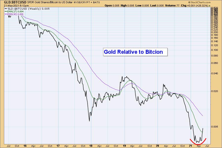
It has long been our belief that gold should be doing a lot better, considering the reckless spending and borrowing that is currently in progress. We have also believed that billions of dollars being diverted into Bitcoin (and other cryptos) is the reason for gold's poor performance. In his recent The 10th Man newsletter, Jared Dillion included a chart showing the relative strength of gold versus Bitcoin that offered hope that this detrimental trend may be about to reverse. Here is our version of that chart. Note the rounded bottom forming this year, the result of sudden crypto weakness versus relatively steady gold prices. No guarantees, but we think that the rounded bottom is more promising than the spike bottom we saw in 2017. Let's take a look at Bitcoin and Gold next.

ChartWatchers SPECIAL:
50% off your first month of any of subscriptions!
Just enter coupon code: SAVE50 at checkout!
CLICK HERE TO LEARN MORE!


Click here to register in advance for the recurring free DecisionPoint Trading Room! Recordings are available!
Bitcoin
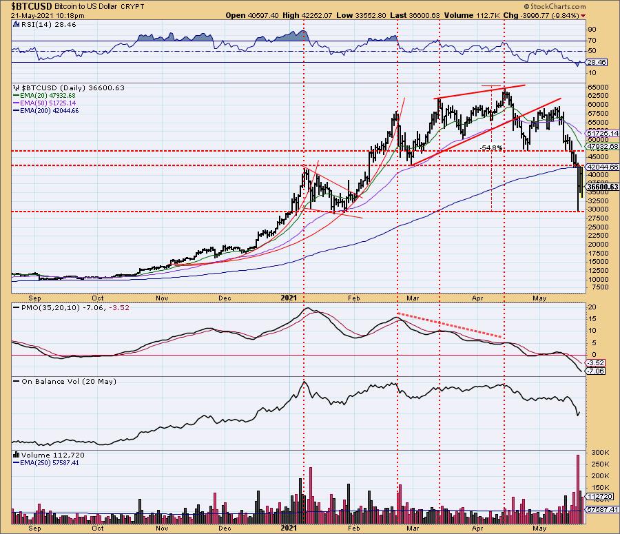
Bitcoin has been in decline since mid-April, and this week some major selling took place. Intraday on Wednesday, Bitcoin was down nearly -55% from its April top. The rounded top formed over the last several months looks like a major top. Reported on Fox Business: "The IRS disclosed Thursday 'businesses that receive crypto assets with fair market value of more than $10,000' will need to be reported." We can be sure more regulation of crypto is on the way, and that will not be favorable to crypto prices moving higher. Is crypto becoming a crypt?

Gold
IT Trend Model: BUY as of 5/3/2021
LT Trend Model: BUY as of 5/21/2021
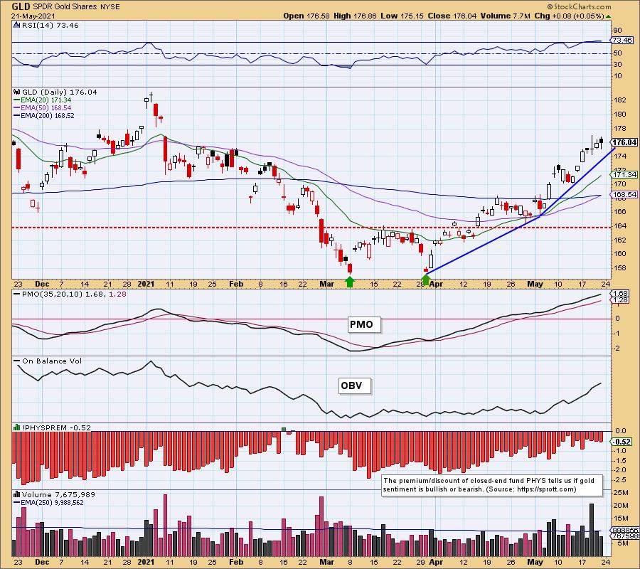
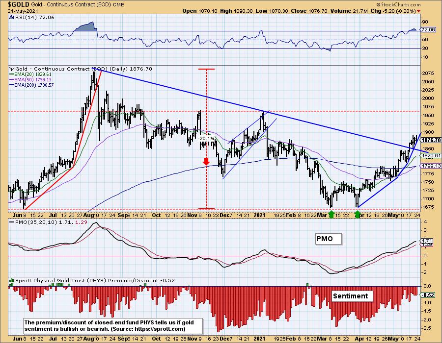
GOLD Daily Chart: We are declaring an LT Trend Model BUY signal as of today. The 50-EMA is just a hair away from crossing up through the 200-EMA. Technically, we should wait for the actual crossover to change the signal, but price is well above the moving averages, and the crossover should happen Monday. Might as well anticipate it.

It is obvious that the rising trend for gold from the March low is accelerating. That, combined with this week's breakout, could result in some snapback or consolidation soon.

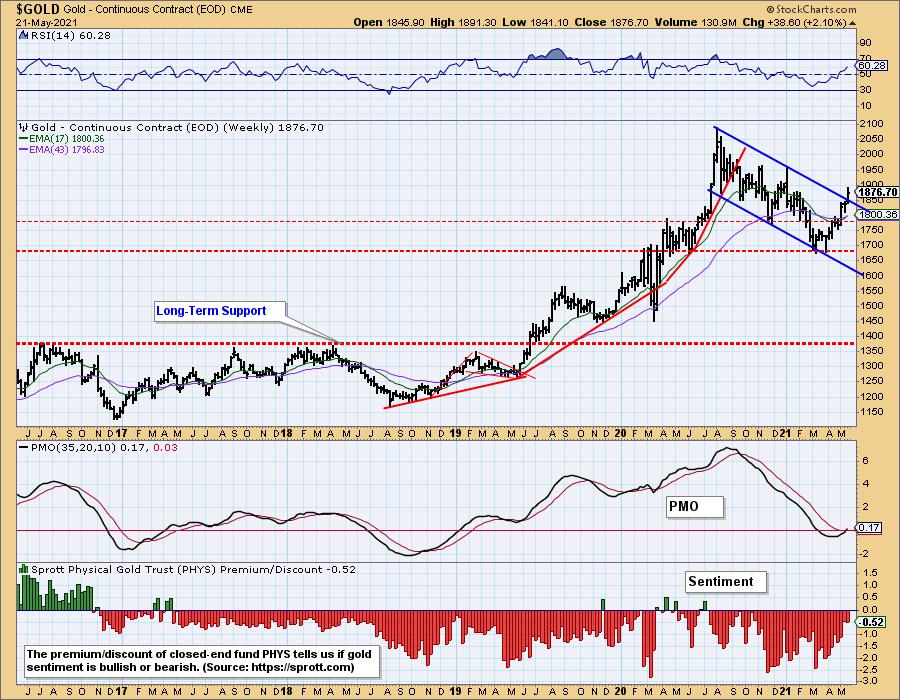
GOLD Weekly Chart: A breakout and a solid weekly PMO bottom and crossover BUY signal are most encouraging.

Happy Charting!
- Carl
Technical Analysis is a windsock, not a crystal ball.
Helpful DecisionPoint Links:
DecisionPoint Alert Chart List
DecisionPoint Golden Cross/Silver Cross Index Chart List
DecisionPoint Sector Chart List
DecisionPoint Chart Gallery
Trend Models
Price Momentum Oscillator (PMO)
On Balance Volume
Swenlin Trading Oscillators (STO-B and STO-V)
ITBM and ITVM
SCTR Ranking
DecisionPoint is not a registered investment advisor. Investment and trading decisions are solely your responsibility. DecisionPoint newsletters, blogs or website materials should NOT be interpreted as a recommendation or solicitation to buy or sell any security or to take any specific action.
|
| READ ONLINE → |
|
|
|
| ChartWatchers |
| These Stocks Can Provide Stability and a Lot More During These Tricky Times |
| by Mary Ellen McGonagle |
I don't have to tell you it's been tough for most investors to make headway in the markets this month. We're navigating a landscape that's never before been traveled. With government stimulus triple the Great Recession and sharp economic growth with pandemic distortions that's bringing on fears of high inflation, it's no wonder we're in a bumpy period.
Today, I'm going to share with you stocks from an area that can offer stability in an otherwise tricky market. A way to buffer the swings seen elsewhere in the markets where every economic data point or Fed comment is being responded to.
I'm talking about Healthcare stocks, which are gliding higher amid news surrounding positive developments. In addition, these stocks offer yields.
A study from Evercore Research shows that, historically, high-dividend stocks outperform during periods when inflation is rising. This is because many companies paying high dividends stand to gain the most from a growing economy.
DAILY CHART OF BRISTOL MYERS (BMY)

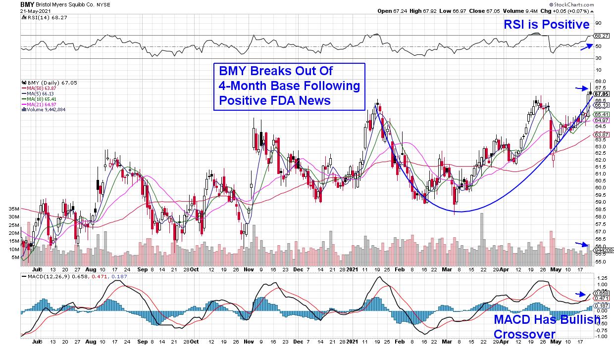
First up is Bristol Myers (BMY), which just announced FDA approval last week for another expansion of their blockbuster immuno-oncology drug Opdivo. In addition, the drug is also approved in several countries for various therapies.
The news helped push Bristol Myers out of a 4-month base on volume, with the stock now poised to trade higher. The 2.9%-yielder is now extended following last week's rally and can be bought on a pullback to the $66 area.
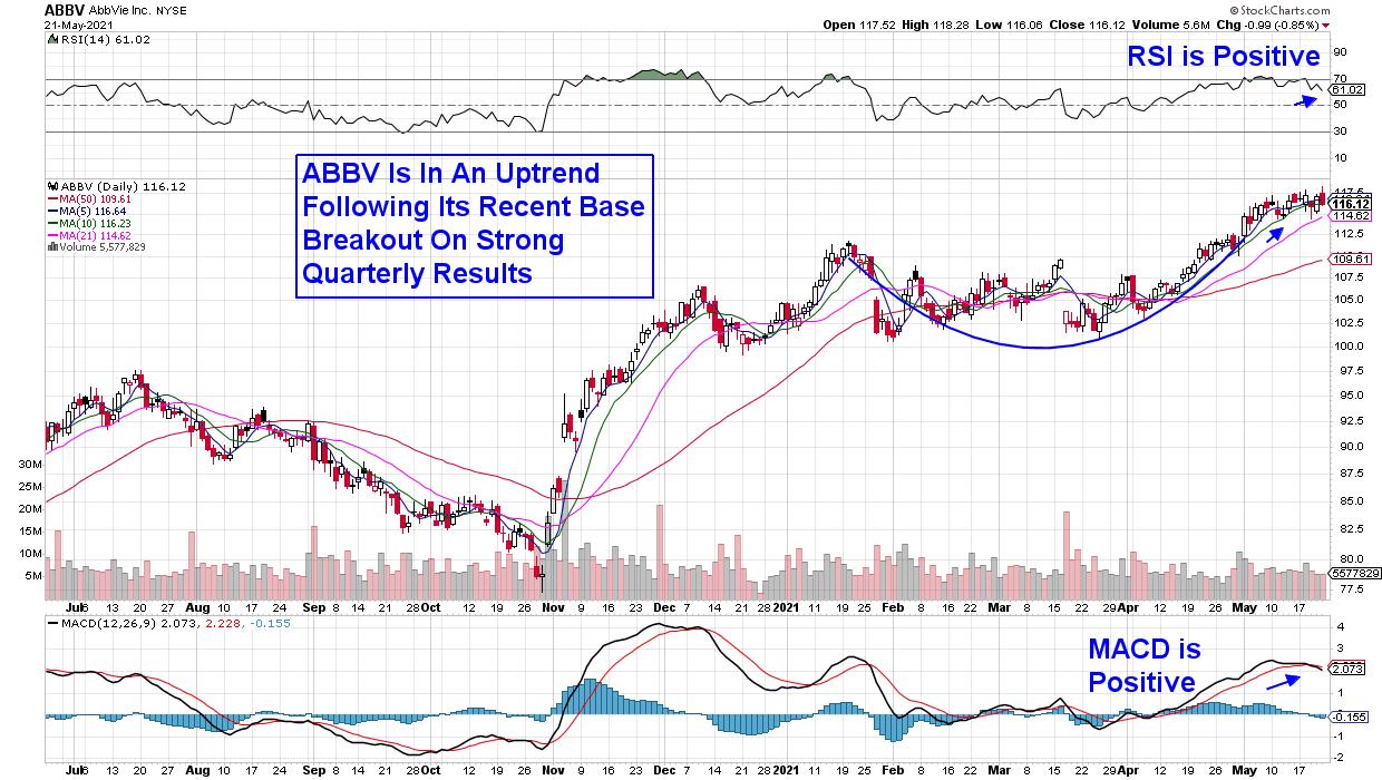
DAILY CHART OF ABBVIE (ABBV)

Next up is Abbott Lab's spinoff AbbVie (ABBV), which provides the best-selling drug Humira, used for rheumatoid arthritis. The company has additional products, which have helped ABBV grow their sales by over 50% in each of their last 3 quarters. In addition, ABBV offers a healthy 4.5% yield as analysts raise earnings estimates for both this year and next. The stock broke out of a 4-month base earlier this month and is now in an uptrend.
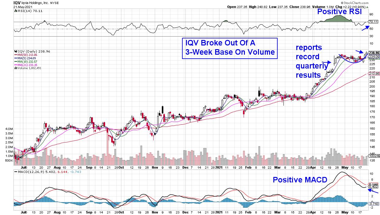
DAILY CHART OF IQVIA (IQV)

Last up is Medical Research provider IQVIA (IQV), a pioneer in using data to assist biotech and pharmaceutical companies in running robust clinical trials. More recently, IQV gained market share for their COVID-19 related work. The result was a record 1st quarter for the company, with strong double-digit growth across all areas. In addition, management raised guidance for the remainder of this year. IQVIA broke out of a 3-week base last week and is poised for another leg up.
Near-term, the markets appear poised for continued volatility, at least until a clearer path is created as more economic and monetary policy news is released. And while Cyclical stocks have been leading the markets year-to-date, my MEM Edge Report is on the lookout for a move back into select areas of Technology. If you'd like to be alerted to our top-performing stock picks among Cyclicals, as well as be alerted to a bullish move into select Tech names, you can trial this bi-weekly report for 4 weeks for a nominal fee.
You'll also receive sector and market insights that'll keep you in front of sector rotation as it's beginning to emerge. Take a look at a sample report using this link here!
In this week's edition of StockCharts TV's The MEM Edge series, I share top candidates that are defensive, as well as recovery plays. I also highlight new areas that are reversing lengthy downtrends and, lastly, headline stocks due to report earnings next week.
Warmly,
Mary Ellen McGonagle, MEM Investment Research
|
| READ ONLINE → |
|
|
|
| MORE ARTICLES → |
|
 Chart 1
 Chart 2
 Chart 3

