| THIS WEEK'S ARTICLES |
| The Mindful Investor |
| Three Key Charts for Falling Rates |
| by David Keller |
In terms of key developments this week, I would argue that the ten-year Treasury yield breaking below 1.5% was perhaps the most significant. On The Final Bar this week, we've talked about the $140 level on the long bond ETF ($TLT) and how this rotation higher in bond prices has broad implications.
How can we best approach this potential drop in interest rates from a technical perspective?
First, let's start with the $TLT, which indicates a clear transition from bearish phase to bullish phase.
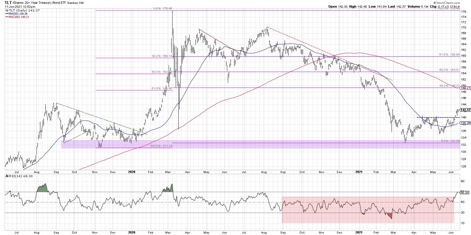
The most important tell here is the RSI, which has broken above the 60 level for the first time since August 2020. The RSI remained below 60 through the second half of 2020 through May 2021 and indicated the overall bearish phase for bonds.
I'll be hosting a FREE webinar called "Demystifying Fibonacci" this coming Tuesday, June 15th at 1:00pm ET. We'll break down Fibonacci retracements, discuss why these percentages make sense and review lots of examples. Sign up on my website if you're interested!
Now that pattern has reversed, as price pushing above resistance around $140 completed a rotation from lower lows and lower highs to higher highs and higher lows. Bond prices are headed higher.
Second, let's review the ten-year Treasury yield.
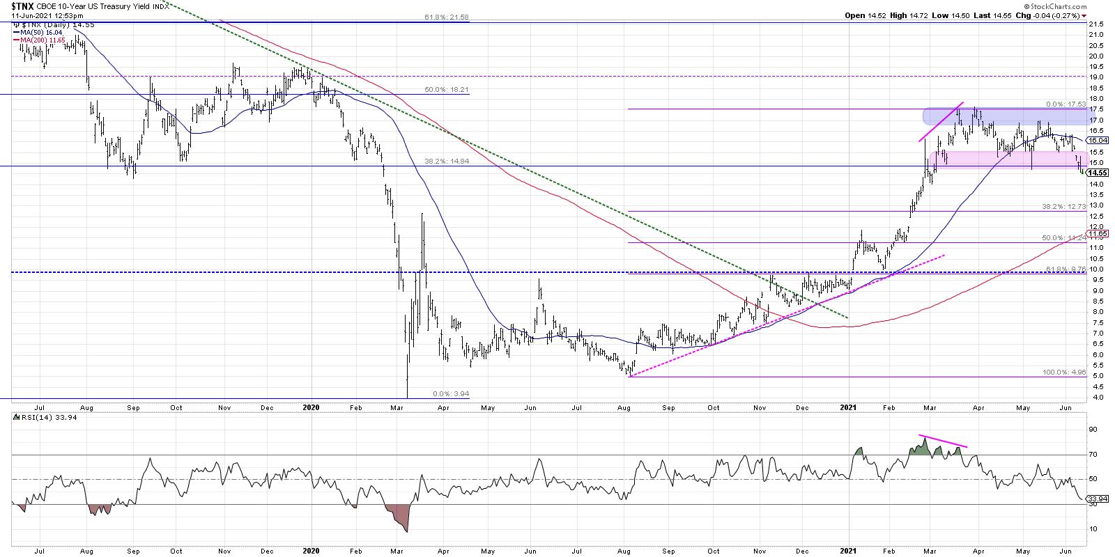
Here, we're using the $TNX (the CBOE 10-Year index), which is basically quoted at 10x the actual yield. So a reading of 14.6 means the ten-year bond is at a yield of 1.46%. We can see how interest rates have been stable for the last three months after the $TNX reached a high around 17.4 in mid-March.
The breakdown here is a change of character, as support levels failed and the RSI dipped below the key 40 level. The first Fibonacci support level, coincidentally, is just below the 1.3% level.
Finally, and perhaps most importantly, we can look at the shape of the yield curve and how that impacts different sectors.
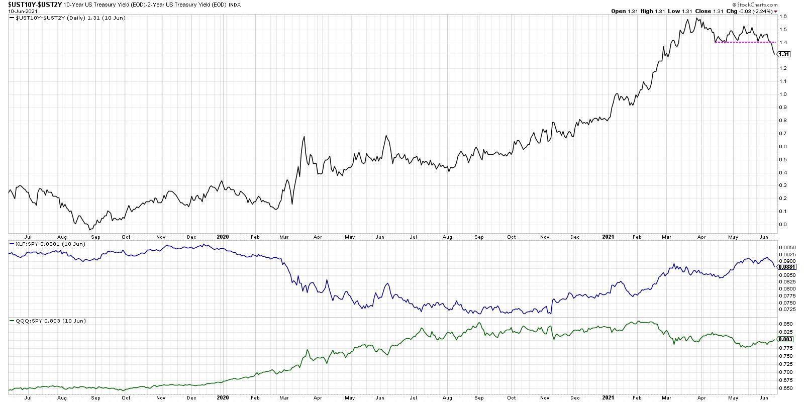
Here, we're looking at the shape of the yield curve by subtracting the yield on the two-year from the yield on the ten-year. So, if this line is increasing, the yield curve is steepening. The opposite would indicate a flattening yield curve. As this ratio has broken down this week, I'd point out other periods where the yield curve has been flattening and its impact on the relative performance of the financial sector.
Banks essentially make money based on a steep yield curve, as they can borrow on the short end of the curve and lend out at the long end. So a flatter curve means more of a headwind for financials, and thus the relative performance suffers.
Growth stocks like technology (represented here by the QQQ), on the other hand, tend to do better as rates come down and the yield curve flattens. If it's easier and cheaper for individuals to borrow, it's easier to spend money as well. Better for growth areas like tech and consumer!
Here, we can track whether the yield curve continues to flatten and see the impact of on the financial and technology sectors. Based on rising bond prices, falling interest rates, and a flattening yield curve, the coming weeks are more likely to see growth stocks reassert themselves in a leadership role. These charts should help you track that thesis and identify when the theme has potentially played out.
Want to see this in article in video form? Check out my YouTube channel!
RR#6,
Dave
P.S. Ready to upgrade your investment process? Check out my free course on behavioral investing!
David Keller, CMT
Chief Market Strategist
StockCharts.com
Disclaimer: This blog is for educational purposes only and should not be construed as financial advice. The ideas and strategies should never be used without first assessing your own personal and financial situation, or without consulting a financial professional.
The author does not have a position in mentioned securities at the time of publication. Any opinions expressed herein are solely those of the author, and do not in any way represent the views or opinions of any other person or entity.
|
| READ ONLINE → |
|
|
|
| Martin Pring's Market Roundup |
| Oil May Be on the Verge of a Major Breakout |
| by Martin Pring |
Last week, I featured three energy-related ETFs as part of an article on the bond market, as they had just broken out on a short-term basis. Chart 1 shows that those breakouts have held so far. This week, though, I'd like to take a deeper dive into the crude oil price, since the charts are suggesting that something technically very important may be about to happen.
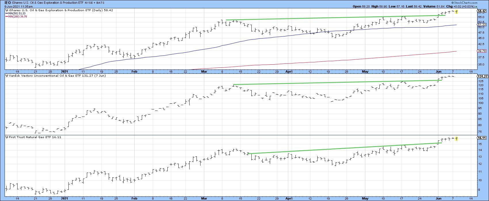 Chart 1 Chart 1
Secular Bull Market Underway?
What I am alluding to is the possibility that crude oil may be on the verge of confirming that a new secular or very long-term bull market began last spring. Something very unusual, perhaps unique in commodity pricing history, occurred at that time. A storage shortage caused the spot oil price to temporarily sell at a negative price. That means that producers paid consumers to take the oil away, completely the reverse to the normal way of doing business. From a contrarian aspect, that's a big deal. It compares, say, to the emperor's palace being valued at a higher level price than the combined value of Californian real estate at the height of the Japanese real estate boom. Alternatively, we could compare it to reports claiming that Price Line's total valuation at the end of the tech boom was greater than the market cap of all the airlines combined. These examples point to unusually unsustainable out-of-whack phenomena that all too often characterize secular turning points.
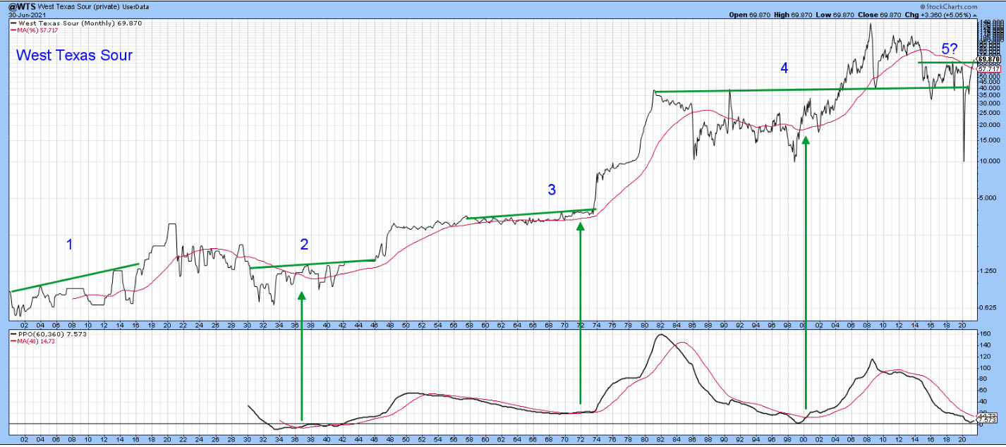 Chart 2 Chart 2
Chart 2, features an oil price series spliced with West Texas Intermediate Sour back to 1890. It shows that it has a habit of consolidating for a decade or so, subsequently breaking out to a new plateau. The numbers 1-4 represent these rangebound periods and subsequent breakouts. The fifth example has been augmented with a question mark, as a decisive breakout has not yet materialized. Also, the price has only been updated through June 7, so it lacks the end-of-the-month data required by this monthly chart for an official plot. Even so, the chart clearly reflects a market that could be close to a major breakout.
The three green arrows indicate that, when the PPO crosses above its 48-month MA, it's usually a reliable sign that a new secular bull market is underway.
If you refer to Chart 3, which focuses on a more recent period, you can see that the PPO has begun to turn up once again. However, it has not quite managed to cross above its MA. This, along with the fact that the price is right at its secular down trendline, again underscores the possibility that oil may be on the verge of an historic breakout.
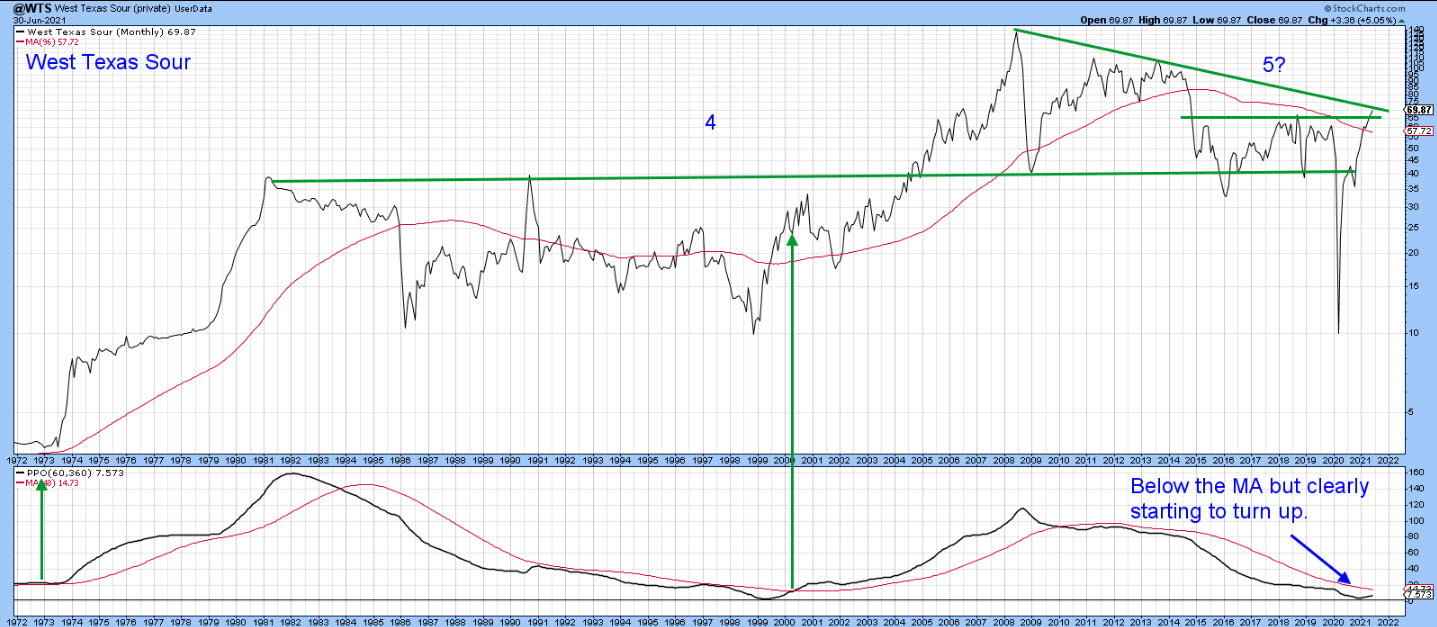 Chart 3 Chart 3
Chart 4 compares the West Texas Sour to the West Texas Intermediate Crude ($WTIC) carried by StockCharts. Both are positioned right at their secular down trendlines and have crossed above their 96-month MAs. I like that timespan for long-term technical work because it covers the approximate length of two business cycles. Also, as shown by the blue arrows, it has been an important support/resistance point for both series.
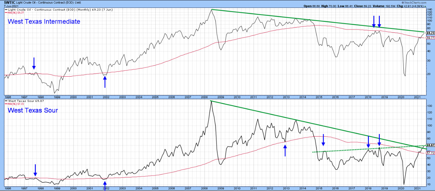 Chart 4 Chart 4
The Primary Trend
Chart 5 compares the $WTIC (top window) to its relative strength against the S&P Composite (third window). The price crossed above its 65-week EMA some time ago and recently cleared that 2014-2021 resistance trendline. Since the long-term KST is bullish, I am expecting it to build on that breakout. What's really intriguing though, is the fact that the RS line is right at the 2013-2021 down trendline. It's a pretty significant one, not only due to its length and relatively low angle of descent, but the fact that it has also turned back many rallies along the way. A successful penetration would be a very important technical event. A breakout seems likely because the KST for relative action, in the bottom window, is bullish. It looks as if it has already had a large rally, but this indicator has yet to reach zero and is therefore by no means overextended.
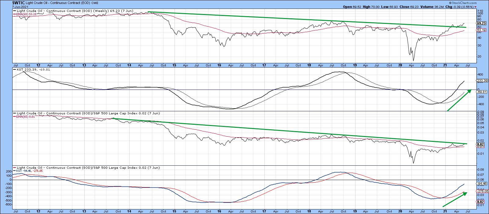 Chart 5 Chart 5
Energy ETFs
The SPDR Energy Fund (XLE) is the largest energy ETF, but Chart 6 shows that it has not necessarily been the best performer, as all the ETFs featured in the chart have recently outperformed the black horizontal line representing it. I am always a bit reluctant to get involved with overextended markets, but it is a technical characteristic that, in any group, leaders have a tendency to continue to lead. In this instance, we have two overall winners, the First Trust Natural Gas ETF (NCG) and the VanEck Vectors Unconventional Oil and Gas ETF (FRAK). Using the four-window format we used for Chart 5, let's see if these two ETFs are overextended on from a primary trend perspective.
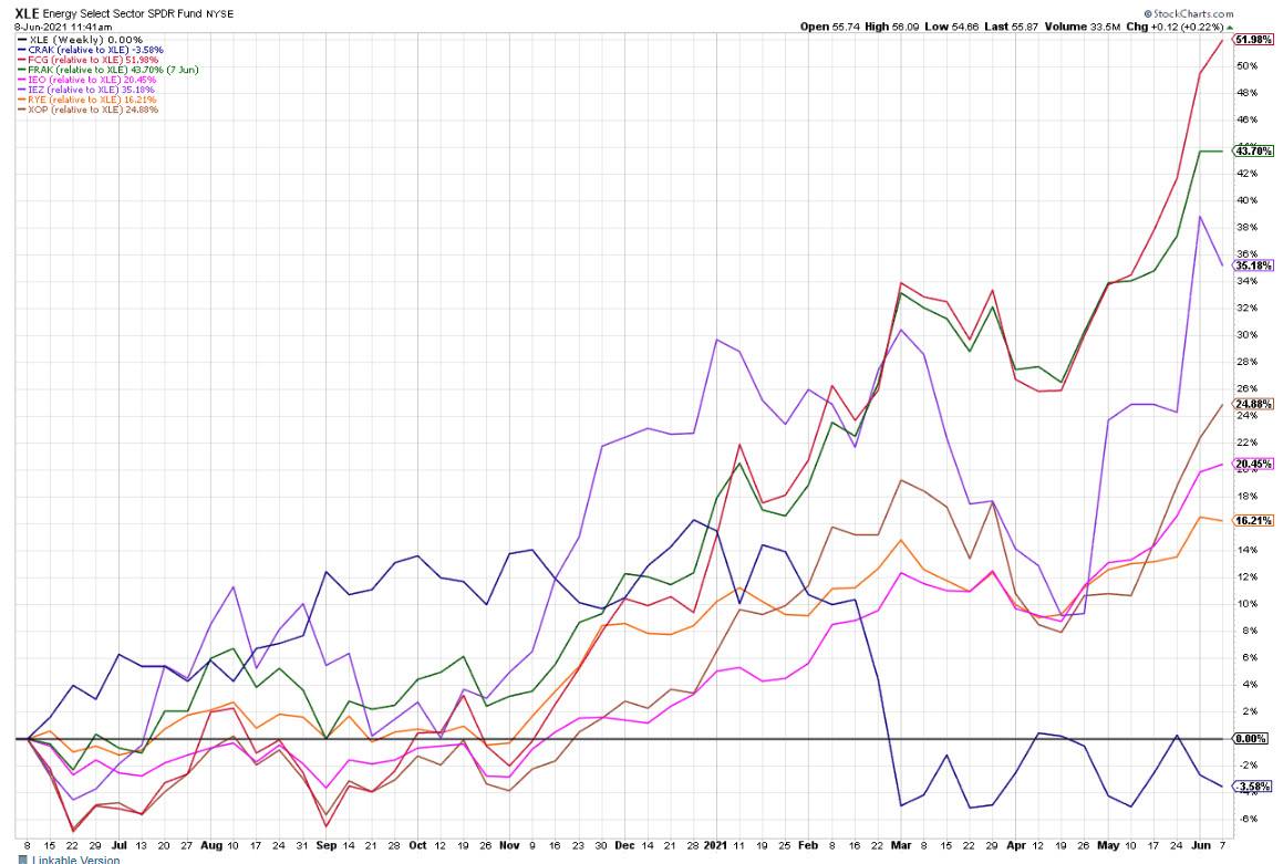 Chart 6 Chart 6
Chart 7 shows that the FCG has broken out on both an absolute and relative basis. That demonstrates this ETF is leading the oil price because the $WTIC has not quite broken out on a relative basis. The FCG may be a tad overextended on the daily charts, but this weekly one is suggesting that the major trend is positive and has lots of unrealized potential.
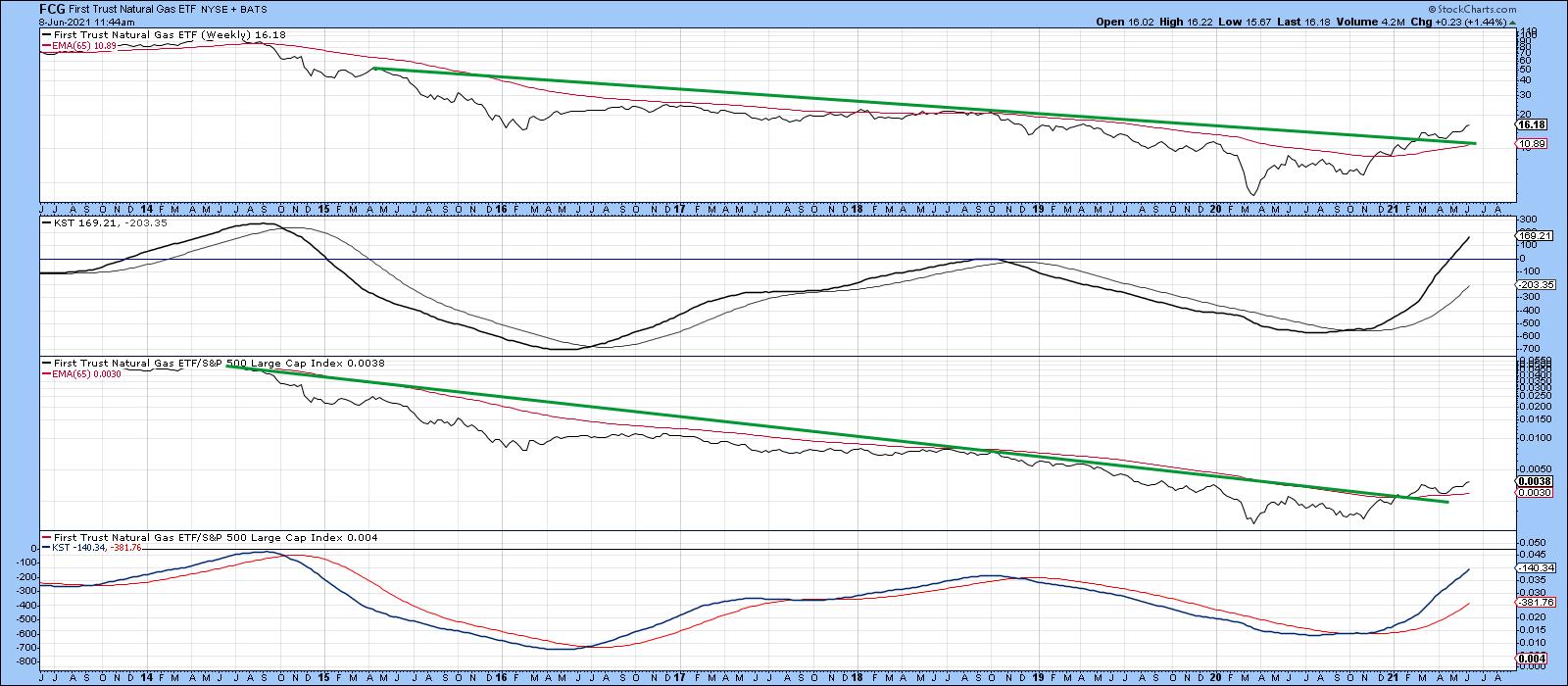 Chart 7 Chart 7
FRAK (Chart 8) has also broken out on an absolute and relative basis, but the break has so far been tentative. Both KSTs look as if they have had a huge rally, but the absolute one, in the second window, has only just crossed above zero, whereas its RS counterpart is still below this equilibrium point.
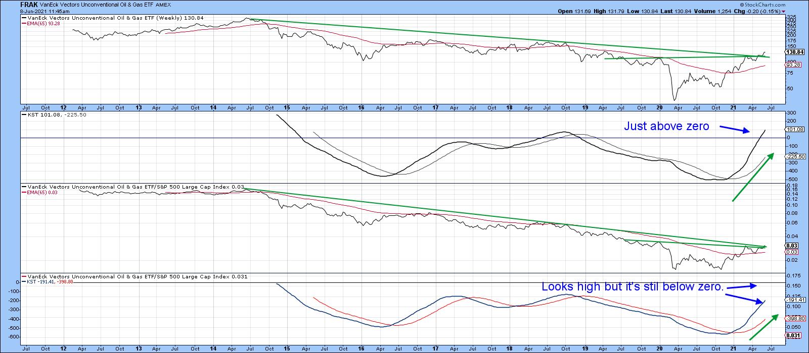 Chart 8 Chart 8
In summary, oil may be on the verge of a major breakout, which would confirm a secular bull market should it take place. Both oil and some energy-related ETF's look poised to signal an extended period of superior performance against the S&P Composite.
Good luck and good charting,
Martin J. Pring
The views expressed in this article are those of the author and do not necessarily reflect the position or opinion of Pring Turner Capital Group of Walnut Creek or its affiliates.
|
| READ ONLINE → |
|
|
|
| ChartWatchers |
| Momentum Turns Up as Utes Form Bullish Pattern |
| by Arthur Hill |
The Utilities SPDR is lagging the broader market over the last eight weeks, but a close look at price action reveals an uptrend, a bullish continuation pattern and an uptick in short-term momentum. Let's investigate.
First and foremost, the long-term trend is up for the Utilities SPDR (XLU). The ETF hit a new high in April and is trading well above its rising 200-day SMA. The 50-day SMA is also above the 200-day. A long-term uptrend means we want to look for bullish setups and bullish continuation patters. In other words, trade in the direction of the bigger trend.
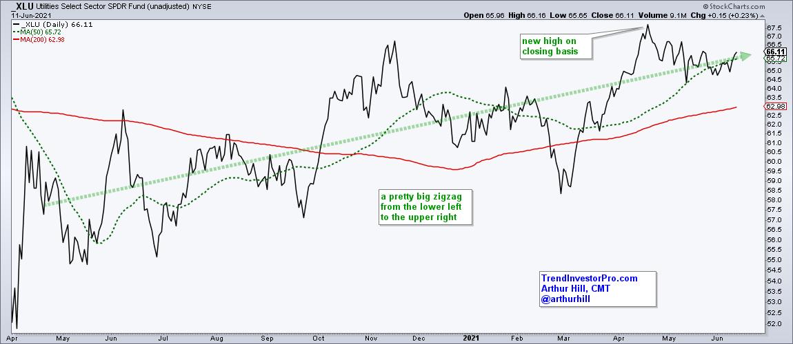
A bullish continuation pattern is basically a correction within a bigger uptrend. Corrections can take the shape of flat trading ranges (rectangles), declines (falling wedges/channels), contracting consolidations (triangles) or some sort of hybrid. Corrections digest the prior gains and pave the way for the next move.
The chart shows XLU with a 16.7% advance and a triangle of sorts taking shape. XLU was quite overbought after this big advance and the triangle consolidation alleviated these overbought conditions. A triangle breakout would signal an end to the correction and a resumption of the bigger uptrend.
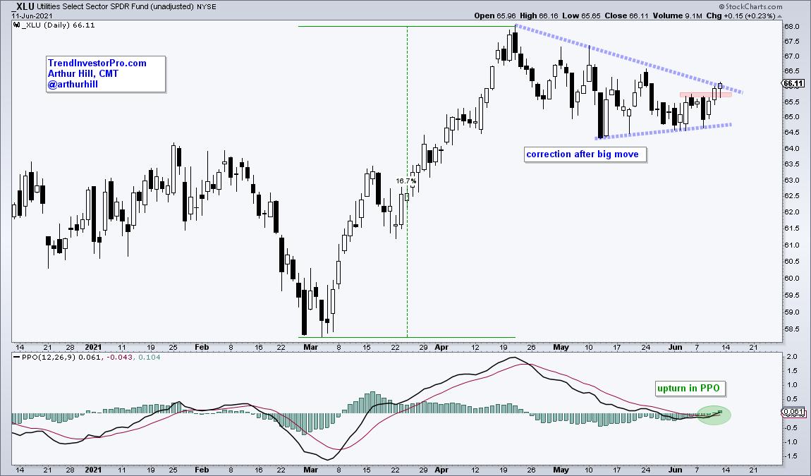
Signs of a breakout are already present. First, XLU broke above last week's high with a two day surge last week (Wed-Thu). Second, the Percentage Price Oscillator (PPO) turned up with a move above its signal line and into positive territory. This shows an upturn in momentum. I would expect XLU to complete its triangle breakout as long as the PPO holds above its signal line.
Looking for more bullish setups in ETFs? TrendInvestorPro.com tracks trend signals, ranks performance and highlights bullish setups from our ETF universe. Click here to take your charting to the next level!
--------------------------------------------------
|
| READ ONLINE → |
|
|
|
|
|
| ChartWatchers |
| How To Avoid Option-Related Manipulation This Week |
| by Tom Bowley |
Friday, June 18th is the next monthly options expiration day and, if it's like recent option-expiration Fridays, then get ready for crazy reversals. To best illustrate how the madness around options expiration works, we'll review past results.
Before I do that, let me explain that I host a "Max Pain" webinar the Tuesday before the 3rd Friday of every calendar month. Options expire on the third Friday every month, so we want our members to at least be aware of crazy reversals that could materialize in the market makers' attempt to wipe out options premium, saving themselves BILLIONS in premium payouts each month.
When a company's stock makes a big run in either direction and is heavily traded on the options exchange, you'd better keep one eye on max pain, which I define as the point in which in-the-money call premium is completely offset by in-the-money put premium. I'll give away my age here, but I like to use the analogy of a seesaw. When a stock makes a big advance, there will be thousands (quite possibly hundreds of thousands) of in-the-money calls, while there'll be relatively few in-the-money puts. If you think about the call premium (heavy) on one side of the seesaw and the put premium (light) on the other side, you should be able to picture what that seesaw would look like. The call premium side would be weighed down to the ground, while the put premium side would be way up in the air with legs dangling. That provides market makers an incentive to see that stock fall into options expiration day, minimizing the net payout of all those in-the-money calls and balancing the seesaw.
I'm going to provide you the best max pain monthly call that we made in 2021:
May 2021
While we've had plenty of success in 2021 with max pain, I think May 2021 really stood out, as both our long candidates and short candidates worked out quite profitably. Keep in mind that we provide our EarningsBeats.com members a handful of trade candidates each month based solely on max pain characteristics. We discuss them on the Tuesday night before Friday's options expiration, so we're talking about very short-term trades to take advantage of the market inefficiencies created by options expiration. The following table shows you the Tuesday close, the Max Pain price (think about that evenly-balanced seesaw with legs dangling on both sides) and the price point at which the most profit would have been generated:
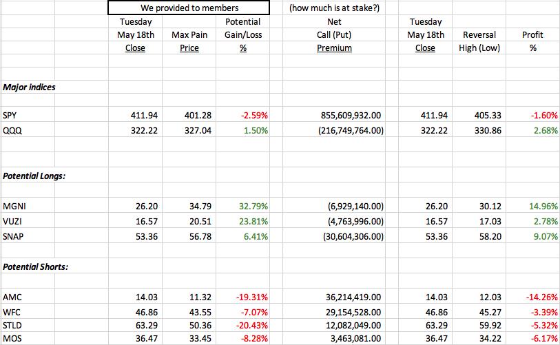
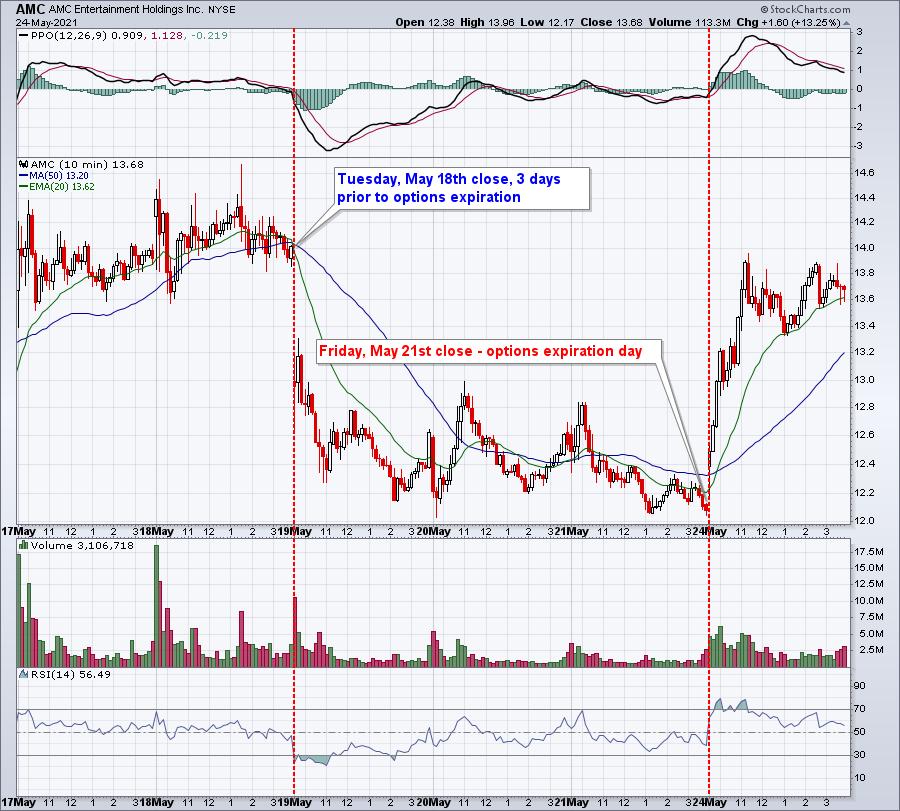
The best potential trade would have been AMC Entertainment (AMC), which was discussed as a short candidate at Tuesday, May 18th's closing price of 14.03. It fell as low as 12.03 within 48 hours, wiping out about $28 million of the $36 million of net call premium. Here was the intraday chart that week showing the price being driven lower:
On the flip side, Magnite (MGNI), a software stock, had millions of net put premium, indicating that it was in the market makers' best interest to see prices finish higher. Check out MGNI's chart over the final three days before its options expired:

We've been doing this for many years and I can tell you that max pain, like anything else, isn't a guarantee and doesn't work all the time. But I look at it like this. If I was thinking about buying AMC at 14.03 on Tuesday, May 18th, I think it would have been good information to know that it was in the market makers' best interest to see prices decline short-term, even if just temporarily. That would have enabled me to enter into a position on AMC much lower.
This Tuesday, June 15th, I'll be hosting our June Max Pain webinar. These webinars are reserved for our members, but during our Spring Special, we're going to open it up one time to the public. Everyone is welcome. Room instructions will be mailed to everyone in our free EB Digest newsletter community on Tuesday. If you'd like to be included in this webinar, with no strings attached, you just need to be an EB Digest subscriber. CLICK HERE to enter your name and email address in the space provided on our home page. If nothing else, I believe this event will be eye-opening and very educational.
Now is also a great time to become an annual member at EarningsBeats.com, as we're running our annual Spring Special, providing 2 free bonus months. For more information on this special, HERE is the link.
Happy trading!
Tom
|
| READ ONLINE → |
|
|
|
| Mish's Market Minute |
| Small-Cap Growth Stocks |
| by Mish Schneider |
 "A small-cap is generally a company with a market capitalization of between $300 million and $2 billion. The advantage of investing in small-cap stocks is the opportunity to beat institutional investors through growth opportunities. Small-cap stocks have historically outperformed large-cap stocks but have also been more volatile and riskier investments." Investopedia "A small-cap is generally a company with a market capitalization of between $300 million and $2 billion. The advantage of investing in small-cap stocks is the opportunity to beat institutional investors through growth opportunities. Small-cap stocks have historically outperformed large-cap stocks but have also been more volatile and riskier investments." Investopedia
Adding the word growth makes the small-cap growth stocks those that expect fast growth (in earnings, sales, book value and cash flow) with high valuations (ratios high, dividend yields low). Hence, the operative words are "volatile" and "riskier." Furthermore, "fast growth" is what we are going for here.
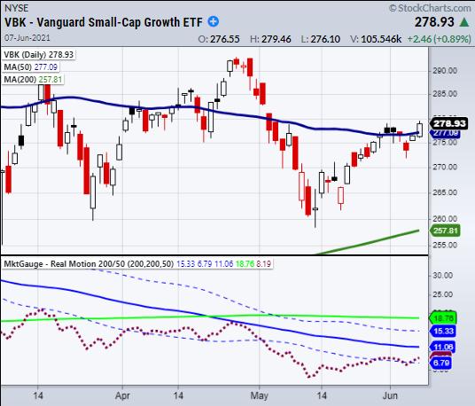
The ETF (Exchange Traded Fund) Vanguard Small-Cap Growth (VBK), as of April 30, 2021, has 647 stocks in its basket. VBK is a great choice for investors looking for solid exposure to the US small-cap growth market. 99.94% of its country holdings is in the U.S, with only 0.06% Canadian. The top five sectors within the ETF are Technology, Healthcare, Industrials, Consumer Cyclicals and Financials. Of course, keep in mind that the stocks in this ETF and within this sector are not the big tech ones like Microsoft or Apple. These are the potential highflyers that are expected to grow quickly in earnings and sales.
VBK, which began trading in 2004, rose with the market until the 2008 financial crisis. However, ever since the spring of 2009, VBK has been in a monstrous uptrend. During the pandemic in 2020, it fell with the market once again, yet has held a key 6-year monthly moving average, which has kept the uptrend intact.
In 2021, the year-to-date return is 2.83%. VBK made an all-time high in February 2021 at 304.93 and currently trades between 275-280.
As of last Friday, VBK's price rose, ending the week higher and outperforming the S&P 500. This puts not only this ETF but several other stocks in its basket in focus should the market remain solvent. In a strong bull market, we would rather put our money here than in the classic mega-cap stocks as the profits can come swiftly with huge percentage gains.
Within the basket, there are a few instruments of interest. One stock is 3D Systems (DDD). Not only has DDD moved well since 2021 began, but the stock has also quadrupled in price and now sits well situated with support on the charts, capable of seeing the price rise to $50.00. Another favorite is Sonos Inc., a maker of speakers (SONO), and Sunrun (RUN), a solar company.
Going back to VBK, which gives you exposure to the small-cap growth stock space without picking a specific company, the chart I highlight shows that VBK has begun to show some leadership against MarketGauge's benchmark. Our Real Motion Indicator, which measures momentum, illustrates that the momentum has increased, yet still has a way to go. And the price, as mentioned, is peeking its head above the 50-daily moving average, which, if it holds along with rising momentum, is a good sign.
Follow Mish on Twitter @marketminute for stock picks and more. Follow Mish on Instagram (mishschneider) for daily morning videos. To see updated media clips, click here.
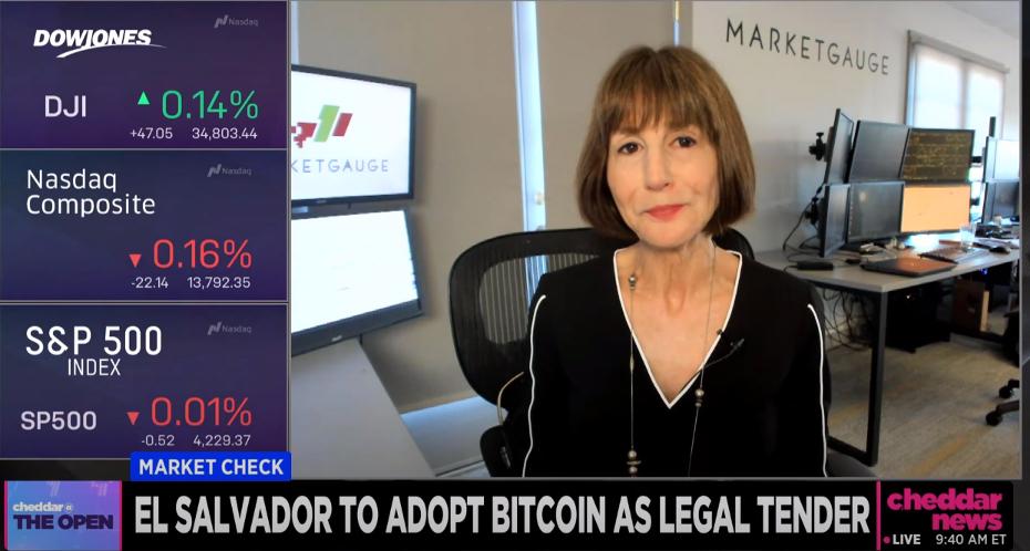
Click below to watch Mish give insight on the G7 summit on Cheddar News!
Mish Schneider reviews $SPY, $IWM and $IYT, plus 20 actionable picks from various sectors to watch should the stock market hold up, in this week's edition of StockCharts TV's Mish's Market Minute (watch below).
ETF Summary
- S&P 500 (SPY): Resistance 422.82 to clear
- Russell 2000 (IWM): 230.95 to clear with support 226.69
- Dow (DIA): 351 resistance
- Nasdaq (QQQ): Strong close over 335 range
- KRE (Regional Banks): Holding 70.00 with 71.82 resistance
- SMH (Semiconductors): 244 support. 258.59 resistance
- IYT (Transportation): 268.02 the 50-DMA
- IBB (Biotechnology): Large move created by Biogen Inc (BIIB)
- XRT (Retail) 96.16 resistance
Mish Schneider
MarketGauge.com
Director of Trading Research and Education
|
| READ ONLINE → |
|
|
|
| RRG Charts |
| Recap of Long/Short Baskets, adding CRM (+) and SWKS (-) |
| by Julius de Kempenaer |
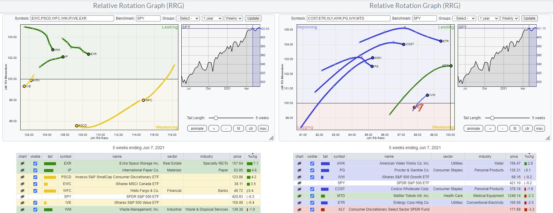
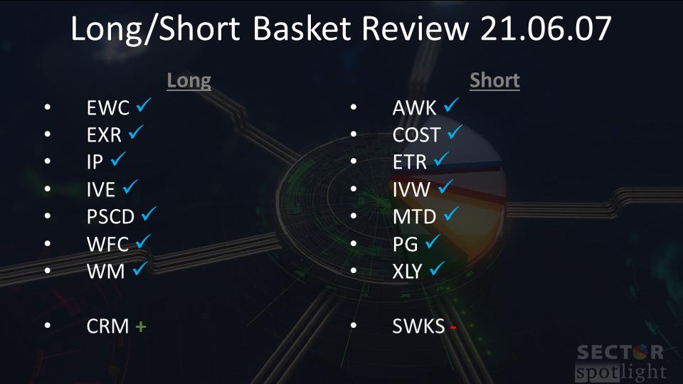
In today's episode of Sector Spotlight, I did a full review of all stocks that we are monitoring in the RRG L/S baskets. Both baskets (Long and Short) with the stocks on watch are shown in the RRGs above; the members of the Long basket are on the left and the short basket on the right. At the end of the show, I introduced two new additions. Salesforce (CRM) on the long side and Skyworks Solutions (SWKS) on the short side. In this article, I will provide my rationale for these additions to the baskets.
First of all, both stocks are in the Technology sector, which is one of the weaker sectors. In the Sector Spotlight seasonality segment for June and a recent presentation in Your Daily Five, I highlighted that the seasonal expectations for the Tech sector going into June were mixed.
The current rotation on the RRG, as well as the seasonal expectations, are weak. However, the average performance vs. SPY in June over the last 20 years is flat. One conclusion could be (and maybe should be) that XLK will be dragging SPY lower in June.
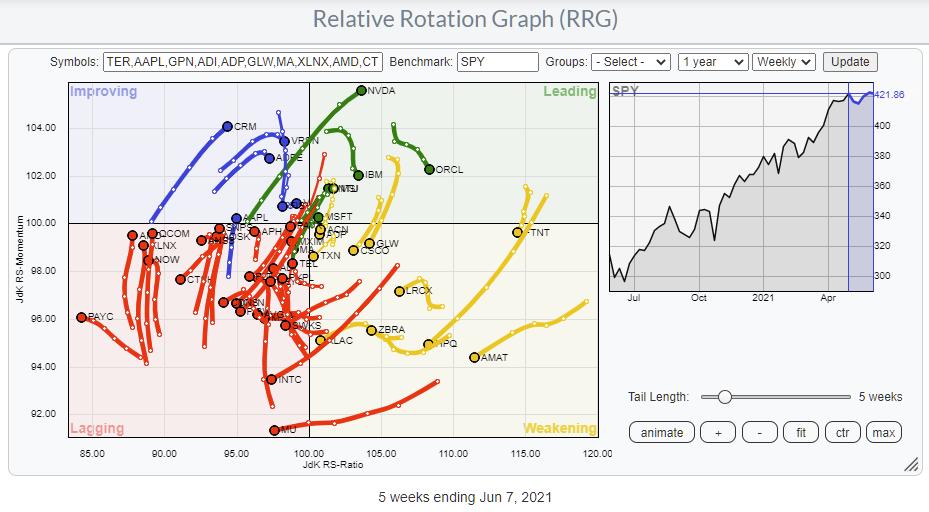
Nevertheless, when you dig a bit deeper and show all XLK members on a Relative Rotation Graph against SPY, it is only slightly tilted to the (lower) left, and there are definitely also a few more interesting tails for long positions visible.
Checking Out The Industries
To get a better handle on how this universe is spread in terms of relative strength, I charted the RRG for the industries inside the Technology sector.
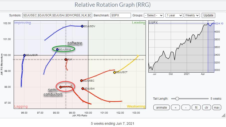
Most of the tails on these industries are to the left of the benchmark ($SPX), indicating a relative downtrend, which is to be expected when the sector index (XLK) itself is moving to the left of $SPX and inside the lagging quadrant. Please note that the dashed lines indicate the center of the RRG when XLK would be used as the benchmark.
The first tail that looks interesting is $DJUSDV, Computer Services, but when I explored the chart, I noticed that the relative strength line is still very weak, and the tail on the RRG has already started to flatten after its initial rotation through the improving quadrant.
The next tail, on $DJUSSW, software, seems to be offering more opportunities. There is no shortage of weak tails and negative RRG-Headings on this chart. Studying the individual price charts, in combination with the position of the talks on the RRG, I came to $DJUSSC, semiconductors, as being the one with the most downside potential in relative terms.
Software
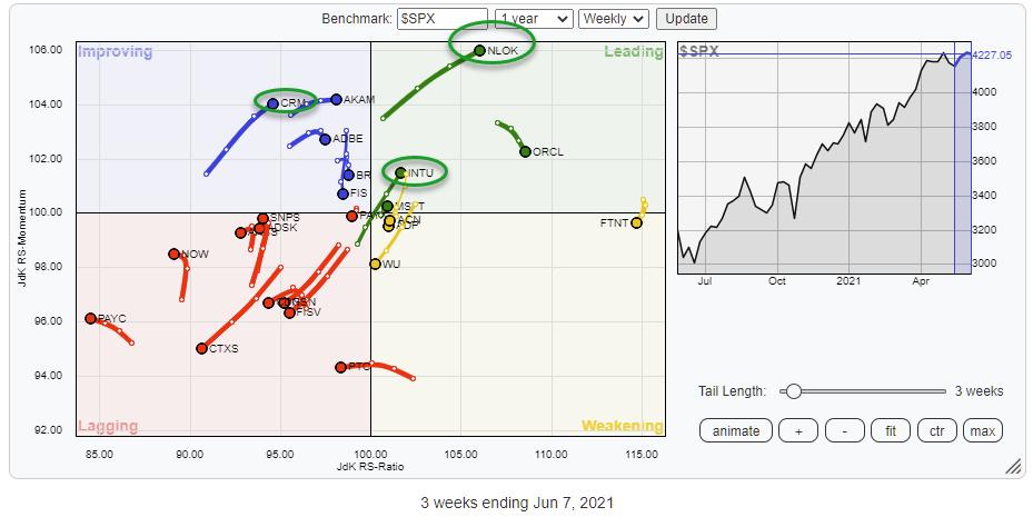
Plotting the members of the Software index on a Relative Rotation Graph against $SPX gives the image above. Despite the clear bias towards the lagging quadrant, a few tails are certainly worth further inspection.
First of all, NLOK (of course) really stands out while powerfully moving into the leading quadrant. The chart sure looks good, but NLOK really rallied very aggressively over the last 5-6 weeks, which means an inherent downside risk is also present. Too much for (my) comfort.
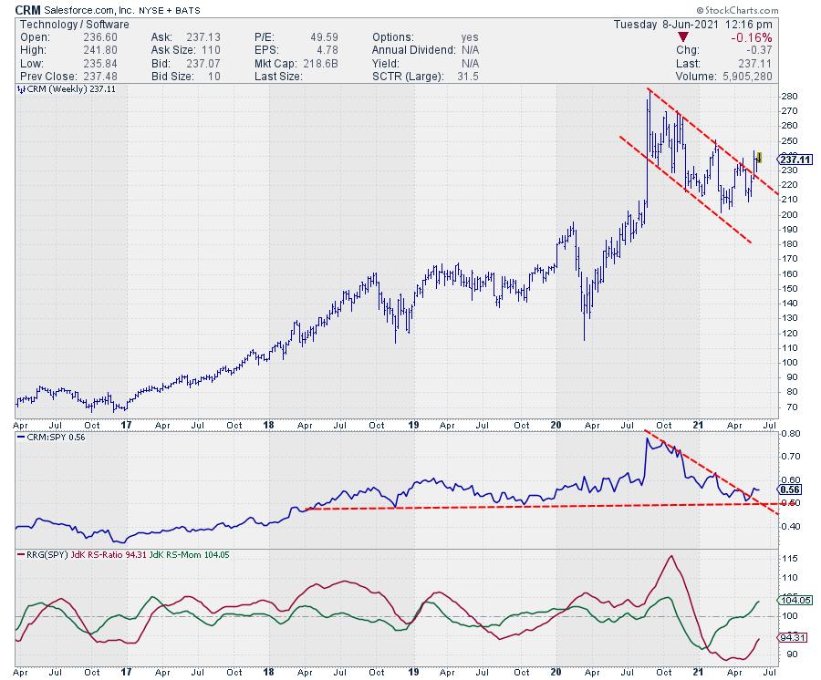
Then there are INTU and CRM. Both are looking strong. For my addition to the Long basket, I went with CRM, as I like the upward break after the downtrend from August last year in combination with the bottoming out of relative strength at horizontal support.
Semiconductors
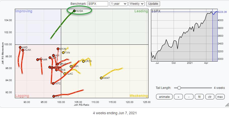
When you plot the members of the semiconductors index on an RRG against $SPX, the tail on NVDA immediately stands out as clearly being the dominant stock in terms of market cap as well as performance. However, despite that strength in NVDA, the $DJUSSC index still is moving further into the lagging quadrant, pointing to more underperformance for the group.
Going over the individual tails and the accompanying charts, I found SWKS as a potential addition to the short basket.
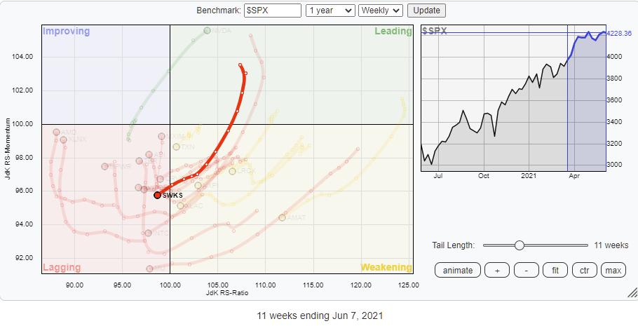
This chart has all the ingredients for a major turnaround in the making. First of all, relative strength has just left a rising channel that started back in 2019. This is now translating in both RRG-Lines moving below 100 and pointing further down.
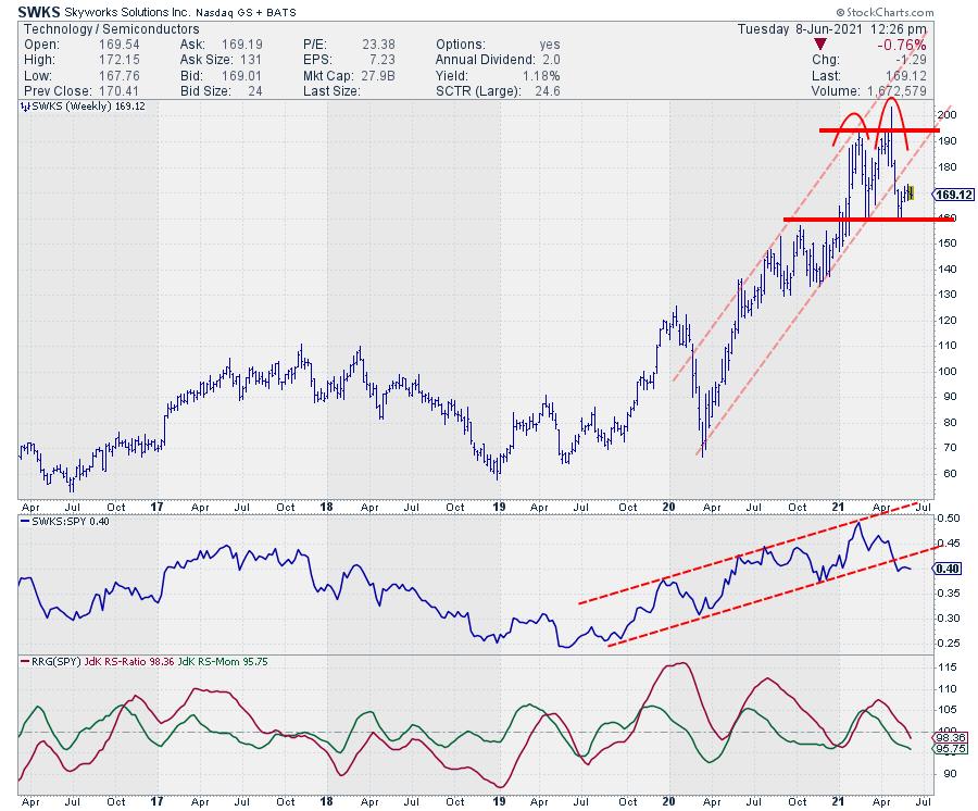
On the price chart, a similar thing happened. Here, the price dropped out of the rising channel that started at the start of 2020 after stalling around $195 on the latest leg up. This means that a large double top formation could now be in the making. The only thing needed now is a break below support at $160. When that happens, SWKS will complete a large double top at the end of a rising channel, while relative strength has already started to head lower. A move to watch out for.
New Basket Compositions
With the new additions, the RRG L/S baskets are now as follows:
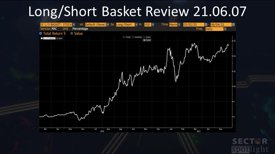
Performance
The performance of the baskets up to 6/7, before adding the new positions, looks like this:
#Stay#Safe, --Julius
|
| READ ONLINE → |
|
|
|
| ChartWatchers |
| Technical Analysis for Bitcoin |
| by Greg Schnell |
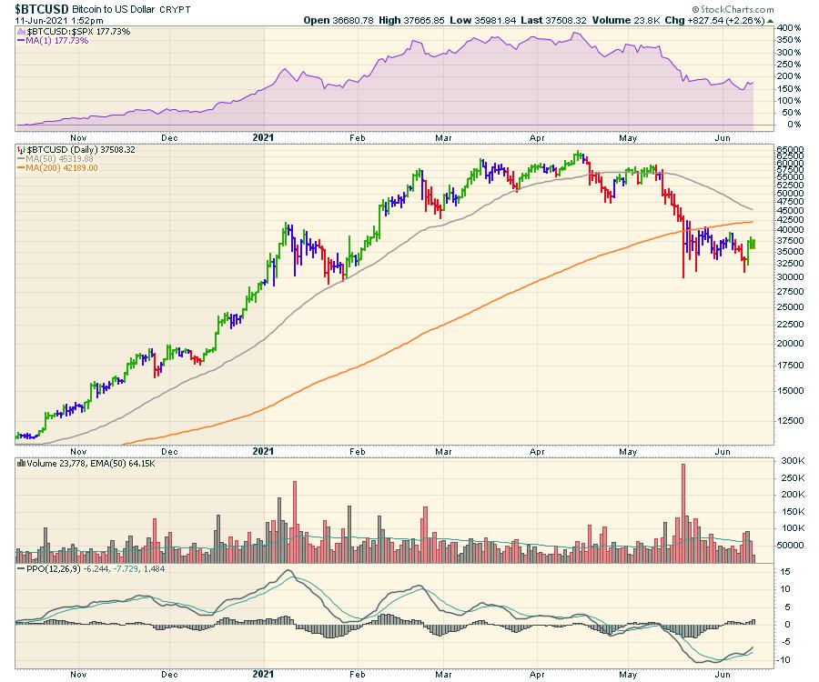
Bitcoin ($BTCUSD) is setting up some historical patterns, and it's worth watching to see how they play out. It's always easier when I don't have a crypto trade on. One of the patterns is the head-and-shoulders top. There are other patterns we could use as well, but this is a good one for something so emotional.
First of all, here is a description of a head/shoulders top. It covers off the main points really well of what typically happens during the construction of the top. So that is one piece of history that we can compare to. It's a pattern we see in the markets a lot. What it really offers is a way to examine the current chart moves for potential failures.
Below is a Bitcoin chart. Sometimes it is moving $2000/hour. You are allowed to buy partials, but the volatility is the same on a partial or a whole piece.
1) Notice the relative strength -- RS -- to the $SPX (purple area chart). Where did it top out and when did it start making lower highs and lower lows? Is it currently making lower highs and lower lows in relative strength? When did the uptrend line break?
2) We have a head/shoulders structures on the chart. A lower low, then a lower high to make the right shoulder.
3) The PPO momentum was getting weaker as the RS was flattening. Each rally had a lower peak. Eventually, it stopped bouncing and went below zero.
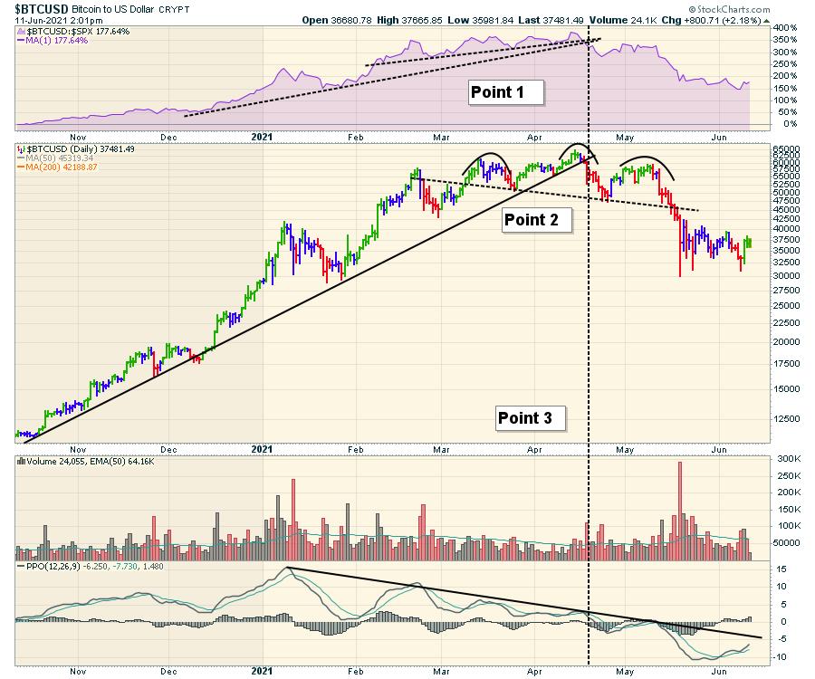
Let me add those points on the chart.
1) The relative strength -- RS -- to the $SPX (purple area chart). It topped out when the two different uptrend slopes broke. That was a nice sell signal. Right after that, RS started making lower highs and lower lows. The RS is still making lower lows and highs. When something is outperforming the $SPX by so much and then stops, that's a pretty good clue that the trend in outperformance is changing.
2) We have a head/shoulders structure on the price chart. A lower high to make the right shoulder. It may or may not make a lower low first.
3) The PPO momentum was getting weaker as the RS was flattening. Each rally had a lower peak. Eventually, it stopped bouncing and went below zero. If a trader didn't leave at the top, then the PPO rolling over at zero, after going below zero, would have been a good second exit. The PPO was also at the PPO momentum down trend line (roughly May 10) where a trader could watch for a break above or sell when the rollover occurred.
4) This topping coincided with expectations of Bitcoin to $500,000. A friend of mine in his 70s suggested buying some together through the Canadian ETF. The last chart in this article is the weekly PPO. I mentioned to him that we sell when the PPO is this high, not buy! When 70-year-olds are getting dragged in (and they are typically cautious investors), that is not a good sign. The speculative fever has reached the last remaining buyer.
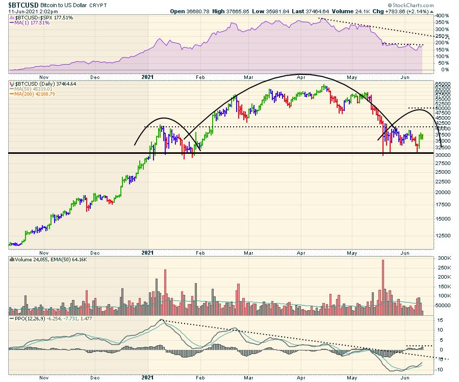
The next question is "now what?" I wrote this article on Friday morning, so you will be able to click on the chart and see the most recent data.
There are two RS trend lines in play, one near 200% and one near 250%. If Bitcoin is going to be in a rally I want to own, I want it to move faster than the $SPX. A breakout above the RS lower trend line is a good long signal and the RS upper trend line would be where I would expect the rally to end if it is going to roll over again. Emotions will be running fast on this chart.
For price: a couple of numbers are in play if it does rally. A breach of 40000 would put a target of 50000. There is also horizontal resistance at $47,500, which could cause some selling. The breakout above the consolidation on this right shoulder would be met with great enthusiasm.
For the PPO (a momentum indicator), if momentum is going to improve, it has to break the long downtrend. That would be the first goal, and momentum usually leads price. The second part gets hard. Not unlike back in May where the PPO stalled around zero, this is typical of something continuing a downtrend. Momentum doesn't really get going and rolls over around zero.
When I look at the weekly, there is a lot more information to consider. It looks like a brief rally from below the 40-week moving average back up to the 10-week moving average is a possibility. But the real message here is Bitcoin usually needs more time to consolidate. Both previous examples had the weekly PPO momentum indicator well below zero, but there were some bounces along the zero line that both ended up failing.
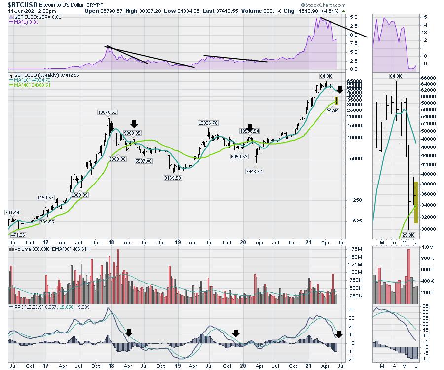
There may be a short spurious rally up to the 10-WMA (currently at $47,500 and dropping), but it may be just that, a countertrend rally. That's my thinking. If I was trading it, my expectations would be this next rally will be swift both ways. The first downtrend after a significant RS peak was a year, and the next downtrend lasted 9 months. At 8 weeks, it looks very quick to expect the next big major up leg. It could happen, but investors might also need time for emotions to be repaired after a 50% drop.
|
| READ ONLINE → |
|
|
|
| ChartWatchers |
| "Diamonds in the Rough" - Last Week's Darlings and Dud |
| by Erin Swenlin |
 Each week in my DecisionPoint Diamonds reports, I give readers 10+ stock picks to consider. This week, we had 11 picks. I look for stocks that are beginning to show positive momentum, bullish chart patterns, breakouts and improving relative strength among not only the SPX, but also against its industry group. Each week in my DecisionPoint Diamonds reports, I give readers 10+ stock picks to consider. This week, we had 11 picks. I look for stocks that are beginning to show positive momentum, bullish chart patterns, breakouts and improving relative strength among not only the SPX, but also against its industry group.
Today, I thought I would share three of last week's "Diamonds in the Rough." I have two "Darlings" and one "Dud." They aren't all winners and certainly are not "sure things," so I feel it is appropriate to show you the trade that didn't work out.
This week's "Darlings" come from the Biotech industry group, which really broke out this week. This week's "Dud" wasn't actually too bad. It was a timing issue, but it actually looks pretty good going forward. As part of a DP Diamonds subscription, you also get entrance into the Friday "Diamond Mine" where we review in detail the "Diamonds in the Rough" that presented for the week. I also take symbol requests and we look at BUY points for symbols with promise. An added bonus is that, at the end, we "mine" for new opportunities going into next week.
Below I have the "Diamonds in the Rough" as they were presented originally, followed by my comments on the chart today.
Darling #1:
Illumina, Inc. (ILMN) - Up +4.43% since 6/9
EARNINGS: 8/5/2021 (AMC)
Illumina, Inc. engages in the development, manufacturing, and marketing of life science tools and integrated systems for large-scale analysis of genetic variation and function. It operates through Core Illumina segment, which serves customers in the research, clinical and applied markets, and enables the adoption of a variety of genomic solutions. The firm's products include instruments, kits and reagents, selection tools, software and analysis. Its services include sequencing and microarray services; proactive instrument monitoring; and instrument services, training and consulting. The company was founded by David R. Walt, John R. Stuelpnagel, Anthony W. Czarnik, Lawrence A. Bock and Mark S. Chee in April 1998 and is headquartered in San Diego, CA.
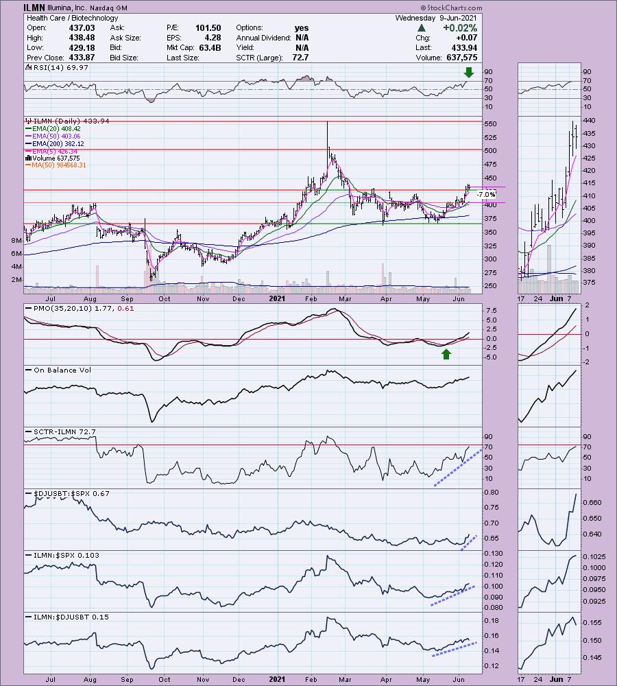
Below is the chart and commentary from Wednesday (6/9):
"ILMN is down -0.01% in after-hours trading. I was surprised I hadn't covered this one before. It's not as volatile as many of the biotechs out there. We have a nice breakout from a trading range. The breakout occurred Monday and price has held above support today and yesterday. The RSI is on the overbought side, so we should be aware of that. The PMO is on an oversold BUY signal and has now reached positive territory. There was a recent IT Trend Model "Silver Cross" BUY signal when the 20-EMA crossed above the 50-EMA. The OBV is confirming the rally and the SCTR is almost in the "hot zone" above 75, meaning it is in the upper quartile among all large-cap stocks. Outperformance is clear. I like that you can set a reasonable 7% stop."

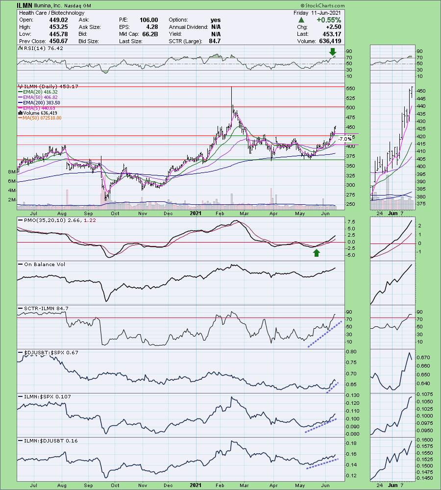
Here is today's chart:
The biggest flaw is the overbought RSI, which is flattening out. ILMN needs to consolidate Thursday's breakout. It began to today, I still love this Biotech and you can tighten the stop more too. The SCTR is now in the "hot zone" above 75, meaning it is in the top quartile among its peers in the large-cap "universe." Also, regarding the SCTR, the calculations are heavily based on intermediate- and long-term indicators.


Take advantage of our Spring special! Ending in July!
Get 50% off your first month of DecisionPoint:
Use coupon code: SAVE50 at checkout!


Arthur Hill, CMT in the free DecisionPoint Trading Room!
Arthur Hill, CMT, is the Chief Technical Strategist and main author at TrendInvestorPro.com. Schooled in classical technical analysis, Arthur crossed over to the dark side, quantitative analysis, in 2012. Classical technical analysis provides a solid foundation for learning, but is largely subjective and discretionary in nature. Quantitative analysis puts classical technical indicators to the test with clear rules, signals and results. Taken together, classical chart analysis and quantitative analysis provide the basis for Arthur's systematic approach to analysis, trading and investing. Next level technical analysis.
If you missed Arthur's appearance, here is a link to the recording:
Topic: DecisionPoint Trading Room
Start Time : Jun 7, 2021 08:41 AM
Meeting Recording Link.
Access Passcode: June-7th
Register now for the free Monday DP Trading Rooms!
Click here to register in advance for the recurring free DecisionPoint Trading Room! Recordings are available!
Darling #2:
Novavax, Inc. (NVAX) - Up +2.31% since yesterday
EARNINGS: 8/9/2021 (AMC)
Novavax, Inc. focuses on the discovery, development and commercialization of vaccines to prevent infectious diseases. It provides vaccines for COVID-19, seasonal flu, respiratory syncytial virus, Ebola and Middle East respiratory syndrome. The company was founded in 1987 and is headquartered in Gaithersburg, MD.
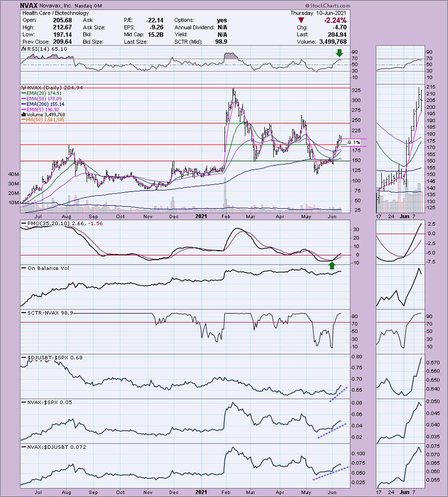
Here is the chart and commentary from Thursday (6/10):
"NVAX is up +0.16% in after hours trading. I covered NVAX as a Reader Request on July 30th, 2020. It hit its 9.2% stop when price dropped in August, so the position would be closed at this point. However, I like it today given the improvement in the Biotech space and knowing that this one is a leader based on the 98.9 SCTR. Today, price pulled back toward the breakout point. This took the RSI away from overbought territory. The PMO shows no damage and is now rising in positive territory on an oversold crossover BUY signal. Volume is coming in and, despite the pullback, the OBV didn't sustain much damage either. The stop is set below the August 2020 top."

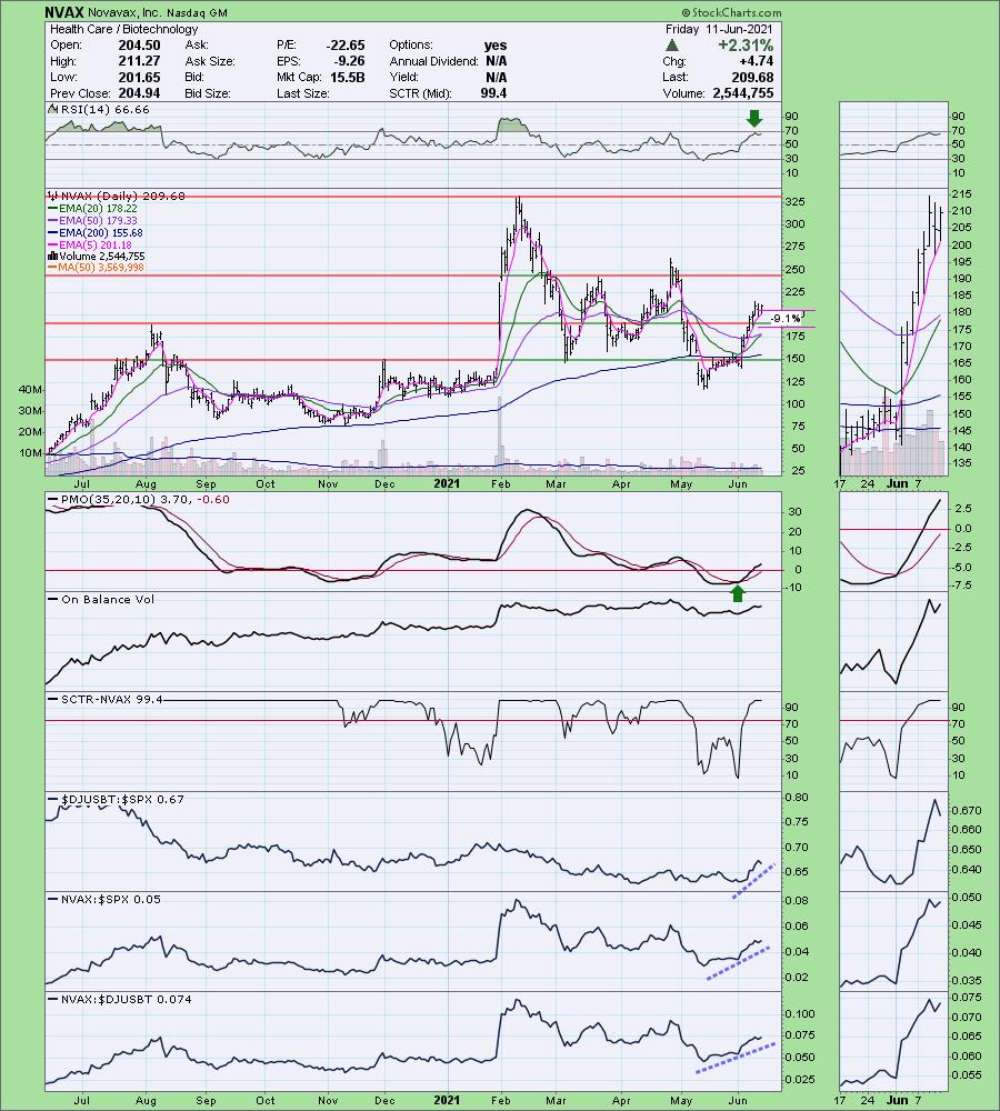
Below is today's chart & commentary:
The trade still looks good and it isn't too late for entry. The RSI is positive and not overbought. The PMO is rising strongly on a BUY signal. Most interesting is the nearing of an IT Trend Model "Silver Cross" BUY signal, which will be triggered when the 20-EMA crossover above the 50-EMA. Join me in the free Trading Room on Monday and we'll explore the best BUY points! Register HERE if you haven't already.

Dud:
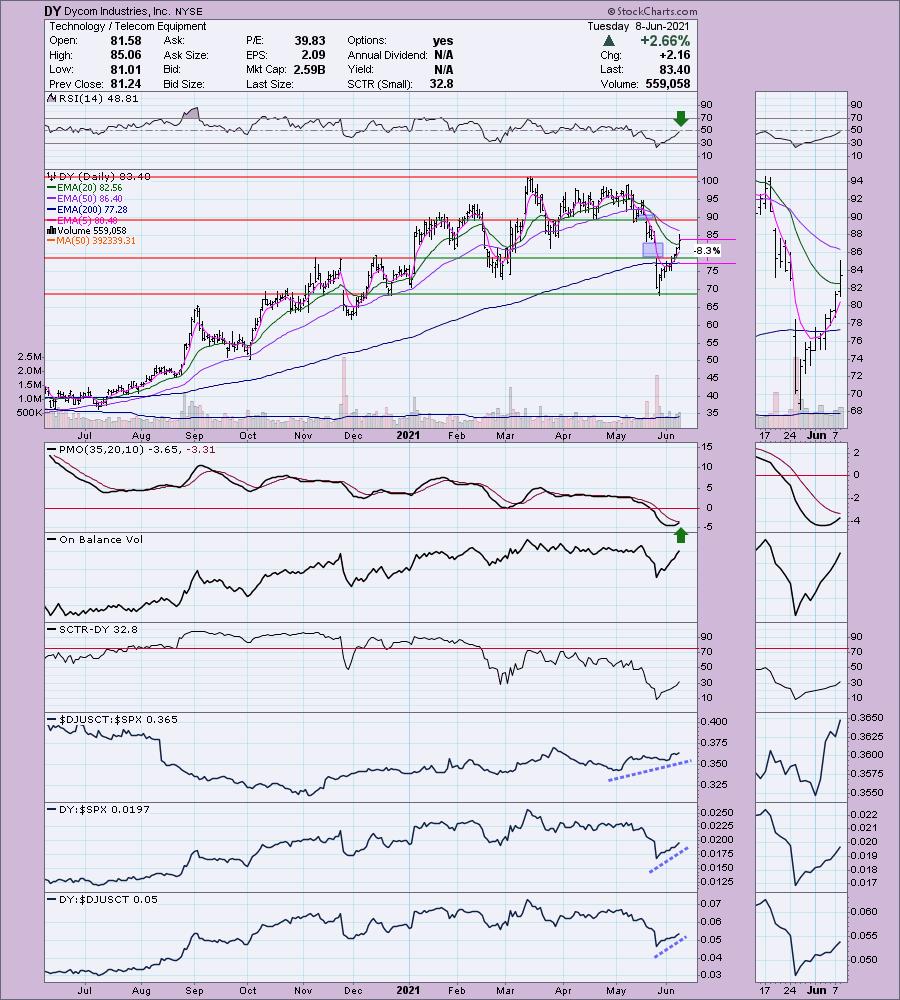
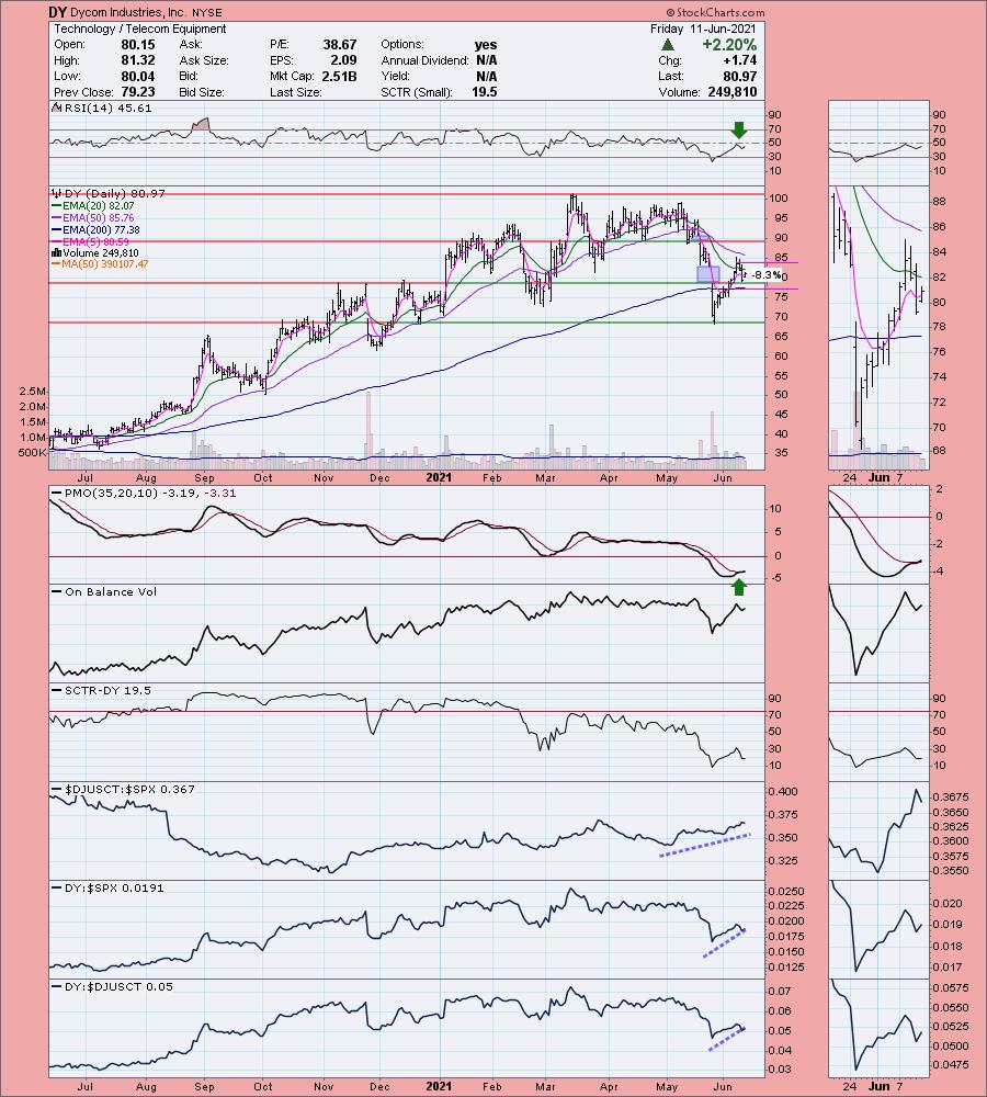
Dycom Industries, Inc. (DY) - Down -2.91% Since 6/8
EARNINGS: 8/25/2021 (BMO)
Dycom Industries, Inc. provides contracting services throughout the United States. Its services include engineering, construction, maintenance and installation services to telecommunications providers, underground facility locating services to various utilities, including other construction and maintenance services to electric and gas utilities, and others. The company was founded in 1969 and is headquartered in Palm Beach Gardens, FL.
Below is the chart and commentary from Tuesday (6/8):
"DY is up +0.72% in after hours trading. I covered DY in the October 14th 2020 Diamonds Report. I didn't put a stop on the chart, but an 8% stop wouldn't have triggered even on the big gap down in November. This means that the position is up +26.7%. The end of May was killer for DY, but it is retracing the decline rapidly. The first of two gaps has now been covered. Today's rally pushed DY above the 20-EMA. The PMO had already begun to curl upward. The RSI isn't positive yet, but it is on its way. The industry group is outperforming the SPX and DY is outperforming both. The stop is set below the gap, right around the 200-EMA at $77.28."

Below is today's chart:
While a lot of things went wrong on this chart, everything still looks bullish, especially after today's strong rally. A short-term flag has formed. The PMO had a positive crossover today. The RSI is still negative, but it is rising again. The timing was just off for it to look good this week. However, if we revisit this chart later, I expect that flag will have resolved upward and we'll be challenging the highs from April and May.

Happy Charting! - Erin
Technical Analysis is a windsock, not a crystal ball.
Helpful DecisionPoint Links:
DecisionPoint Alert Chart List
DecisionPoint Golden Cross/Silver Cross Index Chart List
DecisionPoint Sector Chart List
DecisionPoint Chart Gallery
Trend Models
Price Momentum Oscillator (PMO)
On Balance Volume
Swenlin Trading Oscillators (STO-B and STO-V)
ITBM and ITVM
SCTR Ranking
DecisionPoint is not a registered investment advisor. Investment and trading decisions are solely your responsibility. DecisionPoint newsletters, blogs or website materials should NOT be interpreted as a recommendation or solicitation to buy or sell any security or to take any specific action.
|
| READ ONLINE → |
|
|
|
| MORE ARTICLES → |
|


 "A small-cap is generally a company with a market capitalization of between $300 million and $2 billion. The advantage of investing in small-cap stocks is the opportunity to beat institutional investors through growth opportunities. Small-cap stocks have historically outperformed large-cap stocks but have also been more volatile and riskier investments." Investopedia


 Each week in my DecisionPoint Diamonds reports, I give readers 10+ stock picks to consider. This week, we had 11 picks. I look for stocks that are beginning to show positive momentum, bullish chart patterns, breakouts and improving relative strength among not only the SPX, but also against its industry group.