| THIS WEEK'S ARTICLES |
| John Murphy's Market Message |
| BOND YIELDS BOUNCE ON STRONG JOBS REPORT |
| by John Murphy |
10-YEAR TREASURY YIELD REBOUNDS... A strong July jobs report is helping boost bond yields today. Chart 1 shows the 10-Year Treasury yield bouncing 7 basis points to 1.29% on the day. A small double bottom on the daily bars suggests that a bottom may be forming. The TNX is also close to regaining its 200-day moving average. Today's rebound in bond yields appears to be giving a big boost to financial shares.
 Chart 1 Chart 1
FINANCIAL SPDR GAPS HIGHER...Financials are the day's strongest sector. Chart 2 shows the Financial Sector SPDR (XLF) gapping 2% higher today which pushes it well above its 50-day moving average. Most of the individual groups within the XLF are trending higher including insurance stocks and banks.
 Chart 2 Chart 2
BANK SPDR CLEARS 50-DAY LINE...Banks stocks are having a strong chart day. Chart 3 shows the S&P Bank SPDR (KBE) gapping 3% higher on the day and trading above its 50-day moving average. That's following a successful test of its 200-day moving average during July. Banks are usually one of the biggest beneficiaries of rising bond yields.
 Chart 3 Chart 3
|
| READ ONLINE → |
|
|
|
| ChartWatchers |
| Regional Banks Take Their Cue from the 10-Year Yield |
| by Arthur Hill |
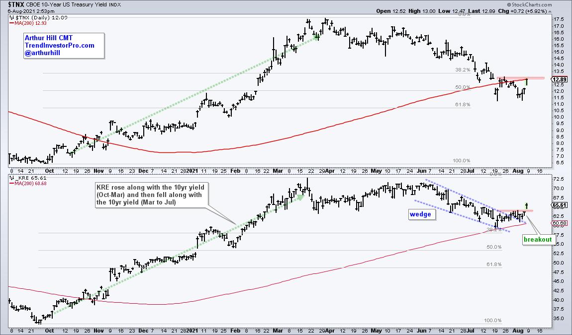
The Regional Bank ETF (KRE) and the 10-yr Treasury Yield are positively correlated and the recent surge in the 10-yr yield led to a breakout in the Regional Bank ETF. More importantly, this breakout signals an end to a corrective period and a resumption of the bigger uptrend. As noted last week, signs of rotation are appearing again.
The chart below shows $TNX (top window) and KRE rising from October to March and falling from March to July. These directional movements show that they are positively correlated. The correction in $TNX returned to battle the RISING 200-day SMA and retraced just over 50% of the prior advance. According to Charles Dow, secondary price moves (corrections) within primary uptrends retrace between one-third and two-thirds of the prior advance. Fifty percent is right in the middle and marks the base case. This week's surge is the first sign that the correction is ending and the bigger uptrend is resuming. A follow-through break above the late July high would complete the reversal with a higher high.

The lower window shows KRE doubling with a surge to new highs in March. Such a move deserves a correction and KRE fell back to the rising 200-day SMA. This decline retraced around 38% of the prior advance and formed a falling wedge. The price pattern and retracement amount are also typical for corrections within bigger uptrends. KRE reversed this decline with a strong move the last two days and this breakout argues for a challenge to the March-June highs.
As the name suggests, TrendInvestorPro specializes in trend identification and finding short-term bullish setups within the bigger uptrend. We constantly monitor a core ETF list with over 120 names and regularly update trend signals. Click here to take your analysis to the next level!
--------------------------------------------------
|
| READ ONLINE → |
|
|
|
| Martin Pring's Market Roundup |
| The Indicators are Mixed. What Does this Contradiction Mean for the Market? |
| by Martin Pring |
This morning, an interesting chart of the S&P Composite authored by Ed Clissold of NDR Research crossed my desk. It can be seen at @NDR_Research. It is a composite of 3 historic cycles: 1-year, 4-year (post-election) and 10-year decennial cycle with an average of years ending in a 1. Also included in the chart was this year's overlay, which has so far tracked the idealized cycle reasonably well. What caught my eye was the fact that the composite called for a peak in late July/early August, to be followed by a sharp drop into October. Ed was quick to point out that it is not a predictive model. It is really meant to give one a sense of direction more than magnitude.
Even though my experience tells me that these kinds of relationships work well until they don't, the chart did send me to the StockCharts workbench for an examination of the indicators, in order to see if there was any justification for a drop into October. My findings, as suggested by the title of this article, were quite mixed, as some were bearish, while others were projecting further upside potential.
Bearish Indicators
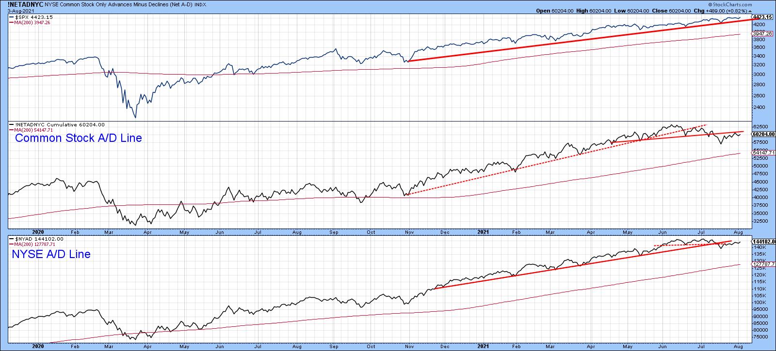
One negative characteristic that had been lacking during the post-March 2020 rally was been the setting up of a negative divergence between the S&P Composite and the NYSE A/D Line. That was resolved in the early summer, as neither NYSE A/D or its common stock counterpart have confirmed new highs in the Index. This discrepancy could certainly be cleared up with relatively little effort, but the fact that both series have broken important up trendlines and completed tops makes that task a lot more difficult over the near-term.
 Chart 1 Chart 1
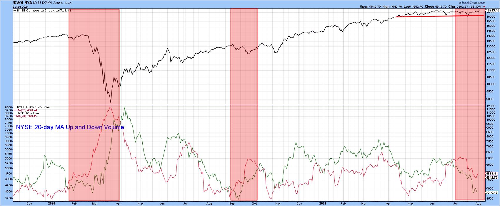
Weakness is even more pronounced in the volume department, as the 20-day MA of NYSE downside volume has been trading above that for upside activity since the beginning of July. The pink shadings tell us that this type of condition offers potential vulnerability for stocks.
 Chart 2 Chart 2
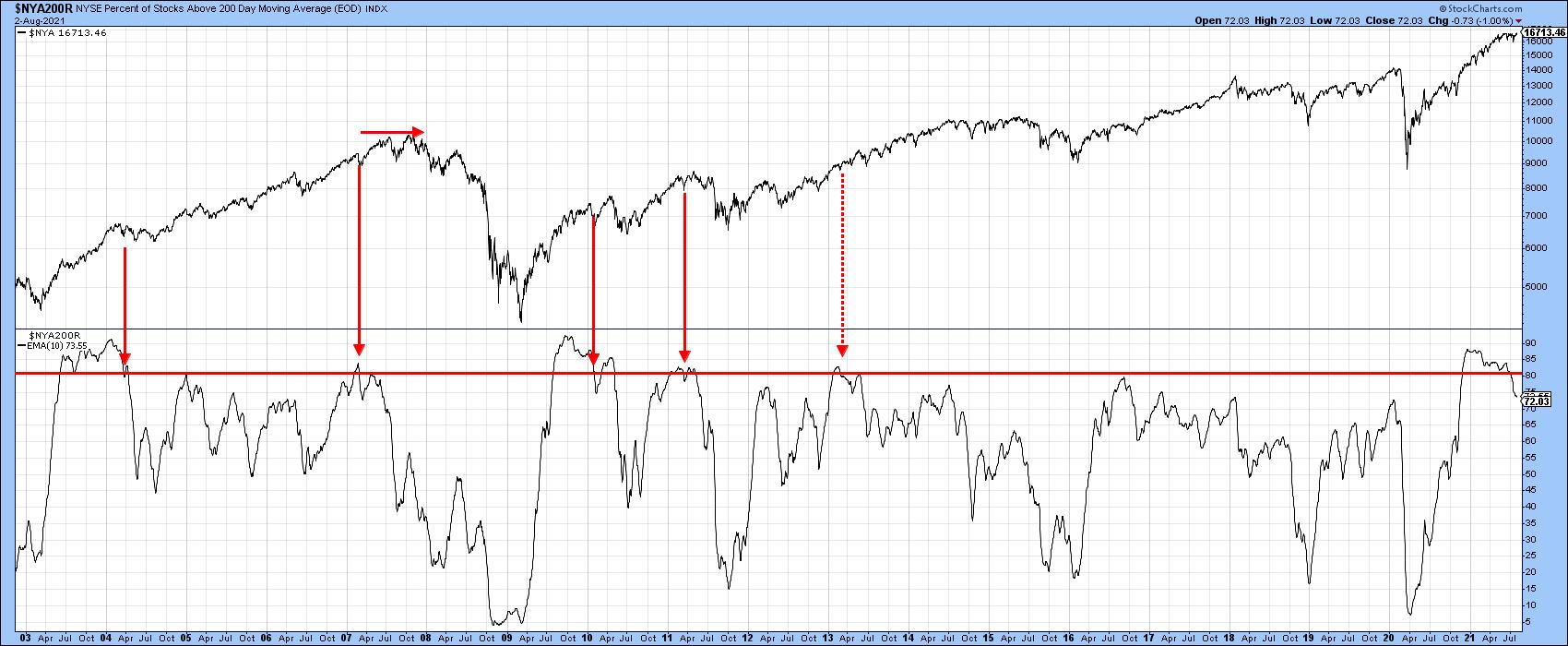
The percentage of NYSE stocks above their 200-day MAs recently crossed below the 80% level. The solid red arrows indicate that this has often been a threshold point to be later followed by some kind of decline. The one dashed arrow in 2013 reminds us that, though unlikely, it is possible for the Index to barrel ahead even as the number of stocks in positive trends continues to drop. In other words, the Index may rally, but the shrinking number of stocks trading above their 200-day MAs means that the market is getting progressively more selective and, therefore, more of a challenge to turn in a trading profit.
 Chart 3 Chart 3
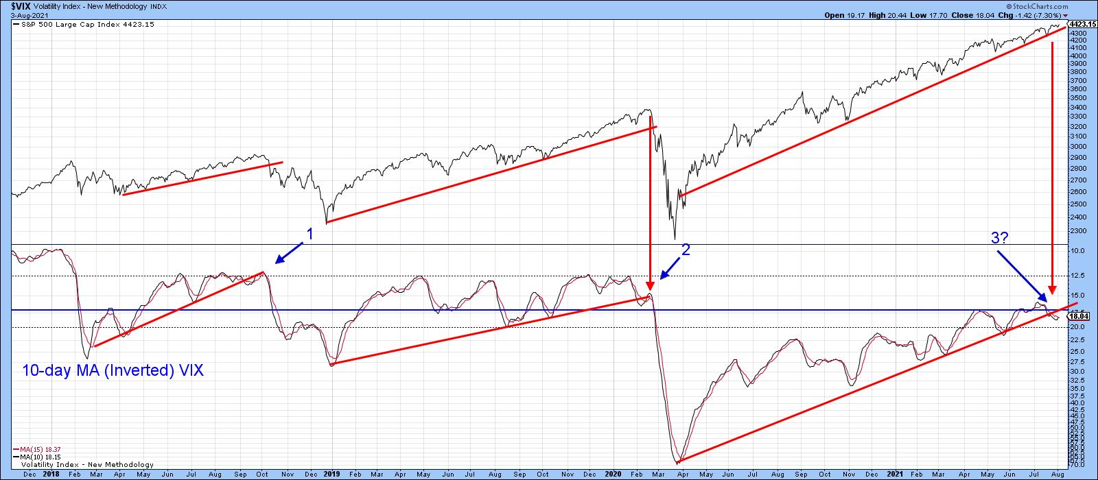
Chart 4 plots the 10-day MA of the VIX inversely. That way, it corresponds to swings in the S&P Composite. Occasionally, it is possible to construct trendlines. When those lines are violated and this is confirmed by a trendline break in the S&P, prices typically reverse to the downside. Two previous setups of this nature developed in 2010 and 2018. A third seems to be developing currently, as the (inverse) VIX recently dropped below its bull market trendline. What we have not yet seen is confirmation by the S&P Composite in the form of a decisive break below its secondary bull market up trendline at, say 4,300.
 Chart 4 Chart 4
Bullish Indicators
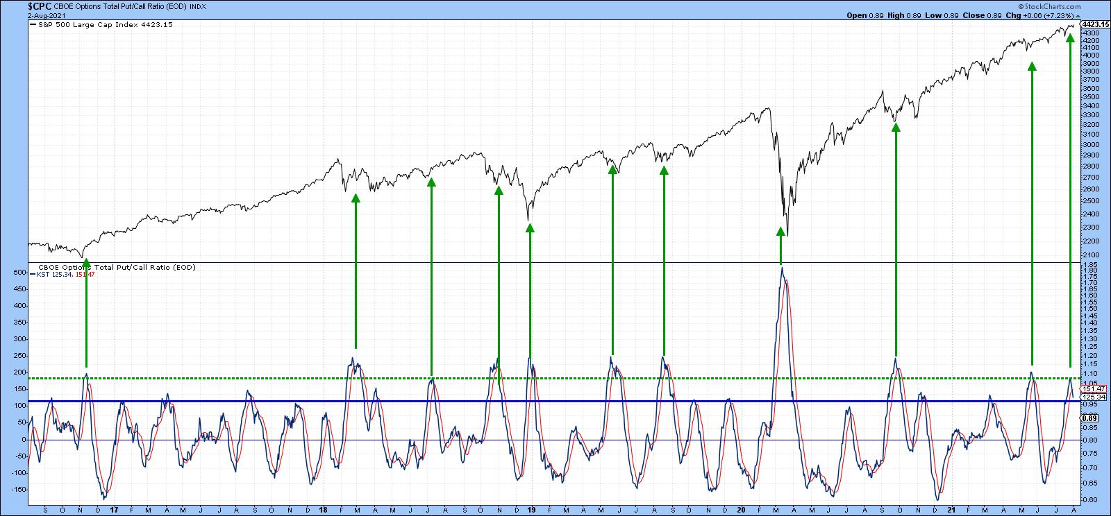
The KST for the CBOE total option put/call ratio is featured in the lower window of Chart 5. A rising momentum indicator means that investors are getting progressively more negative as they place more bets on the bearish puts over the bullish calls. The green arrows show that peaks in the KST, which develop at or above the green horizontal line, are bullish for equities, as they reflects a shift in investor sentiment away from puts. The indicator peaked last week and looks set to head (bullishly) lower.
 Chart 5 Chart 5
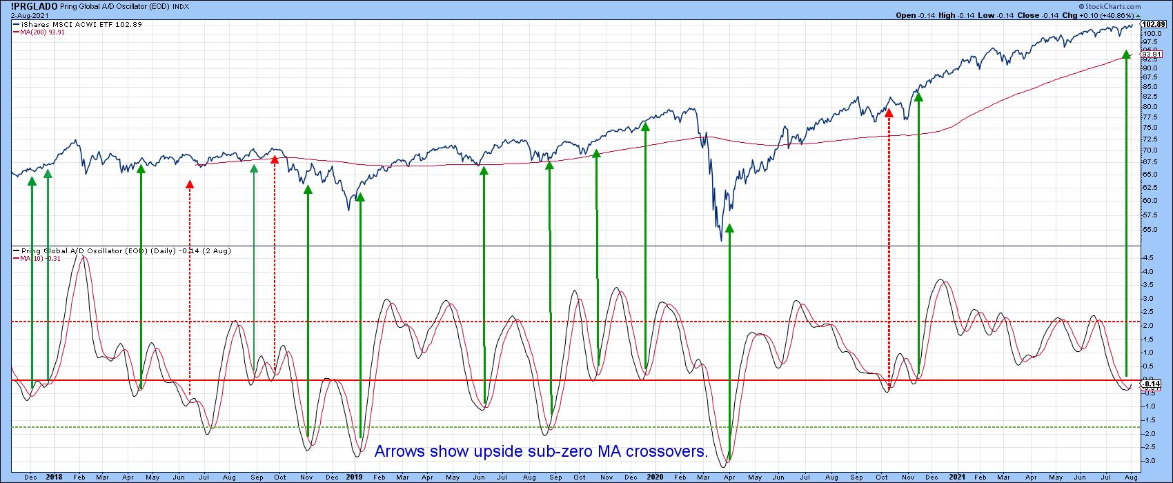
An oscillator constructed from my Global A/D Line is featured in Chart 6. The arrows indicate when the indicator drops below zero and then crosses above its 10-day MA. Typically, the MSCI World Stock ETF (ACWI) experiences a short-term rally. About 25% of the time, that does not happen. These instances have been flagged by the red dashed arrows. In the last couple of sessions, the indicator has again begun to reverse, which suggests that prices will continue to move higher.
 Chart 6 Chart 6
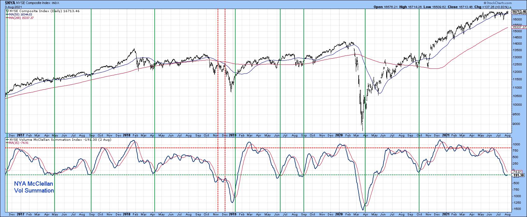
Finally, the NYSE McClellan Volume Summation Index has fallen back to its oversold zone. However, it is not yet bullish because it remains below its 15-day MA. It's certainly a development worth monitoring, because the vertical lines, which flag previous oversold reversals, show that such action is typically followed by a very worthwhile advance.
 Chart 7 Chart 7
Something Worth Monitoring
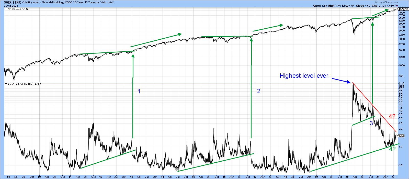
I am not going to break it down and say there is one indicator that will be the arbiter of the current contradictions. However, Chart 8 does seem to capture the mixed nature of the technical picture. It features a ratio between the VIX and the yield on the 10-year bond. When rising, the ratio reflects investor's growing level of fear because it implies that the VIX is rising and the yield falling.
 Chart 8Since 2009, there have been three instances where up trendlines in the ratio have been violated, meaning the trend of improving confidence is likely to extend. All were confirmed by the price breaking to the upside and followed by rising prices. Right now, this series is caught between two converging trendlines. Both have been touched on numerous occasions and are fairly lengthy. That could well mean that the ultimate breakout will signal the direction of the next important market move. Please remember that this chart is live, which means that, as new data is available, it can be updated with a simple click. Chart 8Since 2009, there have been three instances where up trendlines in the ratio have been violated, meaning the trend of improving confidence is likely to extend. All were confirmed by the price breaking to the upside and followed by rising prices. Right now, this series is caught between two converging trendlines. Both have been touched on numerous occasions and are fairly lengthy. That could well mean that the ultimate breakout will signal the direction of the next important market move. Please remember that this chart is live, which means that, as new data is available, it can be updated with a simple click.
Conclusion
The long-term indicators continue to point north, so we should assume that the contradictory evidence laid out above will be resolved in a positive way. However, when the evidence is narrowly mixed, so are the probabilities, which means that a trimmed-back trading position is not a bad idea until the smoke clears.
Finally, it recently came to my attention (thanks Grayson) that StockCharts carries 150 cryptocurrencies. If you are interested, please go here to see the list.
Good luck and good charting,
Martin J. Pring
The views expressed in this article are those of the author and do not necessarily reflect the position or opinion of Pring Turner Capital Group of Walnut Creek or its affiliates.
|
| READ ONLINE → |
|
|
|
|
|
| ChartWatchers |
| Better Breadth Indicators |
| by Carl Swenlin |
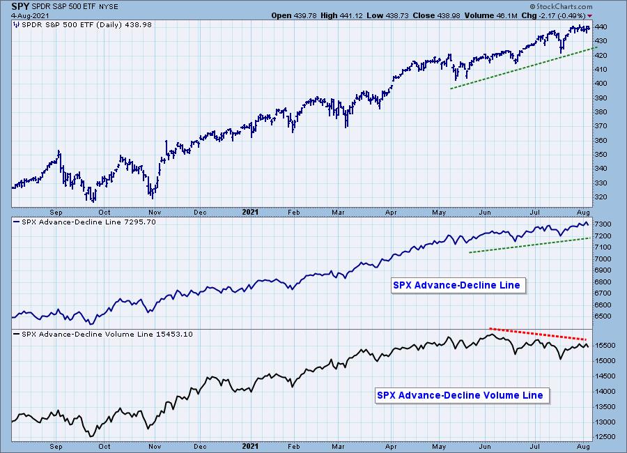
The other day, I was looking at the S&P 500 version of the Advance-Decline (A-D) Line, which tracks the cumulative daily advances minus declines for the SPX components. We can see that it has been confirming the market's advance for months, with a steady stream of rising bottoms confirming the market's advance. But we can also see that, for the last two months, the Advance-Decline Volume Line has turned in a string of declining tops, which is a bearish negative divergence. This raises the question: which indicator should we believe?

For the A-D Line, a stock will register as an advance or decline with a change of just one penny, and it will be equally weighted against a stock that changes by 100 pennies. That doesn't seem fair, does it? Well, it is what it is, and the A-D Line is a venerable indicator that it gives us a useful peek into the market's internals. We just have to be aware of its limitations.
That's all well and good, but why is the A-D Volume Line diverging from price? The reason is that it takes the same basic advance or decline and weights it by the amount of the day's volume. This doesn't address the disparity of differences in the amount of price change between stocks, but it does apply a useful adjustment to the problem. Because of this, I think the A-D Volume Line is the more useful of the two, because it is telling us that, in spite of rising prices, volume is fading and the advance is losing support.

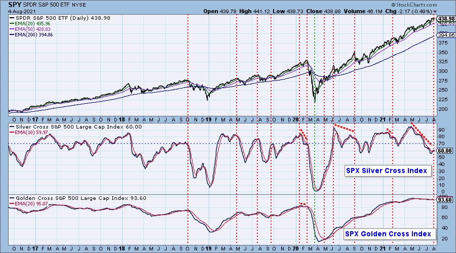
This leads me to a third breadth indicator, the Silver Cross Index (SCI), which was invented here, so we think it's pretty good. Most people have heard of the Golden Cross, which is when the 50-day moving average crosses up through the 200-day moving average. The Golden Cross implies a very positive long-term outlook for the stock or market index. We have always viewed the upside crossover of the 20EMA versus the 50EMA, a Silver Cross, as a positive omen for the intermediate-term, and so we developed the SCI, which expresses the percentage of stocks in the SPX that have a Silver Cross.
The chart below shows the SCI along with its sister, the Golden Cross Index (GCI), which is the same as the SCI except it tracks the percentage of upside 50/200EMA crossovers in the SPX. But back to the SCI, which gives us a more accurate, more enduring assessment of market breadth, and it is a superior breadth indicator. When the 20EMA is above the 50EMA, it tells us that the stock has been persistently bullish over an extended period. When the SCI drops, we know with certainty that negative 20/50EMA crossovers are taking place, and that participation is fading. The result is that any market advance is being undermined.

Since May, the SCI has been dropping steadily and by a lot. Yes, we can see steeper and deeper SCI declines, but none that have happened while the market was moving up. At this point, only about sixty percent of SPX stocks are participating in the market advance. This can happen because the larger-cap stocks are holding the index aloft, but it is a less desirable condition, carrying considerable danger.
At DecisionPoint.com, we have SCIs and GCIs on 22 market and sector indexes.
Technical Analysis is a windsock, not a crystal ball.
--Carl Swenlin

Click here to register in advance for the recurring free DecisionPoint Trading Room! Recordings are available!
(c) Copyright 2021 DecisionPoint.com
Helpful DecisionPoint Links:
DecisionPoint Alert Chart List
DecisionPoint Golden Cross/Silver Cross Index Chart List
DecisionPoint Sector Chart List
DecisionPoint Chart Gallery
Trend Models
Price Momentum Oscillator (PMO)
On Balance Volume
Swenlin Trading Oscillators (STO-B and STO-V)
ITBM and ITVM
SCTR Ranking
DecisionPoint is not a registered investment advisor. Investment and trading decisions are solely your responsibility. DecisionPoint newsletters, blogs or website materials should NOT be interpreted as a recommendation or solicitation to buy or sell any security or to take any specific action.
|
| READ ONLINE → |
|
|
|
| ChartWatchers |
| Financials Turn Higher |
| by Greg Schnell |
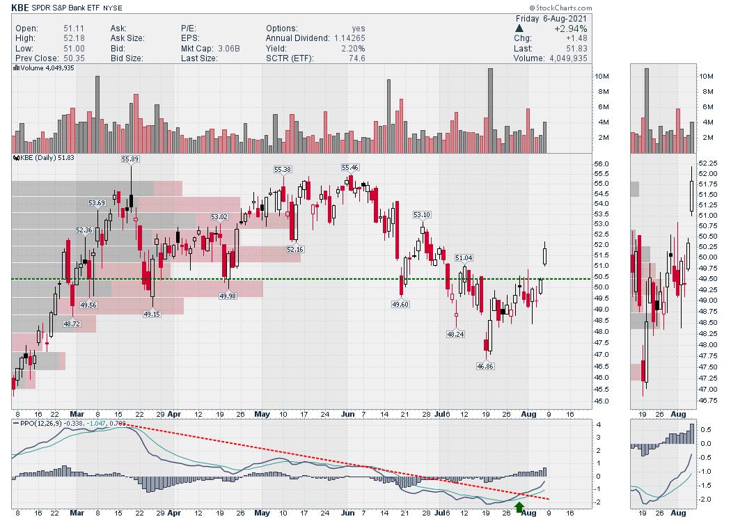
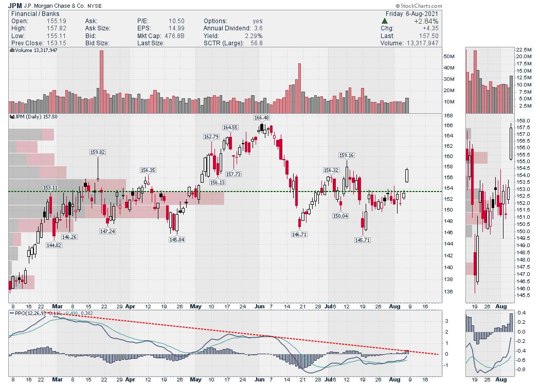
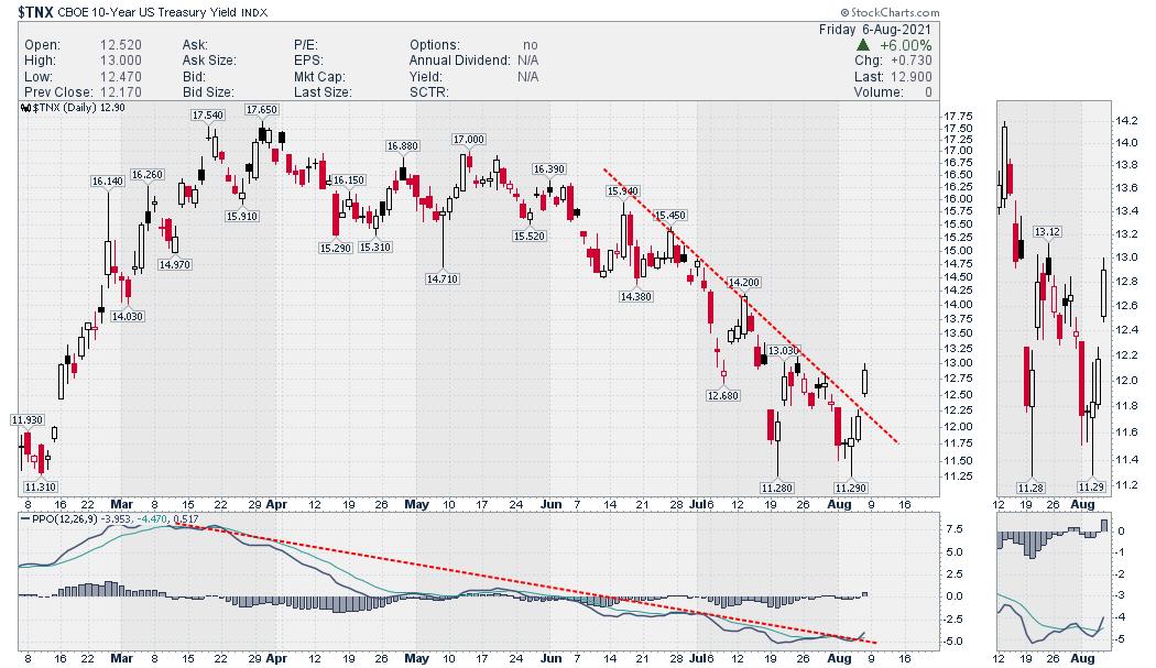
With the US jobs report coming in this morning, bond yields rallied while banks and insurance companies popped out of the funk they have been in. The bank ETF is a good example.

Streaming through the various charts within the financial sector, this same chart shape is manifesting widely. JPM is breaking out above the large volume-by-price bar and breaking the down trend from the June high.

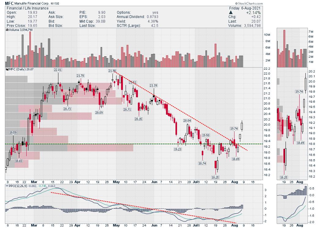
Manulife (MFC) is a good size insurance company. The chart shape is similar to the KBE.

Travelers is a Dow Component. It too looks the same. Some have broken the downtrend in price, but some have not; however the chart shapes across the financial sector are similar and they all look to be turning up.
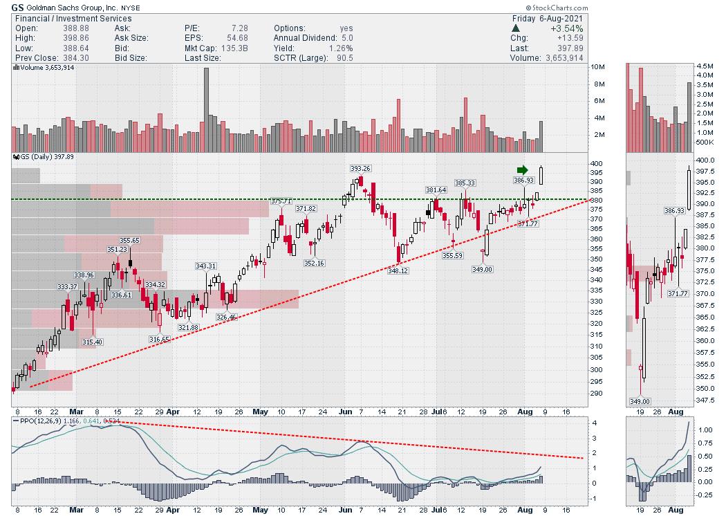
Lastly is Goldman Sachs (GS). Goldman and Morgan Stanley both made fresh new highs today. They didn't pull back as much as the banks and insurance companies, but these companies are moving higher now with the same tail wind as the banks.

Based on the price action across the financial space, it looks like the financials are suggesting the lows are in for the bond yields.

The break in the downtrend line in price and the PPO momentum line on the bottom of the chart suggest to me we are moving into a yield uptrend. One day doesn't make a trend, but one day can be the start of a new trend!
|
| READ ONLINE → |
|
|
|
| DecisionPoint |
| The Decimation of China's Market |
| by Erin Swenlin |
China has been in the news often as many of the Chinese companies are experiencing a crack down by the government on the "private" sector. We, of course know that there really isn't a "private" sector in China as the government controls all. This has been a wake-up call for many investors who were holding many of these China-based companies.
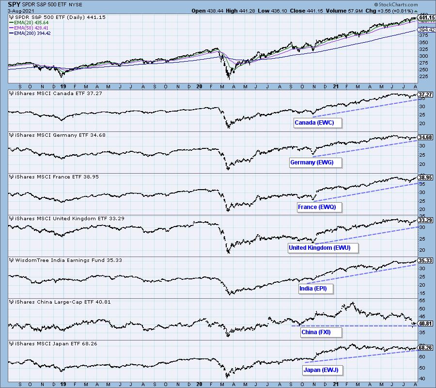
How damaging has the government been to the Chinese market? The global markets chart below (available to subscribers) shows the continued long-term rising trends on all markets with the exception of China (FXI).


Click here to register in advance for the recurring free DecisionPoint Trading Room! Recordings are available!
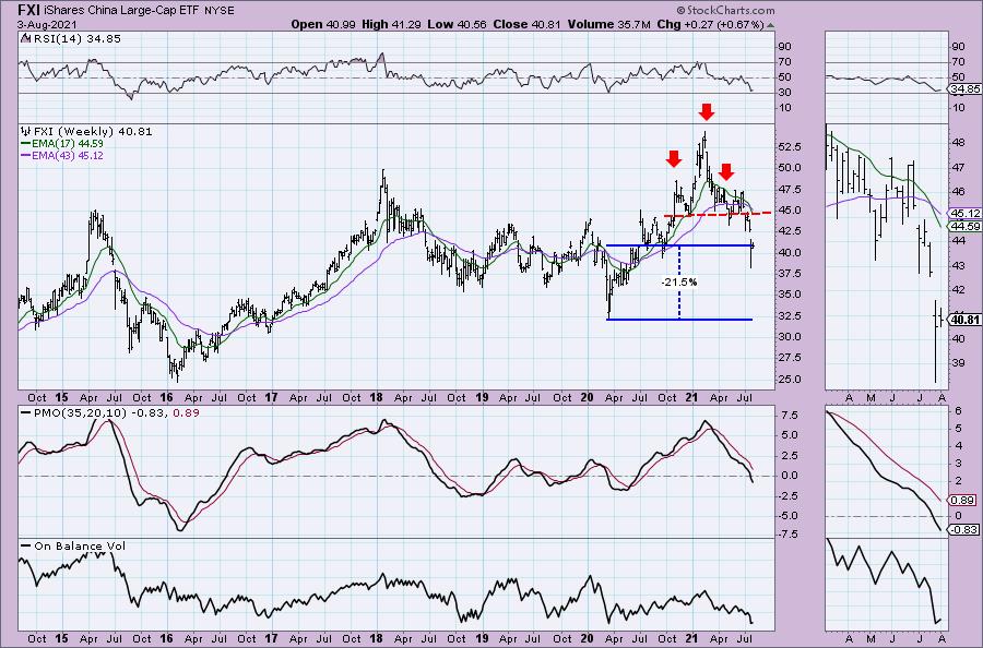
If we look at the weekly chart for FXI, we can see a large head and shoulders pattern that formed this year. It resolved to the downside as expected back in May. The minimum downside target of the pattern would put FXI at support around $35.00, but I doubt it will stop there. In fact, FXI is only 22% away from its bear market low! The weekly RSI is attempting to turn back up in oversold territory, but the weekly PMO has plunged into negative territory. Many might consider this a possible reversal point, but the weekly PMO suggests otherwise. I wouldn't go bottom fishing here, the risk is still far too high to catch a tasty bottom fish here.

Technical Analysis is a windsock, not a crystal ball.
--Erin Swenlin
(c) Copyright 2021 DecisionPoint.com
Helpful DecisionPoint Links:
DecisionPoint Alert Chart List
DecisionPoint Golden Cross/Silver Cross Index Chart List
DecisionPoint Sector Chart List
DecisionPoint Chart Gallery
Trend Models
Price Momentum Oscillator (PMO)
On Balance Volume
Swenlin Trading Oscillators (STO-B and STO-V)
ITBM and ITVM
SCTR Ranking
DecisionPoint is not a registered investment advisor. Investment and trading decisions are solely your responsibility. DecisionPoint newsletters, blogs or website materials should NOT be interpreted as a recommendation or solicitation to buy or sell any security or to take any specific action.
|
| READ ONLINE → |
|
|
|
| ChartWatchers |
| How to Profit from a Great Earnings Season |
| by John Hopkins |
Q2 Earnings season is winding down and, based on the record highs on all of the major indexes this past week, traders liked what they heard and saw.
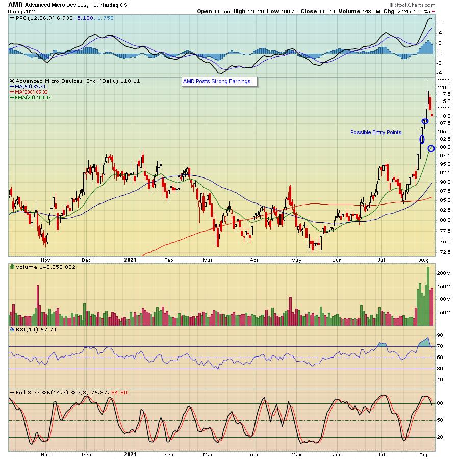
The solid earnings beats by many companies comes as no surprise, with interest rates remaining low while the Fed continues its bullish stance and as the economy shows signs of improvement. In other words, as the economy strengthens and demand picks up, cheap money allows companies to leverage their balance sheets and reap nice profits, as seen by companies like AMD, which knocked it out of the park when they reported their earnings earlier last week.

What's great about a blowout earnings season are the opportunities that arise, especially for those who are patient. For example, in the case of AMD above, it has already pulled back nicely off its high and there's a strong chance it could give up even more of the big gains that arose post-earnings, landing at levels where traders can enter at lower prices; this will be the case for many stocks. Thus, it becomes a matter of zeroing in on those stocks that beat all expectations, shoot up higher and pull back to key support levels, like I've identified above. And remember, traders gravitate to those companies that show the best results, especially those that guide higher. And this is why you need to know how to find the best trading candidates.
At EarningsBeats, our Chief Market Strategist Tom Bowley tracks charts on companies leading up to earnings, then analyzes the market response post-earnings. In other words, how does a company perform leading up to its earnings report and what does it look like a week or so after the numbers are released? This is very valuable information, especially when looking for high reward-to-risk trading candidates.
In fact, Tom will be conducting a FREE webinar this Tuesday, August 10 at 4:30pm ET, where he will demonstrate how he tracks these companies that includes creating a ChartList for ease of access. This event, our "Earnings Season Update," will be open to all members of the EarningsBeats and StockCharts communities, so, if you want to save a seat, just click on this link to sign up for our free EarningsBeats Digest newsletter and you will receive room instructions prior to the start of the webinar.
Earnings Season brings with it great opportunities to profit if you know where to look for the best candidates. You should start by keeping an eye on those companies that beat top- and bottom-line expectations and guide higher as well.
At your service,
John Hopkins
EarningsBeats.com
|
| READ ONLINE → |
|
|
|
| Analyzing India |
| Is This Key Index Likely To Play A Catch-Up? |
| by Milan Vaishnav |
The frontline NIFTY50 Index staged a strong breakout following eight weeks of strong consolidation. It has marked a fresh lifetime high and presently trades in uncharted territory.
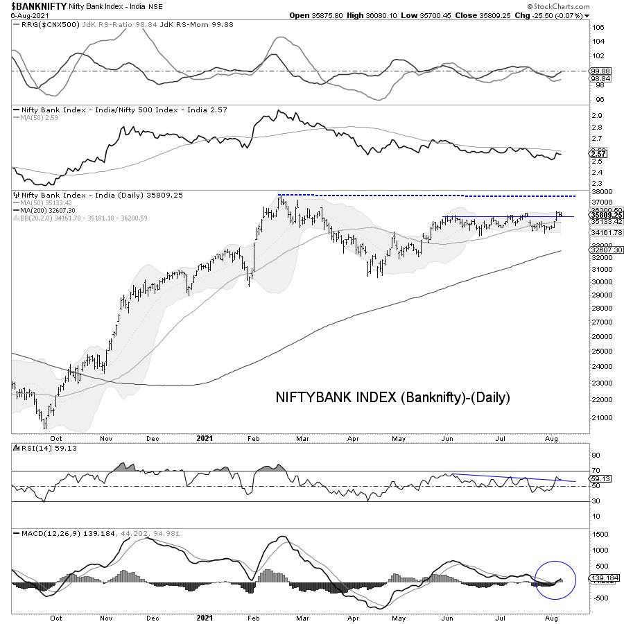
For a bull run to sustain in a meaningful way, there has to be broad-based participation; especially from key sectors like banks and finance. However, we can see that one of the key indexes, NIFTYBANK (more popularly called BankNifty), has relatively underperformed the NIFTY on a relative note.
The present technical setup suggests that this key index is likely to play catch-up in the event of the markets consolidating and sustaining the present gains.

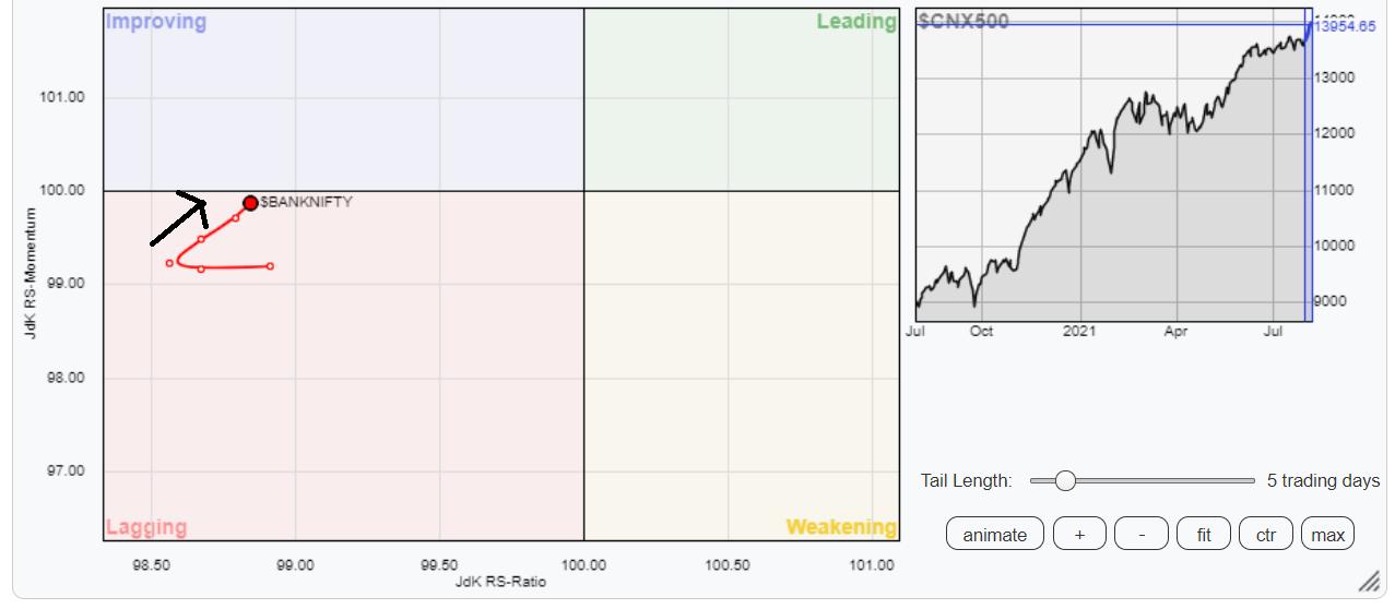
When benchmarked against the broader NIFTY500 Index, the NIFTYBank Index is showing a strong improvement in its relative momentum and is on the verge of entering the improving quadrant. If the present improvement in the momentum sustains, as well as if the Index enters the improving quadrant, it would mean an end to the relative underperformance of this Index.

The analysis of the daily chart shows that the NIFTY Bank Index is away from its lifetime high point of 37708. The recent price action shows the index consolidating in a sideways trajectory and sitting on the verge of a breakout.
The MACD is bullish and above the signal line. The PPO remains positive. The RSI is seen breaking out from a pattern resistance ahead of the actual breakout.
If the present strength in the general market sustains, there are greater chances of the present pattern resolving with an upward breakout. In this case, the possibility of BankNifty testing its previous high point cannot be ruled out. This would also mean that the breakout, if at all that happens, will also bring in a meaningful move in the key NIFTY Bank constituents like HDFCBANK, ICICIBANK, SBIN and KOTAKBANK.
Milan Vaishnav, CMT, MSTA
Consulting Technical Analyst
www.EquityResearch.asia | http://www.ChartWizard.ae
· For Premium Equity Portfolio Advisory on Indian Stocks, Click Here
· Alpha-generating actionable investment ideas on the US and UK Equities Click Here
· For International Commodities like Gold, Crude Oil and EURUSD/GBPUSD pairs Click Here
Disclosure pursuant to Clause 19 of SEBI (Research Analysts) Regulations 2014: Analyst, Family Members, or his Associates holds no financial interest below 1% or higher than 1% and has not received any compensation from the Companies discussed.
The securities discussed and opinions expressed in this report may not be suitable for all investors, who must make their own investment decisions, based on their own investment objectives, financial positions, and needs of specific recipients. This may not be taken in substitution for the exercise of independent judgment by any recipient.
The recipient should independently evaluate the investment risks. The value and return on investment may vary because of changes in interest rates, foreign exchange rates, or any other reason. Past performance is not necessarily a guide to future performance. The usage of the Research Reports and other Services are governed as per the Terms of Service on https://equityresearch.asia/terms-of-use
The Research Analyst has not managed or co-managed the issues of any of the companies discussed and has not received any such remuneration from such activities from the companies discussed.
The Research Analyst has not received any remuneration from the Merchant Banking activities.
The Research Analyst has adopted an independent approach without any conflict from anyone. The Research Analyst has not received any compensation or other benefits from the companies mentioned in the report or third party in connection with the preparation of the research report.
Compensation of the Research Analysts is not based on any specific merchant banking, investment banking or brokerage service transactions.
The Research Analyst is not engaged in a market-making activity for the companies mentioned in the report.
The Research Analyst submits that no material disciplinary action has been taken on him by any Regulatory Authority impacting Equity Research Analysis activities.
This report is not directed or intended for distribution to, or use by, any person or entity who is a citizen or resident of or located in any locality, state, country, or other jurisdiction, where such distribution, publication, availability, or use would be contrary to law, regulation or which would subject the Research Analyst to any registration or licensing requirement within such jurisdiction
|
| READ ONLINE → |
|
|
|
| MORE ARTICLES → |
|
 Chart 1
 Chart 2
 Chart 3

