| THIS WEEK'S ARTICLES |
| The Mindful Investor |
| Why Is Bitcoin 42,000 So Important? |
| by David Keller |
I recently recorded a "Choose Your Own Adventure" style approach to Bitcoin. I laid out four different scenarios for this crypto, from the uber-bullish move to 65,000 to the ultra-bearish scenario down to 24,000.
If you're interested, you can see the original video here and be sure to comment on which scenario you see as most likely and why!
I promised to follow up on that video with my vote and to explain the technical justification and implications for that choice. Given the choice of those four potential outcomes, I would vote for scenario #2. This would mean that Bitcoin remains in a general range between 42,000 on the lower end and 54,000 or so on the upper end.
Here's why.
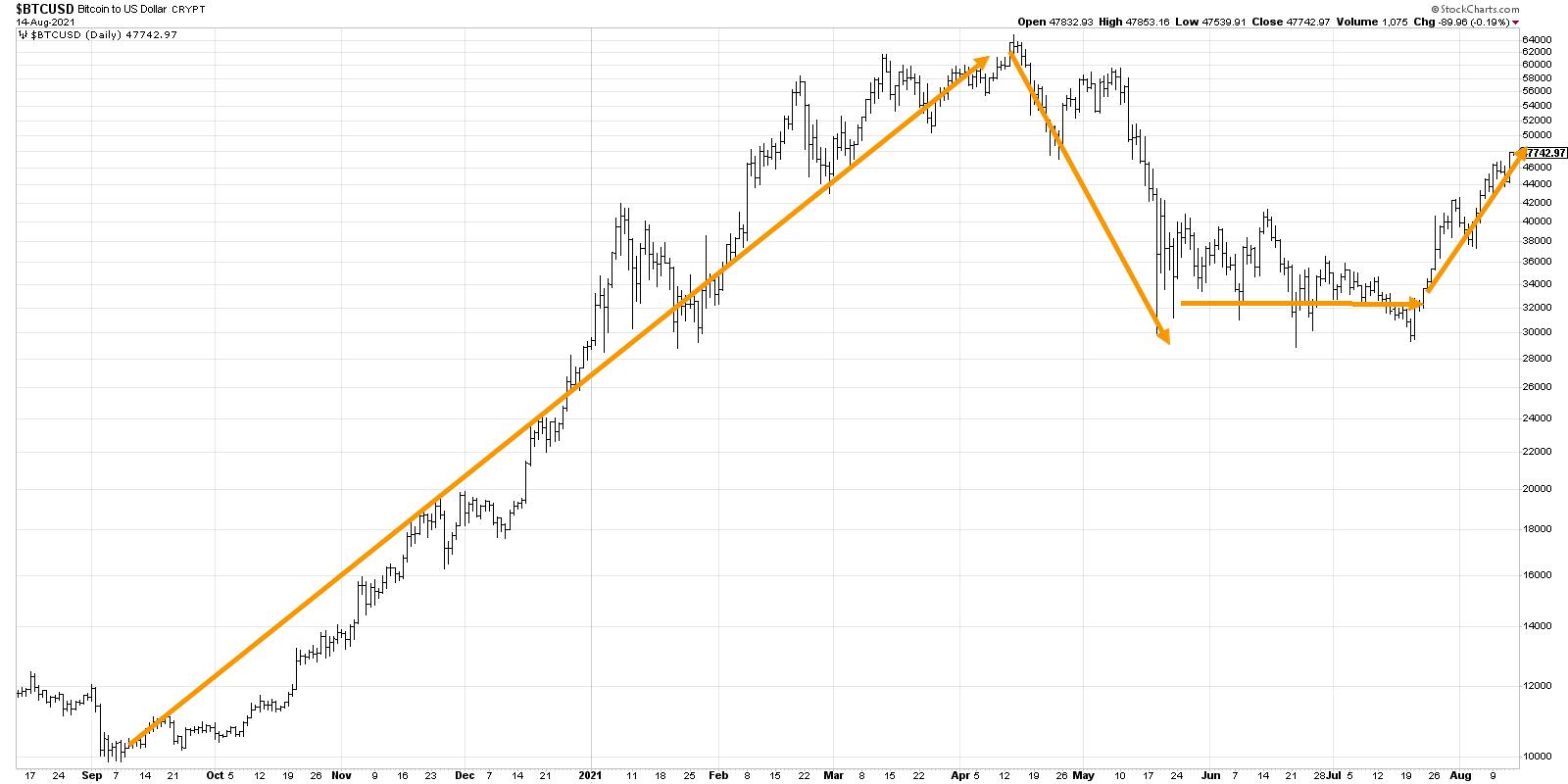
First, let's start with the general trajectory of Bitcoin over the last twelve months.

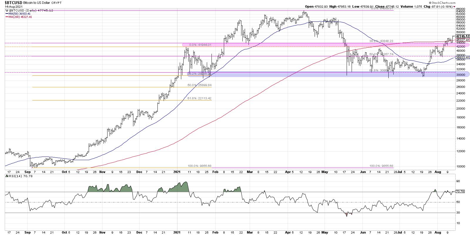
In August 2020, Bitcoin was just turning lower to retest support at the big round number of 10,000. This level served as a springboard as the price launched upward to reach the 42,000 level in January 2021. After a brief pullback to around 30,000, Bitcoin then continued its upward climb to reach its eventual peak just below 65,000.
Notice those two levels, 30,000 and 42,000, as they will come into play again shortly!
Join me on Tuesday, August 17th at 1:00pm ET for a FREE webinar "Relative Strength: Top Performers Make Top Portfolios". We'll discuss how to measure relative strength, ways to visualize relative rotation, and stocks that are demonstrating strong trends now. Sign up here!
After reaching 65,000 in April, we saw an initial move lower to around 48,000, followed by a significant drop to find support at 30,000. This down move, punctuated by a lower high in early May, was an indication that Bitcoin had transitioned from a bullish phase to a bearish phase. This support level of 30,000 remained important through May, June and July as Bitcoin consistently rose from that price point. This period is what I would consider a digestion or consolidation phase, as the crypto remained rangebound with 42,000 serving as the upper boundary.
In the last four weeks, Bitcoin has managed to finally break out of this sideways range, suggesting a transition from consolidation phase to another accumulation phase.
Now let's review the chart with some additional evidence.

Scenario #2 that I mentioned earlier is a rangebound scenario between 42,000 and 54,000. The reason why I did not choose scenario #3 or #4 (the more bearish scenarios) is because the break above 42,000 was pivotal, as was the higher low around 38,000 in early August.
The trend appears positive until proven otherwise!
Why not the very bullish scenario of retesting all-time highs? That would actually be my second choice, but what prevents me from choosing that is a simple measuring technique using the trading range from May through July. Bitcoin trading from 30,000 to 42,000 means a range of around 12,000 points. If we add that range to the breakout level, we reach an upside objective of 54,000. I could see that becoming an upside objective that involves an exhaustion of buyers and/or an influx of selling pressure that would result in minimal upside follow-through.
The real point of this exercise, however, was to illustrate the benefits of considering alternative scenarios. We often get way caught up in one particular narrative, one particular thesis, one particular trade. The markets rarely do exactly what we expect. Investing is all about considering different scenarios, clearly defining your risk/reward and sticking to what the evidence is telling you. For now, it's telling me that the path of least resistance for Bitcoin is higher.
Want to digest this article in video format? Here you go!
RR#6,
Dave
PS- Ready to upgrade your investment process? Check out my free course on behavioral investing!
David Keller, CMT
Chief Market Strategist
StockCharts.com
Disclaimer: This blog is for educational purposes only and should not be construed as financial advice. The ideas and strategies should never be used without first assessing your own personal and financial situation, or without consulting a financial professional.
The author does not have a position in mentioned securities at the time of publication. Any opinions expressed herein are solely those of the author, and do not in any way represent the views or opinions of any other person or entity.
|
| READ ONLINE → |
|
|
|
| Martin Pring's Market Roundup |
| Which of These Three Leading Commodity Indicators are Forecasting Higher Prices? |
| by Martin Pring |
We hear a lot about inflation these days and have certainly experienced rising grocery bills, as well as runaway used car and housing prices. Commodity prices are often, but certainly not always, a leading indicator for the CPI, but there are three markets that have a useful, though imperfect, record of leading them. These are gold, the Canadian Dollar and lumber. Let's take a closer look at each one.
Gold
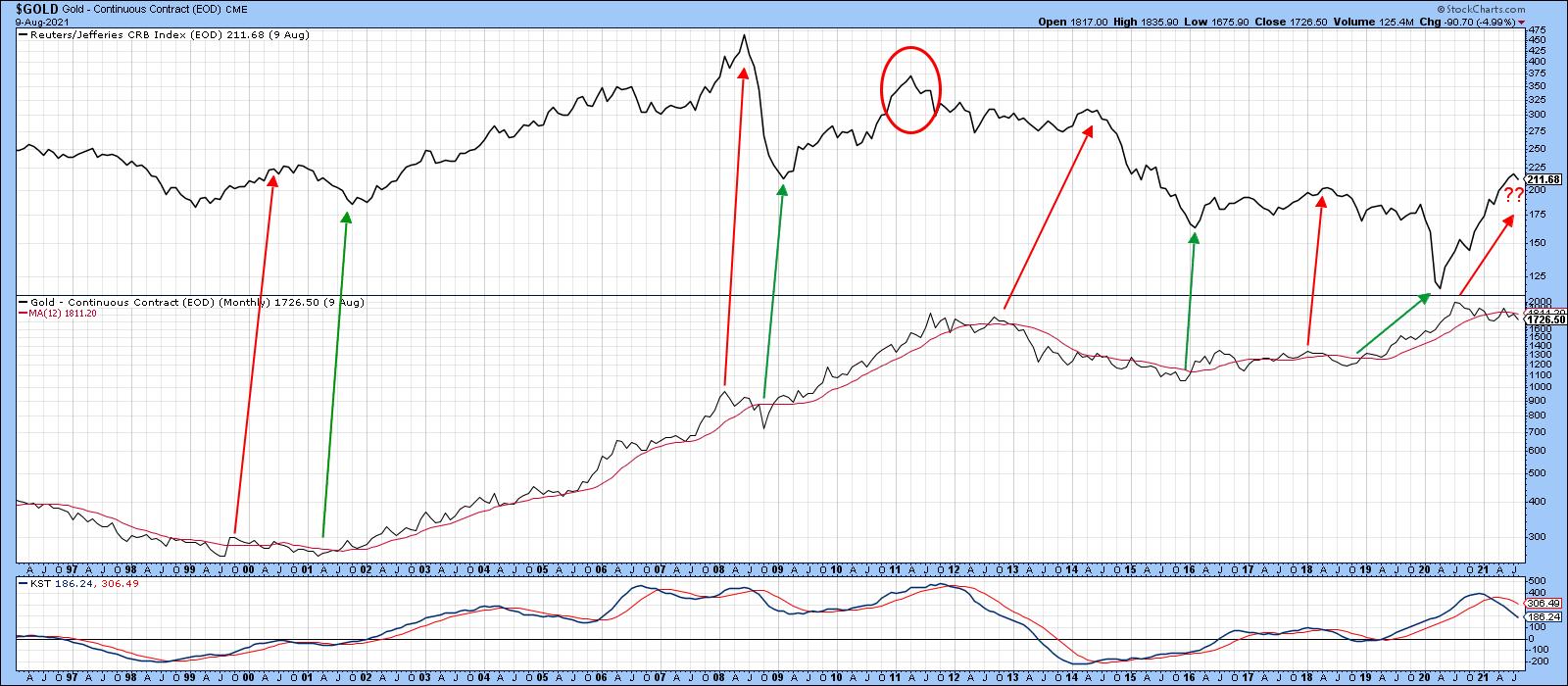
Gold has long been thought of as a hedge against inflation; Chart 1, which compares the CRB Composite to the gold price, demonstrates that point. The arrows indicate that turning points in gold generally take place before those for the CRB. The angle of their slope reminds us that the lead time varies quite a bit. Also, the CRB led gold at the 2011 peak. Fast forward to the current situation and we find that gold topped out last August, as the CRB has been advancing.
 Chart 1 Chart 1
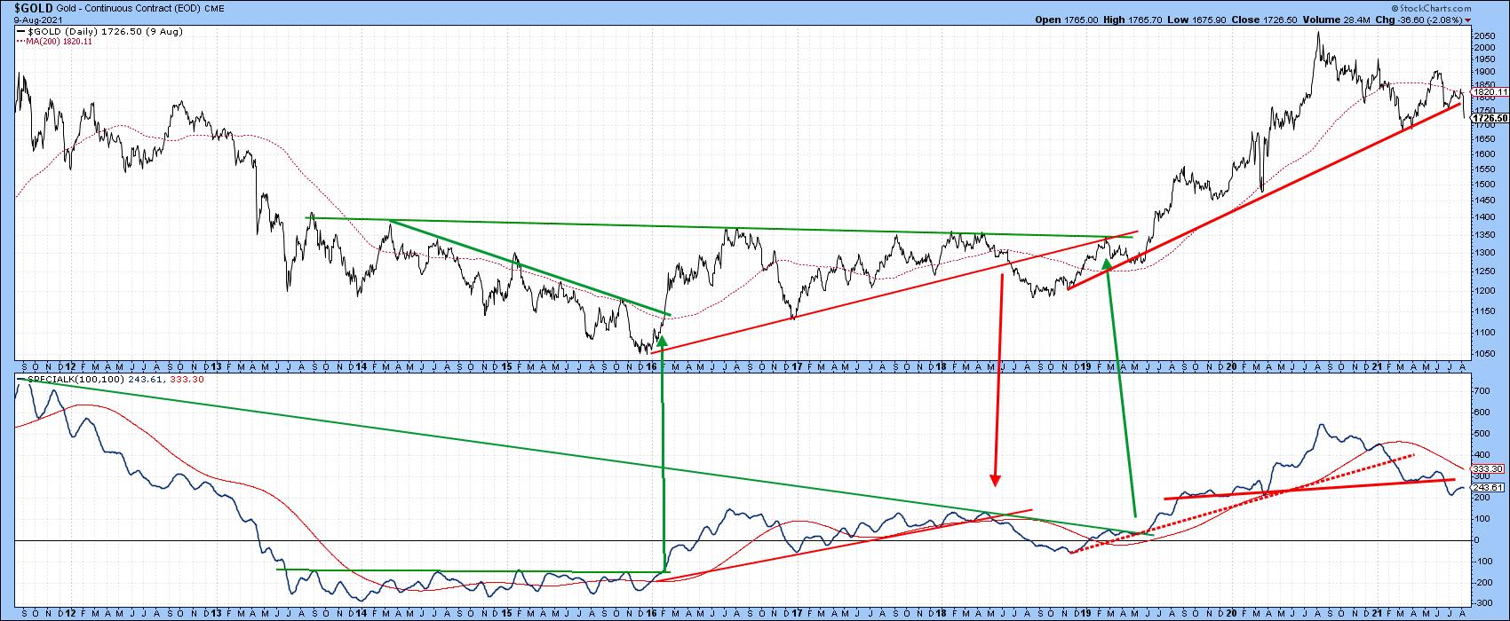
Chart 2 argues that gold is likely to move even lower, as the price has just edged through a major up trendline. The Special K, which you can read about here, has already violated its bull market trendline, crossed decisively below its signal line and just completed a head-and-shoulders top. The rising short-term KST in the lower window argues that the break in the price could turn out to be a whipsaw. However, as it stands right now, it looks like gold is headed lower. Given its historical lead relationship with commodities, the message is that the current CRB rally may be limited in scope.
 Chart 2 Chart 2
Canadian Dollar
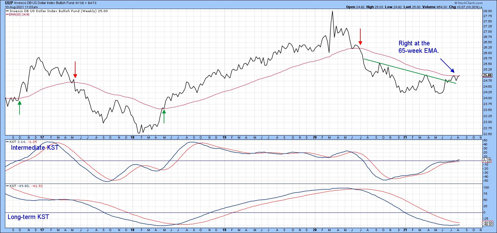
It is generally accepted that the US Dollar Index and commodities move in opposite directions. Most of the time, that is certainly true. At present, the Index looks as if it is in the process of reversing from a primary bear to bull. That would be confirmed if it can build on the recent breakout, as shown in Chart 3. This would require a decisive penetration of the 65-week EMA that can hold. The small arrows indicate 65-week EMA crossovers have offered timely and reliable signals of important trend reversals in the last few years. Other things being equal, such a signal would be a negative development for the CRB.
 Chart 3 Chart 3
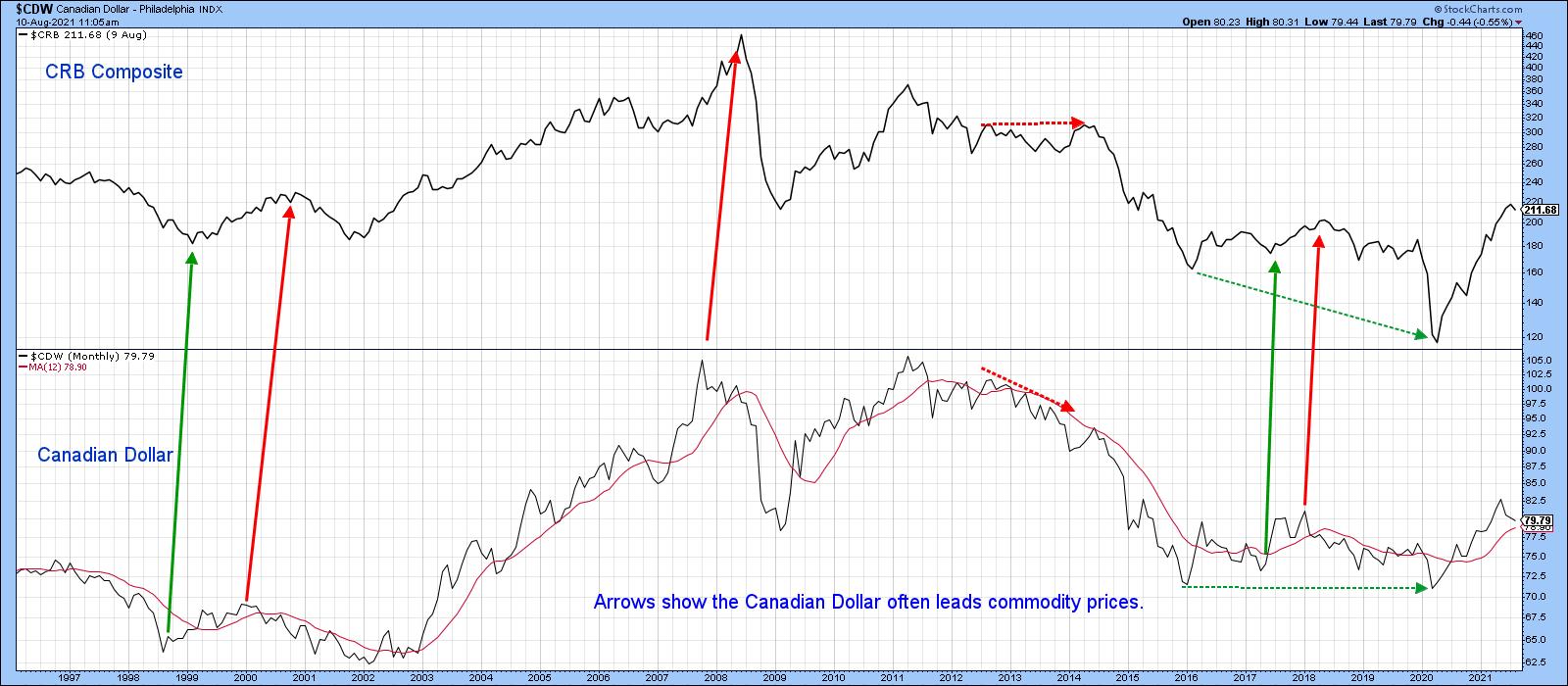
The Canadian dollar has an even closer relationship with commodity price swings than the Dollar Index. The arrows in Chart 4 show that, at important turning points, the currency usually has a slight lead over the CRB. When it does not, it is usually a coincidental relationship. The green- and red-dashed arrows also point up that divergences between the currency and the CRB are usually resolved in the direction of the currency.
 Chart 4 Chart 4
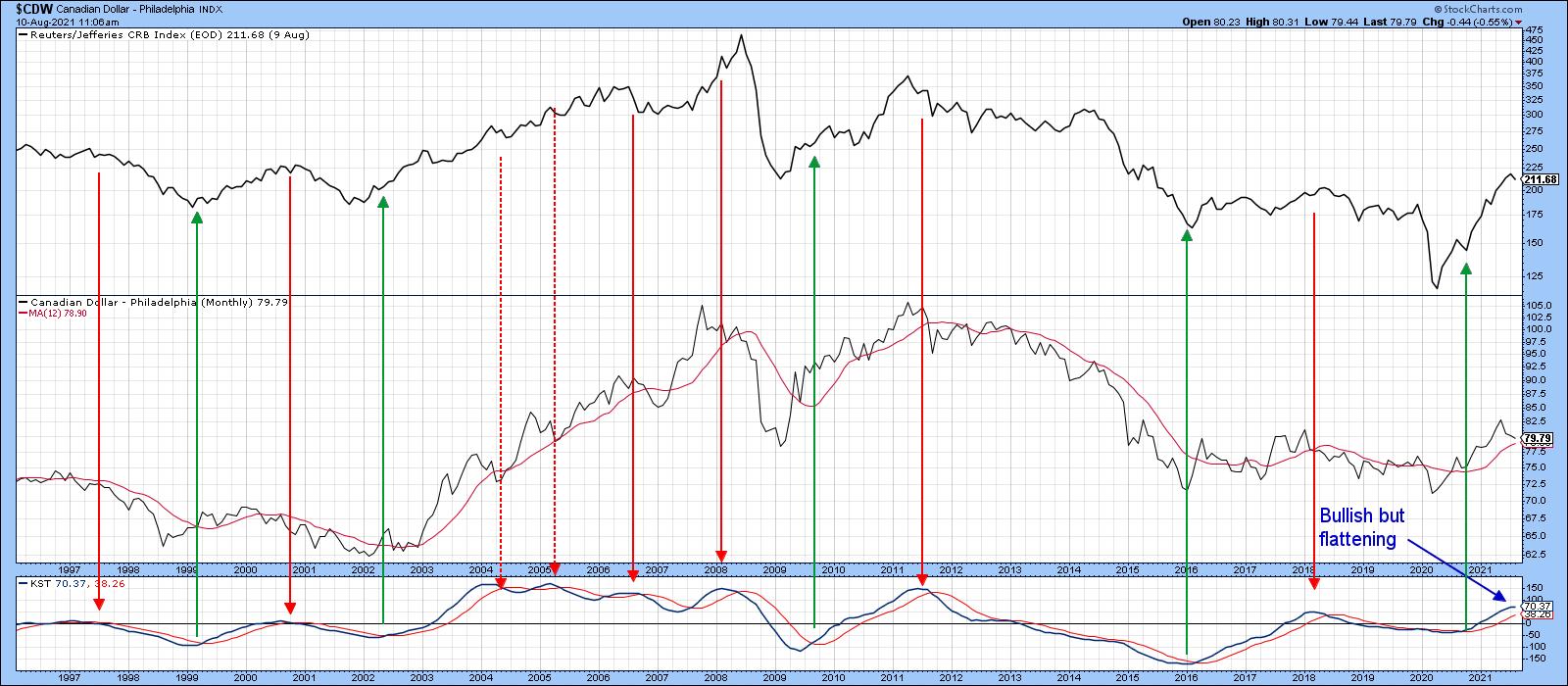
Chart 5 further underscores the close relationship between the currency and commodity prices, as the four KST buy signals for the dollar are all followed by some sort of an advance in the CRB. The red sell arrows were also followed by commodity weakness. Two exceptions, flagged by the dashed arrows, tell us that negative momentum loses its power in a really strong market. At the moment, the KST is bullishly above its MA. However, it has begun to flatten, which could be the precursor of something bigger.
 Chart 5 Chart 5
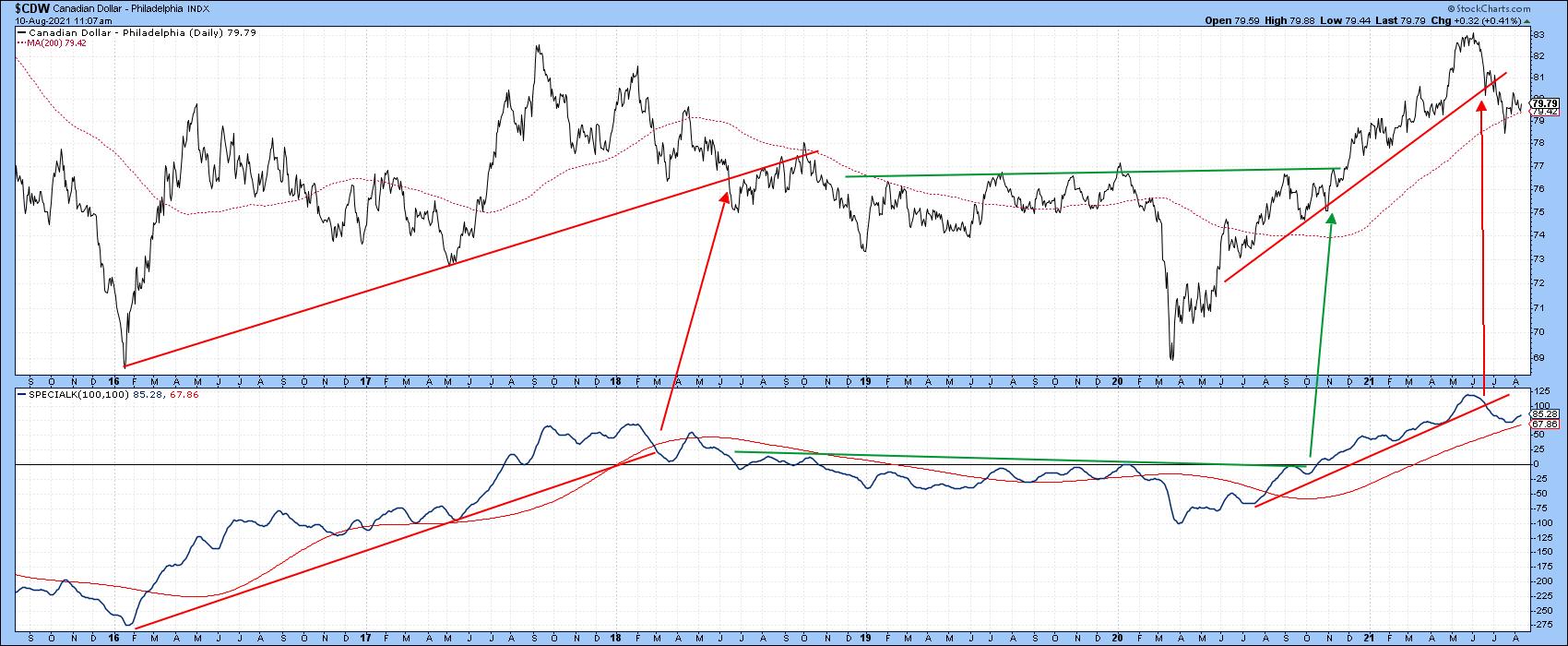
Chart 6 indicates that things have already started to deteriorate, as the both the currency and its Special K have violated their 2020-2021 up trendlines. All is not completely lost, as the currency has not yet dropped below its 200-day MA. Neither has the Special K crossed below its signal line.
 Chart 6 Chart 6
Lumber
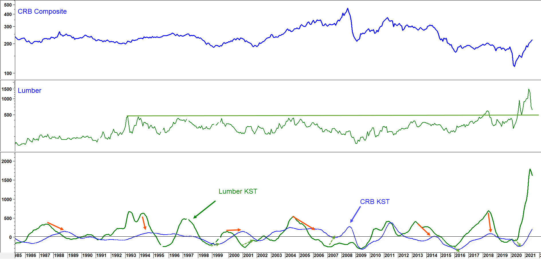
The price of lumber is very sensitive to housing developments. Housing is a very long leading economic indicator due to its interest rate sensitivity. That means that lumber has a tendency to move ahead of commodities in general. Chart 7 compares the lumber price to the CRB Composite as well as their two long-term KSTs. The red and green arrows connecting the peaks and troughs of these two series show that, in most situations, lumber momentum leads the KST for the CRB. It's not a perfect relationship, as occasionally there is no connection between the two. Also, the leads can vary from cycle to cycle. However, the recent lumber KST peak does suggest that the CRB rally may be limited from here.
 Chart 7 Chart 7
Conclusion
The CRB Composite, whilst overextended on a primary trend basis, is nevertheless above its 12- and 24-month moving averages and, therefore, in a positive trend. That said, three markets that have a reasonably accurate record in foreshadowing swings in commodity prices are currently moving in the wrong direction. That's not to say that they can't soon turn around. However, at this point, it is certainly worth raising the question of why we should expect higher commodity prices when these bellwethers are pointing in the opposite direction.
Good luck and good charting,
Martin J. Pring
The views expressed in this article are those of the author and do not necessarily reflect the position or opinion of Pring Turner Capital Group of Walnut Creek or its affiliates.
|
| READ ONLINE → |
|
|
|
| ChartWatchers |
| From Sectors to Groups to Stocks to Find One Name That Dominates |
| by Julius de Kempenaer |

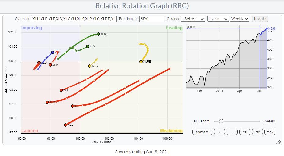
Relative Rotation Graphs are a great tool to use for a top-down approach. Lots of people look at sectors and trade the sector ETFs. The State Street sector SPDRs range (XLK, XLY, XLP, etc.) is probably the most popular family of ETFs for that purpose. The RRG above shows the rotation for these sectors over the last five weeks.
In one pass, you can easily see the strength and further improvement for the Technology (XLK) and Healthcare (XLV) sectors as they move into the leading quadrant. However, at the same time, you can see the rapid weakening for Industrials (XLI), Materials (XLB), Financials (XLF) and Energy (XLE) as they head further into the lagging quadrant.
Of course, one could stop here and build a portfolio just using these ETFs. The use of these ETFs that cover an entire index makes sure that risk is properly distributed across all the stocks that make up the index. Thus, there is very limited "single-stock risk" in such an approach.
Groups
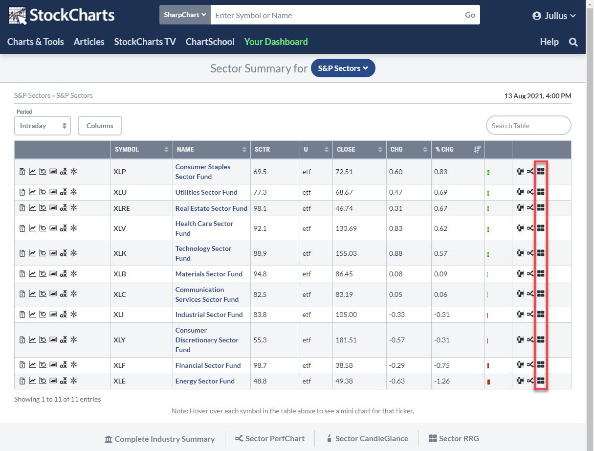
However, all these sectors are sub-divided into industries or industry groups, which allow for more granular analysis of the sector. This breakdown is easily accessible from the StockCharts Sector Summary page:

On this page, you find a lot of information for each sector ETF. The last icon on each line is the RRG icon. Clicking that icon opens up the Relative Rotation Graph, showing the breakdown for that group into industries. By default, the sector ETF is also included, and the benchmark defaults to $SPX.
You can leave it like that, which will give you an instant view of the sector and its industries against the S&P. Because the sector ETF is also included on the plot, you can also gauge the rotation for these groups vs. their sector.
Let's take the Technology sector as an example. It is one of the stronger sectors at the moment, and this approach allows us to see which group or groups we should focus on and maybe which group or groups we should preferably avoid.
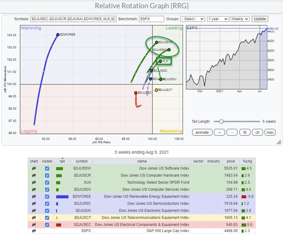
Clicking the RRG icon on the XLK line gives this Relative Rotation Graph.

The position of XLK vs. the benchmark $SPX is the same as seen on the sector RRG at the top of this article. Only now are the groups added, and we can see their rotational behavior against the S&P as well as against the Technology sector index.
As the sector itself is strong and improving vs. the S&P 500, it is expected that the majority of the groups will show a similar rotation vs. $SPX as the benchmark.
To find the "best" group or groups inside the technology sector, I am going to change the benchmark to XLK.

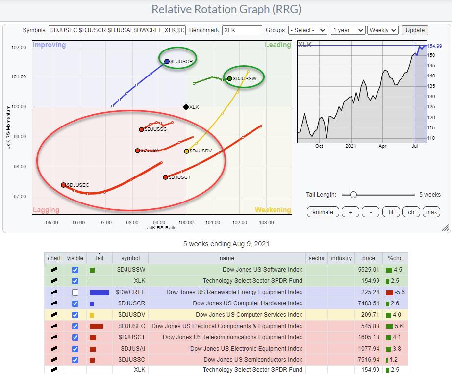
This changes the image quite a bit. Please note that I have un-ticked $DWCREE, as it is so far away from the benchmark and the rest of the groups that it distorts the image.
The RRG above clearly shows that there are actually only two groups inside the technology sector that are driving the sector -- Computer Hardware ($DJUSCR) and Software ($DJUSSW). That is very helpful information for investors, as it narrows down the search for interesting stocks to these two groups.
Stocks
To find the individual stocks inside a group, we need to use the StockCharts scanning functionality.

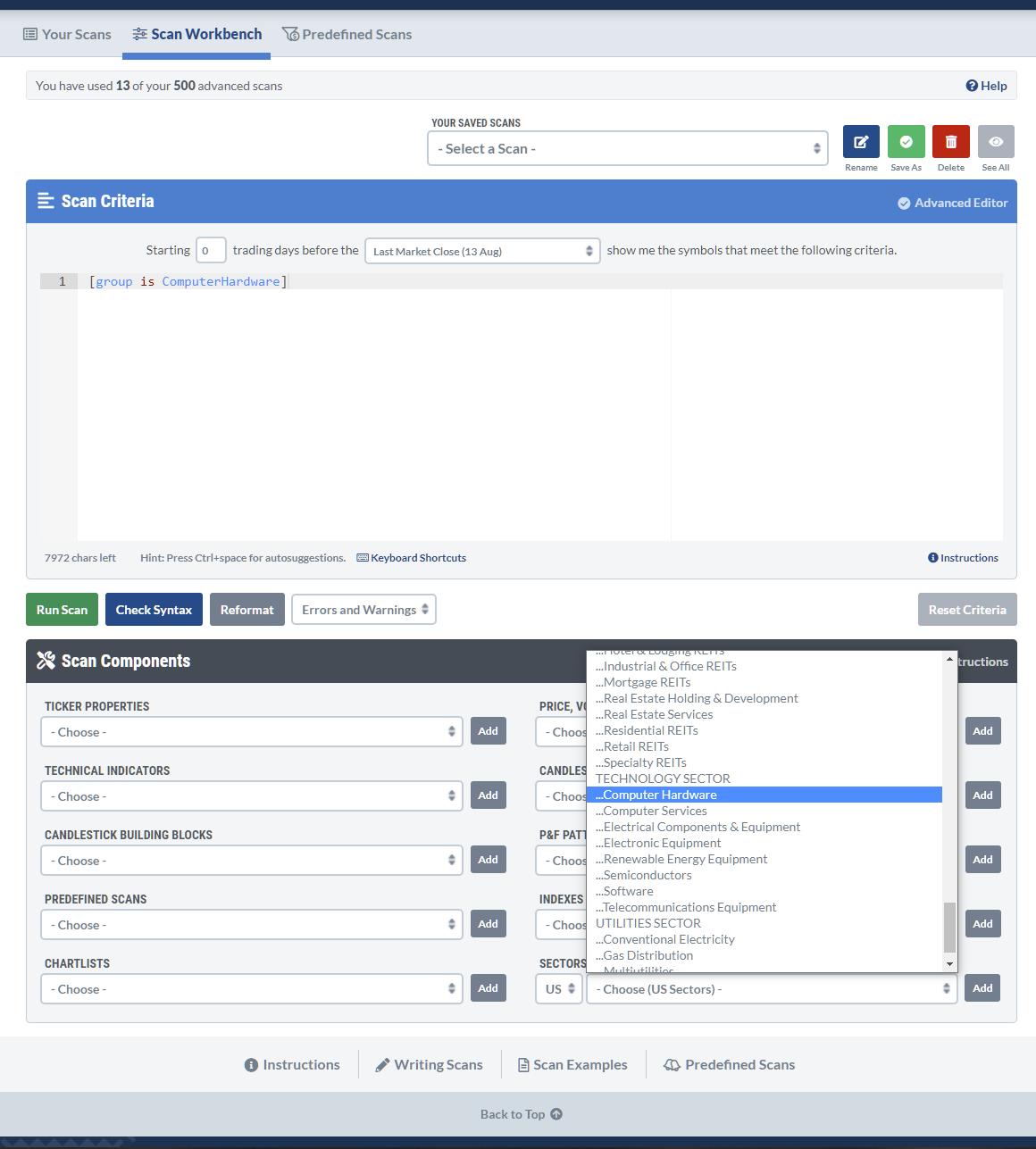
Open up a new scan and delete the default line so you have a blank canvas, then go to the scan components at the bottom and look for Computer hardware in the sectors and industries section. Simply click Add, and the rule will be added to your scan.
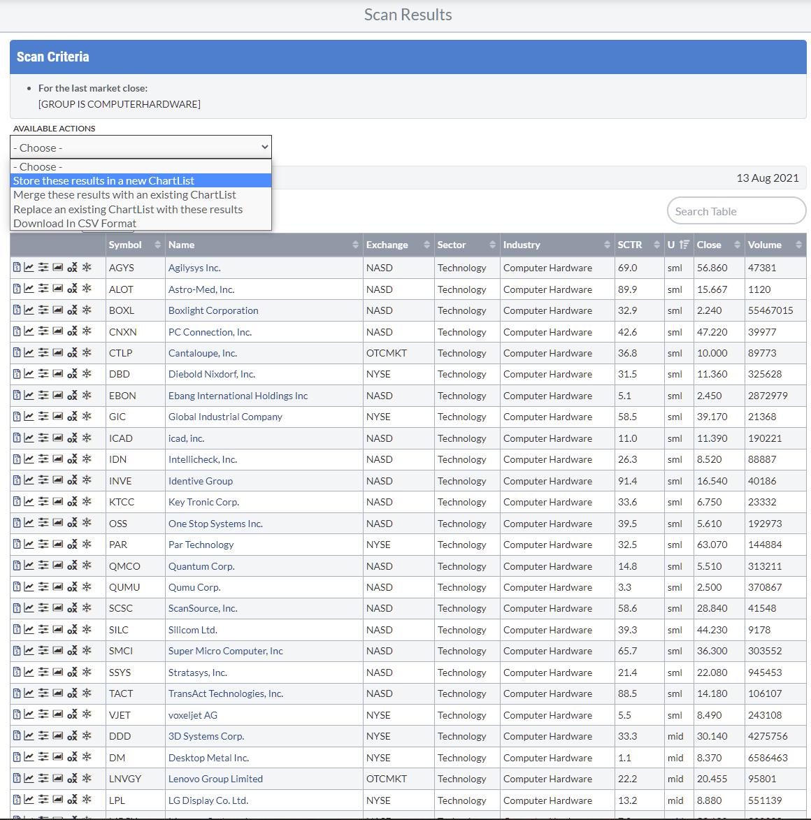
Running this scan will result in 49 matches. You can save these results as a ChartList for future reference using the Available Actions function, so you do not have to run this scan every time.

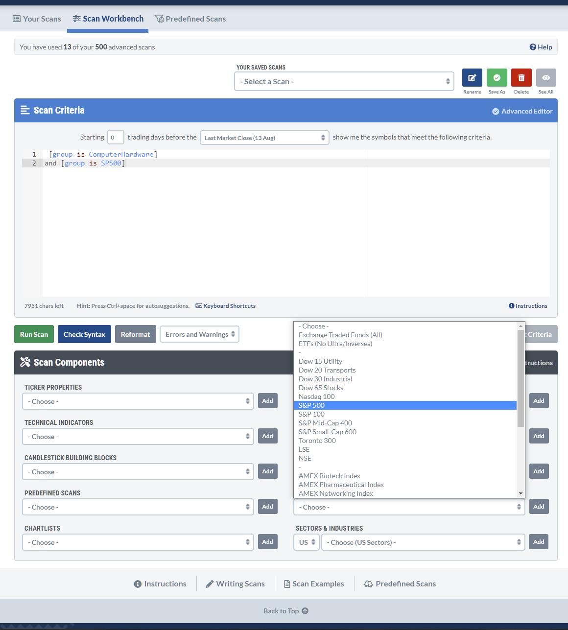
However, the keen observer may have noticed that this scan also includes small- and mid-caps, and unclassified (by size). If you are happy to include them, leave things as they are. When you would like to limit your analysis to just S&P 500 stocks, you can add another rule to make that happen. Go back to your scan and select S&P 500 from Indexes & ETFs, then click Add.

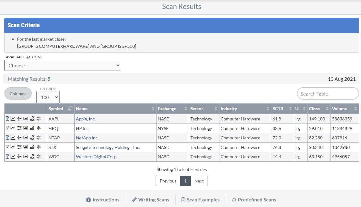
Then, rerun the scan.

The list is now limited to the 5 stocks in the Computer Hardware industry group that are also a member of the S&P 500. I saved this result to a ChartList for later use.

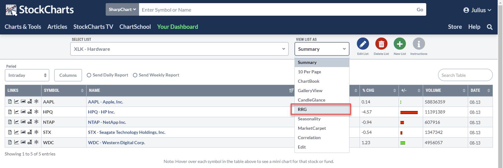
When you go to your ChartLists, you will see the list you just created. In the "View List As" selection, you will find the option to show the list on a Relative Rotation Graph.

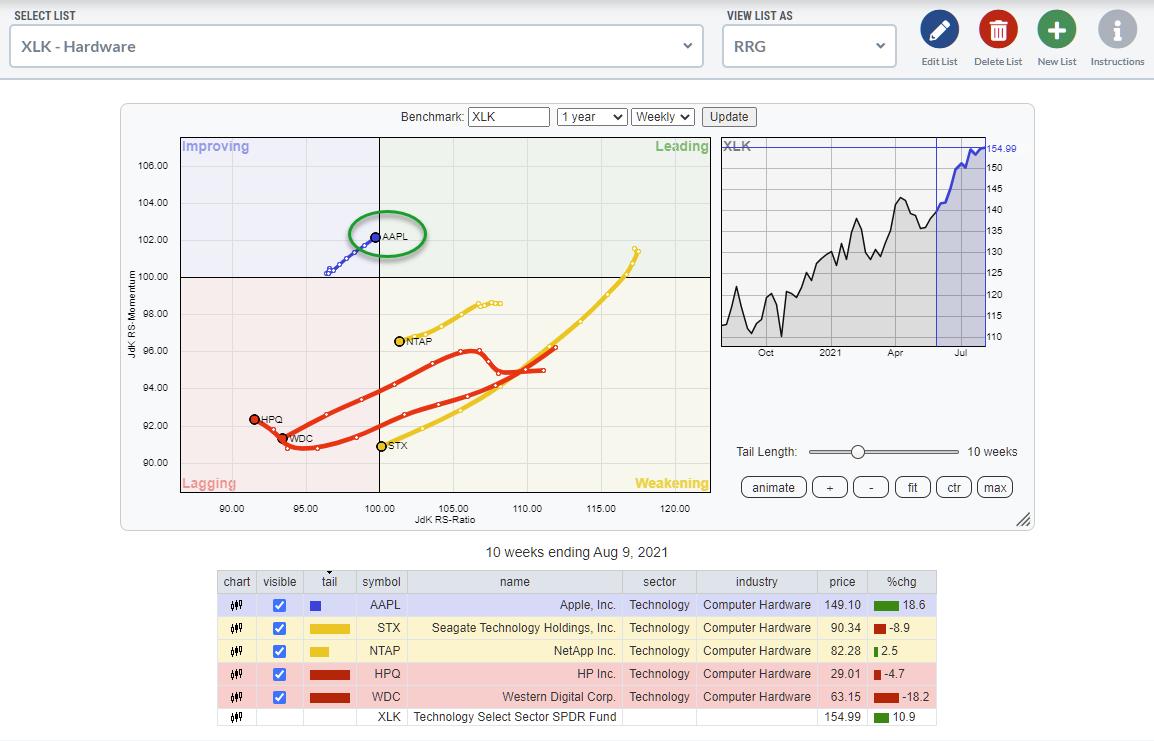
By default, the RRG will open with $SPX as the benchmark. I have changed that to XLK to see the rotations against the sector index in the image above.

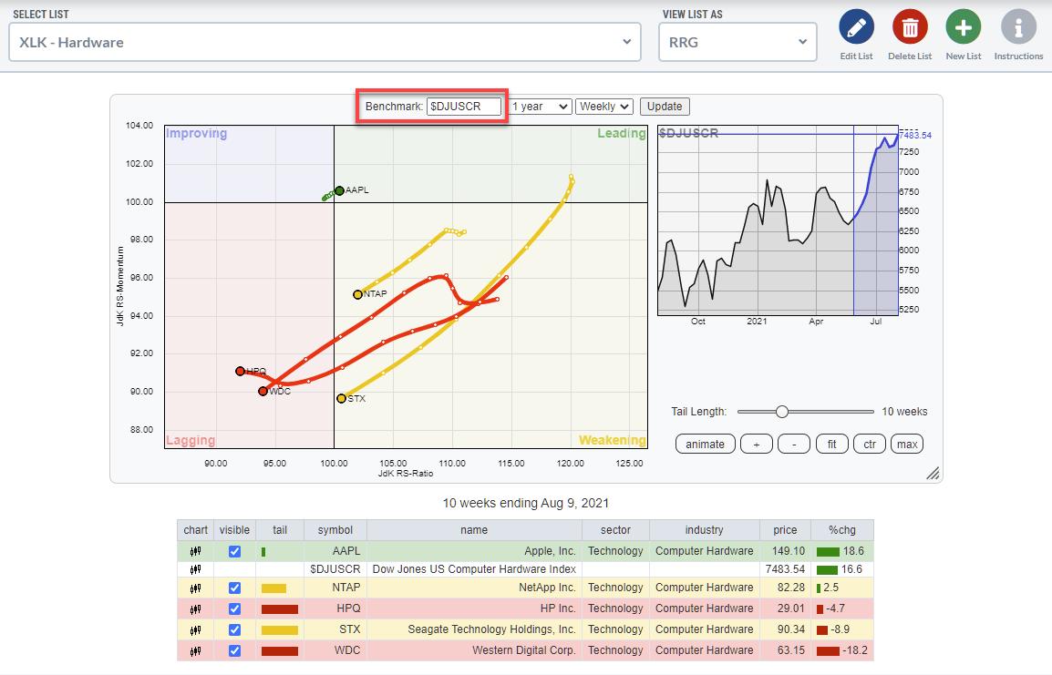
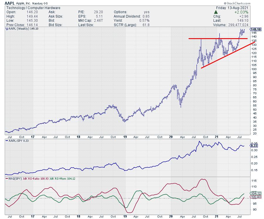
Changing the benchmark to the group index does not change the image much. It only brings AAPL even closer to the benchmark (center), indicating how dominant the stock is.

You can copy this workflow to all other sectors and groups and find the good/dominating stocks per group and per sector. In this example, AAPL in the Computer Hardware group in the Technology Sector is an exception because it is such a heavyweight. In other sectors' groups, you will find broader rotations and more opportunities in potentially interesting stocks. But, on the other hand, it also shows how potentially vulnerable the Computer Hardware group is. The Software group has much broader participation, for example.
Enjoy your weekend, and let me know what you think about this workflow or how you use these functionalities!
#StaySafe, -- Julius
My regular blog is the RRG Charts blog. If you would like to receive a notification when a new article is published there, "Subscribe" with your email address.
|
| READ ONLINE → |
|
|
|
|
|
| ChartWatchers |
| A New Uptrend Just Posted In This Major Market Index - Here are Candidates Poised to Benefit |
| by Mary Ellen McGonagle |
The broader markets are at a very positive juncture as recently leading areas are holding their gains while newer areas are coming into their own after reversing their downtrends.
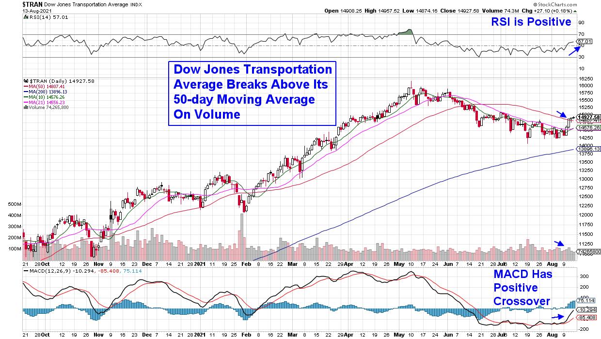
Last week, my MEM Edge Report highlighted the new uptrend in Financials while recommending several Bank stocks which outperformed last week and are poised for much greater heights. This week, I'm excited to report that another major area of the markets has turned positive after the Dow Jones Transportation Index broke back above its key 50-day moving average.
DAILY CHART OF DOW JONES TRANSPORTATION AVERAGE INDEX

The good news is this bullish reversal is on the heels of strong earnings reports from many well-known Trucking and Rail stocks. As you may know, strong earnings is the primary driver of stocks that go on to outpace the broader markets.
Another major component of stocks that outperform is that they're in a strong area of the markets. Studies show that almost half of a stock's price movement is directly tied to the performance of its industry group and sector.* That's why I pay close attention to which industry groups are leading the markets higher -- this is where you'll find your leading stocks.
While Rail stocks are not a leading group quite yet, they're certainly in an uptrend after reports of 4 straight weeks of increased rail traffic will boost current quarter growth prospects. This is in addition to several heavyweight Rails that have reported triple digit 2nd quarter earnings that were well above estimates.
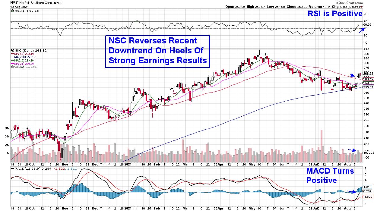
DAILY CHART OF NORFOLK SOUTHERN CORP. (NSC)

Above is Norfolk Southern Corp. (NSC), which posted 114% year-over-year earnings growth and 34% growth in revenues three weeks ago. Downward pressure on the group held the stock back; however, last Wednesday the stock bullishly broke back above its 50-day moving average on volume.
With its RSI and MACD in positive territory, NSC is poised to trade higher from here.
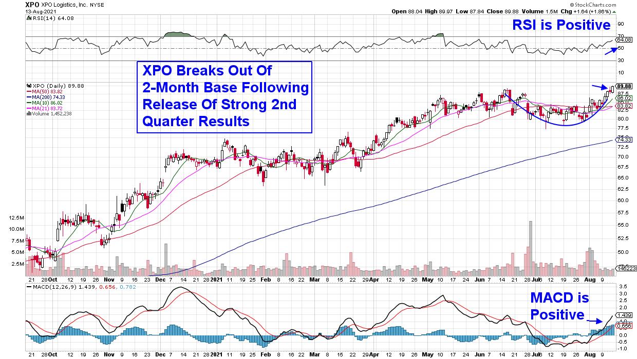
DAILY CHART OF XPO LOGISTICS, INC. (XPO)

Next up is transportation logistics company XPO Logistics (XPO), which provides supply chain solutions in the U.S. and Europe. The company reported 681% earnings growth over last year and its 4th straight quarter of coming in ahead of estimates.
The late July release brought buying which pushed the stock above its key 50-day moving average on volume as analysts raised guidance for the remainder of the year.
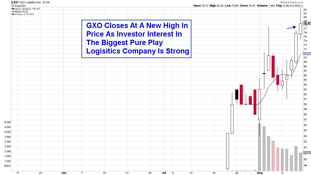
DAILY CHART OF GXO LOGISTICS INC. (GXO)

XPO Logistics also announced the official spinoff of their contract logistics business, called GXO (GXO), earlier this month. The company runs warehouses around the world for companies such as Nike (NKE) and Apple (AAPL), to name just a few. Management laid out healthy growth guidance for the company, which uses high-tech solutions that are set up to capitalize on the continued move into e-commerce.
The IPO closed at a new high last week, with high volume characteristics that point to further upside. However, a 1-hour intraday chart points to an overbought stock that needs to reset before trading higher.
Next Tuesday, Deutsche Bank will be hosting their virtual Transportation Conference, where management from many well-known transportation companies will be presenting their outlooks for this year and possibly next. Depending on comments, the conference may provide an added boost to these companies.
While economically sensitive stocks are reversing their recent downtrends, there are plenty of areas in Healthcare, Technology and other sectors that remain poised to trade much higher. To receive immediate access to my bi-weekly MEM Edge Report, take a 4-week trial for a nominal fee. You'll receive sector and select stock insights that will put you on the path to outperformance during this tricky period.
On this week's edition of StockCharts TV's The MEM Edge, I share the reversal of a prominent index that's poised to trade higher after strong earnings from underlying stocks. I also reviewsthe move into higher yielders as inflation remains elevated.
Warmly,
Mary Ellen McGonagle, MEM Investment Research
|
| READ ONLINE → |
|
|
|
| ChartWatchers |
| Rotation and Seasonality Point To This Sector As Our Next Leader |
| by Tom Bowley |
Rotation is nothing new during secular bull markets; it's actually what drives bull markets. Rather than money leaving the stock market for another asset class when leading sectors sell off, it simply moves from one sector to another sector. Financials (XLF) recently caught fire as treasury yields rebounded. Materials (XLB) took a turn leading the market higher after retreating back to test its February relative support level. Technology (XLK) and Consumer Discretionary (XLY) had their best moments during 2020. Real Estate (XLRE) suffered through a brutal 2020, but has been a leader throughout 2021. The list goes on and on.
I believe it could be Industrials' (XLI) turn for a couple of reasons.
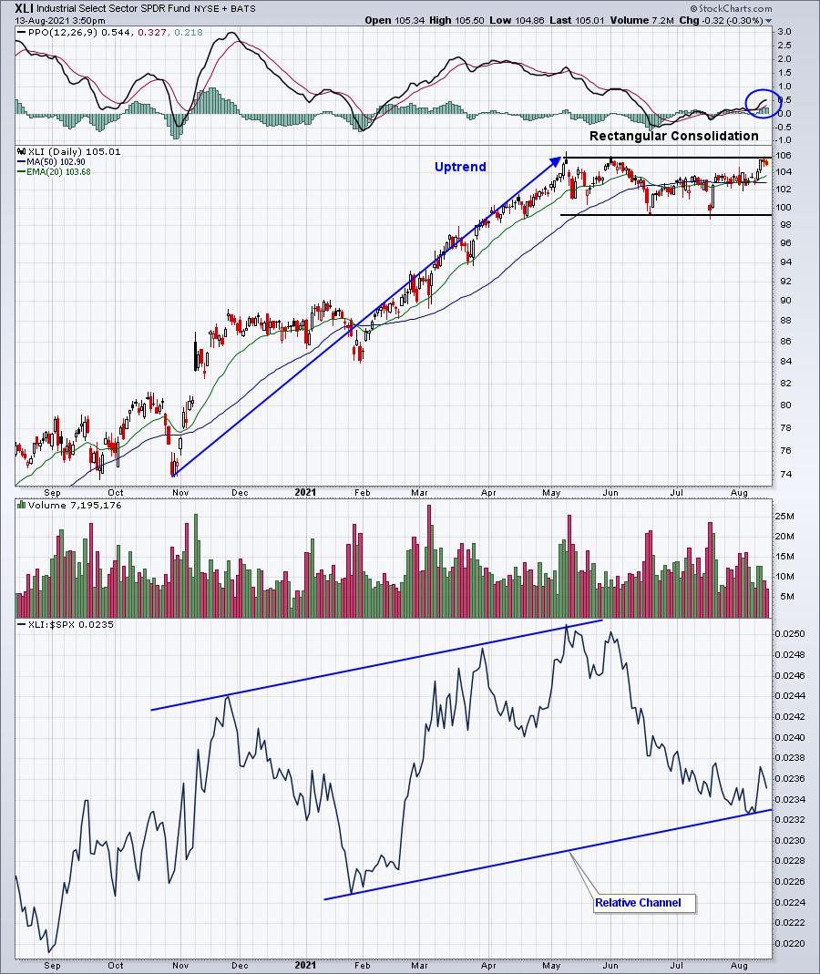
Let's start with the technical reason. The relative strength of XLI turned on a dime when both absolute and relative support were tested. In the case of relative support, it was channel support that was tested. Check out this chart:

Industrials were very weak throughout June and July; price support held when tested in July. Then, in early August, we saw a channel support level created/tested. If the XLI loses the absolute and relative support levels illustrated above, then I'd re-evaluate my sector thoughts. Until then, however, I'd move forward under the assumption that industrials will perform well.
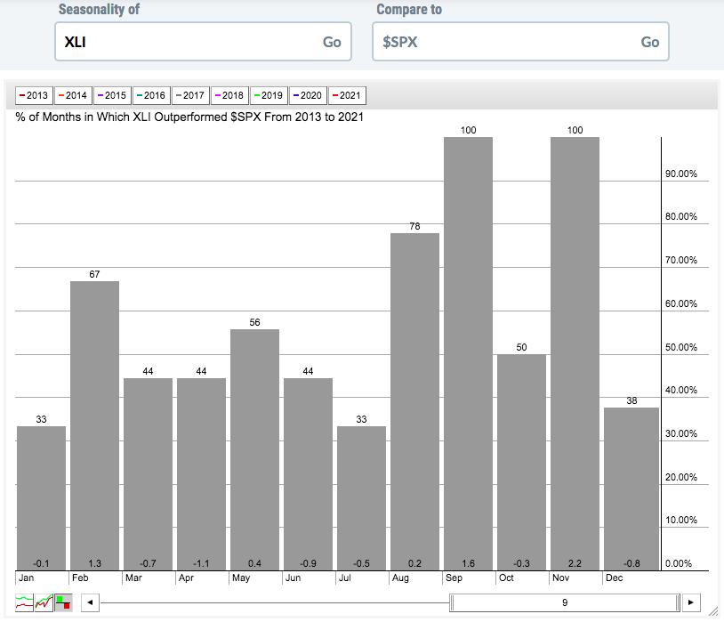
There's another reason why it's time to look at industrials. From a seasonal perspective, the XLI loves the upcoming 3-month period, September through November:

The above seasonality chart shows the XLI relative performance vs. the S&P 500. It's a 9-year lookback period which covers 2013 through 2021. April 2013 is when the S&P 500 cleared its double top from 2000 and 2007, confirming the current secular bull market. Over the past 9 years, I believe it's quite obvious that the XLI loves two of the next 3 months. It's outperformed the S&P 500 every year since 2013 in both September and November. That's a very strong track record and completely supports the technical bullishness in the prior chart.
When I select the 10 equal-weighted stocks in each of our 4 portfolios on Thursday, August 19th, I'll be keeping all of this information in mind. If you're unfamiliar with our portfolios and our selection process, I'll be hosting a "Sneak Preview" event on Monday, August 16th at 4:30pm ET, to describe the process. Our flagship Model Portfolio is up 228% since its inception on November 19, 2018, while the benchmark S&P 500 is up 65.79% by comparison.
The Monday event is completely free (no credit card required). We'll invite all of our free EB Digest subscribers, in addition to our paid members at EarningsBeats.com. If you'd like to secure a spot at our free Monday event, simply sign up for our EB Digest newsletter by entering your name and email address HERE. We'll send out room instructions to everyone on Monday!
Happy trading!
Tom
|
| READ ONLINE → |
|
|
|
| The Canadian Technician |
| Sector Rotation is Getting Discouraging |
| by Greg Schnell |
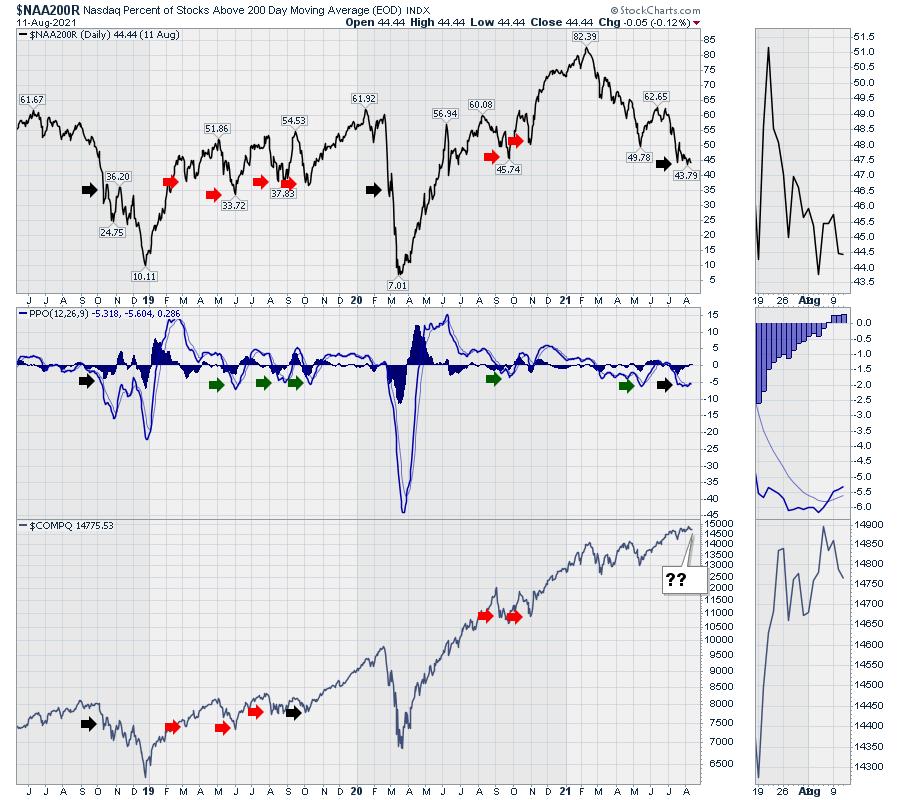
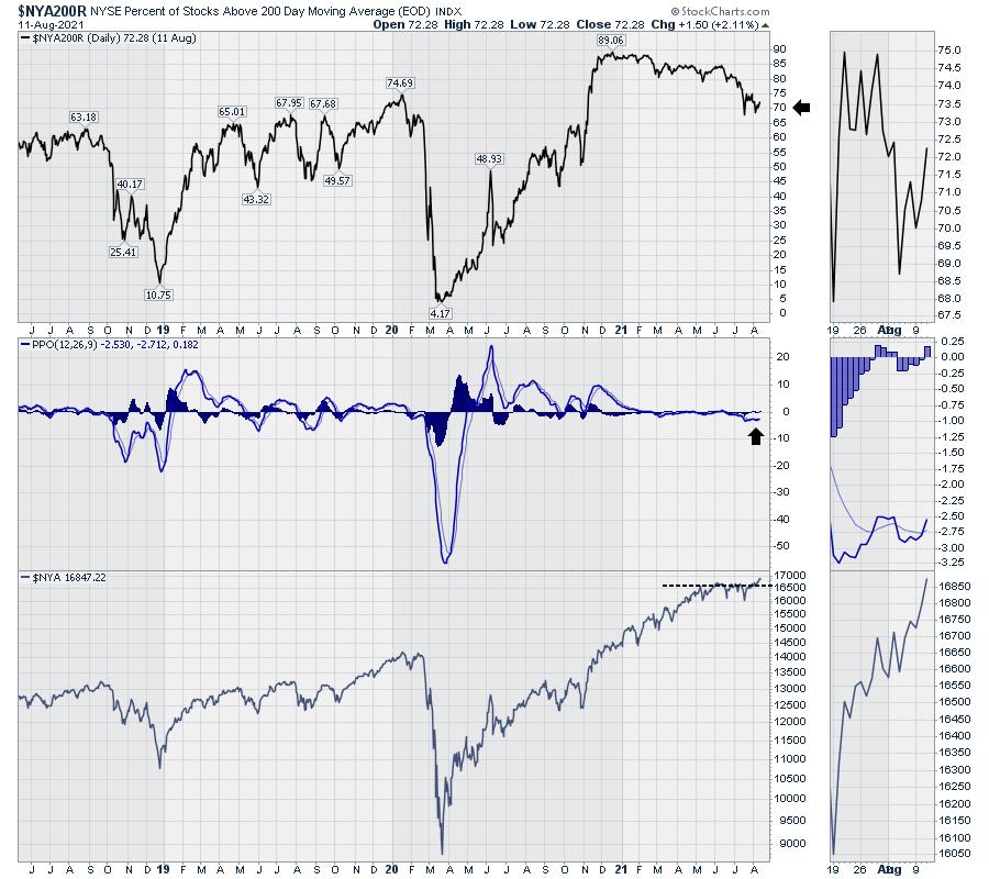
Some of my regular breadth indicators are getting stronger, but others are getting weaker. Below is a chart so out of sync with history it's almost like the indicator is broken.
Notice how the percentage of stocks above the 200-day Moving Average (long term trend line on each stock within a group) has declined from a very high level since February. Less than 45% are above the 200-DMA, yet the market is spitting distance from an all-time high. Historical readings would suggest a meaningful pullback has already started when the market is this weak. It would also suggest that it is so weak that it's time to start rallying.
Two exceptions to this level of weakness have occurred in the last 3 years: the 20% decline in 2018 and the 35% decline in 2020.
When we look at the PPO (a momentum indicator), this is historically a bounce level, but it also signaled bigger breakdowns when it got weaker than current levels. The amazing part is the market's resilience, sporting new highs every week, with the majority of stocks not just below their highs but below the long term average.
The red arrows are where we bounced after noticeable pullbacks. The black arrows are where things really broke down.

Taking this same chart style and reverting it from the Nasdaq list of stocks to the New York Stock Exchange (NYSE), the data flip-flops and looks like a bullish breakout. The NYSE has a lot of utilities and consumer staples companies and these companies are holding up well. The indicator is at one of the highest "lows" in three years, declining since December, but the chart is turning up. The stock index on the lowest panel is hitting new highs after breaking out of a 4-month consolidation.

This looks very bullish. The one part of note for this is that the Consumer Staples and Utilities are making higher highs, while the semiconductor index appears to be showing a failed breakout.
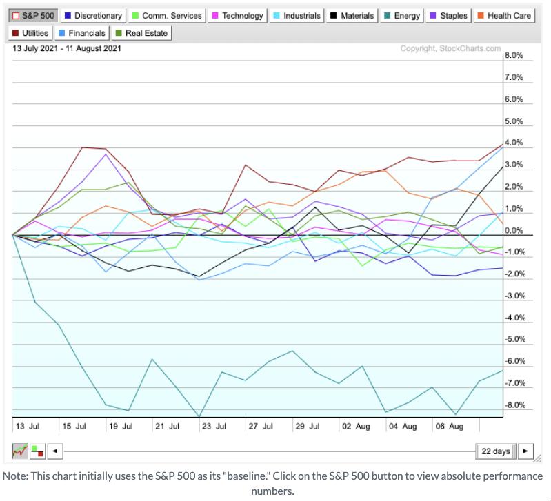
Recently, Utilities, Financials, Materials, Industrials and Consumer Staples are breaking higher, while the higher growth groups like Tech, Communications, Healthcare and Consumer Discretionary are starting to underperform the other sectors.

This all started with the turn in rates last week.
If the NYSE stocks are going to start outperforming the Nasdaq names, it's hard to understand how the top chart in this article is going to improve. Will the divergence between the Nasdaq near all time highs and the percentage of stocks above the 200-DMA continue, or will all stocks (both Nasdaq and NYSE) broadly get a bid here?
A more pessimistic case would be seeing the move into the defensive sectors, like Utilities, Staples and Financials, while the rest of the market pulls back.
There is a change going on, and we are about to find out which way this finishes. Watch closely.
|
| READ ONLINE → |
|
|
|
| Top Advisors Corner |
| What Happens to Gold When Real Yields Go Too Far |
| by Tom McClellan |

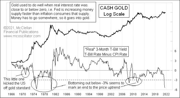
Gold analysts have long "known" that the real interest rates have an effect on gold prices. By "real" interest rates, I am referring to the inflation-adjusted interest rates, which, in this week's chart, are represented by the 3-month T-Bill yield minus the CPI Inflation rate. The current T-Bill yield is +0.05 (hey, at least it's a positive number), and the latest CPI data show prices up 5.37% from a year ago. So the difference between those two is -5.32%.
Gold was first traded freely in the U.S. beginning in 1975 and, since then, it has been demonstrably well correlated (negatively) with the real T-Bill interest rate. There was even a brief moment of negative real rates back in 1970-71 that put enough pressure on the dollar to kick the U.S. off the gold standard. Since then, episodes of negative real rates have been fairly well correlated, but with a twist.
Rates that are a little bit negative are stimulative to gold prices going higher. But, if the spread gets too big, that tends to stifle further progress. It is almost like it is too much of a good thing. The -3% threshold seems to be the boundary line for this effect. Excursions below -3% tend to mark important tops for gold prices, or at least that has been the case for the past 37 years. Maybe this time will be different.
So why would this matter? A big negative real yield is a sign of a huge imbalance in the banking system and horribly misguided Fed policy. It says that the Fed is WAAYYYY behind the power curve and has let inflation get away from them.
When that happens, the natural reaction is for the FOMC to start raising short term rates, trying to get the genie back into the bottle. It is the hiking of the short term Fed-controlled rates that does the work of discouraging people from owning gold. Higher interest rates mean that a gold investor misses out on that much more money which he could have earned in a bank account or CD, instead of in gold. It is also the anticipation of those rate hikes that gets gold traders moving the price down in advance of the actual Fed action.
The very real question (and that does not mean an inflation-adjusted question) right now is about whether the current Fed is not going to do its job, and respond as it would have in the past to a ridiculous spread between the inflation rate and its short term interest rate targets. We arguably have a Fed whose honchos are collectively stupid enough to not only think that 2% is their goal (statutorily, it is 0%), but who also think that 5%+ is just "transitory" and so they don't need to do anything about it.
This arguably changes the dynamic involved in this week's chart. If a big negative real yield is an indicator of what the Fed is about to do that will hurt gold prices, but if we now have a Fed which cavalierly ignores market conditions, then does this indication really still work as an indicator for gold? That is a legitimate question. And a troubling one, to contemplate having a Fed which refuses to do its job.
|
| READ ONLINE → |
|
|
|
| MORE ARTICLES → |
|
