| THIS WEEK'S ARTICLES |
| ChartWatchers |
| Michigan Consumer Sentiment Drops 13.5% in July; What Does that Mean for US Equities? |
| by Martin Pring |
Last Friday (August 13), the University of Michigan released the initial August response to their consumer sentiment survey. A sharp 13.5% retreat was recorded. The Expectations Index fared even worse, with a 17.5% drop. According to the summary report, only six of these monthly surveys since the late 1970s have seen a more substantial deterioration. The question naturally arises: What does this mean for the stock market?
Consumer Sentiment vs. Equities
Chart 1 compares the survey to the inflation-adjusted S&P Composite. Given the huge recent jump in the CPI, it seems more appropriate now for long-term charts to express stocks in purchasing value terms than nominal ones. While the chart shows that there is an obvious connection between stocks and sentiment, the sentiment numbers are really too volatile to be of any consistent value in forecasting equity prices. However, if we run a smoothed momentum (KST) through the data, some reasonably timely buy signals are returned. In this respect, sub-zero upside KST reversals have been flagged by the green arrows. The KST is still bullish. However, the weak August data has thrown the latest signal into question, as it has caused the indicator to stabilize.
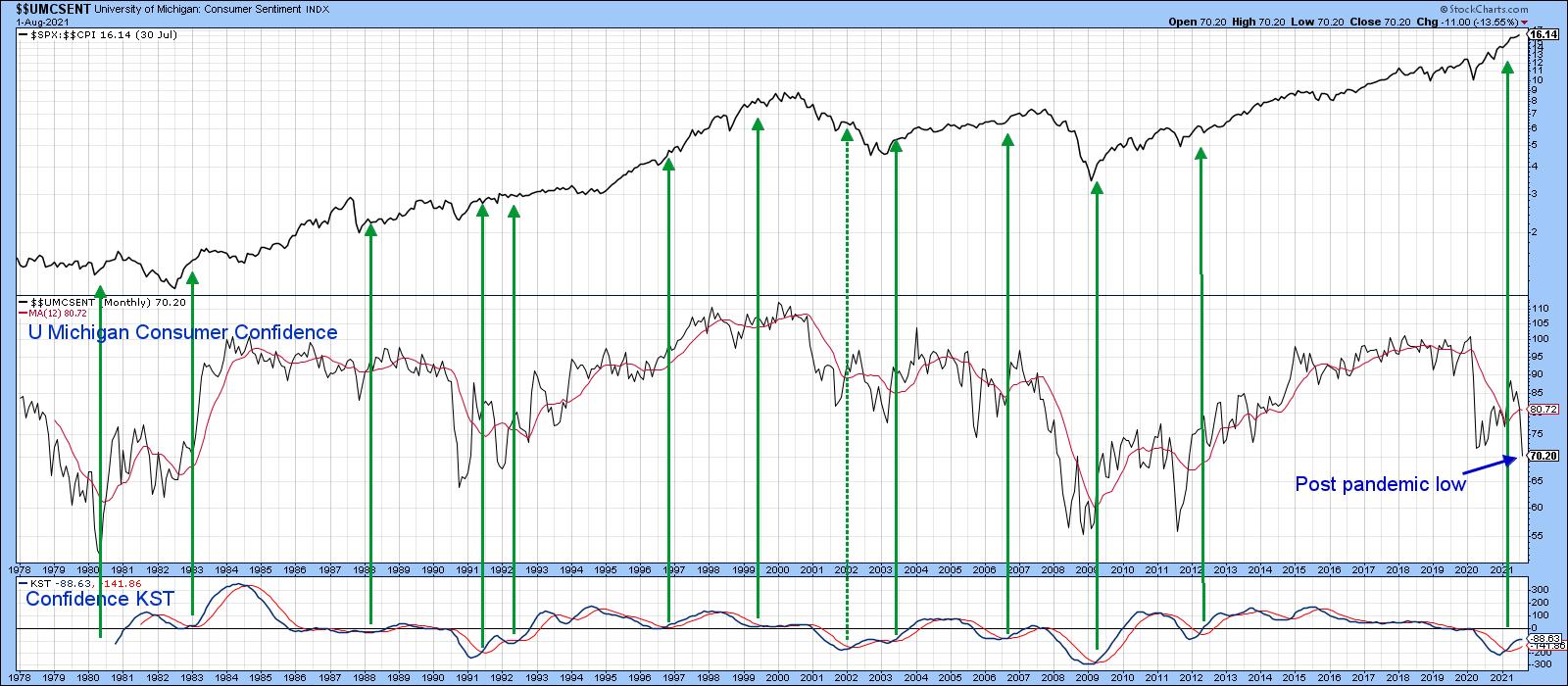 Chart 1Chart 2 features the same exercise but from a bearish point of view. My conclusion is that that these signals definitely have a bearish bias, but are not quite as reliable as the buy ones. It's important to note that the KST has not yet given a sell signal, so to conclude otherwise is jumping the gun a bit. However, if we get much more deterioration, the implication would be negative for stocks. Chart 1Chart 2 features the same exercise but from a bearish point of view. My conclusion is that that these signals definitely have a bearish bias, but are not quite as reliable as the buy ones. It's important to note that the KST has not yet given a sell signal, so to conclude otherwise is jumping the gun a bit. However, if we get much more deterioration, the implication would be negative for stocks.
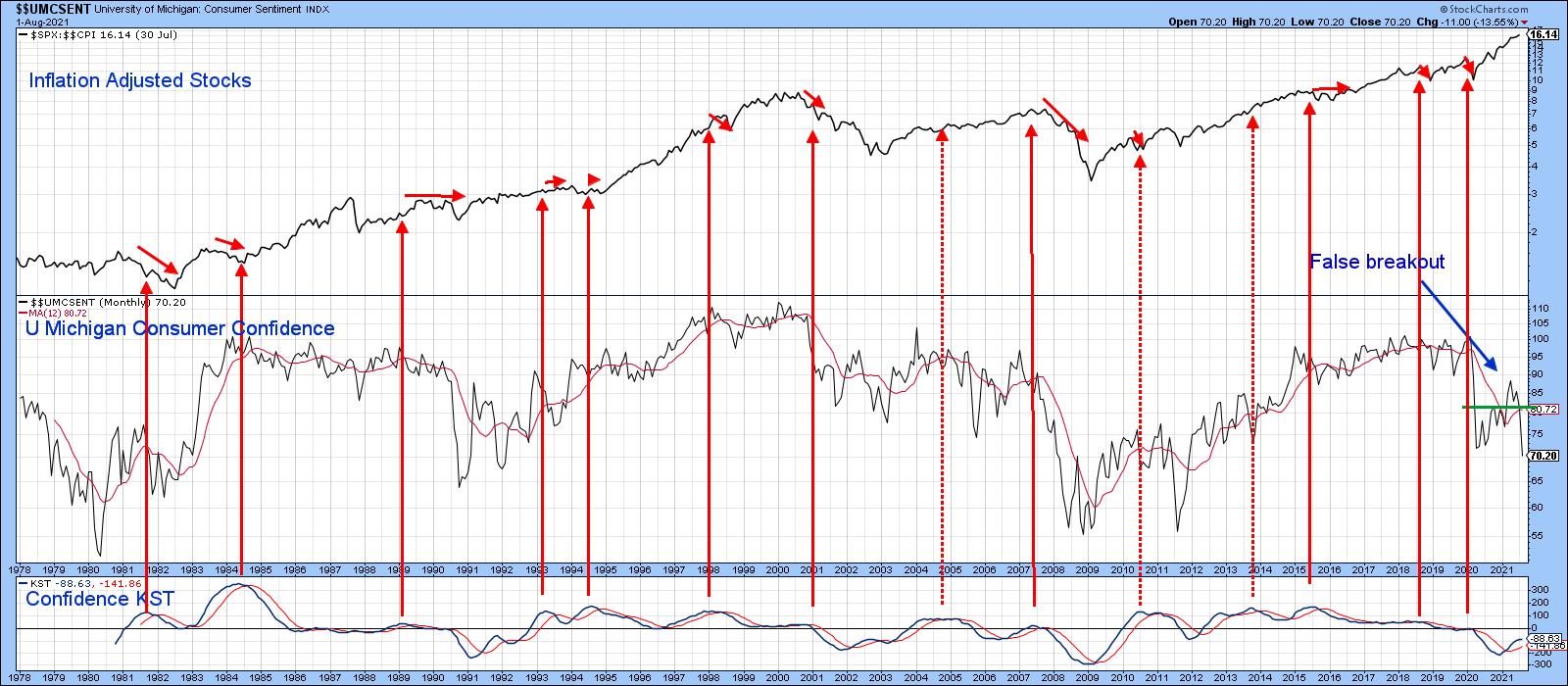 Chart 2Chart 3 offers more hope as it points up that most cyclic lows in sentiment are followed a year or so later by a test; hence the green arrows. There have been four such setups since the 1970s -- each was followed by a very nice long-term rally in inflation-adjusted stocks. In their August consumer sentiment report, the authors state that a huge contributor to weakening sentiment was the unexpected resurgence of the pandemic, just when it appeared that things were returning to normal. The seven-day average of some European countries has started to look better than that for the US. If that proves to be a leading indicator of better things to come, perhaps it would relieve downward pressure on the sentiment numbers, thereby triggering a fifth buy signal for stocks. That's something worth thinking about. Chart 2Chart 3 offers more hope as it points up that most cyclic lows in sentiment are followed a year or so later by a test; hence the green arrows. There have been four such setups since the 1970s -- each was followed by a very nice long-term rally in inflation-adjusted stocks. In their August consumer sentiment report, the authors state that a huge contributor to weakening sentiment was the unexpected resurgence of the pandemic, just when it appeared that things were returning to normal. The seven-day average of some European countries has started to look better than that for the US. If that proves to be a leading indicator of better things to come, perhaps it would relieve downward pressure on the sentiment numbers, thereby triggering a fifth buy signal for stocks. That's something worth thinking about.
Also worth noting is the fact that the market had a perfect excuse to sell off sharply last week, given the chaotic exodus from Afghanistan. That ability to shrug off good news is usually a sign of strength.
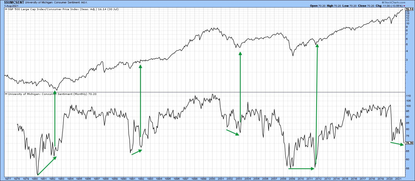 Chart 3That said, there may be another factor adversely affecting sentiment. That factor is inflation. This is shown in the bottom two windows of Chart 4, comparing the 12-month ROC of the CPI to consumer sentiment. The red horizontal line in the center window flags what appears to be the CPI warning level at 4%. The vertical lines flag those points where the ROC initially touches 4%. Note the red-dashed arrows plotted against the Consumer Sentiment Indicator. Every situation since the late 1970s has been associated with an extended deterioration in sentiment. There was one exception, which took place in 2012; in that instance, sentiment again deteriorated, but it did so prior to the CPI reaching the 4% level. When it did, a quick reversal followed and the stock market, in the top window, rallied. Chart 3That said, there may be another factor adversely affecting sentiment. That factor is inflation. This is shown in the bottom two windows of Chart 4, comparing the 12-month ROC of the CPI to consumer sentiment. The red horizontal line in the center window flags what appears to be the CPI warning level at 4%. The vertical lines flag those points where the ROC initially touches 4%. Note the red-dashed arrows plotted against the Consumer Sentiment Indicator. Every situation since the late 1970s has been associated with an extended deterioration in sentiment. There was one exception, which took place in 2012; in that instance, sentiment again deteriorated, but it did so prior to the CPI reaching the 4% level. When it did, a quick reversal followed and the stock market, in the top window, rallied.
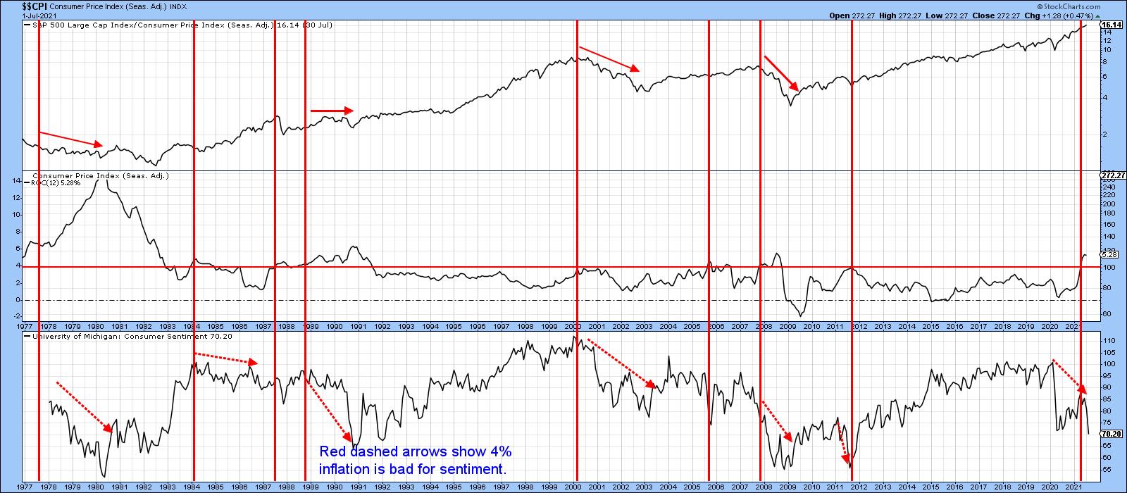 Chart 4Finally, Chart 5 compares the inflation-adjusted stock series to a longer history of the CPI 12-month ROC. This time, the bar has been set a little lower at approximately 3.5%. Once again, the vertical lines flag the initial achievement of 3.5%. The three dashed ones indicate that inflation does not always have a negative impact on inflation-adjusted prices. On the other hand, the solid lines remind us that virtually every bear market in real prices has been associated with an inflation rate that has touched or significantly exceeded 3.5%. Chart 4Finally, Chart 5 compares the inflation-adjusted stock series to a longer history of the CPI 12-month ROC. This time, the bar has been set a little lower at approximately 3.5%. Once again, the vertical lines flag the initial achievement of 3.5%. The three dashed ones indicate that inflation does not always have a negative impact on inflation-adjusted prices. On the other hand, the solid lines remind us that virtually every bear market in real prices has been associated with an inflation rate that has touched or significantly exceeded 3.5%.
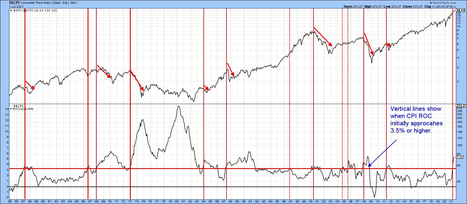 Chart 5The latest reading is 5.8%, so it is well above the 3.5% threshold. Based on this historic relationship between consumer sentiment, stock prices and inflation, it's pretty important for the inflation rate to soon begin its downward trajectory. If it fails to do so, equities and sentiment are likely to suffer the consequences. Chart 5The latest reading is 5.8%, so it is well above the 3.5% threshold. Based on this historic relationship between consumer sentiment, stock prices and inflation, it's pretty important for the inflation rate to soon begin its downward trajectory. If it fails to do so, equities and sentiment are likely to suffer the consequences.
Good luck and good charting,
Martin J. Pring
This article is an updated portion of an article previously published on Monday, August 16th at 7:53pm ET in the member-exclusive blog Martin Pring's Market Roundup.
The views expressed in this article are those of the author and do not necessarily reflect the position or opinion of Pring Turner Capital Group of Walnut Creek or its affiliates.
|
| READ ONLINE → |
|
|
|
| ChartWatchers |
| Finance Sector Holds Breakout and Establishes Line in the Sand |
| by Arthur Hill |
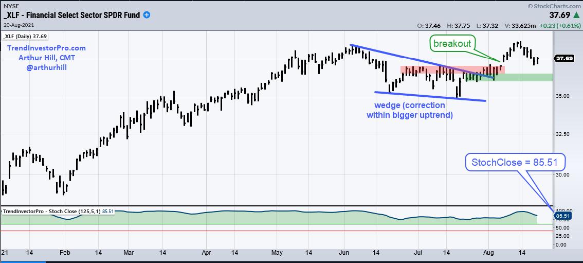
The Finance SPDR (XLF) is one of the leading sectors and recently broke out of a falling wedge correction. There was a little throwback this week, but the breakout is holding and remains bullish until proven otherwise. Let's see what it would take to prove otherwise.
First and foremost, XLF is in a long-term uptrend and one of the leading sectors. The ETF hit a new high last week and StochClose (125,5) is at 85.51 (lower window). This indicator ranges from 0 to 100 and levels above 85 show that price is near a six month high. TrendInvestorPro uses StochClose to rank its core list of 128 ETFs for performance and XLF is in the top quarter. Also note that seven sectors have StochClose values above 85 and are also in the top quarter (XLK, XLC, XLI, XLF, XLV, XLP, XLU, XLRE). No wonder SPY and large-caps are so strong. You can learn more about this indicator on the TIP Indicator Edge Plugin Page.

Turning to the price chart, XLF hit a new high in June and then corrected into July with a falling wedge, a pattern that is typical for a correction within a bigger uptrend. XLF broke out in early August to signal an end to the correction and a resumption of the bigger uptrend. The ETF followed through with a new high and then fell back this week. The late July and early August lows (green shading) mark support and this breakout is considered bullish as long as these lows hold.
TrendInvestorPro uses StochClose for momentum ranking, trend signals and trend-following strategies for ETFs in the All Weather List and the Core List. There is a seven part series for strategies related to this indicator complete with backtest results, both in and out of sample. Click here for immediate access.
-------------------------------------------------
|
| READ ONLINE → |
|
|
|
| ChartWatchers |
| Total Volume is Troubling |
| by Erin Swenlin |
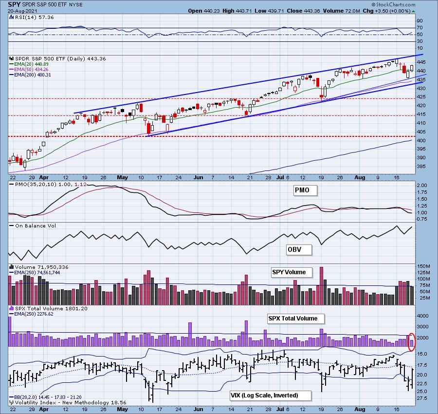
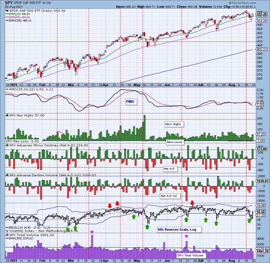
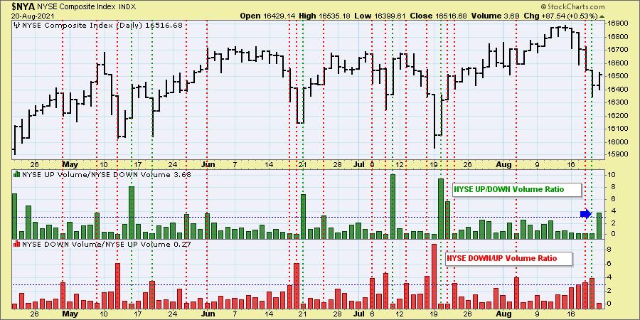
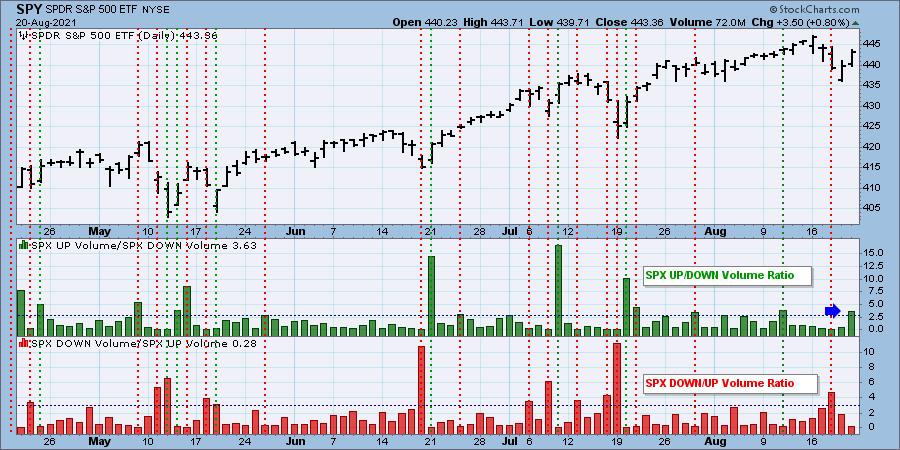
Today, we have a possible "upside exhaustion climax." We didn't get confirmation of the climax because Total Volume was so low today. This is a problem. Today was options expiration -- we should have seen more volume. Additionally, it was a strong rally day and Total Volume wasn't behind that either.
Yes, the VIX did spike higher on our inverted scale after puncturing the lower Bollinger Band, which generally leads to an upside reversal. However, you could say that, over the last two days, we got that reversal. The VIX remains below its EMA. The market typically shows weakness when the VIX is below its EMA.

Some of you may ask, "What happened to Wednesday's Downside Initiation Climax?"
Two thoughts:
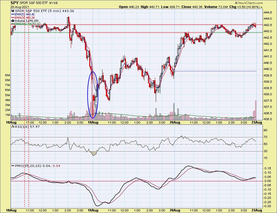
1) We saw a gap down on the open Thursday that could be assigned to the downside climax.
Below is the 5-minute candlestick showing the gap down that capped off the waterfall decline on Wednesday. That could be the conclusion of that downside initiation. Now, price is chopping around and has been followed by an "upside exhaustion climax."


Click here to register in advance for the recurring free DecisionPoint Trading Room! Recordings are available!
2) Wednesday's climax hasn't completely played out.
Today's elevated Net A-D and New Highs, combined with threshold breaks on the Volume Ratios, could be an upside exhaustion climax. Or it could simply be confirming Wednesday's downside initiation climax.


Conclusion: Whether we have a new upside exhaustion climax or we have a continuation of Wednesday's downside initiation climax, the result is the same: lower prices. We're not out of the woods yet.
Be alerted to all downside and upside climaxes by subscribing to the DP Alert. It is a must-read that you can read in less than 10 minutes. Get coverage of Bitcoin, Yields, Bonds, Dollar, Gold, Gold Miners, Crude Oil and sector rotation. It's invaluable at an incredibly low price of $35/month! Get the best technical analysis for less!
Technical Analysis is a windsock, not a crystal ball.
--Erin Swenlin
(c) Copyright 2021 DecisionPoint.com
DecisionPoint is not a registered investment advisor. Investment and trading decisions are solely your responsibility. DecisionPoint newsletters, blogs or website materials should NOT be interpreted as a recommendation or solicitation to buy or sell any security or to take any specific action.

Try us out!
Have access to our archived reports going back to 2019.
Subscribe to our "Bundle Package"
Use Coupon Code: DPTRIAL at checkout to receive one free week!
Helpful DecisionPoint Links:
DecisionPoint Alert Chart List
DecisionPoint Golden Cross/Silver Cross Index Chart List
DecisionPoint Sector Chart List
DecisionPoint Chart Gallery
Trend Models
Price Momentum Oscillator (PMO)
On Balance Volume
Swenlin Trading Oscillators (STO-B and STO-V)
ITBM and ITVM
SCTR Ranking
|
| READ ONLINE → |
|
|
|
|
|
| ChartWatchers |
| Life is a Highway - With Exits |
| by Greg Schnell |
The auto stocks have been in the news for the allure of everyone driving electric vehicles. A year ago, I started writing about the electric car theme and the race to lead.
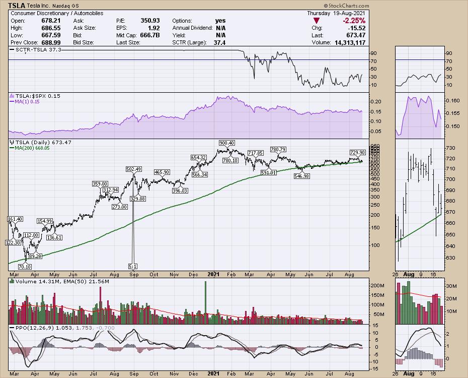
 1934 TerraplaneAfter TSLA made its mountaintop high in the spring, the primary stock in the industry group has not done much. Even the charm of Elon can't seem to warm the buy button for investors. It's a good time to review the stock. Tesla made a daunting run in 2020 and, in the first part of September, it split shares 5:1. That would put the stock at $2500 before the split and $500 after the new shares were split out. The stock cooled sideways for 2 months and hit the mountain highway again for a final assault on $900 after being added to the S&P 500, making Elon one of the richest men in the world. 1934 TerraplaneAfter TSLA made its mountaintop high in the spring, the primary stock in the industry group has not done much. Even the charm of Elon can't seem to warm the buy button for investors. It's a good time to review the stock. Tesla made a daunting run in 2020 and, in the first part of September, it split shares 5:1. That would put the stock at $2500 before the split and $500 after the new shares were split out. The stock cooled sideways for 2 months and hit the mountain highway again for a final assault on $900 after being added to the S&P 500, making Elon one of the richest men in the world.

But it also captured the enthusiasm of the youthful investor, the millennial investor, the ESG investor, the woke investor, the future investor and the index investor.
Anyone doubting Tesla at the top was just an idiot. 7 months after those heady days in January, the stock continues to rest on the 200 day moving average in green, roughly $200 off the all time highs. This little green line has supported the stock for four months. Why is this line so important?
For computer programmers, a simple definition for a stock in a long term uptrend is to be above a long term average. Institutions also like to own stocks above the long-term average and be more careful when the stock is below the average.
Tesla's future is still being talked about and the troop leader Elon mentioned the company is 12 individual startups all rolled into one company. What does that mean? The ever-present promise of autonomous driving software, the battery technology, the sophistication of electric motors, charging stations and home charging stations are all part of the allure keeping investors in the stock.
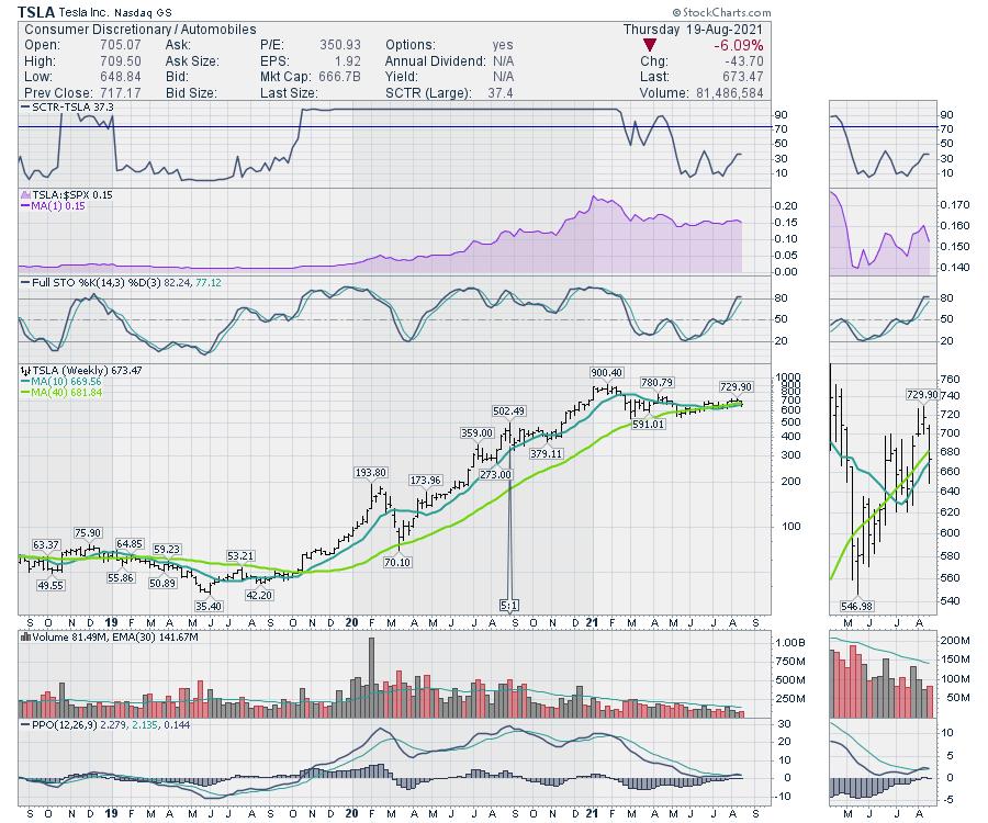
When the weekly chart is shown, the weekly momentum (PPO indicator) is near zero but turning up. I have mentioned it many times before, but strong stocks keep positive momentum. So Tesla is currently stalling, with the PPO momentum indicator staying just above zero and just above the signal line. For me, these are very important signals that must hold up.

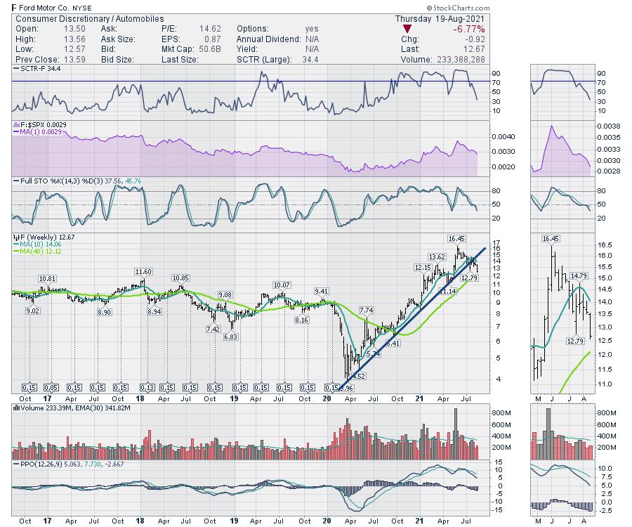
The Ford (F) brand is launching its electric pickup and my Twitter feed shows me the same ad over and over. If anyone can mainstream the truck business with electric power supply, it should be the #1 truck brand. But investors are seeing these stocks focusing on electric starting to wane. Ford is breaking the steep uptrend of the last year and is now trying to find support on the green long term moving average. In this case, it is the 40-week moving average, which is roughly equal to the 200-day (40 weeks x 5 days = 200 days). As both stocks have shed 6% this week with a day of trading left, it's a good place to make sure these electric stocks hold up. Ford's PPO momentum is dropping hard. It's even got the Cramer effect on its side, but it is not holding up.

For me, the stocks are at an important inflection point. In my Cleantech newsletter to clients each week, I look for opportunities to invest in the area. Recently, some of the names like BMW, Toyota and Honda were perking up. But this week's swoon seems to be changing all that.
All that to say, as an investor, don't be caught on the hype of the future. The Terraplane company back in 1934 was losing $21 million a year trying to compete with Ford, Dodge, Packard, Cadillac and others. There were many investors that lost everything betting on the future. While Tesla looks like the winner, at one point Ford was 80% of the automobiles worldwide.
As part of my newsletter subscription service, each week investors are kept abreast of the technical view of the wider industries related to the Cleantech theme. If that information interests you at all as just one part of my technical analysis, there is currently an August promotion where you can get 40% off the annual rate by going to gregschnell.com/explore with a two week free trial.
|
| READ ONLINE → |
|
|
|
| Trading Places with Tom Bowley |
| Taper Talk: Smoke and Mirrors to Drive Prices Lower |
| by Tom Bowley |
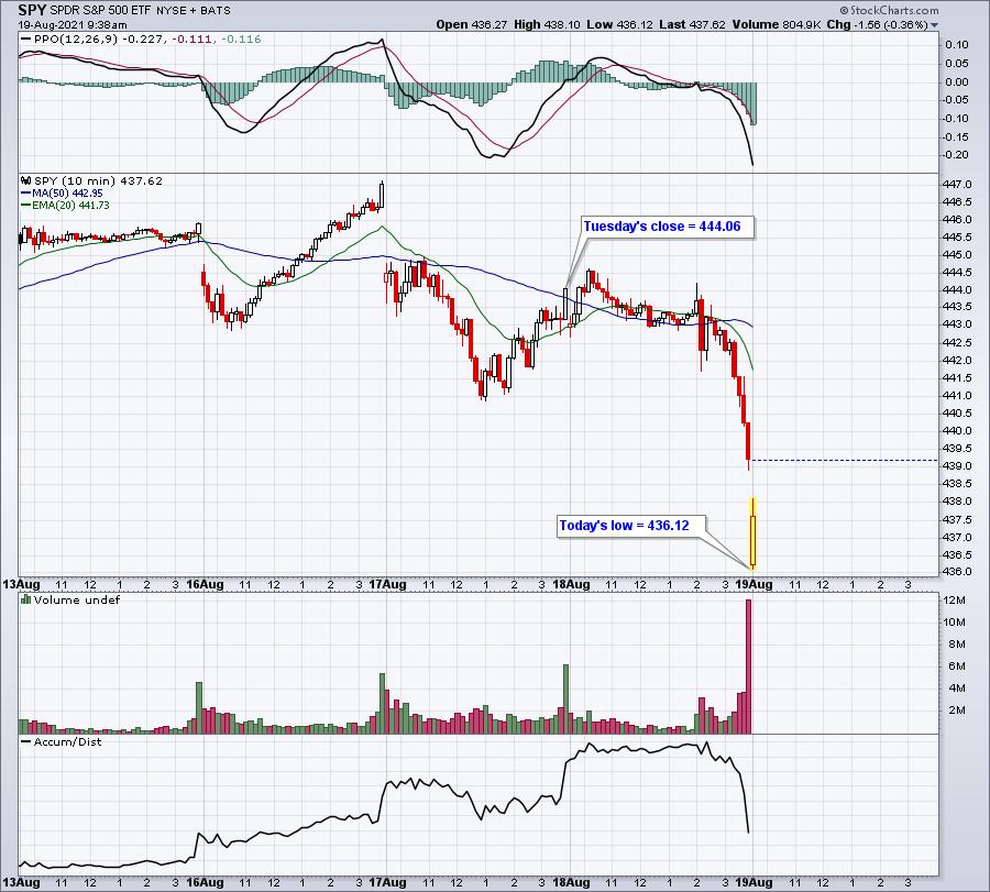
One key element of our service at EarningsBeats.com is to address monthly max pain, which I define as the point at which in-the-money call premium completely offsets in-the-money put premium. As of Tuesday's close, there was a TON of net in-the-money call premium. On the SPY alone, I calculated the total to be roughly $925 million. That's just one ETF. Think market makers might have a little incentive to drive prices lower?
The SPY (ETF that tracks S&P 500) was at 444.06 at Tuesday's close when we discussed max pain issues. The max pain level was 431.31. Since Tuesday's close, check out the SPY chart:

The net in-the-money call premium drops by $70 million for every dollar the SPY falls. So, already since Tuesday's close, we've seen the SPY fall 8 bucks to today's low, trimming that net in-the-money call premium by $560 million. Crazy!
I also want to mention that I did an analysis of trading this year (2021). We've had 158 trading days thus far. 89 have been higher, 69 have been lower. I further broke down performance during options expiration week. Here is how the S&P 500 has performed this year during options expiration week (Tuesday through Friday):
- Tuesdays: 2 up, 6 down, annualized return -57.03%
- Wednesdays: 3 up, 5 down, annualized return -54.28%
- Thursdays: 2 up, 5 down, annualized return -18.02%
- Fridays: 1 up, 6 down, annualized return -99.34%
If we strip out the Tuesday through Friday options expiration week activity, the balance of the year has seen 81 up days and just 47 down days. You want to see your trading results pick up? Sit out options expiration week, or consider shorting those stocks that are optionable with tons of net in-the-money call premium.
Let me explain it another way. The S&P 500 began the year at 3756.07. At Wednesday's close, the S&P 500 was at 4400.27. That's a net gain of 644.20 points. Here's the breakdown in points gained (lost) during non-expiration week and expiration week:
S&P 500, beginning of year: 3756.07
Tuesdays-Fridays of options week: -284.11
All other days of the year: +928.31
S&P 500, August 18th close: 4400.27
How much clearer does this picture have to get? All the headlines and fear mongering serves one purpose and one purpose only. It lines the market makers' pockets. This month it's taper talk. Recently, it's been hyperinflation. Pick a topic each month. If taper talk was truly impacting our markets in a big way, the biggest response should have been the selling of bonds and rising treasury yields. At the time of yesterday's FOMC minutes release, the 10-year treasury yield stood at 1.30%. After the announcement, we've seen the yield move as low as 1.26% this morning. Traders are BUYING treasuries, sending yields lower! If you knew the Fed was about to taper its bond-buying program, wouldn't you want to sell your bonds, driving yields higher? That's not what happened in the bond market. So why should taper talk have such a major impact on stocks? I'll tell you why. Options expiration.
The bottom line is that there are plenty of short-term inefficiencies in the stock market and monthly options expiration is just one of them. But if you like to short-term trade and don't understand the impact of options expiration, you're WAY behind those in the know. Smart money always prevails.
I'll be announcing the 10 equal-weighted stocks in our 4 stock portfolios later today. It's our portfolio "DRAFT"! If you'd like to see which stocks made our list for this upcoming 3-month period, you can sign up for a 30-day FREE trial. CLICK HERE to subscribe! Our flagship Model Portfolio has gained 217% since its inception on November 19, 2018. The benchmark S&P 500 has gained just 64% by comparison.
Happy trading!
Tom
|
| READ ONLINE → |
|
|
|
| Mish's Market Minute |
| How Strong is Russell 2000's (IWM) Current Rally? |
| by Mish Schneider |

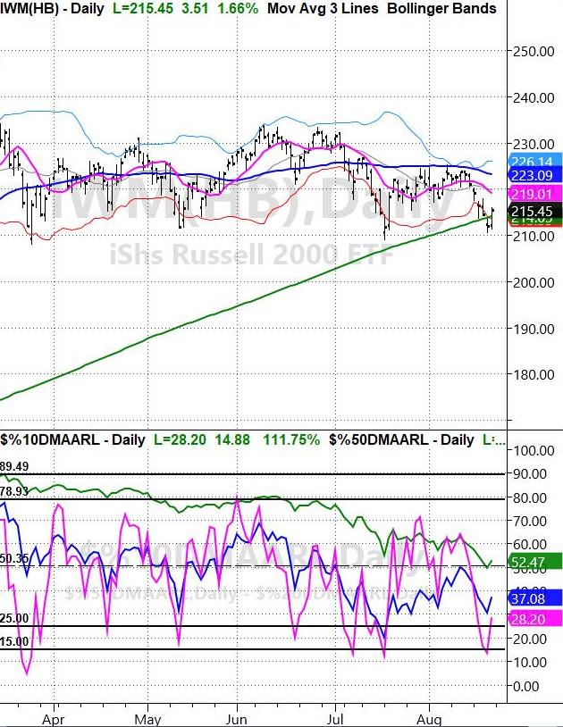
Above is a chart of the Russell 2000 (IWM), which is one of the most valuable indices as it tracks 2000 small-cap companies and, therefore, gives a great picture of the overall market direction.
Since the beginning of 2021 IWM has been mostly rangebound. The high of the range is around $234, while the low or the range is in the $209 area. On Thursday, IWM visited the bottom area of that range and now, on Friday, we are seeing IWM clear back over its 200-day moving average at $214. However, the key is that IWM is bouncing off the bottom of its range and offering opportunities for traders to enter at a lower price, with good risk based off the recent low.
With that said, on the above chart sits a special indicator that helps confirm the market's rally from an oversold state, but also gives caution for the coming trading weeks. What the indicator is showing us is the percentage of stocks over 3 major moving averages. Each colored line represents popular daily moving averages.
- Green = 200-DMA
- Blue = 50-DMA
- Magenta = 10-DMA
Because the Magenta line is showing 28.20, that means that 28.20% of stocks in the IWM index are trading over their 10-DMA. Likewise, 37% of stocks are trading over the 50-DMA. Knowing this, in the past we can see that, when the 10-DMA was trading under 25%, along with IWM's price trading near the bottom of its range, the market bounced back.
However, here is the catch. Most of the time, the 50-DMA and the 200-DMA were showing extra strength while the 10-DMA was dipping lower. Currently, both major moving averages are in sharp downward curves. This may be a sign of underling weakness in the market. While the bounce could continue higher, we should be cautious as it might not be as strong when both the 50-DMA and 200-DMA on the indicator are sloping down.
Follow Mish on Twitter @marketminute for stock picks and more. Follow Mish on Instagram (mishschneider) for daily morning videos. To see updated media clips, click here.
In this week's edition of StockCharts TV's Mish's Market Minute, Mish compares the portfolios of Cathie Wood and Michael Burry, breaking down the holdings and strategies of each to decide who the winner will be.
ETF Summary
- S&P 500 (SPY): Flirting with the 10-DMA at 443.29.
- Russell 2000 (IWM): Closed over the 200-DMA at 214.05.
- Dow (DIA): Support level 347.
- Nasdaq (QQQ): 360 new support.
- KRE (Regional Banks): Needs to clear the 50-DMA at 64.50.
- SMH (Semiconductors): 249.35 new support.
- IYT (Transportation): 248.88 needs to hold.
- IBB (Biotechnology): 164.27 support.
- XRT (Retail): 95.37 resistance.
Forrest Crist-Ruiz
MarketGauge.com
Assistant Director of Trading Research and Education
|
| READ ONLINE → |
|
|
|
| ChartWatchers |
| AMD Shows Patience is a Virtue as Opportunities Abound |
| by John Hopkins |
In my last ChartWatchers article, I discussed ways to profit from the terrific earnings season that we just experienced. So many companies put up solid numbers which led to the market reaching an all-time high.
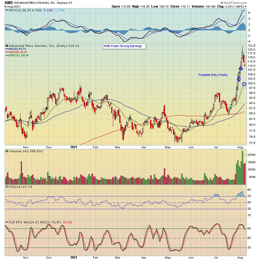
I'm referencing my article from two weeks ago because it's a great lesson in patience. In fact, I'm including the same chart on AMD that I showed in that article.

You can see that I pointed out several potential entry levels on any pullback. In this case, averaging in and taking a 1/3 position at each level shown would have resulted in a blended price of close to $103. That's a whole lot lower than the peak price after earnings of $122.49, which is the price someone could have paid if they chased the stock after earnings.
AMD is only one example, as there were a ton of stocks that beat both top and bottom line expectations and guided higher that have similar charts and required patience as well. Snapchat (SNAP) comes to mind.

You can see in the chart above that SNAP gapped up sharply after the company reported its numbers. And, after that happened, there was a very nice opportunity to buy it on a pullback for a nice trade. In fact, it has set up for another nice opportunity as well.
The point is there are so many great opportunities that arise on those stocks that beat all expectations, especially if you are willing to be patient. It helps if you have a list to refer to -- i.e., to find potential trading candidates -- which is something we provide to our members on a regular basis. It's called our "Strong Earnings ChartList", which currently includes almost 600 charts on companies that have beaten Wall Street consensus estimates as to both revenues and earnings, are liquid and have solid technical charts. This is a POWERFUL tool and, if you would like to see a sample, just click here to sign up for our FREE EarningsBeats Digest. The sample list will be in Monday morning's newsletter.
Earnings season is a time to see which companies are performing at a high financial level. Zeroing in on those companies that beat all expectations should be an integral part of your trading platform.
At your service,
John Hopkins
EarningsBeats.com
|
| READ ONLINE → |
|
|
|
| MORE ARTICLES → |
|
 Chart 1Chart 2 features the same exercise but from a bearish point of view. My conclusion is that that these signals definitely have a bearish bias, but are not quite as reliable as the buy ones. It's important to note that the KST has not yet given a sell signal, so to conclude otherwise is jumping the gun a bit. However, if we get much more deterioration, the implication would be negative for stocks.
 Chart 2Chart 3 offers more hope as it points up that most cyclic lows in sentiment are followed a year or so later by a test; hence the green arrows. There have been four such setups since the 1970s -- each was followed by a very nice long-term rally in inflation-adjusted stocks. In their August consumer sentiment report, the authors state that a huge contributor to weakening sentiment was the unexpected resurgence of the pandemic, just when it appeared that things were returning to normal. The seven-day average of some European countries has started to look better than that for the US. If that proves to be a leading indicator of better things to come, perhaps it would relieve downward pressure on the sentiment numbers, thereby triggering a fifth buy signal for stocks. That's something worth thinking about.
 Chart 3That said, there may be another factor adversely affecting sentiment. That factor is inflation. This is shown in the bottom two windows of Chart 4, comparing the 12-month ROC of the CPI to consumer sentiment. The red horizontal line in the center window flags what appears to be the CPI warning level at 4%. The vertical lines flag those points where the ROC initially touches 4%. Note the red-dashed arrows plotted against the Consumer Sentiment Indicator. Every situation since the late 1970s has been associated with an extended deterioration in sentiment. There was one exception, which took place in 2012; in that instance, sentiment again deteriorated, but it did so prior to the CPI reaching the 4% level. When it did, a quick reversal followed and the stock market, in the top window, rallied.
 Chart 4Finally, Chart 5 compares the inflation-adjusted stock series to a longer history of the CPI 12-month ROC. This time, the bar has been set a little lower at approximately 3.5%. Once again, the vertical lines flag the initial achievement of 3.5%. The three dashed ones indicate that inflation does not always have a negative impact on inflation-adjusted prices. On the other hand, the solid lines remind us that virtually every bear market in real prices has been associated with an inflation rate that has touched or significantly exceeded 3.5%.
 Chart 5The latest reading is 5.8%, so it is well above the 3.5% threshold. Based on this historic relationship between consumer sentiment, stock prices and inflation, it's pretty important for the inflation rate to soon begin its downward trajectory. If it fails to do so, equities and sentiment are likely to suffer the consequences.

