| THIS WEEK'S ARTICLES |
| John Murphy's Market Message |
| S&P 500 IS TESTING 50-DAY AVERAGE |
| by John Murphy |
S&P 500 TESTS 50-DAY MOVING AVERAGE... Chart 1 shows the S&P 500 trying to find support at its 50-day moving average (blue arrow). Stocks have entered a seasonally weak period extending from September into October. And despite the general consensus that stocks are due for a pullback, the selling so far has been pretty well contained. Some measures of market breadth, however, show more signs of weakness.
 Chart 1 Chart 1
% OF STOCKS ABOVE MOVING AVERAGE LINES ARE WEAKENING...While the S&P 500 is holding above its 50-day moving average, Chart 2 shows the S&P 500 Percent of Stocks Above Their 50-day Averages dropping to 55%. That means that nearly half of S&P stocks have fallen below their 50-day lines. That suggests that lot more profit-taking has taken place beneath the surface. Chart 3 shows that the S&P 500 Percent of Stocks Above Their 200-day moving averages has also weakened. The red line shows that measure dropping to 75%. That means that a quarter of S&P stocks have fallen below their 200-day lines. Another measure of market breadth has weakened.
 Chart 2 Chart 2
 Chart 3 Chart 3
ADVANCE-DECLINE LINE HAS ALSO WEAKENED... The red line in Chart 4 shows the NYSE Common Stock Only Advance-Decline Line declining from its June peak. By contrast, the black bars show the S&P 500 continuing to advance during that period of time. That negative divergence is worth paying attention to and may be a warning that the broader market is weaker than the major stock indexes suggest. The same is true of the lines in Charts 2 and 3.
 Chart 4 Chart 4
|
| READ ONLINE → |
|
|
|
| ChartWatchers |
| AAII Percent Bears Surges, but Excessive Sentiment is not a Two-Way Street |
| by Arthur Hill |
 The AAII indicators are making waves this week so I will cover two charts. AAII percent bears surged to 39.3% and percent bulls dropped to 22.40%. As a result, net bull-bear percentage plunged to -16.90%, the first negative reading since September 2020. Note that the remaining 38.3% are neutral. As a contrarian indicator, this bearish shift points to excessive bearishness that could give way to an advance. Let's look at some actual signals and evidence. The AAII indicators are making waves this week so I will cover two charts. AAII percent bears surged to 39.3% and percent bulls dropped to 22.40%. As a result, net bull-bear percentage plunged to -16.90%, the first negative reading since September 2020. Note that the remaining 38.3% are neutral. As a contrarian indicator, this bearish shift points to excessive bearishness that could give way to an advance. Let's look at some actual signals and evidence.
On the chart below, the red lines show when bull-bear net dips below -15% and the green lines show when bull-bear net subsequently exceeds +15%, levels that show modest excess. The November 2019 dip below -15% preceded the stock market plunge in December 2019 and the February 2017 dip preceded a correction the next six weeks. Not very contrarian.
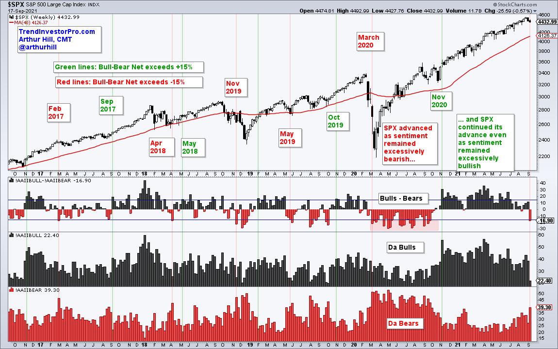
On the flipside, the April 2018 and May 2019 dips below -15% marked lows in the S&P 500 and foreshadowed significant advances. Bull-bear net dipped below -15% in the middle of the covid crash and stayed excessive as the S&P 500 rallied from late March to August. The results are mixed overall, but I would give a slight edge to the bullish signals based on excessively bearish sentiment.
Signs of excessive bullishness (> 15%), however, seem to be more bullish than bearish. Note that "excessive" bullishness kicked off big advances in September 2017, May 2018, October 2019 and November 2020. Yep, you read right. The S&P 500 rallied when bull-bear net reversed its prior signal and exceeded 15% (green lines). Clearly, chartists should not consider signs of excessively bullish sentiment as a bearish signal for the S&P 500.
Sentiment aside, TrendInvestorPro specializes in trend identification and finding short-term bullish setups within the bigger uptrend. Using StochClose, the Momentum Composite, RSI and classic pattern analysis, we monitor a core ETF list with over 120 names to bring you trend signals and mean-reversion setups. Click here to take your analysis process to the next level.
*****************************
|
| READ ONLINE → |
|
|
|
| The Mindful Investor |
| When In Doubt, Use a Checklist |
| by David Keller |
I recently gave a webcast on how to avoid one of the sneakiest and most prolific of the behavioral biases: confirmation bias. Here's how it works. Instead of gathering evidence and then making a decision, you reverse the two. You actually make your decision first and then you begin to gather the evidence.
So what happens as you start reviewing the available information? You basically assign greater value to any evidence that supports your decision and mentally push away any evidence that goes against your decision. Essentially, you look for information that will confirm your already completed decision.
If you think a little deeper about this one, you'll realize that your goal is not to make a good decision, but rather to make yourself feel better about the decision you've already made. Does that sound like a great way to manage your portfolio? It's not.
So how do we minimize the impact of confirmation bias?
Pilots face the same issue of needing to make split-second decisions and to do so without being affected by the emotional experience of what's happening. How do they manage to do this consistently? By using checklists. A lot of them.

When I was learning to fly a Cessna 172R, I had a checklist for preflighting the airplane, another one for right before takeoff and even one in case of an engine cut-out in midair. You used the checklists every time you flew the airplane, because that was the way you minimized the chance of human error.
When was the last time you used a checklist for a trade? I mean spelling out the evidence you were going to evaluate, keeping track of the results of each step and then making an investment decision based on the weight of the evidence?
Here's the checklist I use to evaluate 90% of the charts that I review. You should use a written checklist, especially as you're getting started. If you don't have a checklist, you should write one down. Now. If you don't know how to get started, you're welcome to use mine as a starting point!
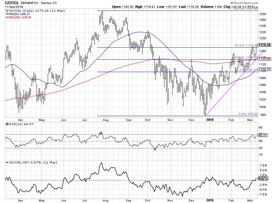
Let's take an example of GOOGL a couple years ago and see how the chart checks out.
Step 1: Dow Theory
Is the chart making higher highs and higher lows? Yes.
Step 2: Trend Lines
Are there any key trend lines in play? Yes, I can connect the December 2018 and February 2019 lows to track this confirmed uptrend.
Step 3: Moving Averages
Where is the price relative to the moving averages? Are the moving averages sloping up or down? The price is above two upward-sloping moving averages.
Step 4: Pattern
Any important price patterns that I recognize on the chart? I could argue that February 2019 showed a pennant pattern that resolved to the upside.
Step 5: Support/Resistance
Where is the price relative to key support and resistance levels? GOOGL had recently broken above the February high and just eclipsed the 61.8% Fibonacci retracement level.
Step 6: Confirmation
Can I confirm price action with any technical indicators? The RSI is in a bullish range, well above 40 and not yet overbought.
Step 7: Relative Strength
How is this stock performing relative to its peers? GOOGL is showing positive relative strength, and the RS line is close to making a new six-month high.
Overall, the weight of the evidence in this example seems positive. Now, try the same seven steps on another chart, VALE.
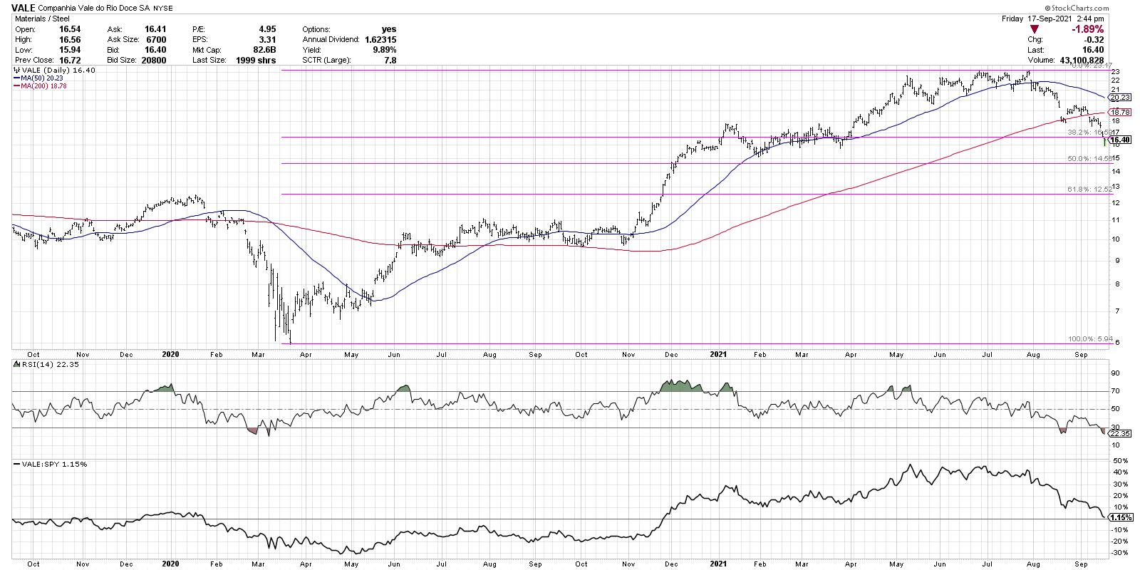
The most successful investors I've worked with surround themselves with resources and routines they need to add discipline to their investment process. Checklists are one way to take the guesswork out of technical analysis and minimize confirmation bias by focusing on the weight of the evidence!
Want to digest this article in video format? Here we go:
RR#6,
Dave
PS- Ready to upgrade your investment process? Check out my free course on behavioral investing!
David Keller, CMT
Chief Market Strategist
StockCharts.com
Disclaimer: This blog is for educational purposes only and should not be construed as financial advice. The ideas and strategies should never be used without first assessing your own personal and financial situation, or without consulting a financial professional.
The author does not have a position in mentioned securities at the time of publication. Any opinions expressed herein are solely those of the author, and do not in any way represent the views or opinions of any other person or entity.
|
| READ ONLINE → |
|
|
|
|
|
| ChartWatchers |
| Walking Blind Into An Energy Crisis |
| by Greg Schnell |
 A theme is emerging in the energy space. Oddly, it is not a theme focused on green energy. At this point, it appears to be a theme focused on the energy squeeze that is right before us. This worldwide issue appears to be coming to a head. A theme is emerging in the energy space. Oddly, it is not a theme focused on green energy. At this point, it appears to be a theme focused on the energy squeeze that is right before us. This worldwide issue appears to be coming to a head.
Type in the name of any country with the words "electricity price spike" into your Google search bar. A result pops up. Most countries are experiencing record demand for electricity, but utility companies are not building power stations to match demand. The governments worldwide are quick to mask the problem by announcing green plans. The real problem is the sun and wind are renewable, but the infrastructure to catch that power is not. These plants wear out as fast as a Samsung fridge.
All of a sudden, in the last few weeks, a major surge has shown up.
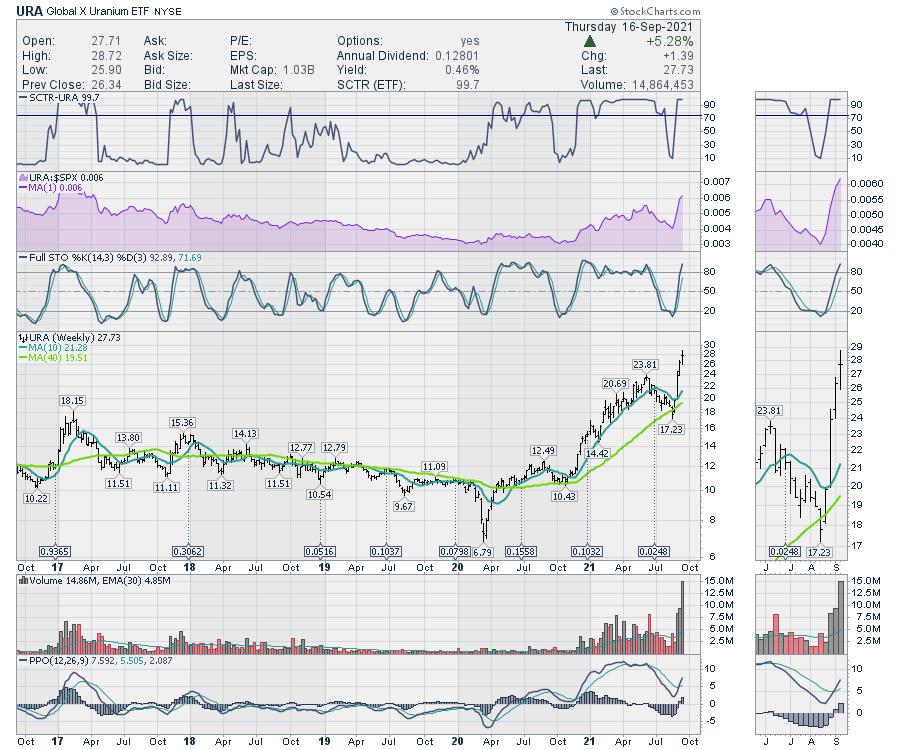
The Uranium ETF (URA) is soaring. Part of this is apparently due to ETFs, but the other part of it is the chart has been improving for a while. And the chart is on a rocket ship higher.

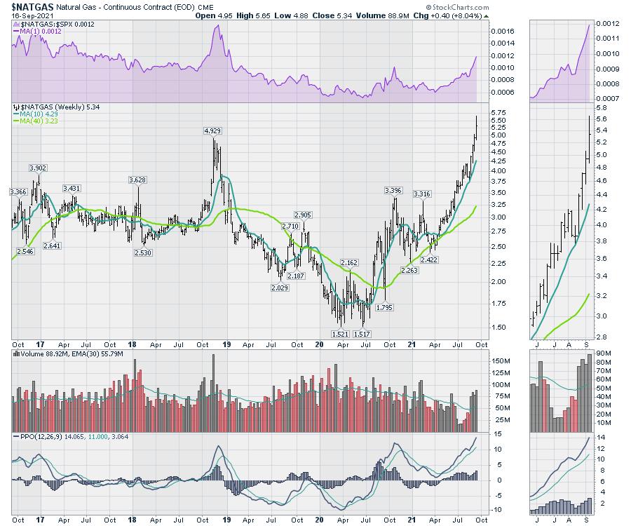
Natural Gas ($NATGAS) has been soaring worldwide as Europe is paying 4x more than North America. The price below is for North America.

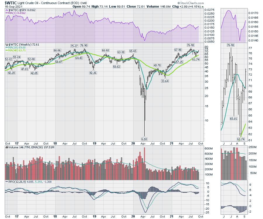
West Texas Crude ($WTIC) pricing appears to be ready to break out this week, moving back above the 10-week moving average. This looks set to challenge the 5-year highs.

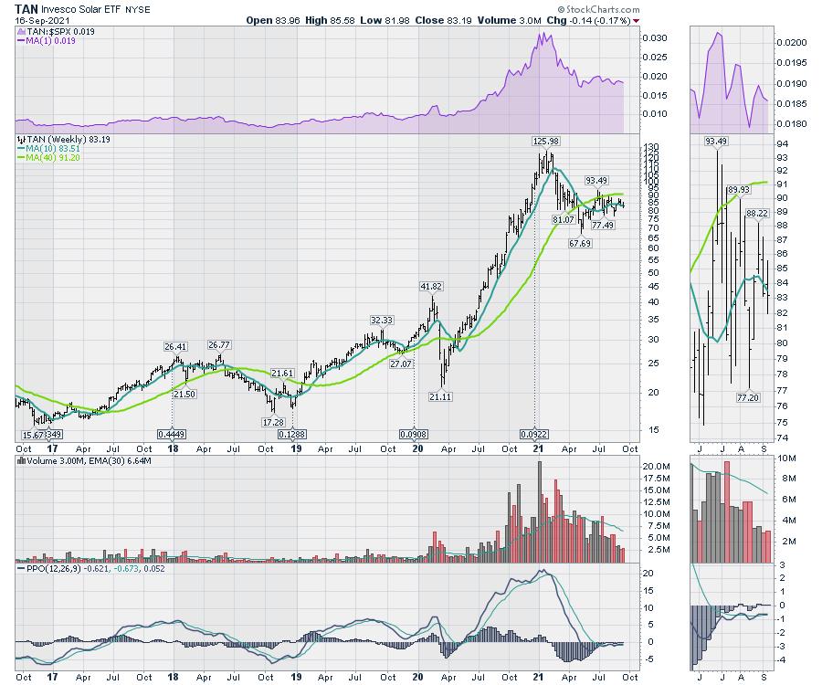
What has not broken out yet is the Solar ETF (TAN).

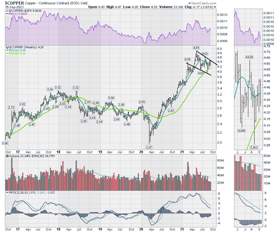
Copper ($COPPER) is all lined up to break out.

As winter approaches, be ready for massive issues in power supply. We continue to have government inaction to approve new power generation, but we keep increasing demand worldwide.
This entire sector looks like the pressure relief valve is about to blow on these charts. Stay tuned! Here is an article I wrote on Monday about the Copper linkage: Green Energy - All Aboard?!
For more information on following my recommendations for investing on this energy crisis, visit Gregschnell.com/explore. It might be the best $500 you've spent this year! I cover energy every week in my newsletter extensively.
|
| READ ONLINE → |
|
|
|
| Trading Places with Tom Bowley |
| Will The Market Maker Manipulation Kick In Again This Month? |
| by Tom Bowley |
One of my favorite times to trade is leading up to options expiration, because it's one time where I feel fairly comfortable which side of the trade that market makers are on. It's options expiration week and a time where we do a lot of research of EarningsBeats.com, trying to uncover great trading opportunities for our members. Of course, nothing is a guarantee, but I do believe tendencies are in our favor.
A Look Back
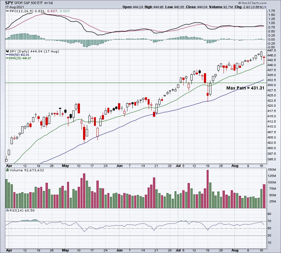
2021 has been a strong year for options-related trading as we've sped towards prior options expiration Fridays (and into the following week). I wanted to point out a few of our "max pain" related calls from August, so that you can get a feel for what we look for. Let's start with the major indices. I always review all call and put open interest the Tuesday before options expiration Friday for both the SPY and QQQ (ETFs that track the S&P 500 and NASDAQ 100, respectively). One month ago, here's where the SPY was and where "max pain" resided:

At that time, there was a total of $855 million of net in-the-money call premium just on the SPY. Every dollar that the SPY dropped would save market makers roughly $70 million. While the SPY never moved down to that 431 level, it did drop over the next two days to hit a low of 436.12. It's extremely important to keep in mind that market makers can protect themselves against loss in the event that the SPY went higher. It's the covered call strategy, where you can buy a stock and sell a call. Owning the stock protects you against losses from selling the call. That's why max pain's directional clues don't always work. Again, it's very important to understand that this strategy will not work every time. However, it's possible for market makers to make a windfall of profits. Consider this scenario:
Trader A wants to buy 10 calls of ABC stock with a strike price of $20. The stock currently trades for $21. So Trader A must pay $1 for this call because it's one dollar "in-the-money", PLUS a premium for time and volatility. If there are no willing sellers, then a market maker provides the liquidity by selling those 10 calls. If the market maker doesn't buy the stock and ABC stock shoots higher to $30 before the date of the option, the market maker will lose a small fortune. However, if the market maker sells the 10 calls and turns around and buys 1000 shares (1 call equals 100 shares), then that market maker is protected against that price surge higher. The premium paid for those 10 calls becomes the profit to the market maker. But what if the stock were to move to $30 a week before options expire and the market maker decides to get aggressive? The market maker could sell the ABC stock position at $30 and begin shorting ABC shares to drive the price lower. What if the market maker drives the price down $10 by shorting back to the $20 level. Let's recap what would happen in this scenario.
Trader A loses 100% of his/her capital on this trade. The calls expire worthless. But how did the market maker do? Well, the long position from $21 to $30 netted a $9 gain, or $9,000. The short position netted profit from wherever shorted down to $20. And how about that call? 100% profit. They make money on their long position, make money on their short position, and completely confound the Trader A, who watches his/her entire capital lost in a matter of days as ABC stock falls apart short-term from the sudden overhead supply provided by the market maker. Think this doesn't happen?
I'm not suggesting this scenario plays out every time. Of course it doesn't. But I have seen it play out plenty of times.
Real Life Examples
Ok, so let's move on from ABC stock and Trader A. Let's discuss real scenarios from last month. On Tuesday, August 17th, I held an "August Max Pain" webinar and provided a total of 8 potential trading candidates to our EB.com members where stocks had made significant moves in both directions, were optionable, and were subject to a possible advance/decline based on max pain. Of the 8 potential trades, I view all 8 as successful trades, but some were much more successful than others. Here are two that were unbelievably profitable:
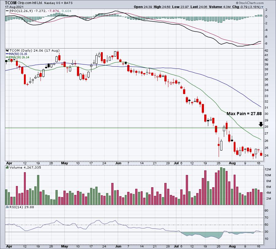
TCOM:
At the time of our August 17th webinar, TCOM traded at 24.06 and max pain resided at 27.88. Here was the chart we provided to our members at that time:

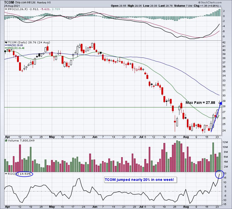
By Friday's close, TCOM had surged back to an intraday high of 27.07. There was plenty of net in-the-money put premium on Tuesday. By Friday? Vanished. POOF! And look at where TCOM finished just one week after our webinar:

Coincidence or market maker magic? You be the judge.
LVS:
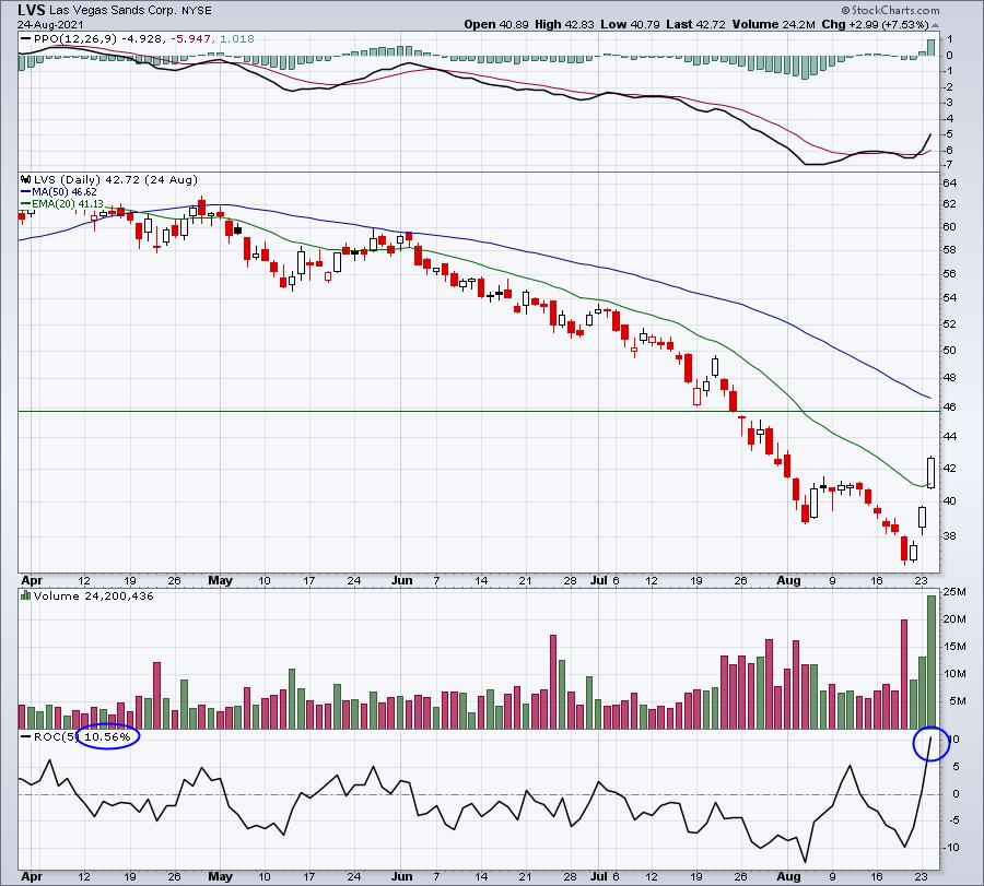
TCOM only had $3 million of net in-the-money put premium on the table. LVS was at another level, with nearly $40 million of net in-the-money put premium. Let me "cut to the chase" here as the chart below also shows what happened over the week following our webinar:

We didn't reach max pain, but LVS made a directional move to the upside, which is what I look for. Even just a 50 cent move to the upside saves premium dollars. In the case of LVS, we saw a 10.5% jump from the Tuesday before options expiration Friday to the Tuesday after.
These are the types of trades we look for during options expiration week. Believe me, they do not all work like the two I just showed you. I don't want you to get the wrong impression. But max pain provides us knowledge that many other traders don't have and it gives us a trading advantage, in my opinion. I will be spending the balance of today researching hundreds of stocks, trying to uncover the best "September Max Pain" candidates, both on the long and short side, to try to take advantage of market maker manipulation. I'll unveil those max pain trading candidates, along with max pain levels on both the SPY and QQQ, in our monthly webinar.
The Event
Today at 4:30pm ET, I'll be hosting our "September Max Pain" event. I'd love for you to join us. If you're not already an EarningsBeats.com member, we do offer a FREE 30-day trial, which will allow you to join me. CLICK HERE (and then click the green "JOIN TODAY" button) to get your FREE 30-day trial started. I hope to see you this afternoon for what should be another great event!
Happy trading!
Tom
|
| READ ONLINE → |
|
|
|
| ChartWatchers |
| Profiting on Stocks After Earnings |
| by John Hopkins |
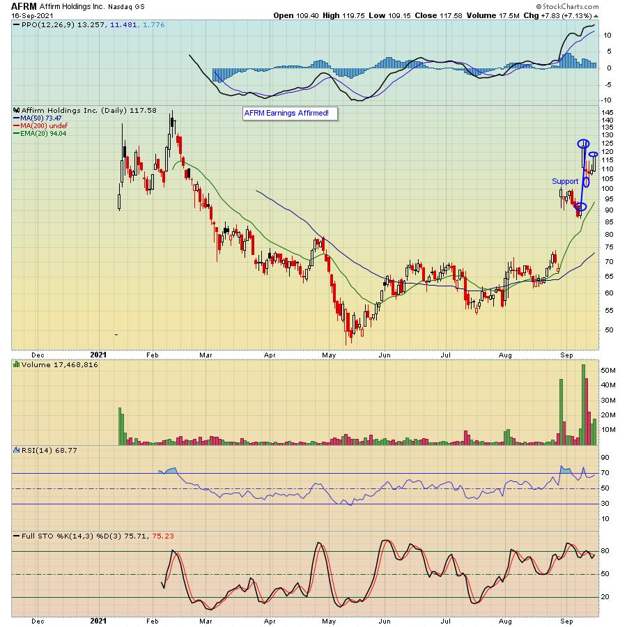
On September 9, Affirm Holdings (AFRM) reported its earnings results after the bell. The market liked what they heard and saw, with the stock climbing a nifty 37.5% from the prior day's close to the high the day after the numbers were released.
If you owned the stock into the earnings report, you would likely be quite pleased. However, as we see in many cases, traders took advantage of the move higher, with the stock pulling back nicely on profit-taking and setting up for another nice trade.

For example, as you can see in the chart above, the stock got as high as $126.46 the day after the earnings were released. One day later, euphoria had cooled with the stock moving down to $102.30, a 19% pullback. That was right near key support and presented an opportunity to jump back in, especially for those traders who liked what they saw but did not own the stock into the earnings report, with the stock moving back up 17% in just a few days.
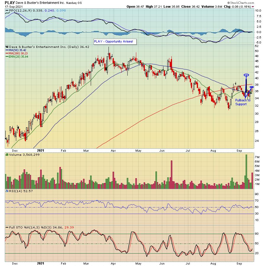
AFRM is only one example of a company that beat earnings expectations, showed a very positive response and then pulled back on profit-taking. I see this happen all the time. Another example is Dave & Buster's (PLAY), which reported its earnings the same day as AFRM, moved up sharply the next day and then pulled back almost 18% to price support before heading up again, gaining over 10% when it hit this past Friday's high.

Point being, instead of taking the risk of holding a stock into its earnings report, I like to watch the initial market reaction, see what happens over the next day or two, then get involved in a trade if it pulls back to key technical or price support, like AFRM and PLAY did.
Hard to believe, but we're now just 3 weeks or so away from Q3 earnings season getting underway. With it, we'll see a lot of great opportunities, especially those companies that report solid numbers and pullback to key support levels like I've demonstrated above. At EarningsBeats, we'll continue to identify those companies that show the greatest promise. If you want to get our FREE EarningsBeats Digest, just click here and our Chief Market Strategist Tom Bowley will keep you posted on important earnings and market-related news.
At your service,
John Hopkins
EarningsBeats.com
|
| READ ONLINE → |
|
|
|
| RRG Charts |
| We Can See More Than "Just" Sector Rotation on Relative Rotation Graphs |
| by Julius de Kempenaer |
I had planned to look at some lesser-known Relative Rotation Graphs in this week's episode of Sector Spotlight, but I used too much time on asset class and sector rotations to make that happen. So I am going to publish them here and give a brief description and interpretation.
Dow Composite

In the drop-down selection list, we have a lot more RRGs available than just the one showing the US sectors. Further down the list, below the breakdown of the sectors into individual stocks, you will find "US Markets", which holds the DJ Composite 65, DJ Industrials 30, DJ Transportation 20, DJ Utility 15.
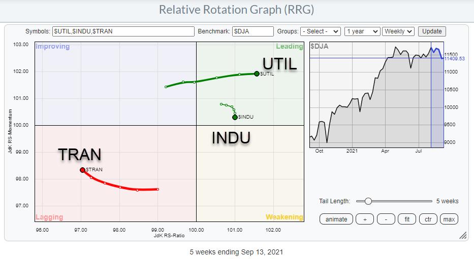
The Composite 65 shows the three groups inside the DJ Composite: Industrials, Transport, and Utilities. Although it is a very simple RRG, it can give strong pointers.
In the RRG above, the Risk OFF rotation is very visible. Transports are already well inside lagging and Industrials are rolling over inside the leading quadrant, while Utilities are shooting off into the leading quadrant.

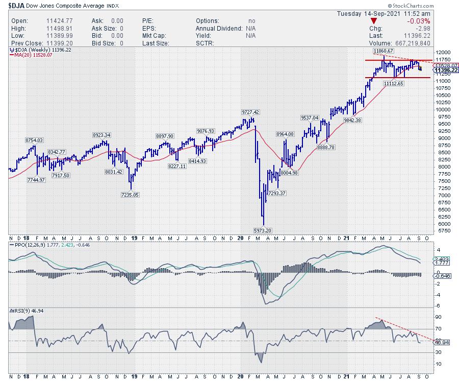
On the price chart, $DJA has just bounced off the former high of around 11,750. The support level to watch in the coming weeks, IMHO, is 11,130. If that gives way to the downside, a double-top pattern will be completed with an accompanying price target around 10,500, and possibly lower towards the former breakout level between 9,500-9,750.
The PPO and RSI indicators that are plotted below the price chart are clearly pointing lower and showing (semi-) negative divergence. The peaks on the price chart are not higher, which is what you'd ideally like to see in case of negative divergence, but at the same level while the indicators are pointing lower. They are definitely NOT confirming the highs and lows on the price chart.
Commodities

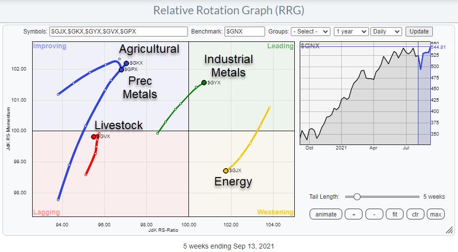
Another RRG we do not look at too often is the one showing the rotations for the Commodity sub-indexes against the S&P GSCI Commodity index.
There are five groups in this index. Industrial Metals just entered the leading quadrant at a strong RRG-heading while Energy ($GJX) rotated out of the leading quadrant into weakening over the last weeks and has now started heading towards the lagging quadrant. The rotation for Energy happened after a very strong rotation, pushing Energy prices higher since the end of last year. Given the strength of $GJX on the price chart, there is a good opportunity that this rotation represents a pause in the relative uptrend, and $GJX can curl back up before hitting the lagging quadrant.
Inside the lagging quadrant, we find the tail for Livestock which has just turned back down after moving higher on the JdK RS-Momentum scale. Measured on the JdK RS-Ratio scale, Livestocks is the weakest group in this universe.
Inside improving, Precious Metals is rolling over and starting to head lower on the RS-Momentum scale, moving back towards the lagging quadrant and picking up its relative downtrend again.
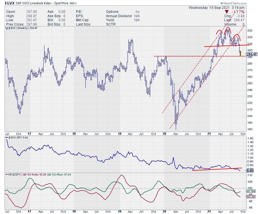
The long tail on the Agricultural sub-index shows a strong move relative to the S&P GSCI Commodity index, but is still low on the RS-Ratio scale. This means that there is still the possibility for the tail to roll over, as Precious Metals has already started doing. A quick look at the price chart for Agri reveals that a potential H&S top is in the making, which would certainly support a rollover inside improving and a renewed move back towards the lagging quadrant.
Livestock

Livestock shows a completed H&S reversal, which rejected resistance in the 310-320 area (2017 and 2019 peaks). This chart leaves very little room for upside. There is some support around 290 now for Livestock, but, when that gives way, there is plenty of downside before any meaningful support will be met.
Industrial Metals

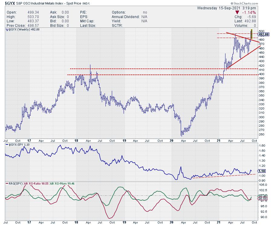
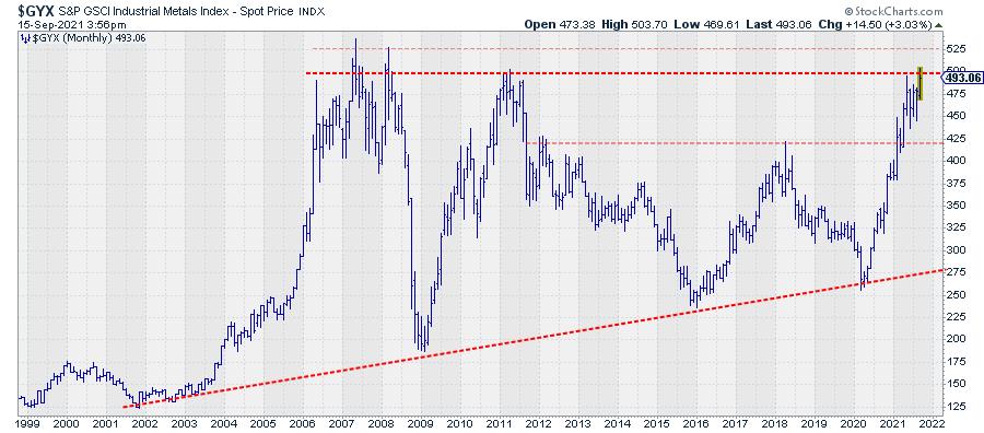
The tail on Industrial Metals has just broken out of a triangle-like consolidation. This consolidation formed after Industrial Metals broke above the 400-410 barrier at the start of the year, pushing the sub-index to its highest level in 10 years. However, the index is now pushing against a 10-15-year-old resistance level, as you can see in the monthly chart below.

Note on the chart above how Industrial Metals are now entering the resistance zone that is offered by the peaks dating back to 2007-2008 and 2011. Breaking from the consolidation was the first positive sign. But the real deal will be a break beyond 500 and preferably 525. Such a break will very likely be the catalyst for a much further rise and relative outperformance for industrial metals.
#StaySafe, --Julius
|
| READ ONLINE → |
|
|
|
| MORE ARTICLES → |
|
 Chart 1
 Chart 2
 Chart 3
 Chart 4

 The AAII indicators are making waves this week so I will cover two charts. AAII percent bears surged to 39.3% and percent bulls dropped to 22.40%. As a result, net bull-bear percentage plunged to -16.90%, the first negative reading since September 2020. Note that the remaining 38.3% are neutral. As a contrarian indicator, this bearish shift points to excessive bearishness that could give way to an advance. Let's look at some actual signals and evidence.



 A theme is emerging in the energy space. Oddly, it is not a theme focused on green energy. At this point, it appears to be a theme focused on the energy squeeze that is right before us. This worldwide issue appears to be coming to a head.