| THIS WEEK'S ARTICLES |
| John Murphy's Market Message |
| STOCKS REBOUND ON CPI REPORT |
| by John Murphy |
LARGE CAPS ARE ENDING THE WEEK HIGHER DESPITE RISING CPI... This morning CPI report showed annual inflation rising 6.8% to the highest level in nearly forty years. Despite that high reading, major stock indexes are gaining ground on the day and week. Chart 1 shows the Dow Industrials climbing back above their 50-day average after last week's successful test of their 200-day line. Charts 2 and 3 show the S&P 500 and Nasdaq 100 trading well above their 50-day averages. Small caps, however, continue to lag behind.
Chart 4 shows the Russell 2000 iShares (IWM) trading lower today after meeting resistance at its 200-day moving average. That's not an encouraging sign for the market as a whole, and partially explains why market breadth figures continue to lag behind this week's gain in large cap stocks. Bond yields are also down today.
 Chart 1 Chart 1
 Chart 2 Chart 2
 Chart 3 Chart 3
 Chart 4 Chart 4
BOND YIELDS DROP... It's surprising to see bond yields falling in the face of today's rising CPI report. Chart 5 shows the 10-Year Treasury yield ending the week on the downside. That may partially explain today's rebound in stocks. That pullback in yields, however, is likely to be short-lived. Expectations for a more hawkish Fed in the months ahead to slow inflation should start pushing bond yields higher. That would provide a bigger test for stocks.
 Chart 5 Chart 5
|
| READ ONLINE → |
|
|
|
|
|
| ChartWatchers |
| Oil & Gas Equipment & Services ETF Makes a Bid to End its Big Digestion |
| by Arthur Hill |
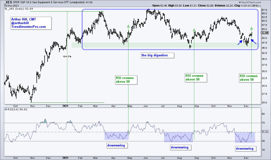
 The Oil & Gas Equipment & Services ETF (XES) was one of the leading industry group ETFs in the spring after it surged some 164% off its November low. This was clearly a massive gain and the ETF was entitled to a rest. Big meals require long digestive periods and this is exactly what XES did as it traded flat the last nine months. Long-term trend followers might wait for a range breakout to turn bullish. Astute traders can use range support and RSI to identify reversals within the range and get the early jump. Let's investigate. The Oil & Gas Equipment & Services ETF (XES) was one of the leading industry group ETFs in the spring after it surged some 164% off its November low. This was clearly a massive gain and the ETF was entitled to a rest. Big meals require long digestive periods and this is exactly what XES did as it traded flat the last nine months. Long-term trend followers might wait for a range breakout to turn bullish. Astute traders can use range support and RSI to identify reversals within the range and get the early jump. Let's investigate.
The chart below shows this big digestive period marked as a large rectangle consolidation (blue outline). There is a clear support zone and XES is reversing off this zone with a solid bounce this week. The blue arrows show a gap down on November 26th and a gap up on December 7th. It is not exactly an island reversal, but it is clearly a reversal off support, and this is bullish price action.

The indicator window shows RSI dipping to a downswing zone three times (blue shading). The cup is half full when RSI is above 50 (upswing) and have empty when RSI is below 50 (downswing). Notice how RSI stayed below 50 for several weeks in March-April and July-August. The break above 50 signaled a momentum breakout and this confirmed the reversals off support. The same thing is happening now as RSI makes a bid to break above 50.
Looking for more setups like these? Check out TrendInvestorPro.com. Each week we pick the best setups from a core ETF list and include them in the ETF Trends, Patterns and Setups Report. There is also a regularly updated broad market timing model to keep us on the right side of the market trend and an ETF ranking table.
Click here to take your charting to the next level!
------------------------------------------
|
| READ ONLINE → |
|
|
|
| ChartWatchers |
| Sector CandleGlance Reveals Positive Momentum in All But One Sector |
| by Erin Swenlin |
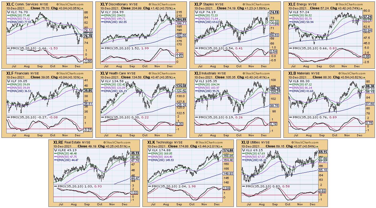
One of the tools we use at DecisionPoint to review sector performance and strength a CandleGlance with our PMO and key moving averages. It wasn't too long ago that every sector was displaying negative momentum. Now, we are seeing broad participation, with every sector having a PMO rising -- except for XLY, which pulled back this week.
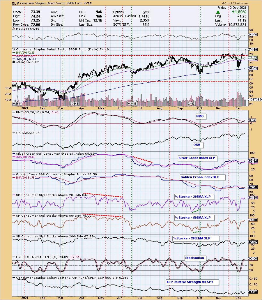
Other interesting observations from the CandleGlance would be the breakouts of XLK and XLP. These sectors are on the opposite ends of the spectrum in terms of defensive v. aggressive. Seeing both of these sectors breaking out hints that the market could be on track to make new all-time highs.

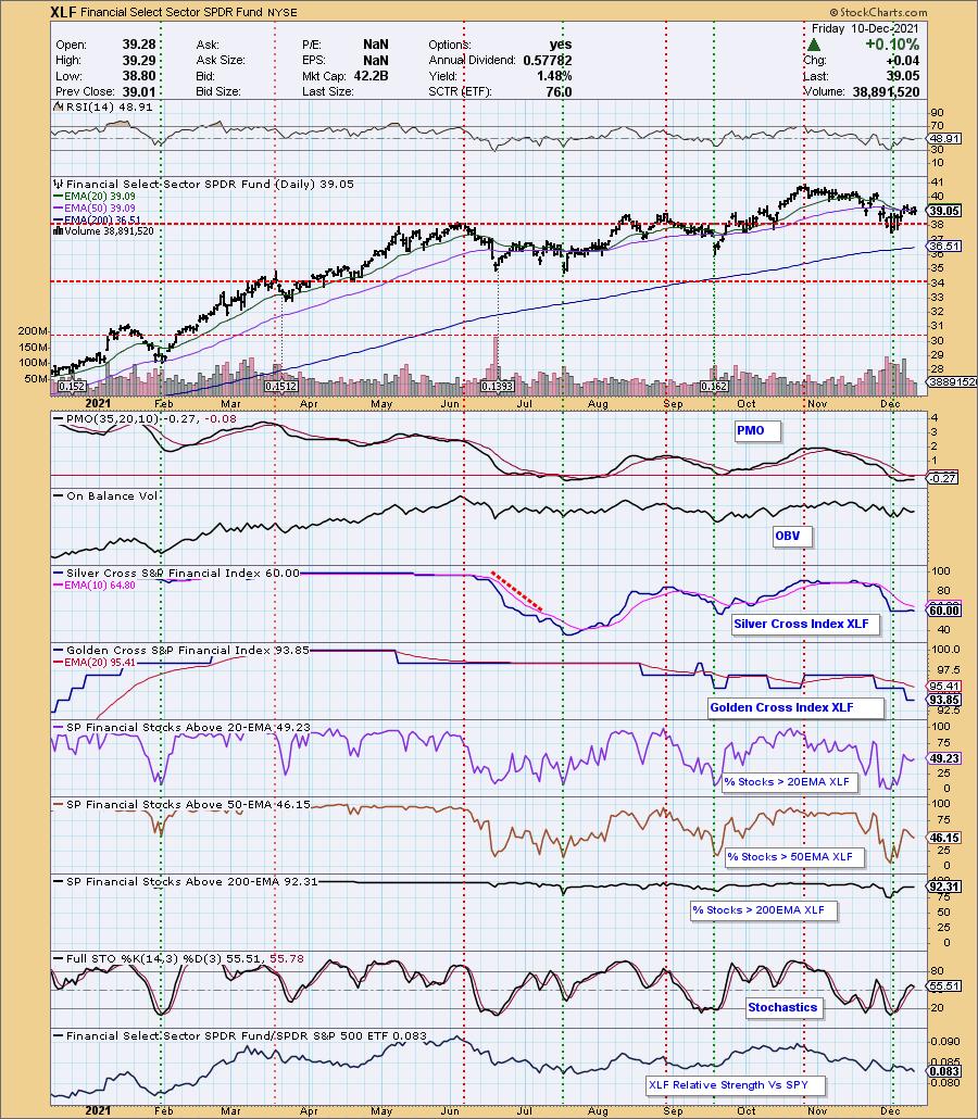
Communication Services (XLC) has been a laggard, holding onto its IT Trend Model "Dark Cross" Neutral signal (20-EMA < 50-EMA while 50-EMA > 200-EMA) for weeks. We now have another sector with an IT Trend Model "Dark Cross" Neutral signal: Financials (XLF). The PMO is technically rising on XLF, but is ready to turn back down. There is a strong bearish bias given %Stocks > 20/50-EMAs are lower than the SCI reading. This suggests that XLF could find itself falling further.

Read on...
ChartWatchers Save More on Our Holiday Special!
Save 50% off your FIRST month AND get a 2nd month FREE!
Currently we are running our holiday special of "BUY ONE MONTH get ONE MONTH FREE" on our website. However, as a ChartWatchers reader, we are offering you an even better deal!
Use Coupon Code: SAVE50CW and you will get 50% off your first month AND get your second month FREE! Once you've subscribed, we will move your renewal date out to February!
This is our best deal of the year! Subscribe Now!

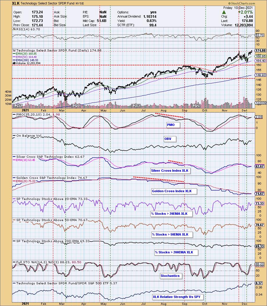
The sectors with the most potential moving into next are XLK and XLP, based on their breakouts and participation percentages.
A PMO crossover BUY signal was generated on XLK. The SCI is about to have a positive crossover of its signal line as well. I like the positive RSI and improving Stochastics. Participation percentages are above the SCI reading, giving it a bullish short-term bias. The breakout is icing on the cake. I like XLK better than XLP based on the relative strength line. XLK has been showing relative strength since May.

XLP also triggered a PMO crossover BUY signal. The indicators look very much like XLK. Participation is higher than on XLK, but that relative strength line is the issue, as it has been flat or trending down this year. If the market decides to turn over next week, I would expect this sector to perform better than XLK. You'll also notice on the RRG that XLK looks the most healthy in the short- and intermediate-terms.


Click here to register in advance for the recurring free DecisionPoint Trading Room! Recordings are available!
If you'd like to use the DecisionPoint CandleGlance ChartStyle, click HERE and then save the ChartStyle as "CandleGlance". Every time you pull up a CandleGlance, you'll see them with our DP CandleGlance style.
Technical Analysis is a windsock, not a crystal ball.
--Erin Swenlin
(c) Copyright 2021 DecisionPoint.com
Helpful DecisionPoint Links:
DecisionPoint Alert Chart List
DecisionPoint Golden Cross/Silver Cross Index Chart List
DecisionPoint Sector Chart List
DecisionPoint Chart Gallery
Trend Models
Price Momentum Oscillator (PMO)
On Balance Volume
Swenlin Trading Oscillators (STO-B and STO-V)
ITBM and ITVM
SCTR Ranking
DecisionPoint is not a registered investment advisor. Investment and trading decisions are solely your responsibility. DecisionPoint newsletters, blogs or website materials should NOT be interpreted as a recommendation or solicitation to buy or sell any security or to take any specific action.
|
| READ ONLINE → |
|
|
|
| ChartWatchers |
| These Important Names are Just About Ready |
| by Greg Schnell |
When the market is spiking up and down like it has recently, it can be hard to read through to areas of strength.
One area that I have been keeping an eye on is the materials space, as many of the names have been consolidating since May. I've entered a few trades, only to get stopped out. These names are important for the conversion to electric energy. Some of the odd metals, like Zinc, along with more popular metals, like Copper, are mined by these companies that we need for the transition. When the group of these important names are turning higher, I want to be ready as well.
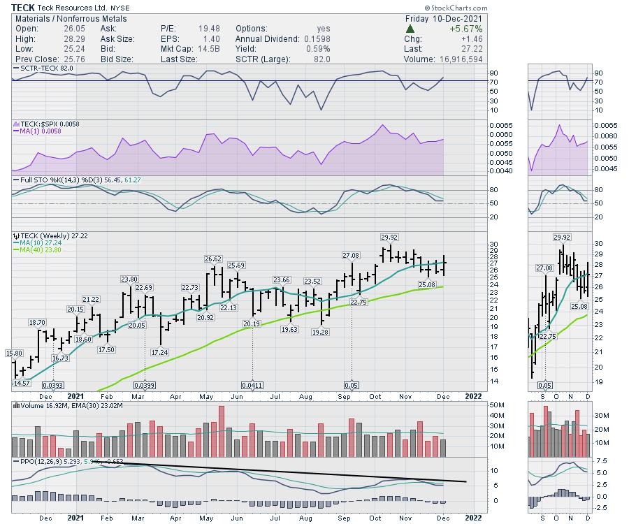
This week looks a little more promising. The big 5 miners are inviting some attention to start December. First up is TECK, which made a breakout above $27 and pulled back. Last week was a smaller range; this week we closed with a nice outside bar. After three weekly closes below the 10-week moving average (WMA), we closed at it this week and, at $27, it appears ready to rise above that level again.

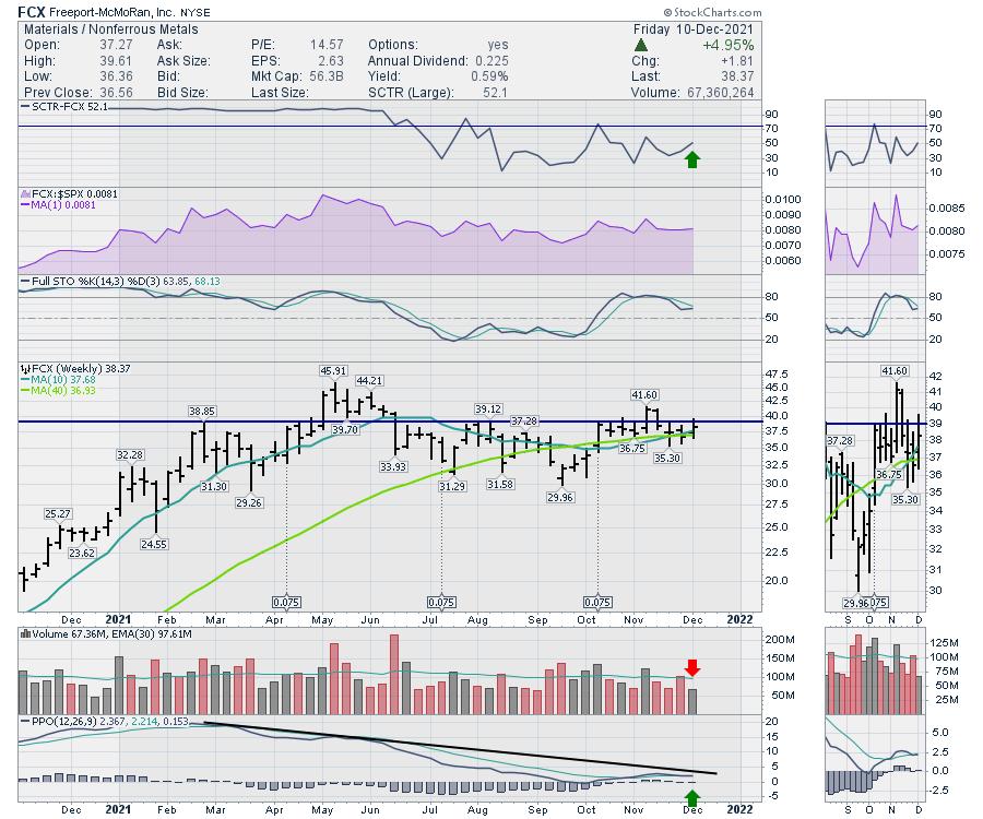
Freeport (FCX) continues to test my patience. It tested the resistance level around $39 again this week and closed above both the moving averages. The PPO momentum bounced off zero in September and is patiently making a higher low. Can it finally break out and hold?

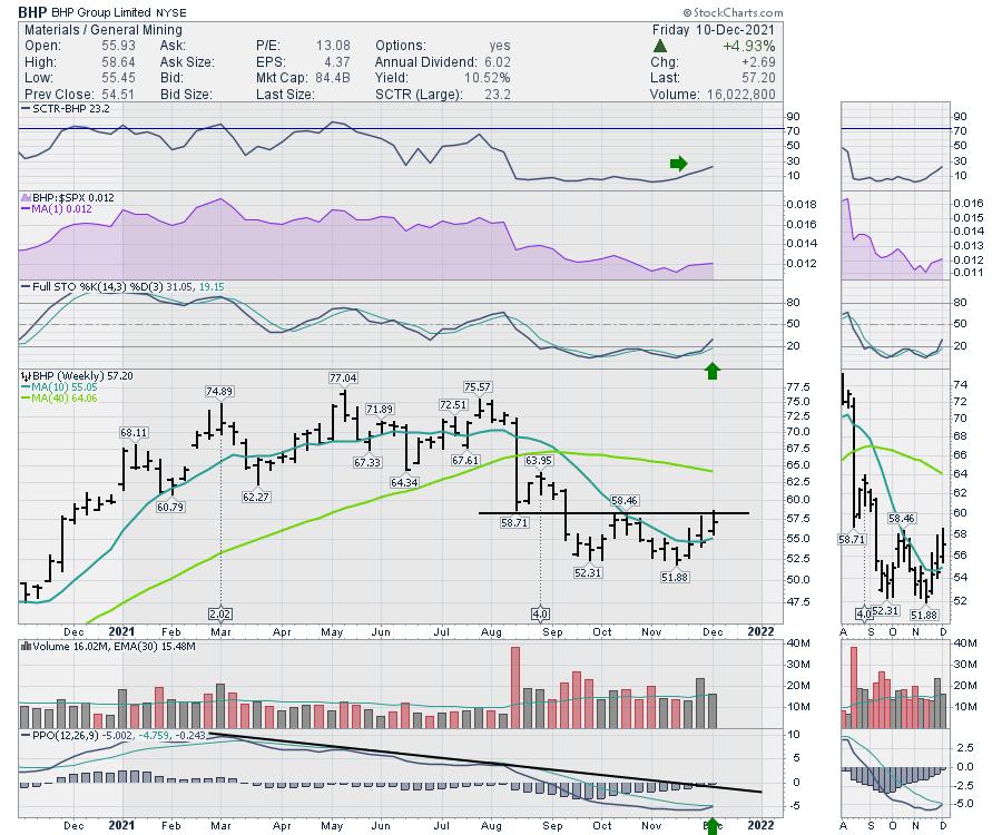
BHP Billion - I mean Billiton - looks set to run up here as well. A nice double bottom base suggests this is finally ready to make the turn higher. The PPO momentum seems ready to give us a buy signal next week. A break through resistance would probably get a few more swing traders on board as well.

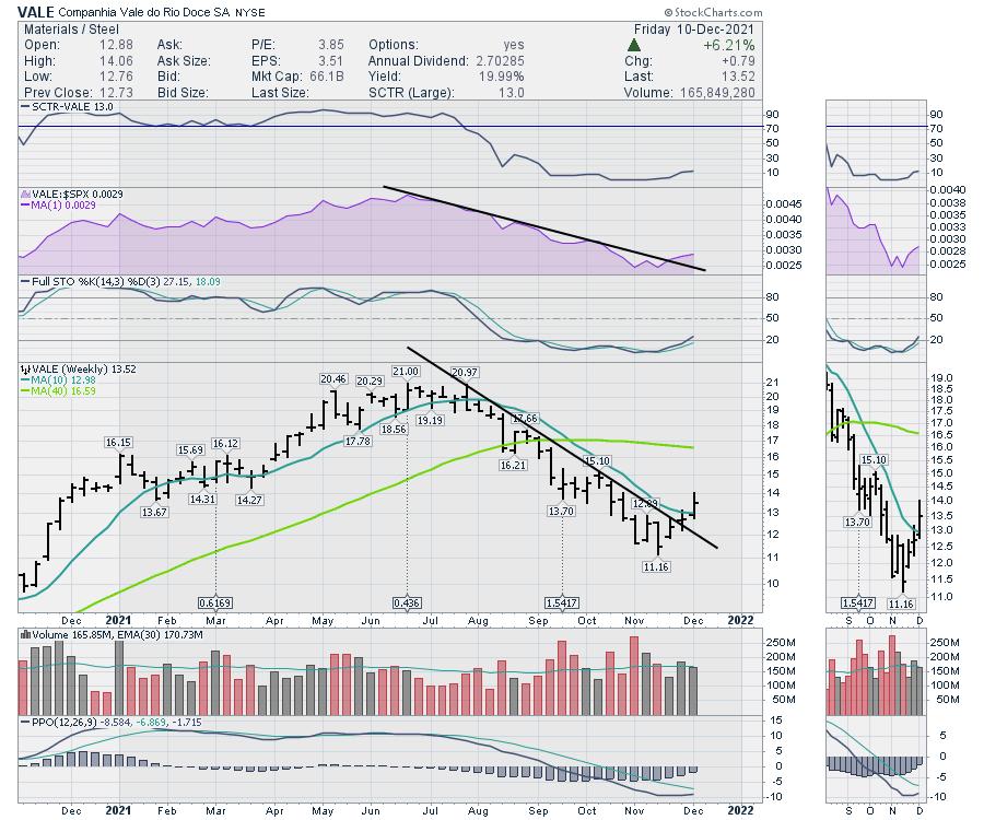
VALE is well on its way to higher highs. It broke a big downtrend last week and continued higher this week. The stock was down almost 50% from the highs; a push back up here suggests lots of room to get to former highs.

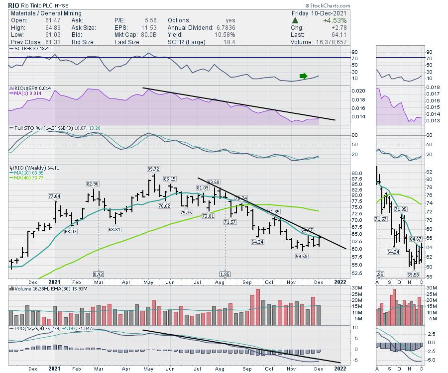
Lastly, RIO is the weakest-looking one, but it looks to be two weeks behind the Vale turn shown above. It did push above the 10-WMA to close out the bar.

The top on these charts didn't catch us off guard in the spring, but they have stayed down longer than I might have expected. If we can participate in the next leg higher, I am interested, because their uptrends can garner significant gains every week. They moved up 5% on the week, which is a robust start. Sometimes, it is all about the hunt, and I have been hunting them for a while. In this case, I am looking for Santa to help kickstart the next leg of the big bull trend.
|
| READ ONLINE → |
|
|
|
| RRG Charts |
| Sector Rotation Model Suggests There's Still Upside Available |
| by Julius de Kempenaer |

In this week's episode of Sector Spotlight, I reviewed the current position of markets (sector rotation) in combination with the theoretical framework provided by the Sector Rotation Model (Sam Stovall). This article provides a quick write-up of that segment.
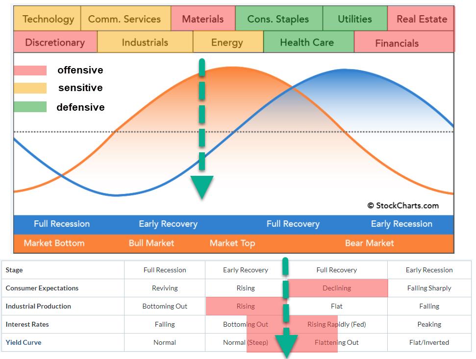
The sector rotation model shows the typical cyclical movement of an economy. We start when the economy is in a (full) recession, before moving into an early recovery phase and eventually reaching a full recovery, after which the new cycle starts with an early recession.
It is generally known that the stock market leads the economic cycle by 6-12 months on average. In the image above, the blue sine wave represents the economy and the orange sine wave represents the stock market. Across the top of the image are the sectors that are expected to do well during that time of the cycle.
Clearly, it is a very rough guide, with no specific start and end dates available for the various periods/segments. (I wish ;) ). The table below the graph is a crucial part of the sector rotation model, as it lists four macroeconomic factors that influence the economic cycle.
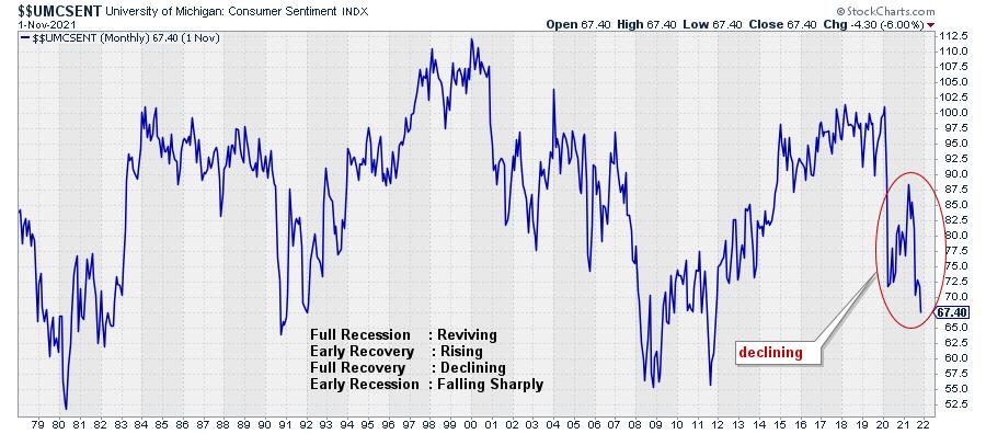
Consumer Expectations/Sentiment

The trend for this indicator is definitely pointing lower, which puts it in alignment with "Full Recovery".
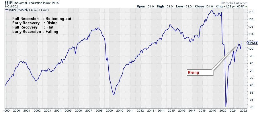
Industrial Production

This economic indicator continues to rise and recently confirmed its trend by taking out the most recent high. This aligns with "Early Recovery" in the economic cycle.
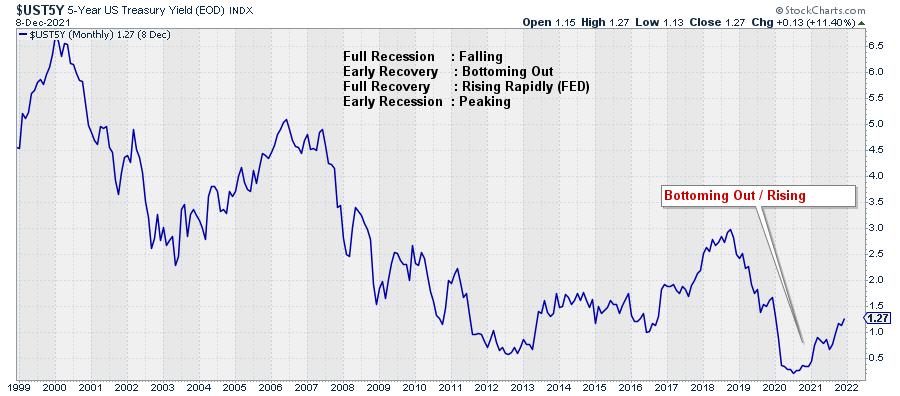
Interest Rates

Interest rates (5-year US Treasuries) are rising after a two-year decline. Trying to position this in alignment with the expected behavior according to the economic cycle means that we have to decide whether this is still "Bottoming Out" or "Rising Rapidly". For me, it is not entirely clear; I could argue for both options, so I am going to position it between Early and Full Recovery.
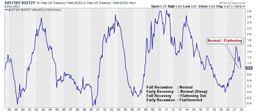
Yield Curve

For the yield curve, we need to decide if it is "Normal" or "Flattening Out". This one is also not all that clear. The curve is above zero, which is "normal" but not by much. If you look at the history, the difference between 10-2 years yields can go as high as 2.5-2.8%. The most recent high at 1.6% looks to be somewhere in the middle of the historical range and, from there, we are coming down, which means a flattening of the curve.
I am going to judge this also as between Early and Full Recovery.
You can find a chartlist containing these four metrics here.
Sectors
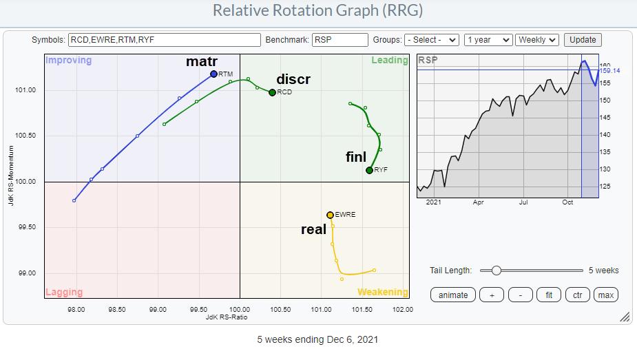
To look at the sectors and their recent rotations, I am using the Equal Weight ETFs from Invesco. This eliminates the influence of some mega-cap stocks in certain sectors, which will provide us with a more balanced picture for the sectors/stocks.
Offensive
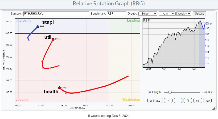
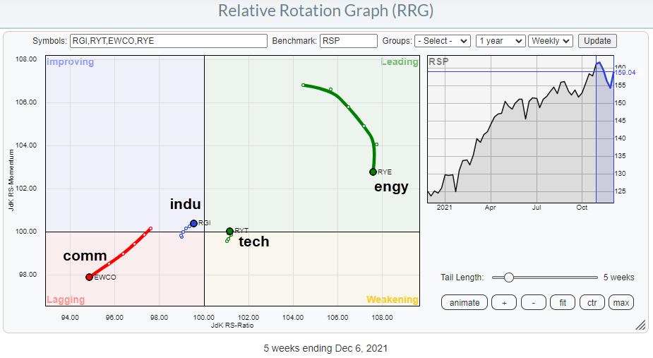
The offensive/cyclical sectors are all doing well. Discretionary and Financials are both well inside the leading quadrant, but have been losing some relative momentum lately. For the time being, this is judged to be a temporary pause. Real Estate is inside weakening and picking up momentum again, which indicates that this sector is about to start a new up-leg in an already rising relative trend.
The Materials sector finally is still inside the improving quadrant but rapidly approaching leading, with a long powerful tail at a strong RRG-Heading.
All in all, this paints a picture of outperformance for the offensive sectors. On the SRM image at the top of this article, they are shaded red.
Defensive

The defensive sectors are all showing up, so far, on the left-hand side of the RRG. This indicates a relative downtrend vs. the market and the other sectors in the universe. Given the low readings on the JdK RS-Ratio scale, the recent pickup in relative momentum is judged to be temporary in nature.
The overall takeaway for this group is underperformance. These sectors are shaded green in the SRM image.
Sensitive

The group of sensitive sectors is more scattered. Energy is deep inside leading but losing relative momentum. The high JdK RS-Ratio reading makes a rotation leading-weakening-leading very well possible. It remains a strong sector.
Technology has just rotated back into the leading quadrant from weakening at a very short tail. This suggests that the sector is in a stable relative uptrend, which is starting a new leg higher. Industrials, like tech, is on a very short tail, but very close to crossing over into the leading quadrant. For both technology and industrials, an increasing tail length while maintaining that strong RRG-Heading would be an additional positive sign.
The only sector inside and pushing further into the lagging quadrant is Communication Services. At the moment, this is really the weakest sector.
The group of sensitive sectors is shaded orange on the SRM image.
Conclusion
With the offensive and sensitive sectors generally showing relative uptrends, except Communication Services, while defensive sectors are clearly underperforming, I think that the center of gravity based on sector rotation is also between early recovery and full recovery, but a little more shifted to early, which aligns fine with the conclusion from the economic factors. Looking at the accompanying position on the sine wave for the stock market, this suggests that there is still some room to the upside.
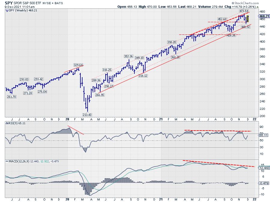
With the S&P 500 comfortably inside the boundaries of its rising channel (weekly chart), that seems to make sense.

|
| READ ONLINE → |
|
|
|
| Don't Ignore This Chart! |
| Bitcoin vs. Ethereum: It's An Easy Choice |
| by Tom Bowley |
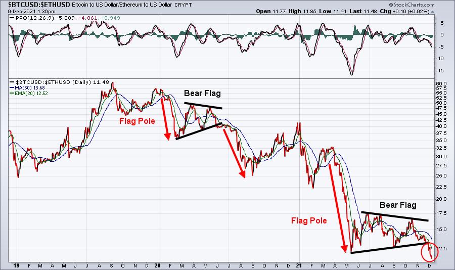
As technicians, what do we care about? The charts, right? Well, when I look at the charts of Bitcoin ($BTCUSD) and Ethereum ($ETHUSD), the choice between the two is relatively simple. The charts tells us everything, and this one simple price-relative chart says to go with Ethereum until further notice:

We just saw another relative breakdown in Bitcoin. It's now been underperforming Ethereum since printing a relative top in the summer of 2019. That's more than two years and counting.
Until this relative trend changes, go with what's working.
Please CLICK HERE to join our FREE EB Digest newsletter. It's published 3 times per week and is a very quick, two paragraph plus one chart read. There's no credit card required and you may unsubscribe at any time.
Happy trading!
Tom Bowley, Chief Market Strategist, EarningsBeats.com
|
| READ ONLINE → |
|
|
|
| Top Advisors Corner |
| Under the Influence |
| by Mike Zaccardi |
My first investment was plopping $3,000 into a Vanguard target-date fund in late 2005. I scrimped and saved as much as I could in the years following, working part-time jobs and internships through college.
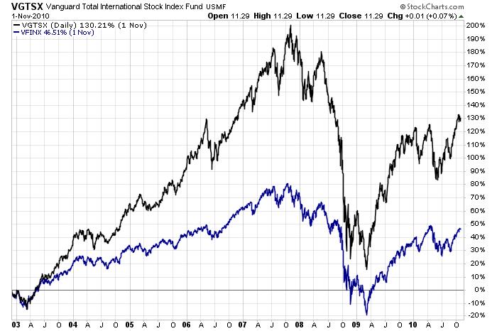
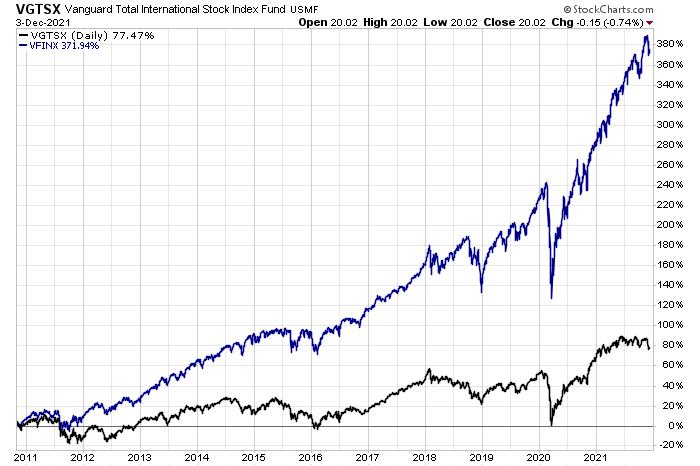
All investors are impacted by the economic and investing environments that took place when they started. For me, foreign stocks and emerging markets were handily outperforming domestic indexes in the mid-2000s. Even after the Great Financial Crisis, the ex-U.S. market had a brief relative resurgence, eventually peaking on a relative basis in late 2010. Since then, the S&P 500 (or, more specifically, the Nasdaq 100) has been the place to be for monster absolute and relative returns.
 Chart 1: International Stocks vs. U.S. Stocks (December 2002-October 2010) Chart 1: International Stocks vs. U.S. Stocks (December 2002-October 2010)
That first handful of years shaped me more than I realized. I always kept a sizable portfolio allocation to international funds while most other investors simply stuck with what they knew best — American companies. An overweight to foreign markets certainly helped my returns from 2005 to 2010, but it was a huge drag over the last decade-plus.
 Chart 2: International Stocks vs. U.S. Stocks (November 2010-December 2021) Chart 2: International Stocks vs. U.S. Stocks (November 2010-December 2021)
Moreover, I was influenced by the GFC and subsequent 2011 bear market. Compared to young investors today, I am probably more skeptical of huge stock market rallies. It was like I was groomed to believe that every 20% or 30% rise in stock prices would naturally feature a 10% or 15% correction in short order. Again, that might have helped me understand markets when I was in my early to mid-20s, but a bull market with limited drawdowns since 2011 led me to keep a little too much cash on the sidelines at times. Although the S&P 500 did drop about 20% three years ago, and who can forget the swift 34% plunge 22 months ago?
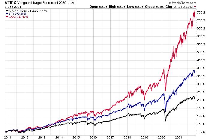
Hindsight bias is real, but so too is the home bias. It surely would've been nice to simply go with the S&P 500 and call it a day a decade ago, but c'est la vie. I take solace in knowing that, even with sub-par returns versus SPY and QQQ, I earned enough to become financially independent by age 33.
 Chart 3: Vanguard 2050 Target-Date Fund vs. SPY and QQQ (November 2010-December 2021) Chart 3: Vanguard 2050 Target-Date Fund vs. SPY and QQQ (November 2010-December 2021)
Advisors play an important role in keeping clients' investing behavior in check. It's even beneficial for advisors to have their own advisor! For most long-term investors, a systematic, hands-off approach sometimes works better than trying to get too cute and pick niches of the market to wager on. An advisor can also help mitigate individuals' biases. That is the behavioral alpha that is often studied by outfits such as Morningstar and Vanguard.
We, as investors, can be our own worst enemy. Few people have the temperament to successfully micromanage an investment portfolio. Sticking with a disciplined approach based on historical evidence (while still being open to new investing paradigms) is not easy, but a qualified fiduciary advisor can help design a plan that works for the long haul.
Mike Zaccardi, CFA, CMT
Investment Writer, Zaccardi LLC
|
| READ ONLINE → |
|
|
|
| ChartWatchers |
| Retail Sector Could Hold the Key to a Santa Claus Rally |
| by John Hopkins |
The market has been under pressure the past several weeks after all of the major indexes hit record highs during November. The NASDAQ has particularly had a tough time getting back on track and it's hard to imagine any Santa Claus rally without the participation of tech stocks.
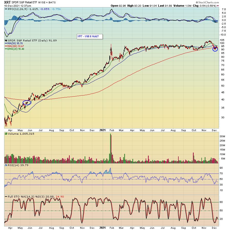
But one sector that might hold the key and has really shown tremendous weakness of late is retail. In fact, you can see the substantial move lower in the retail ETF -- the XRT -- since it hit its peak mid-November.

A few observations. First, notice that the XRT is below its 200-day moving average for the first time since its pandemic low back in the Spring of 2020. That never bodes well and is showing that inflation and supply chain issues are really weighing on the sector.
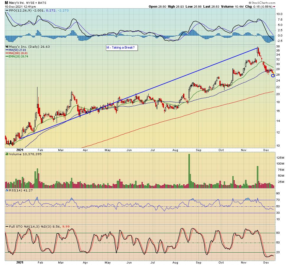
Next, the breakdown in the sector is happening right at the peak of the holiday shopping period. Not a good sign. Further, in spite of the XRT falling by almost 14% in about a two-week period from its November high, traders don't seem to be in any hurry to take advantage of much lower prices. A great example is Macy's (M), which has been a retail darling that had more than tripled since the beginning of the year, but has pulled back substantially from its most recent high with no takers.

As usual, though, we do need to keep things in perspective. For example, in the case of Macy's, it's still up substantially for the year in spite of the recent pullback. And, in fact, it's close to being technically oversold. So it would not surprise me to see traders taking a serious look at stocks like M, which, in turn, could lead to a rally in the retail sector heading into year-end.
I still believe we'll need to see renewed interest in tech stocks for the market to get back to its all-time highs. But if traders start to take advantage of the substantial pullback in stocks like Macy's, we just might be seeing green as Christmas comes around. In the meantime, if you would like to stay on top of the overall market, including fresh trading opportunities, feel free to sign up for our FREE newsletter, the EB Digest, by clicking here and, every M, W and F, you will get insightful and timely information from our Chief Market Strategist Tom Bowley.
At your service,
John Hopkins
EarningsBeats.com
|
| READ ONLINE → |
|
|
|
| MORE ARTICLES → |
|
 Chart 1
 Chart 2
 Chart 3
 Chart 4
 Chart 5


 The Oil & Gas Equipment & Services ETF (XES) was one of the leading industry group ETFs in the spring after it surged some 164% off its November low. This was clearly a massive gain and the ETF was entitled to a rest. Big meals require long digestive periods and this is exactly what XES did as it traded flat the last nine months. Long-term trend followers might wait for a range breakout to turn bullish. Astute traders can use range support and RSI to identify reversals within the range and get the early jump. Let's investigate.