| THIS WEEK'S ARTICLES |
| John Murphy's Market Message |
| THE STOCK MARKET'S TECHNICAL CONDITION CONTINUES TO WEAKEN |
| by John Murphy |
NASDAQ CONTINUES TO LEAD MARKET DECLINE...Stocks are suffering through another bad week, with the Nasdaq market continuing to lead the decline. The Nasdaq Composite Index has also suffered the most technical damage. It fell below its 200-day moving average last week. Chart 1 shows the COMPQ falling below its October low this week to reach the lowest level since last June. It's also the first major index to fall into correction territory with a loss of more than -10% from its November peak. The Nasdaq 1o0 is also nearing a test of important chart support. Chart 2 shows the QQQ falling below its 200-day line and nearing a test of its October low. Heavy trading activity during this week's selloff is another negative sign. The Dow and S&P 500 are also testing important support levels.
 Chart 1 Chart 1
 Chart 2 Chart 2
THE DOW BREAKS ITS 200-DAY LINE...THE S&P 500 MAY BE NEXT...Chart 3 shows the Dow Industrials trading below their 200-day average in afternoon trading. The next level of potential support is the early December low. Chart 4 shows the S&P 500 falling below its early December low and threatening its 200-day line. Odds for it holding aren't encouraging. As of Thursday's close, only 55% of the S&P 500 stocks were still trading above their 200-day averages. That means that nearly half of SPX stocks have already fallen below that long-term support line.
 Chart 3 Chart 3
 Chart 4 Chart 4
SMALL CAP INDEX FALLS TO 52-WEEK LOW... Last Friday's message showed the Russell 2000 iShares (IWM) testing important chart support along last year's low. Chart 5 shows that small cap index falling this week to the lowest level in a year. That's a bad sign for small caps and most likely for the rest of the market. This week's trading pattern has also been discouraging in the sense that stocks have been unable to hold onto to earlier intra-day gains.
BUYING DIPS HAS CHANGED TO SELLING BOUNCES... Previous market drops over the last year were supported by a philosophy of buying the dips. This week's trading, however showed traders and investors selling into market bounces. That's been especially visible with heavy selling late in the day reversing earlier gains. That change in philosophy strongly suggests that the market's current selloff could be longer and deeper than earlier ones.
 Chart 5 Chart 5
|
| READ ONLINE → |
|
|
|
| ChartWatchers |
| An Indicator to Keep you on the Right Side of the Trend (QQQ) |
| by Arthur Hill |
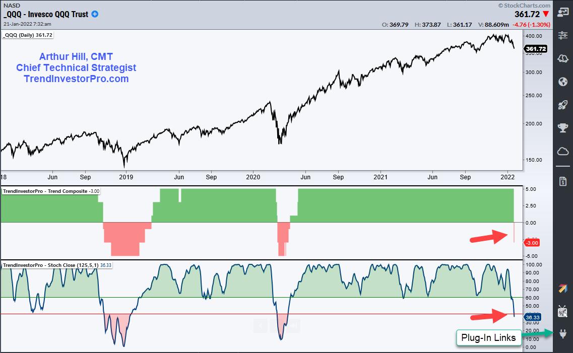
 The Nasdaq 100 ETF (QQQ) reversed its uptrend signal from April 17th, 2020 as two trend-following indicators turned bearish this week. The chart below shows QQQ with the deepest decline from a high since the 10.9% decline in February-March 2021. Prior to that, the deepest decline was in September 2020 (-12.6%). The Nasdaq 100 ETF (QQQ) reversed its uptrend signal from April 17th, 2020 as two trend-following indicators turned bearish this week. The chart below shows QQQ with the deepest decline from a high since the 10.9% decline in February-March 2021. Prior to that, the deepest decline was in September 2020 (-12.6%).
Even though these two declines were deeper than the current decline (10.4%), they did not trigger downtrend signals and were deemed pullbacks within the bigger uptrend. This decline is different because the Trend Composite turned negative (-3) this week, which means four of the five indicators triggered downtrend signals. Also note that StochClose moved below 40.

The green and red shadings show the prior trend signals for the indicators. We will focus on the Trend Composite signals. On the last two completed bullish signals, QQQ gained some 69% from April 2020 to January 2022 and 52% from July 2016 to October 2018. The two downtrend signals were mixed. The bearish signal on October 24th avoided the meltdown in late 2018. The downtrend signal on March 12th was near the covid low (March 23rd), but it perhaps preserved a little sanity by having a strategy in place.
Keep in mind that trend-following indicators by definition lag. They will not catch the exact bottom or top, but will catch an extended trend should it develop. Trend-following indicators can also limit drawdowns. Note that QQQ experienced two drawdowns in excess of 50% since 2000 (2003 and 2009), as well as a 28% drawdown in March 2020. Having a strategy for entry and exit can help capture the upside and limit the downside.
The Trend Composite and ten other indicators are available on the TIP Indicator Edge Plugin for StockChartsACP (here). The Trend Composite aggregates trend signals in five trend-following indicators: Bollinger Bands, Keltner Channels, Moving Average Direction, StochClose and CCI Close. The Trend Composite turns bullish when at least three of five signal uptrends (+1) and bearish when at least three of five signal downtrends (-1). Different indicators work at different times and the Trend Composite is designed to capture the combined signals.
TrendInvestorPro specializes in finding bullish setups within bigger uptrends in our core list of 129 ETFs. We also have a Composite Breadth Model for broad market timing as well as an ETF Ranking and Trend Signal Table. Click here for more information.
---------------------------------------------------
|
| READ ONLINE → |
|
|
|
| ChartWatchers |
| Evidence for a Bear Market |
| by Erin Swenlin |
In today's subscriber-only Diamond Mine trading room, I was asked why Carl and I think we are on the first leg of a bear market. I'm sure we're not alone in our bearish stance, but I have a few charts to provide our evidence that this is indeed the beginning of a bear market. To be fair, we hope we are wrong.
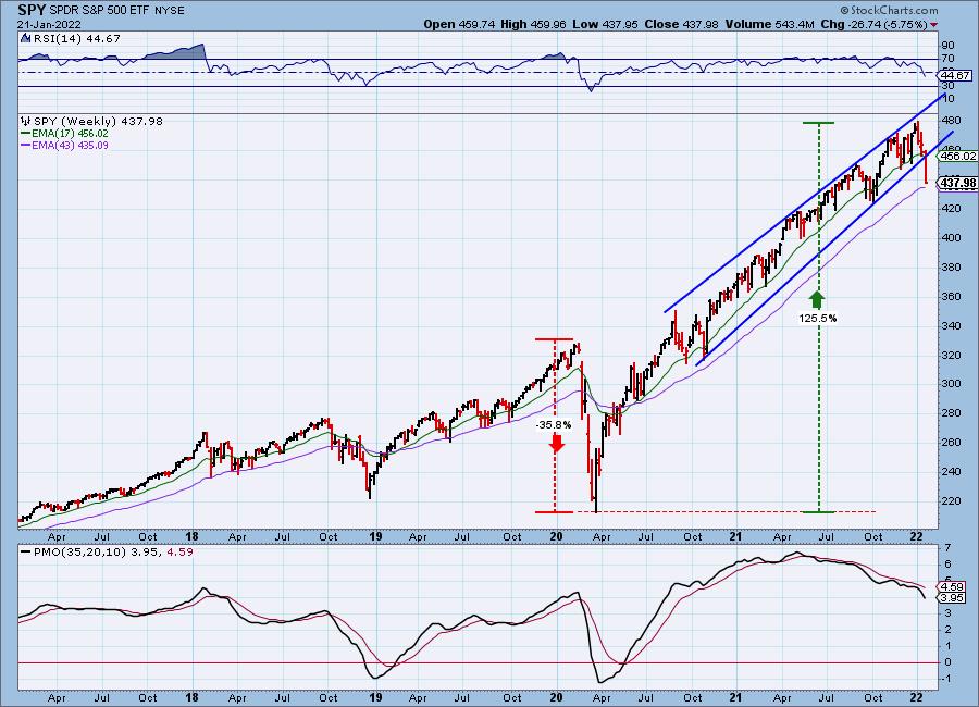
Let's start with the weekly chart of the SPY. Price has been traveling in a bearish rising wedge all year. This week, we saw a breach of the rising trend. The 43-week EMA is available as support, but, with the weekly PMO accelerating lower and not oversold, along with the weekly RSI hitting negative territory and not oversold, we don't think it will hold.

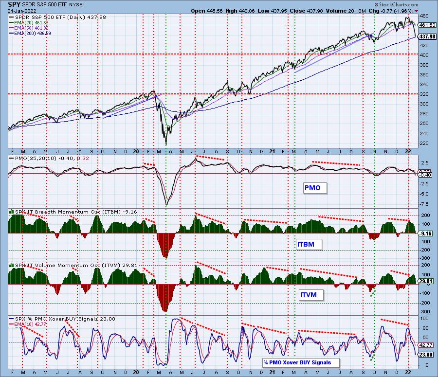
Our intermediate-term indicators are only sitting in neutral territory. They aren't even close to oversold territory. We don't even have the ITVM in negative territory yet and the ITBM just dropped below zero today. A little less than one-quarter of the SPX have PMO crossover BUY signals. While that is an anemic number, we saw it move much lower even on the December low.


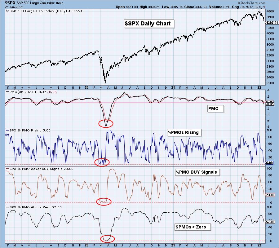
Let's look at our PMO Analysis chart. The short-term %PMOs Rising is at 5% and is certainly oversold. Before I move on, let that number sink in... only 5% of the SPX have rising momentum. The intermediate-term %PMO BUY Signals is dropping quickly, but isn't oversold yet. The %Stocks with a PMO greater than zero is more than 50%, definitely not oversold. Even during the September slide, these numbers were much lower. The problem is that even if they reach oversold territory, we can see that, in the bear market, they hovered at oversold levels for over a month.


Click here to register in advance for the recurring free DecisionPoint Trading Room! Recordings are sent to all registrants each week! Here is the recording link information for our last trading room on 1/17:
Topic: DecisionPoint Trading Room
Start Time: Jan 18, 2022 09:00 AM PT
Meeting Recording Link.
Access Passcode: January@18
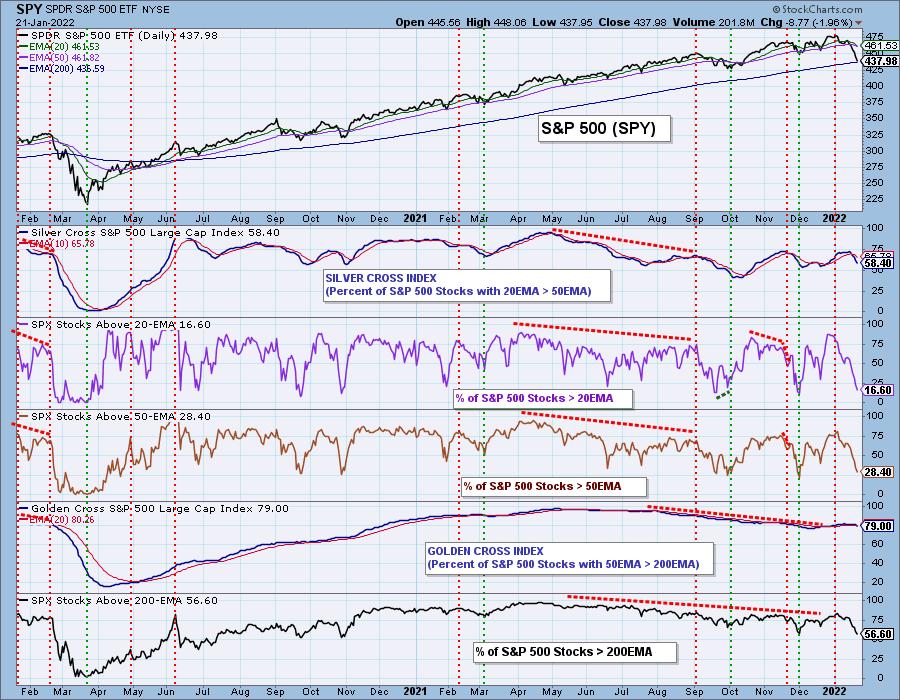
Finally I bring you to my last chart, Bias Assessment. The Silver Cross Index (SCI) measures how many stocks have a 20-day EMA > 50-day EMA, currently a neutral-to-bearish 58%. The problem is that there are far fewer stocks with price > 20/50-day EMAs. This means the SCI will continue lower, giving us a short-term bearish bias. Notice those participation numbers, while oversold, aren't THAT oversold when you compare it to the 2020 bear market or even the November low!
The intermediate-term bias is bearish given the SCI is falling and below 70%. The Golden Cross Index (GCI) measures how many stocks have "golden crosses" or a 50-day EMA > 200-day EMA. The long-term bias is also bearish, given there are fewer stocks > 200-day EMAs compared to the GCI.
The SCI and GCI are NOT oversold.

Conclusion: Indicators are just not that oversold right now. In many cases, they aren't even as oversold as at the end of the September correction or the November pullback. Sorry to say, this is not over yet.
Technical Analysis is a windsock, not a crystal ball.
--Erin Swenlin
(c) Copyright 2022 DecisionPoint.com
Helpful DecisionPoint Links:
DecisionPoint Alert Chart List
DecisionPoint Golden Cross/Silver Cross Index Chart List
DecisionPoint Sector Chart List
DecisionPoint Chart Gallery
Trend Models
Price Momentum Oscillator (PMO)
On Balance Volume
Swenlin Trading Oscillators (STO-B and STO-V)
ITBM and ITVM
SCTR Ranking
DecisionPoint is not a registered investment advisor. Investment and trading decisions are solely your responsibility. DecisionPoint newsletters, blogs or website materials should NOT be interpreted as a recommendation or solicitation to buy or sell any security or to take any specific action.
|
| READ ONLINE → |
|
|
|
| ChartWatchers |
| The Real Problem Arrives |
| by Greg Schnell |
It has been a tough January.
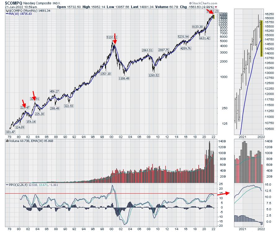
I want to use a few charts to illustrate my point about why the real problem is just arriving. It might lead to a scenario across all of the charts (both growth and value) over the next six months to a year. It doesn't have to play out this way, as it can be different this time. A long-term chart like this should help us be aware of the three prior situations when the PPO indicator has soared to this level of enthusiasm.
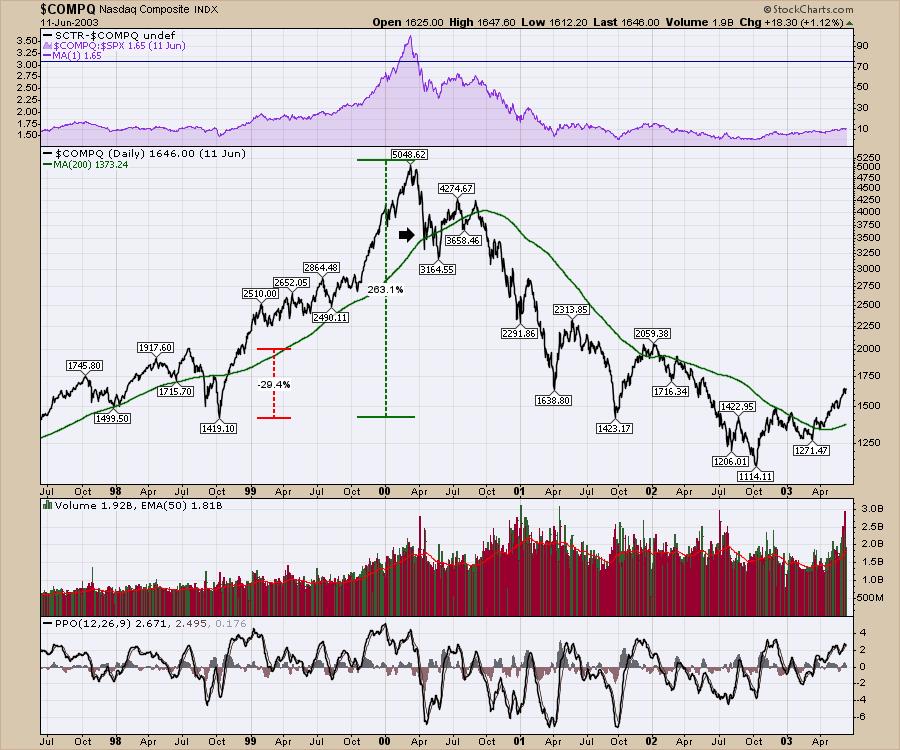
We got a PPO sell signal on the December close of the Nasdaq Composite. Of the three readings at this level, the pain endured was significant and long-lasting. It was also not easy to trade through, as it is a volatile series of trades with a downward-sloping trend.

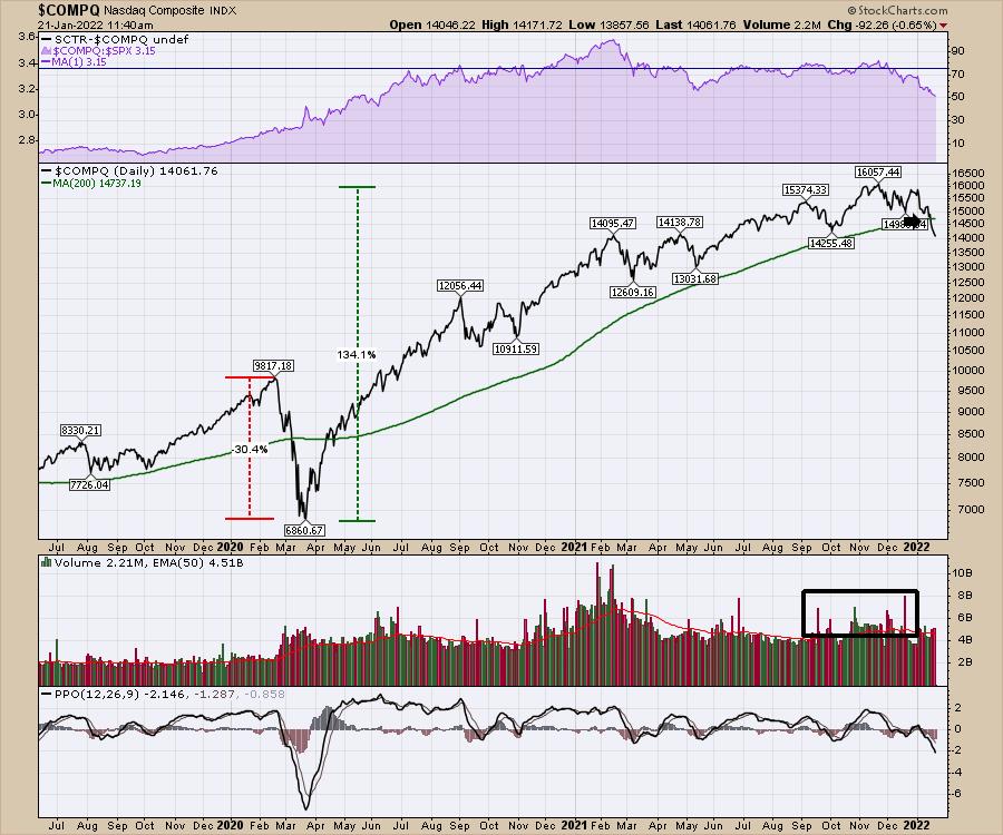
Let's look at the examples where the PPO momentum indicator ran up to a euphoric level near 15 closely, to see what happened in history. For comparison, the COMPQ fell 30% in March 2020 and has rallied 130% over 21 months.
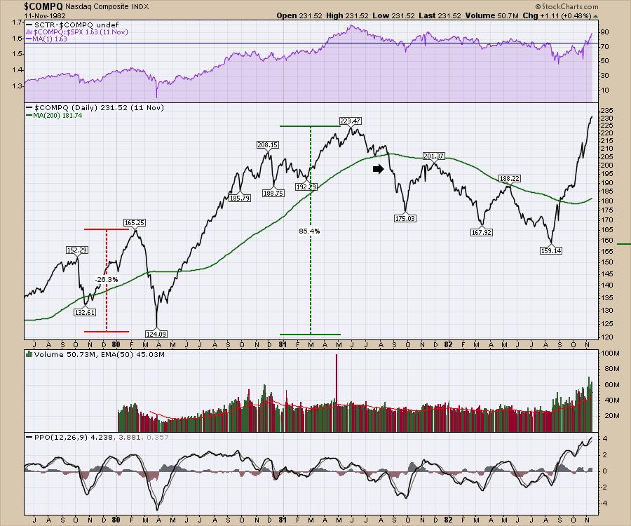
1980
In early 1980, the Nasdaq fell 26% in a month. It subsequently rallied 85% over the next year. It took two months to fall below the 200-DMA but a series of three volatile waves followed for the next year. Each were significant trading opportunities, but you had to sell your positions to make gains on the year.

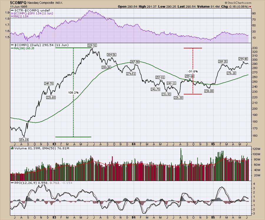
1982
From the 1982 low, another rally started. And it was also a massive rally. After rallying over 100%, the market pulled back 30% in an unrelenting wave lower. I'll let all the other chartists bring in the bond market, the US Dollar, the price of oil, the energy crisis, Iran, etc. The world always has something going on!

The Year 2000
There was nothing like it. The internet was a thing. Companies were measured on how many eyeballs were looking at their websites. New companies came out with outlandish valuations and promises of the future revenue stream. Alternative energy was also a big theme.
The Asian Financial Crisis had happened in 1997-1998. In 1998, we had a three-month pullback of 30% as LTCM imploded. The follow-on rally soared 250% in 18 months to the internet top. Trading volume skyrocketed 50% in the last quarter of 1999. The downstroke to the 200-DMA was quick. The market wobbled for six weeks. After the wobble, the Nasdaq Composite lost all of the investor support as they sold and sold and sold. The $SPX made a final high in September 2000 (not shown) just below the $SPX March high, but relented to the selling pressure as well.

2022
Fast-forward twenty years to the market run of 2021.
We have seen volume in late 2021 pick up meaningfully from the September levels. There have been three volume surges of note; one when COVID-19 started, the SPAC boom in February 2021 and during the final highs that we had before the PPO sell signal on the monthly chart above. The Nasdaq made the highest closing high in November 2021.

Conclusion
As the title of the article implies, we are at a turning point. The optimistic folks will suggest that this is a pullback on a road to euphoria as the world economies open up. I think Cathie Wood called a value-investing approach "Pavlov's dogs", as investors expect everything she invests in to continue cratering but value to hold up. She thinks the value stocks are way overvalued! It is an interesting paradigm where each person's bias shows up! Optimists say the bubble we had gave consumers money, and they will be out in full force to spend it. Back to growth!
Will the damage we saw in the three historic similarities create the same sort of market response? That is the real problem and it has arrived in a similar fashion. There are 75 stocks on the S&P 500 with price-to-sales ratios of 10 or higher. That is a staggering number. Our world has a global energy crisis that we are slamming into. Fund managers have supported market valuations at levels well above the long-term average. Consumer confidence numbers are declining. The world of optimism has created at least 150 cryptocurrencies, apparently all worth something. Investors can buy NFTs that double after you buy them, while people playing games are buying land in virtual reality games with crypto converted from US Dollars. I could go on. None of it matters until it does. We can have a lot slower year trading 2022 than 2021, but I need to wait for the opportunities. Most importantly, capital preservation is the key to winning after having such a massive run.
For me, I am an energy bull, a mining bull and starting to think about becoming a gold bull. But the cracking of this market has made me reel in my trading size and number of positions. I penned an article discussing the potential for the market to bounce as the $SPX hits the 200-DMA, which happened Friday morning. My videos for Market Buzz and Your Daily Five from this week also talked about the market setup. You might enjoy watching my entry for StockCharts TV's end-of-year review, 2021's Most Influential Charts. Stay safe, and be aware of the prior instances of euphoria. It may play out differently this time, but the previous three examples have a lot of similarities to the current setup.
|
| READ ONLINE → |
|
|
|
| ChartWatchers |
| The Tail is Wagging the Dog; Big Plunge Ahead |
| by Tom Bowley |
Normally, the stock market is humming along and we have indicators all supporting the sustainability of that move higher. But things aren't normal right now.
It started with the rotation into defensive sectors to lead the S&P 500 higher on that last final leg in December. These types of signals do not provide me a guarantee; they simply help me to manage risk. Once I saw the defensive leadership spurring the S&P 500 to new all-time highs, I'd seen enough. The fundamental red flags were already out there with rising inflation and the Fed turning more hawkish, but I don't buy and sell based on those. I need to see it on the charts, and, in November and December, I began to see exactly that. Wall Street turned to defense -- and when they play defense, they do it like the 1985 Chicago Bears.
This is just the start of the problems we face ahead. Technical breakdowns have been occurring by the hour and, as more technicians sell and begin shorting, that'll start a period of disbelief. After all, we've been going straight up since March 2020. The Reddit folks don't even know what a correction looks like, let alone a bear market. Sentiment has reached heights of bullishness that we've never seen before and, unfortunately, could result in a stunning and painful drop here in Q1.
As the Volatility Index ($VIX) heats up, you should expect big moves in both directions, but, for now, I'd view the U.S. stock market as downtrending until we can reset sentiment.
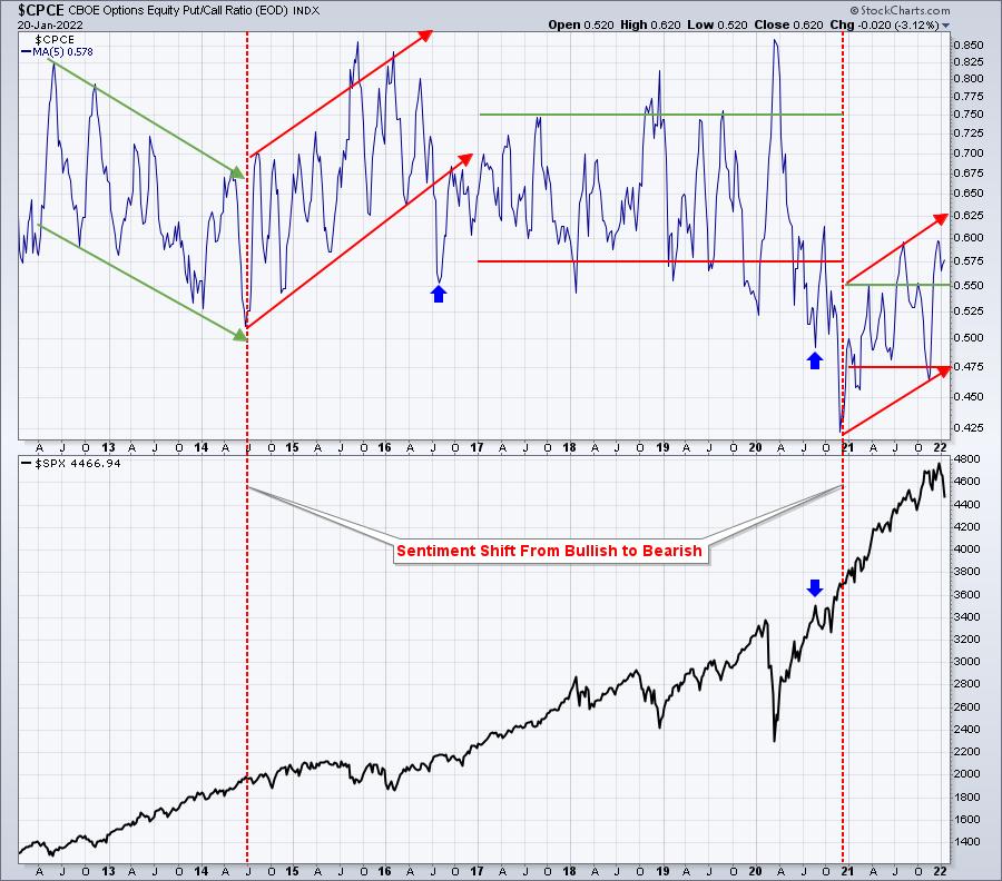
Equity Only Put Call Ratio ($CPCE)
The CPCE is a big problem. Options traders have been pouring into calls, despite the fact that they've been growing more and more expensive. The VIX is a measure of expected volatility. When the VIX rises as the S&P 500 rises, it's a warning, because it means that the stock market is growing much more nervous even though prices continue to rise. Historically, that's a pretty significant warning sign.
Since 2018, we've made four consecutive tops (all-time highs) with four consecutive higher VIX readings. Eventually, that will catch up with us and it is....now. As the VIX rises, options see their premiums rise and they become more expensive. Yet options traders just keep buying them -- at any price. It reminds me of someone buying crack; they don't care what the price is, they just have to have it.
Many retail options traders are greedy. They can't step back and look at the big picture. They don't know when to tone it down. They just buy because the only way to make a LOT of money is to keep buying calls. Well, in a bear market, that strategy is one that will ruin a lot of traders. Unfortunately, I see it coming.
So let's look at a couple charts. The first one may be a refresher to some of you, but it's important not to lose sight of it to keep everything in perspective. Perspective will be critical over the next 3-6 months, in my opinion.
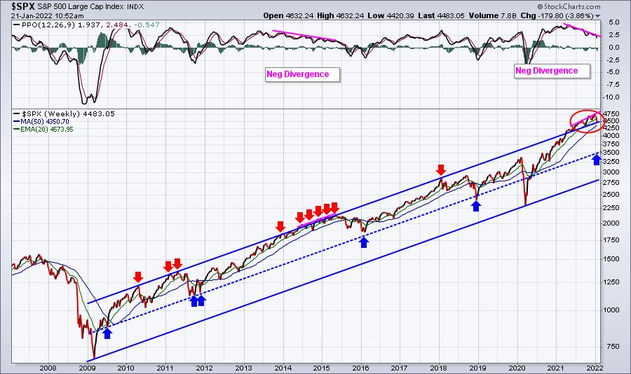
S&P 500 -- 15-year weekly chart:

I see many similarities to the 2013-2016 period, a straight-up market with weekly negative divergences and very bullish sentiment. In 2015 and 2016, you can see the drops that took us back fairly close to that blue-dotted centerline in the 13-year trend higher. The 2007-2009 financial crisis and the March 2020 pandemic collapse established key long-term trend support, while we've seen several tests of that blue-dotted centerline. I'd consider that to be the real downside potential during any period of selling. That number, right now, is close to 3500 on the S&P 500, which is another 20% or so lower from current prices. I don't believe we'll reach that rising dotted line, but we could get close.
It's important to understand that we see significant swings in sentiment and investor psychology in the stock market, and it can have VERY significant implications on market performance in both the short-term and long-term. We have experienced a run-up in U.S. equities like very few others. The S&P 500 was at 2191 in March 2020 and just recently set an all-time high at 4818 on the second trading day of this year. That's a 120% gain in 22 months! Even if we consider the S&P 500 all-time high of 3393 on February 19th, before the pandemic collapse, the S&P 500 still rose 55% from that date through January 2nd. Given the massive run up, don't you think it's at least possible that the market could trend lower for awhile?
I believe the biggest problem we face is that we need to reset sentiment to a more bearish level before the stock market can truly take off again. We've simply been too bullish in the options world and we're about to pay the price.

At the far left side of the chart, back in 2012 into 2013, you can see the CPCE dropping over time, moving from a bearish sentiment to a more bullish sentiment. That change in sentiment drove the S&P 500 soaring higher. But the red-dotted vertical lines both highlight changes from extreme bullish sentiment readings to more bearish readings. I think it's significant that the transition began in 2014, but market bottoms weren't reached until bearish sentiment peaked. I believe that's the road we have ahead. We are in the midst of sentiment transitioning. In weather parlance, we have to go from a Category 3 hurricane approaching to a Category 5 devastation. When it's approaching, you think, "how bad can it really get?" But after it's hit, you just look around at the ruins. Is it worth the risk to take that chance? That's the question I'd be asking myself right now.
I do believe there are investments that will work while we make this transition and I'll feature one of them on Monday morning in my free EB Digest newsletter. If you're not already a subscriber, simply CLICK HERE and type in your name and email address. It's that simple. There's no credit card required and you may unsubscribe at any time.
Enjoy your weekend and happy trading!
Tom
|
| READ ONLINE → |
|
|
|
| RRG Charts |
| Financials are All Over the Place |
| by Julius de Kempenaer |


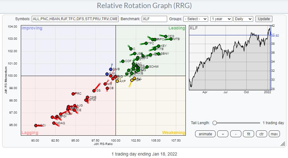
On the back of a lot of earnings announcements, the financial sector is getting a lot of attention this week. A few stocks, led by SIVB, FRC and GS, got hurt pretty bad yesterday with >5% declines.
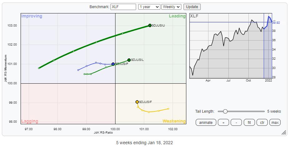
The RRG above shows the (top 50) stocks inside the financial sector. As you can see, there is a large group moving further into the leading quadrant at a strong RRG-Heading, while there is an almost equally large group traveling deeper into lagging at a negative RRG-Heading.
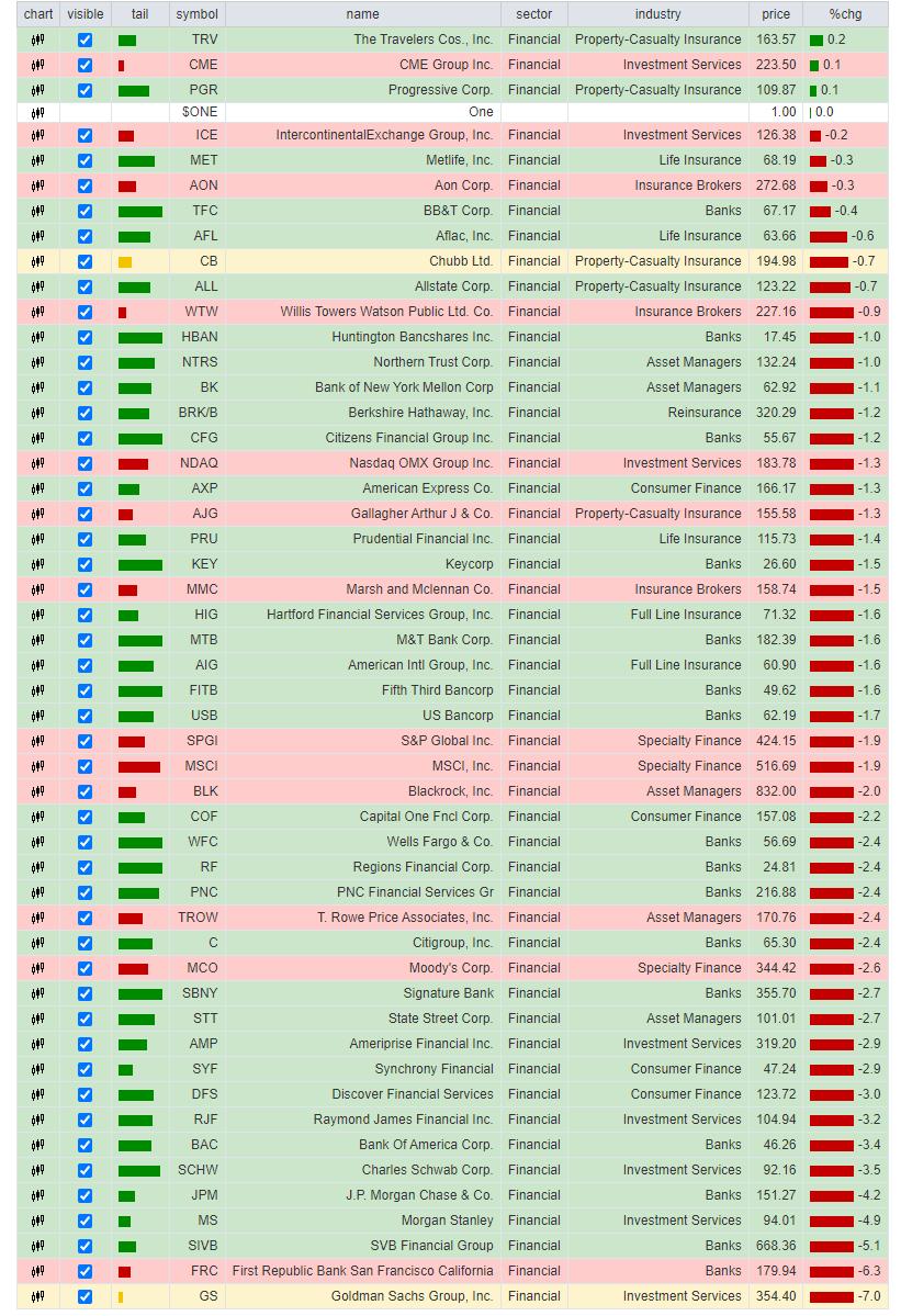
Looking at the performance table plotted below the RRG, we can see that the bottom part is mainly populated by banks and investment services. And the "banks" at the bottom of the list are heavily involved in investment-related activities. For example, GS and MS are technically not "banks" but investment services companies.
It is interesting to see that, at the top of the list we also find investment services companies like CME and ICE. My take on this dispersion is that CME and ICE are both exchanges, providing a service (access to markets) that benefits from a lot of activity (=volatility). The companies at the bottom of the list are important users of those exchanges and they, in a way, also benefit from a lot of activity. But what they don't like, especially the trading desks, is inconsistent activity or volatility.

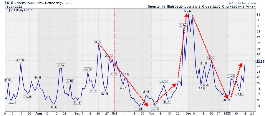
The VIX index above shows how volatility continued to decline into Q4 of 2021, then rapidly shot up to levels above 30 at the start of December, followed by an equally rapid decline back to levels below 20 at the end of the year. These are difficult conditions for trading desks to consistently make money. And that is reflected in the earnings of companies like GS.
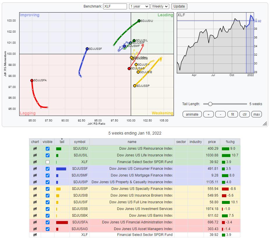
However, there are many more groups and stocks inside the financial sector than just banks and investment-related companies. And not all banks are (investment) banks. To get a clearer picture of rotations inside the financial sector, I have plotted the Relative Rotation Graph for the industries inside the sector below.

There are a few clear trends/rotations visible.
Financial Administration is deep inside the lagging quadrant, moving up on the RS-Momentum scale recently but still a ways to the left and unlikely to make the complete rotation to leading from here. Consumer Finance is inside the improving quadrant and rising on the RS-Momentum scale. Given the position of the other industries, Consumer Finance also seems too low on the JdK RS-Ratio scale to make it all the way to leading from here.
Inside the weakening quadrants, we find four tails that are heading towards lagging (RRG-Heading between 180-270 degrees). These groups are Specialty Finance ($DJUSSP), Insurance Brokers ($DJUSIB), Investment Services ($DJUSSB) and Banks ($DJUSBK).
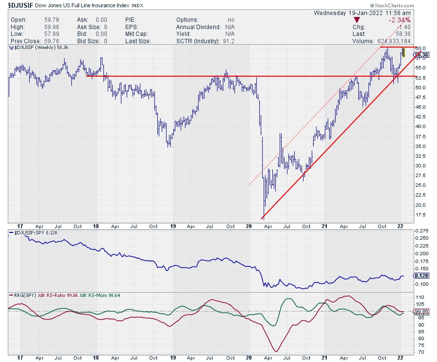
The stronger industries at a strong RRG-Heading and inside or approaching the leading quadrant are Reinsurance ($DJUSIU), Life Insurance ($DJUSIL), Mortgage Finance ($DJUSMF), Property & Casualty Insurance ($DJUSIP) and, inside weakening but rotating back up towards leading, Full Line Insurance ($DJUSIF).
Are you seeing the same theme I noticed? ;)
All these groups that are traveling at a positive heading and in a relative uptrend against XLF are related to the Insurance industry. So, going forward, it looks like the various insurance-related groups will be driving the financial sector.

The RRG above isolates these four insurance-related groups so their rotations are better visible.
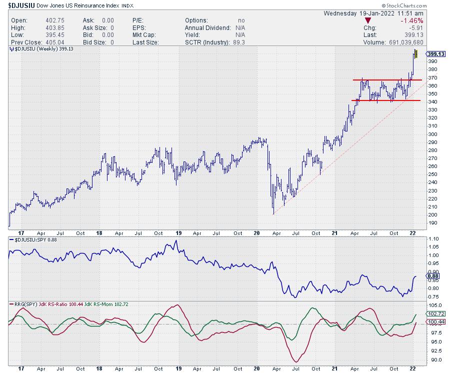
Reinsurance Index

This index is currently moving fastest and highest on the RS-Ratio scale. The improvement in relative strength, as well as price, is obvious, but the fast move higher after breaking away from the consolidation also means this group has quite a bit of risk for a pullback. Be warned that this is a small group. There are only two stocks in this group that are also in the S&P 500. These are Berkshire Hathaway BRK/B, and Everest Re Group RE. Extending the universe to the S&P composite 1500 adds another three.
I prefer not to chase and wait to possibly get better entry opportunities on a drop back, while relative uptrend and breakout remain intact.
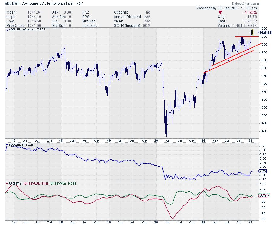
Life Insurance

Life Insurance is on a similar trajectory as Reinsurance, but at lower levels on both scales. This means it is earlier in the rotation than Reinsurance. The same goes for the price chart, where Life Insurance has less downside risk and therefore, most likely, better upside potential (risk/reward).
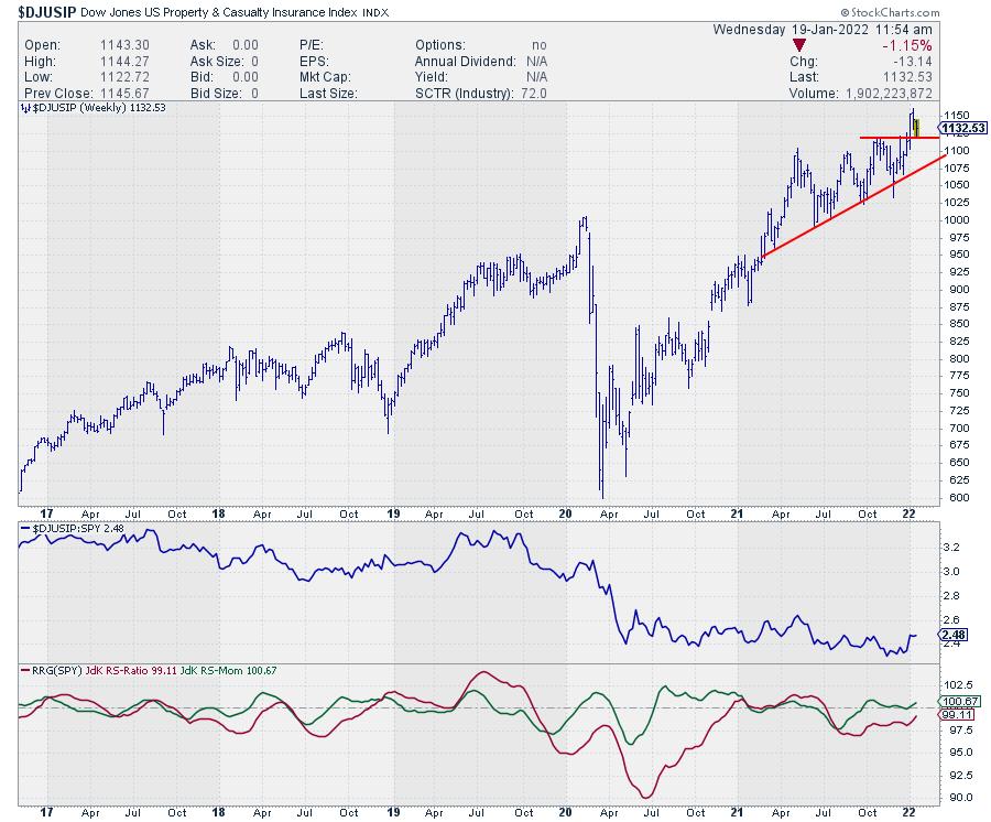
Property & Casualty Insurance

On the RRG, Property & Casualty Insurance is still inside the improving quadrant, but very close to crossing over. Price already broke out of its consolidation and now testing the old breakout resistance level as support. As long as that level, around 1120-1125, holds, this looks like a good entry level on the back of improving relative strength.
Full Line Insurance

Full Line Insurance already broke above resistance in September, rallied to a new peak at 60, then dropped back to find support at the breakout level. This has caused relative strength to improve and push both RRG lines above 100 and the tail into the leading quadrant. The dip in price and the resulting loss of relative strength has made the tail rotate from leading into weakening, where it has now started to turn back up again as price reached back to its previous peak. What is needed now is a break back above 60 in price and a continuing improvement of relative strength to complete the rotation back to the leading quadrant.
All in all it looks like Property and Casualty Insurance is offering the best risk/reward at the moment, followed by Full Line insurance when that index breaks above 60.
#StaySafe, --Julius
|
| READ ONLINE → |
|
|
|
| Mish's Market Minute |
| Do You Have a Solid Trading Plan? |
| by Mish Schneider |
As the stock market corrects and potentially forms a new trend, traders who don't have strict plans might be wondering what to do next. So far, many symbols, along with the market, are not dipping like many expected and people are either realizing large losses or sticking to their trading plan.
The rules created through trial and error allow successful traders to not only make money, but also keep it when times get tough, and volatility increases. While there can be many pieces to a puzzle, here are three important pieces every trader must have when creating a successful trading plan:
1. Know why you entered a trade.
This might sound simple, but defining the trade will allow you to know if the trade is or isn't working correctly. For instance, if you bought a dip, you would be looking for a quick pop-up in price. Another example would be if you bought a symbol on a breakout; if the price is not holding over the breakout level, the initial trade idea could be wrong.
Once you realize the trade isn't behaving as you originally expected, this gives you the opportunity to exit the trade early or figure out the next best way to manage the position.
2. Always have a risk point or stop loss level.
Before you put a trade on, you need to pick a price level where, if broken, you will exit the trade no matter what. If you don't pick a concrete price level, you could easily take large losses as you question your exit price. Many traders make more losing trades than winning trades; however, since they control their losses, they can still come out profitable in the long run.
3. Pick a trading style.
Many traders constantly switch their trading styles with rules, indicators and more. In order to build consistent trading profits, you will need to narrow your focus into one trading style.
Jumping from one to the next is great when you're first exploring how you want to trade, but you will never get a chance to fully test out the rules you have created if your style continues to change. Many traders get stuck in a loop of trying something for only a short amount of time before deciding it doesn't work or that they would rather trade another way. Therefore, keep these three points in mind on your trading adventure as many trading traps lurk in these areas.
Follow Mish on Twitter @marketminute for stock picks and more. Follow Mish on Instagram (mishschneider) for daily morning videos. To see updated media clips, click here.
It's been a hectic week in the markets and we are finally seeing them take a dive! On this week's edition of StockCharts TV's Mish's Market Minute, Mish takes a deep dive into the charts, showing you what stagflation looks like and how to trade during this rocky period.
ETF Summary
- S&P 500 (SPY): Broke the 200-DMA at 441. Watch 426 next support.
- Russell 2000 (IWM): Watching to find support.
- Dow (DIA): 340 next area to watch for support.
- Nasdaq (QQQ): 350 next support area.
- KRE (Regional Banks): 68.63 the 200-DMA next support area.
- SMH (Semiconductors): 269.15 the 200-DMA.
- IYT (Transportation): Watch to hold low near 254.
- IBB (Biotechnology): Needs to hold the 128 area.
- XRT (Retail): Like this to find support in the 76 area.
Forrest Crist-Ruiz
MarketGauge.com
Assistant Director of Trading Research and Education
|
| READ ONLINE → |
|
|
|
| 4th Dimension |
| Looking at Cryptos with 4th Dimension |
| by Shaun Downey |
The world of Crypto has become far more mainstream in the past year, with increased institutional involvement. Not only that, but 70% of retail investors traded crypto in 2021. As a space becomes crowded, it is often felt that the major opportunities disappear. However, whilst easy gains are likely to be things of the past and there is market talk of a Crypto winter, my personal view is that institutional acceptance removes much of the doubts about Crypto remaining the Wild West and liable to regulatory roadblocks. There is no doubt that Web3 and NFTs can provide amazing opportunities if you are prepared to put in the work. That is what I have been doing for the past year and have now reached the point where I'm comfortable in the space.
StockCharts has greatly increased its coverage in Crypto, with there now being well over 100 instruments. Data history is comprehensive and the quality very good. I monitor around 60 on a daily basis using 4-hour charts to gauge the short term behaviour and daily charts for a historical prospective. Whilst this may seem daunting, what rapidly became clear to me was the need to watch so many in order to gauge the relative strength between different types of Crypto and performance between those in the same space.
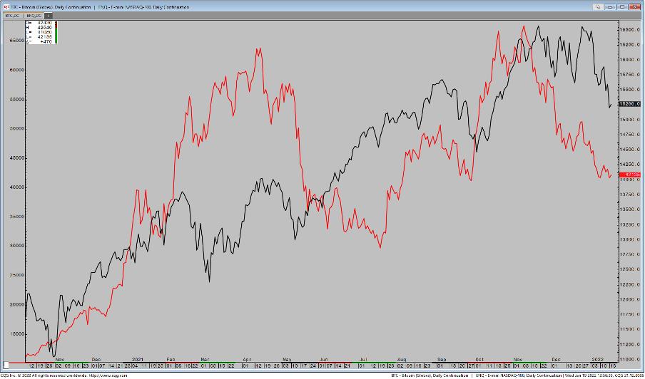
It's true that there are strong correlations across the whole spectrum and, therefore, this understanding of relative performance is essential. Recent history shows that we may not be trading Crypto at all, but the Nasdaq. That is true up to a certain extent, but in truth, when the Nasdaq has rallied during the part few months, Crypto hasn't gone up very much, whereas when the Nasdaq falls, many Cryptos tank.
This chart shows an overlay of Bitcoin against the Nasdaq over the past year. Note how Bitcoin has underperformed since last November, dropping 30% into year-end as the Nasdaq remained close to its all-time highs.

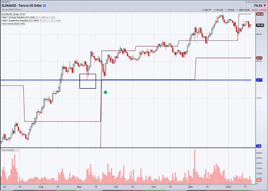
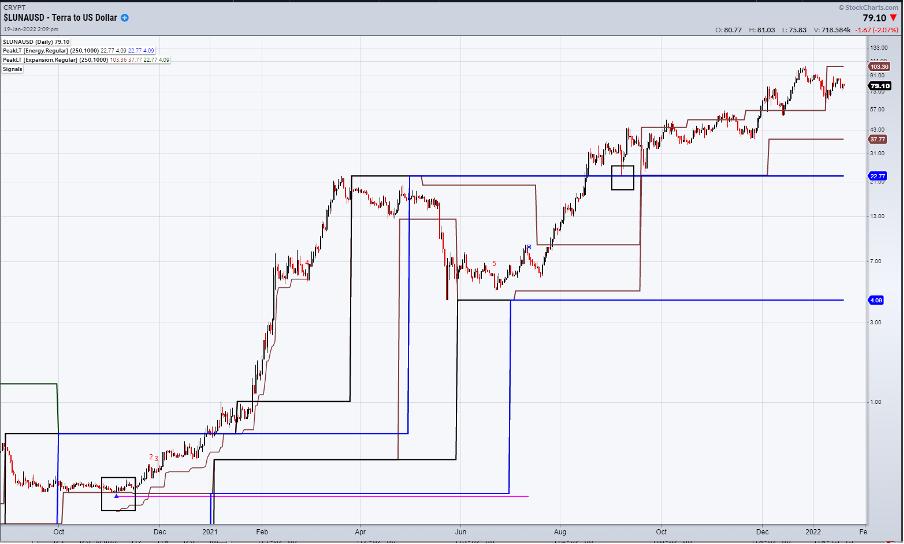
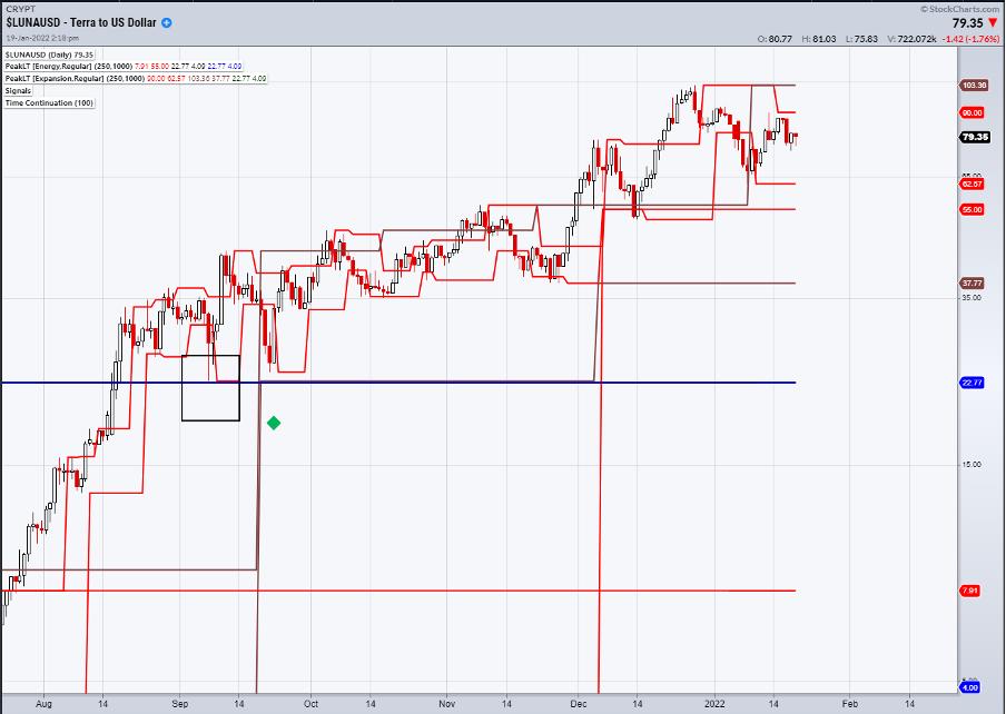
Contrast this with Luna, which has been in a steady uptrend since last year. The key moment came in September, when price held the major Monthly Based Peak Energy Support (Blue Line) and then, a few days later, posted a buy signal with a Time Continuation pattern (green diamond).

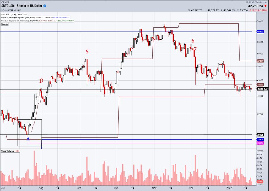
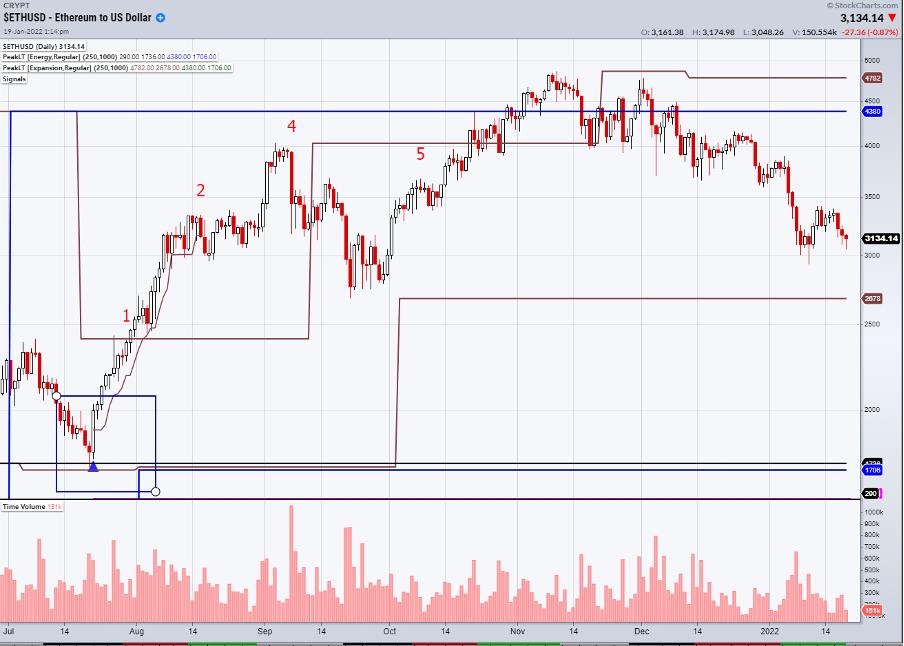
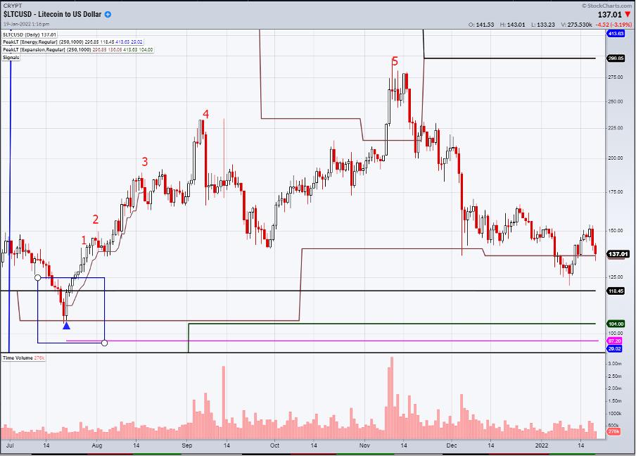
Whilst it is possible to wait for patterns, the 4th Dimension System also provides signals. They are rare, but often significant. Last year, Ethereum, Bitcoin and Litecoin all gave major buy signals on the same day.
Bitcoin entered a major weekly based zone of support in July, and a pattern within that zone triggered a signal (blue triangle) at $32100.

Ethereum did the same, entering a weekly zone at $2100.

Litecoin's zone of support was wider, but it gave a signal at $117.

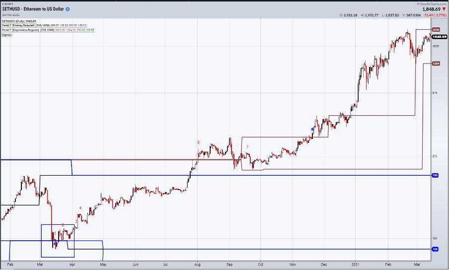
Ethereum's only signal came a little earlier in March, at $125, after swiftly losing 70% of its value.

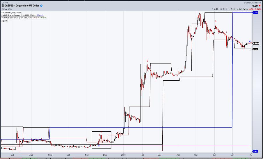
Going back through history and observing many such signals on all sorts of instruments was enough to get me serious. Whilst the type of returns these signals gave is unrealistic now, the evolving world of NFT and Crypto means that new opportunities will present themselves. The buy on Dogecoin back in November 2020 was at such a low price that the StockCharts scale has it at zero!!! It is necessary to scroll back and adjust the scale to see that the buy came in at $0.0032.

Returning to Relative Strength, we already know that Luna is outperforming. The others are Atom and Fantom. Starting with Luna, the buy back in November 2020 was at 29 cents. At its recent peak above $100, it's up over a staggering 30,000%. Now you see why I got serious.

The 4th Dimensions System triggers signals only at weekly- or monthly-based support. This was designed that way due to the large number of stocks in America. The crypto world is smaller and more manageable, so it is possible to modify this to include daily supports and resistances as well.
Returning to Luna, the Red Lines are the daily levels. We have supports at $62.57 and $55.00, with a weekly based support all the way down at $37.77. With the prevalence of Flash Crashes, especially at weekends, I have no problem having a cheeky order down there. Resistance has been built based on its own momentum, so a day-to-day close above the weekly resistance at $103.38 would signal a breakout.

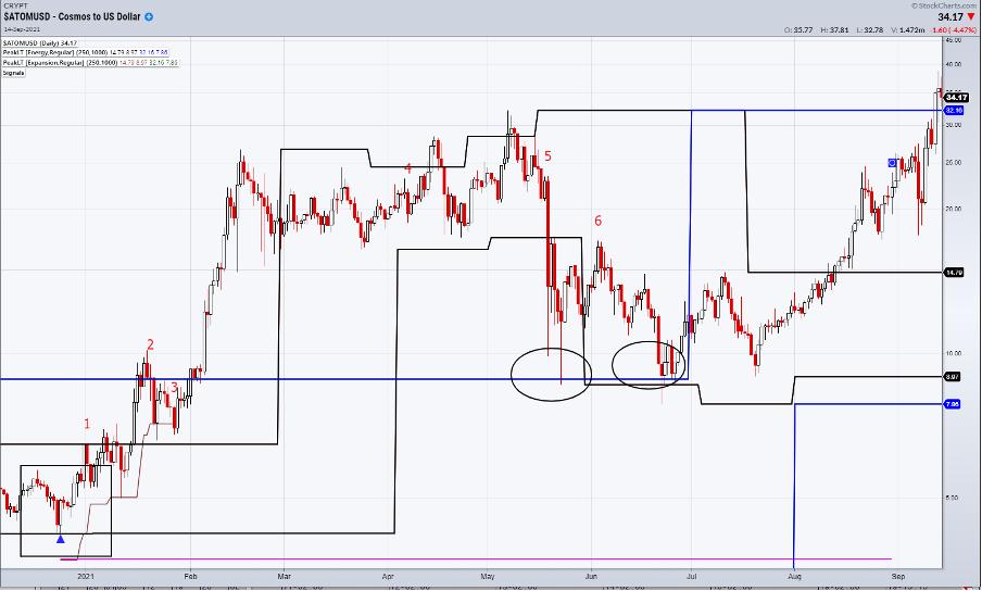
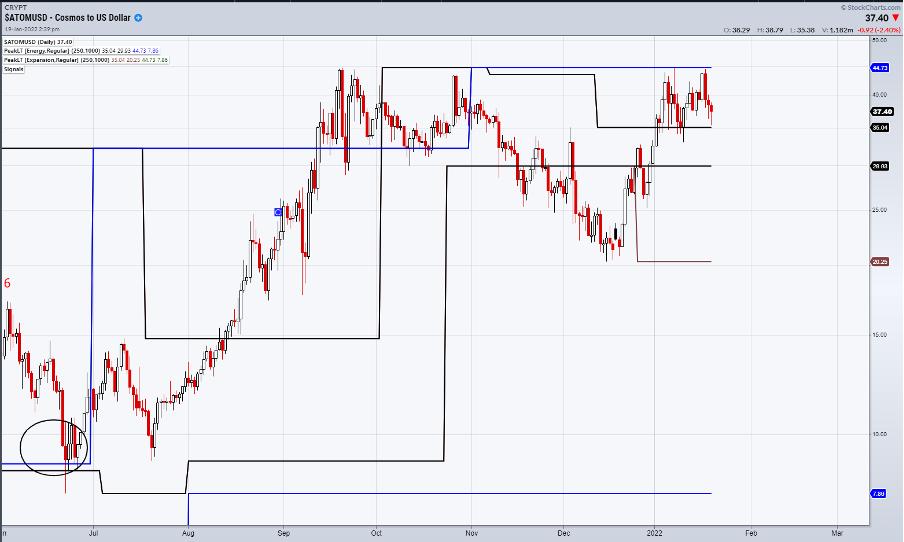
Moving onto Atom, the last 4th Dimension signal was at the end of 2020 at $5. Price did respect monthly support twice during the following summer, but did not produce a pattern.

Moving to now, weekly levels are more relevant and closer, with support at $35.04 and $29.93. The Flash Crash level is $20.25. The past two weeks has seen failure at the final monthly-based resistance at $44.73, which means a 2-day close above here would signal a bullish breakout.

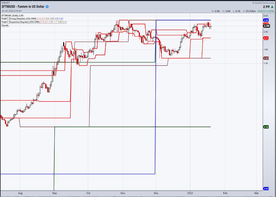
Fantom has been ignoring the general downtrend in Crypto and sits close to its all time high. Fundamentally, it is a Crypto similar to Ethereum in its place within the digital framework. The historical data is more limited than the others, so no 4th Dimension signal has appeared as of yet. However, daily support lies at $2.11 and a Flash Crash level is at $1.17. A 2-day close above $3.55 would signal a bullish breakout.

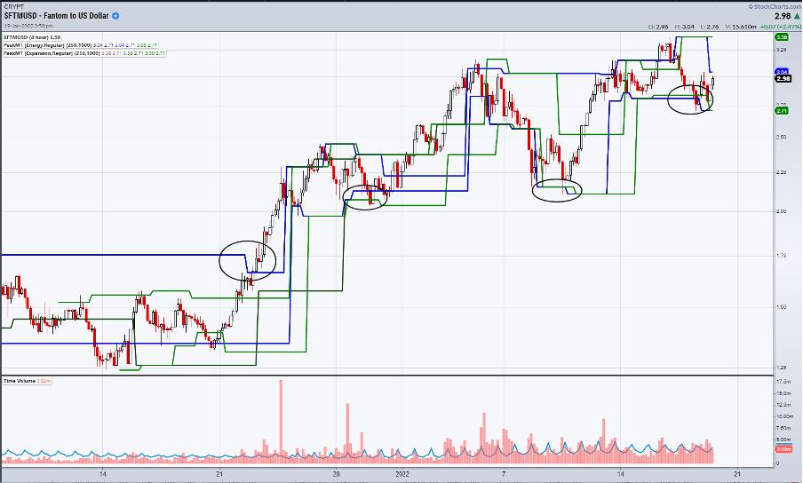
Drilling down further for shorter term opportunities, I use the 4-hour charts with the Peak Expansion and Energy referencing 120-, 240- and 480-minute charts. Price broke out just before Christmas and, 3 times, has held final short-term support on a 2-bar basis as circled. That final level lies at $2.71.

Its fair to say that, with big potential returns, risk is also big.
I can be contacted at shaun.downey@aol.com to answer any questions.
Shaun Downey
|
| READ ONLINE → |
|
|
|
| MORE ARTICLES → |
|
 Chart 1
 Chart 2
 Chart 3
 Chart 4
 Chart 5

 The Nasdaq 100 ETF (QQQ) reversed its uptrend signal from April 17th, 2020 as two trend-following indicators turned bearish this week. The chart below shows QQQ with the deepest decline from a high since the 10.9% decline in February-March 2021. Prior to that, the deepest decline was in September 2020 (-12.6%).