| THIS WEEK'S ARTICLES |
| John Murphy's Market Message |
| SHORT-TERM MARKET BOUNCE RUNS INTO SELLING |
| by John Murphy |
SHORT-TERM BOUNCE RUNS INTO RESISTANCE... My last message showed the three major stock indexes in an oversold condition and trying to bounce from underlying chart support. So the recent stock rebound wasn't a surprise. Neither was the size of the rebound. The combination of overhead resistance and today's selling puts the recent rebound in jeopardy. That earlier message also suggested that any stock rebound should be viewed within a more negative environment. That being the case, any potential rally failure has to be taken more seriously. Two of my favorite ways to measure overhead resistance levels are moving averages and Fibonacci retracement lines. The three charts below show stocks pulling back from some some of those resistance levels.
Chart 1 shows the Dow Industrials pulling back from their 50-day moving average (blue line). In addition, the Dow is meeting resistance at its upper Fibonacci retracement line after recovering 62% of its recent selloff. Fibonacci lines measure retracements of 38%, 50%, and 62% of a prior move and are useful for finding support and resistance levels. That being the case, this would be a logical spot for the Dow to meet with new selling.
Chart 2 shows the S&P 500 turning back from its 62% Fibonnaci retracement line as well. During a rebound following a price selloff, that upper Fibonacci line is usually the most difficult to overcome.
 Chart 1 Chart 1
 Chart 2 Chart 2
QQQ MEETS RESISTANCE AT 50% LINE...The technology-heavy Nasdaq 100 has been the weakest of the three stock indexes and is also pulling back from a couple of overhead resistance levels. Chart 3 shows the QQQ meeting resistance at the middle Fibonacci line after regaining 50% of its recent decline. In addition, the QQQ is running into new selling around its 200-day moving average (red line). That's also a logical spot for it to run into overhead resistance.
BOUNCE OR BOTTOM? The bigger question at the moment is whether the recent rebound in stocks represents an important bottom, or a short-term rebound within a larger downtrend. Longer-range charts, and greater weakness in various measures of market breadth, appear to favor the more negative outlook. If this is just a short-term rebound within a larger downtrend, the overhead resistance lines shown on the three charts may be hard to overcome.
 Chart 3 Chart 3
|
| READ ONLINE → |
|
|
|
| The Mindful Investor |
| S&P 500 Using Ichimoku Cloud Model |
| by David Keller |
The Ichimoku cloud model (often just referred to as the "cloud model") is a traditional Japanese technical indicator which actually combines three separate trend-following devices. I spent some time on Japanese trading desks earlier in my career, and was always fascinated at how much I would see candlestick charts and the Ichimoku clouds all around me. What's compelling about the Ichimoku indicator is that, with one glance, you can form a fairly complete picture of the trends of an underlying asset.
My recent interview with Katie Stockton of Fairlead Strategies encouraged me to spend some time with the Ichimoku charts this week, and I wanted to share some of my takeaways. Our Chart School section has some fantastic articles on the Ichimoku system, but today we'll focus on what the cloud portion of the indicator can tell us about the current market environment.

One thing you'll notice immediately is that the cloud is plotted 26 days in the future. This is one of the few technical indicators that actually has a true forward-looking component! The cloud is determined by using some of the other components of the Ichimoku system, but, basically, is looking at the midpoint of price ranges over a certain lookback period. What is the average of the highest high and lowest low over the previous nine days? You make similar calculations for different time periods and eventually you arrive at the cloud you see on the chart of the S&P 500.
How do we use the cloud? First, it can tell you the overall trend of the asset. I think of markets in three phases:
- Accumulation Phase with higher highs and higher lows
- Distribution Phase with lower highs and lower lows
- Consolidation Phase with overall sideways, rangebound price action
If the cloud is green and sloping higher, we are in an accumulation phase. If the cloud is red and sloping lower, we are in a distribution phase. If the cloud is flat, we are in a consolidation phase.
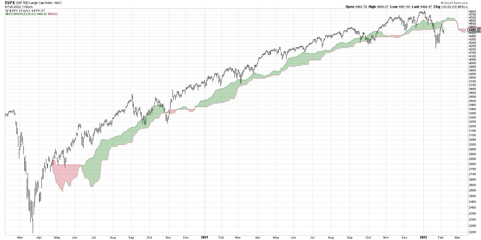
Next, we can look at the price relative to the cloud. During an accumulation phase, the price will often find support in the cloud. Note the pullbacks for the S&P 500 in September 2020, March 2021 and December 2021. Most recently, we saw the S&P 500 break below the cloud, then retest the cloud from below and find resistance in this key area. Support has now become resistance!
Finally, the forward-looking components allows us to identify potential resistance levels in the next 4-5 weeks. So we have a sense of where any impending rally may find resistance, as well as an idea of what the S&P would need to do to reverse from distribution phase to accumulation phase.
What does all of the above tell us about the current market environment? As long as the S&P remains below the cloud, the trend is bearish (at least according to this indicator). If we do see a rally here in the coming weeks, expect resistance in the cloud, which currently ranges between 4500 and 4650, depending on how quickly the price would increase.
What's great about the Ichimoku cloud model is that it can be used along with other technical indicators like support and resistance, oscillators like RSI, and especially candlestick charts. When you see a significant candle pattern that occurs just as the price is entering the cloud, prepare for a price reversal!
Want to digest this article in video format? Head over to my YouTube channel!
RR#6,
Dave
P.S. Ready to upgrade your investment process? Check out my free course on behavioral investing!
David Keller, CMT
Chief Market Strategist
StockCharts.com
Disclaimer: This blog is for educational purposes only and should not be construed as financial advice. The ideas and strategies should never be used without first assessing your own personal and financial situation, or without consulting a financial professional.
The author does not have a position in mentioned securities at the time of publication. Any opinions expressed herein are solely those of the author, and do not in any way represent the views or opinions of any other person or entity.
|
| READ ONLINE → |
|
|
|
| ChartWatchers |
| Reduce Whipsaws and Improve Performance with a Simple Filter |
| by Arthur Hill |
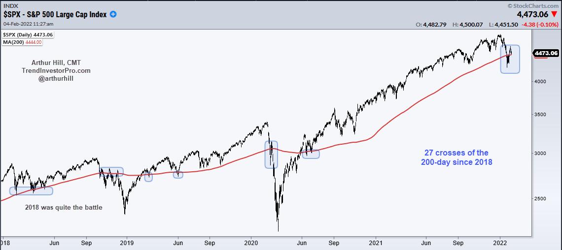
The 200-day SMA is quite the battle zone when it comes to the S&P 500. In fact, the index has crossed this key moving average 165 times since 2000. That's a lot of crosses, and a lot of needless whipsaws. Chartists can reduce whipsaws and improve performance by applying a simple filter to qualify signals. Let's investigate.

The chart above shows the S&P 500 with the 200-day SMA in red. The blue shadings show when price crosses the 200-day SMA. As we can see there were several dips below the 200-day in the first half of 2018, but the index ultimately held. SPX plunged below the 200-day in the fall of 2018 and then returned to do battle with several forays back above. These also failed to gain traction. Overall, there have been 27 crosses since 2018 alone.
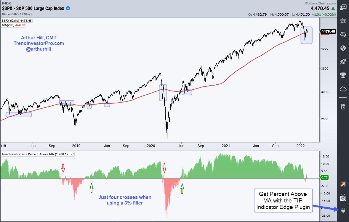
Chartists can seriously reduce these whipsaws by adding a percent filter to qualify the crosses. For example, turn bullish when the close is 3% or more above the 200-day SMA and bearish when the close is 3% or more below the 200-day SMA. Using this filter, the number of signals went from 27 to 4, which is much more manageable. The indicator in the chart below shows Percent Above MA (1,200,1), which shows the percentage difference between the close and the 200-day. The horizontal lines are set at +3% and -3%.

Adding this 3% filter not only reduces whipsaws, but it also increases overall performance. The table below shows a higher Compound Annual Return (4.3% vs 6.73%), a better Maximum Drawdown (24.34% vs 19.83%) and a much higher Win% (82% vs 26%). The 200-day is a big battle zone and we should not take a cross seriously until it clears the 3% threshold. This indicator and technique can be applied to any price series.

Percent Above MA is one of 11 indicators in the TrendInvestorPro Indicator Edge Plugin for StockCharts ACP. The Trend Composite, Momentum Composite and ATR Trailing Stop are also included. Click here to learn more.
This week at TrendInvestorPro we unveiled a table to track Trend Composite signals and rank more than 250 ETFs by their StochClose score. There are lots of downtrends out there right now, but we are seeing uptrends and leadership in commodities, banks, energy and some defensive groups. Click here to take your analysis to the next level.
-------------------------------------------------------------
|
| READ ONLINE → |
|
|
|
| Martin Pring's Market Roundup |
| Examining the Monthly Bar Charts for a Possible Reversal |
| by Martin Pring |
Usually, when we are identifying one or two bar price patterns or candlesticks, it's because they appear close to a turning point, thereby giving us a trading edge. From a practical point of view, it makes sense to observe daily or intraday price action. That's because a short-term trend reversal will already be well underway if we wait for the longer-term charts to turn. That said, I like to occasionally review a chart list containing open, high, low and close data based on monthly information by way of searching for one and two bar patterns.
In the vast majority of situations these charts tell me absolutely nothing. Occasionally, though, they offer pearls of information not being transmitted from those daily and intraday charts. Working on the assumption that one or two bar formations mostly have an effect for 5-10 bars, this information also has longer-term (5-10-month) significance. A specific pattern therefore sets the scene for a new emerging intermediate trend.
In reviewing my chartlist for monthly bars yesterday, I was struck by several examples of outside bars. Outside bars develop when the trading range of the latest bar totally encompasses that of its predecessor. That phenomenon can be observed in Chart 1 for the Dow. In order to gain significance, a bearish outside bar must experience certain characteristics. Think of it as a chart reflection a of a battle between buyers and sellers. First, it should be preceded by a rally. In other words, there must be something for it to reverse. That was definitely the case for the Dow last month; the recent overbought reading in the RSI also confirms the overstretched nature of the market. Note that it has recently re-crossed its overbought zone on its way back to equilibrium. The red arrows on this and the other charts show that this kind of behavior has usually been followed by a multi-month correction of some kind.
The second outside bar characteristic, already discussed, is that it must encompass the trading range of the previous bar. This one though, earns extra points. Not only does encompass December's price action, but also all those bars going back to last summer. In other words, it reflects a huge battle between buyers and sellers. The sellers won, in this instance -- or did they?
 Chart 1 Chart 1
A further characteristic for an outside bar is that it opens near the previous bar's close, indicating the dominance of buyers. Last month's bar qualifies in that regard. Finally, by way of reflecting the dominance of sellers, the price should end the month well into the lower half of the monthly range. This one, as well as that of the S&P Composite in Chart 2, end exactly at the half-way point, close to their respective nine-month moving averages.
 Chart 2 Chart 2
One final point about the validity of any one- and two-bar formation is that the pattern, in and of itself, is only one piece of technical evidence. Consequently, to increase the probabilities that the pattern will "work", some additional evidence is required. That could take the form of a trendline violation, a moving average crossover, etc. In the case of these two charts, a decisive month-end close under the nine-month MA should suffice.
My conclusion from this is that on-balance monthly action is bearish. However, this view is somewhat clouded by the close being well above the intra-month low. Further complicating the picture is the fact that weekly data is presenting us with some positive evidence.
Weekly Action
In that respect, Chart 3 features a weekly candlestick chart for the NYSE Composite. A clear intraweek break took it below its recent trading range and 52-week MA. However, by the time of the Friday close, it had managed to "hammer" its way back to the trendline breakdown point and, this week, has exceeded it. That suggests the break was false, but we will need confirmation of that with a move to new highs.
 Chart 3 Chart 3
In the case of the S&P Composite, the downside break was not so blatant, being limited to the 52-week MA.
 Chart 4 Chart 4
Sectors and Monthly Outside Bars
Drilling down to individual sectors and industry groups, two areas stand out; semiconductors and energy. Semiconductors experienced a monthly outside bar. However, unlike the Dow and S&P Composite in Charts 1 and 2, the SPDR Semiconductor ETF (XSD) closed the month much closer to its low. The bar was also much wider in relation to its two predecessors, which reflects a much bigger battle between buyers and sellers than took place in the Dow or S&P Composite. The bottom line is that it's far more likely to be followed by negative action.
 Chart 5 Chart 5
On the other hand, energy, unlike most sectors, demonstrated a complete absence of any sort of bearish outside bar, as it has broken above its 2014-2021 down trendline, achieving a new bull market high in the process. Not much doubt over which is the strongest sector on the board at this time.
 Chart 6 Chart 6
Conclusion
Several indicators tried to violate 9-month and 52-week moving averages last week, but escaped with a late-month rally, which also threw some doubt as to the validity of several monthly outside bars. Going forward, it will be interesting to see whether this week's rally is sustainable or whether it turns out to be a dead cat bounce, to be later followed by negative 9-month and 52-week MA penetrations and lower prices.
Good luck and good charting,
Martin J. Pring
The views expressed in this article are those of the author and do not necessarily reflect the position or opinion of Pring Turner Capital Group of Walnut Creek or its affiliates.
|
| READ ONLINE → |
|
|
|
| ChartWatchers |
| Don't Confuse a Cyclical Bear Market Bounce With a Secular Bull Market Rally |
| by Tom Bowley |
There are never any guarantees in the stock market. As much knowledge as I've gained over the years, and as much respect I have for my fellow technicians here at StockCharts.com, there's simply no way to ever be sure that your forecast is the right one. I've been humbled plenty of times, and perhaps 2022 will be one more to add to the list.
But I REALLY don't like this market.
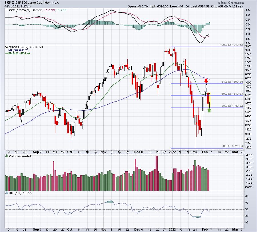
I don't trust a single rally. After the S&P 500 rallied from 4222 on Monday, January 24th to its high of 4595 on Wednesday, February 2nd -- an incredible 8.83% gain in just 9 calendar days -- Meta Platforms (FB) dropped its earnings bomb on U.S. equities. From Wednesday's high of 4595 to this morning's low at 4452, that represented a 3.11% drop in a little more than 24 hours. The NASDAQ's drop was even greater at 4.51%. This whipsaw action is absolutely insane right now. If you've had great experiences on the roulette wheel at a casino, then you might also be great at forecasting stock market performance on a day-to-day basis. It's crazy and wild right now, which is usually the case when major issues divide the bullish and bearish camps.
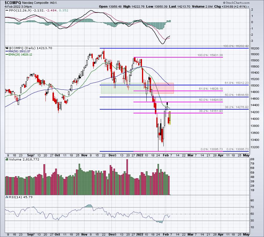
Bear market rallies typically fizzle at one of the key Fibonacci retracement levels, while secular bull market rallies result in higher highs, easily breaking out above prior market highs. After our horrific January, the bulls have a ton of work left to do. The very first step is to clear the key 61.8% Fib retracement level. Here's where the S&P 500 and NASDAQ stand right now:
S&P 500:

NASDAQ:

Based on the above, the S&P 500 has room to the upside to roughly 4600, or just another 1.5% or so. The NASDAQ, which has been hit harder, has maybe another 5% or so before having to tackle that critical Fib resistance.
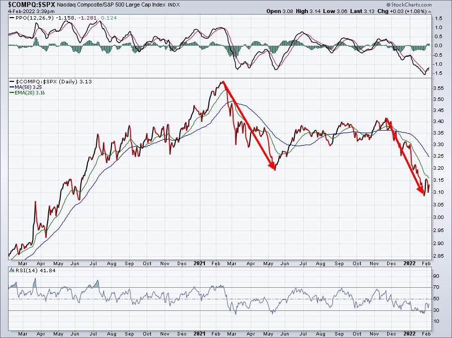
If you're unable to determine that the NASDAQ has been underperforming based on the above charts, this next $COMPQ:$SPX relative chart makes it much easier to see:

The NASDAQ has much more of a growth flavor to it, which is why it's been performing so poorly on a relative basis. Growth stocks have been under tremendous selling pressure -- both absolute and relative -- since their November high.
In addition to the technical and sentiment warning signs that I've been discussing, history is now telling us to GET OUT of the market. Since 1950, the "January Effect" has been unbelievably accurate in predicting "balance of the year" performance. That Wall Street adage, "as goes January, so goes the year", has a ton of merit to it. I'll be discussing that historical phenomenon tomorrow morning during a special FREE presentation of "The January Effect", which will start at 10:00am ET.
For more information and to register for the event, you can either (a) CLICK HERE to sign up for our EB Digest newsletter (100% free, no credit card required) or (b) use the room link below to join me directly. If you decide to join using the link, we'll add you automatically to our newsletter. It's important to join our EB Digest community as that will ensure that you receive room instructions in the future for all of our free events. For the link for tomorrow's event, click here.
(The room should open around 9:30am ET.)
Happy trading!
Tom
|
| READ ONLINE → |
|
|
|
| ChartWatchers |
| Swing Style For Bitcoin and Ethereum |
| by Greg Schnell |
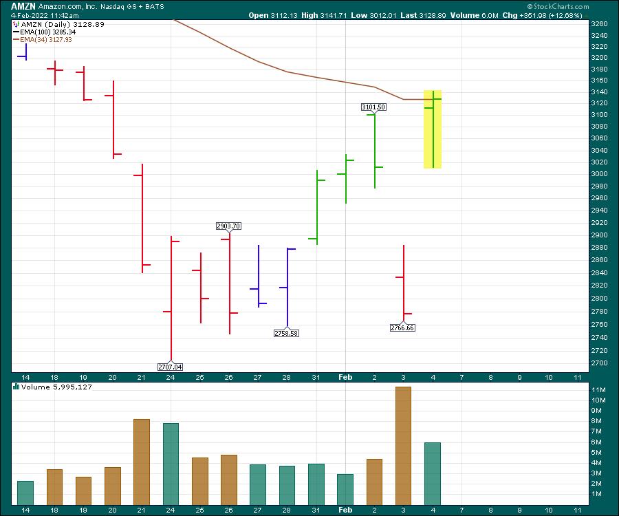
The violent swing trade in Amazon (AMZN) was enough to shake the teeth loose on most risk managers. We saw a $350 swing down from Wednesday to Thursday, followed by a full reversal on Friday after the earnings call.

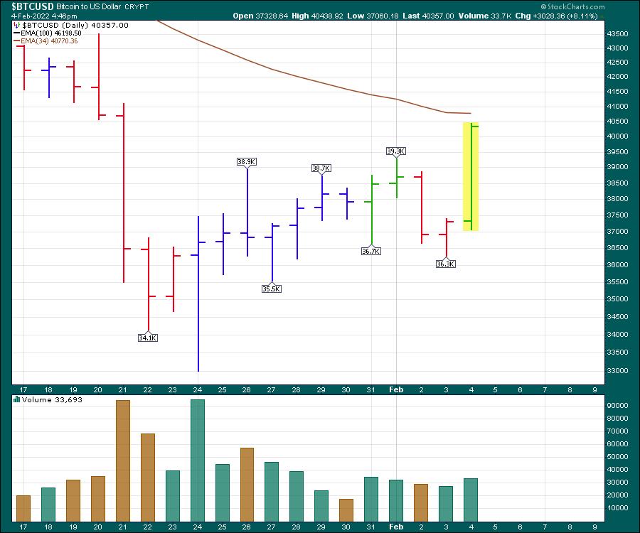
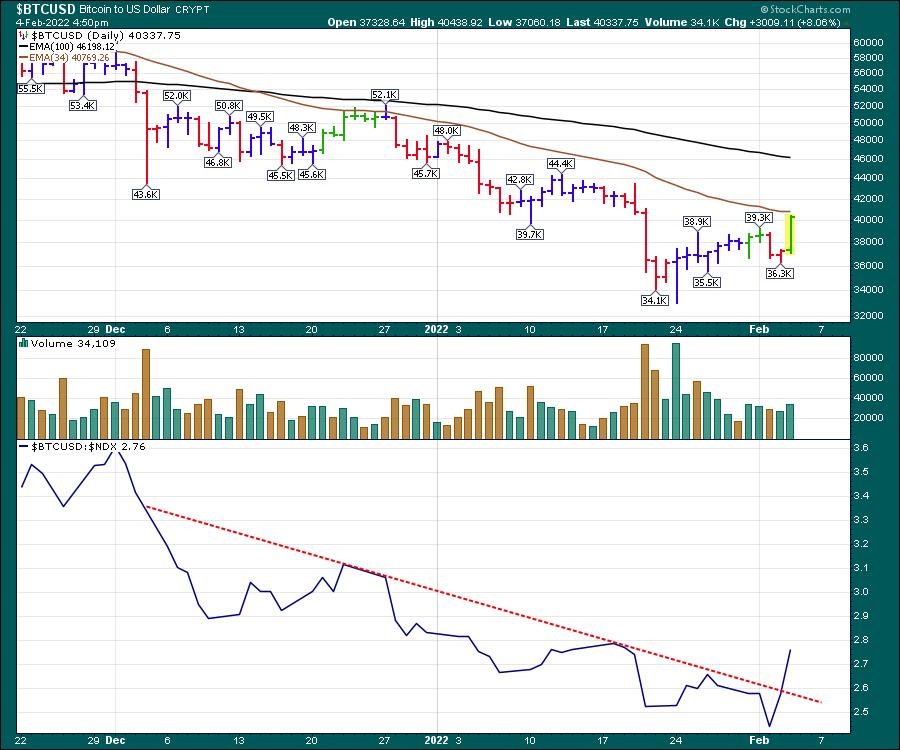
But one trade that caught my eye this week was the calmness of the Crypto market. While it's never really calm in cryptoville, the charts were fairly smooth through the last ten days. Here is a chart of Bitcoin ($BTCUSD), swinging will the normal volatility of the crypto markets, but consistently trying to make higher lows coming out of the base. Thursday's intraday pullback to new 5-day lows surged to close near the high of the day while the Nasdaq was down 4%.

When we draw a relative strength line on the bottom of the Nasdaq chart, it helps us see this change in momentum better. This is done by comparing the Bitcoin price with the Nasdaq index, using a colon sign between them to get a relative strength ratio.

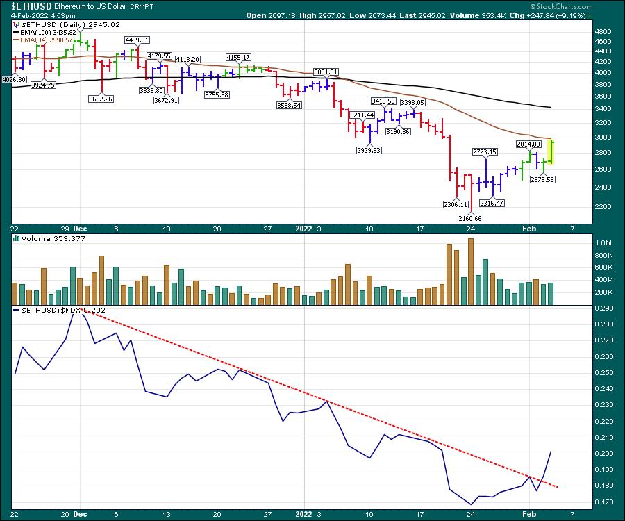
Doing the same thing with Ethereum ($ETHUSD), we can check to see if Ethereum is breaking out after months of underperforming.

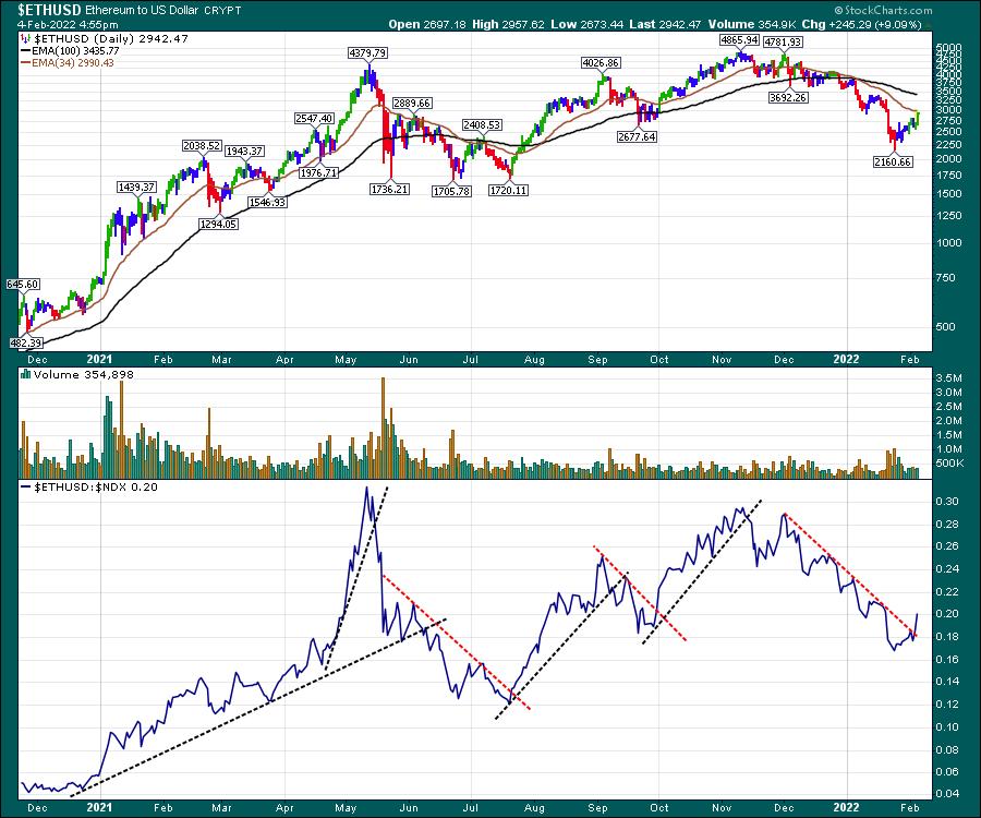
When we widen that view out, we can see if there is any value there.

These trend line breaks of relative strength show when the crypto coin is outperforming the Nasdaq. It also helps show when crypto is trending higher on the price chart. Might be a worthy clue, as it looks like the crypto names are going to get another day in the sun.
|
| READ ONLINE → |
|
|
|
| RRG Charts |
| Sector Rotation to Defense Continues |
| by Julius de Kempenaer |

Big drops call for big recoveries, but it's dangerous to watch these moves in isolation.
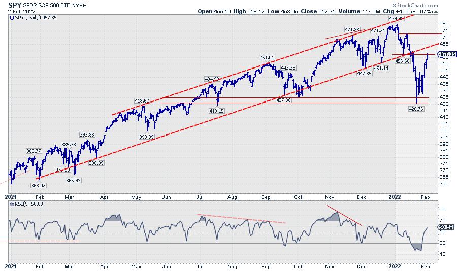
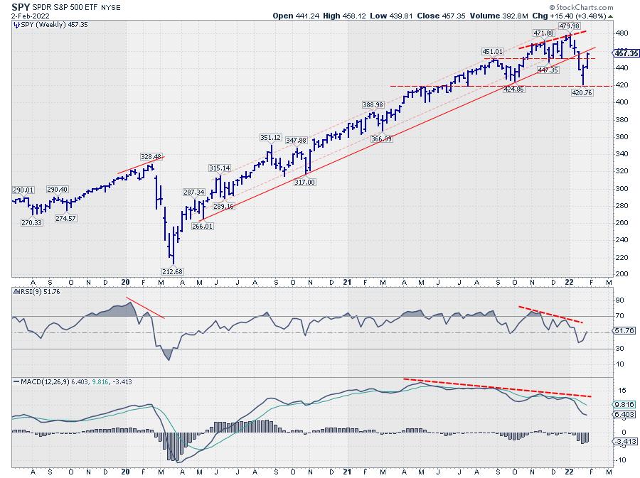
The S&P 500 dropped roughly 60 points from its peak at 480 at the start of the year to find a low recently around 420. Out of that low, the market rallied 40 points. In percentage terms, that equals a drop of around 12.5% and a rally of roughly 10%, a little less. I am NOT KIDDING when I tell you that I have met people who wanted to convince me that the market was thus only down 2.5%. We all know that a 12.5% drop from a high level is very different from a 10% rally out of a much lower level... Don't we?
This S&P chart is in my ChartList that I use in Sector Spotlight on a regular basis. The big problem that is staring you in the face from this image is the break below the rising support line, which marked the lower boundary of the rising channel the S&P has been moving in. The initial drop from the high caused a lot of damage to that chart and to that uptrend. The rhythm of higher highs and higher lows is now broken, and we need to set up a new starting point for higher highs and higher lows to get back into a new uptrend (on the daily chart, that is).
On this daily chart, a series of lower highs and lower lows has already started, and we can see how old support levels are now showing up as resistance on the way up. This means that the "ease of movement" is now on the downside rather than to the upside.

If we look at the weekly version of this chart, we can see that, here also, the rhythm of higher highs and higher lows is broken. But a new series of lower highs and lower lows has not started yet. However, here also, it is clearly visible that damage has been done. And, whatever happens next, this damage needs time to recover.
Even if the most recent low at 420 will hold, it is highly unlikely that the market will shoot higher from here as if nothing has happened.
From a Sector Rotation Perspective
Does the current sector rotation give us any pointers?
For a few months, I started to break down sectors into three groups, instead of two: Cyclical (Offensive), Defensive, and Sensitive. One of the watchers of Sector Spotlight pointed me to this approach by Morningstar, and it actually makes sense. At least IMHO. Also, to get a better grip on what's happening in the sectors, I started to use the Equal Weight Sectors more to eliminate the big impact of some mega-cap stocks on the performance of cap-weighted sectors.
BTW, don't be fooled by the idea that using EW sectors means that every sector has the same weight in the S&P 500. The individual stocks in the S&P are of equal weight. When this is translated to sectors, that does not mean that every sector is equal weight. If you want to read more about that; I have written a ChartWatchers article on this subject in May last year.
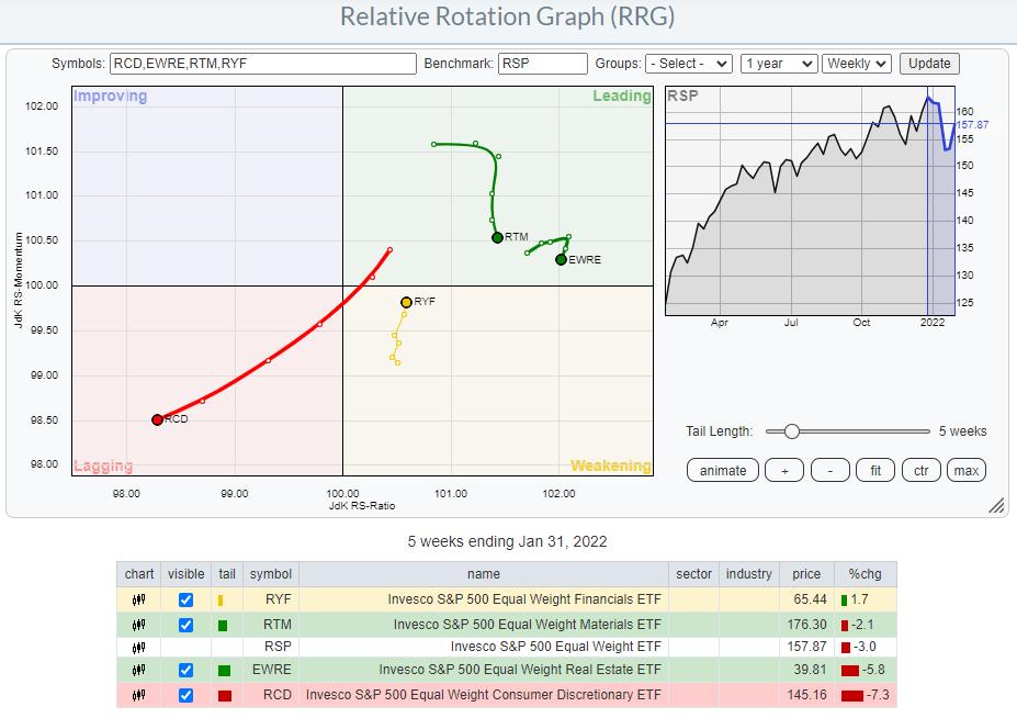
Cyclical

This Relative Rotation Graph shows the recent rotation fore the groups of cyclical sectors (Equal-weight). It's pretty clear that these tails are not representing a group of sectors that is driving a strong bull market.
Materials and Real-Estate are inside the leading quadrant but have already started to roll over. So at least they are taking a break from their prior up-moves. Consumer Discretionary is nose-diving further into the lagging quadrant, confirming its recent weakness.
The only sector that does reasonably well in this group is Financials, which are crawling back up towards the leading quadrant, albeit at a very short tail.
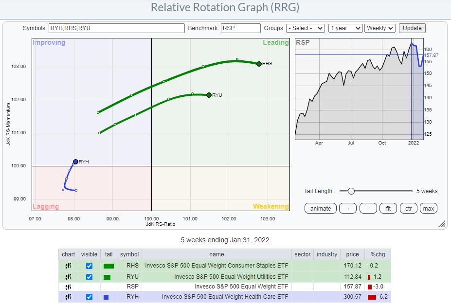
Defensive

The general direction for the tails in the defensive group is much clearer. Staples and Utilities are clearly inside the leading quadrant, powered by long tails. The performance during the week so far, the last segment of these tails, shows a slight slow-down, but the direction and the gain in terms of relative strength (JdK RS-Ratio scale) is clearly there. Healthcare has been lagging in recent weeks/months, but now seems to be picking up again as it is moving from lagging into improving.
This means that all defensive sectors are on a positive rotational trajectory, which is something that does not really rhyme well with a full-fledged bull market.
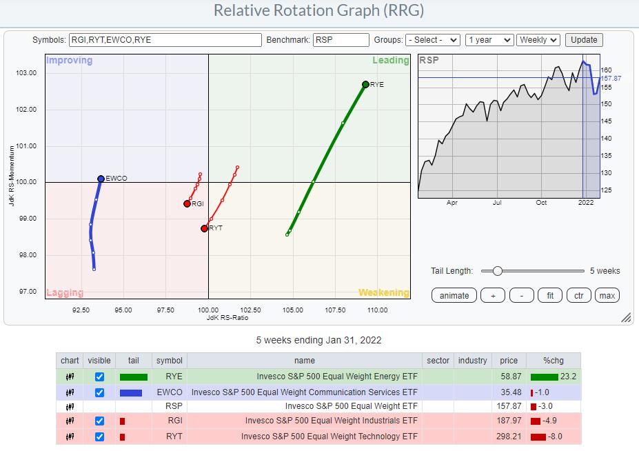
Sensitive

In the groups of sectors that are classified as sensitive, we see Energy standing out, with a long tail shooting further into the leading quadrant. Technology and Industrials are heading(further) into the lagging quadrant, while communication services is picking up relative momentum (JdK RS-Momentum scale) but not much relative strength (JdK RS-Ratio scale).

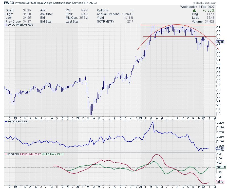
Given the large and completed top-formation on the price chart, in combination with the weak relative strength line and the low reading on the RS-Ratio scale (vs. RSP), I believe there is a very good chance that EWCO will complete a rotation on the left-hand side of the graph. So lagging-improving-lagging. Which will bring 3 out of 4 sensitive sectors at a negative rotation.
With defensive sectors leading the market at the moment and both cyclical and sensitive sectors turning more negative, there are enough reasons to remain very careful with this market. Downside risk largely outweighs upside potential, which is a situation most investors don't really like too much.
|
| READ ONLINE → |
|
|
|
| Top Advisors Corner |
| Let's Talk About Expectations |
| by Mike Zaccardi |
Advisors know that setting the right expectations with clients is critical. Investment performance can be an awkward conversation when there isn't clarity between the advisor and client on what the investment benchmark is. When the client knows what they own and why they own it, quarterly meetings are a breeze — and performance is often not even discussed.
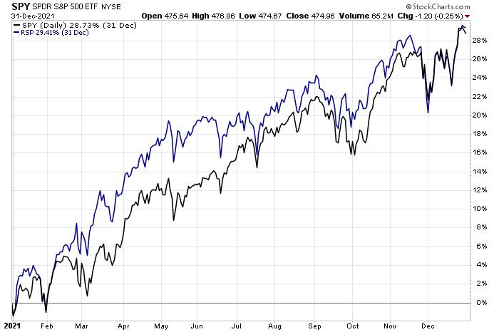
2021 was a tough year to explain portfolio return differences because of the sharp outperformance among just a handful of S&P 500 stocks. To be fair, the equal-weight version of the S&P 500 returned about the same as the cap-weighted version, but ex-U.S. stocks and the bond market provided relatively meager returns.
 S&P 500: Cap-Weighted and Equal-Weighted Indexes (SPY, RSP) 2021 Performances (29% Total Return) S&P 500: Cap-Weighted and Equal-Weighted Indexes (SPY, RSP) 2021 Performances (29% Total Return)
 SPY, Nasdaq 100 ETF (QQQ) and Ex-U.S. Stocks (VEU) 2021 Performances SPY, Nasdaq 100 ETF (QQQ) and Ex-U.S. Stocks (VEU) 2021 Performances
That wide dispersion in sub-asset class total return numbers made diversified portfolios appear to be losers versus the S&P 500. When clients flip on financial TV or step into the Fintwit blogosphere, they are inundated with return figures of the Nasdaq and S&P 500. When they read about returns in the 25-30% range for large-cap domestic equities, they might naturally assume that is about what their accounts earned for the year.
Most advisors have likely worked with their clients long enough to where this potential discrepancy is a non-issue, but new advisors scrambling just to manage their business and keep clients satisfied can easily overlook a proper investment benchmarking conversation. Important strategies to keep on the same page include using historical return data, explaining the benefits of diversification, going over the logic of the home bias and underscoring the importance of owning a portfolio that fits the client's risk and return objectives.
 JPM Guide to the Markets: Cycles of U.S. Equity Outperformance JPM Guide to the Markets: Cycles of U.S. Equity Outperformance
Sure, we all wished we owned a 100% U.S. equity portfolio in 2021 (and over the last 13 years), but when inevitable bear markets happen and as market cycles change, a diversified portfolio will probably provide some cushion for a long-term investor. Moreover, an extremely risky basket of holdings might not be ideal from a behavioral perspective, since a sustained uptick in volatility might cause the retail client to panic and sell at the wrong time.
It is an advisor's duty to help people navigate volatile markets, not by moving in and out of the market but by helping them keep to their long-term strategy. The right time is always "soon" when it comes to getting on the same page about allocation strategy.
Be sure to hop on my CMT Association Educational Webinar on Wednesday, February 9 from 12:00 pm – 1:00 pm ET, where I will discuss how technical analysis can be useful for financial advisors.
Mike Zaccardi, CFA, CMT
Investment Writer, Zaccardi LLC
|
| READ ONLINE → |
|
|
|
| MORE ARTICLES → |
|
 Chart 1
 Chart 2
 Chart 3

