| THIS WEEK'S ARTICLES |
| John Murphy's Market Message |
| USING FIBONACCI RETRACEMENT LINES FOR POTENTIAL DOWNSIDE TARGETS |
| by John Murphy |
INFLATION REMAINS THE BIGGEST THREAT TO MARKETS... It was reported this morning that April's Producer Price Index for the past year came in at 11%. That followed yesterday's report that the Consumer Price Index was 8.3%. Both reports confirm that inflation remains dangerously high with no sign of easing. That spells continuing trouble for bonds and stocks which are negatively effected by a more hawkish Fed which has just started raising interest rates. That has pushed major stock indexes into a major price decline which is likely to get worse. The Nasdaq market is already in a bear market with a loss of -30%. The Dow and S&P 500 are heading in that direction. The three weekly charts shown below use Fibonacci retracement lines to determine some potential downside targets.
POTENTIAL DOWNSIDE TARGETS... The weekly bars in Chart 1 apply Fibonacci retracement lines to the Dow Jones Industrials. Those lines measure the distance from the 2020 low to the peak formed near the start of this year. The Dow has fallen the least of the major stock indexes but is clearly in a downtrend. It's next potential downside target is the 38% retracement line near 30000.
The weekly bars in Chart 2 show the S&P 500 nearing a test of its 38% retracement line. If that doesn't hold, the next potential support would be at its 50% retracement line.
The retracement lines in Chart 3 are measured from the peak formed by the Invesco QQQ Trust during the fourth quarter of 2021. The chart shows the Nasdaq 100 already testing its 50% retracement line. If that doesn't hold, a further drop to its 62% line would be possible. One encouraging sign on all three charts is that their 14 week RSI lines in the upper boxes are nearing oversold territory below 30. That might help stabilize prices and lead to a rebound attempt. The overall look of the charts, however, show no convincing signs of a bottom.
 Chart 1 Chart 1
 Chart 2 Chart 2
 Chart 3 Chart 3
|
| READ ONLINE → |
|
|
|
| The Mindful Investor |
| This Chart Says More Downside for S&P 500 |
| by David Keller |
We are now in the seasonally weakest half of the year, which is why "sell in May and go away" comments have made the annual rounds. While the Sell in May approach has not been particularly successful in recent years, it is indeed based on the general tendency of the market to settle down as it nears the summer months.
What will May bring in 2022? So far, it's been about extreme volatility, sudden price swings and elevated uncertainty for investors. And while the market rallied nicely going into the end of this week, the long-term trend remains decidedly down for the major averages.
With the S&P 500 having reached around a 20% drop from the January highs, many investors are looking for signs of a bottom. But a review of one key breadth indicator suggests that the pain may just be beginning.
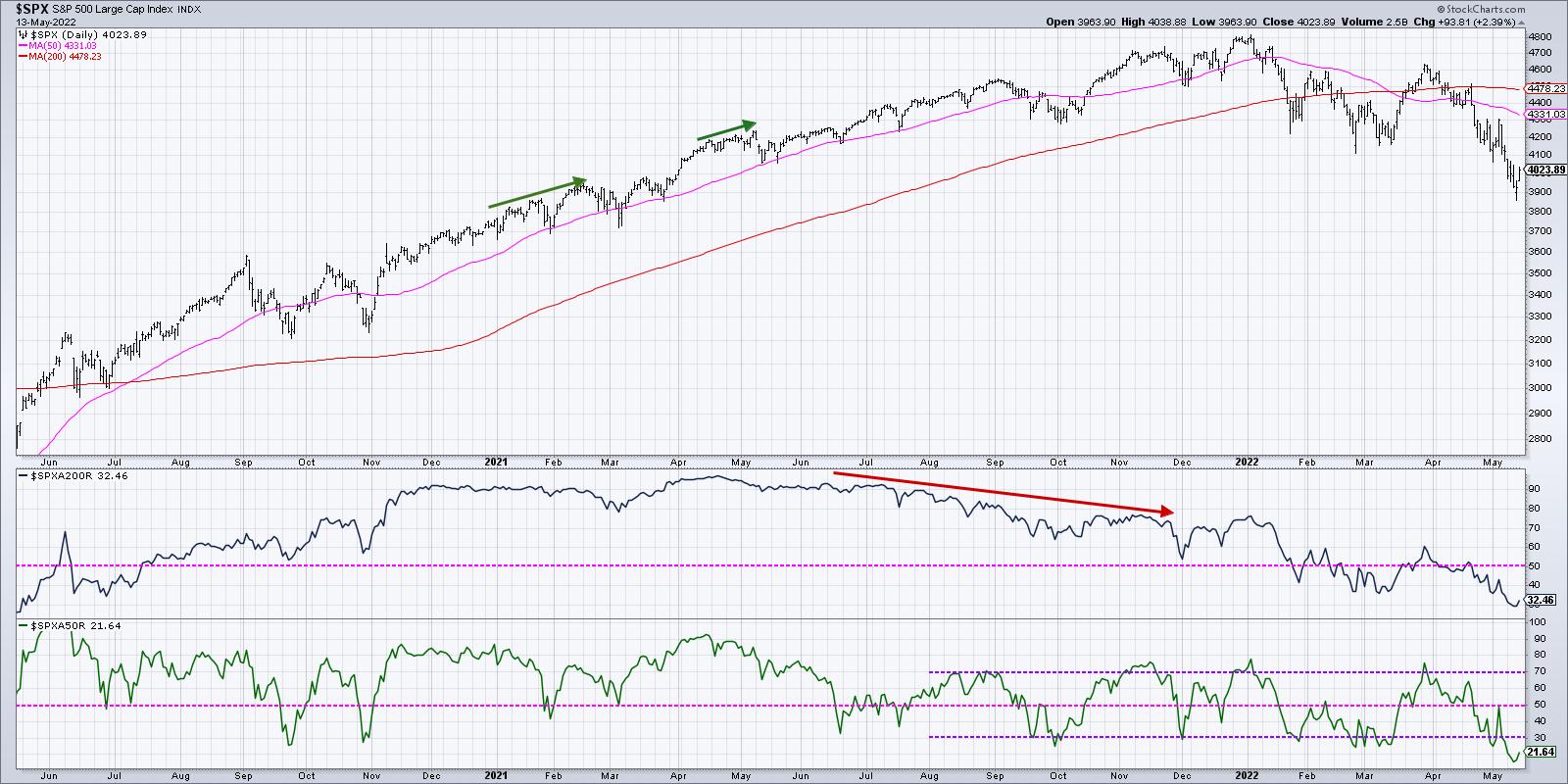
The S&P 500 broke down through its 50-day moving average in early April, soon to be followed be the 200-day moving average as well. But, as of Friday's close, one out of every three S&P 500 members actually sits above its own 200-day moving average.
We also see that 22% of S&P 500 stocks sit above their own 50-day moving average, which means that, while many stocks are in a similar pattern to the broader indexes, a decent number of names are still holding up on a price basis.
Over the last 22 years, I've enjoyed working with and learning from some of the most successful investors in the world.
While I have found that there are a number of ways to make a profit in the financial markets, there are certain consistent habits demonstrated by top investors.
In our upcoming FREE webcast, Seven Habits of Successful Investors, I'll share my own journey as an investor and how I've tried to incorporate the best practices I've seen firsthand from top money managers and traders.
Please join me on Tuesday, May 17th at 1:00pm ET for this FREE webinar. You can sign up HERE and I'll follow up with additional details before the event.
So how does this compare to previous market cycles? Looking at recent history, we can see that, since August 2021, a break below the 30% level in the bottom panel meant a buyable bounce. We've seen four such bounces over the last nine months.
So, having pushed below 20% this week, does that mean a rally from here is a certainty? Well, a short-term bounce could certainly make sense given the bombed-out breadth numbers. But how bombed-out are they, really, relative to previous extreme readings?
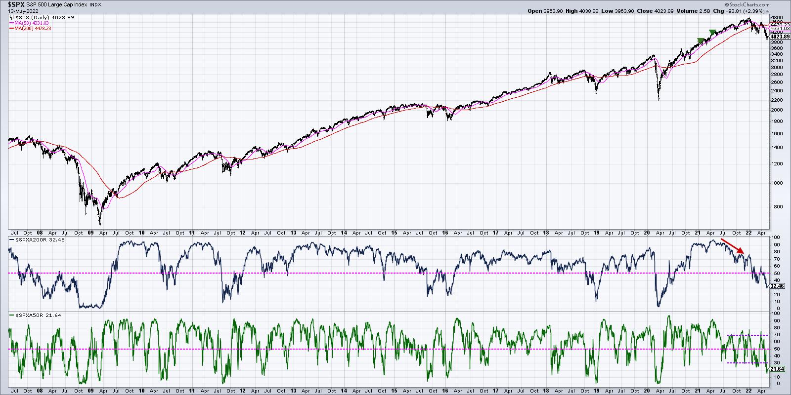
When we go back to the 2009 market low, we see that, for both of these breadth indicators, the recent low readings still do not come close the breadth conditions for most of the corrective market phases. In March 2020, the percent above the 200-day got down to single digits, and the percent above the 50-day reached all the way down to zero. We see similar readings in 2018 and 2011.
But look at the 2007-2009 period and you'll see why this indicator has not reached anywhere near dire readings by historical standards. In that case, we saw the percent of stocks above the 200-day remain in single digits for almost six months!
So is breadth showing negative readings relative to the last 12 months? Absolutely. But have we seen levels similar to what we've seen at previous correction lows? Not yet.
We may certainly see a tradable bounce as the Sell in May phenomenon takes another breather. But until the breadth picture becomes more negative on selloffs, a capitulation phase may be a bit further down the road.
RR#6,
Dave
P.S. Ready to upgrade your investment process? Check out my YouTube channel!
David Keller, CMT
Chief Market Strategist
StockCharts.com
Disclaimer: This blog is for educational purposes only and should not be construed as financial advice. The ideas and strategies should never be used without first assessing your own personal and financial situation, or without consulting a financial professional.
The author does not have a position in mentioned securities at the time of publication. Any opinions expressed herein are solely those of the author, and do not in any way represent the views or opinions of any other person or entity.
|
| READ ONLINE → |
|
|
|
| ChartWatchers |
| A Key Factor in the Trading Puzzle |
| by Arthur Hill |
 The bigger trend is one of the most important factors to consider when trading stocks or ETFs. We can use trend signals as part of a trend-following strategy or to dictate our trading bias. I look for bullish setups and pullback opportunities when the trend is up. When the trend is down, I am out or looking for bearish setups. In short, I want to trade in the direction of the bigger trend because this is the dominant force at work. May the trend be with you! The bigger trend is one of the most important factors to consider when trading stocks or ETFs. We can use trend signals as part of a trend-following strategy or to dictate our trading bias. I look for bullish setups and pullback opportunities when the trend is up. When the trend is down, I am out or looking for bearish setups. In short, I want to trade in the direction of the bigger trend because this is the dominant force at work. May the trend be with you!
There are dozens of trend-following indicators and techniques to define the trend. We never know which indicators will work and when so I devised the Trend Composite to aggregate trend signals in five trend-following indicators. These include the Moving Average Trend, Bollinger Bands, Keltner Channels, StochClose and CCI-Close. The Trend Composite and other indicators are part of the TIP Indicator Edge Plugin for StockCharts ACP (learn more here).
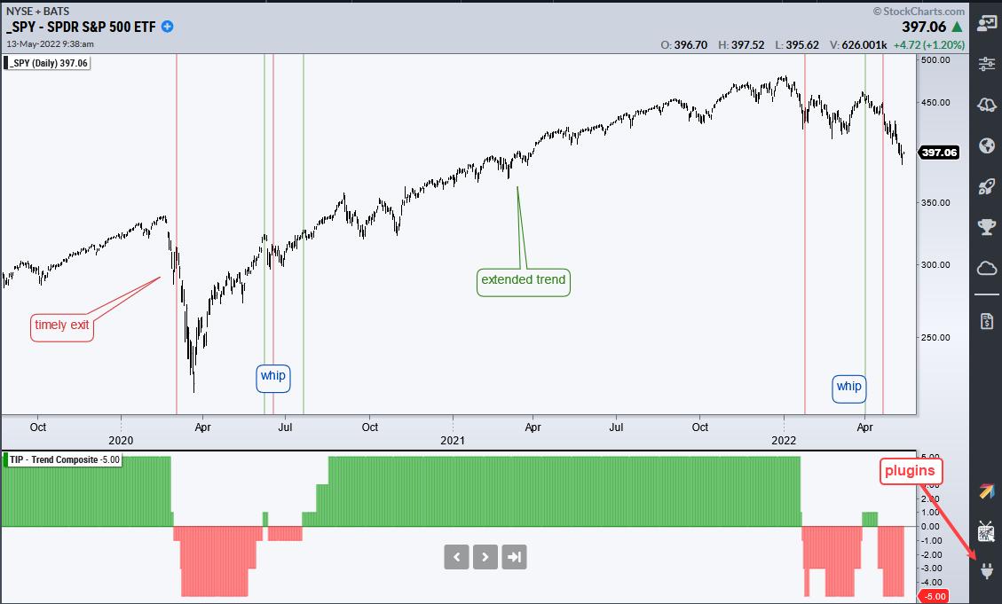
The chart above shows SPY with the Trend Composite generating seven signals since February 2020. This is a typical assortment for trend-following signals because they lag, there are some whipsaws and there is a big trend. The blue annotations show the whipsaws (whip) in June 2020 and late March 2022. Whipsaws and lag are just part of the process needed to catch the big trend, which extended from July 2020 to January 2022.
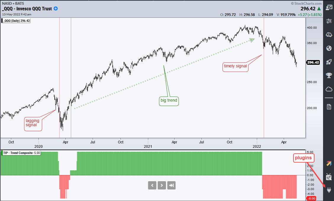
The chart above shows QQQ with just three signals over this same timeframe. The bearish signal in March 2020 did not catch the top and the bullish signal in May 2020 did not catch the bottom. Even so, the bullish signal in May 2020 lasted until January 2022 and caught a monster trend. Trend-following is built on the assumption that a few good trends (profits) will pay for the losses over time.
The focus at TrendInvestorPro remains on select commodity-related ETFs and defensive ETFs because these are still in uptrends (energy, agriculture, staples, utilities). The Composite Breadth Model has been bearish for a month and most stock-related ETFs in our trend-signal table are in downtrends. Click here for immediate access to the breadth model and trend signal table.
In this week's Next Level Charting video (here), I reviewed the Market Regime using the Composite Breadth Model and yield spreads. I also showed what the "stink" bid might look like when using the percentage of S&P 500 stocks above the 200-day SMA.
The Trend Composite, Momentum Composite, ATR Trailing Stop and eight other indicators are part of the TIP Indicator Edge Plugin for StockCharts ACP. Click here to take your analysis process to the next level.
---------------------------------------
|
| READ ONLINE → |
|
|
|
| ChartWatchers |
| Tech Tries To Thrust |
| by Greg Schnell |
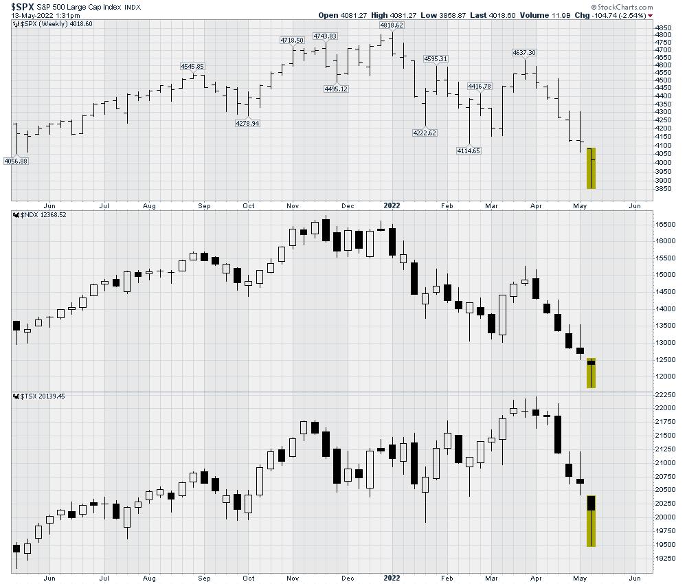
Tech shares have been pounded for the last 6 months after making their highs in November. This week, we saw some significant lows. The Nas-dawg 100 was down 30%. That's not 30% of the gains since 2020 -- that's 30% of the whole price. That is a massive haircut. Perhaps the move on Friday marks a move for Tech trying to thrust higher.
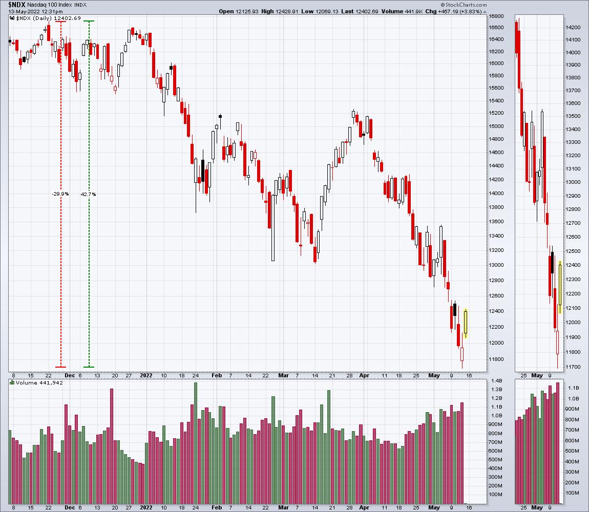
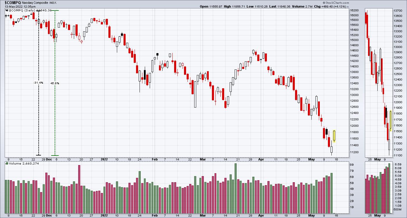
Looking at the Nasdaq Composite, it is similar, but the broader Nasdaq is where a lot of the massive damage was done. Because the companies were so small, it didn't really damage the Index more than the Nasdaq 100. The reason is the indexes are market cap-weighted. That means that, the more the shares are worth of a company, the bigger the weighting in the index. Although companies like PTON, ZM, LSPD have had drops way bigger than 30%, their weighting in the index was not as big.
The $SPX represents 500 large companies as a broad index across all the sectors. As tech was hit the hardest, the blow was softened by owning a broader index. The $SPX only fell 20%. While that is still painful, the Nasdaq 100 drop was 50% more painful. The percentages can get confusing, but the bottom line is that the Nasdaq composite was where the majority of pain was felt. The Nasdaq 100 was a little better, while the $SPX was significantly better but still down 20%.
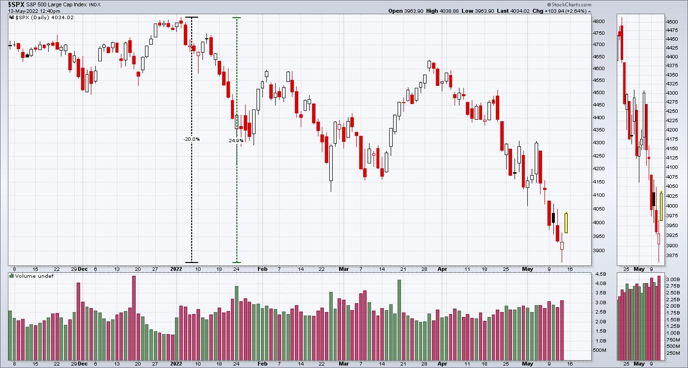
However, on each of the charts above, you'll notice two dotted columns. The black column is how much the market dropped. The green column is how much of a gain we need to get back to the highs again.
- $SPX - 25%
- $NDX - 42%
- $COMPQ - 45%
So, being in a damaged area of the market is definitely a problem and a lot harder to get back to the previous highs. With all that said, the market was very resilient in the face of negative news this week. Price is going out near the highs of the week which is a big change.
Still need to be cautious, but the 30% pullback is massive, and a rally even halfway back to the highs would be a wonderful gain. For more information on trading when we have the wind at our back, check out OspreyStrategic.org. We do have a trial package at $7 for the first month to see if you like it.
|
| READ ONLINE → |
|
|
|
| Martin Pring's Market Roundup |
| Bitcoin Bubble Finally Bursts |
| by Martin Pring |
I have written two articles about Bitcoin in recent months. The first, last December, concluded that "there are definitely some cracks appearing (in the technical structure), but a shrinking consensus of evidence continues to point to an uptrend." The second, entitled "Has the Bitcoin Bubble Burst", noted things had continued to deteriorate, but the puzzle still had some missing pieces. Yesterday's drop completed the puzzle and met the benchmarks I laid out. It seems to me the technical evidence now proves beyond a reasonable doubt that the Bitcoin bubble has indeed burst. Since this is such an important technical event, I'll quickly recap the negative evidence that was available last month and wrap up with the updated benchmark violations.
Bitcoin Momentum
It's my belief that markets are driven by one thing and one thing only: the attitude of market participants to the emerging fundamentals. That psychology can be monitored using sentiment indicators, but these are principally related to short-term market movements and are not available for all markets. On the other hand, momentum indicators, such as a rate of change, can be applied to any data set and time frame and reflects psychological mood swings just as accurately.
One technique that helps identify bubble peaks involves the observation of an 18-month ROC to see when, following a lengthy advance, it reaches the 200% level and then reverses. A reading north of 200% is important because it indicates a doubling in price over a period of a year and a half. Research shows that this is a very rare occurrence. For example, the very volatile copper price has only achieved it once, in the 1970s. The S&P has never touched 200%, not even in 1929. The highest peak for any commodity, currency or stock market (not stocks) that I have ever observed was 500% for silver in 1980. My studies, covering 30+ examples spread over centuries of data, indicate that, after the ROC peaks above 200%, it has taken an average of 20 years to regain the bubble high, as shown in Table 1.
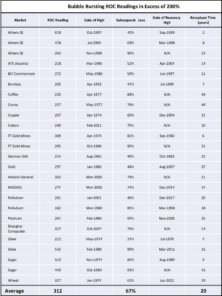 Table 1 Table 1
Genuine bubbles, as defined by this approach, take many years to form, as they need to be preceded by a multi-year advance extending at least four years, subsequently culminating in a 200% 18-month ROC reading. That means that the 2017 Bitcoin record breaking 2,000% peak, being preceded by only 2-3-years of publicly recorded data, is not long enough to establish a bubble path. It falls more in the category of what we call a momentum thrust, which comes off a major bottom rather than capping a multi-year advance. Momentum thrusts are therefore very bullish long-term.
Chart 1 shows that the ROC bottomed in 2020. The two 2021 highs clocked in at a remarkable 600%. They only look subdued in the chart because of the record-high 2017 reading. Note also that both price and momentum are below their respective MAs. More important is the fact that the ROC has recently dropped below its up trendline, thereby confirming beyond a reasonable doubt that a momentum reversal has taken place.
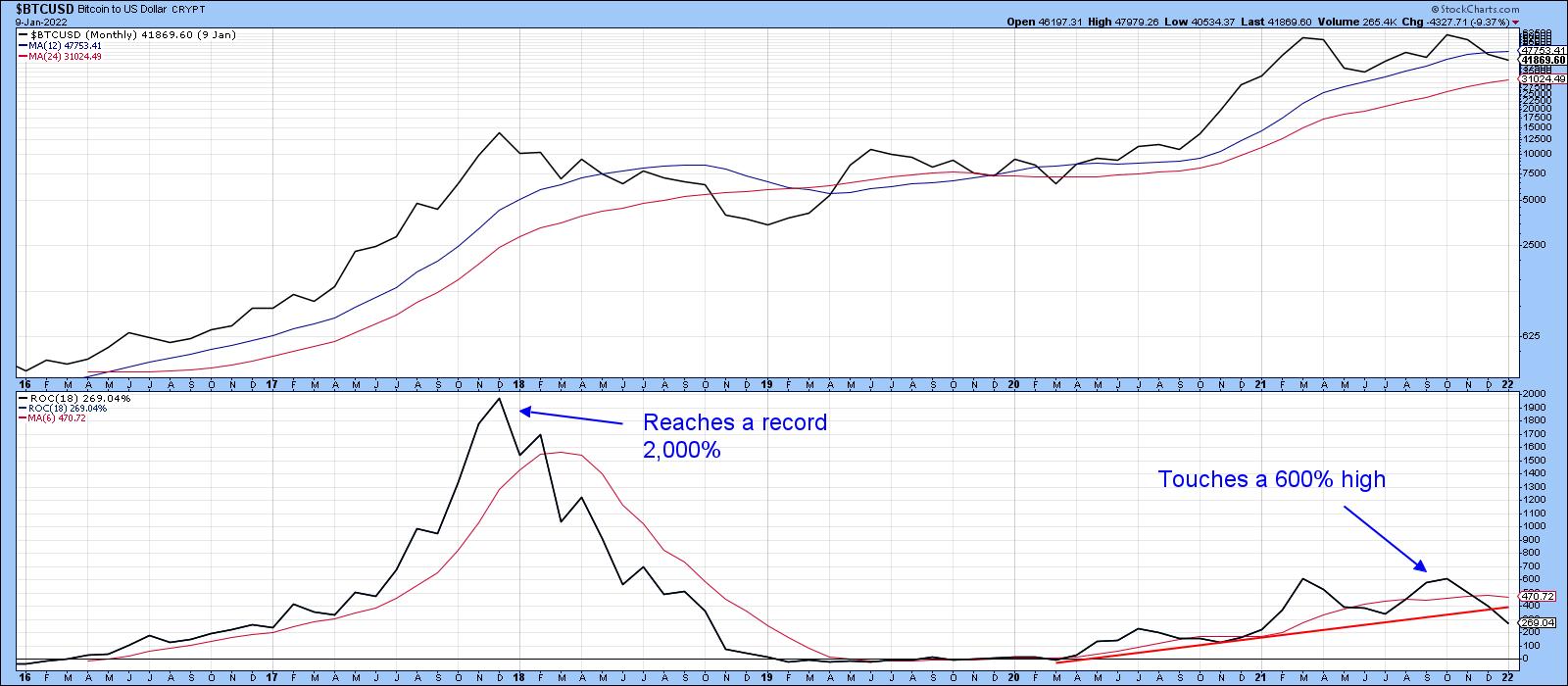 Chart 1 Chart 1
Recent Price Action
Chart 2 shows that the price dropped below its 600-day MA in late April. The arrows show that, up until last week, the series of rising peaks and troughs was still intact. However, Monday's action took out the January low around $35,000, thereby confirming that a series of declining peaks and troughs is now underway.
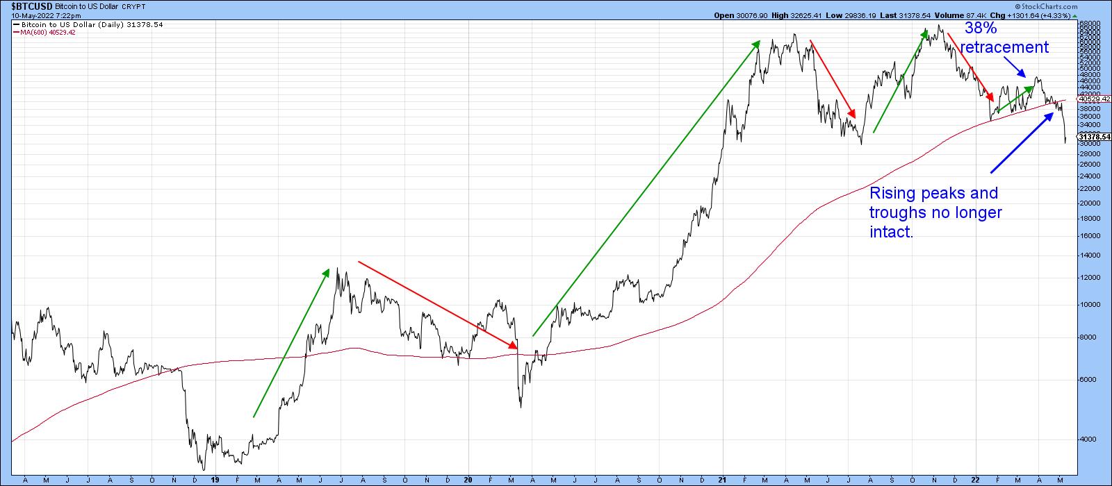 Chart 2 Chart 2
Chart 3 tells us that Bitcoin is now experiencing a trend of under-performance against commodities and stocks. Both relationships have recently broken down from important tops. Prior to that, Bitcoin was outperforming just about everything else.
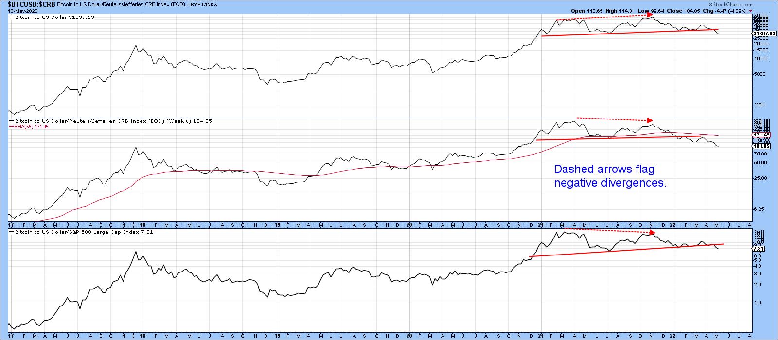 Chart 3 Chart 3
Finally, Chart 4 indicates the price has now completed a head-and-shoulders top with a minimum ultimate downside objective of $22,000. Interestingly, a double objective count indicates substantial support in the area of the 2019 and 2020 rally highs, just below $12,000. To be clear, this is not meant as a prediction, but more as a statement of possibilities.
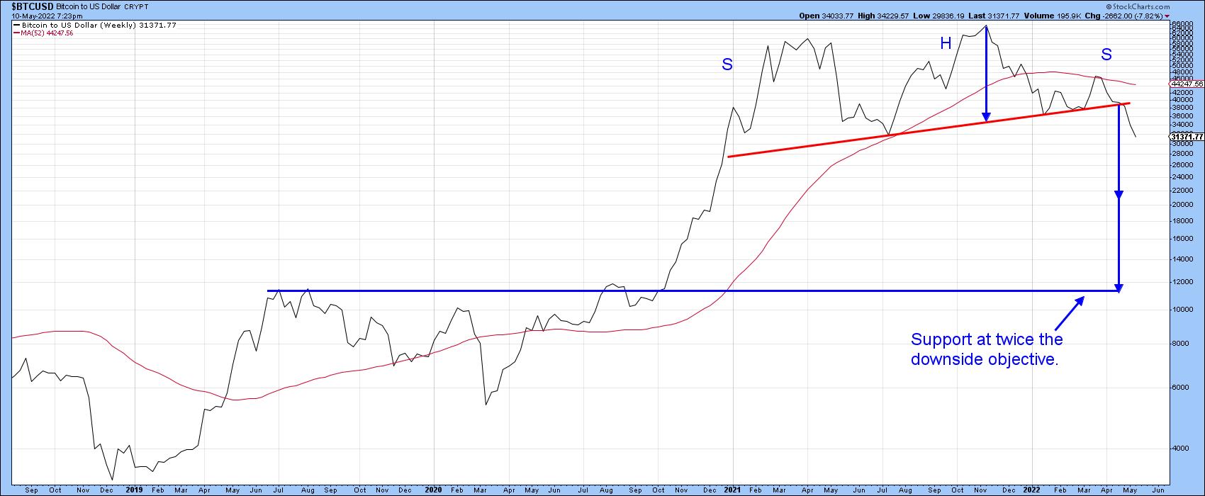 Chart 4 Chart 4
The price has already sunk from a $68,000 high to a recent $30,000. That's an awfully large drop. However, in the history of punctured bubbles, it's not that much. The price will undoubtedly continue to zig and zag and a relief rally is overdue. However, with easy money no longer available, watch out below, as there are likely to be a substantial number of Warren Buffet's naked and fraudulent swimmers yet to be exposed.
Good luck and good charting,
Martin J. Pring
The views expressed in this article are those of the author and do not necessarily reflect the position or opinion of Pring Turner Capital Group of Walnut Creek or its affiliates.
|
| READ ONLINE → |
|
|
|
|
|
| ChartWatchers |
| Great Rally But Lacked Conviction |
| by Carl Swenlin, Erin Swenlin |
The following is a complimentary copy of Friday's subscriber-only DP Weekly Wrap. Want this content in your email box every market day? Subscribe to the DP Alert without delay!
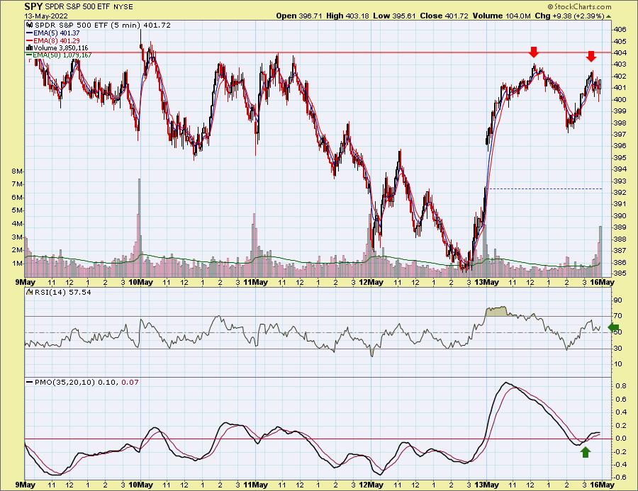
It was a volatile trading week, with investors breathing a sigh of relief on today's positive close. However, today's rally didn't prevent a negative close on the week. Looking at the 10-minute candlestick chart of trading this week, we see a possible double-top bearish chart pattern developing. Yet the RSI remains positive, and we did see a 5-minute PMO crossover BUY signal that intimates a follow-through on today's rally. The price pattern is the big problem. Volume was also a problem, as you'll see on the SPY charts.

The DecisionPoint Alert Weekly Wrap presents an end-of-week assessment of the trend and condition of the Stock Market, the U.S. Dollar, Gold, Crude Oil and Bonds. The DecisionPoint Alert daily report (Monday through Thursday) is abbreviated and gives updates on the Weekly Wrap assessments.
Watch the latest episode of DecisionPoint on StockChartsTV YouTube channel here!
MAJOR MARKET INDEXES
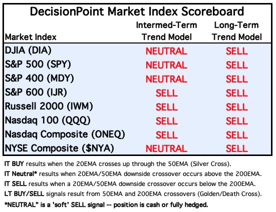
For today: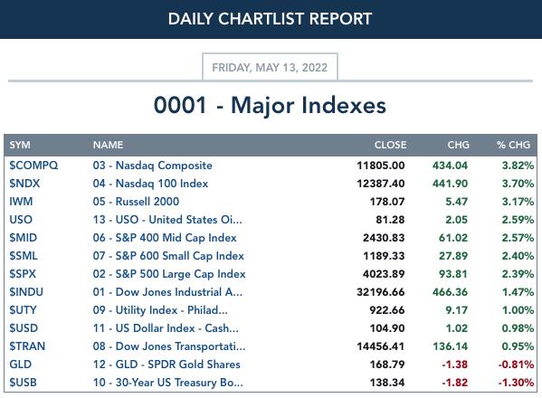
For the week: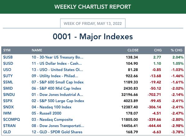
SECTORS
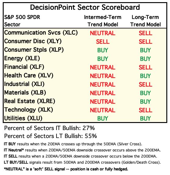
Each S&P 500 Index component stock is assigned to one of 11 major sectors. This is a snapshot of the Intermediate-Term (Silver Cross) and Long-Term (Golden Cross) Trend Model signal status for those sectors.
For today: 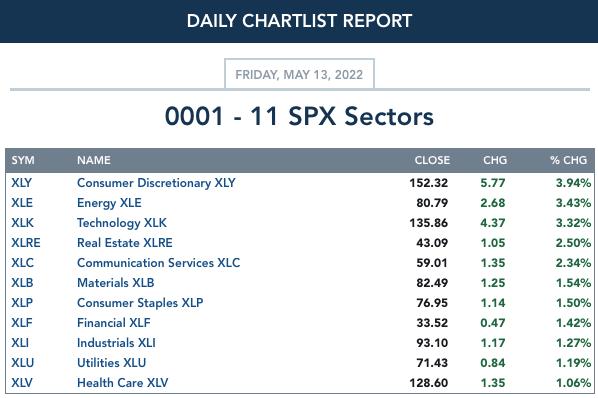
For the week: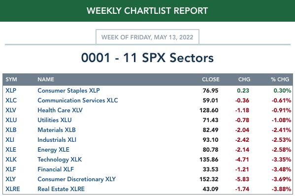
RRG® Weekly Chart ($ONE Benchmark):
$ONE is the current benchmark on the RRGs:
It occurred to Carl and I that using the SPY as a benchmark is useless right now. The SPY is in a bear market, so sectors could be moving lower but still outperform the SPY. One way to get around this problem is to use $ONE as the benchmark. By using $ONE, you get to see ACTUAL performance in relation to other sectors. The picture is completely different, but far more accurate. We have decided to only use the $ONE Weekly version of the RRG. I believe it is more accurate as to the market environment.
The weekly RRG hasn't been changing much, which we actually appreciate. Readers had mentioned that the daily RRGs were very jumpy, and we believe, along with them, that it is somewhat misleading.
There are three sectors in the Leading quadrant: XLB, XLV and XLU. All of them have bearish southwest headings, so they are getting relatively weak. The closer they are to the center point, the closer they get to "no change" in performance. Of the three, XLU is the best given its distance from the center point, despite its bearish southwest heading. Still, not a sector we would want to join, as its performance is deteriorating, not getting stronger.
XLRE is in the Improving quadrant, but has a bearish southwest heading. It is also near the center of the graph. Performance is waning.
XLE (the Sector to Watch) as well as XLP (the runner up) are in the Weakening quadrant. XLP is headed for the center of the graph, but also toward Leading. XLE doesn't look as appetizing, given its southward descent into the Weakening quadrant, but it is far from the center point, which is good. However, a look at the sector chart suggests it is gaining participation again.
All other sectors are in the Lagging quadrant, with bearish southwest headings for all except XLF, which has a northwest heading. XLF looks slightly better than the rest, as it is pointed toward the Improving quadrant; however, it has a LONG way to go before it gets there and its underperformance has been damaging, given its bearish location in the Lagging quadrant.
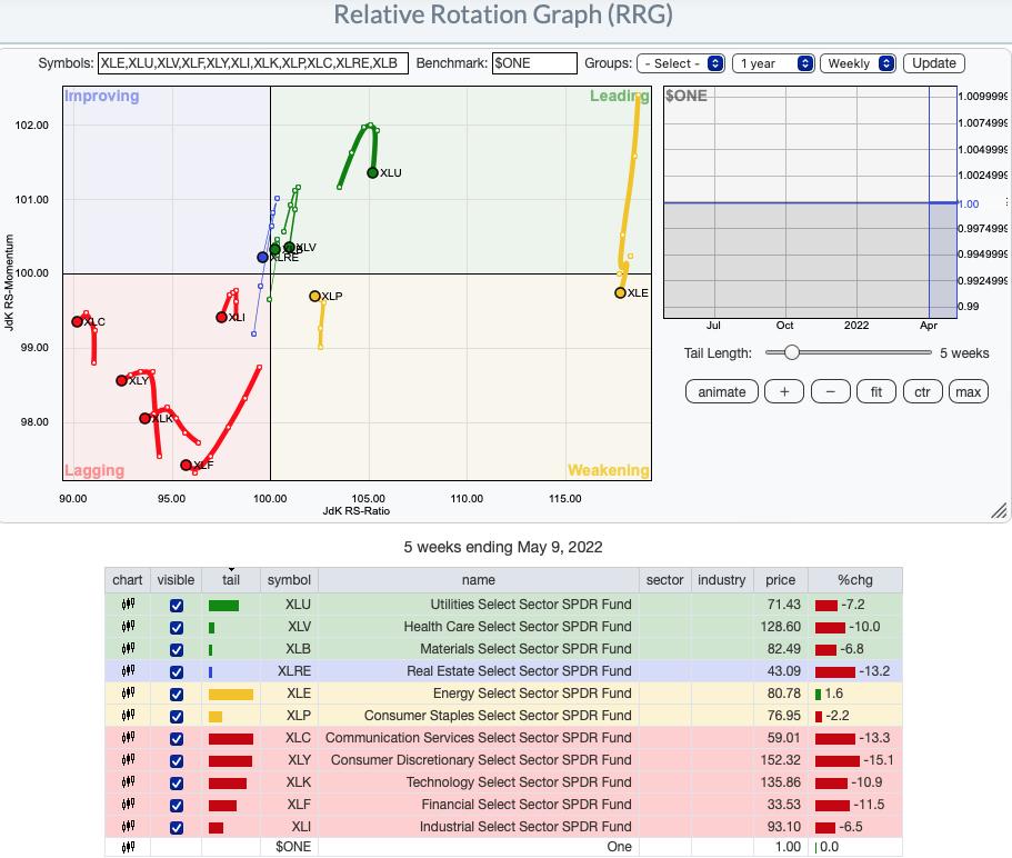
RRG® charts show you the relative strength and momentum for a group of stocks. Stocks with strong relative strength and momentum appear in the green Leading quadrant. As relative momentum fades, they typically move into the yellow Weakening quadrant. If relative strength then fades, they move into the red Lagging quadrant. Finally, when momentum starts to pick up again, they shift into the blue Improving quadrant.
CLICK HERE for an animated version of the RRG chart.
CLICK HERE for Carl's annotated Sector charts.
THE MARKET (S&P 500)
IT Trend Model: NEUTRAL as of 1/21/2022
LT Trend Model: BUY as of 6/8/2020
SPY Daily Chart: The short-term falling wedge resolved to the upside, as expected. However, we now have a declining trend channel based on the new price bottom. Notice that Total Volume was only just above its annual average on a big gap up rally. Why is this a problem? On a big gap up rally day, we want to see high volume. It confirms investor conviction.
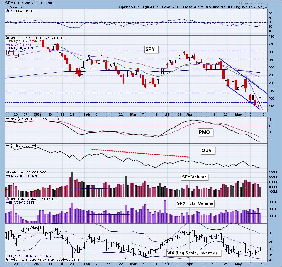
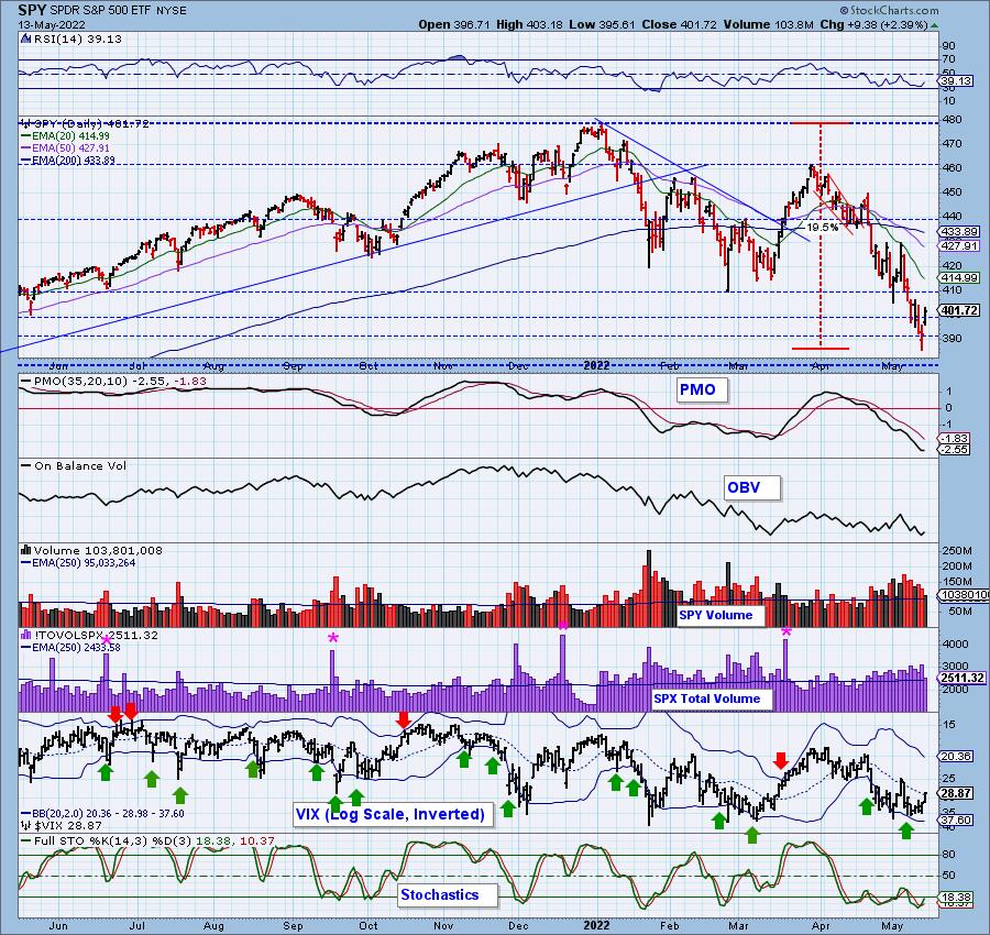
Today's rally did improve the indicators. The RSI is now rising, although it remains in negative territory below net neutral (50). Stochastics are similarly configured. The PMO is turning back up in oversold territory. The VIX finished above its moving average on our inverted scale, which is encouraging.
 DON'T DELAY! IT'S FREE! DON'T DELAY! IT'S FREE!
Latest Recording:
Topic: DecisionPoint Trading Room
Start Time: May 9, 2022 08:59 AM
Meeting Recording Link.
Access Passcode: May#on9th
For best results, copy and paste the access code to avoid typos.
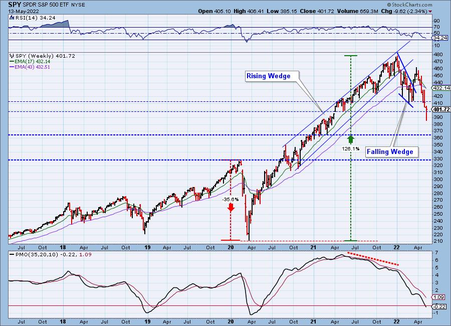
SPY Weekly Chart: Price closed the earlier gap formed at the end of the first quarter. Typically, when a gap is filled, you will see follow-through. In this case, a gap closure to the downside implies more downside. The next area of somewhat strong support for the SPY is $365, but the strongest support lies at $330. Two months ago, when we were discussing a drop to $410, folks thought we were being too bearish. Now we're off to $365. Hope we're wrong, but the weekly RSI is negative and falling and the weekly PMO has hit negative territory. This has been the signal that a bottom is close (2018 bottom and 2020 bottom). Time to watch for a reversal on the weekly PMO.
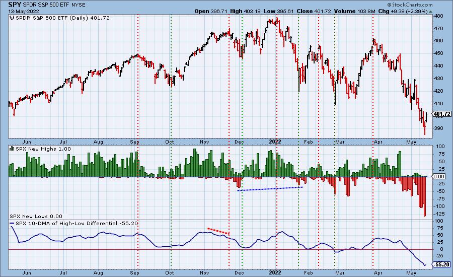
New 52-Week Highs/Lows: To clarify, there were zero SPX New Lows and only one SPX New Highs. New Lows hit oversold territory yesterday. We saw a broad rally, and the lack of New Lows today confirms that. The 10-DMA of the High-Low Differential ticked up today.
Climax Analysis: There were solid climax readings on all indicators today, giving us an upside initiation climax. The problem is that SPX Total Volume contracted considerably on the upside breakout, making meaningful follow through next week less likely. Naturally, Monday's open will be enormously informative in this regard.
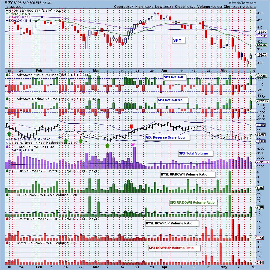
*A climax is a one-day event when market action generates very high readings in (primarily) breadth and volume indicators. We also include the VIX, watching for it to penetrate outside the Bollinger Band envelope. The vertical dotted lines mark climax days -- red for downside climaxes, green for upside. Climaxes are, at their core exhaustion events; however, at price pivots, they can be seen to be initiating a change of trend.
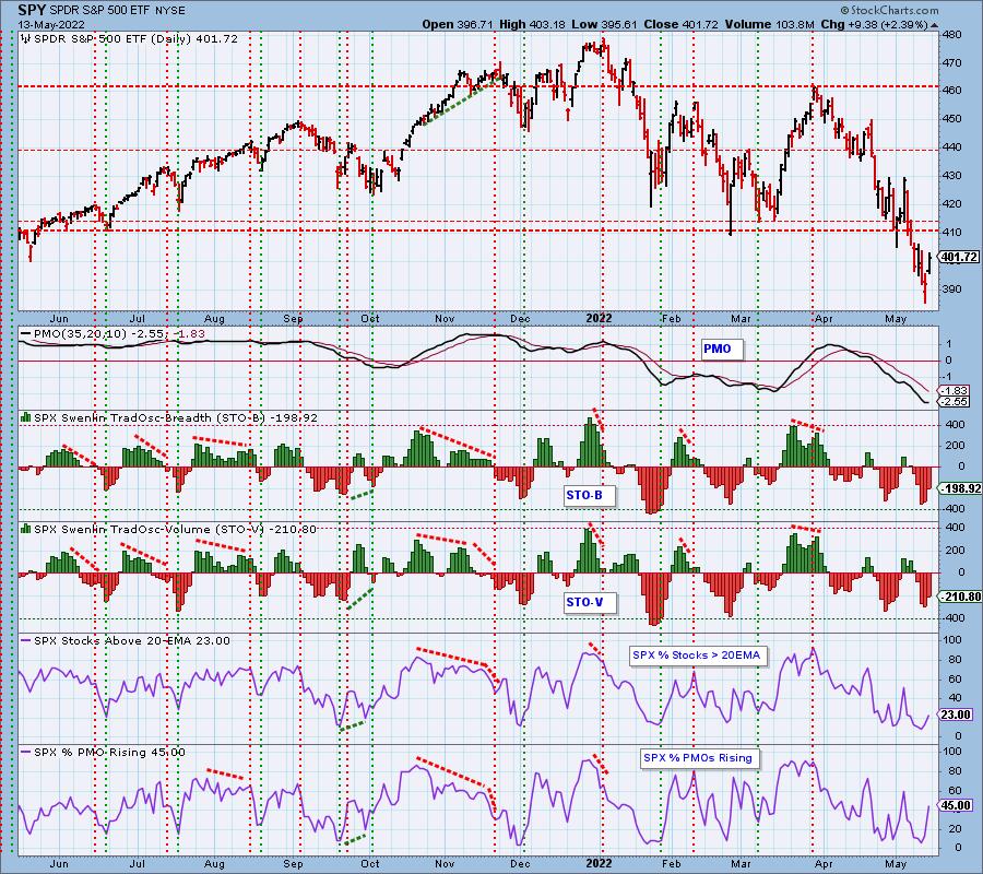
Short-Term Market Indicators: The short-term market trend is DOWN and the condition is OVERSOLD.
We saw STOs contract today, which bodes well for follow-through. Rising momentum is building back up within the index as well, but is still showing less than half the SPX with positive momentum.
Intermediate-Term Market Indicators: The intermediate-term market trend is DOWN and the condition is OVERSOLD.
The ITBM/ITVM contracted today as well. We saw this the last time we had a brief rally, but the rally failed quickly, keeping the steep declining trend intact. While these indicators are oversold, they aren't as oversold as they were at the 2020 bear market bottom.
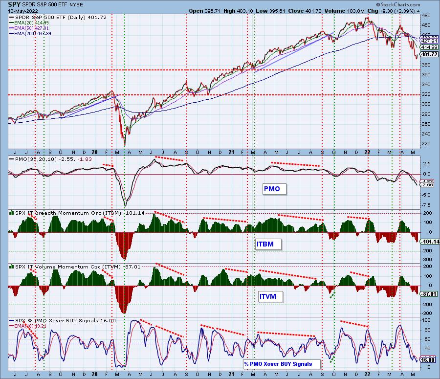
PARTICIPATION and BIAS Assessment: The following chart objectively shows the depth and trend of participation in two time frames.
- Intermediate-Term - the Silver Cross Index (SCI) shows the percentage of SPX stocks on IT Trend Model BUY signals (20-EMA > 50-EMA). The opposite of the Silver Cross is a "Dark Cross" -- those stocks are, at the very least, in a correction.
- Long-Term - the Golden Cross Index (GCI) shows the percentage of SPX stocks on LT Trend Model BUY signals (50-EMA > 200-EMA). The opposite of a Golden Cross is the "Death Cross" -- those stocks are in a bear market.
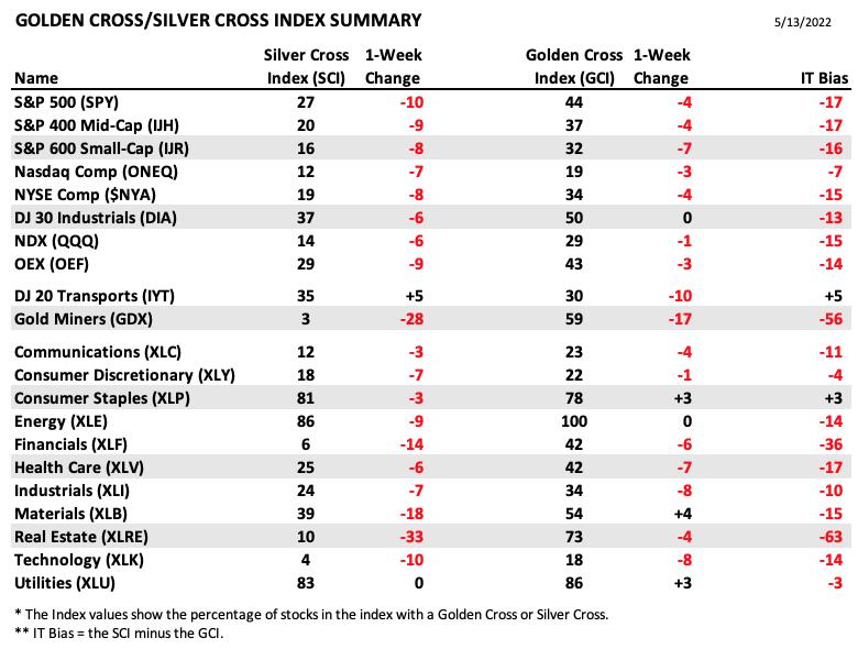
The following table summarizes participation for the major market indexes and sectors. The 1-Week Change columns inject a dynamic aspect to the presentation.
The one-week change for the SCIs and GCIs showed further erosion, and the IT Bias remains strongly bearish.
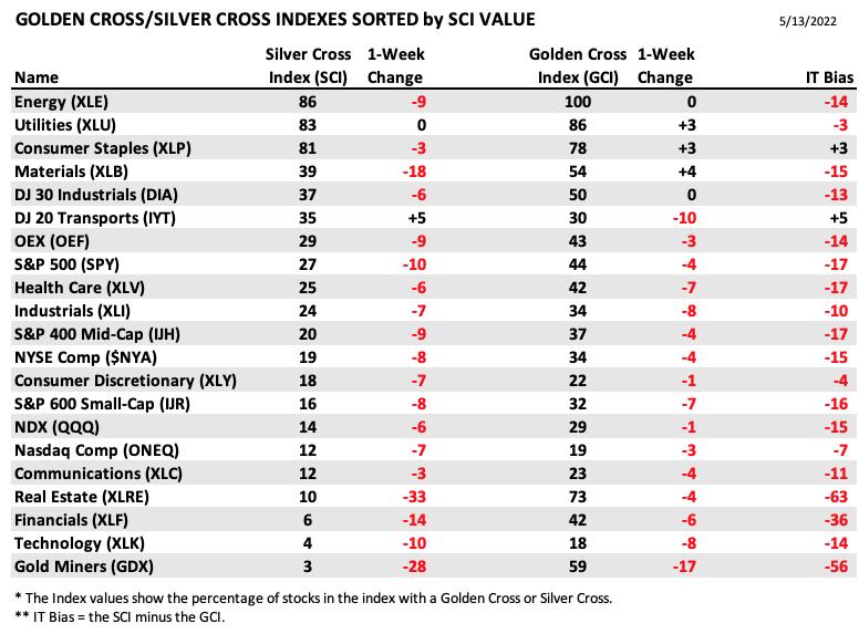
This table is sorted by SCI values. This gives a clear picture of strongest-to-weakest index/sector in terms of participation. Only three of 21 SCI indexes are 50 or above (bullish), the rest are below 40 (bearish). Five of the GCI indexes are 50 of above (bullish); the rest are 30 or below (bearish).
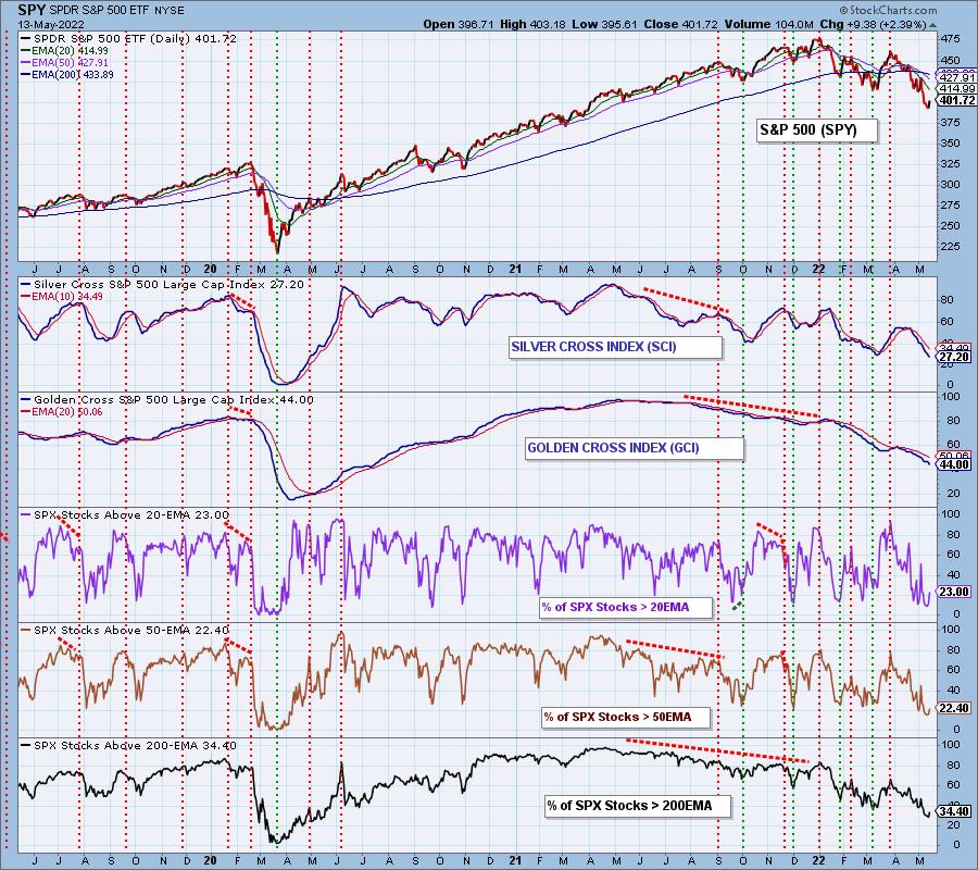
Participation across nearly all the market and sector indexes we follow is solidly bearish, as is the IT Bias. These indicators are quite oversold, and we could get a bounce out of that condition; however, we think we're headed for conditions that look more like what we saw at the 2020 bottom.
CONCLUSION: The rally was strong and broad today, but it wasn't enough to erase the losses for the week. We saw an upside initiation climax, but it wasn't accompanied by strong Total Volume, which implies investors are still tentative about reentering the market. The only sector that finished higher this week was the defensive Consumer Staples (XLP) sector. This further suggests traders' reservations. Indicators are oversold and some have turned higher, so follow-through seems likely next week. We must remember that indicators, while oversold are nowhere near the levels we saw at the 2018 and 2020 lows, so we would continue to exercise extreme caution.
Calendar: Next week is options expiration, so we should expect low volatility toward the end of the week.
Have you subscribed the DecisionPoint Diamonds yet? DP does the work for you by providing handpicked stocks/ETFs from exclusive DP scans! Add it with a discount! Contact support@decisionpoint.com for more information!
BITCOIN
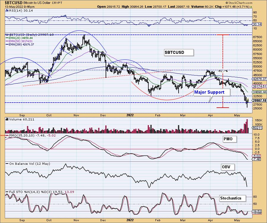
Bitcoin lost major long-term support this week, but is currently righting the ship. Next up is overhead resistance at $32,500, followed by the 20-day EMA. The RSI and Stochastics are oversold and rising. The PMO is attempting to turn back up.
This is a defining moment for Bitcoin. A loss of this support level could trigger more losses with a downside target down at $10,000. Hard to imagine, but who would've thought that, in six months, Bitcoin would be at $27,500 (other than us)?
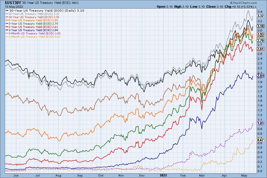
INTEREST RATES
Yields dropped this week, but are resuming their march higher.
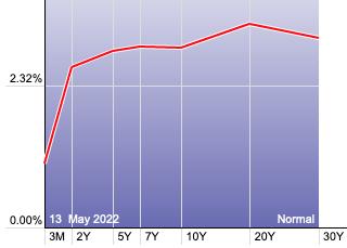
The Yield Curve Chart from StockCharts.com shows us the inversions taking place. The red line should move higher from left to right. Inversions are occurring where it moves downward.
10-YEAR T-BOND YIELD
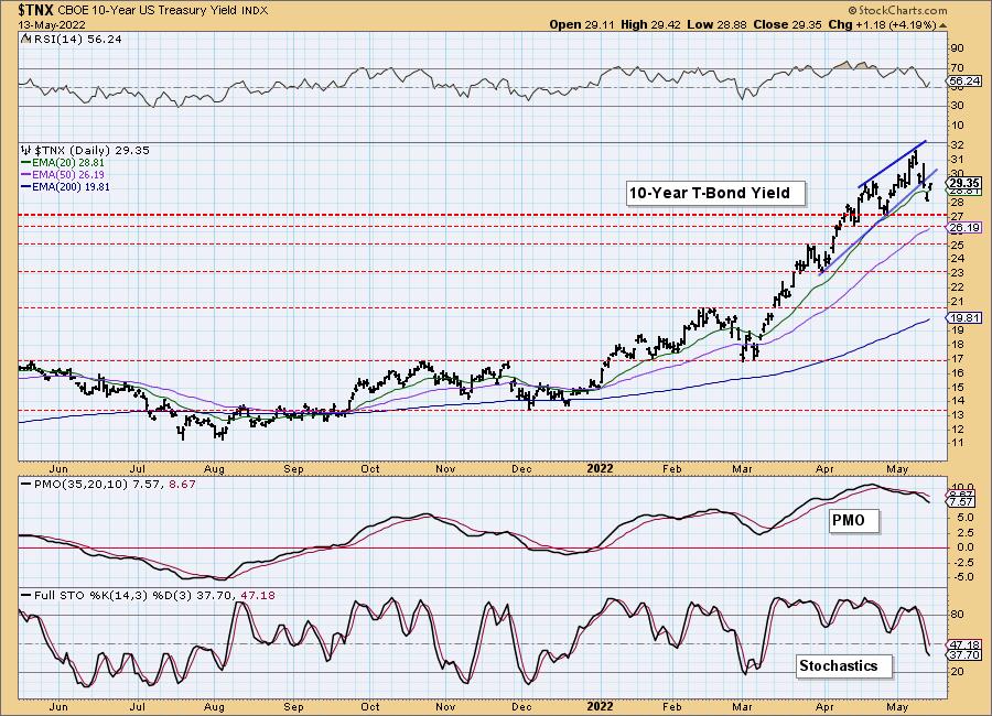
$TNX confirmed the bearish rising wedge chart pattern with a breakdown. Indicators moved south quickly, but the RSI is already firming up again above net neutral (50). The PMO and Stochastics are still bearish, so a test of 2.7% isn't out of the question.
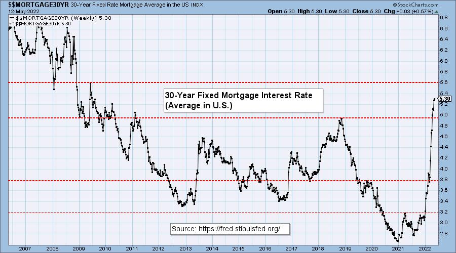
MORTGAGE INTEREST RATES (30-Yr)**
**We watch the 30-Year Fixed Mortgage Interest Rate because, for the most part, people buy homes based upon the maximum monthly payment they can afford. As rates rise, a fixed monthly payment will carry a smaller mortgage amount. As buying power shrinks, home prices will come under pressure.
This week, the 30-Year Fixed Rate increased from 5.27 to 5.30.

DOLLAR (UUP)
IT Trend Model: BUY as of 6/22/2021
LT Trend Model: BUY as of 8/19/2021
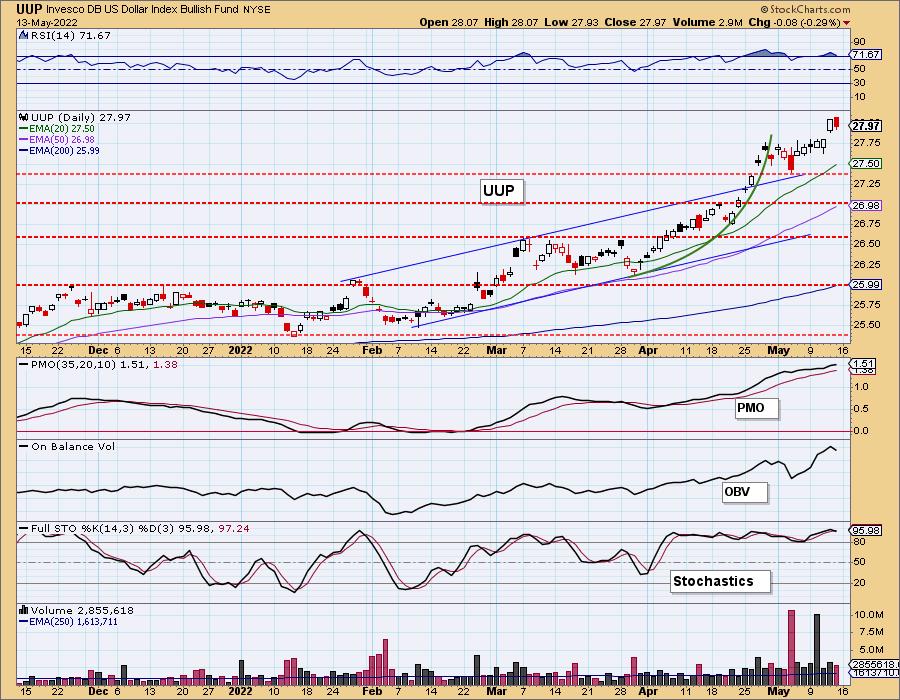
UUP Daily Chart: The Dollar fell slightly today, but ended with a higher low and higher high. The RSI and PMO are very overbought, so consolidation would be helpful to relieve these conditions. Stochastics are strong. Consolidation seems more likely than a deep decline.
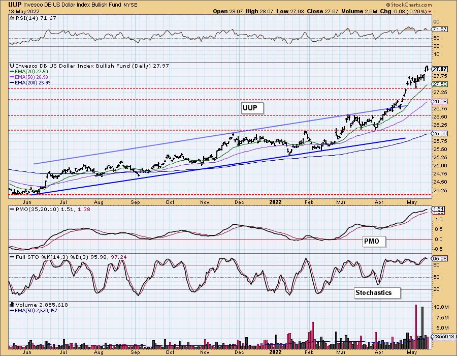
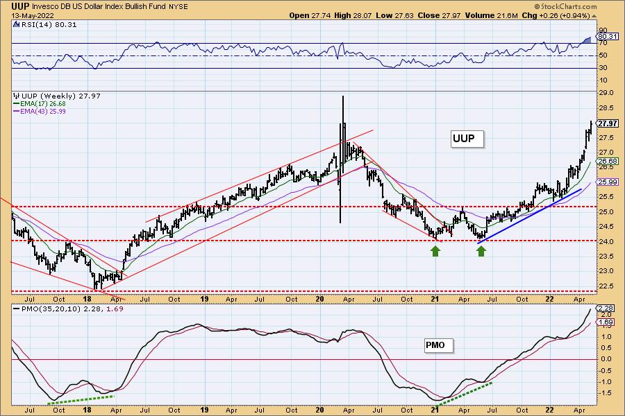
UUP Weekly Chart: UUP is rising parabolically. Those rising trends are destined to be broken quickly and painfully. However, under the current global conditions, the Dollar is in favor. Overhead resistance doesn't arrive until $29.
GOLD
IT Trend Model: BUY as of 5/3/2022
LT Trend Model: BUY as of 1/12/2022
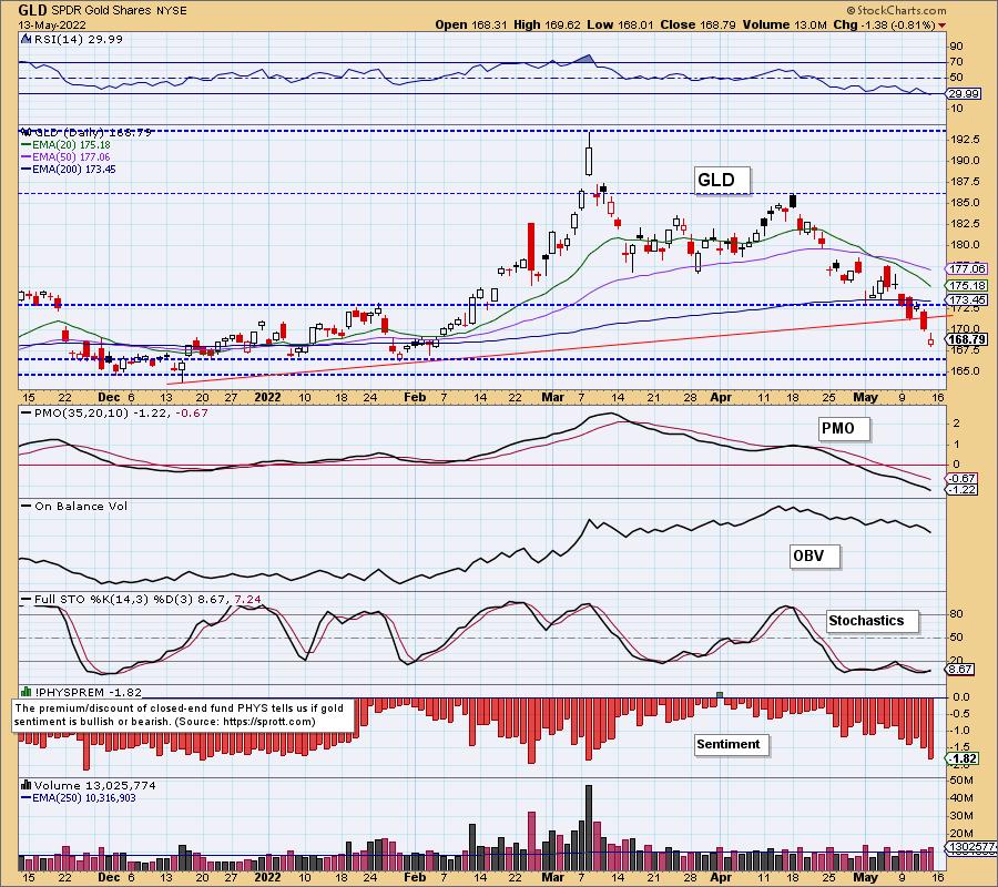
GOLD Daily Chart: With the Dollar rising exponentially, Gold has been hard. GLD is now reaching strong support at $165.
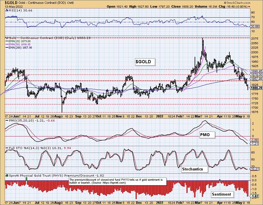
On the one-year daily chart of $GOLD, we see a falling PMO with negative RSI and Stochastics. The strongest level of support for $GOLD lies at $1750. Sentiment is very bearish, given the expansion in discounts, but are still not at bearish extremes.
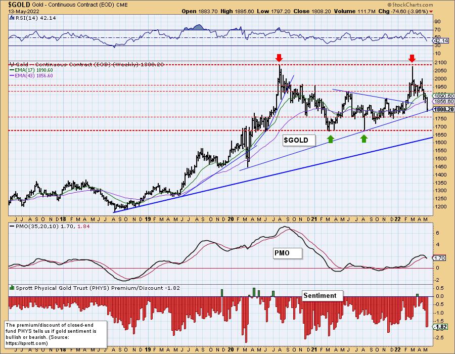
GOLD Weekly Chart: The weekly PMO triggered a crossover SELL signal signal just as price settled on the intermediate-term rising bottoms trendline. We believe that rising trend will be broken. The long-term rising bottoms trendline should hold, as it will intersect with support at $1700.
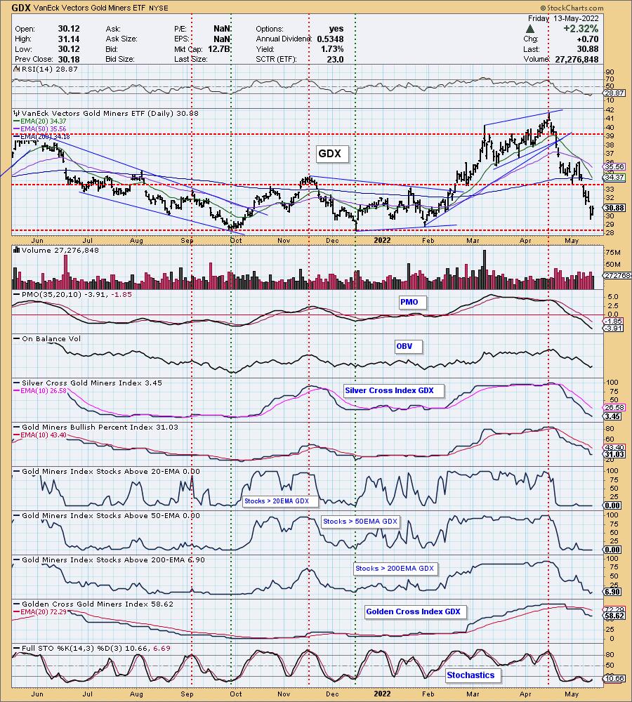
GOLD MINERS Golden and Silver Cross Indexes: Gold Miners rebounded today, but haven't hit strong support yet. The PMO is still falling and participation didn't improve much. With Gold likely continuing its slide next week, we would expect GDX to test support at $28.50.
CRUDE OIL (USO)
IT Trend Model: BUY as of 1/3/2022
LT Trend Model: BUY as of 3/9/2021
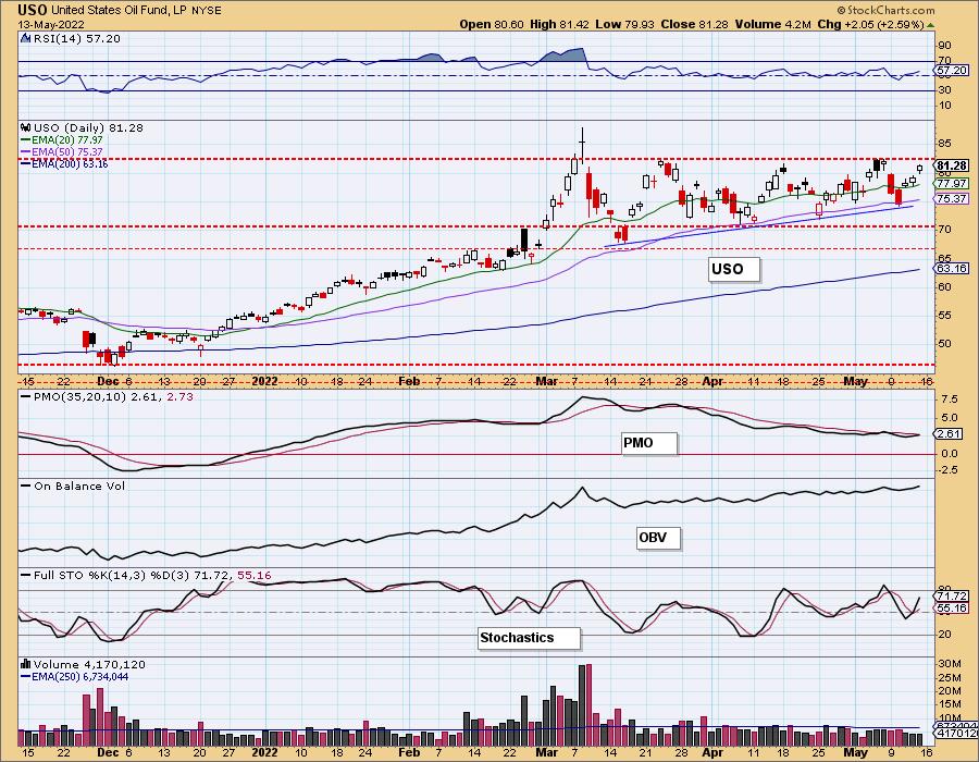
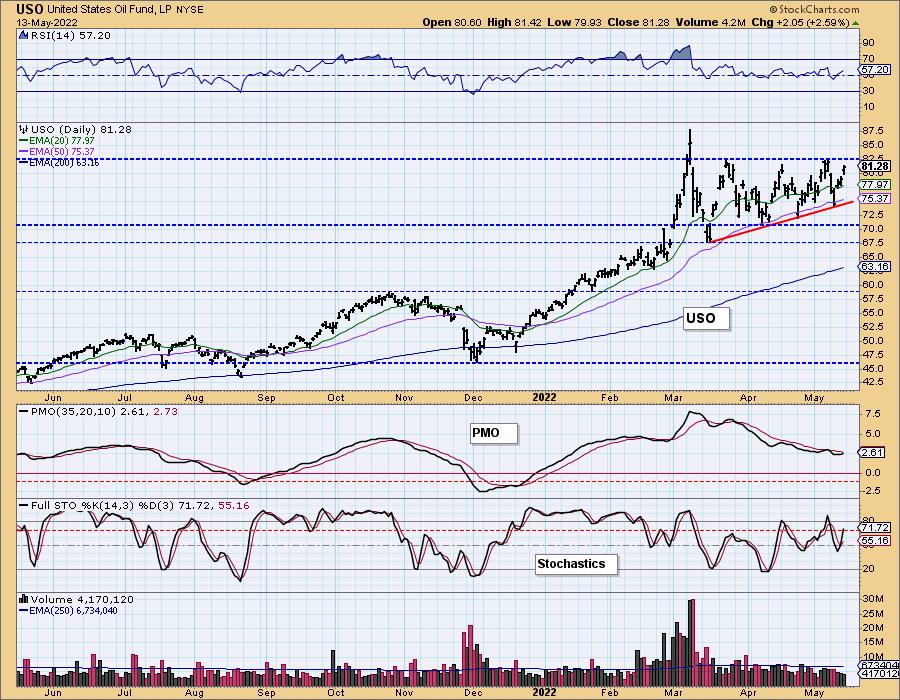
USO Daily Chart: The ascending triangle on USO is intriguing, as it suggests an upside breakout ahead. The PMO is about to give us a crossover BUY signal. The RSI is positive and not overbought. Stochastics are rising strongly after reversing just below net neutral (50). A breakout seems imminent.
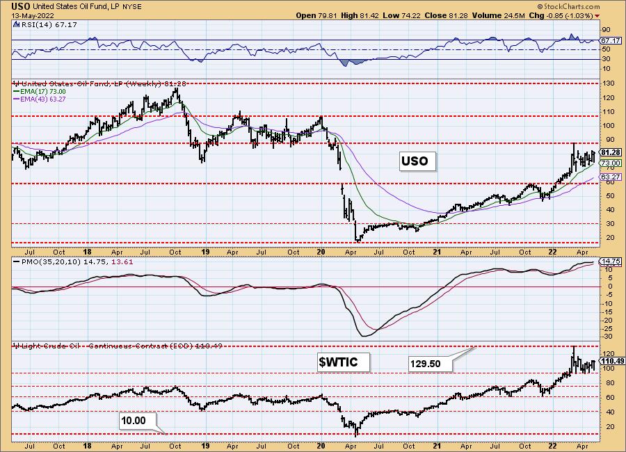
USO/$WTIC Weekly Chart: The weekly PMO is beginning to accelerate higher. The weekly RSI is positive and not quite overbought. We would look for a test of overhead resistance at $90 for USO.
BONDS (TLT)
IT Trend Model: NEUTRAL as of 1/5/2022
LT Trend Model: SELLas of 1/19/2022
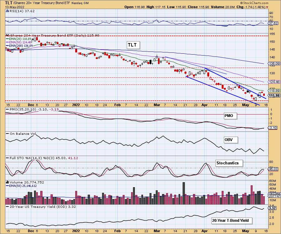
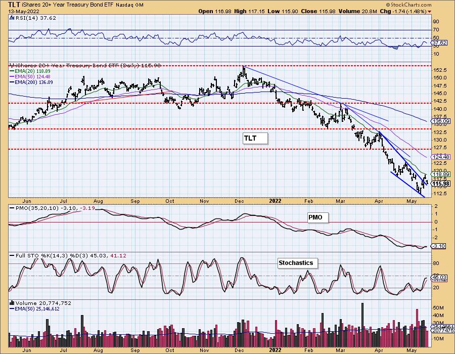
TLT Daily Chart: After breaking out of the bullish falling wedge, price failed to overcome the 20-day EMA. The PMO did trigger a crossover BUY signal, but, given Stochastics and the RSI are topping in negative territory, look for Bonds to continue their slide again.
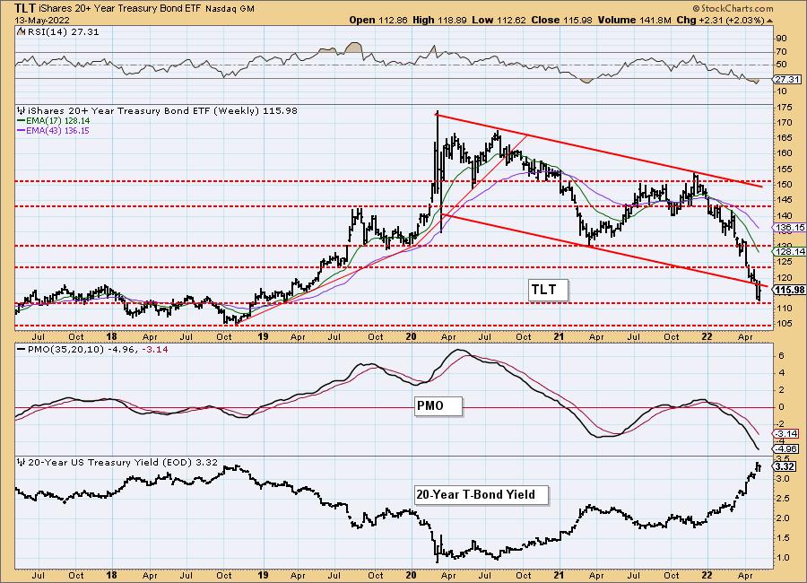
TLT Weekly Chart: Price is breaking down from a declining trend channel on the weekly chart, but it did find support at the 2019 lows. The weekly RSI is rising out of oversold territory, but the PMO is bearishly configured, suggesting a drop to the next support level at $105.
Good Luck & Good Trading!
Carl & Erin Swenlin
Technical Analysis is a windsock, not a crystal ball. --Carl Swenlin
(c) Copyright 2022 DecisionPoint.com
Helpful DecisionPoint Links:
DecisionPoint Alert Chart List
DecisionPoint Golden Cross/Silver Cross Index Chart List
DecisionPoint Sector Chart List
DecisionPoint Chart Gallery
Trend Models
Price Momentum Oscillator (PMO)
On Balance Volume
Swenlin Trading Oscillators (STO-B and STO-V)
ITBM and ITVM
SCTR Ranking
Bear Market Rules
DecisionPoint is not a registered investment advisor. Investment and trading decisions are solely your responsibility. DecisionPoint newsletters, blogs or website materials should NOT be interpreted as a recommendation or solicitation to buy or sell any security or to take any specific action.
|
| READ ONLINE → |
|
|
|
| Dancing with the Trend |
| Bear Markets and Drawdowns - part 2 |
| by Greg Morris |
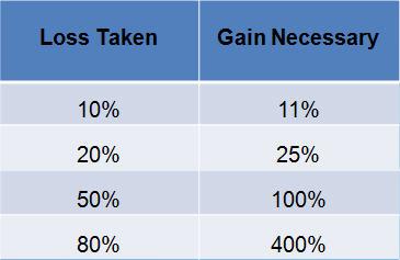 This is a continuation of the previous article. The Dow Jones Industrial Average, also referred to as The Dow by the financial media, is a price-weighted measure of 30 U.S. blue-chip companies. The Dow covers all industries with the exception of transportation and utilities, which are covered by the Dow Jones Transportation Average and Dow Jones Utility Average. While stock selection is not governed by quantitative rules, a stock typically is added to The Dow only if the company has an excellent reputation, demonstrates sustained growth, and is of interest to a large number of investors. Maintaining adequate sector representation within the indexes is also a consideration in the selection process. This is a continuation of the previous article. The Dow Jones Industrial Average, also referred to as The Dow by the financial media, is a price-weighted measure of 30 U.S. blue-chip companies. The Dow covers all industries with the exception of transportation and utilities, which are covered by the Dow Jones Transportation Average and Dow Jones Utility Average. While stock selection is not governed by quantitative rules, a stock typically is added to The Dow only if the company has an excellent reputation, demonstrates sustained growth, and is of interest to a large number of investors. Maintaining adequate sector representation within the indexes is also a consideration in the selection process.
The following data is from the Dow Jones Industrial Average, not adjusted for dividends or inflation, over the period from February 17, 1885 through December 31, 2012.
Note: If you have not read the previous article on Bear Markets and Drawdowns, much of the terminology used here will be easier to understand.
Table A is focused only on the percentage decline of the various drawdowns. The columns in the table are defined as follows:
Drawdown Range – this is the percentage of drawdown decline, it is divided into various ranges which make of the rows in the table. The top row of data is for drawdowns with declines greater than 20% and the bottom row is the data for all drawdowns.
Average Max Drawdown – this is the average of all the drawdowns for the percentage decline in the first column.
Average Days in Decline – this is the average number of market days that the drawdowns were in the decline whose percentage decline is defined by the first column.
Average Months in Drawdown – this is simply a calculation of dividing the average market days in decline by 21, which is the average number of market days per month, which yields calendar months.
Total Days in Decline – this is the sum of all the days the particular decline range was in decline.
Total Months in Decline – this is the total market days in decline divided by 21.
Percentage of time spent in Decline – this is the percentage of time that the declines were in a state of decline based upon the total number of market days for the period of analysis.
Drawdown Decline - Dow Jones Industrial Average
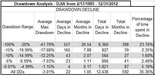 Table A Table A
From Table A you can see that all drawdowns greater than 20%, which are also called bear markets, were in a state of decline for almost 24% (23.76%) of the time, in other words bear market declines accounted for 24% of the total time from 1885 to 2012. The bottom row in the table above shows that all drawdowns, no matter what their magnitude spent over 35% (35.36%) of the time declining.
Drawdown recovery is the term used to define the time spent from when a drawdown bottoms (hits its absolute lowest point and greatest percentage of decline) and completely recovers (gets back up to where the drawdown began). The columns in Table B are similar to the Drawdown Decline table in Table A; I am just discussing the last portion of the drawdown here instead of the first portion.
Drawdown Recovery - Dow Jones Industrial Average
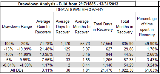 Table B Table B
We can see that Drawdown Recoveries, where the magnitude of the drawdown was greater than 20%, took almost 50% (49.90%) of the total time to recover. Remember that recoveries from declines always take longer than the declines. This is generally defined by the fact that declines (selling) are more emotionally driven so usually are quicker and more abrupt. There is a new column in the Drawdown Recovery table, and it is called Average Gain to Recovery. This is the percentage of gain (recovery) needed to get back to where the drawdown began. This was discussed in more detail in previous article. From the Table B you can see that for drawdowns greater than 20%, on average it takes a gain of over 71% (71.78%) to be get back to even. Remember we are dealing with averages in these tables.
Drawdown duration is shown in Table C; this is the total amount of time that a complete drawdown occurred. The previous two tables dealt with the decline and the recovery, this table is the total of those two.
Drawdown Duration - Dow Jones Industrial Average
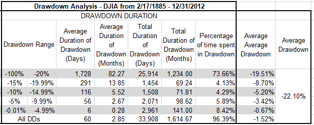 Table C Table C
Drawdowns of greater than 20% averaged 1,728 days, which is over 82 months, or almost 7 years. The total number of days of all drawdowns greater than 20% was 33,908 market days. Now the real eye-catcher in this table is the last row that shows all drawdowns regardless of the percentage decline. It shows that the market from 1885 to 2012 was in a state of drawdown for over 96% (96.39%) of the time. In other words, the market was making new all-time highs less than 4% of the time. Finally, the last column shows the average of all drawdowns at -22.1%.
Chart A shows all drawdowns that were greater than 15%. You can see that for the period from 1927 to 2012, the S&P 500 had 5 drawdowns in the 15 – 19.99% range, 2 in the 20 – 24.99% range, etc., for a total of 20 drawdowns of magnitude greater than 15%.
Distribution of Drawdowns - Dow Jones Industrial Average
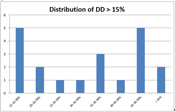 Chart A Chart A
Chart B shows all drawdowns no matter how small. You can see that there were 566 drawdowns, with 496 of them less than 5%. Five percent declines are generally considered just noise and part of the market pricing mechanism. Drawdowns between 5% and 10% are considered pullbacks; there were 37 pullbacks during this period. Corrections are drawdowns between 10% and 20%, you can see that there were 18 (total of 10-14.99% and 15-19.99%). There were 15 drawdowns of 20% or greater. Also notice that Chart A is also reflected in Chart B, just that 3 more distribution percentages were added to the left end.
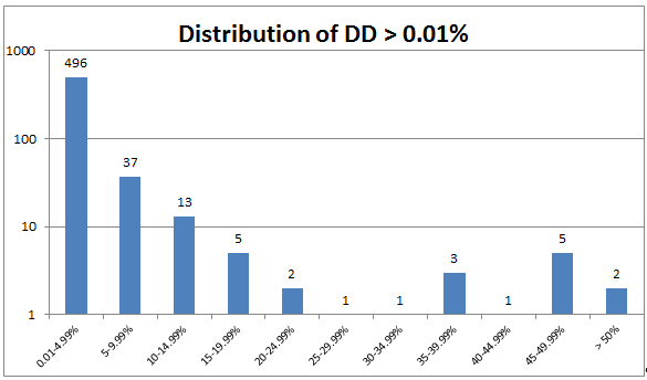 Chart B Chart B
Chart C shows you a visual of all drawdowns during the analysis period. The 1929 Drawdown is clearly exceptional not only in magnitude of decline but also duration; so much so that it skews the visual effect of the remaining drawdowns.
Cumulative Drawdown for Dow Industrials
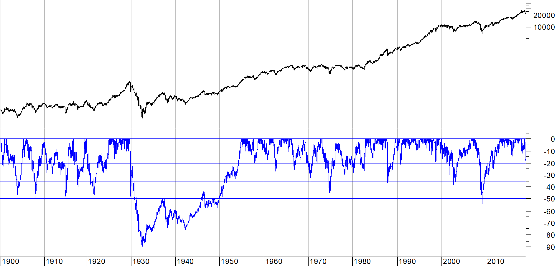 Chart C Chart C
These last two articles on Bear Markets and Drawdowns presented a lot of data. Since I strongly believe that risk is loss of capital which is also drawdown, I feel it necessary that you understand the past history on drawdowns (risk). I rarely use the Dow Industrials for analysis, but it does offer over 30 years more of daily data.
Warning! Sales Pitch to Follow: My book, Investing with the Trend, has data and charts similar to these, but not only just for the price, but also includes data without the bear markets, total return analysis, and much more. Plus it does all that not only for the Dow Industrials, but also the S&P 500, Gold, Japan's Nikkei 225, Copper. Pick up a copy, I need a new set of golf clubs. Thanks.
Dance with the Trend,
Greg Morris
|
| READ ONLINE → |
|
|
|
| ChartWatchers |
| Is There Any Hope for the Beaten Down Stocks? |
| by John Hopkins |
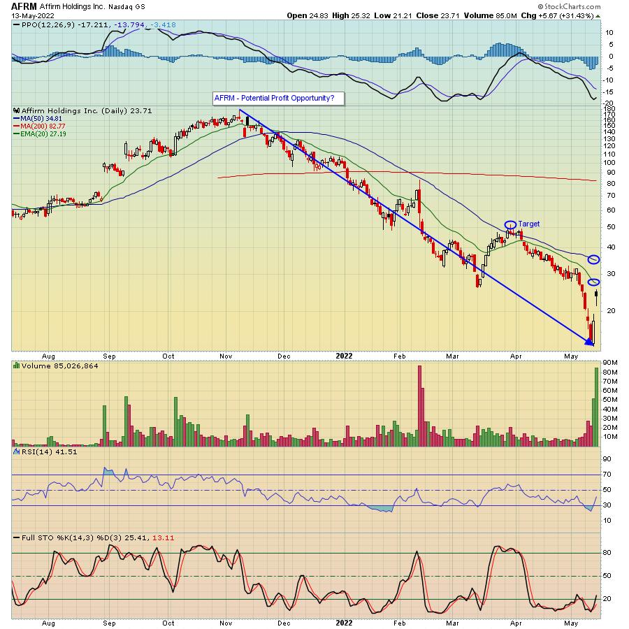
The carnage in the market, which has resulted from the 30% decline in the NASDAQ since its November 22, 2021 high, is going to be remembered for a long time, especially by those who painfully held on to stocks that, in some cases, fell 50% or more from their all-time highs. A prime example is Affirm Holdings (AFRM), a company whose stock has been completely obliterated the past six months, going from a high of $176 in November to a low of $13.64 this past Thursday (a 92% decline), the day before it reported its earnings. It didn't help that a stock in the same space - Upstart Holdings (UPST) - had fallen 73% over the span of a few days leading up to its earnings report, which preceded AFRM's own report.

The panic selling in AFRM turned into a relief rally after they reported their numbers, which were better than expected, including a rosier going-forward forecast than had been anticipated. Accordingly, the stock rose 85% from that $13.64 low to a high just above $25, before closing at $23.71 on Friday.
The magnitude of AFRM's loss, like so many other stocks, is stunning, to say the least, paralleling the types of losses seen during the dotcom bubble. Whether or not these losses - or for that matter, the lofty prices in the first place - were justified is immaterial. Instead, we need to focus more on the here and now, trying to identify some of the stocks that have been beaten down and determine if they might be able to gain back a decent portion of their losses.
In the case of AFRM, it will be interesting to see if they can hold or build on last week's gains, maybe serving as a poster child for other stocks that have suffered a similar fate. For example, if the stock was able to clear its 20- and 50-day moving averages, where there's likely to be resistance, it might find its way to the March 30 high of $51.49, which would represent more than a double from Friday's close. It would be prudent to keep a tight stop, perhaps Friday's gap low of $21.21, in case selling resumed. Even then, that would represent a 10% haircut from Friday's close, so it might make sense to see if it revisits that level first. But the prospect of a possible double might make it worth the risk.
Trust me when I tell you there are a TON of stocks that fit the AFRM mold; Shopify (SHOP), Microstrategy (MSTR) and Netflix (NFLX), to name a few. And perhaps these stocks are destined to remain in the dust bin for a long period of time. But if you can zone in on the ones like AFRM that were put out to pasture before reporting better than expected earnings, you might have an opportunity to make some nice scores. In the meantime, if you would like to get ongoing, timely market insights and expert analysis from our Chief Market Strategist Tom Bowley, just click here to start receiving our highly educational EarningsBeats Digest that comes out every M, W and F.
At your service,
John Hopkins
EarningsBeats.com
|
| READ ONLINE → |
|
|
|
| Mish's Market Minute |
| 3 Key Sectors to Watch with Hidden Momentum |
| by Mish Schneider |

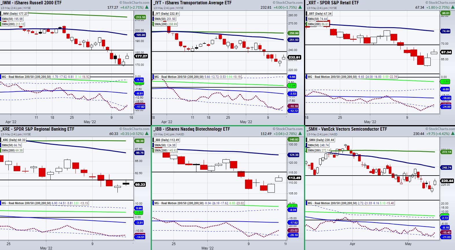
Mish's Economic Modern Family looks to have found temporary support, as each of the members has closed over the prior day's high, providing relief from the downward trend. However, will this last, or is the rally a potential trap before the market breaks lower?
If we look at the above chart, we can see 6 ETFs making up a majority of Mish Economic Modern Family. The Family is useful for grasping a quick view of where the stock market is heading and which sectors should be focused on. Additionally, each chart is paired with our Real Motion momentum indicator, which helps us further identify the strongest sectors to watch for Monday.
Across the board, in the Family and the major indices, we have seen downward pressure stall. However, when looking at the Real Motion indicator (RM), we can see that certain charts stand out more. With that said, let's start with the small-cap index Russell 2000 (IWM).
In the case of IWM, Real Motion (RM) has pulled up from oversold territory, as the red dotted line is now clearing the lower band (blue dotted line). If RM continues to hold over the lower band, this will show that momentum is improving, thus decreasing the chance IWM will break lower in price. The same can be said for the Biotech (IBB), and Retail (XRT) sectors, with IBB making the strongest comeback from oversold levels in RM.
On the other hand, ETFs like the Transportation (IYT), Semiconductors (SMH) and Regional Banking (KRE) never broke their lower band and are looking to push towards the 50-DMA (blue line) in RM. While KRE is the weakest of the bunch, IYT and SMH have created a decent amount of space from the bottom of their band and are now looking to push towards the 50-DMA (blue line).
Having said that, the takeaway is that IYT, SMH, and IBB have the most strength from a momentum standpoint. However, the catch is that the overall market trend is still down, meaning any rally can easily be met with resistance.
In the above chart, you will find lines drawn for the most recent resistance levels. If these price levels are cleared, watch for the 50-DMA as the next key resistance level to clear.
Follow Mish on Twitter @marketminute for stock picks and more. Follow Mish on Instagram (mishschneider) for daily morning videos. To see updated media clips, click here.
ETF Summary
- S&P 500 (SPY): 410 resistance.
- Russell 2000 (IWM): 188 resistance.
- Dow (DIA): 322 pivotal.
- Nasdaq (QQQ): 309-317 resistance area.
- KRE (Regional Banks): Minor support 58.75.
- SMH (Semiconductors): Needs to hold over 230.
- IYT (Transportation): 239 resistance.
- IBB (Biotechnology): 115-118 resistance area.
- XRT (Retail): 70 resistance.
- GLD (Gold): Watch for a close-over Friday's high at 169.62.
- USO (Oil): 82.41 to clear.
- DBA (Agriculture): Now needs to hold over the 50-DMA at 22.07.
Forrest Crist-Ruiz
MarketGauge.com
Assistant Director of Trading Research and Education
|
| READ ONLINE → |
|
|
|
| Top Advisors Corner |
| Investors Intelligence Data at Bearish Extreme |
| by Tom McClellan |

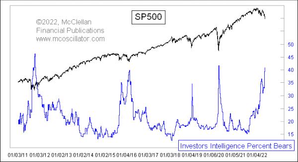
When prices go down, people turn more bearish. It is a natural human phenomenon, and it is still working during the current price decline. The useful aspect of this is that, when you see an extreme reading for a sentiment indicator, it is a sign that a bottom is at hand for prices.
This week's survey data from the folks at Investors Intelligence showed a big jump in the percentage of investment advisors and newsletter writers they track who are being tallied as bearish, up to 40.8% now. This is pretty rarified territory, only seen 3 other times in the past decade. Each of those were associated with pretty important price lows.
It has been bigger than this before. At the scariest point of the 2008 decline, the week of Oct. 3, 2008, it got all the way up to 53%. And, in December 1994, it got all the way up to 59%. So it is possible to get this group to a greater bearish state than this, but it has been a long time since they have done that. It is worth noting that, between then and now, a lot of the old analysts have been replaced to some extent by a new group. So no such survey is ever exactly the same, just as you can never step in the same river twice.
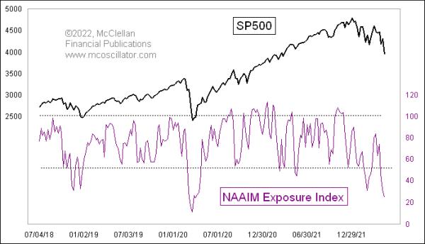
A similarly extreme sentiment reading comes from the NAAIM Exposure Index, which, this week, got down to 24.

This indicator reflects the average stock market exposure each week among the members of the National Association of Active Investment Managers (NAAIM). Their individual responses can range from -200 for leveraged short to 0 for neutral, and up to +200 for leveraged long. Those responses are then averaged together to get the NAAIM Exposure Index. Even though these survey respondents are professional money managers, they still fall victim to the same moods and fears as everyone else.
The NAAIM Exposure Index went a little bit lower than this at the bottom of the COVID Crash in March 2020. Other than that, we have to reach all the way back to the twin price bottoms in September 2015 and February 2016, when investors got fearful in the illiquid period following the end of QE3.
In other words, the current sentiment condition in these indicators is in the same range as what was seen at some really meaningful price bottoms. A sentiment reading is a condition, and not a "signal", and the one thing such a reading will not tell you is when it is going to finally matter. They all usually do, eventually, but it can be frustrating to wait for that moment to appear.
|
| READ ONLINE → |
|
|
|
| MORE ARTICLES → |
|
 Chart 1
 Chart 2
 Chart 3


 The bigger trend is one of the most important factors to consider when trading stocks or ETFs. We can use trend signals as part of a trend-following strategy or to dictate our trading bias. I look for bullish setups and pullback opportunities when the trend is up. When the trend is down, I am out or looking for bearish setups. In short, I want to trade in the direction of the bigger trend because this is the dominant force at work. May the trend be with you!


 This is a continuation of the
  Table A
 Table B
 Table C
 Chart A
 Chart B
 Chart C