The following is a complimentary copy of Friday's subscriber-only DP Weekly Wrap. Want this content in your email box every market day? Subscribe to the DP Alert without delay!
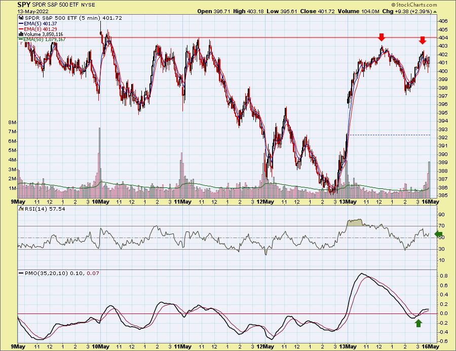
It was a volatile trading week, with investors breathing a sigh of relief on today's positive close. However, today's rally didn't prevent a negative close on the week. Looking at the 10-minute candlestick chart of trading this week, we see a possible double-top bearish chart pattern developing. Yet the RSI remains positive, and we did see a 5-minute PMO crossover BUY signal that intimates a follow-through on today's rally. The price pattern is the big problem. Volume was also a problem, as you'll see on the SPY charts.

The DecisionPoint Alert Weekly Wrap presents an end-of-week assessment of the trend and condition of the Stock Market, the U.S. Dollar, Gold, Crude Oil and Bonds. The DecisionPoint Alert daily report (Monday through Thursday) is abbreviated and gives updates on the Weekly Wrap assessments.
Watch the latest episode of DecisionPoint on StockChartsTV YouTube channel here!
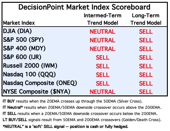
MAJOR MARKET INDEXES
For today: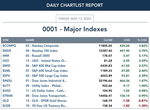
For the week: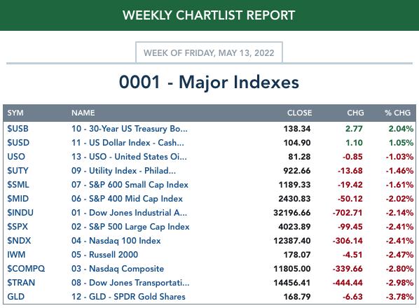
SECTORS
Each S&P 500 Index component stock is assigned to one of 11 major sectors. This is a snapshot of the Intermediate-Term (Silver Cross) and Long-Term (Golden Cross) Trend Model signal status for those sectors.
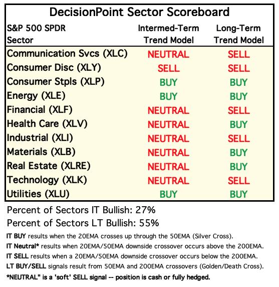
For today: 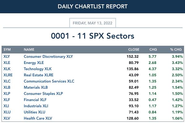
For the week: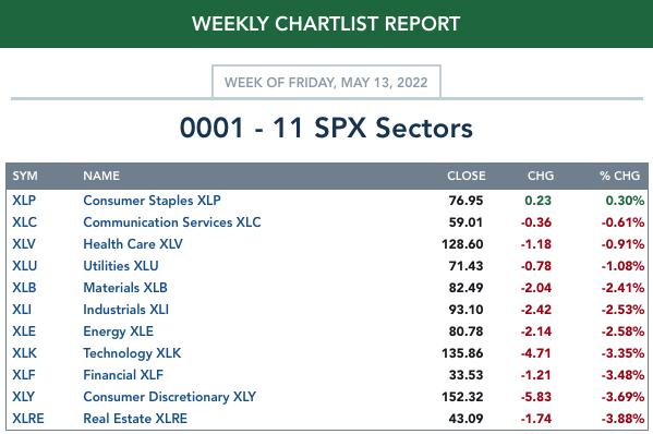
RRG® Weekly Chart ($ONE Benchmark):
$ONE is the current benchmark on the RRGs:
It occurred to Carl and I that using the SPY as a benchmark is useless right now. The SPY is in a bear market, so sectors could be moving lower but still outperform the SPY. One way to get around this problem is to use $ONE as the benchmark. By using $ONE, you get to see ACTUAL performance in relation to other sectors. The picture is completely different, but far more accurate. We have decided to only use the $ONE Weekly version of the RRG. I believe it is more accurate as to the market environment.
The weekly RRG hasn't been changing much, which we actually appreciate. Readers had mentioned that the daily RRGs were very jumpy, and we believe, along with them, that it is somewhat misleading.
There are three sectors in the Leading quadrant: XLB, XLV and XLU. All of them have bearish southwest headings, so they are getting relatively weak. The closer they are to the center point, the closer they get to "no change" in performance. Of the three, XLU is the best given its distance from the center point, despite its bearish southwest heading. Still, not a sector we would want to join, as its performance is deteriorating, not getting stronger.
XLRE is in the Improving quadrant, but has a bearish southwest heading. It is also near the center of the graph. Performance is waning.
XLE (the Sector to Watch) as well as XLP (the runner up) are in the Weakening quadrant. XLP is headed for the center of the graph, but also toward Leading. XLE doesn't look as appetizing, given its southward descent into the Weakening quadrant, but it is far from the center point, which is good. However, a look at the sector chart suggests it is gaining participation again.
All other sectors are in the Lagging quadrant, with bearish southwest headings for all except XLF, which has a northwest heading. XLF looks slightly better than the rest, as it is pointed toward the Improving quadrant; however, it has a LONG way to go before it gets there and its underperformance has been damaging, given its bearish location in the Lagging quadrant.
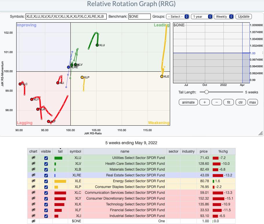
RRG® charts show you the relative strength and momentum for a group of stocks. Stocks with strong relative strength and momentum appear in the green Leading quadrant. As relative momentum fades, they typically move into the yellow Weakening quadrant. If relative strength then fades, they move into the red Lagging quadrant. Finally, when momentum starts to pick up again, they shift into the blue Improving quadrant.
CLICK HERE for an animated version of the RRG chart.
CLICK HERE for Carl's annotated Sector charts.
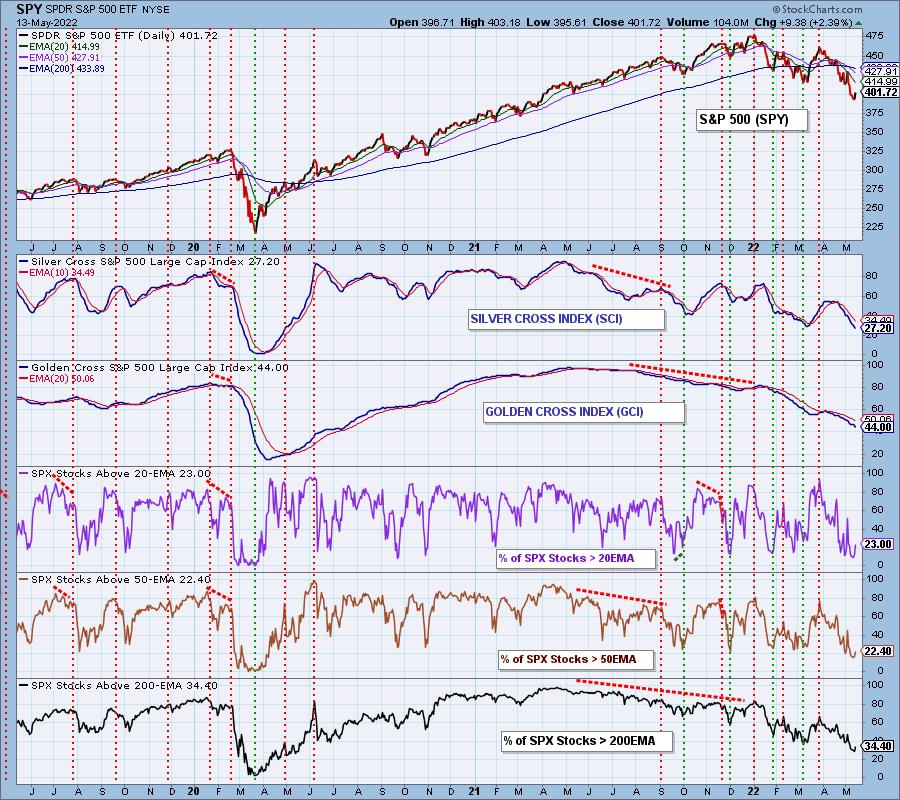
THE MARKET (S&P 500)
IT Trend Model: NEUTRAL as of 1/21/2022
LT Trend Model: BUY as of 6/8/2020
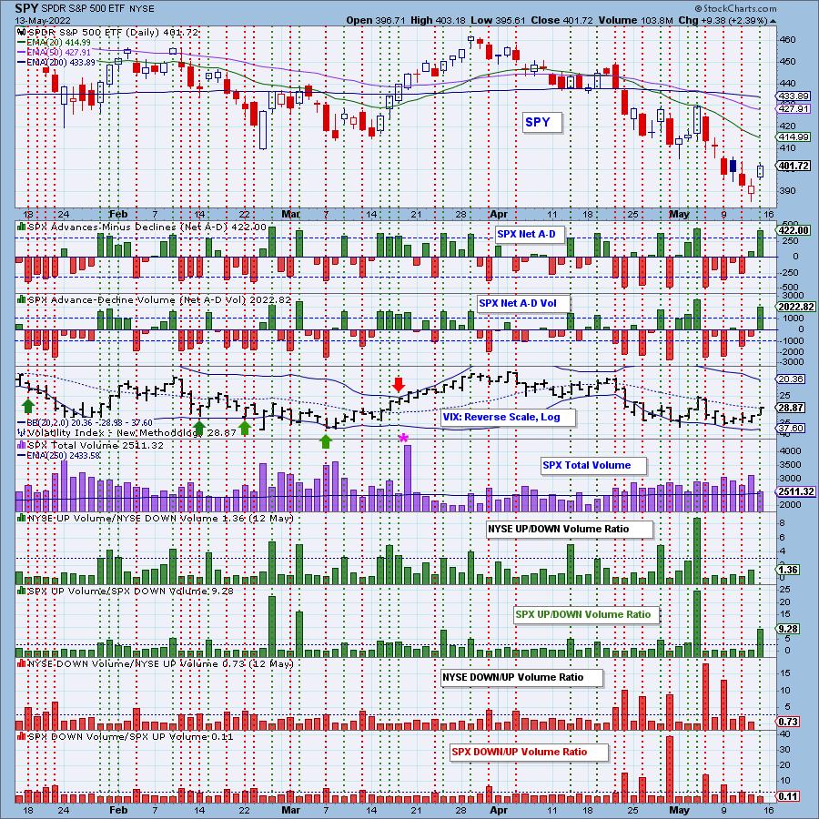
SPY Daily Chart: The short-term falling wedge resolved to the upside, as expected. However, we now have a declining trend channel based on the new price bottom. Notice that Total Volume was only just above its annual average on a big gap up rally. Why is this a problem? On a big gap up rally day, we want to see high volume. It confirms investor conviction.
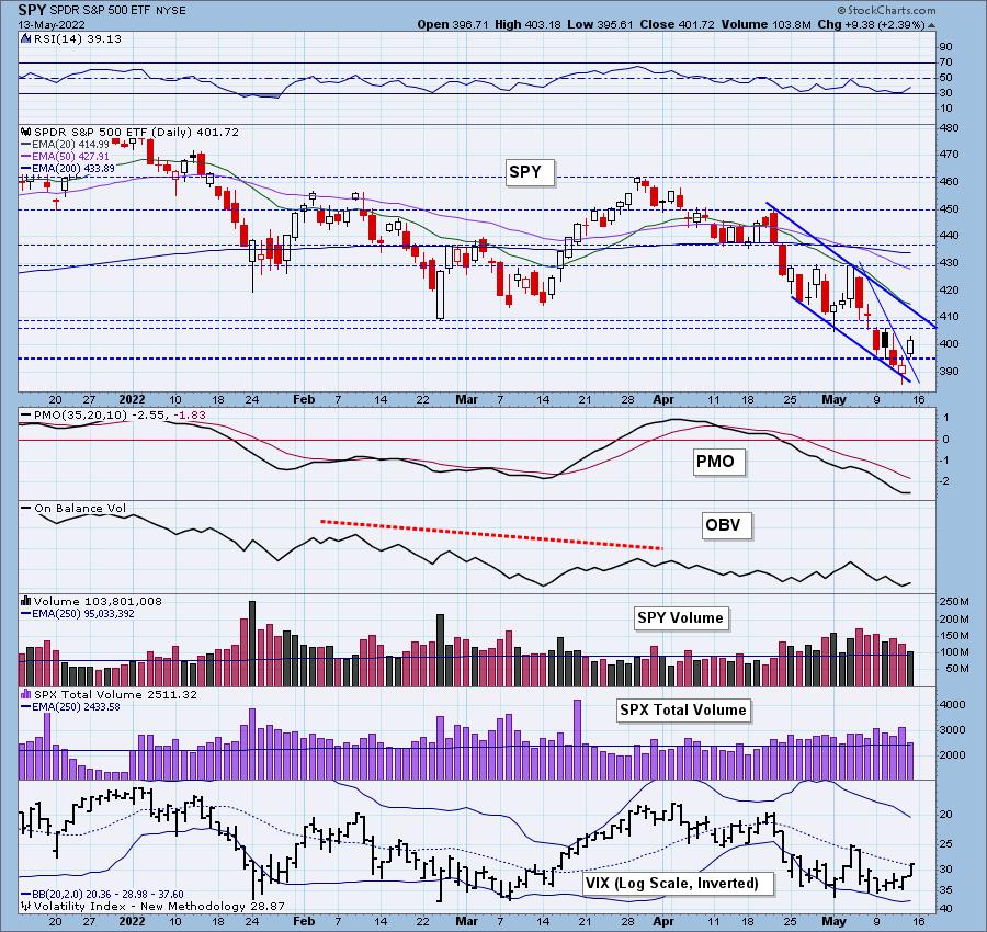
Today's rally did improve the indicators. The RSI is now rising, although it remains in negative territory below net neutral (50). Stochastics are similarly configured. The PMO is turning back up in oversold territory. The VIX finished above its moving average on our inverted scale, which is encouraging.

Latest Recording:
Topic: DecisionPoint Trading Room
Start Time: May 9, 2022 08:59 AM
Meeting Recording Link.
Access Passcode: May#on9th
For best results, copy and paste the access code to avoid typos.
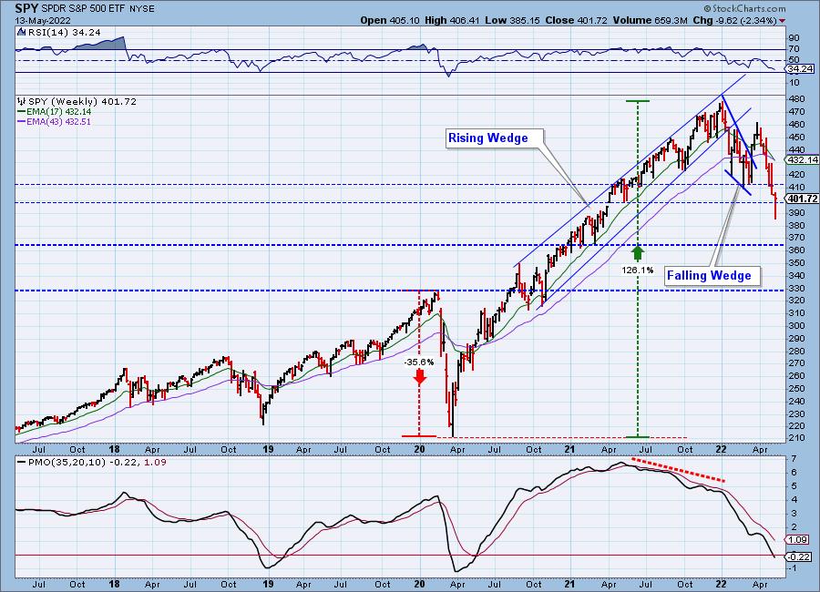
SPY Weekly Chart: Price closed the earlier gap formed at the end of the first quarter. Typically, when a gap is filled, you will see follow-through. In this case, a gap closure to the downside implies more downside. The next area of somewhat strong support for the SPY is $365, but the strongest support lies at $330. Two months ago, when we were discussing a drop to $410, folks thought we were being too bearish. Now we're off to $365. Hope we're wrong, but the weekly RSI is negative and falling and the weekly PMO has hit negative territory. This has been the signal that a bottom is close (2018 bottom and 2020 bottom). Time to watch for a reversal on the weekly PMO.
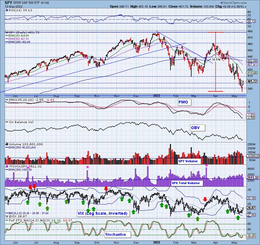
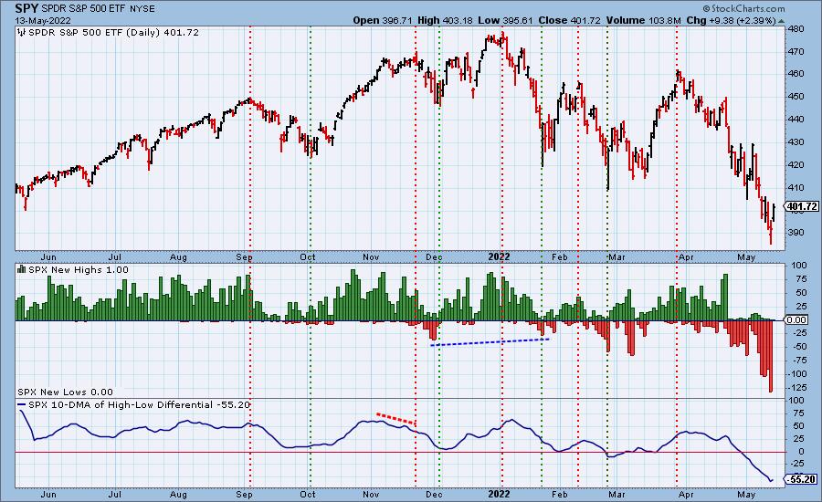
New 52-Week Highs/Lows: To clarify, there were zero SPX New Lows and only one SPX New Highs. New Lows hit oversold territory yesterday. We saw a broad rally, and the lack of New Lows today confirms that. The 10-DMA of the High-Low Differential ticked up today.
Climax Analysis: There were solid climax readings on all indicators today, giving us an upside initiation climax. The problem is that SPX Total Volume contracted considerably on the upside breakout, making meaningful follow through next week less likely. Naturally, Monday's open will be enormously informative in this regard.
*A climax is a one-day event when market action generates very high readings in (primarily) breadth and volume indicators. We also include the VIX, watching for it to penetrate outside the Bollinger Band envelope. The vertical dotted lines mark climax days -- red for downside climaxes, green for upside. Climaxes are, at their core exhaustion events; however, at price pivots, they can be seen to be initiating a change of trend.
Short-Term Market Indicators: The short-term market trend is DOWN and the condition is OVERSOLD.
We saw STOs contract today, which bodes well for follow-through. Rising momentum is building back up within the index as well, but is still showing less than half the SPX with positive momentum.
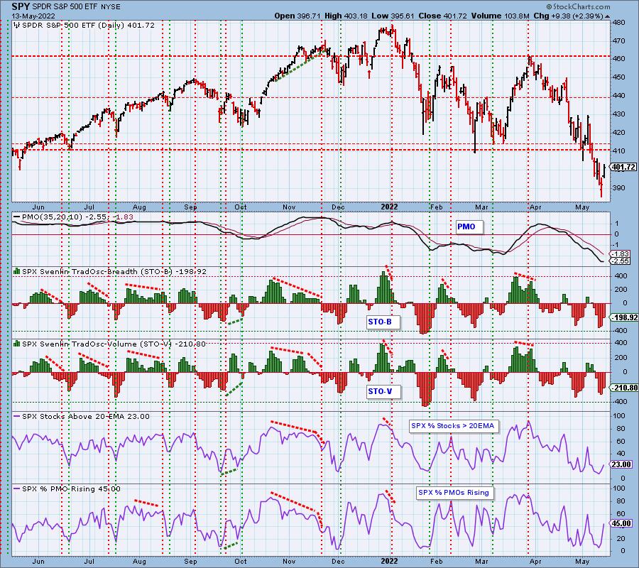
Intermediate-Term Market Indicators: The intermediate-term market trend is DOWN and the condition is OVERSOLD.
The ITBM/ITVM contracted today as well. We saw this the last time we had a brief rally, but the rally failed quickly, keeping the steep declining trend intact. While these indicators are oversold, they aren't as oversold as they were at the 2020 bear market bottom.
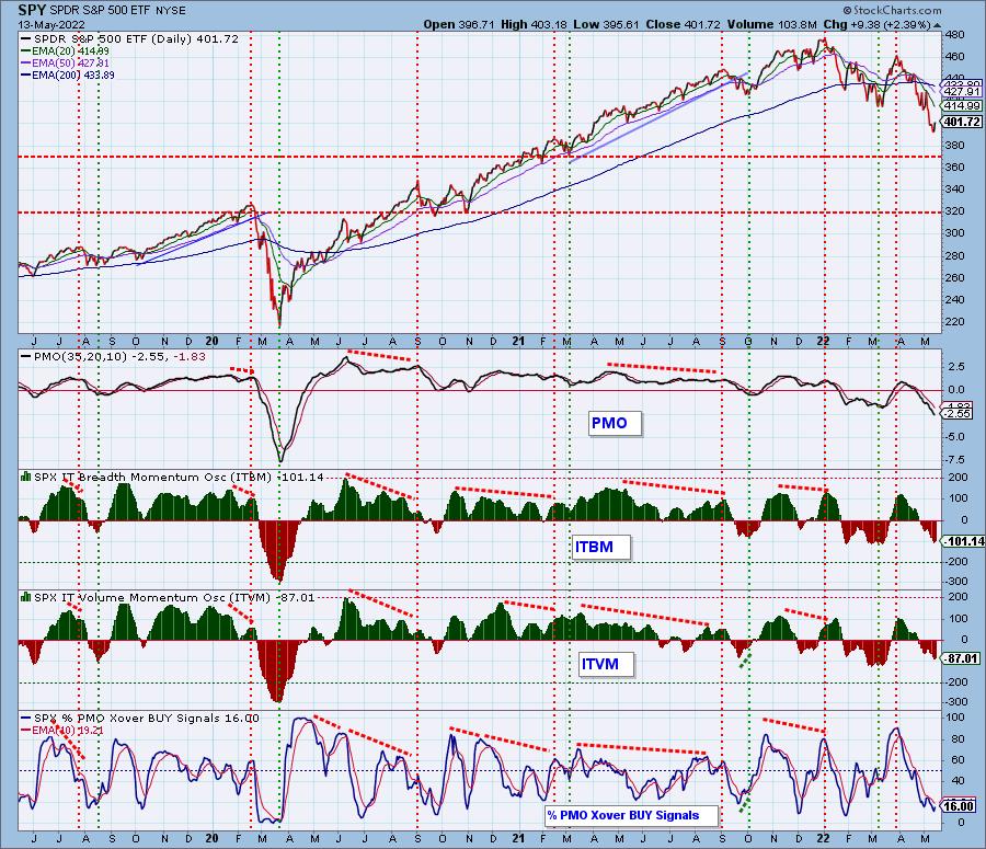
PARTICIPATION and BIAS Assessment: The following chart objectively shows the depth and trend of participation in two time frames.
- Intermediate-Term - the Silver Cross Index (SCI) shows the percentage of SPX stocks on IT Trend Model BUY signals (20-EMA > 50-EMA). The opposite of the Silver Cross is a "Dark Cross" -- those stocks are, at the very least, in a correction.
- Long-Term - the Golden Cross Index (GCI) shows the percentage of SPX stocks on LT Trend Model BUY signals (50-EMA > 200-EMA). The opposite of a Golden Cross is the "Death Cross" -- those stocks are in a bear market.
The following table summarizes participation for the major market indexes and sectors. The 1-Week Change columns inject a dynamic aspect to the presentation.
The one-week change for the SCIs and GCIs showed further erosion, and the IT Bias remains strongly bearish.
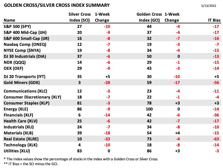
This table is sorted by SCI values. This gives a clear picture of strongest-to-weakest index/sector in terms of participation. Only three of 21 SCI indexes are 50 or above (bullish), the rest are below 40 (bearish). Five of the GCI indexes are 50 of above (bullish); the rest are 30 or below (bearish).
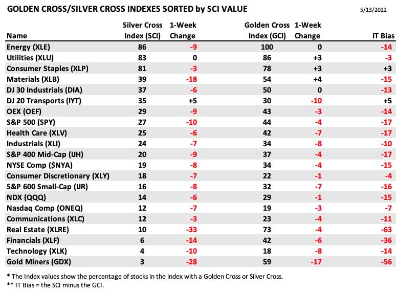
Participation across nearly all the market and sector indexes we follow is solidly bearish, as is the IT Bias. These indicators are quite oversold, and we could get a bounce out of that condition; however, we think we're headed for conditions that look more like what we saw at the 2020 bottom.
CONCLUSION: The rally was strong and broad today, but it wasn't enough to erase the losses for the week. We saw an upside initiation climax, but it wasn't accompanied by strong Total Volume, which implies investors are still tentative about reentering the market. The only sector that finished higher this week was the defensive Consumer Staples (XLP) sector. This further suggests traders' reservations. Indicators are oversold and some have turned higher, so follow-through seems likely next week. We must remember that indicators, while oversold are nowhere near the levels we saw at the 2018 and 2020 lows, so we would continue to exercise extreme caution.
Calendar: Next week is options expiration, so we should expect low volatility toward the end of the week.
Have you subscribed the DecisionPoint Diamonds yet? DP does the work for you by providing handpicked stocks/ETFs from exclusive DP scans! Add it with a discount! Contact support@decisionpoint.com for more information!
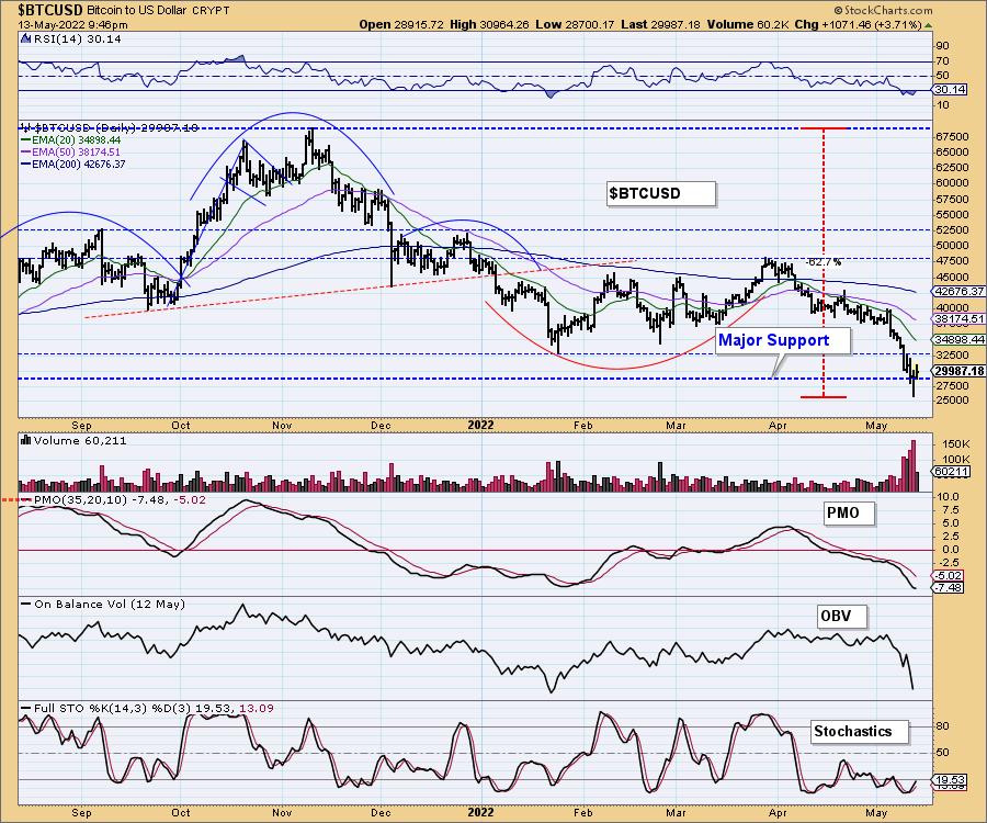
BITCOIN
Bitcoin lost major long-term support this week, but is currently righting the ship. Next up is overhead resistance at $32,500, followed by the 20-day EMA. The RSI and Stochastics are oversold and rising. The PMO is attempting to turn back up.
This is a defining moment for Bitcoin. A loss of this support level could trigger more losses with a downside target down at $10,000. Hard to imagine, but who would've thought that, in six months, Bitcoin would be at $27,500 (other than us)?
INTEREST RATES
Yields dropped this week, but are resuming their march higher.
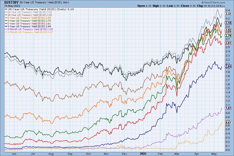
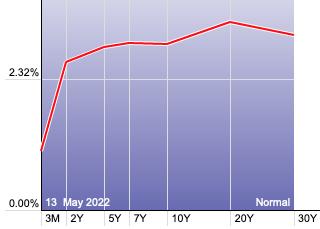
The Yield Curve Chart from StockCharts.com shows us the inversions taking place. The red line should move higher from left to right. Inversions are occurring where it moves downward.
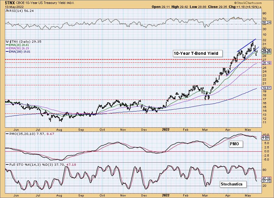
10-YEAR T-BOND YIELD
$TNX confirmed the bearish rising wedge chart pattern with a breakdown. Indicators moved south quickly, but the RSI is already firming up again above net neutral (50). The PMO and Stochastics are still bearish, so a test of 2.7% isn't out of the question.
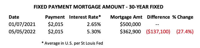
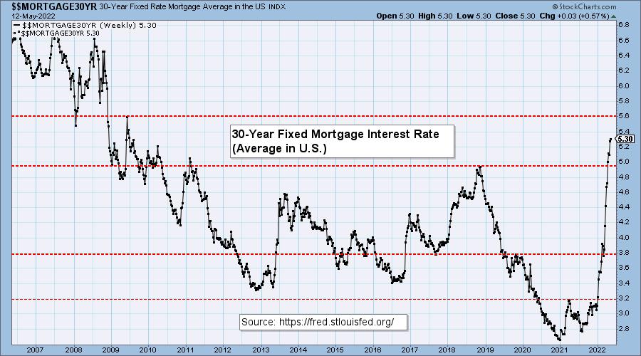
MORTGAGE INTEREST RATES (30-Yr)**
**We watch the 30-Year Fixed Mortgage Interest Rate because, for the most part, people buy homes based upon the maximum monthly payment they can afford. As rates rise, a fixed monthly payment will carry a smaller mortgage amount. As buying power shrinks, home prices will come under pressure.
This week, the 30-Year Fixed Rate increased from 5.27 to 5.30.
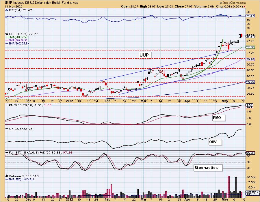
DOLLAR (UUP)
IT Trend Model: BUY as of 6/22/2021
LT Trend Model: BUY as of 8/19/2021
UUP Daily Chart: The Dollar fell slightly today, but ended with a higher low and higher high. The RSI and PMO are very overbought, so consolidation would be helpful to relieve these conditions. Stochastics are strong. Consolidation seems more likely than a deep decline.
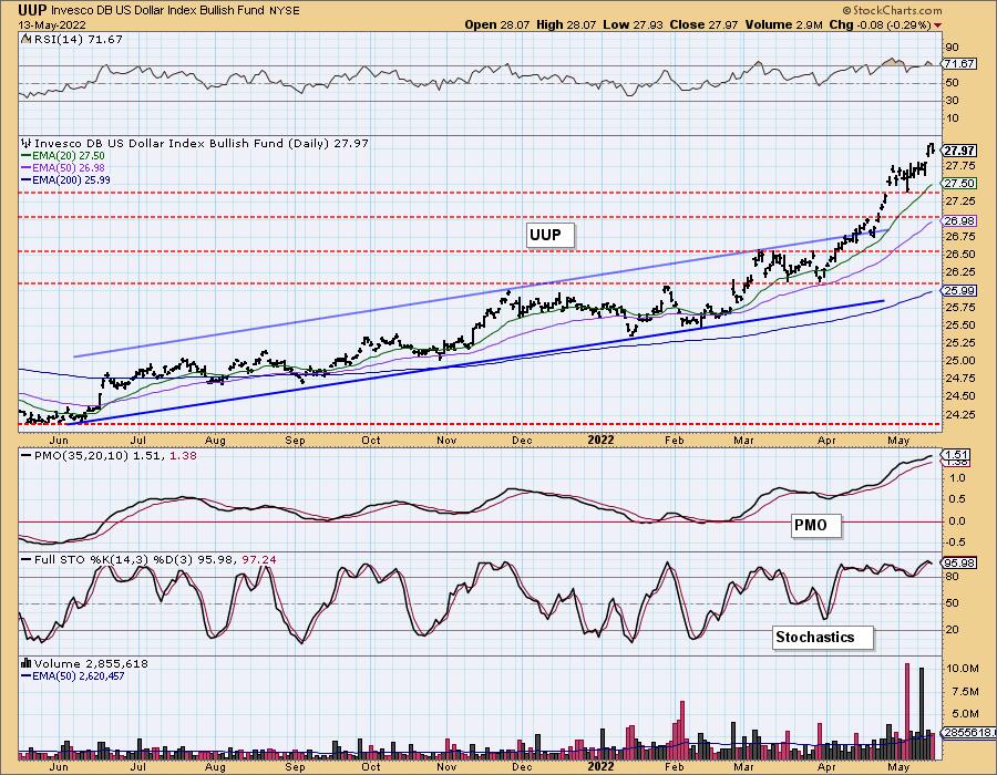
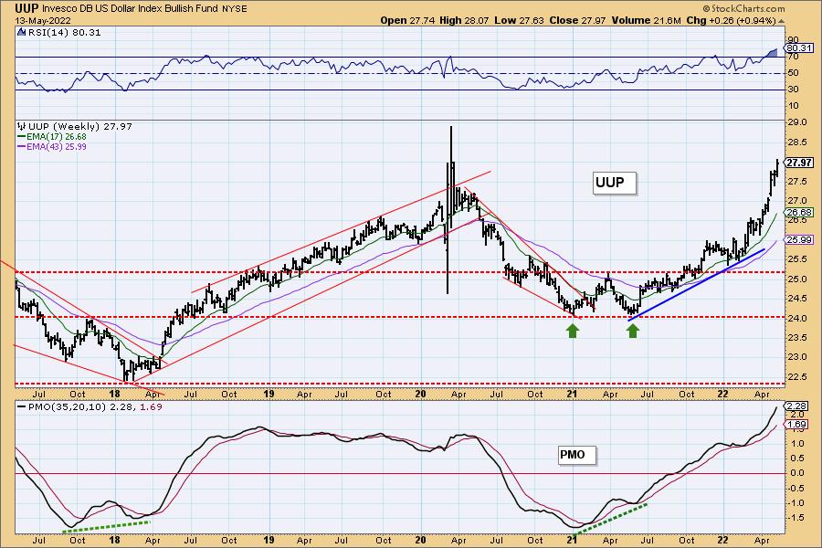
UUP Weekly Chart: UUP is rising parabolically. Those rising trends are destined to be broken quickly and painfully. However, under the current global conditions, the Dollar is in favor. Overhead resistance doesn't arrive until $29.
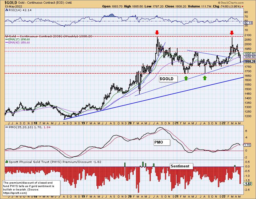
GOLD
IT Trend Model: BUY as of 5/3/2022
LT Trend Model: BUY as of 1/12/2022
GOLD Daily Chart: With the Dollar rising exponentially, Gold has been hard. GLD is now reaching strong support at $165.
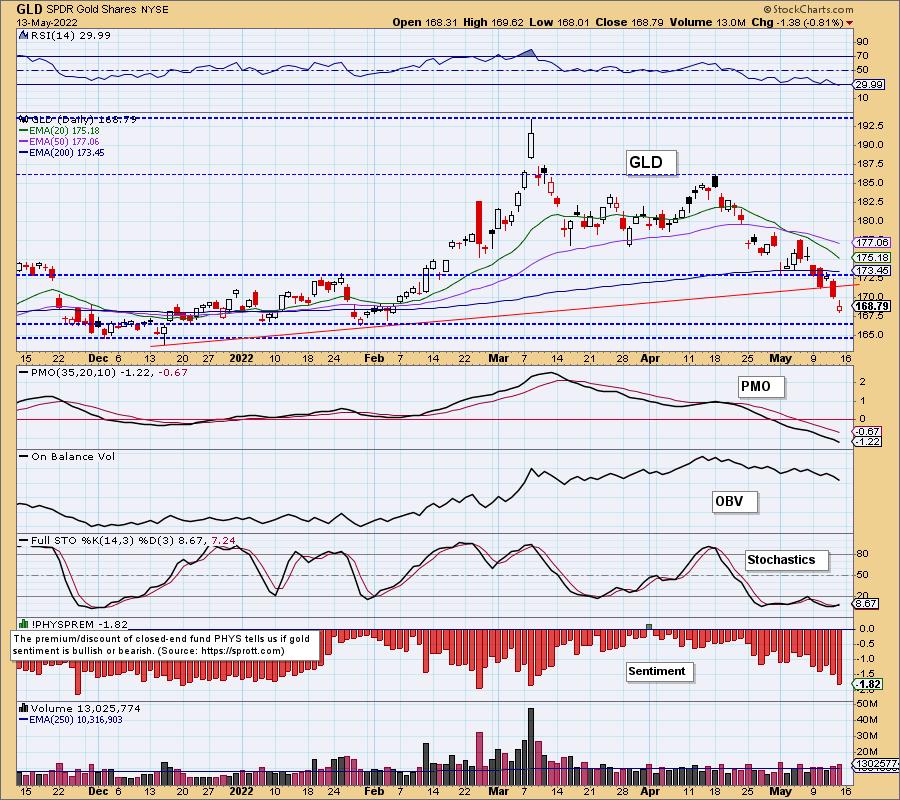
On the one-year daily chart of $GOLD, we see a falling PMO with negative RSI and Stochastics. The strongest level of support for $GOLD lies at $1750. Sentiment is very bearish, given the expansion in discounts, but are still not at bearish extremes.
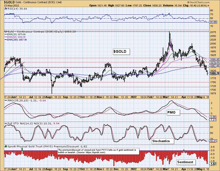
GOLD Weekly Chart: The weekly PMO triggered a crossover SELL signal signal just as price settled on the intermediate-term rising bottoms trendline. We believe that rising trend will be broken. The long-term rising bottoms trendline should hold, as it will intersect with support at $1700.
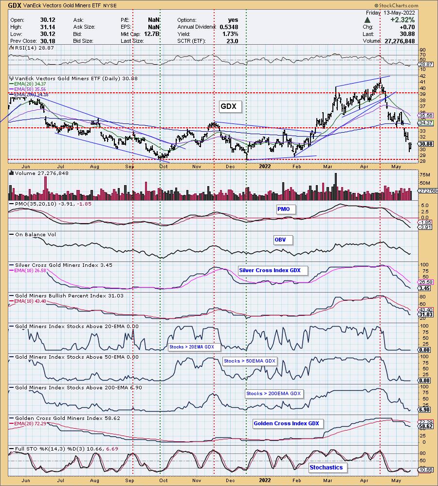
GOLD MINERS Golden and Silver Cross Indexes: Gold Miners rebounded today, but haven't hit strong support yet. The PMO is still falling and participation didn't improve much. With Gold likely continuing its slide next week, we would expect GDX to test support at $28.50.
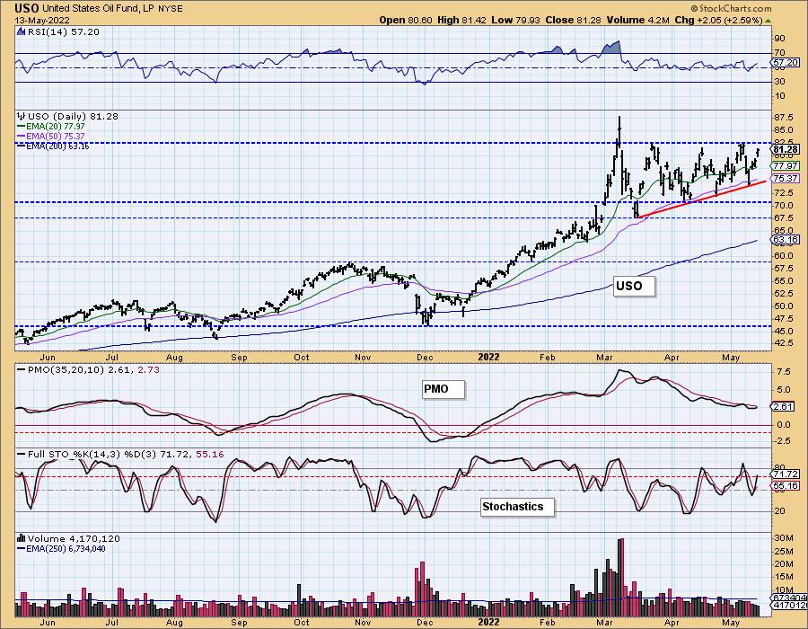
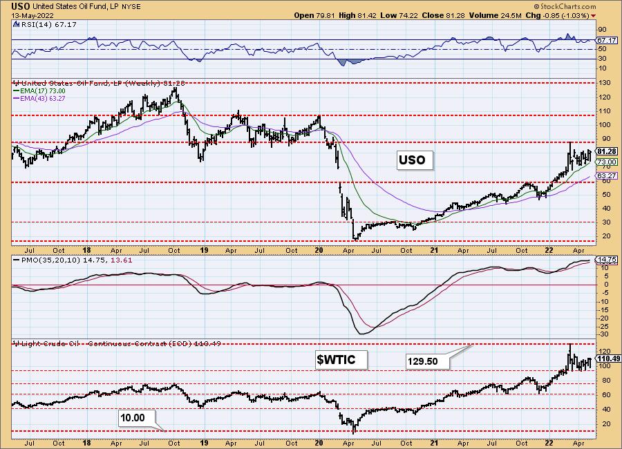
CRUDE OIL (USO)
IT Trend Model: BUY as of 1/3/2022
LT Trend Model: BUY as of 3/9/2021
USO Daily Chart: The ascending triangle on USO is intriguing, as it suggests an upside breakout ahead. The PMO is about to give us a crossover BUY signal. The RSI is positive and not overbought. Stochastics are rising strongly after reversing just below net neutral (50). A breakout seems imminent.
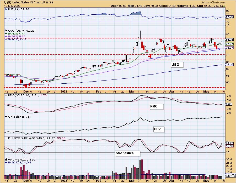
USO/$WTIC Weekly Chart: The weekly PMO is beginning to accelerate higher. The weekly RSI is positive and not quite overbought. We would look for a test of overhead resistance at $90 for USO.
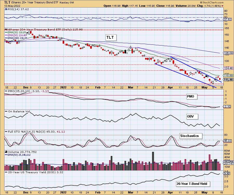
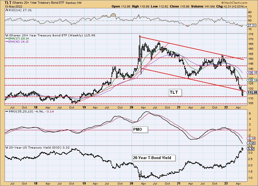
BONDS (TLT)
IT Trend Model: NEUTRAL as of 1/5/2022
LT Trend Model: SELLas of 1/19/2022
TLT Daily Chart: After breaking out of the bullish falling wedge, price failed to overcome the 20-day EMA. The PMO did trigger a crossover BUY signal, but, given Stochastics and the RSI are topping in negative territory, look for Bonds to continue their slide again.
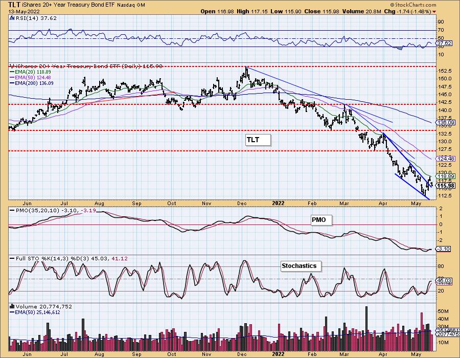
TLT Weekly Chart: Price is breaking down from a declining trend channel on the weekly chart, but it did find support at the 2019 lows. The weekly RSI is rising out of oversold territory, but the PMO is bearishly configured, suggesting a drop to the next support level at $105.
Good Luck & Good Trading!
Carl & Erin Swenlin
Technical Analysis is a windsock, not a crystal ball. --Carl Swenlin
(c) Copyright 2022 DecisionPoint.com
Helpful DecisionPoint Links:
DecisionPoint Alert Chart List
DecisionPoint Golden Cross/Silver Cross Index Chart List
DecisionPoint Sector Chart List
Price Momentum Oscillator (PMO)
Swenlin Trading Oscillators (STO-B and STO-V)
DecisionPoint is not a registered investment advisor. Investment and trading decisions are solely your responsibility. DecisionPoint newsletters, blogs or website materials should NOT be interpreted as a recommendation or solicitation to buy or sell any security or to take any specific action.