| THIS WEEK'S ARTICLES |
| John Murphy's Market Message |
| STOCKS END SECOND QUARTER ON THE DOWNSIDE |
| by John Murphy |
STOCKS REMAIN UNDER PRESSURE...Stocks are ending the quarter with more selling. The weekly bars in Chart 1 show the S&P 500 down more than 3% on the week with a monthly loss of more than 8%. For the year, the S&P 500 is down 20%. Unfortunately, there are no technical signs of things getting any better. There are also more negative signs on the economy. One is the recent drop in commodity prices like copper and oil. Another is a decline in bond yields which threatens to cause the yield curve to invert.
YIELD CURVE NEARS INVERSION... The weekly bars in Chart 2 plot the difference between ten-year and two-year bond yields. The chart shows that popular version of the yield curve nearing the zero mark. A drop below zero would put the shorter yield over the longer yield which is one of the signs of recession. Sector rankings remain defensive.
 Chart 1 Chart 1
 Chart 2 Chart 2
SECTOR RANKINGS REMAIN DEFENSIVE... Chart 3 ranks the eleven market sectors for the month of June. That offers a view of which sectors investors are favoring, which ones they're selling. And it remains defensive. Although all eleven sectors lost ground. the smallest losses were seen in consumer staples, healthcare, utilities, and real estate. All four are defensive in nature and are usually favored during stock market declines and a weakening economy. At the same time, the weakest sectors are energy, materials, financials, consumer discretionary, and technology. Weak energy and materials reflects recent selling in commodity prices. Selling in economically-sensitive financials and consumer discretionary stocks are reflective of a weakening economy. Weak technology stocks explain why the Nasdaq market is leading the rest of the market lower. They're especially sensitive to a more hawkish Fed.
 Chart 3 Chart 3
|
| READ ONLINE → |
|
|
|
| Martin Pring's Market Roundup |
| The Rally Since Mid-June Leaves a Lot to be Desired |
| by Martin Pring |
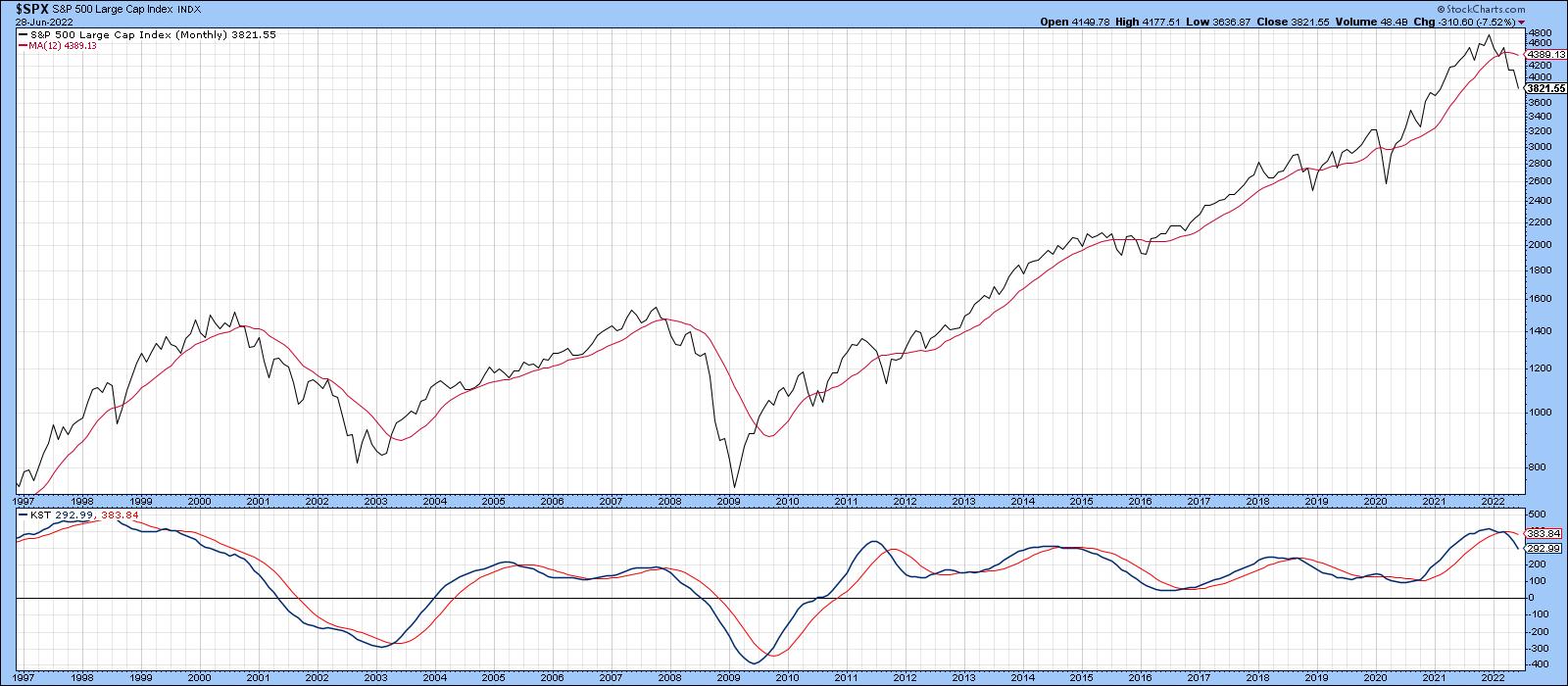
Long-term indicators, such as the KST and the S&P relative to its 12-month MA, remain in a bearish mode, but, that said, it would certainly be unusual to see them turn bullish immediately after the final low. Indeed, Chart 1 shows that the Index is currently well below its MA. Note that the long-term KST is still overbought, despite a 20% drop in the Index.
 Chart 1 Chart 1
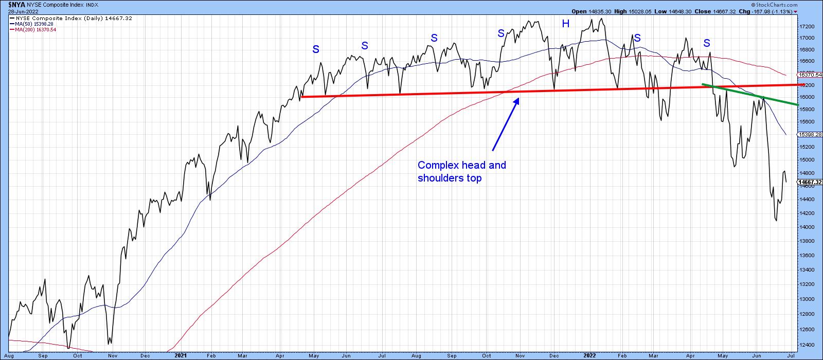
Also, by way of a negative backdrop, Chart 2 demonstrates that the NYSE Composite recently broke down from a large complex top, which is likely to offer an impressive barrier on the way back up. Surely, a lot of investors will want to break even when given the chance.
 Chart 2 Chart 2
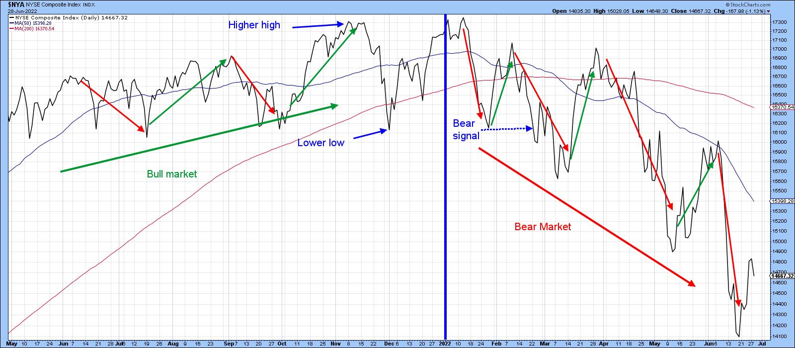
A characteristic of the bear market since January is the existence of a series of lower short-term peaks and troughs. Recent price waves are indicated in Chart 3 by the arrows. A lower low was touched in December of last year. At that time, the price registered a new low under September's bottom, but the series of rising peaks was still intact.
The December low did not signal a bear market. Rather, the signal was triggered in late February, following the failed rally earlier in the month. Until we see a reversal in this progression, peak and trough analysis will remain in the bearish camp, as we have yet to see even a successful test of the low.
 Chart 3 Chart 3
These things obviously take time to work through. However, it is occasionally possible to get excited about some really bullish characteristics in the early stages of a rally. Unfortunately, I don't see any of that in the current technical picture. More to the point, there are several bear market characteristics that are still in force and that tell us to be ultra-cautious.
Three Bear Market Characteristics
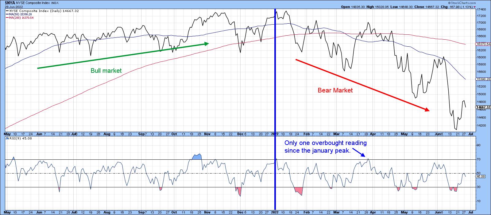
Short-term rallies and reactions usually behave differently in bull and bear markets. When the primary trend is up, RSI and other short-term indicators generally remain in an overbought condition longer and are extremely sensitive to oversold conditions. We can see that in the left-hand part of Chart 4, where the NYA rallied smartly every time it touched an oversold condition. That compares to the right-hand, where the 9-day RSI has only touched its overbought zone once since the bear market began, which was followed by the sharp March/May decline. By the same token, oversold conditions have been plentiful and been followed by weak advances; not much sensitivity here. Consequently, there is nothing in the RSI's behavior in the last few weeks to suggest that anything has changed.
 Chart 4 Chart 4
Volume is also behaving in a way that is consistent with a primary bear market. Normally, we expect activity to rise on a rally, indicating buyer enthusiasm, and to contract during a decline. When volume behaves differently, by contracting in the face of an advance, it indicates a lack of enthusiasm on behalf of buyers and is bearish. In a similar vein, rising volume during a sell-off tells us that sellers are motivated. That's also a bad sign. Such characteristics are not always present in every bear market, but when they are, we need to be careful.
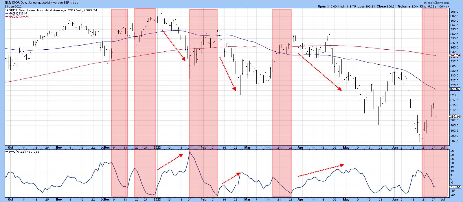
In that respect, Chart 5 compares the SPDR Dow Jones ETF (DIA) to a price volume oscillator (PVO) using the 6- and 12-day parameters. The pink-shaded areas flag periods when the PVO is in a declining mode. Note that is also the time when the Index is rallying, so it's a bearish characteristic. The red-dashed arrows point out when the Index is declining and volume, as measured by the PVO, is expanding. Note that the late June advance is (so far) being accompanied by a trend of declining volume.
 Chart 5 Chart 5
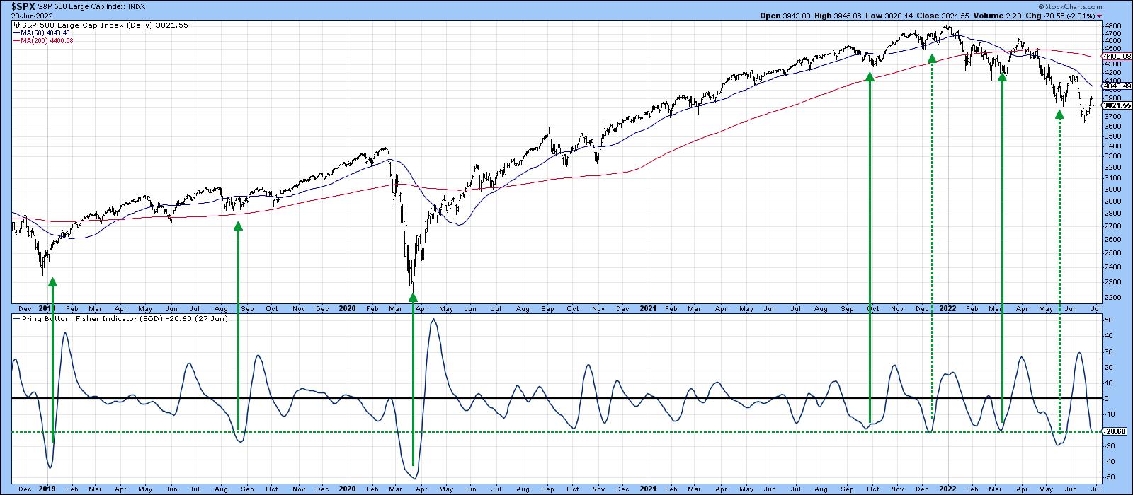
A third bearish characteristic arises when an indicator that is normally reliable in signaling a strong rally is instead followed by a weak or non-existent one. That's been the case with several indicators in 2022. By way of an example, my Bottom Fisher, which is described here, is featured in Chart 7. The solid green arrows demonstrate that, when the Fisher drops below the dashed green line and reverses to the upside, it is normal for the market to experience a worthwhile rally. The dashed arrows were followed by sub-par advances. The December and March signals were borderline in terms of their power to signal a strong advance. However, the latest in May signal was only able to generate a two-week advance. That's pretty pathetic by normal standards and is definitely consistent with a bear market.
 Chart 6 Chart 6
Good luck and good charting,
Martin J. Pring
The views expressed in this article are those of the author and do not necessarily reflect the position or opinion of Pring Turner Capital Group of Walnut Creek or its affiliates.
|
| READ ONLINE → |
|
|
|
| The Mindful Investor |
| New Low for Semiconductors is Not Bullish |
| by David Keller |
Semiconductors are what I consider a "bellwether" group. These companies truly provide the backbone of the modern information economy, so, when these stocks are doing well, the economic conditions are most likely strong. The SMH is featured a number of times on my Mindful Investor Live ChartList, mainly because strong semiconductors usually mean strong stocks in general.
So what does it mean when these stocks are struggling?

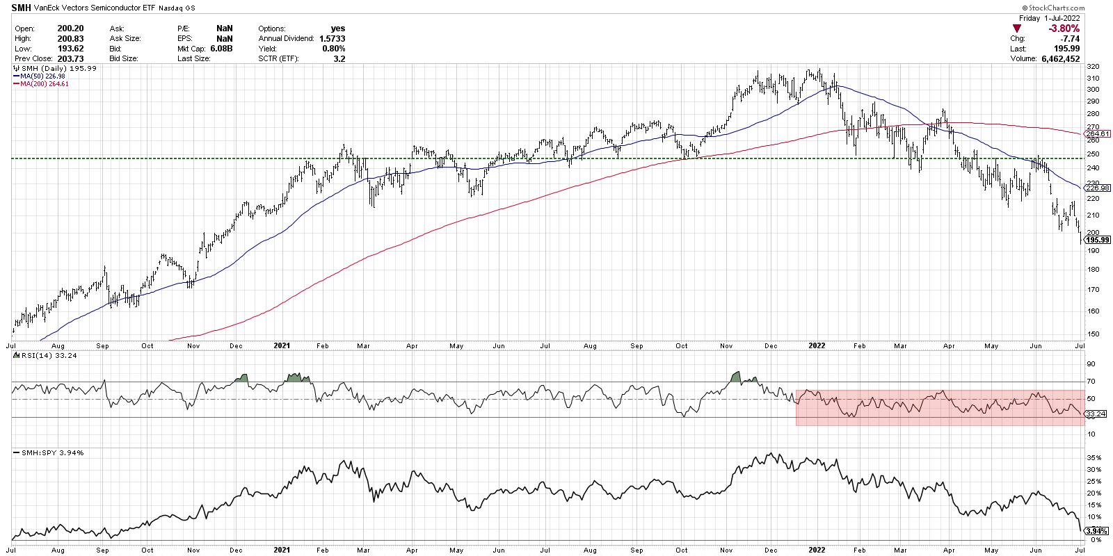
While the Nasdaq 100 index made a slightly lower high in January, the semiconductor ETF (SMH) actually made a higher high in early January. That ended up being the peak for 2022 thus far, as the SMH has achieved a new low every month. This past week saw the semiconductor group drop leading into the long holiday weekend, while most stocks finished the day in the green.
2022 has been marked by support levels being established and then broken, indicating a persistent downtrend of price weakness. The chart of semis tells the story beautifully, with a resistance level around $250 that was actually first confirmed in early 2021. The SMH bumped up to that $250 level a number of times until it was finally eclipsed in June 2021. This price level then became support (a key component of the technical toolkit) with subsequent retests in August and October. This level was finally violated to the downside in April, followed by a number of brief rallies to test $250 from below.
Over the last four weeks, semiconductors have shown renewed downside strength as the SMH has now moved below $200. Note the bearish range of the RSI, which has failed to move back above the 60 level on short-term rallies. This is a classic indication of a bear market phase, with weak momentum showing that sellers are very much still in control.
Finally, we see the relative strength, which is in a confirmed downtrend. Along with most of the growth-oriented sectors and groups, semiconductors are underperforming the broader equity market indexes.
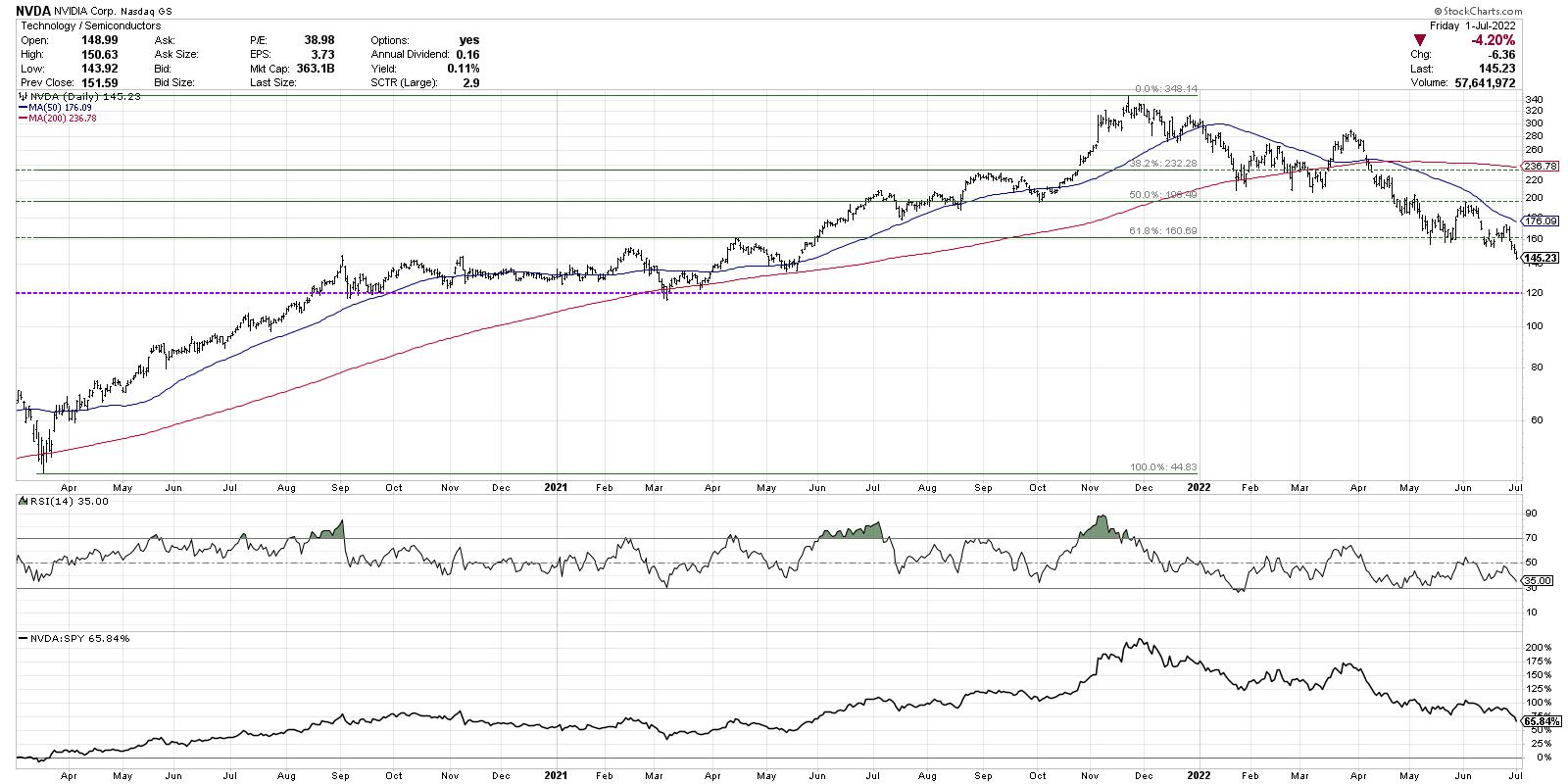
But what about individual semiconductor stocks? Are they telling us anything different? Well, not only does Nvidia Corp (NVDA) mirror what we've discussed thus far, but a Fibonacci analysis seems to confirm the bearish thesis.

If we use the March 2020 low and November 2021 high, then $232 represents a 38.2% retracement off the all-time high. NVDA made a number of attempts to break below this level, yet, in each instance, it was able to bounce higher. This finally failed in April as the stock moved on to the 50% level.
The stock broke down through the 50% level (around $200) and retested that level from below two times. This level also served as price support back in October 2021. So a failure at $200 was another negative confirmation.
Nvidia popped up off the $160 level in May and early June, which represented a 61.8% retracement of the previous bull cycle. This week, NVDA finally broke down through this final level of Fibonacci support. In the short-term, the next potential support range would be around $120, based on the low in 2020 and 2021. Below that? All the way to the March 2020 low around $45.
Semiconductors are a struggling group in a struggling sector. It's hard to imagine that our growth-driven benchmarks would be able to mount any meaningful participation from a bellwether group like semis. As long the SMH continues to make new lows, the chance of a bull market recovery remains quite low!
RR#6,
Dave
P.S. Ready to upgrade your investment process? Check out my YouTube channel!
David Keller, CMT
Chief Market Strategist
StockCharts.com
Disclaimer: This blog is for educational purposes only and should not be construed as financial advice. The ideas and strategies should never be used without first assessing your own personal and financial situation, or without consulting a financial professional.
The author does not have a position in mentioned securities at the time of publication. Any opinions expressed herein are solely those of the author, and do not in any way represent the views or opinions of any other person or entity.
|
| READ ONLINE → |
|
|
|
| DecisionPoint |
| 2022 Q1 Earnings Are In and Valuations Are No Longer Extreme |
| by Carl Swenlin |
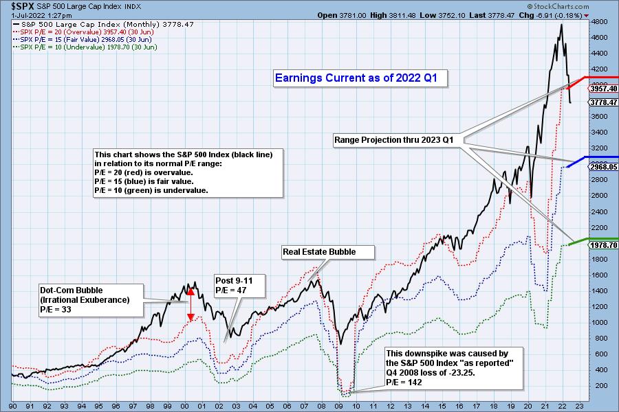
The following chart shows us the normal value range of the S&P 500 Index, indicating where the S&P 500 would have to be in order to have an overvalued P/E of 20 (red line), a fairly valued P/E of 15 (blue line), or an undervalued P/E of 10 (green line). Annotations on the right side of the chart show where the range is projected to be based upon earnings estimates for the next four quarters, through 2023 Q1. Note that earnings estimates are no longer soaring and are beginning to flatten.


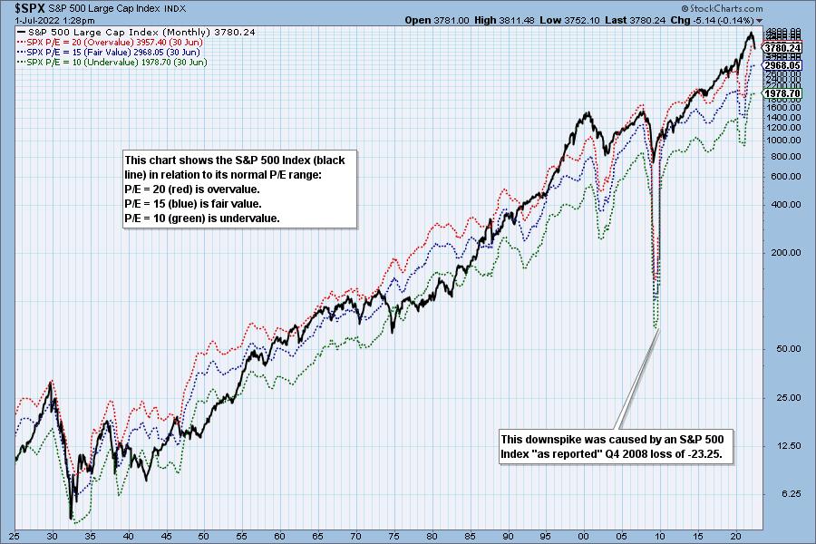
Historically, price has usually remained below the top of the normal value range (red line); however, since about 1998, it has not been uncommon for price to exceed normal overvalue levels, sometimes by a lot. The market has been mostly overvalued since 1992, and it has not been undervalued since 1984. We could say that this is the "new normal," except that it isn't normal by GAAP (Generally Accepted Accounting Principles) standards.

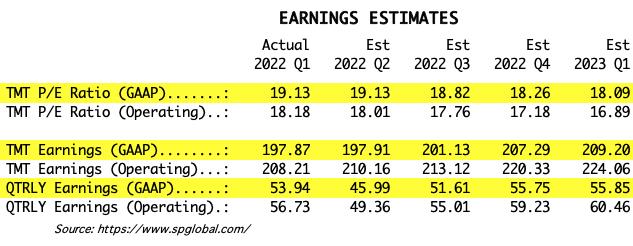
We use GAAP earnings as the basis for our analysis. The table below shows earnings projections through March 2023. Keep in mind that the P/E estimates are calculated based upon the S&P 500 close as of June 30. They will change daily depending on where the market goes from here. It is notable that the P/E is finally within the normal range, albeit still in the overvalued side of the range.

The following table shows where the bands are projected be, based upon earnings estimates through 2023 Q1.

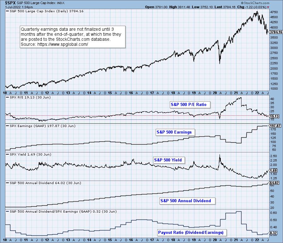
This DecisionPoint chart keeps track of S&P 500 fundamentals, P/E and yield, and it is updated daily -- not that you need to watch it that closely, but it is up-to-date when you need it.

CONCLUSION: The market is still overvalued, but at least it is back within the normal range. This is thanks to improved earnings and bear market falling prices. As the bear market progresses, I expect actual earnings will fall short of estimates, and that prices will continue to fall. I would like to see the S&P 500 get back to the undervalued level. Falling prices will help that happen, but falling earnings will cause the value range to move lower, making it harder to reach undervalue.
(c) Copyright 2022 DecisionPoint.com
Technical Analysis is a windsock, not a crystal ball.
Helpful DecisionPoint Links:
DecisionPoint Alert Chart List
DecisionPoint Golden Cross/Silver Cross Index Chart List
DecisionPoint Sector Chart List
DecisionPoint Chart Gallery
Trend Models
Price Momentum Oscillator (PMO)
On Balance Volume
Swenlin Trading Oscillators (STO-B and STO-V)
ITBM and ITVM
SCTR Ranking
Bear Market Rulesg
|
| READ ONLINE → |
|
|
|
| The MEM Edge |
| These "Recession Stocks" Are On The Move |
| by Mary Ellen McGonagle |
It's been a tough year for the markets, with U.S. stocks posting their worst start to a year in over 50 years. The second half may bring additional woes, with investors increasingly on the lookout for a possible recession amid a slowdown in corporate and economic growth.
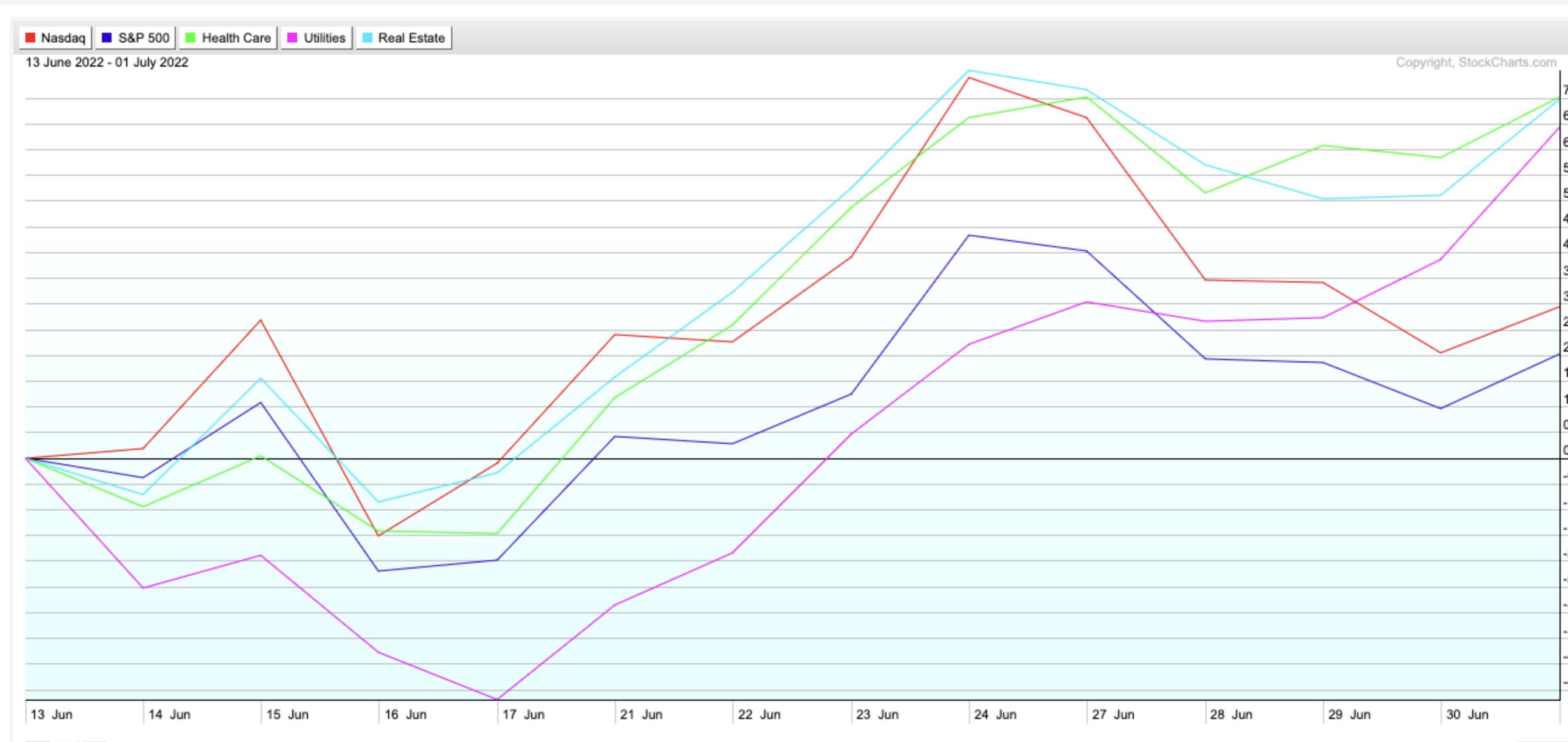
In response to these worries, there's been a rotation in the markets back into defensive sectors over the past 2 weeks as economically sensitive stocks come under pressure, while growth stocks continue to sell off. As you can see in the chart below, the S&P 500 (blue line) and Nasdaq (red line) are trending below Healthcare, Consumer Staples and the Real Estate sectors, which are currently outperforming.
Healthcare (XLV), Consumer Staples (XLP) & Real Estate (XLRE) vs S&P 500 Index and Nasdaq - Last 2 Weeks

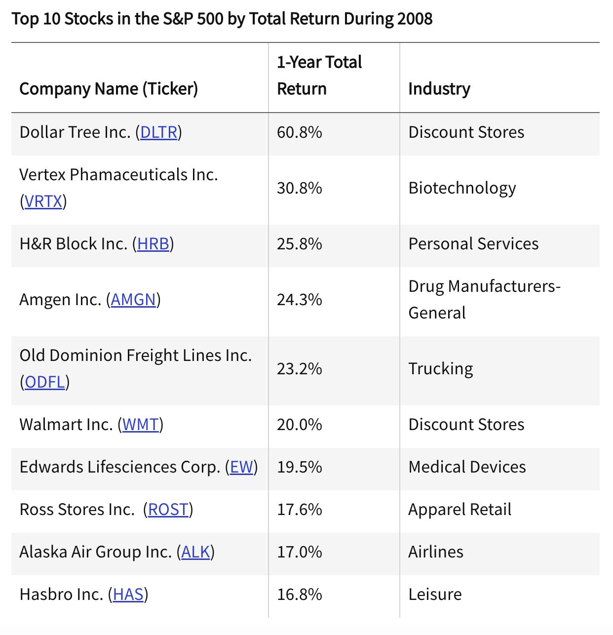
Other dynamics are also at play, with 1st Quarter GDP being reported last week as down 1.6% and below estimates, while Consumer Confidence fell to a 16-month low amid a slowdown in manufacturing. As the drum beats louder around the possibility of a recession, I took a minute to look at the top ten stocks that outperformed during the last sizable recession, which took place in 2008.

With the S&P 500 down 37% for 2008, it's no small feat that the stocks listed above gained anywhere from 16.8% to a high of 60.8% for the year. A review of theses names shows that defensive Healthcare stocks and Discount Retailers dominated. Not among the top ten, but also posting a solid gain in 2008, was McDonalds (MCD), which would certainly qualify as a discount retailer.
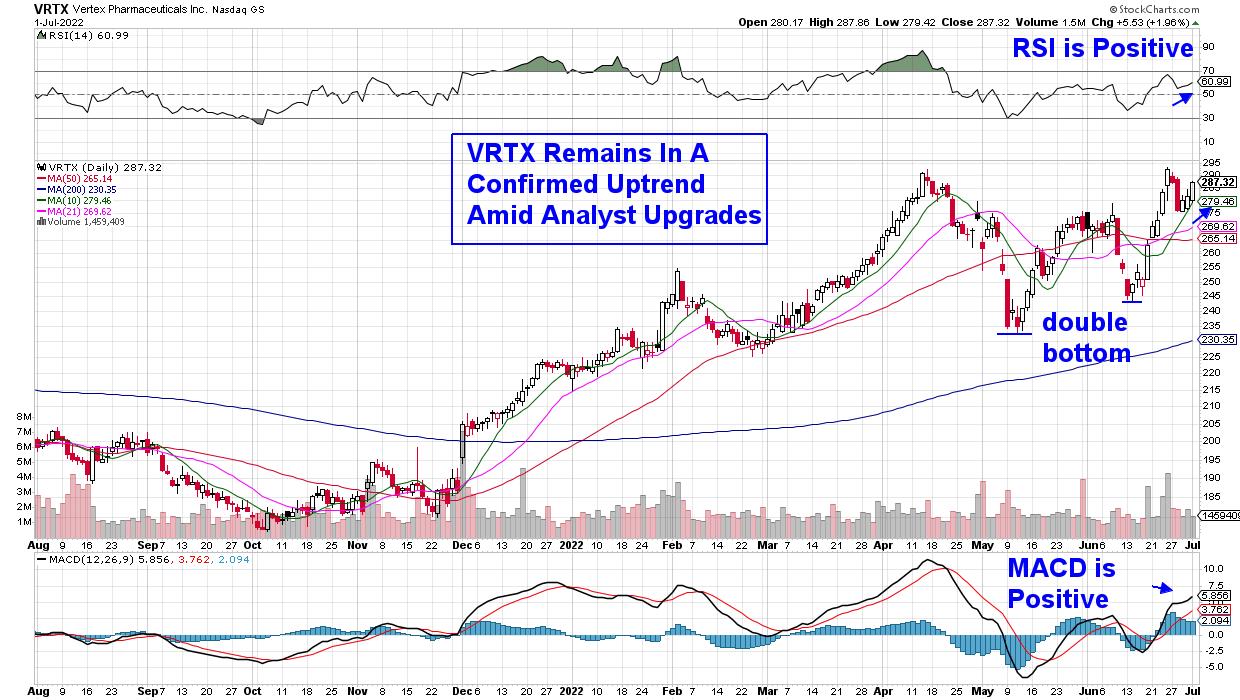
Below are the current charts of select 2008 winners, as they're exhibiting bullish characteristics in a period where anticipation of another recession looms. First up is Biotech stock Vertex (VRTX), which is in a strong buy zone as it approaches its recent base breakout level while in a confirmed uptrend.
VRTX has seen sales of its Cystic Fibrosis drug continue to expand while also announcing positive progress with its pipeline of drugs slated for approval later this year. All this good news has analysts raising earnings estimates for both this year and next, and, with a P/E of 19 times trailing 4 quarter earnings, the stock can be seen as a bargain.
DAILY CHART OF VERTEX PHARMACEUTICAL, INC. (VRTX)

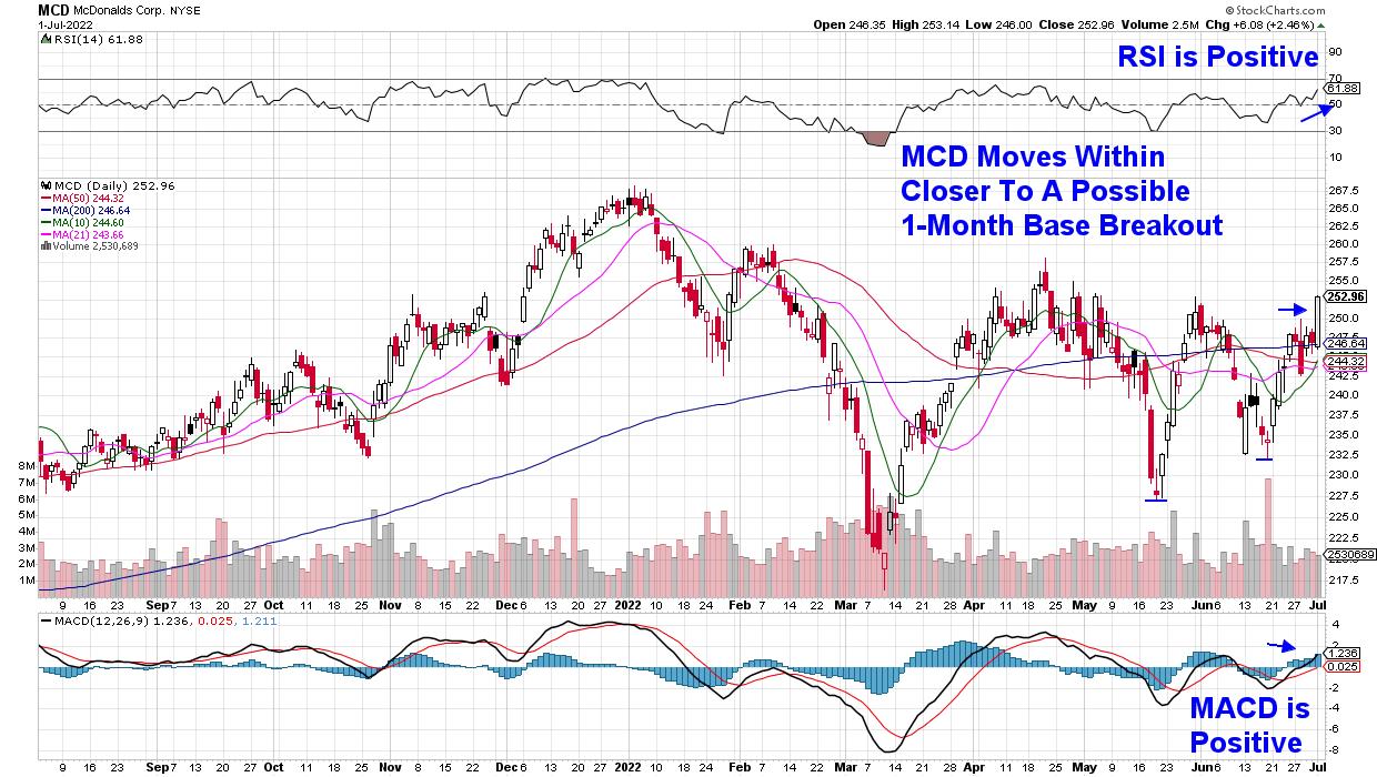
Next up is McDonalds Corp. (MCD), which was a top performer in the Dow today following a 2.5% rally that occurred on above-average volume. The move followed a Wall Street upgrade on Wednesday, where the company's proven resilience during economically tough periods, coupled with a recent uptick in digital engagement that's driving growth, had the analyst upgrading their price target to $278.
Last week's gain puts MCD within a hair of a 1-month base breakout, and the stock currently has bullish characteristics in both its daily and as weekly charts. In addition, MCD is part of the Dividend Aristocrat group of stocks, which are companies that have raised their dividends each year for at least 25 years. MCD offers a 2.8% yield.
DAILY CHART OF MCDONALDS CORP. (MCD)

While the broader markets continue to struggle with both the S&P 500 and Nasdaq below key moving averages, there are pockets of strength, as evidenced by the stocks above and the recent move back into defensive areas of the market. More nimble investors can take advantage these pockets of strength--provided you have strict sell disciplines in place.
Subscribers to my twice-weekly MEM Edge Report have been provided with select stocks that are currently poised to trade higher, while also being kept up to date on the status of the broader markets. Exit strategies for those stocks are also provided. Use the link above to receive a 4-week trial of my MEM Edge Report at a nominal fee. You'll also get immediate access to our most recent reports!
On this week's edition of StockCharts TV's The MEM Edge, I explain why Growth stocks suffered despite interest rates declining. In addition, I examine where the strength is in the markets and the best ways you can participate.
Enjoy the long weekend,
Mary Ellen McGonagle, MEM Investment Research
|
| READ ONLINE → |
|
|
|
| RRG Charts |
| Money Rotating Out of Insurance Groups is Splitting The Financials Sector in Two |
| by Julius de Kempenaer |

The Financial sector qualifies as an offensive, or cyclical, sector, together with Consumer Discretionary, Real-Estate and Materials.

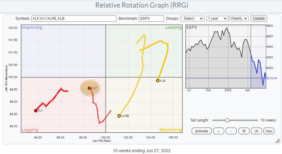
On the Relative Rotation Graph for sectors, XLF is showing up inside the lagging quadrant, signaling a relative downtrend vs. the benchmark (SPY). It is interesting to see that XLF is the only tail on this graph that is NOT moving at a negative heading (180-270). Over the last weeks, the Financials sector started to move higher on the JdK RS-Momentum scale. The sector still lost value on the JdK RS-Ratio scale, but much less fast.
Although all cyclical sectors are still either inside the lagging quadrant or traveling (back) towards it at a negative heading, XLF seems to be at least going slightly against the tide. Time to investigate what's going on inside the sector.

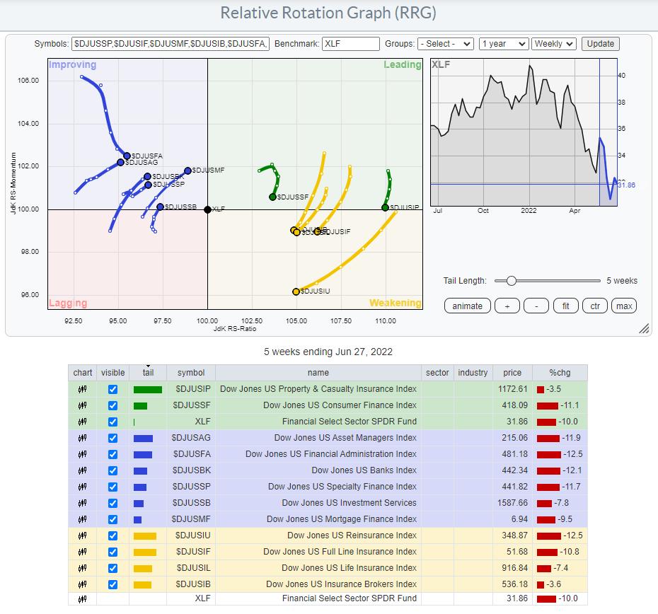
This RRG shows the groups inside the Financials sector, and it is immediately apparent that the sector is divided into two camps. One cluster of groups is on the right-hand side of the RRG, but all rotating at a negative RRG-Heading. The other cluster is on the left-hand side of the RRG, inside the improving quadrant, with all but one rotating at a strong RRG-Heading.
A quick check of the table below the graph shows that the groups inside the weakening quadrant are all insurance-related groups. Inside the leading quadrant is one more insurance group, Property & Casualty Insurance, and Consumer Finance. The only group inside the improving quadrant that is NOT moving at a strong RRG-Heading is the Financial Administration index. All others are on a strong trajectory towards the leading quadrant, with Mortgage Finance leading the way.
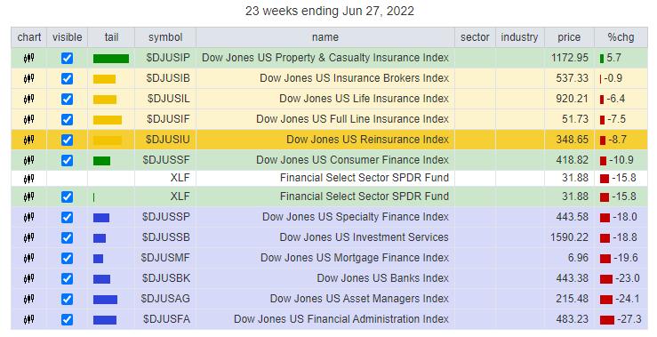
The last time I wrote about the financials sector was in this article in January. At that time, the insurance groups had just rotated into the leading quadrant and they were leading the sector. Setting the tail length to 23 weeks will show the performance of all groups since the week of Jan 18.

The insurance-related groups, which are now inside the weakening quadrant, are all showing up at the top of the list and above XLF. They have all outperformed the Financials sector index. The Property and Casualty index even managed to get a positive return.
But!! This period of outperformance for these groups seems to be coming to an end now, as money is rotating away from them and into the groups that are currently inside the improving quadrant.
It is interesting to see how different the charts in these two groups are looking.
US Reinsurance Index

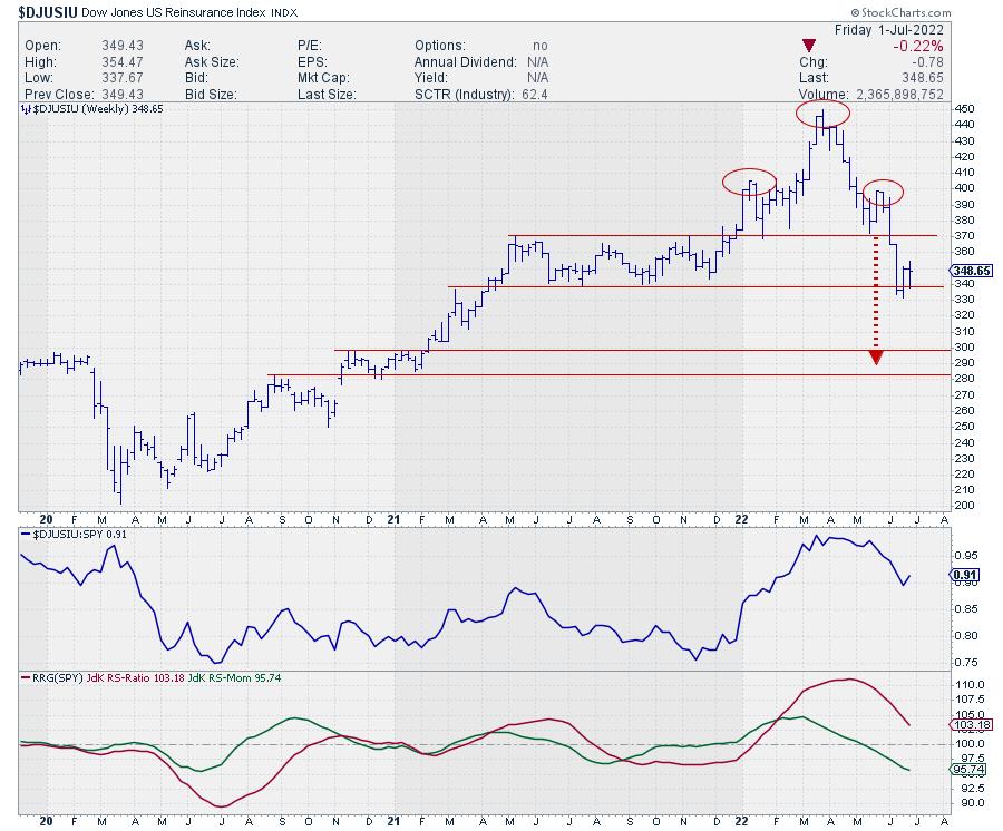
The Reinsurance index, which was one of the strong groups in January, has now rolled over and formed a large H&S top formation in the first half of 2022. The neckline, which was perfectly horizontal at 370, was broken three weeks ago. The initial decline took the group down to around 340, where support was found coming from the lower boundary of the 2021 range.
The target area, based on the height of the H&S pattern, is around 290. In the near-term, a bounce from current support back to the breakout level is possible, but such a move, when it happens, should be seen as a selling opportunity.
When this index breaks to new lows in the coming weeks, a further decline towards the 290 area is likely.
US Mortgage Finance Index

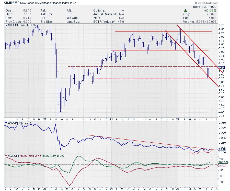
This group is still inside the improving quadrant, but at the longest tail and closest to crossing over into leading while at a strong RRG-Heading.
The price chart shows a falling trend channel after this group broke downward from a broad range at the start of this year. The index recently found support around 6.25 and is now pushing against double resistance coming from the down-gap and the previous low in the area around 7.00.
The interesting thing is the gradual improvement of relative strength. In the raw RS-line, a first higher low is visible, as it is trying to break the falling resistance line of the relative highs since mid-2020. This improvement, which is essentially a slowing down in the decline, has caused the RRG-Lines to gradually approach the 100-level. The RS-Momentum line has now already crossed above that level and RS-Ratio is closing in.
From a relative point of view, this makes Mortgage Finance a very interesting group. From a price perspective, it would help if we could hold above that support level near 6.25, then break back above 7.00 to support a further rise in relative strength.
All in all, it is very clear that money is rotating out of the insurance groups, and at least some of that money is moving into Mortgage finance and the other groups inside the improving quadrant.
#StaySafe and have a great weekend, --Julius
|
| READ ONLINE → |
|
|
|
| The Canadian Technician |
| Commodity Reckoning |
| by Greg Schnell |
Commodities have been a standout for two full years since the COVID lows. However, the charts faced some significant hurdles this month. This article presents a new look to the commodity charts that could help equities.
The CRB Index
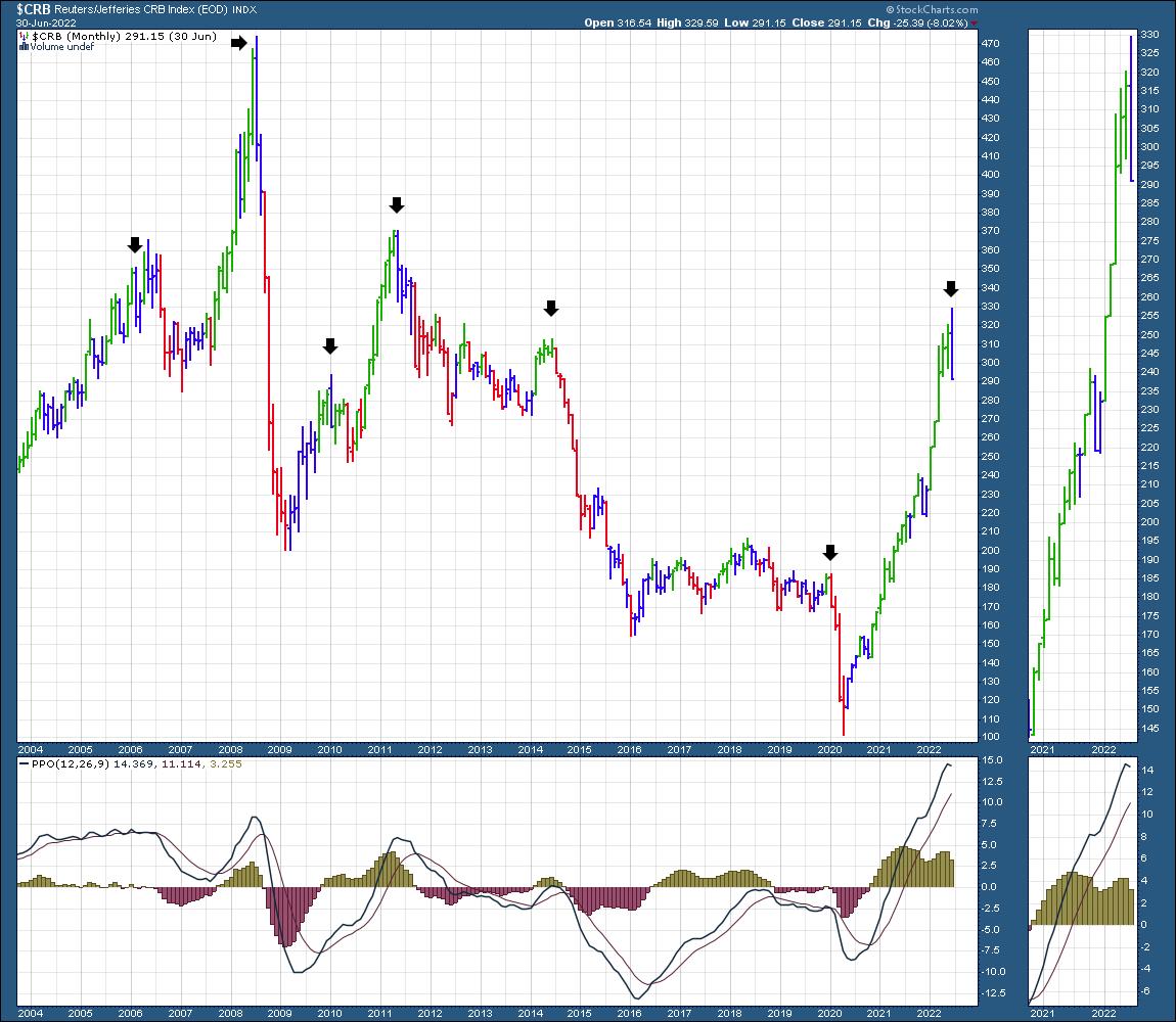
First of all, the $CRB index closed with an outside bar for the month. Much to the dismay of bullish commodity traders, this is a caution sign for me.

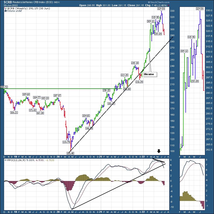
When I look at the weekly chart below, it has some clues for us as well. The weekly PPO (momentum) is making a lower high and has now broken the uptrend in momentum. There are two specific pieces of information there.
1) Momentum rolls over before price. The momentum is currently waning.
2) The long trend line off the COVID low is breaking, implying, at a minimum, that the pace of the commodity advance is changing.

For investors in commodities, there are no obvious exit signs at the top. If you are looking for an exit sign, watching the price action of investors on these two charts above is a great way to be aware.
The top in commodities always happens when it looks so bullish, exactly like the start of 2022 for the equity markets.
Some other examples
When I think about all the commodity traders in the world creating these market patterns as a group, it's important to realize the change in behaviour.
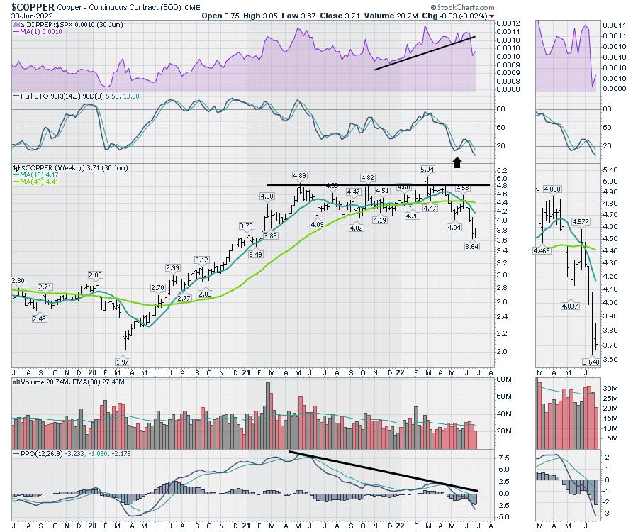
Below are two examples of specific commodities. Copper ($COPPER) has given a typical charting pattern of a major market top.

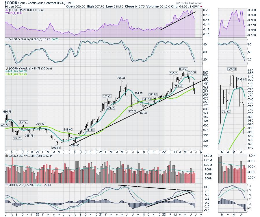
Below is Corn ($CORN).

None of these charts are suggesting pullback. The recession will slow demand, and these charts are pricing that in until further notice. I've been warning clients about the commodities for a while, and they continue to break down.
If you would like more technical analysis information about the four asset class pillars, we'll be holding a monthly conference call for clients of OspreyStrategic.org the week of July 4th. For the price of a $7 trial, catch up on the changes in the market, including more than just commodities. That will also give you a chance to read the weekly newsletter and watch the latest weekly video.
|
| READ ONLINE → |
|
|
|
| Trading Places with Tom Bowley |
| Falling VIX Spells BIG Trouble for the Bears |
| by Tom Bowley |
If there's one thing that a bear market - secular or cyclical - feeds on, it's fear. The further the drop, the bigger the spike we see in the Volatility Index ($VIX).
As explained by the CBOE.com website, the VIX "measures the level of expected volatility of the S&P 500 Index over the next 30 days that is implied in the bid/ask quotations of S&P options. Thus, the VIX is a forward-looking measure..."
So let's be clear about this. The VIX does NOT measure what's happening now or what just happened last week. Instead, it looks forward to determine expected volatility. High volatility is generally associated with falling equity prices and low volatility typically accompanies rising equity prices. As fear dissipates, expected volatility drops and bear markets end. That's the historical formula.
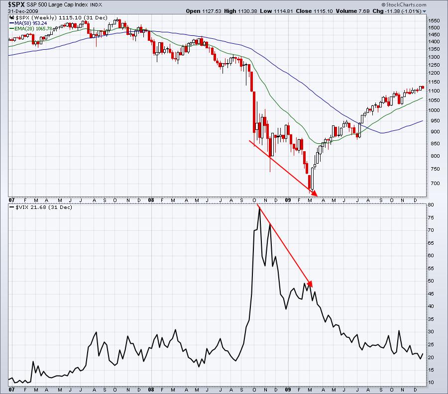
Let's start off by looking back to the financial crisis in 2008 and how the spiking VIX unfolded:

The VIX topped in October 2008 and, though the S&P 500 hit two lower price points, the bear market ran out of sellers, as fear came tumbling down in late 2008 and into the first quarter of 2009.
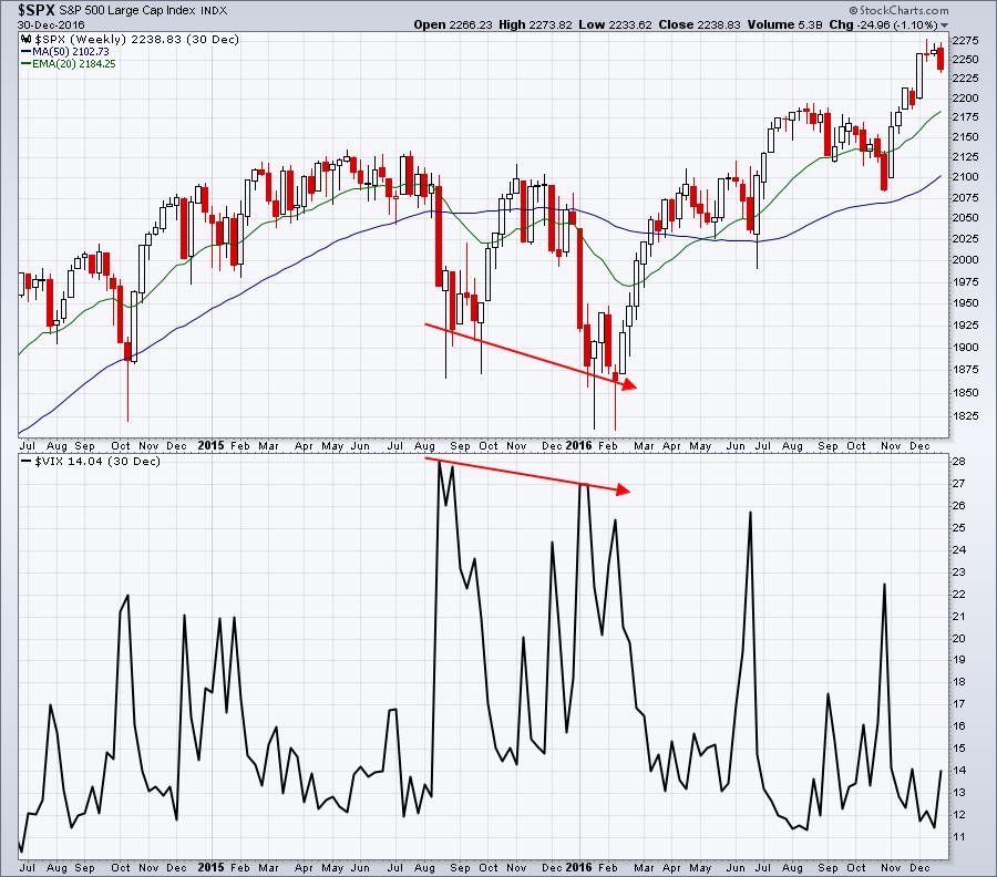
During the market turbulence in 2014-2016, we saw a somewhat similar pattern:

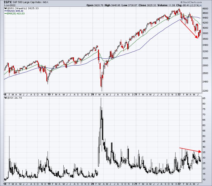
Q4 2018 was a very short cyclical bear market (less than 3 months), as was the pandemic-led selling in March 2020 (4 weeks), so there really wasn't much time to evaluate the VIX at various low points, but currently we're seeing a similar pattern in the cyclical bear market of 2022:

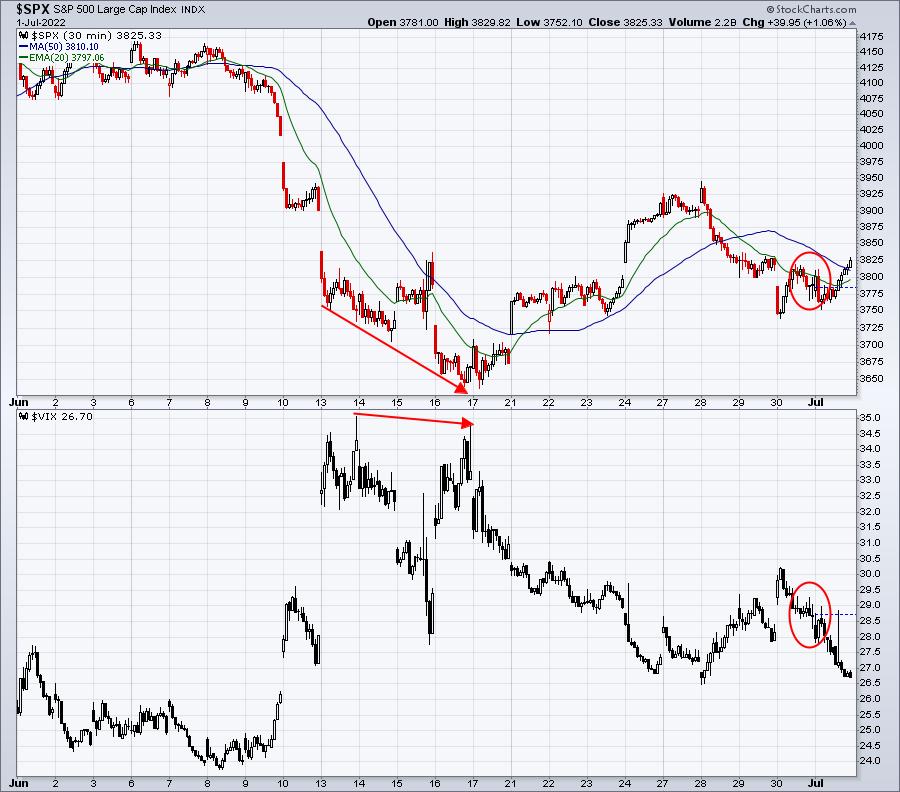
But the action on the VIX was really strange this week. The S&P 500 saw selling pressure once again, yet the VIX finished very close to a 3-week low. Check out this 1-month 30-minute chart:

From mid-day on Thursday through the early morning Friday, the S&P 500 fell from 3820 to 3750, and the VIX was dropping right along with it. That's extremely unusual behavior. The VIX is looking ahead, and it's pricing in less volatility. That suggests that we're being given a signal of a rally ahead. That's the reason the VIX goes down. Less volatility means higher equity prices.
We're heading into a fresh quarterly earnings season, and I'll be featuring one company that I believe is poised to make a big run into its quarterly earnings report later this month. To read about it in our next newsletter article, simply CLICK HERE and sign up for our FREE EB Digest newsletter. It only takes a name and email address. There is no credit card required and you may unsubscribe at any time.
Happy trading!
Tom
|
| READ ONLINE → |
|
|
|
| Dancing with the Trend |
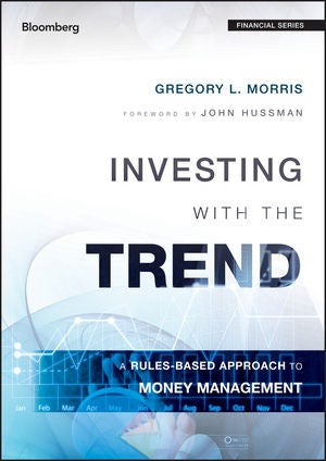
| "Investing with the Trend" Review |
| by Greg Morris |

A review by Dr. Mark Holder.
"History repeats itself." Never was a phrase (oft cited as Churchill quote) more apt in describing a text. The book, Investing with the Trend by Gregory L. Morris, is now more in tune with today than ever. As a trainer for new hires at investment banks and hedge funds, I have found one of the main purposes to this training is to relate past market scenarios to these new hires so they "don't reinvent the wheel." One story I relate is a passbook savings account I had that paid 14% annual interest! The events of 2007-08 are among many of the market situations that I relay to these groups to get them ready for their upcoming careers in finance. I also try to give them content and readings that they can use to continue their learning journeys. One of my highest recommended readings for these groups is Greg's book, "Investing with the Trend." It provides insight and reasoning behind the mathematics that is often used to explain how markets work. Every group I have trained has valued this text and I often receive feedback on how it helped them to get a better idea of markets, investing, and trading.
The first section on Market Fictions, Flaws, and Facts is a common sense look at the "rules of thumb" and outright fictions that permeate many texts in finance. I especially like Greg's chart showing performance with and without the ten best return days in a year. This often shocks people the first time they see this. Another fallacy is that of standard deviation and the measures for risk. Perhaps part of this continued belief is that using skew and kurtosis makes the math intractable. But that shouldn't be an excuse to simply use standard deviation as a risk measure (or its evil twin, volatility). Greg clearly dispels many myths that exist in finance. Mind you, he doesn't throw them out entirely, but puts them in context in terms what is useful and when to be much more careful in their use. While the mathematical concept of volatility has a place, what investors are truly concerned about, especially in today's markets, is whether their portfolio at a gain or loss – drawdown. Greg carefully delineates these concepts and gives the math its due but provides readers with better insight on what really matters regarding investing and portfolio management.
Greg also provides readers with a quite complete coverage of the behavioral biases that inevitably creep into decision making regarding investing. The presentation is clear and straight forward without any of the typical circular reasoning I have often seen, particular with respect how to deal with these logic errors. He distills down prospect theory into just a few paragraphs that provide the reader with everything they need to know without any of the academic hypothesis testing. I found these sections to be very insightful and self-explanatory.
Chapter 11 on drawdown analysis can be extremely useful for readers in terms of really understanding what risk is. He covers not just depth, but breadth of drawdowns. There are countless charts and tables illustrating how to understand and measure drawdown. It is important to note that good readers will likely review Greg's prior performance as a professional investor and his actual drawdown numbers. On seeing this, the reader will know that they are listening to the "Master's Voice" (sorry RCA Victor records for that quote).
Chapter 16 is short and sweet. It uses interviews with solid professionals to ensure that readers really understand what it takes to put the contents of this book into practice. The book is especially useful in today's investing world. History does seem to be repeating itself with 40-year highs in inflation, turmoil on the world stage, and forecasts (at least as of this writing) of a recession. The techniques and content provided by Greg are timeless, but especially important in the difficult investing environment today. Throughout the 2000's investing and trading looked easy. But "never mistake a bull market for brains" is never truer than it is now. Investing today and earning solid returns requires more than luck now. Chapter 15 provides readers with practical knowledge on putting your investing on the right track in today's marketplace. His advice on developing objective rules and discipline will be key to building your own system that works. The text has great advice and guidance on measuring risk and setting sell criteria to avoid large drawdowns. This chapter is replete with charts and tables that demonstrate these key tools.
In summary, you would be hard pressed to find a more well-written text that thoroughly explains why markets work the way they do. It provides readers with a solid understanding of the fallacies that exist about markets and instead provides a commonsense approach to truly understand, in an intuitive way, what is going on in the world of investing, markets and trading. The coverage of technical analysis avoids the faddish models often promoted by charlatans and instead gives readers a useful understanding of the real purposes of technical analysis. The last section of the book gives a practical and useful guide for building a rules-based trading system culminating in trend analysis and how to build your own successful system for investing. This book is full of great anecdotes, useful tips and is an easy read. It is a highly valuable read for everyone from part-time investors to highly experienced money managers. I am certain everyone will find practical and effective content that will change your thinking about markets and trading and enhance your performance.
Dr. Mark Holder is a consultant in financial markets, providing services to leading global Investment Banks, Exchanges, and Commodity Firms. He is also a lead partner for a proprietary trading firm located in Hong Kong. He has prior experience as the Director of Research and Product Development at two Exchanges, as well as Managing Director for a leading financial training company. His background also includes 14 years of teaching experience at the masters and PhD levels. While at the university he was the Chairman of the Department of Finance and Program Director of the Master Science in Financial Engineering program.
Dr. Holder has designed and conducted training programs for a wide range of clients including Goldman Sachs, Merrill Lynch, Barclays, Reuters, Dubai Financial Services Authority, CSRC, Guotai Junan, Aberdeen Asset Management and many other leading financial institutions for the past 15 years. These programs have covered a wide variety of topics, including Derivatives, Risk Management and Financial Modeling, for audiences such as Analysts and Associates to Managing Directors and Vice Chairs. He has also offered courses for Practical Training requirements and client-based courses as well.
Dr. Holder is also an accomplished author. His publication record includes more than 50 articles in leading journals. He was the Editor of the journal Review of Futures Markets, a leading academic journal covering the field of derivatives and markets for over 10 years. Mark has significant prior experience working in fixed incomes and derivatives from the CBOT and as a trader. He has firsthand knowledge of market practices and operations. His evaluations show he can convey this information is an intuitive way to participants to maximize their understanding and knowledge.
|
| READ ONLINE → |
|
|
|
| MORE ARTICLES → |
|
 Chart 1
 Chart 2
 Chart 3

