| THIS WEEK'S ARTICLES |
| Martin Pring's Market Roundup |
| Housing Data Disappoints, But Housing ETFs Rally |
| by Martin Pring |
Due to its sensitivity to interest rates, housing has the greatest average lead time going into recessions than any other economic (as opposed to financial) indicator. For that reason alone, it is worth examining amid the constant talk of recession.
The HMI vs. Housing Starts
Earlier this week, two important housing indicators were reported: the NAHB/Wells Fargo Housing Market Index (HMI) and housing starts. The HMI is based on a monthly survey of National Association of Home Builders members and is designed to take the pulse of the single-family housing market. The survey asks respondents to rate market conditions for the sale of new homes at the present time and in the next six months, as well as the traffic of prospective buyers of new homes. Unfortunately, data is only available since the mid 1980s, which is not that long in economic terms.
However, since its inception, the HMI has tracked the housing starts numbers pretty closely. It also has four advantages. First, the data is reported in the current month and not lagged by a month, as is the case with housing starts. Second, it is far less jagged and, therefore, offers a better reflection of the underlying trend, Third, the HMI has a tendency to lead housing starts by a month or two. Finally, since it is based on opinions, the reported number is never revised, unlike housing starts themselves.
Chart 1 compares the two series since the mid-1980s. It is apparent that both violated support trendlines in 1989, as well as in early 2006 just prior to the housing bust. The dashed arrows also show that the HMI experienced a small negative divergence, with the start data just prior to the housing crash.
The latest June data for housing starts showed a slight decrease, but not enough to decisively break that solid trendline that began in 2009. Note that the line is also close to the moving average, which has the effect of reinforcing its ability to reflect the trend. The chart also reveals that the HMI peaked in November 2020, whereas the highest level achieved by housing starts was set in April of this year. That's important because the HMI data for July dropped sharply and violated its 2012-2022 support trendline. This action indicates that a downward cycle is now underway.
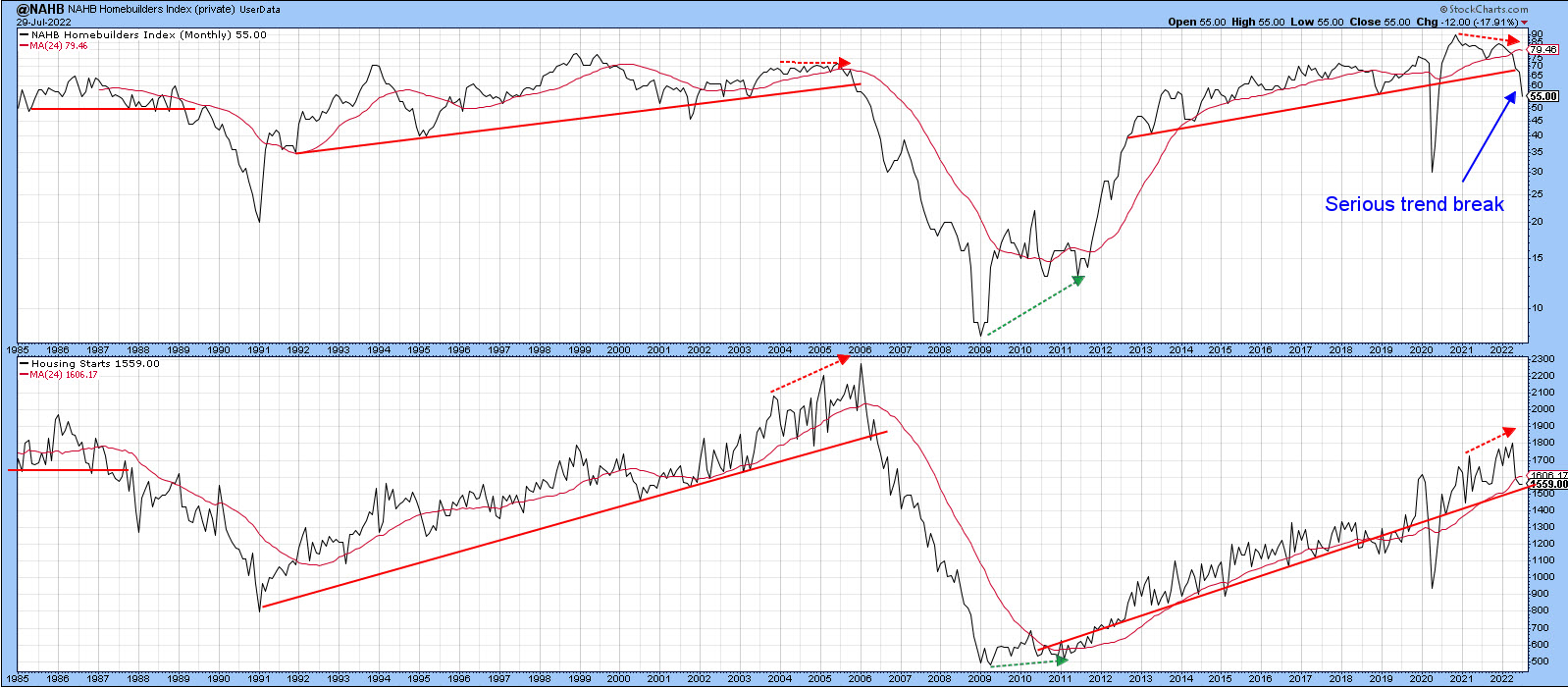 Chart 1 Chart 1
Charts 2 and 3 show that the long-term KST for both series is in a negative mode. Once again, we can see the leading characteristics of the HMI, since its momentum has been zig-zagging down for some time and is much closer to its equilibrium point than the KST for housing starts. Given the sharp break and leading tendencies of the HMI, it seems very likely that the housing start data will soon violate its secular up trendline. From an overall economic and housing point of view, that is not encouraging, as we look to this sector to turn up ahead of a growth slowdown or recession ending.
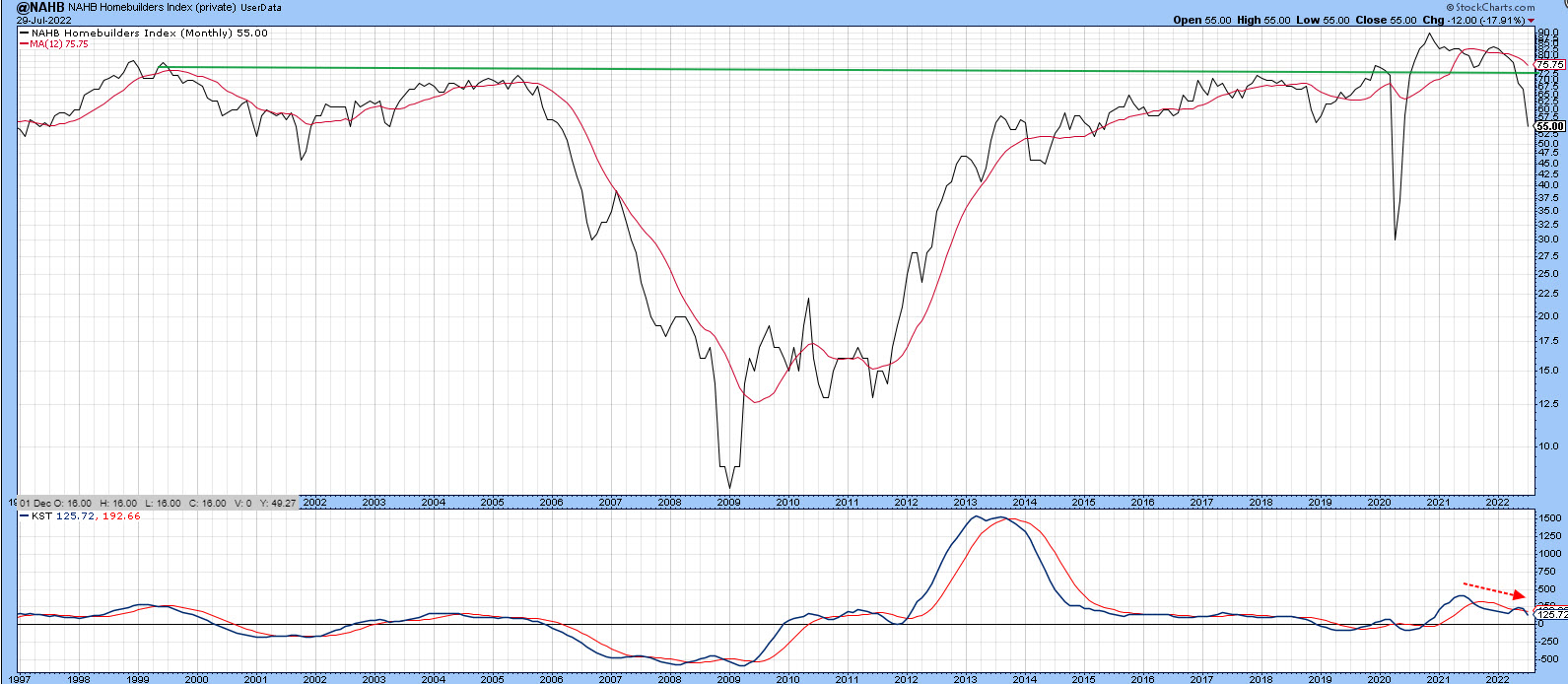 Chart 2 Chart 2
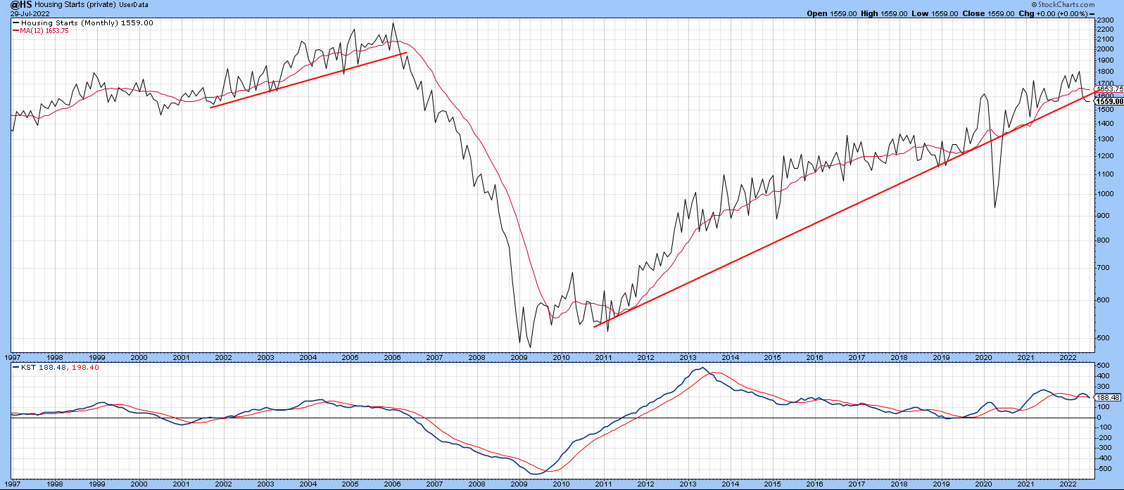 Chart 3 Chart 3
What are the Housing ETFs Telling Us?
There are two principal ETFs exposed to the housing industry: the SPDR Homebuilders (XHB) and the iShares Home Construction (ITB). The XHB is a purer play because it has a 45% exposure to building products, as well as 40% to household durables. The ITB, on the other hand, has a much more limited 13% allocation to homebuilders themselves, as most of its exposure (67%) is devoted to household durables.
Both act in a similar manner, as demonstrated in the to two panels of Chart 4. However, the XHB has been under-performing since late 2011. That may be about to change, as the ratio between them is very close to its secular down trendline.
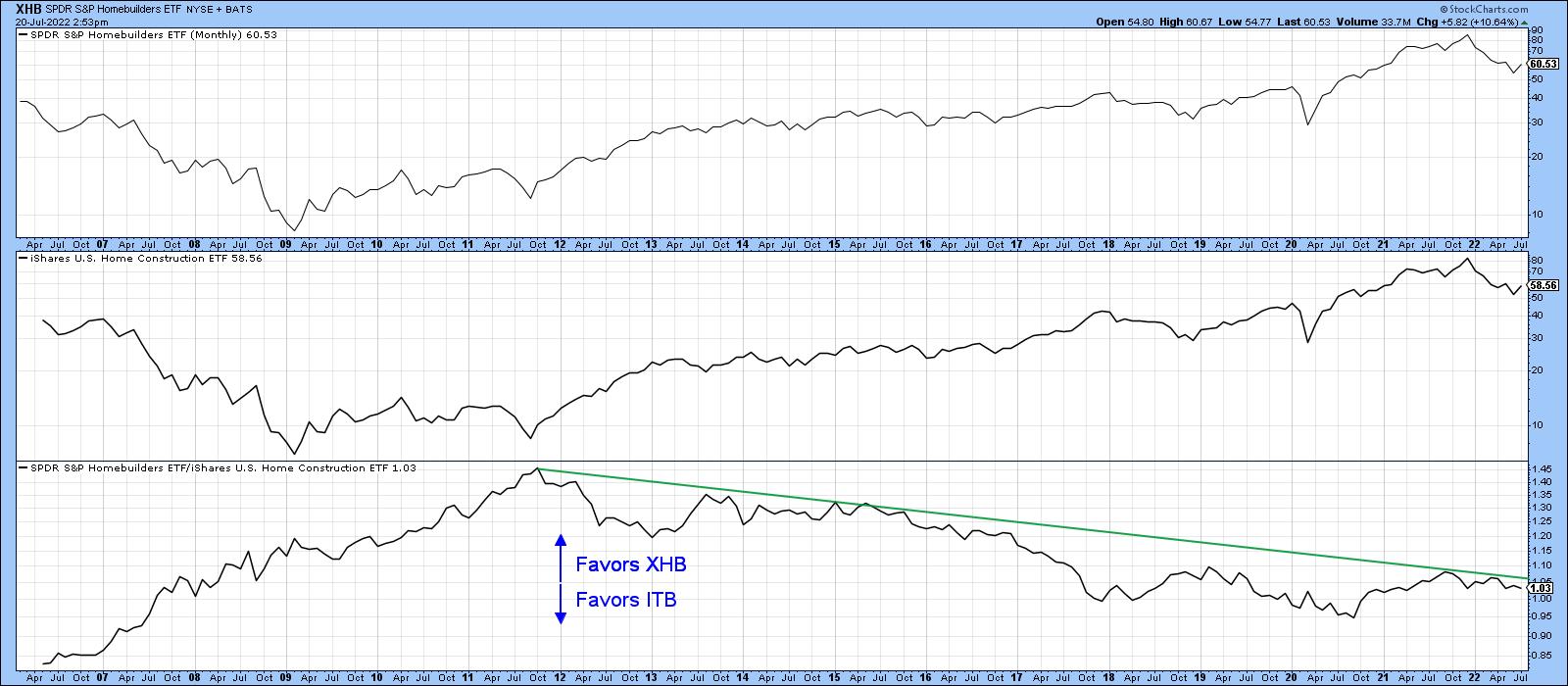 Chart 4 Chart 4
The XHB is again featured in Chart 5, where it is apparent that it peaked around the same time as the HMI. The price has since dropped close to 40%, so it has already factored in a lot of the bad news. The long-term KST, which monitors the primary trend, is still negative and sets an overall bearish mode. However, the fact that the price has rallied in the face of the very bad HMI news is a definite positive, which justifies the tentative reversal in the intermediate KST. A positive down trendline penetration by the price itself and the ability of the short-term KST to tentatively rise above its equilibrium level suggests that the mid-June bottom is going to hold . The ability of prices to rally in the face of bad news is definitely a good sign and encouraging first step. However, it is premature to call a primary trend reversal, as there is no strong technical evidence for that at present.
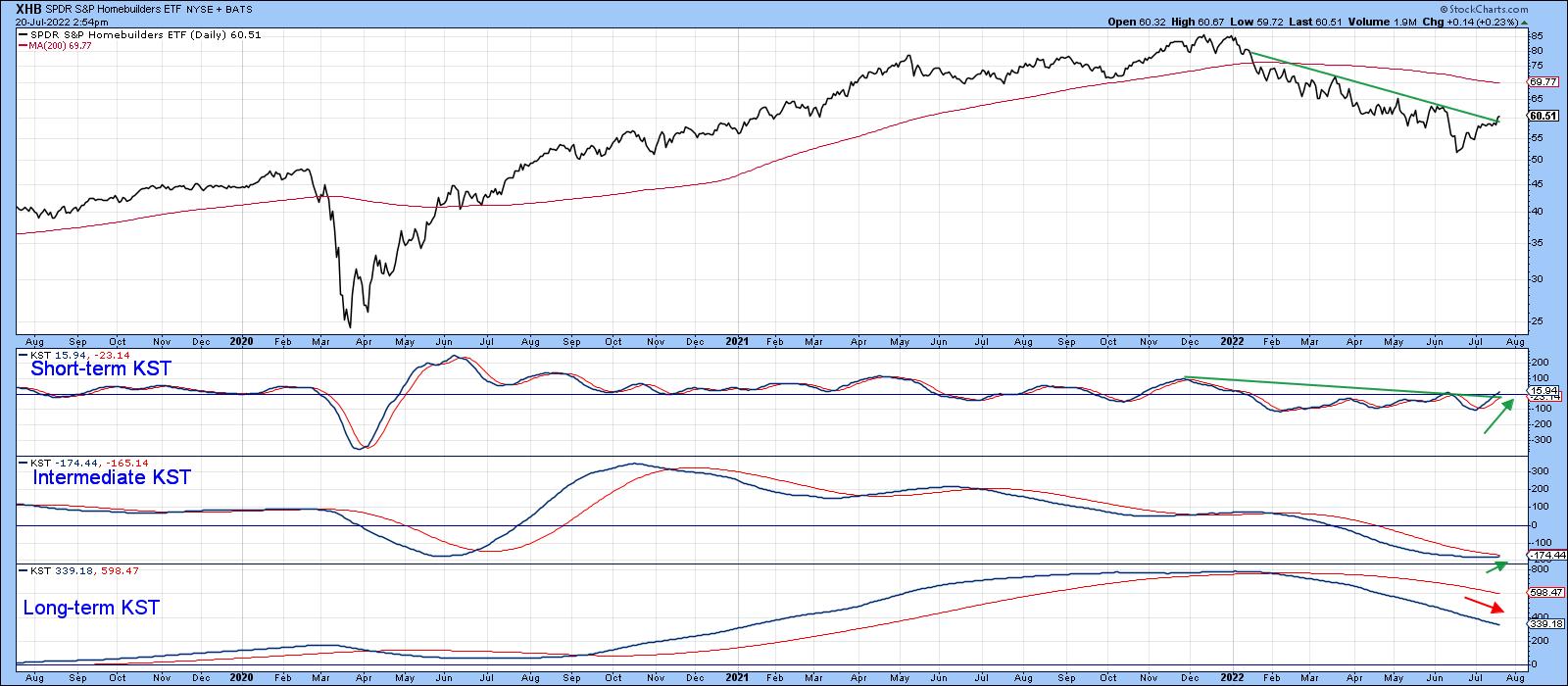 Chart 5 Chart 5
Good luck and good charting,
Martin J. Pring
The views expressed in this article are those of the author and do not necessarily reflect the position or opinion of Pring Turner Capital Group of Walnut Creek or its affiliates.
|
| READ ONLINE → |
|
|
|
| The Mindful Investor |
| It's All About That 50-Day Moving Average |
| by David Keller |
For the last couple months, when someone would bring up some bullish argument, my response would usually be something like, "Sure, but we're still below the 50-day moving average."
I've learned that this game is all about identifying a key level, price, signal, or what I call a "line in the sand," at which point you agree to revisit your investment thesis. This has helped me to avoid some of the temptation of behavioral biases like confirmation bias and endowment bias and focus more on the evidence that the markets provide.
So, when the S&P 500 broke above the 50-day moving average this week, I definitely took notice.
For me, the 50-day moving average is a key component to understanding trend. The 50-day moving average represents about 20% of the trading days in a calendar year, or about two and a half months. Quite simply, when the price is above its average price for the last couple months, that's bullish.
But here's the catch: it's all about time frames.
You see, if I'm trying to look out a couple months as an investment horizon, I want to be focused on the longer-term trends (which I like to capture with my Market Trend Model), but also understand the shorter-term fluctuations. The price breaking above the 50-day moving average tells me that the short-term picture has improved to the point the S&P 500 has broken above this key trend barometer. But we can take it a step further and see how the members of the S&P 500 index are faring against their own 50-day moving averages.
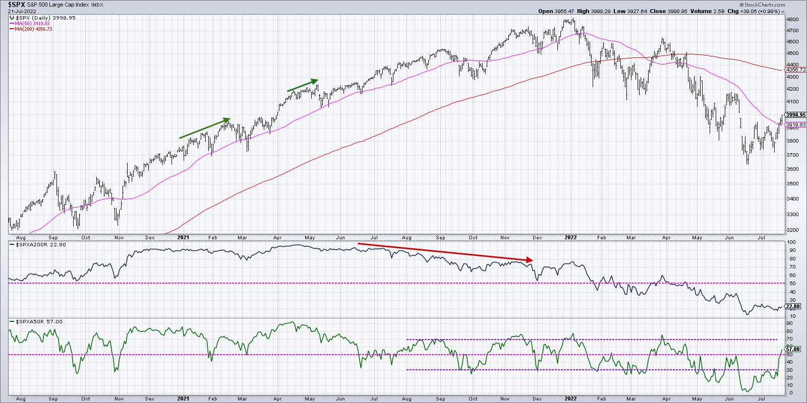
As of Thursday's close, 57% of the S&P 500 members were trading above their 50-day moving average. That's up from about 3-5% in mid-June. So, in one month, over half of the S&P 500 stocks have gone from below their 50-day to above their 50-day.
That's a decent rotation for a fairly large number of stocks. But is it sustainable?
Do your eyes glaze over when someone starts talking "doji" or "hammer" candles? We've got you covered! Here's our latest video covering how to trade using common candle patterns.
Starting in August 2021, most rallies have stalled out when this indicator has reached to 70%. We saw that in August 2021, November 2021, January 2022 and March 2022. A couple other bear market rallies saw this indicator rise only to around 50% in February 2022 and June 2022.
The March rally may be a good parallel to what we're seeing now. Are the broad macro conditions significantly better than before? I don't believe so. But investors are clearly buying into the short-term bull thesis and bidding stocks higher. In March, that pushed the S&P 500 right up to previous resistance around 4600 before the downtrend resumed.
Given the strength in stocks leading into next week's Fed meeting, I could see a rally to the June high in the 4100-4200 range. Let's see what percent of S&P 500 members are above their 50-day moving average if the market reaches that upside objective.
As an investor, you should have three goals every day:
- Identify trends
- Follow those trends
- Anticipate when those trends are changing.
That's it. So far in 2022, the trends have been largely down, and we've enjoyed tracking that downward phase on my show, The Final Bar. But I've seen enough short-term strength to cause me to focus on that crucial third goal.
The most bullish thing the market can do is go up. And on the tactical time frame, we've certainly seen that play out this week.
RR#6,
Dave
P.S. Ready to upgrade your investment process? Check out my YouTube channel!
David Keller, CMT
Chief Market Strategist
StockCharts.com
Disclaimer: This blog is for educational purposes only and should not be construed as financial advice. The ideas and strategies should never be used without first assessing your own personal and financial situation, or without consulting a financial professional.
The author does not have a position in mentioned securities at the time of publication. Any opinions expressed herein are solely those of the author, and do not in any way represent the views or opinions of any other person or entity.
|
| READ ONLINE → |
|
|
|
| The Canadian Technician |
| The Sector Rotation Model is Working Nicely |
| by Greg Schnell |
The market is a moving target, where something new is starting to run and something that was working starts to fail. It's very frustrating for the buy and hold investor, but, for the technical world using risk management techniques, it is a continuously morphing event.
In 2021, the market had tech leadership, with the software industry doing extremely well. When tech leadership failed, we had materials and energy take the lead. Recently, some of the best-performing sectors have been utilities and healthcare. Financials tried to lift off the lows during last Friday's options expiration. Subtly, in the background, the tech stocks are starting to get a bid. How can we keep track of all this?
Well, a great guy named Sam Stovall came up with a rotational model. Here is the link to the page with it, though you need to scroll down a little to see it.
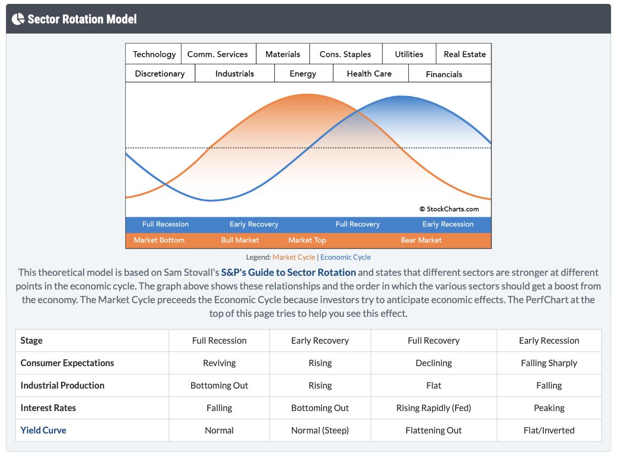
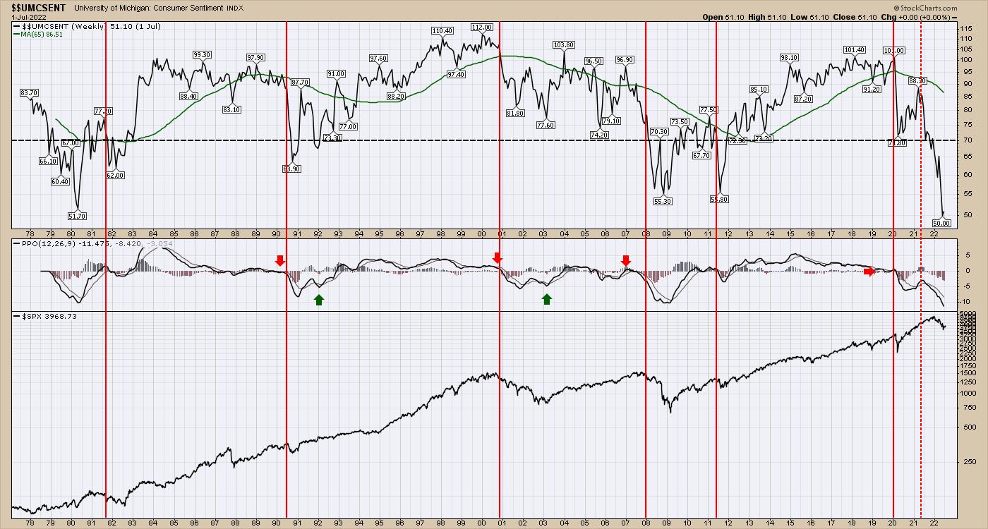
Analyzing where we are in the cycle is interesting with the little table at the bottom. Look at the last column, starting with "early recession." Consumer expectations falling sharply. University of Michigan consumer sentiment is at record lows.
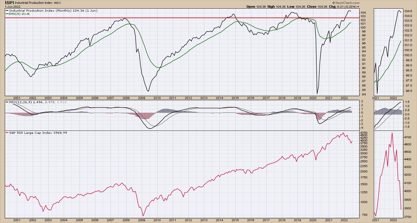
Industrial Production has been a mishmash due to supply chain problems. It's not falling sharply, but it is having end of cycle issues. Examples include automobile availability, appliances, port congestion, etc. However, it has started to roll over.
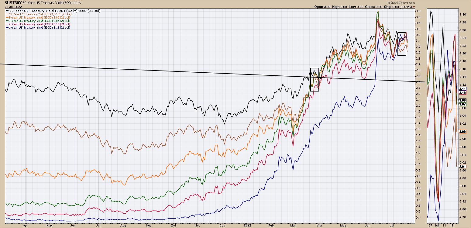
Interest rates are still rising, as the Fed is expected to announce another increase. But Bond markets are not accelerating higher, suggesting they think most of the move is done. Interest rates have been at this level for roughly three months, amazingly.
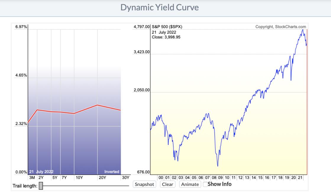
Lastly, we have the yield curve. There are some negative slopes between the time periods, which means an inverted yield curve.
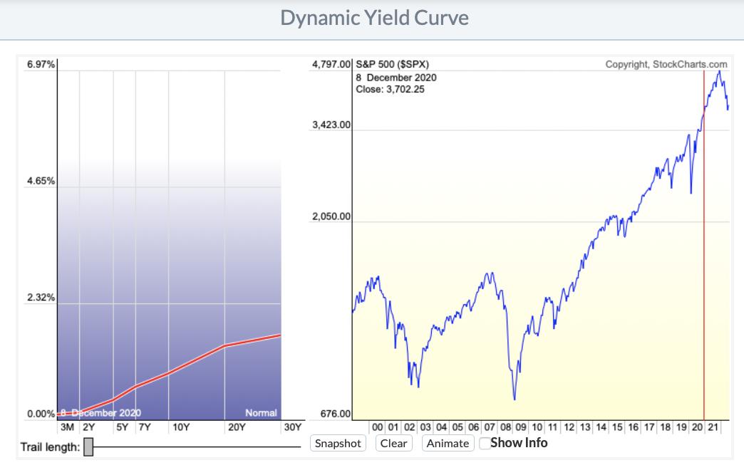
This is what a normal yield curve looks like.
This market model is working remarkably well. At Osprey Strategic, we try to keep clients aware of where we are in this rotation, to help find the next areas of opportunity. I try to keep clients abreast of the moving target called sector rotation. We also host a monthly conference call which is coming up next week. If you'd like to sample the OspreyStrategic.org offering, we have some trial subscriptions available for just $7. If you sign up before month-end, we also host a monthly conference call, which is coming up next week. Once you register, you'll be able to join in. Best wishes on your investing journey.
|
| READ ONLINE → |
|
|
|
|
|
| Trading Places with Tom Bowley |
| These 3 Earnings Massacres Last Night Had 1 Thing in Common |
| by Tom Bowley |
Trying to predict how Wall Street might react to an earnings report is no simple task. Sometimes, a stock has a big run into its earnings report, but then sells off after delivering solid results. It's the old adage, "buy on rumor, sell on news." In my experience, it pays to listen to what Wall Street is saying BEFORE the news comes out.
Every quarter, we have a quarterly earnings webinar where I point out what I believe are the strongest and weakest companies as they speed towards their earnings confession. Earlier this week, we had our "Q2 Earnings - Sneak Preview" event and I looked only at stocks that were reporting quarterly results this week. Last night, earnings were not good and neither were their reactions. 3 of these stocks, however, were stocks I cautioned about, because their relative strength was very weak as they approached earnings. Here they are, in no particular order:
Capital One Financial (COF)
After the bell yesterday, COF reported revenues and EPS that BOTH fell short of Wall Street expectations. I wasn't at all surprised. Take one look at the COF daily chart:
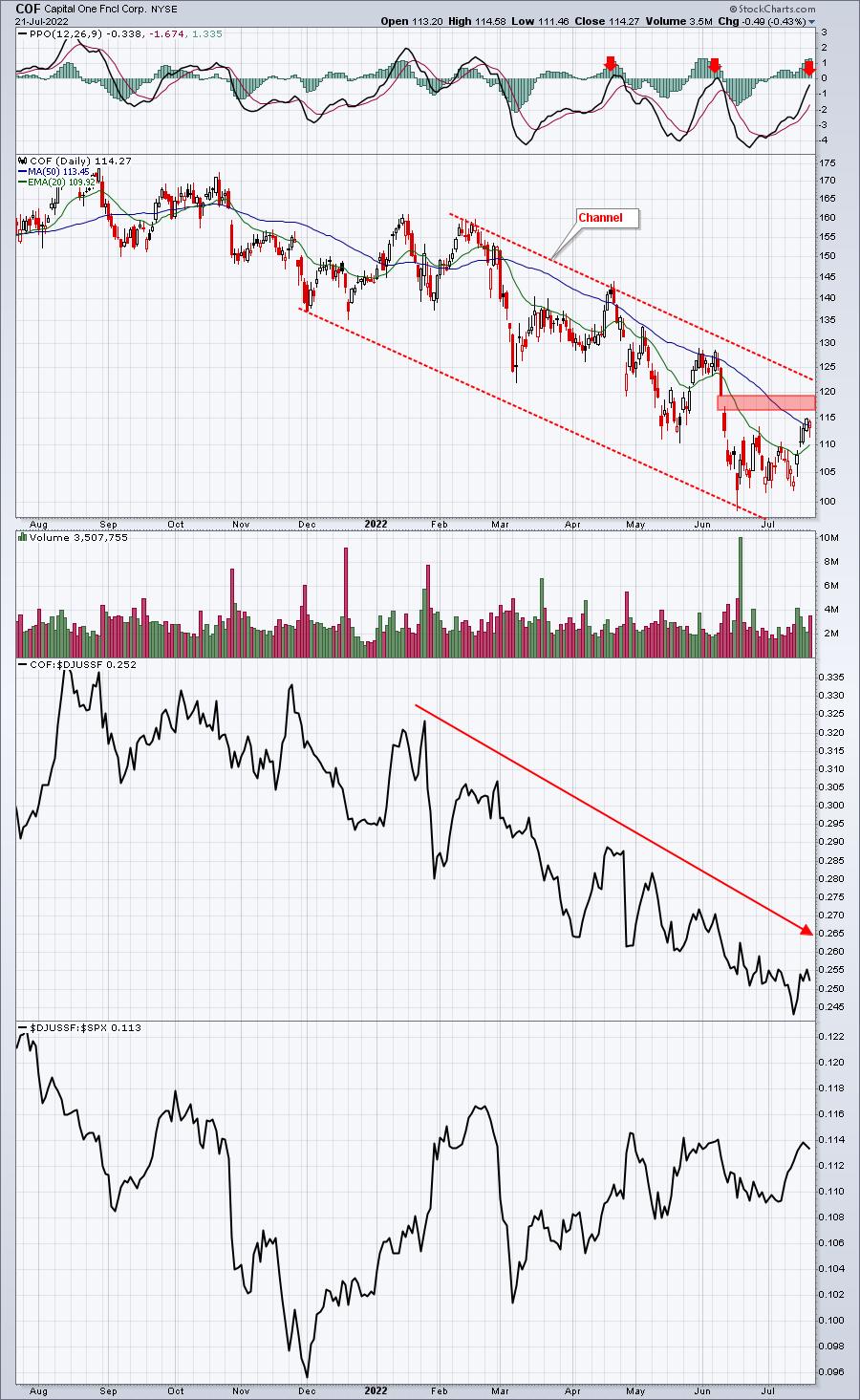
Gap resistance, the down channel, and PPO centerline resistance were all reasons to be cautious technically, but it was the consistent downtrend in relative strength that made me most cautious. Wall Street firms regularly meet with management teams and are able to differentiate between the strong and weak companies within an industry group. Relative strength is, in a way, a report card that summarizes how companies and their management teams are performing. When I see a downtrending relative strength chart like COF's, I can't help but believe that a shoe is about to drop. Last night, COF dropped a couple shoes and it's trading down roughly 5% in pre-market action.
Snap, Inc. (SNAP)
Like COF, SNAP also hit the daily double -- in a bad way. It, too, fell short of both revenue and EPS estimates, announced a reduction in its hiring rate, and avoided future guidance altogether. Several analysts downgraded the stock after the earnings were released. Based upon the stock's very poor relative strength, I'd say Wall Street firms have consistently been selling this stock for months:
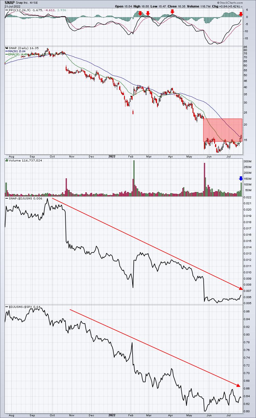
The blue arrow marks the big volume that accompanied SNAP's nice day on Thursday as it approached its earnings report. I've heard traders say, "oh, someone must know something!" and then they proceed to buy the stock ahead of earnings. Big risk and big mistake. I'm not just saying that because SNAP is down 33% in pre-market. I'm saying it because Wall Street has been bailing on SNAP for almost a year. It's an awful relative performer in a poorly performing industry group -- internet ($DJUSNS). Wall Street's not buying, so why should we expect a great earnings report? SNAP is a dumpster fire.
Intuitive Surgical, Inc. (ISRG)
Once again, we have a company that reported revenues and EPS below expectations. We should have seen this coming:
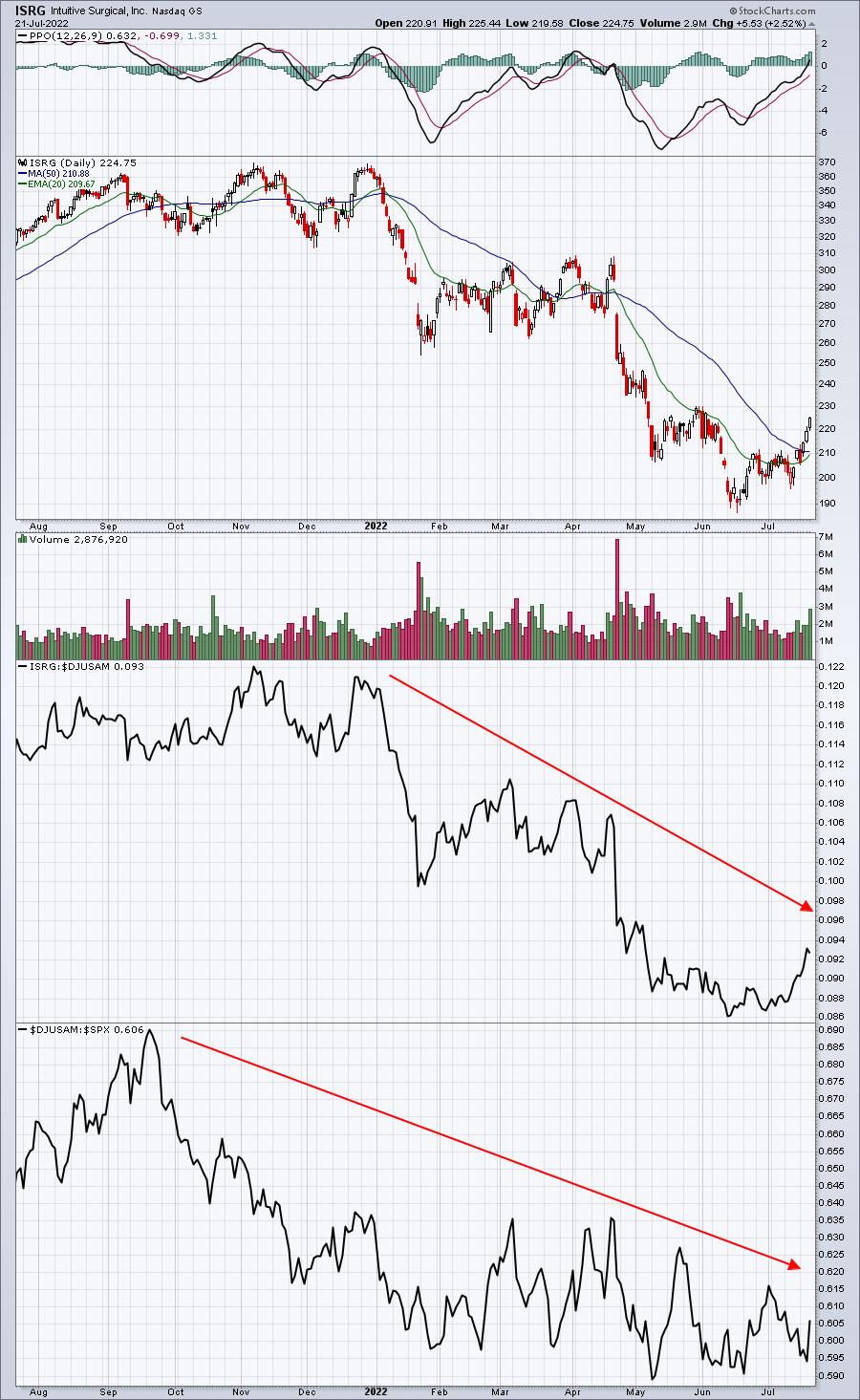
Some technicians might point to price action moving above its 50-day SMA as a signal of health. But we have to keep in mind that the overall market environment has improved substantially. Since the stock market bottomed in mid June, the S&P 500 has rallied more than 10%. It's a "rising tide lifting all boats" kinda thing. Relative strength tells us what Wall Street truly believes about the company and ISRG's relative strength has been tumbling throughout 2022. There'll be a time to buy, but just before earnings wasn't the time.
Conclusion
Listen, holding ANY stock into earnings is incredibly risky. I've seen stocks with excellent relative strength lay an egg. There's a human element to all of this and sometimes management teams simply aren't honest with Wall Street throughout the quarter, believing they can turn things around. But over the years, I've found that nothing works better than relative strength in terms of providing us key clues about upcoming earnings reports.
On Monday, in my FREE EB Digest newsletter, I will be providing a very well-known company that's likely to be massacred after its upcoming earnings report. I can promise you this - there's ZERO chance I'd hold into its earnings report. If you'd like to receive this article on Monday, and you're not already an EB Digest subscriber, simply CLICK HERE and enter your name and email address. There's no credit card required and you may unsubscribe at any time!
Happy trading!
Tom
|
| READ ONLINE → |
|
|
|
| RRG Charts |
| 5 Interesting Industries In Industrials |
| by Julius de Kempenaer |
In this article, I'd like to dig a bit deeper into the Industrial sector.
Starting at the sector level, we find the tail for XLI inside the weakening quadrant and moving towards lagging. So definitely not one of the better sectors. As a matter of fact, it's one of the sectors that is about to start underperforming the S&P 500 index.
Sector Level
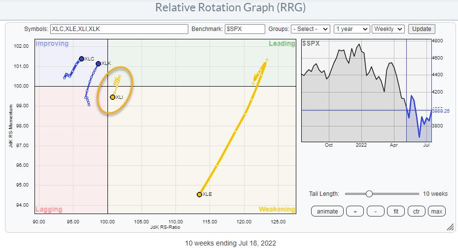
The industrial sector is one of the sensitive sectors (vs. offensive and defensive) together with communication services (XLC), technology (XLK) and energy (XLE). They are plotted on the RRG above.
It becomes instantly clear that this "sensitive" group is split in half. On the one hand, XLK and XLC are inside improving and traveling at a strong RRG-Heading towards leading. On the other hand, XLI and XLE are inside weakening and traveling at a negative RRG heading towards lagging. XLE still has some wiggle room, as it is going through a setback after a massive rally. XLI is different as it is very close to crossing over into the lagging quadrant.
In terms of market capitalization, industrials are a mid-tier sector at 8% of the S&P 500. But the industrial sector is a big sector in terms of groups and individual stocks inside those groups. XLI holds 71 individual stocks. When you go to the sector summary page and click the RRG icon for XLI, you will get the RRG that shows the industries inside XLI. All 16 of them.
16 Industries Inside Industrials
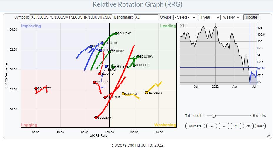
When plotted against XLI as the benchmark, we get the picture above.
Some of these tails are long and nicely pointing in a clear direction, while many are less decisive. Even if I plot all the groups against SPY, the spread remains fairly even across the entire image, which means that there is no clear direction for the sector as a whole. This explains why XLI is/remains so close to the benchmark at the moment.
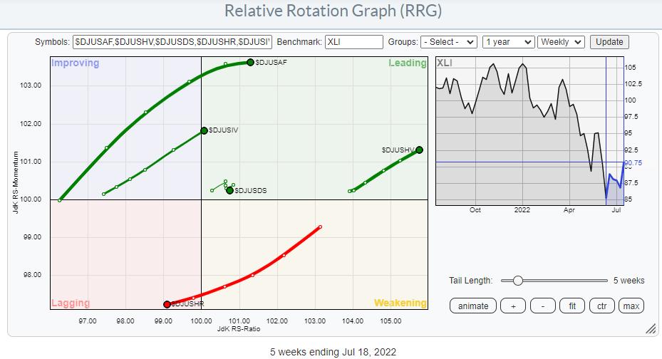
By browsing through all tails, using the arrow keys on my keyboard to highlight the next tail, I have identified a few groups worth extra attention. I have highlighted these groups on the RRG below.
Commercial Vehicles & Trucks - $DJUSHR
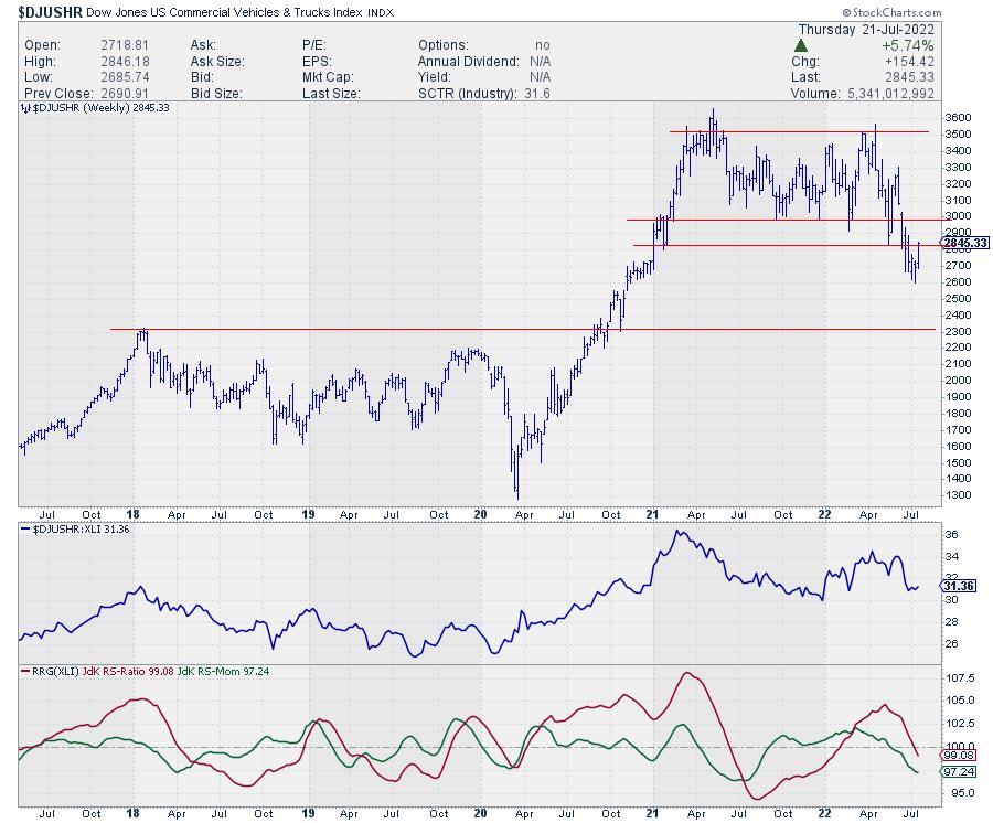
This is very clearly a weak group, and it's a group inside the industrial sector that I'd like to avoid.
Both RRG-Lines are pushing lower below the 100-level, taking the tail deeper into the lagging quadrant. This follows the weakness in the RS-line that has started to increase after rolling over, putting a new relative peak in place.
But maybe even more important is the massive top-formation that was recently completed after the index broke below support near 3000. After the break of this horizontal support level, the index has now started to recover somewhat, but, as far as I'm concerned, that is only a pullback towards the breakout level, where the market will very likely find resistance. So the upside here is very limited.
Industrial Suppliers Index - $DJUSDS
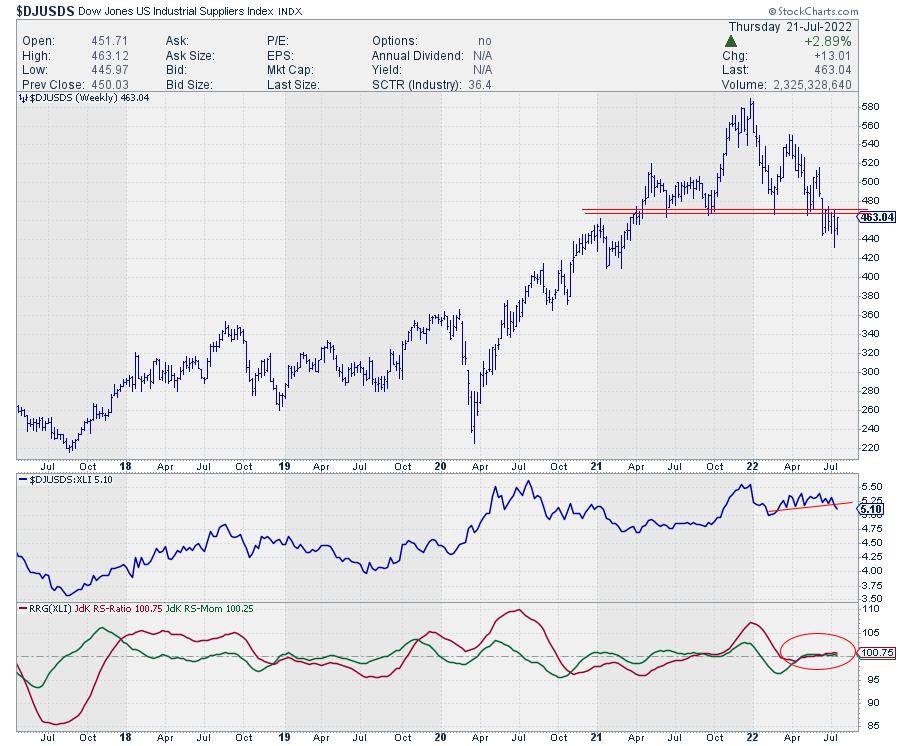
The Industrial Suppliers group has an unusual tail. It is inside the leading quadrant, very short and with no clear direction. This becomes clear when you look at the RRG lines, which are almost on top of each other and only just above the 100-level.
Looking at the raw RS-line shows that it has just started to break away lower from a small trading range and is picking up downside momentum. Combining that with a big topping formation that was recently completed in the price chart suggests that the tide is shifting towards a more negative outlook for this group.
The break below support in the 470 area was definitely a negative signal from a price perspective and is now starting to take its toll on relative strength. Continued weakness for this group will rapidly push it down into weakening, likely into lagging after that.
Delivery Services - $DJUSAF
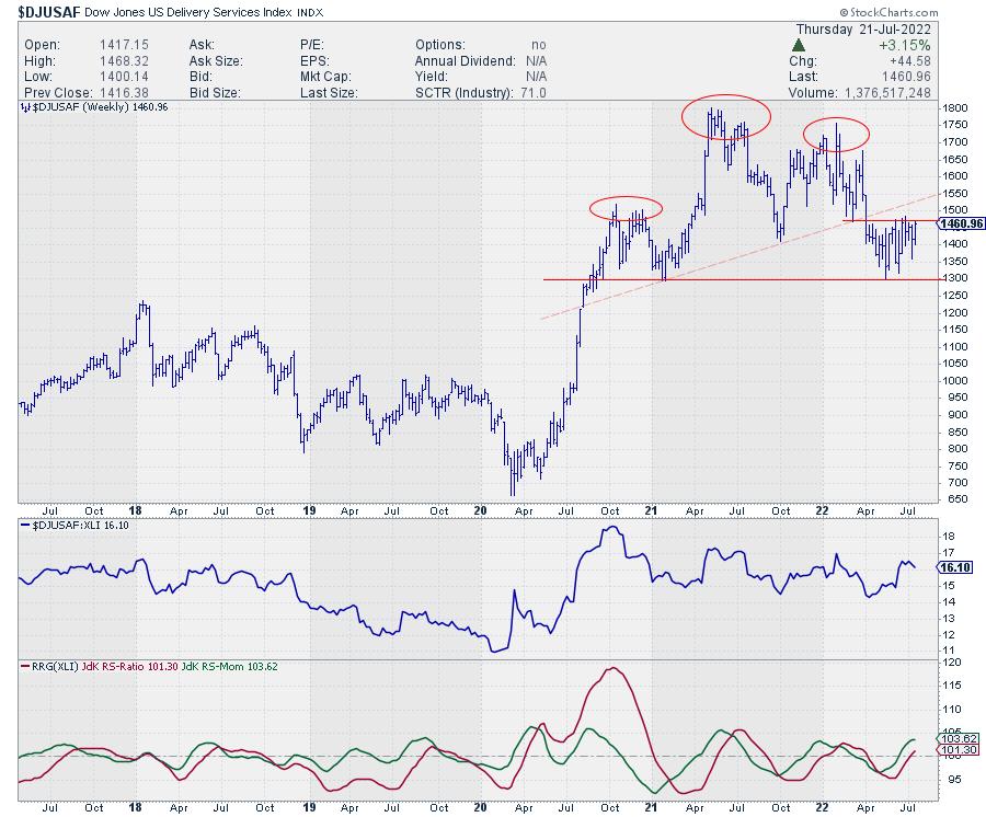
This group has the highest JdK RS-Momentum reading and pushed into the leading quadrant a few weeks ago. It is picking up on the JdK RS-Ratio scale.
At first sight, that looks like a strong and interesting rotation. And, from a relative point of view, it certainly looks strong. Especially when the RS-line can push beyond the overhead resistance that it is currently attacking. However, when we bring in the observations from the price chart, things are not so rosy. It looks as if we had a massive head-and-shoulders reversal that formed over the last year and a half, which is now starting to take its toll.
Going with that observation, we have now had the initial decline, and the market is pulling back and did not even make it back to the neckline, which is weak from a price perspective. So price and relative are presenting us with conflicting pictures. From a relative point of view, things look pretty strong for the group. From a price point of view, not so much. There is this big reversal pattern which, I think, is still in play, but there are also the first higher lows being put into place. And it looks as if we're pushing against resistance around 1470.
Hence, this can go both ways. If we take out 1470-1500, more upside will be unlocked, potentially back above that neckline. In that case, the delivery services index will definitely improve further and push that relative strength further up. On the other hand, if that fails and the decline continues, we break 1300, and then there is much more downside to be expected for this delivery services index.
Tradable opportunities will very likely arise in either scenario, but we have to wait for the market to choose its direction and act accordingly when it happens. In this case, I am watching 1300 on the downside and around 1500 on the upside.
Heavy Construction - $DJUSHV
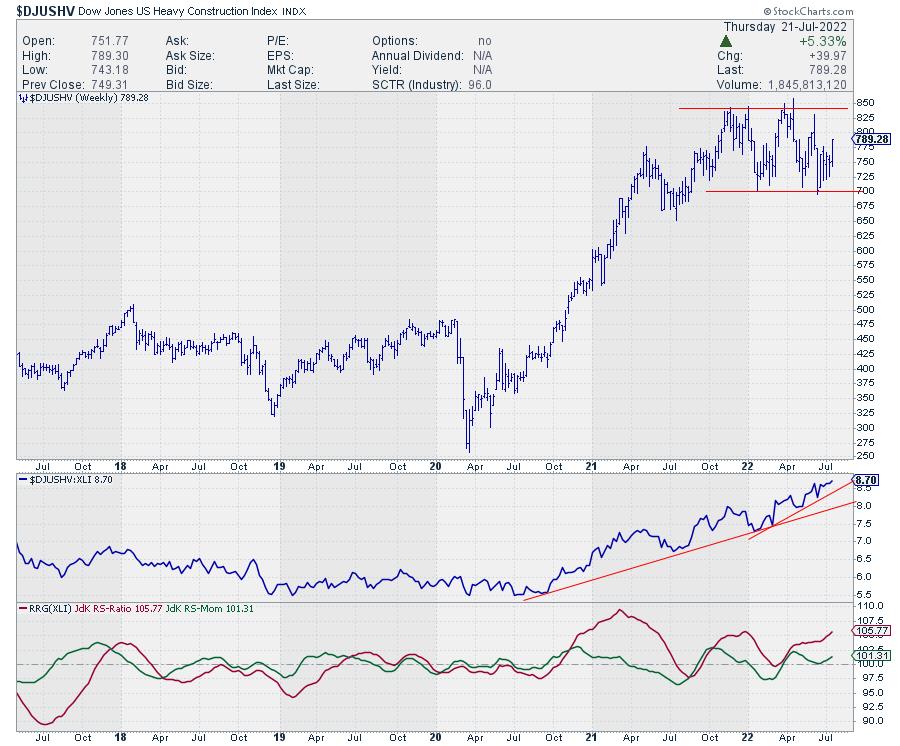
The relative strength for the heavy construction index is still nicely moving higher in an uptrend that started back in the summer of 2020 and is still in play. On the Relative Rotation Graph, this results in a tail that is deep inside the leading quadrant and moving further into it at a strong RRG-Heading.
On the price chart, $DJUSHV is caught in a trading range between 700-840, currently moving up towards the upper band of that range. At the moment, there is very little that points to a potential upcoming weakness for this group, which makes it one of the stronger industries within the industrial sector.
Business Support Services - $DJUSIV
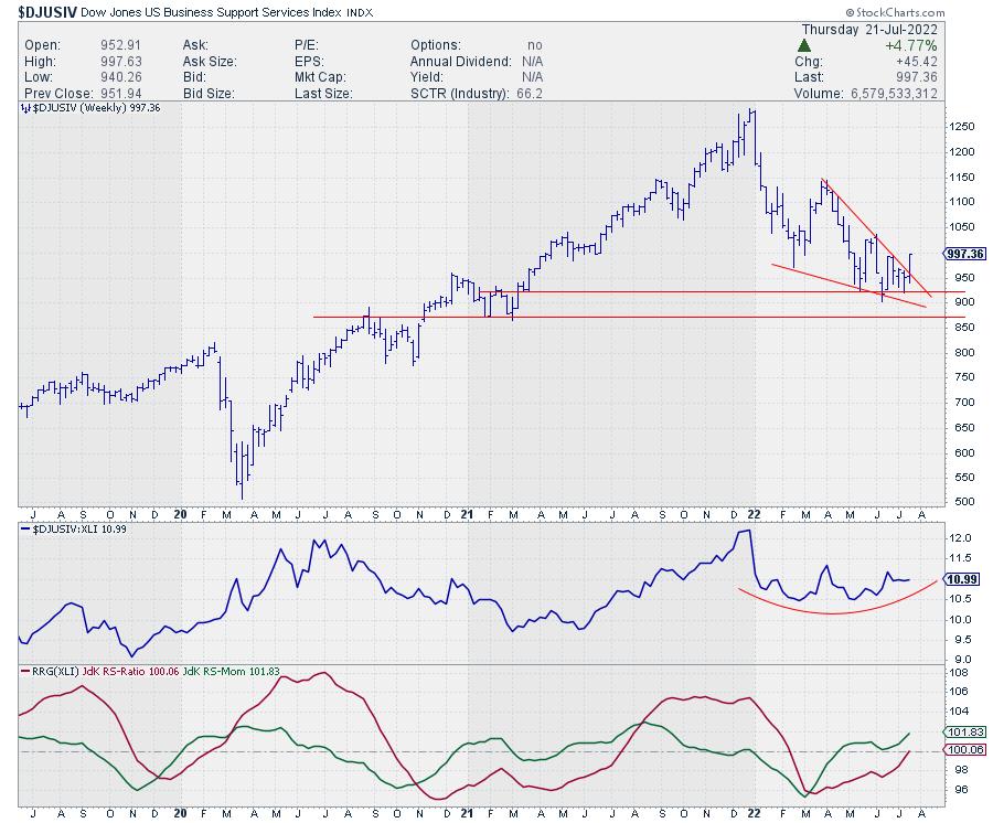
Saving the best for last. The Business Support Services index has just crossed over into the leading quadrant following a slow turnaround in the raw RS-Lines, which is still in the process of bottoming out after a dip that started at the beginning of the year.
The improvement of relative momentum (green JdK RS-Momentum line) has now resulted in the RS-Ratio line also moving above the 100-level, pushing the tail into the lagging quadrant. What makes this group especially interesting is the fact that it arrived at an important support level a few months ago and it is still holding up above that level (~ 900).
Against that support level, a falling wedge pattern was formed, and, this week, $DJUSIV seems to be leaving that wedge to the upside, which suggests a bullish follow-through. Combined with the improving relative strength, this makes it the group with the biggest upside potential at the moment.
#StaySafe, --Julius
|
| READ ONLINE → |
|
|
|
| Top Advisors Corner |
| A Subtle Message in the Volume Summation Index |
| by Tom McClellan |
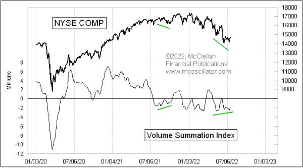
If we look at the classic version of the McClellan Volume Summation Index in this week's chart, then there is some reason for the bulls to have hope.
There is a slight bullish divergence right now, with prices having made a lower low, but the Summation Index has made a slightly higher low (at least for the moment). However, digging deeper, the message gets more complicated. The Volume Summation Index is very similar to the McClellan A-D Summation Index, for which we are more familiar, which is calculated off of the numbers of Advances minus Declines. Both tools were developed by my parents, Sherman and Marian McClellan, back in 1969. The difference is that the Volume Summation Index uses the daily difference between NYSE Up Volume and Down Volume to drive the calculations.
First there is a McClellan Volume Oscillator, calculated as the difference between a 10% Trend and a 5% Trend of the daily Up-Down Volume difference. See this link for a description of the calculations. Then, the Volume Summation Index is an ongoing running total of past Volume Oscillator readings. So the Volume Summation Index will change each day by the value of the Volume Oscillator.
The Volume Summation Index will generally go up and down as prices go up and down. But how far it goes can carry an important message. And that is where we finally get to the topic of this week's posting.
That little bullish divergence that is evident in the classic Volume Summation Index is not evident in the Ratio-Adjusted Volume Summation Index, which can be abbreviated as a Volume RASI. While the number of issues traded is relatively consistent on a day to day basis, and drifts somewhat over long periods of time, it is a different story with the volume numbers. Those can vary a lot from day to day, which can greatly affect the amplitudes of indicators based on those Up and Down Volume numbers.
The RASI factors out changes in the number of issues or the amount of volume traded over time. See this link for calculation details. And, in doing that, the Volume RASI can reveal messages that the regular Summation Index does not show us.
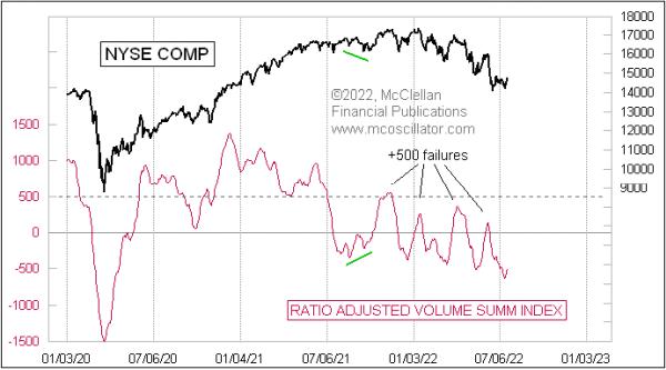
Back in August 2021, the Volume RASI agreed with the bullish divergence that we saw in the classic Volume Summation Index. But it disagrees right now, showing a continuing progression of lower highs and lower lows. So not much hope for the bulls in this version.
The Volume RASI also shares a property with the A-D RASI, in that it can show bullish strength when it is able to climb up above its +500 level. The higher it goes above +500, the stronger the message. Perhaps more importantly, it shows a lack of strength when it fails to get up above +500 on a rally attempt, and that is what we are seeing all during 2022. Each countertrend rally attempt has seen the Volume RASI fall short of reaching the +500 level, telling us that the bears are in charge and the bulls cannot achieve "escape velocity" in their rally attempts.
So which version of the Volume Summation Index is the "better" one, the RASI or the classic? That depends upon how one uses either of them. The important message is that each can be useful, and when they disagree it is a noteworthy condition to which we should pay attention.
|
| READ ONLINE → |
|
|
|
| Mish's Market Minute |
| Weekend Daily: What Will Drive the Commodities Market? |
| by Mish Schneider |
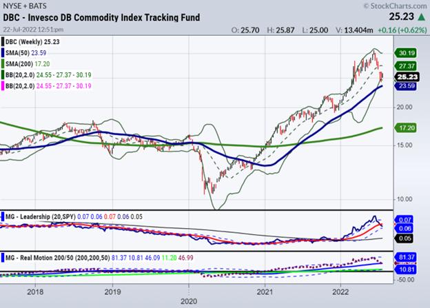
Commodities across the board rallied after the Russian invasion of Ukraine and have since declined significantly.
Before the War though, commodities were already enjoying a rally due to results of the pandemic such as supply chain, low production, rising demand, high government debt and labor shortages.
The other significant factor influencing commodity prices is the value of the U.S. dollar. A stronger greenback makes dollar-denominated commodities more expensive for foreign buyers, which pushes prices lower.
Right now, the dollar seems to have found a peak. With FOMC on tap, that could change. Assuming a peak has been established, we can also make that a reason for a bigger move in commodities.
So while a short-term correction ensues, commodities could still have massive room to run in the longer term. The Invesco DB Commodity Index Fund is currently near the 50 day moving average suggesting commodity prices have found support and will continue higher.
Next week, there will be lots more earnings on tap plus, we have the FOMC meeting. With expectations of a raise by 75 bps, there has been hints of perhaps .50 bps instead.
Moreover, Powell suggested that this raise at the next meeting could be the end of aggresssive rate hikes in general.
If one follows the logical path we can assume a few things:
- Yields remaining around 3% will not impact a 9.1% inflation rate
- A weaker dollar will not help reduce inflation
- With nary a recession (strong labor, ok housing market) nor economic growth (earnings mixed, reduction in corporate spending) in the near future, stagflation-a word rarely used, is the economic theme
- The war in Russia-Ukraine is not ending
- Oil supply remains low
- China, still somewhat asleep, has yet to emerge hungry for raw materials.
What we did see this past week was a potential bottom in gold and in bitcoin.
Whether we see more rally in the equtities remains to be seen, yet, the rally to resistance certainly supports a stagflation-trading range scenario.
This coming week, watch a few key indicators.
First, watch the yields and the high grade plus high yield bonds.
Secondly, watch the consumer discretionary sectors. We need to see the consumers stay in the game.
Watch the dollar and the gold market-if gold continues to hold the major multiyear support, then we see a big gold rally coming.
Finally, watch the oil and energy market. Should crude oil join natural gas in a new bull run-commodities will soar while equities will suffer.
Investing in commodities can be a speculative bet on future price movements or a way to hedge against other investments in one's portfolio. Energy commodities, for example, may be used as a hedge against inflation.
Adding commodities to a larger balanced portfolio can also help reduce risks as commodity prices tend to have low correlation to other assets such as stocks and bonds.
Commodities provide valuable diversification and enhanced risk-adjusted returns to a portfolio, but active management is needed, due to volatile price swings.
 Get your copy of Plant Your Money Tree: A Guide to Growing Your Wealth and a special bonus here. Get your copy of Plant Your Money Tree: A Guide to Growing Your Wealth and a special bonus here.
Follow Mish on Twitter @marketminute for stock picks and more. Follow Mish on Instagram (mishschneider) for daily morning videos. To see updated media clips, click here.
Mish in the Media
In this appearance on BNN Bloomberg, Mish explains why commodities could have a second run higher, and what we can expect from the equities market.
Mish discusses the term "stagflation" in her latest appearance on Neil Cavuto's Coast to Coast on Fox Business.
Mish talks about the current rally and how retail is key to its continuation or failure on Making Money with Charles Payne.
Read Mish's latest article for CMC Markets, "What Does EV Adoption Mean for Traders?".
Mish discusses "Taking Profits on Good Profits" in Business First AM.
Hear Mish explain how the market is in a range, but could break down from here on Money Life with Chuck Jaffe.
See Mish's most recent appearances on Neil Cavuto's Coast to Coast on Fox Business!
ETF Summary
- S&P 500 (SPY): 403 big resistance, 390 support.
- Russell 2000 (IWM): 176.50 support to hold and now must take out 182.50.
- Dow (DIA): 322-323 resistance, 316 support.
- Nasdaq (QQQ): 308 big resistance, 293 support.
- KRE (Regional Banks): 60 key support.
- SMH (Semiconductors): 221 support, 230 resistance.
- IYT (Transportation): On Friday, I noted the pause here in XRT and IWM; the decision was sell. Now 221 support.
- IBB (Biotechnology): Given the bearish type day, still in best shape with support 120.
- XRT (Retail): 62.90 support on the 50-DMA.
Mish Schneider
MarketGauge.com
Director of Trading Research and Education
|
| READ ONLINE → |
|
|
|
| MORE ARTICLES → |
|
 Chart 1
 Chart 2
 Chart 3
 Chart 4
 Chart 5


 Get your copy of Plant Your Money Tree: A Guide to Growing Your Wealth and a special bonus here


