| THIS WEEK'S ARTICLES |
| John Murphy's Market Message |
| STOCK INDEXES TEST MOVING AVERAGE RESISTANCE |
| by John Murphy |
STOCK INDEXES GAIN MORE GROUND... Despite a .75% rate hike by the Fed on Wednesday, and a second quarter of negative GDP growth on Thursday, stock indexes continued to gain ground. And they're in the process of testing some overhead resistance lines. Chart 1 shows the Dow Industrials testing their 100-day moving average line (green line). Chart 2 shows the S&P 500 doing the same. Chart 3 shows the Invesco QQQ Trust already testing its June high and its 100-day average. The June high represents a significant resistance barrier for all three indexes. A strong technology performance has boosted the Nasdaq market. A drop in bond yields may be helping.
 Chart 1 Chart 1
 Chart 2 Chart 2
 Chart 3 Chart 3
BOND YIELDS DROP... Last week's message suggested that falling bond yields since mid-June could be supporting the rebound in stock indexes. Their negative correlation was seen again this week. Chart 4 shows the 10-Year Treasury Yield falling to the lowest level in three months. That seems unusual with the Fed hiking rates again this week. One factor pushing bond yields lower could be this week's negative GDP report for the second quarter in a row. Two consecutive quarters of negative growth are usually the technical definition of a recession. The 2-Year Yield also fell this week but remains above the 10-Year yield keeping the yield curve inverted. An inverted yield curve is another recessionary sign. That may help explain why a defensive sector like utilities had such a strong week.
 Chart 4 Chart 4
UTILITIES HAVE A STRONG WEEK... Chart 5 shows the Utilities Sector SPDR (XLU) rising to the highest level in two months and breaking through an overhead resistance line drawn over its April/June highs. That may be another caution signal for the market since utilities are considered to be a defensive sector. The XLU may also be benefiting from the drop in bond yields and a rebound in bond prices.
ENERGY STOCKS REBOUND... Energy stocks were the week's strongest sector owing to a rebound in energy prices. Chart 6 shows the Energy Sector SPDR (XLE) trying to clear its 50-day average after rebounding from its 200-day line. That's worth keeping an eye on. The recent drop in crude oil and other commodities has raised hopes that inflation might be peaking. New buying in that sector could challenge that optimistic view.
STOCK DOWNTREND STILL INTACT... Stocks have had a good month of July. Longer range technical indicators, however, continue to suggest that the bear market remains intact. In addition, a Fed raising interest rates in the face of a slowing economy continues to provide a negative economic environment. High inflation combined with a slowing economy is also the standard definition of stagflation which we haven't experienced since the 1970s.
 Chart 5 Chart 5
 Chart 6 Chart 6
|
| READ ONLINE → |
|
|
|
| The Mindful Investor |
| Why Breadth is Bullish... For Now |
| by David Keller |
If I had just one thing to use to understand the markets and predict what was coming next, it would be a daily chart of the S&P 500 index. If I had a second chart? It would absolutely involve market breadth.
My Morning Coffee Routine involves a number of charts covering market breadth, as breadth is all about participation. If the major averages are in a bull/bear trend, what about all the individual stocks that make up those indexes? At major market turning points (for example, Nov 2021-Jan 2022) you will often find a divergence between the major equity indexes and key measures of breadth. This is because individual names will already start to rotate into the new direction before the indexes themselves begin to change.
Here's how the cumulative advance-decline lines looked in early 2022, so that you can see what I mean.
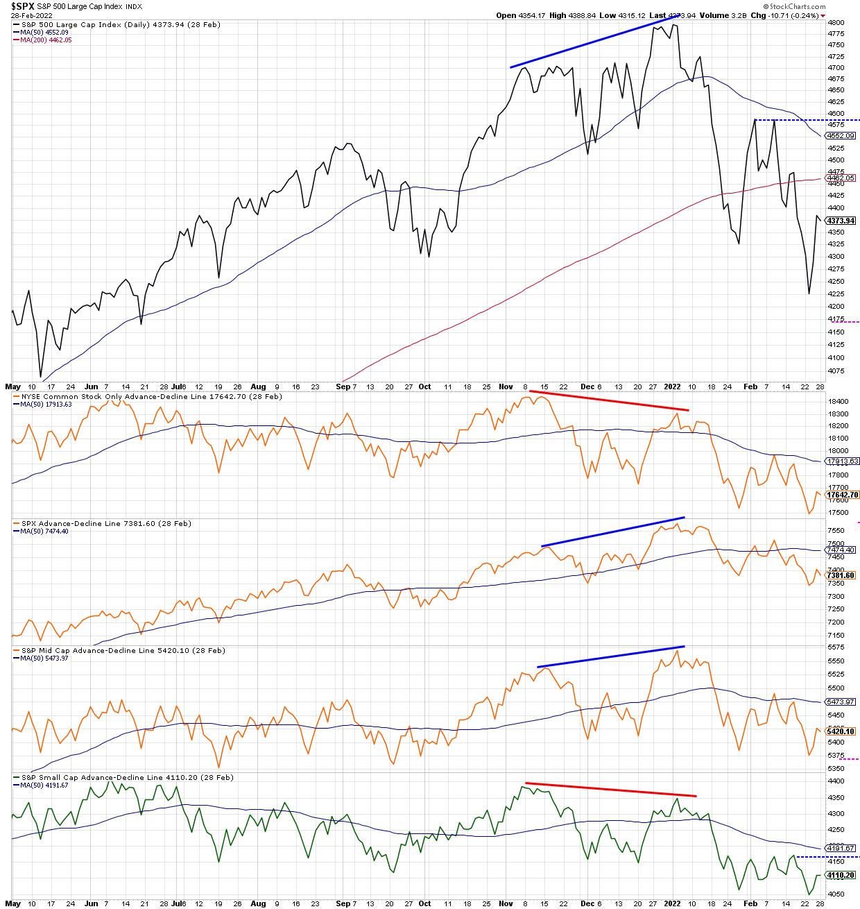
Note how the S&P 500 made a new closing high in early January, which was confirmed by new highs for the S&P 500 and S&P Mid-Cap 400 advance-decline lines. However, this new high was not confirmed by the NYSE advance-decline line (common stocks only) as well as the S&P Small-Cap 600 advance-decline, both of which made lower highs in January 2022. This "non-confirmation" event, where not all the advance-decline lines are in agreement, suggests that not all cap tiers are moving in the same direction, and often indicates a likely change in trend.
The concept of confirmation and non-confirmation is a key part of breadth analysis, which is basically a recognition that individual stocks and groups do not often agree with the direction of the overall market indexes. And I have found, over my career, that certain sectors and groups changing direction is usually a good precursor of a larger directional shift that will become apparent much later for the broad market indexes.
While there are numerous ways to track "participation" through measures of market breadth, today, I'll share three that I'm watching closely, as the current rally feels less like a bear market rally and more like a sustained rise.
First, let's dig into the percent of stocks above key moving averages.
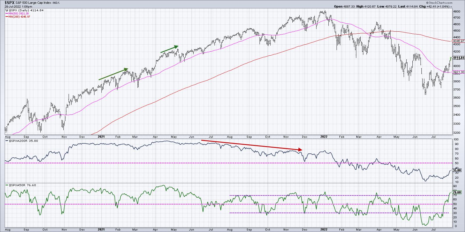
With the strength in stocks around the Fed meeting and some key earnings releases, we now see that just over 75% of the S&P 500 members are currently above their 50-day moving averages (second panel in blue). What's remarkable is that this indicator was around 5% in mid-June. So, in the last six weeks, literally 70% of the S&P 500 members have broken back above their 50-day moving averages.
While this is certainly encouraging to see such broad participation in the current rally, I can't help but notice that we saw a very similar level for this indicator in late March at the end of that bear market rally. The S&P had bounced off 4200 and fired up quickly to retest the most recent swing high around 4600. About 75% of the S&P names were above their 50-day moving averages just as the bear market rally exhausted and the larger downtrend resumed.
Bull market phases often see this indicator go well above 75%, and usually will remain above 50%. When the market pulls back next, check to see if this indicator can remain above 50%. That could indicate more of a bullish rotation to this indicator that has been particularly effective in 2022.
Next, we can look at the Bullish Percent Index.
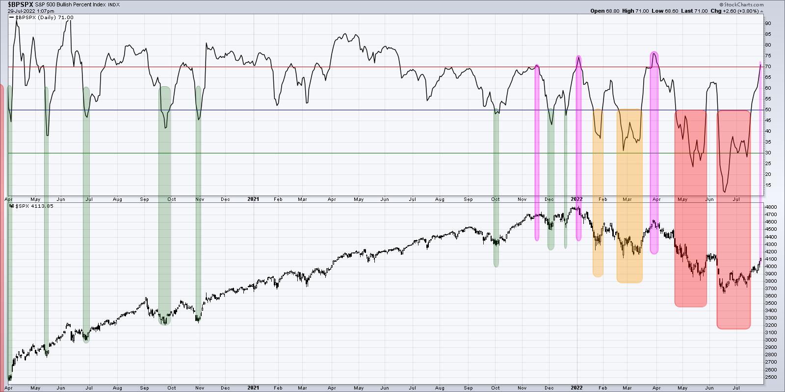
This indicator has gone from lower teens in mid-June to just over 70% going into this weekend. That means that above two thirds of the S&P 500 members had been showing a sell signal on their individual point & figure charts in June, but have now generated a buy signal.
Buy signals do not come easy on point & figure charts. In fact, that is part of their true power. Point & Figure is all about tracking trends, and you need to see enough of an upside reversal to confirm a change in trend from bearish to bullish.
But here's the problem. Look back to late March, and you'll see a very similar pattern, where the indicator was around 30% and then powered to above 70% in a short amount of time. This indicator peaked at 75% at the January and March highs and has now returned to that same level. As we discussed in the previous chart, this indicator needs to go high and stay high to signal a bullish phase. Bear market rallies look like this. The difference between a bear market rally and a broader bull market phase is that breadth indicators like the Bullish Percent Index get high and then remain high. That's what I'm watching for now.
Finally, we can review the cumulative advance-decline lines, which we previewed at the beginning of the article.
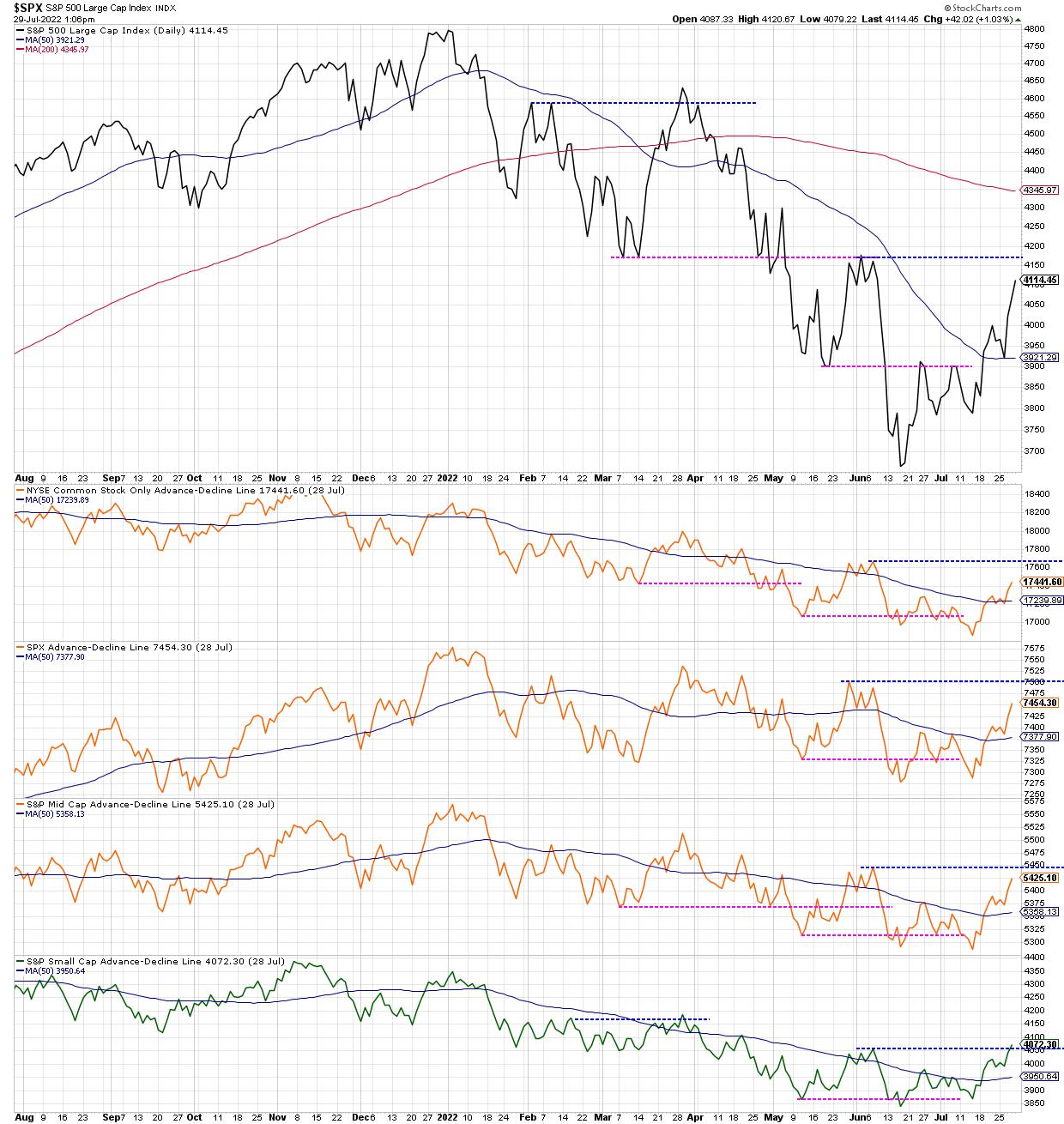
I would consider this the most important chart, because, while the first two are oscillators tracking momentum in breadth, these advance-decline lines are much more tracking the trend in breadth over time.
The S&P 500 is heading higher toward likely resistance in the 4150-4200 range. We can also track the four advance-decline lines to see what happens as they also approach resistance at their June highs. So far, one of them (small cap) has eclipsed its June high, earning a change to green in my very subjective color-coding system. The other three turned neutral orange when they eclipsed their 50-day moving averages, and would turn bullish green if they break to a new swing high as well.
Going into next week, I'll be watching this last chart in particular. Does the S&P 500 break above 4200? Is that breakout confirmed by the cumulative advance-decline lines? And does the Bullish Percent Index and Percent Above the 50-Day MA remain elevated as stocks push higher?
For now, a summer rally is very much in play. And these breadth indicators should help us to understand the momentum behind this uptrend and also when this uptrend may be nearing exhaustion!
Want to know more about cumulative advance-decline lines? Check out my latest video:
RR#6,
Dave
P.S. Ready to upgrade your investment process? Check out my YouTube channel!
David Keller, CMT
Chief Market Strategist
StockCharts.com
Disclaimer: This blog is for educational purposes only and should not be construed as financial advice. The ideas and strategies should never be used without first assessing your own personal and financial situation, or without consulting a financial professional.
The author does not have a position in mentioned securities at the time of publication. Any opinions expressed herein are solely those of the author, and do not in any way represent the views or opinions of any other person or entity.
|
| READ ONLINE → |
|
|
|
| The Canadian Technician |
| Nasdaq Month End Analysis |
| by Greg Schnell |
After a choppy period between the June Fed low and the recent Fed meeting, we finally got a market resolving to the upside. While everyone has flipped to bullish with Apple, Amazon and Microsoft pushing the indexes up, let's check our work.
We need to look at a couple of bullish data points. First of all the Nasdaq 100 took out the previous months high. That's pretty bullish.
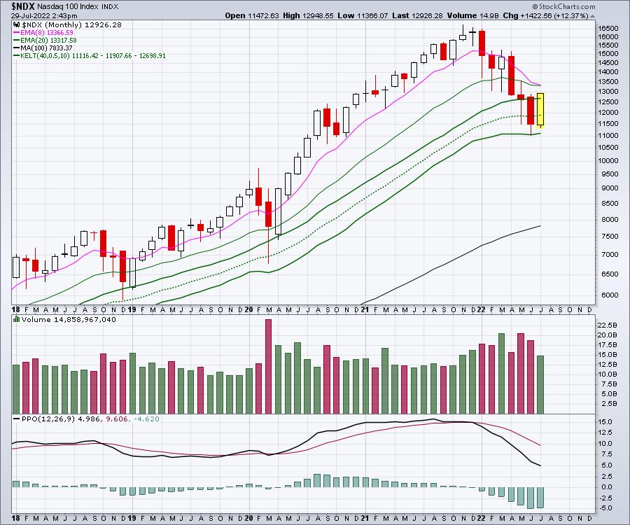
On the daily chart we have some important levels showing up. We have a series of higher highs and higher lows.
Some important levels sit below us and above us. We took out the 4-week ceiling around 12200 in July after the Options expiration on Friday July 15th was behind us.
Also notice the July 1 low. We have rallied significantly for the month up 12.73% which is a massive month. Nice turning point.
On the upper side (resistance), we are testing the high of June. We are also testing the 100-period moving average.
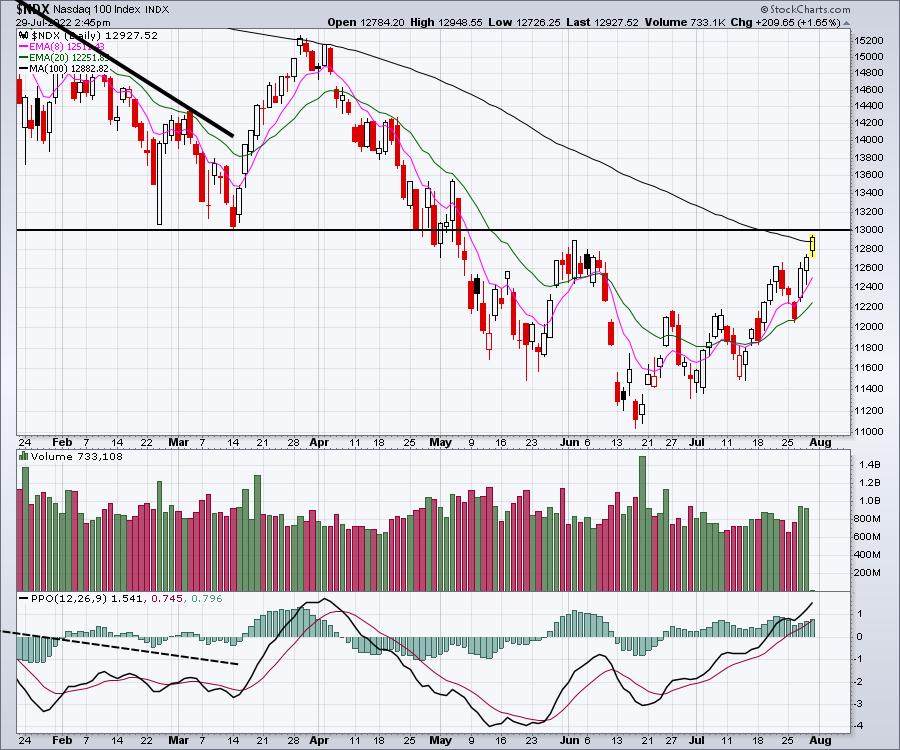
When we widen this chart out, we have retraced to the neckline of the Head/shoulders top. This is a very important technical level to respect. I will also point out that the PPO has rolled over around the 2% level for the last two years which suggests we might be near the maximum momentum higher. Do we roll over suddenly now that earnings are behind us, or does market momentum stay elevated and keep running??
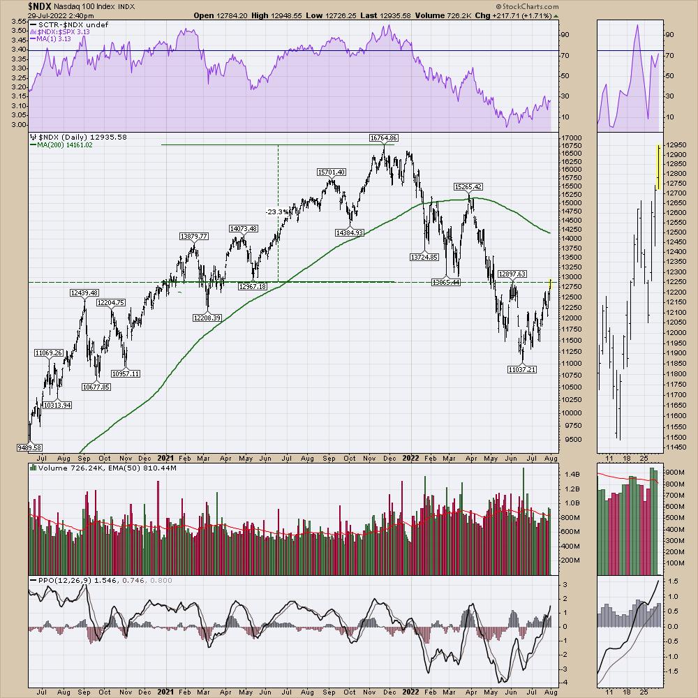
This is the second week of higher highs for the stock market and that says the momentum trend is up. That is very bullish. However, we did see the same thing at the end of March. 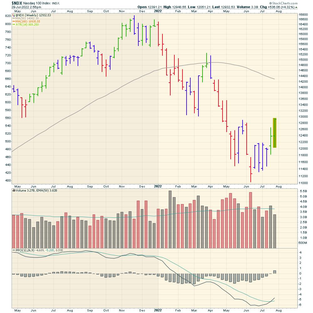
I do want to point out one thing that suggests watching the price action very closely. The red arrows show the market reversing near the first of the month, sending markets lower. The two black arrows show the markets reversing higher near the beginning of the month.
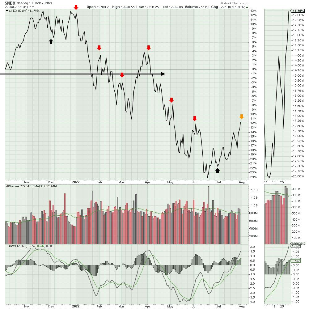
All that to say, the market is working its way higher. However, don't be complacent with a downtrending 200 day moving average.
If you'd like help understanding market momentum, feel free to try a subscription to the macro market overview on OspreyStrategic.org. For only $17/week, you'll find some good clues there that you don't find elsewhere.
|
| READ ONLINE → |
|
|
|
|
|
| RRG Charts |
| Are You a Short-Term Trader? Watch This! |
| by Julius de Kempenaer |
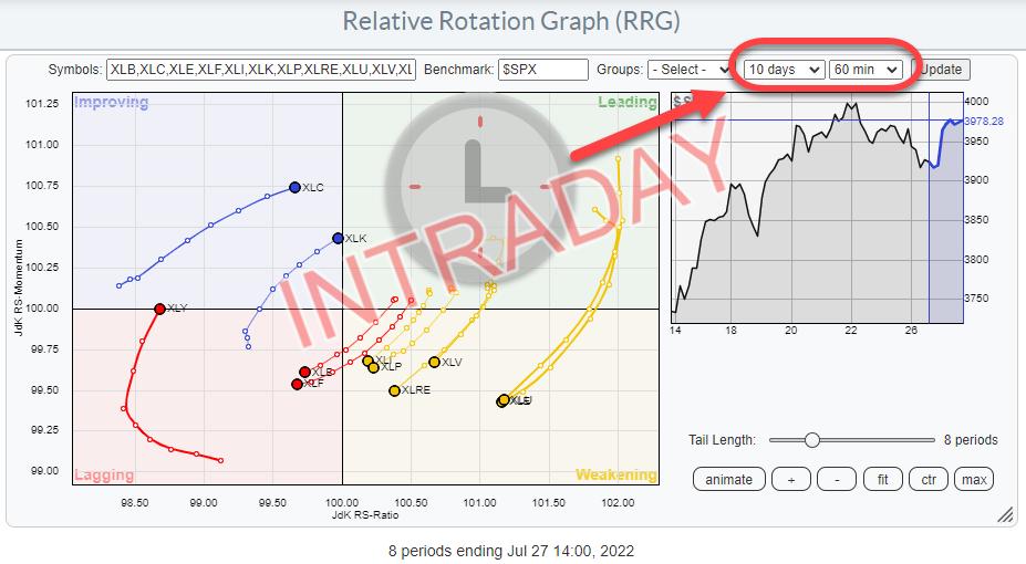
Relative Rotation Graphs (RRG) were introduced on StockCharts.com in July 2014. Since then, we have had the possibility to render the charts using weekly or daily data. Primarily, I think, because those were the time frames I was, and am, using most of the time for myself and in conversations and research for institutional investors, who usually have a bit of a longer-term investment horizon.
With the introduction of RRG on StockCharts.com, a lot more eyeballs have started looking at RRGs and using them in different ways and setups. One of the most requested functionalities since its introduction was to make RRGs available for intraday time frames. I know now, with hindsight and from eight years of experience working with StockCharts.com, that there are a lot of shorter-term oriented traders, and swing-traders on the site. A daily RRG was a nice to have for them, but it would only give them a very high-level picture given their investment horizon.
The wait is now over. With the latest release (Bainbridge) of the website, Relative Rotation Graphs can now be run on intraday data as well.
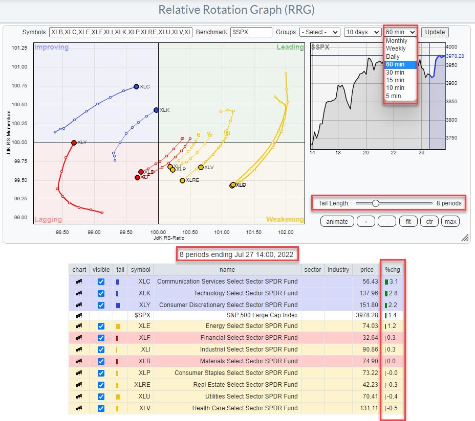
When you go to the RRG page and open the drop-down menu for the time frames, you will now see many more options besides weekly and daily. For long-term investors, the monthly time frame has been added, which allows monitoring of really long rotations and their resulting trends. Meanwhile, the intraday periods that are available are 60, 30, 15, 10 and 5 minutes. These should give short-term traders enough choices to pick a time frame that suits their trading style.
The RRG above is using 60-min timeframes. The tail length of 8 periods, therefore, covers 8 hours of trading. And the date/time stamp below the chart tells you the last update of the graph; in this case, the 60-min period starting 14:00 on July 27.
*Date/Time stamps on StockCharts are always at the start of the period. Thus, the last observation on a weekly chart will be Jul 25 this week, as that was the Monday when this week started. Also, the date stamp for a monthly chart will be on the first of the month.
As a result, the %chg column in the table below the chart will show the percentage change over the 8 periods = 8-hour length of the tails on this chart.
Just like regular intraday charts, the trends and distances traveled in terms of price will be much smaller than on daily or weekly charts. What seems to be a nice uptrend on an hourly chart (bar chart or RRG) can be invisible on a daily or weekly chart. As long as you are aware of the finesses and the implications of using intraday time frames, these new periodicities on RRG can help you get a better handle on developments that are taking place intraday, or over the course of a few days, which would be very hard to spot on daily or even weekly RRGs.
Just like you can use Weekly and Daily RRGs alongside each other to get a handle on the rotations in different time frames, you can do exactly that with 60- and 10-min RRGs, as an example.
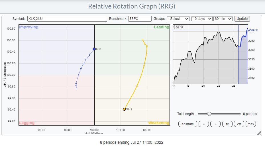
This first RRG shows the completed 60-min tails for XLK and XLU. The last period started at 14:00, which means that this is at 3pm in terms of time. XLK is about to cross over into the leading quadrant at a strong RRG-Heading, while XLU is now inside the weakening quadrant and moving towards lagging at a negative RRG-Heading.
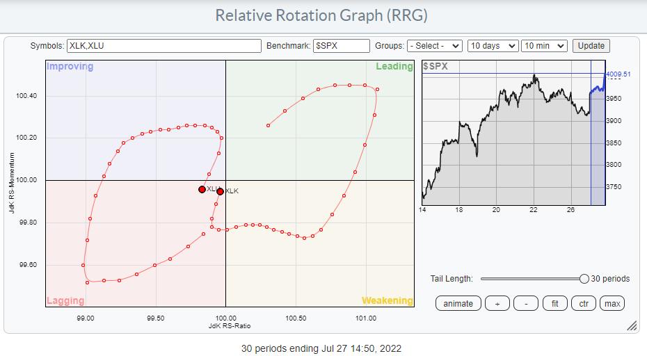
This second RRG has 10-minute tails and the last observation started at 14.50. So this snap is also at 3pm. With the tail length set at 30, we are looking at the 10-min rotation over the last 5 hours (=300 minutes). What we see here is that the tails for XLU and XLK started in sync with the hourly rotations, XLU at a negative heading and XLK at a positive heading. Then, the 10-min tails started to rotate in opposite directions until an hour ago or so, when they started to converge again with the hourly rotations.
So, just like you can combine weekly and daily RRGs, you can also combine, say, hourly and 10-min RRGs, or daily and hourly, etc., etc.
The addition of these new time frames significantly opens up more possibilities to use RRG and makes them attractive to a larger group of investors/traders.
As usual, I remain open to any feedback or comments.
#StaySafe, --Julius
|
| READ ONLINE → |
|
|
|
| Martin Pring's Market Roundup |
| The Truth About Recessions |
| by Martin Pring |
This week, we diverge from our normal chart talk to focus on the economy, as the word "recession" is now on virtually every one's lips, provoked by a lot of misinformation.
First, there seems to be a general understanding in the media that the definition of a recession is two consecutive quarters of declining GDP. According to the good people at the national Bureau of Economic Research (NBER), who are the official arbitrators of business cycle chronology, a recession "is a significant decline in economic activity that is spread across the economy and that lasts more than a few months." The committee goes on to say that each of the three criteria—depth (how much output is lost), diffusion (the breadth of the decline) and duration (how long it lasts)—need to be met individually. However, extreme conditions revealed by one criterion may partially offset weaker indications from another. By way of an example, they cite the 2020 situation by concluding, "the drop in activity had been so great and so widely diffused throughout the economy that the downturn should be classified as a recession even if it proved to be quite brief". No two quarters of back-to- back GDP decline here, just a two-month waterfall. In other words, one size does not fit all.
Calling a recession is clearly more of an art than a science. From our point of view as investors, the question is not so much "Is there going to be a recession?" but rather "How deep will it be?" and "How long will it last?"
There's Always Another Recession Around the Corner
Throughout 20 years or so of recorded US economic history, the economy has continuously transitioned between recovery and recession. In recent decades, recessions have been a less common experience, thanks to the Fed intervening with soft landing policies, which limited the downside part of several cycles to growth slowdowns. Ironically, since 1962, the business cycle low points in the economy, be they slowdowns or recessions, have been separated by an average of 41-43 months, not dissimilar to the 41-month cycle discovered by Joseph Kitchin in the 1920s. The reason probably lies in human nature, as individuals in the economic world transition from fear to greed just as investors do in the financial markets.
It's the Depth and Duration of Recessions That's Important
Chart 1 highlights bear trends that have been associated with economic slowdowns in blue and recessions in pink. The smaller ellipses indicate bear markets caused by slowdowns or mild recessions. The larger ones are associated with deeper and more prolonged economic contractions. At Pring Turner, we call these mild bear markets "burglars" because they have a mild and temporary effect on portfolios, whereas the larger ones, named "bank robbers," are responsible for more devastating and protracted damage. At first glance, it seems almost random as to whether a recession induced bear will turn out to be a burglar or bank robber, but Chart 2 puts us straight on that one.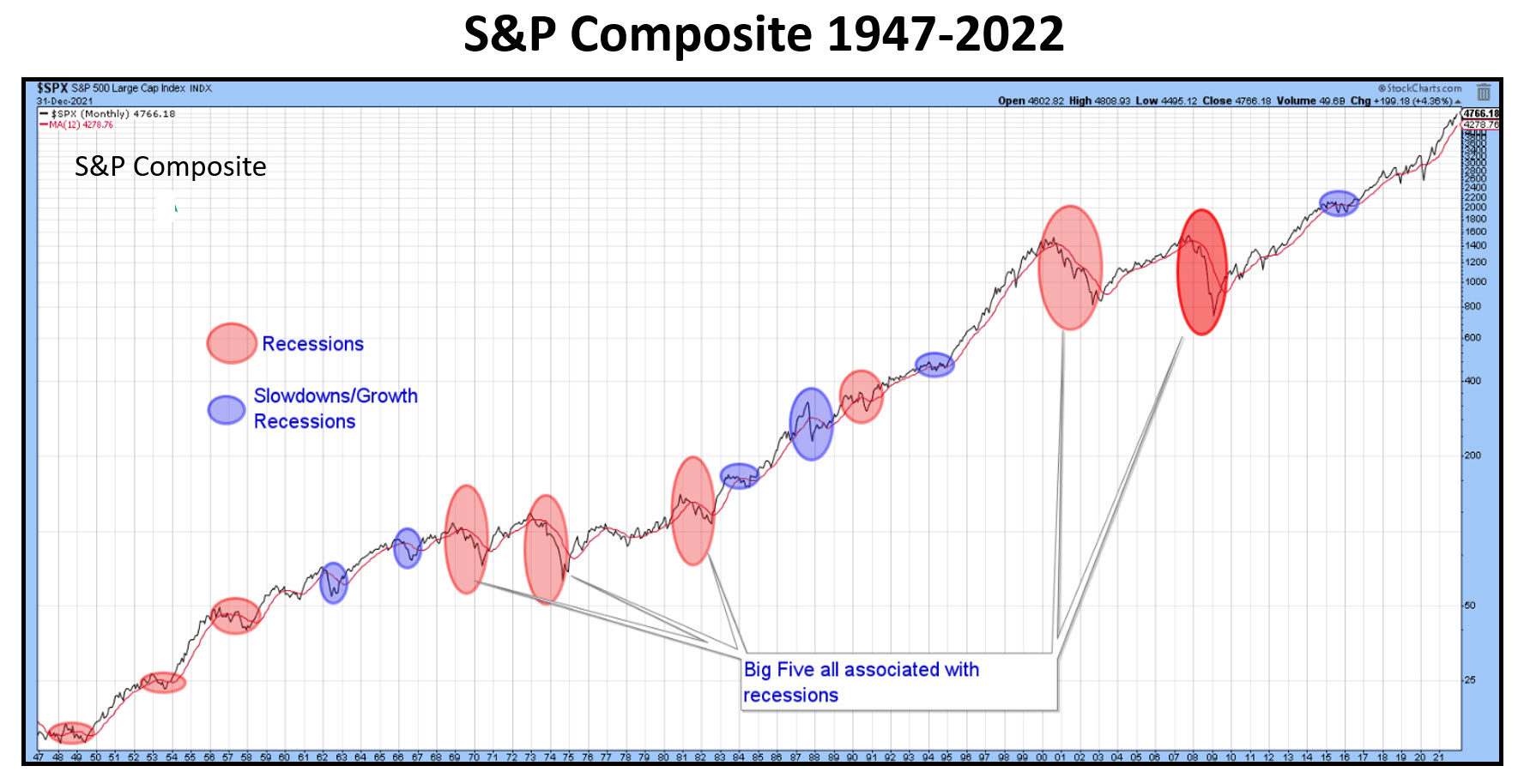 Chart 1 Chart 1
Here, the S&P has been plotted on an inflation-adjusted basis for two reasons. First, from a long-term aspect, it does not help if we increase our portfolio by 50% and the CPI rises by a similar amount. Growing your assets by less than the cost of living is not that helpful. Second, rapidly-expanding inflation is caused by structural imbalances in the economy, which means more frequent and generally deeper recessions.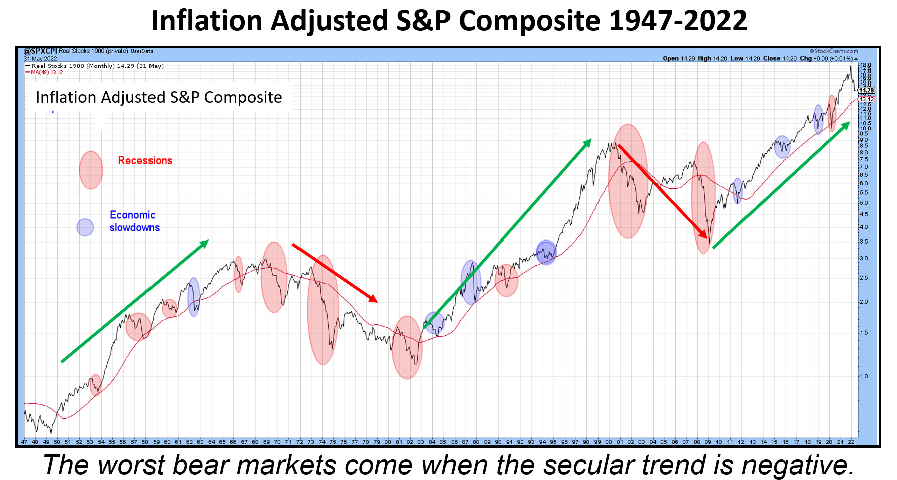 Chart 2 Chart 2
The arrows in the chart reflect the secular trends, green for the bulls and red for the bears. Secular uptrends are characterized by burglars and secular declines by bank robbers. Note how, during the period between 1966 and late 1982, the nominal S&P rallied overall (Chart 1). Compare that to the devastating performance by the inflation-adjusted series.
Conclusion
US equity prices have already lost 20-30%, depending on which average is considered. That means the market has already priced in a burglar, i.e. a slowdown or mild recession. It therefore represents a great buying opportunity if the secular bull market is intact. The question of whether we are in or are about to get into a recession is therefore a moot point. From an investment point of view, the real question should relate to the depth and duration of any recession, because that will determine whether the secular trend has reversed to the downside. If so, it most probably means that the current bear market will turn out to be a bank robber. I try to answer some of these points in my StockCharts mid-year outlook presentation and the question of whether the secular trend is turning in this article.
Good luck and good charting,
Martin J. Pring
The views expressed in this article are those of the author and do not necessarily reflect the position or opinion of Pring Turner Capital Group of Walnut Creek or its affiliates.
|
| READ ONLINE → |
|
|
|
| Dancing with the Trend |
| The Enemy in the Mirror |
| by Greg Morris |
 I first published this article in March, 2019 and believe the message then is the same as for today. As a retired money manager I want to share some thoughts on that profession and investors in general. Portfolio management is as much about managing emotions as it is about correlations, standard deviations and Sharpe ratios. Over the decades much has been written about the "math" of portfolio management but the emotional aspect of the investment decision making process does not receive nearly the attention or research. However, Behavioral Finance is a relatively new field that seeks to combine behavioral and cognitive psychology theory with conventional economics and finance to provide explanations for why and how people make investment decisions. I first published this article in March, 2019 and believe the message then is the same as for today. As a retired money manager I want to share some thoughts on that profession and investors in general. Portfolio management is as much about managing emotions as it is about correlations, standard deviations and Sharpe ratios. Over the decades much has been written about the "math" of portfolio management but the emotional aspect of the investment decision making process does not receive nearly the attention or research. However, Behavioral Finance is a relatively new field that seeks to combine behavioral and cognitive psychology theory with conventional economics and finance to provide explanations for why and how people make investment decisions.
There is a great deal of research demonstrating that investors consistently underperform the S&P 500. The most frequently cited research comes from Dalbar, Inc. The Dalbar research shows that investors have underperformed S&P 500 index by over 6 percentage points per year over past 30 years.
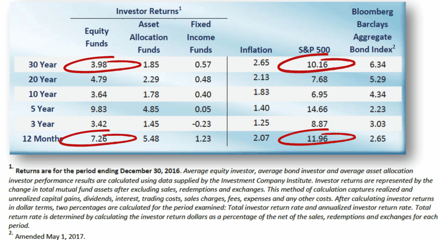 Table A Source: Dalbar, Inc. Table A Source: Dalbar, Inc.
Even with some of the brightest, most well educated, and well-intentioned professionals, about 70% of money managers also underperform their benchmarks. Is there something taking place in our brains that impairs our ability to make rational investment decisions? These same abilities that helped in making us smart at so many things make us not so smart when it comes to investing.
Behavioral Finance has uncovered a surprising number of subconscious idiosyncrasies that can prevent investors from achieving their long-term goals as they fall prey to potential traps. This article will shed light on—and help address—some of the more common idiosyncrasies that often impact the investment decision making process and lead to poor decision making, as well as provide some knowledge to overcome common behavioral traps.
Data has shown that investors as a whole continue to buy and sell at exactly the wrong time. While we cannot possibly know the specific reasons, a shallow understanding of the human psyche will offer some answers. Investors tend to react to news without doing any analysis, and it doesn't matter if it is considered good news or bad. Investors become mesmerized by long running bull markets and absolutely unnerved by bear markets. Investors try to match the investment acumen of their relatives, neighbors, friends, business associates, and even complete strangers, if anyone in that group have claimed, even casually, that they have done well in the market.
Another study put out by Morningstar's Russell Kinnel on 2/4/2013, shows the same problem with investors; investors as a whole do quite poorly compared to indices. Based upon all funds, the average investor lagged the average fund by 0.95% annualized over the last ten years.
 Table B Table B
The bottom line is that most investors fail to have the discipline to follow a systematic approach which will assist them on detaching their emotions from their decisions. Here is a list of investor faults when it comes to investing. Books are filled with much more and with much more detail, I just wanted to include the ones that I have experienced, with the Lack of Discipline being the one that can cause the most pain.
Lack of Discipline
Impatience
Greed
Refusal to Accept the Truth
No Objectivity
Impulse Behavior
Avoid False Parallels
Your human brain will play tricks on you. If you take an escalator or moving sidewalk when going to work and do so frequently, you will understand. Your brain will cause an automatic (involuntary) action to assist you as you step onto the escalator or moving sidewalk. You might not even realize it. However, if one day the escalator is stopped, and you notice that it is stopped, you will almost stumble as you step onto it because your brain is programmed to assist, and this time that assistance is not helpful, even though you knew it was not moving prior to stepping on it.
One critical solution to overcoming flawed investor behavior is having a proven, disciplined and repeatable process that guides decision-making absent emotion. Discipline keeps your emotions in check and your perceptions clear. But discipline requires intellectually identifying a process you trust, then sticking with it in good times and bad, even when your emotional biases begin railing against it. No strategy is always perfect.
January of 2013 a study was released entitled "Head and Shoulders above the Rest? The Performance of Institutional Portfolio Managers who use Technical Analysis." The study looked at more than 10,000 institutional portfolios; about one-third of actively managed equity and balanced funds use technical analysis. The study compared the investment performance of funds that use a technical approach versus those that do not. The Funds using technical analysis appeared to have provided a meaningful advantage to portfolios that do not use a technical approach.
The bottom line is that it is critical for all investors to acknowledge the possibility that deep-seated behavioral flaws can negatively impact investment decision making, and that in proportion to the absence of discipline, the investment process may be doomed to fail. I have written a number of articles entitled "Know Thyself," in which I cover many of the human failings and heuristics. Below are links to those articles.
Know Thyself
Know Thyself II
Know Thyself III
Dance with the Trend,
Greg Morris
|
| READ ONLINE → |
|
|
|
| The MEM Edge |
| July Ends With a Bang as Rotation into New Areas Takes Shape |
| by Mary Ellen McGonagle |
The S&P 500 recorded its strongest monthly gain since November 2020, rallying 9.1% during a volatile period that ended with a bang. Growth stocks outperformed, with Consumer Discretionary (XLY) and Technology (XLK) stocks leading the way. It was not a particularly easy period to navigate, however, as investors digested news of inflation hitting a 40-year high amid mixed economic data that sparked debates surrounding the Fed's possible reaction.
News this past week appeared to strike the right chord, with a decline in 2nd quarter GDP signaling a slowdown in the economy, which could lead to less aggressive Fed action and a slowing of their rate hikes later in the year. Earnings season also provided a boost, as deeply oversold stocks rallied after reporting results that weren't always stellar. I wrote about this possibility, and highlighted Amazon (AMZN), in an article 2 weeks ago, which can be accessed here.
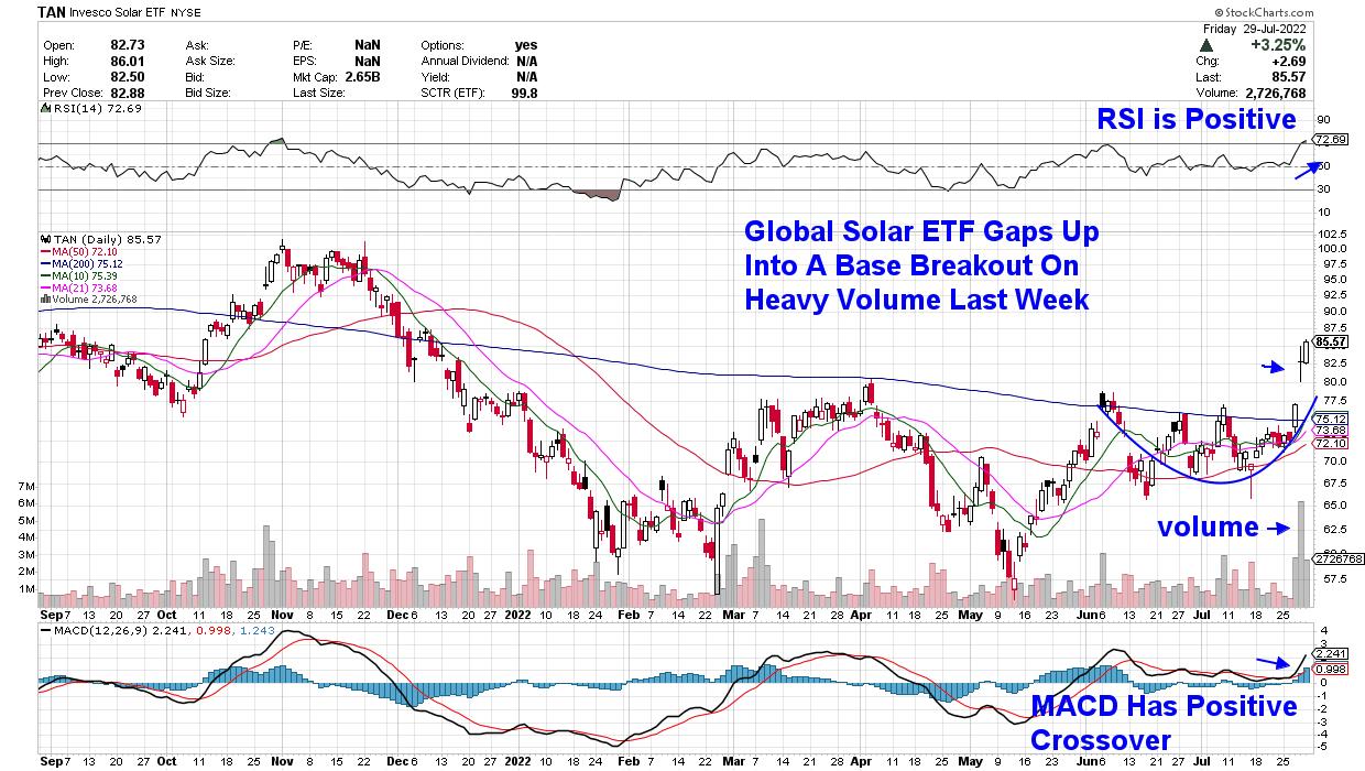
Within July's top-performing Technology sector, Renewable Energy was the big outperformer with a 40% rally on the heels of a large gain in Solar stocks last week. The group appears to have further upside following last week's announced Inflation Reduction Act. The bill will represent the biggest climate investment in U.S. history. Another important driver for this group has been positive earnings reports.
DAILY CHART OF INVESCO SOLAR ETF (TAN)
Subscribers to my MEM Edge Report were alerted to a positive shift in this group, as well as a buy recommendation for one of the top performers, in my July 10th report.
The interest in stocks from this group has been driven by the continued uptick in the price of oil, which has sparked a demand for alternative energy sources. Russia's reduction of gas supplies is another factor, particularly within Europe.
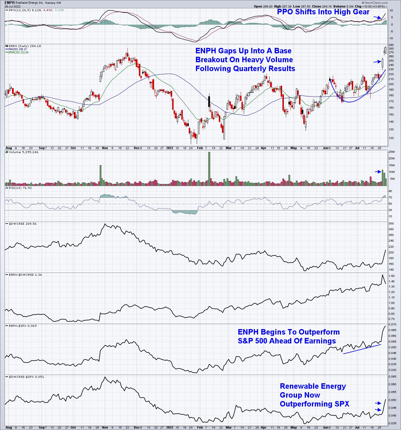
Enphase (ENPH) from my MEM Edge Report, is the largest producer of converters that turn solar-based electricity into usable energy. The company reported quarterly earnings last week that were 100% higher than last year, with management guiding growth prospects higher well into next year.
DAILY CHART OF ENPHASE ENERGY INC. (ENPH)

The potential passage of the Inflation Reduction Act spurred the stock higher as well.
While Alternative Energy stocks are on the move higher, other rotation is also taking place, with Energy, Utility and REIT stocks far outpacing the markets last week amid strong earnings results. Other dynamics are also at play for these groups and, for those who'd like insights into why you should be in these groups, as well as which stocks will benefit the most, take a 4-week trial of my twice weekly MEM Edge Report for a nominal fee.
My MEM Edge Report had a 75% success rate in 2021 with losses not exceeding 3%. Take a trial now using the link above!
On this week's edition of The MEM Edge, now available to watch on demand at StockChartsTV.com and the StockCharts YouTube channel, I explain why the markets are poised to trade higher and how you can participate. I also discus the rotation into newer areas that have higher upside from here.
Warmly,
Mary Ellen McGonagle, MEM Investment Research
|
| READ ONLINE → |
|
|
|
| Top Advisors Corner |
| JOLTS Data Following NYSE A-D Line Downward |
| by Tom McClellan |

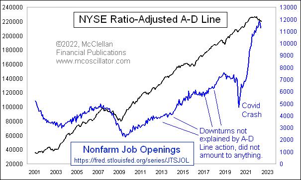
Starting in December 2000, the Bureau of Labor Statistics has published what it calls the Job Openings and Labor Turnover Survey (JOLTS). In simple terms, it is a measure of how many job openings there are. It has been showing astounding growth ever since the COVID Crash in the spring of 2020, but, just recently, it saw a peak in March 2022 at 11.8 million job openings. As of May, it is down to 11.2 million. The next JOLTS release is scheduled for August 2, 2022.
The point of this week's chart is to show that the NYSE's A-D Line has been telling us for a few months to expect a downturn in the JOLTS data. The two have a very strong correlation, not just in terms of the overall upward slope from the left end of the chart to the right, but also in terms of moving up and down together on shorter time frames. And the A-D Line often foretells the turns in JOLTS data.
Back in March 2009, the A-D Line bottomed four months ahead of the eventual JOLTS data bottom, which came in July 2009. The A-D Line also showed strength in 2003 ahead of the JOLTS upturn that year. It is fair to note that the A-D Line did not foretell the drop in jobs listings during the COVID Crash, but I don't think we should hold that against the A-D Line for missing that one.
On a month-end basis, the NYSE's daily A-D Line peaked back in October 2021 and has moved downward pretty decisively. It has given us plenty of warning this time that liquidity was in trouble, in ways that would eventually come around and bite the jobs market in addition to the stock market.
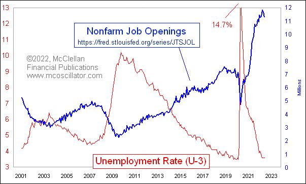
Okay, you say, but what about the unemployment rate? Here is a comparison of the JOLTS numbers to the U-3 unemployment rate, which is the most commonly cited version.

The two are obviously inverted, which is not a surprise. What is noteworthy is that the changes in slope for the JOLTS data tend to precede changes in the unemployment rate by a few months. Back in 2009, unemployment did not reach its peak until October 2009.
The key point here is that the unemployment rate tends to lag behind a lot of other economic data. So when you hear someone say that we cannot be in a recession yet because it is not showing up in the unemployment rate, you can be confident that such a person has no real idea how economics or statistics work. That can be a useful thing to know about an "expert."
The NYSE's A-D Line is still showing weakness, and does not appear to have bottomed yet in a meaningful way. That is another way of saying that liquidity is tight and will make things difficult for the "real" economy to withstand a slowdown, especially with a Federal Reserve that is hiking rates aggressively in order to crimp liquidity even further.
|
| READ ONLINE → |
|
|
|
| MORE ARTICLES → |
|
 Chart 1
 Chart 2
 Chart 3
 Chart 4
 Chart 5
 Chart 6


 I first published this article in March, 2019 and believe the message then is the same as for today. As a retired money manager I want to share some thoughts on that profession and investors in general. Portfolio management is as much about managing emotions as it is about correlations, standard deviations and Sharpe ratios. Over the decades much has been written about the "math" of portfolio management but the emotional aspect of the investment decision making process does not receive nearly the attention or research. However, Behavioral Finance is a relatively new field that seeks to combine behavioral and cognitive psychology theory with conventional economics and finance to provide explanations for why and how people make investment decisions.
 Table A Source: Dalbar, Inc.
 Table B