| THIS WEEK'S ARTICLES |
| John Murphy's Market Message |
| STOCK RALLY CONTINUES |
| by John Murphy |
INTERMEDIATE TERM RALLY CONTINUES... The stock rally that started in mid-June continues to gain ground which confirms that the market has put in an intermediate term bottom. The question is how far that intermediate rally can rally within the current downtrend. Hopefully, the charts shown below will help determine where upside targets are located. The daily bars in Chart 1 show the S&P 500 trading above its 100-day moving average and nearing a test of its June high at 4177. The red horizontal trendline also shows potential resistance along the spring lows. That's an important test because a close above 4177 would interrupt the negative pattern of lower peaks and lower troughs that have been in effect. If that happens, prices could rally to more significant overhead at its 200-day moving average (red arrow).
 Chart 1 Chart 1
HIGHER RESISTANCE LINES COULD BE TESTED... Chart 2 puts the current rally in better perspective. It shows the SPX testing its red resistance line drawn along the spring low and June high. A decisive close above that resistance line could signal a further rally in the SPX to its 200-day average (red line) and a falling trendline drawn over its January/March highs (blue circle). The combination of those two important resistance lines should provide a significant barrier to the current rally if it gets that far. And could happen without disturbing the downtrend intact since the start of the year. The Nasdaq market has already cleared its first technical hurdle.
 Chart 2 Chart 2
NASDAQ 100 TESTS DOWN TRENDLINE... The tech-dominated Nasdaq market has led the recent rally in stocks. Technology stocks also led the market higher today (along with consumer discretionary and communication services). Chart 3 shows the Invesco QQQ Trust already trading above its June high and now testing a falling trendline drawn along its January/March peaks. If that falling resistance line is exceeded, the QQQ could rally up to a test of its 200-day moving average (red arrow). The horizontal red lines show Fibonnaci retracement lines drawn from the December high to the June low. They could also provide overhead resistance barriers if the current rally carries that far.
ENERGY LAGS BEHIND... Energy was the only stock sector to lose ground today. That was due mainly to a drop in the price of oil. Most other commodities also weakened. That could carry good news that inflation is peaking. And may help explain why bond yields have been dropping. That combination could also be supporting stock prices.
 Chart 3 Chart 3
|
| READ ONLINE → |
|
|
|
| Art's Charts |
| A Theme Emerges within a Bear Market |
| by Arthur Hill |
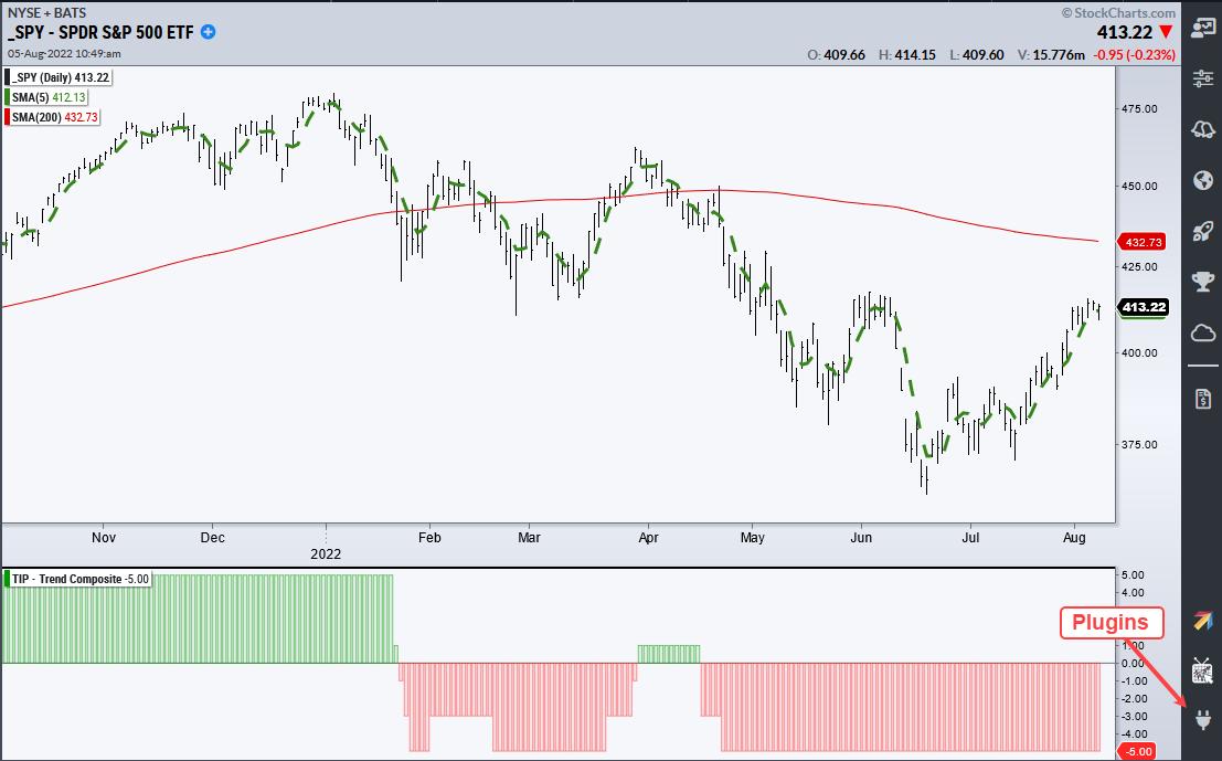
The Composite Breadth Model at TrendInvestorPro has been bearish since April 11th and remains bearish, which suggests that the current bounce in SPY is a counter-trend advance within a bigger downtrend. Also note that the 5-day SMA for SPY is below the falling 200-day SMA and the Trend Composite is negative (long-term downtrend).
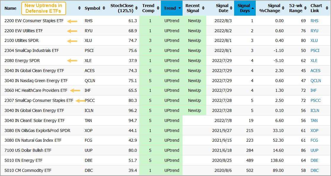
Despite a bear market environment, one group is attracting buying interest and this is reflected in our ETF Trend Signal and Ranking Table. The image below is a cut out of this table, which tracks Trend Composite signals and momentum for 274 ETFs. The Clean Energy industry is one, if not the, strongest group right now because four of the seven are in uptrends (TAN, ICLN, ACES, QCLN).

Note that there were 10 new uptrend signals this past week, which are shown in the "Recent Signal" column on the table below. Despite these new signals, only 16 of the 274 ETFs (5.8%) in our trend tracker are in uptrends. Outside of Clean Energy, the new uptrends signals were in ETFs related to Energy, Utilities, Staples and Healthcare (yellow arrows). This tells me that the broader market still favors defense (risk off) over offense (risk on).
The Trend Composite and StochClose form the backbone of the ETF Trend-Momentum Strategy at Trend InvestorPro. In addition to regular analysis and comprehensive videos, this strategy is detailed in a ten part series available to subscribers. Click here for immediate access.
The Trend Composite, StochClose, ATR Trailing Stop and eight other indicators are part of the TIP Indicator Edge Plugin for StockCharts ACP. Click here to take your analysis process to the next level.
---------------------------------------
|
| READ ONLINE → |
|
|
|
| The Mindful Investor |
| Why Breadth is Bullish... For Now |
| by David Keller |
If I had just one thing to use to understand the markets and predict what was coming next, it would be a daily chart of the S&P 500 index. If I had a second chart? It would absolutely involve market breadth.
My Morning Coffee Routine involves a number of charts covering market breadth, as breadth is all about participation. If the major averages are in a bull/bear trend, what about all the individual stocks that make up those indexes? At major market turning points (for example, Nov 2021-Jan 2022) you will often find a divergence between the major equity indexes and key measures of breadth. This is because individual names will already start to rotate into the new direction before the indexes themselves begin to change.
Here's how the cumulative advance-decline lines looked in early 2022, so that you can see what I mean.
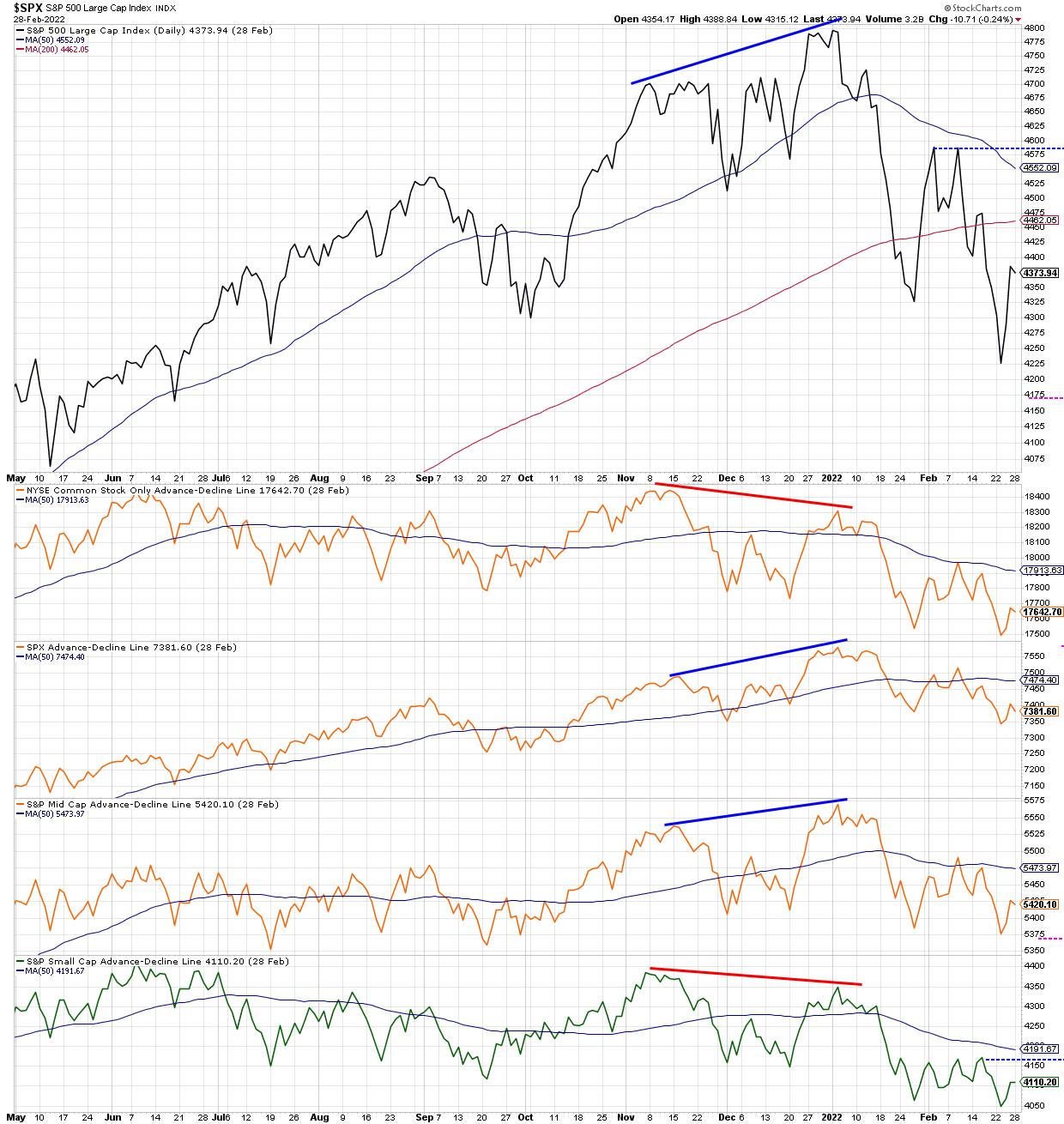
Note how the S&P 500 made a new closing high in early January, which was confirmed by new highs for the S&P 500 and S&P Mid-Cap 400 advance-decline lines. However, this new high was not confirmed by the NYSE advance-decline line (common stocks only) as well as the S&P Small-Cap 600 advance-decline, both of which made lower highs in January 2022. This "non-confirmation" event, where not all the advance-decline lines are in agreement, suggests that not all cap tiers are moving in the same direction, and often indicates a likely change in trend.
The concept of confirmation and non-confirmation is a key part of breadth analysis, which is basically a recognition that individual stocks and groups do not often agree with the direction of the overall market indexes. And I have found, over my career, that certain sectors and groups changing direction is usually a good precursor of a larger directional shift that will become apparent much later for the broad market indexes.
While there are numerous ways to track "participation" through measures of market breadth, today, I'll share three that I'm watching closely, as the current rally feels less like a bear market rally and more like a sustained rise.
First, let's dig into the percent of stocks above key moving averages.
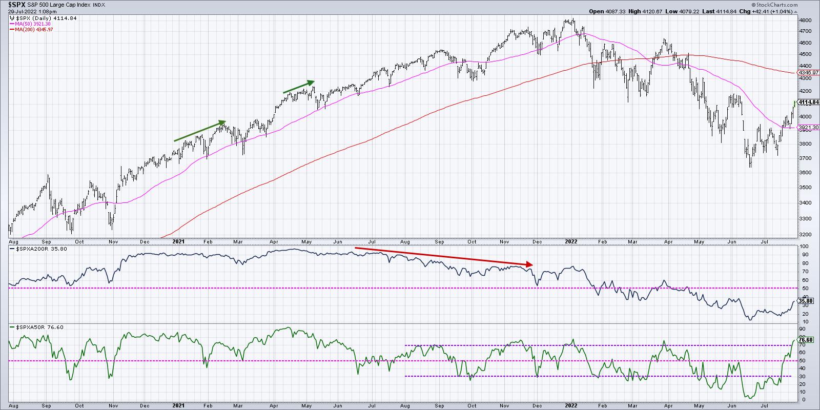
With the strength in stocks around the Fed meeting and some key earnings releases, we now see that just over 75% of the S&P 500 members are currently above their 50-day moving averages (second panel in blue). What's remarkable is that this indicator was around 5% in mid-June. So, in the last six weeks, literally 70% of the S&P 500 members have broken back above their 50-day moving averages.
While this is certainly encouraging to see such broad participation in the current rally, I can't help but notice that we saw a very similar level for this indicator in late March at the end of that bear market rally. The S&P had bounced off 4200 and fired up quickly to retest the most recent swing high around 4600. About 75% of the S&P names were above their 50-day moving averages just as the bear market rally exhausted and the larger downtrend resumed.
Bull market phases often see this indicator go well above 75%, and usually will remain above 50%. When the market pulls back next, check to see if this indicator can remain above 50%. That could indicate more of a bullish rotation to this indicator that has been particularly effective in 2022.
Next, we can look at the Bullish Percent Index.
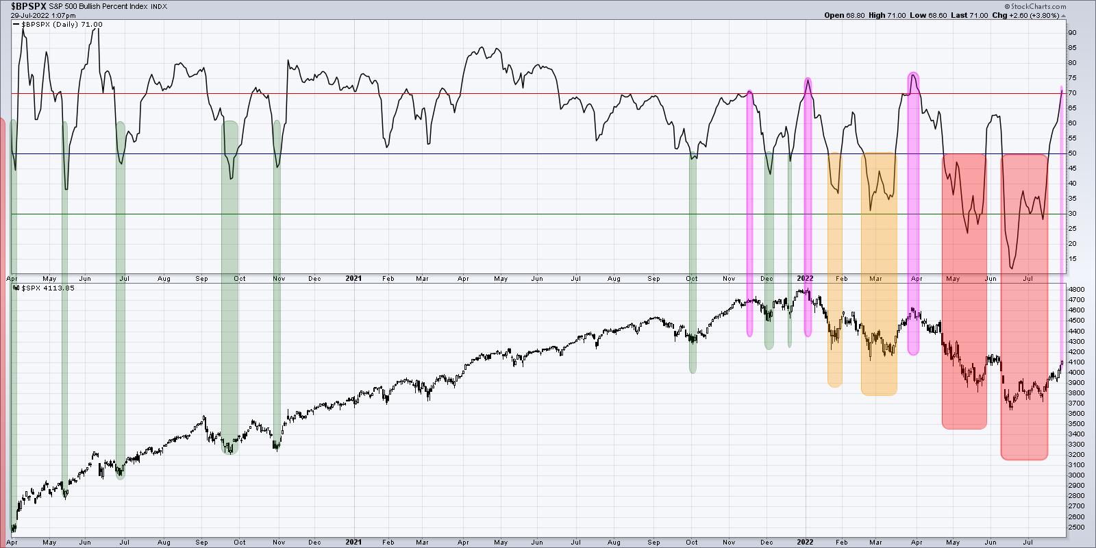
This indicator has gone from lower teens in mid-June to just over 70% going into this weekend. That means that above two thirds of the S&P 500 members had been showing a sell signal on their individual point & figure charts in June, but have now generated a buy signal.
Buy signals do not come easy on point & figure charts. In fact, that is part of their true power. Point & Figure is all about tracking trends, and you need to see enough of an upside reversal to confirm a change in trend from bearish to bullish.
But here's the problem. Look back to late March, and you'll see a very similar pattern, where the indicator was around 30% and then powered to above 70% in a short amount of time. This indicator peaked at 75% at the January and March highs and has now returned to that same level. As we discussed in the previous chart, this indicator needs to go high and stay high to signal a bullish phase. Bear market rallies look like this. The difference between a bear market rally and a broader bull market phase is that breadth indicators like the Bullish Percent Index get high and then remain high. That's what I'm watching for now.
Finally, we can review the cumulative advance-decline lines, which we previewed at the beginning of the article.
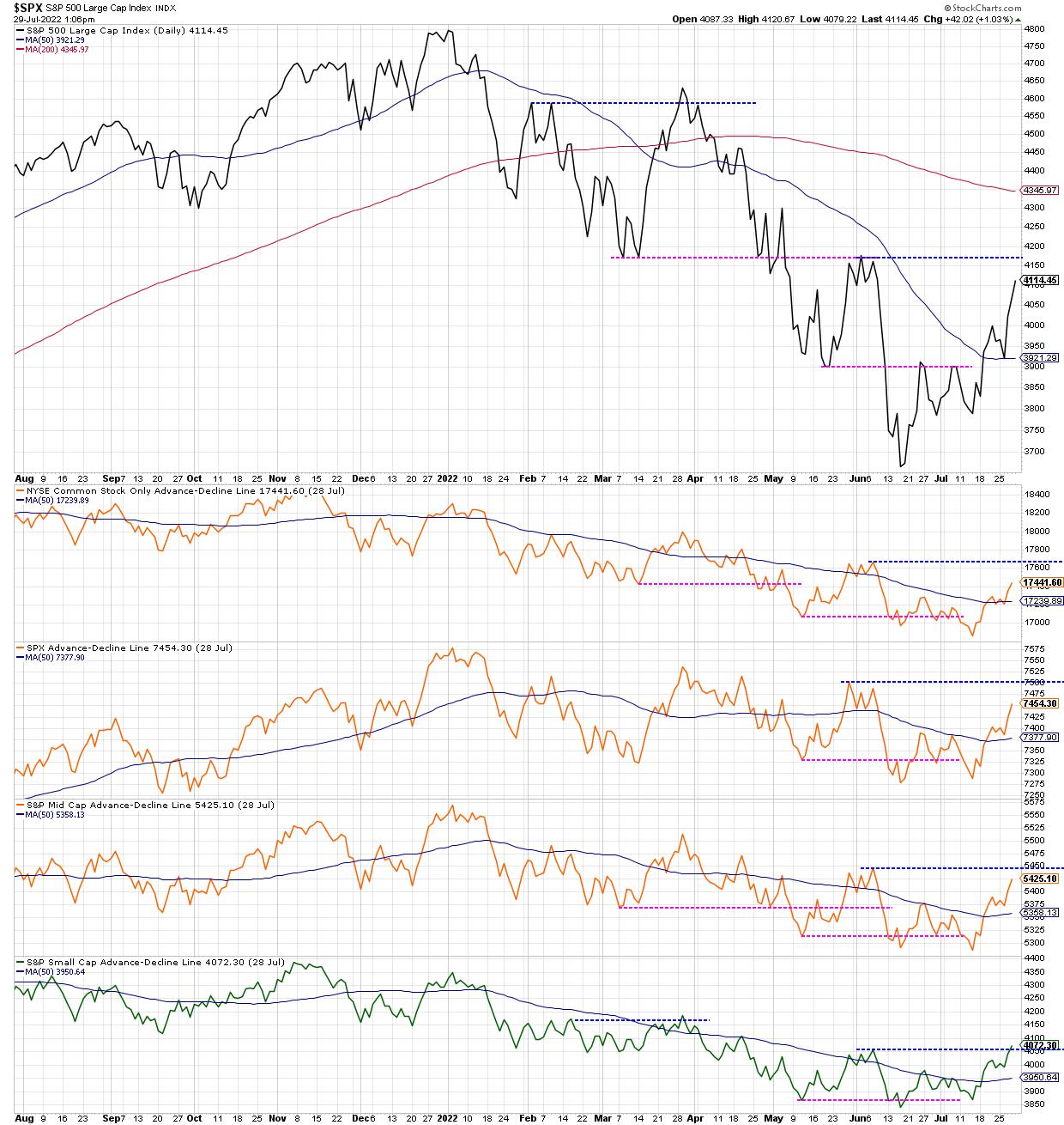
I would consider this the most important chart, because, while the first two are oscillators tracking momentum in breadth, these advance-decline lines are much more tracking the trend in breadth over time.
The S&P 500 is heading higher toward likely resistance in the 4150-4200 range. We can also track the four advance-decline lines to see what happens as they also approach resistance at their June highs. So far, one of them (small cap) has eclipsed its June high, earning a change to green in my very subjective color-coding system. The other three turned neutral orange when they eclipsed their 50-day moving averages, and would turn bullish green if they break to a new swing high as well.
Going into next week, I'll be watching this last chart in particular. Does the S&P 500 break above 4200? Is that breakout confirmed by the cumulative advance-decline lines? And does the Bullish Percent Index and Percent Above the 50-Day MA remain elevated as stocks push higher?
For now, a summer rally is very much in play. And these breadth indicators should help us to understand the momentum behind this uptrend and also when this uptrend may be nearing exhaustion!
Want to know more about cumulative advance-decline lines? Check out my latest video:
RR#6,
Dave
P.S. Ready to upgrade your investment process? Check out my YouTube channel!
David Keller, CMT
Chief Market Strategist
StockCharts.com
Disclaimer: This blog is for educational purposes only and should not be construed as financial advice. The ideas and strategies should never be used without first assessing your own personal and financial situation, or without consulting a financial professional.
The author does not have a position in mentioned securities at the time of publication. Any opinions expressed herein are solely those of the author, and do not in any way represent the views or opinions of any other person or entity.
|
| READ ONLINE → |
|
|
|
|
|
| The Canadian Technician |
| These Charts Say It's Not Over |
| by Greg Schnell |
Many years ago, I developed a recession chart list. It's a list of 20 or so charts that reverse during recessions. They don't all fire at the same time, but it is a good list to keep track of.
How will we know when the recession is ending? Through many of these historical charts, we can see what changed before we saw the final lows in the market. Many are waiting for a Fed pivot. When does that arrive, and how likely is it that the market turns without a Fed pivot?
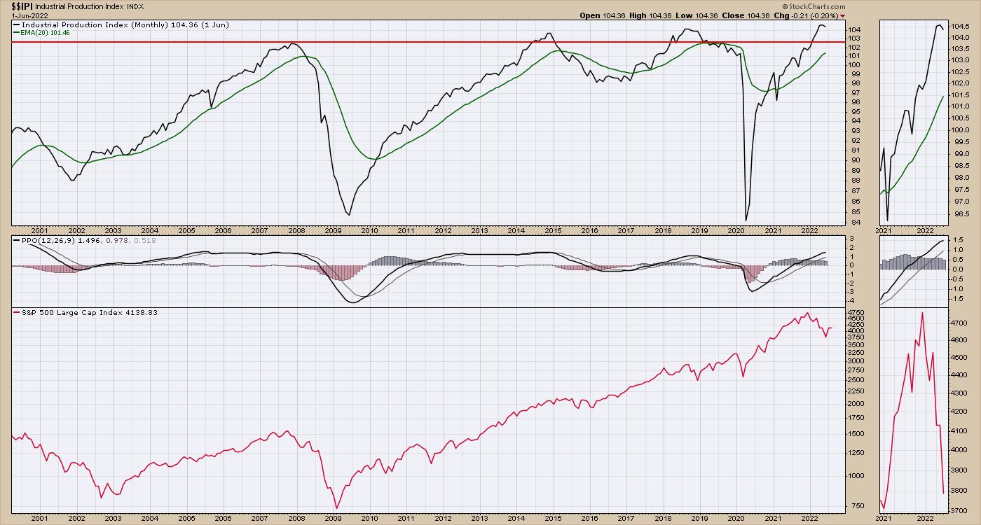
With all the hurdles in supply chains these days, one of the most resilient charts has been the industrial production. It is very strong, albeit rolling over recently. The end of 2018 had this chart dipping after the China/US Tariff Tantrum, and the stock market pulled back 20% in 2018. So its a bit of an oddity that, with global parts management in disarray, this still looks unaffected. However, based on the scale of the drops, industrial production has had wild swings but no real overall gains since 2007. This chart fired a huge negative signal in 2020, but the central banks around the world were keen to avoid an economic collapse. While the chart quickly rebounded, it looked dire at the time. The uptrend is still very much up at this point.
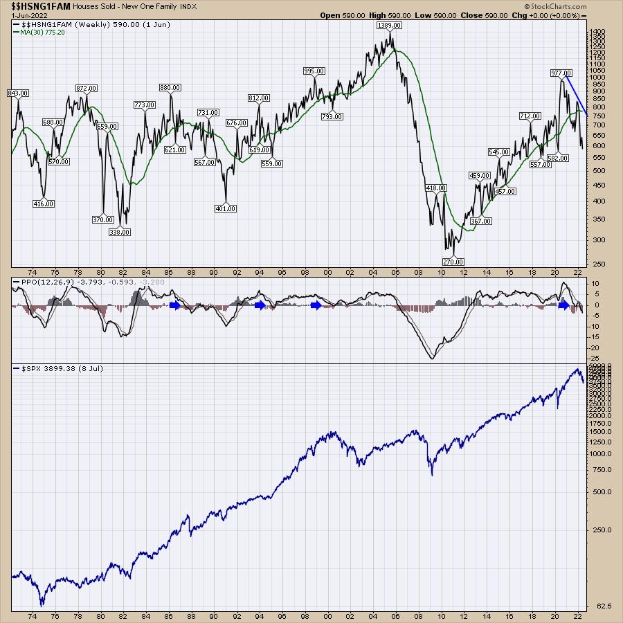
The housing sales data has been correcting for a while. I think a larger worry here is that, the longer this goes on, the more likely the economy gets in trouble. One simple way to look at the chart is above/below the moving average in green, or the direction of the moving average line. Is it sloping positively or negatively? I would say the green line has rolled over and is starting to drop.
The second way I like to look at it is with the PPO momentum indicator; when that falls below zero, we have to at least be aware of the changing dynamics of the population. The legend for the PPO is negative, and this is a signal that all is not well.
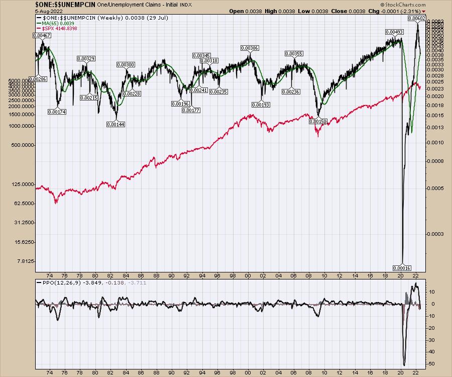
Another great chart for the economy is initial jobless claims. The chart is inverted so the peaks and valleys align with the $SPX. With the initial claims this week, that chart sits at the 40-week moving average, which is sloping up, but the PPO has turned negative. Part of the PPO turning negative is the wild swing we saw in the data due to COVID, so the amplitude of the wave (percentage change) is much higher.
The PPO is in negative territory, so this chart would appear to be cautionary as well.
The Market Buzz episode I recorded this week worked through many of my "Recession Watch" chart lists. As the market appears to be approaching the first major recession in 10 years (COVID & government response not included), these charts get more timely to help us understand where we are in the cycle and what that means for the stock market. These charts are the more bullish ones in the list, so I would encourage you to watch the video and be knowledgeable of what the other charts are showing.
Knife Edges Are Sharp On Both Sides
Investing during recessions is harder. The bull thesis is a lot more wobbly than traditional market recoveries. If you'd like more information, there are lots of free resources at OspreyStrategic.org.
|
| READ ONLINE → |
|
|
|
| RRG Charts |
| Disconnected EW Sector Rotation Offers Opportunities |
| by Julius de Kempenaer |
From time to time, I compare the rotations of the SPDR sectors that we usually use with their EW counterparts.
The first RRG below shows the rotations for the SPDR sector spiders (cap-weighted). The second RRG shows the rotations of the Equal Weight sectors. In both, the Energy sector is off the canvas to get a better view of the others.
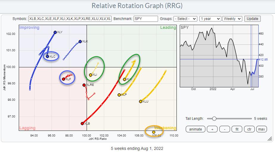
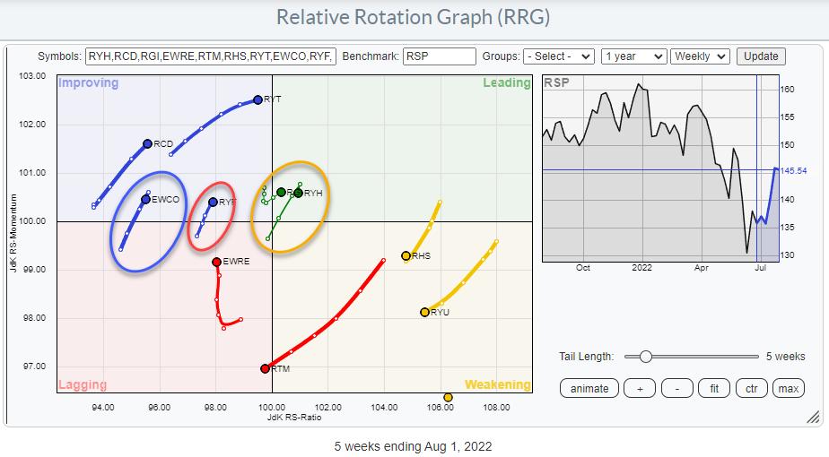
Most rotations trace out more or less the same trajectory, but, for a few sectors, there is a significant disconnect between the cap-weighted and the equal-weighted versions.
In the two RRGs above, I marked the disconnected sectors with the colors of the quadrant in "the other" RRG.
Communication Services
The tail for XLC is inside the improving quadrant, but rolled over a few weeks ago and is now heading down towards the lagging quadrant. Starting last week, EWCO has now also reversed its course, but XLC is clearly ahead. This suggests that one or more big names in the communication services sector are pulling XLC down.
Further inspection of the RRG that shows all members of the Communication services reveals interesting rotations for META and GOOG. They are at opposite trajectories, which is always interesting as it offers great pair trading opportunities.
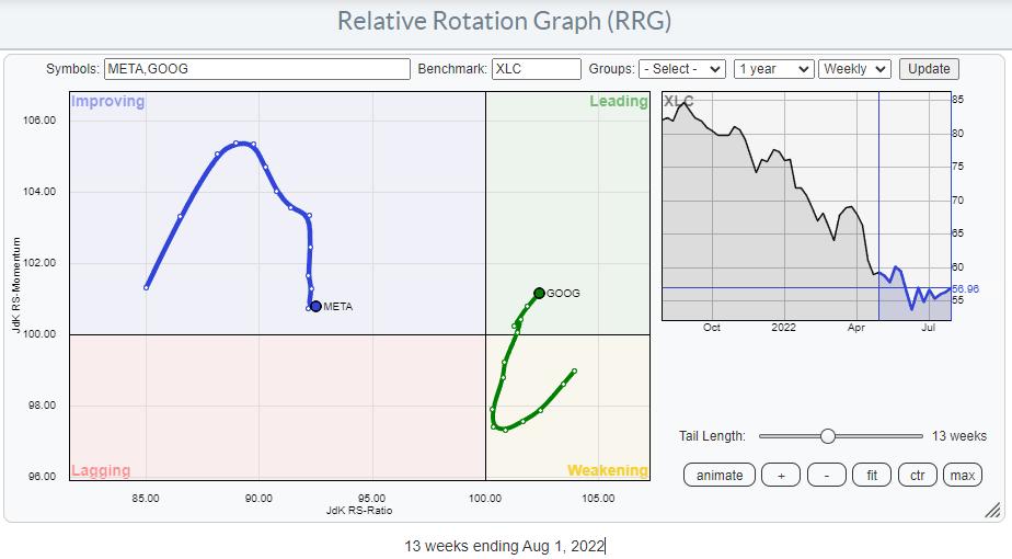
GOOG is shooting off deeper into the leading quadrant, while META is moving back towards the lagging quadrant after a stint through improving.
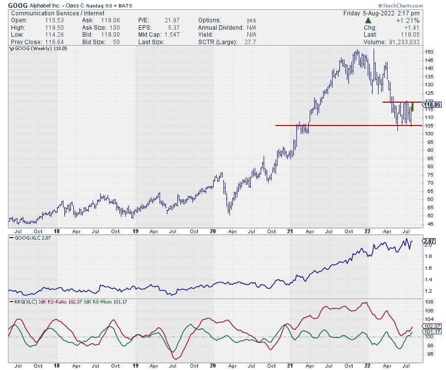
On the price chart, GOOG is pushing against the top of its trading range, which formed after the decline in the first half of the year. Notably, a break above 120 will open up fresh upside potential for GOOG, which will certainly help the rotation further into the leading quadrant.
Financials
On the cap-weighted RRG, XLF is inside the lagging quadrant and moving deeper into it. From the short tail on XLF, we can learn that it is moving at a slow rate, but the sector is weakening further. On the EW RRG, RYF is located inside the improving quadrant and moving further up at a strong RRG heading. This is a pretty serious disconnect between the two tails, which suggests that the larger names in this space are performing significantly weaker.
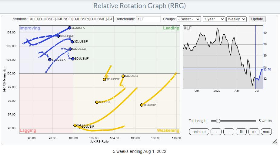
Pulling up the rotations of the various groups inside the financials sector reveals a very clear split and a sector in transition. There are NO groups inside leading and NO groups inside lagging. The majority of the groups inside weakening are at a negative heading, except for Insurance brokers. And the groups inside the improving quadrant are all at a positive heading except for Banks, Specialty Finance and Mortgage Finance.
Two interesting tails for individual components are found for BLK and TRV.
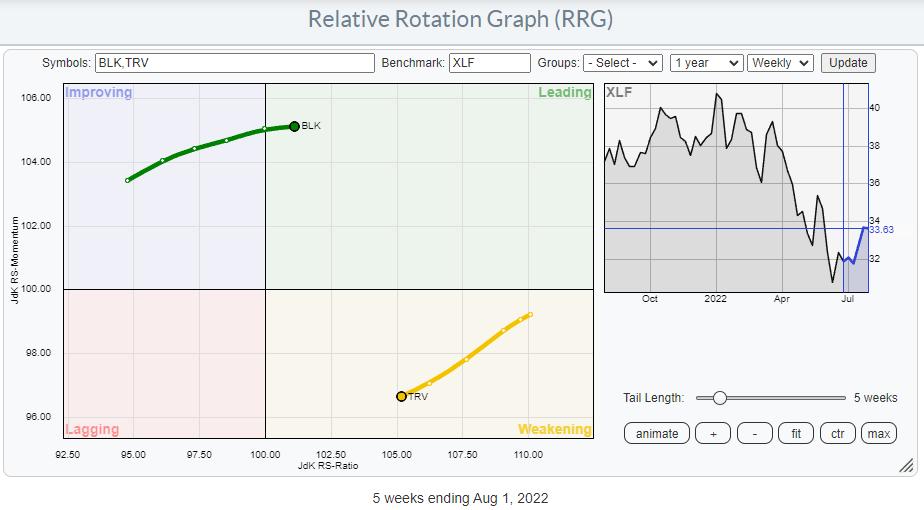
BLK has just entered the leading quadrant while TRV is inside weakening and heading towards lagging.
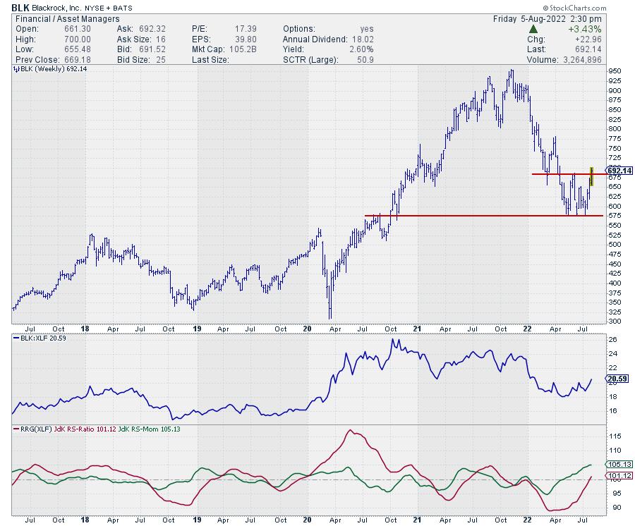
On the price chart, BLK has just completed a double bottom that was formed against a long-term support level. This upward break clears the path towards the next resistance level which is only found around 775.
Industrials
On the cap-weighted RRG, XLI has just crossed into the weakening quadrant and started to move further into it at a negative RRG heading. Its equal-weight counterpart has just crossed into the leading quadrant and is picking up on the RS-Momentum scale.
So here, also, it looks as if one or more big(ger) names are pulling the sector down vs. the S&P, while the broader group is not too bad at all.
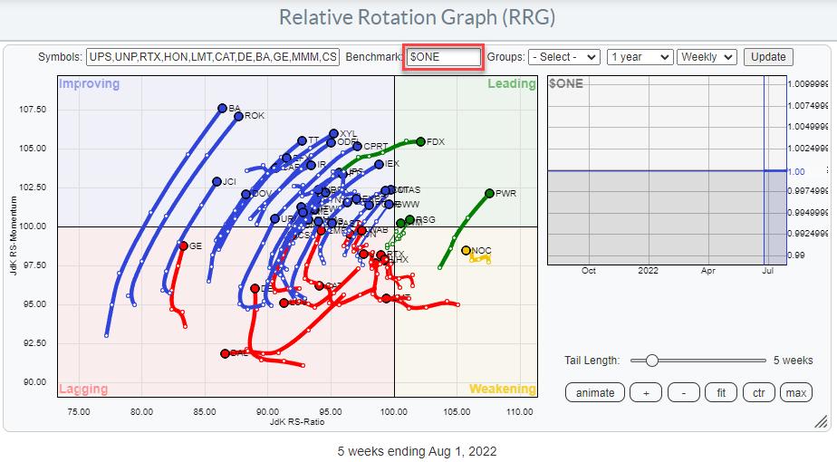
A quick check that I often use is to switch the benchmark on the RRG to $ONE. This changes the rotation to show absolute price performance instead of relative, and it can give a good handle on how the group as a whole is doing in terms of price trends. And, as you can see, the majority of tails are inside the improving quadrant and moving towards leading.
One of the stocks that really caught my eye is GWW.
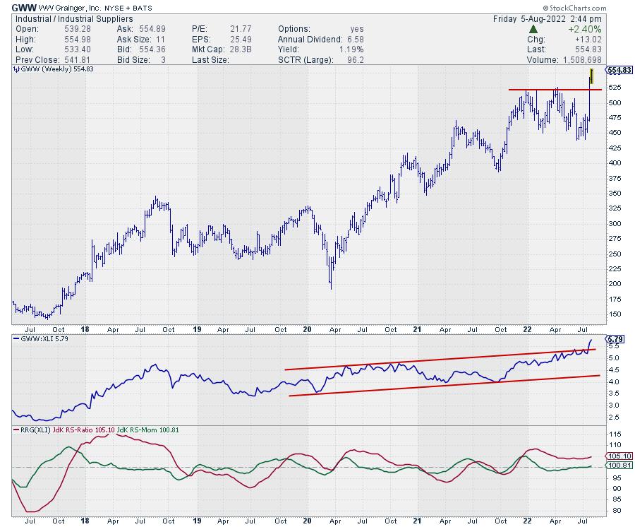
Two weeks ago, GWW broke to new all-time highs with a good follow-through last week. With the downside now well-protected at the breakout level, this creates a very good risk/reward profile. This strength in price is also causing even more improvement in relative strength, where the raw RS line is now breaking out of its already rising channel, while both RRG lines have started to move gradually higher again.
Health Care
XLV, the cap-weighted SPDR ETF, rotated into the weakening quadrant two weeks ago and is now moving lower on both scales. The EW counterpart RYH is still inside the leading quadrant and started pausing its move last week. It looks a bit similar to the move we saw for Communication Services inside improving. It still suggests that, here also, the bigger names are having an impact and they are dragging the sector, XLV, lower against SPY.
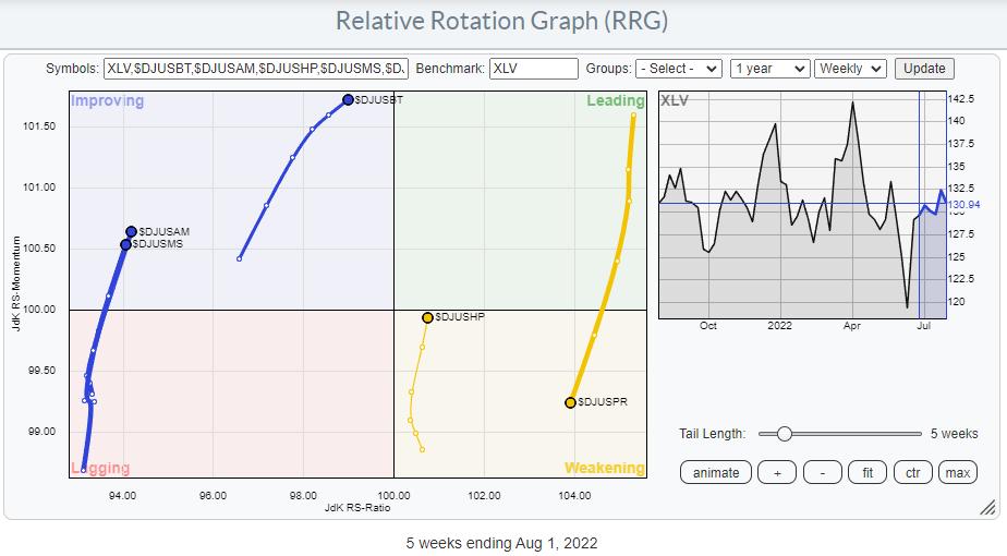
Inside the sector, there is a clear difference in rotation for the various groups. BioTech ($DJUSBT) looks really promising, together with Health Care Providers ($DJUSHP). Meanwhile Pharmaceuticals ($DJUSPR) are at an opposite rotation.
#StaySafe and have a great weekend, --Julius
|
| READ ONLINE → |
|
|
|
| Top Advisors Corner |
| When Cash is King |
| by John Hopkins |
There are times to be more aggressive in the market and other times when it makes some sense to lay low. To me, sitting more on the sidelines for the moment is not a bad idea.
For example, I wrote an article on July 15 where I made the case that the reward-to-risk had shifted to the upside, and that we could have hit the bottom. And, at that time, my target on the S&P was in the range of 4150 to 4170. Guess what? As you can see in the chart below, we hit that target this past week. And so it could make some sense to be a bit more patient here and let some natural profit-taking take place.
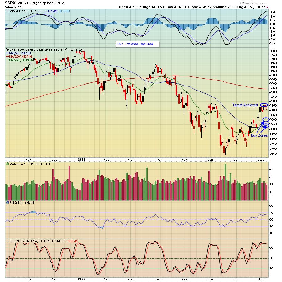
Could we go higher? Absolutely. In fact, our Chief Market Strategist, Tom Bowley, who declared the June 17 bottom (The "Bowley Bottom"), believes we are just at the beginning of a secular bull market. But he also has pointed out that we're seeing some negative divergences across the board, which means we could see some pullback before further moves to the upside resume.
Thus, from my perspective, it could be a good time to "sit on your hands" until the reward-to-risk once again favors an upside move. And though one could argue you could put some of your capital to use on the short side, it gets tougher to make successful trades when the bulls are in charge.
For sure, we've seen a sentiment shift, with traders now more willing to consider "buying on the dips." But there's no need to rush in here; the S&P has risen over 14% since the Bowley Bottom. And if the market continues to go higher? That's fine. But having some cash ready to take advantage of inevitable dips makes a lot of sense.
In the meantime, if you would like to regularly hear what Tom Bowley thinks about the market, just click here to sign up for our FREE EarningsBeats Digest and you will get timely updates every M, W and F in your inbox.
At your service,
John Hopkins
EarningsBeats.com
|
| READ ONLINE → |
|
|
|
| DecisionPoint |
| Climbing the Wall of Worry |
| by Erin Swenlin |
This morning I was at parent's house and my Dad chatted with me before I left. He said in so many words that I was probably a bit too bearish right now. It was likely in response to yesterday's free article (and DP Alert opening) about the diverging short- and intermediate-term indicators. I told him I was cautiously bullish, but that something didn't sit well with me after this week's trading, but I couldn't put my finger on it.
Carl told me that he was looking at the top ten capitalized stocks in the S&P (they are below) and the charts looked bullish. These heavy hitters lead the market and if they are doing well, the market tends to follow. I looked at the CandleGlance below and I was struck by the same thoughts. Other than META, the charts were all bullish. All but META have garnered IT Trend Model "Silver Cross" BUY signals (20-day EMA crosses above the 50-day EMA) and all are in rising short-term and even intermediate-term trends in some cases. Overhead resistance has been overcome by a handful (MSFT, AMZN and AAPL) and those that haven't overcome resistance levels, the indicators suggest they will.
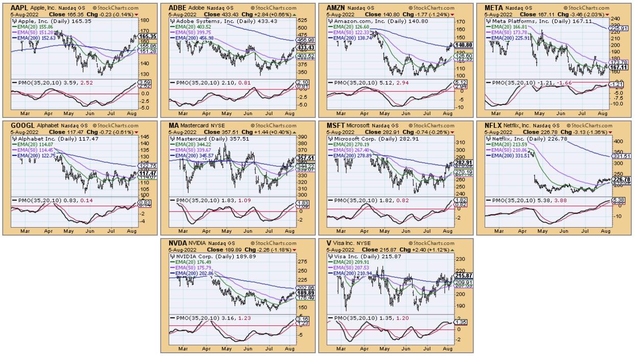
Don't get me wrong, we both agree that the bear market isn't likely over, but this looks like the rally should continue. After reviewing the charts, I realized my sticking point: the SPY's inability to overcome resistance this week alongside Swenlin Trading Oscillators (STOs) that are pulling back. Yet, participation is still healthy.
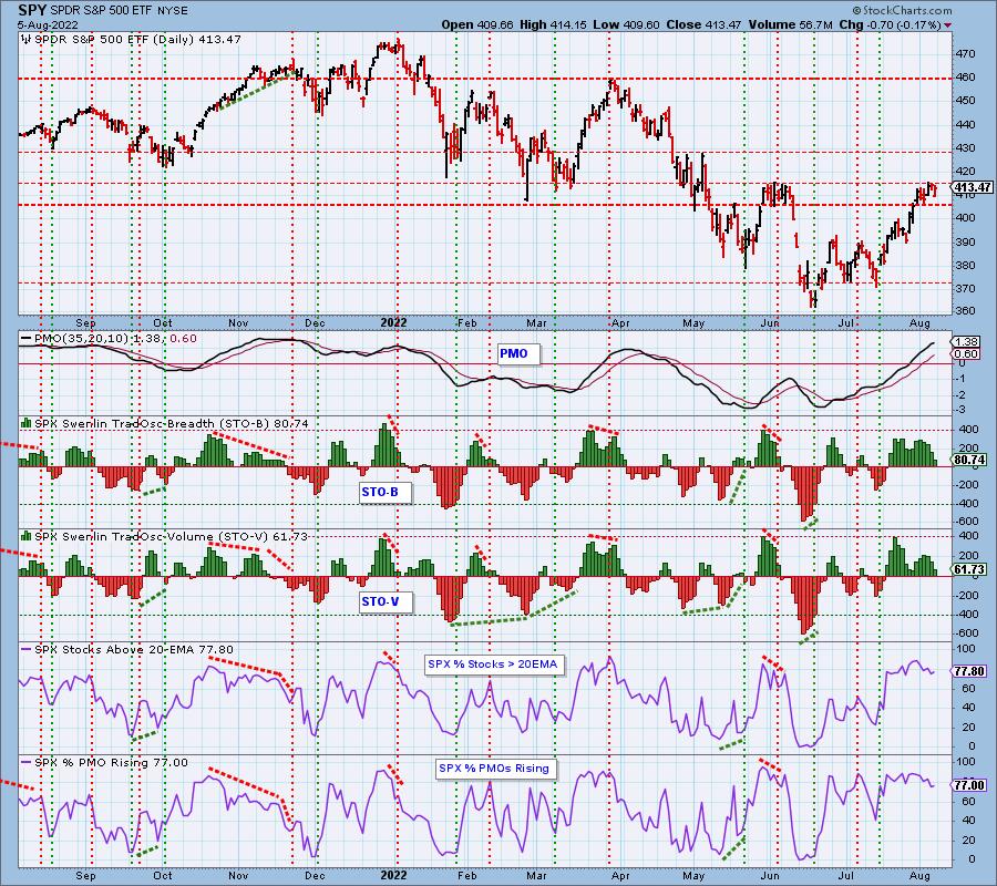
Often times, indicators will pullback out of overbought territory, basically unwinding overbought conditions while price consolidates. This could be exactly what is happening. I am reminded of the saying, "Climbing the Wall of Worry".
Good Luck & Good Trading!
Erin Swenlin

Technical Analysis is a windsock, not a crystal ball. --Carl Swenlin
(c) Copyright 2022 DecisionPoint.com
Helpful DecisionPoint Links:
DecisionPoint Alert Chart List
DecisionPoint Golden Cross/Silver Cross Index Chart List
DecisionPoint Sector Chart List
DecisionPoint Chart Gallery
Trend Models
Price Momentum Oscillator (PMO)
On Balance Volume
Swenlin Trading Oscillators (STO-B and STO-V)
ITBM and ITVM
SCTR Ranking
Bear Market Rules
DecisionPoint is not a registered investment advisor. Investment and trading decisions are solely your responsibility. DecisionPoint newsletters, blogs or website materials should NOT be interpreted as a recommendation or solicitation to buy or sell any security or to take any specific action.
|
| READ ONLINE → |
|
|
|
| Martin Pring's Market Roundup |
| Indexes Back to Their Breakdown Points; Should We Pop the Champagne If They Go Through? |
| by Martin Pring |
The rally since mid-June has taken several indexes back to their extended breakdown trendlines, which mark one demarcation point between bull and bear. Chart 1, for instance shows that the NASDAQ completed a top in May and then followed through with further weakness. By mid-June, the Index found a bottom and has been zig-zagging its way higher ever since; it now stands at resistance, as indicated by the extended breakdown trendline.
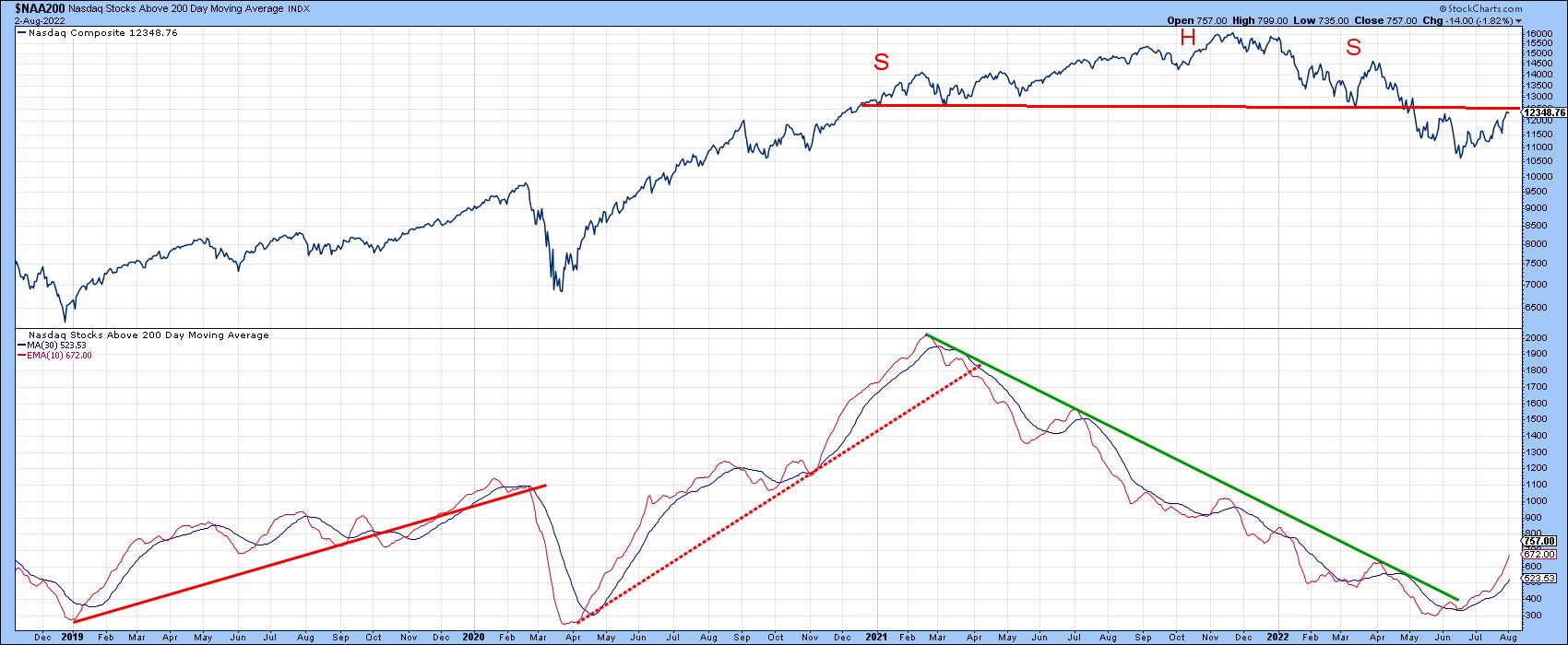 Chart 1 Chart 1
A very encouraging sign comes from the 10-day EMA of NASDAQ stocks above their 200-day MA, as it has successfully violated its 2-year down trendline. That suggests the bear market in this market measure is most likely over. The breakout would normally be expected to be positive for the index, but not necessarily so. That's because the two series diverge from time to time. For example, the 200-day 10-day EMA peaked in March of 2021, whereas the Index topped out eight months later in November of that year. What the trend break does suggest is that, going forward, the environment for the average NASDAQ stock will be improving, just as it was deteriorating between March 2021 and mid-June of this year. This action also increases the odds the NASDAQ Index can rally above its extended neckline.
That said, take a look at the 2007-09 bear market for the NYSE Composite. The Index completed a head-and-shoulders top in early 2008, sold off and subsequently rallied back to the extended neckline. However, it was unable to surpass it. You can also see that the 10-day EMA of the percentage of NYSE stocks above their 200-day MA had also violated an important down trendline. That suggested the NYA would likely break above the extended neckline, which would have gone a long way towards cancelling the top. However, hindsight tells us that it was a bear market environment, where deception reigns and normally positive signals give way to disappointing ones.
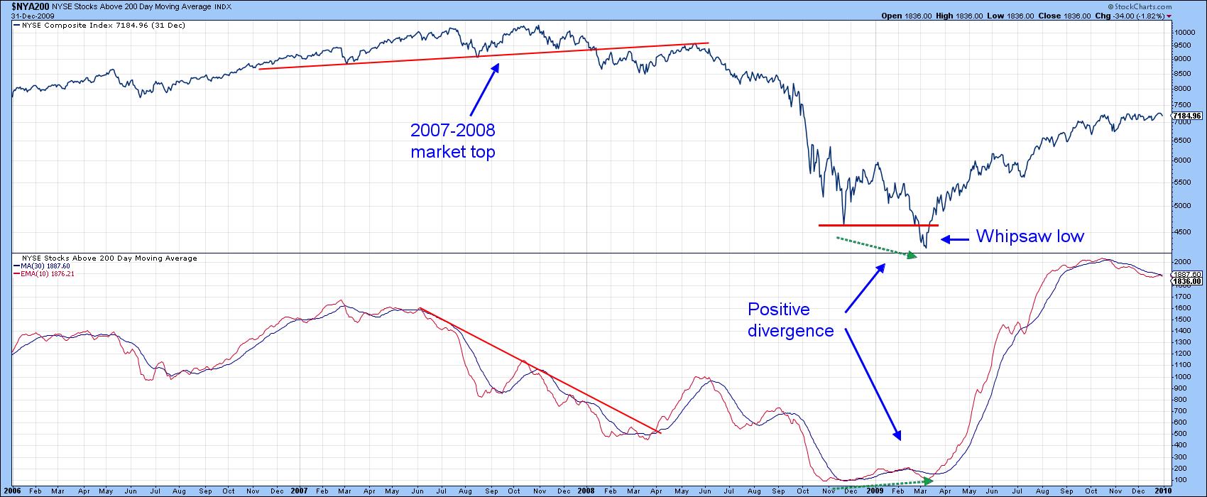 Chart 2 Chart 2
Action at the actual 2009 bottom was far more convincing, because the Index temporarily took out its late 2008 low, but the EMA of the number of stocks above their 200-day MAs failed to confirm, thereby setting up a large positive divergence. The Index may have registered a new low, but it was not being accompanied by more stocks dropping below their 200-day MAs.
Chart 3 shows that the S&P also sports a head-and-shoulders top with a rally back to the neckline. In any situation, a price that is able to recapture the neckline increases the odds that a pattern will fail. An even more important juncture point, though, comes from the line joining the head with the right shoulder. The significance depends on the angle of descent; the shallower the angle, the stronger the resistance and the greater the importance of the line. In this instance, the dashed trendline has a fairly shallow angle of descent, so it holds quite a bit of significance if penetrated. Such a breakout would involve a rally that can hold above the 4,400 area.
One encouraging sign this week has been the tentative violation of the down trendline for the 10-day EMA of the S&P percentage of stocks above their 200-day MAs.
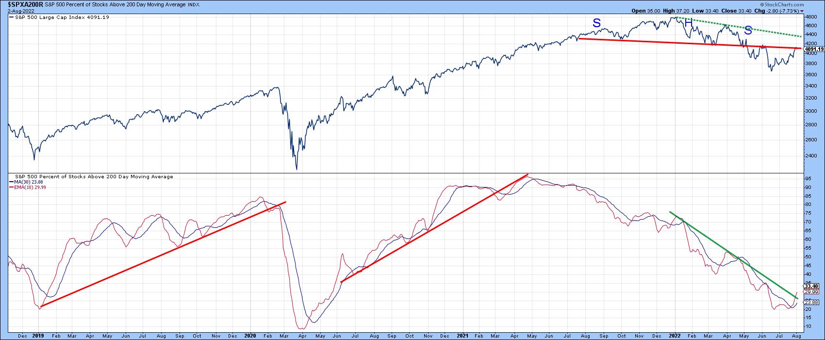 Chart 3 Chart 3
Bear markets are notably deceptive, though, which is why I always want have the weight of the evidence on my side before concluding that the bull has returned. In that respect, take a look at the 1946 top for the Dow in Chart 4. It starts off with a perfect head-and-shoulders distribution pattern, followed by a false move to the downside. Then, just after it looked as if the Index was going to violate the trendline joining the head with the right shoulder, it drops below the neckline once again.
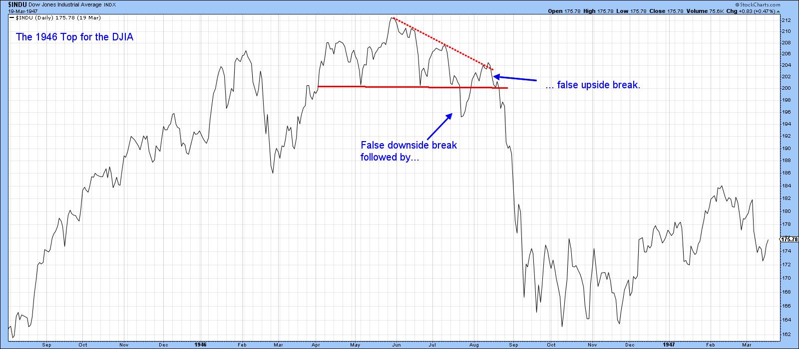 Chart 4 Chart 4
Chart 5 shows a similar fake breakout for the Dow during the formation of the 1972-3 top. In this case, the Index pushes its way back above the extended neckline, but is unable to hold there. Note that both the 1946 and 1972 whipsaws were directly followed by the worst part of the bear market.
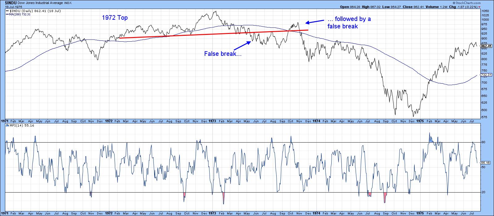 Chart 5 Chart 5
I am not forecasting that's going to happen in the current situation, because I honestly do not know. What I do know is a basic technical principle that says, "A trend is a trend is a trend." That means we should assume that the current trend is in force until the weight if the evidence shows or proves that the trend has reversed. We have lots of evidence that the intermediate trend is positive, but lack the proof that the primary trend is also bullish. Enjoy the rally, but be careful.
Good luck and good charting,
Martin J. Pring
The views expressed in this article are those of the author and do not necessarily reflect the position or opinion of Pring Turner Capital Group of Walnut Creek or its affiliates.
|
| READ ONLINE → |
|
|
|
| The MEM Edge |
| Growth Stocks Continue To Gain -- Will The Uptrend Last? |
| by Mary Ellen McGonagle |
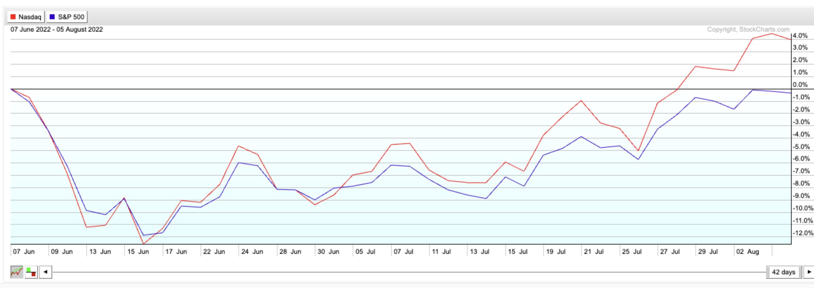
The bull market in stocks carried on last week, despite warnings from several Federal Reserve governors that the central bank is nowhere near being done cracking down on inflation. Growth stocks, in particular, continued their run, with the tech-heavy Nasdaq posting a 14.4% rally over the past 5 weeks compared to the S&P 500's 9.4% gain.
Nasdaq (red line) vs S&P 500 (blue line) Over Past 2 Months
In addition to investors' vote of confidence that the Fed may be able to tame inflation without crushing the economy, strong earnings reports from select Technology and Biotech stocks has helped fuel buying in Nasdaq names. Software stocks were some of the biggest gainers last week, with beaten-down names such as software provider Atlassian (TEAM) gapping up 18% after reporting quarterly results that were above estimates, while guiding growth estimates higher going into the 3rd quarter. Servicenow Inc. (NOW) was another winner, after posting 11% on the heels of predicting strong growth prospects going into the remainder of the year.
Both top performing Software companies have several things in common, including being well off their peaks in price from late November of last year. Their declines occurred amid a rise in inflation that impacted all Growth stocks, and it occurred despite NOW and TEAM posting subsequent quarters of growth earlier this year.
Going forward, both companies are citing their continued growth in subscribership, which has them set up to ride the currently turbulent economic environment. Whether these growth prospects can overcome a rising interest rate environment remains to be seen, however, and, below, we review the near- and longer-term prospects for these companies.
DAILY CHART OF ATLASSIAN CORP. (TEAM)
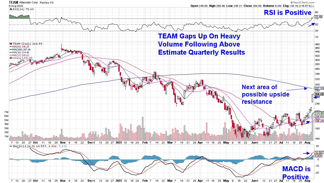
Today's gap up in price in TEAM occurred on volume that was 277% above estimates, which indicates strong accumulation and often leads to further near-term upside. The stock is closing in on its 200-day moving average, however, which is the next area of upside resistance and is 6.5% away. The good news is that the MACD and RSI are both positive, and I'd be on the lookout for further gains next week and beyond -- market permitting.
WEEKLY CHART OF SERVICENOW (NOW)
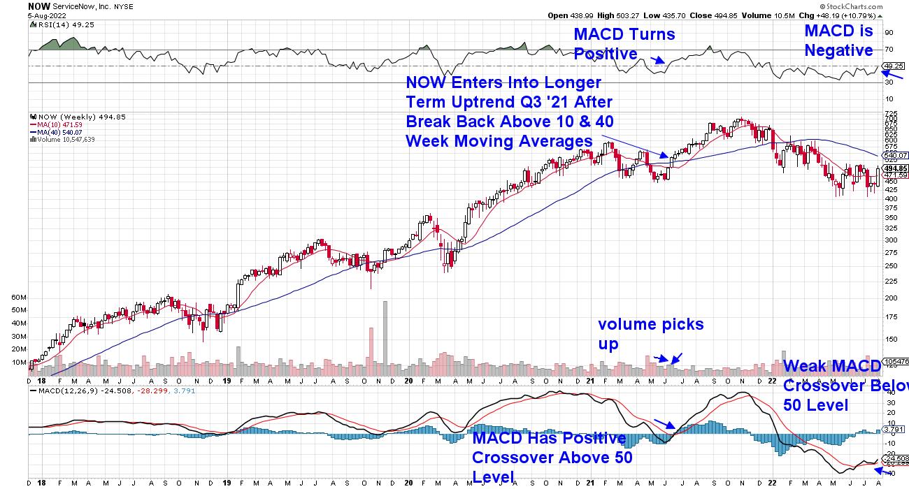
For a longer-term perspective, I'm sharing a weekly chart of ServiceNow (NOW) and, as highlighted, both the RSI and MACD are in negative territory. If we use July 2021 as precedent, NOW has more work to do before embarking on a longer-term rally. A move above its 10- and 40-week moving average would change that outlook, however; particularly if coupled with a positive RSI and MACD crossover similar to July. With most stocks, the health or weakness of its Industry Group and Sector will also play a key role, as almost 50% of a stock's price movement is attributable to its industry.
Other areas of Growth are also on the move and, if you use this link here, you can access a 2-week trial of my twice weekly MEM Edge Report for a nominal fee to receive a list of select stocks that are in strong buy zones. You'll also be provided with in-depth insights into the markets, as well as sector rotation currently taking place.
Staying on top of the markets and being aware of when this current rally runs into headwinds will provide you a peace of mind. Use the link above to sign up for a trial today!
On this week's edition of The MEM Edge, now available to watch on demand at StockChartsTV.com and the StockCharts YouTube channel, I review areas of growth and shares why they remain in a leadership position. I also reveals a more risky area of the markets that is on the move higher, and how to trade stocks after they gap up in volume.
Warmly,
Mary Ellen McGonagle, MEM Investment Research
|
| READ ONLINE → |
|
|
|
| Wyckoff Power Charting |
| A Wyckoff Cause is Forming. What's Next? |
| by Bruce Fraser |
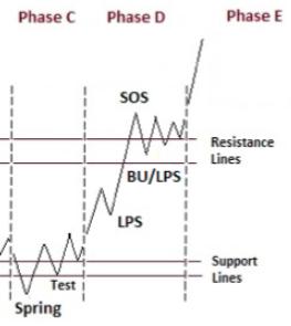 In May and June oversold conditions in the major stock indexes developed. Internal breadth and sentiment measures reached notable extremes. Keeping in mind the quarter-end effect, Wyckoffians were on the lookout for an acceleration of the downtrend into a ‘Selling Climax', which arrived in mid-June (quarter-end). Following a series of selling panics (in May and June) a period of ‘Testing' and ‘Cause' building would be expected. A successful test followed in July with two declines of narrowing spread and diminished volume. After becoming oversold below the downtrend channel (green shaded area on the chart below), the S&P 500 worked its way back into the channel (above the oversold trendline). A quality rally followed and now the index is at initial resistance. In May and June oversold conditions in the major stock indexes developed. Internal breadth and sentiment measures reached notable extremes. Keeping in mind the quarter-end effect, Wyckoffians were on the lookout for an acceleration of the downtrend into a ‘Selling Climax', which arrived in mid-June (quarter-end). Following a series of selling panics (in May and June) a period of ‘Testing' and ‘Cause' building would be expected. A successful test followed in July with two declines of narrowing spread and diminished volume. After becoming oversold below the downtrend channel (green shaded area on the chart below), the S&P 500 worked its way back into the channel (above the oversold trendline). A quality rally followed and now the index is at initial resistance.
In Power Charting episodes on StockChartsTV we discussed ‘Green Shoots' during the recent Selling Climax and subsequent tests (green shaded area). This was evidence of internal exhaustion of selling (likely window dressing) as the quarter was coming to a close. This echoed the January to March period of ‘Green Shoots' that preceded the significant April advance (which completed a ReDistribution structure).

S&P 500 Index - For Educational Use. Not a Recommendation
Chart Notes:
- As the Distribution unfolded, beginning in the fall of '21, I have been using this $SPX chart as a real-time Wyckoff case study of emerging Distribution and Markdown.
- Currently range-bound, a possible Cause is forming for a more important rally. Most likely in the context of a long-term bear market. Price holding above resistance is needed to confirm.
- The downtrending ‘Supply Trendline' and the declining 200dma are at approximately the same level and could be a price objective for this rally.
- The Cause building process is not complete and will likely grow larger. We must keep this in mind when estimating PnF objectives.
- Bear Market rallies can be very convincing, resulting in many market pundits declaring the Bear vanquished. Wyckoffians follow the action of the ‘Tape' allowing the market to lead the way.
- Initial overhead resistance is now being approached and may lead to ‘Backups'. Shallow and narrow reactions are preferred. A deeper reaction could signal either ReDistribution or continuation of a range-bound structure. We will study price and volume characteristics for essential clues.

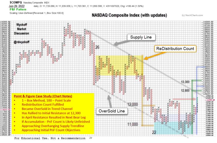
NASDAQ Composite Index ($compq)
Another stock index perspective is the NASDAQ Composite through the lens of a Point & Figure case study. Using the 1 – Box Reversal technique (and 100 point scaling) the January to April ReDistribution horizontal count was taken. The objective range was fulfilled between 12,000 and 11,000 with the May decline. The climactic decline stopped at the brief ThrowUnder of the OverSold trendline. This was the start of a ‘Range-Bound' condition. In June there was another attempt to reach the OverSold Line which produced a Selling Climax.
The current range-bound price structure appears unfinished (if Accumulation) and would likely need a shallow and brief reaction to be complete. A sharp decline to the area of prior (June) support is not out of the question either. If this is ReDistribution, the prior March to April rally high could be a suitable analog.
All the Best,
Bruce
@rdwyckoff
Disclaimer: This blog is for educational purposes only and should not be construed as financial advice. The ideas and strategies should never be used without first assessing your own personal and financial situation, or without consulting a financial professional.
An archive of Power Charting episodes discussed in this article is available (click here)
Announcement:
Each week Roman Bogomazov and I discuss the current state of the financial markets from a Wyckoffian perspective. To learn more about this dynamic weekly session (click here)
|
| READ ONLINE → |
|
|
|
| MORE ARTICLES → |
|
 Chart 1
 Chart 2
 Chart 3


 In May and June oversold conditions in the major stock indexes developed. Internal breadth and sentiment measures reached notable extremes. Keeping in mind the quarter-end effect, Wyckoffians were on the lookout for an acceleration of the downtrend into a ‘Selling Climax', which arrived in mid-June (quarter-end). Following a series of selling panics (in May and June) a period of ‘Testing' and ‘Cause' building would be expected. A successful test followed in July with two declines of narrowing spread and diminished volume. After becoming oversold below the downtrend channel (green shaded area on the chart below), the S&P 500 worked its way back into the channel (above the oversold trendline). A quality rally followed and now the index is at initial resistance.
