| THIS WEEK'S ARTICLES |
| John Murphy's Market Message |
| SHORT-TERM STOCK REBOUND CONTINUES |
| by John Murphy |
SHORT-TERM REBOUND CONTINUES... Stocks are ending the week on a positive note and continue to show signs of having formed a short-term bottom. The daily bars in Chart 1 show the S&P 500 building on the gains that started the previous week. Sbort-term momentum indicators like the RSI and MACD lines are also rebounding. The first hurdle the SPX needs to extend the rebound is its early October intra-day peak at 3806. If that level is overcome, more substantial resistance should be evident at its early September low and its 50-day moving average (blue arrow). This week's rebound, however, still needs to be viewed within the context of a continuing bear market. While all eleven sectors are having a positive week, energy remains the market's strongest sector. And it's having a good chart week.
 Chart 1 Chart 1
ENERGY SECTOR HITS FOUR-MONTH HIGH... Energy has been the market's strongest sector all year. And again this week. The daily bars in Chart 2 show the Energy Sector SPDR (XLE) moving above its August peak to reach the highest level in four months. That bullish breakout is another positive sign for the sector and its individual stocks.
CHEVRON AND EXXON BREAK OUT AS WELL... Chart 3 shows Chevron (CVX) also exceeding its August high to achieve an upside breakout of its own. Exxon is having an even stronger day. Chart 4 shows Exxon (XOM) clearing its June high to reach a new record. Oil service stocks are also having a strong day.
 Chart 2 Chart 2
 Chart 3 Chart 3
 Chart 4 Chart 4
SCHLUMBERGER LEADS OIH HIGHER...Oil service are also achieving upside breakouts. Chart 5 shows the VanEck Oil Services ETF (OIH) rising to the highest level since June. It's being led higher by Schlumberger (SLB). Chart 6 shows that oil service leader exceeding its June high to reach the highest level in four years.
ENERGY LEADERSHIP MAY BE A WARNING SIGN... Although rising energy shares are contributing to today's strong stock market gains, today's upside breakouts aren't necessarily good for the rest of the market going forward. That's especially true if gains in energy shares are based on expectations for higher energy prices.
 Chart 5 Chart 5
 Chart 6 Chart 6
|
| READ ONLINE → |
|
|
|
| The Mindful Investor |
| Top Ten Stocks in Accumulation Phase |
| by David Keller |
When someone sends me a ticker to review, the first thing I do is bring up my standard two-year daily chart on StockCharts. And the very first question I ask myself is always the same: is this chart in an accumulation phase or a distribution phase?
Now that is a somewhat subjective question to be sure, but the technical toolkit provides many ways to quantify trends and measure trend strength. For me, "accumulation" suggests that buyers are pushing prices higher, thus the stock is in an uptrend. And "distribution" means essentially an absence of buyers, meaning the price trends lower over time.
The StockCharts SCTR rankings are based on a simplistic price momentum model. Basically, the stronger the trend, as defined on three different time frames, the higher the SCTR. As I review the top ten large cap stocks based on their SCTR rankings, I'm struck by the consistent uptrends of stocks very much in an accumulation phase.
Here are the top-ten ranked large cap stocks based on their SCTR scores, along with comments for each. Note three consistent features: higher highs and higher lows, strong momentum characteristics and improving relative strength!
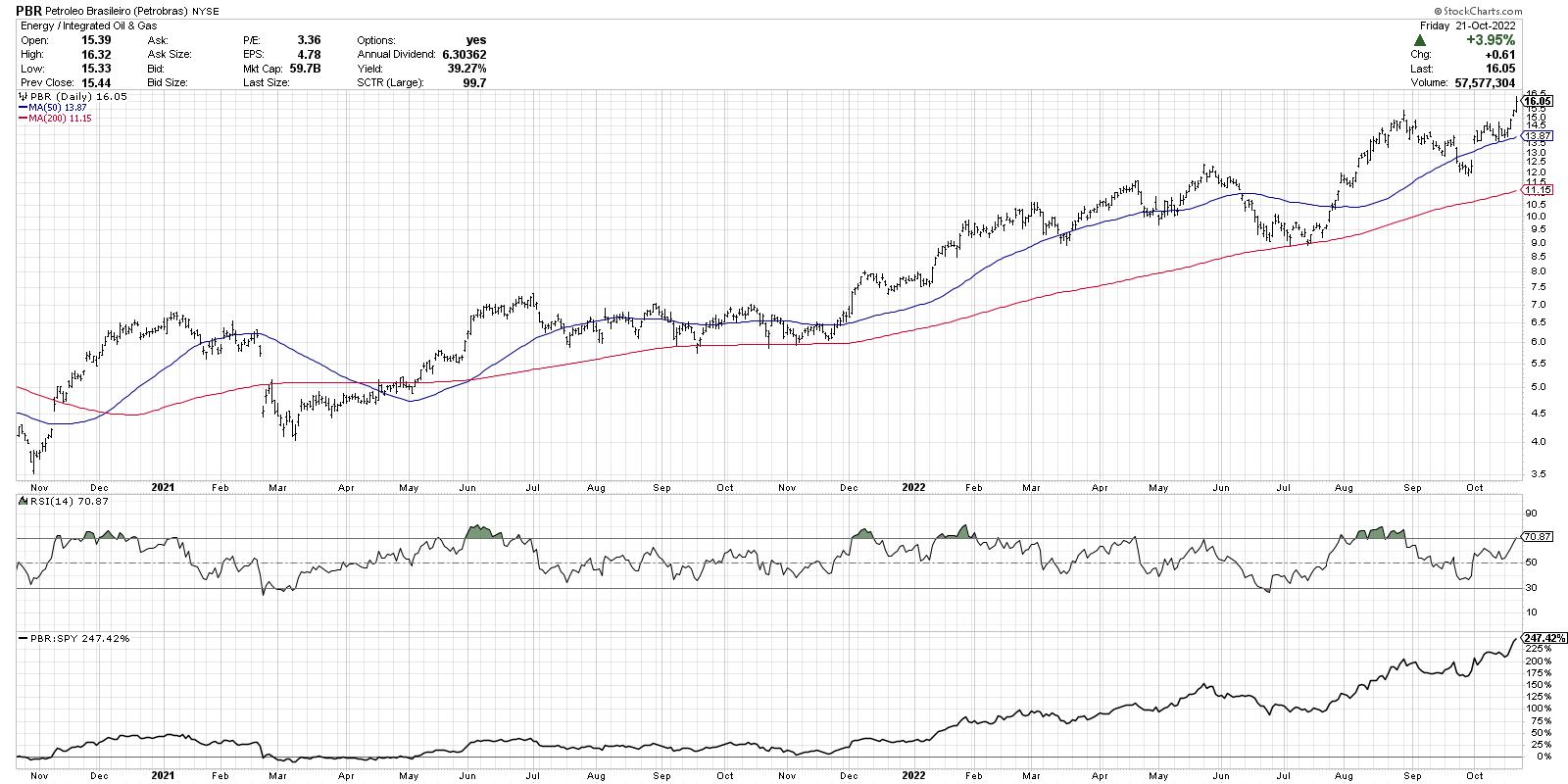
1. Petrobras (PBR/A)

2. Petrobras (PBR)

These first two are different share classes of the same Brazilian oil company, Petrobras. It's hard to imagine a chart like this exists in a year when the major equity averages are in consistent downtrends!
Note the recent breakout to new highs after a pullback to the 50-day moving average, which is a classic bullish pattern.
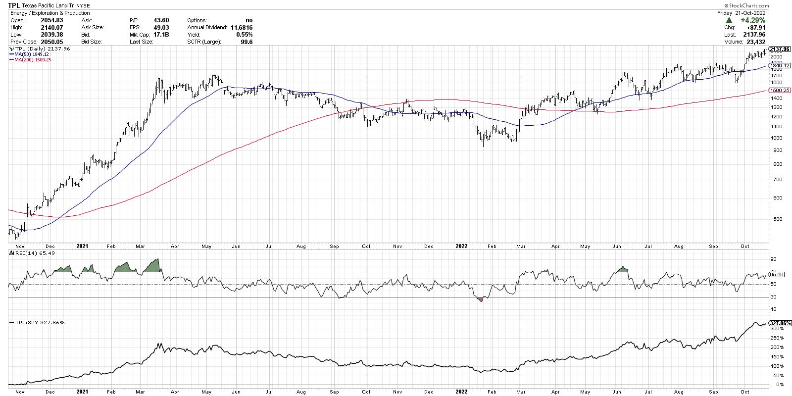
3. Texas Pacific Land Trust (TPL)

A rare name that has doubled since January, TPL just broke above the $2000 level for a new all-time high. Notice how the RSI has remained above 40 on recent pullbacks, which is common in bull phases.
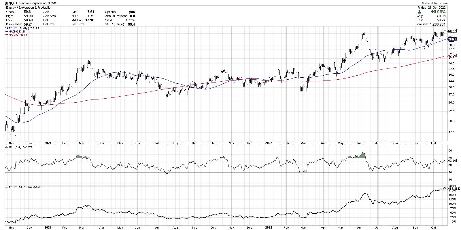
4. HF Sinclair Corporation (DINO)

Now this one has a cup-and-handle appearance to it, with a rounded consolidation phase from the June peak into late August, followed by a shallower pullback in September. The recent break to new highs completes the pattern and suggests further upside potential.
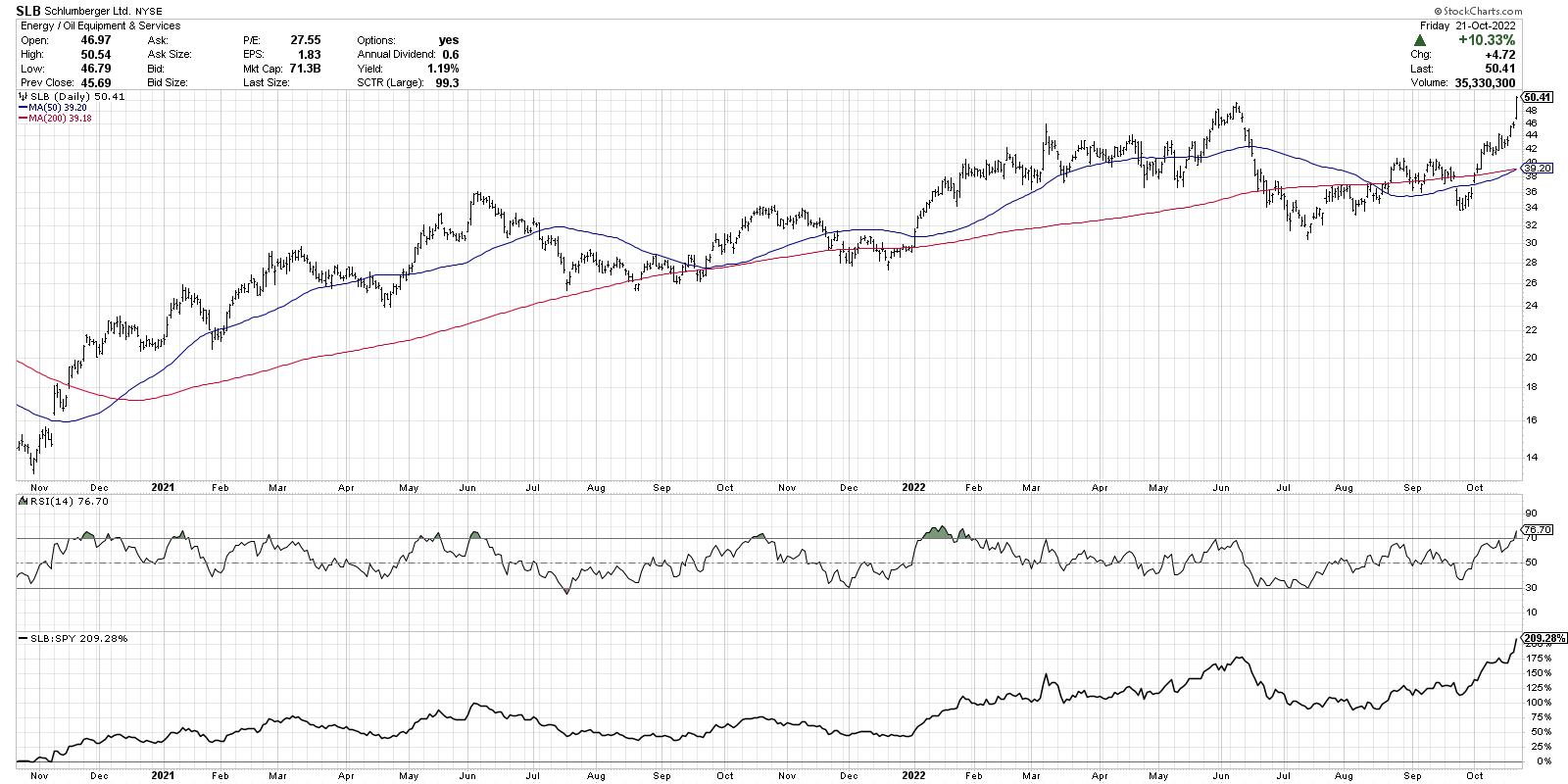
5. Schlumberger (SLB)

SLB pulled back with the rest of energy in June, but the higher low in October set the stage for a successful retest of the June high. The stock is now overbought with an RSI over 70, but that is not always a bad thing! Check out the RSI in January.
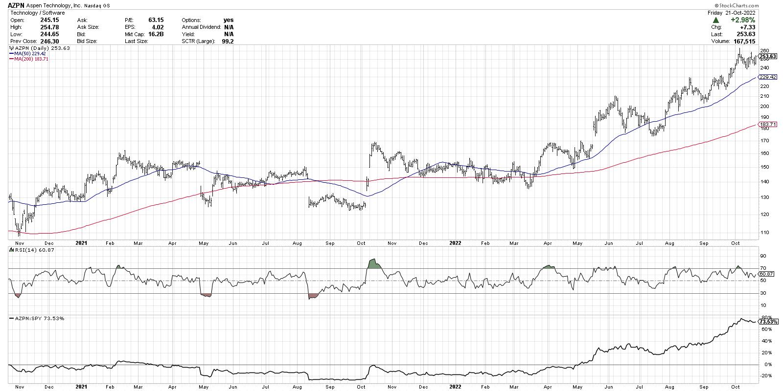
6. Aspen Technology (AZPN)

What? A technology stock actually made it into the top ten?!? AZPN has been quite an outlier in its sector, up 67% year-to-date while the XLK is down about 28%. Here, we find a very consistent uptrend of higher highs and higher lows. When the price is above two upward-sloping moving averages, the trend is strong.
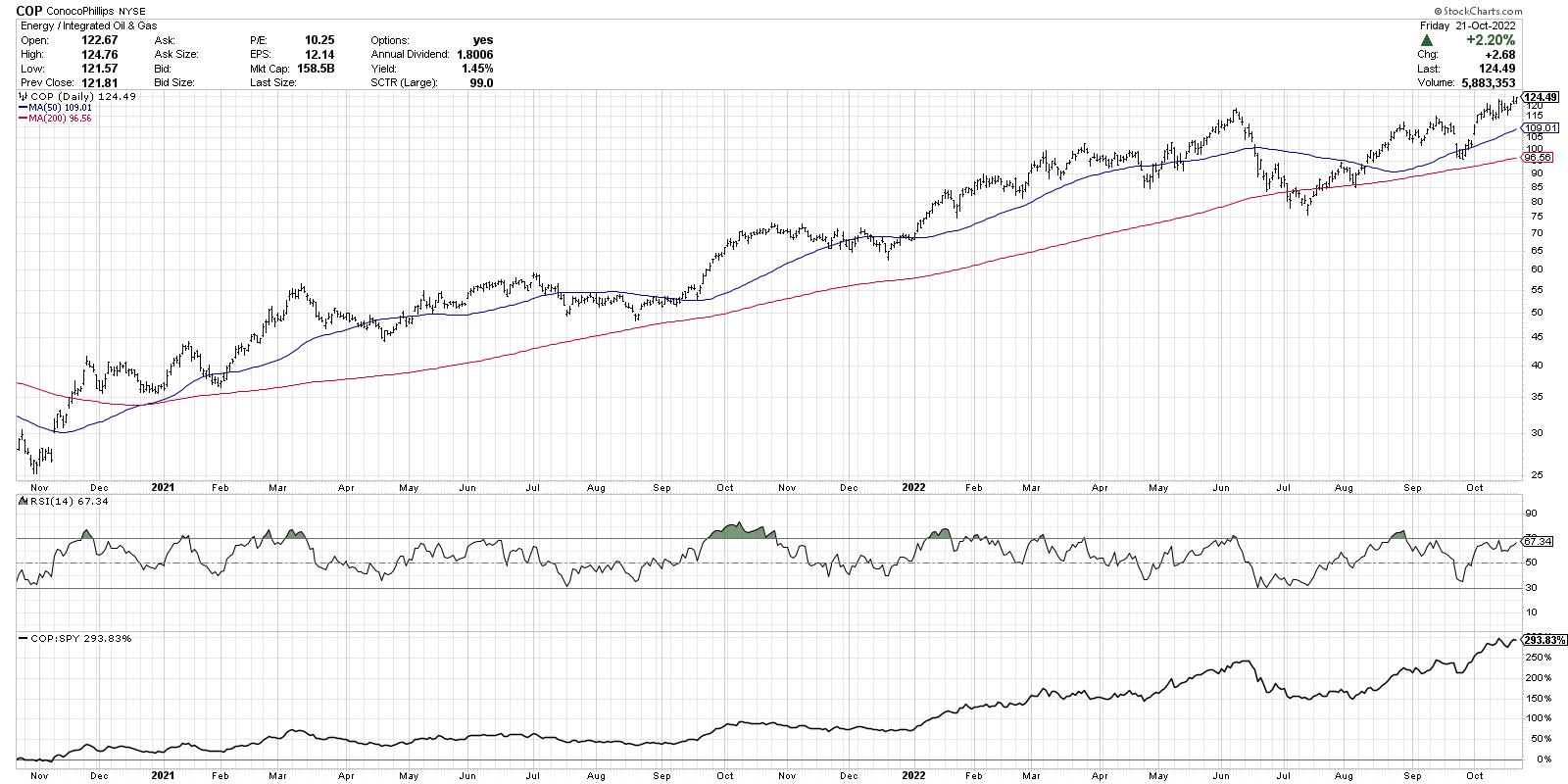
7. ConocoPhillips (COP)

COP has an even better cup-and-handle pattern than DINO, with a clearly defined "rim" to the cup and a valid breakout above resistance in early October. Somewhat weaker momentum since the overbought conditions in August, which may be something to watch.
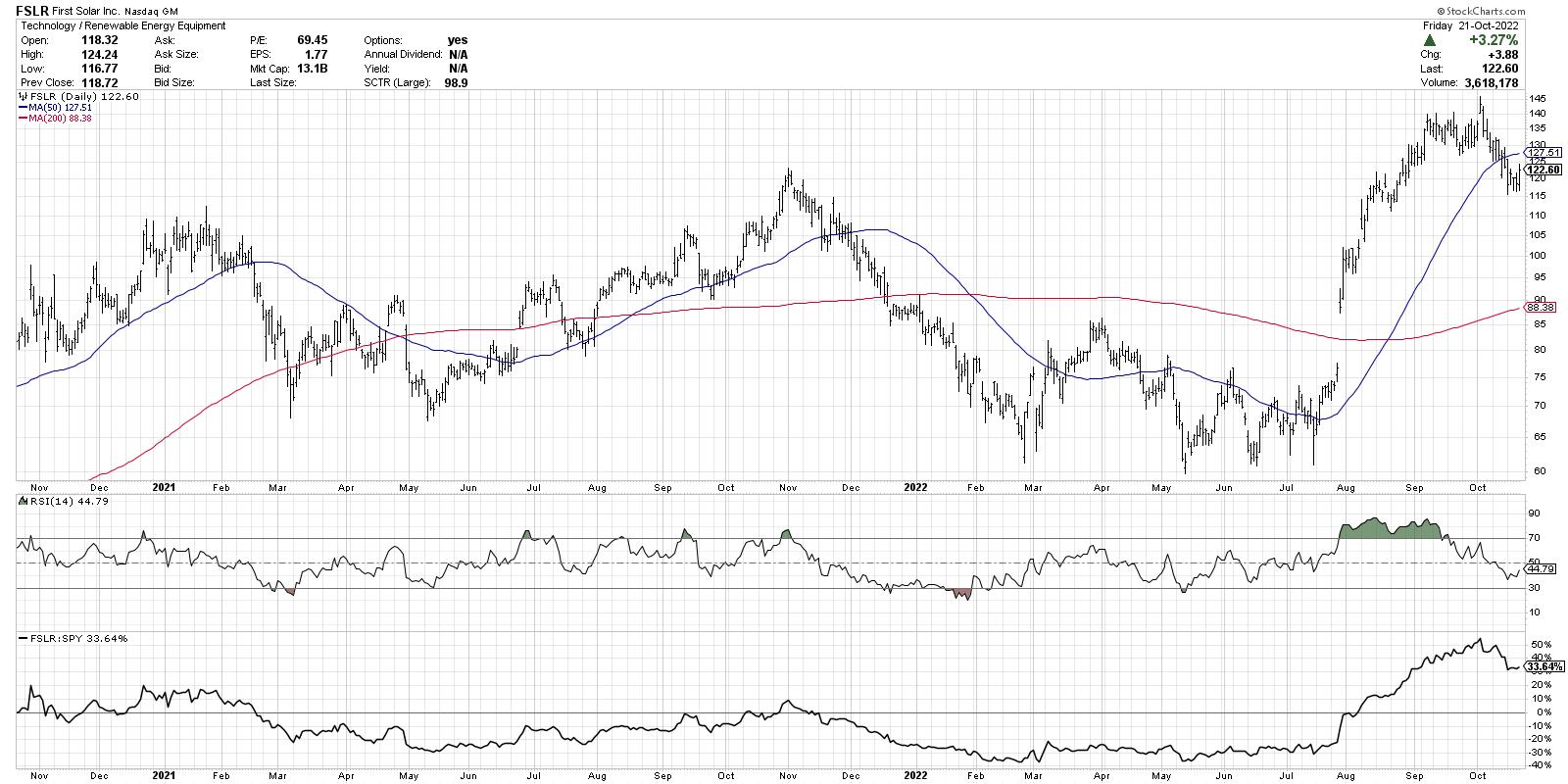
8. First Solar (FSLR)

Now we go from "old energy" to "new energy" with a jump to the solar stocks. This is an intriguing chart for many reasons. Look how FSLR tested price support around 60-65 numerous times, before gapping higher in July and never looking back.
The price broke above the 2021 high in late August and has now pulled back to the breakout level around $120. Can FSLR hold this key support level?
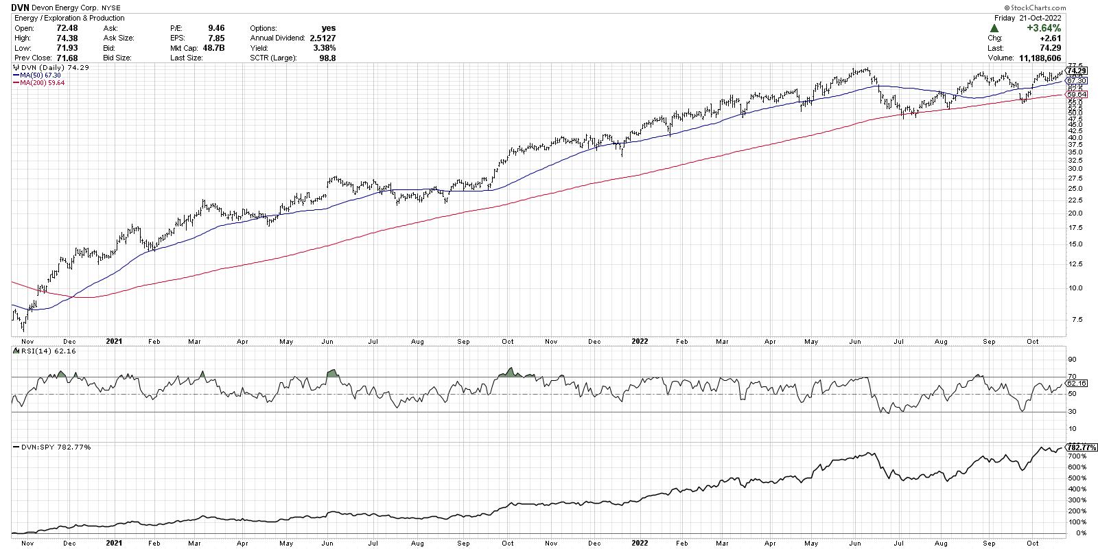
9. Devon Energy (DVN)

DVN has been a favorite name in 2022, particularly in the first half of the year, when it was often in the SCTR top ten. Along with the rest of the energy space, we're seeing renewed upside pressure and a retest of all-time highs. Does this trend continue to much higher highs? I would suspect the answer is most likely yes.
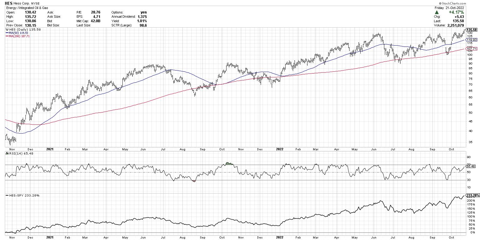
10. Hess Corp (HES)

And we may have saved the best for last. HES has been in a basing pattern for the last four months and, just this week, made a decisive move above the $130 level. And the relative strength shows that this has been a consistent long-term outperformer.
So what is consistent with all of these charts? They are in the accumulation phase. They are showing evidence that buyers are pushing prices higher as resistance levels are met and eclipsed.
While this round is dominated by energy stocks, that is certainly not always the case. But if you regularly review the top-ranked SCTR stocks, you will find that, regardless of the broader market environment, some stocks somewhere will be in the accumulation phase.
As Paul Montgomery once said, "The most bullish thing the market can do is go up."
One more thing... My latest YouTube video answers a recent question, "Can you discuss the role of time in the formation of technical patterns?" Check it out:
RR#6,
Dave
P.S. Ready to upgrade your investment process? Check out my YouTube channel!
David Keller, CMT
Chief Market Strategist
StockCharts.com
Disclaimer: This blog is for educational purposes only and should not be construed as financial advice. The ideas and strategies should never be used without first assessing your own personal and financial situation, or without consulting a financial professional.
The author does not have a position in mentioned securities at the time of publication. Any opinions expressed herein are solely those of the author, and do not in any way represent the views or opinions of any other person or entity.
|
| READ ONLINE → |
|
|
|
| Art's Charts |
| Tape and Fed Outweigh Seasonality |
| by Arthur Hill |
The seasonal patterns for October and yearend are quite positive, but seasonality is just one aspect of broad market analysis and the weight of the evidence remains bearish.
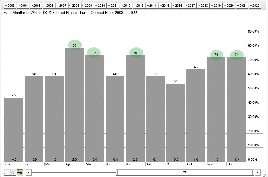
The histogram below shows the seasonal patterns for the S&P 500 over the last twenty years. Five of the twelve months stand out because they closed higher more than 70% of the time (April, May, July, November and December). October is the sixth strongest month of the year because it closed higher 65% of the time. Not bad, but this also means October closed lower 35% of the time.

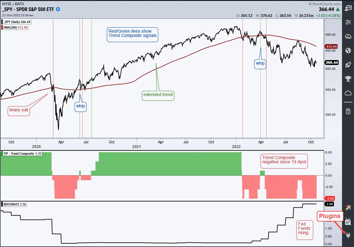
Even though October has positive expectations and November-December are even stronger, I am putting seasonal patterns on the back burner because the tape is bearish and the Fed is tightening. I bet many of you can guess what I am going to say next! Don't fight the tape or the Fed. This phrase, which was coined by the late Marty Zweig, is as prevalent today as it was in the 80s. Yes, the 80s are back! The tape is bearish because the S&P 500 is in a downtrend. This key benchmark is below the falling 200-day SMA and the Trend Composite has been negative since April 19th.

The bottom window shows the Effective Fed Funds Rate ($$FEDRATE) turning up in March and stair-stepping higher since. Rates are rising sharply so being bullish now would be fighting the Fed. I would also note that the balance sheet has been contracting since April. Even though I am showing Fed Funds here, I will be watching the 10-yr Treasury Yield for the first signs of a change in Fed policy because the bond market tends to lead the Fed.
Bullish seasonal patterns may produce a counter-trend bounce or consolidation because the S&P 500 became quite oversold recently, but the index remains in a long-term downtrend and the Fed is still in tightening mode. Nobody knows when the bear market will end or how far it will extend. The best we can do is accept the evidence and trade accordingly until it changes. Personally, I will be watching the breadth thrust indicators that are part of the TrendInvestorPro Composite Breadth Model, which has been bearish since April 11th. Click here for immediate access to our timing model, ETF reports, comprehensive videos and ETF Trend/Rank table.
The Trend Composite, Momentum Composite, ATR Trailing Stop and eight other indicators are part of the TrendInvestorPro Indicator Edge Plugin for StockCharts ACP. Click here to learn more and take your analysis process to the next level.
---------------------------------------
|
| READ ONLINE → |
|
|
|
| Martin Pring's Market Roundup |
| Sectors to Avoid if the Market Declines and Worth Consideration if it Rallies |
| by Martin Pring |
Last week, I suggested that some unusually bullish outside bars, in conjunction with positive short-term momentum and a favorable seasonal going into year-end, could trigger a worthwhile rally. That does not make me wildly bullish, because I still think we are in a bear market. When my long-term indicators turn, so will I. In the meantime, I am assuming that any advance will be difficult to play and extremely deceptive, as that's the nature of bear markets. There is no doubt things are oversold, and certainly overdue for an advance. However, that was also the case in November of 2007 and March and July of 2008. All three periods experienced strong intermediate buy signals, yet none bore fruit, because they all developed under the context of a bear market.
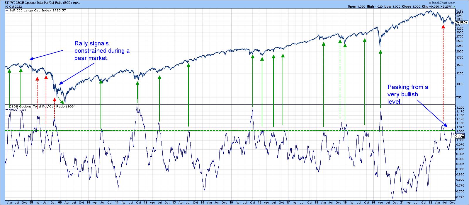
By way of an example, Chart 1 features a 30-day MA of the CBOE Options Put/Call Ratio. Downside reversals from at or above the green dashed line have consistently been followed by a nice advance. However, that was not the case during the only true bear market since 2007, where failed signals have been flagged with the red-dashed arrows. Last summer's rally also had the same deceptive characteristics and also earned a red dashed arrow.
 Chart 1 Chart 1
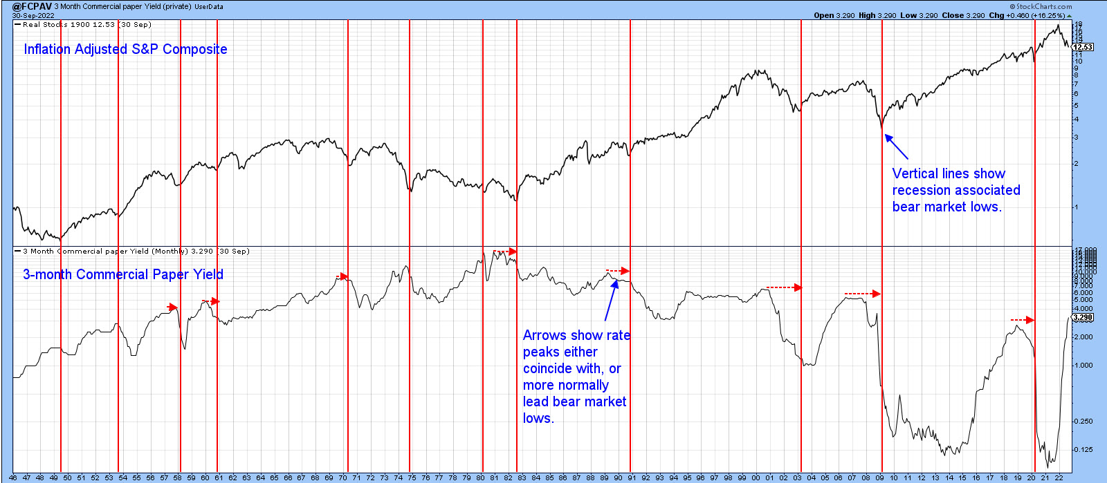
Chart 2 shows that bear market lows since the 1940s have all lagged or, to a far lesser degree, coincided with the peak in the yield on 3-month commercial paper. With inflation still running high and the Fed, at this point, sworn to defeat it, money market yields are almost certain to rise. Based on historical precedent, if rates rise, stocks have yet to see their lows. This time could be different, but I doubt it. Bearing that in mind, there are a couple of sectors sporting improving relative action and one in particular that looks vulnerable.
 Chart 2 Chart 2
Sectors with Emerging Relative Strength
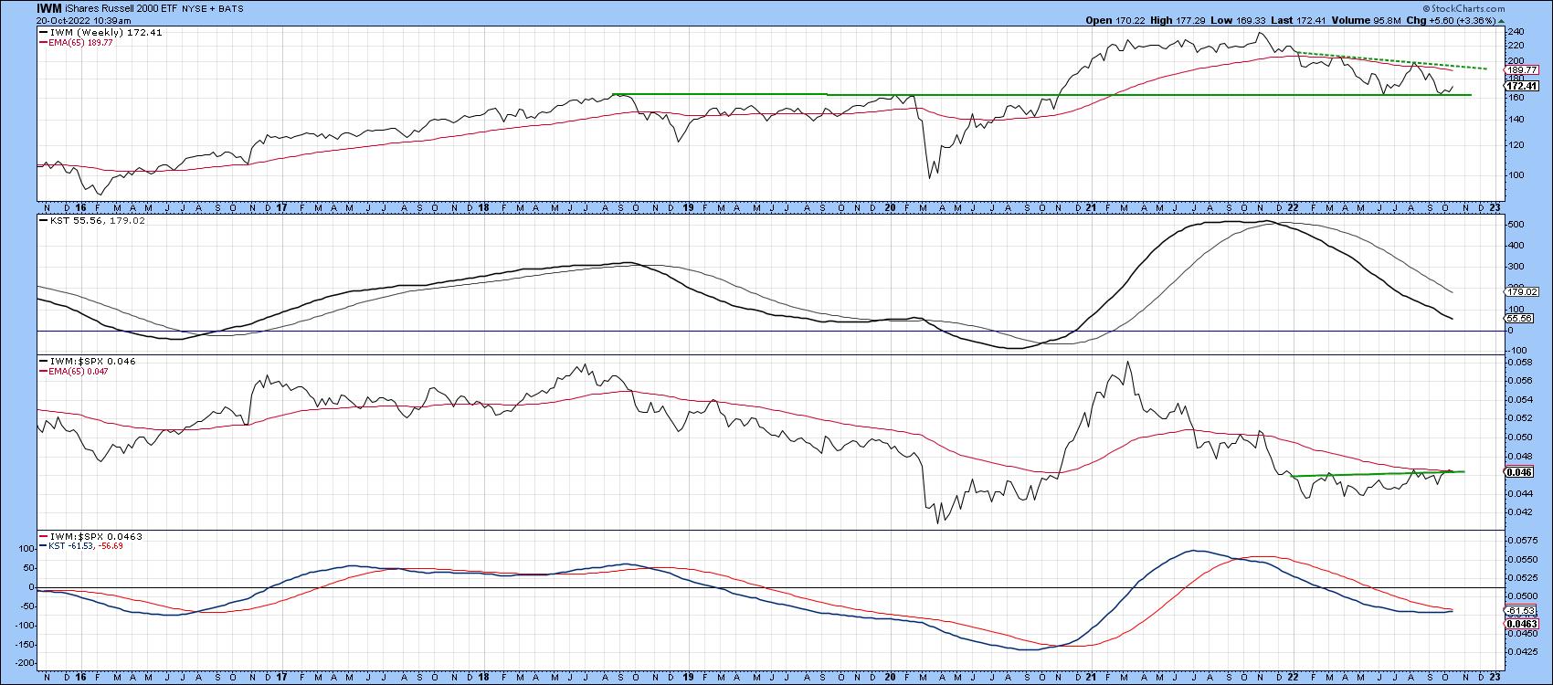
Chart 3 shows that the Russell 2K ETF broke out from a major consolidation pattern in late 2020 and has now pulled back to support at the extended breakout trendline. Long-term momentum, in the second window, is bearish, and the price itself remains below its 2022 resistance trendline and 65-week EMA. Consequently, it's not a raging buy yet, but you can see that relative momentum in the bottom window and the RS line itself are both poised to surpass resistance. Until they do, I am keeping the caution flag hoisted. Please remember that, going forward, it's possible to update these charts by simply clicking on them. They are then savable to one of your chart lists.
 Chart 3 Chart 3
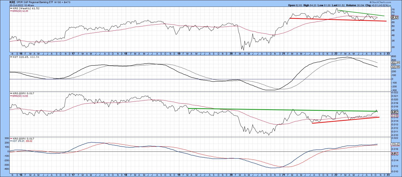
The SPDR Regional Banking Index (Chart 4) is also trying to break out on a relative basis. It is being supported by a positive long-term KST for relative action, as featured in the bottom window. This positive RS trend suggests this sector could break to the upside in the event of a nice year-end rally. However, should the rally scenario fail to take hold, the price itself could easily slip below the red neckline of a potential head-and-shoulders top.
 Chart 4 Chart 4
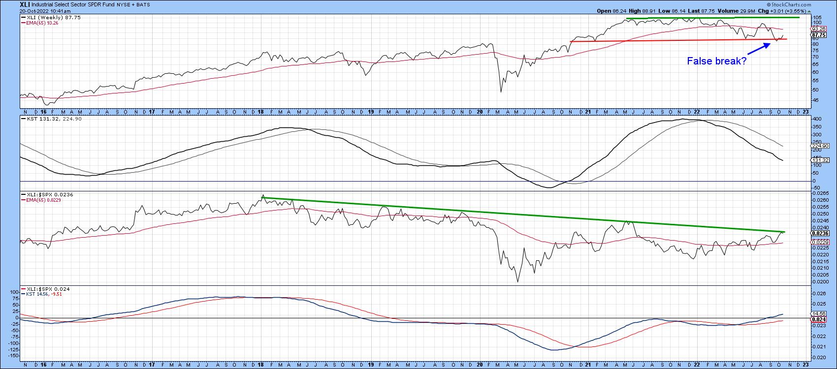
The RS line for the SPDR Industrials (Chart 5) has started to edge through a 5-year resistance trendline. It looks likely to experience a stronger break, as the KST for relative action is in a positive mode. The price itself may have experienced a false break to the downside, but needs to confirm this with a positive crossover of its 65-week EMA. Industrials also face the challenge of a moderately overbought and declining long-term KST.
 Chart 5 Chart 5
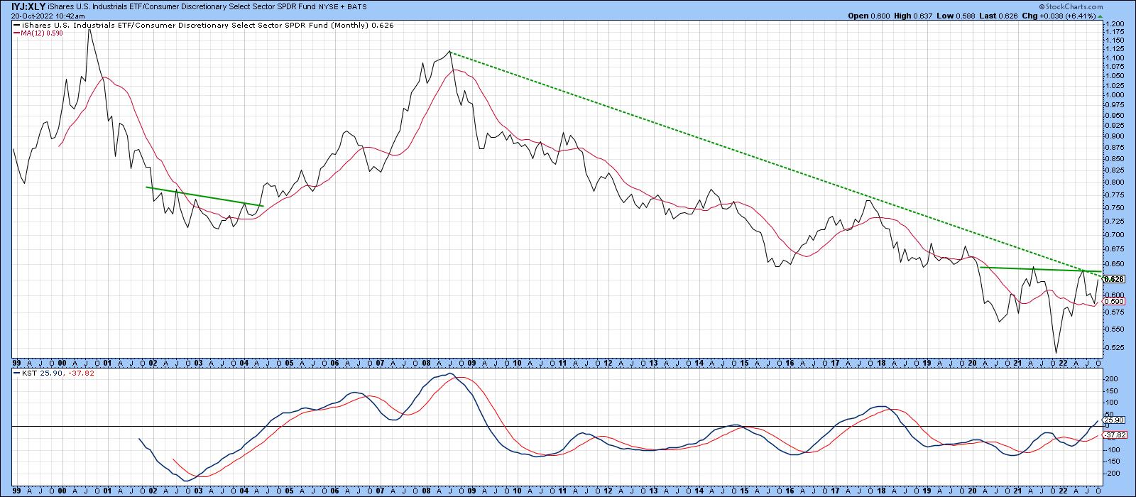
Industrials could be a leading group in the next bull market. That view is based on its relative strength against consumer cyclicals, which could be in the process of reversing a 23-year down trend. If the dashed down trendline and horizontal potential neckline, featured in Chart 6, are both surpassed, that would strongly suggest a new long-term theme favoring industrials is underway.
 Chart 6 Chart 6
Technology, a Sector with Deteriorating Technicals
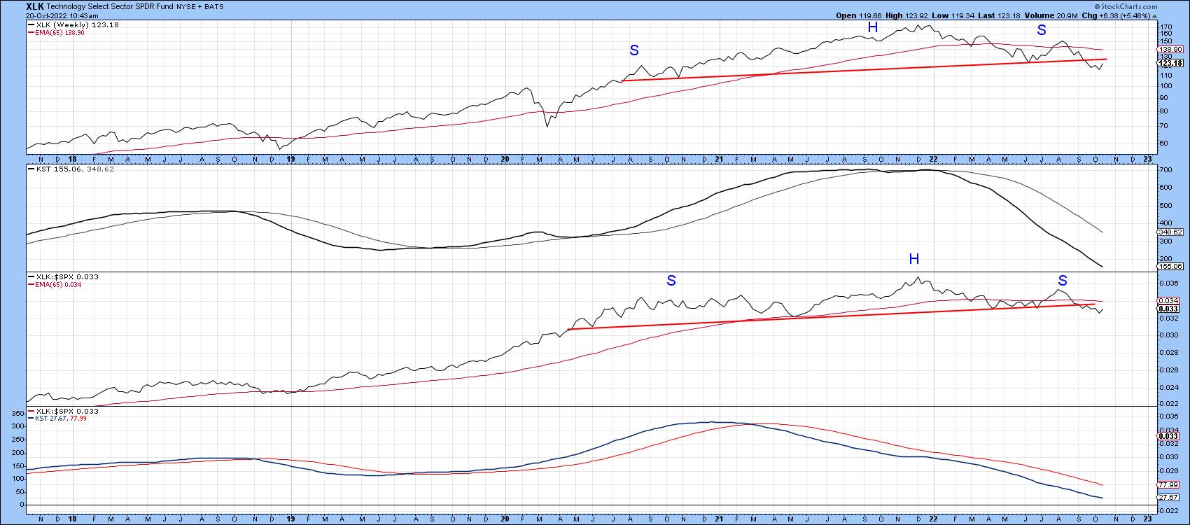
Technology has suffered a lot this year, but Chart 7 shows that the SPDR Technology ETF has only recently completed a head-and-shoulders top on both an absolute and relative basis. Neither of the KSTs are below their equilibrium point, so further losses are likely. That means that if, the market ultimately registers a new low, technology could be a sector that helps put it there.
 Chart 7 Chart 7
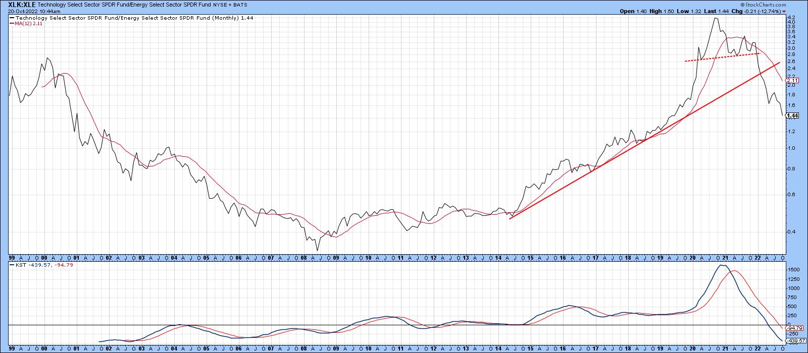
Technology has already reversed two long-term theme changes this year. First, as shown in Chart 8, it has been falling like a stone against energy.
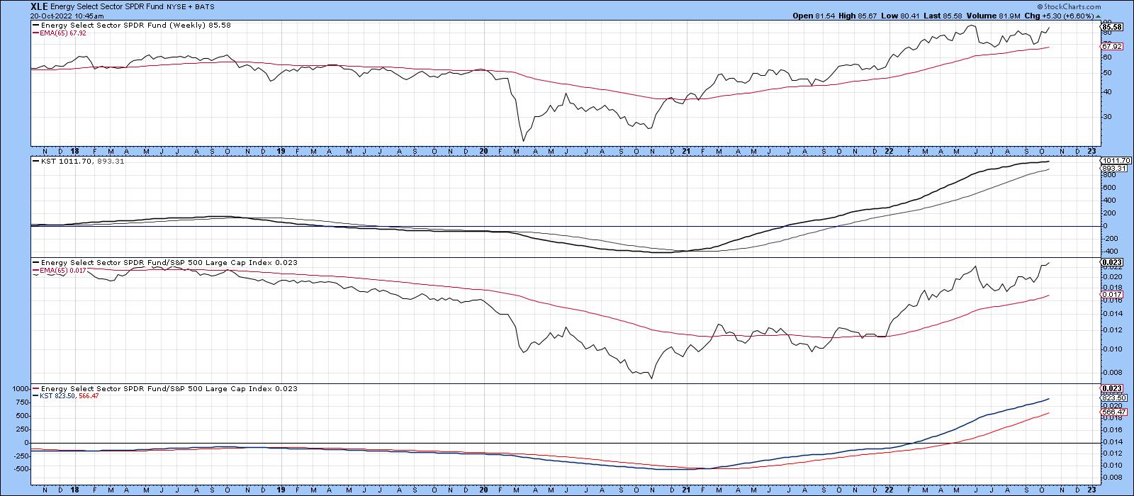
 Chart 8Energy itself, though, continues to look strong, as we can see from Chart 9. Chart 8Energy itself, though, continues to look strong, as we can see from Chart 9.
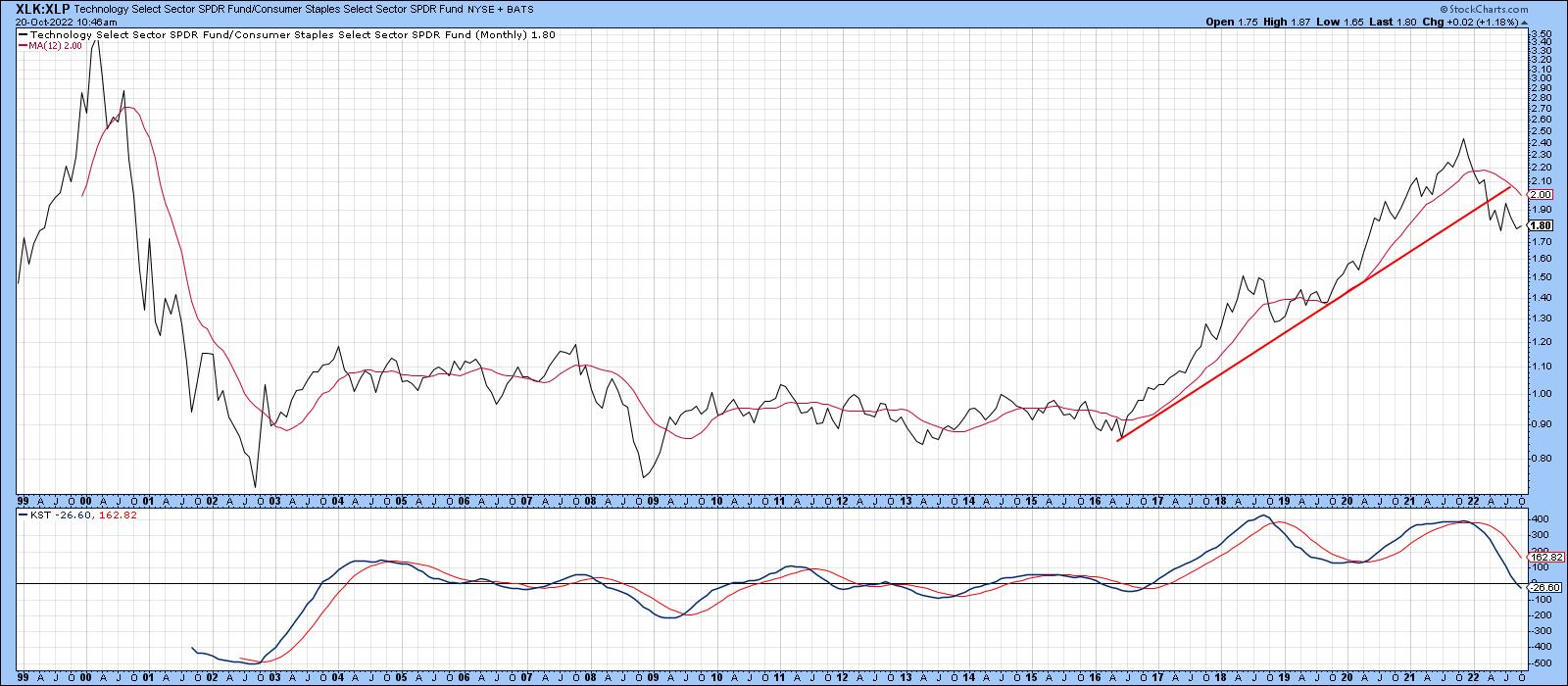
 Chart 9Second, Chart 10 pits technology against consumer staples in a form of confidence indicator. This relationship appears to have peaked on a long-term basis, as market participants have pulled back from the higher risk technology stocks to favor the more defensive staples. That's not a good sign for the longer-term market prospects either. Chart 9Second, Chart 10 pits technology against consumer staples in a form of confidence indicator. This relationship appears to have peaked on a long-term basis, as market participants have pulled back from the higher risk technology stocks to favor the more defensive staples. That's not a good sign for the longer-term market prospects either.
 Chart 10 Chart 10
Good luck and good charting,
Martin J. Pring
The views expressed in this article are those of the author and do not necessarily reflect the position or opinion of Pring Turner Capital Group of Walnut Creek or its affiliates.
|
| READ ONLINE → |
|
|
|
| The Canadian Technician |
| Are You Tired of the Noise? |
| by Greg Schnell |
The parade of commentators continues week in and week out to talk about the recession in 2023. It is important to consider whether, in late 2021, any of them saw a recession or a stock market decline in 2022.
Then there was the inversion by the bond market in March/April, and everyone said don't worry as the recession won't be here for at least a year. Even if that may have been true, the market won't wait for it to show up in the data after the fact. If you see two negative quarters of GDP, we are already in one. The market looks forward.
So now the brilliance is showing through to call a continuation of the downtrend. I don't really care when the recession ends. I guess I do, but what I really care about is when the stock market suggests it is not going to get worse and starts rising based on things getting better in the future.
Will these economists have a method of finding a bottom close to the stock market bottom? Will they wait until the 200-day moving average is tilted up and price has been above it for three months, and they'll still be looking for the economic data to start improving? A nice 3-6 month lag or something? What is the signal?
We can all discuss the different methods for finding a bottom and how accurate they were. One whipsaw signal one time doesn't invalidate a system. You still need stops when investing if you want your winners to outrun the losers. But it certainly helps to realize when the downside risk is less than the upside return and to be ready to ride a trend higher.
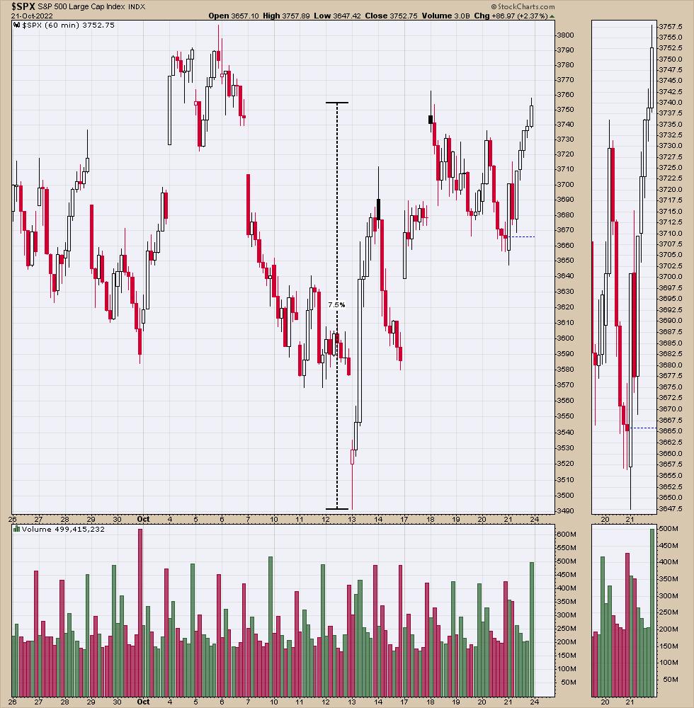
All that to say, my internal data has been turning more bullish for weeks, getting us ready for this low. The Friday, October 21st strong close turned a lot of other systems onto a buy signal. Interestingly, we are already 7.5% off the lows. Nice bounce so far. The $SPX Index was down 28% at the lows of last Thursday, if my math is correct.

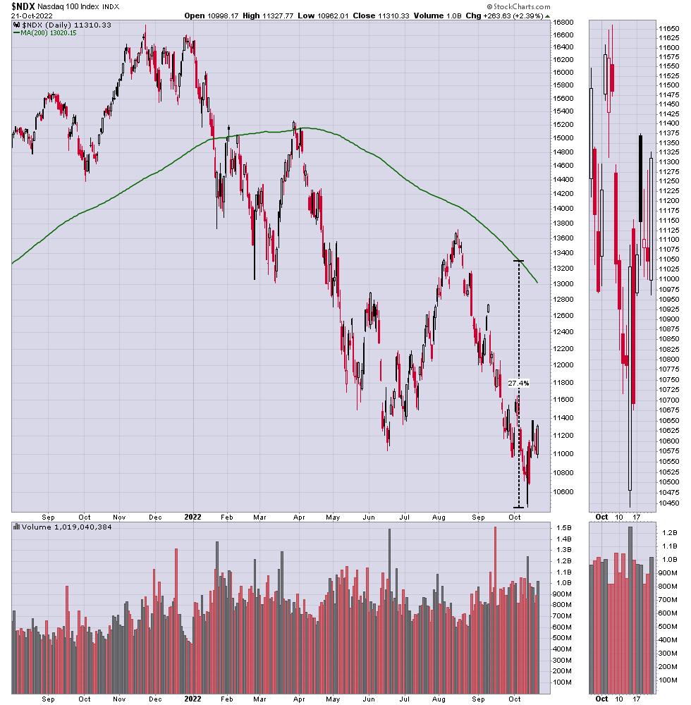
I noticed that the Nasdaq daily chart needed a 25% rally to reach the 200 DMA. That's a great year for anyone, but the bears continue to hammer on the downside perspective. At some point, even a reversion-to-the-mean trade can make you a lot of money!

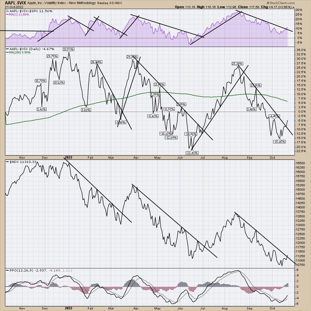
I produced this chart the other day, and found it quite interesting. As Apple is one of the biggest companies, I plotted Apple minus the $VIX. Two things from this chart.
1) As the VIX drops and Apple turns up for each rally, this spread will change quickly.
2) Because this difference moves faster than just a price move by Apple, I wondered if it could help alert us when Apple is about to start outperforming the $SPX by giving us an early signal. This would be the purple area. I like the confirmation on all three charts. (Without deeply diving in, there is a place on the two lower charts that could have a shorter tighter trend line being broken in late May, but it wouldn't have confirmed on the top panel.)
The rally in early June rolled over on the $SPX (lower panel) and made lower lows, trapping people long if you just used those charts. Nothing is perfect, but a few unique charts can help us see the changes in a new light.

It's a different chart, but I like how it's a unique way to monitor an important technology name from a new view. Apple continues to be one of the most dominant companies on the stock exchange.
I have lots of other charts I like to use, having built my library of charts on the StockCharts platform over the last twelve years. I'll be sharing some of them at an informational webinar next week. The no-cost presentation will be on Tuesday, discussing the tools for how I spot lows and highs in the market, for those that might be interested. Follow this link to register. Nothing wrong with a little education for those inquiring minds; I'd be thankful if you choose to join in.

I know the news is bearish, but some of the charts are downright bullish. Have a good weekend and perhaps we'll share some optimism by month-end! Right now, I feel a little alone.
|
| READ ONLINE → |
|
|
|
| The MEM Edge |
| Three Reasons We're Headed Higher From Here |
| by Mary Ellen McGonagle |
The markets posted an impressive rally this past week as a lack of inflation-related economic data had investors focused instead on quarterly earnings reports. While not all companies posted strong results -- think Tesla (TSLA) -- a majority came in with positive earnings surprises that were greeted with heavy buying that brought on super sized gains.
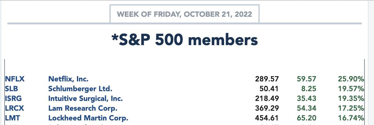
Below is a listing of the top 5 performers from the S&P 500 last week and each company reported earnings.

The possibility of most companies reporting earnings ahead of estimates is something I wrote about in my MEM Edge Report two weeks ago, as a study from Factset stated that analysts were lowering their guidance while management remained positive on their earnings outlook. That investors would bid up shares sharply following this outcome remained to be seen, and, as you can see from the list above, that's been the case.
Next week will bring plenty more earnings reports, with heavyweight names such as Microsoft (MSFT), Apple (AAPL) and Amazon (AMZN) among the companies due to release results. With the economic calendar remaining relatively light until Friday's PCE report, I expect the bullish response to corporate results above estimates to continue. This is reason 1.
Also noteworthy is the fact that the Federal Reserve is going into their blackout period, where they will not be publicly speaking any more until after their next meeting, which will take place on November 2nd.
Federal Reserve officials have been very vocal about their intent to keep interest rates elevated for as long as needed in order to reduce the currently high level of inflation. Comments from over 30 separate speeches over the first 2 weeks of October squashed any rally attempts in the markets. Last week, pullbacks in the market occurred again, when Fed Governors were publicly reiterating their hawkish policy intent at a speaking event. The upcoming quiet period for any "Fed speak'' is my 2nd reason.
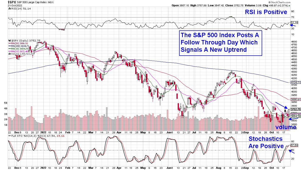
The third and most compelling reason is that today's strong rally in the markets sparked a follow-through day in both the S&P 500 Index and the Nasdaq.
DAILY CHART OF S&P 500 INDEX
The follow-through day looks for proven price and volume characteristics in the broader market indexes that signal a shift into an uptrend. Today's rally was above the follow-through day's threshold of 1.4%, and it occurred on heavy volume. Lastly, it was on the 4th day out from a rally attempt.
While each of the reasons outlined above point to upside for the markets, they do not mean that a market bottom has been put in. I view any rally into next week and beyond to be a bear market or counter trend rally that will last potentially until early November, when the Federal Reserve meets. Of course, it could last longer if certain conditions persist.
For those interested in receiving access to a list of stocks poised to benefit from this new uptrend, use this link here to access my twice weekly MEM Edge Report for a 4-week trial at a nominal fee. You'll also be alerted to when the uptrend has ended so you can lock in profits. You'll also be updated regularly to any shift in sentiment regarding the broader markets as well as individual stocks.
Don't delay, use the link above to gain immediate access!
On this week's edition of The MEM Edge, now available to watch on demand at StockChartsTV.com and the StockCharts YouTube channel, I review what's driving the markets higher and what to be on the lookout for next week. I also share Group and Sector rotation that's taking shape.
Warmly,
Mary Ellen McGonagle, MEM Investment Research
|
| READ ONLINE → |
|
|
|
| DecisionPoint |
| Broad Market Rallies Confirmed by Silver Cross Index |
| by Erin Swenlin |
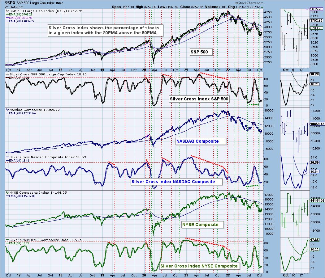
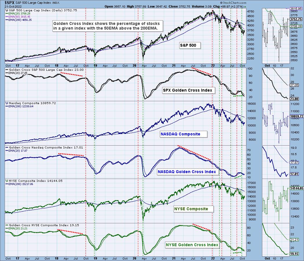
With the market on the cusp of a rally, we thought it time to walk through our Silver Cross Index (SCI) and Golden Cross Index on the broad markets (SPX, NASDAQ and NYSE). Before we look at each chart, let's review what Golden and Silver Crosses are.
Most people are familiar with a golden cross. It is when the 50-day moving average moves above the 200-day moving average. It can be an SMA or an EMA. We use EMAs. The Golden Cross Index (GCI) measures how many stocks within the named index have a 50-day EMA above the 200-day EMA.
The silver cross is something we came up with to describe a 20-day moving average crossing above the 50-day moving average. Again, we use EMAs. The Silver Cross Index (SCI) measures how many stocks within the named index have a 20-day EMA above their 50-day EMA.
We'll start with the shorter-term SCI chart. In all cases, the SCIs are oversold and at levels we saw before the 2020 bear market recovery and also before last summer's bear market rally. All three are rising on positive crossovers. In the case of the SPX and Nasdaq, we have positive divergences with price lows leading into this bear market rally.

The GCI chart is less bullish. On the bright side, readings are oversold, though not as oversold as we've seen previously. Given the up and downs of the GCI all along the way down, we do see positive divergences leading into the current price low. This chart suggests to us that in the longer term, we are still in a bear market.

Conclusion: We do believe the market is about to pop, but in the meantime we could experience some chop and churn as it angles higher. The SCI tells us with its positive divergences and signal line crossovers that the short and intermediate terms are bullish. The GCI suggests the long-term picture is less bullish. This could be telling us this isn't the beginning of a new bull market. The bear may start hibernating, but it is still alive and well.
Good Luck & Good Trading!
Erin Swenlin
If you'd like to try out DecisionPoint.com free for two weeks, use coupon code: DPTRIAL2 at checkout when you subscribe to our "Bundle" package.

Technical Analysis is a windsock, not a crystal ball. --Carl Swenlin
(c) Copyright 2022 DecisionPoint.com
Helpful DecisionPoint Links:
DecisionPoint Alert Chart List
DecisionPoint Golden Cross/Silver Cross Index Chart List
DecisionPoint Sector Chart List
DecisionPoint Chart Gallery
Trend Models
Price Momentum Oscillator (PMO)
On Balance Volume
Swenlin Trading Oscillators (STO-B and STO-V)
ITBM and ITVM
SCTR Ranking
Bear Market Rules
DecisionPoint is not a registered investment advisor. Investment and trading decisions are solely your responsibility. DecisionPoint newsletters, blogs or website materials should NOT be interpreted as a recommendation or solicitation to buy or sell any security or to take any specific action.
|
| READ ONLINE → |
|
|
|
| Trading Places with Tom Bowley |
| Do We Have A BIG Drop Ahead? |
| by Tom Bowley |
I have a feeling that most of you would say "Yes, there's no way we've reached bottom."
Let me start by saying that calling tops and bottoms is GREAT if you get it right. For me, it's not about calling every stock market move perfectly; instead, it's about evaluating risk and trying to avoid the worst outcome. To give you a golf analogy, imagine that you're stepping up to a lengthy dogleg par-4 with water all the way down the right side from tee to green. The safe play is to aim left and leave a longer approach shot to the green. It would be a much easier hole, however, if you could fly it over the water and land it in the fairway, cutting off perhaps as much as 50 yards and leave a shorter approach shot into the green. The reward of such a shot is obvious, but you have to evaluate the risk of dropping it in the water.
Now back to the stock market. In December 2021, staying long in the market with all the warning signs I discussed back then was the equivalent of trying to drive the ball over the water. If you stayed long, you dunked a few in the water and probably made a 10 on the hole. However, if you chose safety back in December and moved to cash (or even shorted), then you probably walked off the hole with a par. Most everything in life is about evaluating reward vs. risk and then making a decision that makes sense to YOU. No one else. I can't tell you what the right decision is for you, but I know what risks I'm willing to take and which ones I'm not.
Listen, we're in a rough bear market, no doubt. I tried my best to warn back in December 2021 and throughout 2022 that the RISKS were extremely high on the long side. Did I know for a fact that the stock market was topping and would fall 25% over the next 9 months? Absolutely not. I just knew that water was all the way down the right side of the fairway from tee to green and I chose to play my shot WAAAY left. I didn't want to risk the water (being long in the market).
Now let's fast forward to where we are today. The S&P 500 has fallen 25%. Economic conditions have worsened. Inflation remains a problem. Interest rates are rising rapidly. The Fed is hawkish. What's to like, right? Well, I'd say the reward to risk has shifted considerably and that many of the issues/risks present in December 2021 are GONE. A lot of bad news is priced in. Is it enough? I'm not sure - we're going to find out together as we have another tee shot over water approaching.
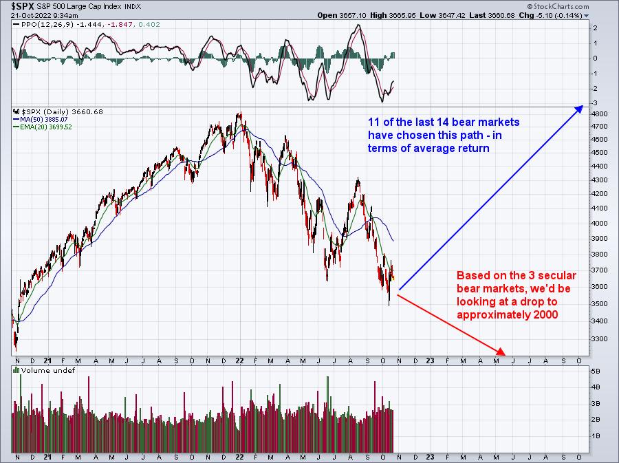
But I believe that being in cash or being short right now is the equivalent of taking the risk to drive the ball over the water. History tells us that drops of 25% in the S&P 500 should be bought, not sold. Could it get worse from here? Absolutely. The market can do anything it wants. Just keep in mind that we've had 14 bear markets since 1950 and 3 have morphed into "secular", or long-term, bear markets that have lost 50% or more. The other 11 have been of the "cyclical", or short-term, variety. Of these 11, we've seen an AVERAGE of a 42% gain over the one-year period from its ultimate bottom. You DO NOT want to miss that rally, as it's the most powerful rally during a secular bull market.
In the most recent cyclical bear market in March 2020, during the COVID-19 pandemic, the S&P 500 jumped 78% in the year following its March 23, 2020 bottom. I don't believe we'll see that type of one-year return, but I absolutely believe a 40% rally off the bottom is likely. If we jumped 40% from where we sit today, the S&P 500 would be at an all-time just above 5000 in October 2023. Is it possible? Absolutely.
So, based on history, let's look at the S&P 500 and where we might be heading:

So which way are we heading? Honestly, I don't know. However, based on all of my historical research and the current technical and sentiment signals I'm seeing -- namely, the elevated equity only put call ratio, positive divergences everywhere, bullish rotation since June, etc. -- I am of the opinion that being bearish right now is the equivalent of trying to drive the ball over the water and the "safe" play to the left side of the fairway is to be long.
It always comes down to how much risk you're willing to take to achieve your return objectives. The odds favored the bears in December and they favor the bulls now.
We'll be announcing a FREE virtual event on Saturday, November 5th, likely starting at 10:00am ET. Everyone on our FREE EB Digest will be invited. If you'd like a 3x per week newsletter with plenty of free events throughout the year, CLICK HERE and enter your name and email address. There's no credit card required and you may unsubscribe at any time.
Happy trading!
Tom
|
| READ ONLINE → |
|
|
|
| Don't Ignore This Chart! |
| About That Yield Curve Inversion |
| by Julius de Kempenaer |

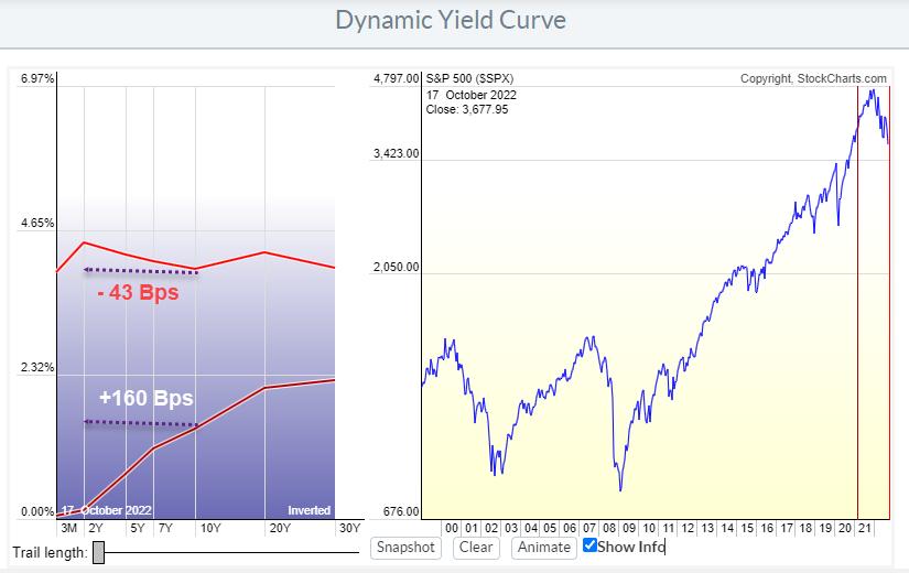
In March 2021, lending money to the US Government for ten years would give you a return of around 1.7%/ann over the next 10 years. Lending money to the government for 2 years at the same time would give you roughly 0.1%/ann for the next 2 years. Which makes sense, as one would require a bigger reward for lending out money for a longer duration vs. a shorter duration.
The difference between these 10- and 2-year yields (on Govt bonds) at the time was 160 Bps (1.6%). This represents a "normal" steep shape of the yield curve shown in the lowest curve in the graph above. Since then, the yield curve has flattened and eventually became inverted. The yield on 2-year bonds is now higher than on 10-year bonds. That is shown in the highest of the two curves. The difference between 10- and 2-year bonds has now shifted to minus 43 Bps.
It is clearly visible how the higher curve is much flatter than the lower curve. The process leading to that change is called the flattening of the yield curve. Here is the animated version.

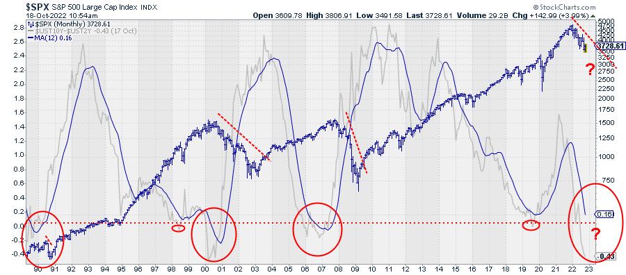
The chart above shows this difference between 10- and 2-year yields plotted on a standard price-time graph since 1990. The grey line is the actual difference, the solid blue line is the 12-month moving average and the blue bar chart is the S&P 500 index.
It is hard to pinpoint exact dates or moments, but the big picture shows three major yield curve inversions over the last 30 years (big red ovals). Every time the yield curve started to steepen again and rise back above 0, the S&P either started to decline or continued/accelerated a decline that had already started.
Despite the fact that the market ($SPX) seems to be improving somewhat at the moment, this is one of the observations that keeps me from getting overly bullish at this point.
--Julius
|
| READ ONLINE → |
|
|
|
| MORE ARTICLES → |
|
 Chart 1
 Chart 2
 Chart 3
 Chart 4
 Chart 5
 Chart 6


