| THIS WEEK'S ARTICLES |
| John Murphy's Market Message |
| SMALL CAP LEADERSHIP IS AN ENCOURAGING SIGN |
| by John Murphy |
SMALL CAP LEADERSHIP... The last couple of messages have shown improvement in market breadth. That improvement was reflected in rising advance-declines lines and percent of stocks over moving average lines. Here's another example of improving breadth in the form of small cap leadership. The daily bars in Chart 1 show Russell 2000 iShares (IWM) rallying all the way to its August high. Meanwhile, the large cap S&P 500 has lagged behind. Small cap leadership is reflected more graphically in the IWM:SPX relative strength ratio in the upper box which has been rising since the start of the year and has just exceeded its November high. Small cap leadership usually coincides with rising advance-decline lines. That's because there are more small caps than large caps in the broader stock market and, as a result, small cap leadership usually improves market breadth. Chart 1 also shows the IWM 50-day average rising above its 200-day line to form a "golden cross" which is another positive sign for small caps.
 Chart 1 Chart 1
S&P 500 REACHES SIX-MONTH HIGH...Large cap stocks had another good week and continue to show technical improvement. Chart 2 shows the S&P 500 rising above its December high to reach the highest level since August. The SPX also rose in heavier trading which is a positive sign. Its blue 50-day average is close to rising above its red 200-day which would be another positive development. The only cautionary note is its 9-day RSI line in the upper box reaching overbought territory above 70. The Nasdaq market also had a strong week. Chart 3 shows the Invesco QQQ trust also rising to a new six-month high. The tech-led QQQ also rose faster than the broader market which reflects strong buying of beaten down technology shares. Falling bond yields contributed to that buying.
STRONG JOBS REPORT CAUSES PROFIT-TAKING... Stocks in general saw some profit-taking on Friday on news that the January jobs report came in much stronger than expected. That unexpected strength in jobs raised concerns that the Fed may need to continue raising rates and keep them higher for longer. That strong report also boosted interest rates and caused some profit-taking in bonds. Bond yields are also at an important support line.
 Chart 2 Chart 2
 Chart 3 Chart 3
BOND YIELD TESTS 200-DAY LINE... Chart 4 shows bond yields in decline since October. That decline has coincided closely with the stock market rally. The chart, however, shows the 10-Year Treasury yield bouncing today off its 200-day moving average (red arrow). Friday's uptick in interest rates resulted from the strong January jobs report which contributed to profit-taking in bonds and stocks. It remains to be seen if the TNX finds support at that important support line. That could have some influence on stock values.
 Chart 4 Chart 4
|
| READ ONLINE → |
|
|
|
| Martin Pring's Market Roundup |
| These Five Long-Term Indicators Are Signaling a Bull Market |
| by Martin Pring |
I have been negative on the market for some time. I believe that it's a wiser policy to wait for the long-term indicators to turn bullish, rather than trying to capture every twist and turn of those bear market rallies, pregnant as they are, with false breakouts and other deceptive ploys. In that vein, January saw enough primary trend indicators turn bullish to conclude that we have a bull market on our hands. I'm not looking for a huge run, because a lot of my secular or very long-term indicators are either overextended or pointing south, but, for now, things are looking a lot more constructive.
The 1978 Lesson
The current setup reminds me very much of the spring of 1978, when the Fed raised the discount rate, as part of a chain of multiple. The market responded not by breaking down, but by completing a small base on record volume and exploding higher into the fall. There are many differences between now and then, of course, but the key takeaway from that period is to believe what the market is trying to tell you, rather than focusing on the future course of interest rates if there is a discrepancy between them.
Five Bullish Charts
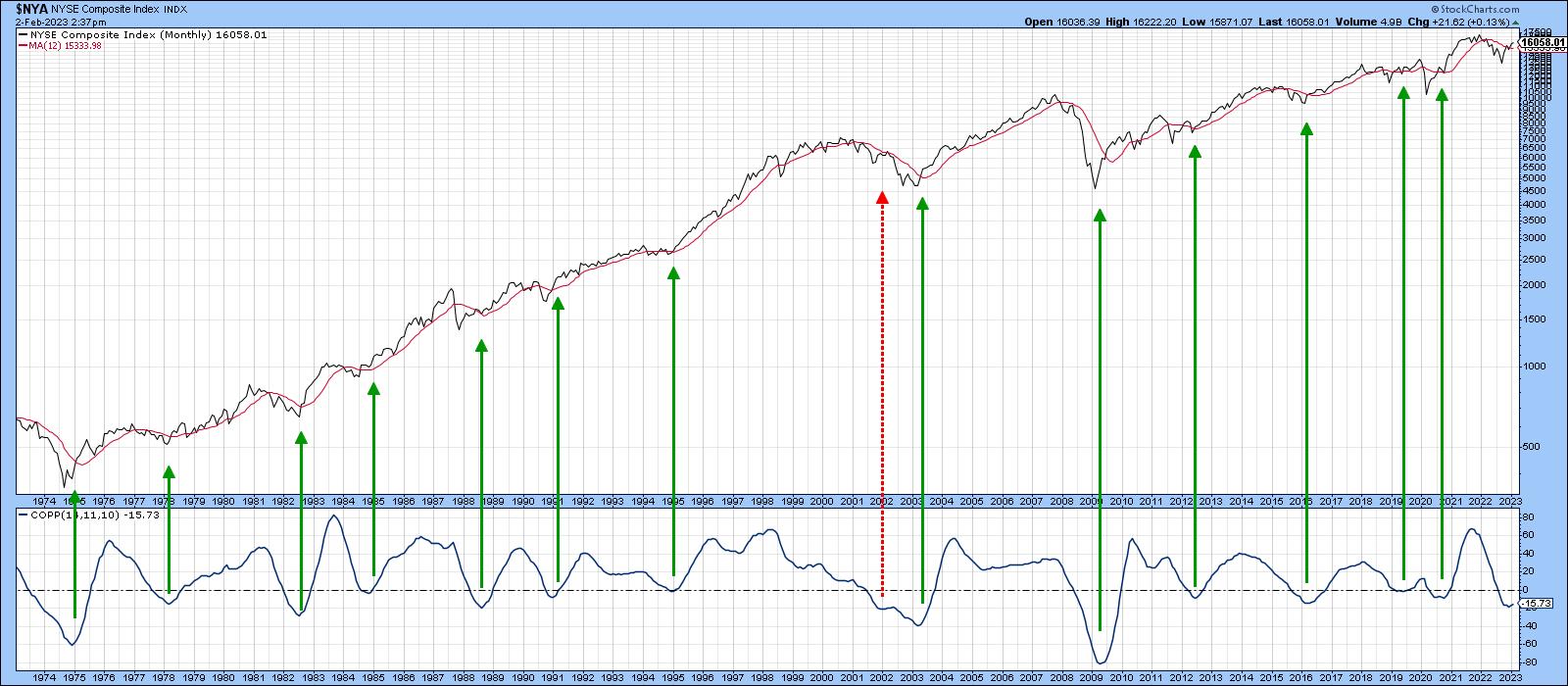
A favorite indicator amongst technicians is the Coppock Curve. It is beloved because it has been consistently correct in calling major turns in US equities since the 1930s. The plotted series in Chart 1 is a 10-month weighted moving average, calculated from the sum of an 11- and 14-month ROC. Coppock used 11 and 14 periods because he was told by a priest they represented the average mourning period for relatives grieving the loss of a loved one. Coppock theorized that the recovery period for stock market losses would follow a similar time frame.
Officially, it moves into bullish territory when its slope turns positive, after having previously dropped below zero. The vertical lines in the chart approximate such turning points for the NYSE Composite since 1974. February's number will not be known until the end of the month, but that does not really matter, because the January plot ticked up slightly, thereby indicating another buy signal is already in the bag.
 Chart 1 Chart 1
Another approach is to calculate a PPO using the 6- and 15-month parameters. It's featured in Chart 2 along with the S&P Composite. In this instance, the vertical lines indicate when the indicator drops below the blue horizontal dashed line and then reverses to the upside. There have been 24 instances since 1949, only two of which could be regarded as a failure. It looks very much as if this accurate indicator has once again bottomed.
 Chart 2 Chart 2
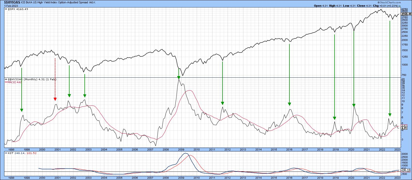
Chart 3 features the ICE BofA US High Yield Option Adjusted Spread Index ($$HYIOAS), which reflects the premium being paid as insurance against a high yield debt default. The higher the Index, the more elevated the cost of this insurance and the greater the implied fear of market participants. The arrows flag previous "fear" peaks in the $$HYIOAS. They have, with the exception of the early 2001 reversal, all been associated with an important market bottom. The indicator peaked out last summer and has been zig-zagging downwards ever since. It has now crossed below its 12-month MA, which suggests that this bullish decline is likely to extend.
 Chart 3 Chart 3
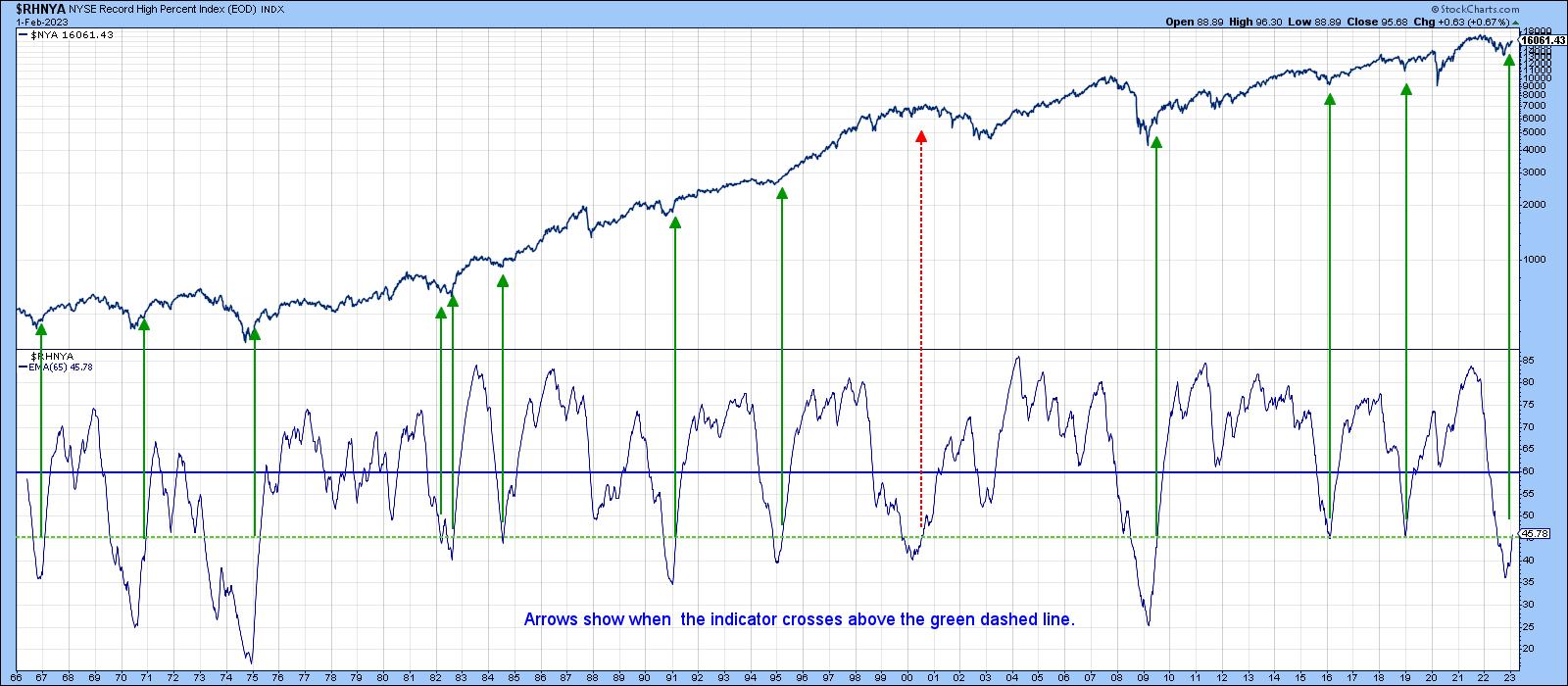
Chart 4 looks at the market through the lens of net new 52-week high data. The indicator is derived by dividing the number of new highs by the number of new highs plus new lows. The actual plot in Chart 4 is a 65-week EMA of the weekly ratio. Major buy signals are triggered when the oscillator drops below the green-dashed horizontal line and then crosses back above it. It has only failed once since the mid-1960's, which occurred at the 2000 peak. In that instance, the broad market declined between 1998-2000, but the S&P moved to new highs because of its heavy weighting in tech stocks. Consequently, the 1998-2000 period looked good on the surface, but in reality was broadly weaker. Alternatively, the 2000-2001 period was tolerable for the broad list, but not so positive for the S&P.
Fast forward to the current situation and we see that another Net New High buy signal has just been triggered, as the oscillator is slightly above that green line again.
 Chart 4 Chart 4
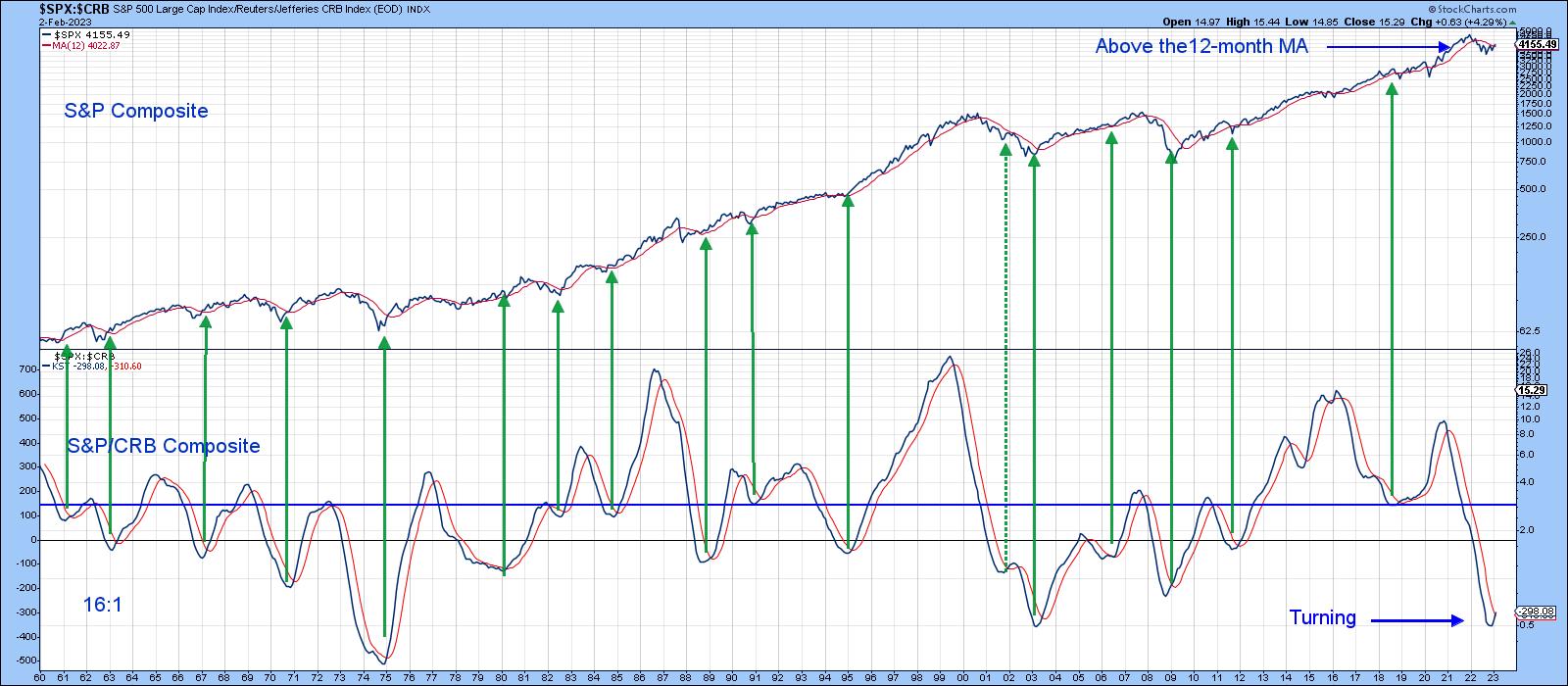
Finally, stocks are a leading indicator of the economy, while commodities are more of a coincident one. It is not surprising, therefore, that, when the ratio between them reverses to the upside, it often signals a new bull market. In this respect, Chart 5 compares the S&P Composite to a long-term KST of the Stock/Commodity ratio. This series has just begun to rally above its 9-month MA, thereby triggering its seventeenth buy signal since the 1960s.
 Chart 5 Chart 5
Good luck and good charting,
Martin J. Pring
The views expressed in this article are those of the author and do not necessarily reflect the position or opinion of Pring Turner Capital Group of Walnut Creek or its affiliates.
|
| READ ONLINE → |
|
|
|
| The Mindful Investor |
| New Dow Theory Declares Bullish Phase |
| by David Keller |
While the technical analysis toolkit has certainly evolved over time, having benefitted from advances in computing and data analysis, in many ways, the tools of the modern technical analyst are not far from the original work of Charles Dow in the early 20th century. But an updated version of his classic "Dow Theory" suggests that the markets have entered a new bullish phase, as both the S&P 500 and Nasdaq are making new swing highs.
Dow's Foundational Analysis of Markets
To be clear, Dow's work was all done via paper and pencil, a practice which continued well into the 1980s for many technical analysts (or "chartists" as Ralph Acampora enjoyed telling me they were called, given that much of their time was spent creating charts instead of analyzing them!).
One of Charles Dow's contributions was so significant that now we simply call it "Dow Theory". He proposed looking at two indexes, the Dow Industrials and the Dow Railroads (now evolved into the Dow Transports), and seeing if they were in agreement. If both indexes were breaking to new highs, the market was strong. If both indexes were breaking to new lows, the market was weak. If there was a non-confirmation, where one of the indexes was breaking out but the other was not, then it indicated a potential reversal point. His theory was based on the importance of these two groups--the Industrials as the producers of goods and the Railroads as the distributors of goods--as a way to evaluate the strength of the economy.
Dow Theory for the Modern Age
Now, in 2023, the Dow Industrials includes a fairly diverse group of businesses that are better classified as service-oriented than product-oriented. And the Dow Transports includes stocks like JetBlue and Avis Budget Car Group. Not really the distributors of goods. Plus, perhaps most importantly, names like TGT and AMZN, arguably to be included in both indexes, are actually in neither of them!
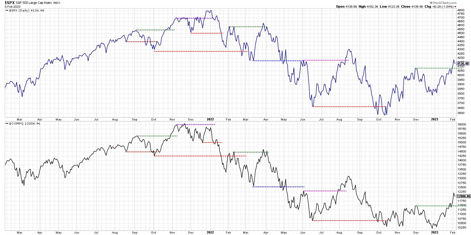
So I now prefer to use a New Dow Theory, comparing the S&P 500 (representing the old economy) and the Nasdaq Composite (the new economy). If both indexes are in uptrends, the market is strong.

What's most striking to me about this chart is the bearish non-confirmation that occurred at the end of 2021. Notice how the S&P 500 was making a new all-time high which the Nasdaq Composite was making a lower high?
This pattern suggested that the breakout for the SPX was suspect and to be faded, not bought. To be honest, this was one of many divergences you'll find during this period, along with weakening momentum, weakening breadth, and a lower high for small caps.
New Dow Theory in February 2023
Both the S&P 500 and the Nasdaq Composite made a new 52-week low in October of last year, providing a bearish confirmation. Then, in December, we had the Nasdaq continue to make lower lows while the S&P 500 bounced higher to achieve a higher low before year-end. This was a bullish non-confirmation, where one index makes a new low but the other one does not confirm the bearish setup. It suggests the bear market phase of 2022 was at a potential inflection point.
Here in February 2023, you'll note how both indexes made a new swing high as they pushed above their December 2022 peaks. This is what I'd consider a bullish confirmation, where both the old economy and new economy indices are confirmed in a new uptrend.
Both the S&P 500 and Nasdaq are facing significant overhead resistance. Until we see the S&P 500 push above its August 2022 high around 4300, and the Nasdaq break above its own August 2022 high around 13,000, then the upside potential for stocks may be limited beyond current levels.
"Don't fight the tape." That's what I was told early on in my career. And the New Dow Theory suggests that the tape is telling us that it's onward and ever upward for stocks. Combined with renewed strength in breadth indicators like the McClellan Oscillator, we have a strong start to 2023 for the S&P 500!
RR#6,
Dave
P.S. Ready to upgrade your investment process? Check out my free behavioral investing course!
David Keller, CMT
Chief Market Strategist
StockCharts.com
Disclaimer: This blog is for educational purposes only and should not be construed as financial advice. The ideas and strategies should never be used without first assessing your own personal and financial situation, or without consulting a financial professional.
The author does not have a position in mentioned securities at the time of publication. Any opinions expressed herein are solely those of the author and do not in any way represent the views or opinions of any other person or entity.
|
| READ ONLINE → |
|
|
|
|
|
| ChartWatchers |
| The Fed's Interest Rate Decision: How To Play Your Trades |
| by Jayanthi Gopalakrishnan |

Gain insight into the Fed's interest rate decision and explore how you can strategize your trades in the future.
CHARTWATCHERS KEY POINTS
- The Fed raises interest rates by 25 basis points (0.25 percentage points).
- Stock markets closed higher after hearing Chairman Powell's comments.
- Monitoring sector performance may be the way to go in 2023.
Can the market move on and leave inflation in the rearview mirror? Not just yet. As expected, the Fed raised interest rates by 25 basis points in their February 1 meeting. This was in line with the CME FedWatch Tool expectations, which showed a 99% chance of a 25 basis point rate hike. The interest rate hike increase brings the target range to 4.50%–4.75%.
If you look at the Dot-Plot on the same website (interest rate projections), the median target range is 5.1%. That means the Fed is likely to continue raising interest rates at least in the next few meetings.

The Fed is still firm on its primary objective to bring inflation down to 2%. To reach this objective, the Fed would need to bring monetary policy to sufficiently restrictive levels. In short, we're not there yet. The one difference this time is that the focus appears to have shifted to the extent of rate hikes versus the pace of rate hikes.
When you look out further into 2024 and beyond on the Dot Plot, you'll see that interest rates are projected to come down. This suggests that, at some point, the Fed is likely to pivot. But, at the moment, there's no telling when the central bank will hit the brakes on the rising cycle. The market has priced in the possibility of a 25 basis point increase in March, but it's likely that we'll see a few more rate hikes because inflation is still running high.
While the disinflationary process has started, the Fed will need to see the effects in the services sector, ex-housing before gaining confidence that inflation is coming down.
Before the Fed's Announcement
Ahead of the Fed meeting, the economy seems to be in decent shape. Recent economic reports have indicated the following:
- Q4 GDP rose higher than expected.
- Consumer Price Index (CPI), Producer Price Index (PPI), and Personal Consumption Expenditure Price Index (PCE) supported the assumption that inflation may be easing.
- 10-year yields have eased.
In the minutes prior to the FOMC announcement, the Dow Jones Industrial Average ($INDU) was already down 332 points, the S&P 500 index ($SPX) was down 0.5%, and the tech-heavy Nasdaq Composite ($COMPQ) also fell 0.3%. After the announcement, the three indexes fell further, but then started coming back. At the close of the trading day, $INDU was up 0.02%, $SPX was up 1.05%, and $COMPQ closed higher by 2%. Overall, investors reacted positively to the Fed decision and Powell's comments (more on this below).
One area the Fed is watching closely is the job market. The JOLTS report was strong, indicating an increase in December job openings. The January jobs report will give further insight into the tightness of the job market. The expectation is for a 190,000 increase, with the unemployment rate at 3.6%. The next round of inflationary reports will probably play a big role in informing the Fed's monetary stance. In the meantime, let's take a look at what the charts are showing.
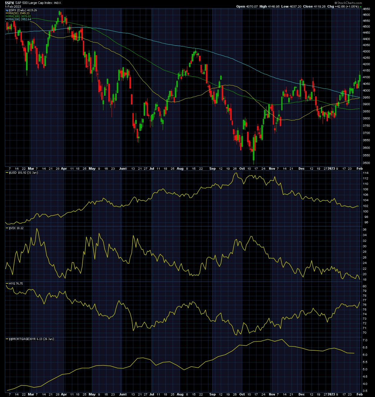
The chart below looks at various data points that paint a picture of the U.S. economy (click on chart to view the live chart).

The following points surface from this chart:
- Equity prices as represented by the S&P 500 index ($SPX) are rising. The $SPX is trading above its 200-day moving average.
- The U.S. dollar ($USD) is weakening. A weakening dollar could help exports.
- The CBOE Volatility Index ($VIX) is declining. After spending some time ranging between 20 and 35, the $VIX is now hanging out below the 20 levels. This shows that investors are complacent.
- High-yield corporate bonds (using HYG as a proxy) are trending higher. Some of these bonds are yielding higher than 7%. When high-yield bonds are on the rise, it suggests that business borrowing conditions are easing.
- Mortgage rates ($$MORTGAGE30YR) have been declining since November, although we have yet to see home sales increase.
Powell's Words: How Did the Market React?
The Fed is strongly committed to bringing inflation down to its 2% goal. That means ongoing interest rate increases, achieving price stability, and a significant reduction of its balance sheet. Although economic growth has slowed down due to restrictive monetary policy, the labor market remains extremely tight. The labor market is out of balance—wage growth is high and job gains are robust, but the labor force participation hasn't changed much from a year ago.
While acknowledging the dangers of over-tightening, the Fed believes the risk of implementing too-loose a policy that proves ineffective over time may be greater than implementing a restrictive stance that yields subdued economic growth.
What Does This Mean for Your Portfolio?
"Don't bet against the Fed" is the best course of action to take. Some economists believe the U.S. economy may experience a "rolling recession" in 2023. This is a kind of recession that hits sectors at different times (hence, "rolling") versus hitting all sectors simultaneously. A few economists believe we're already in one. We've seen layoffs in the Tech sector, weaker earnings reports, and a slowdown in the housing market. Yet inflation is cooling, the economy is still growing, and the job market is still strong.
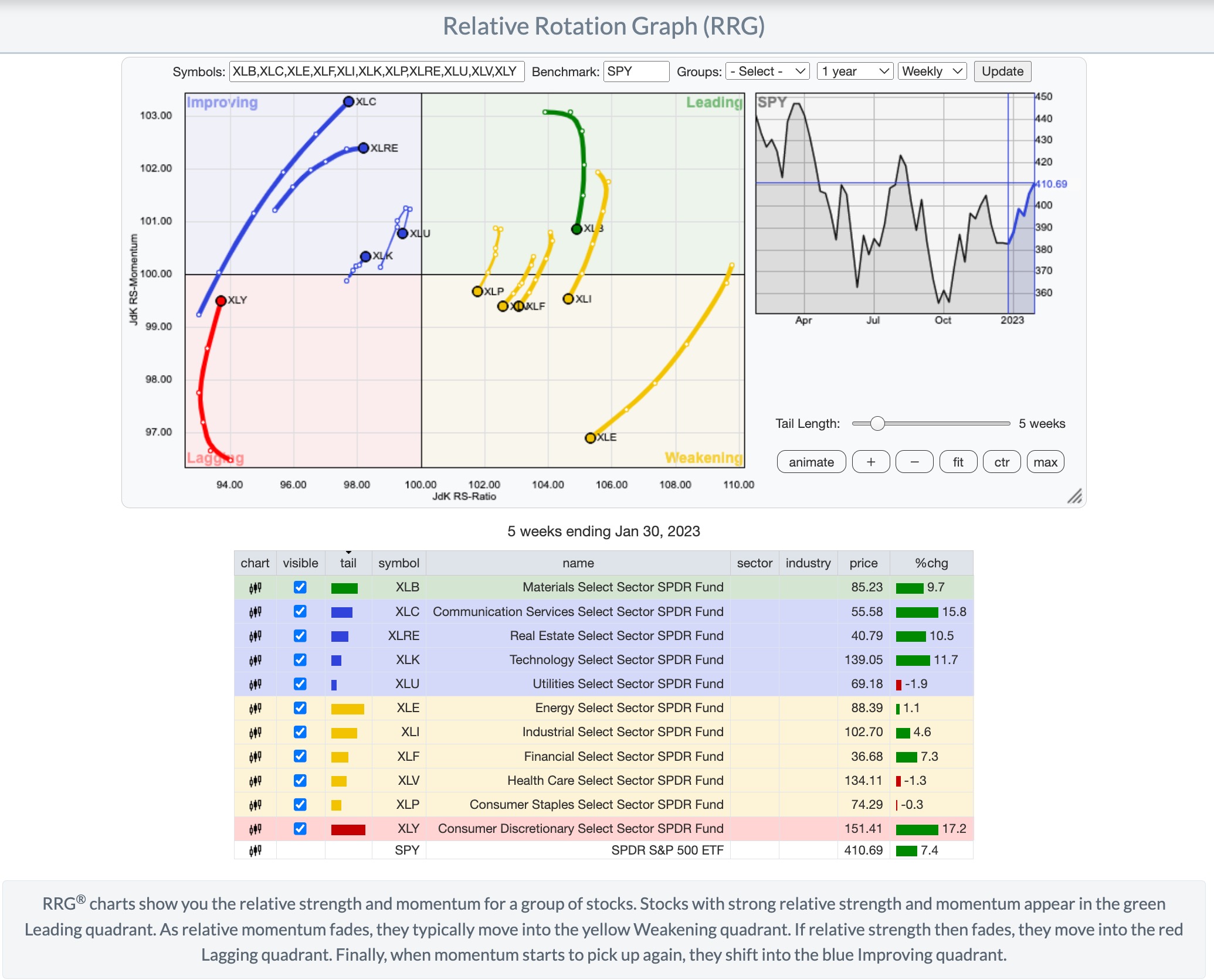
Housing and manufacturing may be some industries to keep an eye on. And don't rule out global markets, especially emerging markets. The markets are dynamic, and things can change on a dime. Fortunately, the Relative Rotation Graphs (RRG) in your StockCharts platform provide a visual overview of which sectors are leading, improving, lagging, or weakening by analyzing their relative strength and momentum. You can look at the performance of different groups of stocks using different time frames. The chart below displays the RRG of the 11 S&P sectors.

Want to explore the RRG tool? Check out the video below.
Jayanthi Gopalakrishnan
Director, Site Content
StockCharts.com
Disclaimer: This blog is for educational purposes only and should not be construed as financial advice. The ideas and strategies should never be used without first assessing your own personal and financial situation, or without consulting a financial professional.
|
| READ ONLINE → |
|
|
|
| The MEM Edge |
| Growth Stocks Roar into the New Year; This FAANMG Stock is Poised To Go Higher |
| by Mary Ellen McGonagle |
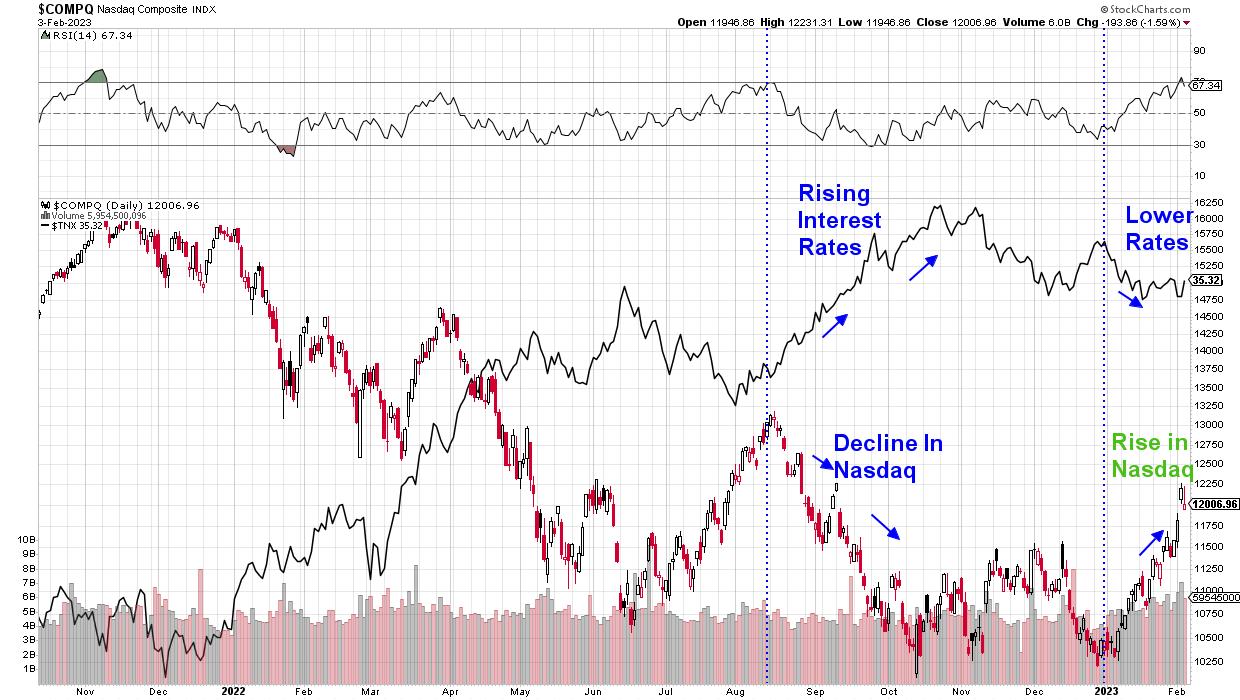
The Nasdaq just booked its fifth consecutive weekly gain, which is the longest winning streak in over a year. The rally has occurred amid strong earnings reports from some major tech companies. Also driving this Index higher is bottom-fishing among investors looking for quality Software and Retail stocks that were crushed during a period of rising interest rates last year. Rising interest rates are a negative for Growth stocks, as they lower the value of future earnings.
DAILY CHART OF NASDAQ ($COMPQ) VS YIELD ON THE 10-YEAR TREASURY ($TNX)

Subscribers to my MEM Edge Report were alerted to a bullish turnaround in the Nasdaq after this Index posted a follow-through day in early January. This unique occurrence signaled a near-term bottom in the markets, and recent price action has further strengthened our conviction that the markets are headed higher from here.
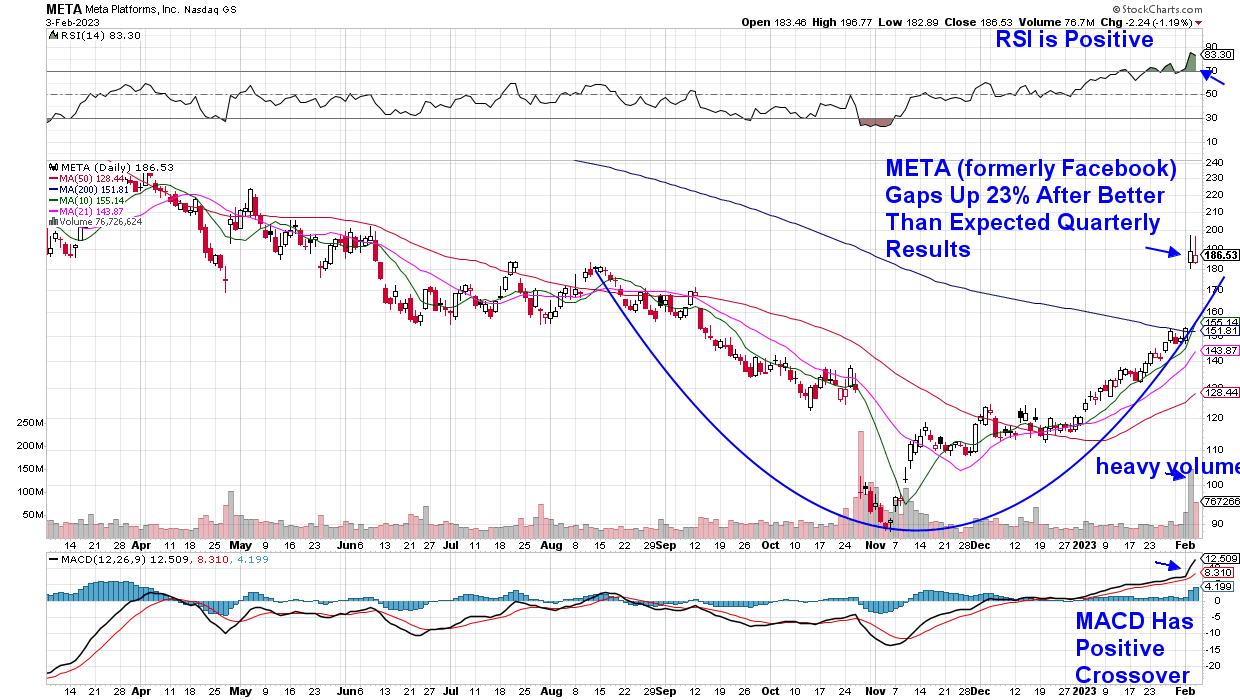
One of many reasons for my positive bias for the markets is last week's sharp gain in Meta Platforms (META), which took place after the company announced better-than-expected results while also speaking positively about their growth prospects for 2023. The stock gapped up 23% on the news, as well the announcement of a huge share buyback program.
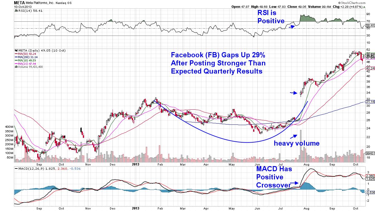
Gaps up in the price of mega-cap Growth stocks is not very common, and the huge volume that accompanied last week's rally points to a stock that's under accumulation. In fact, the last time META posted this sharp of a gain on heavy volume was in July of 2013, after the company posted much better than expected mobile ad sales numbers. Below is a chart of the company at that time and, as you can see, the gap up into a base breakout marked the beginning of a 59% gain before Facebook formed a secondary base.
DAILY CHART OF META PLATFORMS (META) IN 2012-2013

While market conditions in July of 2013 were much different from now, the fact remains that gaps up in price into a base breakout are one of the most powerful base formations, as they often lead to greater gains.
As you can see in the chart above, META's RSI remained in an overbought position for several months in 2013 before pulling back. Also of note is the continued high volume, which took place after the initial gap up in price. This is critical price action in the beginning stage of the stock's advance, as it points to high demand which can sustain a more prolonged advance. Next week's price action in META will help determine its ability to climb higher from here.
DAILY CHART OF META PLATFORMS, INC. (META) INTO FRIDAY'S CLOSE

Going forward, another signal that the current uptrend in META still in place will be a bullish position of both the RSI and MACD going forward. This would mean that they remain above 50 for the RSI and above zero for the MACD. Most important will be a bullish backdrop for the broader markets, which are currently in an uptrend, as market conditions will drive investor sentiment regarding underlying stocks.
If you'd like to be kept up to the minute on market conditions, as well as have access to the winning Growth stocks on my Suggested Holdings List, use this link to receive immediate access to my twice weekly MEM Edge Report. Last week, a key sector entered a downtrend, which we highlighted in yesterday's Thursday Alert report, and you can uncover this as well.
It's an exciting time to be investing given the strength in the current market uptrend. Use the link above so you can confidently take advantage of the bullish shift in the markets!
Warmly,
Mary Ellen McGonagle - MEM Investment Research (powered by Simpler Trading)
|
| READ ONLINE → |
|
|
|
| DecisionPoint |
| New Industry Group Golden Cross Indexes and Silver Cross Indexes |
| by Erin Swenlin |
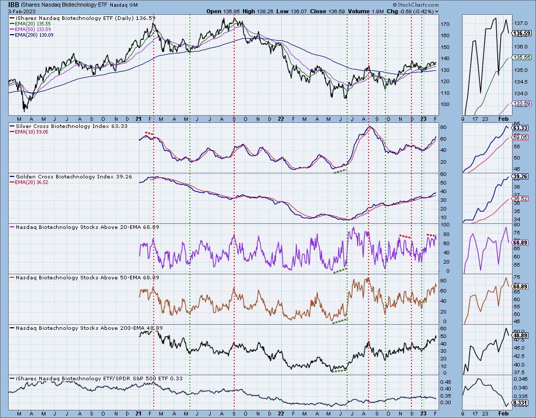
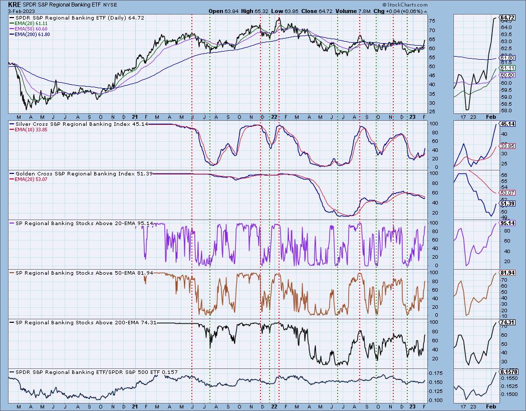
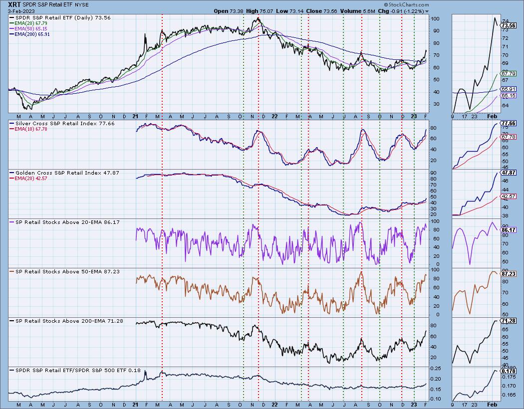
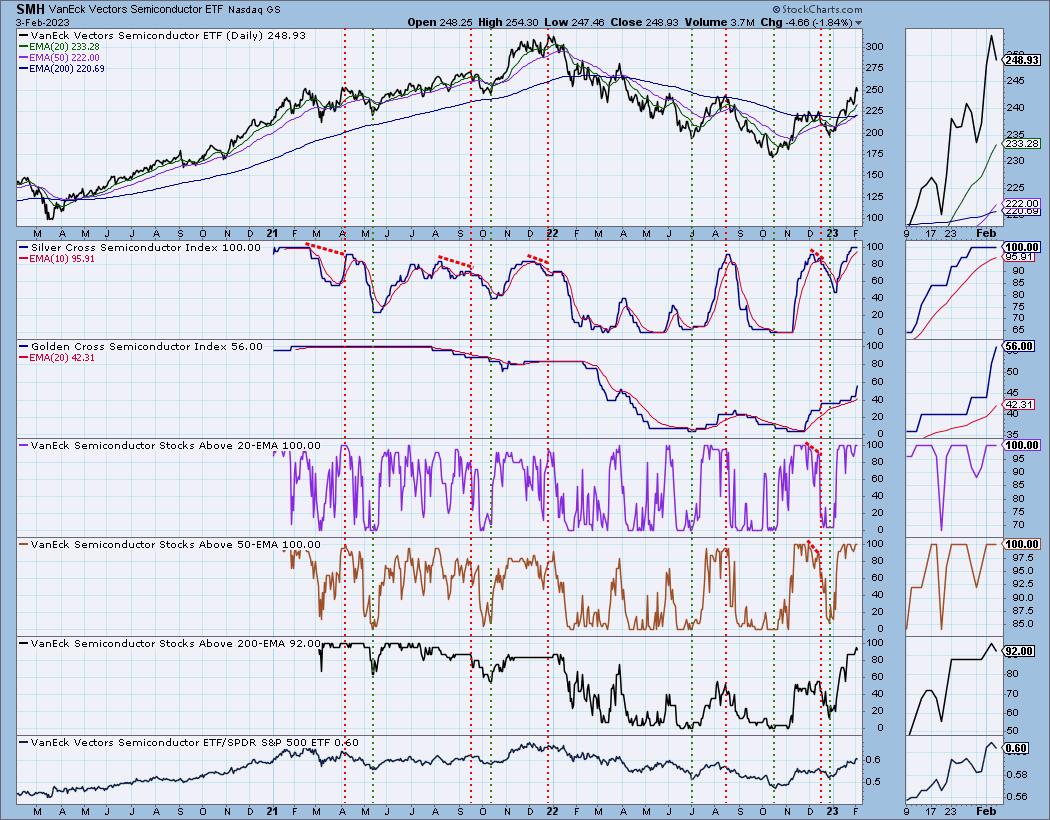
We have begun collecting Silver Cross Index and Golden Cross Index data for four new industry groups, and StockCharts.com back-calculated data for two years: Biotechnology (IBB), Regional Banking (KRE), Retail (XRT), and Semiconductors (SMH).
First let's cover what the Golden/Silver Cross Indexes are:
- The Golden Cross Index (GCI) shows the percentage of stocks on LT Trend Model BUY signals (50-EMA > 200-EMA). The opposite of a Golden Cross is the "Death Cross" -- those stocks are in a bear market.
- The Silver Cross Index (SCI) shows the percentage of stocks on IT Trend Model BUY signals (20-EMA > 50-EMA). The opposite of the Silver Cross is a "Dark Cross" -- those stocks are, at the very least, in a correction.
Let's take a look our new industry group Golden/Silver Cross Indexes:
Since mid-January, we have seen the relative strength line falling. However, notice what was going on 'under the hood'. Participation was increasing and the Silver Cross Index was rising. Relative strength was misleading. During this same period, IBB has been in a rising price trend.

Regional Banks (KRE) has seen participation shooting skyward. The relative strength line is in agreement with participation, which suggests overall strength. Notice the Silver Cross Index moving vertically higher. This is an industry group to pay attention to.

The Silver Cross Index and Golden Cross Index are rising nicely on XRT. Participation is robust. Notice that, when the Silver Cross Index turned up, the relative strength had not begun to rise much. Participation began to improve even before the Silver Cross Index would have gotten us into the rally sooner.

The SMH chart is bit disjointed, mainly because there are fewer members in this industry group ETF. We know this group has shown amazing leadership and, looking at the participation numbers, it's still going strong. Notice we just got a LT Trend Model "Golden Cross" BUY signal on SMH as the 50-day EMA crossed above the 200-day EMA. This is one reason we see the vertical rise in the Golden Cross Index. If the group itself is getting a Golden Cross, the stocks within are likely seeing the same thing. Currently, all of them have price above their 20-/50-day EMAs, and that has pushed the Silver Cross Index to 100% as well. What this tells us is that we should see a rally continuation. As soon as the participation numbers begin to crack, we will be warned.

Conclusion: Adding participation to charts gives you advance notice of internal strength. We now have Golden Cross Indexes and Silver Cross Indexes for all of the major indexes, all sectors, and, now, six industry groups (Gold Miners (GDX), Transportation (IYT) and now Regional Banks (KRE), Semiconductors (SMH), Retail (XRT) and Biotechs (IBB)). These annotated charts are only available for daily review by DecisionPoint.com subscribers.
Want to give us a try? Use coupon code: DPTRIAL2 and get two weeks to check us out for FREE!
Watch the latest episode of DecisionPoint on StockCharts TV's YouTube channel here!

Technical Analysis is a windsock, not a crystal ball. --Carl Swenlin
(c) Copyright 2023 DecisionPoint.com
Helpful DecisionPoint Links:
DecisionPoint Alert Chart List
DecisionPoint Golden Cross/Silver Cross Index Chart List
DecisionPoint Sector Chart List
DecisionPoint Chart Gallery
Trend Models
Price Momentum Oscillator (PMO)
On Balance Volume
Swenlin Trading Oscillators (STO-B and STO-V)
ITBM and ITVM
SCTR Ranking
Bear Market Rules
DecisionPoint is not a registered investment advisor. Investment and trading decisions are solely your responsibility. DecisionPoint newsletters, blogs or website materials should NOT be interpreted as a recommendation or solicitation to buy or sell any security or to take any specific action.
|
| READ ONLINE → |
|
|
|
| ChartWatchers |
| Earnings Analysis: GOOGL, AMZN, AAPL |
| by Jayanthi Gopalakrishnan, Karl Montevirgen |

Three big bellwether stocks announced earnings on the same day, after the close, and they all missed estimates. Does this mean the Technology sector or the broader market will head lower?
Not necessarily. From a technical perspective, ahead of earnings, the charts of Alphabet (GOOGL), Amazon (AMZN), and Apple (AAPL) were leaning towards being bullish. Here's a technical perspective.
Alphabet (GOOGL): What to Watch Out For
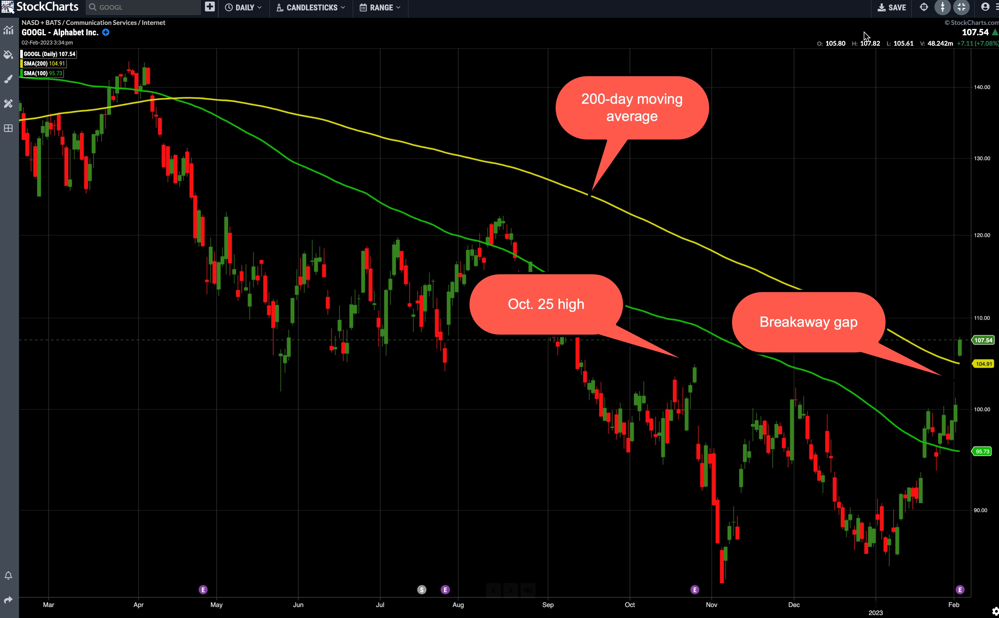
GOOGL's breakaway gap on February 2 indicates some significance for the following reasons. It betrays strong bullish sentiment on the day it's slated to report earnings after hours. It also places share prices above three critical levels of resistance:
- The 200-day moving average
- The December 2 (2022) high leading to the most recent rounding bottom, and
- The October 25 high preceding the bearish swing, which brought GOOGL stock to its lowest 12-month level.
 CHART 1: WILL GOOGLE STAY ABOVE ITS 200-DAY MOVING AVERAGE? We'll see how the stock reacts after its earnings report. If it goes above it, the 200-day MA could become a support level. Chart source: StockChartsACP. For illustrative purposes only. CHART 1: WILL GOOGLE STAY ABOVE ITS 200-DAY MOVING AVERAGE? We'll see how the stock reacts after its earnings report. If it goes above it, the 200-day MA could become a support level. Chart source: StockChartsACP. For illustrative purposes only.
- Depending on the scenario, gaps often get filled, and the outcome following the fill depends on whether the initial bullishness was driven by real anticipated value or overextended exuberance.
- For the current swing to develop into a stronger trend, GOOGL should remain above its 100-day moving average.
- A move below the January 6 swing low (at 84.86) would likely invalidate any uptrend thesis.
Amazon (AMZN): What to Watch Out For
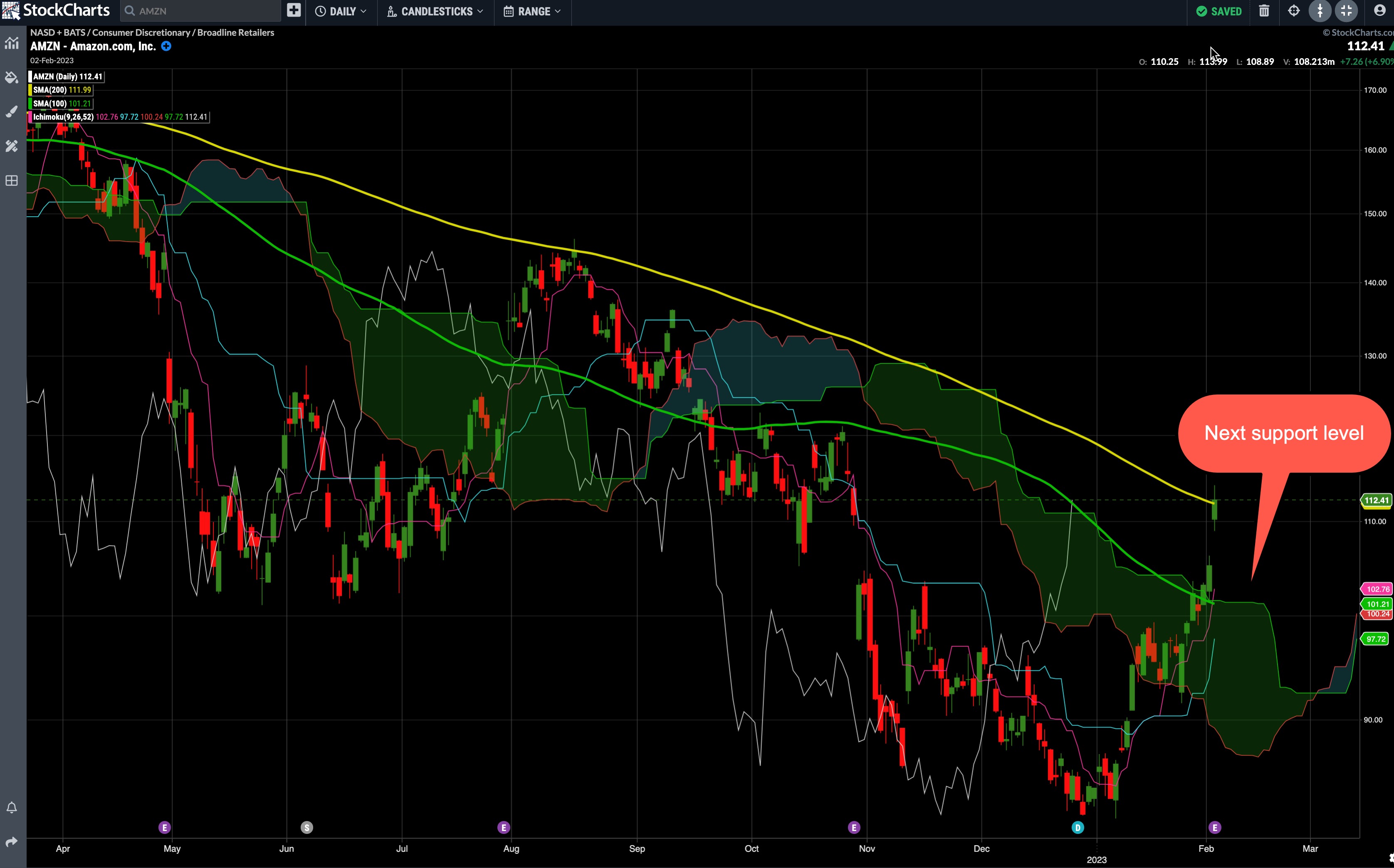
Adding the Ichimoku cloud overlay to the price chart takes care of some of the critical points a trader should be looking for. The cloud helps identify trend direction, support, and resistance levels.
While Amazon's stock price may be tempting to buy given it gapped up to its 200-day moving average, it's best to take a step back and look at the bigger picture (see chart below).

CHART 2: AMAZON IN THE CLOUD. The Ichimoku cloud overlay identifies support and resistance levels and trend direction. Chart source: StockChartsACP. For illustrative purposes only.
Consider the following:
- Price is trading above the shaded band, which means the top line of the band (green line) would be your first support level. The bottom band line (red line) would be the second support level.
- The base line (cyan) can be used to confirm a trend. Since AMZN's stock price is above the base line, it's an indication that price could go higher.
- The conversion line (pink) is another trend confirmation indicator. The direction of this line coincides with trend direction. In the chart of AMZN stock, the pink line is trending higher, which is another positive for the stock price.
There are many other ways to use the Ichimoku cloud indicator but its main purpose is to act as a measure of future price movement which is why you see the cloud extending beyond the prevailing price bar. You can see a bullish cloud forming with the red line above the green line. There's also a lagging span line (white). While it's lagging, it still is useful in identifying price direction. It's trending up and is above the price charts from 26 bars ago. That's another positive indication.
Any reversal in any of these lines or a reversal in the crossover should alert you to a potential reversal in price direction.
Apple (AAPL): What to Watch Out For
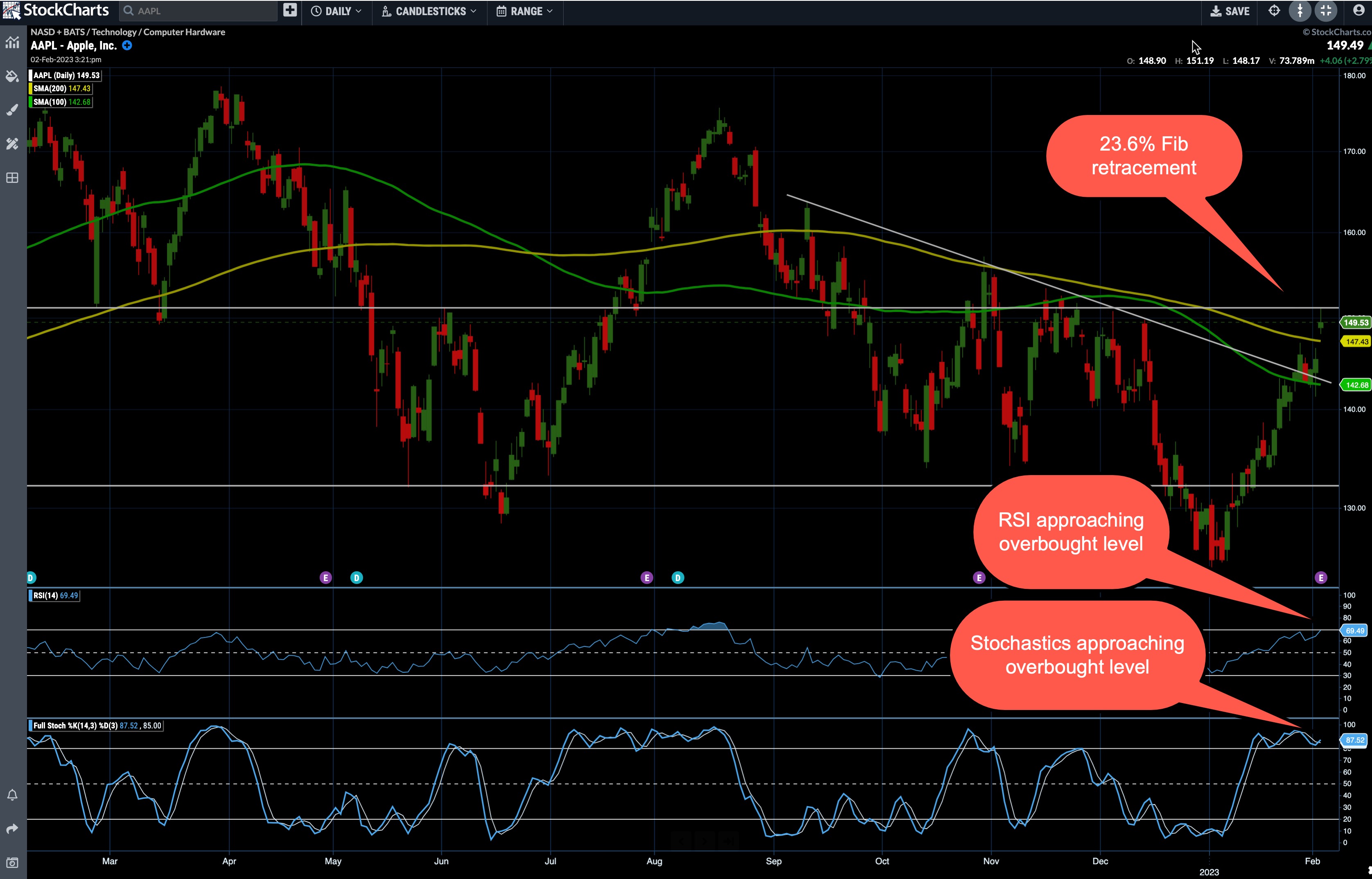
Out of the three, Apple's stock price has held up pretty well. Since reaching a high in January 2023, the stock price has seen slightly lower highs and lows but the stock has held above its 50% Fib Retracement levels (see chart below).
 CHART 3: A BULLISH BIAS IN APPLE? The stock price is approaching its 23.6% Fib retracement level and there's a chance that price could move higher. Chart source: StockChartsACP. For illustrative purposes only. CHART 3: A BULLISH BIAS IN APPLE? The stock price is approaching its 23.6% Fib retracement level and there's a chance that price could move higher. Chart source: StockChartsACP. For illustrative purposes only.
- If you look at the Fib retracement levels from the 2020 low to the January 23, 2022 high, price is approaching its 23.6% level (upwards), having bounced slightly above the 50% retracement level. If Apple's stock price crosses above it, then it would likely become a support level, considering it's been tested as a resistance level about five times since 2021.
- Note that from December 13 to the present day outlines a V Bottom. If Apple stock pulls back in the next few days to test its V bottom neckline (white trendline), you at least have some idea as to the prevailing market sentiment, which currently leans bullish.
- The relative strength index (RSI) and stochastic oscillator indicate that AAPL may be approaching "overbought" levels. That might make you think that prices may pull back but remember, these oscillators can sustain oversold readings for a lengthy period of time (so exercise caution).
Another thing to consider: Apple's earnings, along with those of Amazon, Alphabet, and other stocks within or correlated to big tech may play a significant role along with or despite the prevailing technical readings. This is a case where fundamentals may or may not play along with trader sentiment as revealed by the pre-earnings technical setup.
Trade With Caution
Earnings are tricky to trade, particularly for those attempting to enter early on to catch the upside. Based on the Nasdaq's performance compared to the S&P and Dow, the overall market bullishness seems to be favoring tech-heavy names. Today's triple earnings, following Meta's positive surprise, may boost all three stocks. But they could also pull back to their support levels. So, just set your stops before you enter any trades.
Disclaimer: This blog is for educational purposes only and should not be construed as financial advice. The ideas and strategies should never be used without first assessing your own personal and financial situation, or without consulting a financial professional.
|
| READ ONLINE → |
|
|
|
| The Canadian Technician |
| Inspire Soaring Profits: A Unique View For Success |
| by Greg Schnell |
A month ago, the Nasdaq Chart was in the bottom right corner. Tech layoffs were being announced, and the CEO/CFO/CIO teams were preparing for a terrible 2023. A month later, the market looks almost silly, rocketing to new multi-month highs. But here's where it gets tricky; you needed to buy what no one was interested in at the end of the year.
Hindsight is 20/20, but let me explain.
Look at the Worst 300 Stocks
So what did you need to buy to do well this year?
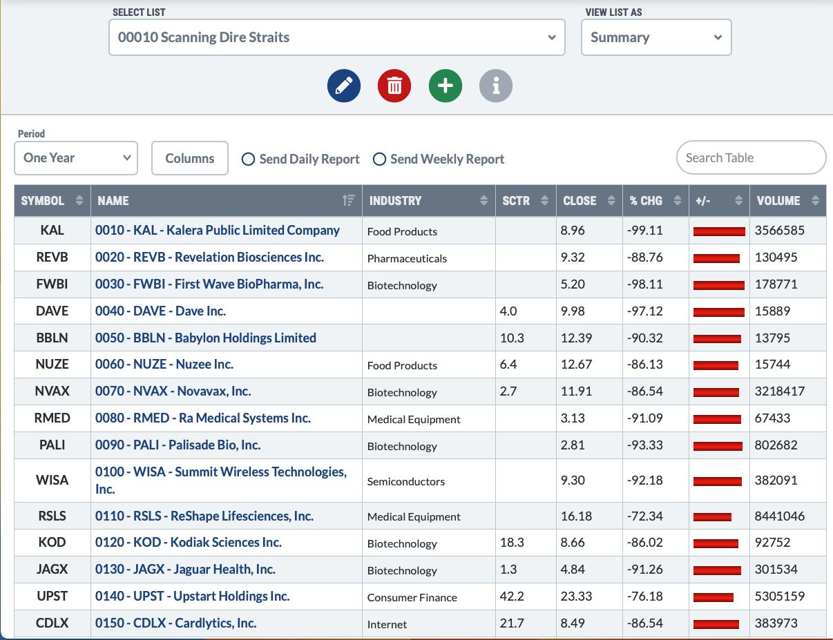
Below is a sort of stocks down more than 60% last year (ending December 31) and ranking them by the worst performers (0010) to best of the worst (0300). I added a series of numbers keeping this sort order. The sort order is based on the scan (0010, 0020,0030 in the name column) and last year's worst stock is at the top of the chart).
Please note the red bars on the picture below shows the one-year performance (Feb 3, 2022 to Feb 3, 2023) as of February 3rd, not year end. Also note the name of my scan results folder!

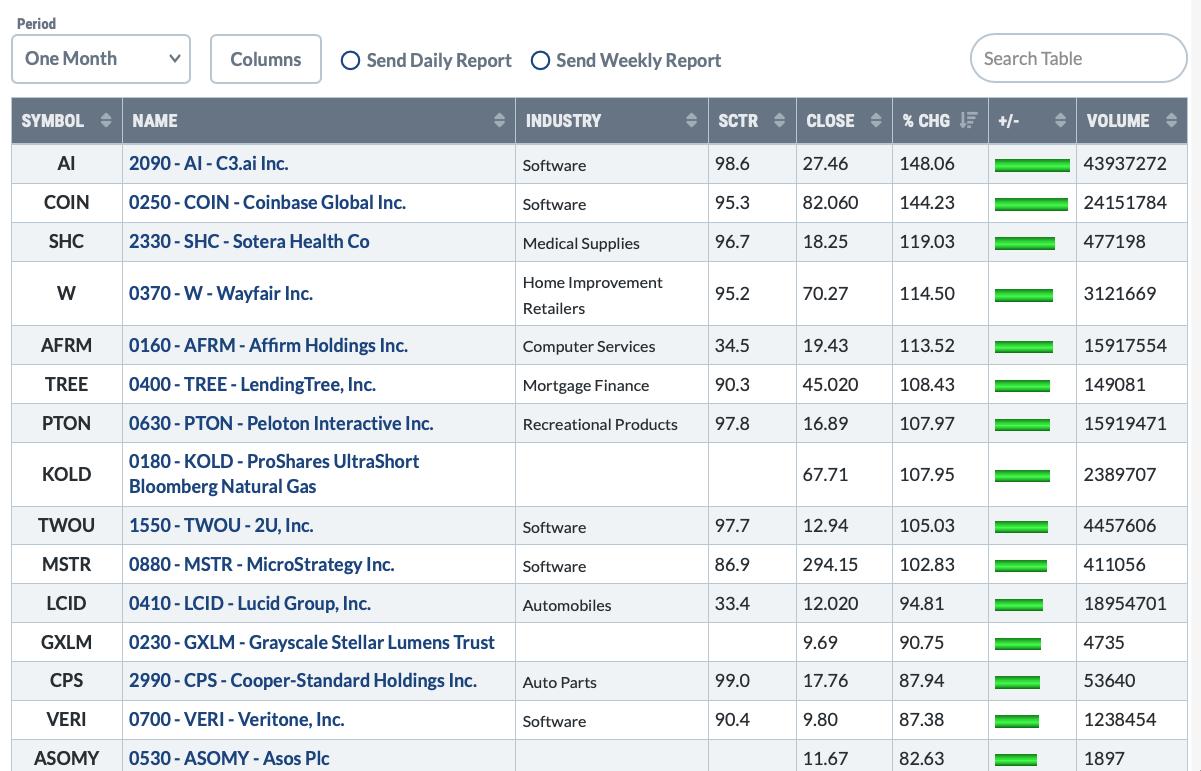
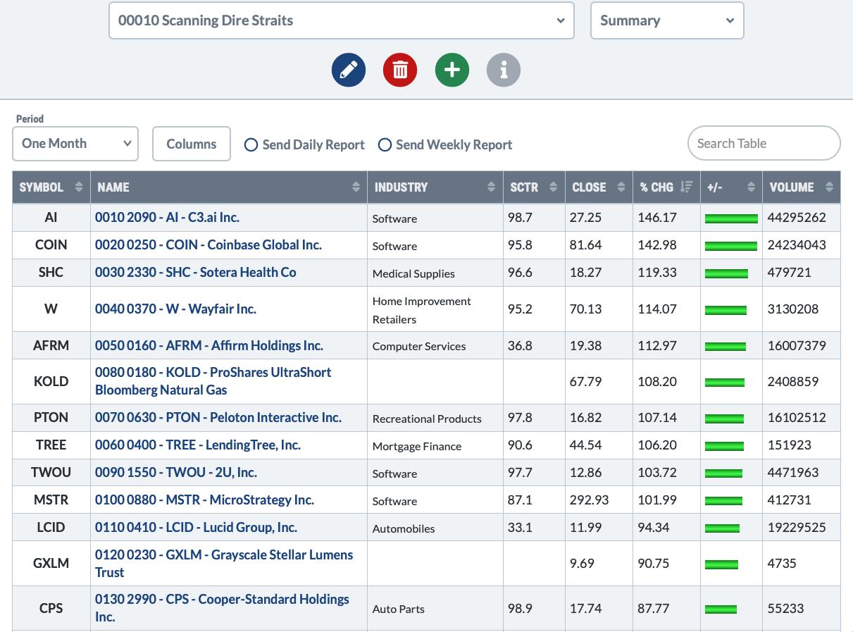
When we sort those same names by the largest up move over the last month, we get this picture from the same 300 stocks. The green bars show the percentage change. What I find fascinating is that many of the worst 300 stocks of last year in the USA are up 5x or 10x over how much the index ($SPX = 8%) is up in the first month of the rally.

Just to keep this straight now, I've added a second column of numbers on the list below.
- The second column of numbers was the rank of how awful they were; 0010 being the worst stock and 0300 being the best of the bad bunch.
- The first column of numbers is the current leadership of that group over the same month; 0010 being the best stock and 0300 being the lowest performer.
C3.ai
To explain a little further - for C3.ai -
It was the 209th stock out of 300. It wasn't the worst stock of the worst 300 losers, but it was ranked 209th (2090) meaning 208 stocks were worse.
Now, C3 is first, so 0010.
Coinbase
Coinbase was one of the worst 25 stocks (0250 in the second column), but is now 2nd in the move up.

It can be confusing so let me try to explain it again.
On the picture above there are two numbers at the beginning of the name.
- The first is the current ranking from best to 300th shown as (oo10 - to 0300).
- The second is the worst stock of the year ranked from 0 to 300 (0010 to 0300).
A stock like TREE was 40th worst stock of the year (0400), and is the top 6 (0060) in this group for the best one-month performance -- up 106%.
StockCharts does not have a way for me to post the complete PDF here, but I've posted the same article on ospreystrategic.org and you'll be able to download the PDF from there.
I'll be doing a presentation to show how we operate in the market during rallies and downturns. If you would like to learn more, follow the link for free registration: Osprey Strategic Information Session.

The bottom line is that, when the market turns higher, staying in the 'safe' names might just lead to a massive underperformance. I'll be adding this scan to my tool box for major lows.
|
| READ ONLINE → |
|
|
|
| MORE ARTICLES → |
|
 Chart 1
 Chart 2
 Chart 3
 Chart 4

