| THIS WEEK'S ARTICLES |
| Martin Pring's Market Roundup |
| Is the Tech Rally Overdone? |
| by Martin Pring |
When the direction of the primary trend changes, it's usually because the business cycle is transitioning from a slowdown or recession to a recovery. That process usually results in a change in sector rotation, as defensive ones, such as utilities and consumer staples, come to the fore and more speculative issues are downplayed. The market peaked in early 2022 and declined into October, following which we have seen a nice, but very much unloved, rally. Right on cue, the economy has slowed down. Some sectors, such as manufacturing and housing, are in a clear-cut recession, but others, such as the labor market and the services sector, are relatively unscathed. The thing that strikes me about all this is that sector leadership on the upside has not been characterized by the usual suspects, rather an extension of the previous ones.
To explain this, I refer to my Nirvana Template. I call it that because it contains most of the elements I need for a quick assessment of the long-term technical picture. Chart 1, featuring utilities, shows an example. It consists of four windows, the upper two of which contain the absolute price information in the form of the Friday close, its 65-week EMA and the long-term KST. The price and its position relative to the EMA sets the scene for the direction of the primary trend. The KST gives us a fix on how far that trend may or may not be in its development. Meanwhile, the lower two panels contain the same information, but this time for relative action against the S&P or whatever market average you choose.
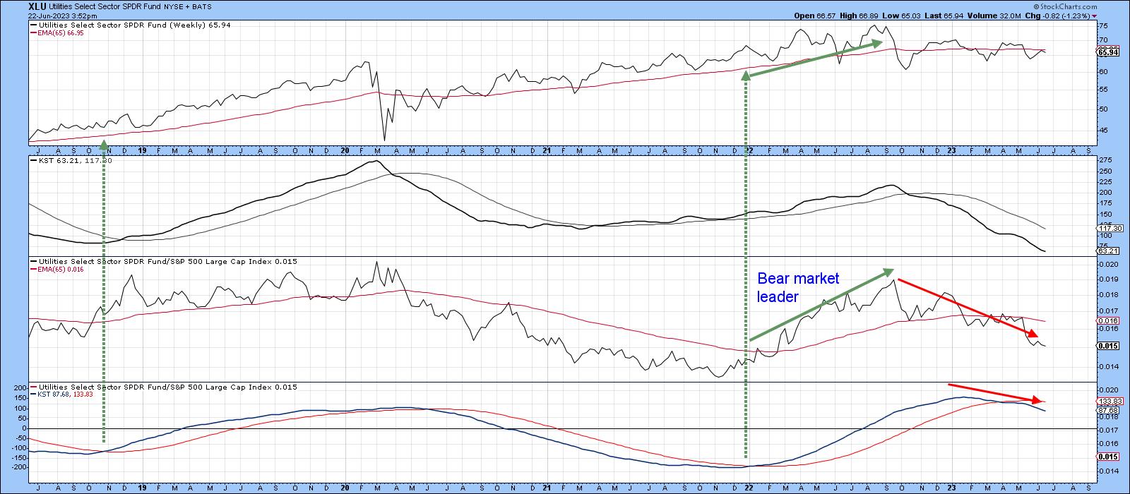 Chart 1 Chart 1
Ideally, we want to acquire the item concerned when the two KSTs are trading below zero, but above their respective 26-week EMAs. It's also good to see the price and relative line above their 65-week EMAs, or breaking through a meaningful trendline of some kind. Two examples for the utilities have been flagged with the dashed-green arrows. It is self-evident that this layout is helpful for long-term investors. If we assume that a rising tide lifts all boats, it also means this arrangement and its focus on the primary trend can also be of aid to short-term traders, since it helps to isolate pro-trend short-term signals, which tend to be a lot more profitable than contra-trend ones. Should you discover that you too find this arrangement helpful, simply click on any of the charts in this article and then save it as a ChartStyle or in a ChartList.
Defensive Sectors
Currently, we are seeing defensive sectors underperforming. For example, the RS line for the Utilities, in Chart 1, is below its EMA, and the KST for relative action has been in a negative mode for most of 2023.
RS action for Real Estate, in Chart 2, spent the 2022 bear market in a negative trend, which, following a post October rally, has now resumed. One of the things I have learned from this arrangement is that sectors (or stocks) trading below all four EMAs are usually best avoided, and those where all are above usually do okay. Real estate is currently negative on all four grounds.
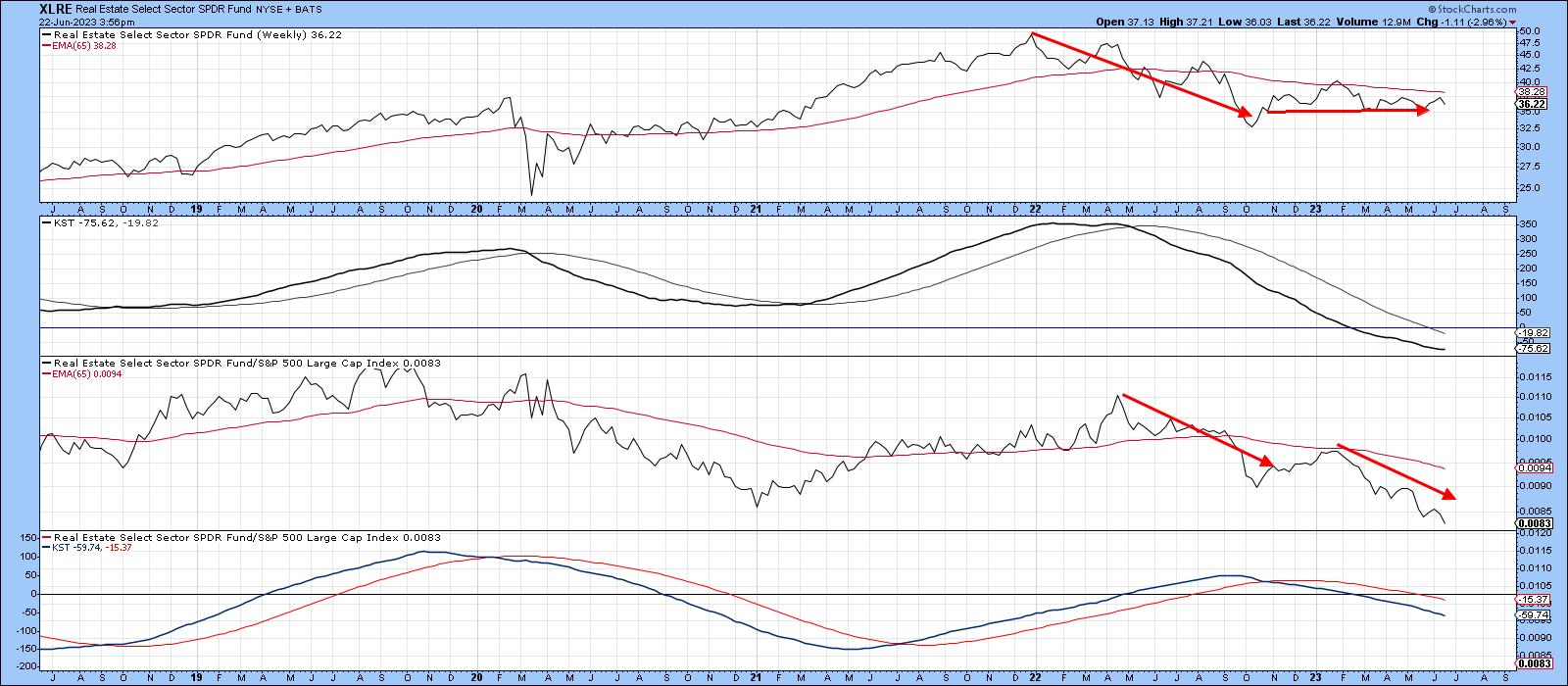 Chart 2 Chart 2
Finally, on the defensive sectors, we see that consumer staples relative action peaked at the turn of the year, just slightly after the October low in the overall market. That weakness has been sufficient to result in the relative KST crossing below its 26-week EMA. Now, three of the four indicators in the chart are below their EMAs.
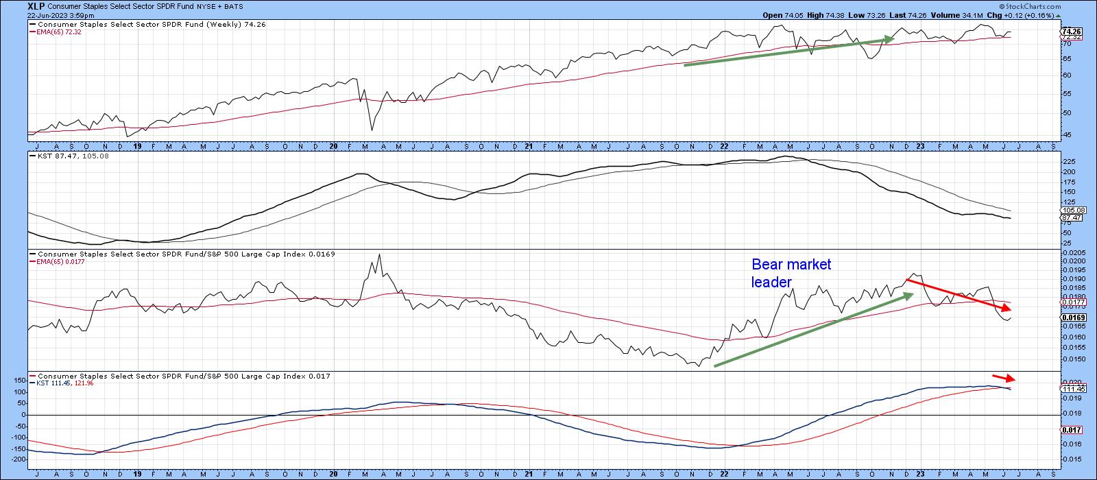 Chart 3 Chart 3
Market Leaders
Chart 4 features the undisputed leader, technology. The red arrows indicate it was a downside leader the during the 2022 bear market. Now, it is leading on the upside, with all four indicators being above their respective EMAs. Note that even though the RS line is at a new all-time high, neither KST is at an overstretched level. This leaves room for substantially higher prices.
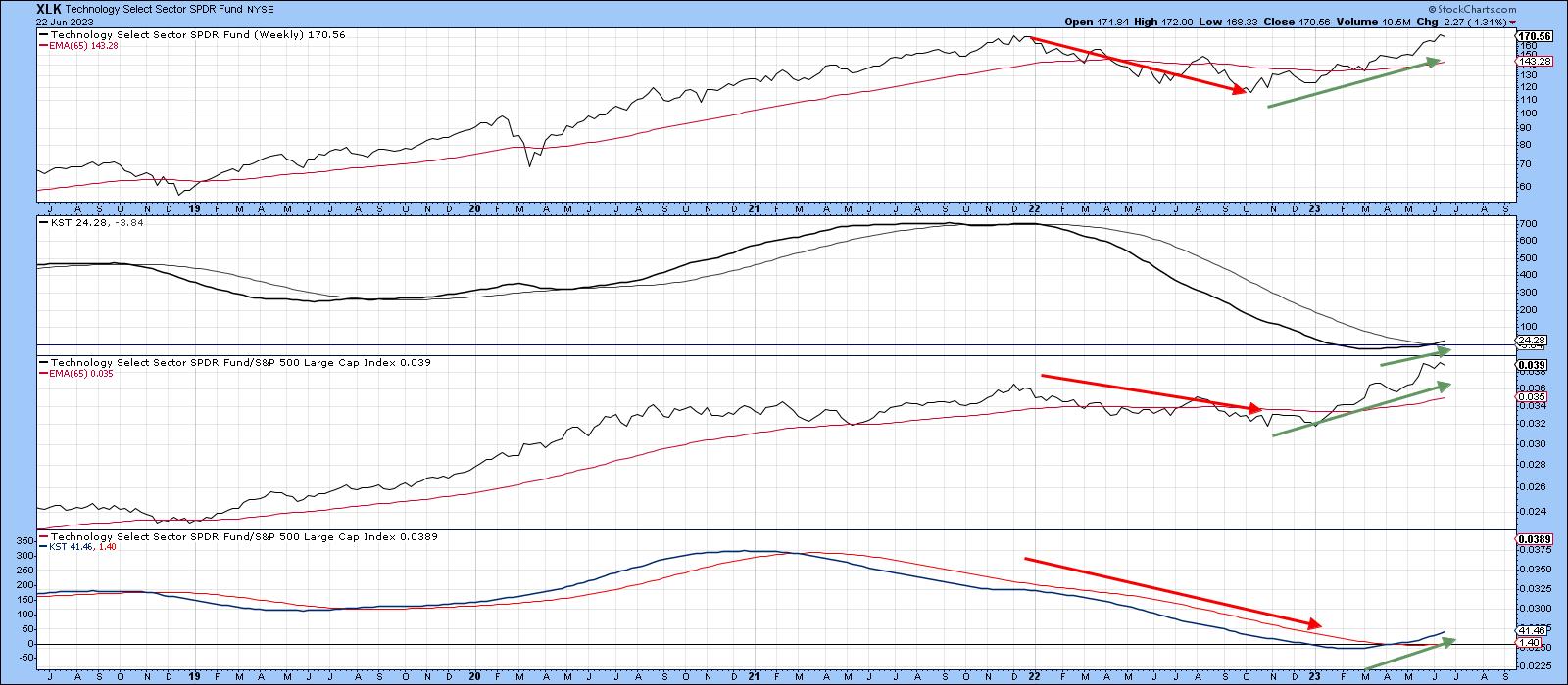 Chart 4 Chart 4
A similar downside/upside leadership pattern is also apparent for the communications services sector. Once again, all four series are now trading above their EMA's. If you look carefully, you will see that both KSTs, despite a four-month rally, remain well below their equilibrium point. That also suggests plenty of unrealized upside potential.
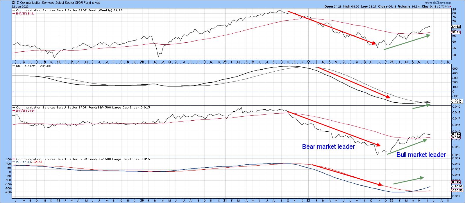 Chart 5 Chart 5
Finally, consumer cyclicals, unlike the market, did not bottom in October, as they troughed out on both an absolute and relative basis in December. Since then, this sector has been on a tear. As a result, the two KSTs look set to join the price and RS line above their respective EMAs.
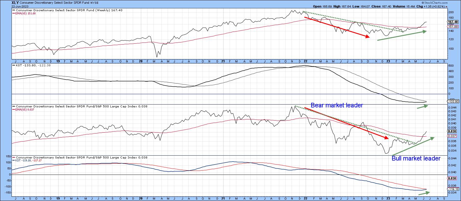 Chart 6 Chart 6
Conclusion
Some may say that technology, communications and consumer cyclicals have come too far, and that may well be the case from a short-term aspect. However, as long as their RS lines and long-term relative momentum continue to rise, it will represent one piece of evidence, to me, that the post-October rally is alive and well.
Good luck and good charting,
Martin J. Pring
The views expressed in this article are those of the author and do not necessarily reflect the position or opinion of Pring Turner Capital Group of Walnut Creek or its affiliates.
|
| READ ONLINE → |
|
|
|
|
|
| The Mindful Investor |
| Downside Targets For S&P 500 Pullback |
| by David Keller |
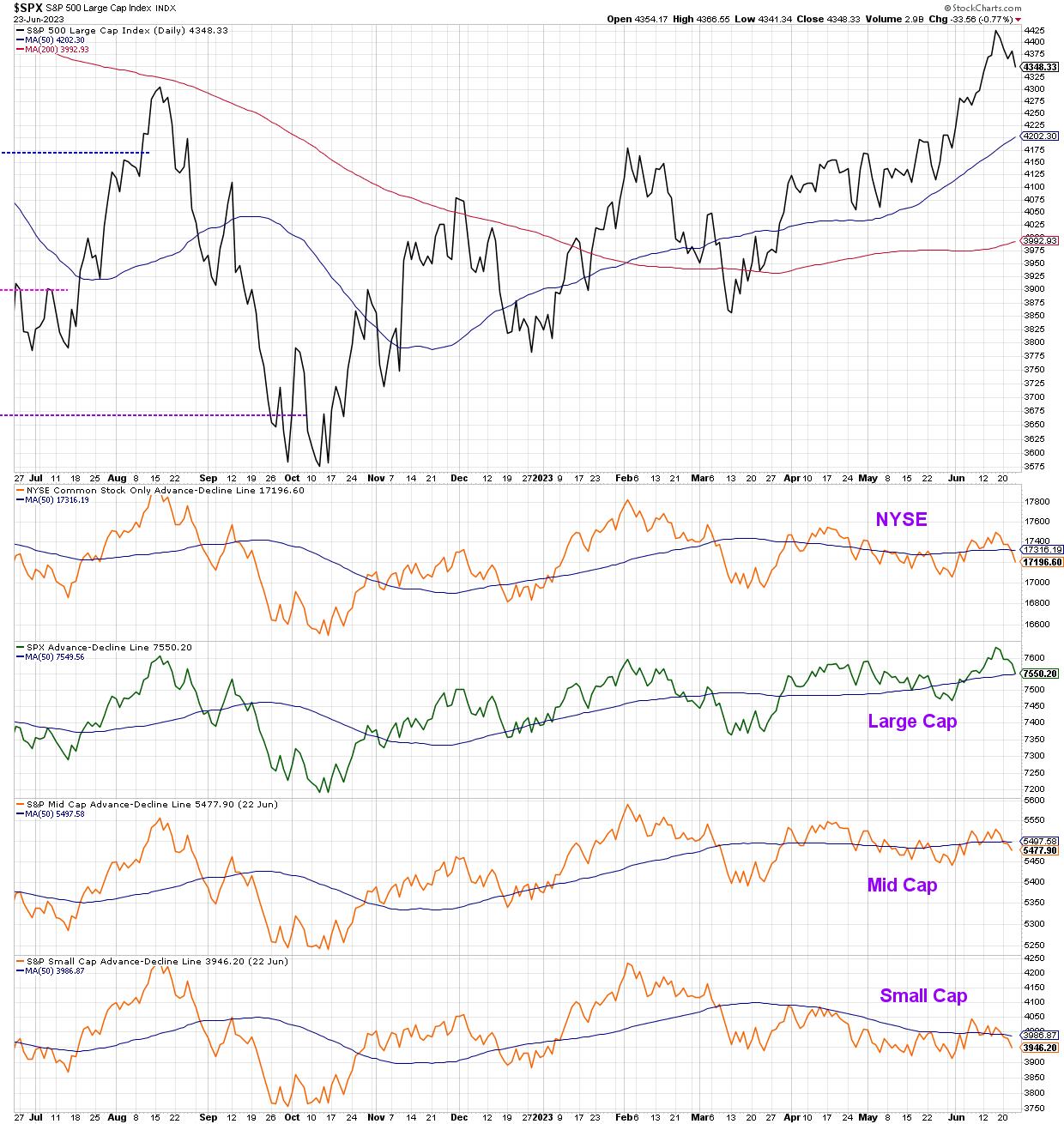
Recently, we've focused on the overextended nature of the small group of mega-cap leadership names in 2023, and even identified three key charts to watch for a pullback in the technology sector. This week, we observed further deterioration in breadth indicators, with the cumulative advance-decline lines for all cap tiers closing Friday in a position of weakness.
At the end of the day, our growth-oriented, cap-weighted benchmarks will follow the direction of the FAANG stocks. And that will remain the case until there is some dramatic upheaval in the calculation of our widely-followed equity benchmarks.
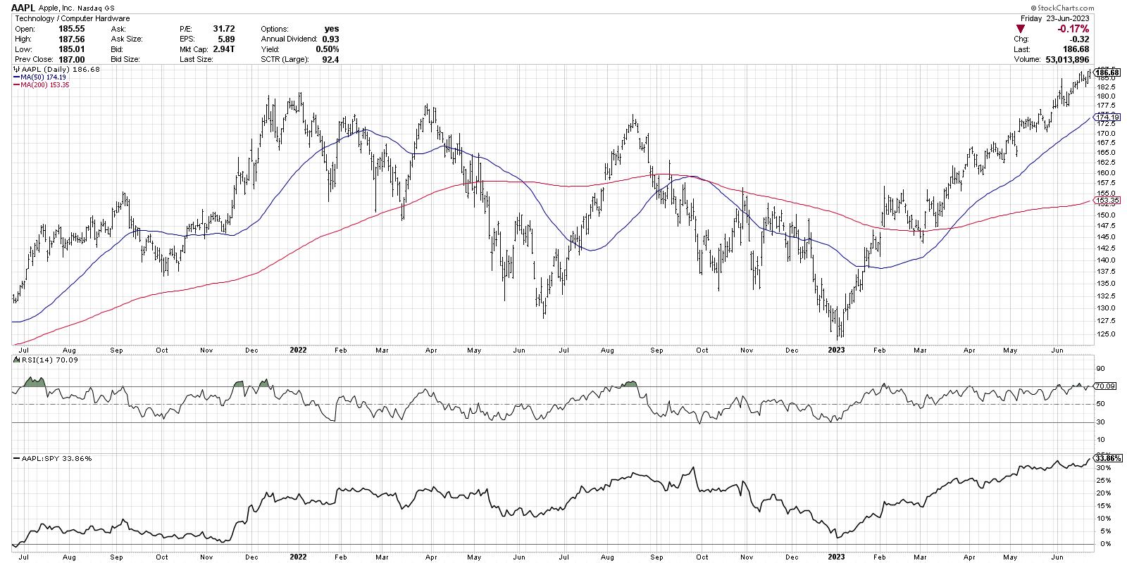
With that in mind, charts like AAPL are still working. Higher highs and higher lows are an uptrend by definition, and Apple is displaying plenty of both in 2023.
So if AAPL looks so bullish right now, then why are we talking about downside targets for the S&P 500? Well, that has to do with two key market breadth charts that flashed big-time sell signals this week.
First, let's check the McClellan Oscillator, which is based on cumulative advance-decline data.
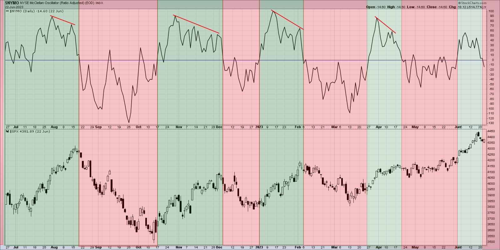
I've shaded this chart green when the indicator is above the zero level, and red when it flips back below the zero line. Think of it as an oscillator that tracks the rate-of-change of the cumulative advance-decline line, showing us the trend in breadth over time.
The most recent sell signal in late April did not lead to much of a decline, with the SPX drifting slowly higher until the next buy signal about a month later. Previous sell signals over the last 18 months have been incredibly valuable, highlighting the most important drawdowns in both bullish and bearish cyclical markets. So I'm inclined to follow the lessons of history and assume that this week's signal is a good reason to think more defensively and focus on capital preservation instead of capital growth.
Here's another breadth indicator that just turned bearish, and it's based on point & figure charts of the Nasdaq 100 members.
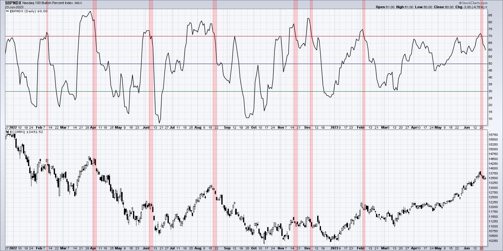
I've highlighted in red when the indicator moved above the 70 level and then back below. To rephrase, we're looking for when the breadth became overwhelmingly positive, and then turned much less positive. If you know point & figure charting, you know that it takes quite a bit to rotate from a bullish signal to a bearish signal, so I've found these rotations to be a great indicator of potential market tops. Almost all of these bearish signals over the last 18 months have preceded healthy pullbacks, and in some cases have come at the beginning of meaningful declines in price.
So let's assume for a moment that the market continues lower next week. What are some downside objectives to keep in mind?
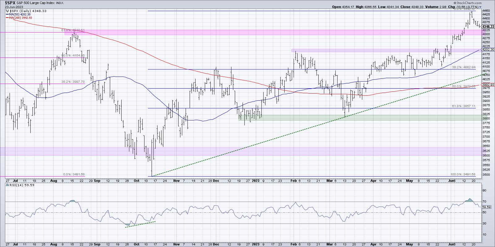
The first level to watch is the recent breakout level. You'll often see stocks break above a key resistance level, then soon after revisit that level from above. This can serve as a springboard to further price gains once resistance becomes support. So that means 4300 is the initial level and, as long as we remain 4300, then this would be a brief pullback indeed!
If we break 4300, then I'd be looking toward the 50-day moving average, currently sitting right around the February 2023 high at 4200. Strong charts often pull back to an ascending 50-day moving average, and one could argue that a similar move for the S&P 500 in June-July could set the stage for a resumption of the long-term uptrend. If both of those levels fail, then I'd be focused in on the 4060-4080 range. 4083 represents a 38.2% retracement of the October 2022 to June 2023 rally, so a key Fibonacci level to expect price support. A trendline connecting the major lows in 2022 and 2023 currently lines up around 4050 so we have what's considered a "confluence of support".
Now given all of the evidence above, here's what we should we really be asking ourselves as investors in June 2023.
How comfortable would I be with a 5% drop in the S&P 500? 10%? 20%?
How could I protect myself now from the downside risk we discussed?
At what "line in the sand" should I get more defensive? And where would I consider adding to existing positions?
By thinking through downside possibilities now, you can be better equipped to handle any challenging market environment!
Our latest YouTube video digs into the Nasdaq 100 Bullish Percent Index, including potential impacts to the Technology and growth stocks more broadly speaking.
RR#6,
Dave
P.S. Ready to upgrade your investment process? Check out my free behavioral investing course!
David Keller, CMT
Chief Market Strategist
StockCharts.com
Disclaimer: This blog is for educational purposes only and should not be construed as financial advice. The ideas and strategies should never be used without first assessing your own personal and financial situation, or without consulting a financial professional.
The author does not have a position in mentioned securities at the time of publication. Any opinions expressed herein are solely those of the author and do not in any way represent the views or opinions of any other person or entity.
|
| READ ONLINE → |
|
|
|
| Art's Charts |
| Chart and Trend Signals Align for Datadog |
| by Arthur Hill |
It does not always happen, but sometimes the indicator and chart signals align to send a powerful message. Datadog (DDOG) sports a confirmed bullish reversal on the price chart and a trend signal from the Trend Composite. Today's article will review these signals and highlight a developing short-term pattern.
The chart below shows Datadog with a confirmed bullish reversal pattern. First, DDOG formed two lows in the low 60s for a Double Bottom (green lines). These lows represent an area of demand (support) in the low 60s. The peak between these two lows marks overhead supply (resistance). Demand prevailed over supply as the stock surged above the red resistance line.
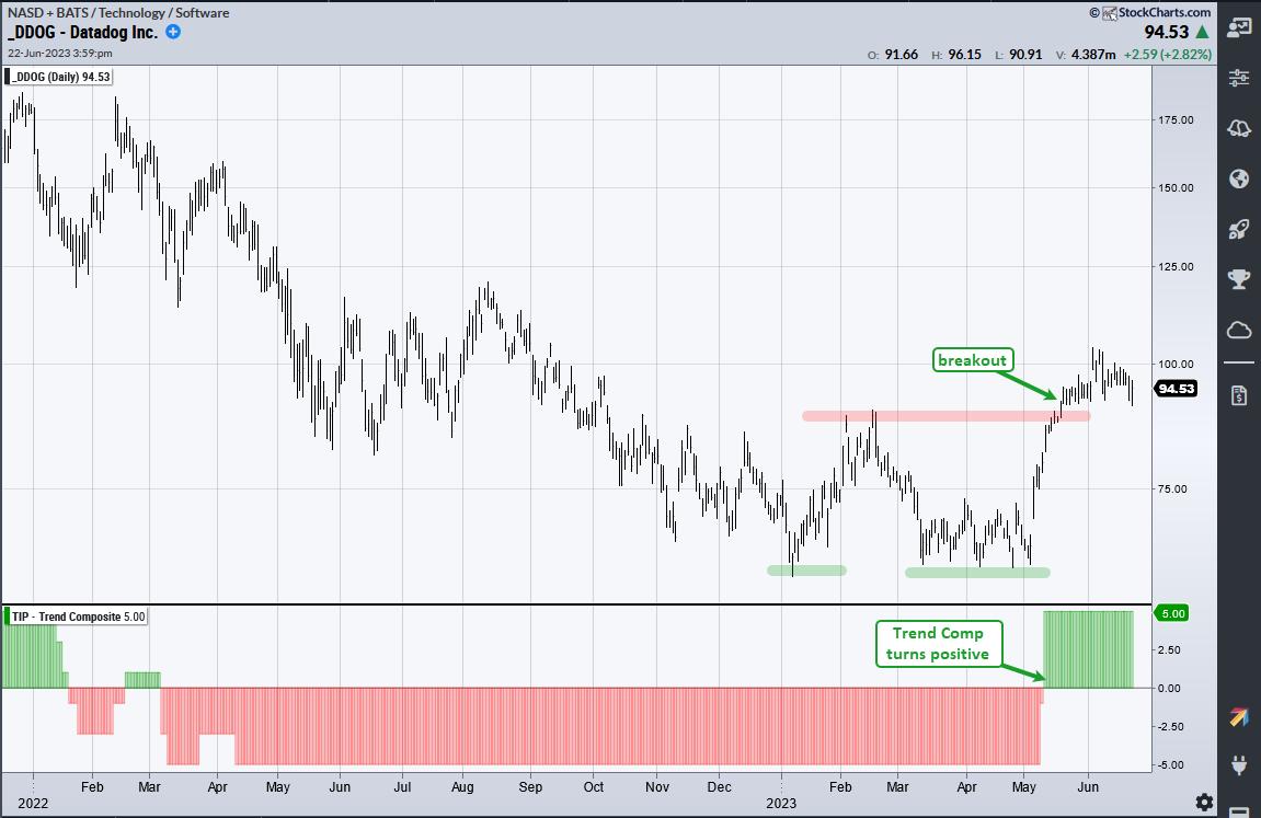
The indicator window shows the Trend Composite turning positive just before the Double Bottom breakout. The Trend Composite aggregates signals in five trend-following indicators. It surged to +5 and this means all five indicators are bullish. This signal reverses the bearish signal from March 7th, 2022.
With the long-term trend up, it is now time to look for tradable pullbacks or short-term oversold conditions. The next chart shows broken resistance at 90 (red line) turning into support (green line). This is a classic tenet of technical analysis. One price breaks resistance and demand overpowers supply, the previous supply overhang becomes an area of demand (support).
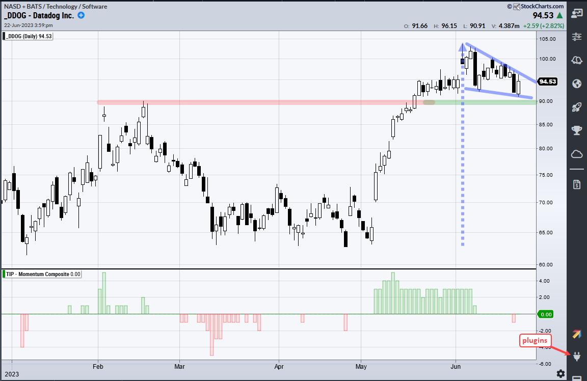
DDOG pulled back to the breakout with a pennant in June. This is a short-term bullish continuation pattern that is dependent on the prior move for a directional bias. The prior move was up (early May to early June) so this is a bullish continuation pattern. A breakout here would be bullish. Barring a breakout, chartists can watch the Momentum Composite for a move to -3 or lower to signal a short-term oversold condition.
A rotation strategy trading S&P 500 and Nasdaq 100 stocks was just released at TrendInvestorPro. This strategy trades weekly using two trend indicators, two volatility filters and a ranking indicator. Strategy and performance metrics are detailed in a comprehensive article. We will complete this series and introduce a signal table next week. Click here to learn more.
The Trend Composite, Momentum Composite, ATR Trailing Stop and eight other indicators are part of the TrendInvestorPro Indicator Edge Plugin for StockCharts ACP. Click here to take your analysis process to the next level.
---------------------------------------
|
| READ ONLINE → |
|
|
|
| The MEM Edge |
| Are The Markets Just Pulling Back, or Is It More? |
| by Mary Ellen McGonagle |
The markets pulled back this week amid global recession fears that followed the Bank of England's interest rate hike. Most concerning to investors was that the ½% increase came on the heels of an elevated U.K. inflation report for May. Thoughts that the U.S. may get stuck in a similar position pushed the S&P 500 lower as rising interest rates are negative -- particularly for Growth stocks.
Other factors were at play in last week's pullback as well, however, with the broader market Indices exhibiting an overbought condition after five weeks of gains. Most stretched were Technology stocks, which were the top performers and were led by Semiconductor and Software stocks.
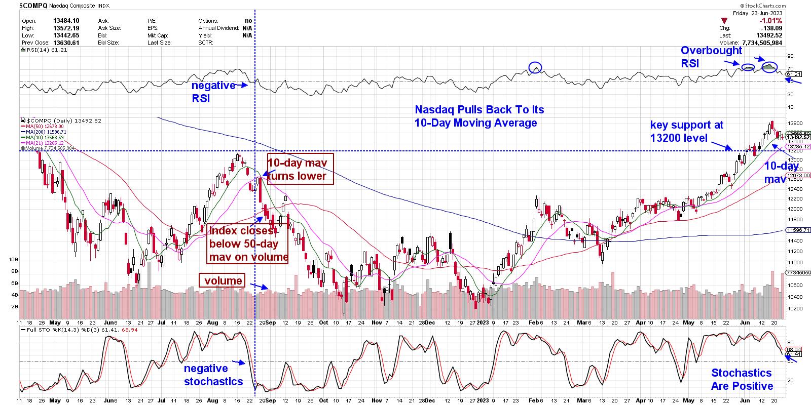 Daily Chart of the Nasdaq Composite Daily Chart of the Nasdaq Composite
Above is a chart of the Tech-heavy Nasdaq, which has gained almost 17% since March. Gains this month pushed the RSI into an overbought position, with an early June period of consolidation being enough to appease the markets. The more recent overbought condition has brought a pullback into play, with heavy volume on two of this week's down days, which indicates distribution.
At this juncture, each of the moving averages remain in an uptrend, with the markets exhibiting surprising resiliency in the face of renewed global recession fears. In fact, most of the names from the Suggested Holdings List of my MEM Edge Report outperformed the markets and are holding up above key support.
On the Nasdaq chart above, I've highlighted the characteristics of this Index prior to last year's late August-into-October decline, which resulted in a loss of over 20%. While I'm not anticipating a decline of that magnitude, it's important to be aware of what to be on the lookout for to signal more than just a 5% pullback.
These signals can be used for individual stock holdings as well. At this time, I'm focused on names in leadership areas that are holding in better than the markets. These stocks will go on to be your top performers once the market pressures are lifted.
Paying attention to any sector rotation will also be key. Last week, we saw a larger pullback in the Industrial and Material sectors, which are cyclical and will be more sensitive to fears of a global recession. The pullback in these areas, as well as Technology, pushed the Equal Weighted S&P 500 down 2.3% for the week. A lessening of participation in the markets would not be a positive.
If you'd like to be alerted to any shift in my outlook for the broader markets, as well as become tuned in to the leadership stocks that will take the markets higher as downside pressure subsides, use this link here to trial my twice-weekly MEM Edge Report for a nominal fee.
Warmly,
Mary Ellen McGonagle, MEM Investment Research
|
| READ ONLINE → |
|
|
|
| Don't Ignore This Chart! |
| Wynn Resorts: Is Now a Good Time to Trade the Stock? |
| by Jayanthi Gopalakrishnan |

When the stock market trends higher, it doesn't necessarily mean all stocks are moving higher. This is why it's necessary to have a method to filter through the day's market action and select stocks or securities to trade that have the potential for a decent return. And since each trader is different and each trading day is different, it's a good idea to develop various scans that identify securities to trade.
Once you've developed your scans, it's good to get in the habit of running a few of them every day. This can be for several reasons—are your scans still working the way they were designed? Are you getting very few results or too many results? Each day you run the scan, it produces different results, some of which may raise eyebrows. For example, on June 21, one of the stocks that came up in the StockCharts Technical Rank (SCTR) scan was Wynn Resorts Ltd. (WYNN).
During the pandemic, casino stocks suffered, and those with exposure to Macau felt the pain for an even longer period. With China reopening, you'd expect casino stocks like WYNN to recover. But the general thought is that the recovery was priced in, and the stock is due for a pullback.
Earlier this month, Wynn was downgraded by a couple of analysts. So when the stock was one that popped up in the SCTR scan results list, it's worth focusing on the stock and analyzing it more closely.
The Big Picture: Analyzing the Leisure Industry
It may be worth doing a top-down analysis for WYNN stock. Let's start by looking at the hotel, restaurant, and leisure industry by analyzing the S&P 500 Hotels, Restaurants & Leisure Industry index ($GSPHRL). The weekly chart (click on the chart below for live version) shows that the index has been trending higher since October 2022. But it looks like it's reaching a high, which could be a resistance level for the industry. The question is whether the index will break to the upside and reach new highs.
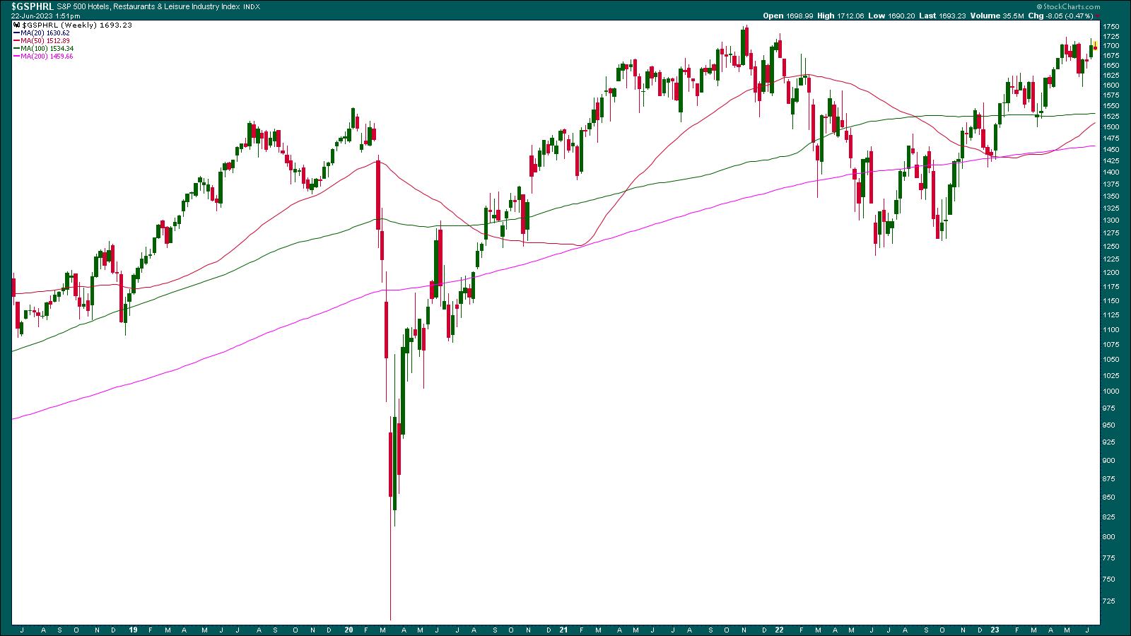
CHART 1: STARTING FROM THE TOP. An analysis of the weekly chart of the S&P 500 Hotels, Restaurants & Leisure industry ($GSPHRL) shows that this group of stocks is trending higher. However, it is pretty close to its high. Will it bust through its highs and move higher?Chart source: StockCharts.com (click on chart for live version). For educational purposes only.
The index is trading above its 50-, 100-, and 200-week simple moving average (SMA). For as long as people are spending more on discretionary items such as travel and leisure, this index could continue to move higher. But inflation is still a huge concern, and if consumers start cutting back on spending, this index could reverse quickly. So if you are considering investing in WYNN, analyzing $GSPHRL would be your starting point.
A Weekly Perspective of WYNN
Looking at the weekly chart of WYNN, you see that the stock has had its share of ups and downs. Although the stock has been trending higher since October 2022, it's had a tough time breaking above $116.90. Plus, there have been a series of lower highs since 2020.
Adding the 50-week and 100-week SMA to the weekly chart shows that the 50-week is crossing above the 100-week SMA. And that's after the stock has pulled back and bounced off its 200-week SMA. The SMA crossover and WYNN's stock bouncing off its 200-week SMA are positive signs.
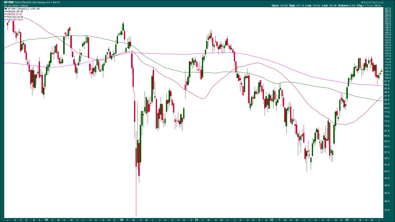
CHART 2: WEEKLY CHART OF WYNN RESORTS. The stock looks to be trending higher but it has to reverse its lower highs pattern to move higher.Chart source: StockCharts.com (click on chart for live version). For educational purposes only.
If the stock breaks above its $116.90 resistance, it could go as high as $151, the January 2020 high. That's about a $35 move, or almost a 30% move. If that happened, it would reverse the "lower highs" scenario. What are the chances of that happening? To answer that question, let's turn to the daily chart.
 Use the Inspect tool to measure the point and percent move. Place your cursor at the low and drag it to the high. Use the Inspect tool to measure the point and percent move. Place your cursor at the low and drag it to the high.
Zeroing In: Daily Price Action in WYNN
WYNN is trading above its 200-day SMA but below its 50- and 100-day SMAs. The stock has bounced below the resistance of its 50-day SMA (see zoom thumbnail in chart below).
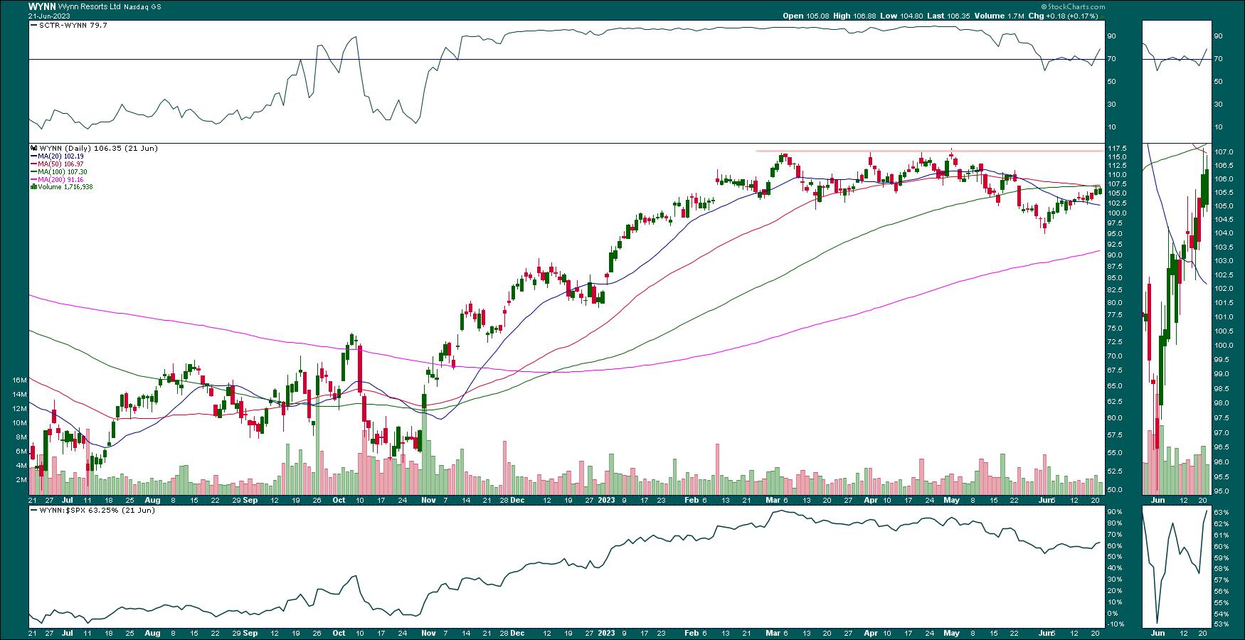
CHART 3: DAILY CHART OF WYNN STOCK. Will the stock bust through its 50-day SMA? Thats' something investors need to keep an eye on.Chart source: StockCharts.com (click on chart for live version). For educational purposes only.
So, the first area to look at would be to see if WYNN breaks above the 50-day SMA. If it does, the next area would be the $116.90 resistance. The stock is still far away from that level. The SCTR is above 70, and WYNN's relative strength relative to the S&P 500 index ($SPX) is above 70%. So, overall, the stock looks like a candidate for your ChartLists.
How to Trade WYNN Stock
- The first hurdle for WYNN is to break above its 50-day SMA. If you're considering trading WYNN stock, set an alert for when the stock crosses above its 50-day SMA. If the breakout occurs with above-average volume, it increases the odds of the stock moving to the $116.90 level.
- If price fails to break above the 50-day SMA, keep an eye on price action at a shorter-term SMA, such as the 20-day. It could bounce off this SMA, or it could break below it. A break below could send the stock much lower, which may be a good reason to delete the stock from your ChartList.
- This type of trade may require patience, and if you decide to enter a long position, as long as entry conditions are met, it may not be a long-term play. It all depends on what the stock does at its next resistance level. From the weekly chart, the stock could go as high as $151, but take it one day at a time.
Other Stocks From the Scan
Here are some other stocks that showed up on the large-cap SCTR scan.
Baidu, Inc. (BIDU)
FedEx Corp. (FDX)
Lattice Semiconductor Corp. (LSCC)
Lululemon Athletica Inc. (LULU)
Micron Technology (MU)
Snowflake Inc (SNOW)
Looking Back at Intel
On June 13, Intel Corp. (INTC) was the featured SCTR scan stock. Let's look at how that stock is performing.
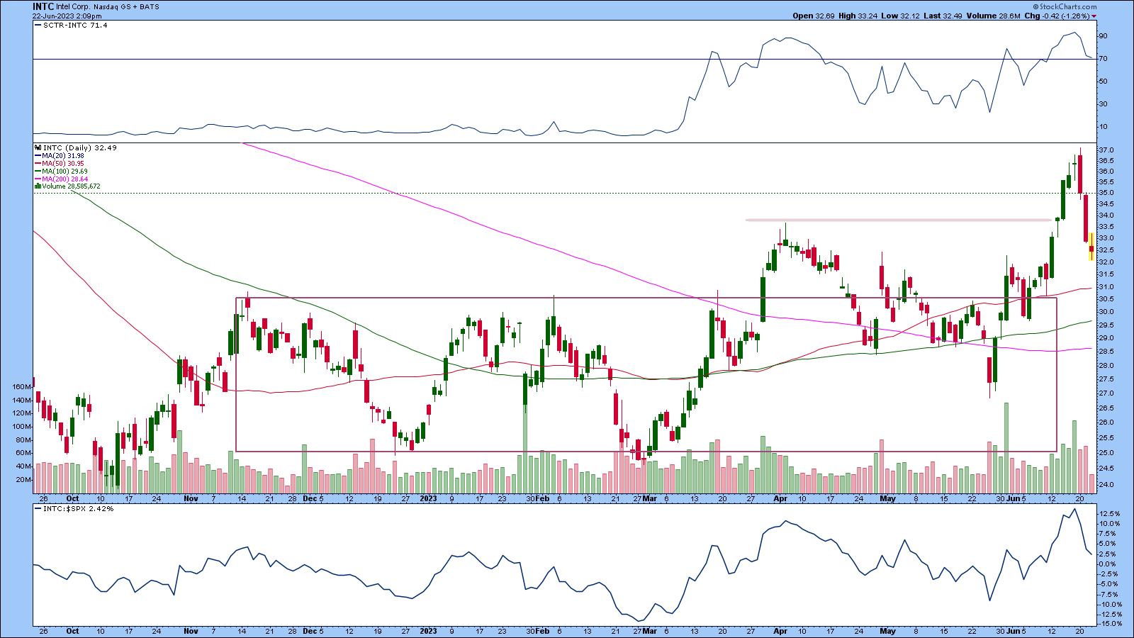
CHART 4: DAILY CHART OF INTC STOCK SHOWS MAJOR PULLBACK. Will INTC reverse back to the upside?Chart source: StockCharts.com (click on chart for live version). For educational purposes only.
INTC stock broke out above $35 and moved higher on strong volume. The stock has pulled back, but has fallen below $35. SCTR is still barely hanging on to the 70 level. Relative strength with respect to the S&P 500 index ($SPX) has fallen and is barely in positive territory. Intel's stock price is now heading lower toward its 50-day SMA, which could be a support level. Any lower than that and the stock may be back to its pre-breakout trading range. It's still worth watching the stock and analyzing a chart of INTC vs. the VanEck Vectors Semiconductor ETF (see chart below).
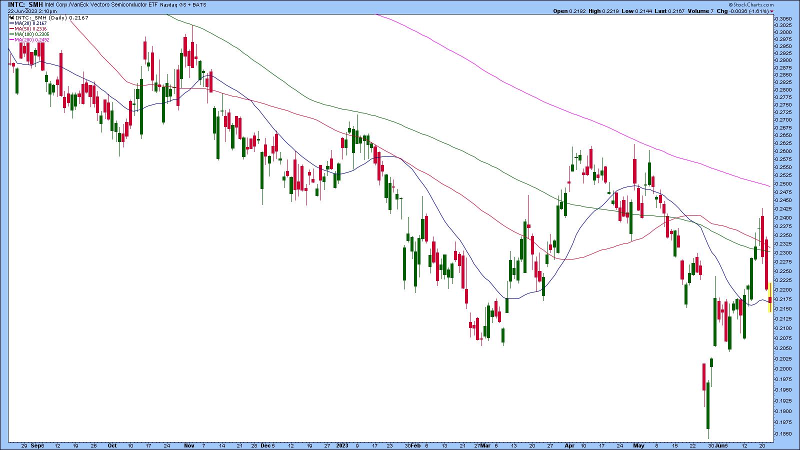
CHART 5: INTC VS. SMH. INTC is underperforming the semiconductor subsector. Will it catch up with them? It depends on its future investments in the AI space.Chart source: StockCharts.com (click on chart for live version). For educational purposes only.
INTC may be one of the laggards in the semiconductor space. But that doesn't mean it should be avoided. If INTC succeeds in being a part of the AI boom, it could become a stronger player.

Disclaimer: This blog is for educational purposes only and should not be construed as financial advice. The ideas and strategies should never be used without first assessing your own personal and financial situation, or without consulting a financial professional.
|
| READ ONLINE → |
|
|
|
| The Canadian Technician |
| The Best Since 2000! |
| by Greg Schnell |
2023 has seen a significant thrust in tech names. The recent run in semiconductor and software stocks are great examples of market thrusts. The market has split into different vehicles, and we are currently riding the AI vehicle to higher highs.
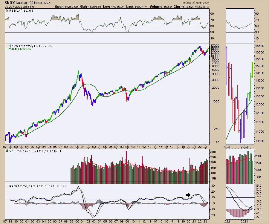
One of the tools I like to use to analyze stocks and indexes for momentum is the PPO.
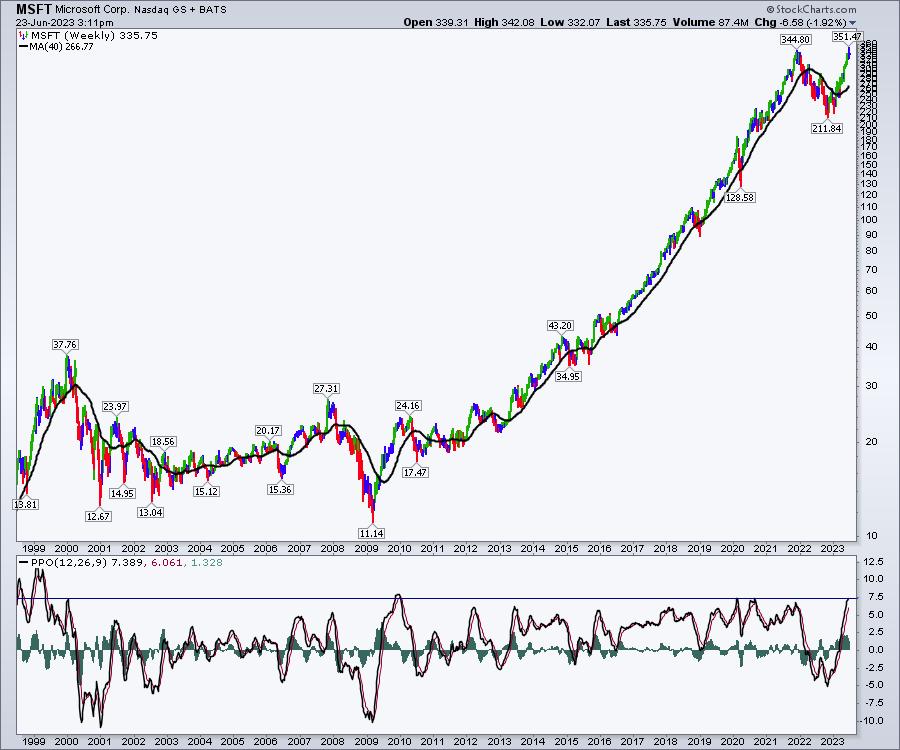
Back in 2021, the $NDX index had a PPO surging to very high levels on the monthly chart. It was the highest level in 20 years, and suggested caution. When it rolled over, it was quite important to respect that. The PPO turned up to a buy signal this month, so that looks more bullish.
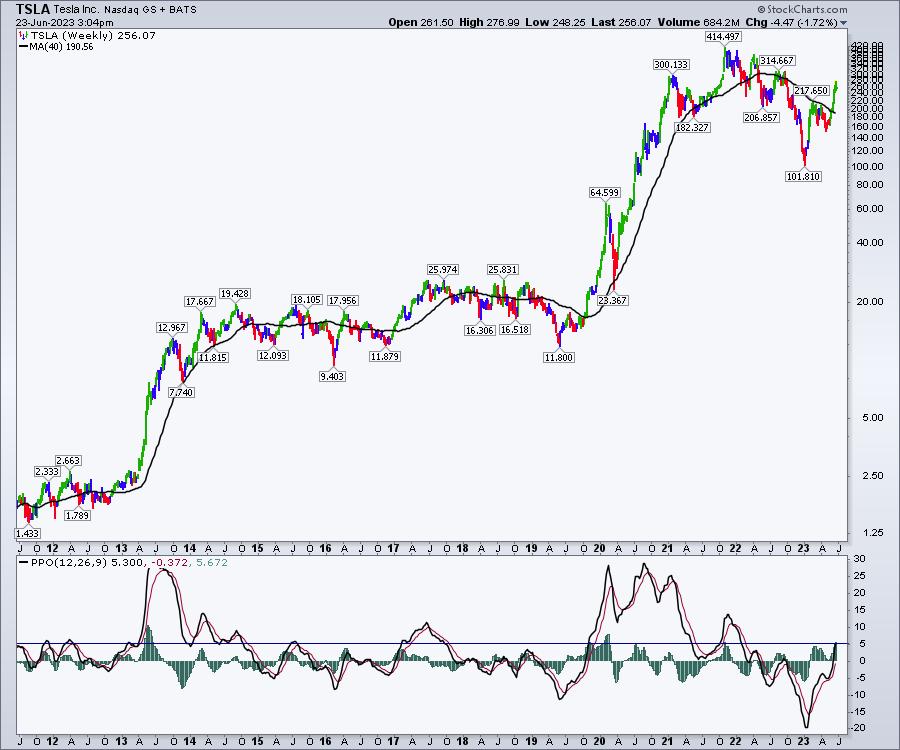
When I look at the mega-cap tech names, some of the charts are ramping up nicely, like TSLA. The weekly PPO is surging, and this looks like it could run to much higher levels. There is not a limit for the PPO, but when it rolls over on a weekly chart, it can be a clue to be more protective of gains.
When I look at MSFT, the PPO is significantly higher compared to history. Only in 2010 (which was after a major bottom) have we reached this level of momentum in this century. We are testing the prior high, so it's probably a good place to be cautious. Nothing wrong with waiting for MSFT to give a little pullback.
Looking at NVDA, we have a significant surge as well. This is higher than anything since the turn of the century! The volatility of NVDA back in 2000-2002 gave you great trading opportunities. The real opportunity was in taking profits at high levels. That does not mean sell your stock here, but it does suggest having a plan for protecting profits.
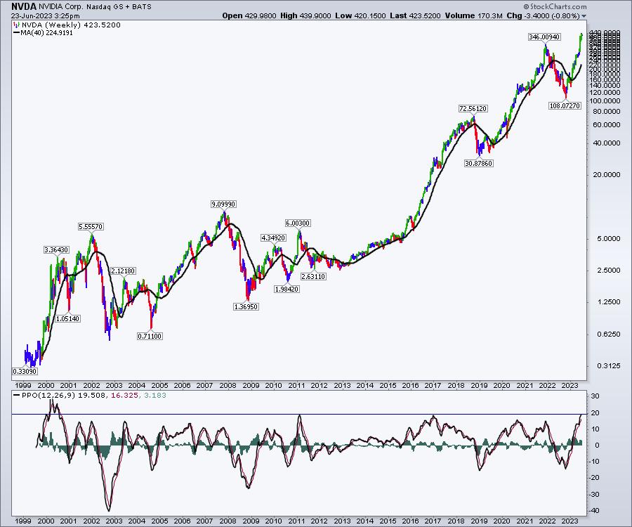
What it suggests to me is that some of these charts are too extended for new positions. Feel free to analyze other mega-cap names for where they are relative to history. I had 46 charts on the $SPX with high PPOs, but that is only 10% of the index. Some are still rising, some are cresting, and some are well on their way lower.
It's only been one week of selling, but it is important to recognize that these charts might be ready for a bigger breather.
If you like the work we do, feel free to go over to OspreyStrategic.org and consider a $7 one-month trial. I'll be detailing some other indicators in the weekend newsletter. Enjoy the week.
|
| READ ONLINE → |
|
|
|
| ChartWatchers |
| Homebuilder Stocks are Soaring, But Is It a Good Time to Buy? |
| by Karl Montevirgen |

The May Housing Starts and Permits released this past Tuesday was quite eye-popping, despite riding the back of a disappointing market drop in the Dow, S&P, and Nasdaq.
How so? If you think about it, mortgage rates are averaging a painful 7%+. And still demand for homes rebounded, with 1.63 million housing starts last month, far above the 1.39 million economists were expecting.
A Bullish Reversal for the Housing Sector?
Quite possibly. If anything, Tuesday's data gave us yet another indication that the US economy is robust, despite the uncertainties that continue to plague it. If you can remember, housing was the first to get hit once the Fed began tightening. So is it now the first to bottom?
Housing Is a Leading Indicator (On the Fundamental Side)
Another plus is that the increase in demand for homes, especially new ones, indicates more spending. For new homes, it indicates demand for construction labor and materials. It also points to more spending across Consumer Staples and Consumer Discretionary sectors; basically, all the things that make a house a "home." In other words, home spending begets even more spending for home stuff.
Time to Jump Into Homebuilder Stocks?
So, to sum it all up...
- Housing data is showing signs of recovery amid high mortgage rates.
- 10-year Treasuries are holding steady.
- The Fed had set expectations for two more rate hikes before the end of the year.
- Homeowners whose property values didn't sink as low as expected during the housing recession are helping keep afloat consumer spending (which may be a factor keeping the economy from falling into a recession).
Time to jump into homebuilders? Let's look at the charts for four of the biggest homebuilder stocks in the sector: DR Horton, Inc (DHI), Toll Brothers, Inc (TOL), PulteGroup, Inc (PHM), and Lennar Corporation (LEN).
Analyzing on a Comparative Basis
First, let's take a look at all four charts stacked together using StockChartsACP.

CHART 1: DHI, TOL, PHM, AND LEN STACKED SIDE BY SIDE. The 50-day, 100-day, and 200-day Simple Moving Averages illustrate the strength of each stock's upward advance on a comparative scale.Chart source: StockChartsACP. For illustrative purposes only.
At a glance, all four stocks are trending upward.
- All three moving averages—the 50-day Simple Moving Average (SMA), 100-day SMA, and 200-day SMA—appear (mostly) fully extended.
- Momentum-wise, you can see that PHM and TOL appear the strongest, having barely traded below the 50-day SMA. LEN, on the other hand, appears to be the laggard among the four, having tangled with the 50-day SMA more frequently than the rest of the group.
 To explore the different layouts in StockChartsACP, check out this video. To explore the different layouts in StockChartsACP, check out this video.
Looking at the four homebuilders from a quarterly perspective, PerfCharts provides a clearer picture of their comparative performance.

CHART 2: A 3-MONTH COMPARATIVE LOOK AT PERFORMANCE USING PERFCHARTS. PHM is the clear leader, with TOL, DHI, and LEN pacing behind (and in that order).Chart source: StockCharts.com. For illustrative purposes only.
Now you can more clearly assess the group's performance leadership, and if you were to look at each stock's three-month StockCharts Technical Rank Score (SCTR) score, it would align with the PerfChart reading, with PHM leading the pack and LEN straggling behind.
More specifically, the SCTR scores (at the time of writing) are as follows: PHM 97.8, TOL 95.8, DHI 93, and LEN 92.5.
Are These Stocks "Toppy" or Is There Room for More Upside?
When you're buying an uptrending stock, you're assuming the stock is still relatively undervalued, meaning there's room for more upside. But still, you probably want to avoid entering a position bound for a sizable "dip."
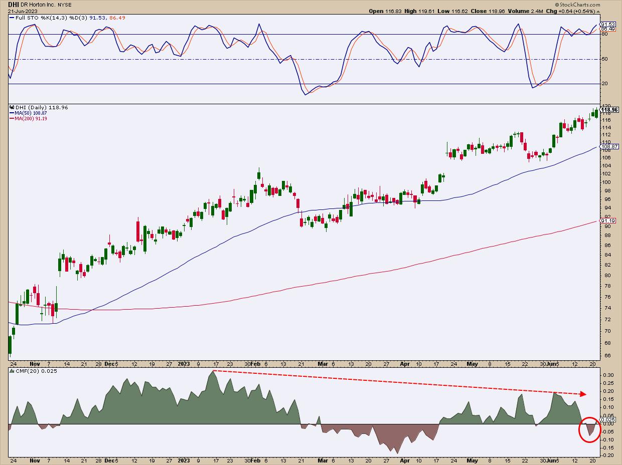
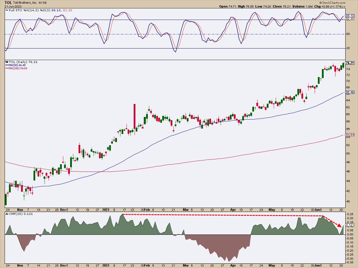
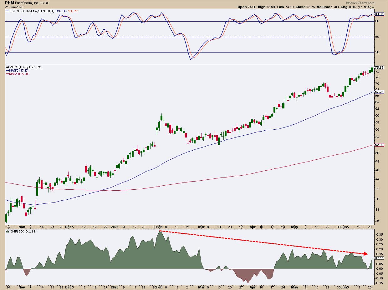
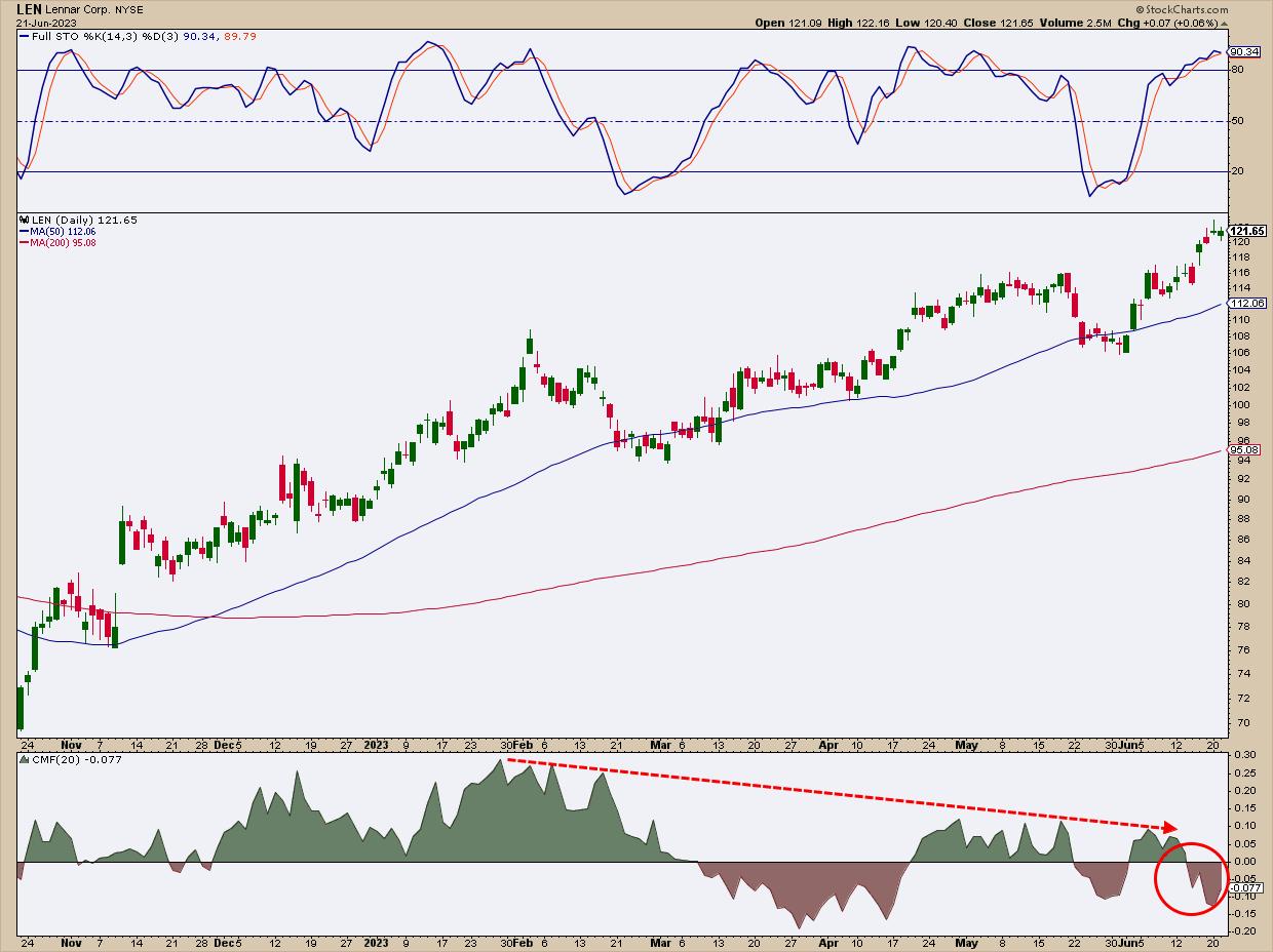
So, to figure out which of these stocks might be overbought and possibly topping, let's take a look at each chart, pull up a Stochastic Oscillator to see if any occupy the overbought range, and take a look at the stocks' momentum profile, checking buying pressure against selling pressure using the Chaikin Money Flow (CMF).
Let's look at each chart, note a few characteristics unique to each stock, and then do an overall assessment after looking at all four.
DHI: Sellers Tip Their Hand

CHART 3: DAILY CHART OF DHI. What sticks out is the bearish divergence between price and the CMF and that money flow has crossed below the zero line.Chart source: StockCharts.com (click on chart for live version). For illustrative purposes only.
- According to the Stochastic Oscillator, DHI is clearly in overbought territory.
- Notice the bearish divergence between the trend and the CMF, now falling below the zero line into negative territory. This indicates selling pressure amid DHI's flight to higher valuations.
TOL May Be Topping, But Not as Badly as DHI

CHART 4: DAILY CHART OF TOL. Price appears to be advancing with strong momentum, and, unlike the other three charts in the group, the divergence between price and money flow appears to be relatively near-term.Chart source: StockCharts.com (click on chart for live version). For illustrative purposes only.
- TOL is also giving us an overbought stochastic reading.
- While the CMF shows a sharp divergence in the near-term (longer-term divergence is barely visible), money flow crossed over to negative territory.
PHM: The Outperformer of the Pack Seems Bound for a Pullback

CHART 5: DAILY CHART OF PHM. Despite leading the other three in terms of performance, PHM's advance seems overdue for a pullback.Chart source: StockCharts.com (click chart for live version). For illustrative purposes only.
- Remember that PHM is the strongest performer among the group (at least over the last quarter).
- You can clearly see price advancing strongly, its forward momentum stretching both 50-day and 200-day moving averages into full sail.
- Also notice the clear divergence between price and money flow for the past four months.
LEN the Laggard

CHART 6: DAILY CHART OF LEN. Perhaps more than the other three stocks in the group, LEN appears to be losing steam based on its performance relative to its 50-day SMA and negative CMF reading.Chart source: StockCharts.com (click chart for live version). For illustrative purposes only.
- LEN's performance relative to the group has been the weakest, at least over the last quarter.
- Similar to DHI, LEN is also overbought, exhibiting longer-term price divergence, and has fallen into negative CMF territory.
After looking over the four homebuilders, how do you trade them?
How to Trade the Homebuilders
Your best bet here is to sit and wait. All four stocks—DHI, TOL, PHM, and LEN—are in record-high territory (aka, all-time highs). Although all four are trending rather strongly, it's hard to look past the likelihood that they're poised for a breather.
What this means is that it's best to wait for a pullback. Both the stochastic and CMF readings indicate that a dip is highly likely in the near term, as buying pressure appears to be dwindling even as momentum continues to push prices upward.
Once the stocks have topped, it will be easier to set clear buy levels (such as using Fib retracements to measure potential buy zones). But until then, look to swing levels and the 50-day and 200-day moving averages for potential support.
The Bottom Line
Despite a challenging economic climate and high mortgage rates, the US housing market is showing encouraging signs of recovery. Major homebuilder stocks like DHI, TOL, PHM, and LEN are trending upwards, indicating a bullish reversal in the sector. However, you might want to sit and wait for a possible near-term pullback before jumping in. All four are showing overbought conditions and dwindling buying pressure. But once a relative top is in place, it will be easier to target your potential buy points.

Disclaimer: This blog is for educational purposes only and should not be construed as financial advice. The ideas and strategies should never be used without first assessing your own personal and financial situation, or without consulting a financial professional.
|
| READ ONLINE → |
|
|
|
| Top Advisors Corner |
| Gold Chart Looks a Lot Different In Other Currencies |
| by Tom McClellan |

Traders have a tendency to "think" in their own currencies, which is a natural human action. But it is worth paying attention to how other traders may think, because how they see prices can affect their behavior in ways we might not be seeing through our own lenses.
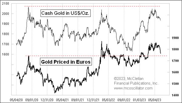
In the USA, we think in dollars, and so gold traders have noticed how prices have been thus far unable to climb above the $2067/oz level, which marked the high for spot gold prices back on August 6, 2020. But the gold traders who think in euros see it differently. For them, that August 2020 high was exceeded back in March 2022. So they would naturally not understand anyone asserting that the August 2020 high price level still matters as a resistance level. But on this current pullback, the euro-based gold traders might see it as a potential support level.
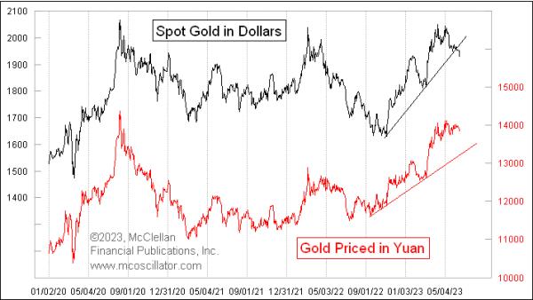
The chart also looks different to traders who think in the Chinese yuan currency.

The USA is the richest country in the world, but it only has about 334 million residents. In China, there are more than 4 times that number, people who are potential gold traders that think in yuan (also known as the renminbi). While the dollar price of gold has now broken the steep rising bottoms line, the same line drawn on the price in yuan is still fully intact. So is gold breaking down, or not?
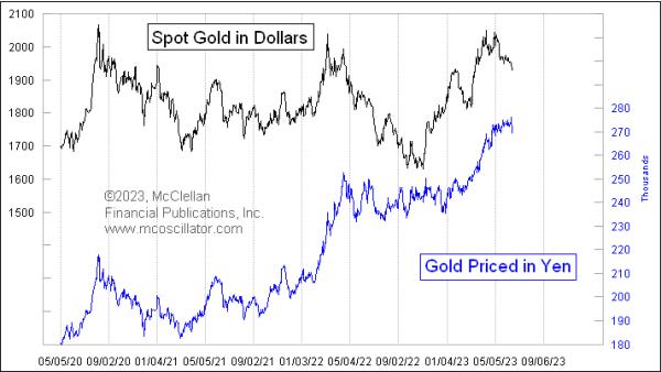
A similar question can be posed for those who look at gold prices measured in Japanese yen.

Here, we see that there is no breakdown, no struggling to get up above the August 2020 high. The yen price of gold shows just a solid steady uptrend. The weakness of the yen over the last 3 years means that each yen has less value than it used to have, and so it takes more of them to buy something (like gold).
So which chart is right? They all are, even though they seem to be saying totally different things. And thus, no single one set of prices is "right". A dollar-based gold trader would be quite reasonably concerned about the breakdown in the chart. But yen-based and yuan-based traders are congratulating themselves on being so wise as to have bought gold under such fortuitous conditions.
Where this phenomenon gets complicated is when chartists come to think of prices arriving at a support or resistance level. It is common for chartists to draw horizontal lines from prior highs or lows, expecting that the sellers or buyers who sold or bought at those levels will do so again if prices return to those levels. Such is the case with the dollar price of gold getting back up close to revisiting that $2067/oz level seen in August 2020. Dollar-based traders think that gold encountered "key resistance" at that prior high. But dollar-based traders are only a small fraction of the world's gold traders, and the rest of the gold traders around the world had no awareness at all of that August 2020 prior high being very significant to them at all.
It is for this reason that I try to stay away from thinking that a static support or resistance level is ever going to matter on a chart of the dollar price of gold. It looks so different to so many other traders that the supposed importance of that prior high or low on a dollar priced chart is just not going to matter to them, and they will not exhibit behaviors expected by someone staring at the dollar priced chart. And it gets further complicated if one looks at the spot price of gold or the futures price, since contango can introduce price differences into futures price charts, especially now that we have higher short-term interest rates. So a logical support or resistance level on a continuation futures chart (stringing together lots of different contract months) can look different from what the spot price chart looks like, potentially ruining any chart pattern interpretation one might try to make.
I realize that this assertion goes against the thinking of a lot of technical analysts, and I am okay with that.
|
| READ ONLINE → |
|
|
|
| MORE ARTICLES → |
|
 Chart 1
 Chart 2
 Chart 3
 Chart 4
 Chart 5
 Chart 6





 Use the Inspect tool to measure the point and percent move. Place your cursor at the low and drag it to the high.


 To explore the different layouts in StockChartsACP,
